
Music is organized sound.
—Edgard Varèse
While the link between design and music might seem tenuous, forced, or even nonexistent, music has proven to be one of the oldest and most informative media we can study—providing us with insights into areas of cognitive psychology and neuroscience as varied as cultural convention, anticipation, surprise, intuition, and emotion. When we break music down into its constituent components, such as melody, harmony, rhythm, and timbre, we’re able to explore one of the main tenets of art as a function of the mind: its core lies in the organization of stimuli.
Organization is what separates the individual noises that form a fragment of a musical piece from the meaningful, purposeful arrangement of these fragments. Similarly, it is organization that separates the individual brush strokes and colors of a painting from the intricate forms they’re intended to portray, or the discrete, isolated components of an interface from the usable and interactive whole. Furthermore, music is organized based on relationships (something we’ll explore in a little more detail throughout this chapter)—whether it’s the relationship between one note to the next to form melody, the relationship between two or more overlapping notes to form harmony, or the relationship between beat durations to form rhythm. Sounds, melodies, phrases, and movements are grouped, based on their relationships, to form an entity that is different to its constituent parts. Just as Gestalt’s approach to grouping and its assumption of a “global whole” inform the basis of our understanding of visual perception, so do musical elements appear relevant in how we perceive musical concepts.
We can explore how music plays on our expectations to elicit moments of suspense, interest, surprise, and intrigue. Exposure to particular kinds of musical concepts is an inherent part of cultural convention, with the differences in musical leanings being one of the most pronounced differences from culture to culture. Good musicians understand that by setting a certain baseline—establishing a certain note, phrase, or hook as “home”— deviations and explorations from this baseline can create tension, spark interest, and grab attention. (Hopefully, this is all starting to sound rather familiar!)
Finally, I think it’s important to discuss these concepts outside of design. We don’t create in a vacuum, nor should we study, teach, and learn in one—music is such a visceral, important part of our existence and provides myriad ways to marvel at the human mind. I hope you’ll allow me the indulgence of parallelism.
Fourth Dimensional Design
While we’ve touched on the importance of change in interfaces, as well as animation’s role in highlighting and communicating moments of change, we’ve yet to delve into the deeper notion of progressive art and media. A lot of “traditional” design education revolves around static representations of ideas—hardly surprising given modern design’s emergence from art and graphic design. However, interfaces are not static. By definition, an interface exists to provide some form of interaction with a system, almost always with a resultant change to the state of that system. While the insight that static art and graphic design provides us is crucial, it only offers part of the equation. To get the other parts we must look into progressive media, which we can view as media that uses time as a tool of organization or communication.
When we look at a static work of art or a piece of graphic design, the only thing that realistically changes over time is our perception of that work. If we’re being super pedantic, we can argue that the aging of the paper a poster is printed on, or the yellowing of a painting’s canvas, constitutes “change over time,” but realistically, the work is sufficiently static to be considered non-sequential and non-progressive. This static media captures a moment in time and locks an idea or thought down into the then-and-there of its creation—that is, its beauty and its limitation.
On the other end of this spectrum, we have music. While it’s possible to use sheet music or other forms of notation to portray a static representation of a piece of music, one cannot consume a musical composition without its occurrence over time. Music is, at least in part, the sequential arrangement and layering of sound. And while this may seem like an obvious or even trivial notion, the sequential nature of music’s organization means that its ideas and messages are communicated progressively. Rather than communicating in a static art form—like a painting—the ideas, message, and story of a musical piece evolve over time. This concept of using time and progression as a tool of creative organization is an incredibly powerful one, allowing us to explore how implicit and explicit divisions of time can be used to give life to sequential and progressive works.
Just like music, movies, animations, video games, comics, and novels, interaction design is not a static medium. While all these media utilize time to varying degrees of explicity (music’s explicit “division” of beats vs. comic books’ implicit use of panels to communicate moment-to-moment transitions) and many of them can maintain their intentions to some degree if time is removed from the equation (a still from a movie can communicate a great deal of artistic intent, as can a screenshot of a video game), what they all have in common is that they are enhanced by, or reliant upon, the use and manipulation of time as a creative tool.
When we view time this way, we’re quite literally given a whole new dimension to utilize in our work. We can stop looking at our interfaces as various stages of static screens and start looking at them as compositions that are played out over a somewhat measurable period of time, as moments and movements and transitions. Of course, this is nothing new. We’ve already discussed animations in Chapter 2, yet animations are an abstraction layer, merely a constituent part of the progressive nature of our work. Animations let us describe how an interface progresses from one state to another, with the “end” frame of our animation portraying the final state of an interaction. However, on a more theoretical level, time opens up the chance for us to build and release tension—to set, manage, and subsequently defy expectations. We’ll explore this in much greater detail throughout this chapter because it’s an integral part of the parallels we can draw between music and design.
This control of tension and time lets us tell stories through our work, whether these are literal and overt or subtle, implied stories. The approach of allowing our work to unfold and morph over time gives us a great deal of control— control that traditional graphic design has rarely allowed for. The “design-is-storytelling” angle has become something of a cliché, but there’s absolutely some truth and value to it. As we discussed in Chapter 3, concepts such as progressive disclosure—the act of revealing different, often more complex, interaction devices throughout the prolonged use of an interface—are only made possible by accepting that our interfaces can, will, and should change over time. An understanding of when someone is in our interface, that is, at what point in implicit or progressive time they’re currently experiencing it, is an important, albeit abstract, notion we should always keep mind.
Melody, Harmony, and Rhythm
Music, in an insultingly simplified nutshell, can be seen as the sequential arrangement and combination of notes over a period of time. This is one of those definitions that is of no use to anyone, though, and we need to explore some of the basic building blocks of musical composition in more detail to build a working definition.
Melody
When we talk about melody, we’re really talking about pitch-based relationships. Pitch, at a basic level, refers to the frequency at which a sound vibrates, usually noted in Hz. When we hear a note of a certain pitch, followed by another note of (potentially) a different pitch, and this continues over time until a “phrase” is completed, we’re experiencing melody. Think of a phrase, by the way, as a musical “sentence.” Pieces of music are often formed of many interconnected phrases that lead into and out from one another. Some pieces—especially nursery rhymes and modern pop pieces—are made up of a very few, repetitive phrases (often called “hooks”), while more avant-garde genres, such as improvised jazz, might be made up of hundreds of phrases, which barely, if ever, repeat.
The melody of a phrase is what you might whistle, hum, or sing along to, and it is usually the most memorable component of a piece of music. (This is assuming it actually has a melody. Many forms of sub-Saharan and Western African music, for example, are purely rhythm-based.) Our recognition of melody is, in part, how we can intuit that the three masterpieces that are “Baa, Baa, Black Sheep,” “Twinkle, Twinkle Little Star,” and “A, B, C” (how we’re taught in Western culture to sing the alphabet) are essentially the “same song” with different words. The melodic relationships between the notes of these songs are identical. For example, the first two syllables (“baa, baa” or “A, B”) of all three pieces are sung at the same pitch, with the next two (“black sheep” and “C, D”) are sung at a higher pitch than the first pair. We’re able to notice this similarity extraordinarily intuitively. (If you’re lucky enough to have not grown up on a westernized musical diet and have no idea of these nursery rhymes, or if you’re just feeling somewhat nostalgic, you can watch two cartoon beavers present a mash up of all three songs at youtu.be/sHWsLMaL3Tc. The Internet truly is incredible.)
Melody, like almost everything in music, is based on relationships—that is, the mood of a melodic phrase and the impact of a certain note within such a phrase are determined by the relationships between the phrase’s notes. Change or add a component, and the melody itself becomes something new. If this concept is sounding familiar, it’s the mantra of Gestalt: the “whole” exists independently from the “parts.” In fact, while the prevalent use of Gestalt Theory lies in the perceptual grouping we discussed in Chapter 2, the grouping of sounds to form melody is reported to have been of great concern to the Gestalt School.
Indeed, one of the more intriguing phenomena of melody is how we can intuitively recognize a particular melody, regardless if it is transposed or not. Transposition, in music, involves essentially moving every note of a piece higher or lower by the same amount—changing the key and the note pitches, but maintaining the relationship between each note. If you don’t have absolute pitch, you’ll likely struggle to start an a cappella rendition of “Baa, Baa, Black Sheep” on the “correct” note, but you’ll probably have no issues whatsoever getting the melodic relationships correct. Preserve the relationships and the melody is as recognizable when started on G as would be if started on D♯. This is actually a striking phenomenon and an ability of recognition that is displayed by humans from our infancy.
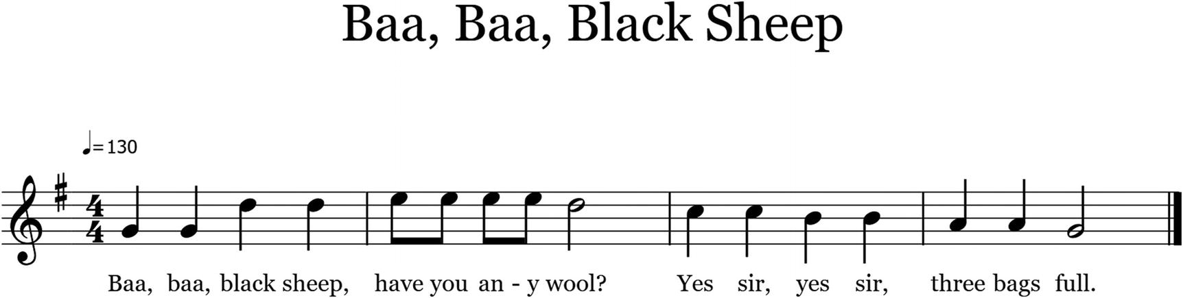
The first four measures of “Baa, Baa, Black Sheep,” lovingly transcribed just for you by the author
The placement of notes on a stave provides us with a good visualization of this theoretical “sonic distance” between pitches. In music, the “distances” between two notes (in other words, the degrees to which the notes’ core frequencies are separated) are known as intervals . In this case, the distance between the second and third note of the piece (G to D) is what is known as a “major third.” Music theory is notoriously esoteric, and there are lots of strange, often counterintuitive ways of labeling or structuring musical concepts. The next few sections will be pretty theory-heavy, but please do not worry if you get a little lost or overwhelmed by some of the musical concepts—it’s okay! We’re more concerned with how music thrives based on relationships than we are with explicit, arbitrary terms, theories, and rules. However, a good understanding of how Western scales are formed and learning some of music’s more general terminology when discussing relationships will help us discuss these concepts going forward. Deep breaths.
In most forms of music, there are 12 notes, most commonly given letter values between A and G, with a few “sharp” or “flat” (denoted as ♯ and ♭, respectively). Thus, variants of these notes are written as follows: A♯, C♯, D♯, F♯, and G♯ (which are functionally equivalent to B♭, D♭, E♭, G♭and A♭). This rather esoteric approach gives us a full octave of A, A♯, B, C, C♯, D, D♯, E, F, F♯, G, G♯, and A, completing a theoretical circle. (A sharp, or flat, note, by the way, is its own, discrete note. An A is no more or less related to A♯, in any functional sense, than an E is to an F.)

Music notes and intervals associated with piano keys. The distance between two adjacent notes is known as a semitone, or half step.
If you’ve ever played (or observed someone play) piano, you may have noticed that as you move from right to left along the keyboard, each note you play is higher than the one that came before. The full “journey” from the first A to the last A is our chromatic scale, and the distance between the first A and the second is our octave. The key points are that we have 12 notes to work with and the distance from one note to another is called an interval.
Very rarely, however, will a piece of Western music make use of all 12 notes. Western music is traditionally “tonal” music, which means pieces have a “key.” The key of a musical piece indicates a couple of things. First, it indicates what is likely the “home” note of a piece, and, second, it communicates which notes are “legal” members of that key.
So, a piece in the key of C Major tells us that C is the likely “home’” note (more on this later) and the “legal” notes of the piece are limited to those found in the C Major scale. G♯ Minor tells us that G♯ will feel like home, and the legal notes are those of the G♯ Minor scale. A scale is a collection of notes, separated by defined intervals, that communicates a certain mood. In C Major, those notes are C, D, E, F, G, A, and B. If you’ve ever seen a jam band play, and they decide they’re going to improvise in the key of C, then aside from some “flavor” notes (known to music theorists as “accidentals”) here and there, they’re likely to restrict themselves to phrases constructed from those notes listed.
Rather than memorizing each note of every possible scale, though, musicians tend to learn scales based on their intervals. So when we look at C Major, we see that the distance from C to D is two semitones (or a “whole step”), as is the distance from D to E. From E to F, we have a “half step.” Then it’s whole, whole, whole, and half to give us the structural sequence of whole, whole, half, whole, whole whole, half to define a major scale. Now, if we start at any other note and follow this structure, we will get the major scale of that note. So G Major would contain G, A, B, C, D, E, and F♯. By learning the underlying structural sequence of a major scale, musicians can essentially play or write in any key without learning 12 different note sequences. This only works because, in music, relationships rule all.
While explicit, provable knowledge of these aspects of music theory is likely useless to a non-musician, the fact that these rules govern the vast majority of Western music means that we hear and expect these rules to be followed as part of our intuitive understanding of music in general. Indeed, the key thing to take from this theoretical rambling is that these limitations and musical rules, based around sonic relationships, are what form our subconscious understanding of music.
When we listen to a melody, we’re hearing relationships between notes—and not just from each “pair” of notes to the next, but in the context of the entire melody so far. When we perceive a melodic phrase, every note, every core “part” of that phrase, turns the “whole” into something else—something it categorically was not before the introduction of that note. Again, without sounding like a broken record, this is the core tenet of Gestalt psychology.
When we talk about intervals, we’re documenting a specific relationship between frequencies of a sound. A “minor third” interval (for example, going from A to C) describes the relationship between these notes in a particular way—it communicates the sonic distance between the root frequencies of each note. For example, if an A note has a frequency of 440Hz, its relationship to other notes can be described in the form of a ratio. It could be related to an E at 660Hz, or a ratio of roughly 3:2. It could be related to a C at 264Hz, or a ratio of 3:5, or a D at ratio 2:3.
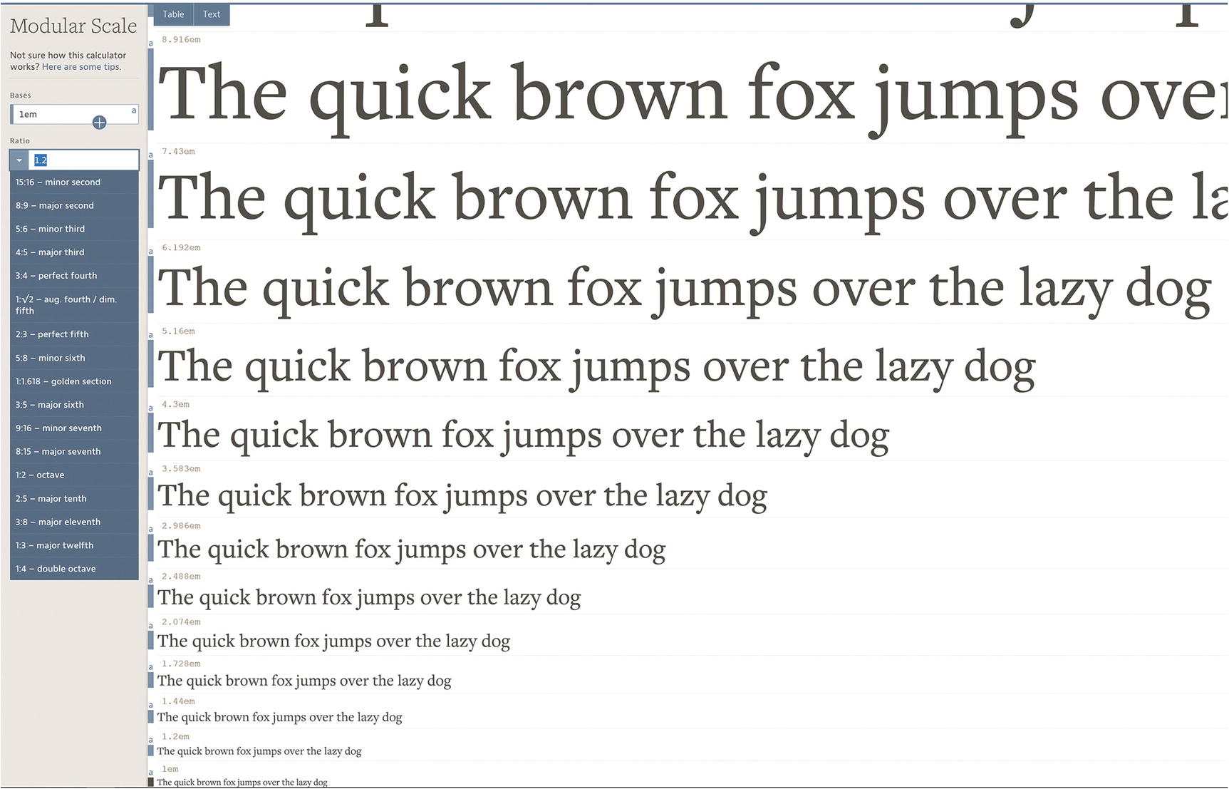
Modular scale lets you choose “harmonious” typographic scales
With all the options aside from one (the Golden Ratio, funnily enough) being based on musical intervals, such as minor second, perfect fourth, and so on, modular scale shows an interesting and potentially useful direct application of the pure mathematics of music intervals to design.
Fundamentally, melody and phrasing are the driving forces of many forms of Western music. While genres such as ambient and noise focus on textural (or timbral) and reverberative qualities, and many forms of hip-hop eschew melody for rhythm (Public Enemy’s “Bring The Noise” is a fantastic example of how melody does not have to be the be-all and end-all of musical composition), it’s extremely difficult to find music that doesn’t revolve around melodic movements.
Harmony
Luckily for us, harmony and melody utilize the same underlying concept—intervals—just along a different axis. If we define melody as the intervallic relationship between sequential notes (for example, playing one note, then playing another some arbitrary time after the first), then harmony is the intervallic relationship between concurrent notes—that is, notes played at the same time.
In music, a combination of two or more notes played (usually, but not always, on the same instrument) at the same times is called a chord. If you’ve ever picked up a guitar, you might have learned a G chord early on in your musical career, and then gave up, maybe, because fingers weren’t designed to work in such stupid ways. This chord would have had you playing multiple notes, across multiple strings, at roughly the same time (fast enough to sound like one discrete note rather than an arpeggio). As with melody, the relationship between all the notes of a chord informs the harmonic structure of that chord. By layering specific intervals on top of each other, we can form chords with specific characteristics. The root + major third + perfect fifth combination, for example, gives us a major triad chord (“major” defining the intervallic relationship between the root and the third, “triad” because it’s formed of three notes). Changing a single interval by a single semitone in that equation gives us the combination of root + minor third + perfect fifth—or a minor triad.
Major chords—due almost exclusively to cultural convention—connote triumph, happiness, and irreverence, while minor chords can imply sadness, seriousness, and melancholy. One change to one interval, and we’re able to completely change the qualities of a chord. Of course, as we discussed when exploring melody and previously when discussing Gestalt, the relationship between multiple chords provides much more harmonic information than taking a single chord out of context to analyze its qualities. For example, minor chords show up all the time in otherwise “happy” songs, as do major chords in the melancholy landscapes of “sad” music. Without the context of a piece’s other chords, a single, out-of context chord—while containing more intervallic relationships than a single note—is still a relatively abstract and arbitrary fragment of a musical idea.
Just as melodic phrases occur over time, so too do the underlying chords that form the tonality of a piece. While the sequential transition from one note to another forms our melody, the movement from one chord to another is known as a “chord progression.” Chord progressions allow us to explore what is probably the most relevant concept we can borrow from music: the building and releasing of tension.
The concept of a “home” chord is something that almost every traditional piece of Western music will utilize. By communicating a certain chord as the tonic root of a piece, we essentially establish that chord as a musical base camp— returning here “feels right” (very scientific, right?) and any deviation from it creates some degree of tension or intrigue. There are myriad ways to make a chord “feel like home,” ranging from the not-so-technical “play it first, play it loud, and play it often” to more nuanced and subtle techniques. However, the core goal is to establish this tonic root. Once this root is established, we can move away from it to create tension, intrigue, and suspense, and return to it to resolve these feelings. How, and to what degree, we deviate from this home chord, as well as how long we take to return to it, greatly affects the tonal characteristics of a piece of music. Once we’ve got one more pesky definition out the way, we’ll delve much deeper into the underlying emotional functions that permit this approach to tension.
Rhythm
Rhythm is music’s explicit use of time, and it defines how much time a particular note or chord is played for as well as where any emphasis is placed. Rhythm can be thought of, in part, as the punctuation of a piece of music. While the notes of a melody might be our word choice and each phrase a sentence, rhythm is the essential punctuation that allows our syntax to breathe. Rhythm is what has us tapping and dancing along with music. When we read a piece of sheet music, we generally encounter bars. Bars, otherwise known as measures, are (somewhat arbitrary) ways of splitting a piece of music into phrases or sections.
Going back to “Baa, Baa, Black Sheep,” if we look instead at the rhythmic structure of the song, we can see that the first bar (Baa, baa, black sheep) consists of four notes of equal duration. In the second bar (have you any wool), each individual syllable until wool are sang twice as fast as the four notes in the first bar, and the final wool is held, making it twice as slow as those in the first bar. Try slowly tapping these beats out if this labored written description is hard to grasp!
Without delving too deeply into rhythmic theory (as much as I’d love to), the first four beats of the song are called “quarter notes,” or crotchets—a beat that takes up one-quarter of a bar (if that bar is in 4/4 time). The have you any wool beats, twice as fast as the quarter notes, are known as “eighth notes,” or quavers. In a single bar of 4/4 (again, if this doesn’t make sense, don’t worry—4/4 is a musician’s way of saying “each bar of this piece contains the equivalent of four quarter notes”), it’d take eight quavers to fill a bar. The final syllable of the second bar, wool (or woooooooool, to be precise) is what is known as a “half note,” or a minim. This takes up as much time as two quarter notes, or four eighth notes. When we add our fractional notes together, for each bar, we get a nice, round one (four quarters in bar one, four eighths + one half in bar two).
The division and duration side of musical rhythm only forms part of the equation, however, because without emphasis to reinforce a piece’s rhythmic qualities, we’d be left with a rather bland, plodding piece of music. Emphasis determines where we should place accents in a piece of music, giving it a distinct, recognizable pulse. Try singing “Baa, Baa, Black Sheep” out loud, while paying specific attention to which words you “naturally” emphasize (probably by singing them a little louder than the others). If you’re super talented, try even tapping your feet along with singing. (Don’t worry if you’re reading this book in a public place! Do it anyway. You’ll be the winner.)
Now, it’s quite probable that the biggest emphases in your sing-along were placed on the first Baa, and the word have. It’s also quite likely that you added a less-obvious emphasis to the words black and that last, prolonged wool. Now, this doesn’t account for if you were feeling particularly rebellious or fancy with your rendition, nor does it accommodate for your having been taught that song by someone rather fond of syncopation, but the vast majority of us will “naturally” add emphasis in these places. This is due to our constant exposure to this prototypical rhythm forming part of our “rules” for Western music.
The overwhelming majority of contemporary western music is in a 4/4 time signature. This means that each measure of a 4/4 piece of music is made up of beat divisions that add up to four quarter notes. Furthermore, the overwhelming majority of songs in 4/4 time place primary emphasis on the first quarter note of every bar and secondary emphasis on the third quarter note. This combination of beat divisions and emphasis provide the rhythmic “feel” of a piece of music. In emphasizing the “right” beats of a bar, such pieces can cater to our musical expectations. As you may have noticed in your earlier rendition, this emphasis feels ingrained into our brains—due to such an extensive, lifelong exposure to “4/4-with-an emphasis-on-the-1-and-the-3” music, anything that differs from this can initially feel weird. One of the most common contemporary deviations from this rhythmic approach is found in reggae music. Throw on a popular reggae track (I recommend Peter Tosh’s “Legalize It,” if you’re short on reggae knowledge—just please don’t choose UB40) and try to tap along to the rhythm.
If you noticed you had a little difficulty matching the emphasis or rhythmic pulse of reggae music, that’s likely because it uses syncopated rhythms—the emphasis in reggae usually hits on the second and fourth beat of each bar. This is what gives reggae music its signature “bouncy” vibe. It’s still predominantly a genre based around 4/4 time, with contemporary Western instrumentation (guitar, bass, drums, and vocals), but simply changing the pulse of the beat gives it an “exotic” feel—at least in comparison to the average Western pop song.
Tension, Anticipation, and Surprise
If there’s something I’m positively certain you’ll agree with me on by now, it’s that “Baa, Baa, Black Sheep” is really, horrendously boring. There’s a reason such simplistic pieces are saved for young kids and meandering, example-driven music explainers in the middle of design books: it’s so stripped-down and basic that it’s almost completely dull. Which leads nicely into the fun part of dissecting music—the medium’s insightful and incredible application of emotional engagement through tension, anticipation, and surprise.
In order to explore the underpinnings of emotions like surprise, we must first understand how we build expectations of the world around us. One of the most elegant methods of explaining this is through the notion of schema.
Schemas
In Chapter 1, we spoke about the mind’s need to categorize. As a result of categorizing, we create and reference various schemas. A schema is a mental structure that consists of “rules” against which we can judge objects or stimuli from our environment. Schemas are similar, at least in definition, to the mental models we covered in Chapter 3. They both represent structures of the mind that allow for relation, abstraction, and categorization.
To hopefully disambiguate when I talk about mental models in this book, I’m talking specifically about a person’s perception and understanding of an underlying system. Contrast this to schemas, which, in this context, represent a broader set of rules, or features of a category, that we may later use to classify something as a member, or nonmember, of said category. For example, our schema for car might include “has wheels, has seats, has a steering wheel, and has an engine.” This approach to categorization allows us to quickly make decisions and predictions of objects and stimuli in our environment, based on things like physical appearance, tactile response, and auditory input. Furthermore, by developing rules and expectations for categories, we also appear to form prototypical members of categories based on our schema.
As part of an important and intriguing series of experiments around categorization starting in the 1970s, Eleanor Rosch presented and evolved her Prototype Theory. The Prototype Theory suggests that, rather than simply having a binary yes/no determinator as to whether or not an object or stimulus is a member of a category (it either meets the rules, or it doesn’t—also known as the Aristotelian Model), we adopt the notion of prototypes (Rosch, 1973)—basing category membership on comparisons to central members that most closely adhere to the schema of our categories. Rosch’s examples include the category of furniture, where it was shown that objects such as chairs and sofas are deemed “more central” (Rosch, 1975) to the furniture category than, say, stools or lamps. Thus, we can position chairs and sofas as “privileged” members of the category against which membership can be weighed for less prototypical, potential members.
The implication of this approach to graded categorization was substantial, The idea that categorization is central to our understanding of the world is rarely disputed, but the idea that we use and compare members of categories to help determine membership presents some fascinating insights into our nature. Particularly, it goes some way in explaining why our existence and understanding of the world is so inundated (and often plagued) by stereotypes and archetypes. By using prototypical members of a category as a heuristic determinator as to whether the thing we’re analyzing “belongs” in that category, we invariably form—often incorrect, and often damaging—stereotypes for members of that category. While instantly jumping to a small chirpy sparrow or robin as opposed to a big, gangly ostrich when asked quickly to “think of a bird” isn’t a damaging worldview at all (unless you’re an ostrich), jumping to the image of a young woman when asked to “picture a nurse,” or an old, white man when asked to “think of a scientist,” for example, really is.
Schema and prototypes appear to show that our boundaries for categorization are not immutable rule sets, but fuzzy, evolving concepts. For a long time, the schema most people held for “woman” would seemingly only encompass biological females—a hugely problematic mindset that still, depressingly, exists in many people and subcultures in modern times. While many people are changing their schemas as to what constitutes an apparent member of a gender—the fact that transgender women are women should raise zero questions about transgenderism, and infinite questions about how fallible, arbitrary, and hurtful accepted schemas and stereotypes can be—and many still are rightfully questioning the binary nature of a gender paradigm in general, we must accept that this societal change is required, in part, due to our blinkered willingness to categorize in such ways. Our brains are, evolutionarily, quite outdated—and this is just one of many examples of how schemas and heuristic can hamper social progress. This does not, however, excuse or diminish bigotry and myopia. It merely serves to offer a potential explanation for some of their root causes.
This also suggests that our schemas are greatly informed by exposure to sociological events and cultural convention. When something challenges our schemas, we’re confronted with a situation that likely raises many questions, causes cognitive dissonance, and quite probably affects us emotionally. This is especially true if the schema in question is one that we’ve held for a long time, one that relates to a category that is of notable intrinsic importance, or one that underpins many other schemas that form the scaffolding for our worldviews. Many people, too, possess schemas that they believe to be immutable, resulting in a form of schematic myopia. Depending on the category in question, we might call these people “snobs” (for instance, jazz and classical music obsessives that refuse to acknowledge heavy metal or dub step as “music”) or even “bigots” (prejudiced individuals who appear devoted to their myopic opinions).
Most non-obsessive, non-bigoted humans, however, will possess schemas somewhere close to the middle of a mutability scale. That is to say, the boundaries for various categories are, to a degree, moveable and changeable in the face of evidence and experience. As well as being able to adapt and alter the underlying schema we hold for a category, prototype theory suggests that we also have “fuzzy” members of a category. Rather than a binary member/nonmember deduction, we have the notion of something being more, or less, of a category member, depending on its resemblance to a prototype and its adherence to the rules of our schema for said category.
Schemas, for better or worse, appear to form the basis of how we categorize objects and stimuli in our environment. However, another key area of schemas—and the area that is pertinent to the discussion of concepts such as tension and anticipation—is that they greatly inform our expectations. This is something that musicians, knowingly or otherwise, take advantage of all the time. Remember the idea that music is organized sound? Part of that organization revolves around knowing and manipulating the expectations we’ve formed of music as a whole. Our schema for music is based on what we’re exposed to throughout our lives, and it includes implicit rules for rhythms, melodies, and harmonies, as well as more esoteric expectations such as instrumentation and dynamic range.
When you sang “Baa, Baa, Black Sheep” earlier (you did sing it, right?) and I asked you to pay attention to where you placed your rhythmic accents, it was almost inevitable you’d been “taught” that nursery rhyme with those specific rhythmic emphases. In that sense, these simplistic nursery rhymes can be seen as prototypical of Western rhythmic structure. Our schema for a particular genre’s rhythm, or even the entirety of musical rhythm known to us, is informed by our prolonged exposure to this one very specific approach to musical composition. This rhythmic structure, then, represents one of our core schematic expectations—an assumption that we take in to any scenario of music listening.
As we explored, the vast majority of western music has this rhythmic pulse to it. The first beat of every bar is usually the most energetic, followed by a generally low-energy beat, then a notable emphasis on the third beat preceding another low-energy beat to finish the bar, repeat ad nauseum—DUM-dum -DA-dum, DUM-dum-DA-dum, and on, and on. This rhythmic pulse can be heard in The Beatles’ “Yellow Submarine,” in Black Sabbath’s “Paranoid,” Beyoncé’s “Love On Top,” and Kendrick Lamar’s “King Kunta.” It’s everywhere, regardless of genre or tempo, and a whole host of artists spend their entire career barely deviating from it. This pulse, coupled with non-changing 4/4 time signatures, could also quite feasibly represent the only approach to rhythmic composition the average listeners will hear in all the music they listen to. Through this kind of exposure, our schemas for many forms of music are littered with this rhythmic pattern.
Now think to how reggae, which is far from an avant-garde form of music, sounds somewhat “strange” or “exotic” when compared to the prototypical Western pop song. The instrumentation, timbre, melodic and harmonic constraints, and song structure of a prototypical reggae piece are extremely similar to those found in Western pop music, yet that one single shift in rhythmic emphasis defies our expectations and gives the genre its own unique vibe. Quite plainly, we’re experiencing a form of schematic violation when we encounter this. Western audiences have, over many years, built up an idea of what music is, and when faced with something that doesn’t fit that idea, we’re exposed to something new, often challenging, and sometimes surprising. This challenge, or schematic violation, provides a degree of necessary complexity to musical stimuli. By going against what we’re used to, by defying our expectations, artists can provide us with novel and important stimulatory challenges.
Given that reggae mostly makes use of timbres, instrumentation, meter, and structures that Western audiences are used to, the syncopated rhythms provide just a slight deviation from our expectations. If we were to, say, replace the electric guitars found in many reggae pieces with a Japanese shamisen and swap the vocal melodies over to a West African balafon, we’d be further deviating from the “safe” expectations of a Western audience’s schema for music.
Our exposure to instrumentation also plays a major role in our schema for music—especially the timbral qualities of the instruments we’re used to hearing. While we haven’t explored timbre much in this chapter, it is essentially a combination of harmonic overtones produced by an instrument that gives it its sound. A G# played on a piano sounds different from the same G# note played on a saxophone, for example. Our schemas for classical music might include typical orchestral instruments such as the piano, cello, violin, and French horn, while our schema for folk music will likely include the acoustic guitar, double bass, and fiddle.
When distorted electric guitars were first introduced to music, it created quite the stir. Many people were taken aback, even offended, at this fuzzy, distorted noise. In an age where acts like Tony Bennett, Dean Martin, and Frank Sinatra provided the sound of the times, this high-energy, visceral noise—with its jarring, micro-dissonant overtones—was quite the contrast.
Many others, however, were enamored. Intrigued and inspired by this sound and their sense of adventure aroused, a cultural revolution emerged and the chase for more distortion, louder amplifiers, and heavy, guitar-centric music started. From the early emergence of rock-and-roll to the high-energy, riff-based approaches of Deep Purple, Black Sabbath, and Led Zeppelin to the anarchist punk stylings of The Stooges and the Clash to the energetic hardcore of Black Flag and Bad Brains and on and on, entire genres of music and cultural movements emerged based around, as Frank Zappa wonderfully puts it, “the disgusting stink of a too-loud electric guitar.” Similar movements occurred around the invention and popularization of audio synthesis, with many electronic, synth-driven artists going against the “real” musicians of those days, or the grunge musicians of the late 1980s and early ‘90s taking rock and metal music away from the flashy, Van Halen-style, shred metal to a visceral, bare-bones genre. For every one of these emergent countercultures, there were many listeners rooted in their fixed schema, rolling out phrases such as “it’s just noise,” “that’s not real music,” and “I really wish Frank Sinatra was the only person ever allowed to make music” as thinly veiled excuses for schematic myopia.
These do represent notable deviations from popular schematic expectations, however, so it’s easy to see why many people rejected the concepts outright (and may go some way to showing why younger people tend to “get” new, different music easier and faster than older—they’ve spent less time validating their own myopic schema). However, this challenge to our preconceived notions of what constitutes a genre of music, or even music itself, is considered to be a major factor in music’s evocative and emotional underpinnings.
Tension as Schematic Violation
As we’ve explored, our schemas help inform our expectations. While being able to analyze our concurrent stimuli and make a logical prediction has worked wonders for our evolutionary survival, when it comes to processing noncritical stimuli (which, from modern, privileged positions, represents the majority of daily processing), we’re very easily bored by things that adhere too closely to our expectations. Movies rely on this all the time. By having the audience expect one thing (and often playing to that expectation) for the first acts of a movie, only to slowly unravel a conspiracy that completely defies that expectation, a much more exciting, memorable plot is played out. By carefully presenting us with enough information early on to form a theory or expectation, only to take us in a completely different direction, good movies create engaging, challenging experiences—and a decent plot twist or two can salvage even an otherwise terrible movie.
Music metaphorically throws plot twists at us all the time. And rather than taking two hours to do so, it often does this in a matter of seconds. When we hear music, especially if we’re paying direct attention and actively listening to a piece, our brain very quickly starts thinking of where the piece or movement might end up. Patterns start to emerge in the lines and phrases we hear, too, satisfying an innate desire of the auditory cortex to organize what we hear into safe, known, and expected patterns. As we explored when discussing harmony earlier, a major component of expectation in music lies in establishing a “home” chord or note, and traveling away from and back toward it in various ways. This very act is made possible because we have expectations as to where a piece of music will go next, and this is constantly updating as we parse the sequential stimuli of a piece. Great composers will use this to dance between moments of intrigue (defying our expectations) and reward (the acknowledgment that we were “right” or the reversion to a harmonious baseline emotion). Another way at looking at this flow between intrigue and reward, using more “musically appropriate” terms, would be the concept of tension and resolution.
Tension in music is much like tension in many forms of progressive and sequential art, and it essentially boils down to these idea of flirtation with schema and pattern. Tension relies on using these ideas to create a kind of “useful complexity,” whereby we’re processing something that deviates from our expectations in novel ways—ways that suggest, retract, and reintroduce patterns, challenging our preconceived schemas and thus mentally arousing us. Musical tension is often achieved through first establishing this baseline of “home.” By framing and emphasizing a certain chord, note, or pattern, a composer can sow the seeds of expectation. What follows is generally a power dynamic wherein the listener, vulnerable and at the whims of the composer, allows their expectations to be teased and their emotions manipulated as the piece moves further away from the nice, established patterns of home and into stranger, schematically inconsistent territories.
The fulfilling of expectation in this process can be viewed more generally as the reinforcement of a schema, either through what we understand of music or genre as a whole, or through what the piece itself has communicated about its own baseline structures and patterns. When we imagine something like a piece of music to have rules and expect it to follow them, we’re left with a sense of reward when it does so: we’ve successfully predicted the direction of a piece; we’ve finally rediscovered the pattern we so craved.
Rules that are set early and adhered to often create this feeling of “correctness,” as can be seen in any song that has a “count-in” intro. Count-ins are one of the most obvious ways possible of setting expectations, explicitly calling out the rhythmic structure of the song before it begins. This can be heard in songs like Outkast’s “Hey Ya” and James Brown’s “Get Up (I Feel Like Being A) Sex Machine.”
Count-ins are common in live performances, where a member of the band (usually the drummer) counts “out loud” (either literally counting the numbers or tapping the rhythm on a drum or cymbal) a sample bar to give the rest of the band an idea of the tempo of the piece and an indicator for when to start playing. However, they serve a secondary purpose, especially in music with a heavy focus on rhythm and movement, by setting the expectations of an audience. James Brown was a master of this, both explicitly (as heard in “Sex Machine,” “The Boss”) and implicitly (“Get Up Offa That Thing”) introducing the song’s rhythmic “rules” and setting expectations before the full band comes in. This works so well because James Brown’s music exists, primarily, to be danced to. If you can’t listen to James Brown without risking a little boogie, it’s highly likely you’re an extremely boring person.
Dancing and general outward displays of emotion and movement form a huge part of music. A notable amount of our brain’s response to music occurs when processing rhythm. There’s a direct link between music listening and the cerebellum—the area of the brain associated with movement, and it’s been shown that our brain’s rhythms actually sync in time with musical beat. Any physical response to music is largely taught out of us, with many Western cultures preferring the polite, white-bread response of simply observing musicians perform without much engagement. From seated, civil viewings of classical performances to that boring couple you know who pay to see Eric Clapton play and might potentially risk a head nod or two if no one’s looking (don’t deny this, everyone has these people in their life)—the white, middle class have long been taught to hold back any natural desire to move along with a piece of music.
When the late, great James Brown counts-in “Sex Machine,” he sets up a few expectations. First, by counting to four, he shows that the song is in 4/4 (unless it’s a waltz, 4/4 is the time signature of almost every “danceable” piece). We’re used to this. This is the time signature of most music. It’s an ingrained part of our schema. Second, the time between each number in the count tells us the tempo—how fast the song is going to be. This, very quickly, has us forming a schema for the song. We expect that the song will, at least at the beginning, adhere to these rules. Before we’re presented with the “bulk” of the musical experience, our auditory cortex already has the beginnings of a pattern.
Now, some artists, especially those who thrive on being avant-garde and unpredictable, might see this as an opportunity to immediately defy expectations, either by delaying the entry of the instrumentation (Frank Zappa did this all the time) or by immediately changing the tempo or meter. However, James Brown and his band played music that got people moving. To grossly and immediately defy expectations in such a way would be counterproductive, leaving an audience’s expectations (and movements) out of sync with the musicians’ performance. By setting and sticking to expectations for rhythm, James Brown’s music gives us a sense of trust. It’s validating to perceive stimuli that we can predict, especially when those stimuli are designed to have us moving and expressing emotion.
Predictability, however, is often boring, and many areas of James Brown’s work defy expectations in their own way. While the key tenet of the music—the rhythm—is predictable and often maintained, the amazing range of vocal timbres, the masterful ebb and flow of dynamics, and the wide gamut of instrumentation and melodic ideas heard within Jams Brown’s works make for a varied and eclectic discography. While there’s little in Brown’s hits that violates “traditional” rhythmic schema, the sheer excitement I (still) get when he first turns a dulcet, low-pitched, smooth vocal note into an energetic, almost-screamed tone—dripping in vibrato and on the verge of completely falling apart changes the entire dynamic of a song. Similarly, when a piece that has been riding along with only vocals, bass, guitar, and drums for a while seemingly from nowhere introduces a loud, dynamic horn or brass section, it surprises us, defying our expectations and violating our schemas.
Dissonance is probably one of the most obvious and visceral schematic violations music can provide. Put simply, dissonance is the result of juxtaposing certain intervals that do not “fit” together. The introduction of incorrect or incompatible relationships to a previously harmonious whole checks both of the requisite boxes to be seen as novel; it eschews expected patterns, and it violates our schematic understandings. Dissonance is the vehicle of melodic and harmonious attention, our hearing of such challenging stimuli arouses our innate desire for novelty, and dopamine is released in response.
Everyone has their own thresholds for dissonance and novelty or complexity in general. To pit dissonance and tension as the brave saviors of music in the face of banal repetition and positive-feedback loops would be to only tell half the story. As much as we need the challenges of dissonance, so too do we need to safe and expected embrace of normalcy. In fact, over time and through repetition, once-novel musical ideas work their way into our schemas, into our stored patterns. The previous sources of surprise and violation slowly form parts of our stored patterns and our expected whole. As with almost every deep dive into the perceptual and attentional systems we’ve performed in this book so far, we require the yin of safe expectance just as much as we require the yang of dissonant novelty. Order and disorder, just like consonance and dissonance, just like expectation and surprise, do not exist away from, or in spite of, one another.
The Spectrum of Surprise
Remember the crashing mugs in the coffee shop in Chapter 1 that caught our attention through initiating a startle response? This response is surprise. Surprise is often categorized as an emotion, insofar as scientists can actually agree for 12 seconds on the actual definition of one, and often lasts for a very short period of time, usually giving way to other, longer-lasting emotions. Surprise and the startle response exist to “snap us out” of our current attentional focus, often toward the source of the startling stimuli. Broadly, surprise can be seen as the initial “switch” of attention that occurs when our expectations are defied. It’s that pesky lions-eating-our-face scenario all over again.
Like many emotions, surprise can occur with varying degrees of intensity and valence, meaning we can have big, bad surprises, such as a nasty wasp sting from out of nowhere, or little, happy surprises, like receiving a small, unexpected gift from a friend. In Chapter 2, I dropped the awe-inspiring knowledge that only primates can see the color red. The “surprising” thing about learning this, for me, was the implication that bulls can’t see red. After years of seeing the (awful and incomprehensible) matador-with-a-red-cape vs. an angry bull trope, I’d gone about my life believing incorrectly that the specific color somehow antagonized the bull. Now, this knowledge is, essentially, borderline useless to me. The surprise I felt was merely a violation of an accepted schema. It didn’t arouse my emotions and it didn’t make me feel particularly sad or happy, yet it still surprised me. In reality, I remember that single, silly fact plainly because it was surprising.
When something violates our expectations enough to instigate surprise, we remember the specifics of our situation much more readily. In a December 2008 article in Scientific American, Daniela Fenker and Hartmut Schütze suggest that the hippocampus, which plays a significant role in taking information from working and short-term memory into long-term memory, is the brain’s “novelty detector.” When the hippocampus is presented with new information, it compares it to our implied knowledge of the world (our acquired schema) and, if the two are incompatible, sparks a kind of dopamine feedback loop between the hippocampus and various brain regions. This is the accepted reasoning as to why novel (that is, surprising or expectation-defying) occurrences and learnings tend to stick with us much more easily and for a much longer period of time.
As well as the novel occurrence or stimuli themselves being more memorable, Fenker and Schütze give evidence that, in fact, stimuli and information that are present alongside the novel item are also more memorable. That is to say, in many cases, when we’re surprised by a thing, as well as that thing itself being more memorable, the stimuli we experience around that time are as well. This notion might seem obvious if you think back to the last time you were truly surprised by something that occurred during your day-to-day activities.
As a personal example, I still vividly remember the emotion and stimuli I experienced when I discovered the results of the United Kingdom’s shocking Brexit vote. A lot has changed in my life since then, yet I still remember the layout of the room I was in, down to where the light was coming in. I remember my emotional reaction and my immediate response to such a personally dismaying and surprising situation. I have a similar vividness of my memories of the day I found out that Donald Trump became the actual president of the United States of America. Perhaps this says a lot about my own naivety, in that I was sure enough that neither of these events would happen, to render their occurrence shocking, but they at least provide good working examples of the power of surprise, especially with regards to memory retention. For reference, these events occurred almost two years before the time of writing this chapter, and I struggle to remember what I had for dinner yesterday. Furthermore, these are two very negative, personal, and isolated examples of surprise and—by the very nature of their categorization as “very surprising things”—are not situations we often find ourselves processing. More common surprises (at risk of presenting an oxymoron) are the novel occurrences that elicit much tamer responses. It is in these moments that art forms like music, as well as good design and great copy, can really shine.
Surprise is a kind of gateway emotion. When we experience surprise, it’s generally followed, quite quickly, by a more “opinionated” emotional cocktail. This could be the mixture of confusion and dismay at a shocking political result, or a blend of joy and excitement at a big lottery win. On a subtler level, less-intense forms of surprise can result in a wry smile or chuckle at a well-placed joke, or a feeling of exhilaration and excitement when a song transitions from sparse, ambient tones to a loud, energetic crescendo. Regardless of the emotions that follow, one thing is clear: we remember them better in the presence of novel events. This is the heart of what we know as emotional design; not only do we look to create positive moments throughout our interface, we must strive to make them memorable as well.
If mystery movies and crime TV shows rely on the intense surprise of, for example, finally revealing the killer, music relies on the subtler surprises: the “I wasn’t expecting that, but I like it” transition from a basic 4/4 beat to a 10/8 breakdown—the unexpected, dynamic horn section that takes us into the chorus of an upbeat funk or soul track. Design, too, tends to operate at this level of surprise, favoring humorous copy and clever animations over pure, shock-value moments of awe and explosion.
Surprise: the Remedy to Habituation
An inevitability of the permeation of digital products and interfaces into every aspect of modern life is that of habituation. By this, I do not mean the forced introduction of a single product or application into the daily habits of an individual—an idea I find at its core quite deplorable. We spend our days performing largely homogenous actions, gestures, and interactions within largely homogenous interfaces that more or less meet our largely homogenous expectations. This is the double-edged sword of the habit-novelty dichotomy. On one level, the habituation of product usage and the resulting homogenous, expected interaction paradigms allow us standards with which to inform our work, much like the patterns that form our musical expectations. On a different level, however, this homogeneity leads to novelty-free, insipid interactions.
Purely functional interfaces—in this sense, interfaces that are constructed with meeting schematic expectation as the end goal—are the simplistic nursery rhymes of product design. Their reliance on previous habits and avoidance of any form of schematic violation have them teetering somewhere between boredom and irrelevance. Contrast this with interfaces that view fulfilling expectations as simply the price of admission and that acknowledge that, occasionally, positively defying expectations at the right moments to disrupt monotony and elicit surprise can be hugely beneficial acts. These interfaces, while a riskier proposition, stand to create a lasting, positive impact.
While “invisible” designs that “don’t make me think” are valuable goals, we should take care not to misrepresent these values as the championing of meek and insipid interaction design. Furthermore, by acknowledging that “invisible” and “habitual” are malleable states that our interfaces can be in—moments that can be deviated from and resolved back to over time or via interaction—we may start to notice areas where we can inject some positive, enjoyable surprises.
Happy Complexities
In Chapter 3, we looked at complexity in the form of a feature or interface where the system’s underlying model is difficult to communicate, or reconcile, against someone’s mental model. More generally, we can look at complexity as a form of schematic incompatibility. When something doesn’t match our preconceived expectations or understandings, it is, to us, complex. I feel that, as well as giving us an actual framework within which to judge complexity, this notion lets us look at difficult concepts away from the gaze of things like perceived intelligence or domain-specific expertise.
In taking this approach, we can take a step back from dangerous assumptions like “this person lacks the intelligence to solve this problem” and look toward the much less-judgmental assumption of “this person’s schema is incompatible with the behavior displayed by this object.” The former puts blame and impetus on the perceiver, leaving the creator unblemished. Conversely, the latter shows us that, when complexity is a function of schema, it presents itself as a problem that requires deeper thinking from the creator to navigate.
Furthermore, this approach to discussing complexity as an incompatibility between stimuli and schema lets us explore the idea of necessary, or “happy,” complexities. We’ve spent a great deal of this chapter analyzing how schematic violation can often result in excitement, intrigue, and surprise. If we abstract this out, we can suggest that a certain level of complexity is desirable, often necessary, for people to enjoy certain media. The notion of “desirable difficulties” (Bjork, 1994) presents this idea as a tool of learning, and we can look to our outgrowing of the simplistic movies, books, and music of our infancy to tackle the idea that complexity, to a certain extent, is salvation from the boring and mundane.
As children, we tend to lean toward preferring simple, repetitive music—with the abundance of nursery rhymes and “group” songs as well as popular TV shows and movies with simplistic musical underpinnings playing into this. Part of this is due to the fact that, at such a young age, our brains are still going through the process of creating and strengthening the neural networks that allow us to distribute our attention between multiple stimuli (Posner, 1990). At this stage of our neural development, it proves exceptionally difficult for us to process complex or concurrent stimuli, such as music that makes heavy use of dissonance and overlapping sounds. We appear to prefer simple, consonant music partly because the cognitive processing required is so low. We’re also still forming our schema for the proverbial syntax of music.
Music’s role as a language, or protolanguage, is a source of heavy debate across the sciences, so to call it a “language” in an academic sense is tantamount to kicking a hornet’s nest—but in our infancy (and actually some time before birth), we are processing music in many cases as we would language. We’re learning implicit structural rules and causalities, forming the basic syntax of musical communication, forming the schema that underpins the generative functions of music, and all the while everything is new to us. It stands to reason, then, that simplistic, repetitive music is our easiest, earliest foray into the realms of musical schema.
Yet as we grow, our ability to process multiple stimuli at the same time improves, our attentional filtration systems mature, and we’re better equipped to separate our sensory inputs into discrete concepts in our brains. At this point, the oversimplified, prototypical music we’ve become used to becomes boring; it has served its purpose as a schematic primer, but we know it and its inherent structures all too well. We start noticing and appreciating the complexities of our world a little more, and with that comes a desire to be challenged—to not be exposed merely to the simplistic and predictable. Compare, say, the classic soundtracks of Disney movies to the very early prototypical nursery rhymes we teach infants. The majority of Disney movies are aimed toward a more “mature” audience of 4- to 12-year-old children. With this, comes the notion that more complexity is not only permissible, but also actively required to maintain engagement. Disney movies are part of many infants’ first exposures to nonlinear story arcs with more complex emotional content and character development, so it’s no surprise that the accompanying music is itself more evolved than the prototypical rhymes and lullabies that inform many a child’s early musical schemas.
Yet, the soundtrack to The Little Mermaid is hardly Meshuggah. The harmonic, rhythmic, and tumbrel qualities of typical Disney pieces are still very much prototypical of Western music—even the Mulan soundtrack does very little beyond a few instrumentation cues to match soundtrack with thematic and cultural content. This is, in part, due to Disney’s need to maintain its widespread appeal—to present overly challenging and overly complex ideas would inherently make their products more niche and be less universally appealing. Given their target audience and the fact that schema and neurological faculty are still evolving and maturing in the vast majority of it, Disney represents an abstraction of a milestone in cognitive and schematic development: an increased desire for complexity is offset by still-maturing faculties and schema.
As we reach adolescence and early adulthood, our mental faculties are generally approaching their peak abundance. The brain switches from mostly creating neural networks to a focus on strengthening and culling what we already have. This is where we start informing and developing a lot of our lifelong preferences and tastes. During the hormonal and emotional abundance of our teenage years, things like our emotional vulnerability, desire for social connection, and increasing focus on our sexuality and sexual desires all feed in to inform and reinforce the stimuli we reach out for and the art we consume. Cultures emerge around fandoms and shared interests. The desire to fit in, to be part of something, and to flock around likeminded people introduces external influences and attachments to our idea of what we “like.” We encounter new, strange-to-us music and artwork that we never knew existed. During these times, our schema for things like music, art, movies, and video games are constantly challenged in consistently novel ways. This potent cocktail of emotional vulnerability and incessant exposure to new ideas makes for some of the most powerful memories and attachments we form in our entire lifetime, and it serves to greatly inform our worldview through schematic reconstruction and cultural exposure.

Representations of the desired complexity of two very different people
Yet, these curves do not tell the story of a person’s attachment to complexity, and there’s plenty of reasons to believe these curves change based on many factors. First, the media in question: I really dislike simplistic music, for example, and I much prefer music that provides a challenge to the listener; odd time signatures, non-standard structure and abrasive timbres appeal to me greatly. However, I love simplistic, “trashy” TV shows—I like predictable plots and one-dimensional characters and memorable one-liners. That’s not to say that I don’t appreciate sprawling, nonlinear television jaunts, or that I refuse to listen to anything in non-syncopated 4/4—just that I understand the points on the complexity curve where I’m most satisfied for particular media.
Second, mood, mental fatigue, cognitive load, and any concurrent activities will all impact our desired complexity curves. If I’m anxious or having a depressive episode but need to get something important done, I’ll listen to simplistic, calming ambient music or Disney soundtracks that I know by heart (yes, I’m that cool). If I’m working while watching YouTube, I might throw on a Let’s Play, where some esteemed YouTube Person simply plays through a video game. As we discussed in Chapter 1, circumstance and cognitive load affect our ability to actively pay attention to, or filter out, various stimuli. If the focus of our attention is something important, like our work, then it stands to reason that the desired complexity of background stimuli would be lower than if those stimuli were to be the focus of our active attention. Conversely, if I’m tidying my kitchen, my music choice might be something more complex to take my mind off the remedial task at hand—just as the default mode network may take over when we’re carrying out a boring or trivial task.
What this tells us is that complexity is desirable. Yes, the level of desirability is heavily dependent on the nature of the media, cultural convention, and the personal preferences of the person interacting with the piece, but very rarely will something that completely adheres to our schema be engaging or impactful.
The Musical Interface
Part of the emotional power of music is a sort of two-way contract between artist and listener—the notion that vulnerability is the price of admission to a novel and invigorating experience. Movies, books, video games, and comics, among many more media, are all art forms that benefit from this unwritten contract. But what about design? Given the state of digital technology and product design, the general anticipation or uncomfortable feelings we encounter are, quite rightly, more rooted in trepidation and cynicism than they are in the adventurousness and suspended disbelief that give other progressive media their emotional canvas. Justifiably, rather than asking, “What kind of journey will you take me on?”—as one often would with a new piece of music or a new video game—when faced with digital products, our questions are more likely to be, “What data are you going to mine from me?” and “How often are you going to email me marketing trash?”
However, we can look to progressive media such as music and video games for inspiration in many areas. The first source of inspiration might be the use of time as an axis on which schematic inference and violation can occur. A huge part of what helps to make applications usable and enjoyable lies in not only the designer’s acceptance that their creations afford an experience that changes and adapts over time, but also that these changes and adaptations inform—and are informed by—a person’s schematic understanding on many levels.
We all have preconceived notions of what an “app,” in abstract, actually is. For those of us who do most of their work on the Web, perhaps an “app” is simply anything that has a digital interface. For people who only use a smartphone, their schema for “app” likely has a very different rule set; perhaps it’s something they find in an app store and install to their device. Second, there will exist a schema for the specific type of application. Someone’s preconceived idea of a calendar app might differ in expected functionality to another person’s. Finally, there will exist a schema for your application in particular, informed by a wide array of preexisting schema and by the expectations you help set. It’s important to acknowledge that, while malleable and still in its infancy, a schema will highly likely exist for your app before it’s even used, either through direct, in-depth feature descriptions on your web site or through abstract messages and broad-stroke feature descriptions on your off-site marketing.
What music shows us is that there lies opportunity in the fulfilling and violating of these preconceived schemas. Now, we’re likely going to want to do a whole lot more of the fulfilling and a whole lot less of the violating, given that we do not have the same emotional contract with our audience that movies, games, and music have, but there are still times where schematic violation can actually be rewarding. The flip side to the apparent default cynicism an average person holds toward digital products is that it carries with it certain expectations. Indeed, if the schema for a digital interface is “boring, data-mining, riddled-with-advertisements clusterf#@#,” by defying those expectations, which isn’t exactly hard with a bit of care, time, and mindfulness, we’re instantly able to differentiate our products from the boring, data-mining, riddled-with-advertisements clusterf#@#s.
Surprise, especially when manifested as the fail state of a negative prediction, is a huge factor not only in the memorability of an interaction, but also in the potential affect attached to that moment. By first understanding some of the default schemas that people might have of our interface (we’ll explore how testing sessions can be better-utilized around this idea in Part 2 of this book) and how these might manifest themselves as expectations and predictions, we can determine areas of a schema that may result in negativity or complacency. Second, by pinpointing potential areas to defy these expectations, a good designer can take the lead of a good composer, injecting well-judged schematic violations to create the kind of positive surprise that is so well used throughout progressive media.
Defying expectation for the sake of it rarely works out without a huge deal of fortune. Setting the expectation that “this icon will save my work” only to have it actually pop up an animated dinosaur at the bottom of the screen for no apparent reason is, first, admirably weird, and second, likely to be an infuriating “surprise.” However, understanding where a schematic violation could be beneficial is something that is absolutely key to this part of a process.
And what about tension, consonance, and dissonance? While the general build-sustain-release approach that music takes with suspense and tension rarely translates well to interface design, where productivity and efficiency trump any kind of “emotional journey,” the notion of generating interest and dissonance through the deviation from an established “home” state, and intrinsic reward through the reversion to this state is something we can absolutely explore in our work.
While extremely poor uses of dissonance can be seen throughout modern applications in the form of unnecessary notifications and simply poor design, there are uses to this approach. When we talk about a harmonious baseline in design, we’re essentially talking about the combination of a few concepts.
First, we’re talking about an application that is in an expected state. Second, the interface’s representation of that state is correct and accurate. Finally, that, through interaction with various areas or components of the interface, we can re-achieve this expected state should we need to.
A wireframe-like prototype of a hypothetical bug-tracker

Introducting a relevant amount of tension
This now creates a state where our previous, harmonious baseline has been deviated from and work must be done to revert it to that state. By fixing the bug and marking it as such, we give the bug-fixer the rather understated reward of being the force that resolves this tension. Empty states in apps where empty is preferred (we want 0 active bugs in our bug tracker) are prime candidates for this approach, but so too can empty states themselves be the points of tension and dissonance. This is often the case in applications where the creation of content is the goal. In this case, we seemingly lose the luxury of being able to communicate our harmonious state up-front. We want our nonempty state to represent our harmonious baseline, with the tension coming from communicating our empty states.

Trello’s example project

A new, empty Trello project
Empty or sparsely populated Trello projects look somewhat strange. There’s an awkward asymmetry to Trello’s UI when it’s not populated with content and, as we’ve already been exposed to the “filled” project state, we (hopefully) know that this doesn’t just come down to idiosyncratic design decisions. Put another way, our schema for a Trello project is not an empty, single-lane interface; it’s a populated and content-rich environment. The schematic violation presented by a sparse-feeling empty state would not exist if we were not initially presented with an idea of the “normal” state of a populated project. Without that initial exposure, the visual dissonance can easily be mistaken for just outright poor design rather than a creation of necessary tension. To resolve some of this tension, we’re invited to create new cards and, as we do so, we can slowly see that we’re bringing our tense state toward the predictable, safe notion of “home.”
It’s imperative, however, to acknowledge that tension without a clear resolution path is just anxiety. And that accidental tension and dissonance that remain unaddressed by a designer can very quickly tank the notion of a harmonious baseline. This entire exercise relies on the baseline state of our applications actually being desirable, fulfilling systemic expectations, and effectively being communicated as such. Use of dissonance as a tool for “nudging” behavior is tantamount to fallacy. If the underlying, intrinsic goals of an application’s “happy” state are neither met nor communicated, then any tension we attempt to create is likely to manifest itself at best as annoyance and at worst as anxiety. This means that incessant notifications purely to “differentiate” your app icon from others or to create a degree of unresolved tension until the notification is read only “work” when notifications are a violation of your app’s schema.
For most applications, notifications are thrown around in abundance, and this soon forms part of people’s schemas, translating to an expected behavior. Suddenly, the tool used to attempt to convey a departure from an expected state (the big red blob of notification hell) becomes the de-facto, assumed base state of the interface and its underlying system. The same applies to attention-grabbing advertisements, creating an unavoidable and indismissable dissonance between the actual, realized interface and the expectations one might have of it. This is part of why incessant and unnecessary notification badges and demanding, obnoxious advertisements aren’t just annoying, but actively damaging. The constant tension they create mean a harmonious baseline is rarely, if ever, achieved. Unresolved tension lingers and leaves us with a sense of apprehension and anxiety, emotions that we should see as absolute failure states should our application elicit them.
To summarize, music taps in to the rewarding nature of expected, safe, and predictable feelings of schematic adherence and pattern recognition, as well as the intrigue and surprise made possible by providing novel and enjoyable violations of an underlying schema. We can achieve similar, albeit diluted, results in our designs. By acknowledging the shifting, progressive nature of our interfaces, by accepting that we can morph away from, and back toward, an accepted, harmonious state—providing pleasant surprises along the way—we can disrupt the predictability and joyless monotony of habituated product use. Just like with music, relationships with our creations are built up and reinforced over time, and we have the luxury of time as an organizational and communicative tool that was rarely afforded to the static visual media that so informs our work today. By first understanding the nature of human expectation, and subsequently finding novel ways to play to and veer from these expectations over time, we can view our work as a composition that plays out over time and in response to human interaction.
Of course, there’s an important set of responsibilities that arise when we approach emotion and expectation in this way— namely, that too much dissonance, or too big a gap between schema and stimuli, can lead to uncomfortable and anxiety- inducing scenarios. Furthermore, we must wield tension and dissonance as we would any other form of attention-grabbing phenomena: mindfully and empathetically. The overabundance of design “techniques” that create an undercurrent of negative tension with no clear path to resolution are not only plainly abhorrent, but they also serve only to further reinforce the idea that design is unworthy of emotional investment and engagement. While we do not have the luxuries afforded to the more entertaining art forms, we can still embrace the lessons they teach us about wonder, surprise, and exhilaration. Maybe one day, we’ll have set a new schema for digital products, one that brings us closer to providing real moments of excitement and enjoyment.
Summary
In this chapter, we used music to explore the mind’s proclivity toward forming schemas and concepts against which we categorize events, environments, and experiences. We discussed how music relies on cultural convention and emotional association to constantly blur schematic boundaries, making the unexpected enjoyable.
We also discussed the importance of seeing interface design as something that takes place moment-to-moment, existing as a sequential medium alongside music, video games, movies, and television, rather than as a series of static screens. We can view our interfaces as places where tension can be built and released, where applicable, to create interest and enjoyable complexities.
Our schemas and concepts lead us to perceive the world in certain ways, allowing us to make predictions and form expectations against our understanding of the world. It’s important to remember that these concepts are mutable and can change over time. Whenever we’re presented with a novel concept, a member of a category that we haven’t experienced before, it can go on to inform our schemas from then on. It’s important to attempt to understand the cultural conventions and worldviews that might form the basis of people’s schemas, similarly to how we wish to bridge the gaps between our system’s models and the mental models people form when using our interfaces.
We explored the idea of “happy complexities” and how people enjoy a certain amount of challenge and “newness.” Different people have different levels of desired complexity, and this can often be informed by cultural conventions.
Finally, we discussed how surprise, when used as the fail state of a negative prediction (defying the notion that “this application will be clunky and full of ads,” for example) can, occasionally, be a useful tool in our work, as well as how we can build and release tension through creating consonant and dissonant states in which our system can exist and transition.
The main thing I’d like you to take away from this chapter is the idea that our interfaces exist across moments and transitions and they can effectively build and release tension over time. Understanding our innate desire to form schemas and conceptual categories provides a valuable insight into how cultural convention and exposure can shape our perception of the world, but in creatively defying some of these schematic expectations—especially against a harmonious baseline—we can use time, progression, and transition to create a composition of sorts.