After a highly theoretical chapter, let’s jump right into some practical discussion. Chapters 8 and 9 will explore the early-stage design process from two different angles with the end goal of providing a unified, practical approach to incorporating many of the theories and practices we’ve discussed so far in this book. In Chapter 9, we’ll take a look at several underused and new concepts that I feel we can weave into our design process. However, in this chapter, I’d like to explore the practices—and their resulting artifacts—that are, first, well set up to incorporate these findings with almost no disruption and, second, already part of myriad established design processes.
I’d like to stress that this chapter will potentially include tasks and activities that you currently don’t do and will almost definitely not include everything in your current process. There are so many design disciplines, as we’ve seen, and exponentially more ways of combining these disciplines into a single designer’s role and skill set. Many designers specialize in a single discipline of the industry, such as “strict” UX, Visual, Motion, or Service Design—just as many of us are generalists in the field and blur the lines between many different disciplines. The goal of this chapter is to not be prescriptive or overwhelming, but to provide an accessible and streamlined reference as well as suggestions for tweaking them to accommodate the ideas presented throughout this book.
This chapter will be split into some broad categories of design tasks: research and planning, scribbling and sketching, and testing and iterating. Within each of these categories, we’ll delve into a number of smaller tasks, such as customer research, wireframing, and user testing, and see where and how we might work in some of the theories and knowledge we’ve been building upon throughout this book. If you’re new to the industry, this will hopefully be a good primer for dipping your toes into the various areas of the design process. If you’re further along in your design career, feel free to skip to the sections that fit your role!
Research and Planning
The research and planning stages of a design process are where we set our foundations for our projects. Just like a house, if the foundations are weak, the end product will suffer. Of all the projects that I’ve worked on, the ones that have failed have done so almost exclusively because of poor research or planning by designing around the wrong problems, designing for the wrong audience, or simply just making far too many unverified assumptions.
These two stages are all about getting yourself clued in on your audience, your problem definitions and the underlying system you’ll be building. Then you can define your potential solutions. I’ve grouped research and planning together here because they’re almost inseparably cyclical in nature. The more we research people, problems, markets, cultures, and competitors, the more likely our plans are to change and adapt to accommodate them.
The depth and reach of your research will depend on a rather large list of variables, specifically your research budget, team size, any deadlines you may have, and the level of access you have to the people you’re designing for and the tools they use. While the dream might often be to have a bottomless pit of money and as much time as you’ll ever need to get the perfect amount of work done, in reality, money is always an issue, and time, at the risk of sounding clichéd, is money. Furthermore, even with this mythical “as much time as necessary” at our disposal, research is a task of diminishing returns. After a certain point of information gathering, dependent on the depth and ubiquity of the problems we’re trying to define, we all hit a point where the value of the information we’re gathering drops to the point where we’ve learned enough to jump in and start our project.
Before we delve into some of the common approaches to design research, I want to discuss why this stage is so important, especially in relation to the content of this book. When we embark on a research phase of a project, our goal is to collect, collate, and explain understandings. From the moment we start delving into what makes our audience tick, we’re on a mission to build upon knowledge, insight, and data that will be constantly referred back to throughout the project. Research is what takes the amorphous, fuzzy blob that is the idea we have of the people who we’re designing for and turns it into a sharpened, well-documented set of findings, examples, hypotheses, and problem definitions. Most importantly though, everything we do at this stage is bubbling with potential sources of empathy and compassion. This is our chance to truly learn about the humans for whom we’re creating our products. To observe our audience, in all their fallibility and idiosyncrasy, while our project is still comparatively free of bias and guesswork is the best chance we get to truly understand why the thing we’re creating needs to exist.
If research is all about gathering this understanding, then planning is a statement as to how this research will be used. Design planning is a lot different from planning a product or a project. While the findings of design research form an integral part of product and project management, we’re veering into “not-my-job” territory. It would be remiss of me to try to explain the intricacies of a product owner’s, product manager’s, or project manager’s job on their behalf, and this book is far from a design strategy book. There’s already more than enough information out there on the subject, and it is so dependent upon internal practices. For our purposes, design planning lies in problem definition and in distilling our research findings—especially the human qualities of such—into artifacts and assets that can be referenced throughout our project by colleagues of many different disciplines.
Finally, research and planning act as the first link in a chain of accountability and reasoning. Any time a decision is questioned or debated or when we’re simply unsure of its importance to our core goals, our research findings and project plans become our point of reference to determine if this decision is true to our original intentions. This is critically important. As designers, we’ll either be working directly with researchers or be conducting some, most, or all of this research ourselves. One of the best things we can do is instill this empathy and compassion into our project at the ground floor. Like our design work, our research findings and documentation have an audience: our clients, our colleagues, and the project’s stakeholders. This is our best chance to ensure that the emotional, irascible, and human sides of the people we interview, observe, and analyze permeate our entire project.
With that in mind, I’d like to focus on just two of the industry standard areas of research and planning that I feel are most open to providing this platform: customer research and user personas.
Customer Research
This stage of the research phase is all about understanding the makeup of the people who might want to use our stuff. While this method of research often takes a quantitative form with many stoic reports being the only artifacts of such a phase, providing data and averages and charts is not enough. Getting to know people on an emotional and motivational level is absolutely critical at this phase. While data is an essential part of presenting research findings, it’ll never be more important than the intrinsic understanding we can get from delving into the emotional underpinnings of people’s problems, frustrations, excitement, and motivation.
The intangibles of this phase should light a fire in your belly. This is where you observe the behaviors of the real people whose real lives you want to improve, where you witness their fallibility and frustrations, their routines, and their rituals. Every moment of this kind of research should be seen as a privileged insight into the minds of the humans on the other side of your products. Do not let that pass you by in the name of producing orderly, assumption-affirming research reports for your bosses, colleagues, or clients. In fact, if—for whatever reason—you have to choose between spending more time with people or documenting your findings, get out there and spend time with people. Regardless of how deep into a project you’ll be involved, your understanding of the human aspects of the problem it intends to solve will be of much more important than an accessible and well-documented market analysis.
Customer research is one of the most expansive areas of design, and every design methodology and framework seems to favor a certain subset of research practices. I’d like to focus on just one area of customer research for this section, as I believe it’s the single most important: observation research.
Observation Research
Design happens in context. And research is simply understanding that context.
Erika Hall, “Just Enough Research” (A Book Apart, 2013)
Observation research follows a similar process to user testing in that you present people with tasks or scenarios and watch on as they unfold. Similarly to user testing, observation research is often best conducted with as little interference from the designer as possible. One of the key things with observation research is getting out into “the field” and observing people in their everyday environments. This is commonly known as field observation. Far too often, interviews and testing sessions are conducted in manufactured environments that reveal little beyond the most obvious stumbling blocks and usability issues that people face. By getting into the places where work happens and where problems are encountered, you’re not only observing individual people, but you’re also observing their environment. This is a critical consideration, especially in the early stages of your research. In fact, I’d go so far as to suggest that in-field customer observation is the first act of research you perform.
One of the key benefits to early observation is that, in the embryonic stages, we are as unaffected by project-internal bias and assumption as we’ll ever be. Every interaction we have with a colleague who has a preconceived notion of the problem space and customer base within which you’re operating is, at this point in a project, nothing more than a well-meaning distraction. You absolutely will want to quiz the experts of the domain you’re designing within, and often your clients and your team members are the perfect people from whom to acquire that knowledge. However, at such an embryonic stage, I feel it’s incredibly important to visit your potential audience and justwatch them.
How It’s Done
Observation research is an extremely broad methodology and often takes multiple forms, depending on which stage a project is at. Anything that involves a designer or researcher watching people do stuff can be classed as such, and almost any kind of observation can be beneficial. There are, though, a few things to consider to make sure our observations are as efficient and as usable as possible.
To best accommodate the diminishing returns of research, I’d suggest scheduling between two and four sessions of observation research, with the first being scheduled as close as possible to the project start date. This first foray into observation is your chance to soak in everything you can about the way your potential audience approaches the problems you’re trying to solve for them. It’s your chance to start compiling an initial list of the things that make your people tick, to see what frustrates them, what hacks they use to get around technical or environmental obstacles, what appears to excite them, and what you feel motivates them. Further sessions can become progressively more interactive, eventually becoming a hybrid between observation and interview.
These ideas are super fuzzy without an example project, so let’s say we’re working on a new tool that allows designers to animate their static design concepts. We want to get a grasp on how our potential customers currently go about this. Our problem space —the gamut of problems we might potentially wish to solve—is somewhere between a static design concept being completed and a final prototype being shared with a client or a colleague.
Our core goal with research is to understand the people who operate in this problem space, the environments in which they operate, the distractions they might face, and the motivators that keep them ticking along. In my opinion, the absolute best way to discover this is through going out and watching people operate within this problem space. I’ll discuss how we can work around limitations shortly, but for now, let’s assume that we’re at least able to get out and visit the people we wish to learn about.
The first things we’ll need are participants and consent. Many of us are horribly anxious and self-aware when we’re being observed—unpermitted observation is simply an invasion of privacy. If we have plans to watch designers work, we have plenty of options. Social media is a big help, and many of my less-formal research projects have solely involved visiting people from Twitter and watching them work. A simple “Designers! I’d love to observe you for an hour or two as you work on a problem. Coffee’s on me.” tweet can provide you with more than enough willing participants. Other options would be to visit local coworking spaces, or even the office of a friendly agency or startup, and ask for some willing volunteers. Almost all recruitment can be done online, though, and it’s quite rare that you’ll want or need to venture out and start soliciting subjects on the street. Finally, remember to pay people for their time. A common approach is to offer Amazon gift vouchers, but in the past I’ve had success offering free coffee, buying participants brunch, or simply offering cold, hard cash.
This stage is commonly known as recruitment . A large part of it consists of ensuring that you’re working with a diverse range of participants while still making sure that they all work in your problem space and would make good subjects. (Filtering potential participants is known as screening .) Good recruitment and screening are integral to good observation. If you notice that your entire shortlist just happens to be white dudes in tech startups, then work on diversifying your network and your recruitment, or outsource your recruitment to professional researchers who can provide you with an expansive array of willing participants. A lack of diversity—of background, race, sexuality, gender identity, age, financial well-being, physical and mental health, and so much more—in your recruitment should set off the loudest, flashiest alarm bells in your head. The whole reason of investing in research, especially in recruitment, is to ensure that our understanding is wide reaching and expansive. If you’re interviewing people that don’t challenge your assumptions and your status quo, then you might as well just interview yourself and throw your research budget in the sea.
Once we have a diverse range of participants, have their permission to study them, and have made our way to our new friends’ place of work—whether that’s an office, a coffee shop, a coworking space, or even their own home—we can prepare our subjects and our station. Here, we have a few options, with differing levels of practicality and personal space invasion. We’re going to want to record our session in some way—so let’s tackle that first.
One option—and this will massively depend on the environment—is to set up a camera on a tripod and have it record the general area where your subject will be working. This is more practical in offices and coworking spaces, where this kind of setup might be a little more commonplace than it is in a coffee shop, where you’re likely to just get in the way. Another option is to wear some kind of mounted camera yourself. I’ve recorded sessions with a GoPro and a chest strap in a pinch. While you’re likely to get some weird looks, it’s a lot less invasive and obvious than an impromptu film set. Finally, you can ask the participant themselves to start a screen-recording application before the session starts and use that as your reference. Personally, I think the ideal scenario is a combination of all three: a camera with a wide-angle lens set up to capture most of the environment, a smartphone or smaller camera on your person, and screen-recording software running on the subject’s machine (ask them kindly to install this beforehand).
It’s important to note that the more you “tamper” with the environment in this way, the more you dilute the experience. If you feel you’ve impacted your subjects’ environment too much, scale things back. The more aware someone is of their surroundings, the less likely they are to act like themselves. You may find that when observing people who are hyperaware of the fact, they’ll—consciously or otherwise—embellish their process or practices. Alas, this embellishment is unavoidable, and all we can do is limit our interference to the point where it’s at an acceptable level. If we inspect our own creative process, I’m sure there’s a whole host of things we do that we’d like to very much keep to ourselves! Use your intuition and best judgment. Some people are simply more confident and more open than others, but there’s absolutely no one-size-fits-all approach to setting up your recording methods.
In a case where you feel like you would compromise the environment or process too much even with the subtlest of recording setups, I believe it’s much better to go without and document by other means, such as taking detailed notes. You don’t want to spoil your data before you even start.
The participants’ screen(s) (screen-recording software)
The participants’ input devices (camera, your eyes)
The immediate environment (camera, your eyes)
The whole environment (wide-angle camera)
At a minimum, we should be recording participants’ screens and be able to see the immediate environment. This means we can use screen recordings as a documentary of the entire session and take notes about the other aspects we observe. In many cases, this is all it takes to get a solid observation session underway. Once we’re all set up and positioned, we observe.
What environmental distractions slow progress?
Can you spot what frustrates or hampers?
Are there any points where participants seem particularly enthused?
What on-device distractions interrupt their flow?
Preparing to document our observation session
If we’re looking out for dozens of things at once, the last thing we need is to have to bring out the pencil and ruler, so make sure you’ve got ample room to take notes. Any time you spot something that might fit into these categories, jot it down into one the correct quadrants. Then start looking out for the next.
Let’s say, in our first observation stage, we manage to interview five designers of varying expertise, working environments, and backgrounds. Perhaps our only “designer-at-a-busy-agency” participant gets frustrated at the lack of time they have to complete their tasks, is mostly distracted by Slack DMs from their project managers, and feels motivated by positive client feedback. Maybe our two “interaction-designers- collaborating-in-an-open-plan-startup-office” are motivated by being able to quickly show each other their ideas, are distracted by the constant noise and chatter in their office, and are frustrated by interruptions from the patrolling, over-eager CEO. Already, with such a tiny subset of notes, we’re able to start seeing the problem space from a number of perspectives. Perhaps our tool should offer real-time collaboration or an extremely simple way of sharing prototypes with colleagues and clients. We also know what distracts and frustrates our participants. Let’s say our tool is going to be web-based. We’re now competing with team chat tools, the allure of social media, the patrolling CEO, nagging colleagues, and the bustle of an open-plan office.
These findings, a hypothetical subset from two hypothetical observation sessions, might already start shaping your product feature set and will definitely start sculpting your understanding of the problem space. Even if you have a broad idea of the problem you’re trying to solve, say, “Designers struggle to take their static screen designs into web-friendly, animated prototypes,” you still need to explore this space. The act of putting these prototypes together as well as the gaps in the market is extraordinarily broad problems that, frankly, most people have the vision to see and define. These observation stages allow you to come to grips with the reality of the problem space, spotting the sub-problems —the tiny frustrations, the daily distractions, and the limitations of tools—that provide depth and diversity to your solutions. This is where problem definition starts taking shape, where so-called blue-sky thinking becomes actionable, and informative findings become possible. Our core offering (an animation and prototyping tool) might not change much, but the features, qualities, and mental models that make it up will be greatly informed by the work done in this phase.
I mentioned earlier that I believe it’s best to have between two and four stages of observation research. While I believe the first stage should be as untainted by bias and other research areas as possible, I think it’s essential to conduct at least one more stage of field observation toward the end of your research phase. In these latter stages, increase your interaction with your participants—even consider turning it into a combination of observation and interview—and try to figure out what makes them tick. In these latter stages, when you understand the problem space and your audience much more, you can start trying to answer some of the countless questions you’ve amassed throughout the research phase.
Compassionate Interview Tips
Interviewing customers, either as part of a hybrid field observation and interview approach or as its own discrete task, is an art form. Our goal is to encourage participants to talk about their experiences and recall moments when they felt certain ways about their work, their tools, or their life. So, rather than asking someone, “What do you like about your current prototyping tool?,” consider asking them to tell you about the last time their current tool made them feel like they were a superhero or about the last time they got frustrated with their current prototyping tool.
The first question, “What do you like...” will likely just get you a big list of features, and, if the tool’s marketing team has done a good job, you’ll probably find most of these on the company’s web site anyway. By asking someone to recall and explain moments in their life, you’re going to get a more holistic recollection of their experience. Encourage your participants to become storytellers. Listening to them as they regale you with tales of their triumphs and failures is a humbling and humanizing experience. Just like with field observation, try to stay out of the way as possible, only intervening when the participant appears to need a nudge in the right direction: “Oh, tell me more about how broken link-copying code nearly resulted in your boss getting a sweary Winnie-the-Pooh GIF instead of the link to your prototype” (which may or may not have happened to me. Twice.). You’re getting all the information you need—what frustrated them, what feature in particular allowed this, and how they reacted to the situation—but in a way that has a valuable emotional context.
Keep in mind that when you’re trying to eke out details of someone’s frustrations or negative experiences with a process or a product, these could be traumatic and uncomfortable memories. An interview is an invitation into someone’s personal headspace, and as guests there, we are entitled to nothing. If you notice that your line of questioning makes a participant uncomfortable in any perceivable way, apologize, offer to take a break, or even end the discussion. Interpersonal skills and emotional intelligence are prerequisites of an acceptable research skill set. If you struggle to recognize when others are uncomfortable, you should be wary about entering their personal space altogether. Freelance researchers and agencies exist for this reason. If your skills lie outside the realm of conducting and directing compassionate face-to-face conversations, outsource this work to someone else and observe the interview, or watch the recording afterward. Again, when we conduct interviews like this, we are not entitled to make anyone feel uncomfortable, to press them for details when they appear unwilling, or to take their emotions and mental health for granted.
Tell me about a time that X made you feel like a superhero.
Tell me about your favorite moment with X.
Tell me about a time that X frustrated you.
Tell me about a time where you used X to do something it wasn’t intended for.
These starting points will give you insight into the areas we often most care about: what the tools in our problem space do well, what they do badly, and how people wrangle limited technology to do things that might not have been considered by its designers (this, incidentally, is a byproduct of rescinding control and creating explorable environments). This information, combined with your observation notes and recordings, can quite easily form the backbone of your entire project.
With a diverse range of participants and environments, we can quickly build up an extensive library of research and documentation that can be used to inform the subsequent stages of our projects. I believe that this approach to research has the biggest return on investment of any of the popular methods. In addition to customer interviews and competitor research, it’s quite possible to amass an enthralling and diverse range of research materials in a very short space of time.
Competitor Research
While many research practices treat customer and competitor research as two very different disciplines (for practices like market research, this is essential), for design research, they’re often both results of the same kind of approach. If we take into consideration that a huge part of design research consists of understanding the problem space, then the products and services that attempt to solve problems within that space are an integral part of it. When defining our problems, it’s important to explore these potential solutions and get a read on our competitors.
I won’t dwell too much on competitor research, but I will say that you’ll likely be conducting it if you’re observing and interviewing people. Make a conscious effort to find participants that use a wide range of your competitors’ tools when you’re recruiting for your field observation and interview participants.
For example, part of our screening and recruitment process for our prototyping app participants could be to ensure we have a range of people who use After Effects, Principle, Figma, InVision, Keynote, and Framer. This lets us double-up our observation research with competitor research.
An analysis of competitors can also reveal some helpful information on the mental models that customers might take when using products within the same genre and problem space. In the case of our prototyping and animation application, we might notice that all the animation apps our participants use make use of timelines for editing transitions. If we were making a video-editing application, we might notice that all our competitors use the razor blade icon to indicate a tool that splits clips.
One simple method of conducting competitor research as part of a design research phase is to actively user test the competitor’s products. This might appear to be a strange suggestion, but if we consider the notion that user testing our own interfaces provides us with considerations as to how we can improve our own offerings, then doing so with our competitors is essentially a fast-tracked market analysis. If this is something you’re interested in trying, the user testing section later in this chapter will be of particular interest!
Customer Service Is Your Friend
If you happen to be working on a new feature or product for an existing company, make friends with customer service . Quickly. Customer service should be your go-to any time you’re struggling to pinpoint the core problems that people are facing. Get to know the company’s customer service team, get access to their support system, and shadow them for a day or two. Get to know every possible customer-service employee on a first-name basis!
User Personas
I have, throughout this book, aimed a few subtle digs at user personas, for various reasons—all of which I feel are relevant, and most of which I will discuss. However, I must stress that they stand alone as the single artifact of the research and planning phase that can best present and communicate compassion and empathy throughout our project’s lifecycle.

A common format for a user persona
Now, deep breaths because here are my problems with user personas. First and foremost, they are manufactured empathy, an abstraction of a human being often distilled into a banal and mundane list of life experiences, skills, abilities, and preferences. Human beings do not fit into such a box. All of us have idiosyncrasies, bad days, things we enjoy, secrets, desires, dreams, and ambitions. It’s impossible to cram all of this into an entire book, never mind the single PowerPoint slide format that most personas occupy.
Second, personas can suffer greatly from a cascade of bias and assumption, depending on how many people there are between the people who’ve been observed and the weird, digital protohuman that sits in your research slide deck. It’s impossible, when creating these fantastical fictional characters, to avoid project-level, colleague-level, and personal-level biases and assumptions. So we often end up with personas that not only fail to represent even a fraction of the humanity that we’re really designing for, but that are essentially pre-judged and pre-victimized by the unconscious and systemic biases that live within our teams and ourselves. The overwhelming majority of manifestations of user personas I have witnessed in my career have served both as placation for executives that we feel are too busy, too important, or too removed from the project to display true empathy and as a convenient dictionary of the biases of our teams and companies.
Once we’ve traded away people’s frustrations, eccentricities, and self-expression for nicely formatted human-shaped pigeon holes, these artifacts often become the single point of reference throughout our work until we finally get some working prototypes and ideas in front of real people. This is a dangerous and insidious precedent in an industry that is already insufficient in the empathy department.
Phew.
Now, why then, if I dislike personas so much, am I treating them with such importance? Simply put, they work. Personas’ ability to unify a team around a core set of principles and supposed human qualities are unrivaled in the world of design artifacts. We just need to make sure that our personas communicate the correct principles.
Here’s my suggestion : every user persona should challenge an ingrained assumption or bias that you feel exists within your team. Maybe that assumption is that only able-bodied people will use your product. Or perhaps the assumption is that only affluent, white millennials care about your solution. Every time someone on your team makes an assumption, write it down and figure out how to break that assumption down in your persona work. Nominate someone on your team, preferably someone who will be involved in early-stage planning, to call you out on your own assumptions and vice versa. Personally, I’ve had the good fortune to work with amazing and compassionate product owners who make the perfect foil for BS-calling-out—they’re usually involved from the very beginning, and the artifacts of your work massively impact their job.
You don’t have to share with your team that you’re doing this. In fact, doing so is probably the fastest way to put up barriers between you and your colleagues (being that person who is constantly taking notes about other people is not a great shtick) and potentially cause some pretty tough “political” situations. My advice here is simple: the impact your work has on the people it is intended to help is more important than some friction and discomfort. The other side to this, of course, is that being taken seriously in the workplace is something that is often afforded disproportionately to the privileged among us, and this kind of assumption-challenging can often grate on the egos of our colleagues. If you are a design manager or if you work with a design manager you trust, this kind of approach is one that’s best initiated from a position of leadership.
When we treat personas as a means of challenging assumptions, we start to infuse a form of BS-detection into our early-stage documentation. If you work on a team that already uses “standard’ personas, you might have witnessed the power a well-placed “but how does this work for Steve the Persona?” possesses when diffusing a situation or settling a debate. If we strive to present a truly challenging and diverse set of personas, we provide ourselves with a safety net should our discussions lead away from compassionate design decisions and veer toward the distracting, the manipulative, or the just plain exploitative.
Consider the following “traditional” persona for an imaginary flight-booking application.
Sandra is a 28-year-old single woman living in Brighton, England. She likes ice cream and taking her dog, Cedric, for walks along the beach. She travels to her company’s head office in Seattle on a quarterly basis and rarely travels for leisure. She uses her smartphone to book her flights and is more concerned about getting things done quickly than in finding a bargain.
This all sounds pretty solid. We can actually start to imagine what Sandra’s preferred relationship with our application might be, understand her motivations, and probably draw out a nice, convenient use case for her time with the app. Sandra is, however, a product of our imagination. She is a work of fiction based on some form of statistical analysis and observation research. We’ve stripped this prototypical person down into the chunks that are convenient for us to work with. In many cases, Sandra will simply be a byproduct of our assumptions. If we assume that everyone who travels for work doesn’t care about bargains and would rarely use our app to book leisure flights, then we’ve created Sandra to appease these assumptions. Consider the alternative.
A is 24 years old and suffers from anxiety . They work from home and enjoy taking hot vacations in the winter. A relies on their phone’s calendar and schedule to provide an in-depth itinerary of their day. A struggles to cope with chaotic or unexpected circumstances. A is easily distracted by notifications and ads, and their anxiety is often triggered when their control over the particulars of an event is taken away.
This persona challenges a few assumptions that we might encounter when kicking off such a project: the people using our app will be neurotypical, something as simple as a travel booking app couldn’t possibly trigger an anxious episode, and our app will be used in a serene/distraction-free environment. With these assumptions challenged, it forces us to accept the fallibility of the humans we’re designing for. We suddenly have to consider how our work might negatively impact someone’s life (an anxious episode really is a heavy experience) and how we might take this consideration into the later stages of our project. Let’s take a look at a third persona.
J is a single parent living below the poverty line. They save enough for a vacation every couple of years and like to let their children choose among a small number of potential options. They often have a limited budget to work with and try to avoid showing the kids the more expensive vacation options. J is sight-impaired and struggles to make out smaller forms or words.
In this case, we have a slightly different set of challenged assumptions. From earlier in this book, we understand that there’s a cognitive load associated with poverty. We can also infer that, as a single parent, a certain degree of chaos will be the norm in this person’s life and start thinking about how to accommodate that. We’re also presented with a concept that challenges what we might show this person. If our app makes money through upsells or advertising, we run the risk of showing J’s children an ad for a trip they simply can’t afford. If you’re on a limited budget and can only afford to get your children to a place that has a beach and a water park once every couple of years, how would you feel if they suddenly got bombarded with a full-screen takeover ad for an all-inclusive Disney adventure?
While these are far from extensive manifestations of user personas (we’d also want to include something that hints at their technical proficiency, the devices they might use, what brands they like, and so on), I hope they offer an insight into how we can use personas to challenge assumptions. For every persona you create, in addition to ensuring they’re representative of your research findings try to also work in these challenges to assumptions. The end result is something that transcends the basic goals of your project and forces you and your team to consider the distinctive environmental and personal circumstances people find themselves in every day. If your personas aren’t impaired, frustrated, or cognitively affected in any way, then they aren’t real enough to be of any use. And while randomly bestowing our imaginary friends with unfortunate situations or impairments might seem somewhat vulgar at first, it’s one step on a path toward imbuing our projects with the empathy and compassion they require.
The Important Questions
How do I succinctly define the problem we are solving?
Who are we solving this problem for and what makes them tick as human beings?
What frustrates these people?
What motivates them?
What distracts them?
What kind of environments are these problems encountered in?
What mental models already exist in this problem space?
How could our product hurt, or otherwise negatively impact, someone who uses it?
The Common Deliverables
Competitor and customer research reports
Stakeholder interviews
User personas
Empathy maps
Problem definitions
Research videos and documentation
Usability analysis (for existing products or for your competitors)
Scribbling and Sketching
Scribbling is one of the most important activities of a designer. We all do it, some of us a lot more formally and in a lot more in detail than others. This is the stage where we start taking our high-level plans and turning them into proposed solutions. Through activities like thumbnailing, wireframing, and paper prototyping, we’re able to very quickly get ideas from our head into the world. Everything at this stage is disposable by necessity—we’re not here to be precious or protective of our work.
I believe this phase of a project is probably the one with the most widely distributed and disparate methods. Some of us like to keep our sketches and scribbles confined completely to “offline” media—paper, pens, pencils, whiteboards, and Post-its. Some prefer the power and flexibility of digital media—drawing by hand on a tablet, in a purpose-built wireframing tool such as Balsamiq, or in the design tool that they’ll later use to put together their high fidelity work.
There is no correct way, or place, to perform this work. Whatever your preference might be, it’s the mindset that you take into it that matters. We need to make sure that our ideas and expectations aren’t limited by the tools we’re currently working with—hence, why many prefer to get away from screens and do all their early work in notebooks, on the back of napkins, or on whiteboards. However, the flexibility offered by digital tools is, to many others, an integral part of their process. My advice, if you don’t have a preference right now, is to try as many different methods of sketching that you can. If you’re able to get ideas down on a tablet or computer without being restricted by the medium or distracted by the temptations that are wont to live on such devices, then why not do all your sketching there? If you’re like me, and as soon as you look at a screen you’re already typing the first part of “twitter.com” into a browser, then perhaps sticking to pen and paper—or a big whiteboard—is the best solution.
Let’s go back to that elusive mindset that is so important. What we should be considering at this stage is twofold: our problem definition, and our broad-strokes, proposed solutions. The first consideration, our problem definition, strives to answer the question “Is my problem defined enough to begin solving it?” While it’s arguable that the problem definition derived from our research should already have answered this, there are myriad reasons as to why we might enter into our sketching phase with a still-fuzzy definition. Jumping into this stage is a fast-track method of figuring out if your problem definition needs work. As soon as you start mind-mapping or thumbnail sketching, you’ll be able to internally query your understanding of your problems and how technology might start solving them.
Sketching is a form of iterative refinement in the sense that we’ll be transitioning from a starting point of comparative chaos and slowly refining, embellishing, and redefining our ideas and understandings. This is why a solid research and planning session is so important, and why resisting the urge to prematurely jump into solution-izing will serve you well. The more data we have to feed into this phase, the more patterns we’ve noticed and analyzed from our research phase, and the more complete grasp we have of our problem space, the more painless this phase will be.
If the results of our research and planning phase act as a problem definition, then the results of our scribbling and sketching phases act as solution definitions . Through documentation like design briefs and feature lists, sketched ideas such as thumbnails and wireframes, and more holistic representations of our products such as storyboards, we’re able to very quickly iterate through potential solutions without getting into the nitty-gritty world of visual design and prototyping.
Design Briefs and Feature Lists
A good design brief can often be the difference between a successful project and a comparative failure. I debated whether a design brief is a product of research or that of sketching, and my conclusion was that it bridges the gap between the two. While our research phases will produce many reports and artifacts that explain our products, our customers, their problems, and their cognitive and emotional qualities, the design brief will explain, as succinctly as possible, what we’ll do to achieve that.
A design brief can take many forms, from a scribbled mind map that lists the features and the problems they solve to a formalized document that both abstracts the research findings and explains how you plan to go about solving the problems you’ve defined. The format will depend on the size of your team and the layers of approval you might need. Smaller, autonomous teams can get away with their design brief being rough and utilitarian; larger teams or teams with more politics and ego-stroking will likely need a more formalized, persuasive task.
Your design brief, regardless of the format it’s in, should answer the questions in the following sections.
Who Are We Designing For?
Who is our target audience? List the challenges they face in their day-to-day life. Reference your personas. Discuss what their common goals and ambitions are. Make sure to present a diverse range of people, with fallibilities, frustrations, and intrinsic motivators that match those of the customers you’ve interviewed.
What Is the Proposed Solution?
What are we going to build? This can be anything from a quick couple of sentences to a multi-paragraph essay—again, your preferences and those of your team will determine this. Personally, I prefer a couple of sentences that present a broad and open-ended solution concept. For example, “We will build an animation tool that can automatically import static Sketch, Photoshop, and Figma files. It will allow designers to link art boards together, decide how transitions should occur, and finally send a prototype preview link to their team members and their clients.” This is a broad-stroke definition, and it shies away from being prescriptive.
What Features Are We Going to Include?
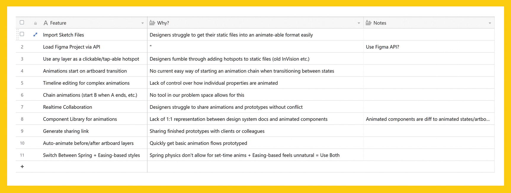
A feature table for part of an example design brief
A Note on Feature Lists
Feature lists aren’t something we can magically put out of thin air! I highly recommend stepping back away from the design brief and exploring your feature list as a stand-alone deliverable first. Get away from a screen and throw Post-its on a whiteboard. If you’re remote, use something such as RealtimeBoard ( http://realtimeboard.com ) to collaboratively throw Post-its around a digital whiteboard.
Feature lists are often the real heroes of design briefs since they comprise the first stage when we actually start presenting some granular potential solutions to our customers’ problems. Here’s my advice on how best to generate these. Get yourself in a (physical or digital) room with as many people involved in the project as you can muster. If you’re on-site, pick the room with the biggest whiteboard. If that room is the CEO’s room, kick them out and wipe their motivational Gary Vaynerchuck quote off, and do some real work on it. If you’re doing this remotely, get on a other digital whiteboarding tool and share your screen. Have all the other participants log in to the same tool beforehand.
First, make sure you have all your research reports handy (and that everyone who is coming has at least been given the Cliffs Notes of the results of your research). If you’re conducting this exercise in person, pull your personas up on a large screen and try to get your user videos up on another. If you don’t have access to big screens or projectors, have that one PM who refuses to work on anything but a 17” Thinkpad get them up on their widescreen hunk of plastic. Just make sure that your research deliverables are accessible and in everyone’s face. If you’re facilitating this as a remote session, share your screen and keep them open in a new tab, or dial in as a separate user solely to show the deliverables.
Divide your board into broad-level problems that you know you need to solve. In the case of our animation tool, our problems might be the following: people struggle to collaborate on prototyping, people can’t easily share prototypes, and people can’t animate in great detail. I’m purposefully limiting this to three for this example, but you’ll want to keep dividing the board up into as many problems as you feel can be handled in this session. You can always attack a new set of problems the next day, so don’t worry about being succinct in the name of exploration.
Once you’ve split your board up into problems, have everyone brainstorm potential solutions. No idea at this stage is a bad idea, so keep the Post-its flowing and take responsibility for morale in the room. This isn’t the time or place to shoot down ideas or to assert your problem-solving dominance as the World’s Least Awful Designer; it’s a place to get a good portion of your team exploring the problem space in an interactive way. Set aside at least five minutes per problem, but don’t be scared to move on sooner if ideas are running low. During this time, if people aren’t sure what a problem is or why we’re trying to solve it, show them in your research. At this point, you should be the de facto expert on your research findings, so if someone asks, “Why do we need to even bother with collaboration?,” you can show them the exact interviews, observations, or other items of research that show this.
Once you’ve filled your board—which could take anywhere from 15 to 20 minutes to several hours—offer the ideas up for discussion. If you’ve exhausted your team and yourself, don’t be scared to take a break and come back and discuss the next day, but be prepared for people to come in with new ideas and to have forgotten all about many of the ones they initially had. This is why I like to split these exercises up into smaller ones—it allows us to get the brainstorming and the discussion done in one sitting. This discussion process should be as streamlined as possible. As the facilitator, start with one problem, pick out a Post-it, and ask the person who made it for a quick, one-sentence explanation. Continue this for every card and let the conversation flow naturally around the more interesting or exciting ideas, but don’t start fully solutionizing yet. Ideas such as built-in version control are great—vague and non-prescriptive—but ideas such as a git-style version control tree in the left-hand sidebar, with a purple-pink gradient timeline indicator and a 2px drop shadow are terrible. Keep the details out of the discussion and absolutely do not let the meeting devolve into design by committee.
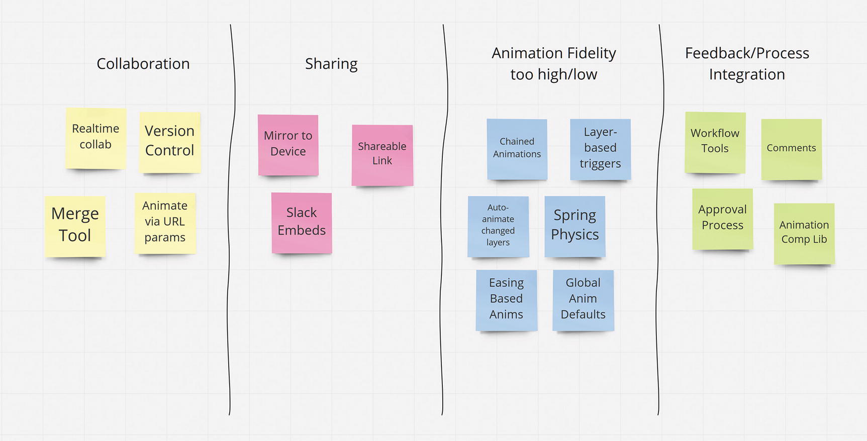
Our board full of feature ideas
After that, take the board into a refinement session with your design and product team alone. Your job now is to filter these ideas and start forming the real feature list for your brief. This might seem to relegate the previous session to smoke and mirrors, nothing more than a surface-level game of Happy Families, but the reality is that you and your design and product colleagues have been hired for your ability to drag signal from noise. You and your team will understand the problem space better than anyone else involved in the project and, thus, any potential feature set should be filtered first and foremost through this lens.
Many times, the opportunity to bring colleagues into this process won’t exist. This is especially likely if you’re a freelancer hired into a project as the sole “full-stack” designer. In this case, I’d suggest still performing this exercise—just do it on your own. Find a room or a corner, grab your Post-its, throw some Enya on, and enjoy the peace and quiet.
Success Metrics and Goals
One of the key aspects we’ll need to consider is how we’ll judge the success of our product. Again, this book is not a design strategy book, so I’ll keep this brief. We’ve already discussed what we’re building and the problem space we’re operating in, so this section will explain how we know we’ve succeeded with our work. This could be through quantitative improvements such as a reduction in customer support tickets and a conversion rate increase of at least 16%, or it could be through qualitative improvements, such as noticeably saving our customers time or improving their lives. If you’re not sure how best to suggest these metrics, speak to your client, manager, or a key stakeholder and discuss what their ideas for success are. You could even collaboratively build a list of clear markers of success.
I recommend this approach to a design brief for any situation where your team or client is comfortable with terse and open-ended solution descriptions. If you go with a more open-ended design brief, it can act as a great primer to your wireframing and prototyping work. However, if you’re dealing with particularly difficult stakeholders who want more fully-fledged documentation, you might need to spend a little more time fleshing your ideas out. My advice here is to, wherever possible, invite these stakeholders into the process. Explain the research findings to them, invite them into your thought process, show them your customer interview videos or your competitor user testing, and explain to them why the problems and features in the brief exist. Often, our office politics simply boil down to people feeling like they’ve been left out or don’t have a seat at the table. Fix this by inviting them in early and working their contributions into the design brief.
Finally, consider turning your design brief into a presentation. As part of the team (or the sole designer) who defined the problem space and the proposed solutions, you’re going to need to get practice in explaining the ins and outs as well as the whys and the why nots of this proposed solution. Treating the design brief almost as a pitch to stakeholders can help you polish your definitions, practice answering on-the-spot questions, and clue you in on any early-stage objections or potential conflicts.
Wireframes
Wireframing is, in my opinion, where any early-stage or full-stack designer proves their worth. While design research is extraordinarily important and, coupled with a solid brief, will form the foundations of our projects, wireframing is our first foray into domain-specific solutions. Wireframes are where we take all the theory surrounding a project and start down the path of practical, presentable, and testable solutions.
Having said that, it’s often highly tempting to jump into the wireframing stage prematurely, so make sure you’ve got some solid research, a good brief, and an actionable understanding of the people and problems that your designs will attempt to serve and solve.
I see the purpose of wireframes as twofold. First, the traditional definition of wireframes as the structural representation of a potential interface is absolutely true. They’re our blueprints for structure and form the basis of our hierarchy, information architecture, and logical groupings. Second, wireframes act as our first opportunity to start testing our conceptual models against people’s mental models. This has been a running theme throughout this book, and I think it’s something that many designers (and I absolutely include myself here) can easily forget about at this stage. The excitement of your solutions finally taking shape and the inevitable gun-jumping we all do when we feel as though we’ve touched on an elegant solution to a complex problem both conspire to have us double-down our thinking further toward solution intricacies and further away from the system, conceptual, and mental models that we’re attempting to reconcile.
As I touched on in Chapter 7, when thinking in terms of environments, moments, and models, we’ll be doing a lot of metaphorical zooming in and out in terms of our processes. This is just as true for our wireframing as it is for our visual and interaction design phases. As you progress with your wireframes, you’ll want to make sure that you’re questioning your solutions against existing mental models that you’ve (hopefully) managed to garner from your customer and competitor research.
Thumbnail Sketches
A list of layers
The filename
A profile menu
A timeline for tweaking animations
A toolbar for setting animation variables such as easing and timing

A page prepared for thumbnail sketches
Now, try to divide these boxes into those broad, structural areas of your interface. Work quickly and try not to overthink or overdesign things. If you’re working on an analogue notebook, try and keep your boxes no bigger than a few square inches. If you’re working in a large notebook, use thick-tipped sharpies or brush pens. If you’re working on a digital device like a tablet or touch-screen monitor, do not zoom in. The goal with thumbnailing is to consider the different ways you can lay out your information and features, so work in rectangles and lines. My favorite tools for thumbnailing are a small whiteboard and the most offensively thick marker I can find.

The thumbnail boxes filled in
The point of thumbnailing is to explore solutions for visually arranging your broadest application areas. Think in a suitably broad mindset when doing this exercise. Even at this point, however, consider convention and mental models. There’s a reason that apps in the same problem space are often structurally similar; it rarely suggests a lack of creativity on the design team’s part. Even at this early stage of wireframing, we need to be thinking about how we balance what we believe to be an elegant or innovative solution with the mental models and convention that we know our customers will expect. Now, we don’t have to think this critically while we thumbnail; this is our unconstrained and expressive flow of creativity after all. However, when it comes to analyzing them, our most creative solutions are often our least practical.
Interface Sketches
Once we’ve analyzed you thumbnails, we can move on to turning them into more detailed sketches. Depending on how confident you are with your thumbnails or how experienced you are with the wireframing process in general, you’ll either want to do some more-detailed thumbnailing work or just go straight into “full” wireframes.
If you’re not super confident with your thumbnails and you have several options you think might work, try upping the fidelity a little and working at a larger size. Still, stick to mostly rectangles and lines, but don’t be scared to add a little shading or highlighting here and there. Alternatively, perform even more rounds of thumbnailing. The beauty of these stages of our process is that everything is so disposable and so quick to create.

A slightly more-detailed sketch, based on our previous thumbnailing example
At this point, we want to think back to Gestalt. One of the most integral aspects of structural representation is perceptual grouping. If you need a refresher (I always do), try wireframing with a Gestalt reference (flip back to Chapter 2!) in front of you and consult it if you get stuck.
These more-detailed wireframes are also an excellent place to start reviewing your content in context. While content strategy and information architecture are separate disciplines to design, with their own processes and methodologies, wireframing is often the point in a project where these processes first truly converge. Showing your content team their work in a structural and more contextual blueprint can often spark some great collaboration. Remember, too, that when we test our wireframes, we’re also testing our content. Banish Lorem Ipsum wherever you can, and get real words and real data into your sketches wherever possible.
Storyboarding and State
If you’re designing an application that is going to change drastically based on state or a web site that you know is going to have multiple templates or page designs to meet varying goals, you’ll want to repeat this thumbnailing-sketching-iterating process for your key pages or permutations of state. A great companion exercise for this is storyboarding.
My preferred approach to storyboarding will be discussed in explicit detail in Chapter 9, so we won’t dwell on it for too long right now. Just keep in mind that, as well as presenting ideas for main structural areas, wireframing is as much about laying down the foundation for the moments and exploration that our interfaces will allow.
The Important Questions
Have I defined our problem in a way that opens it up to solutions?
Have I presented a clear and concise brief detailing the reasons this product should exist?
What functionality (and thus system models) does our feature list dictate?
How is our proposed solution compatible with convention and existing mental models?
How do our proposed components and structures update to reflect state?
What are our key moments?
The Common Deliverables
Design briefs
Thumbnail sketches
Mind maps and flow diagrams
Site maps and feature lists
Wireframes
Paper or digital prototypes
User journeys, stories, and scenarios
Testing and Iterating
While I’ve included testing and iterating as its own phase, and included it last in this chapter, it’s imperative to stress that this is neither a discrete phase nor is it something that should be restricted to the end of a design process.
In reality, we should test and iterate during every phase of our work. Often we’ll go through dozens of rounds of testing for a single phase, especially while we’re wireframing and prototyping.
Testing is our means of discovering and understanding the validity and efficacy of our potential solutions. It’s how we prove our hypotheses. It’s how we reveal the underlying biases and assumptions that are holding our work back and the happy accidents and small touches that highlight the unexpected moments of enjoyment and expression that people may encounter.
Given that the design process is often cyclical, it can be difficult to separate testing from research. For the purposes of this chapter, both testing and research are almost functionally identical. The rules are the same: we need diverse recruitment, informed consent to record and annotate our sessions, and respect for our participants. The only real difference is that testing is used to prove, measure, and observe our current work, while research is focused on understanding our problem space and our competitor’s tools.
User Testing
User testing is to the testing and iterating stages of a design process what customer research is to the design research phase. It involves getting our work in front of real people in their real environments, where we can observe them using our products and interview them about their experiences with them.
While customer research undeniably works best as a field observation exercise, user testing can—depending on the phase you’re testing and the assumptions or hypotheses you’re validating—be conducted in slightly less realistic environments, including a remote session. Before deciding how best to conduct user testing, consider the phase you’re in and the assumptions you need to validate. If you’re in the wireframing phase and you’re trying to discover if your proposed conceptual model fits in with your customers’ mental models, you’ll likely want to conduct a more guided, interview-based testing session. Given that wireframes are often still just representations of structure, they almost always require a form of priming or explanation. If we’re mostly considered with mental models, we’re actively going to have to ask our participants about their expectations and past experiences.
Contrast this with the kind of testing session you’d conduct on a completed product or a high-fidelity, fully animated prototype. In this case, we’d likely want to conduct a number of field observation tests in the best facsimile of our customers’ environment as possible. Refer back to the customer research section of this chapter for a primer on conducting such sessions.
The kind of information we wish to garner from these sessions is also just as dependent on the phase we’re testing. In our wireframe example, we’re looking to see if the basic structural, conceptual notions we’re presenting match the mental models and expectations of our participant. Slight confusion over the shape of a button is negligible, but shutting down at what we believed to be a super-innovative and elegant solution because we are unable to reconcile it against our users’ expectations or model is a huge issue. With regards to our finished product or hi-fi prototype test session, we want to explore how well our product holds up against all the intangibles and unpredictable occurrences that daily life throws at our participants. Are they able to get back to their task if they’re distracted at any point? Are we operating at a low enough cognitive load that work can be done among the bustle of a busy coffee shop? These contextual and environmental considerations are absolutely paramount.
The best testing sessions are designed to throw curveballs at us and force us to discover the areas of our products that are blighted by assumption and bias.
High-Tech Testing
I’ve had the opportunity to conduct and observe testing sessions in fancy usability labs with intricate eye-tracking rigs and a whole host of biometric monitoring. Honestly, though, absolutely none of them were anywhere close to beneficial to a project, at least compared to well-conducted field observation and interviewing.
As an obvious proponent of neuroscience, cognitive psychology, and scientific methodologies, it might seem strange that I would decry lab-based testing and experimentation, but here’s the thing: design testing is not a precise scientific field. It benefits from a lot of the core tenets of scientific methodologies, especially in recruitment and data collection and analysis, but when we’re looking at our testing and research methods and results, we’re far closer to the realms of ethnography than we are of rigid scientific experimentation.
A well-conducted field observation will give us qualitative data on our subjects, such as their habits, their frustrations, what distracts them, the particulars of their routine, and what motivates them. This is actionable, humanized data that almost anyone can look at and at least empathize with to a certain extent. Contrast this to a typical usability lab result set, where we’ll be collecting quantitative data such as eye-tracking heat maps, facial expression data, and sometimes even skin sweat analysis.
Frankly, the best use I’ve ever seen for such a UX lab is as a marketing tool for design agencies.
Now, I don’t believe eye-tracking data to be completely irrelevant—that is categorically not the case—but it doesn’t tell a story. You cannot, from how someone lingers or skips merrily through the various parts of our interface, accurately deduce that their held gaze was that of confusion, sheer awe of our visual design skills, or just a case of the mind-wandering absentmindedness that is wont to skip off hand-in-hand with our focused attention at any given moment. Eye-tracking, alongside our more qualitative ethnographic research and testing, can be a useful tool. Remember that our goal with testing is to reveal the assumption and biases inherent in our work. If our assumptions are “this part of the interface will demand the full gaze of someone when they are asked to animate from one art board to another,” then absolutely break out the eye-tracking and go for it. However, I vehemently believe that design testing doesn’t revolve around these kinds of questions. Heat maps can be useful auxiliary data, but often stakeholders get caught up in the “highly scientific” realm of tracking and biometrics. Your carefully crafted field observations and emotional connection with your customers is suddenly open to debate because “the science disagrees with you.”
Facial expression coding and galvanic skin response (GSR) testing are the last two methods. They’re both, in my humblest of opinions, absolutely useless to any form of design research or testing. GSR involves attaching electrodes to peoples’ hands. The electrodes measure sweat gland activity and then use this activity to determine a level of emotional arousal. This is often combined with facial expression coding techniques to determine whether the supposed strong emotional responses are negative or positive. First, the idea that any one emotion has a discrete and measurable biological “fingerprint: is devoid of consensus and evidence (Barrett, L. F., 2017) and, second, the amount of interference and abstraction these laboratory conditions enforce makes their results questionable at best, and complete garbage most of the time. Here’s the thing—if you start attaching stuff to people, they sometimes, kind of, maybe don’t enjoy it. If you invite them to a laboratory, put a glove on their hand, say, “This is going to measure your sweat, enjoy!,” and then pop off to your terminal, you are putting your subjects in an environment that is so far removed from their day-to-day encounters that your results are going to border on meaningless.
This, for me, is the crux of testing: we need to test in context, in the field, and around the distractions and motivators that our subjects experience. While psychology and neuroscience both benefit immeasurably from controlled laboratory conditions for many of their studies, design does not. We sacrifice our controlled conditions for the real-life chaos that our work will be viewed in. Our research and testing is not an academic pursuit; we’re trying to improve people’s lives and solve people’s problems. We get that from understanding them at a human level.
This brings me to my main concern with user testing as a whole, at least in relation to this book: it should be donein context as much as possible. Through our research, we should have a list of all the environmental and on-device distractions we can expect our work to do battle against in its day-to-day usage. Through our grasp of the relevant brain science, we know the kind of mental processes and potential issues that our work must accommodate. When it comes to testing, we have to make sure that we allow for these intangibles to unfold. Creating a completely controlled laboratory environment is not how we achieve this. If you do wish to conduct controlled environment experiments, bring some distractions into the mix. If you’re testing a mobile application, don’t put your subject in a closed, empty room or corner and hand them an empty iPhone on Do Not Disturb mode. Fill the room with distractions, put a movie on, have someone offer them a glass of water at a random point in the experiment, ping the test phone with notifications and messages at varying intervals. Like I said earlier, if your subject has children—or a particularly needy pet—have them bring them along. Let the overfriendly office dog loose. You can even let your CEO come up to them and absolutely thrill them with a tale of how their latest VC pitch went.
Recreating the chaos of the real world in a controlled environment might seem counterproductive to a data-gathering exercise, but we’re not here for pristine data or to produce a whitepaper that will stand up to continuous academic scrutiny. We’re here to learn about how suitable our work is for the real world. If, for whatever reason, you can’t get out and test in your subjects’ common environments, bring the chaos of the real world to them. A huge part of design testing and research is learning to spot the intangibles in an environment or a person that either informs the problem space we’re exploring (in the case of research) or qualifies the efficacy of a decision we have made (in the case of testing). If you feel like you could use some work on this, take a course on ethnography or grab a book on the subject. Resist the urge to equate design and usability testing with fancy labs and ridiculous sweat gloves. Your mental image of a design researcher should be you, sitting in a room and watching someone try to simultaneously use your product while they juggle their toddler, a cat, their nosy neighbor, a TV they can’t find the remote for, and the undulating stress, distraction, and daydreaming of everyday life.
Iterating after Testing
Iteration is the act of adjusting, changing, or embellishing your product away from a previous manifestation toward another one. Changing a button from blue to a slightly different blue is an iteration. Pivoting entirely from a flight-booking application to an electric-scooter sharing company because your main VC read a Wired article is an iteration. One requires a lot more work than another.
It’s exceptionally hard to quantify iteration—it’s simply doing the same work you’ve already done, but under different constraints or within an adjusted problem space. When we first start scribbling, we do so based on our current understanding of these constraints and spaces. Every time we test our work, we’re essentially opening ourselves up to further changes to its foundation. If, for example, our research suggested that collaboration was a key feature of our prototyping application and we assumed that the problem we were solving through collaboration was that of version control—understanding who made what changes, the ability to revert changes, etc.—then we might propose a fully featured Git-style timeline as a feature. If we then tested this assumption and it turned out that the underlying problem was an inability for two or more people to work on the same prototype simultaneously without causing conflict, our problem space is suddenly very different. Instead of version control, we might want to consider real-time collaboration functionality.
This is what testing gives us. Through a slight misdefinition of our problem, we’ve incorporated a feature that no one needs—and we’ve discovered this by getting it in front of people. If we learned this by testing our wireframes, we’ve just managed to save a lot of time and effort, our super-complicated version control feature doesn’t make it beyond a quick scribble or a structural blueprint, and our problem definition gets updated and we resketch and rethink based on that. If we learned this by testing our final product, erm ,,, oops.
Every stage of the design process should be open to iteration. The further toward “finished” we get, the more expensive it becomes to fix issues with core problem definitions or challenged assumptions. So, test your wireframes. Heck, test your personas. Show them to customers and ask them if they can relate to them in any way. The earlier you can have you and your team’s incorrect assumptions and biases laid out on the table, the less expensive it becomes to redefine your problem and rethink your solution. Iteration is not simply the procedural improvement of an area of your interface—although this is a form of iteration—it’s also a systematic reviewing, editing, and realization of your problem definitions and a cyclical rethinking of your solution. Test early, test in context, and test often.
The Important Questions
What false assumptions have I made?
What biases have I introduced in my work?
Does our product “work” in real-world situations?
Am I still solving the correct problems?
The Common Deliverables
User testing reports and videos
Usability analyses
Accessibility analyses
UX reviews
A/B test reports
Snap-judgment test reports
Revised versions of other deliverables (new wireframes, prototypes, or designs to accommodate test findings, for example)
Summary
With such a diverse range of skill sets and disciplines in modern design jobs, and with the responsibilities, frameworks, and methodologies seemingly continuing to grow apace, documenting the design process is a thankless and arduous task. I’ve tried to limit this chapter to the areas of the design process where I feel like we—as a union of design workers—can make the most impact in humanizing our process. I’ve also discussed areas where I think it’s very easy to lose track or deviate from our goals of creating problems that operate in a space of compassion and empathy.
The phases and deliverables discussed here are far from a complete overview of any atomic design process—partly because such a thing no longer exists—but I do feel that the key talking points can permeate throughout the rest of your process, whatever that may be. Remember that our research—including our design, usability, and accessibility testing—should provide us with insight not only into the high-level preferences of people, but to their habits, their environments, their distractions, frustrations, and the stuff that makes them happy and motivated. When distilling this information down into user personas, make sure that your user personas challenge the assumptions and biases evident in your own thinking and that of your team members. Personas should not serve already existing assumptions. A persona that doesn’t provide a challenge is one that exists simply to placate.
When sketching and wireframing ideas, think both in terms of the “traditional” wireframing goals of correct structural representation and early-stage exploration and in terms of reconciling mental models. Use your understanding of your competitors and similar tools that exist in your problem space—especially if you’re trying to bring a traditionally manual process into a digital environment—as well as customer interviews and observations to map out the commonalities in language, structure, and process. If you understand these mental models well enough, you’ll be able to understand what can stay in as convention (the razor, for cutting a video clip) and what you might want to do differently, deviating from a mental model to solve a problem in a way that you’re confident people will learn. Think also in terms of state and state transitions—exploring moments and movements as well as static representations and linear flows. More on this one in Chapter 8!
Remember that testing is as much a means of further revealing assumptions and biases that slipped through the cracks as it is a means of validating the efficacy of certain interface features or components. Design testing and research are intertwined. Just as our best research manifests itself in ethnography and qualitative study, so too do our best testing sessions. High-tech design testing should never be our only form of testing, but eye-tracking, in particular, can provide us with a degree more of context to our qualitative explorations. Just remember that the qualitative “cold, hard facts” of such studies can easily be overhyped. Remember that iteration is as much about iterating on your definitions as it is on your product. Redefining your problem at an early stage is a lot less expensive than releasing an untested product full of assumptions and biases that solves problems no one asked for.
I realize that I’ve almost completely skipped over visual, motion, and interaction design in this chapter, but that’s not because I think they’re unimportant! Quite the contrary. I’ll be devoting a large part of the remainder of this book to discussing how we might marry these practices with some of the early-stage and theoretical concepts we’ve explored so far. These areas of design rely heavily on problem definitions being validated and scribbles being representative of a solution that we’re confident in. The practices listed in this chapter are our vehicle for reaching that point. Before we get into these areas, I want to take one last chapter to discuss process—namely, the new and underused concepts that I think we can weave into our design process to further imbue it with compassion, empathy, and a desire to serve the human mind.