I’ve never been particularly fond of the word “user.” Despite its permeation in the digital world, there’s something inherently cold about referring to human beings as “users.” I’m even less fond of the term “User Experience (UX) Design.” While I don’t disagree with the core concepts of UX Design, and I feel that the artifacts produced and the research conducted in these practices are extraordinarily important, I can’t shake the idea that “user” is reductive and “experiences” cannot, really, be designed.
That first point—that “user” is far from a flattering term for humans—is hardly controversial. The idea, though, that UX Design isn’t really “a thing” is something that is likely to produce more than a touch of ire. Allow me, if you will, the indulgence of elaborating on this point and suggesting an alternative approach that I feel is far more applicable when implementing the information from the first part of this book and, thus, far more integral to the idea of mindful design. First, though, I believe it’s important to look into the history and develop a working definition of UX to use as a platform for this chapter’s discussions.
What Is UX?
User Experience, as part of a job title at least, is commonly traced back to Don Norman (many of whose ideas and phrases have been, and will be, discussed throughout this book) who, in 1993, became Apple’s first “User Experience Architect.” Norman’s book, The Design of Everyday Things (1988) is seen as a seminal book on the psychology of design and is likely one of the most-cited design books ever written.
UX, broadly speaking, is a design methodology: a series of activities and tasks as well as an ethos that is designed to bring emotion and cognition to the forefront of a design process. A UX process will often involve research, planning, sketching, prototyping, and iterating. These general activities will almost always involve many more granular activities, such as interviews, persona creation, wireframing, and paper prototyping.
UX design is an incredibly broad practice. Finding one solid definition shared among individuals, companies, or even industries as a whole is incredibly difficult. As a UX practitioner, depending on the granularity of your role, you might find yourself conducting and facilitating research one day and designing the minutiae of an app’s interactions in a motion design tool the next. Like many of the supposed catchall terms for early-stage design methodologies, “UX” seems to suffer from a crippling vagueness. To some, it’s a very prescriptive set of tasks and deliverables that essentially amounts to “everything up until the wireframes are done.” To others, it’s an amorphous, elusive blob of a concept that “describes every interaction a person has with a product, application, or company.”
User Experience Design (UX)
User-Centered Design (UCD)
Human-Centered Design (HCD)
Activity-Centered Design (ACD)
Customer Experience (CX)
Service Design
Design Thinking
Similar to UX, we have User Centered Design (UCD), Activity Centered Design (ACD), and Human Centered Design (HCD). While UX is popularly seen as a methodology, UCD, ACD, and HCD are viewed as overarching frameworks. The difference is subtle and arbitrary, but still somewhat important. UX, by its most accepted definition, is predominantly task- and deliverable-based. Wireframes, interactive prototypes, research notes and competitor reports are all potential artifacts of a UX process’s activities. The aforementioned frameworks, however, present themselves more as mindsets. They strive to guide the focus and thinking we apply to our approach, without dictating the tools and artifacts of our approach.
This list merely scratches the surface of potential design disciplines at the time of writing this book and doesn’t include the more easily defined disciplines such as graphic design, interaction design, and motion design. If you’re new to the design industry, this can all feel extremely overwhelming. While the proponents of each discipline might feel passionately that theirs is the One True Method, the reality is that the differences between these practices are often arbitrary and rarely well documented. You can forge a successful career in design without ever really needing to define these concepts. While they might provide us with a slightly clearer direction or a manifesto to get behind, not knowing the ins and outs and minute differences between such amorphous concepts isn’t going to hinder your progress!
Note
UX is often restricted to the digital areas of a design process, while UCD and HCD are often more holistic and involve buying into a specific mindset, approach, and underlying goal. As IDEO’s excellent Field Guide to Human- Centered Design suggests,
Embracing human-centred design means believing that all problems, even the seemingly intractable ones like poverty, gender equality, and clean water, are solvable. Moreover, it means believing that the people who face those problems every day are the ones who hold the key to their answer.
The key thing to keep in mind is that UX, ACD, UCD, and HCD served to bring qualitative and quantitative research into design processes, popularizing activities such as user research, storyboarding, user persona creation, and journey mapping. Essentially, the goal of all of these concepts is to bring a focus on humans and human problems into the forefront of our design and development processes
Design Intangibles
The last two on our list, Service Design and Design Thinking, are, at the time of writing, extremely popular concepts. Defining these two terms has spawned hundreds of medium articles and blog posts. They’re also a lot more theoretical, intangible, and broad practices, generally involving the whole spectrum of a human’s interaction with an entire system.
A good example of this would be if we were to consider the design of a museum. The whole end-to-end flow of ticket purchase, finding and accessing the venue, knowing which way to enter, finding a path through the various exhibitions, exiting through the gift shop, buying an overpriced scale model of a prehistoric ground sloth, finding the bathroom, exiting the building, and finding your car could be overseen by a Service Designer. At various points, UX would play a key role in the museum’s digital offerings (if we accept the common notion that UX is restricted to digital “experiences”), perhaps in a companion app that allows for interaction with the museums exhibits that could include audio commentary and maybe even augmented-reality additions to the real-world experience. HCD might come in to play when planning the ideal order that the exhibits would be visited in, either by focusing on a path that brings the most interactive, most exciting exhibitions in at a “sweet spot” along the journey, or by structuring them in a way that allows the knowledge from one exhibit to inform the experience of another. CX, then, could be arrows on the floor or a natural, followable path through the exhibits.
It’s highly likely that throughout our museum visit, we’ll encounter other, moretraditional design disciplines such as the graphic design of the exhibition summaries and a printed museum map. Furthermore, we’d also need to consider accessibility—both physical and digital—by ensuring we have things like wheelchair access, Braille translations, and audio descriptions for exhibits in multiple languages. Additionally, there’s likely a whole bunch of business- or industry-specific red tape to design around. A beautiful museum is useless if it’s a death trap that defies multiple health and safety rules. And we’ll almost definitely need to consider how we’re going to place security cameras and alarms to keep our bosses and insurers happy.
While this book is probably a UX book or perhaps (and if you ask me) an HCD book, a lot of the information from Part 1 can be applied elsewhere. I do, however, want to discuss the implications from Part 1 of this book mostly in relation to digital products—which leads us to focus primarily on UX and HCD. This book revolves around making decisions that affect the workings of digital products, with a focus on the real-world impact of those decisions. However, I do believe the discussions and ideas around Service Design, in particular, are worth exploring. Accepting that design has never started or finished on a screen is an important idea to keep in mind throughout our careers.
Another important reason for this limitation is that I’m trying extremely hard not to propose a new discipline or a new job title into this mix. Everything I’ll propose in the remainder of this book is designed to piggyback on, or bridge the gap between, existing stages of common UX approaches. When I talk about “environmental design,” for example, I’m not suggesting we adopt an entirely new design framework that we have to sell to our bosses or our clients. I absolutely do not want to spark an “Environmental Design” movement. I want to offer a few, slight mental shifts that I feel can enhance and re-frame many of our existing design practices in order to greater assist and respect the idiosyncrasies and fallibility of the human mind.
User research documentation
User personas and user scenarios
Wireframes and interactive prototypes
User journey diagrams and sitemaps
Usability reports
User testing documentation
And while this list is far from exhaustive and the boundaries of a typical UX job (especially on smaller teams) are always blurred—information architecture, accessibility audits, UI, interaction design, and sometimes even copywriting and front-end development can fall into the gamut of common UX designer tasks—to discuss even this short list of deliverables in depth would be an undertaking requiring an entire book unto itself. Fortunately for us, there exist a plethora of UX-specific books that do just that, including Leah Buley’s The User Experience Team of One (Rosenfeld Media, 2013) and UX For Lean Startups: Faster, Smarter User Experience Research and Design (O’Reilly, 2013) by Laura Klein, to name but two. Furthermore, formal and informal UX courses and certifications exist in abundance—with a seemingly endless list of online courses and formal academic syllabi to choose from.
All of this is to say, while this book intends to present ideas that attach themselves to existing UX practices and processes, that presenting a deep-dive, exhaustive introduction to such is beyond its scope. Now, you don’t need to run off right away and clue yourself up on all and sundry related to UX—we’ll touch on many of its key ideas and artifacts as we progress through this book—but I’d thoroughly recommend that after—or even during—reading this book, you jump into some short beginner or refresher content on the follies of UX design if you’re feeling a little lost or forgetful when things such as wireframes, user testing, personas, and journeys are mentioned.
With a hopefully less-murky working definition of UX design, I’d like to propose what I believe to be an integral problem, both with the terminology and with the underlying practices of the discipline.
The Folly of UX: Control and Linearity
I discussed at the start of this chapter my general distaste for the word “user”—it’s cold and assumptive and just, well, a crappy way to talk about people. It also serves to create some cognitive and emotional distance from the actual human with their actual human brain and their actual human feelings, beliefs, talents, flaws, and heuristics. For some reason, at some point, someone arbitrarily decided that the correct way to talk about the people who interact with the things we make was to refer to them as “users”—and it’s stuck, and fighting it is fighting a losing battle.
Just to add to my cynical gripe list, I also really dislike the word “experience”—at least in this context. “User Experience Design” implies, intentionally or not, that experiences themselves can somehow be designed. This is a concept with which I take great umbrage—an experience is a combination of infinitesimal emotional responses, a conscious and subconscious self-deterministic processing of one’s self and one’s place in time, in space, in life. An experience happens both in the minds of the experiencing humans and the environment in which it is facilitated, and it impacts these actors in unpredictable and immeasurable ways. The outright hubris it requires to suggest that we are, to any degree, in control of the actual experiences people may have throughout even a single interaction is, to me, astounding.
Words are important, but there comes a point when one has to accept that an industry has its standards, and a big part of such standards are the arbitrary terms, job titles, and never-ending lists of acronyms that attempt to describe its machinations. UX is a thing, it has been accepted and embraced, and its impact on the design world has been, on the whole, extraordinarily positive. I do, however, feel like in our pursuit for control, and in the potential hubris that has seeped from the term to its practitioners, we’ve taken the discipline to a point where best practice, process efficiency, and ease of education has led us to an intellectual space that is a little too preoccupied with control and linearity.
This, really, is what I believe to be the root problem with the UX methodology at the time of writing. In trying to control as many aspects of an experience as possible, we’ve maneuvered ourselves into creating products and interfaces that are just far too linear. Without realizing it, the artifacts of our profession play directly into habitual restriction and attempted control. User journeys, for example, tend to be incredibly linear, as do the various “flow diagrams” we’re wont to produce. Looking more deeply, even the atomic forays into wireframing and prototyping often tend to focus on key “paths” through an interface, and user testing sessions often focus on the speed at, and efficiency with, people can complete these atomic, de facto paths. When people get confused, we add more wayfinding aides, we limit auxiliary information and tasks and we double-down on focusing on these key paths or points along them.
One of the key ideas that I hope Part 1 communicated is the notion that self-expression, displays of mastery, and perceived autonomy are key factors of intrinsic motivation. Oppressive linearity makes such activities and emotions impossible to achieve and experience. While clear wayfinding and constrained flows are critical moments of any interface, they are, quite often, far from all that is required. As we discussed in Chapter 3, when we spoke about different methods of creating learnable interfaces, linear paths and constraining of possible actions can be fantastic tools, but they should be utilized conservatively, and only when genuinely required. For many of the complex, interaction-rich digital products that we presently create, linearity should not be our default stance.
Quite possibly the loftiest goal of this book is to present a solution to this problem that doesn’t brand itself as a whole new acronymized methodology with its own manifesto and a thousand arbitrary deliverables that you have to sell upward to your bosses and clients. I believe that by focusing on creating digital places where interactions can simply happen; by eschewing linearity and pathfinding as unquestioned defaults; by designing moments and by seeing our work in terms of states, transitions, and models, we can start to hone a mindset that allows us to view our current processes and artifacts in a different light. We can create much more open interfaces where self-expression and mastery can occur, where edge-cases melt away, and where personas become a challenge to the status quo, rather than yet another tool of limitation and linearity. In my head, I call this “digital environment design”—but you don’t have to.
What Is a Digital Environment?
When I talk about designing an environment, I’m referring to—in the simplest terms—a place where stuff can happen. Crudely speaking, an environment acts as a container for actions and interactions, and it updates itself to reflect the results of such. Environments, unlike experiences, can be designed. They can have explicit and implicit rules, just as our world employs rules of physics like gravity or our society has concepts like manners and cultural convention. Environments allow moments to occur over time, creating a rhythm based around human activity and response. They allow for expression, introspection, and creativity where applicable. Conversely, they contract into linear, obvious paths when necessary. Environments have a breath and a cadence that is inextricably tied to the actions and desires of the people exploring them, and I feel they represent the culmination of everything we’ve learned so far in this book. The remainder of this chapter will focus on the slight shifts in mindset required to make a dramatic change in the way you approach design.
Broadly speaking, in addition to our existing tasks and methodologies, this approach to design involves balancing linearity and nonlinearity; designing rules; treating design as a function of state; reconciling system, conceptual, and mental models; and designing moments. This may seem like a lot of extra work, especially when we consider how involved a typical UX process is already, but the vast majority of it can be achieved using the tools and approaches that you’ve either already learned (if you’re an experienced designer) or that you’re currently studying right now (if you’re still coming to grips with the industry). Most of these ideas can manifest themselves as sketched diagrams or wireframes as part of a standard prototyping process or as a form of design and decision documentation.
Balancing Linearity and Nonlinearity
As discussed earlier, the linearity of an interface plays a substantial role in its suitability to the self-deterministic motivators of control, autonomy, and mastery. One of the key considerations when planning your work will be its cadence. Rather than focusing on neat, end-to-end flows or journeys, think about broad moment-to-moment acts. The key to this approach to design lies in harnessing time and progression to create an environment that feels authentic, no matter what order things happen in and no matter how someone prefers to interact with its constituent elements.
The closest analogy to this approach can be found in video games’ level and world design. You might have noticed by now that this book leans heavily on the teachings and examples of our colleagues in the games industry. As creators of open, interactive experiences, their influence on our work, as technology and expectations grow interminably, is becoming more and more unavoidable. When a level design team sets out to create an environment in their game, they rarely start thinking in terms of linear paths. Video game worlds are designed to be explored. They’re created with a set of rules that determine what, and in what way, one actor can interact with another and how the environment may shift in response to that action. Progression through a world in a video game doesn’t necessarily occur over time, as we’d expect with a movie or a piece of music; it occurs based on interaction—one action results in a change to the state of an environment, and the environment shifts to reflect the new state. Rinse and repeat. The parallels to world design in video games and my proposed digital environment design are stark.
Linearity
When it comes to high degrees of linearity in our work, we’ve fortunately got it (mostly) figured out already. Common design practices and processes lend themselves very nicely to planning and creating linear flows and paths. Linearity is often a result of subtraction—an act that many people believe to be the core of design itself. By limiting options and removing an apparent overabundance of choice, we’ve found ourselves remarkably adept at constructing interfaces of singularity—designs that allow for the extremely efficient performance of single-to-a-few actions.
There are a number of downsides and dangers, however, to this approach. To quote Tristan Harris, “If you control the menu, you control the choices.” Our approach to manufacturing linearity in our interfaces is often one of restriction. If an action that our products are quite capable of allowing to occur is not seen as “important” (which often is simply a replacement for “profitable”), then we can just throw it in the bin. Rather than creating alternative, less-invasive ways to allow that action to take place, we’ve formed a habit of ruthless subtraction. This isn’t a negative habit at all—I’d be a hypocrite of the highest order given the points raised in the first part of this book if I were to suggest that removal-by-default is a poor design ethos—but this ruthless removal isn’t always the right tool to throw at a situation.
Harris’s menu metaphor—the notion that our interfaces, at any one time, can resemble a menu of specific options in the form of actions a person can perform—gives us an interesting heuristic for measuring the linearity of our interface at any given moment: linearity is a function of all available options. At any point, we want to be able to look at the options for action that our interface allows, regardless of how obvious they are or how they are performed, and use this number as a proxy for linearity. A small number of possible actions represents a limited menu and thus a high level of linearity. An abundance of options represents a more open, less linear state.
Simply adding or removing potential actions depending on application state, while a good start, is not going to get us far if we want to elegantly manage the linearity of our environment states. Clearly, too, some actions—regardless of state or linearity—will always be more important than others. We’re not about to start sacrificing hierarchy and categorization in some naive pursuit of openness, and it remains critical that we continue to apply our understanding of attention, information overload, and decision overload to our work. As an extremely broad metric, though, option abundance can provide a useful initial insight into how linear our application states may be.
Designing Linearity
Most of what we explored in Chapter 3 can provide us with the tools required to manipulate the linearity of an interface. Concepts like setup wizards, constrained onboarding flows, and streamlined checkout processes all utilize linearity to limit the available options and, really, that’s what most of the linearity of our environments boil down to: how many actions do they allow someone to perform?

Google Hangouts’ iPad app onboarding
In this flow, we’re constrained to a relative paucity of actions and information. The copy is extremely terse; there’s a single, simple illustration; and we can either click Next, or swipe left or right to navigate between sections, or click Skip to leave the onboarding flow at any time. By limiting options in this way, Google is “controlling the menu.” As we discussed in Chapter 3, onboarding can be an extremely valuable learning tool, but with Google’s example, we see it used almost as a piece of marketing design. We’re essentially being invited to scroll through a feature list one last time before we start using the application.
This has its upsides, for sure. For one, it definitely sets expectations as to what the perceived key features of the application are. It could also act as a sort of primer for the app’s audience, essentially a way of saying “These are the actions you can expect to perform.” However, as we explored, by removing so much context and not allowing concepts to be interacted with in a way that allows for deeper processing of information, its effectiveness as a learning tool—which, really, all good onboarding should be—is limited.
Similarly, look at Amazon or any other shopping site, and you’ll see their checkout processes greatly limit the number of potential options we can perform. During normal shopping, we’re inundated with navigation, categories, related items, sales, and deals. Yet, when it comes time to check out, we’re mostly limited to a few basket-related options, such as changing item quantities, removing items, and completing the checkout process. In fact, for all the talk in this book—and in the industry—about innovative, interactive applications, online stores are one of the best examples we have of linearity being manipulated at various points throughout their usage.
By allowing for exploration and an abundance of (and often far too much) choice, online stores like Amazon provide an open and almost unlimited initial state. At various points, and mainly at the checkout stages, that openness transforms into a constrained, controlled, and limited linear flow. Once the purchase is complete and confirmation is shown, the environment opens up again and more choices—more potential actions—are presented. Shopping apps tend to have a very specific cadence, or rhythm, to their linearity.
A linear flow, then, is one of constraint and rescinded control. At any given point, should we wish for our environments to enter such a state, we need to be sure of a few things. First, that there is indeed enough implicit intent to justify this rescinding of control. Second, that the transitions between any preceding, open states are managed well. We’ll discuss the latter point later on when we start looking at dissecting interactions, but understanding intent is something that can very quickly be assumed, tested, and proven. Essentially, we’re looking to deduce, based on the statement behind previous actions, what someone wants to get from our interface at that moment in time.
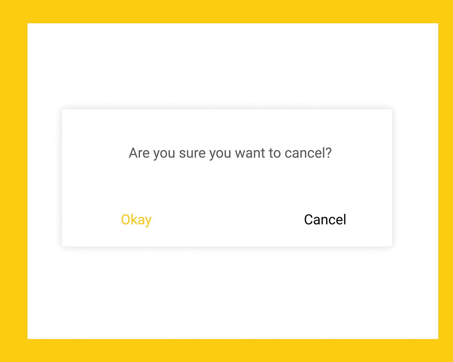
Are you sure you want to cancel?
Alerts like this are unfortunately common and could be prevented rather easily with a simple audit of the copy, assumed intent, and actual action.
Limit Options. The first step to linearity is to limit the available options and actions to the bare minimum required. When entering into a linear flow, we can reasonably assume that we must cater for a period of focused attention. That means being ruthless with the options we present and removing any distractions, clearly grouping and spacing related elements, and ensuring that copy is terse and clear.
Understand the Path to Completion. By their nature, linear paths have an ideal endpoint. Keep this endpoint in mind and constantly question how any decision you make allows for progression toward this.
Display Progression. Similarly, find ways to communicate someone’s progression through this process. “Linear” doesn’t always mean short and doesn’t ever have to mean compressed. In many cases, our linear flows might be broken down into multiple smaller steps (similar to the Google Hangouts onboarding discussed earlier). Whether our linear flows are explicitly stepped through or progress is a little more ambiguous, we should look to communicate how far toward this aforementioned end goal someone is at any point. This can be done through explicit progress indicators, such as numbered steps or progress bars, or through implicit indicators, such as Almost there! prompts.
Be Explicit and Timely. Linear moments in interfaces suffer immensely if ambiguity is introduced into the equation. Furthermore, delayed responses—such as waiting until the end state of a checkout flow to show an error in the first section of the address form—can be equally as catastrophic. Shallow processing and linear flows go hand-in-hand, so ensure that any signifiers and mental models used in communicating concepts are as universally recognizable as possible. A truly linear interface, although rarely encountered in real life, would rely exclusively on recognition and not require any learning or memorizing at all.
Design the End State . One of the most important aspects of any flow, but specifically a linear one, is how we present the success or completion state. If the flow involves some form of deletion, then take the learnings of empty states and apply them here. If it involves the creation of data, such as a new Tweet, then present an All done!’ message of some kind and, wherever possible, show their creation in context. If someone has given up control to follow a constrained and linear path to creating, removing, or editing something, the least we can do is let them see clearly that their changes were successful.
Nonlinearity

An example project open in Cockos Reaper
At first glance, Reaper seems like a textbook example of information overload. There are literally hundreds of potential actions able to be performed from this single state of the interface. To many, this is likely an incoherent mess of non-standard interface elements, yet professional music producers and audio engineers use software like this for hours on end to create, produce, mix, and master a huge percentage of the music we listen to every day.
Reaper, Photoshop and dozens of other apps that we might broadly define as “creativity tools” share a few traits that, were we to apply a reduction-first UX gaze, could convince us they were overbearing, or at least in need of simplification. While there’s no denying that many of these tools could benefit from a solid action audit and some ruthless simplification, part of their nature as creative tools means they’re playing by slightly different rules. What we initially see as complexity and a questionable density of features and information can alternatively be seen as an environment that refuses to be overly constrained or prescriptive in the name of encouraging creativity and self-expression.
Nonlinear applications often require at least some degree of learning and will almost definitely require moments of prolonged focus and deeper levels of processing. The positive side to this lies in how they allow for displays of mastery, autonomy, and self-expression. Many of the concepts explored in Chapter 3 apply directly to our nonlinear application states. We must allow for—and forgive—mistakes, focus on exploration, and teach our difficult concepts well. For nonlinear states in our applications, we lack the nice, sequential snugness of user journeys and simple flow diagrams that often work perfectly for documenting our linear flows . Attempting to document a nonlinear process can actually be a huge pain—user journeys become almost impossible in their traditional format, and flow diagrams become a tangled web of circling back and incomprehensible loops. One of my main goals for this chapter was to present a groundbreaking new method of early-stage documentation that would translate perfectly to open, nonlinear environments. On that point, I completely failed. Nonlinear environments, by their nature, don’t fit nicely into diagrams or documentation. They’re a container for elements and interactions that consistently change based on state and input. As we discussed earlier, they’re much more like the worlds and levels of video games. Without turning this chapter into a deep dive on video game design, a concept that I think directly applies to our work is that of creating an environment that has overarching rules and purposefully arranging objects within it.
In video games, rules are often a mixture of global physics and internal, codified ideas. Much of the feel of a video game lies in its use of the rules of physics, such as gravity and friction. Video game designers can essentially place elements of varying mass into their worlds and have them governed by these global rules. Gravity, for example, might dictate how high and fast a character can jump (Mario’s trademark jump went through numerous iterations, all based around the peak height he reaches and the speed at which he rises and lands), how fast they move, how instantly they stop, and so on. The purpose of these rules in a video game is not necessarily to create a highly realistic world—although, for many games, that might be integral—but to provide an engaging and enjoyable experience.
We can use a similar, albeit to a much less integral degree, approach when designing how our interactive elements behave—are our buttons heavy and stiff, or squidgy and bouncy?—and how they animate—do we have a high-gravity, low-friction environment? Is this one element “heavier” than another? Just like games designers, our environments don’t have to mimic the physical qualities of the real world (we tried that, it didn’t go well), but having a consistent and predictable rule set can make the difference between an environment that feels united and one that feels like a messy interlinking of discrete elements.
Finally, as we explored in Chapter 2, video games designers are experts at subtly communicating information that we codify within these environments. Horizon: Zero Dawn’s use of yellow as a signifier for climbable elements provides the perfect example for this. Don’t underestimate the power of allowing people to discover new ways of executing complex tasks (for example, through keyboard shortcuts or gestures) on their journey to mastery.

Vim in action
To the unsuspecting first-time user of Vim, it’s a complete enigma to figure out. There’s no mouse control, highlighting text is a chore, it has “modes” that completely change the function of most keys on the keyboard, and it relies heavily on people learning its own, specific way of operating. On the surface and through the gaze of ruthless simplification, Vim is a decades-old, archaic tool that should be long dead. Yet, thousands of people swear by Vim and its unabashed weirdness. A text editor that has hundreds of tutorial playlists on YouTube should not be loved by so many humans, yet it’s what Vim offers in return for learning its ways that make it so tantalizing to use.
First, Vim is set up to be 100-percent keyboard usable. While there are plug-ins that enable mouse interaction, the “pure” way of using Vim is by keeping your fingers over the keyboard at all times. The speed, so people say, of using the keyboard to navigate and select blocks of text far outweighs the initial time taken to get used to such an idiosyncratic way. Vim’s focus on keyboard control doesn’t end there. The H, J, K, and L keys replace the Left, Down, Up, and Right arrow keys. The argument here is that the “home row” (the middle row of the keyboard) is where most advanced typists want to rest their fingers for the majority of their usage and reaching those centimeters to the arrow keys is far too imposing a task.
The core reason behind Vim’s widespread usage, in spite of its inaccessibility and idiosyncrasies, is that it allows for an extremely efficient writing or coding process for those who have taken the time to learn it. By being hyper-focused on efficiency, to the point where around a centimeter of space is seen as too far to move one’s fingers, Vim has sacrificed simplicity and linearity to focus on an end goal of mastery.
One of the most intriguing aspects of Vim is just how many different ways there are to use it. Although its initial appearance is hardly delectable to the visual palate and it remains a notoriously difficult editor to come to grips with, it actually has many more layers of complexity beyond its basic usage. Through combinations of keystrokes, well-practiced Vim users can select individual words, sentences, lines, and paragraphs in a fraction of the time it would take to use a mouse or trackpad to highlight them. Similarly, one can very easily perform complex tasks such as toggling the capitalization of various words or letters or changing the text inside quotes, parentheses, or brackets in a similarly speedy combination of keystrokes. Watching someone experienced with Vim fly about their text or code at ridiculous speeds is itself a lesson in the untapped power of complexity.
While Vim looks bare and barren, it’s actually an extraordinarily powerful editor and has survived for this long not through consistent innovation, but through simply being the perfect tool of choice for people who really care about the speed at which they can code and write. Compared to Reaper, which is as visually intimidating as it is in concept, Vim relies almost purely on a willingness to learn and embrace its weirdness.
The key thing, I believe, we as designers can take from Vim is that multiple methods of execution, especially of complex tasks, can make an environment feel incredibly enjoyable to work in. I believe this boils down to mastery. While it’s extremely common to hear things like “our audience isn’t experts,” “that’s more of a power user thing,” and “we’re designing for the mainstream,” I believe that perceived mastery, especially in creative applications that are used for hours daily, is a fine goal to work toward.

Trello’s interface is clear and precise, with a host of complexity living in its keyboard shortcuts
Hover over, or keyboard focus, a card in Trello and press a key and you’re able to, for example, quickly assign a member to a card (with the M key), change the due date (D), archive it (C), or move it around and between lists (‘,’,‘.’,‘<’, and ‘>’). While Trello is fully usable as a “traditional” point, click, and type web app, watching someone extremely comfortable with its shortcuts and specifics whiz around a complicated board is a genuinely insightful experience.
Vim and Trello offer a different example of nonlinearity—multiple methods of interaction. Both applications have their own learning curve, but they allow us to explore their environments in different ways. By offering multiple paths to the same result, Vim and Trello—in their own ways—create a sense of openness and self-expression that simply doesn’t exist in the constrained, linear flows we discussed previously.
By thinking beyond the obvious visuals and offering multiple paths to the same solution, encouraging exploration and learning, and consistently providing timely feedback, we’re able to create environments that are open enough for self-expression and perceived mastery, but not so opaque or idiosyncratic that they’re too dense to be usable.
Balancing the Two
Balancing linearity ultimately comes down to how much we might limit control at any given point. A limited, constrained path has the advantages of allowing for an explicit showing of progress and a clear indication of intent, and it is relatively simple to document and design around. However, constantly seeing an interface as a sequence of interlinked, extremely linear flows can quickly lead to uninteresting, unmotivating experiences. Conversely, nonlinear interfaces allow for much greater self-expression, allow people to problem-solve within the constraints of the environment, and can play directly into the notion of self-determination and intrinsic motivation. Conversely, nonlinear interfaces require much deeper information processing, take time to master, and can often appear daunting at first glance.
One of the first considerations we should make when starting a design is the level of linearity that makes the most sense for our various application states. Many times, especially for mainstream or single-purpose apps, we’ll be heavily operating on the constrained side of the spectrum, but that decision should be informed by correct research and testing. If we don’t understand our audience, it’s impossible to deduce just how—and when—our interfaces should expand and contract. Once we do have a solid idea of what people expect from our work, we can look into crafting our moments and designing the various states that make them up.
Design Your Moments
This approach to design might seem daunting at first. It essentially revolves around feeling comfortable ditching the tried and tested documentation of journeys and flows and embracing the chaos of “just throw some interactive elements into a room and let them do their thing.” Interfaces, though, aren’t video games. They’re rarely, if ever, autotelic, and there will always be a need for linearity and nudging, even in the most abstract of interfaces.
The key to this approach of design is to learn and practice when it makes sense to think in terms of global rules and properties and when it makes sense to zoom in and focus on linear flows. Essentially, this boils down to designing moments.
Seeing your search results
Spotting an item you like
Adding that item to your basket
Checking out and paying
Seeing payment confirmation
Now, this might look extraordinarily like a user flow, but the important consideration is to, wherever possible, treat these moments not as linear, interdependent actions, but as discrete events that can potentially occur at any given time. “Spotting an item you like” doesn’t necessarily have to come after seeing your search results, and people don’t always go from adding an item to their basket to checking out. Consider, too, how stored baskets allow someone to leave with a full basket and return at a much later time with all their items saved and still intact. I’m willing to bet that an early user journey in at least one of your recent projects contained such moments that were unnecessarily forced into a linear, interdependent flow diagram. That’s not me being all high and mighty, either. This is the most common “mistake” I continue to make. The temptation to apply order to, and demand control over, this part of the design process is a natural and healthy instinct, but that doesn’t mean it’s never problematic.
By focusing on these key moments and letting go of any need to fully control when they might happen, we start to build up an idea of our key interactions and the elements that might make them up. We can also start thinking about how the various states of our application might shift to allow for, or respond to, these events.
Moments like this represent the key events that our environments should allow to occur. It’s highly likely that we’ll be able to break these down further, either into smaller “sub-moments” or into their own constituent linear flows. Remember that design is a progressive discipline. The media we produce takes place both over time and in response to interactions. In a movie, these moments might be our key plot twists or story scenes; in a musical composition they might be conceptually relevant parts of an opera; and in a video game, they might be boss encounters or conversations with important characters in the world. Because of the similarities between other forms of progressive media, I like to think of combinations of these moments as “acts.”
Essentially, an “act” represents two interlinked concepts: the moments that can occur during that act and, subsequently, the degree of linearity presented during this act. This might sound like a somewhat convoluted way of thinking, but it essentially boils down to understanding and documenting your key interactions and, just as importantly, when they might occur. Going back to video games again, From Software’s approach to world design in Bloodborne is a huge inspiration for this way of thinking.
Bloodborne revolves around traversing various, usually terrifying areas of a larger world, opening up shortcuts and hidden passages, defeating a host of monstrous enemies, and eventually finding and defeating an area’s main boss. And dying. Lots. While many games like this adopt a very linear approach by dictating the order in which you encounter bosses (an adage of the games design world is that a boss should act like a “test” for the skills you’ve picked up and developed in the preceding areas) to try and control and dictate your path through the game, Bloodborne eschews this common approach in many stages, allowing the player to pick and choose (or stumble upon, in my case) the order in which they face the available bosses at a given time—even going so far as to making many bosses completely avoidable, should the player wish.
By choosing the best times to open the world up and provide the player with freedom and control or to constrain their options and nudge them along a more-linear path, Bloodborne provides a perfect example of this kind of “rhythm of linearity” that I feel is integral to this approach to design. Bloodborne’s acts revolve around how open the game is to this kind of exploration. It starts relatively linear, forcing you to make your way past one unskippable boss encounter, with an optional boss presented early on should the player wish to test themselves. After that, it opens up greatly, and the game doesn’t progress until a number of bosses are defeated, yet it leaves the order in the player’s control. This trade-off between controlled linearity and chaotic openness continues as a feature of Bloodborne throughout the game.
While we’re admittedly not designing games, FromSoftware’s approach to Bloodborne is rooted in mastering the balance between control and exploration, and it provides us with an ideal case study in such. FromSoftware understands that there’s a give-and-take to gaming—that there are times when the gamer must sacrifice control for a storyline or focused learning, and there are times when the developer must sacrifice their control of the player’s destiny and how their game is played—and they transition between various levels of linearity expertly. We, too, can learn to integrate this approach into our work. By understanding that our key moments might happen at any given time, we can start thinking in terms of limiting options. What moments should the current state allow? is a lot more open-ended than What happens next? Often that open-mindedness is exactly what we need.
Design as a Function of State
The final ingredient to this approach to design is borrowed directly from a front-end development mindset. If you’ve delved into the world of JavaScript frameworks, it’s quite likely you’ve encountered Facebook’s React. Part of what popularized React is the oft-repeated idea that UI is a “function of state.” This might sound somewhat obtuse, but the general idea is something that completely changed my outlook on design.
Applied to design, this concept mandates that an interface, at any point in time, is a product of all the underlying variables of its system. If you’re wondering why throughout this book I’ve referenced “application states” and “interface states,” this should hopefully clear things up. “State,” here, is essentially a snapshot of all these underlying variables. We’ve explored (and will continue to do so) the idea that design is a conceptual model of a system that is then used to inform the mental models of those who perceive it. Communicating state is an integral component of these models.
Outside of its rules and concepts, an environment can simply be seen as a representation of a system’s current state, presenting all the variables and interaction possibilities at any given time. When a certain element within an environment is interacted with, we might induce a change in the system’s state, and the environment must shift accordingly.
Current logged-in user (if any)
List of projects
Currently selected project
Project tasks
Currently selected task
Can I create a new task?
Is a new task being created?
Can I create a new project?
Is a new project being created?
Can I edit a task?
Am I currently editing a task?
Am I moving a task?
The premise of treating our interfaces as functions of their system’s underlying state relies on assuming that any one of these variables can, and will, change in many different ways throughout any one single session with our application. Interaction Design relies on the premise of modulating state. An environment exists in one state, and through action and response, modulates to another. By deciding how our interfaces should represent various components to reflect the underlying state, we’re able to craft an environment that feels consistent and compelling.
When looking at our designs in this way, our environments have two main concerns: how should the current state affect what is communicated and how it is presented? And how should the actions that perform changes in state be presented and communicated? Again, while this mindset might be new to you, the concept is rooted in tradition UX design. Instead of creating single screens as part of larger flows, though, we’ll be creating discrete components and component groups that respond to and/or control various parts of our underlying state. The easiest way I can describe this is by considering the state as a central conductor for our interface. Rather than thinking in terms of step-by-step-by-step flows, think in terms of what any action might communicate to this central state and then how every component you feel necessary to include in each moment of state might respond to reflect that.
Name text
E-mail text
Submitting state
- Errors
What field is errored
An error message for that field
Showing or hiding an error message next to the fields that are invalid
Disabling the submit button
In this case—let’s say our e-mail text isn’t valid—any change to the e-mail text should be communicated to our central state. The state may then analyze if this is valid or not, and update itself to add or clear any errors. Everything else on this screen should then update itself accordingly. For example, our button “knows” that if the form state is errored, it should be disabled. Our input field “knows” that if the error applies to it, it should show with a red border and with error message close to the input.
This practice essentially has us going back-and-forth between the low-level notion of state and the high-level notion of component-specific reflection of state. While, at first, this might seem strange, dizzying, or counterproductive, over time, thinking in terms of systems and state is one of the key tenets of this approach to designing environments. As we’ve discussed already, if design acts as the conceptual model of a system, a huge part of its role can be boiled down to accurately representing the current state of the system.
Of course, we’re rarely working on interfaces that are just a single web form. performing an audit of all the underlying variables and all the discrete states your system might exist in can be a huge undertaking, but if we take this approach from the start, our work will grow alongside our understanding of our system’s underlying concepts and data.
When we look at much more complex environments, state becomes a lot more integral. It not only dictates how all the components in the interface should be presented, but it also has a great impact on the potential actions we allow at various manifestations of state. If our project-management application from earlier were being described as manifestations of state, a core part of that would be determining and communicating the allowed actions based on these manifestations. So if someone is creating a new project, for example, we’ll likely want to contract into a much more linear flow than if someone was browsing a complex board of tasks. The entire “add project” flow could be extremely linear, taking the form of a kind of wizard, or even as the onboarding process for the entire application itself—but the key consideration is that we’ve been shown clear intent. Someone has clicked a New Project button (or used a keyboard shortcut, gesture, voice command, or whatever other alternative input methods we might be catering for) and clearly communicated their intentions. Were we to allow for tons of open exploration during the new project moment, we’d likely just end up detracting from the clearly communicated need for a focused flow.
So, our “is creating a new project?” variable from our state is true. Our environment then contracts into a linear flow, greatly reducing the potential actions and thus removing a lot of control away from the project creator. This is still a function of state! The actions that we allow people to perform are informed by the underlying state of the system at any one time. And this is where the idea of balancing linearity comes to the forefront. Just as our visual design—our colors, signifiers, typography, grouping, and animations—is dependent on state, so too is the openness of our environment. By constantly interrogating the data-level building blocks of our system’s state, we can make intelligent decisions around how and when we expand and contract our environments, using state as a representation of our system and as a heuristic for intent.
This approach, fortunately for us, also doesn’t necessarily require the explicit production of wireframes and prototypes for every permutation of state. While the key moments we discussed earlier in this chapter will likely require focused attention and detailed mockups, often it’s just fine to document how state affects your individual components and just let it happen. This, again, is pretty difficult to swallow at first. Rescinding control of all the minutiae of our applications in order to present designs that are responsive and malleable based on the underlying state can feel like giving up part of what makes us designers. But, we absolutely don’t stop controlling things altogether, and there will always be a need for linear wireframes and flows. It just so happens that these form only part of our work, and we need to accede control here and there, usually in the form of opening up our environments and allowing people to express themselves within them, to not be ushered through a linear flow by the digital equivalent of a pushy salesperson.
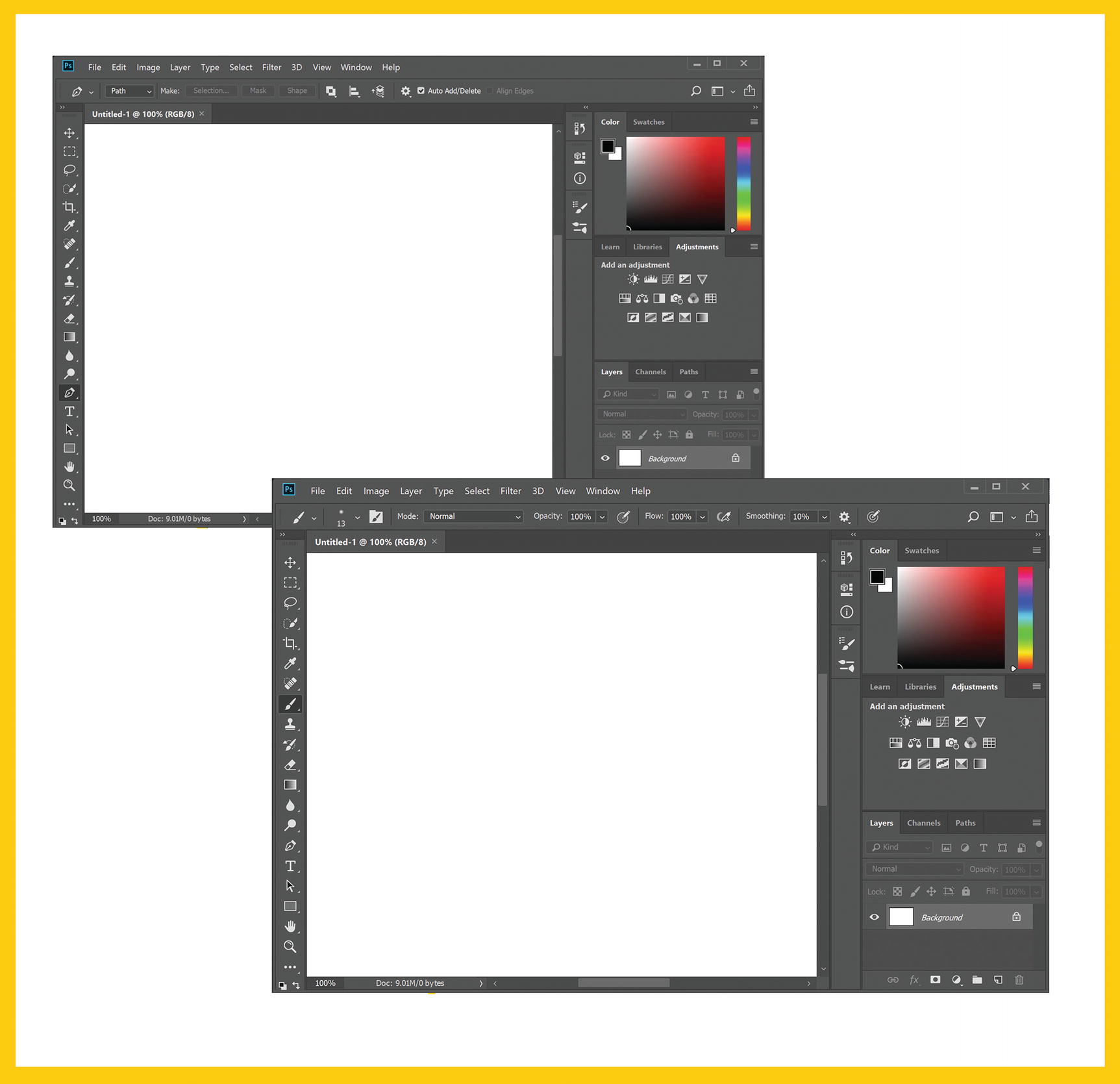
Photoshop’s interface when the pen (left) and brush (right) tools are selected
The pen tool icon in the left toolbar is styled differently to denote it as the “active” or selected tool.
The top toolbar, where most tool-specific settings are changed, allows us to determine whether we’re drawing paths or shapes. The settings perform various path operations, including adjusting path alignment and arrangement.
The cursor, when we hover over the canvas, changes to a pen nib-like icon.
When we select the brush icon, the toolbar and cursor update visually to let us know we’ve selected a new tool, and the top toolbar is full of settings that affect the style and performance of the brush we’ve selected. This approach is far removed from the usual UX processes we may be used to when creating web and mobile applications. It leans heavily into the notion of letting state and intent shape the environment, rather than prescribing set paths, flows, and journeys for every possible permutation of state. This is the key difference between designing linear flows and designing open environments—one is a representation of user intent, the other is a representation of the intent of the designer, or the system, or the business.
If creating global rules, designing individual, self-contained components that communicate with and reflect underlying state, and rescinding control over the minutiae in order to focus on these sounds familiar, it’s because it essentially forms the basis of a Design System. Design Systems are a relatively new introduction to our design lexicon at the time of writing, but they’re fast becoming a standardized, well-documented practice for documenting large, interaction-rich interfaces. We’ll discuss Design Systems and their role in the design stack in detail throughout the next chapters of this book because they act as the perfect foil for documenting the more open, nonlinear aspects of our work.
Summary
This is a highly theoretical chapter, and many of the concepts we’ve explored might seem at least a little bit fuzzy and perhaps even impractical. I want to stress that you absolutely don’t need to use words such as “environment design,” “acts and moments,” or any other obtuse terminology you may have turned your nose up at throughout this chapter. These concepts are simply metaphors that attempt to summarize an approach and a mindset that I feel is often lost when we strive for control.
The key facets of this approach boil down to understanding and reflecting the underlying state of an application at any given time, designing how your interface will expand and contract based on state (including any currently performable actions), and embracing the letting go of control in the name of presenting open, explorable, and progressive compositions.
The remaining chapters will inspect and analyze the traditional design practices where I feel this approach can be best implemented, without stepping on the toes (too much, at least) of accepted practice and industry standards. We’ll first explore the broad areas of the modern design stack and look at the artifacts and processes of each area that I feel can most benefit from slight tweaks or changed mindsets. Then we’ll take a look at a number of less common approaches to planning, documenting, reviewing, and testing designs specifically to focus on the theories and concepts discussed throughout this book.
I truly believe that the best possible design decisions can be made by using the understandings from part one to inform our environments, specifically around how they respond to and reflect state, changes in state, and communicating conceptual models of an underlying system. I hope by the end of this book you’ll agree.