
The first contact that most users have with computers is through GUIs, and the primary means of accessing the most advanced applications by the most sophisticated users is also through GUIs. So it’s natural that building GUIs is one of the first concerns of most new programmers and of many experienced programmers learning a new language like Java or a new tool like NetBeans.
Support for creating GUI applications and components has been essential in NetBeans since its beginning, and it is among its most mature features. But GUI development in NetBeans continues to evolve in response to user requests and technological advances. For example, the serialized objects used in early versions of NetBeans for persistent storage of GUI design details have long since been replaced by XML files. NetBeans is an excellent choice for creating GUIs because its GUI development tools are mature and stable, its GUI development features are easily adaptable to individual preferences, and it has a history of quickly adapting to the needs of the user community.
On the surface GUI building is quite straightforward. Start by creating a container from a template, drag and drop some visual components into it, and then adjust properties for the components as needed. Dig deeper, and you may find some pitfalls. For example, NetBeans translates visually designed forms into automatically generated read-only code, called guarded code . What if the read-only code doesn’t quite do what you want? We’ll talk about ways to make it behave later in this chapter and in the next.
Let’s start by building a very simple GUI class. Our example GUI will concatenate strings in two textfields and then show the result in a third textfield. We won’t build a complete application, but just enough to give you a good start for more complex forms. We’ll start developing the example in this chapter, and then continue through the JavaBeans chapter that follows. Look at the source code example GuiDemoBasic to see the results through the end of this chapter.
First, start NetBeans running, open up a working directory, and create a package for the GUI demo that we’re building:
Launch the IDE.
Click the GUI Editing tab in the main window to switch to the GUI workspace.
Decide what directory that you want use for building the source files. If the directory is already mounted, open up nodes in the Explorer window to expose it. If the directory isn’t mounted, right-click the Filesystems top node, select Mount Directory from the context menu, and mount it. Or start in the main window File menu, select Mount Filesystem, and use the Mount Filesystem wizard. As usual, there’s more than one way to accomplish anything you might want to do.
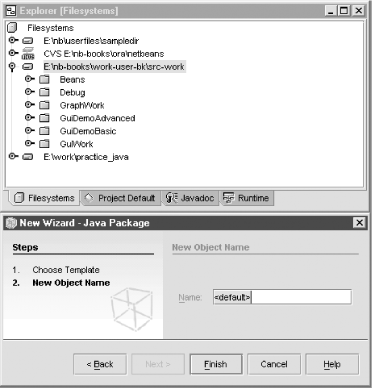
Right-click the containing directory, select New → Java Package. Name the new package GuiDemoBasic. This operation is shown in Figure 8-1.
Next, create the GUI container class from a template. We will choose
JFrame for this example. The choices include an
AWT Applet, Dialog,
Frame, or Panel or a
Swing
JApplet,
JDialog, JInternalFrame,
JFrame, or JPanel.
Right-click the GuiDemoBasic package and then select New → GUI Forms → JFrame from the context menu. Or start in the main window File menu and then select New to launch the New Wizard.
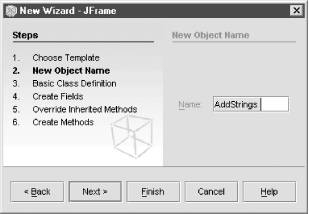
Navigate to select the
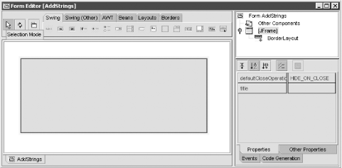
JFrametemplate. The New Wizard looks a little different, depending on which route you took, but it’s nicely intuitive. Name your newJFrameobjectAddStrings, as shown in Figure 8-2 and then click Finish.The IDE opens a Source Editor window with Java code for your new
JFrameclass. It also opens a Form Editor window, which includes the Component Palette panel at the top, the Component Inspector window at the right side, and the Form Editor panel below the Component Palette. We’ll say more about these panels shortly.
Let’s go outside the IDE for a moment to see
what’s happening. Look in your working directory
with an external file browser. There’s a
.java file with the base name that you chose for
your new JFrame class. The new
.java file contains the Java code that is open
in the IDE’s Source Editor.
Java code created with NetBeans can be exported, compiled, and run outside of the IDE in any valid Java environment. And valid Java code developed elsewhere can be imported, modified, compiled, and run in NetBeans. Currently, there is no way to generate a NetBeans .form file from imported code. That means that imported code must be modified by hand, instead of with the Form Editor. Don’t mess up a good .form file, or you’ll be stuck with hand editing the Java code whenever you need to change the GUI.
The Component Palette at the top of the Form Editor window (shown in Figure 8-3) looks like a large toolbar, but it contains more than action buttons. The tabs on the right of the Component Palette provide categories of components for building up GUI forms. The three buttons on the left are used to set the Form Editor’s mode. We’ll look at these buttons more closely as we progress. For now, make sure the Selection Mode button is pressed.
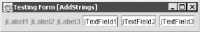
Click the Swing tab in the Component Palette to reveal a selection of
basic Swing components. Click the JLabel button,
which by default is the first component on the Swing tab. Hold down
the shift key and then click three times in the Form Editor for our
AddStrings GUI. This adds three
JLabel components to the form. If you had not held
down the Shift key while clicking in the Form Editor, only one
JLabel would have been added. The default behavior
is to only drop a component on the first click of the mouse; to have
the selected component dropped for successive clicks, hold Shift
while clicking in the Form Editor window.
If you’re new to Java, but have had experience building GUIs with other languages, you may be startled to see that the components you drop into the form don’t stay where you clicked to drop them. Component size and position is determined by a layout manager, not by the developer directly, and every Java GUI container has a layout manager. A novice will be tempted to fight the layout manager’s apparent misbehavior. A Java guru knows how to use layout managers to handle the tedious work of GUI layout. We’ll get deeper into layout managers soon. For now, don’t be too concerned about component positioning.
We will use a slightly different procedure for adding the
JTextField components. Right-click [JFrame] in the Component Inspector panel on
the right. Select Add From Palette
in the context menu to get a submenu that matches the Component
Palette tabs. Select Swing
JTextField. Do this three times, and notice
that the components appear in both the Form Editor and Component
Inspector panels. This way you don’t need to
remember the component icons or hover your mouse pointer to see their
names in the tooltip. Once again, there are several ways to get the
same result with NetBeans.
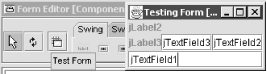
We have a quick and easy way to see what a GUI form will look like
during actual execution. Check the tooltips to identify the Test Form button in the left end of the
Component Palette. Click the button now to see what the form will
look like in execution. When you use the Test Form feature, the
layout manager works and the GUI components respond to mouse and
keyboard activity just as they would during execution, but the
components are not connected and event handling code is not executed.
The Test Form feature enables you to fine tune your form without
compiling it. This gives you a first look at
AddStrings from a user’s
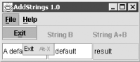
viewpoint. You should see a window much like that shown in Figure 8-4.
So far so good, except that the layout looks terrible. The default
layout manager for a JFrame is
BorderLayout. Let’s try
FlowLayout. There are several ways to change the
layout. We could go back to the Component Palette, click the Layouts
tab, click the Flow Layout button,
and click anywhere inside the JFrame border in the
Form Editor. But let’s do something different. Go to
the Component Inspector and right-click the JFrame node. Select Set
Layout
FlowLayout from
the context menu and then click the Test
Form button again to see how it looks (see Figure 8-5). That’s a little better.
Now, at least we can see all the components. But it still
isn’t quite what we want. Let’s see
what else can be done in the
Component Inspector.
Scroll the Source Editor to show the
InitComponents(
)
method of
AddStrings
.
Notice that it’s shaded light blue. That identifies
guarded code. It’s generated automatically and must
not be modified directly. Keep this code visible so you can watch it
while we work with the Component Inspector.
Setting Text
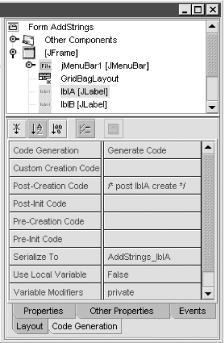
In the Component Inspector select jLabel1. Click the Properties tab and then locate the text property. Change its value from jLabel1 to String A. Notice that the value also changes in the Form Editor and in the guarded code of the Source Editor. Now change the value of the text property for the other components as shown in Table 8-1. While you’re in the properties window, turn off the editable property for jTextField3 because it needs to be a display only field.
Sizing Components
Notice that our components changed their size to fit the amount of text. Click the Other Properties tab and then locate the preferredSize property. Change its value for all of our
JLabelandJTextFieldcomponents to [80,30]. Let’s see how it looks so far. Go back to the main window and click the Test Form button in the Form toolbar. It’s nice to see all the components at the same size, but it doesn’t make sense for them all to be on one line. We’ll fix that soon, when we change the layout manager.Renaming Components
Let’s give more meaningful names to our components. In the Component Inspector right-click the JLabel and JTextField components and then select Rename from the context menu. Or just click to select the component, pause for the double-click interval to lapse, and then click again to open the name for editing. Rename the components as shown in Table 8-2.
Set Frame Title
Set the title property of AddStrings [JFrame] to AddStrings 1.0.
Now add a JMenuBar to your
AddStrings
form. You can select JMenuBar from
the Swing component palette and then click anywhere in the Form
Editor window to drop it in. Or you can navigate from the context
menu for the JFrame component in the Component
Inspector through the submenus to select JMenuBar. Initially, the menu bar will have
one menu, but no menu items. You could also add a
JPopupMenu through a similar procedure.
In the Component Inspector right-click your new JMenuBar and then select Add JMenu from the context menu. What good is
a menu without selections? Right-click jMenu1 and then select in the context menu
Add
JMenuItem. Notice the standard menu item types
that are available: JMenuItem,
JCheckBoxMenuItem,
JRadioButtonMenuItem, JMenu
(for submenus), and JSeparator. Move over to
jMenu2 and add another
JMenuItem, a JSeparator, and a
JMenuItem. Rename the JMenu and
JMenuItem components, and modify their properties
as shown in Table 8-3.
Table 8-3. Menu item properties for AddStrings
|
Original name |
New name |
Text |
Tooltip text |
Mnemonic |
|---|---|---|---|---|
|
jMenu1 |
FileMenu |
File |
File |
F |
|
jMenuItem1 |
ExitItem |
Exit |
Exit |
X |
|
jMenu2 |
HelpMenu |
Help |
Help |
H |
|
jMenuItem2 |
ContentsItem |
Contents |
Contents |
C |
|
jMenuItem3 |
AboutItem |
About |
About |
A |
We have nice looking menus, but they don’t do anything yet. We’ll take care of that later in this chapter, when we look at event handlers. But first, let’s fix the layout.
We already know how to
change the layout manager, because
we changed it from the default BorderLayout to
FlowLayout. That made it possible to set the size
of the visual components, which was much more functional than the
default. But we really want the three labels to line up neatly over
the three textfields. To accomplish this, we’ll
change the layout manager again, this time to
GridLayout. By now you know two ways to change a
nonvisual component. Either select GridLayout on the Component Palette and then
drop it onto the Form Editor, or right-click JFrame or FlowLayout in the Component Inspector and then
select GridLayout from the context
menu.
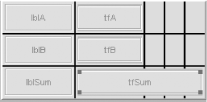
Now change the Columns property of
your layout manager to 3 and the Rows property to 2. Finally, everything lines
up correctly. But you lose some control over the size of the visual
components. GridLayout makes every cell the same
size, just large enough to accommodate the largest of the visual
components. You can see this new layout in action in Figure 8-6.
We can add some class to
our GUI design by applying a few
finishing touches to the visual components. Select our result field
tfSum in the Component Inspector and click the
Other Properties tab. Notice that
its border property defaults to
[CompoundBorderUIResource]. Click the value side of the property to
get the ... button and then click that button to get the border property editor. Select [BevelBorder],
and a property sheet appears. Depending on the border type, you may
be able to configure such properties as Highlight Color, Bevel
Type, Title, and
Insets. Compile and execute your
modified form to see how it looks. It should be a bit nicer, with the
result field standing out a bit.
Play around with the other components as well. Give each
JLabel component a different border type and
color, just to see what’s possible. [CompoundBorder]
gives you an inside border and an outside border. You can use
different border types inside and outside a simple text field.
The following discussion about accessibility digresses somewhat from our main thread, using NetBeans for the GUI building tasks that most developers need. But this is the right time for the discussion, because building in the simplest accessibility features greatly benefits users who have limitations while significantly improving usability for ordinary users. Learn now what little is needed and make a habit of applying the techniques; ordinary users will benefit, users with limitations will be able to use your GUI, and you will meet legal requirements for certain kinds of usage.
Providing accessibility in a computer application means building in features that assistive technologies can use to enable persons with disabilities to use the application easily. For example, when a blind person moves a mouse pointer to a GUI component, an assistive device can generate speech that names and describes the component. Accessibility is required by law in the United States for most computer applications that are available to the public or used for government purposes. It’s worth doing in all GUI applications worldwide, public or private, whether required by law or not.
Building accessibility into the GUI classes that you develop with NetBeans is surprisingly easy, thanks to the Java Accessibility Application Programming Interface (API) that is included with all releases of Java 2. When you know what’s needed, you can write code with little extra effort that automatically provides most of what assistive technologies require. The IDE does not yet provide an accessibility testing tool, but that’s under development and will be available soon. Meanwhile, see the following links for guidelines on providing accessibility manually:
- Developing Accessible JFC Applications
Clear explanation of why and how to make Swing classes accessible.(http://www.sun.com/access/developers/developing-accessible-apps/)
- Java™ Accessibility Quick Tips
Checklist for ensuring that your Swing classes are accessible.(http://www.sun.com/access/developers/tips.html)
All Java 2 Swing components implement the
Accessible interface, which allows assistive
technology devices to retrieve an instance of
AccessibleContext with its AccessibleName and AccessibleDescription properties. Assistive
devices use a variety of technologies, such as speech synthesis, to
communicate the values of these properties, allowing disabled users
to work with the GUI. If you just make sure every GUI component has a
meaningful value for AccessibleName,
you will meet the bare minimum to make your components available to
assistive technologies. It’s easy, because the value
of AccessibleName defaults to the
text property that labels, buttons,
menu items, and other components normally show to the user. Always
fill in meaningful text, and you will automatically meet the minimum
for accessibility.
Sometimes one component identifies another; for example, a
JLabel identifies a blank
JTextField. In this case set the JLabel.LabelFor property, and the
JTextField will set its AccessibleName from the
JLabel that identifies it. In our
AddStrings example the JLabel
lblA identifies the JTextField
tfA, so we would add the following:
lblA.setLabelFor(tfA);
If the component has a value set for its tooltip, AccessibleDescription defaults to the tooltip value. This is especially important if the AccessibleName does not adequately describe the component. Just make a habit of filling in the tooltip for every visible component, and you will make your application more usable for ordinary users while greatly enhancing its accessibility.
Now we’ll get back to the main thread of GUI building. The sections that we just finished focus on the visual aspect of GUI building—putting the right components in place and setting their visible features correctly. The sections that follow focus more on the code behind the components—making them work the way you want in response to user actions.
You can copy and paste objects in the Explorer window with ease. In fact, you can even copy class members—fields, constructors, methods, and bean patterns—between classes, and you can copy GUI components between forms. Let’s start by copying the example class from the previous chapter:
Create a new package to contain the copy. Right-click the mounted filesystem, select New Java Package, and name the package GuiDemoAdvanced.
Right-click the AddStrings source object in the old GuiDemoBasic package and then select Copy from the context menu.
Right-click the GuiDemoAdvanced package and select Paste Copy from the context menus. Once again we have a context menu that provides every reasonable action for the copied object.
Double-click the copied
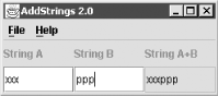
AddStringsobject to open it in the Source Editor and Form Editor windows. Notice that the package name was changed automatically to the new location.Go to the Component Inspector and set the title property of AddStrings[JFrame] to AddStrings 2.0.
We want the third JTextField,
tfSum, to display the concatenation of the other
two at all times. If either tfA or
tfB fires an ActionEvent, the
text property of tfSum must change to show the new
result. The
Connection Wizard helps us link events
fired by one component to actions that belong to another component.
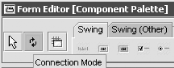
The Connection Wizard is enabled by clicking the Connection Mode button in the Component
Palette (shown in Figure 8-7), next to the
Selection Mode button.
Here are the specific steps to link up your events:
Click the Connection Mode button in the Component Palette.
In the Form Editor click the component that will send the
ActionEvent. That’s theJTextFieldnamedtfA, displaying text “A default.”Next, click the target component. That’s the
JTextFieldnamedtfSum, displaying text “result.”The Connection Wizard will launch. Open the action node, and select actionPerformed. Accept the default method name
tfAActionPerformed, and click Next.In the next pane of the Connection Wizard keep the default operation
Set Property, select the property text, and click Next.In the last pane specify
Get Parameter Fromby pressing the User Code radiobutton. Enter the following in the User Code textfield and then click Finish:tfA.getText( ) + tfB.getText( )
Look in the Source Editor window. Notice that a new method
tfAActionPerformedwas created to handle theActionEventfired by thetfAcomponent.Repeat the procedure for the other input textfield,
tfB.Compile and execute. Change the input textfields to verify that it works. The result textfield,
tfSum, will showtfAconcatenated withtfB, as illustrated in Figure 8-8.
What if you want more control over the size and placement of GUI
components? Use GridBagLayout. You could use
Null Layout
(no layout manager), but that would reduce cross-platform
portability. Or you could
use
AbsoluteLayout, a custom layout manager that is
included with NetBeans. But that would add complexity to distribution
and maintenance of your application. GridBagLayout
is a standard Java layout
manager that was designed for precise control over GUI components
while preserving portability. However, there is a cost for this
flexibility. GridBagLayout is complex to configure
and tedious to modify. Many developers avoid
GridBagLayout because configuring it by hand can
take too much time.
But there’s a better way. The
GridBagLayout Customizer
gives the full power of
GridBagLayout to the developer in a visual tool.
With the GridBagLayout Customizer you can visually adjust the size
and placement of your components and then numerically fine tune them
for maximum precision.
We used the GridLayout to divide our
AddStrings example into a grid of equally sized
rectangular cells. Each cell can hold one visual component. The
GridBagLayout also defines a grid, but each
component can occupy several cells in a rectangular subarray.
Furthermore, the rows and columns in GridBagLayout
are not required to be all the same height or width. You can see just
such an example in Figure 8-9.
Here’s a general procedure for building a GUI with
GridBagLayout in NetBeans. Let’s
follow the procedure with our AddStrings example.
The first step is to add visual components to a GUI container using any layout. In our example we have already done this step.
Change to
GridBagLayout. Either dropGridBagLayoutfrom the Component Palette onto the Form Editor or right-click the container node in the Component Inspector and select Set Layout from the context menu.Start the Customizer. In the Component Inspector window right-click the GridBagLayout node and then select Customize from the context menu to open the Customizer Dialog.
Resize and move the components. Just drag their edges, corners, and centers as needed in the visual pane of the customizer. Create roughly the arrangement that you want. Make the
JLabelandJTextFieldcomponents in ourAddStringsexample match Figure 8-10.Place the
JLabelcomponents in the first columnPlace the
JTextFieldcomponents in the second column
Fine tune the components. Click a component in the right pane to select it and then make the fine adjustments in the left panes. Either adjust the properties in the upper left, or adjust the visual controls in the lower left.
In our
AddStringsexample the only component we need to change is thetfSumJTextField. It should be about double the size of the input fields. Adjust its properties to match Table 8-4 and then close the Customizer, compile, and test.You can also adjust layout properties without opening the Customizer. Just select any visual component node in the top pane of the Component Inspector and then click the Layout tab at the bottom. You can access the same properties that the Customizer shows.
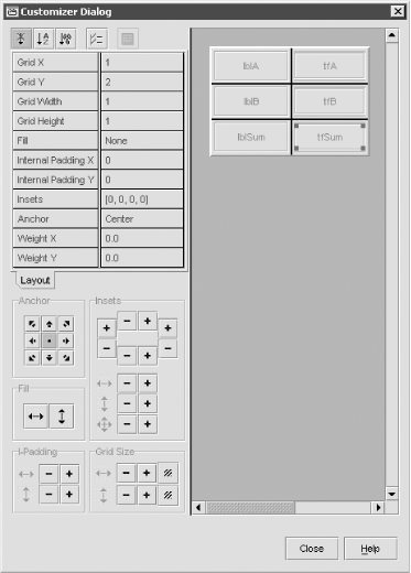
What are all those properties in the GridBagLayout Customizer?
They’re the GridBagConstraints
properties. Each visual component has its own set, which tells the
GridBagLayout manager how to display the
component. Here’s a summary of the properties:
- Anchor
Specifies where to place the component within the free space in the grid cells that it occupies. Values are Center, North, Northeast, and so on. Can also be set by Anchor buttons.
- Fill
Specifies whether or not the component should fill all the horizontal and vertical space in the grid cells that it occupies. Can also be set by Fill buttons.
- Grid Height and Grid Width
Component height as number of rows and width as number of columns. Can also be adjusted by Grid Size buttons in the lower left pane.
- Grid X and Grid Y
Row and column location of the component in the grid. Can also be adjusted by dragging the component in the visual pane.
- Insets
Each number specifies the minimum distance between the edge of the component and its grid cell boundary. Numbers denote pixels. The four numbers apply to the top, left side, bottom, and right side, respectively. Can also be adjusted by Insets buttons.
- Internal Padding X and Internal Padding Y
Extends component width and height. Numbers denote pixels, not rows or columns. Can also be adjusted by I-Padding buttons.
- Weight X and Weight Y
Specifies the distribution of available space among all the components in a row or column when the container is resized. Components with larger weights get more space. Weights are relative numbers, not pixels or cell counts.
Let’s take a closer look at the code that the
IDE generates to handle GUI events.
It automatically creates an event handler method for the
windowClosing event. The IDE also supports all
possible events for other GUI components and will create a handler
method for any event that the developer selects manually. The
Connection Wizard includes a step for the developer to select an
event and then creates a handler method for it. We will examine
several different ways of creating event handler methods.
Locate the exitForm method in the Java source for
our AddStrings class, usually just above the
main method. This method is the code for the
windowClosing event handler that was generated
automatically when the initial JFrame container
was created. Notice that the first and last lines of
exitForm are guarded code (shaded light blue), but
the body of the method is not. You are free to modify the body of
this method as needed. This is the pattern for event handler methods
that the IDE generates. By default the exitForm
method for a JFrame contains only the following
line, which you are free to replace or augment as needed:
System.exit(0);
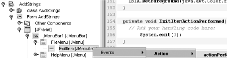
Locate our AddStrings example in the
Explorer window. If it isn’t open already,
double-click to open it. Then open its nodes all the way to ExitItem, as follows:
AddStrings
→
Form
AddStrings
→
[JFrame]
→
jMenuBar1
→
FileMenu
→
ExitItem. Now let’s give that
menu item some action. Right-click ExitItem
→
Events
→
Action
→
actionPerformed. This action is shown in
progress in Figure 8-11. Now, locate the
ExitItemActionPerformed method.
It’s an empty method because there is no reasonable
default. Copy (or retype) the System.exit(0); line
from the exitForm method into
ExitItemActionPerformed method.
Remember tfAActionPerformed and
tfBActionPerformed? Those event handler methods
were created when we used the Connection Wizard to connect actions in
the tfA and tfB textfields to
results in tfSum. As usual, they were created as
empty methods, which we filled in to produce the results we want.
However, the two methods have identical code. That’s
redundant, so let’s fix it. Select
tfB in the Component Inspector and then click the
Events tab at the bottom of the window. Here we have yet another
approach to creating event handlers, with possible events in the left
column and any handler methods in the right. Click
tfBActionPerformed at the top of the right column
and then click the “...” button.
This opens a window that allows you to specify the event handler
methods for any event. Remove tfBActionPerformed
and add tfAActionPerformed. Click OK to finish, and look at the source. Notice
that tfBActionPerformed is no longer needed and
has been deleted automatically. Now we have a cleaner, simpler
program. This approach makes it easy to mix and match new or existing
event handler methods with any number of events.
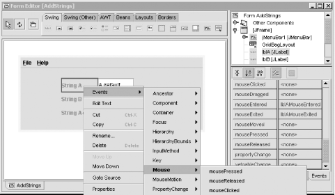
We’ll finish this section with one more way to
create event handlers. Right-click lblA in the
Component Inspector. From the context menu select Events
→
Mouse
→
mouseEntered. This creates the
lblAMouseEntered( ) method. Insert the following
line:
lblA.setForeground(java.awt.Color.red);
Next, right-click lblA in the Form Editor window.
Again, select from the context menu Events
→
Mouse
→
mouseExited as shown in Figure 8-12 to create the
lblAMouseExited method. Insert the following line:
lblA.setForeground(java.awt.Color.green);
Compile, test, and behold Figure 8-13. The label changes color when the mouse rolls over it. Also, the Exit selection in the File menu works as expected.
In our earlier discussion
about configuring components with
the Component Inspector we mentioned guarded code, shaded light blue
in the Source Editor. By now our AddStrings
example has much more blue than white. Guarded code is automatically
generated to reflect the GUI design in the Form Editor and property
settings in the Component Inspector. The IDE will not allow you to
directly modify guarded code in the Source Editor, but you can easily
modify it indirectly through the Component Inspector.
It is possible to use an external editor to modify Java code that was created by the IDE, but this is not recommended. You must be very careful not to modify the guarded code. The IDE regenerates guarded code automatically every time you open the source object, so any changes made outside of NetBeans would be lost. You can identify guarded code in an external editor by looking for comments that start with //GEN-. If you insist on using an external editor to modify code, stick to the following rules:
- //GEN-BEGIN: and GEN-END
Never externally modify any code on or between lines with these comments.
- //GEN-FIRST: and GEN-LAST
Never externally modify any code on lines with these comments.
But you might need to modify guarded code for some very good reasons. For example:
- Instantiation with parameters
Suppose you want to include a few arguments when you instantiate a component, but the IDE always invokes the default constructor.
- Instantiation with factory objects
Suppose you want to recycle objects through a factory, but the IDE always instantiates new objects.
- Complex initialization
Suppose you want to add elements to a
JListorJTree, but the IDE does not fully support initialization of complex components.
The recommended safe way to modify guarded code is through the Code Generation properties in the Component Inspector. Go to the Component Inspector and select any component, visual or nonvisual, including menu items or the GUI container itself. Then click the Code Generation tab at the bottom of the window. This exposes properties that directly modify the guarded code that NetBeans generates. Play around with them to see what’s affected. Pick any property that is initially empty, fill in a comment, and then look in the Source Editor to see what happened.
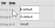
For example, select lblA. Modify its Post-Creation Code property by replacing the
initially empty value with a comment, as seen in Figure 8-14. Look in the Source Editor window for the text
of the comment, and you will see the following lines:
  lblA = new javax.swing.JLabel( );
  /* post lblA create */
Notice that the code you inserted into the Post-Creation
Code property appears immediately after the line that
creates lblA. If you need to insert some logic
immediately after a component is created, you can simply enter that
logic into the Post-Creation Code property. In
other words, just replace the sample comment that we entered with a
snippet of source code to do whatever post-creation work that is
necessary.
The Custom Creation Code property is especially powerful. You can replace the default constructor for a component with any code that returns a suitable object. This is the place to use a custom component, recycle factory-managed objects, or add parameters to the default empty constructor.
What if there’s a problem with the generated code? Maybe one of the NetBeans GUI templates or components has a bug, or maybe you want to use an obscure GUI property that NetBeans just doesn’t expose. Here are some workarounds.
The quickest fix is through the Code Generation properties in the Component Inspector. Take a good look at all the properties, and you will probably find the right place to insert the code you need.
A quick and dirty workaround is to insert the code you want after the
generated code that you don’t like. You can use the
Post-Creation Code and Post-Init Code Code Generation properties. Or
you could avoid guarded code altogether by adding a few lines to your
GUI class constructor, right after invoking initComponents( );.
Maybe there’s a bug in one of the NetBeans templates or components that you used, or you just want it to work differently. Then make your own. Start with a copy of a NetBeans template or component, modify it, and install it in the IDE.
Here are the steps for making a custom template:
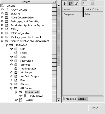
Optionally, create your own template category. Start from the main window Tools → Options to open the Options window. Open nodes Source Creation and Management and then Templates. Right-click GUI Forms and then select New Folder. Finally, name this new folder and click Finish. The result of this operation is shown in Figure 8-15.
Create the source to use for your template. Start with one of the NetBeans templates and modify it to meet your needs, or create completely new source code.
Save the source as a template. Start in the Explorer window, right-click the source, select Save as Template from the context menu, and select the template category from the Save As Template dialog.
And here are the steps for making a custom GUI component:
Optionally, create your own Component Palette tab. From the main window select Tools → Options. Open nodes IDE Configuration node and then Look and Feel. Right-click the Component Palette node and then select Add Palette Category from context menu. Name the new category, and click OK.
Create or locate the new component. It’s just a JavaBean. Use an existing bean, or write your own. See the next chapter for more on beans.
Add the new component to the Component Palette and then customize it.
We will take a closer look at adding components to the Component Palette in the next chapter, after creating our own JavaBean component.
A JPanel can contain any number of components.
Because a
JPanel is itself a component, it can be contained
within another JPanel, a
JFrame, or any other GUI container. As we will see
in the next section, this can be a powerful technique for building
complex GUIs. But there’s a potential editing
problem with components in containers within containers. If all the
components in all the containers were visible at the same time, it
could become visually confusing and unmanageable. The Form Editor
prevents such confusion by showing only one container with its
components at a time and by enabling the developer to choose which
container to show. Let’s walk through a short
demonstration to see how it works.
Notice the empty space in the upper right corner of our
AddStrings example. Let’s fill
the space with a JPanel and then put a couple of
GUI components into the JPanel just to demonstrate
what’s possible. Select the JPanel icon in the Component Pallet and then
drop it into the empty corner of AddStrings in the
Form Editor. It shows up as a small blue square, much too small to be
useful. We’ll fix that by using the GridBag
Customizer to adjust the space it occupies. Right-click GridBagLayout in the Component Inspector and
then select Customize from the
context menu. Select the JPanel in
the Customizer Dialog window and then adjust GridWidth to 3 and
GridHeight to 2. Close the Customizer and turn your attention back to
the Form Editor.
Where’s our JPanel? The little
blue square has vanished, and the space just looks blank in the Form
Editor. No problem, the JPanel still there in the
Component Inspector. Select it in the Component Inspector, and the
blue square reappears. The JPanel was just hidden,
and selecting it in the Component Inspector brought it to the fore in
the Form Editor. Right-click the JPanel in the Component Inspector and then
select Design This Container from
the context menu. Now the JPanel takes over all
the space, and the JFrame disappears.
Drop in a few components from the Component Palette—a
JButton or two, maybe a
JLabel—whatever you like just to get
something visible in the JPanel. Then compile and
execute to see what you’ve done. Not fancy, but it
opens up a world of possibilities. By allowing the developer to put
containers within containers, and by focusing the Form Editor on one
container and its components at a time, NetBeans allows unlimited
complexity in GUI design and keeps the complexity manageable.
Go back to the Form Editor, which has the JPanel
visible. Right-click, and examine the context menu. Now the choices
include Design This Container and
Design Top Container. This gives you
an easy way to
switch back and forth with either the
JFrame or JPanel in the
foreground.
When you create a complex GUI with many components, it can be difficult to make them behave properly. Trying to control the size and placement of even a few components can be like herding cats; focus your attention on one, and the others run amok. As we have seen, GridBagLayout is often your best hope for managing multiple components in a single container. But there’s another way. Instead of struggling with too many components in one container, use the containers within containers technique to build a GUI that’s many layers deep with just a few components in each layer.
Create a container, say a JPanel, and then add
just a few components to the container, few enough that you can
easily control their size and placement. Use the container in
constructing the next layer of your complex GUI. For greater
flexibility in testing and reuse, and for a cleaner design, you may
choose to turn the container with its components into a JavaBean.
This is exactly where we’re headed with the
AddStrings example. We will place a manageable
number of components into a JPanel container and
then turn the JPanel into a Bean. We will add our
new Bean to a JFrame container and use the Bean
properties to configure it. Of course, if you’re
only creating a Bean as an intermediate component for one project,
you won’t need to do everything that will be done in
the JavaBeans chapter—create a BeanInfo
class, link it to an icon, and add it to your Component Palette.
Giving your intermediate containers a few basic Bean features will be
enough to greatly simplify your GUI building task.
By now our AddStrings
example
is looking good and running
smoothly. But it’s a standalone application. The
only way other users could benefit from using the application would
be to install it, launch it every time they wanted to use it, and
then explicitly exit when they’re done. If we
convert the application into a component that other developers can
include in larger applications, it can be used much more widely and
easily. So, in the next chapter, we will build a JavaBean around the
essential feature of AddStrings. Then anyone using
Java to build a
complex GUI can drop
AddStrings into their form with just a few mouse
clicks.