
5
Real‐World Applications in Network Science
5.1 Introduction
This chapter presents some use cases where network analysis and network optimization algorithms were used to solve a particular problem, or at least were used as part of an overall solution. The first two cases were created to demonstrate some of the network optimization capabilities, providing practical examples on using network algorithms to understand a particular scenario. The first case explores multiple network algorithms to understand the public transportation system in Paris, France, its topology, reachability, and specific characteristics of the network created by tram, train, metro, and bus lines. On top of that, the case presents a comparison on the Traveling Salesman (TSP) Problem in Paris by using the multimodal public transportation and by just walking. A tourist wants to visit a set of places and can do it by walking or by using the transportation lines available. The case offers an overall perspective about distance and time traveled.
The second case covers the vehicle routing problem (VRP). Similar to the first case on the (TSP), the main idea is to demonstrate some crucial features of this important network optimization algorithm. The city chosen for this demonstration is Asheville, North Carolina, U.S. The city is known to have one of the highest ratios of breweries per capita in the country. The case demonstrates how a brewery can deliver beer kegs demanded by its customers (bars and restaurants), considering the available existing routes, one or multiple vehicles, and different vehicle capacities.
The third case is a real use case developed at the beginning of the COVID‐19 pandemic in early 2020. In this case, network analysis and network optimization algorithms play a crucial part of the overall solution to identify new outbreaks. Network algorithms were used to understand population movements along geographic locations, create correlation factors to virus spread, and ultimately feed supervised machine learning models to predict the likelihood of COVID‐19 outbreaks in specific regions.
Partially similar to the third case, the fourth one describes the overall urban mobility in a metropolitan area and how to use that outcome to improve distinct aspects of society such as identifying the vectors of spread diseases, better planning transportation networks, and strategically defining public surveillance tasks, among many others. Network analysis and network optimization algorithms play an important role in this case study in providing most of the outcomes used in further advanced statistical analysis.
The remaining cases focus more on the network analysis algorithms, looking into multiple types of subgraph detection, centrality metrics calculation, and ultimately correlation analysis between those outcomes from some specific business events like churn, default, fraud, or consumption and the customer's profile in terms of social structures. The fifth case for instance focuses on the analysis of exaggeration in auto insurance. Based on the insurance transactions, a network is built associating all actors within the claims, like policy holders, drivers, witnesses, etc., and then connecting all similar actors throughout the claims within a particular period of time to build up the final social structure. Upon the final network, a series of subgroup algorithms are executed along a set of network centrality metrics. Finally, an outlier analysis on the different types of subgroups as well as on the centralities are performed in order to highlight suspicious activities on the original claims.
The sixth case describes the influential factors in business events like churn and product adoption within a communications company. Based on a correlation analysis over time between business events and the subscribers' profile in terms of network metrics, an influential factor is calculated to estimate the likelihood of customers affecting their peers on events such as churn and product adoption afterwards.
The seventh and last case study describers a methodology to detect fraud in telecommunications based on a combination of multiple analytical approaches. The first step is to create the network based on the mobile data. The second stage is to detect the communities within the overall network. Then a set of network centralities is computed for each node considering their respective community. The average value for all these metrics is calculated and an outlier analysis is performed on them, highlighting the unusual communities in terms of relationships and connections between its members.
5.2 An Optimal Tour Considering a Multimodal Transportation System – The Traveling Salesman Problem Example in Paris
A good public transportation system is crucial in developing smart cities, particularly in great metropolitan areas. It helps to effectively flow the population in commuting and allow tourists to easily move around the city. Public transportation agencies around the globe open and share their data for application development and research. All these data can be used to explore the network topology in order to optimize tasks in terms of public transportation offerings. Network optimization algorithms can be applied to better understand the urban mobility, particularly based on a multimodal public transportation network.
Various algorithms can be used to evaluate and understand a public transportation network. The Minimum Spanning Tree algorithm can reveal the most critical routes to be kept in order to maintain the same level of accessibility in the public transportation network. It basically identifies which stations of trains, metros, trams, and buses need to be kept in order to maintain the same reachability of the original network, considering all the stations available. The Minimum‐Cost Network Flow can describe an optimal way to flow the population throughout the city, allowing better plans for commuting based on the available routes and its capacities, considering all possible types of transportation. The Path algorithm can reveal all possible routes between any pair of locations. This is particularly important in a network considering a multimodal transportation system. It gives the transportation authorities a set of possible alternate routes in case of unexpected events. The Shortest Path can reveal an optimal route between any two locations in the city, allowing security agencies to establish faster emergency routes in case of special situations. The Transitive Closure algorithm identifies which pairs of locations are joined by a particular route, helping public transportation agencies to account for the reachability in the city.
Few algorithms are used to describe the overall topology of the network created by the public transportation system in Paris. However, the algorithm emphasized here is the TSP. It searches for the minimum‐cost tour within the network. In my case, the minimum cost is based on the distance traveled, considering a set of locations to be visited, based on all possible types of transportations available in the network. Particularly, the cost is the walking distance, which means we will try to minimize the walking distance in order to visit all the places we want.
Open public transportation data allows both companies and individuals to create applications that can help residents, tourists, and even government agencies in planning and deploying the best possible public services. In this case, we are going to use the open data provided by some transportation agencies in Paris (RAPT – Régie Autonome des Transports Parisiens – and SNCF – Société Nacionale des Chemins de fer Français).
In order to create the public transportation systems in terms of a graph, with stations as nodes, and the multiple types of transport as links (between the nodes or stations), the first step is to evaluate and collect the appropriate open data provided by these agencies and to create the transportation network. This particular data contains information about 18 metro lines, 8 tram lines, and 2 major train lines. It comprises information about all lines, stations, timetables, and coordinates, among many others. This data was used to create the transportation network, identifying all possible stops and the sequence of steps performed using the public transportation system while traveling throughout the city.
In addition to some network optimization algorithms to describe the overall public transportation topology, we want to particularly show the TSP algorithm. We selected a set of 42 places in Paris, a hotel in Les Halles, that works as the starting and ending point, and 41 places of interest, including the most popular tourist places in Paris, and some popular cafes and restaurants. That is probably the hardest part in this problem, to pick only 41 cafes in Paris! In this case study, we are going to execute mainly two different optimal tours. The first one is just by walking. It is a beautiful city, so nothing is better than just walking through the city of lights. The second tour considers the multimodal public transportation system. This tour actually does not help us to enjoy the wonderful view, but it surely helps us enjoy longer visits to the cafes, restaurants, and monuments.
The first step is to set up the 42 places based on x (latitude) and y (longitude) coordinates. The following code shows how to create the input data table with all places to visit.
data places;length name $20;infile datalines delimiter=",";input name $ x y;datalines;Novotel,48.860886,2.346407Tour Eiffel,48.858093,2.294694Louvre,48.860819,2.33614Jardin des Tuileries,48.86336,2.327042Trocadero,48.861157,2.289276Arc de Triomphe,48.873748,2.295059Jardin du Luxembourg,48.846658,2.336451Fontaine Saint Michel,48.853218,2.343757Notre-Dame,48.852906,2.350114Le Marais,48.860085,2.360859Les Halles,48.862371,2.344731Sacre-Coeur,48.88678,2.343011Musee dOrsay,48.859852,2.326634Opera,48.87053,2.332621Pompidou,48.860554,2.352507Tour Montparnasse,48.842077,2.321967Moulin Rouge,48.884124,2.332304Pantheon,48.846128,2.346117Hotel des Invalides,48.856463,2.312762Madeleine,48.869853,2.32481Quartier Latin,48.848663,2.342126Bastille,48.853156,2.369158Republique,48.867877,2.363756Canal Saint-Martin,48.870834,2.365655Place des Vosges,48.855567,2.365558Luigi Pepone,48.841696,2.308398Josselin,48.841711,2.325384The Financier,48.842607,2.323681Berthillon,48.851721,2.35672The Frog & Rosbif,48.864309,2.350315Moonshiner,48.855677,2.371183Cafe de lIndustrie,48.855655,2.371812Chez Camille,48.84856,2.378099Beau Regard,48.854614,2.333307Maison Sauvage,48.853654,2.338045Les Negociants,48.837129,2.351927Les Cailloux,48.827689,2.34934Cafe Hugo,48.855913,2.36669La Chaumiere,48.852816,2.353542Cafe Gaite,48.84049,2.323984Au Trappiste,48.858295,2.347485;run;
The following code shows how to use SAS data steps to create a HTML file in order to show all the selected places on a map. The map is actually created based on an open‐source package called Leaflet. The output file can be opened in any browser to show the places in a geographic approach. All the following maps are created based on the same approach, using multiple features of LeafLet.
data _null_;set places end=eof;file arq;length linha $1024.;k+1;if k=1 thendo;put '<!DOCTYPE html>';put '<html>';put '<head>';put '<title>SAS Network Optimization</title>';put '<meta charset="utf-8"/>';put '<meta name="viewport" content="width=device-width, initial...put '<link rel="stylesheet" href=" https://unpkg.com/[email protected] ...put '<script src=" https://unpkg.com/[email protected]/dist/leaflet ....put '<style>body{padding:0;margin:0;}html,body,#mapid{height:10...put '</head>';put '<body>';put '<div id="mapid"></div>';put '<script>';put 'var mymap=L.map("mapid").setView([48.856358, 2.351632],14);';put 'L.tileLayer(" https://api.tiles.mapbox.com/v4/{id}/{z}/{x}/ ...end;linha='L.marker(['||x||','||y||']).addTo(mymap).bindTooltip("'||name...if name = 'Novotel' thendo;linha='L.marker(['||x||','||y||']).addTo(mymap).bindTooltip("'|...linha='L.circle(['||x||','||y||'],{radius:75,color:"'||'blue'||...end;put linha;if eof thendo;put '</script>';put '<body>';put '</html>';end;run;
Figure 5.1 shows the map with the places to be visited by the optimal tour.
Considering the walking tour first, any possible connection between two places is a link between them. Based on that, there are 1722 possible steps (or links) to be considered when searching for the optimal tour. It is important to notice that here we are not considering existing possible routes. The distance between a pair of places, as well as the route between them, is just the Euclidian distance between the two points on the map. The next case study will consider the existing routes. The reason to do that in this first case is that we want to compare the walking tour with the multimodal public transportation tour. The transportation network does not follow the existing routes (streets, roads, highways, etc.), but it considers almost a straight line between the stations, similar to the Euclidian distance. To make a fair comparison between walking or taking the public transportation, we consider all distances as Euclidian distances instead of routing distances.
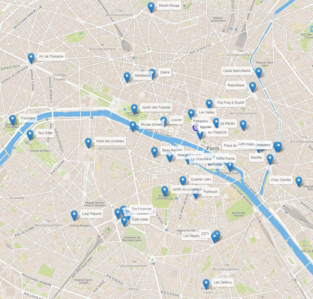
Figure 5.1 Places to be visited in the optimal tour in Paris.
The following code shows how to create the possible links between all pairs of places.
proc sql;create table placeslinktmp asselect http://a.name as org, a.x as xorg, a.y as yorg, http://b.name as dst,b.x as xdst, b.y as ydstfrom places as a, places as b;quit;
Figure 5.2 shows the possible links within the network.
Definitely the number of possible links makes the job quite difficult. The TSP is the network optimization algorithm that searches for the optimal sequence of places to visit in order to minimize a particular objective function. The goal may be to minimize the total time, the total distance, or any type of costs associated with the tour. The cost here is the total distance traveled.
As defined previously, the distance between the places is computed based on the Euclidian distance, rather than the existing road distance. The following code shows how to compute the Euclidian distance for all links.
data mycas.placesdist;set placeslink;distance=geodist(xdst,ydst,xorg,yorg,'M');output;run;
Once the links are created, considering origin and destination places, and the distance between these places, we can compute the optimal tour to visit all places by minimizing the overall distance traveled.
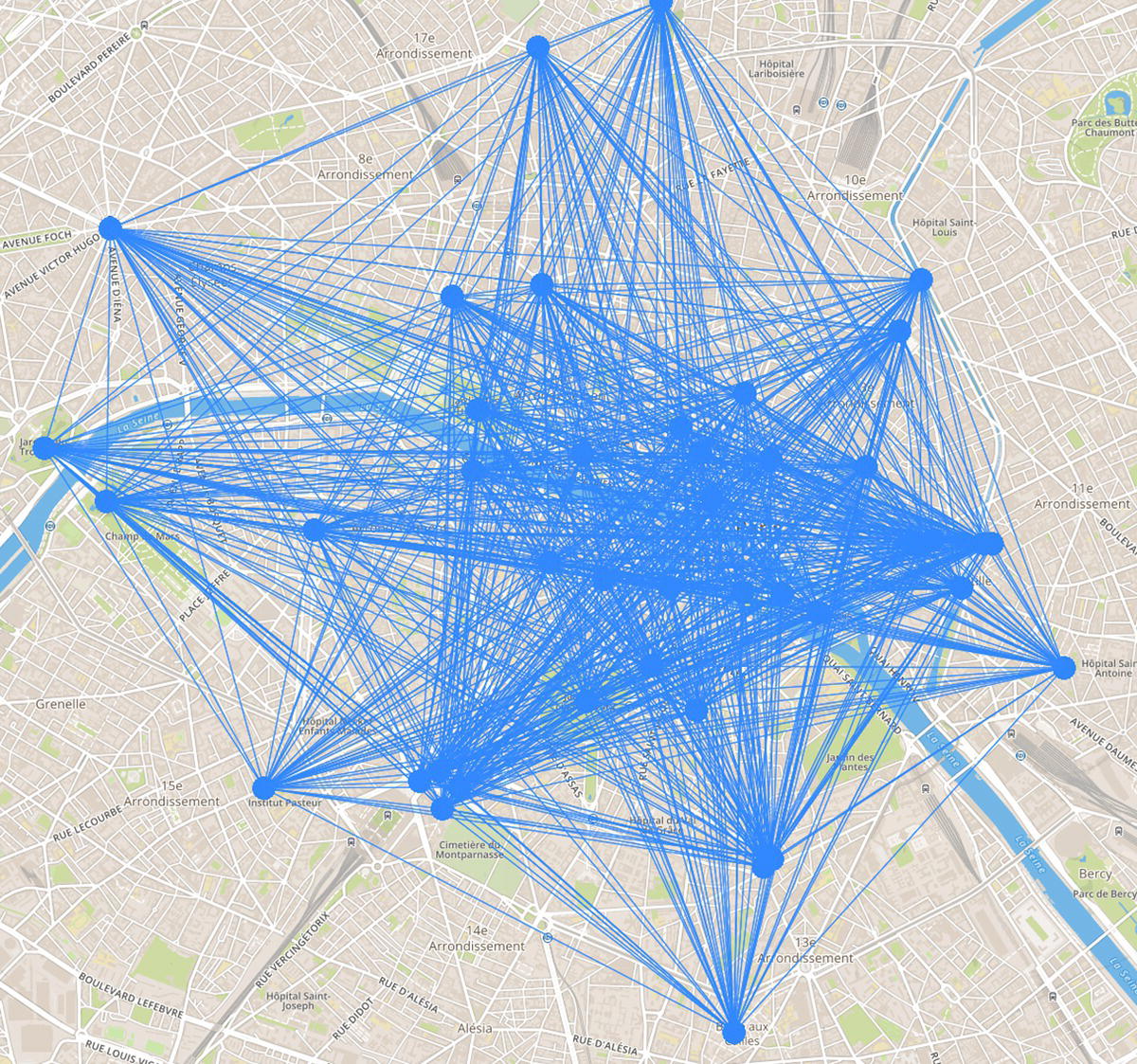
Figure 5.2 Links considered in the network when searching for the optimal tour.
proc optnetworkdirection = directedlinks = mycas.placesdistout_nodes = mycas.placesnodes;linksvarfrom = orgto = dstweight = distance;tspcutstrategy = noneheuristics = nonemilp = trueout = mycas.placesTSP;run;
Figure 5.3 shows the optimal tour, or the sequence of places to be visited in order to minimize the overall distance traveled.
The best tour to visit those 41 locations, departing from and returning to the hotel, requires 19.4 miles of walking. This walking tour would take around six hours and 12 minutes.
A feasible approach to reduce the walking distance is to use the public transportation system. In this case study, this transportation network considers train, tram, and metro. It could also consider the buses, but it is not the case here. The open data provided by the RATP is used to create the public transportation network, considering 27 lines (16 metro lines, 9 tram lines out of the existing 11, and 2 train lines out of the existing 5), and 518 stations.
The code to access the open data and import into SAS is suppressed here. We can basically use two approaches to fetch the open data from RATP. The first one is downloading the available datasets and importing them into SAS. The second one is by using the available APIs to fetch the data automatically. SAS has procedures to perform this task without too much work. Once the data representing the transportation network is loaded, we can create the map showing all possible routes within the city, as shown in Figure 5.4.
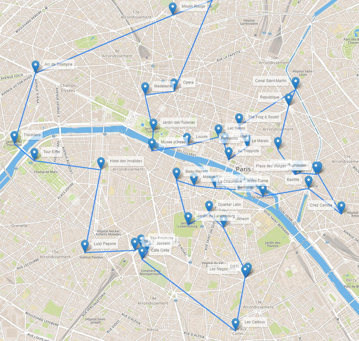
Figure 5.3 Links considered in the network when searching for the optimal tour.
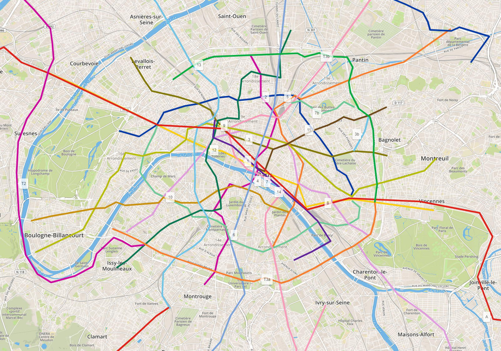
Figure 5.4 Transportation network.
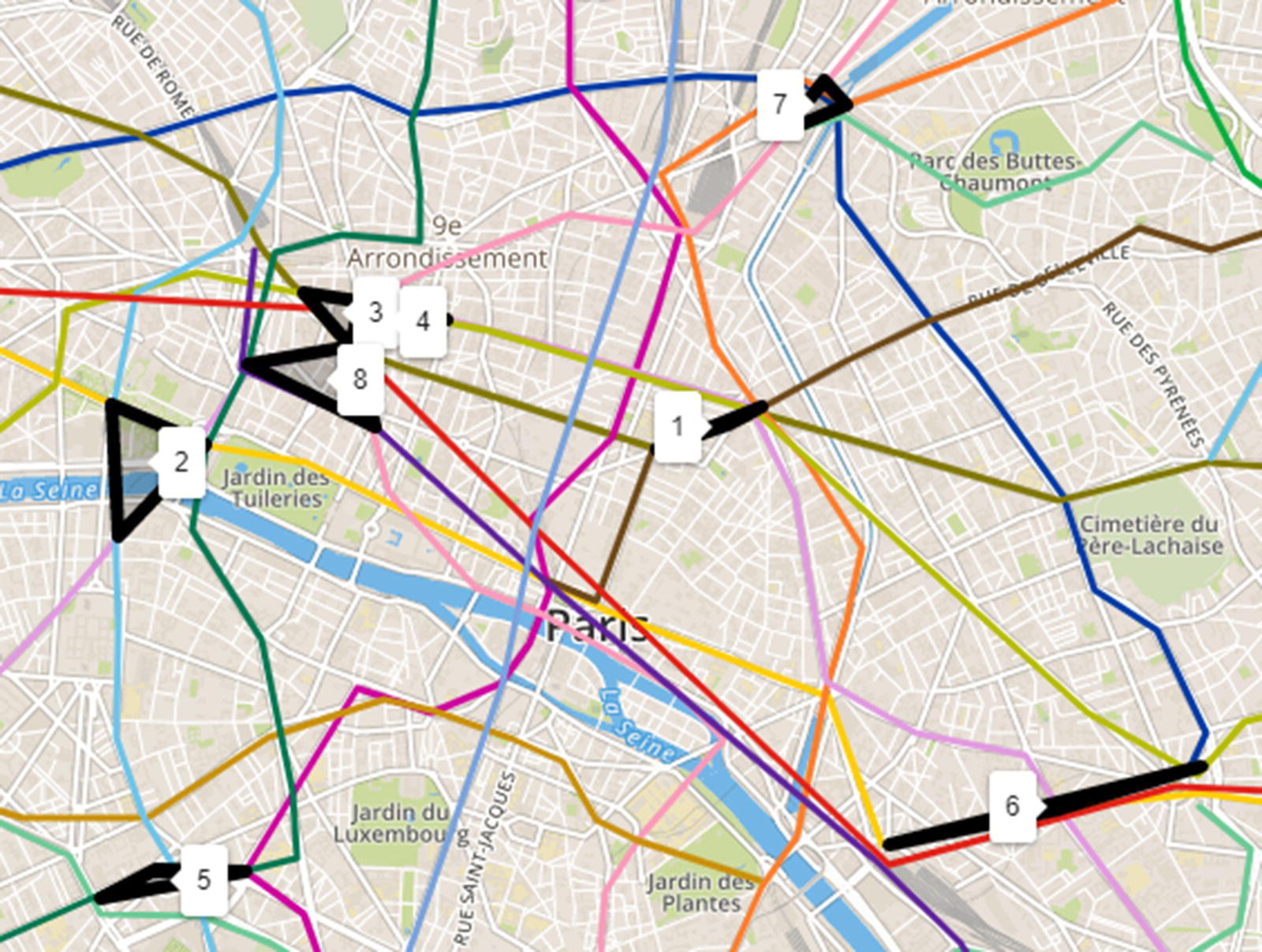
Figure 5.5 Cliques within the transportation network.
Before we move to the optimal tour considering the multimodal transportation systems, let us take a look at some other network optimization algorithms in order to describe the network topology we are about to use.
An option to find alternative stations in case of outage in the transportation lines is to identify stations that can be reached from each other, as a complete graph. The Clique algorithm can identify this subgraph within the network. To demonstrate the outcomes, the Clique algorithm was executed with a constraint of a minimum of three stations in the subgraphs, and eight distinct cycles were found. These subgraphs represent groups of stations completely connected to each other, creating a complete graph. Figure 5.5 shows the cliques within the transportation network.
The following code shows how to search for the cliques within the transportation network.
proc optnetworkdirection = undirectedlinks = mycas.metroparislinks;linksvarfrom = orgto = dstweight = dist;cliquemaxcliques = allminsize = 3out = mycas.cliquemetroparis;run;
The Cycle algorithm with a constraint of a minimum of 5 and a maximum of 10 stations found 18 cycles, which means groups of stations that creates a sequence of lines starting from one specific point and ending at that same point. Figure 5.6 shows the cycles within the transportation network.
The following code shows how to search for the cycles within the transportation network.
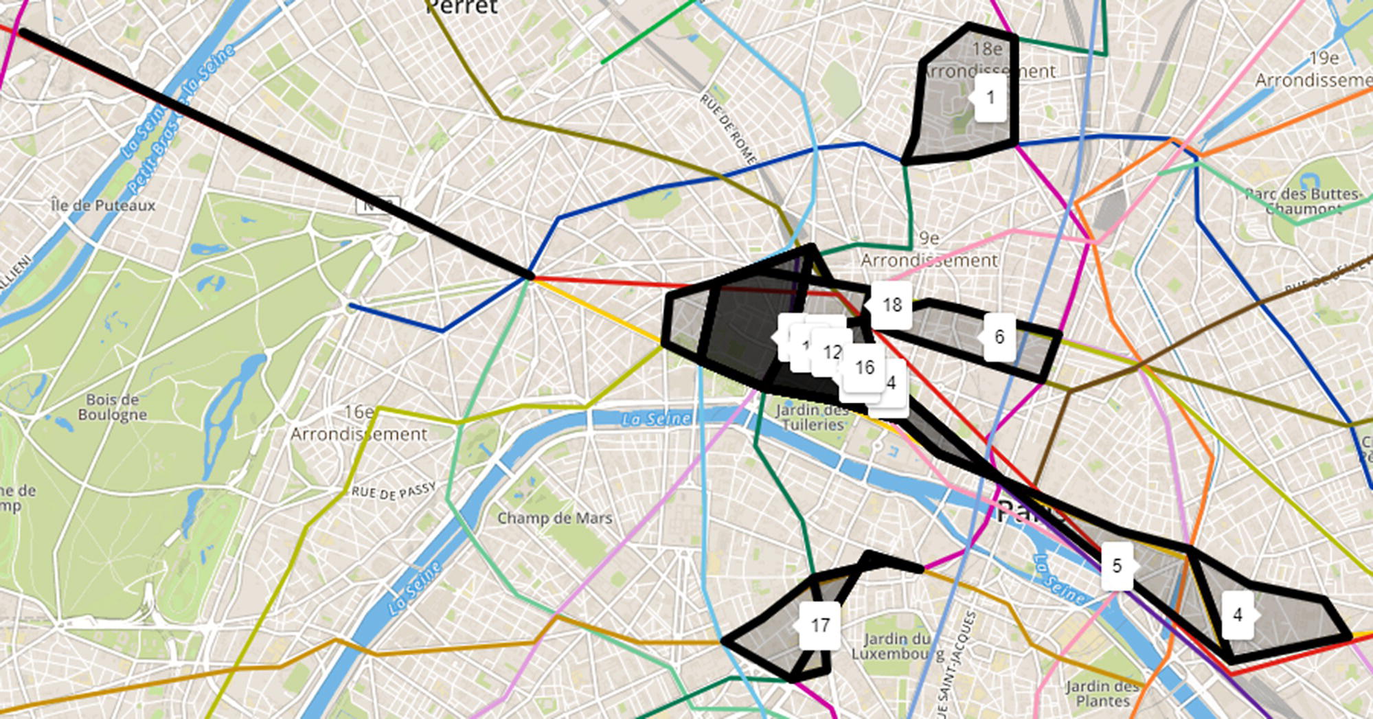
Figure 5.6 Cycles within the transportation network.
proc optnetworkdirection = directedlinks = mycas.metroparislinks;linksvarfrom = orgto = dstweight = dist;cyclealgorithm = buildmaxcycles = allminlength = 5maxlength = 10out = mycas.cyclemetroparis;run;
The Minimum Spanning Tree algorithm found that 510 stations can keep the same reachability from all of the 620 existing stations in the transportation network. The minimum spanning tree actually finds the minimum set of links to keep the same reachability of the original network. The stations associated with these links are the ones referred to previously. It is not a huge savings, but this difference tends to increase as the network gets more complex (for example by adding buses). Figure 5.7 shows all necessary pairs of stations, or existing links, to keep the same reachability of the original public transportation network. The thicker lines in the figure represent the links that must be kept maintaining the same reachability of the original network.
The following code shows how to search for the minimum spanning tree within the transportation network.
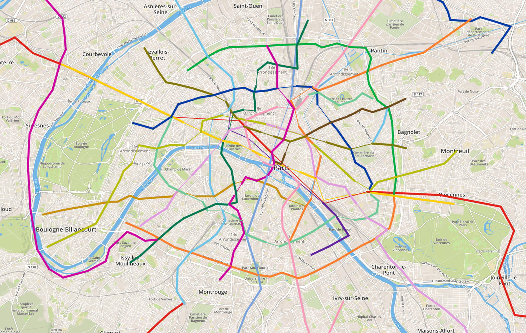
Figure 5.7 Minimum spanning tree within the transportation network.
proc optnetworkdirection = directedlinks = mycas.metroparislinks;linksvarfrom = orgto = dstweight = dist;minspantreeout = mycas.minspantreemetroparis;run;
The transportation network in Paris is a dense network. It holds a great number of possible routes to connect a pair of locations. For example, considering two specific locations like Volontaires and Nation, there are 7875 possible routes to connect them, even considering a constraint of 20 stations as a maximum length for the route. All possible paths between Volontaires and Nation can be found by running the Path algorithm and they are presented in Figure 5.8. In the figure we cannot see all of these multiple lines representing all the paths as most of steps use at least partially the same lines between stations. There are multiple interchange stations in the transportation network, and one single different step between stations can represent a whole new path. For that reason, there are a huge number of possible paths between a pair of locations like Volontaires and Nation.
The following code shows how to search for the paths between two locations within the transportation network.
proc optnetworkdirection = directedlinks = mycas.metroparislinks;linksvarfrom = orgto = dstweight = dist;pathsource = Volontairessink = Nationmaxlength = 20outpathslinks = mycas.pathmetroparis;run;
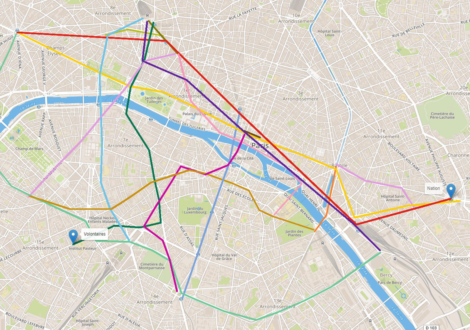
Figure 5.8 Paths within the transportation network between two locations.
As there are many possible paths between any pair of locations, it is good to know which one is the shortest. The Shortest Path algorithm reveals important information about the best route between any pair of locations, which improves the urban mobility within the city. For example, between Volontaires and Nation, there are paths varying from 11 steps to 20 (set as a constraint in the Path algorithms), ranging from 4.8 to 11.7 miles. The shortest path considers 16 steps summarizing 4.8 miles. Figure 5.9 shows the shortest path between Volontaires and Nation. Notice that the shortest path considers multiple lines in order to minimize the distance traveled. Perhaps changing lines that much increases the overall time to travel from one location to another. If the goal is to minimize the total time of travel, information about departs and arrivals would need to be added.
The following code shows how to search for the shortest paths between two locations within the transportation network.
proc optnetworkdirection = directedlinks = mycas.metroparislinks;linksvarfrom = orgto = dstweight = dist;shortestpathsource = Volontairessink = Nationoutpaths = mycas.shortpathmetroparis;run;
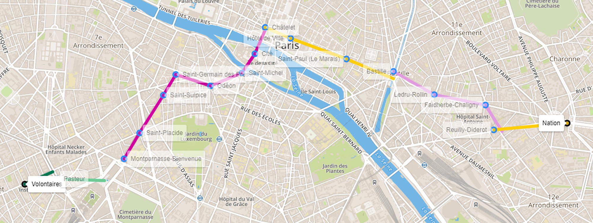
Figure 5.9 The shortest path between two locations within the transportation network.
Figure 5.10 The Pattern Match within the transportation network.
Finally, the Pattern Match algorithm searches for a pattern of interest within the network. For instance, one possible pattern is the distance between any two consecutive stations in the same line. Out of the 620 steps between stations in the same line, there are 44 steps over one mile of distance, as shown in Figure 5.10.
The following code shows how to create the query graph and then execute the pattern matching within the transportation network.
data mycas.pmmetroparislinks;set mycas.metroparislinks;if dist ge 1 thenweight = 1;elseweight = 0;run;proc sql;select count(*) from mycas.pmmetroparislinks where weight eq 1;quit;data mycas.linksquery;input from to weight;datalines;1 2 1;run;proc networkdirection = undirectedlinks = mycas.pmmetroparislinkslinksquery = mycas.linksquery;linksvarfrom = orgto = dstweight = weight;linksqueryvarvars = (weight);patternmatchoutmatchlinks = mycas.matchlinksmetroparis;run;
Now we have a better understanding of the transportation network topology, and we can enhance the optimal tour considering the multimodal transportation system, by adding the public lines options to the walking tour. A simple constraint on this new optimal tour is that the distance we need to walk from two points of interest and their respective closest stations should be less than the distance between those two points. For example, if we want to go from place A to place B. If the total distance of walking from the origin place A to the closest station to A plus from the closest station to B to the destination place B is greater than the distance to just walk from A to B, there is no reason to take the public transportation. We go by walking. If that distance is less than the distance from A to B, then we take the public transportation. Remember we are minimizing the walking distance, not the overall distance neither time.
In order to account for this small constraint, we need to calculate the closest station to each point of interest we want to visit. What stations serves those places we want to go, and which one is the closest. For each possible step in our best tour, we need to verify if it is better to walk or to take the public transportation.
The following code shows how to find the closest stations for each place. We basically need to calculate the distance between places and places, places and stations, and stations and stations. Then we order the links and pick the pair with the shortest distance. Figure 5.11 shows the locations and their closest stations on the map.
proc sql;create table placesstations asselect http://a.name as place, a.x as xp, a.y as yp, b.node as station,b.lat as xs, b.lon as ysfrom places as a, metronodes as b;quit;data placesstationsdist;set placesstations;distance=geodist(xs,ys,xp,yp,'M');output;run;proc sort data=placesstationsdist;by place distance;run;data stationplace;length ap $20.;ap=place;set placesstationsdist;if ap ne place thendo;drop ap;output;end;run;
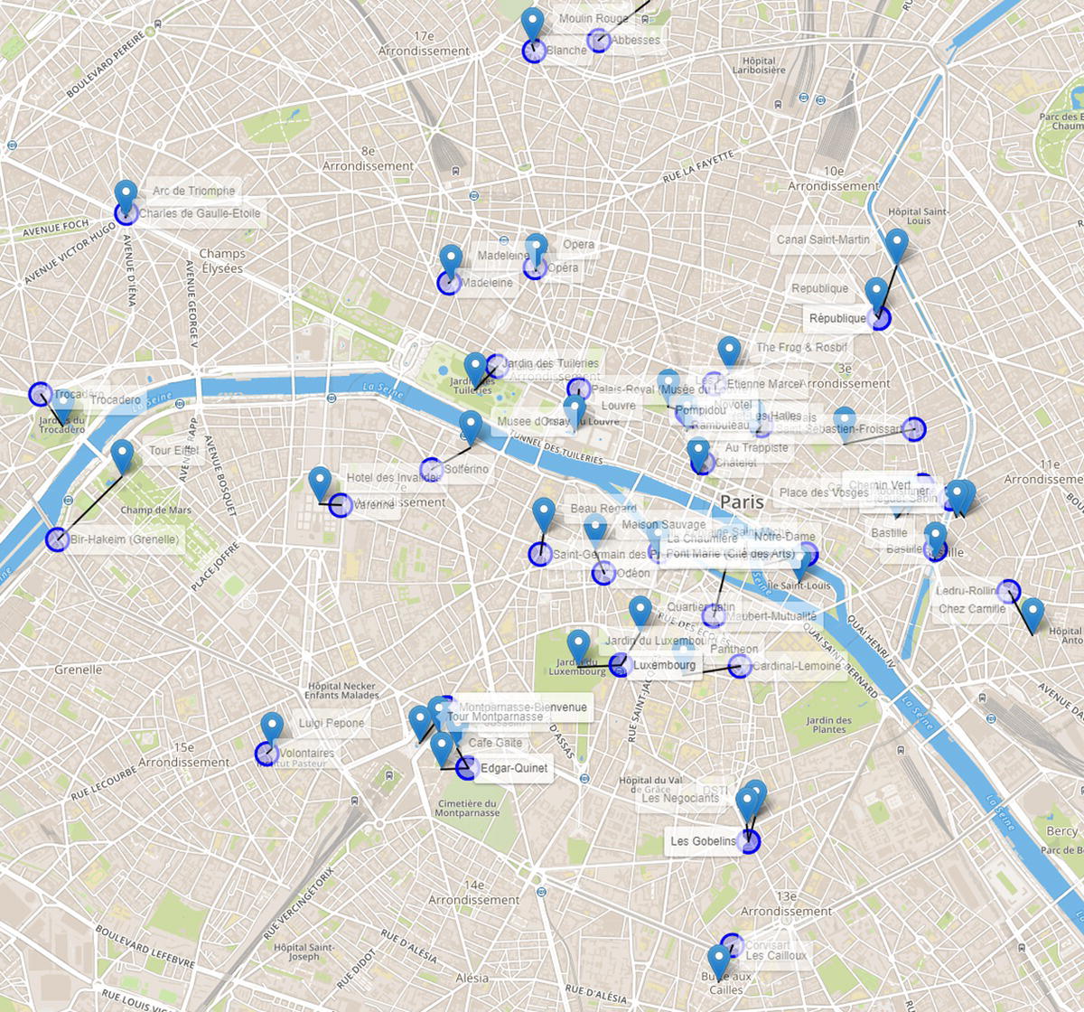
Figure 5.11 The closest stations to the locations to be visited.
Once we calculate the distances between all the places we want to visit and those places to the closest stations, we can compare all possible steps in our paths in terms of shortest distances to see if we take the public transportation or if we just walk. We then execute the TSP algorithm once again to search for the optimal tour considering both walking and the public transportation options. At this point, we know the optimal sequence of places to visit in order to minimize the walking distance, and we also know when we need to walk and when we need to take the public transportation.
Figure 5.12 shows the final optimal tour considering the multimodal system.
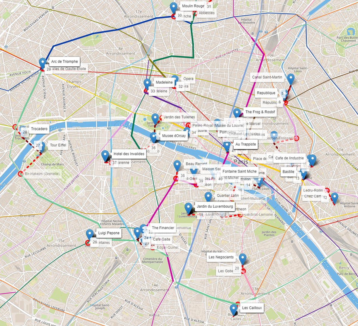
Figure 5.12 The final optimal tour considering the transportation network.
The solid lines in different colors (according to the transportation line) represent the shortest path between a pair locations (place‐station or station‐place) by taking the public transportation. The dashed lines represent the walking between a pair of locations (place‐station, station‐place, or place‐place).
For example, in step 21 of our tour, we stop at Les Cailloux, an Italian restaurant in the Butte aux Cailles district, an art deco architectural heritage neighborhood. From there we walk to the Covisart station, and we take line 6 until Edgar Quinet. From there we walk to Josselin and we grab a crepe (one of the best in the area). Then we walk to Café Gaité and we enjoy a beer, just people watching. The concept of a shot of coffee lasting for hours on the outside tables works for the beer, too. It is a very nice area with lots of bars and restaurants. Then we walk to the Tour Montparnasse. Probably the best view of Paris, because from there you can see the Tour Eiffel, and from the Tour Eiffel you cannot see the Tour Eiffel. We do not need to buy the ticket (18€) for the Observation Deck. We can go to the restaurant Ciel de Paris at the 56th floor and enjoy a coffee or a glass of wine. We may lose one or two floors of height, but we definitely save 13€ or 9€ depending on what we pick. From there we walk to the Financier, a nice pub. From there we walk to the Montparnasse station, and we take line 6 again. We drop off at the Pasteur station and switch to line 12. We drop off at the Volontaires station and we walk to the Pizzeria Luigi Pepone (the best pizza in Paris). And from there our tour continues. We are still in step 26, and we have 14 more steps to go.
The walking tour took us 19.4 miles and around six hours and 12 minutes. The multimodal tour takes us 27.6 miles (more than the first one) but we will walk just 2.8 miles. The entire tour will take about two hours and 30 minutes. Here is the dilemma. By stopping at so many restaurants and bars, we should walk more. But by walking more, we could not stop at so many bars and restaurants. Perhaps there is an optimization algorithm that helps us to solve this complex problem.
5.3 An Optimal Beer Kegs Distribution – The Vehicle Routing Problem Example in Asheville
The VRP algorithm aims to find optimal routes for one or multiple vehicles visiting a set of locations and delivering a specific amount of goods demanded by these locations. Problems related to distribution of goods, normally between warehouses and customers or stores, are generally considered a VRP. The VRP was first proposed by Dantzig and Ramser in the paper “The Truck Dispatching Problem,” published in 1959 by Informs in volume 6 of the Management Science. The paper describes the search for the optimal routing of a fleet of gasoline deliveries between a bulk terminal and a large number of service stations supplied by the terminal. The shortest routes between any two points in the system are given and a demand for one or several products is specified for a number of stations within the distribution systems. The problem aims to find a way to assist stations to trucks in such a manner that station demands are satisfied and total milage covered by the fleet is a minimum.
The VRP is a generalization of the TSP. As in the TSP, the solution searches for the shortest route that passes through each point once. A major difference is that there is a demand from each point that needs to be supplied by the vehicle departing from the depot. Assuming that each pair of points is joined by a link, the total number of different routes passing through n points is ![]() . Even for a small network, or a reduced number of points to visit, the total number of possible routes can be extremely large. The example in this case study is perfect to describe that. This exercise comprises only 22 points (n = 22). Assuming that a link exists between any pair of locations set up in this case, the total number of different possible routes is 562 000 363 888 803 840 000.
. Even for a small network, or a reduced number of points to visit, the total number of possible routes can be extremely large. The example in this case study is perfect to describe that. This exercise comprises only 22 points (n = 22). Assuming that a link exists between any pair of locations set up in this case, the total number of different possible routes is 562 000 363 888 803 840 000.
VRPs are extremely expensive, and they are categorized as NP‐hard because real‐world problems involve complex constraints like time windows, time‐dependent travel times, multiple depots to originate the supply, multiple vehicles, and different capacities for distinct types of vehicles, among others. When looking at the TSP, trying to minimize a particular objective function like distance, time, or cost, the VRP variation sounds much more complex. The objective function for a VRP can be quite different mostly depending on the particular application, its constraints, and its resources. Some of the common objective functions in VRP may consist of minimizing the global transportation cost based on the overall distance traveled by the fleet, minimizing the number of vehicles to supply all customersnn' demands, minimizing the time of the overall travels considering the fleet, the depots, the customers, and the loading and unloading times, minimizing penalties for time‐windows restrictions in the delivery process, or even maximizing a particular objective function like the profit of the overall trips where it is not mandatory to visit all customers.
There are lots of VRP variants to accommodate multiple constraints and resources associated with the.
- The Vehicle Routing Problem with Profits (VRPPs) as described before.
- The Capacitated Vehicle Routing Problem (CVRP) where the vehicles have limit capacity to carry the goods to be delivered.
- The Vehicle routing Problem with Time Window (VRPTW) where the locations to be served by the vehicles have limited time windows to be visited.
- The Vehicle Routing Problem with Heterogenous Fleets (HFVRP) where different vehicles have different capacities to carry the goods.
- The Time Dependent Vehicle Routing Problem (TDVRP) where customers are assigned to vehicles, which are assigned to routes, and the total time of the overall routes needed to be minimized.
- The Multi Depot Vehicle Routing Problem (MDVRP), where there are multiple depots from which vehicles can start and end the routes.
- The Open Vehicle Routing Problem (OVRP), where the vehicles are not required to return to the depot.
- The Vehicle Routing Problem with Pickup and Delivery (VRPPD), where goods need to be moved from some locations (pickup) to others locations (delivery), among others.
The example here is remarkably simple. We can consider one or more vehicles, but all vehicles will have the same capacity. The depot has a demand equal to zero. Each customer location is serviced by only one vehicle. Each customer demand is indivisible. Each vehicle cannot exceed its maximum capacity. Each vehicle starts and ends its route at the depot. There is one single depot to supply goods for all customers. Finally, customers demand, distances between customers and depot, and delivery costs are known.
In order to make this case more realistic, perhaps more pleasant, let us consider a brewery that needs to deliver its beer kegs to different bars and restaurants throughout multiple locations. Asheville, North Carolina, is a place quite famous for beer. The city is famous for other things, of course. It has a beautiful art scene and architecture, the colorful autumn, the historic Biltmore estate, the Blue Ridge Parkway, and the River Arts District, among many others. But Asheville has more breweries per capita than any city in the US, with 28.1 breweries per 100 000 residents.
Let us select some real locations. These places are the customers in the case study. For the depot, let us select a brewery. This particular problem has then a total of 22 places, the depot, and 21 restaurants and bars. Each customer has its own demands, and we are starting off with one single pickup truck with a limited capacity.
The following code creates the list of places, with the coordinates, and the demand. It also creates the macro variables so we can be more flexible along the way, changing the number of trucks available and the capacity of the trucks.
%let depot = 'Zillicoach Beer';%let trucks = 4;%let capacity = 30;data places;length place $20;infile datalines delimiter=",";input place $ lat long demand;datalines;Zillicoach Beer,35.61727324024679,-82.57620125854477,12Barleys Taproom, 35.593508941040184,-82.55049904390695,6Foggy Mountain,35.594499248395294,-82.55286640671683,10Jack of the Wood,35.5944656344917,-82.55554641291447,4Asheville Club,35.595301953719876,-82.55427884441883,7The Bier Graden,35.59616807405638,-82.55487446973056,10Bold Rock,35.596168519758706,-82.5532906435109,9Packs Tavern,35.59563366969523,-82.54867278235423,12Bottle Riot,35.586701815340874,-82.5664137278939,5Hillman Beer,35.5657625849887,-82.53578181164393,6Westville Pub,35.5797705582317,-82.59669352112562,8District 42,35.59575560112859,-82.55142220123702,10Workshop Lounge,35.59381883030113,-82.54921206099571,4TreeRock Social,35.57164142260938,-82.54272668032107,6The Whale,35.57875963366179,-82.58401015401363,2Avenue M,35.62784935175343,-82.54935140167011,4Pillar Rooftop,35.59828820775747,-82.5436137644324,3The Bull and Beggar,35.58724435501913,-82.564799389471,8Jargon,35.5789624127538,-82.5903739015448,1The Admiral,35.57900392043434,-82.57730888246586,1Vivian,35.58378161962331,-82.56201676356083,1Corner Kitchen,35.56835364052998,-82.53558091251179,1;run;
Here we are using the same open‐source package demonstrated in the previous case study to show the outcomes (places and routes) in a map. The code to create the HTML file showing the customersn' locations and their demands is quite similar to the code presented before, and it will be suppressed here. This code generates the map shown in Figure 5.13. The map presents the depot (brewery) and the 21 places (bars and restaurants) demanding different amounts of beer kegs. Notice in parentheses the number of beer kegs required by each customer.
Most of the customers are located in the downtown area, as shown in Figure 5.14.
The next step is to define the possible links between each pair of locations and compute the distance between them. Here, in order to simplify the problem, we are calculating the Euclidian distance between a pair of places, not the existing road distances. The VRP algorithm will take into account that Euclidian distance when searching for the optimal routing, trying to minimize the overall (Euclidian) distance for vehicle travel.
The following code shows how to create the links, compute the Euclidian distance, and create the customers' nodes without the depot.
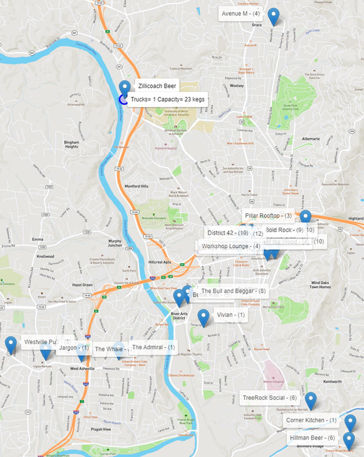
Figure 5.13 The brewery and the customers with their demands of beer kegs.
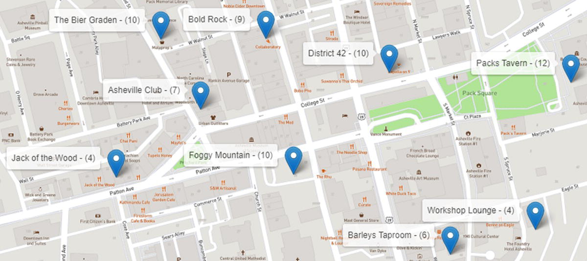
Figure 5.14 Customers located in downtown.
proc sql;create table placeslink asselect a.place as org, a.lat as latorg, a.long as longorg,b.place as dst, b.lat as latdst, b.long as longdstfrom places as a, places as bwhere a.place<b.place;quit;data mycas.links;set placeslink;distance=geodist(latdst,longdst,latorg,longorg,'M');output;run;data mycas.nodes;set places(where=(place ne &depot));run;
Once the proper input data is set, we can use proc optnetwork to invoke the VRP algorithm. The following code shows how to do that.
proc optnetworkdirection = undirectedlinks = mycas.linksnodes = mycas.nodesoutnodes = mycas.nodesout;linksvarfrom = orgto = dstweight = distance;nodesvarnode = placelower = demandvars=(lat long);vrpdepot = &depotcapacity = &capacityout = mycas.routes;run;
Figure 5.15 shows the results produced by proc optnetwork. It presents the size of the graph, the problem type, and details about the solution.
The output table ROUTES shown in Figure 5.16 presents the multiple trips the vehicle needs to perform in order to properly service all customers with their beer keg demands.
The VRP algorithm searches for the optimal number of trips the vehicle needs to perform, and the sequence of places to visit for each trip in order to minimize the overall travel distance, and properly supply the customers' demands. With one single vehicle, with a capacity of 23 beer kegs, this truck needs to perform six trips, going back and forth from the depot to the customers. Depending on the customersnnn' demands, and the distances between them, some trips can be really short, like route 2 with one single visit to Avenue M, while some trips can be substantially longer, like routes 4 and 6 with six customer visits. Figure 5.17 shows the outcomes of the VRP algorithm showing the existing routing plans in a map.
Let us take a step‐by‐step look at the overall routes. ho first route departs from the brewery and serves three downtown restaurants. The truck delivers exactly 23 beer kegs and returns to the brewery to reload. Figure 5.18 shows the first route.
The second route in the output table should be actually, at least logistically, the last trip the truck would make, delivering the remaining beer kegs from all customers' demands. This route has one single customer to visit, supplying only four beer kegs. To keep it simple, let us keep following the order of the routes produced by proc optnetwork, even though this route would be the last trip. The truck goes from the brewery to Avenue M and delivers four beer kegs. Figure 5.19 shows the second route.
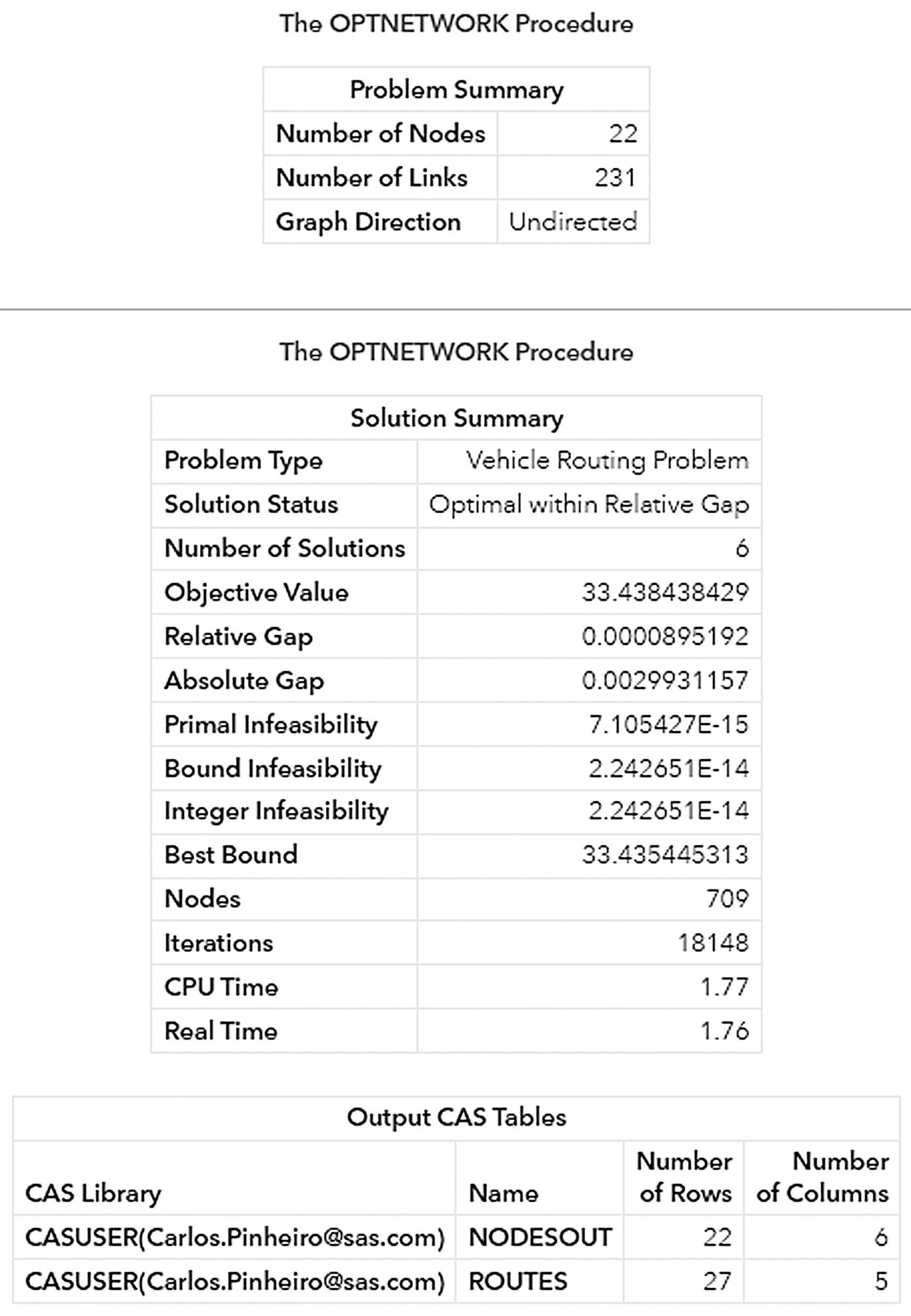
Figure 5.15 Output results from the VRP algorithm in proc optnetwork.
For the third route, the truck departs from the brewery and serves another three customers, delivering exactly 23 beer kegs, 4, 9, and 10, which is the maximum capacity of the vehicle. Figure 5.20 shows the third route.
Notice that the initial route is similar to the first one, but now the truck is serving three different customers.
Once again, the truck returns to the brewery to reload and departs to the fourth route. In the fourth route, shown in Figure 5.21, the truck serves six customers, delivering 23 beer kegs, 5, 1, 6, 6, 1, and 4.
Notice that the truck serves customers down to the south. It stops for two customers on the way to the south, continues on the routing serving another three customers down there, and before returning to the brewery to reload, it stops in the downtown to serve the last customer with the last four beer kegs.
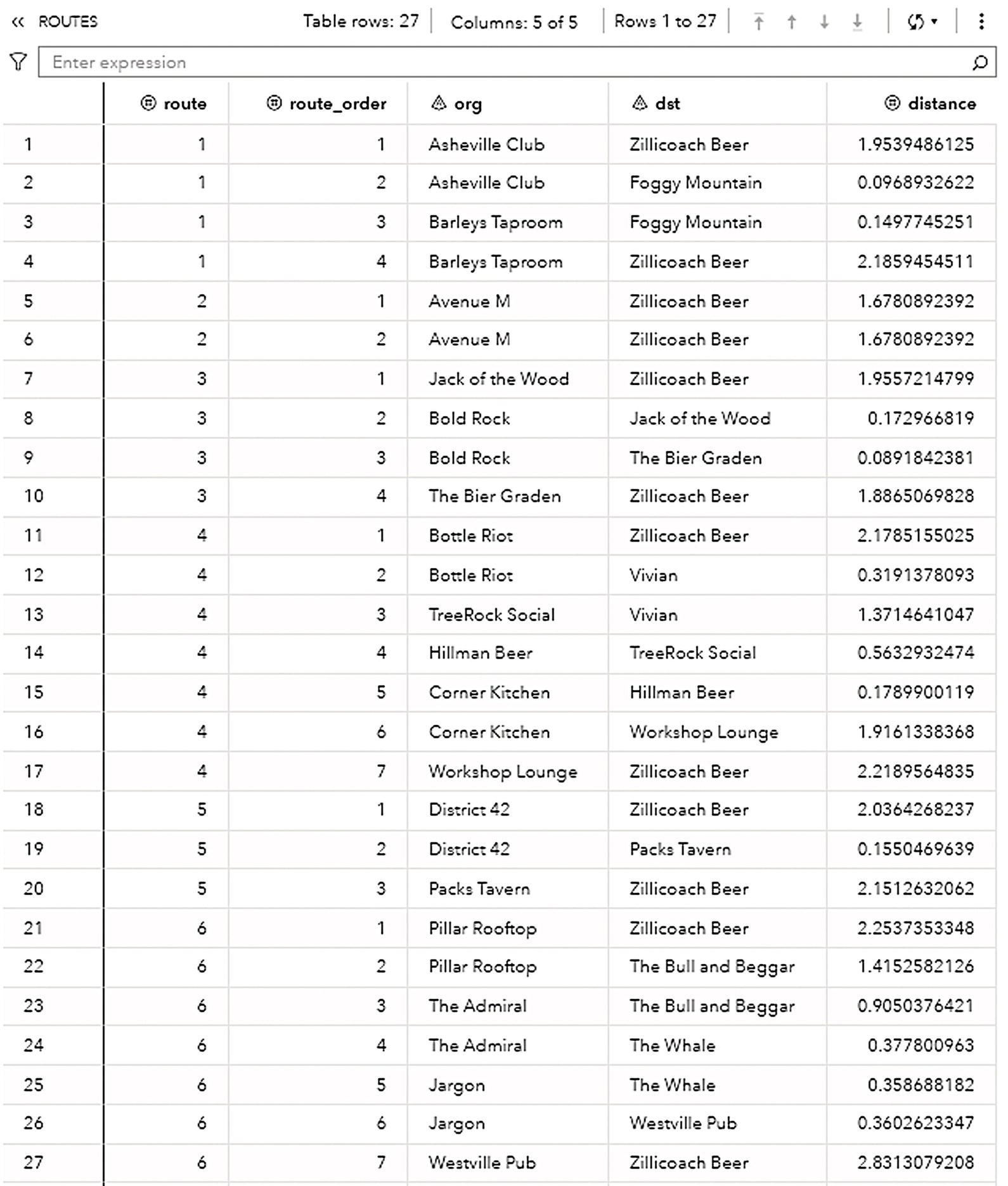
Figure 5.16 Output table with each route and its sequence.
The fifth route is a short one, serving only two customers in downtown. The truck departs from the brewery but now not with full capacity as this route supplies only 22 beer kegs, 10 for the first customer, and 12 for the second. Figure 5.22 shows the fifth route.
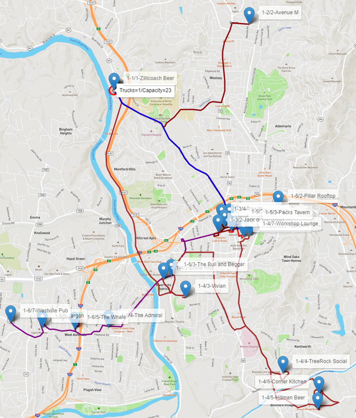
Figure 5.17 Six routes for one truck with 23 capacity.
As most of the bars and restaurants are located in the downtown, and the vehicle has a limit capacity, the truck needs to make several trips there. Notice in all the figures all different routes in the downtown marked in different colors and thicknesses. The thicker dark line represents the fifth route serving the customers in this particular trip.
The last trip serves customers in the west part of the town. However, there is still one customer in downtown to be served. Again, the truck serves six customers delivering 23 beer kegs. Figure 5.23 shows the last route for 1 route with 23 beer kegs of capacity.
Notice that the truck departs from the brewery and goes straight to downtown to deliver the first three beer kegs to the Pillar Rooftop. Then, it goes to the west part of the town to continue delivering the kegs to the other restaurants.
As a tour, after delivering all the beer kegs and supplying all the customers' demands, the truck needs to return to the brewery.
As we can observe, with only one single vehicle, there are many trips to the downtown, where most of the customers are located. Eventually the brewery will realize that in order to optimize the delivery, it will need more trucks, or a truck with a bigger capacity. Let us see how these options work for the brewery.
Originally, the VRP algorithm in proc optnetwork computes the VRP considering only one single vehicle with a fixed capacity.
For this case study, to simplify the delivery process, we are just splitting the original routes by the available vehicles. Most of the work here is done while creating the map to identify which truck makes a particular set of trips. The following code shows how to present on the map the multiple trips performed by the available trucks.
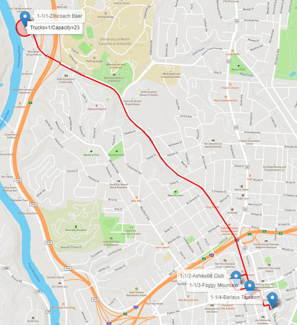
Figure 5.18 Route 1 considering one truck with 23 capacity.
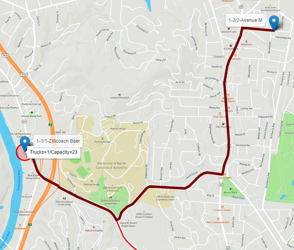
Figure 5.19 Route 2 considering one truck with 23 capacity.
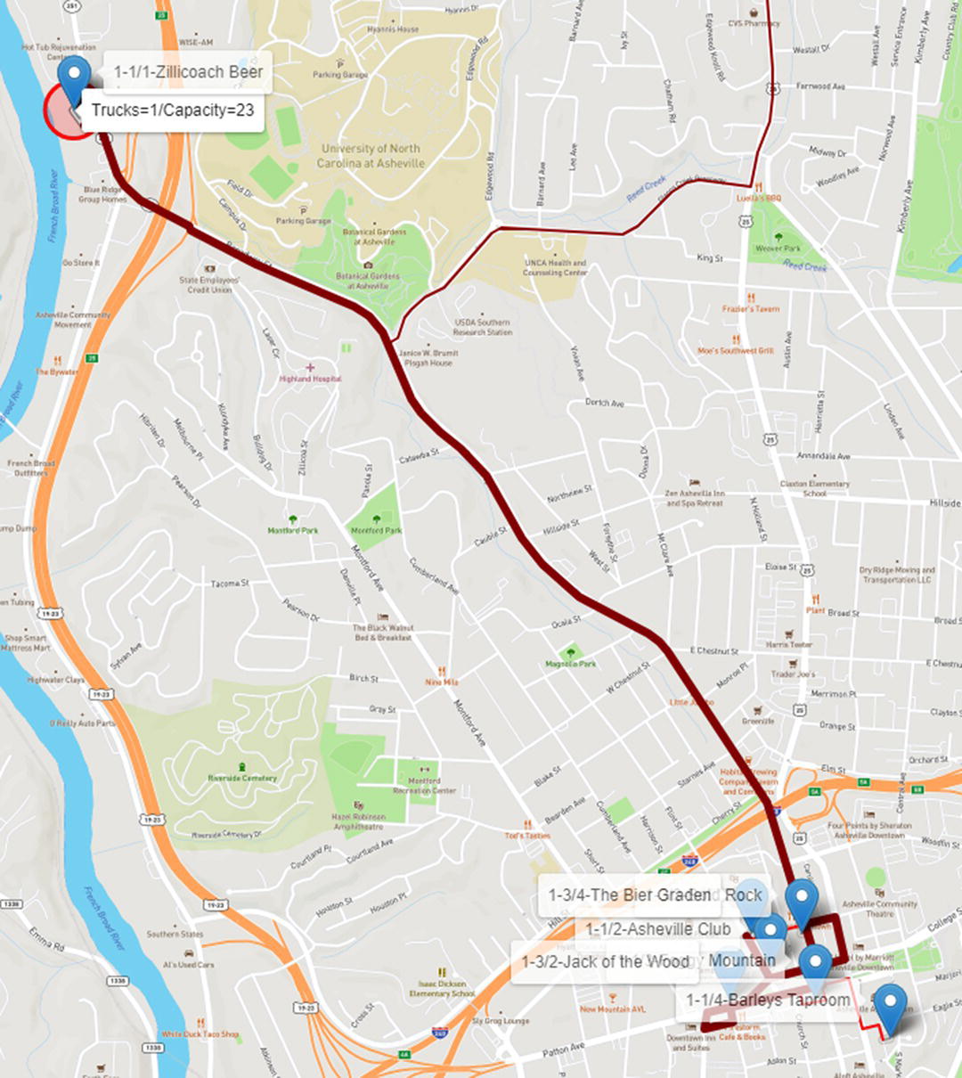
Figure 5.20 Route 3 considering one truck with 23 capacity.
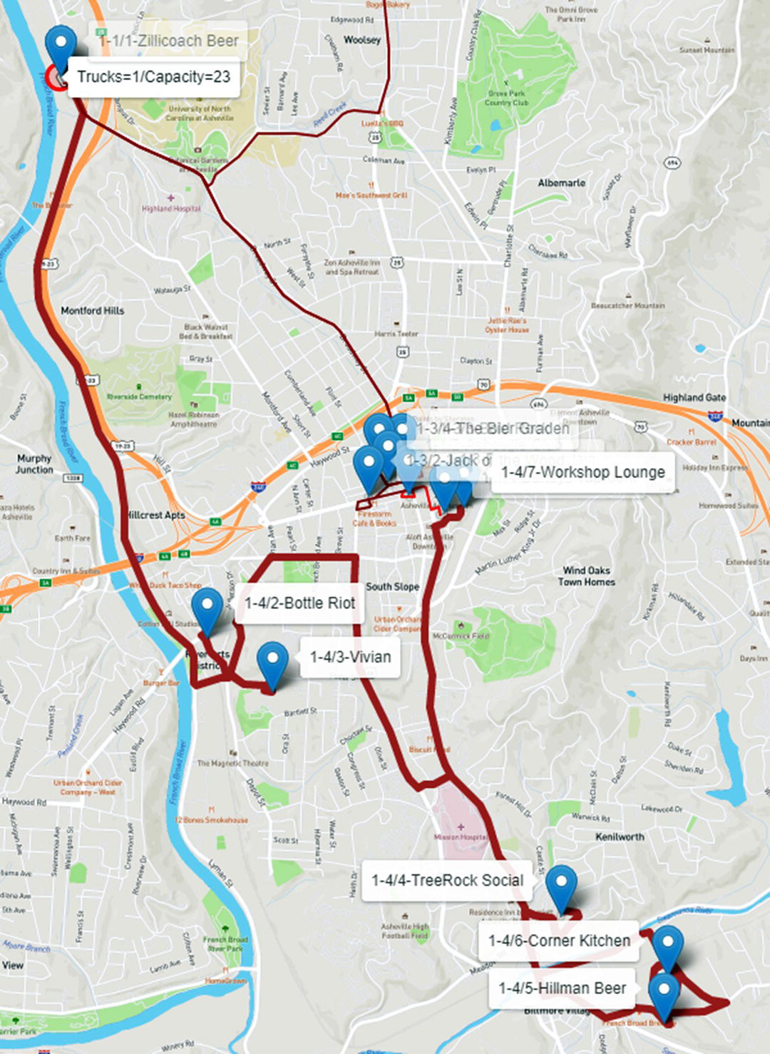
Figure 5.21 Route 4 considering one truck with 23 capacity.
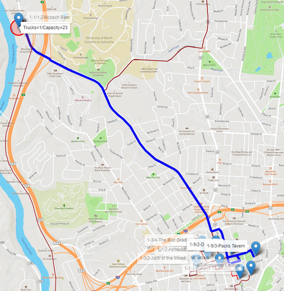
Figure 5.22 Route 5 considering one truck with 23 capacity.
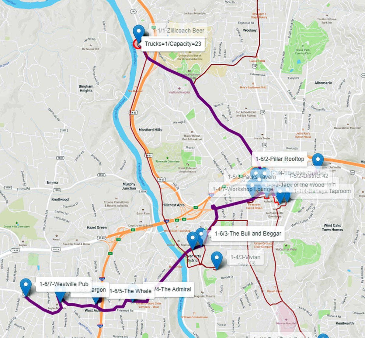
Figure 5.23 Route 6 considering one truck with 23 capacity.
proc sql;create table routing asselect a.place, a.demand, case when a.route=. then 1 else a.routeend as route, a.route_order, b.lat, b.longfrom mycas.nodesout as ainner join places as bon a.place=b.placeorder by route, route_order;quit;proc sql noprint;select place, lat, long into :d, :latd, :longd from routing wheredemand=.;quit;proc sql noprint;select max(route)/&trucks+0.1 into :t from routing;quit;filename arq "&dm/routing.htm";data _null_;array color{20} $ color1-color20 ('red','blue','darkred','darkblue',…length linha $1024.;length linhaR $32767.;ar=route;set routing end=eof;retain linhaR;file arq;k+1;tn=int(route/&t)+1;if k=1 thendo;put '<!DOCTYPE html>';put '<html>';put '<head>';put '<title>SAS Network Optimization</title>';put '<meta charset="utf-8"'/>';put '<meta name="viewport" content="width=device-width, ...put '<link rel="stylesheet" href=" https://unpkg.com/leaf ...put '<script src=" https://unpkg.com/[email protected]/dist/l ...put '<link rel="stylesheet" href=" https://unpkg.com/leaf ...put '<script src=" https://unpkg.com/leaflet-routing-mach ...put '<style>body{padding:0;margin:0;}html,body,#mapid{he...put '</head>';put '<body>';put '<div id="mapid"</div>';put '<script>';put 'var mymap=L.map("mapid").setView([35.59560349262985...put 'L.tileLayer(" https://api.mapbox.com/styles/v1/{id}/ ...linha='L.circle(['||"&latd"||','||"&longd"||'],{radius:8...put linha;linhaR='L.Routing.control({waypoints:[L.latLng('||"&latd...end;if route>ar thendo;if k > 1 thendo;linhaR=catt(linhaR,'],routeWhileDragging:fal...put linhaR;linhaR='L.Routing.control({waypoints:[L.latL...end;end;elselinhaR=catt(linhaR,',L.latLng('||lat||','||long||')');linha='L.marker(['||lat||','||long||']).addTo(mymap).bindToolt"'("'|...put linha;if eof thendo;linhaR=catt(linhaR,'],routeWhileDragging:false,showAlternatives:fals...put linhaR;put '</script>';put '</body>';put '</html>';end;run;
On the top of the map, where the brewery is located, we can see the number of trucks (2) and the capacity of the trucks (23) assigned to the depot. Now, each truck is represented by a different line size. First routes have thicker lines. Last routes have thinner lines so we can see the different trips performed by the distinct trucks, sometimes overlapping.
The first truck makes the routes 1, 2, and 3. Route 1 (thicker red) visits three customers in downtown, identified by the labels 1‐1/2‐Asheville Club, 1‐1/3‐Foggy Mountain, and 1‐1/4‐Barleys Taproom. This truck returns to the brewery, reloads, and visits in route 2 (thicker dark red) one single customer in the north, identified by the label 1‐2/2‐Avenue M. The truck returns to the depot, reloads and visits three other customers in route 3 (marron), once again in downtown, identified by the labels 1‐3/2‐Jack of the Wood, 1‐3‐3‐Bold Rock, and 1‐3/4‐The Bier Garden. It returns to the depot and stops the trips. In parallel, truck 2 goes west and down to the south in route 4 (brown), visiting six customers, labels 2‐4/2, 2‐4/3, 2‐4/4, 2‐4/5, 2‐4/6, and 2‐4/7. It returns to the depot, reloads, and goes for route 5 (violet) to visit two customers in downtown, identified by the labels 2‐5/2 and 2‐5/3. It returns to the brewery, reloads, and goes for the route 6 (purple) to visit the final six customers, 1 to the east, label 2‐6/2, 1 to the west, label 2‐6/4, and 4 to the far western part of the city, labels 2‐6/5, 2‐6/5, 2‐6/6, and 2‐6/7. The trucks return to the brewery and all routes are done in much less time. Figure 5.24 shows the routes for both trucks.
Finally, let us see what happens when we increase the number of trucks to 4 and the capacity of the trucks to 30 beer kegs. Now there are only four routes, and each truck will perform one trip to visit the customers.
The first truck takes route 1 (red) to downtown and the north part of the city visiting five customers, labeled 1‐1/2 to 1‐1/6. The second truck takes route 2 (blue) visiting two customers in downtown, labeled 2‐2/2 and 2‐2/3, three customer in the south, labeled 2‐2/4 to 2‐2/6, and one customer in the west, labeled 2‐2/7 before returning to the depot. Truck 3 takes route 3 (dark red) visiting three customers in downtown, labeled 3‐3/2 to 3‐3/4. Finally truck 4 takes route 4 (dark blue) visiting seven customers in the west and far west part of the city, labeled 4‐4/2 to 4‐4/8. Figure 5.25 shows the routes for all four trucks.
In this scenario, the downtown is served by trucks 1, 2, and 3, the north of the city is served by truck 1, while the south by truck 2. Finally, the west part of the city is served by truck 4.
Increasing the number of trucks and the capacity of the trucks certainly reduces the time to supply all customers’ demands. For example, in this particular case study, not considering the time to load and unload the beer kegs, just considering the routing time, the first scenario with one single truck, the brewery would take 122 minutes to cover all six trips and supply the demand of the 21 customers. The second scenario, with two trucks with the same capacity, the brewery would take 100 minutes to cover all six trips, three for each truck, 18% of reduction in the overall time. Finally, the last scenario with four trucks and a little higher capacity, the brewery would take only 60 minutes to cover all four trips, 1 for each truck, to serve all 21 customers around the city, with 51% of reduction in the overall time.
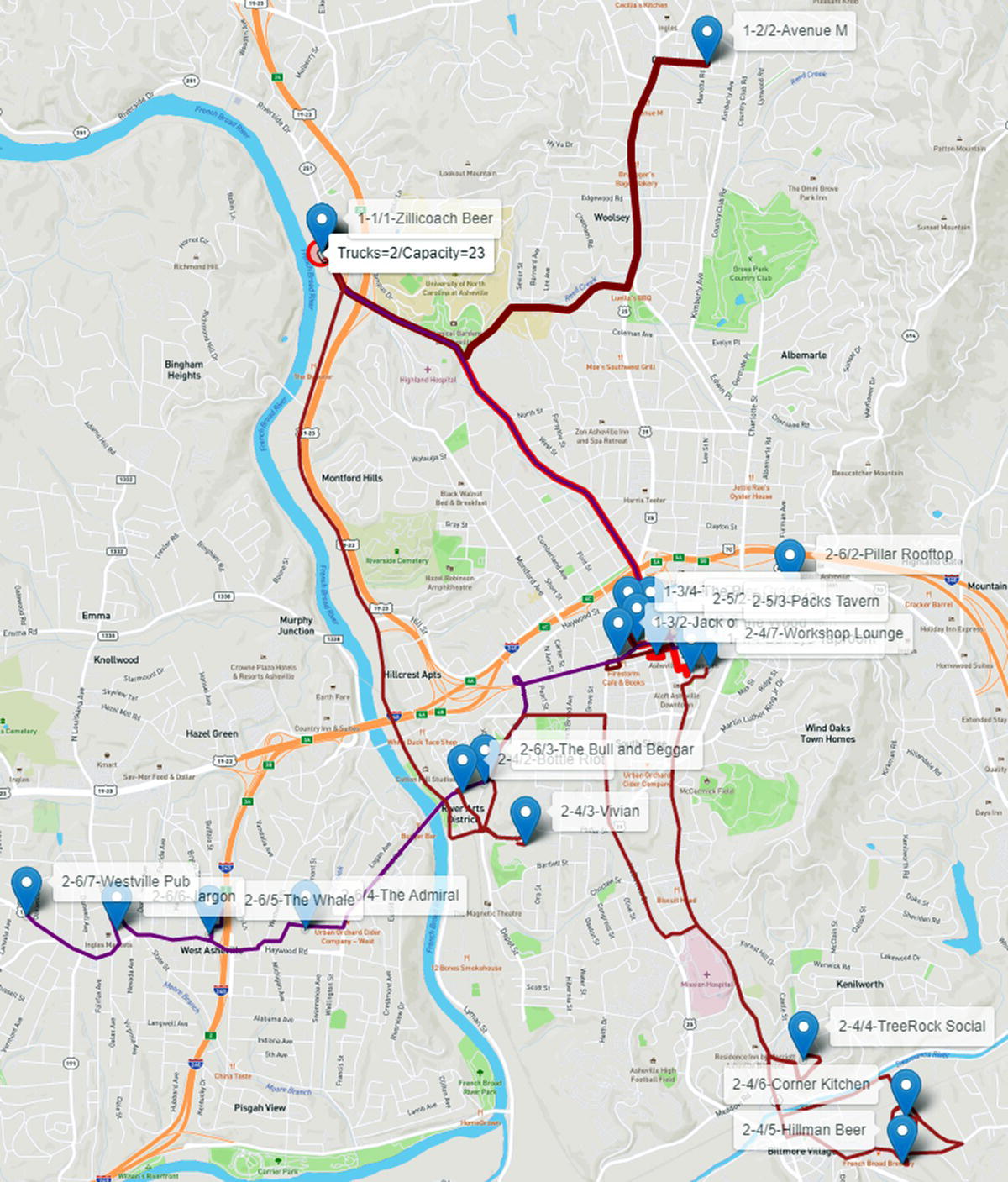
Figure 5.24 Routes considering two truck with 23 capacity.
The previous two case studies were created to advertise the SAS Viya Network Analytics features, particularly in the new TSP and VRP algorithms. For that reason, all the code used to create the cases were added to the case study description. Also, both case studies are pretty simple and straightforward, using only the TSP and VRP algorithms, with minor data preparation and post analysis procedures. The following case studies were real implementation in customers, considering multiple analytical procedures combined, such as data preparation and feature extraction, machine learning models, and statistical analysis, among others. The codes assigned to these cases are substantially bigger and much more complex than the ones created for the previous cases. For all these reasons, the code created for the following case studies are suppressed.
5.4 Network Analysis and Supervised Machine Learning Models to Predict COVID‐19 Outbreaks
Network analytics is the study of connected data. Every industry, in every domain, has information that can be analyzed in terms of linked data in a network perspective. Network analytics can be applied to understand the viral effects in some traditional business events, such as churn and product adoption in telecommunications, service consumption in retail, fraud in insurance, and money laundering in banking. In this case study, we are applying network analytics to correlate population movements to the spread of the coronavirus. At this stage, we attempt to identify specific areas to target for social containment policies, either to better define shelter in place measures or gradually opening locations for the new normal. Notice that this solution was developed at the beginning of the COVID‐19 pandemic, around April and May of 2020. At some point, identifying geographic locations assigned to outbreaks were almost useless as all locations around the globe were affected by the virus.
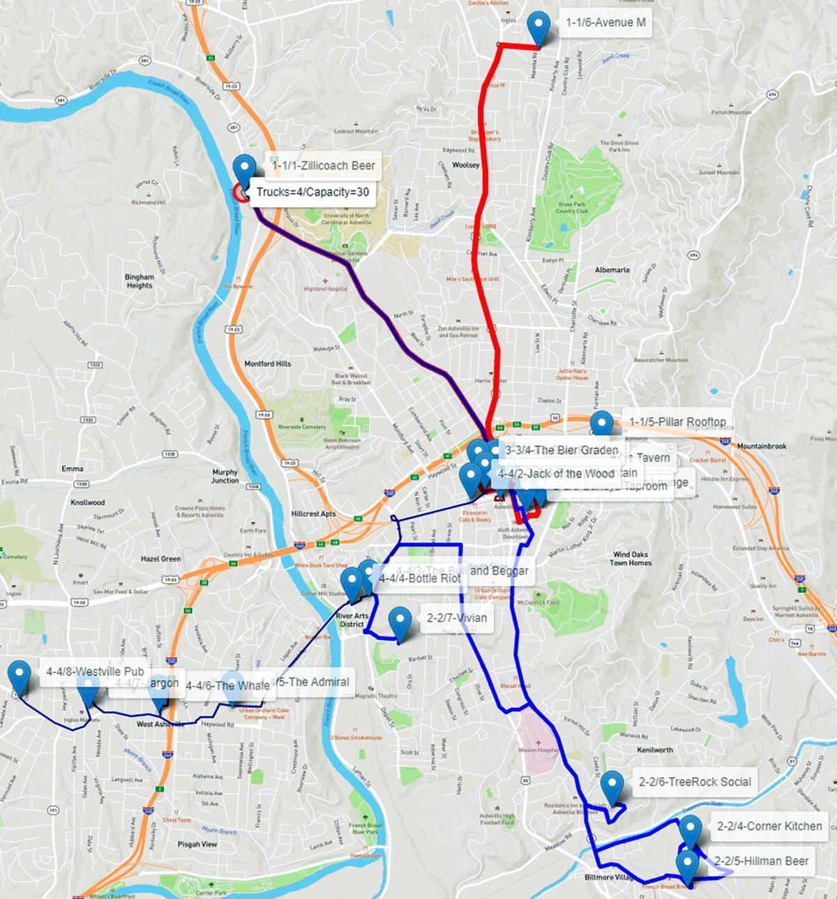
Figure 5.25 Routes considering four truck with 30 capacity.
Using mobile data, penetration of cell phones, companies market share, and population, we can infer the physical amount of movements over time between geographic areas. Based on this data, we use network algorithms to define relevant key performance indicators (KPIs) by geographic area to better understand the pattern of the spread of the virus according to the flow of people across locations.
These KPIs drive the creation of a set of interactive visualization dashboards and reports using visual analytics – which enable the investigation of mobility behavior and how key locations affect the spread of the virus across geographic areas over time.
Using network analytics and the KPIs, we can understand the network topology and how this topology is correlated to the spread of the virus. For example, one KPI can identify key locations that, according to the flow of people, contribute most to the velocity of the spread of the virus.
Another KPI can identify locations that serve as gatekeepers, locations that do not necessarily have a high number of positive cases but serve as bridges that spread the virus to other locations by flowing a substantial number of people across geographic regions. Another important KPI helps in understanding clusters of locations that have an elevated level of interconnectivity with respect to the mobility flow, and how these interconnected flows impact the spread of the virus among even distant geographic areas.
Several dashboards were created (in SAS Visual Analytics) in order to provide an interactive view, over time, of the mobility data and the health information, combined with the network KPIs, or the network metrics computed based on the mobility flows over time.
Figure 5.26 shows how population movements affects the COVID‐19 spread over the weeks in particular geographic locations. On the map, the blue circles indicate key locations identified by centrality metrics computed by the network algorithms. These locations play a key role in flowing people across regions. We can see the shades of red representing the number of positive cases over time. Notice that the key locations are also hot spots for the virus, presenting a substantial number of cases. These key locations are central to the flow of people in and out of geographic areas, even if those areas are distant from each other.
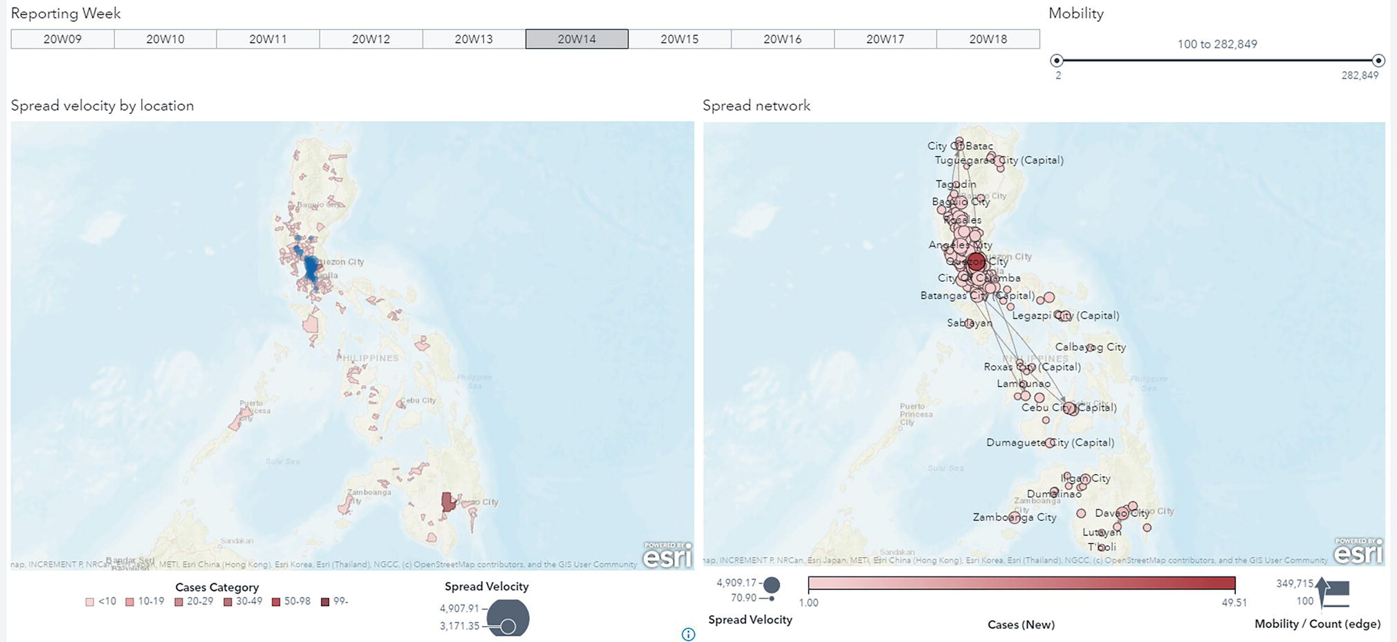
Figure 5.26 Population movement and COVID‐19 outbreaks over the weeks.
Notice that all those hot spots on the map are connected to each other by the flow of people. In other words, a substantial number of people flowing in and out between locations can affect the spread of the virus, even across a wide geographic region. The mobility behavior tells us how people travel between locations, and the population movement index basically tells us that a great volume of people flowing in and out increases the likelihood of the virus also flowing in and out between locations.
Here, we correlate the movement behavior and the spread of the virus over time. On the left‐side of the map, the areas in shades of red represent locations with positive cases and the blue bubbles represent the spread velocity KPI. In addition, note that most of the red areas are correlated to key locations highlighted by the KPI, on the right‐side of the map you can see the in and out flows between all these locations, which in fact drives the creation of this KPI. You can easily see how the flows between even distant locations can possibly also flow the virus across widespread geographic areas.
On the right side, the shades of red indicate how important these locations are in spreading the virus. These locations play an important role in connecting geographic regions by flowing people in and out over time. The right‐side map shows how all those hot spots on the left‐side map are connected to each other by the flow of people. The side‐ by‐ side maps show how movements between locations affect the spread of the virus.
As we commonly do when applying network analysis for business events, particularly in marketing, we performed community detection to understand the mobility behavior ’groups’ locations and the flow of people traveling between them. And it's no surprise that most of the communities group together locations, which are geographically close to each other. That means people tend to travel to near locations. Of course, there are people that probably need to commute long distances. But most people try to somehow stay close to work, school, or any important community to them. If they must travel constantly to the same place, it makes sense to live as close as possible to that place. Therefore, based on the in and out flows of people traveling across geographic locations, most communities comprise locations in close proximity. In terms of virus spread, this information can be quite relevant. As one location turns out to be a hot spot, all other locations in the same community might be eventually at a higher risk, as the number of people flowing between locations inside communities are greater than between locations outside communities. Figure 5.27 shows the communities identified by the network analysis algorithm based on the in and out flows of people across the geographic locations.
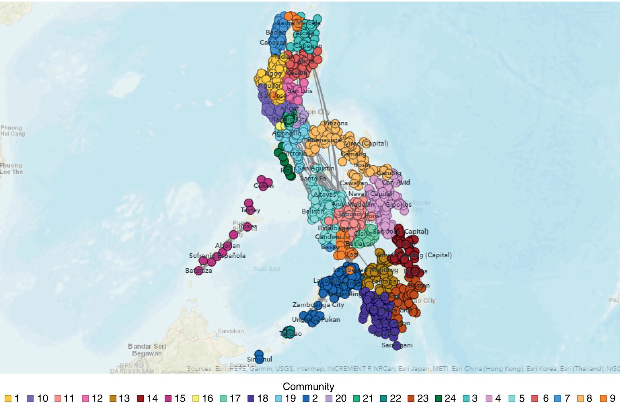
Figure 5.27 Communities based on the population movements.
Core decomposition is a way of clustering locations based on similar levels of interconnectivity. Here, interconnectivity means mobility. Core locations do not necessarily show a correlation to geographic proximity but instead, it shows a correlation to interconnectivity, or how locations are close to each other in terms of the same level of movements between them.
One of the most important outcomes from core is the high correlation to the wider spread of the virus. Locations in the most cohesive core do correlate over time to locations where new positive cases arise over time. By identifying cores, social containment policies can be more proactive in identifying groups of locations that should be quarantined together – rather than simply relying on geographic proximity to hotspots.
Locations within the most cohesive core are not necessarily geographically close, but hold between them a high level of interconnectivity, which means they consistently flow people in and out between them. Then they spread the virus wider. This explains the spread of the virus over time throughout locations geographically distant from each other, but close in terms of interconnectivity. Figure 5.28 shows the most cohesive core in the network and how the locations within that core are correlated to the spread of the virus across multiple geographic regions.
A combination of network metrics, or network centralities, creates important KPIs to describe the network topology, which explain the mobility behavior and then how the virus spreads throughout geographic locations over time.
Considering a specific timeframe, we can see the number of positive cases rising in some locations by the darker shades of red on the map. At the same time, we can see the flow of people between some of those hot spots. We see a great amount of people flowing between those areas, spreading the virus across different regions even if they are geographically distant from each other.
As time goes by, we notice the increase of the dark shades of red going farther from the initial hot spots, but also, we notice the flow of people between those locations. Again, the great volume of people moving from one location to another explains the spread of the virus throughout distant geographic regions. Even when you start getting even farther from the initial hot spots, we still see a substantial flow of people between locations involved in the spread of the virus. The mobility behavior, or the flow of people between locations, explains the spread across the most distant regions in the country. Figure 5.29 shows the key locations based on the centrality measures and the spread of the virus across the country.
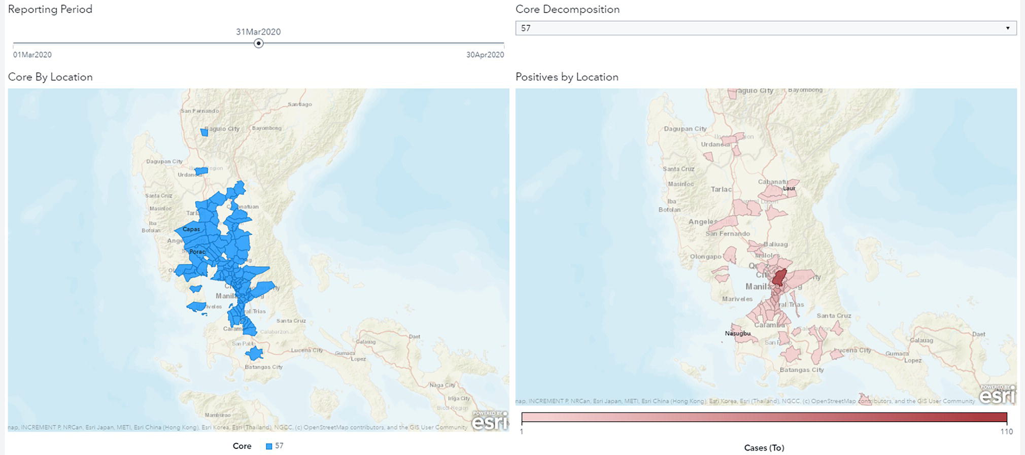
Figure 5.28 Key cities highlighted by the network metrics and the hot spots for COVID-19.
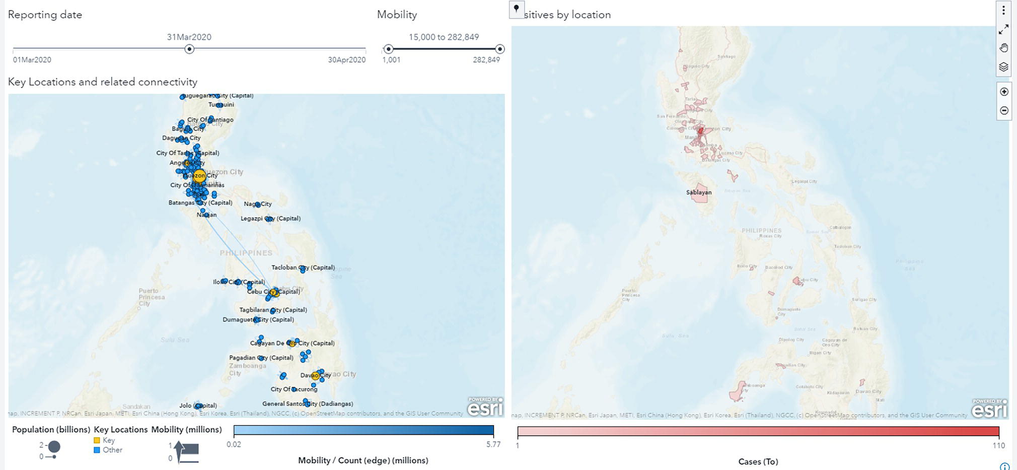
Figure 5.29 Key locations based on the network centrality measures.
A series of networks were created based on the population movements between geographic regions and the number of positive cases in these regions over time. For each network metric and each geolocation, we compute the correlation coefficient of the change in the network metric to the change in the number of positive cases. These coefficients provide evidence supporting the hypothesis that the way the network evolves over time in terms of mobility is directly correlated to the way the number of positive cases changes across regions.
The correlation between the geographic locations and the number of positive cases over time can also be used to create a risk level factor. Each geolocation has a coefficient of correlation between the combined network metrics and the number of positive cases at the destination and origin locations. These coefficients were used to categorize the risk of virus spreading. The risk level is binned into five groups. The first bin has about 1% of the locations; it is considered substantial risk. All locations in this bin have the highest risk for the number of positive cases to increase over time because of their incoming connections. The second bin has about 3–4% of the locations and is considered medium‐high risk. The third bin has about 5% of the locations and is considered medium risk. The fourth bin has about 40% of the locations and is considered medium‐low risk. Finally, the fifth bin has about 50% of the locations and is considered low risk. Figure 5.30 shows all groups on the map. The risk level varies from light shades of green for minimal risk to dark shades of red for high risk.
Based on the clear correlation between the computed network metrics and the virus spread over time, we decided to use these network measures as features to supervise machine learning models. In addition to the original network centralities and topologies measures, a new set of features were computed to describe the network evolution and the number of positive cases. Most of the derived variables are based on ratios of network metrics for each geographic location over time to determine how this changing topology affects the virus spread.
A set of supervised machine learning models were trained on a weekly basis to classify each geographic location in terms of how the number of positive cases would behave, increasing, decreasing, or remaining stable. Figure 5.31 shows the ROC and Lift curves for all models developed.
Local authorities can use the predictive probability reported by the supervised machine learning models to determine the level of risk associated with each geographic location in the country. This information can help them to better define effective social containment measures. The higher the probability, the more likely the location will face an increase in the number of positive cases. This risk might suggest stricter social containment. Figure 5.32 shows the results of the gradient boosting model in classifying the locations that are predicted to face an increase in the number of positive cases the following week. The model’s performance on average is about 92–98%, with an overall sensitivity around 90%. The overall accuracy measures the true positive rates as well as the true negative, false positive, and false negative rates. The sensitivity measures only the true positive rates, which can be more meaningful for local authorities when determining what locations would be targeted to social containment measures. The left side on the map shows the predicted locations. The shades of red determined the posterior probability of having an increase in the number of positive cases. The right side on the map shows how the model performed on the following week, with red showing the true‐positives (locations predicted and observed to increase cases), purple showing the false‐negatives (locations not predicted and observed to increase cases), and white showing the true‐negatives (locations predicted and observed to not increase cases).
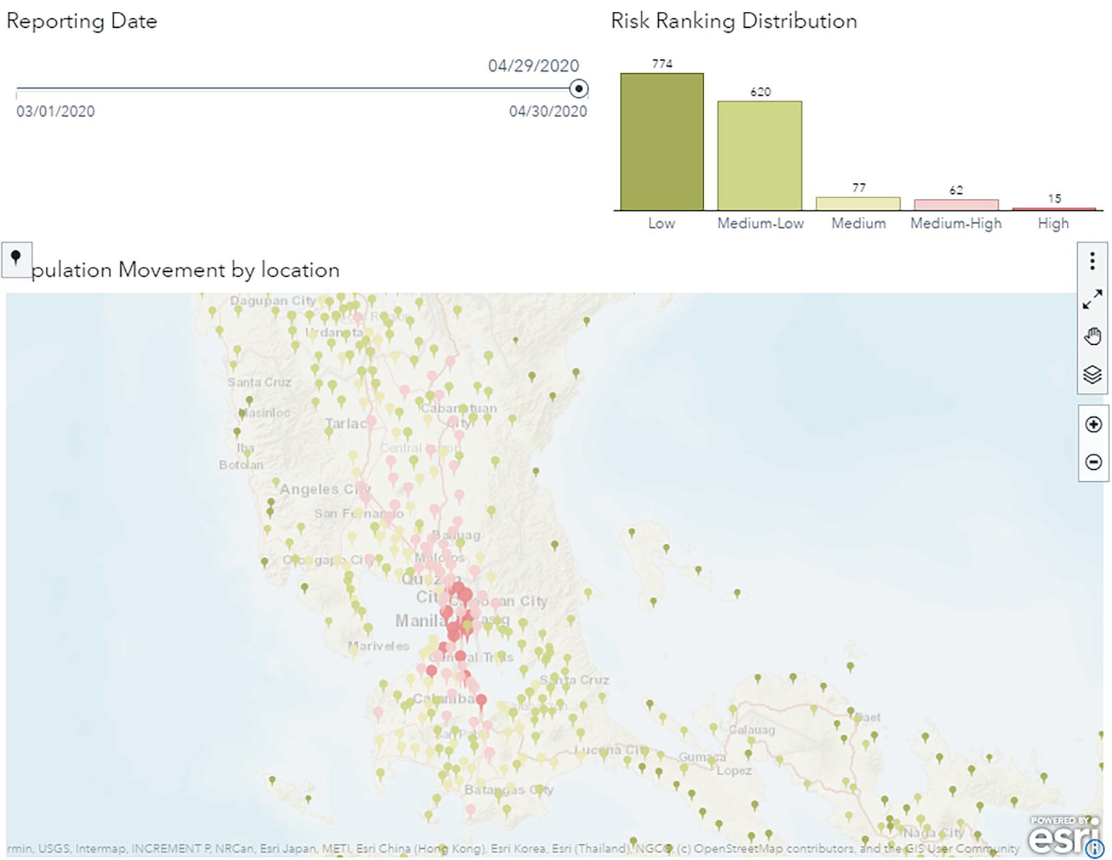
Figure 5.30 Final links associated to the optimal tour.
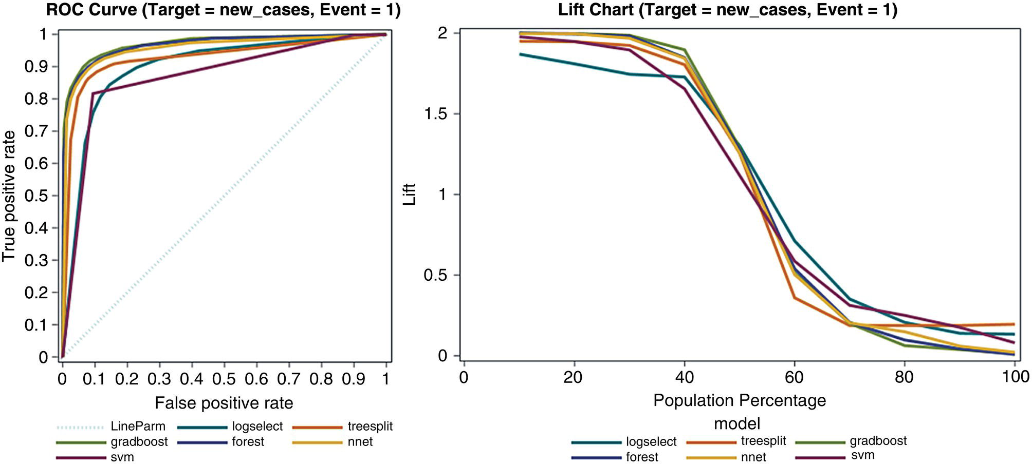
Figure 5.31 Supervised machine learning models performance.
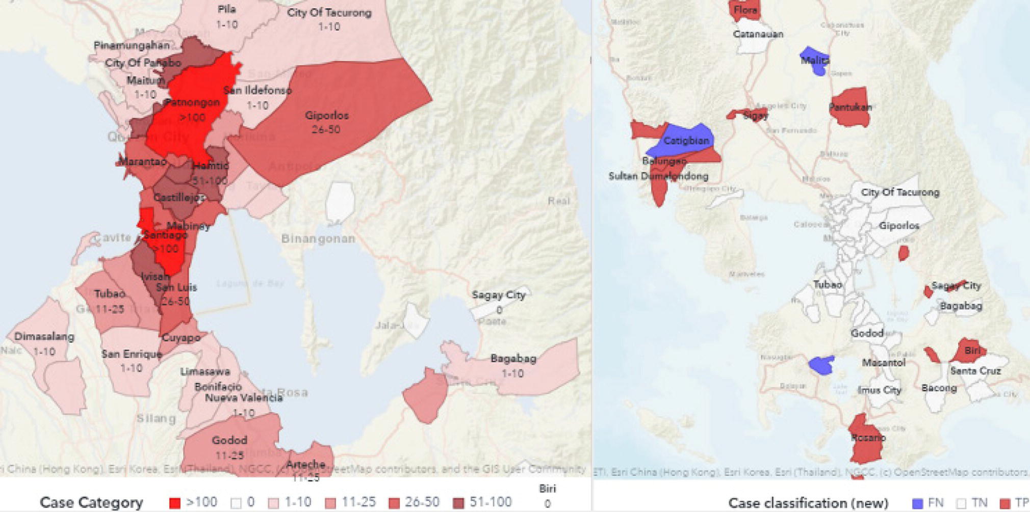
Figure 5.32 Outcomes of supervised machine learning models predicting outbreaks.
One of the last steps in the mobility behavior analysis is the calculation of inferred cases, or how the cases supposedly travel from one location to another over time. The mobility data collected from the carrier give us the information about how the population moves around geographic regions over time. The health data collected from the local authorities gives us the information about the number of cases in each location on a specific day. As the population moves between geographic regions within the country, and we assume that these moves affect the spread of the virus, we decided to infer the possible impact of the positives from one location to another. This information basically created a network of cases in a spatiotemporal perspective. Based on the inferred cases traveling from one location to another, we can observe what locations are supposedly flowing cases out, and what locations are supposedly receiving cases from other locations. The number of cases flowing between locations over time is an extrapolation of the number of people flowing in and out between locations and the number of positive cases in both origin and destination locations. Figure 5.33 shows the network of cases presenting possible flows of positive cases between geographic locations over time.
A spatiotemporal analysis on the mobility behavior can reveal valuable information about the virus spread throughout geographic regions over time. This type of analysis enables health authorities to understand the impact of the population movements on the spread of the virus and then foresee possible outbreaks in specific locations. The correlation between mobility behavior and virus spread allows local authorities to identify particular locations to be put in social containment together, as well as the level of severity required. Outbreak prediction provides sensitive information on the pattern of the virus spread, supporting better decisions when implementing shelter‐in‐place policies, planning public transportation services, or allocating medical resources to locations more likely to face an increase in positive cases. The analysis of mobility behavior can be used for any type of infectious disease, evaluating how population movements over time can affect virus spread in different geographic locations.
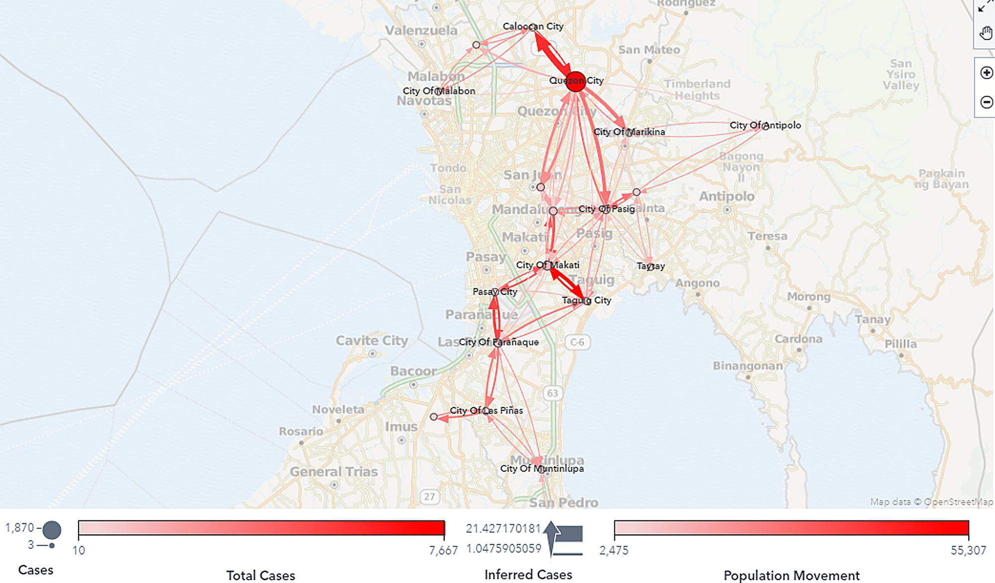
Figure 5.33 Inferred network of cases.
5.5 Urban Mobility in Metropolitan Cities
This case looks into urban mobility analysis, which has received reasonable attention over the past years. Urban mobility analysis reveals valuable insights about frequent paths, displacements, and overall motion behavior, supporting disciplines such as public transportation planning, traffic forecasting, route planning, communication networks optimization, and even spread diseases understanding. This study was conducted using mobile data from multiple mobile carriers in Rio de Janeiro, Brazil.
Mobile carriers in Brazil have an unbalanced distribution of prepaid and postpaid cell phones, with the majority (around 80%) of prepaid, which does not allow the proper customers address identification. Valuable information to identify frequent paths in urban mobility is the home and workplace addresses for the subscribers. For that, a presumed domicile and workplace addresses for each subscriber were created based on the most frequent cell visited during certain period of time. For example, overnight as home address and business hours as work address. Home and work addresses allow the definition of an Origin–Destination (OD) matrix and crucial analysis on the frequent commuting paths.
A trajectory matrix creates the foundation for the urban mobility analysis, including the frequent paths, cycles, average distances traveled, and network flows, as well as the development of supervised models to estimate number of trips between locations. A straightforward advantage of the trajectory matrix is to reveal the overall subscribers’ movements within urban areas. Figure 5.34 shows the most common movements performed in the city of Rio de Janeiro.
Two distinct types of urban mobility behavior can be analyzed based on the mobile data. The first one is related to the commuting paths based on the presumed domiciles and workplaces, which provides a good understanding of the population behavior on the home‐work travels. The second approach accounts for all trips considering the trajectory matrix. Commuting planning is a big challenge for great metropolitan areas, particularly considering strategies to better plan public transportation resources and network routes. Figure 5.35 shows the distribution of the presumed domiciles and workplaces throughout the city. Notice that some locations present a substantial difference in volume of domiciles and workplaces, which affects the commuting traffic throughout the city. For example, downtown has the highest volume of workplaces and a low volume of domiciles. Some places on the other hand show a well‐balanced distribution on both, like the first neighborhood in the chart, presenting almost the same number of domiciles and workplaces. As an industrial zone, workers tend to search home near around.
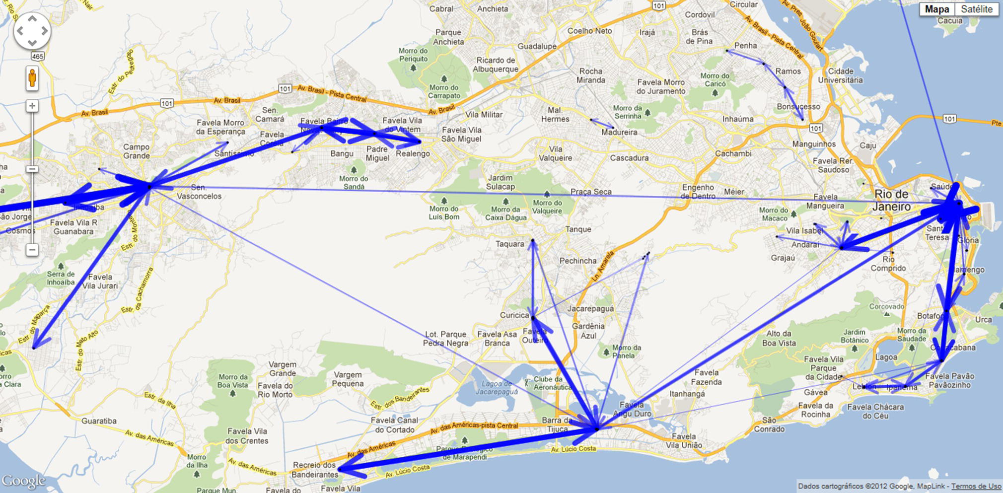
Figure 5.34 Frequent trajectories in the city of Rio de Janeiro.
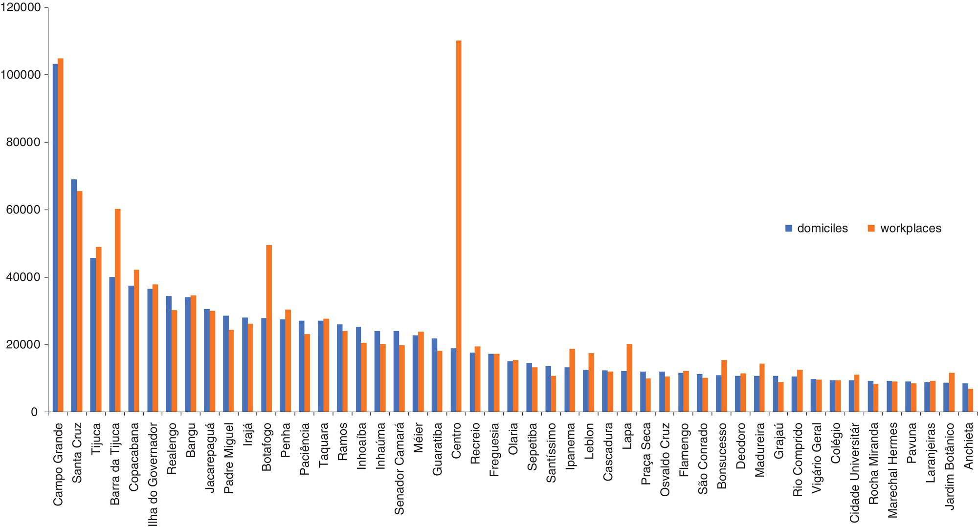
Figure 5.35 Number of domiciles and workplaces by neighborhoods.
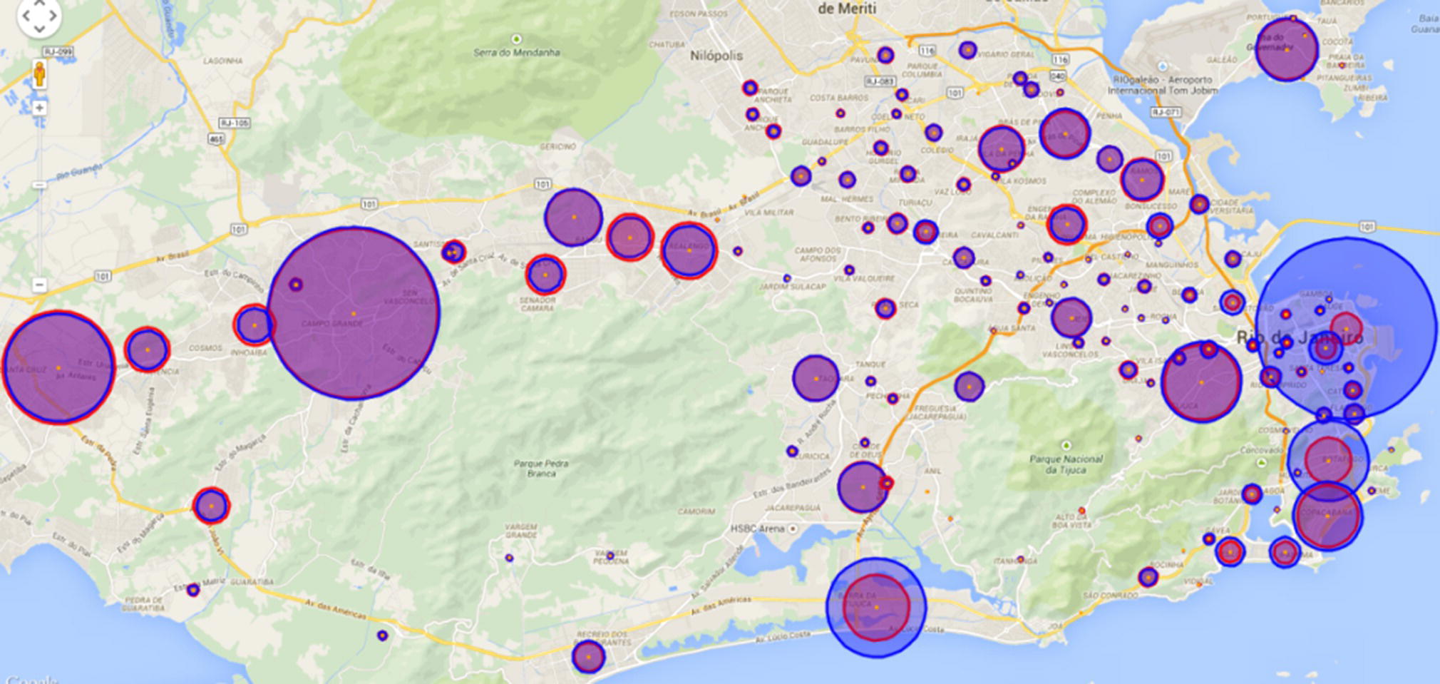
Figure 5.36 Geo map of the presumed domiciles and workplaces.
Figure 5.36 shows graphically the distribution of domiciles and workplaces throughout the city. The diameter of each circle indicates the population living or working on the locations, with light (red) circles representing the presumed domiciles and the dark (blue) circles representing the presumed workplaces. When the number of presumed domiciles and workplaces are similar, the circles overlap, and less traffic or commuting is expected. When the sizes of the circles are substantially different, it means significant commuting traffic is expected in the area.
The network created by the mobile data is defined by nodes and links. Here, the nodes represent the cell towers, and the links represent the subscribers moving from one cell tower to another. The nodes (cell towers) can be aggregated by different levels of geographic locations, like neighborhoods or towns. The links (subscribers’ movements) can also be aggregated in the same way, like, subscribers’ movements between cell towers, between neighborhoods, or between towns.
The most frequent commuting paths are identified based on the presumed domiciles and workplaces and are presented in Figure 5.37. The thicker the lines, the higher the traffic between the locations. These paths include commuting travels between various places within the western zone (characterized by domiciles and workplaces on the left side of the map) and within the eastern zone (mostly characterized by workplaces on the far right side of the map). The paths indicate that there are a reasonable number of people living near their workplaces because these displacements are concentrated in specific geographic areas (short movements). According to this study, 60% of movements are intra‐neighborhood, and 40% of them are inter‐neighborhood. Neighborhoods in Rio are sometimes quite large, around the size of town in U.S. or small cities in Europe. However, there are also significant commuting paths between different areas represented by long and high‐volume movements. On the map, we can observe a thicker line in the west part between Santa Cruz and Campo Grande, two huge neighborhoods on the left side of the map. There are also several high volume commuting paths between Santa Cruz and Campo Grande to Barra da Tijuca, a prominent neighborhood in the south zone, on the bottom of the map, and between those three neighborhoods to Centro (downtown), in the east zone of the city, on the far‐right side of the map. From Centro, the highest commuting traffic to Copacabana, the famous beach, and Tijuca, a popular neighborhood. One interesting commuting path is between downtown and the airport’s neighborhood, Ilha do Governador. Notice a thicker line between downtown and the airport crossing the bay. Here we have the Euclidian distances between each pair of locations, not the real routing.
Figure 5.38 shows the number of subscribers’ displacements in the city of Rio de Janeiro during the week. This distribution is based on six months of subscribers’ movement aggregated by the day of the week and one‐hour time slots. We can observe that subscribers’ mobility behavior is approximately similar for all days of the week. For each day, regardless of weekday or weekend, the mobility activity is proportionally equal, varying similar during each day, and presenting two peaks during the 24 time slots. The first peak is around time slot 12, and the second peak is recorded at time slot 18. Both peaks occur daily. The difference in the mobility behavior on weekdays over weekends relies on the total number of movements and the peaks. The first peak of mobility activity is always during lunch time, both on weekdays and weekends. The second peak of mobility activity is always early evening. This period includes mostly commuting and leisure. At the beginning of the week – i.e. Mondays and Tuesdays – and at the end – i.e. Fridays, Saturdays, and Sundays, the first peak is higher than the second one, which means higher traffic at 12 than at 18. However, there is no difference on Wednesdays, where the traffic is virtually the same. On Thursdays, the highest peak is at 18, where the traffic is higher than at 12. A likely reason for this difference in mobility behavior is the happy hour, very popular on Thursdays. Nightlife in Rio is famous for locals and tourists. The city offers a variety of daily events, from early evening till late night. But a culture habit in the city is the happy hour, when people leave their jobs and go to bars, cafes, pubs, and restaurants to socialize (the formal excuse is to avoid the traffic jam). As in many great cosmopolitan cities around the globe, many people go for a happy hour after work. Even though all nights are busy in Rio, it is noticeable that on Thursdays it is the most frequented day for happy hour. Wednesdays are also quite famous, even more than Fridays. The mobility activity distribution during the week reinforces this perception.
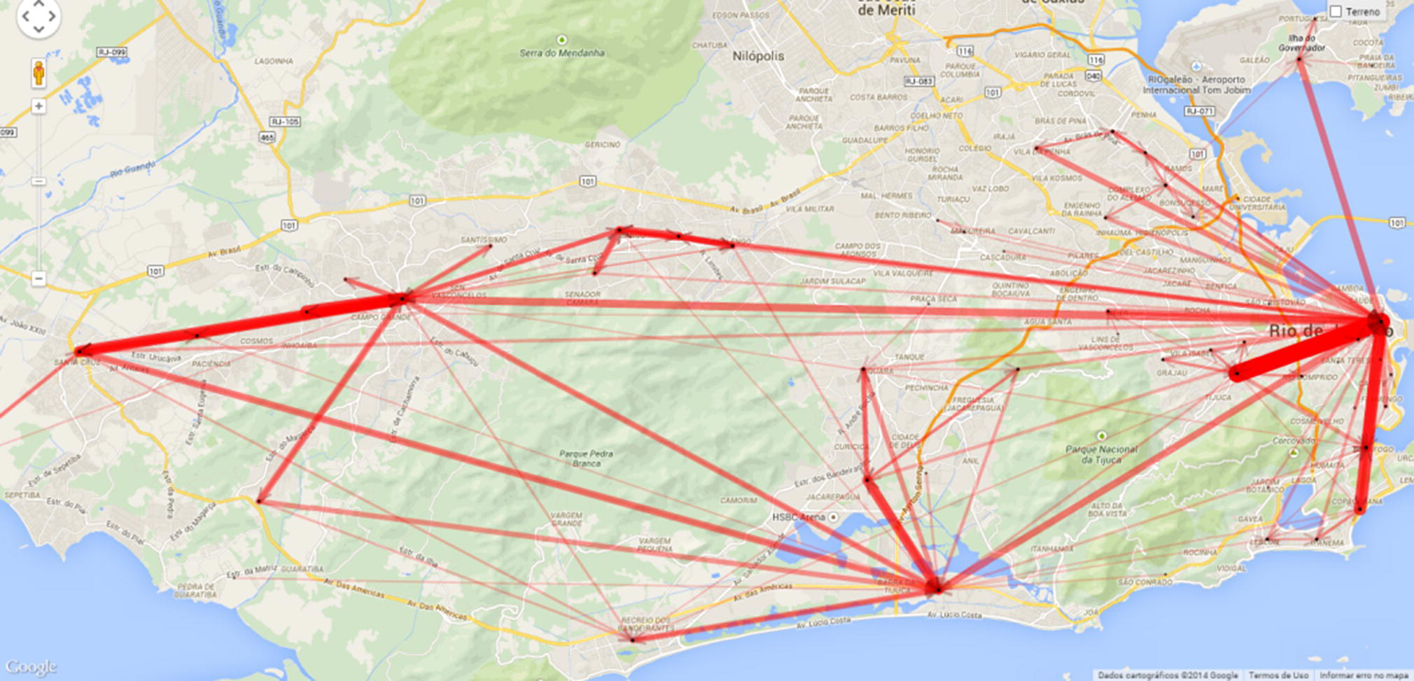
Figure 5.37 Frequent commuting paths in the city of Rio de Janeiro.
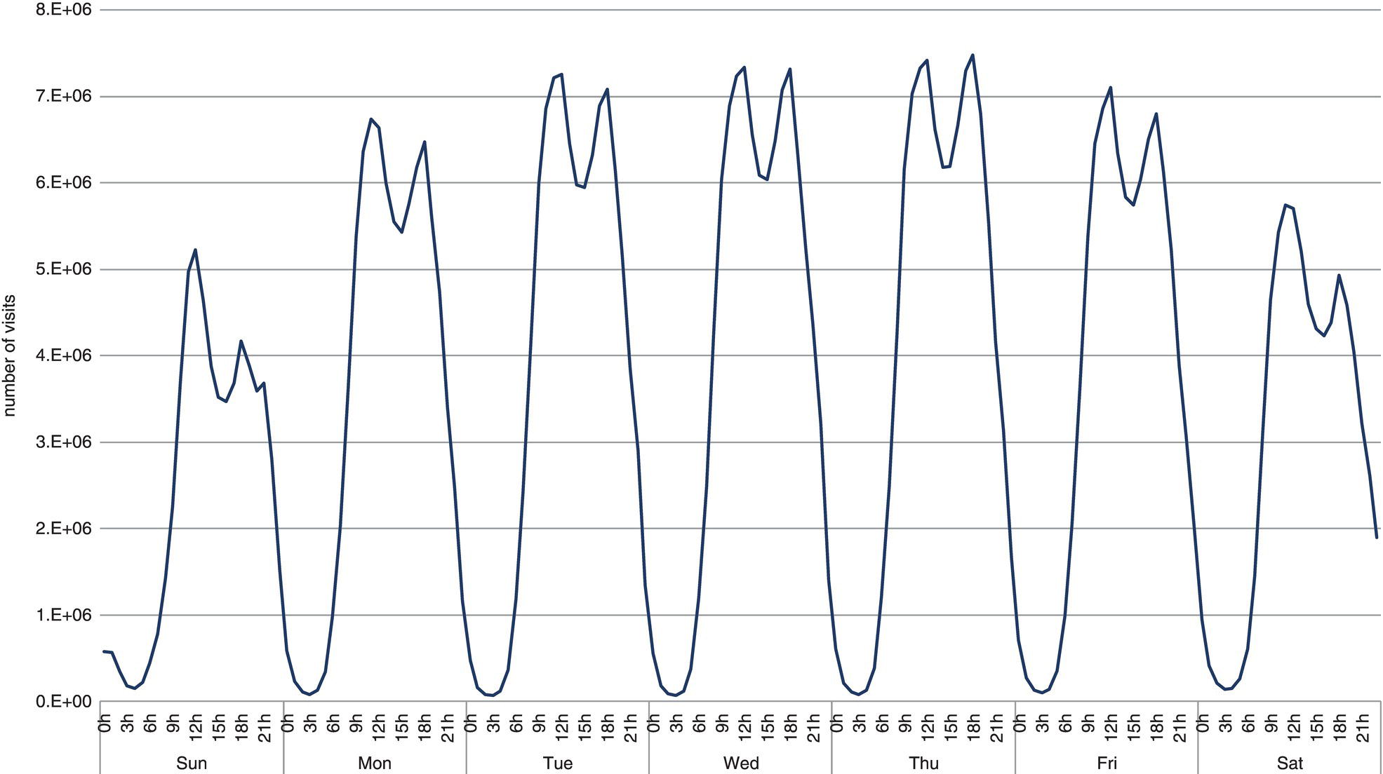
Figure 5.38 Traffic volume by day.
When analyzing urban mobility behavior in great metropolitan areas over time, an important characteristic in many studies is that some locations are more frequently visited than others, and as a consequence, some paths are more frequently used than others. The urban mobility distribution is nonlinear, and often follows a power law, which represents a functional relation between two variables, where one of them varies as a power of another. Generally, the number of cities having a certain population size varies as a power of the size of the population. This means that few cities have a huge population size, while most of the cities have a small population. Similar behavior is found in the movements. The power law distribution in the urban mobility behavior contributes highly to the migration trend patterns and frequent paths in great cities, states, and even countries.
For example, consider the number of subscribers’ visits to the cell towers, which ultimately represents the subscribers’ displacements. We can observe that some locations are visited more than others. Based on the sample data, approximately 8% of the towers receive less than 500 visits per week and another 7% receive between 500 and 1000 visits. Almost 25% of the towers receive 1000 to 5000 visits a week, 11% 5–10 K and 15% 10–25 K. Those figures represent 66% of the locations, receiving only 15% of the traffic. On the other hand, 16% of the towers receive over 20% of the traffic, 9% almost 30%, 5% almost 15%, and 3% more than 11% of the traffic. That means one third of the locations represent over three quarters of the traffic.
The average level of mobility in the city of Rio de Janeiro is substantial. Most users visit a reasonable number of distinct locations during their frequently used paths. The average number of distinct locations visited on a weekly basis is around 30. However, a crucial metric in urban mobility is the average distance traveled. Rio de Janeiro is the second largest metropolitan area in Brazil, the third in South America, the sixth in America, and the 26th in the world. Because of that, it is reasonable that people need to travel midi to long distances when moving around the city, for both work and leisure. The average distance traveled by the subscribers during the frequent paths is around 60 km daily. As an example, the distance between the most populated neighborhood, Campo Grande, and the neighborhood with more workplaces, Centro, is 53.3 km. Everyone who lives in Campo Grande and works in Centro needs to travel at least 106 km daily. The distribution of the distance traveled by subscribers along their frequent paths is presented in Figure 5.39.
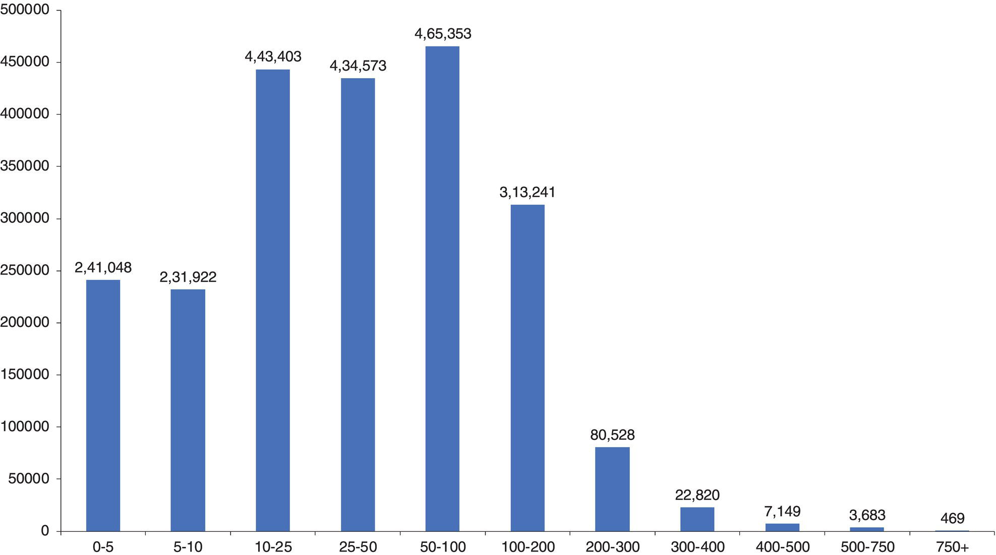
Figure 5.39 Distance traveled by subscribers.
We can observe that only 11% of the users travel on average less than 5 km daily. As a big metropolitan area, it is expected that people have to travel more than this. For example, 70% of the users travel between 5 and 100 km daily, 14% between 100 and 200 km, and 5% travel more than 200 km.
There is an interesting difference between the urban mobility patterns between weekdays and weekends. The mobility behavior in both cases is similar when looking at the movements over time, except by the traffic and the peaks. The number of movements on weekdays is around 75% higher than weekends. The second difference is the peak of the movements. During weekdays, people start moving earlier than during weekends. Here, the first movement is calculated from the presumed domicile to the first visited location. Figure 5.40 shows the movements along the day on both weekdays and weekends. The first movement starts around 5 a.m. and the traffic on weekdays is significantly higher than on weekends. Also, there is a traffic peak at 8 a.m. during weekdays, which means most of subscribers start moving pretty early. On the weekends, there is no such peak. There is actually a plateau between 11 and 17. This is expectable as during weekdays people have to work and during weekends people rest or are not in a rush.
The analysis of the urban mobility has multiple applications in business and government agencies. Carriers can better plan the communications network, taking into account the peaks of the urban mobility, the travels between locations, and then optimize the network resources to accommodate subscribers’ needs over time. Government agencies can better plan public transportation resources, improve traffic routes, and even understand how spread diseases disseminate over metropolitan areas. For example, this study actually started by analyzing the vectors for the spread of the Dengue disease. Public health departments can use the vector of movements over time to better understand how some virus spreads out over particular geographic areas. Dengue is a recurrent spread disease in Rio de Janeiro. It is assessed over time by tagging the places where the diagnoses were made. However, the average paths of infected people may disclose more relevant information about vector‐borne diseases like Dengue and possibly more accurate disease control measures. Figure 5.41 shows some focus areas of Dengue in the city of Rio de Janeiro.
Transportation agencies can evaluate the overall movements over time and the current existing routes in the city and better understand possible areas for improvement. For example, the downtown area in the city of Rio de Janeiro hosts most of the workplaces in the region, like the headquarters for large and medium companies, business offices, and corporate buildings. Due to this, the majority of the other neighborhoods in the city have a significant traffic heading downtown. However, the existing routes are not exactly the same as the vector of movements identified by the analysis of the mobility behavior, as shown in the top left corner of Figure 5.42 by the thicker arrow crossing the bay. This vector represents a substantial traffic between downtown and the region of the airport, which is an island. There is a small bridge connecting this neighborhood to the shore. The existing route to reach for example the airport from downtown is shown on the right side of Figure 5.42. Eventually, it would be more effective to have another bridge connecting downtown straight to the island or a ferry line serving as a route. There are already both a ferry and a bridge connecting downtown to a nearby city called Niteroi. The solution could be an extension of the existing routes.
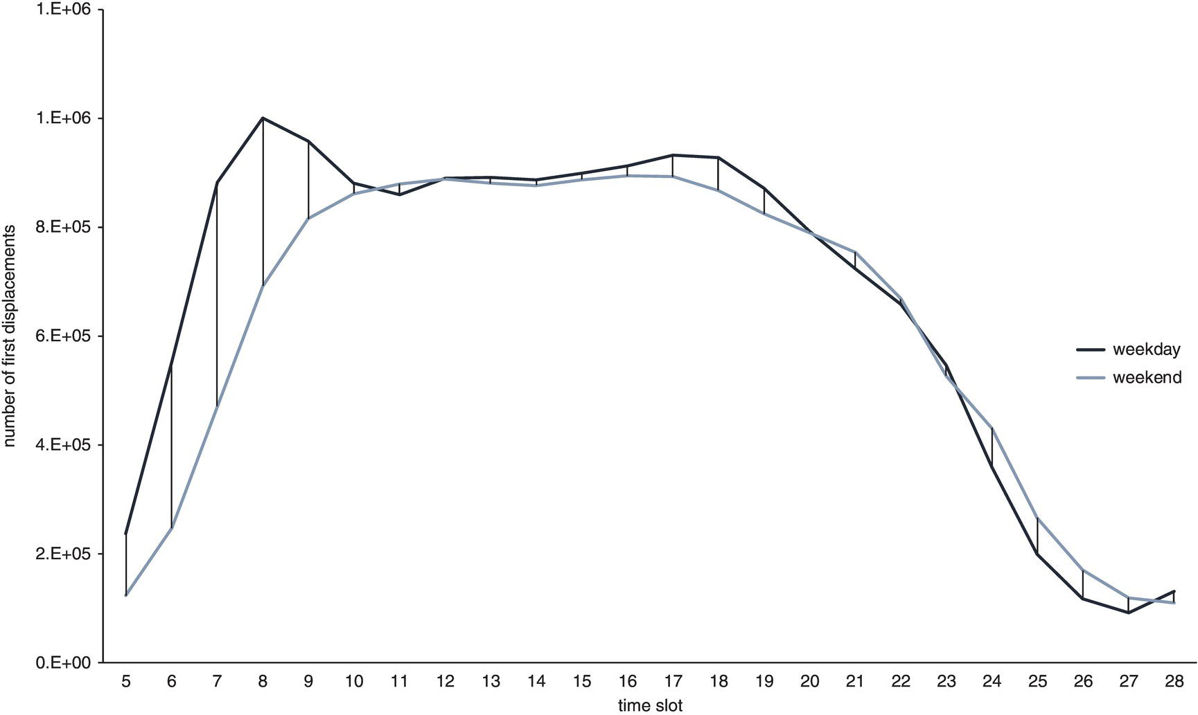
Figure 5.40 Traffic and movements on weekdays and weekends.
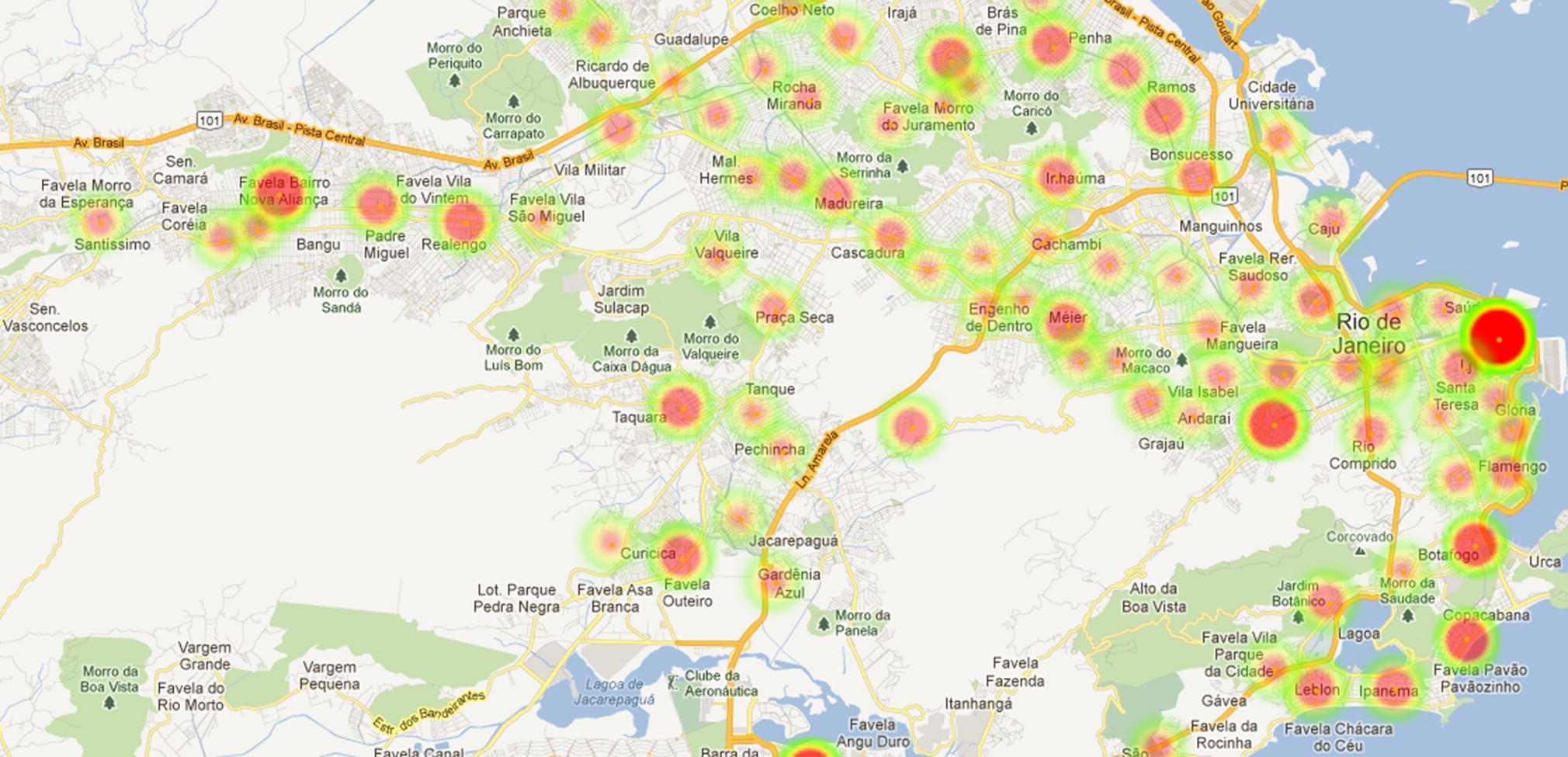
Figure 5.41 Volume of movements in the city of Rio de Janeiro.
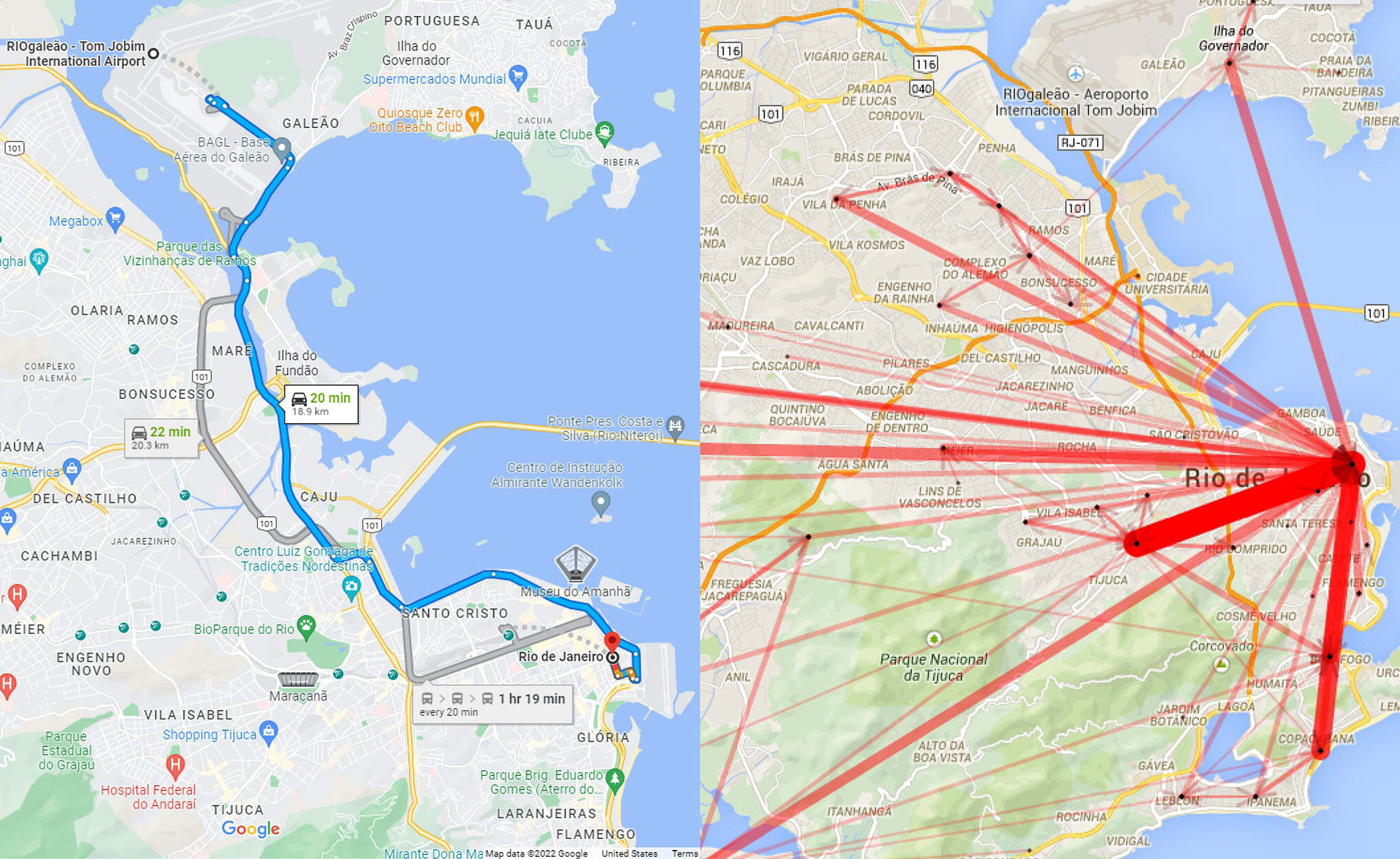
Figure 5.42 Possible alternative routes based on the overall population movements.
Urban mobility behavior is a hot topic in network science and smart cities. This subject comprises many possibilities to better understand patterns in urban mobility, like frequent trajectories, overall paths, commuting behavior, and migration trends. Such analyses may be applied on different geographic scales, lower as to cell towers and greater as to cities, states, or countries. One of the best sources of data to explore and understand the urban mobility behavior is the mobile records from carriers. Due to the high penetration of cell phones in great metropolitan cities, the analysis of subscribers’ movements is closely related to the population’s movements.
5.6 Fraud Detection in Auto Insurance Based on Network Analysis
Insurance companies have evolved into a highly competitive market that requires companies to put in place an effective customer behavior monitoring system. Unusual behavior in insurance can represent different business meanings, such as users properly using the services or suspicious transactions on the claims. Network analysis can be used to reveal important knowledge on the relationships between all the different actors, disclosing customers’ behavior and possibly unexpected usage. Frequent or heavy usage of insurance services substantially impacts the operational cost, either by claims expenses or possible fraud or exaggeration events. Network analysis can be used to evaluate the separate roles assigned to the multiple actors within the claims, and their relationships, allowing companies to implement more effective processes to understand and monitor the commonly great volume of transactions.
The main goal of this case study is a deeper look into the claims, identify all the actors from the transactions, their relationships, and then to highlight suspicious correlations and occurrences. It shows the benefits of using a network analysis approach for fraud detection, a distinct method that focuses more on the transaction relationships than on the individual transactions themselves. This case study is based on data assigned to an auto insurance company. It contains information about the claims in a real auto insurance operation. The main goal of the network analysis in this particular case is to highlight unusual behavior from the participants assigned to the claims. These participants may have multiple roles, like policy holders, suppliers, repairers, specialists, witnesses, and so on. The idea of the network analysis is to identify unexpected relations among participants and identify suspicious groups or individuals. This approach can reveal possible fraudulent connections inside the network structure, indicating from the participants what claims may have a high likelihood of being fraudulent or exaggerated.
The identification of the suspicious claims is mostly based on the values of the network metrics, or on the combination of them when looking into the claims and the network structures created based on the transactions. The steps assigned to create the network, identify structures and groups, and compute network metrics will be briefly described later in this chapter.
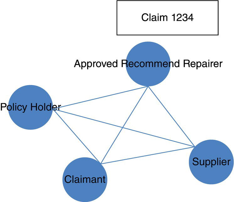
Figure 5.43 Nodes and links assigned to an individual claim.
The network structure in this case study is defined upon the claim’s records. From these records, the participants, and the distinct roles they can possibly play within the claim, are selected, and then their relationships to other participants are defined. All participants in one particular claim are connected to each other in order to create all possible links between them. For example, claim 1234 shown in Figure 5.43 has one policy holder A, one claimant B, one supplier C, and one approved recommended repairer D. Based on this approach, a combination of 3 by 2 should be performed to produce a small social structure consisting of four nodes and six links. That gives us the nodes A, B, C, D, and Links A‐B, A‐C, A‐D, B‐C, B‐D, C‐D.
For this particular case study, the network structure was created based on 22 815 claims. All transactions were aggregated to consider distinct claims with multiple occurrences of participants. Also, the participants were considered based on a smooth match code of their names, addresses, dates of birth, and other individual descriptions, avoiding possible occurrences of the same individual in multiple transactions as a different person. From the claims used, 41 885 distinct participants were identified, along 74 503 relationships. In this network analysis approach, a participant is defined as a node and a relationship is defined as a link.
By connecting all participants to each other, a considerable number of connections among them can be reached. For example, in the network presented in Figure 5.44, there are two participants who appear simultaneously in two distinct subnetworks. Both claims 1234 and 7869 have the same supplier, and both claims 3256 and 4312 have the same driver third party. Based on that, all participants in the claims 1234 and 7869 are connected. Similarly, all participants in the claims 3256 and 4312 are also connected. Both network structures created by these pair of claims sharing the same participant are conserved as complete graphs.
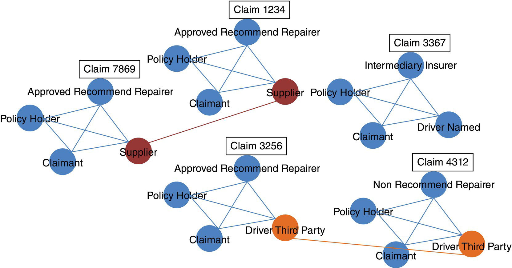
Figure 5.44 Relationships between claims due to same participants.
When analyzing the entire network structure and all correlations among the nodes, the network approach may consider all types of roles within the claims. Specific analyses can be performed upon different types of participants. For instance, the network metrics are computed considering the entire network, accounting for all nodes and links in the graph, regardless of the participants’ roles. The computed network metrics, assigned to all individual nodes or participants are assessed. However, distinct assessments can be performed for individual participants, organization participants, and so on. This approach allows us to compare the average behavior of individuals, organizations, but still accounting for the entire network structure. The same method of analysis can be conducted on the different roles of the participants, such as policy holders, third party drivers, approved repairers, and so forth. These more specific analyses tend to better highlight, or more accurately identify, unexpected behaviors on the relationships throughout the claims by the distinct types of participants. For example, a particular approved repairer could be an outlier based on its network metrics when just the category of approved repairers is considered, but are not considered an outlier when all types of participants are accounted for. Figure 5.45 shows the network structure with nodes as individuals colored and nodes as organizations faded.
The overall analytical method used in this case study combines network analysis to build the network and compute centrality metrics, and outlier analysis to subsequently explore the network metrics distributions seeking unexpected behavior on the transactions, either in terms of nodes or links. That means unusual transactions on the participants’ levels or on the relationship’s occurrences. The outlier detection is mostly based on the univariate analysis, principal component analysis, and clustering analysis upon the network metrics.
To perform an outlier analysis on the individual participants, a categorization was defined based on the names of the participants. Again, the network metrics were computed considering the entire network structure, but the exploratory and outlier analyses were conducted based on the several types of participants, as individual or organization, and also considering the distinct roles. Figure 5.45 shows graphically this particular approach on the individuals and organizations analyses. All links in the network and all participants classified as individual are highlighted, and all participants classified as organization are faded. When computing the network metrics, all links and nodes are counted, but when performing the outlier analysis, just the individuals are considered.
The traditional outcome of outlier analysis and anomaly detection on transactions can be described in terms of a set of rules and thresholds, considering all the information within the transactions, or the claims. On the other hand, in the network analysis approach, the identification of unusual behavior and the presence of outliers are based on the relationships between the participants rather than on their individual attributes. The values within the claims of a particular participant are less important than the combined values considering all relationships of that participant in multiple claims and eventually the separate roles this participant has throughout the network structure. For instance, a high number of similar addresses or participants involved in different claims can trigger an alert about the participants, and therefore, about the claims involved. Or a switch in participants’ roles can raise an alert. For example, in one claim participant A is the driver and participant B is the witness. In a different claim, the same participant A is the witness, and the previous participant B is now the driver. As network analysis looks into frequency and types of relations as well as attributes and types of nodes, this particular case would be easily identified by network outcomes. Another recurrent important outcome from network analysis is how frequently the nodes occur in some relationships throughout the network structure, the size of their subnetworks, the strength of their relationships, or simply the number of distinct connections. A common example is a particular individual within the network with multiple connections, along separate roles over time. Or a particular individual with very few connections but all of them strong, or with high frequency. All these cases can raise some alerts for further investigation. And this is an important aspect of fraud or anomaly detection. Further investigation, usually preceded by business analysts, are always required. Outlier occurrences can be the result of transactions of a heavy user (good) or of an illegal user (bad). The manual analysis on these cases is part of the continuous learning process. Based on that approach, different analytical methods can highlight distinct sets of rules and thresholds upon the network metrics and subnetwork identifications. A combined approach to catch suspicious transactions therefore can consider the outcomes from all those approaches, combining the rules and the thresholds into a more holistic perspective of the cases.
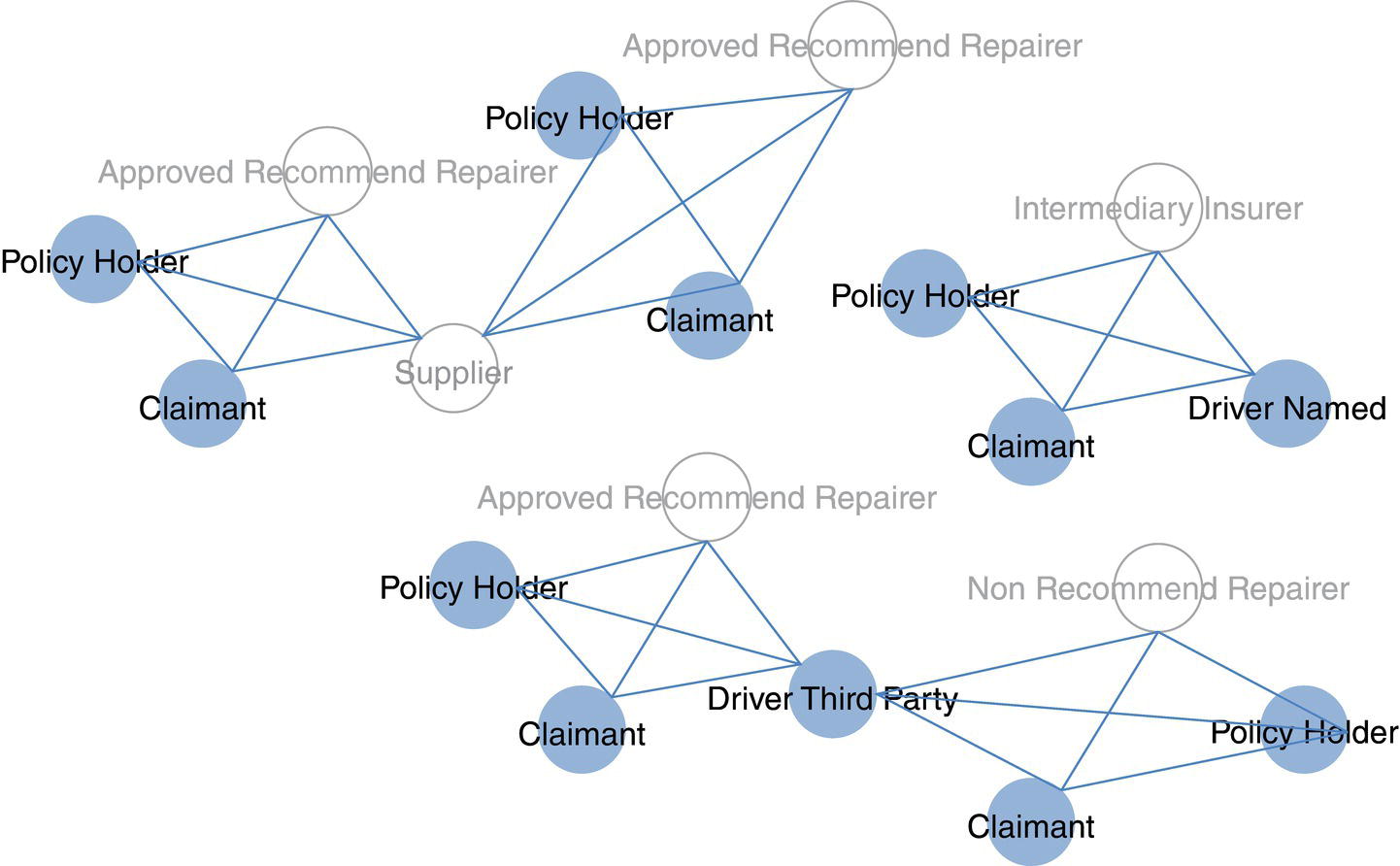
Figure 5.45 Network structure highlighting different types of participants.
The network analysis developed for this particular case study focused on highlighting suspicious participants, or participants with unusual or outlier relationship behavior, considering the network connections as a result of the claims. Traditionally, if several claims have average values for their attributes, such as total amount, number of participants, number of roles, addresses, and so on, neither of those claims would be raised as suspicious, or flagged to be monitored and investigated by using traditional approaches. However, if a particular participant, such as a supplier or a claimant, is involved in all those claims, its relationship level could be considered too high in comparison to the same type of participants, and an alert would be triggered for further monitoring or investigation. The individual attributes values assigned to the claims in a transaction approach, may all be normal or expected. However, the strength of the connections for the participants in those claims may be significantly higher than the normal values when a network structure is considered. Based on that, alarms can be triggered for manual actions, like case analysis and investigation, or automatic actions can be performed, such as user suspension on temporary cancelations. The definition of the manual or automatic actions can be based on the threshold values, which often come from the outlier percentiles. For example, all cases in between the outlier percentiles 90 and 95 are triggered for further analysis, and all cases in the percentiles 95 are automatically blocked.
This approach does not discard any traditional method. Business rules based on previous experience, individual attributes thresholds upon significant values, or any other straightforward strategy can certainly be effective and should be put in place throughout. The main gain in the network analysis approach is the possibility to highlight unusual behavior based on the existing relations rather than on the individual attributes. Often, the most suitable approach to monitoring transactions in a fraud perspective is by combining multiple methodologies. Each analytical method is more or less suitable to catch a particular type of suspicious event, and therefore, a combination of distinct approaches allows a wider perspective on the fraud scenarios.
One of the most important outcomes from the network analysis are the measures in relation to the participants’ subnetworks, which shows how the participants relate to each other, in what frequency, and how relevant their relationships are. From the network analysis outcomes, some suspicious relationships can be highlighted, and as a consequence, also some participants. The network measures are computed upon the overall network, considering all relations of each node and some individual attributes. The following measures describe the structure and the topology of the network. From the 41 885 nodes within the social structure analyzed, 30 428 are considered individual nodes, and 4423 are considered as organization nodes. In addition to the distinct analyses according to the role of the participants, individual or organization, a set of exploratory analyses are performed aiming to highlight unusual groups of participants, either in terms of nodes or links. There are some different types of group analysis that can be performed within the network structure defined, such as community detection, clustering, connected components, and bi‐connected components, among others.
There are some relevant concepts assigned to network analysis that describes the importance of some particular nodes and links, and also the overall structure of the network. These concepts can be used to determine suspicious groups of nodes, or participants, and the claims associated with them. Some of the methods to identify groups of nodes are based on similarity, distance, or the internal paths inside the subnetworks.
The concept of connected components is the first one. When there is a group of nodes, where each node can reach any other node in the group, even going through multiple steps or passing by several other nodes, this group of nodes is defined as a connected component. The connected component can be understood as a close group of nodes, separated from the rest of the network, but each node being reachable by any other node within that group. The network assigned to this particular case comprises 6263 connected components. It is important to notice that during the data cleansing some particular entities were removed from the network. There were some participants within the claims that are way too recurrent, such as government agencies and some insurers, among others. If we include these participants in the study, the entire network will be considered as a one single connected component as those participants will virtually connect all other entities within the claims.
The second approach used the concept of the bi‐connected components. When there is a connected component that comprises a particular node where, if it is removed from the group, the original component would be split into two distinct connected components, this original subnetwork can be considered as a bi‐connected component. Most important in our case study, that particular node that, if removed, splits the original component into two disjoint groups is called as articulation point. The articulation point plays an important role in the network, keeping possibly disjoint groups all together. The articulation point plays as a bridge connecting two disjoint lands, like a shore and an island. Without a bridge, there is no connection, and the island would be isolated. Without the articulation point, the connected component would be possibly split into multiple groups. In the network there are 15 734 bi‐connected components and 2307 articulation points. Analogously to the connected components, the articulation point can be highlighted to be further investigated as they are not exactly expected in the network or at least they have a special role in terms of network structure. Also, from those 2307 articulation points, 984 of them are participants defined as individual, which can be considered even more suspicious.
The third approach is the community detection. There are some techniques, which are put in place in order to identify communities inside the entire network. Different from the connected components, which are isolated from the rest of the network, a community can hold some nodes, which have connections outside the community. In this way, a community can be connected to other communities through one or more nodes. Communities inside networks can be understood as clusters inside populations. The study of the communities can highlight some important knowledge assigned to the structure of the network and the behavior of the nodes, allowing some specific analyses to point out suspicious individuals. For this particular network, 13 279 communities were identified, considering all nodes, no matter if they were classified as individual or organization.
The next phase in this analytical approach based on network analysis is to consider the overall centrality metrics for all individuals. These centralities reveal important characteristics of the individual components within the social structure. These centrality metrics are computed to each and every node within the network. Then, the second step is to compare the nodes centralities to the average metrics for the network as a whole, or at least, to some particular types or categories of individuals, such as policy holders, repairers, or third parties, etc., all unusual or unexpected difference associated with the nodes and links can be considered a possible case for further investigation. There are several centralities to be computed. For this particular case, only six measures were considered: degree, eigenvector, closeness, betweenness, influence 1, and influence 2. All these centralities were described in Chapter 3. To briefly summarize them, the degree represents the number of connections, the eigenvector represents a measure of importance of the node within the network, the closeness represents the average shortest paths for that particular node to all other nodes in the network, the betweenness represents how many shortest paths the node partakes, the influence 1 represents the weighted first order centrality, and finally the influence 2 represents the weighted second order centrality. All these measures were considered to highlight the outliers within the social structure created by the claims.
In order to identify the unexpected transactions, the outlier analysis was performed over the centrality metrics. The outlier analysis considers the average metrics considering the entire network and centralities for each individual node and link. Distinct approaches to identify occurrences of interest were combined, such as univariate analysis, principal component analysis, and clustering analysis. The combination of these techniques allows the definition of a set of rules based on thresholds to eventually determine the likelihood of the suspicious transactions, or the identification of suspicious actors within the network structure. A similar comparison approach was performed on each subnetwork identified, considering all different types of subgroups, such as the connected components, the bi‐connected components, and the communities.
The univariate analysis evaluates network centralities and defines a set of ranges of observations according to predefined percentiles. All observations that, in conjunction, satisfied the defined rules assigned to the outlier percentile should trigger a case for further investigation. For example, considering the individual centralities, when the degree is greater than 9, the eigenvector is greater than 6.30E‐03, the closeness is greater than 1.46E‐01, the betweenness is greater than 1.12E‐04, the influence 1 is greater than 2.32E‐04, and the influence 2 is greater than 1.44E‐01, then the node is considered an outlier and should be flagged for further analysis. Based on the univariate analysis, there are 331 nodes considered as outliers. The average behavior of these 331 nodes creates the thresholds previously presented. If applied in a production environment, this set of rules would flag 21 participants for further investigation.
The principal component analysis evaluates the network centralities by reducing the dimensionality of the variables. All measures in relation to the network are comprised then into a single attribute, which can represent the original characteristics of the nodes. The outlier analysis points out observations according to the top values among all the transactions. Considering the individual centralities, when the degree is greater than 13, the eigenvector is greater than 3.65E‐03, the closeness is greater than 1.42E‐01, the betweenness is greater than 9.10E‐05, the influence 1 is greater than 3.22E‐04, and the influence 2 is greater than 8.48E‐02, then the node is considered an outlier and should be flagged for further investigation. Based on the principal component analysis, there are 305 nodes considered as outliers. The average behavior of these 305 nodes creates the thresholds previously presented. If applied in a production environment, this set of rules would flag 23 participants for further investigation.
The clustering analysis evaluates the network centralities creating distinct group of nodes according to their similarities, or the distribution of their centralities. These similarities are based on the network metrics degree, eigenvector, closeness, betweenness, influence 1 and influence 2. The clustering analysis highlights observations not based on buckets or percentiles but instead according to unusual or low frequent clusters. The vast majority of the clusters identified within the network usually consists of several nodes. Based on that, when some particular clusters consist of a few number of members, they are defined as uncommon, and therefore as outliers in terms of groups of nodes. As a consequence, all nodes comprised in those unexpected clusters would be considered as outliers as well. The averages centralities for the outliers’ clusters define the thresholds to identify which nodes within the network would be considered as outliers. According to the clusters’ thresholds, when a degree is greater than 36, the eigenvector is greater than 1.04E‐02, the closeness is greater than 1.45E‐01, the betweenness is greater than 6.50E‐04, the influence 1 is greater than 9.35E‐04 and influence 2 is greater than 1.49E‐01, then the node is considered as outlier and should be flagged for further investigation. Based on the clustering analysis, three clusters were considered as outliers, comprising 18, 2, and 3 nodes, respectively. In summary, these three outliers’ clusters contain 23 nodes as outliers. The average behavior of these 23 nodes creates the thresholds previously presented. If applied in a production environment, this set of rules would raise only two participants for further investigation.
All previous rules and thresholds were defined based on the analysis of outliers, considering the individual nodes centralities. Although the clustering analysis takes into consideration a group of nodes, the individual nodes centralities were used to determine the thresholds. However, in terms of network analysis is also possible to analyze the behavior of the links among the nodes. The link analysis may highlight the outliers’ links and therefore identifying the nodes assigned to these particular relationships. Similar to the clustering analysis where an uncommon group of nodes are considered outlier, and then its individuals, the link analysis considers uncommon connections among the nodes and then points out the uncommon individuals. In relation to the characteristics of the links, there is a measure that identifies the geodesic distance among the nodes, or the shortest paths associated with them. The link betweenness represents how many shortest paths a particular links partakes. For example, links partaking multiple shortest paths might have higher link betweenness than those do not. The nodes comprised in those outliers’ links are also considered as uncommon, and then also set as outliers’ nodes. The averages network centralities for the outliers’ links determine the thresholds to highlight which nodes within the network would be considered as outliers according to their uncommon links. Based on the links’ thresholds, when the degree is greater than 9, the eigenvector is greater than 4.30E‐03, the closeness is greater than 1.41E‐01, the betweenness is greater than 2.32E‐04, the influence 1 is greater than 2.26E‐04 and the influence 2 is greater than 9.37E‐02, then the node is considered as outlier and should be flagged for further investigation. Based on the link analysis, 300 links were identified as outliers’ connections, comprising 199 nodes. The average behavior of these 199 nodes creates the thresholds previously presented. If applied in a production environment, this set of rules would flag 18 participants for further investigation.
The social structure in this case contains 15 734 bi‐connected components. Interconnecting these bi‐connected components there are 2307 articulation points, which 984 are participants classified as individual. The claims in insurance supposed to have not too many individual participants connecting them into a major subnetwork. Companies can appear several times in the claims, once they are suppliers, repairers, or even other insurers. However, individuals appearing several times, connecting different claims, should be more suspicious and eventually be sent for further analysis. There are two different ways to use the articulation points approach. The first one is by directly highlighting them. The second one is to collect their average behavior, as done in the other approaches, and identify all nodes which match to this criteria. The averages network centralities for the articulation points would therefore determine the thresholds to highlight the outliers’ nodes. Based on this, when the degree is greater than 20, the eigenvector is greater than 5.05E‐03, the closeness is greater than 1.43E‐01, the betweenness is greater than 4.27E‐04, the influence 1 is greater than 5.00E‐04, and the influence 2 is greater than 1.03E‐01, then the node is considered as outlier and should be flagged for further investigation. Based on the bi‐connected component analysis, 99 articulation points were identified as outliers’ observations. The average behavior of these 99 nodes creates the thresholds previously presented. If applied in a production environment, this set of rules would flag 15 participants for further investigation.
Connected components hold a strong concept of relationship among the nodes. All nodes can reach each other, no matter the path required to do that. A connected component analysis was performed over the entire network. Differently than the previous analyses, where the evaluation considered just participants classified as individual, the connected components approach to identify outliers considered all nodes, both individuals and organizations. Additional information in terms of number of nodes, number of individuals and organizations, as well as the total amount of the claims where the connected components nodes are were considered for this analysis. A principal component analysis was performed considering the network centralities, subgroup characteristics, and business measures, like the average values for degree, eigenvector, closeness, betweenness, influence 1 and 2, the number of nodes for each connected component, and the total ledger, the amount claimed, the number of vehicles involved, and the number of participants, among others. The averages network centralities for the nodes comprised into the outliers’ connected components would therefore determine the thresholds to highlight the overall outlier nodes. Based on this, when the degree is greater than 7, the eigenvector is greater than 6.97E‐17, the closeness is greater than 8.33E‐02, the betweenness is equal to 0.00E‐00, the influence 1 is greater than 1.89E‐04, and the influence 2 is greater than 1.50E‐03, then the node is considered as outlier and should be flagged for further investigation. Based on the connected component analysis, three connected components were identified as outliers, comprising 30 nodes. The average behavior of these 30 nodes creates the thresholds previously presented. If applied in a production environment, this set of rules would flag 555 participants for further analysis. Eventually, due to this high number of participants raised by the connected components analysis, this approach could be considered not appropriated to be deployed in production, which would flag a large number of participants to be further investigated. This analysis will then be discarded.
Analogously to the connected components, the most relevant characteristic of the communities is the relationships between the nodes. As performed previously, additional information in terms of number of nodes, like individuals or organizations, and also, business information such as the total amount of the claims, or the total ledge, where the community’s nodes are involved were taken into consideration to perform this analysis. Once again, a principal component analysis was performed over the network and business measures for the communities, considering the same attributes described in the connected component analysis. The averages network’s measures for the nodes comprised into the outliers’ communities would therefore determine the thresholds to highlight the overall outlier nodes. Based on this, when the degree is greater than 13, the eigenvector is greater than 3.20E‐03, the closeness is greater than 1.42E‐01, the betweenness is greater than 7.10E‐05, the influence 1 is greater than 3.26E‐04, and the influence 2 is greater than 8.02E‐02, then the node is considered as outlier and should be flagged for further investigation. Based on the community analysis, 13 communities were identified as outliers, comprising 68 nodes. The average behavior of these 68 nodes creates the thresholds previously presented. If applied in a production environment, this set of rules would flag 24 participants for further investigation.
The entire process to identify outliers based on the different types of analyses produces the following figures:
| Technique | Individual participants |
|---|---|
| Univariate analysis | 21 |
| Principal component analysis | 23 |
| Clustering analysis | 2 |
| Link analysis | 18 |
| Bi‐connected component analysis | 15 |
| Connected Components Analysis | 555 |
| Community analysis | 24 |
Notice that the connected component analysis was discarded. Outliers’ nodes might be raised by distinct techniques. The total number of participants outliers classified as individual, considering all previous techniques is about 33. These participants are involved in 706 claims. They would definitely need to be sent for further investigation.
The analysis of social structures based on the computation of subgroups and centralities is one of the possible approaches to recognize the pattern associated with the relationships. In order to detect unexpected behavior on these social structures a set of exploratory analyses must be conducted, like the ones performed in this case, such as univariate analysis, principal component analysis, clustering analysis, subgroup analyses including bi‐connected components, connected components and communities, and link analysis. The combination of these approaches constitutes a distinguish methodology to recognize social patterns and then unexpected events, which might be considered as high risk for a substantial number of industries.
Individual attributes associated with the claims can definitely hold useful information about the transactions in place. However, these attributes might poorly explain correlations on some particular type of event such as fraud or exaggeration. On the other hand, the multiple relationships between the claims can actually reveal significant characteristics of the participants within the claims. Network analysis can definitely reveal participants in a high number of roles, groups of participants with high average values for some specific business attributes, and strong links among participants, among many other features that traditional analysis would not raise. For example, Figure 5.46 shows a particular doctor specialist who are quite frequent within claims above a specific amount of value. He connects a high number of distinct policy holders. The star network describes a node central to holding lots of connections to different nodes. Further analyses showed completely different geographic addresses for these connected nodes. This might be quite uncommon in the auto insurance industry and hence this specialist would be flagged for further investigation.
Another approach in highlighting unusual behavior is by analyzing the identified subnetworks, such as the connected components, the bi‐connected components, and the communities. Some subgroups are unexpected by their own internal average centralities or characteristics, like the number of nodes or links with respect to the average numbers of the entire social structure. Other groups might be pointed out by business attributes associated with the network metrics, like the amount of claim, the number of distinct roles, the number of cars involved, or the different addresses within the claims associated with the nodes within the subnetwork, among many others. All these attributes within the groups can also be compared to the average numbers of the entire social structure. For example, Figure 5.47 shows some subnetworks that were considered as outliers based on their own centralities or their cumulative business attributes.
Exaggeration is a recurrent problem in most insurance companies, sometimes caused by customers, sometimes by the suppliers. This can represent a substantial amount of money for the insurers, affecting the operational costs and the overall cash flow. Network analysis can be as flexible and dynamic as the market in identifying suspicious events and actors with social structures created by transactions. In some business scenarios, the attributes on the relations can be more important than the individual attributes, and then, reveal relevant information about the operational process.
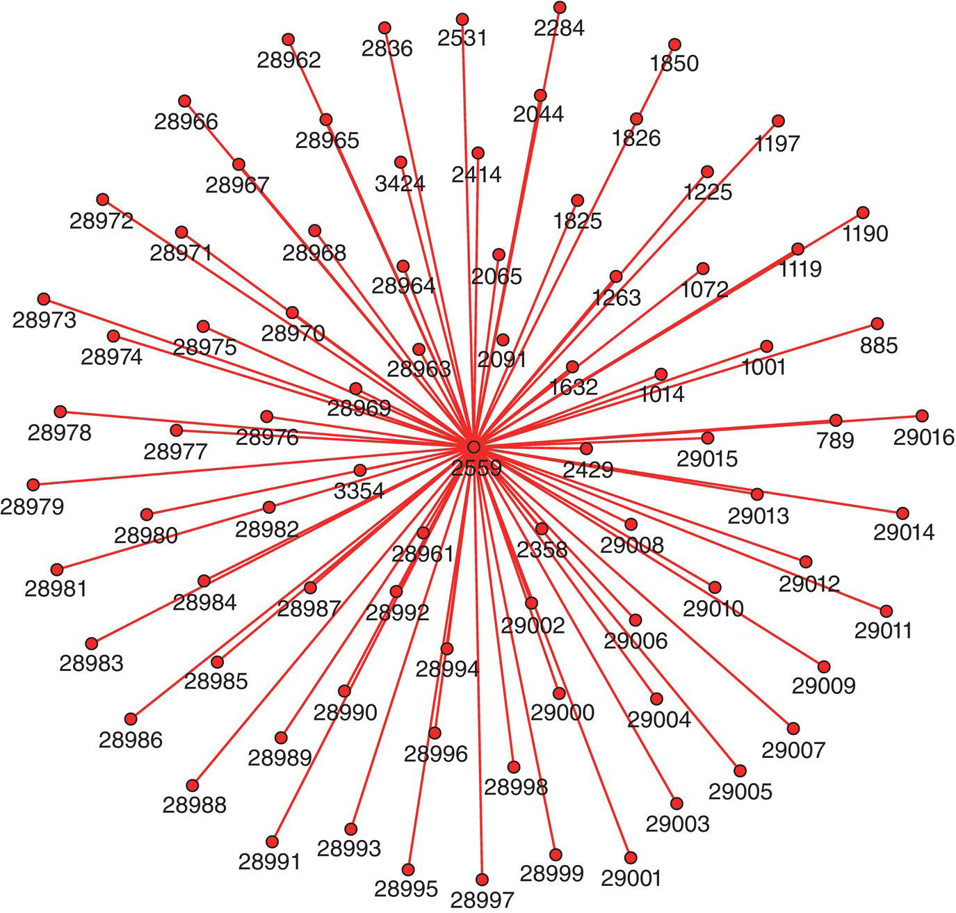
Figure 5.46 Star network showing all connections of a doctor specialist.
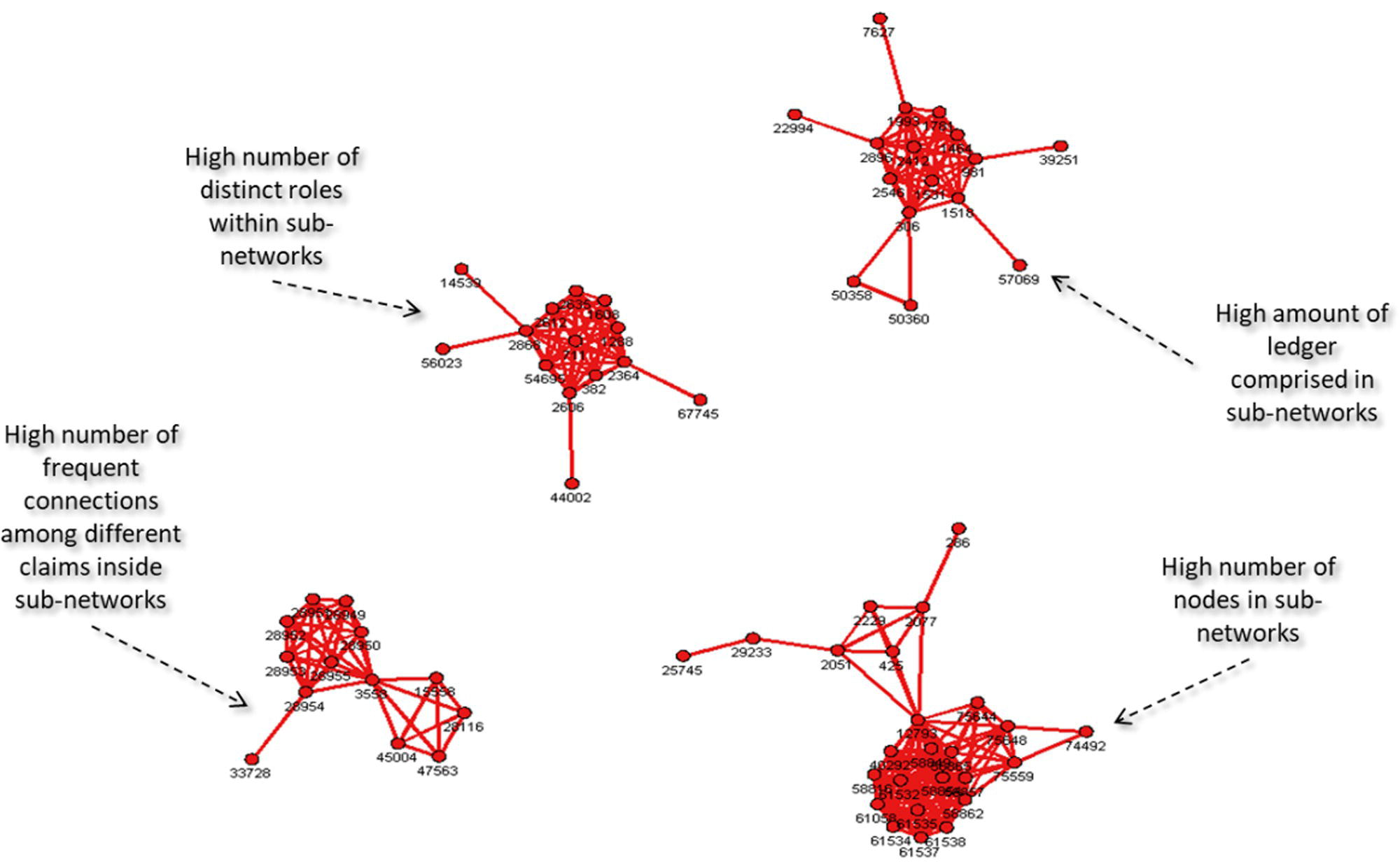
Figure 5.47 Subnetworks considered as outliers.
5.7 Customer Influence to Reduce Churn and Increase Product Adoption
The telecommunications industry evolves into a highly competitive and multifaceted market, including internet, landline, mobile, content, news, streaming, etc. which demands that companies implement a holistic approach for customer relationships management, looking into multiple aspects of the customers’ behavior. Social network analysis can be used to increase the knowledge about the customers’ influence, highlighting relevant information on how customers interact with each other and ultimately how they may influence each other in some particular business events like churn and product adoption.
The most important characteristic of any community is the relationship between their members. Any community is established and maintained based on these relations. With all the modern technologies and devices currently available, there are new types of relationships and that characteristic that creates and holds communities gained even more relevance. From multiple possibilities of communication types, these relationships expanded in terms of flexibility and mobility, defining new boundaries for social networks. With social networks evolving and enhancing, the influence effect of some members of these communities become even more relevant to the companies.
Several events in social communities can be faced as a cascade process, where some members of the network initiate a sequence of similar events over time based on their influence in these social structures. The influential members within the social structures may decide to do something like make churn or start using a new product or service, and then some other members of the network might follow them on the same business event. The way these members are linked within the social network virtually defines how these events will occur over time. Often, the stronger the relationships between the members, the higher the probability that these events take place in a cascade fashion. Understanding the way of these relationships take place and identifying what influences community members to do something can be a great competitive advantage, especially when thinking in business events that may occur in a cascade approach, like churn, product adoption, and service consumption, among many others.
It is clear that in social structures, some people can influence others in multiple events. Recognizing these influencers and identifying their main characteristics can be crucial in defining and executing better business campaigns to exploit the influence effect on some business events like product adoption, and avoid the cascade effect on others, like churn. Identifying the central and strong nodes (subscribers) within these social networks and understanding how they behave when influencing others can be one of the most effective approaches to define a more holistic customer value. This latest information on the customers’ value can be used to estimate the impact of churn and product adoption events over time in a cascade perspective rather than simply isolated. Assessing customers’ connections and identifying the central nodes of each social structure may be the best method to prevent a cascade event of churn, and at the same way it can boost a broader product adoption diffusion.
A combination of community detection and centralities measures with correlation analysis on some particular business events like churn and product adoption can reveal a crucial knowledge on the impact of those events when triggered by a key node within the social structure. This approach allows companies to ultimately estimate the impact of a business event over time when it is initiated by a central and strong node or a satellite and weak node within the social structures. How the influence effect takes place in both scenarios. The influence here basically means the number of customers affected by each one of these business events, either churn or product adoption.
Monitoring social networks over time allows companies to assess the revenue impact associated business events in a cascade process. Based on the likelihood assigned to the events of churn and the level of influence assigned to the customers, companies can put in place direct actions to avoid the cascade of churn over time by retaining an influential customer who would probably lead other customers to make churn afterwards. Analogously, by knowing the likelihood of the customers to purchase some product or service, plus the influential factor assigned to these customers, it is possible to deploy an effective campaign to not just sell more products and services but also to diffuse them throughout the multiple social structures.
In order to evaluate the social structures over time and calculate the influential factor assigned to the customers, a set of mobile data is collected considering a particular timeframe and aggregated to account for the average customers’ relationships. For example, the last three months of mobile data is collected to create the overall network. Once the network is created, the communities within the network are identified and the centrality metrics are computed for each community. Notice that the centrality metrics in this case are not calculated considering the entire network. Instead, they are computed considering each community identified. That means the degree centrality for instance for one particular subscriber does not represent the full connections of that subscriber, but only the connections within its community. The main reason to define this approach is due to the size of the communications network. For this particular case, 76 million mobile transactions generated 34 million links and 6 million nodes. The community detection algorithm identified 218,000 communities, with the average number of 30 members. Figure 5.48 shows graphically the steps assigned to the network analysis approach. The first step is to collect historical information in order to build the network, detect the communities, and compute the centrality metrics for each community. The timeframe for this first step is 12 weeks of mobile data. Then, we analyze the following eight weeks of churn and product adoption events. At this stage, we evaluate what happened with the other customers within the communities after customers making churn or purchasing a product during the first stage of 12 weeks. Did they make churn or purchase the same product on the following eight weeks? How many customers during the second stage of eight weeks did follow the initial events performed by the customers in the first stage of 12 weeks?
Once the customers in the first stage are identified, customers who made churn or purchased a product, then we evaluate what happened to their peers afterwards. How many customers were they able to influence in making churn or buying the product? Based on that, we move forward to the third step, which is correlating the centrality metrics to the customers who influenced other customers to make churn or purchase a product. What differentiates them from the customers who simply made churn or purchased a product in the first 12 weeks without influencing any of their peers to do the same in the following eight weeks?
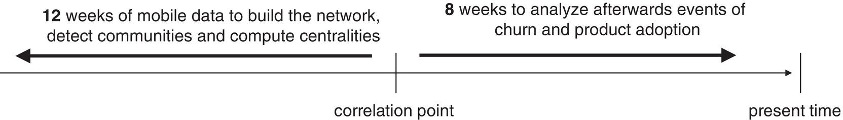
Figure 5.48 Network analysis approach.
The following numbers may better describe the process in terms of the first, second, and third stages of the network analysis process. For example, considering the first timeframe of 12 weeks, almost 40,000 subscribers made churn. From that amount, 9,000 subscribers were connected to other customers who made churn afterwards during the second timeframe of eight weeks. That means 31,000 subscribers made churn and no other subscriber they used to be connected made churn in the following eight weeks. We assume that the first 9,000 customers influenced some of their peers to make churn afterwards, while the other 31,000 subscribers did not. It is virtually impossible to know if there was really an influence effect from the first wave of churn events during the first 12 weeks to the second wave along the following eight weeks. The strength of the relationships between the customers in the first and second waves helped us to create this hypothesis. Often, they were more connected than the subscribers who did not make churn afterwards.
When we look at the top influencers, or the subscribers associated with more than one churn afterwards, the total number of customers in the first wave drops considerably, to a little less than 1,000 subscribers. When we compare these customers to the rest of the 39,000 customers, they are connected to 53% more subscribers, their communities are 60% bigger, and they influence seven times more other customers to make churn afterwards. On average, they are 140% more connected to other customers than the regular churners, they have 53% more connections off‐net (subscribers in the competitors), they spent 150% more time with previous churners, and they were 106% more connected to previous churners. Those indicators describe the overall profile of the influential subscribers in the event churners. Figure 5.49 shows the comparison between the influencers and the regular churners.
Particularly to the churn event, another relevant factor of influence is the multiple occurrences of churn over time within the same community. As mentioned before, based on the historical data analyzed, 218,000 communities were detected, with 30 members on average. Recall that the timeframe to create the network was 12 weeks, and the timeframe to evaluate the cascade effect of churn and product adoption was eight weeks. Along these eight weeks, the average churn rate was around 3%, considering all communities. However, throughout this period, 141,000 communities did not observe events of churn, while 77,000 communities did. Considering only the communities with churn along these eight weeks, the churn rate increases to almost 7%. There is a quite relevant behavior associated with the members of the communities experiencing subsequent churn events. The likelihood to make churn associated with all subscribers who remain after their peers in the same community leave increases substantially. For example, all communities experiencing two subsequently weeks of churn, the churn rate increases to up 11%. For all communities experiencing four to six weeks of subsequently churn, the churn rate increases to up 14%. Finally, for all communities experiencing eight weeks of subsequent churn, the churn rate can exceed 15%. The viral effect in the first scenario, within two subsequent weeks is 28% greater than the normal rate. The second scenario, within four to six weeks, the viral effect is 37% greater than the normal rate. And for the last scenario, for the eight weeks timeframe, the viral effect exceeds 40%. Figure 5.50 shows how the churn rate evolves over time for communities experiencing subsequent churn events.
For product adoption, the viral effect is similar. For this particular product adoption event, a new product launched by this telecommunications company was selected to evaluate the impact of the viral effect on subscribers. Based on a supervised model to estimate the likelihood of customers to purchase this new product, 730,000 subscribers were targeted. In a first wave campaign, considering that initial target, a bit of less than 5,000 customers purchased the new product. In order to evaluate the impact of the viral effect throughout the social structures, two groups of subscribers were identified from those almost 5,000 buyers. For the first group, 816 customers were randomly selected. This group worked as a control group. For the second group, the leaders of each community, or the subscribers with the best centrality metrics combined were picked. They were ranked by the combined centralities and the top 816 subscribers were selected. From the random 816 subscribers, after eight weeks monitoring all purchasing events, another 572 subscribers connected to those 816 initial customers also bought the same new product. The random 816 subscribers were well connected to another 8523 customers, giving an average of 10 extremely relevant relationships. For the second group, after the same eight weeks, another 4108 subscribers connected to those 816 leaders also bought the new product. The 816 leaders were well connected to another 21,013 customers, giving an average of really 26 relevant relationships. The leaders had 160% more strong connections with other customers within their social structures, or 2.6 more relevant relationships. More importantly, the leader were more than seven times more effective spreading the new product throughout their social structures. The subsequent sales assigned to the leader were 620% greater than the subsequently sales assigned to the random customers. Figure 5.51 graphically compares the viral effect in terms of product adoption considering the cascade events of purchasing initiated by the subscribers' leaders in their communities and by the random subscribers. The leaders have not only more than twice as strong connections in their social structures, but they are seven times more effective in disseminating the new production and impacting the overall sales over time.
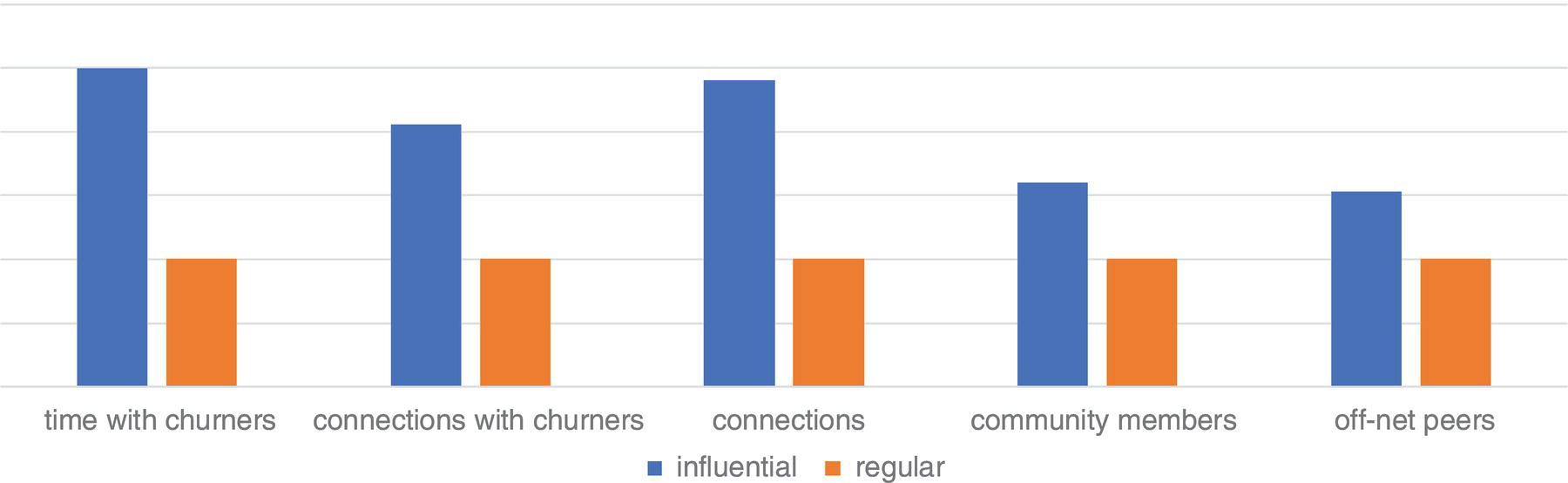
Figure 5.49 Profile of influencers and regular churners.
Figure 5.50 Likelihood of churn over time within the communities.
There is an important fact along the analysis of this case study. While detecting communities and computing the network metrics to identify the leaders of each community, some of the leaders found are not customers for the company. They are subscribers for different carriers, the competitors. Eventually, they should be targeted to acquisition campaigns. For example, out of the 218,000 communities detected, almost 8,000 leaders are off‐net subscribers, which means they are customers of different carriers. Even not considering all the possible connections for these subscribers, as the interactions between them and other competitors' subscribers are not in the data analyzed (each carrier has access only to transactions involving its own subscribers), they are still the most important nodes within their communities, or at least they have the highest combined centrality metrics in their community. These customers might be even more important when considering all their connections, with all subscribers, for all carriers. Based on that, these 8,000 leaders should be targeted in acquisition campaigns, as they actually can influence the current customers to eventually make churn and move to their carriers. In addition to these leaders, there are also almost 140,000 subscribers from other carriers who present a significant combination of centrality metrics and are well connected to the current customers. These subscribers belong to different carriers, but they are well connected in the social structures identified based on the company's mobile data. Similarly, these subscribers may influence the current customers to make churn and move to their originating carriers. Instead of taking the risk to lose actual customers due to their connections to subscribers from different carriers, the company should target these off‐net subscribes in acquisition campaigns. In addition to acquiring possibly very good subscribers, the company would protect the current customers from making churn and moving to the competitors.
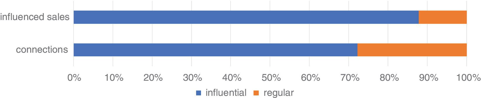
Figure 5.51 The viral effect of purchasing.
5.8 Community Detection to Identify Fraud Events in Telecommunications
This case study presents how social network analysis and community detection based on telecommunications data can be a valuable tool in understanding many different aspects of subscribers' behavior, but particularly in terms of relationships. The analysis of social relationships points out distinct aspects of customers' behavior and possible viral effects on business events within the social structures. One of the most relevant social structures within networks are the communities. The viral effects associated with business events usually takes place within these social structures, following the relationships of its members. The viral effect normally works as a cascade process. A particular subscriber – often an influential one – does something and a subset of its peers follows the same process. For example, an influential customer, well connected within its social structure, decides to make churn at some point. Afterwards, some of its peers end up following this initial event and also make churn after a period of time. A similar scenario can also occur with product adoption. Both cases were described in more detail in the previous case study.
Fraud is a common and recurrent event in telecommunications. The hypothesis here is that fraud is a business event (business at least for the fraudster) that may also be impacted by the viral effect. For example, someone identifies a breach in a telecommunications process. A fraudster sees that breach as an opportunity and creates a scenario where the fraud event can occur unobserved, at least for a period of time. Regardless of the fraud aims to generate revenue to the fraudster or to simply allow people to consume communications services for free, the initial event propagates over time as more and more subscribers start using or consuming that service. Eventually, these people, the initial fraudster, and the following subscribers, are somehow connected within the social structures. Perhaps they are more connected than the other subscribers not committing fraud. If this is the case, a viral effect may occur for fraud events, as might happen for business events such as churn and product adoption.
Social network analysis often raises relevant knowledge about the customers' behaviors, particularly in relation to their relations within the social structures, which is highly correlated to the influence effect of business events over time. This particular case covers few steps on the network analysis process. Based on a specific timeframe of mobile data, which has information about subscribers' connections, the social network was created. The timeframe selected is about six months of transactions, consisting of a couple billion records. The network created from that original data contains 16 million nodes and 90 million links. Upon this network created in this first step, a community detection algorithm was performed to identify the multiple social structures within the communications network. This second step identified 700,000 communities. The average number of members within the communities was around 33 subscribers. The third step is to compute the network metrics for each subscriber considering their communities. Notice that the network metrics are not computed considering the entire network, but by the communities detected in the second step. The fourth step is to aggregate the network centralities for each community within the network. Based on the communities' measures, and the fifth step is to perform an outlier analysis, highlighting the communities with uncommon characteristics or unexpected behavior upon that timeframe defined. There are two main approaches for the outlier analysis. The first is based on the subscribers' centralities within their communities. Subscribers with way different measures compared to the rest of the community may be assigned to further investigation. The second approach is based on the communities' metrics upon the entire network. Communities with way different metrics considering the entire network may be highlighted and all members be flagged to be further investigated. Figure 5.52 shows graphically the overall process.
Most of the analytical approaches employed in fraud detection accounts for usage and demographic variables, which describe the individual behavior assigned to the subscribers. Network analysis on the other hand evaluates the relationships among subscribers, regardless of their individual information. In fact, all this individual information can be added as attributes to nodes and links, enhancing the analysis on the network, the communities, and ultimately on the relationships among customers.

Figure 5.52 The overall process based on the social network analysis.
The main characteristic of any community is the relationship between their members. Communities are identified over time based on that. It is important to notice how dynamic this process is, as over time, connections may come and go, changing the overall topology of the social structures. The links in the network, particularly within the communities, can be used to describe the subscribers' behavior, and therefore correlate that behavior to the business event under analysis, the fraud event. The analysis of these relationships over time allows the company to better understand how the fraud spread throughout the network and how the viral effect takes place within the social structures. For example, one important task is to identify relevant nodes and links within the network. Relevant nodes can be the central nodes or the nodes that control the information flow, the nodes playing as hubs or authorities, nodes with the higher metrics describing importance and influence, and nodes serving as bridges between different social structures. Relevant links can be straightforward and identified by the frequency and the recency between the nodes. The information about nodes and links is correlated to the occurrence of the fraud events over time, possibly allowing the identification of the sequence of those events in a cascade fashion. That allows answers to who initiated the fraud event? What is the overall characteristic of the communities experiencing frequent fraud events? What is the overall profile of the nodes initiating the fraud events over time? The overall analysis aims to detect the viral effect of fraud events within communities. What happens after the first event of fraud? What members of the social structure initiate the fraud and which ones follow? That viral effect might happen because the fraudster wants to disseminate the fraud over the social structure, or multiple structures, or simply because other subscribers get to know about the breach in the telecommunications process that allows them to use services or products for free. It can be a business fraud or an opportunistic fraud. Both have a strong component on the viral effect throughout the social structures within the network.
The most important outcome from a network analysis is the centrality metrics associated with the subscribers. These metrics describe how they relate to each other, in what frequency, and how relevant their connections are. From a network perspective, the suspicious nodes might be identified by the centralities assigned to nodes and links, as well the aggregated metrics assigned to the communities. Nodes with higher network metrics might be suspicious, particularly when compared to the other nodes within the same social structure. The nodes partaking links with high network metrics might also be suspicious. Members of communities with high network metrics might be suspicious, particularly when compared to the overall network profile.
A community usually contains nodes with connections outside the social structure, as bridges linking that community to the rest of the network. In this way, a community may be connected to other communities throughout one or more nodes. Communities within networks can be understood as clusters inside populations. The study of communities can reveal some relevant knowledge assigned to the network topology and therefore to the members of the overall structure.
In large networks such as in telecommunications, it is common to find large communities. The outcomes of the community detection process follow a power law distribution, with few communities consisting of a large number of nodes and the majority of the communities consisting of a few number of nodes. The first step of the community detection was based on the Louvain algorithm. In order to reduce the impact of large communities, we evaluated multiple resolutions while searching for the subgroups, producing several different members’ distribution for the communities detected. Recall that the resolution defines how the network is divided into communities. Resolution is a reference measure used by the algorithm to decide whether or not to merge two communities according to the intercommunity links. In practice, larger resolution values produce more communities with a smaller number of members within them. When producing large communities, the algorithm considers more links between the nodes, even the weak connections that link them. Bigger communities imply in a significant number of members, and therefore, weaker connections between them. On the other hand, smaller communities imply fewer members, but with stronger connections between them. Based on the multiple resolutions, we evaluated the modularity for each level of community detection. The modularity indicates a possible best resolution for the community detection. Higher values for modularity indicate better distribution for the communities. Modularity usually varies from 0 to 1. However, the decision about the number of communities and the average number of members within each community can also be a business requirement. Identifying fraud events might require strong links between the members of the social structures. Then, a combination of the mathematical approach by using multiple resolutions and the modality, and the business requirements, is often a good approach. Finally, to diminish the effects of large communities, we executed a second community detection algorithm. This second pass was based on the label propagation algorithm, with the recursive option to limit the size and the diameter of the communities, as well as with the linkremovalratio, to eliminate small‐weight links between the members of the communities.
The next phase of the network analysis approach is to execute a multivariate analysis and search for the occurrences of outliers in terms of nodes within communities and communities within the network. The outlier analysis was based on the centrality metrics for all nodes within the communities, and the aggregated metrics for all communities within the network. The centrality metrics computed were degree‐in, degree‐out, degree, influence 1, influence 2, PageRank, closeness‐in, closeness‐out, closeness, betweenness (for nodes and links), authority, hub, and eigenvector. These metrics were calculated using the by clause, which forces the calculation to inside each community.
The detection of outliers within the communities identifies unusual behavior, not in relation to individual attributes but mostly with respect to groups of subscribers and their behavior when consuming communications services and products all together. Isolated transactions may hold expected values for some particular attributes. However, the relationship among subscribers based on their connections may reveal unusual characteristics.
Fraud events have a starting point, which can be identified when the fraudster creates the proper environment to diffuse an illegal use of the telecommunications network. As long as this environment is ready to use, the fraud events start spanning throughout the network, spreading like a virus within social structures. Often, the fraud event is highly concentrated among small groups that are aware of the breach, and hence, will present a substantial distinct type of behavior than the regular subscriber groups. The outlier analysis upon the nodes as individuals may not indicate any suspicious behavior. Instead, the outlier analysis upon groups of subscribers or communities can lead the investigation toward suspicious clusters, pointing out nodes comprised within these groups.
After computing the network metrics for all communities, considering all measures previously described, the outlier analysis is performed. The univariate analysis classifies all observations into specific percentiles and points out the high values. For instance, taking the percentile 95% or 99% is possible to highlight X number of nodes, comprised into Y number of communities. These X number of nodes hold an average value for all network measures, such as degree‐in di, degree‐out do, closeness‐in ci, closeness‐out co, closeness c, betweenness b, influence‐1 i 1, influence‐2 i 2, hub h, authority a, eigenvector e, and PageRank p. Also, we might consider the number of members comprised in the groups identified and the average of the network metrics assigned to each community. By applying these thresholds for the whole network, a Z number of nodes will be flagged, indicating possible observations to be sent for further investigation in terms of suspicious transactions of fraud.
The overall fraud detection approach consists of a sequence of steps, from identifying the set of communities within the network, to computing the network metrics for each community, identifying the outlier percentiles (95% and 99% for instance), computing the average metrics values for the outliers' observations and then applying these rules and thresholds to the entire network. The outcome from this sequence is a set of nodes, which possibly require additional investigation to validate the involvement in a fraud event. The outlier percentiles, which will determine the number of nodes flagged as suspicious is a matter of the distribution values for all network metrics but also the company capacity to investigate the cases raised by the process. Lower cutoffs for the outliers imply that more cases are raised, and higher cutoffs for the outlier percentile imply that fewer cases are raised to be investigated. Figure 5.53 shows graphically the process assigned to the rules and thresholds to identify possible cases of fraud for further investigation.
The following two figures present some suspicious behavior when the exploratory analysis considers the network measures. For example, the big node in red in the middle of the social structure showed in Figure 5.54 below makes more than 16,000 calls to the node close to it. The thicker arrow represents how strong this connection is particularly in comparison to the others. A combination of the link weight and the hub was used to highlight this particular case.
Another example, the red node with thicker arrows in the social structure showed in Figure 5.55 receives more than 20,000 calls from just 26 distinct phone numbers, represented by the nodes surrounded it. Analogously, the thicker arrows represent the strength of the links among this particular node and its peers. A combination of the link weight and the authority was used to highlight this particular outlier.
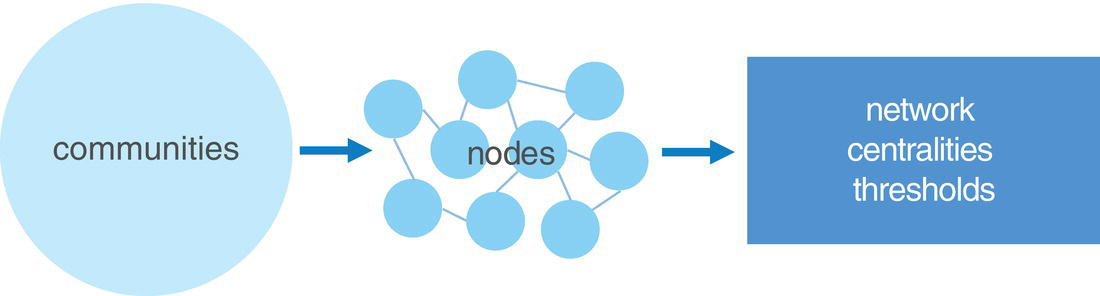
Figure 5.53 Rules and thresholds produced by the outlier analysis.
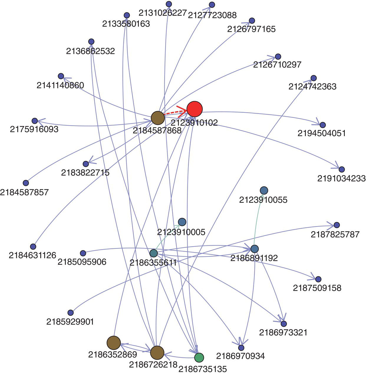
Figure 5.54 Outlier on the link weight and the hub centrality.
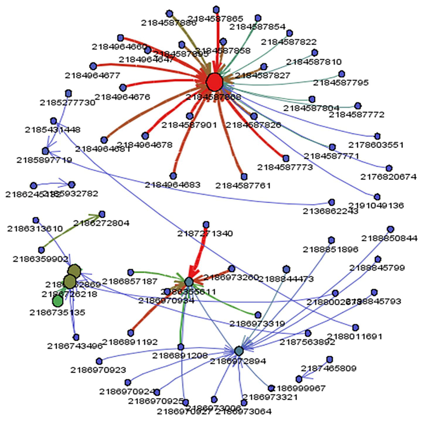
Figure 5.55 Outlier on the link weight, and hub and authority centralities.
Often, the procedures associated with fraud detection or fraud management, for example in this approach, highlights suspicious events, which from a practical point of view, flag those events for further investigation. The outlier analysis upon the social network metrics describes possibly suspicious behavior considering relationships rather than individual measures or attributes. This average behavior can be translated into a set of rules based on thresholds to point out possible cases of fraud. This set of rules based on thresholds can even be deployed in a transactional system, for example, to raise alerts in real time about possible events of fraud in course. Alerts are not stamps of fraud, but instead, they are indications on how likely these events might be fraudulent.
5.9 Summary
This chapter wraps up the content of this book by presenting some real‐world cases studies. The first case showed the utilization of the TSP to find an optimal route in Paris when visiting multiple places by using different transport options. This case was a demonstration, which later on turned out to be a real‐case implementation. The second case also started as a demonstration, which turned into a real deployment. It presented the VRP, which is crucial for supply chain and scheduling and delivering. Both cases were deployed in the United States. The third case presented a real‐case application developed at the beginning of the COVID‐19 pandemic. It employed a series of network analysis and network optimization algorithms in combination with supervised machine learning models to understand the impact of the population movements throughout geographic locations to the spread of the virus and therefore estimating possible new outbreaks. This case was deployed in a few countries around the globe, like The Philippines and Norway. The fourth case was also a real‐world application to understand the urban mobility and to apply these outcomes to improve the public transportation planning, traffic routing, and disease spread. This case was initially developed in 2012 to understand the vectors for the spread of diseases like Dengue in Rio de Janeiro, Brazil. Later on, some of the algorithms were used during the World Cup in 2014 and the Olympic Games in 2016. The fifth case was also a real‐world application developed in Dublin, Ireland, to identify exaggeration cases in auto insurance. The sixth case was a real‐world application deployment in Turkey to identify the impact of the viral effect in business events like churn and product adoption. Finally, the seventh case was a real‐world application to detect fraud in telecommunications. This case was deployed in different carriers in Brazil.