
Chapter 18
Getting Started Making Charts
IN THIS CHAPTER
Charting overview
Seeing how Excel handles charts
Comparing embedded charts and chart sheets
Identifying the parts of a chart
Seeing some chart examples
When most people think of Excel, they think of crunching rows and columns of numbers. But as you probably know already, Excel is no slouch when it comes to presenting data visually in the form of charts. In fact, Excel is probably the most commonly used software in the world for creating charts. This chapter presents an introductory overview of Excel’s charting ability.
What Is a Chart?
A chart is a visual representation of numeric values. Charts (also known as graphs) have been an integral part of spreadsheets since the early days of Lotus 1-2-3. Charts generated by early spreadsheet products were quite crude, but they’ve improved significantly over the years. Excel provides you with the tools to create a wide variety of highly customizable professional-quality charts.
Displaying data in a well-conceived chart can make your numbers more understandable. Because a chart presents a picture, charts are particularly useful for summarizing a series of numbers and their interrelationships. Making a chart can often help you spot trends and patterns that may otherwise go unnoticed. If you’re unfamiliar with the elements of a chart, see the sidebar later in this chapter, “Parts of a Chart.”
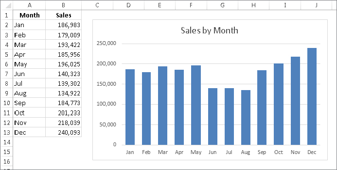
Figure 18.1 shows a worksheet that contains a simple column chart that depicts a company’s sales volume by month. Viewing the chart makes it very apparent that sales were down in the summer months (June through August), but they increased steadily during the final four months of the year. You could, of course, arrive at this same conclusion simply by studying the numbers. But viewing the chart makes the point much more quickly.
FIGURE 18.1 A simple column chart depicts the monthly sales volume.
A column chart is just one of many different types of charts that you can create with Excel. Later in this chapter, I discuss all chart types so you can make the right choice for your data.
Understanding How Excel Handles Charts
Before you can create a chart, you must have some numbers — sometimes known as data. The data, of course, is stored in the cells in a worksheet. Normally, the data that a chart uses resides in a single worksheet, but that’s not a strict requirement. A chart can use data that’s stored in a different worksheet or even in a different workbook.
A chart is essentially an object that Excel creates upon request. This object consists of one or more data series, displayed graphically. The appearance of the data series depends on the selected chart type. For example, if you create a line chart that uses two data series, the chart contains two lines, each representing one data series. The data for each series is stored in a separate row or column. Each point on the line is determined by the value in a single cell and is represented by a marker. You can distinguish each of the lines by its thickness, line style, color, or data markers (squares, circles, and so on).
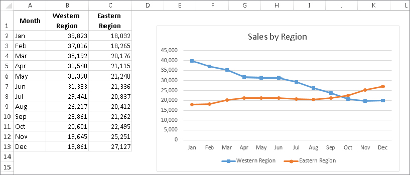
Figure 18.2 shows a line chart that plots two data series across a 12-month period. I used different data markers (squares versus circles) to identify the two series, as shown in the legend at the bottom of the chart. The chart clearly shows the sales in the Western Region are declining steadily, while Eastern Region sales are increasing a bit after remaining level for several months.
FIGURE 18.2 This line chart displays two data series.
A key point to keep in mind is that charts are dynamic. In other words, a chart series is linked to the data in your worksheet. If the data changes, the chart is updated automatically to reflect those changes.
After you create a chart, you can always change its type, change the formatting, add or remove specific elements (such as the title or legend), add new data series to it, or change an existing data series so that it uses data in a different range.
A chart is either embedded in a worksheet or displayed on a separate chart sheet. It’s very easy to move an embedded chart to a chart sheet (and vice versa).
Embedded charts
An embedded chart basically floats on top of a worksheet, on the worksheet’s drawing layer. The charts shown previously in this chapter are both embedded charts.
As with other drawing objects (such as Shapes or SmartArt), you can move an embedded chart, resize it, change its proportions, adjust its borders, and perform other operations. Using embedded charts enables you to print the chart next to the data that it uses.
To make any changes to the actual chart in an embedded chart object, you must click it to activate the chart. When a chart is activated, Excel displays the Chart Tools contextual tabs. The Ribbon provides many tools for working with charts, and even more tools are available in the Format task pane.
With one exception, every chart starts out as an embedded chart. The exception is when you create a default chart by selecting the data and pressing F11. In that case, the chart is created on a chart sheet.
Chart sheets
When a chart is on a chart sheet, you view it by clicking its sheet tab. A chart sheet contains a single chart. Chart sheets and worksheets can be interspersed in a workbook.
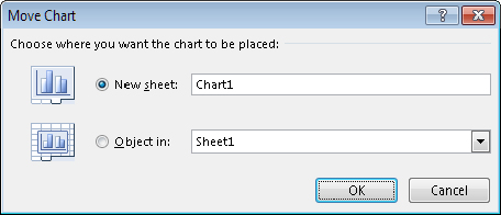
To move an embedded chart to a chart sheet, click the chart to select it and then choose Chart Tools ⇒ Design ⇒ Location ⇒ Move Chart. The Move Chart dialog box, shown in Figure 18.3, appears. Select the New Sheet option and provide a name for the chart sheet (or accept Excel’s default name). Click OK, the chart is moved, and the new chart sheet is displayed.
FIGURE 18.3 The Move Chart dialog box lets you move a chart to a chart sheet.
When you place a chart on a chart sheet, the chart occupies the entire sheet. If you plan to print a chart on a page by itself, using a chart sheet is often your better choice. If you have many charts, you may want to put each one on a separate chart sheet to avoid cluttering your worksheet. This technique also makes locating a particular chart easier because you can change the names of the chart sheets’ tabs to provide a description of the chart that it contains.
The Excel Ribbon changes when a chart sheet is active, similar to the way it changes when you select an embedded chart. You have access to the same editing tools for embedded charts and charts on chart sheets.
If the chart isn’t fully visible in the window, you can use the scroll bars to scroll it, or adjust the zoom factor to make it smaller. You can also change its orientation (tall or wide) by choosing Page Layout ⇒ Page Setup ⇒ Orientation.
Creating a Chart
Creating a chart is fairly simple:
Hands On: Creating and Customizing a Chart
This section contains a step-by-step example of creating a chart and applying some customizations. If you’ve never created a chart, this is a good opportunity to get a feel for how the process works.
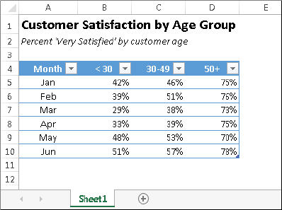
Figure 18.4 shows a worksheet with a range of data. This data shows customer survey results by month, broken down by customers in three age groups. In this case, the data resides in a table (created by choosing Insert ⇒ Tables ⇒ Table), but that’s not a requirement to create a chart.
FIGURE 18.4 The source data for the hands-on chart example
Selecting the data
The first step is to select the data for the chart. Your selection should include such items as labels and series identifiers (row and column headings). For this example, select the entire table (range A4:D10). This range includes the category labels but not the title (which is in A1).
Choosing a chart type
After you select the data, select a chart type from the Insert ⇒ Charts group. Each control in this group is a drop-down list, which lets you further refine your choice by selecting a subtype.
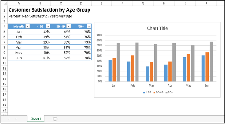
For this example, let Excel recommend a chart type. Choose Insert ⇒ Charts ⇒ Recommended Charts. Excel displays the dialog box shown in Figure 18.5. This dialog box shows several recommended charts, using your actual data. Select the first choice, Clustered Column, and click OK. Excel inserts the chart in the middle of the workbook window. You can move the chart by dragging any of its borders. You can also resize it by dragging in one of its corners. Figure 18.6 shows the chart positioned next to the source data range.
FIGURE 18.5 Letting Excel recommend a chart type
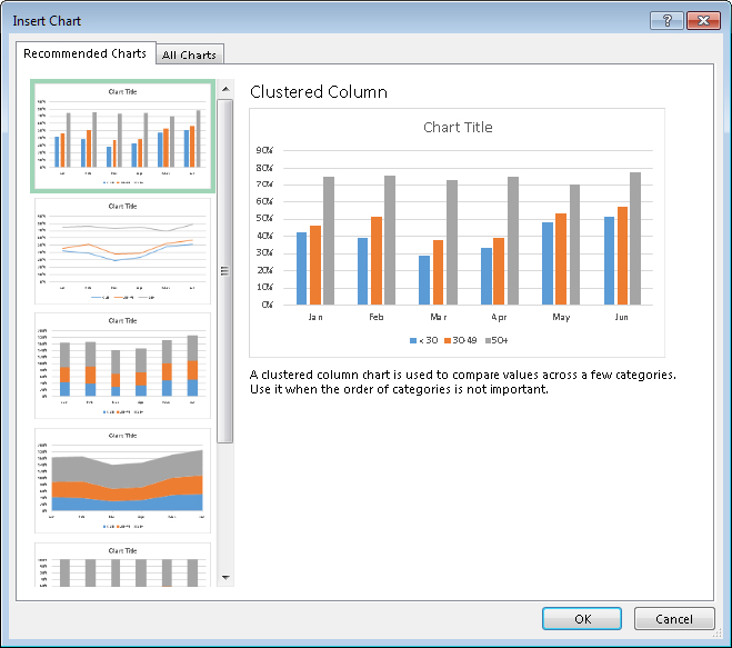
FIGURE 18.6 A clustered column chart created from the data in the table
Experimenting with different styles
The chart looks pretty good, but it’s just one of several predefined styles for a clustered column chart.
To see some other looks for the chart, select the chart (click it) and check out a few other predefined styles in the Chart Tools ⇒ Design ⇒ Chart Styles group. Just hover your mouse over a thumbnail in the gallery, and your chart shows a Live Preview of the new style. If you find a style you like, click the thumbnail to apply the style. Notice that this Ribbon group also includes a Change Colors tool, which lets you quickly modify the colors used in the chart.
You can also access the chart styles and colors by using the Chart Styles button, which appears to the right of the chart when you select it (the button displays a paintbrush). The choices are presented in a scrollable list. The choices are exactly the same as those displayed in the Chart Tools ⇒ Design ⇒ Chart Styles group.
Experimenting with different layouts
Every chart type has a set of layouts that you can choose from. A layout contains additional chart elements, such as a title, data labels, axes, and so on. You can add your own elements to your chart, but often, using a predefined layout saves time. Even if the layout isn’t exactly what you want, it may be close enough that you need to make only a few adjustments.
To try a different predefined layout, select the chart and choose Chart Tools ⇒ Design ⇒ Chart Layouts ⇒ Quick Layout.
To manually add or remove elements from the chart, click the Chart Elements button, which appears to the right of the chart and has an image of a plus sign. Note that each item expands to provide more options, such as the location of the element within the chart. The Chart Elements icon contains the same option as the Chart Tools ⇒ Design ⇒ Chart Layouts ⇒ Add Chart Element control.
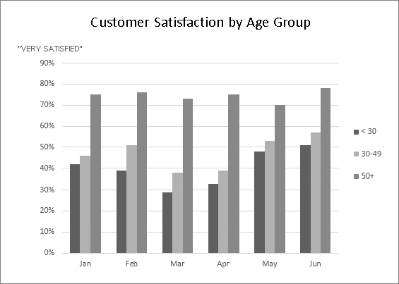
Figure 18.7 shows the chart after selecting a different style and changing the colors. I chose a layout that displays the legend on the right and includes axis titles. I customized the generic title and vertical axis title and deleted the horizontal axis title because it’s obvious that it displays months.
FIGURE 18.7 The chart, after selecting a different style and layout
Experiment with the Chart Tools ⇒ Design tab to make other changes to the chart. Also try the tools that appear to the right of the chart when you click it. For example, you can remove the gridlines add axis titles, relocate the legend, and so on. Making these changes is easy and fairly intuitive.
Up until now, the changes made to the chart have been strictly cosmetic. The following sections describe how to make more substantial changes to a chart.
Trying another view of the data
The chart, at this point, shows six clusters (months) of three data points in each (age groups). Would the data be easier to understand if you plotted the information in the opposite way?
Try it. Select the chart and then choose Chart Tools ⇒ Design ⇒ Data ⇒ Switch Row/Column. Figure 18.8 shows the result of this change.
FIGURE 18.8 The chart, after changing the row and column orientation
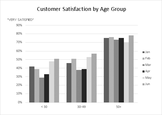
The chart, with this new orientation, reveals information that wasn’t so apparent in the original version. The <30 and 30–49 age groups both show a decline in satisfaction for March and April. The 50+ age group didn’t have this problem, however.
Trying other chart types
Although a clustered column chart seems to work well for this data, there’s no harm in checking out some other chart types. Choose Design ⇒ Type ⇒ Change Chart Type to experiment with other chart types. This command displays the Change Chart Type dialog box, shown in Figure 18.9. The figure shows how the data would look as a line chart.
FIGURE 18.9 Use this dialog box to change the chart type.
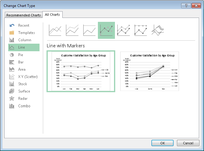
The main chart categories are listed on the left, and the subtypes are shown as a horizontal row of icons. Select an icon and the display shows how the chart will look in both data orientations. When you find a suitable chart type, click OK and Excel changes the chart. Notice that this dialog box has a tab at the top that lets you access Excel’s recommended chart types for the data.
If you don’t like the result after clicking OK, select Undo from the Quick Access Toolbar.
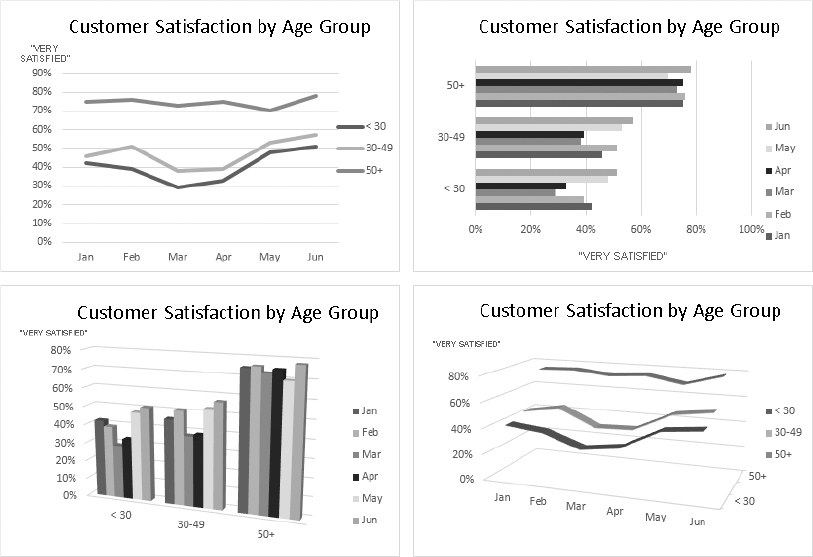
Figure 18.10 shows a few different chart type options using the customer satisfaction data.
FIGURE 18.10 The customer satisfaction data, displayed using four different chart types
Working with Charts
This section covers some common chart modifications:
- Resizing and moving charts
- Copying a chart
- Deleting a chart
- Adding chart elements
- Moving and deleting chart elements
- Formatting chart elements
- Printing charts
Resizing a chart
If your chart is an embedded chart, you can freely resize it with your mouse. Click the chart’s border. Square handles appear on the chart’s corners and edges. Move the mouse pointer over a handle and when the pointer turns into a double arrow, drag to resize the chart.
When a chart is selected, choose Chart Tools ⇒ Format ⇒ Size and use the two controls to adjust the height and width of the chart. Use the spinners or type the dimensions directly into the Height and Width controls.
Moving a chart
To move an embedded chart to a different location on a worksheet, click the chart to select it, move the mouse pointer over one of its borders, and then drag. You can use standard cut-and-paste techniques to move an embedded chart. In fact, this is the only way to move a chart from one worksheet to another. Select the chart and choose Home ⇒ Clipboard ⇒ Cut (or press Ctrl+X). Then activate a cell near the desired location and choose Home ⇒ Clipboard ⇒ Paste (or press Ctrl+V). The new location can be in a different worksheet or even in a different workbook. If you paste the chart to a different workbook, the chart will be linked to the data in the original workbook.
To move an embedded chart to a chart sheet (or vice versa), select the chart and choose Chart Tools ⇒ Design ⇒ Location ⇒ Move Chart; the Move Chart dialog box appears. Choose New Sheet and provide a name for the chart sheet (or use the Excel proposed name).
Copying a chart
To make an exact copy of an embedded chart on the same worksheet, click the chart’s border, press and hold the Ctrl key, and drag. Release the mouse button, and a new copy of the chart is created.
To make a copy of a chart sheet, use the same procedure, but drag the chart sheet’s tab.
You also can use standard copy-and-paste techniques to copy a chart. Select the chart (an embedded chart or a chart sheet) and choose Home ⇒ Clipboard ⇒ Copy (or press Ctrl+C). Then activate a cell near the desired location and choose Home ⇒ Clipboard ⇒ Paste (or press Ctrl+V). The new location can be in a different worksheet or even in a different workbook. If you paste the chart to a different workbook, it will be linked to the data in the original workbook.
Deleting a chart
To delete an embedded chart, press Ctrl and click the chart (to select the chart as an object). Then press Delete. When the Ctrl key is pressed, you can select multiple charts, and then delete them all with a single press of the Delete key.
To delete a chart sheet, right-click its sheet tab and choose Delete from the shortcut menu. To delete multiple chart sheets, select them by pressing Ctrl while you click the sheet tabs.
Adding chart elements
To add new elements to a chart (such as a title, legend, data labels, or gridlines), activate the chart and click the Chart Elements button, which appears to the right of the chart. Click the check box beside one of the listed chart elements to display or hide it. Note that each item expands to display additional options.
You can also use the Add Chart Element control on the Chart Tools ⇒ Design ⇒ Chart Layouts group.
Moving and deleting chart elements
Some elements within a chart can be moved: titles, legend, and data labels. To move a chart element, simply click it to select it and then drag it by its border.
The easiest way to delete a chart element is to select it and then press Delete. You can also use the controls on the Chart Elements icon, which appears to the right of the chart.
Formatting chart elements
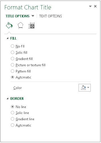
Many users are content to stick with the predefined chart styles and layouts. For more precise customizations, Excel allows you to work with individual chart elements and apply additional formatting. You can use the Ribbon commands for some modifications, but the easiest way to format chart elements is to right-click the element and choose Format <Element> from the shortcut menu. The exact command depends on the element you select. For example, if you right-click the chart’s title, the shortcut menu command is Format Chart Title.
The Format command displays a pane with options for the selected element. Changes that you make appear immediately. When you select a new chart element, the dialog box changes to display the properties for the newly selected element. You can keep this task pane displayed while you work on the chart. It can be docked along the left or right part of the window or made free floating and sizable.
Refer to the “Exploring the Format Pane” sidebar for an explanation of how the Format task panes work.
Printing charts
Printing embedded charts is nothing special; you print them the same way that you print a worksheet. As long as you include the embedded chart in the range that you want to print, Excel prints the chart as it appears on-screen. When printing a sheet that contains embedded charts, it’s a good idea to preview first (or use Page Layout view) to ensure that your charts don’t span multiple pages. If you created the chart on a chart sheet, Excel always prints the chart on a page by itself.
If you don’t want a particular embedded chart to appear on your printout, access the Format Chart Area pane and select the Size & Properties icon. Then Expand the Properties section and clear the Print Object check box.
Understanding Chart Types
People who create charts usually do so to make a point or to communicate a specific message. Often, the message is explicitly stated in the chart’s title or in a text box within the chart. The chart itself provides visual support.
Choosing the correct chart type is often a key factor in the effectiveness of the message. Therefore, it’s often well worth your time to experiment with various chart types to determine which one conveys your message best.
In almost every case, the underlying message in a chart is some type of comparison. Examples of some general types of comparisons include:
- Comparing an item to other items: A chart may compare sales in each of a company’s sales regions.
- Comparing data over time: A chart may display sales by month and indicate trends over time.
- Making relative comparisons: A common pie chart can depict relative proportions in terms of pie “slices.”
- Comparing data relationships: An XY chart is ideal for this comparison. For example, you might show the relationship between monthly marketing expenditures and sales.
- Comparing frequency: You can use a common histogram, for example, to display the number (or percentage) of students who scored within a particular grade range.
- Identifying outliers or unusual situations: If you have thousands of data points, creating a chart may help identify data that isn’t representative.
Choosing a chart type
A common question among Excel users is “How do I know which chart type to use for my data?” Unfortunately, this question has no cut-and-dried answer. Perhaps the best answer is a vague one: Use the chart type that gets your message across in the simplest way. A good starting point is Excel’s recommended charts. Select your data and choose Insert ⇒ Charts ⇒ Recommended Charts to see the chart types that Excel suggests. Remember that these suggestions are not always the best choices.
Figure 18.11 shows the same set of data plotted by using six different chart types. Although all six charts represent the same information (monthly website visitors), they look quite different from one another.
FIGURE 18.11 The same data, plotted by using six chart types
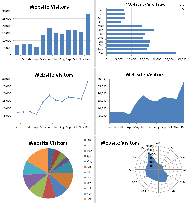
The column chart (upper left) is probably the best choice for this particular set of data because it clearly shows the information for each month in discrete units. The bar chart (upper right) is similar to a column chart, but the axes are swapped. Most people are more accustomed to seeing time-based information extend from left to right rather than from top to bottom, so this isn’t the optimal choice.
The line chart (middle left) may not be the best choice because it can imply that the data is continuous — that points exist in between the 12 actual data points. This same argument may be made against using an area chart (middle right).
The pie chart (lower left) is simply too confusing and does nothing to convey the time-based nature of the data. Pie charts are most appropriate for a data series in which you want to emphasize proportions among a relatively small number of data points. If you have too many data points, a pie chart can be impossible to interpret.
The radar chart (lower right) is clearly inappropriate for this data. People aren’t accustomed to viewing time-based information in a circular direction!
Fortunately, changing a chart’s type is easy, so you can experiment with various chart types until you find the one that represents your data accurately, clearly, and as simply as possible.
Summary
This chapter introduced Excel charts, including the difference between embedded charts and separate chart sheets, and parts of a chart. You learned how to:
- Create a chart, including choosing a recommended or other chart type.
- Change the chart style or layout.
- Display and work with various chart elements.
- Move, resize, and copy a chart.
- Use the Format pane for formatting various chart elements.
- Print a chart.
- Experiment with more chart types.