This chapter is about creating Photoshop effects that look like you created them in a studio, but actually you could have created them in your basement while sitting around in your underwear. That’s part of the magic of Photoshop—nobody knows what you’re wearing. And although they might like to imagine you’re doing all this from a trendy loft studio in Soho, chances are you’re not. Now, that doesn’t mean you’re in your basement—you might be in your parents’ basement, but if you’re 35 or 40, you should probably have your own basement (and your own underwear, as well). But there are advantages to having your fake studio in your basement. One, of course, is overhead. When you work in a basement, everything is overhead, because essentially you’re underground, so now when you talk about your studio you can refer to it as your “underground studio,” which sounds kind of like an “underground bunker,” which reminds me of Archie Bunker from the hit 1970s TV show All in the Family, which was big back when the famous New York disco Studio 54 was big, but of course that was years before the movie of the same name, which was based on the disco, was released (it starred Mike Myers), which is actually what this chapter is named after. Like the way I pulled that together at the last minute? I know. It’s a gift.
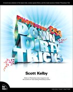
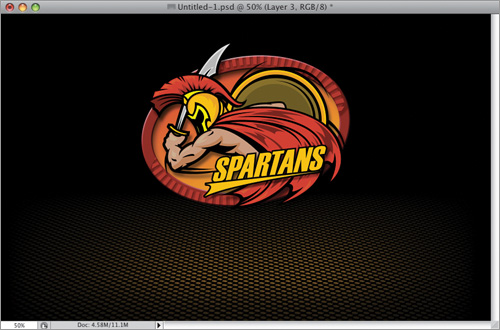
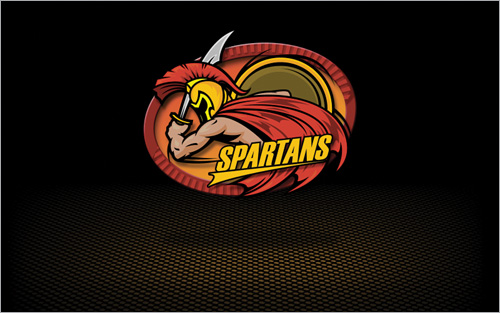
I saw this effect in some TV ads for NFLshop.com (where you can buy real NFL jerseys and team gear), and they used the look in several places on the website as well, tying it back to the TV ads. The effect has you creating a high-tech looking grid floor that seems to fade off, with a dramatic lighting effect falling right where your product (or in this case, a logo) would be, with a soft drop shadow under it to enhance the look. Here’s how it’s done:
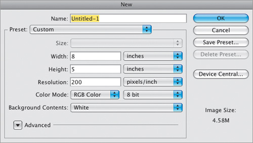
Go under the File menu, choose New, and create a new document that has a resolution of at least 200 ppi (the one I’m creating here is 8 inches wide by 5 inches high at a resolution of 200 ppi).
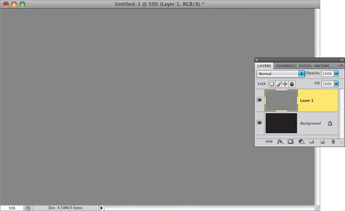
Press D to set your Foreground color to black, then press Option-Delete (PC: Alt-Backspace) to fill your Background layer with black. Create a new layer (click on the Create a New Layer icon at the bottom of the Layers panel), then click on the Foreground color swatch to bring up the Color Picker and change the color to a medium gray. Now, fill this layer with that gray color using the same shortcut you just learned (or you can go under the Edit menu, choose Fill, and from the Use pop-up menu, choose 50% Gray, then click OK).
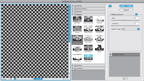
Reset your Foreground color to black, and then to create the rows of dots we need, go under the Filter menu, under Sketch, and choose Halftone Pattern. When the dialog appears, set the Size to 6, the Contrast to 0, and then set the Pattern Type to Dot (as shown here). This creates rows of kinda blurry black and white dots (seen in the preview on the left side of the filter dialog).
Click OK, and you can see here how the pattern looks when applied to your layer.
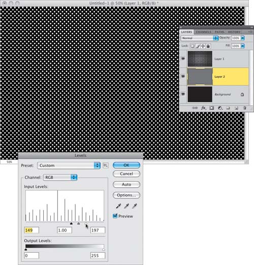
To get rid of the blurriness, and make the dots nice and round, press Command-L (PC: Ctrl-L) to bring up the Levels dialog (seen here), then drag the shadows Input Levels slider (the black-filled triangle appearing under the left side of the histogram) to the right until the shadow amount reaches around 150 (you’ll see the amount displayed in the field under where the slider used to be). Then drag the highlights Input Levels slider (the white triangle found on the far-right side) over to the left until it’s about ½″ from the shadows slider (to around 197). As you do this, the blurring goes away, and the dots become nice and uniformly round. Now, create a new layer, drag it beneath your dots layer, and then fill it with a medium gray (as seen here). Note: Moving the shadows and highlights sliders close together like this is what removes the blurring, but as you’re dragging, you’ll see that where you drag to also determines how large the dots are, and how much space there will be between them.
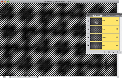
In the Layers panel, click on your dots layer to make it the active layer. Now, go to the Channels panel (found under the Window menu), press-and-hold the Command (PC: Ctrl) key and click directly on the RGB channel’s thumbnail (as seen here) to load that channel’s luminosity as a selection (this puts a selection around all the white areas).
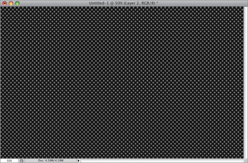
We need the white dots to be transparent, so press the Delete (PC: Backspace) key to delete those white dots, then press Command-D (PC: Ctrl-D) to Deselect. Now, as you see here, you’ll see gray dots where the white dots used to be (that’s the gray from the layer below). Go ahead and switch back to the Layers panel.
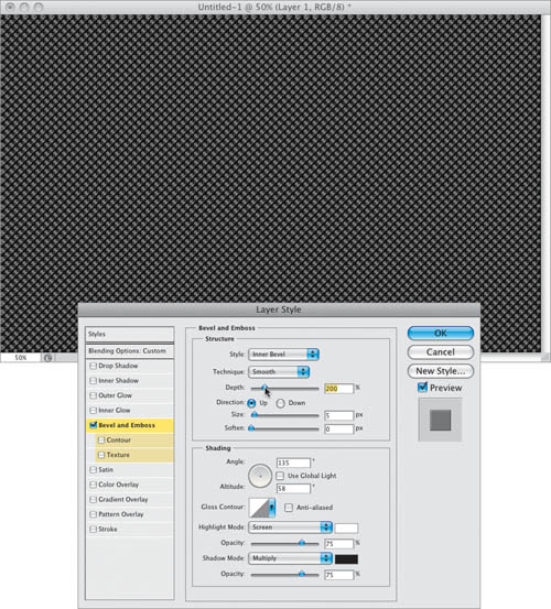
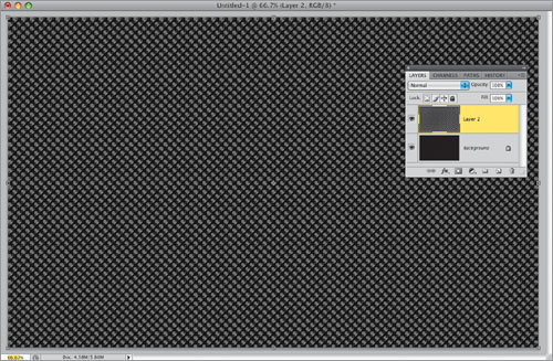
To give some depth to the dot pattern, you’re going to add a bevel to the gray dots. Click on the Add a Layer Style icon at the bottom of the Layers panel and choose Bevel and Emboss from the pop-up menu. When the Layer Style dialog appears (seen here), increase your Depth amount to 200%. Then go down to the Shading section, turn off the Use Global Light checkbox, and in the Angle circle, drag the little crosshair closer to the center point (or just type in 135° for your Angle and 58° for Altitude). Changing the direction of the light like this helps make the effect stand out a bit more. Click OK to apply this bevel to your layer. Now that we have the colors right and the bevel added, you’ll need to merge this dots layer permanently with the gray layer below it by pressing Command-E (PC: Ctrl-E).
Here’s how the beveled dot pattern looks now. Press Command-T (PC: Ctrl-T) to bring up Free Transform, and then press Command-0 (zero; PC: Ctrl-0) to expand the image window slightly, so you can reach the Free Transform handles (as seen here). Note that there are only two layers—your black background and your dots layer—because you merged the dots layer with the gray layer in the last step.
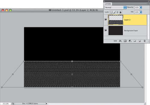
We need to flatten out this dot pattern, so it looks more like a slightly raised view of a tabletop, so although there is a Perspective function for Free Transform, instead we’re going to do this manually using the Distort function (because the Perspective function can sometimes distort the dots in a funky way). Press-and-hold the Command (PC: Ctrl) key, grab the top-right corner point, and drag straight down about two-thirds of the way down the image. Grab the top-left corner point and do the same thing. Next, grab the bottom-right corner point and (while still pressing-and-holding the Command key) drag straight out to the right, then grab the bottom-left corner point and do the same thing. This gives you the perspective look you see here. Now, press Return (PC: Enter) to lock in your transformation.
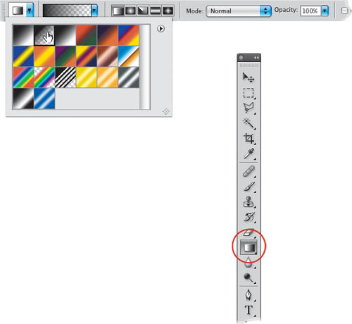
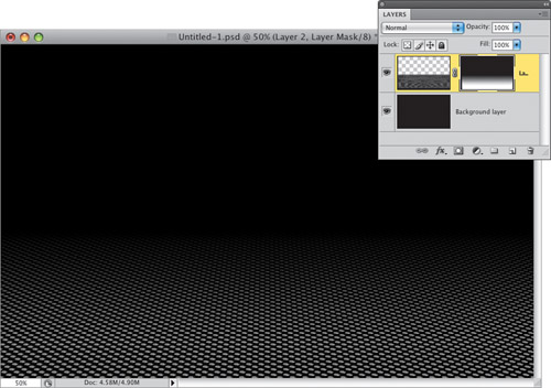
We’re going to use a layer mask and a solid-to-transparent gradient to fade the edges of our dot grid, so it looks like they fade off into black. To do that, get the Gradient tool (G), then up in the Options Bar, click on the down-facing arrow to the right of the gradient thumbnail to open the Gradient Picker, and click on the second gradient (as shown here), which is the Foreground to Transparent gradient.
Go to the Layers panel, and click on the Add Layer Mask icon at the bottom of the panel (it’s the third icon from the left). This should make your Foreground color white, so press X to switch it to black. Now go back to the image, click the Gradient tool near the top center of your dot grid, and then drag downward about an inch or so, and it fades away the top edge of your dot grid (as seen here).
Now, do the same thing for both sides to fade the edges away to black (as seen here).
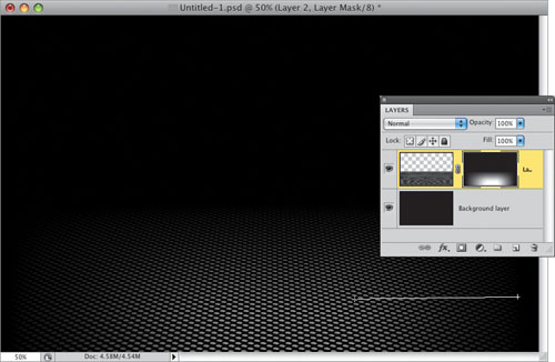
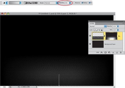
At this point, you’ve got fades on the top, left, and right, and you want a more subtle fade on the bottom (which will help to make it look more like there’s a spotlight falling on your grid). So, go up to the Options Bar (up top) and lower the Opacity of the Gradient tool to 50%, then click-and-drag from the bottom of your image to around 1″ inside your dot grid (as shown here) to subtly fade the bottom edge to black (as shown in the next step).
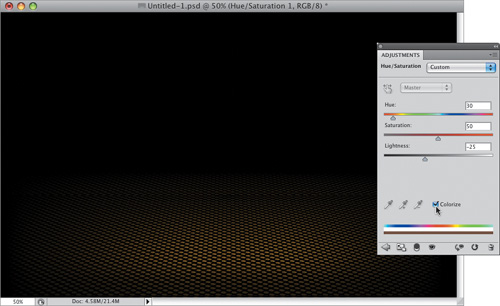
Now, let’s add some color to the dot grid. In the Adjustments panel, click on the Hue/Saturation icon (in the second row, the second icon from the left), and when its options appear, turn on the Colorize checkbox (as shown here), then use the Hue slider to choose which color you’d like for your tint (the color you want for your dot grid). If the color seems too muted, increase the Saturation to around 50, and if it then seems too bright, drag the Lightness slider to the left.
Open the document with your logo (or a product shot), get the Move tool (V), and click-and-drag just the logo itself over onto your main document (as seen here). If your logo has a solid color background area around it, you’ll need to put a selection around just your logo (or product) first (try selecting the background with the Magic Wand tool [press Shift-W until you have it], then press Command-Shift-I [PC: Ctrl-Shift-I] to Inverse your selection), and then drag over just it alone—without the background. Now, you can position your logo (or product) over the brightest area of the grid (as seen here).
You’re now going to add a drop shadow to your logo, but we can’t easily use the built-in drop shadow, because it will want to put the shadow behind your logo, and not below it on the grid. So, to get the shadow to cast below the logo, we’ll have to make one ourselves. Start by pressing Command-J (PC: Ctrl-J) to duplicate the layer. Then press Option-Shift-Delete (PC: Alt-Shift-Backspace) to fill your logo with black (this black-filled copy of your logo is what we’re going to turn into your drop shadow). Next, bring up Free Transform again (as seen here).
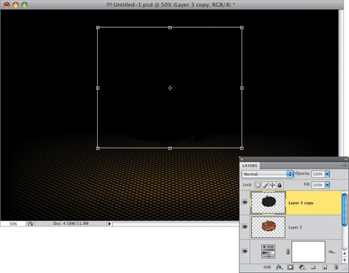
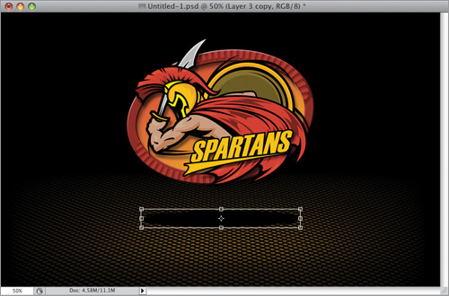
Press-and-hold the Shift key, and drag the black-filled logo straight down beneath your full-color logo. While still pressing-and-holding the Shift key, grab the top-center point, and drag it straight downward, squashing your black logo down until it’s nearly flat (as seen here), then lock in your transformation.
To soften your shadow, go under the Filter menu, under Blur, and choose Gaussian Blur. When the Gaussian Blur dialog appears, enter 9 pixels (as shown here), then click OK to apply the blur, which softens all the edges.
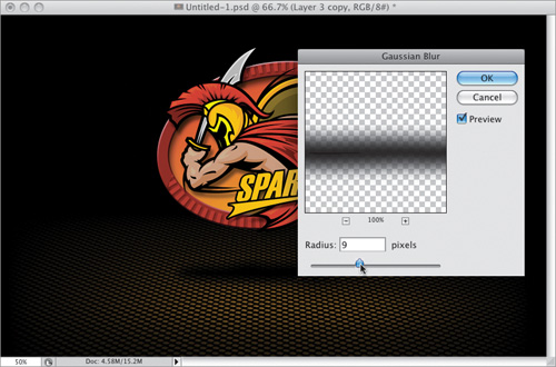
Lastly, go to the Layers panel and lower the Opacity of this layer to around 50% to lighten the shadow, and to make it more transparent, so you see some of the dot grid through it (which helps the shadow look more realistic). That’s it!
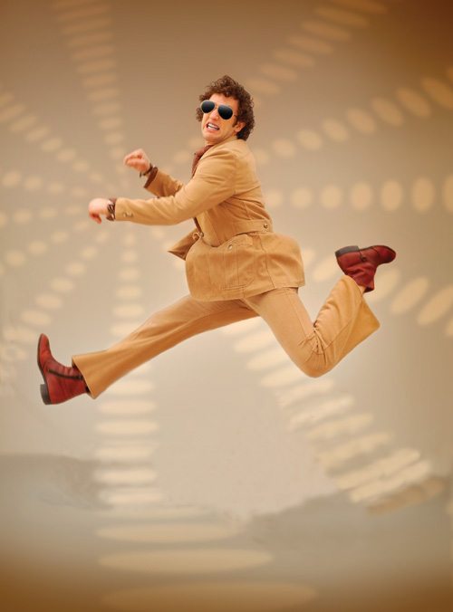
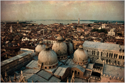
This technique caught my eye when a photo by photographer Laura Boston Thek was chosen as the Image of the Week on the member’s portfolio website for the National Association of Photoshop Professionals (NAPP, for short). She had taken a vacation photo from her trip to Venice, Italy, and then applied a paper texture to the image, which gave it this historical, archival look, and I heard from a number of folks who wanted to know how this was done. Well, here’s how it’s done:
First, open the photo you want to apply the effect to. As luck would have it, my family had taken a vacation trip to Venice, too, so I already had a source image to use (and you can download this same source image from the book’s downloads page, listed in the book’s intro).
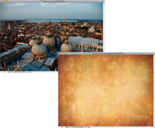
You’ll need a paper texture image, like the one shown here. (You can download this same texture image from the book’s downloads page, too, courtesy of our friends at iStockphoto.com.)
Get the Move tool (V) and drag-and-drop this paper texture image over on top of your photo. (Note: If you press-and-hold the Shift key while you drag-and-drop, it will center the paper texture image over your photo, as you see here.) If you’re using Photoshop CS4’s tabbed windows feature, it’s a bit clunkier. You’ll click-and-drag the paper texture image itself up to the tab for your photo document and just pause there a moment. The photo document will appear, and you’ll drag your cursor down to the center of your photo area, then release the mouse button, and your image will appear (I told you it was clunky and this is the main reason why I don’t use the tabbed windows feature).
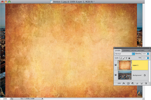
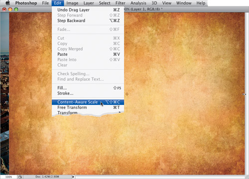
Chances are, your paper texture isn’t going to be a perfect fit over your photo (look at the image back in Step Three, and you can see a gap on the left and right sides because the image isn’t wide enough), so you’re going to have to stretch it to fit. Of course, you could just go to Free Transform and stretch the sides (after all, it’s just a background texture, right?), but it’s just as easy to use CS4’s Content-Aware Scale feature (which helps to keep the “stretched” look to a minimum). So, go under the Edit menu and choose Content-Aware Scale (as shown here). This brings up scaling points around the edges of your image. Just grab the right-center point and drag to the right to stretch your texture to fill that gap. Now, do the same thing on the left side (you could do the top and bottom if it needed it, too), and once your full image area is completely covered, press the Return (PC: Enter) key to lock in your transformation.
You’re going to use a layer blend mode to blend this paper texture into the photo on the layer beneath it. Of course, the question is which layer blend mode will look best? Here’s how to find out: Make sure you have the Move tool, then press Shift-+ (the plus sign on your keyboard), and each time you press that, it will change your layer to the next blend mode in the menu. So in just a few seconds, you’ll be able to run through all the blend modes and choose the one that looks best to you. In this case, after running through them all, I thought the Multiply mode looked best, so I stopped there on my second time through.
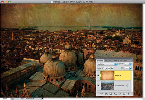
The downside of using the Multiply layer blend mode is that it makes the image look much darker. One way to minimize the darkening is to lower the Opacity of this layer to around 50% (as shown here), which not only lightens the effect of Multiply, but also lowers the intensity of the texture, which I think in this case is a good thing. Note: When going through your layer blend modes, there are a few modes that will be the “most likely” ones you choose. They are: Multiply, Screen, Overlay, and Soft Light. You won’t always choose those, because depending on the photo, you might go with something else, but my bet is that 99% of the time it’ll be one of those four blend modes.

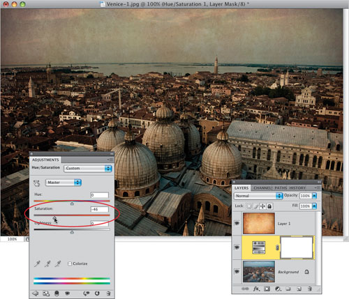
If you really want this photo to have that “historical archival” look to it, the colors in the photo probably wouldn’t be as bright and vibrant as the ones taken by today’s digital cameras. So, to deal with that, first go to the Layers panel and click on the Background layer. Then go to the Adjustments panel and click on the Hue/Saturation icon (it’s the second one from the left, in the center row). This brings up the Hue/Saturation options (seen here). Now, just drag the Saturation slider quite a bit over to the left (as shown circled here in red) to desaturate the color a bit and give it a more realistic look.
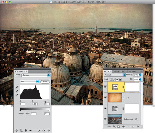
Now that we’ve done all this, to me the photo looks a bit dark, but a quick Levels adjustment will fix that. Click on the top layer in your layer stack, then go to the Adjustments panel and click on the Levels icon (it’s the second icon from the left in the top row). When its options appear, simply click on the white highlights slider (on the far-right side, just below the histogram) and drag it over to the left to around 215 (as shown here) to brighten the highlight areas, which makes the entire photo look brighter, and completes the effect (a before/after is shown below).
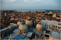
Before
After
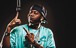
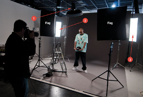
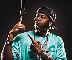
This technique is incredibly popular right now, but before I show it to you, there’s a critical part of it that happens before you get into Photoshop: the lighting has to be high contrast, too. The most common way to light your subject to get this effect is to put two flashes on either side and behind your subject, usually without a softbox or diffuser—just a reflector or bare bulb. These two lights will skim the sides of your subject, and create very bright highlights. Then you use one flash as your main light in front (on the left or right) with a softbox (or use a ringflash), so it’s a bit softer. In short, if the lighting is high contrast, this effect will look good. If not, it won’t.
Here’s the three-light setup I used for the shot we’re going to use in this tutorial (it looks much more complicated than it is). There are three lights: (1) The main light is a flash mounted above the subject’s head, with a beauty-dish attachment, although it’s not necessary to have a beauty dish at all. (2) Behind him and to his right is a flash with a tall, thin softbox (called a strip bank), and (3) another flash with a strip bank is behind him and to his left. The two flash units behind him are aimed at his sides. The only problem with this setup is that since two of the flashes are aiming at the camera, you might get lens flare (which tends to wash out the color, among other things), so I placed two black flags (as seen in the photo) to block the flashes from hitting my lens, then I shot between them (as seen here in the setup shot).
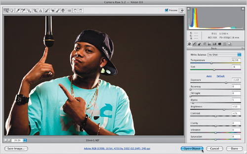
You can download the image shown here if you don’t have a photo with high-contrast lighting (the download address is in the book’s intro). This is a RAW image, so when you double-click on it, it opens in Camera Raw. The image is underexposed, so drag the Exposure slider over to +1.65, then press-and-hold the Shift key, and you’ll notice that the Open Image button at the bottom right has changed to Open Object (as seen here). Click that button to open your brightened image in Photoshop as a Smart Object.
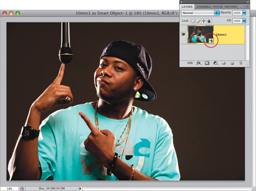
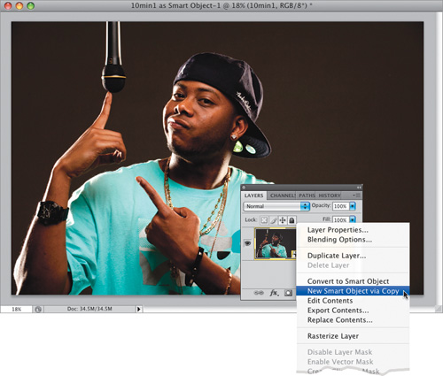
Once the image opens in Photoshop, you can tell it’s a Smart Object layer by looking at the layer’s thumbnail in the Layers panel. If it’s a Smart Object, you’ll see a little page icon in the bottom-right corner of the thumbnail (shown circled here in red). The advantage of opening it as a Smart Object is that we can go back into Camera Raw anytime and change our settings (which we’re going to do in a minute, to a copy of the RAW file). We’re going to duplicate the layer, but if we just drag it down to the Create a New Layer icon at the bottom of the Layers panel (or use the regular keyboard shortcut for duplicating a layer—Command-J [PC: Ctrl-J]), then this new layer will be tied to the original layer, and any changes we make to the duplicate will also be applied to the original. In this case, we need our two layers to be separate, and in the next step you’ll learn how to break that connection.
Control-click (PC: Right-click) directly on an open area of your Smart Object layer (not on the thumbnail) and a contextual menu will appear. From this menu, choose New Smart Object via Copy (as shown here). This makes a copy of your Smart Object layer, but it breaks the connection to the original layer. Now we can edit this copy separately, and the changes we make to this layer will only affect this one layer (and not the original).
Now that you’ve got a copy of your Smart Object layer, double-click directly on that layer’s thumbnail to bring up the Camera Raw window again (as seen here). Increase the Fill Light amount to 100 (which will make your photo look really washed out), then drag your Blacks slider to the right to around 29 to bring back some of the shadow area color and contrast. This makes the photo look pretty bad (as seen here), but it will get better soon. Don’t click OK quite yet, though.
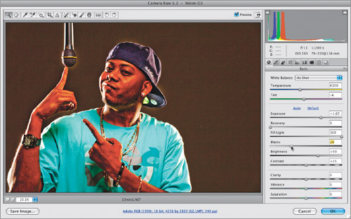
You’re going to make a few more edits, so first drag the Clarity slider (which controls midtone contrast) all the way to the right to 100, then drag the Saturation slider all the way to the left (to remove all the color from the photo. See? I told you we’d fix that color problem). Lastly, let’s bring some more contrast to the shadow areas of this photo by dragging the Blacks slider a little farther to the right—over to around 33—to make the photo nice and contrasty, and then click OK to apply these changes to your copied layer.
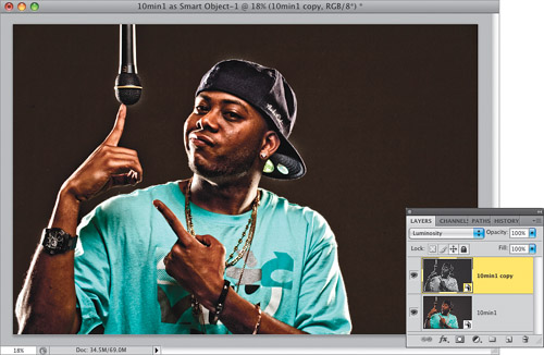
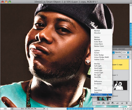
To blend this very contrasty black-and-white layer in with our original full-color Smart Object layer below it, go to the Layers panel and change the layer blend mode from Normal to Luminosity (as seen here).
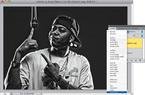
Here’s how the photo looks with the blend mode changed to Luminosity. You can see how much more contrasty and edgy the photo looks with just this one change. (You can turn the visibility of this layer off and on to see a quick before and after—just click on the Eye icon to the left of the top layer’s thumbnail, and then click on the spot where it used to be to make it visible again.)
At this point, you’ll have to make a decision: Do I want this effect applied just to my subject, or do I want it over the entire image? If I had shot this on location, I would normally apply it to the entire image, but since this was shot in a studio on a solid background, I’m going to apply the effect just to selected areas of my subject. To do that, press-and-hold the Option (PC: Alt) key and click on the Add Layer Mask icon at the bottom of the Layers panel (it’s shown circled here in red). This hides your high-contrast layer behind a black mask (you can see the black mask appear to the right of your layer’s thumbnail in the Layers panel).
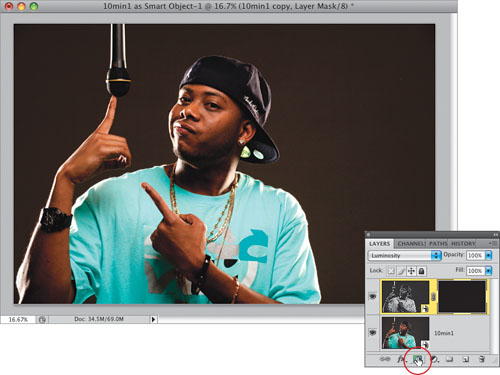
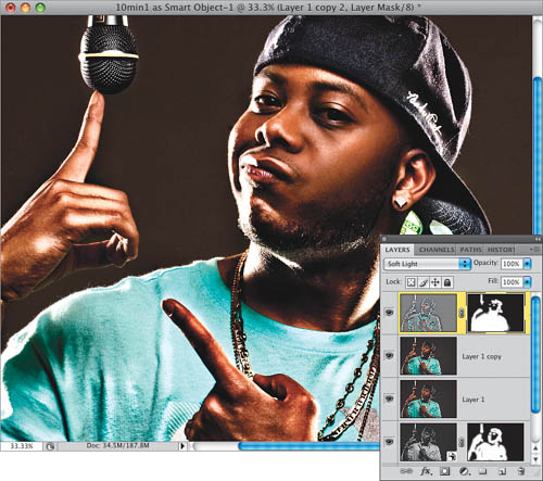
Now, you can “paint” the contrasty look where you want it. Get the Brush tool (B), click on the Brush thumbnail in the Options Bar, and choose a small, soft-edged brush from the Brush Picker, make sure your Foreground color is set to white, then start painting over the subject’s clothes, the mic, his hat, his watch, his arms, and even his face, but try to avoid areas of his skin that should be smooth (like his cheeks). Remember, you’re painting in contrast, so paint over areas of his skin you want to look really contrasty, and avoid the areas you’ll want to look smooth (and avoid any areas with blemishes, spots, etc.). Here, I’m painting in contrast along the left side of his neck. I also painted over his beard, his eyes, his lips, nostrils, and along the edges of his face.
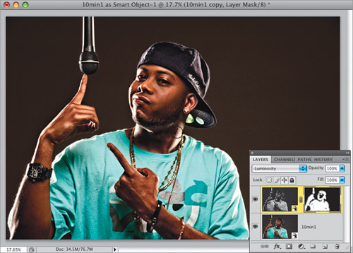
Once you’re done painting in contrast on the top layer, press Command-Option-Shift-E (PC: Ctrl-Alt-Shift-E), which creates a new layer that looks like a flattened version of your file. The advantage of this (over actually flattening the file) is that you keep your Smart Object layers intact, in case you need to go back and make other changes. Now, press Shift-J until you get the Healing Brush, so we can remove any blemishes, spots, etc., on his skin (the reason we do this is that, later, something we’re going to do is going to greatly accentuate any visible blemishes, so we remove them now while it’s still easy). Press-and-hold the Option (PC: Alt) key and click in a smooth area of skin. Then choose a brush size that is just slightly larger than the blemish you want to remove, move over the blemish and just click once, and the blemish is gone (as seen here).
One of the big secrets to this technique is to dodge and burn (brighten and darken) the highlights and shadows already in your photo. You’re actually going to over-accentuate them, which gives the image a more three-dimensional, almost illustrated, look. I always start by burning (darkening) first, so get the Burn tool from the Toolbox (or press Shift-O until you have it). Go up to the Options Bar and, from the Range pop-up menu, choose Shadows, then lower the Opacity to 20% (as shown here).
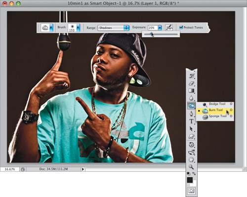
Note: If this were any previous version of Photoshop, I would never recommend using the Dodge and Burn tools, because they were pretty awful, but in CS4, Adobe greatly improved the results you get from them, and now they actually work pretty darn well, so now we use them.
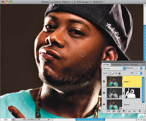
Now, before you begin dodging and burning, duplicate your top layer by pressing Command-J (PC: Ctrl-J). Choose a medium-sized, soft-edged brush from the Brush Picker, then start painting over the dark (shadow) areas of your photo. In our example, I used the Zoom tool (Z) to zoom in so I would have a clearer view, then I started painting over his beard, the dark part of his left cheek, right under the center of his bottom lip, and any shadow areas of his face, his hat, and his neck. The goal is to make the dark shadow parts of this image even darker.
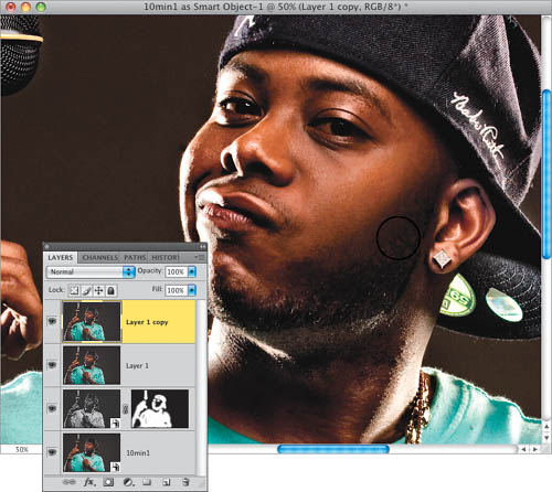
Here’s how the photo looks after a minute of burning (notice how the shadows on his face look darker, and I’m even burning the parts of the wrinkles in his shirt, as seen here). If it seems like the changes you are making here are pretty subtle, try hiding this layer from view for a moment, and you’ll see that it’s having a bigger effect than it first seems.
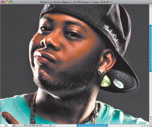
Now get the Dodge tool (press Shift-O), go up to the Options Bar, and set the Range to Highlights (so it only affects the highlights), set the Opacity to no more than 20%, then start brightening the highlight areas of his face, hat, shirt, etc., by painting over them. Go through the entire image, and everywhere you see a highlight, paint over it to make it more apparent. Here, I’ve painted over the highlights on his cheeks, his hat, the wrinkles on his shirt, and the bright areas on his neck, the left side of his face, etc. Anywhere that’s a little bright—make it brighter. Now, as you paint over these areas, some of them (like the areas on his face) are going to get an orange color. Don’t worry, we’ll deal with that next.
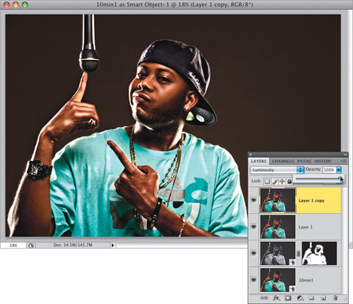
To get rid of the color problems caused by your dodging and burning, go to the Layers panel and change the Layer blend mode from Normal to Luminosity, and those edits now blend right in (compare this image with the one in Step 15 and you’ll see what I mean. Compare the color of his cheeks).
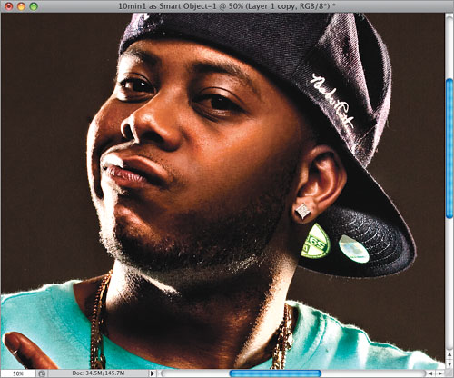
Stop for just a moment and hide your top layer from view (click on the Eye icon), and you’ll instantly see what a difference this dodging and burning makes (it has more effect than it feels like it’s having, right?). Now, because you did all your dodging and burning on a copy of your top layer, you could make the layer visible again, then lower the Opacity of this layer, which would reduce the intensity of the effect (I didn’t here, but I did want to let you know that an advantage of dodging and burning on a duplicate layer is that you have control over the effect after you’ve applied it, by lowering the Opacity setting).
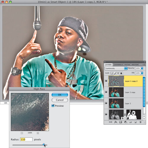
Now you’re going to add some really intense sharpening, and when you add this much sharpening, it really magnifies any skin blemishes or spots your subject has, which is why we were careful to remove them earlier with the Healing Brush tool. Okay, for our hyper-sharpening, first we’re going to duplicate the top layer. Then, go under the Filter menu, under Other, and choose High Pass. When the dialog appears, increase the Radius to around 110 pixels (as shown here), and click OK.
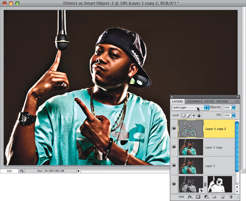
This turns the sharpened layer nearly gray (with outlines of color), so to get your sharpening to blend in with the rest of your image, you’re going to change the layer blend mode of this layer from Normal to Soft Light (as shown here), and now the sharpening blends right in with your photo. Because the Soft Light blend mode is a mode that adds contrast, your image probably looks a bit too dark at this point. So, we’ll use the trick we used earlier to have the sharpening only appear where we want it (and not over the soft blemish-removed areas of his skin, or along the outside edges of his shirt, the mic, or his face, because it might reveal a black glow, which sometimes appears when applying a lot of that High Pass filter sharpening).
Press-and-hold the Option (PC: Alt) key and click on the Add Layer Mask icon at the bottom of the Layers panel to hide your high-contrast layer behind a black mask (as seen here). Now get the Brush tool, choose a soft-edged brush, make sure your Foreground color is white, and paint over detail areas that you want to appear super-sharp and contrasty. I painted over the wrinkles in his shirt, over the inside area of the mic, over his ballcap, his shirt, his hands, his beard, his earring, his eyes, his eyebrows, and his lips—just the high-detail areas (and not the areas we want to stay soft).
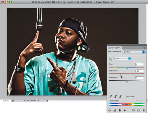
Some of the adjustments and tweaks we’ve made up to this point have made the color in the photo very vibrant—and in almost every case, too red. So, go to the Adjustments panel and click on the Hue/Saturation icon (the second one from the left in the second row) to bring up the Hue/ Saturation options (seen here). Choose Reds from the second pop-up menu from the top, and then lower the saturation a bit by dragging the Saturation slider to the left, which removes some of the red and gives your subject’s skin somewhat of a desaturated look (as seen here).
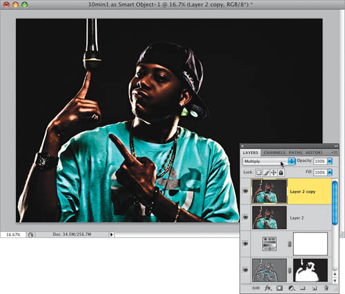
One of the finishing touches most commonly seen with this look is to burn in (darken) the edges around your subject, so they appear almost in their own soft spotlight. To do that, press Command-Option-Shift-E (PC: Ctrl-Alt-Shift-E) again to merge all your layers into a new layer at the top of your layer stack. Then, duplicate the top layer, and change the layer blend mode of this duplicate layer to Multiply (as seen here) to make a much darker version of your photo. This is what we’re going to use for our burned-in edges.
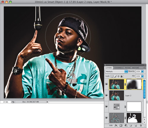
Lastly, click on the Add Layer Mask icon at the bottom of the Layers panel to add a standard layer mask to your layer. Now, get the Brush tool, and choose a huge, soft-edged brush (this brush should be so big that it’s a little larger than your subject’s head). Press X to switch your Foreground color to black, then take the Brush tool and just click once over your subject’s face, and it deletes the darkening over that one area. It may take five, six, or a few more clicks to reveal the brighter version of your subject on the layer below, which leaves you with the effect you see below in the After photo. Note: In the After photo, I did do one extra thing: After looking at the final photo, I thought his eyes looked too dark, so I duplicated the top layer and changed the layer blend mode to Screen (which makes the image very bright). Then I Option-clicked (PC: Alt-clicked) on the Add Layer Mask icon to hide this brighter version behind a black mask, and painted in white over his eyes to lighten that area. That’s it.

Before
After