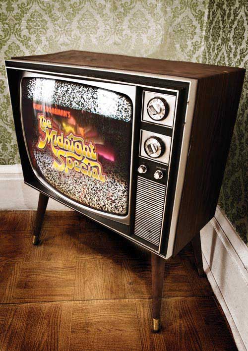
If you recognize The Midnight Special as a TV show that aired from 1972 to 1981, then it means you’re really like crazy old (not like me, who only has a vague recollection of the show, probably from stories my father told me). The Midnight Special (which makes a great name for a chapter on more special effects) was a weekly live concert TV show that featured live performances by everyone from David Bowie to Aerosmith, Elton John to Donna Summer (well, at least I hear those people were on there. Again, I’m very young, so this can obviously only be hearsay). Anyway, if the name rang a bell, it’s time for an “I’m really old” pop-quiz. For 100 bonus points (and a chance to play in our lightning round), who was The Midnight Special produced by? (Hint: His name was in the title.) No, it’s not Don Kirshner (he ran a competing show. At least, that’s what they told me at an AARP meeting). Come on, you’re so close...(bzzzzzt!) sorry, time’s up. It was Burt Sugarman’s The Midnight Special. Now, you’re probably wondering what all this has to do with special effects? Well, besides the obvious tie-in with the name, if you go to www.midnightspecial.com, you’ll see a variation of one of the effects that you’re going to learn in this chapter (and you’ll also see a background effect that you learned in Chapter 3). That is, of course, unless they change the look of their site, and if that happens, well there’s goes my perfect tie-in.


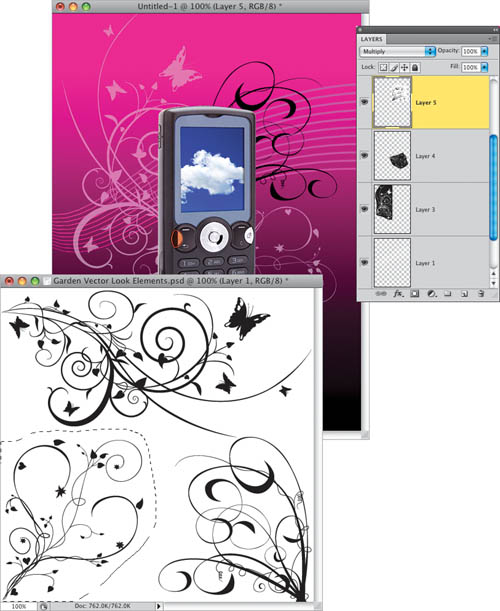
Mixing photography and vector art is hugely popular right now—you see it everywhere from print ads to commercials to t-shirts. The project we’re going to do is based on a fake print ad for the Sony Ericsson W880i cell phone. I originally thought it was a real ad, but later learned (in the ad’s small print) that it was a practice project created by Netherlands-based designer Tobias Gommer. What drew me to the ad were the smooth flowing lines in the background, but once I started it, I broke from his layout to add more vector art—in particular, the “garden vines” look that is so popular right now. Here’s how to fake the fake ad, with some other fake stuff faked in:
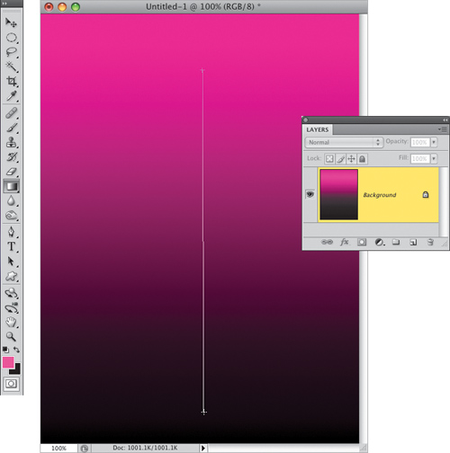
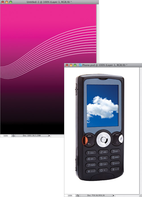
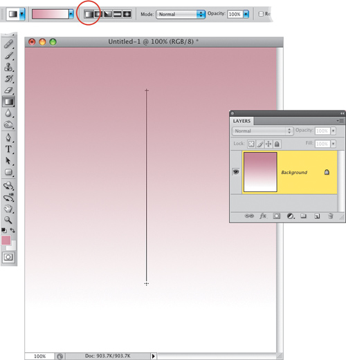
Start by going under the File menu, choosing New, and creating a new document that is 7 inches wide by 9.5 inches high at a resolution of 72 ppi. Press D to set your Foreground color to black, then press X to make white your Foreground color. Click on the Foreground color swatch and now change this white Foreground color to a pinkish magenta color (I used R: 224, G: 28, B: 162). Get the Gradient tool (G) from the Toolbox, and up in the Options Bar, make sure the Linear Gradient icon is chosen (the first of the five icons), then click on the down-facing arrow next to the gradient thumbnail and choose the top-left gradient (Foreground to Background). Click-and-drag the tool about an inch or so from the top of your image to nearly the bottom (as shown here) to create the pink-to-black gradient.
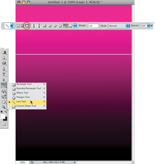
Create a new blank layer by clicking on the Create a New Layer icon at the bottom of the Layers panel. Set your Foreground color to white again, then get the Line tool from the Toolbox (or press Shift-U until you have it). Go up to the Options Bar and click on the third icon from the left (circled here in red), so the line you create will be made up of pixels (rather than creating a Shape layer or a path), and then set the Weight to 2 pixels. Press-and-hold the Shift key and draw a horizontal line from side to side (as seen here).
Press-and-hold the Command (PC: Ctrl) key, then go to the Layers panel and click directly on your line layer’s thumbnail to put a selection around your line. Now, press Command-Option-T (PC: Ctrl-Alt-T), which brings up Free Transform in copy mode. Move your cursor over your line until it turns into a tiny black arrow, then click-and-drag straight down just a little bit to add a second line (as shown here). Press Return (PC: Enter) to lock in this duplication and move, but don’t deselect quite yet.
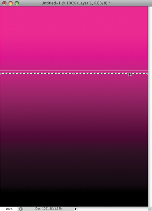
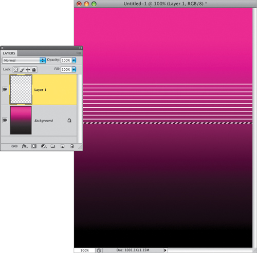
Because you used the keyboard shortcut to copy your line, you can now use a modified version of that shortcut to automatically make a whole row of lines. Press Command-Option-Shift-T (PC: Ctrl-Alt-Shift-T) and it makes a perfectly spaced copy just below your two lines. Now, press that shortcut eight more times until you have a row of lines (11 of them) like you see here, and then you can press Command-D (PC: Ctrl-D) to Deselect.
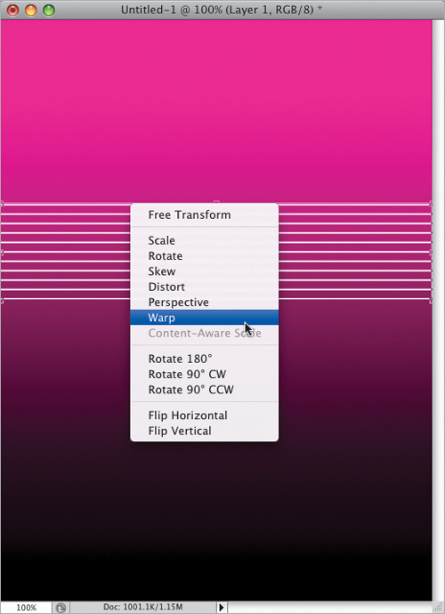
Press Command-T (PC: Ctrl-T) to bring up Free Transform, Control-click (PC: Right-click) on your image, and from the contextual menu that appears, choose Warp (as shown here).
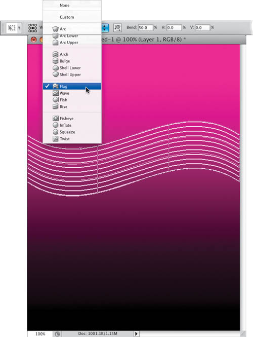
From the Warp pop-up menu (up in the Options Bar), choose Flag to apply a wavy look to your lines (as seen here).
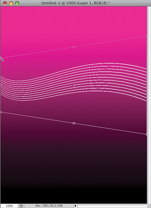
You’re going to apply a perspective effect to both ends of your lines. First, start by pressing Command-T (PC: Ctrl-T) to switch you from Warp back to Free Transform. Press-and-hold Command-Option-Shift (PC: Ctrl-Alt-Shift), grab the top-left point and drag downward, which pinches that side together, creating a perspective effect (as seen here). Now, do the opposite on the right side of your lines—press-and-hold those keys, grab the top-right point, and this time drag straight up to expand this side out, which enhances the perspective effect (you’ll see this side in the next step).
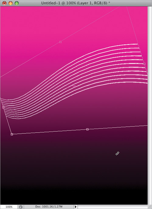
Move your cursor outside the bounding box, and it changes into a two-headed arrow. Click-and-drag in a counterclockwise circular motion to rotate your lines like you see here (it’s a pretty small amount of rotation). Of course, this creates a small gap on either side of your lines, so grab the right-center point and drag it to the right just enough to where your lines completely touch the right side of your image window. Now, do the same thing to the left side (dragging the left-center point to the left) until the lines fill the image area from left to right.
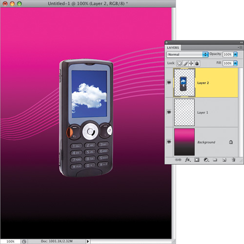
Now, press Return (PC: Enter) to lock in your transformation, so your lines look like the ones here, and then open the cell phone image you see here (you can download it from the book’s downloads page—the address is listed in the book’s introduction).
Go to the Layers panel and change the layer blend mode from Normal to Overlay to have your white lines pick up the colors from the pink gradient they’re sitting over (as seen here). Now, get the Move tool (V), go over to your cell phone document, and drag that phone over onto your main document (I’ve put it on its own layer for you). Use Free Transform to resize the phone image (while pressing-and-holding the Shift key to keep your resizing proportional) and position it like you see here.
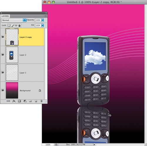
Press Command-J (PC: Ctrl-J) to duplicate your phone layer, then bring up Free Transform. We’re going to create a reflection (for more on reflections, see Chapter 5). Go under the Edit menu, under Transform, and choose Flip Vertical to flip this duplicate layer upside down, then lock in your transformation. With the Move tool, press-and-hold the Shift key (to keep them perfectly aligned while you move things), and then click-and-drag straight downward until the bottoms of the two cell phones touch (as seen here). You can already see we have a problem with the reflection—it doesn’t quite line up flush with the phone, so there’s a big gap at the right side of the phone image. This is going to happen when your product isn’t shot at a straight-on angle, but we can just tweak the reflection to get a better, more realistic look.
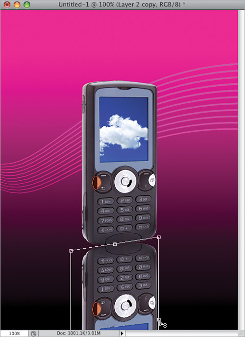
Bring up Free Transform again, on this flipped layer. Press-and-hold the Command (PC: Ctrl) key, along with the Shift key (again, for alignment), and click-and-drag the right-center point upward to skew the right side of your phone reflection upward, so it meets the bottom of the original phone (as shown here). Once you do this, you’ll have to move your cursor inside the bounding box and drag downward a bit, because moving this side of the phone reflection up actually covers part of the original phone. Having to do little tweaks like this to reflections is pretty common, and this skew method works wonders for this type of stuff. Now, lock in your changes (you know how by now).
Go to the Layers panel and drag this reflection layer beneath your original phone layer. Next, lower the Opacity of this layer to 70%, then click on the Add Layer Mask icon at the bottom of the Layers panel (it’s shown circled here in red). Get the Gradient tool, make sure your Foreground color is set to white and your Background color is set to black, and click-and-drag from the top of your reflected layer down about an inch and a half or so to have the reflection fade away (as shown here).
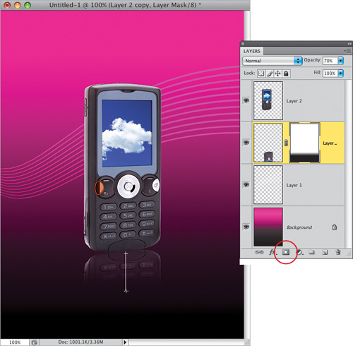
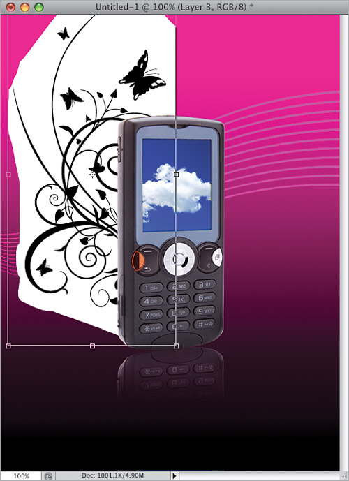
Now, open an image with some vector-looking garden elements (you can download this one from the book’s downloads page, too). Get the Lasso tool (L) and draw a very loose selection around the shape at the top (as shown here). Switch to the Move tool and click-and-drag that area over onto your phone document, and then in the Layers panel, position it beneath your phone reflection layer. We’re going to position these garden elements behind the phone, as if they’re coming out the sides. This particular shape looks like it should be vertical, and we’re going to position it on the left side of the phone, which means we’re going to have to: (a) rotate it, so it’s tall, (b) flip the image, so the stems are coming out from behind the phone, rather than into the phone, (c) get rid of that white background, and (d) change the color of the elements to white. Luckily, this is a lot easier than it sounds.
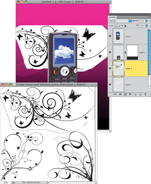
Bring up Free Transform on this garden elements layer, then go under the Edit menu, under Transform, and choose Rotate 90° CCW (counterclockwise) to make your image tall. Go back under that same menu, but this time choose Flip Horizontal, to flip the image so that it now appears as though everything is coming out from behind the phone (as shown here). Now, position your garden elements as seen here, and then lock in your transformation. Two down, two to go.
Press Command-I (PC: Ctrl-I) to Invert your image, so now your garden elements are white and your background is black (if you look at the thumbnail of this layer in the Layers panel, you can see that here). To hide that black background (so you just see the white elements), go to the Layers panel and change the layer blend mode to Screen (as shown here), which gives you the look you see here. Now that the elements are solid white, we want them to blend into the background a bit more. We can’t change the blend mode to do that, because we’re already using Screen mode to ignore the black background, so instead, just lower the Opacity to around 50% (you’ll see how this looks in the next step).
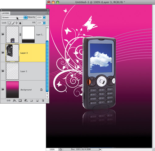
So, that’s the process we’re going to do for the other two pieces of vector-like art we’re going to add. Put a loose selection around each one (my selection around the bottom-left one is shown here), drag each one over to the phone document, see if they need to be rotated or flipped, then invert them (to make them white) or leave them as is (to leave them black, where you’d choose Multiply as your blend mode to ignore the white background). For the art at the bottom right of the phone, I rotated it a bit, inverted it, changed the blend mode to Screen, and lowered the opacity. For the black elements at the top right (selected from the bottom right of the garden elements image), I flipped it horizontally, and scaled it down in size a little (using Free Transform), but didn’t invert, because I wanted them to stay black. I just changed the layer blend mode to Multiply.
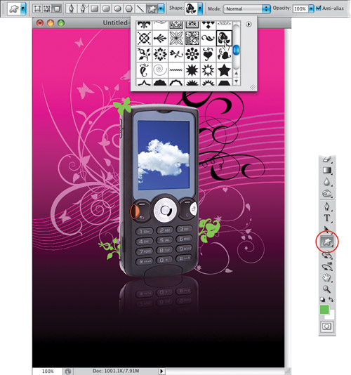
Now that all the elements are in place, go to the Layers panel, click on your lines layer (Layer 1), and with the Move tool, move them up (or down), so they fit your composition better (I moved them down a bit). If you want to add some more little garden vector shapes, there are some already in Photoshop. Create a new blank layer at the top of your layer stack, then set your Foreground color to a bright green (I used R: 156, G: 199, B: 81). Get the Custom Shape tool (press Shift-U until you have it; it’s circled here in red), then click on the Shape thumbnail in the Options Bar to get the Shape Picker. In the Picker, click on the little right-facing arrow in the top-right corner. From the flyout menu, choose All to load all the shapes into the Picker, then click OK in the warning dialog. Now, scroll through them and find any shapes you like (I chose Butterfly, Leaf Ornament 3, and Floral Ornament 1), and click-and-drag out these shapes on the new layer (or put each on its own layer if you want more control over where you place them).
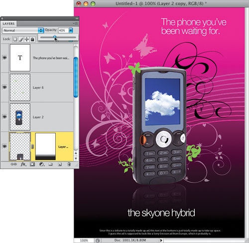
It’s time to add the text. To make room at the top, you’ll have to move everything else down a little. So, go to the Layers panel, and Shift-click on every layer (except the Background layer). Then, get the Move tool and use the Down Arrow key on your keyboard to move all your layers down together. Move everything down enough so you can add two lines of text in the upperright corner. Get the Horizontal Type tool (T), set your Foreground color to white, your font to Helvetica Neue Light, and in the Character panel, set the Tracking (the space between letters) to –60 to tighten things up. Type, “The phone you’ve been waiting for.” Duplicate that Type layer, and with the Move tool, click-and-drag the text to the bottom of the ad, highlight it, and change it to “the skyone hybrid.” You can also add some small text at the bottom, if you like. Finally, the reflection is a little distracting, so lower its Opacity to around 40% to give you the final image, seen here.
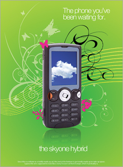
Technically, we’re done, but I want to show you how easy it is to change your look by using a different gradient style and color for your background. Go to the Layers panel, click on your Background layer, and add a new blank layer above it. Now, Option-click (PC: Alt-click) on the Eye icon to the left of the new layer’s thumbnail to hide all the other layers. Set your Foreground color to a dark green (I used R: 99, G: 165, B: 18) and your Background color to a bright green (I used R: 195, G: 218, B: 69), then get the Gradient tool. Click on the second icon from the left (the Radial Gradient) in the Options Bar, then click in the center of the image, and drag all the way to the right—right off the image, about three or four inches outside your window—to get your new background. Just Option-click where the Eye icon used to be to make all your layers visible again, change the color of your Shape layer(s) to magenta, and you’ve got a new look.
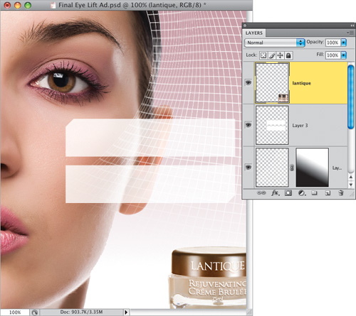
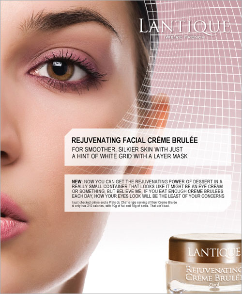
I saw this cool, swooshing, warped grid effect in a print ad for Lancôme’s Rénergie Microlift Eye cream, but besides just the cool grid, there are a lot of other elements here (like see-through panels that hold text) that are found in lots of graphics and layouts (but it was that warped grid that drew me to the ad in the first place, which is really kind of sad because most people would be drawn to the ad by the photo of a beautiful woman. This is what happens if you use Photoshop too much).
Go under the File menu, choose New, and create a new document that is 7×8.5″ at a resolution of 72 ppi. Press D to set your Foreground and Background colors to their defaults of black and white, then click on the Foreground color swatch and change your Foreground color to a light pink color (I used R: 197, G: 160, B: 167). Get the Gradient tool (G), click on the Linear Gradiant icon in the Options Bar (the first icon on the left, circled here in red), then click on the down-facing arrow next to the gradient thumbnail and choose the top-left gradient in the Gradient Picker (Foreground to Background). Now, click the Gradient tool about an inch or so from the top of the image window, and drag straight downward (as shown here) to create a pink-to-white gradient for your background. Next, open the headshot that we’ll be adding (as seen in the next step).
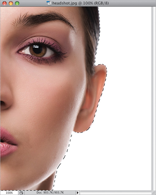
We only want the subject in the image, not the white background behind her, so take the Magic Wand tool (press Shift-W until you have it) and click it once on the white background area to select it (if part of her face becomes selected, just press-and-hold the Option [PC: Alt] key and click there to remove it from the selection). Now, we have the opposite of what we want (we have the background selected, rather than the woman). To switch the two, go under the Select menu and choose Inverse (or press Command-Shift-I [PC: Ctrl-Shift-I]), which inverses your selection, so now only the woman is selected (as seen here).
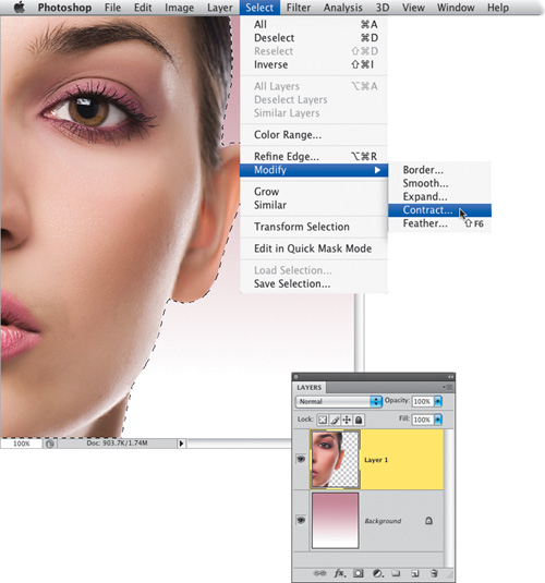
Get the Move tool (V), and click-and-drag her over onto the pink-to-white background image, positioning her on the left. You’ll probably notice a little white fringe around the edges of her hair (this usually happens when you use the Magic Wand tool for things like this), and there are a couple of different ways to get rid of that edge fringe. One way is to go under the Layer menu, then go all the way to the bottom under Matting, and choose Defringe. When the dialog appears, just click OK and that’ll usually do the trick. Of course, you can try what I did here, which is my favorite way to remove edge fringe: Press-and-hold the Command (PC: Ctrl) key and, in the Layers panel, click directly on the layer thumbnail for your subject. This puts a selection around her. Go under the Select menu, under Modify, and choose Contract. When the dialog appears, choose to contract (shrink) your selection by 1 pixel, then click OK. Now, your selection around her has contracted one pixel into her skin and hair. Press Command-Shift-I (PC: Ctrl-Shift-I) to Inverse the selection (so just that one edge pixel is selected), then press Delete (PC: Backspace), and the fringe is gone!
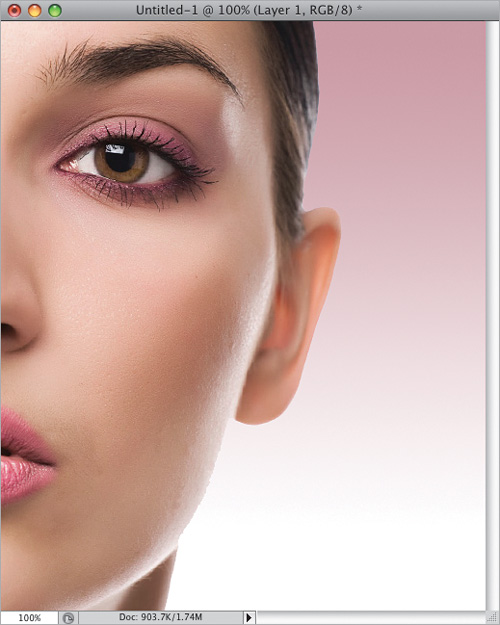
Deselect by pressing Command-D (PC: Ctrl-D), and you can see the nice smooth edges no longer have any visible edge fringe. Now, on to creating our grid: Create a new document that is 100 pixels wide by 100 pixels high, at a resolution of 200 ppi. I’m using a higher resolution, so my final grid is smaller in size (you’ll see this new document in the next step).
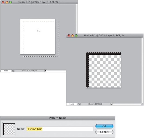
Create a new blank layer by clicking on the Create a New Layer icon at the bottom of the Layers panel. Press Z and click in your document to zoom in a bit, then grab the bottom-right corner of your image window and drag it out to expand the window, revealing the gray area surrounding your image area. Press Command-A (PC: Ctrl-A) to select your entire image area. Now, get the Rectangular Marquee tool (M; actually, you can use any selection tool), move your cursor inside your image area, and click-and-drag down and to the right a few pixels, so your selection extends off the canvas (as shown here, on the left). When you move this selection, you’re choosing how thick your grid lines will be. Inverse your selection, so now only a thin area of the top and left sides are selected. Set your Foreground color to black, then press Option-Delete (PC: Alt-Backspace) to fill your selected area with black (as shown here, on the right). Now, to make the background behind your grid transparent, in the Layers panel, drag the Background layer onto the Trash icon at the bottom of the panel to delete it. Deselect, and then go under the Edit menu, choose Create Pattern, give your pattern a name in the Pattern Name dialog, and click OK.
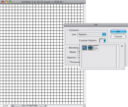
To get our grid really small, we’re going to cheat: create a new document that is 14×17″ (double the size of your main document), but at a higher resolution (200 ppi). Now, create a new blank layer, then go under the Edit menu and choose Fill. In the Fill dialog, choose Pattern from the Use pop-up menu in the Contents section at the top, and then click on the Custom Pattern thumbnail to bring up the Pattern Picker (shown here). Click on the last pattern in the Picker (that’s the one you just created—the latest one created always appears in the last position). Click OK and it fills your layer with that black grid pattern (you can see the grid it creates here).
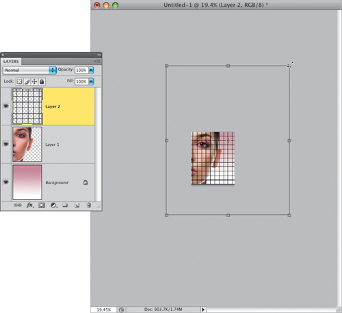
Get the Move tool and drag this grid layer over onto your main document. It won’t look like the grid is very small when it first appears, but that’s just because you’re only seeing a small part of the grid layer (it extends way beyond the boundaries of your image). Press Command-T (PC: Ctrl-T) to bring up Free Transform, then press Command-0 (zero; PC: Ctrl-0) to have Photoshop automatically resize the window, so you can see the Free Transform handles (and you can see how big the layer really is). Grab any one of the corner handles, press-and-hold the Shift key (to keep your grid proportional as you scale it), and drag inward (as shown here). Keep dragging inward until your grid is just a tiny bit larger than your image area, then press Return (PC: Enter) to lock in your transformation. Now, press Command-0 again, to return your window size to a normal view.
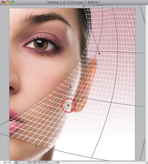
We actually want white grid lines (rather than black—the white just fits so much better with the overall look of the ad), so press Command-I (PC: Ctrl-I), which inverts your black grid to white (as seen here). Now, bring up Free Transform again, then Control-click (PC: Right-click) inside your image area, and from the contextual menu that appears, choose Warp (as shown here). In the next step, you’re going to bend your grid to give it a flowing look.
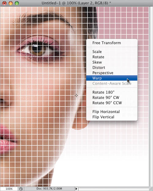
Click on the far-right side of your grid, up in the top third, and just drag to the right. The grid will move just like liquid. You don’t have to move the control handles or any of that stuff—just click on the right side of the grid, drag right, and you’ll see the grid bend and move as you drag it. Now, click on the top-left side of the grid and drag to the right, and then click a little lower (my cursor is shown circled here in red) to move the bottom part over to create more of a curve. If you mess things up, don’t sweat it, just hit the Esc key on your keyboard to cancel your transformation, then bring up Free Transform again, choose Warp from the contextual menu, and try again. Remember, it moves like liquid (well, more like molasses, actually), so just mold it like you want it by dragging. When you’re done, lock in your changes.
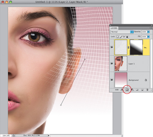
To make the bottom of your grid lines fade away, click on the Add Layer Mask icon at the bottom of the Layers panel (it’s shown circled here in red), then get the Gradient tool, make sure your Foreground is white, and click-and-drag a gradient from the middle of the grid to just below her ear (as shown here) to have the bottom of the grid fade out.
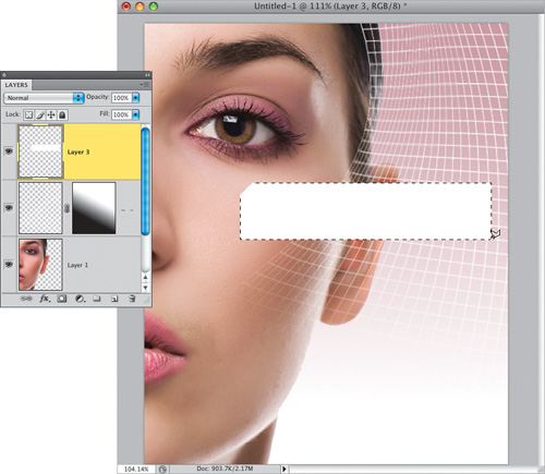
Now, you’re going to add some boxes for text (advertising copy), so create a new blank layer, then get the Polygonal Lasso tool from the Toolbox (or press Shift-L until you have it; it draws straight-line selections). Press-and-hold the Shift key, and draw the shape you see here (it’s basically just a rectangle, but before you get to the top-left corner of the rectangle, you angle to the right. Holding the Shift key makes that an exact 45° angle). When you get back to where you started your shape, a little circle appears at the bottom of the tool to let you know you’ve come “full circle.” Just click once and it completes your selection. Press D, then X to set your Foreground color to white, then fill this selection with the white Foreground color (as seen here). Don’t deselect quite yet.
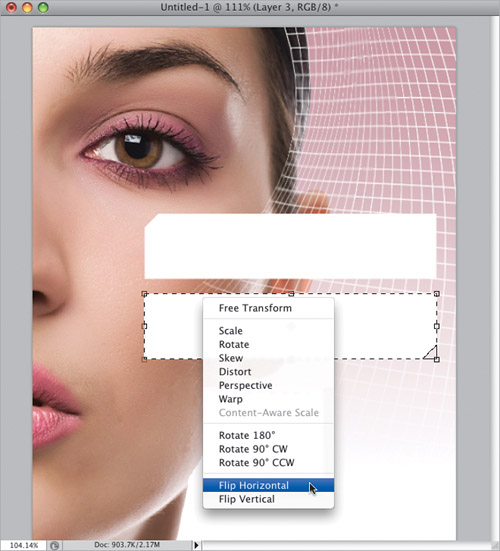
Here, you’re going to duplicate your white rectangle, and flip it both horizontally and vertically. Get the Move tool, press-and-hold Option-Shift (PC: Alt-Shift), then click inside the white selected rectangle, and drag down a copy (holding the Option key while you drag makes a copy; the Shift key keeps it perfectly aligned with the first one). Drag it down, and leave a little gap between the two shapes. Don’t deselect, but instead, bring up Free Transform again, Control-click (PC: Right-click) inside the bottom rectangle, and from the contextual menu that appears, choose Flip Vertical. Control-click (PC: Right-click) again, but this time, choose Flip Horizontal, which gives you the flipped rectangle you see here (which is what they had in the ad). Now, lock in your transformation and deselect.
To make your two rectangular boxes a bit see-through, go to the Layers panel and lower the Opacity of that layer to around 80%. Now, open the eye cream image (available on the book’s downloads page), get the Move tool, and drag it over onto your main document, positioning it in the bottom-right corner (as shown here), so the right side of the jar is extending off the side and is cut off from view. In the next step, you’re going to add all the text, so set your Foreground color to white, then get the Horizontal Type tool (T).
Starting from the top right of the ad, the font is Trajan Pro (which comes installed with Photoshop CS4) and then Copperplate, and the rest of the text is Arial Narrow (which is preinstalled on about every computer on earth, but if you don’t have it, try Helvetica Condensed). The final thing to finish this off is to move the two white rectangles (and the text inside them) down a bit, so they’re closer to the product shot at the bottom. Go to the Layers panel, press-and-hold the Shift key, click on all the Type layers (well, the ones that appear in those two white rectangles anyway), along with the white boxes layer, too. Now, using the Move tool and with the Shift key still held down, drag everything straight down until they’re in the position you see here, which completes the project.
This is based on a collage created to support a piece in a magazine (the original was created by designer Hue Man. I’m not making that up). It was the subtle spiral over each person that caught my eye, along with the white border around them, which is very trendy right now. One thing I noticed was that none of the people were facing the camera. Now, in the original collage in the magazine (which was about the best unlikely movie scientists), the photos were all taken from movies, so they weren’t posed with the subject looking at the camera. The hardest part of this (for me, anyway) was finding stock photos of people not looking straight at the camera.
Go under the File menu, choose New, and create a new document (the one here is 7 inches wide by 10 inches high at a resolution of 72 ppi). Open the first photo you want to use in your collage (I have all six photos used in this project posted on the book’s downloads page, and I already put each photo up on its own separate layer for you. See, I care).

Get the Move tool (V) and drag the first image (the businessman) onto your main document, then press Command-T (PC: Ctrl-T) to bring up Free Transform. Press-and-hold the Shift key, grab the top-right corner point, and drag inward to scale the image down in size (as shown here). Position him in the bottom-left corner, as seen here, then press Return (PC: Enter) to lock in your transformation.

Now, open the next photo, and with the Move tool, drag her over onto your main document. Use Free Transform to scale her down in size (as shown here), but don’t make her as small as the businessman (Note: Her file’s name is “Woman in Front.”) Position her like you see here, then lock in your transformation.

You’re going to continue this process of opening a photo, dragging it over to your document, and scaling it down to size until all six photos are in the document. In the Layers panel, arrange their layers, so they appear (from the top of the layer stack to the bottom) with the “Woman in Front” on the top of the stack (so she appears to be in front), then the businessman and businesswoman should be on the layers directly below her. The confused-looking woman and the rock star should be on the layers below that, and the man with the megaphone (the file is called “Megaphone man”) will be at the bottom of the layer stack (right above the Background layer). Use the Move tool to arrange your people in your main document, so they pretty much look like what you see here.

Now you’re going to remove the color from each layer, so click on the top layer in the Layers panel (the woman in front), and press Command-Shift-U (PC: Ctrl-Shift-U) to Desaturate the image (which removes all the color). Do this for all the layers, so they’re all in black and white (as shown here).

You’re now going to “crush the black,” which is what we call pumping up the shadow areas big time. You can do this once, and have it affect all your layers, by going to the Layers panel and clicking on the top layer. Now, go to the Adjustments panel and click on the Levels icon (it’s second from the left in the top row). Grab the far-left (shadows) slider (beneath the histogram and shown circled here in red) and drag it quite a bit over to the right to make the shadows really dark and rich (like you see here).

You’re going to start tinting each layer individually, and since each layer has to be a different color, we can’t just add a Hue/Saturation adjustment layer at the top of the layer stack, or all the layers would be the same color. Instead, we have to apply the Hue/Saturation adjustment directly to each layer. So, click on the top layer (the woman in front), then press Command-U (PC: Ctrl-U) to bring up the Hue/Saturation dialog (shown here). Turn on the Colorize checkbox, then drag the Hue slider to a yellowish hue. The look we’re going after uses very saturated colors, so for each person you’re going to increase the Saturation amount to somewhere between 30 and 50 (in this case, all the way to 50, but it just depends on the photo, and the color choice). Once your Hue and Saturation amounts are set, click the OK button.

Do the same thing for the other five layers, choosing a different Hue setting for each person, and then deciding how much saturation to give the color (the higher the Saturation amount, the more vivid the colors will be).

Once all your layers have been tinted, you’re going to go to each layer and apply a spiral effect over the image. You’re going to run a filter that creates the spiral effect, but you can’t run it directly on the person, because applying the filter will remove the color, so here’s what we do: In the Layers panel, click on the first person’s layer, then Command-click (PC: Ctrl-click) directly on the layer’s thumbnail to put a selection around the person. Now, click on the Create a New Layer icon at the bottom of the Layers panel to create a new blank layer, click on the Foreground color swatch and set your Foreground color to a medium gray, then fill this selection with that color by pressing Option-Delete (PC: Alt-Backspace), as seen here.

To apply the spiral effect, go under the Filter menu, under Sketch, and choose Halftone Pattern. When the dialog appears, from the Pattern Type pop-up menu on the right, choose Circle (as shown here), and lower the Size to 1. (Note: We’re applying this spiral to a low-resolution image here, so the lines are fairly big, even at a Size setting of 1, but when you apply this to a regular high-resolution image of 200 or 300 ppi, the lines are much finer, and the effect looks better.) Set your Contrast amount to around 22, click OK to apply this spiral effect to your gray layer, and then press Command-D (PC: Ctrl-D) to Deselect.

To blend the spiral effect in with your color image, go to the Layers panel and change the layer blend mode of your gray layer to Soft Light, and then lower the Opacity to 30% (as seen here). Now, press Command-E (PC: Ctrl-E) to merge this gray layer permanently with your person layer below it.

You’re going to continue that same process for each person layer—put a selection around the person, make a new layer, and fill it with gray, but once you’re ready to add the filter, you can just press Command-F (PC: Ctrl-F) to reapply the Halftone Pattern filter using the exact same settings. Then, do the whole change-to-Soft Light-and-lower-the-Opacity thing and then merge the layers. So, go ahead and add the filter for each person layer (it take less time than you’d think).

Here, you’re going to add a white stroke around each person layer. In the Layers panel, click on the top person layer, then click on the Add a Layer Style icon at the bottom of the Layers panel, and choose Stroke from the pop-up menu. When the Layer Style dialog appears, set the Position of the stroke to Inside (so the stroke appears inside your people, instead of outside them), choose white as your Color, click OK, and it adds the white stroke you see here.

To finish things off, you’re going to go to the Layers panel, press-and-hold the Option (PC: Alt) key, click directly on the word “Effects,” which appears below your woman in front layer, and drag-and-drop that effect (the white stroke) right onto your other layers (holding the Option key duplicates the effect you’re dragging). Lastly, add some text (I used the font Rockwell here) and you’re done.

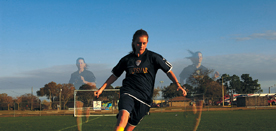
I saw this in a Web ad for a running shoe company. In their version, it had runners on a track, and the runner in front looked regular, but the runners behind him were transparent. At first I thought, “Man, that had to take a lot of masking,” but then I realized that as long as you took three different shots, you could pull off that same look surprisingly easy, with barely any masking at all. In fact, it could be a 30-second job in Photoshop if you do the shoot right, and even that part is easy. So, you know what that tells me? The art director for that ad is really clever! (By the way, in their ad, they totally used the desaturated-look technique in Chapter 1.)
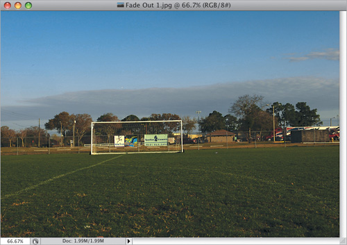
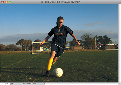
You have to take three photos for this technique, and ideally you’d shoot all three on a tripod. If you don’t have a tripod (or are at a location where you can’t use a tripod), you can hand-hold the three shots and use Photoshop CS4’s Auto-Align Layers feature, which works brilliantly in most cases like this, but if you use a tripod, it’s guaranteed to work. Start by taking an empty photo of your background (so, for example, if you’re shooting at a table in a restaurant, the first shot would be of the empty table, with no one sitting at it). In this case, we shot an empty soccer field (you can download all three of these from the book’s downloads page).
The second shot will be of the people you want to have fade out (by the way, this works equally well with objects you want to fade out—you don’t have to use people). One thing that will make your job easier is to position these people so they won’t overlap the person that is the focus of the shot. For example, we knew that we wanted our main soccer player in the middle, so we had the other players leave a gap in the middle. You don’t have to leave a gap, but if the faded people in the background and your main subject don’t overlap each other, then it makes your job really, really easy.
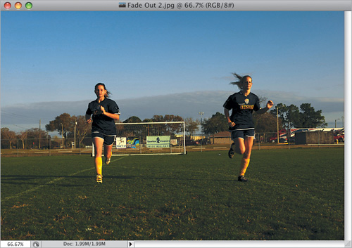
Here’s the third shot—the person who will be the main focus of our shoot. The idea is she is running down the field, and the other players behind her are just fading away. If you have clouds in the background (like we do here) which are moving, albeit pretty slowly, you don’t want to take long between your three shots (of course, if you’re shooting indoors, you can take as long as you like). One more thing: the key to this is to make sure that nothing on “the set” gets moved in the background or foreground during these three shots except your subjects. For example, if you’re shooting in a restaurant, and you shoot an empty table, then you have two people sit down, they can’t move the silverware, or drink glasses, or anything else. Same thing when the third person enters the scene.
Now, you’re going to put all this together in Photoshop. Open the first photo (the empty soccer field), then open the second photo (the people who are going to fade out). Get the Move tool (V), press-and-hold the Shift key (that’s important), and drag your second photo over onto your empty field image (as shown here). Holding the Shift key is important because that’s what ensures that your top layer is exactly aligned with the layer below it (this works, providing you shot all three shots on a tripod). If you hand-held your shots, I’ll show you something in Step Six to get them all aligned automatically.
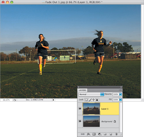
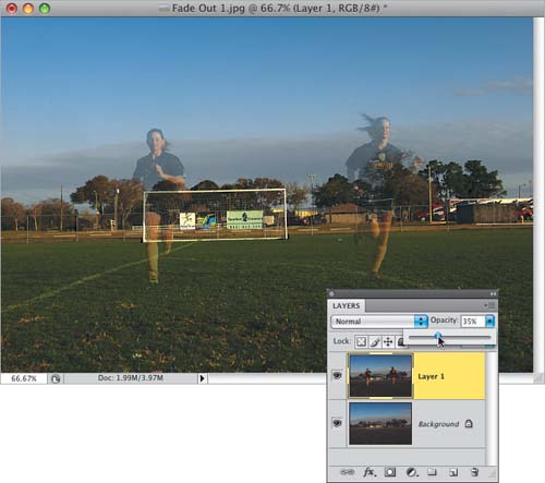
At the top of the Layers panel, lower the Opacity of this layer to 35% (as shown here) to make the players appear to fade out. Everything else stays 100% solid, because the backgrounds in the two shots didn’t move (well, the clouds shifted a tiny bit in this case, but you really can’t tell).
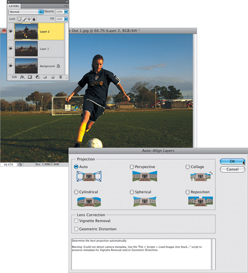
Open the third photo (the photo of your main subject), press-and-hold the Shift key, and drag-and-drop this image onto your main document, on top of your other two images (as seen here). If you hand-held the shots when you took them, you’ll have to have Photoshop align them for you, so go to the Layers panel, press-and-hold the Shift key, and click on all three layers to select them. Now, go under the Edit menu and choose Auto-Align Layers. When the dialog appears, leave it set to Auto and just click the OK button (the dialog is shown here, but again, you’ll only use this feature if you didn’t shoot on a tripod). Now, just for fun, if you want to test this feature, use the three shots taken here, but when you drag them over into the same document, don’t hold the Shift key, so they’re alignment is off by quite a bit. Then run Auto-Align Layers and watch it do its thing. It’s pretty darn amazing.
You’re going to hide the top layer behind a black mask, then paint back in just your player. Press-and-hold the Option (PC: Alt) key and click on the Add Layer Mask icon at the bottom of the Layers panel (shown circled here in red) to put a black mask over your top layer (which hides the layer from view). Get the Brush tool (B), choose a medium-sized soft-edged brush from the Brush Picker in the Options Bar, and with your Foreground color set to white, just paint over where the main player used to be (don’t forget to paint back in the soccer ball, too). If your player doesn’t overlap the other players, this couldn’t be easier, because you don’t have to worry about “staying inside the lines”—just start painting. In our case, the player’s hand on the right side of the image overlaps the player behind her, but outside of that, it’s a 10-second job. When you get to the fingers on her hand on the right side, you’ll just need to shrink your brush size down a little and paint over her fingers, but this is about as easy a masking job as you’ll ever get to do.
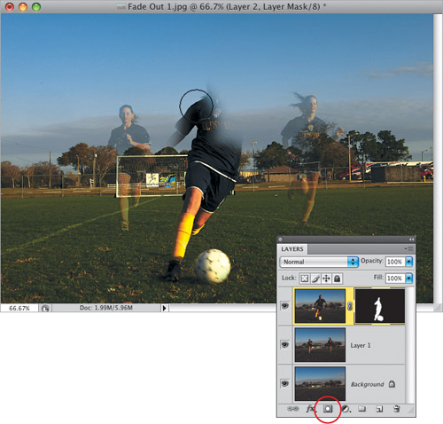
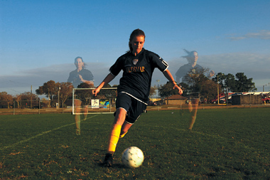
Here’s the final image. If you want the players in the back to be more (or less) transparent, just click on the middle layer and adjust them using the Opacity slider.
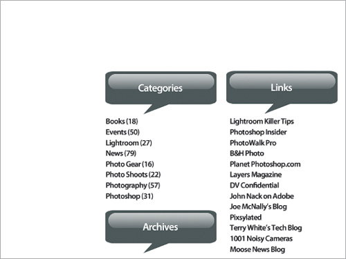
This is just a two-page quickie, and I’m adding it because I saw it last week on a website, and I had to smile at how simple, yet effective, the look was that the designer created as headers for different sections of the webpage. The whole thing is created using built-in talk bubble shapes that are already installed on your computer, that you just have to load into Photoshop’s Shape Picker. The rest is creating a “Down & Dirty” reflection.
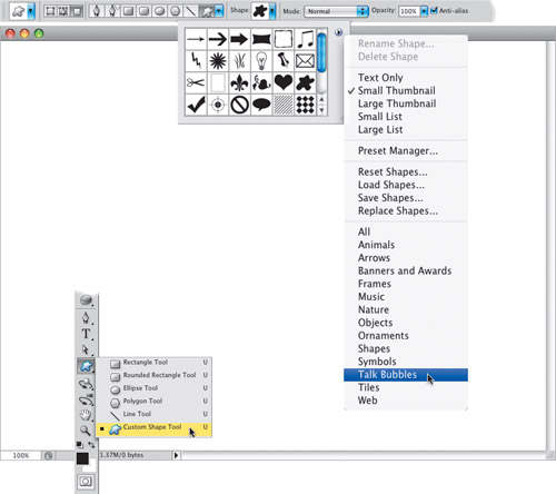
Go under the File menu, choose New, and create a new document that’s 800×600 pixels at a resolution of 72 ppi, then create a new blank layer by clicking on the Create a New Layer icon at the bottom of the Layers panel. Press D to set your Foreground and Background colors to their defaults of black and white, and then click on the Foreground color swatch in the Toolbox and set your Foreground color to a medium gray (I used R: 96, G: 107, B: 110). Get the Custom Shape tool from the Toolbox (or just press Shift-U until you have it), go up to the Options Bar, click on the third icon from the left so your shape will be made up of pixels, then click on the Shape thumbnail to bring up the Shape Picker. Click on the little right-facing arrow at the top-right corner of the Picker to bring up the flyout menu you see here. Choose Talk Bubbles to add the talk bubble shapes to your Picker. You’ll get a warning dialog asking you if you want to replace the current shapes; just click Append.
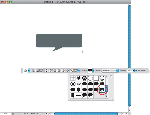
In the Shape Picker, scroll down until you come to the talk bubbles you just loaded. Choose the wide rectangular shape (I chose Talk 10, as shown here), and then click-and-drag out a long, thin talk bubble like you see here. Now, press the letter X to swap your Foreground and Background colors (so white is now your Foreground color, and gray your Background color).
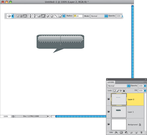
Create a new blank layer, then switch to the Rounded Rectangle tool (it’s one of the shape tools; press Shift-U until you have it), then go up to the Options Bar and set the Radius (the roundness) to 25 pixels. Now, click-and-drag out a horizontal rounded rectangle that extends nearly halfway down your talk bubble (like you see here). It will be filled with white, but you need to delete that white, so go to the Layers panel, and Command-click (PC: Ctrl-click) directly on that layer’s thumbnail. This puts a selection around your white pill shape. Press Delete (PC: Backspace) to delete your white fill, but leave your selection in place. Get the Gradient tool (G), click on the down-facing arrow next to the gradient thumbnail, and choose the top-left gradient (Foreground to Background) from the Gradient Picker. Click-and-drag a gradient through your selection from the top to just about ⅛″ or so past the bottom of the pill shape (as shown here). This gives you a white-to-light-gray gradient in the pill shape.
Deselect by pressing Command-D (PC: Ctrl-D). Next, go to the Layers panel and lower the Opacity of this pill-shaped gradient to 70% to help it blend with the gray shape below it. Now you just need to add some text (here, I switched to the Horizontal Type tool [T] and typed the word “Categories” in the font Myriad Pro Semibold, which comes with Photoshop CS4, in white at 24 points). I added a couple of other copies of the talk bubble (by clicking on the bubble layer and pressing Command-J [PC: Ctrl-J], and then doing the same thing for the gradient layer), so you can see it in use on a webpage layout similar to when I first saw this quick and simple little glassy effect in use.