Tooltips and popovers are great tools to embed extra, secondary useful information to the content of your page. This chapter teaches you both Twitter Bootstrap tooltips and popovers.
You will create a page like the following (Figure 11-1).
Figure 11-1
Example Tooltip Activated
You will learn how to embed HTML content like the following (Figure 11-2).
Figure 11-2
Tooltip HTML Markup Treated As HTML—See Bold Text
The popovers will enhance the styling of the secondary, helpful information, even more (Figure 11-3).
Figure 11-3
Popover Example
Learning Goals
1.
Learn about tooltips.
2.
Learn about activating tooltips and their opt-in feature.
3.
Learn how to wrap a word or phrase into proper HTML in order to attach a tooltip to it.
4.
Learn how to wrap a word or phrase into proper HTML, so that it stands out and a tooltip will appear when the user moves over it.
5.
Learn about the tooltip options that can be used to customize its behavior.
6.
Learn about popovers.
7.
Learn about the differences and similarities between tooltips and popovers.
8.
Learn about the options of the popovers.
Tooltips
Tooltips are a very nice way to display helpful text when a user hovers over a highlighted text. So it is used to give some extra useful information, like a tip or a hint.
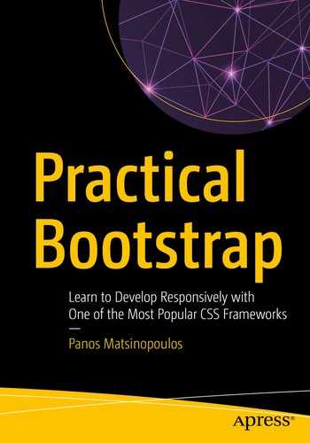
Here is an example of a page that uses tooltips (Figure 11-4).
Figure 11-4
Example Page with Tooltips on Specific Words
If you mouse over the words that are underlined with a dotted line, then you will see the tooltips. See, for example, Figure 11-5.
Figure 11-5
Tooltip Activated
Implementation with Twitter Bootstrap
Let's see how you can implement the preceding example. Here is the HTML page (Listing 11-1).
If you save the preceding code and load the page on your browser, you will see the page displayed correctly, but the tooltips will not be functional. If you mouse over the words RTF and quadcopter, you will not see the tooltips bubble up (Figure 11-6).
Figure 11-6
RTF and quadcopter Do Not Have Tooltips Yet
In order to make a word have a tooltip, you need to do the following:
1.
Wrap the word into a span element. Hence, the word will not change its position with regard to the rest of the text.
2.
Add the data attribute data-toggle="tooltip". This will tell Bootstrap that the content of the span will be decorated with a tooltip on mouse over.
3.
Add the data attribute data-placement="top". This will tell Bootstrap that the tooltip needs to appear on top of the span content. Note that data-placement can take the value left, top, right, or bottom. Choose any value that best suits your case.
4.
Add the attribute title having as value the text that you would like to appear on mouse over.
5.
Activate the tooltips using JavaScript. This is necessary, because Bootstrap has tooltips not enabled by default. This is done for performance reasons. You have to opt in on each particular case you want tooltips in.
Let's take the preceding steps for the words RTF and quadcopter on your HTML page. Wrap the RTF word as follows:
<span data-toggle="tooltip" data-placement="top" title="Ready to Fly">RTF</span>
title="An aerial vehicle using 4 rotors, commonly using only the varying speed of the motors to achieve both stability and direction of flight.">quadcopter</span>
Next, update the javascripts/main.js file as follows:
$(document).ready(function() {
$('[data-toggle=tooltip]').tooltip();
});
This, the preceding code, is the opt-in part of the implementation, which enables tooltips for all the elements that have the data attribute data-toggle="tooltip".
If you save all the preceding code and reload the page on your browser, everything will be ready. When you mouse over the words RTF and quadcopter, you will see the tooltips.
As you can see, the tooltips are displayed on mouse over.
There is a small improvement that we have to introduce. You need to find a way to tell the user that if they mouse over a particular word, a tooltip will appear with further explanation information. If you don't do that, then the user does not know that there is a tooltip hidden behind the word.
In order to achieve that, you usually want the word with the tooltip behind to be underlined with a dotted line. Twitter Bootstrap makes your styling work here easy. Instead of wrapping the text with the tooltip inside a span, you can wrap it inside an abbr element.
Go ahead and change the spans to abbr elements.
For RTF:
<abbr data-toggle="tooltip" data-placement="top" title="Ready to Fly">RTF</abbr>
For quadcopter:
<abbr data-toggle="tooltip" data-placement="top"
title="An aerial vehicle using 4 rotors, commonly using only the varying speed of the motors to achieve both stability and direction of flight.">quadcopter</abbr>
When you save these changes and reload the page on your browser, you will see the words RTF and quadcopter underlined with a dotted line (Figure 11-7).
Figure 11-7
Tooltipped Words Are Displayed Underlined
Tooltip Options
A tooltip has a lot of different options that can be used for its customization. Let's see the most important ones:
1.
animation: Has default value true. It applies a CSS fade transition when displaying the tooltip.
2.
delay: This can be either a number or a JavaScript object. If it is a number, then it defines the delay, in milliseconds, to show or hide the tooltip. If it is an object, then it can have the show and hide properties with integer values representing the delay to show or hide, respectively.
Let's try that. We will set the delay property and see how the tooltip behaves. On the previous page, go ahead and change the javascripts/main.js file so that it is like Listing 11-2.
$(document).ready(function() {
$('[data-toggle=tooltip]').tooltip({
delay: {
show: 3000, // 3 seconds
hide: 1000 // 1 second
}
});
});
Listing 11-2
Add Delay to Tooltips
If you save the preceding code and reload the page on your browser, you will see the tooltip appear 3 seconds after you mouse over the word with the tooltip. You will also see that it disappears after 1 second from the moment you moved your mouse out of the word with the tooltip.
3.
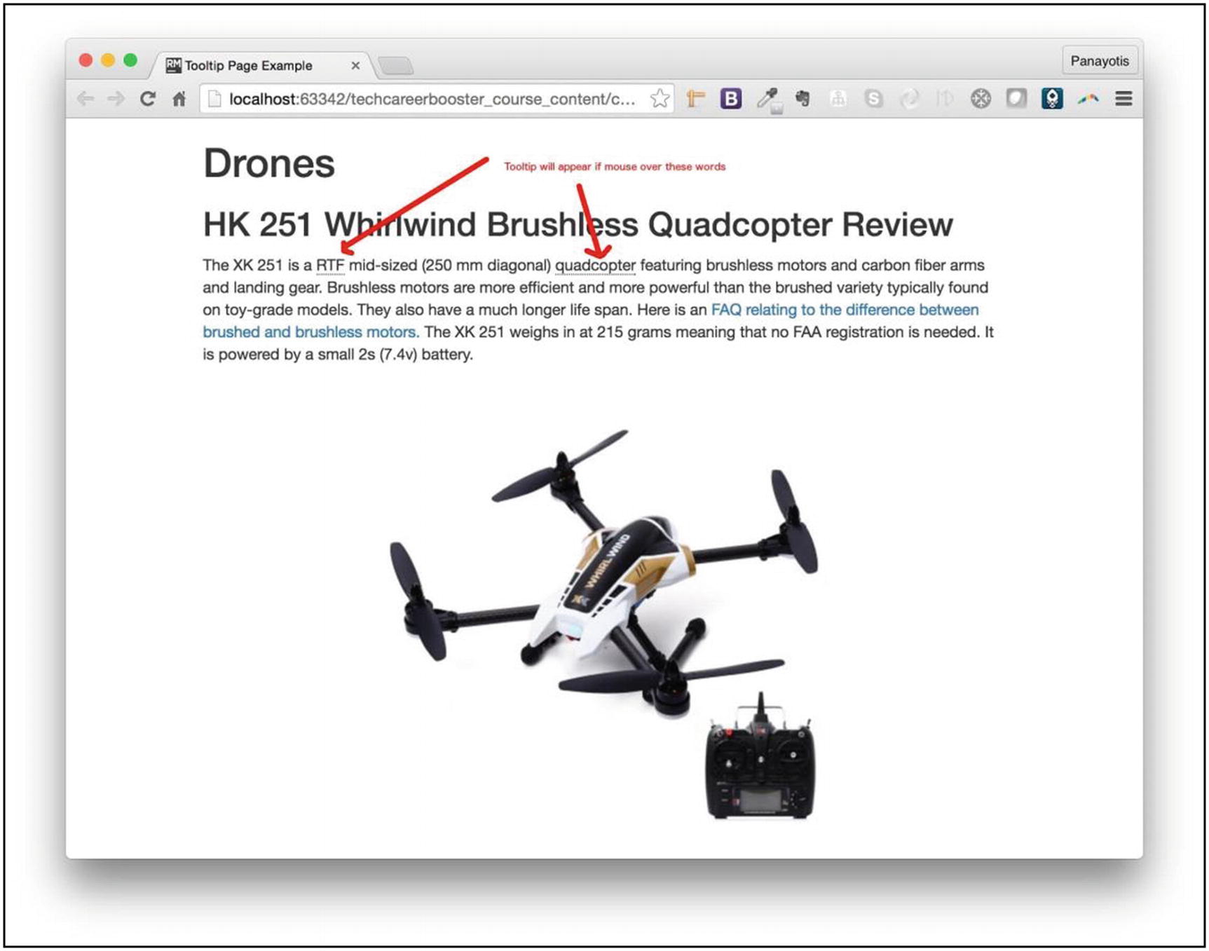
html: This is a Boolean option that takes the value true or false. Its default value is false. With false, the value of the title attribute of the tooltip element is inserted using the .text() method. This means that even if the title contains HTML markup, this will not actually be used; it will be treated as plain text. On the other hand, if the html option is set to true, when you have a value on title that includes HTML markup, this will be inserted in the tooltip area using the .html() method, and, hence, the HTML markup will be respected. Let's see an example.
First, add some HTML markup to the title of the quadcopter word:
<abbr data-toggle="tooltip" data-placement="top"
title="An aerial vehicle using <b>4 rotors</b>, commonly using only the varying speed of the motors to achieve both stability and direction of flight.">quadcopter</abbr>
You have added <b>4 rotors</b> HTML markup inside the title.
Now, make sure that the javascripts/main.js file is as follows:
$(document).ready(function() {
$('[data-toggle=tooltip]').tooltip({
html: false // default value
});
});
Although it is not necessary when you set the html value to false, you will need the preceding snippet in a while.
Save and load the page on your browser. When you mouse over the quadcopter word, you will see the tooltip, but the <b>4 rotors</b> part will be printed verbatim, treated as plain text (Figure 11-8).
Figure 11-8
HTML Markup Printed Verbatim
If you want the HTML markup of the title attribute to be treated as HTML and rendered as such, you need to set the value of the option html to true:
$(document).ready(function() {
$('[data-toggle=tooltip]').tooltip({
html: true
});
});
Save the preceding code inside javascripts/main.js and reload the page on your browser. You will see this when you mouse over the word quadcopter (Figure 11-9).
Figure 11-9
Tooltip HTML Markup Treated As HTML
As you can see, the HTML content of the title attribute is being displayed as an HTML fragment without problem.
Popovers
Popovers are like tooltips but allow richer and more eye-catching layout and style. Also, the target element needs to be clicked in order for the popover to appear and disappear. Here is an example of a popover (Figure 11-10).
Figure 11-10
Popover Example
Let's change the previous page that had tooltips on RTF and quadcopter words. You are going to put popovers.
The HTML page should be like the following (Listing 11-3).
data-content="Ready to Fly drones are drones with the key at hand. You can start flying them immediately.">
<i class="fa fa-question-circle"></i>
</a>
mid-sized (250 mm diagonal)
quadcopter
<a href="#"
data-toggle="popover" data-placement="top"
title="Quadcopter"
data-content="An aerial vehicle using <b>4 rotors</b>, commonly using only the varying speed of the motors to achieve both stability and direction of flight.">
<i class="fa fa-question-circle"></i>
</a>
featuring brushless motors and carbon fiber arms and landing gear.
Brushless motors are more efficient and more powerful than the brushed variety typically found on toy-grade models.
They also have a much longer life span.
Here is an <a href="http://droneflyers.com/talk/threads/is-a-brushless-motor-better-than-a-brushed-motor.754/">
FAQ relating to the difference between brushed and brushless motors.</a>
The XK 251 weighs in at 215 grams meaning that no FAA registration is needed. It is powered by a small 2s (7.4v) battery.
This should be accompanied by the following stylesheets/main.css (Listing 11-4) and javascripts/main.js files (Listing 11-5).
Listing 11-4.stylesheets/main.css
a[data-toggle=popover] {
text-decoration: none;
}
Listing 11-5.javascripts/main.js
$(document).ready(function() {
$('[data-toggle=popover]').popover({
html: true
});
});
Note
This page is using FontAwesome again to draw the question mark icons next to the words RTF and quadcopter. In order to use FontAwesome, you have to create an account with them and generate an account-specific reference to their JavaScript library. You have to use this reference where the preceding code has the line <script src="https://kit.fontawesome.com/<your-font-awesome-account-public-key.js"crossorigin="anonymous"></script>.
Here are the differences and similarities of the HTML page with popovers vs. the HTML page with tooltips:
1.
For popovers, we use the following data attributes:
1.
data-toggle="popover". For tooltips, we use data-toggle="tooltip".
2.
data-placement attribute is used for both to specify the placement of the element.
3.
title attribute is used to specify the content of the tooltip. For popovers, this is used to specify the heading of the popover.
4.
data-content is used only on popovers and specifies the content of the body of the popover.
See Figure 11-11 for the header and the body of the popover and how they are related to title and data-content, respectively.
Figure 11-11
Header and Body of the Popover
If you save the preceding files and load the page on your browser, you will be able to click the question mark icon in order to see the popover.
As you can experience, the way you have integrated popovers has the problem that the popover can close only if the user clicks the same hot spot it is used to show the popover.
How can you allow the user to click anywhere for the popover to close? In order to achieve that, you need to change a little bit the way popovers are integrated:
1.
You need to use the data attribute data-trigger="focus".
2.
You need to add the attribute tabindex="0" for the first popover, tabindex="1" for the second, and so on.
Let's do these updates on the popovers of your page.
For the RTF word:
RTF
<a href="#"
data-toggle="popover"
data-placement="top"
title="Ready to Fly"
tabindex="0"
data-trigger="focus"
data-content="Ready to Fly drones are drones with the key at hand. You can start flying them immediately.">
<i class="fa fa-question-circle"></i>
</a>
For the quadcopter word:
quadcopter
<a href="#"
data-toggle="popover" data-placement="top"
title="Quadcopter"
tabindex="1"
data-trigger="focus"
data-content="An aerial vehicle using <b>4 rotors</b>, commonly using only the varying speed of the motors to achieve both stability and direction of flight.">
<i class="fa fa-question-circle"></i>
</a>
If you do these changes and you reload the page, then you will be able to close the popover by clicking anywhere on the page.
Tip
When you click to open a popover, you will see a blue border around the question mark icon, while the popover has the focus. You can get rid of it by applying the following CSS rule:
Like tooltips, popovers have various options. Some of the most useful ones are the following:
1.
animation: Takes a Boolean value true or false. The default value is true. It applies CSS fade transition to the popover.
2.
delay: This is either a number or an object. This works exactly like the delay option for the tooltips.
3.
html: Boolean with default value false. If true, it allows the content to be parsed as HTML rather than plain text.
Tasks and Quizzes
Task Details
1.
You need to develop a web page that demonstrates both the tooltips and the popovers.
2.
Try to create a page like the following (for this page, the whole content has been taken from Wikipedia) (Figure 11-12).
Figure 11-12
Task Page with Tooltips and Popovers
Key Takeaways
How to create tooltips that appear when a user’s mouse moves over a special word or phrase
How to create popovers that appear when a user clicks an icon
The End
Congratulations!
You are done with this practical encounter with Twitter Bootstrap! I really hope that you enjoyed this trip and you learned things that you can apply to your projects.