In this chapter, we will work to build a Twitter Bootstrap admin dashboard, like the following (Figure 7-1).
Figure 7-1
Basic Admin Dashboard
A site like the one in Figure 7-1 has the sidebar on a fixed position. The sidebar disappears on extrasmall devices, and the dashboard changes its layout according to the device display width.
Also, the table is responsive and can be displayed equally well on both large and small displays.
You will also learn various other new concepts like how to display an image in a circle shape or how to alter the text color using text color–specific classes.
Learning Goals
1.
Learn how to use a container or container-fluid element inside a navigation bar.
2.
Learn about attaching a search form in the navigation bar.
3.
Learn how to move the navigation bar search form to the right.
4.
Learn how to define the correct vertical position of the navigation bar search form.
5.
Learn how to quickly style input controls with the form-control class.
6.
Learn how to create a sidebar, on the left.
7.
Learn how to make the sidebar extend on full height.
8.
Learn how to make the sidebar stay in the same position even if the user scrolls the main content of the page.
9.
Learn how to use the visibility classes to show and hide parts of your page according to the display width.
10.
Learn how to add a border on one side of a div.
11.
Learn how to make a div occupy 100% of the available height.
12.
Learn how to make the content of an ul element occupy the whole available width.
13.
Learn how to create nice page headers with a horizontal line at the bottom.
14.
Learn how to display images in a circle shape.
15.
Learn about the text alignment classes.
16.
Learn how to use responsive images.
17.
Learn about the classes that affect the text color.
18.
Learn how to create responsive tables.
19.
Learn how to apply multiple Twitter Bootstrap techniques in order to create an admin-like layout.
Introduction
In this chapter, you will create a basic admin dashboard page, using Twitter Bootstrap facilities.
Note
This is a long chapter with many new things for you to learn. But, after you do some little extra work, you will be rewarded by the final result.
The first thing that you will add and work with is the navigation bar.
Standard Navigation Bar Content
Let's add the standard navigation bar. Listing 7-2 contains the HTML fragment for the navigation bar that you have to add as the first child of the body element.
If you save that and reload your page, you will see the following (Figure 7-4).
Figure 7-4
Adding the Navigation Bar
Aligning to the Right
The navigation bar has its main options aligned to the left. You need to bring them to the right. You have already learned how to do that, with the use of the ml-auto class. Let's add the ml-auto class to the ul holding the main navigation options (Listing 7-3).
Save the changes and reload the page on your browser. You will see the following (Figure 7-5).
Figure 7-5
Navigation Options Pulled Right
Adding the Search Form
You want to add a search form inside the top navigation bar. This will not be part of the list of options, but it needs to be part of the div that collapses when you switch to small devices, that is, part of the #navbar div.
Let's put the following code inside the #navbar div, but before the ul with the nav options:
<form>
<input type="text" placeholder="Search...">
</form>
Hence, the nav element needs to be like the following (Listing 7-4).
If you save the preceding code and reload the page, you will see the following (Figure 7-6).
Figure 7-6
Search Form in the Navigation Bar
The search form has been put inside the navigation bar. But we want to move it to the right. If you add the ml-auto class on the form, you will get the following (Figure 7-7).
Figure 7-7
ml-auto Class on the Search Form
The search form is not positioned at the far right, but to the left of the options, because you need to remove the ml-auto class from the ul. You can’t have both on the search form and on the ul element.
Go ahead and remove the ml-auto from the ul element. If you save and reload the page, you will see the following (Figure 7-8).
Figure 7-8
Search Form Positioned on the Right
There are two classes that you can apply to the search form and that will make it look much better. I will talk about these classes in the next chapter, but nothing prevents you from using them right now to style the search form:
Use the class form-inline on the form HTML element.
Use the class form-control on the input HTML element.
If you save and reload the page on your browser, you will see the following (Figure 7-9).
Figure 7-9
Search Form with Styling Classes
You have finished with the top navigation bar. Now that you have introduced the search form inside it, it might be a good idea to check how this search form appears when the page is displayed on small devices (Figure 7-10).
Figure 7-10
Search Form and Menu Optionson Small Devices
There is a problem with the search form on the preceding layout. It does not have some margin on top of it. It would have been better if it had some top margin like the following (Figure 7-11).
Figure 7-11
Search Form with Top Margin
In order to achieve this, you can use a sizing Bootstrap utility class, for example, mt-3, which adds a top margin of size 3. Change the form markup to be like this:
And reload the page on your browser. Switch to the small-display (e.g., iPhone X) devices. When you unfold the menu, you will see the search form with the top margin looking much better, like what is depicted in Figure 7-11.
However, if you switch back to large-display devices, you will see the following (Figure 7-12).
Figure 7-12
Search Form Top Margin on Large Displays
As you can see, the layout of the navigation bar has been destroyed, because of the mt-3 presence. In other words
You want the mt-3 only on small devices when the menu options collapse.
You don’t want the mt-3 when the menu options are expanded.
You know that your menu expands on the lg breakpoint (thanks to the navbar-expand-lg class). Hence, in order to negate the effect of the mt-3 class when you are above the lg breakpoint, you will add the class mt-lg-0. Hence, the form markup should be
Again, the preceding markup preserves the mt-3 on devices with display less than the lg breakpoint and uses the class mt-lg-0 on displays above the lg breakpoint.
If you save the preceding code and reload the page on your browser, you will see that the navigation bar is back to its correct style. And shrinking to a small display, it still works as expected.
Aligning Using Flex Utility Classes
You have used margin utility classes to align the items of the navigation bar to the right. But Twitter Bootstrap heavily relies on flexbox. It provides classes that can be used to align content accordingly.
For example, you can use the class flex-row-reverse and have your HTML markup in reverse order. Doing so, you don’t need to use ml-auto on the form element. See in the following what I mean (Listing 7-5).
You have written the form markup after the ul markup.
2.
You have added the class flex-row-reverse on the div that contains both the menu options and the search form.
3.
You have removed the margin classes from the form markup.
If you save the preceding code and load the page on your browser, you will see the following (Figure 7-13).
Figure 7-13
Using flex-row-reverse to Draw Items on the Right
As you can see, the direct children of the flex-row-reverse div have been drawn in reverse order, that is, first the search form and then the ul element.
Note that the fact that we have moved the form to the bottom of the div makes things look better on small devices too. The search form is displayed at the bottom. The flex-row-reverse does not have any effect on these devices because the menu options are displayed top to bottom (Figure 7-14).
Figure 7-14
Search Form Appears at the Bottom
All good! Now, let’s move to the left-side navigation bar.
Left-Side Navigation Bar
We proceed now to build the left-side navigation bar (Figure 7-15).
Figure 7-15
Left-Side Navigation Bar Properties
As you can see in Figure 7-15, the left-side navigation bar should have some properties:
1.
Its background color is not white; it is more like a gray.
2.
The active menu item has white color and blue background color.
3.
There are three groups of menu items, a.k.a. three different lists.
4.
It occupies a specific width of the page. Let's assume one-sixth of the width for medium, large, and extralarge devices (a.k.a. two columns out of 12) and one-fourth of the width for small devices (a.k.a. three columns out of 12). On extrasmall devices, the sidebar will not be visible.
Layout
Let's start with the fourth property. Since we want the sidebar to occupy part of the width of the page, we will use the correct grid classes. Add the following content below the nav element (Listing 7-6).
As you can see in the preceding code, we have a div for the sidebar that uses the grid class col-sm-3 for small devices, hence occupying three columns out of 12, and the class col-md-2 for medium, large, and extralarge devices, hence occupying two columns out of 12.
The main content will go inside the second div, which also uses grid classes col-sm-9 and col-md-10 so that it occupies the rest of the available width. For small devices, it will occupy nine out of 12 columns; and for medium, large, and extralarge devices, it will occupy ten out of 12 columns.
Save the preceding content. If you load the page again on your browser, you will not see any difference, because the sidebar and main content do not have any actual content inside.
Lists Inside the Sidebar
You have identified three lists inside the left-side navigation bar. Let's create them, as you usually do, with ul elements (Listing 7-7).
If you save the preceding code and reload the page on your browser, you will see the following (Figure 7-16).
Figure 7-16
Left Sidebar—Lists Added
One problem that you see now is that the top list is hidden by the navigation bar. This is a problem that you have faced in the past. You need to give some top padding to the body content, at least equal to the height of the navigation bar. You will give 56px.
Inside the stylesheets/main.css file, add the following rule:
body {
padding-top: 56px;
}
Save and reload the page on your browser. You will see the following (Figure 7-17).
Figure 7-17
Lists Are Not Hidden by the Navigation Bar
That's an improvement. Now, you will apply the class nav on the lists. As you remember from previous chapters, the nav class on ul elements removes the default bullets displayed on the list items.
Go ahead and add the class nav to all ul elements of the left-side navigation bar. Then load the page on your browser. You will see the following (Figure 7-18).
Figure 7-18
Class nav Applied to ul Elements
The class nav has removed the bullets from the elements of the lists. But it has also done something else. It has turned the ul elements to display flex, with flex-wrap equal to wrap. That’s why you see the li elements one next to the other.
Since you want your lists to be enlisted top to bottom, you can add the class flex-column that will make all the direct children to be drawn in a column.
Go ahead, and next to the nav class, add the flex-column class too. Save and load the page on your browser. You will see the following (Figure 7-19).
Figure 7-19
flex-column Class Applied
The left sidebar starts to look much better. Yet, it is not finished.
Hide the Sidebar on Extrasmall Devices
You want to hide the sidebar on extrasmall devices and display it only for small, medium, large, and extralarge devices. You can achieve this with the display utility classes:
Class d-none will hide the element.
Class d-sm-block will display the element for any display above the sm breakpoint.
Let’s apply that to the container div that holds the left-side navigation bar lists. Listing 7-8 gives the HTML markup fragment.
<div class="col-sm-3 col-md-2 d-none d-sm-block">
<!-- Left Sidebar Content will go here -->
<ul class="nav flex-column">
<li class="active"><a href="#">Overview</a></li>
<li><a href="#">Reports</a></li>
<li><a href="#">Analytics</a></li>
<li><a href="#">Export</a></li>
</ul>
<ul class="nav flex-column">
<li><a href="#">Nav item</a></li>
<li><a href="#">Nav item again</a></li>
<li><a href="#">One more nav</a></li>
<li><a href="#">Another nav item</a></li>
<li><a href="#">More navigation</a></li>
</ul>
<ul class="nav flex-column">
<li><a href="#">Nav item again</a></li>
<li><a href="#">One more nav</a></li>
<li><a href="#">Another nav item</a></li>
</ul>
</div>
Listing 7-8
HTML Fragment for the Container of the Left-Side Navigation Bar
If you save and reload the page on your browser, you will see that the left-side navigation bar is hidden on a display with width 575px (Figure 7-20).
Figure 7-20
Left Sidebar Hidden on 575px Displays
However, it is visible on a 576px display (Figure 7-21).
Figure 7-21
Sidebar Visible on 576px Displays
Further Styling of the Sidebar
You will proceed now to further style the sidebar. In order to do that, you will apply the class sidebar on the div container that holds the three lists, and then you will write some CSS rules for this particular class. The following are the rules (Listing 7-9).
.sidebar {
padding-top: 10px;
padding-bottom: 10px;
background-color: #f5f5f5;
border-right: 1px solid #eee;
}
Listing 7-9
First Styling Rules for the Left Sidebar
Don’t forget to add the class sidebar to the div that contains the three ul elements with the left-side navigation bar options.
Then, save, and reload the page on your browser. You will see the following (Figure 7-22).
Figure 7-22
Some Styling on the Sidebar
The preceding styling sets the background color and border on the right side of the sidebar and also some padding on the top and bottom.
You now want to make sure that the sidebar height occupies the whole available height. In order to do that, you need to specify height: 100% both on row div and on all of its ancestor elements.
Make sure that the stylesheets/main.css file has the following content (Listing 7-10).
html {
height: 100%;
}
body {
padding-top: 56px;
height: 100%;
}
#main-container,
#main-container .row{
height: 100%;
}
.sidebar {
padding-top: 10px;
padding-bottom: 10px;
background-color: #f5f5f5;
border-right: 1px solid #eee;
}
Listing 7-10
stylesheets/main.css File Content
Note that with #main-container, you are referring to the id of the container that holds the main content of the page, exactly after the nav element. For your help, the HTML fragment of the #main-container should be as in Listing 7-11.
If you save the preceding code and reload the page on your browser, you will see the following (Figure 7-23).
Figure 7-23
Sidebar Occupies the Full Height
You continue with the styling of the sidebar:
1.
You will make sure that the user can tell one group of options from the next. You will apply a bottom margin on the ul elements of the sidebar.
2.
You will increase the height of the elements in the list so that the options are quite distinct and there is some vertical space from one to the next.
3.
You want the lists to occupy all the available width. So that when one moves the mouse pointer over any of the elements, the highlight goes from left to right. In order to achieve that, you will remove the left and right padding from the sidebar container.
4.
However, you want each list item to have some padding so that the text does not start at the left edge of the bar.
Here is the content of the stylesheets/main.css with blue color on the changes that you have to apply (Listing 7-12).
html {
height: 100%;
}
body {
padding-top: 56px;
height: 100%;
}
#main-container,
#main-container .row{
height: 100%;
}
.sidebar {
padding: 10px 0;
background-color: #f5f5f5;
border-right: 1px solid #eee;
}
.sidebar ul {
margin-bottom: 20px;
}
.sidebar ul li {
padding-left: 10px;
min-height: 2.2rem;
}
Listing 7-12
Further Styling of the Sidebar
If you save and reload the page on your browser, you will see the following (Figure 7-24).
Figure 7-24
Further Styling of the Left Sidebar
You proceed with applying some background and foreground colors on options of the sidebar menu. Here are the extra CSS rules that you need to apply (Listing 7-13).
.sidebar ul li a {
text-decoration: none;
}
/* Active <li> and <a>, and for hover over NON-active <li> and <a> */
.sidebar ul li.active,
.sidebar ul li.active a,
.sidebar ul li:hover,
.sidebar ul li:hover a,
.sidebar ul li a:hover {
background-color: #428BCA;
color: White;
}
.sidebar ul li:hover {
cursor: pointer;
}
Listing 7-13
Extra CSS Rules for Left Sidebar Options
If you save and load the page on your browser, you will see the following (Figure 7-25).
Figure 7-25
Options with Colors
If you move your mouse over the options of the left-side navigation bar, you will see that they get a different background color and text color. Also, the cursor is becoming a mouse pointer (Figure 7-26).
Figure 7-26
Hover Over a Nonactive Option
Main Content Area
You stop styling the sidebar, and you proceed to constructing the main content area. You will start with the dashboard top area, in which you are supposed to be presenting a series of graphs (Figure 7-27).
Figure 7-27
Dashboard—Top Area with Graphs
Note the following about the objective:
1.
There is a Dashboard header with horizontal lines at the bottom. You can create this effect with an hr and the class my-4 that you have seen in previous chapters.
2.
You can see four information containers (graph image + text).
3.
On extralarge displays, the information containers displayed on one row are four. Same goes for large and medium devices. On small and extrasmall devices, we display two information containers per row (Figure 7-28).
Figure 7-28
On Extrasmall Devices—Two Information Containers per Row
4.
You will use some placeholder images for the graph images.
Let’s start.
Dashboard Header
First, add the Dashboardheader:
<h1>Dashboard</h1>
<hr class=my-4>
Add the preceding code as the first child of the #main-content-container. Save and reload the page on your browser. You will see the following (Figure 7-29).
Figure 7-29
Dashboard Page Header Added
That was pretty easy, and you have done that in the past. You can now see the Dashboard styled as a page header with the help of the hr element and the class my-4.
Information Containers
The information containers are blocks of HTML code that contain
The div has grid classes col-6 and col-md-3. On extrasmall and small devices, each information container block will occupy half of the available width (six out of 12 columns). Hence, you are going to have two such columns on each row. On larger devices, it will occupy a quarter of the available width (three out of 12 columns). Hence, you are going to have four such columns on each row.
You need to repeat this three more times and enclose the whole set of div columns to a div with class row (Listing 7-14).
Place the preceding code exactly below the Dashboard div container. Save the file and reload the page on your browser. You will see the following (Figure 7-30).
Figure 7-30
Dashboard—Information Containers Put on the Page
Now, information containers have successfully been put on the page, below the page header. But you need to do some style tuning in order to achieve the desired result.
Let's first make sure that the images are displayed with a circle shape. This is very easy to do. You only have to add the class rounded-circle on the img elements.
If you do that, save, and reload the page on your browser, you will see the following (Figure 7-31).
Figure 7-31
Information Containers Have Images with Circle Shape
Next thing that you want to do is to make sure that both the image and the text of the information container are center aligned. You will use the class text-center to all the div elements that wrap the image and the text.
text-center is a class provided by Twitter Bootstrap. It essentially applies the CSS style text-align: center; on the element that it is attached to. There are more alignment-related classes provided by Twitter Bootstrap. The full list is here:
1.
text-left: Corresponds to text-align: left;
2.
text-right: Corresponds to text-align: right;
3.
text-center: Corresponds to text-align: center;
4.
text-justify: Corresponds to text-align: justify;
Also, you can use these classes with their breakpoint-specific variation. For example, you can use the class text-md-center, which will center the content but only for medium or wider displays.
Go ahead and apply the class text-center on all information containers, and then reload the page on your browser. You will see the following (Figure 7-32).
Figure 7-32
Content Aligned on the Center
Although the Figure 7-32 looks as if you have finished with the information containers, there is a small problem that becomes obvious if you see your page on a device with shorter width. For example, try iPad simulation with your developer tools. You will see the following (Figure 7-33).
Figure 7-33
Images Are Not Displayed OK on iPad
This can be remedied if you apply the class img-fluid to the img elements. Let's do that. Then reload the page on your browser. You will see the following (Figure 7-34).
Figure 7-34
Images Are Displayed OK with the Class img-fluid
The img-fluid class does two things:
1.
It sets the max-width to 100%. This means that the image width cannot be wider than the parent block the image is in.
2.
It sets the height to auto. This means that the height will automatically be calculated based on the width, so that the image has the correct aspect ratio.
With these restrictions in place, the images end up drawn correctly on any display size.
What remains to be done is to change the color of the text Something else. It needs to be a light-gray color (see Figure 7-35).
Figure 7-35
Color of the "Something else" Phrase
You can quickly and easily apply a change on the color of a text element by only applying one of the Twitter Bootstrap color utility classes. These classes are
1.
text-primary
2.
text-secondary
3.
text-success
4.
text-danger
5.
text-warning
6.
text-info
7.
text-light
8.
text-dark
9.
text-body
10.
text-muted
11.
text-white
12.
text-black-50
13.
text-white-50
You can see their color equivalent in Figure 7-36.
Figure 7-36
Bootstrap Text Color Utility Classes
Let's apply the class text-black-50 on the span that holds the Something else text. Save and load the page on your browser. You will see the following (Figure 7-37).
Figure 7-37
"Something else" Phrase with the text-black-50 Class Applied
Before we close this section on information containers, I will give you here the HTML fragment that should exist inside the #main-content-container div, as it has been composed until now, that is, with the Dashboard header and the information blocks. See Listing 7-15.
The next part on the admin page is the dashboard table. You have already learned how to design tables using Twitter Bootstrap. So this will not be a difficult exercise.
Section Header
You add the section header with the following piece of HTML code:
<h2>Section title</h2>
<hr class="my-4">
Put that exactly after the closing row div that contains the information containers you implemented earlier. If you save the code and reload the page on your browser, you will see the following (Figure 7-38).
Figure 7-38
Section Title Is Not Displayed
As you can see, the section title is not displayed. Why is that? In fact, you can see the section title if you scroll down. It is at the bottom of the page as in Figure 7-39.
Figure 7-39
Section Title at the Bottom of the Page
Why does this happen? This happens because of the 100% height that you have applied to the #main-container .row CSS selector (see your stylesheets/main.css file). That rule was there to make the sidebar occupy the whole height. But, from the moment we added an extra row div element, the one that holds the information blocks, then this rule was applied to that div too. This last application pushed the section title at the position that you see (Figure 7-40).
Figure 7-40
How Nested Div 100% Height Affects Layout
What you really want is this 100% height CSS statement to be applied only to the first-level nested div inside the #main-container div. In order to do that, the rule
#main-container,
#main-container .row {
height: 100%
}
needs to be changed to
#main-container,
#main-container > .row {
height: 100%
}
The > is the direct child selector. The preceding CSS rule selects the #main-container as well as its first-level direct child element with class .row.
In order to make sure that your code is aligned, I give you here the whole stylesheets/main.css file that your page should be using (Listing 7-16).
html {
height: 100%;
}
body {
padding-top: 56px;
height: 100%;
}
#main-container,
#main-container > .row {
height: 100%
}
.sidebar {
padding: 10px 0;
background-color: #f5f5f5;
border-right: 1px solid #eee;
}
.sidebar ul {
margin-bottom: 20px;
}
.sidebar ul li {
padding-left: 10px;
padding-top: 5px;
min-height: 2.2rem;
}
.sidebar ul li a {
text-decoration: none;
}
/* Active <li> and <a>, and for hover over NON-active <li> and <a> */
.sidebar ul li.active,
.sidebar ul li.active a,
.sidebar ul li:hover,
.sidebar ul li:hover a,
.sidebar ul li a:hover {
background-color: #428BCA;
color: White;
}
.sidebar ul li:hover {
cursor: pointer;
}
Listing 7-16
stylesheets/main.css Content
If you save the preceding code and reload the page on your browser, you will see the following (Figure 7-41).
Figure 7-41
Section Title at the Correct Position
A problem I see on this layout is that the section header needs some room at the top side. You can add some top margin by adding the class mt-4 to the h2 of the section:
<h2 class="mt-4">Section title</h2>
If you save this change and reload the page on your browser, you will see the following (Figure 7-42), which is much better.
Figure 7-42
Section with Some Top Margin
The Table
Let's now add the table below the section header (Listing 7-17).
<p>Sales table is compiled from data retrieved from the main database</p>
<table class="table table-striped">
<thead>
<tr>
<th>#</th>
<th>Header 1</th>
<th>Header 2</th>
<th>Header 3</th>
<th>Header 4</th>
<th>Header 5</th>
<th>Header 6</th>
<th>Header 7</th>
<th>Header 8</th>
</tr>
</thead>
<tbody>
<tr>
<td>1,001</td>
<td>Lorem</td>
<td>ipsum</td>
<td>dolor</td>
<td>sit</td>
<td>Lorem</td>
<td>ipsum</td>
<td>dolor</td>
<td>sit</td>
</tr>
<tr>
<td>1,002</td>
<td>amet</td>
<td>consectetur</td>
<td>adipiscing</td>
<td>elit</td>
<td>amet</td>
<td>consectetur</td>
<td>adipiscing</td>
<td>elit</td>
</tr>
<tr>
<td>1,003</td>
<td>Integer</td>
<td>nec</td>
<td>odio</td>
<td>Praesent</td>
<td>Integer</td>
<td>nec</td>
<td>odio</td>
<td>Praesent</td>
</tr>
<tr>
<td>1,003</td>
<td>libero</td>
<td>Sed</td>
<td>cursus</td>
<td>ante</td>
<td>libero</td>
<td>Sed</td>
<td>cursus</td>
<td>ante</td>
</tr>
<tr>
<td>1,004</td>
<td>dapibus</td>
<td>diam</td>
<td>Sed</td>
<td>nisi</td>
<td>dapibus</td>
<td>diam</td>
<td>Sed</td>
<td>nisi</td>
</tr>
<tr>
<td>1,005</td>
<td>Nulla</td>
<td>quis</td>
<td>sem</td>
<td>at</td>
<td>Nulla</td>
<td>quis</td>
<td>sem</td>
<td>at</td>
</tr>
<tr>
<td>1,006</td>
<td>nibh</td>
<td>elementum</td>
<td>imperdiet</td>
<td>Duis</td>
<td>nibh</td>
<td>elementum</td>
<td>imperdiet</td>
<td>Duis</td>
</tr>
<tr>
<td>1,007</td>
<td>sagittis</td>
<td>ipsum</td>
<td>Praesent</td>
<td>mauris</td>
<td>sagittis</td>
<td>ipsum</td>
<td>Praesent</td>
<td>mauris</td>
</tr>
<tr>
<td>1,008</td>
<td>Fusce</td>
<td>nec</td>
<td>tellus</td>
<td>sed</td>
<td>Fusce</td>
<td>nec</td>
<td>tellus</td>
<td>sed</td>
</tr>
<tr>
<td>1,009</td>
<td>augue</td>
<td>semper</td>
<td>porta</td>
<td>Mauris</td>
<td>augue</td>
<td>semper</td>
<td>porta</td>
<td>Mauris</td>
</tr>
<tr>
<td>1,010</td>
<td>massa</td>
<td>Vestibulum</td>
<td>lacinia</td>
<td>arcu</td>
<td>massa</td>
<td>Vestibulum</td>
<td>lacinia</td>
<td>arcu</td>
</tr>
<tr>
<td>1,011</td>
<td>eget</td>
<td>nulla</td>
<td>Class</td>
<td>aptent</td>
<td>eget</td>
<td>nulla</td>
<td>Class</td>
<td>aptent</td>
</tr>
<tr>
<td>1,012</td>
<td>taciti</td>
<td>sociosqu</td>
<td>ad</td>
<td>litora</td>
<td>taciti</td>
<td>sociosqu</td>
<td>ad</td>
<td>litora</td>
</tr>
<tr>
<td>1,013</td>
<td>torquent</td>
<td>per</td>
<td>conubia</td>
<td>nostra</td>
<td>torquent</td>
<td>per</td>
<td>conubia</td>
<td>nostra</td>
</tr>
<tr>
<td>1,014</td>
<td>per</td>
<td>inceptos</td>
<td>himenaeos</td>
<td>Curabitur</td>
<td>per</td>
<td>inceptos</td>
<td>himenaeos</td>
<td>Curabitur</td>
</tr>
<tr>
<td>1,015</td>
<td>sodales</td>
<td>ligula</td>
<td>in</td>
<td>libero</td>
<td>sodales</td>
<td>ligula</td>
<td>in</td>
<td>libero</td>
</tr>
</tbody>
</table>
Listing 7-17
Table HTML Fragment
If you save the preceding code and reload the page on your browser, you will see the following (Figure 7-43).
Figure 7-43
Table Is Correctly Displayed
However, there is a small problem when viewing the page on small devices. Try with the iPhone X emulation. You will see that the table is truncated. Actually, the page is horizontally expanded in order to display the whole table data. If the user scrolls in order to reveal the rest of the table data hidden, then the image graphs are scrolled to the left too, and the final experience is very bad. See a screenshot of the problem in Figure 7-44.
Figure 7-44
Table Is Badly Styled on Mobile Devices
There is a very easy way you can fix this problem. You can use the Twitter Bootstrap class table-responsive. You need to give this class to the table element. In fact, it may be a better idea to set it only for the extrasmall, small, and medium devices. For large and extralarge devices, you can have the table behave as default.
Hence, go ahead and attach the class table-responsive-lg to the table. This class does the following: From the lg breakpoint and up, the table will behave as normal. But below this breakpoint, that is, for displays <992px, it will get, automatically, without you having to add it in your CSS rules, an overflow-x: auto;, which will allow the user to scroll horizontally in order to see the whole content of the table.
Save and reload the page on your browser, for the iPhone X simulator. You will see the following (Figure 7-45).
Figure 7-45
Table Displayed Correctly on iPhone X
If you scroll horizontally, you will see how the rest of the page is still being displayed correctly.
Some Final Tuning
You have managed to bring the page to look exactly like the page you initially had as a target. There is a small improvement that I would like to work with you on.
When the browser height is short, the user scrolls on the main dashboard area, in order to access/see the content of the table that is not visible. For example, in the following, you can see what the user sees when they scroll to the bottom of the page in order to reveal the bottom of the table (Figure 7-46).
Figure 7-46
Problem with the Left-Side Navigation Bar
As you can see, there is a problem with the left-side navigation bar. The options disappear, as the sidebar content scrolls along with the rest of the main content. You want all the sidebar options to be accessible and visible all the time, so that the user is able to click them irrespective of the actual scroll position of the main content.
In order to have a div always visible, irrespective of the scrolling position of the browser window, then you need to fix its position. Let's add the following in our CSS file:
/* fix the position of the sidebar */
position: fixed;
left: 0;
top: 56px;
Add the preceding CSS properties inside the sidebar CSS selector block. Save the preceding code and load the page on your browser. You will see something like Figure 7-47.
Figure 7-47
Sidebar with Fixed Position—Problem on Main Content
This is an improvement with regard to the sidebar being on a fixed position. Try to scroll the main content; and you will see that the options on the sidebar, all of them, remain visible.
On the other hand, it has brought the main content part far to the left, overlapping with the sidebar content. This is because the sidebar div is not part of the normal page element flow. You have specified the width of the sidebar div, with the grid classes col-sm-3 and col-md-2, but the actual position has been fixed, and, hence, this element is not taken into account when the browser positions the #main-content-container div.
How can you solve this problem? There is a very easy solution. All you have to say to Bootstrap is to align the contents of the row of the container to the right. You have learned how to do that with the help of the justify-content-* classes and, in particular, with the class justify-content-end.
Add the class justify-content-end to the row that is the parent of all the content:
If you save the HTML content and load the page on your browser, you will see the following (Figure 7-48).
Figure 7-48
Dashboard with Main Content Justified End
The last problem that remains to be sorted out is the fact that the left-side navigation bar does not extend to the bottom of the window. This is expected because you have turned the sidebar div into a positioned element with position fixed. Positioned elements extend up to the necessary width and height according to the content they contain.
You can easily change this for the height of the sidebar div by setting its min-height property to 100%. Go ahead and add this CSS property inside your stylesheets/main.css file. Then reload the page on your browser. You will see Figure 7-49.
Figure 7-49
Left Sidebar with Full Height
Perfect! The left sidebar now occupies the whole height. Try scrolling and changing display widths. You will see that everything works as expected.
Tasks and Quizzes
Task Details
1.
You need to implement a page like the following (Figure 7-50 and Figure 7-51).
Figure 7-50
Task—Admin Dashboard (Top Part of the Page)
Figure 7-51
Task—Admin Dashboard (Bottom Part of the Page)
2.
Things you need to take care of are as follows:
You need to use the font family Anonymous Pro. Look at Google Fonts for that.
The sidebar
1.
Should not extend its height to be equal to the maximum height available
2.
Should have transparent background color
3.
Should have a color #eee border, solid and 1px all around it
4.
Should have its border radius be 2px
5.
Should have its position be fixed even if we scroll the main content area
6.
Should have the position be left 10px and top 70px
7.
Should have the dashboard area be composed of 300 × 300 image placeholders
Note If you want to generate such placeholders, visit https://placehold.it and learn how you can generate one. For example, you can visit https://placehold.it/450x450, and you will get an image placeholder with the requested 450px × 450px dimensions. You can right-click and select Save Image in order to save that as an image file in your computer, for later use in your site.
8.
When the page is displayed on extrasmall and small devices, only one information container per row should be displayed (Figure 7-52).
Figure 7-52
One Information Container per Row on Extrasmall Devices
9.
When the page is displayed on medium devices, two information containers per row should be displayed (Figure 7-53).
Figure 7-53
Two Information Containers per Row on Medium Devices
10.
When the page is displayed on large and extralarge devices, three information containers per row should be displayed (Figure 7-54).
Figure 7-54
Three Information Containers per Row on Large Devices
Otherwise, the exercise is similar to the work described in the chapter.
Key Takeaways
How you can have a top navigation bar with a search form inside
How you can have a side navigation bar that is sticky
How to hide parts of a page on small devices
How to create circle-shaped images
How to align content and make an admin dashboard
How to create responsive tables
Lots of other details and techniques to tune the layout of your page
In the following chapter, you will build stunning forms with Twitter Bootstrap.
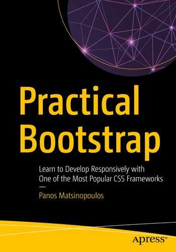


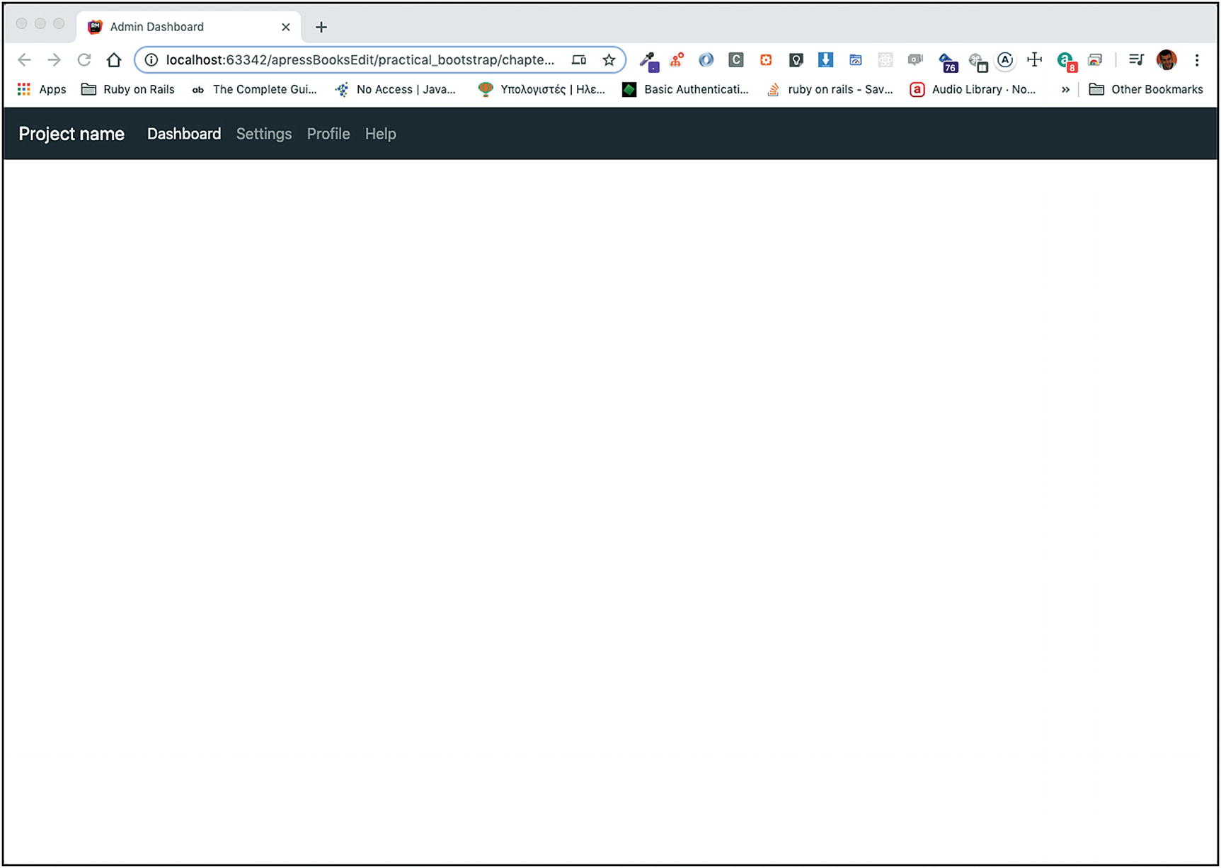


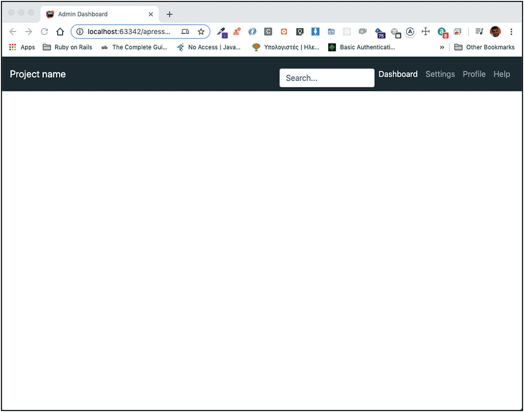
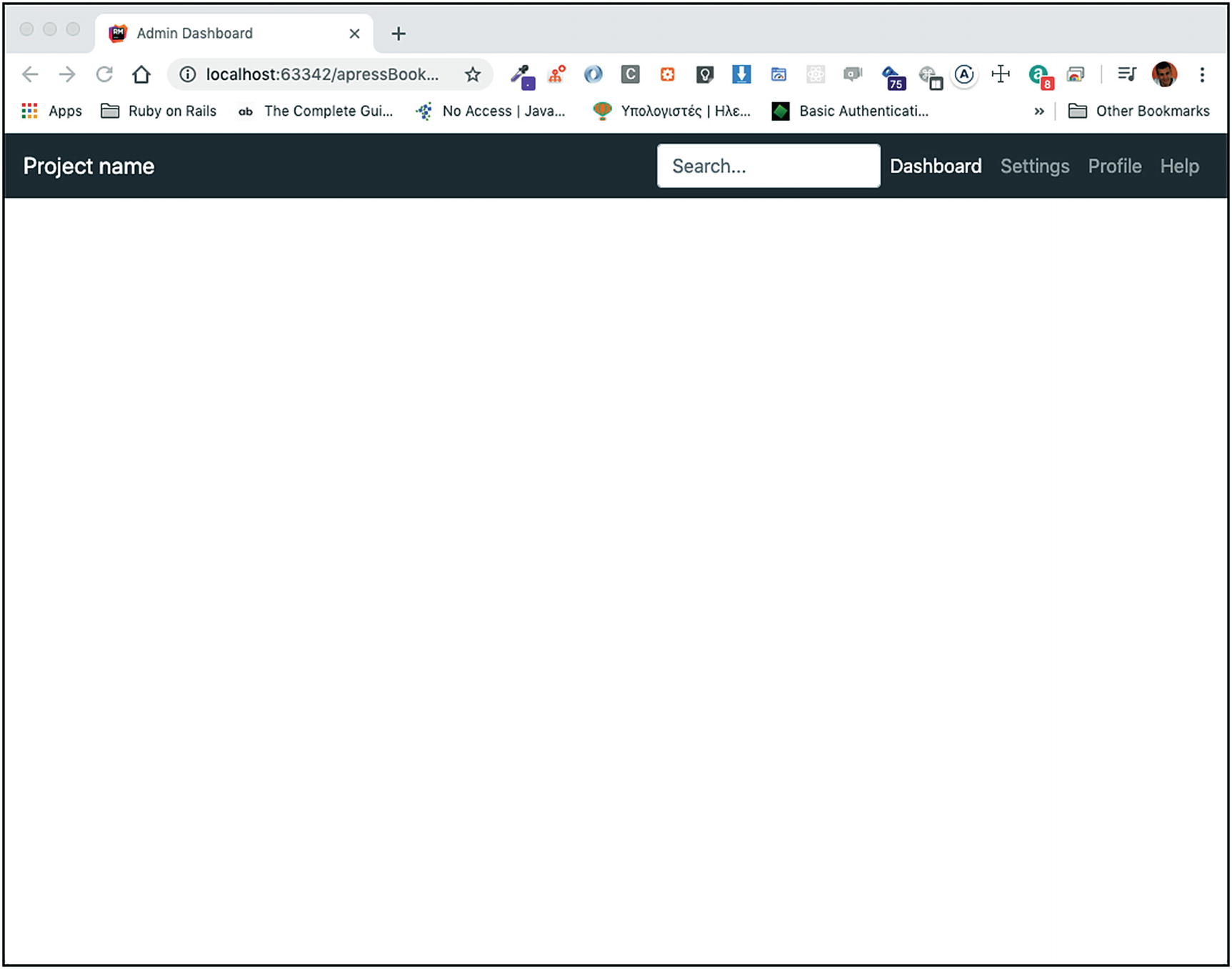


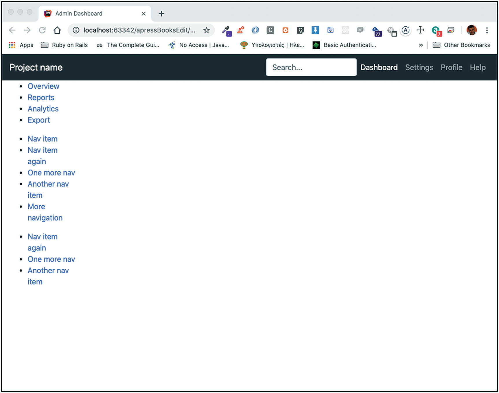
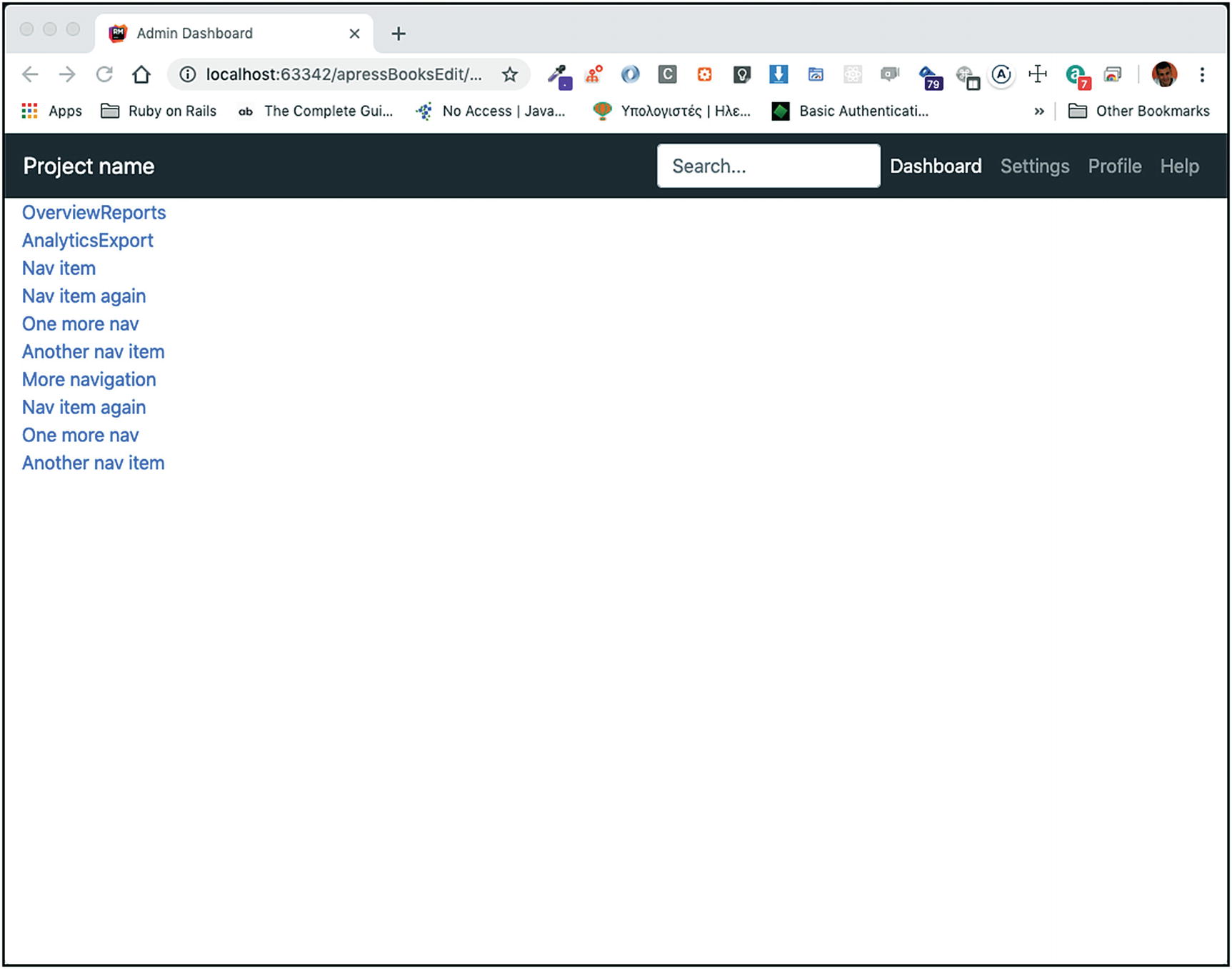

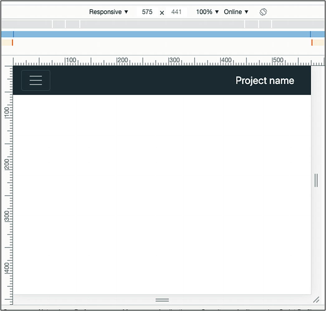


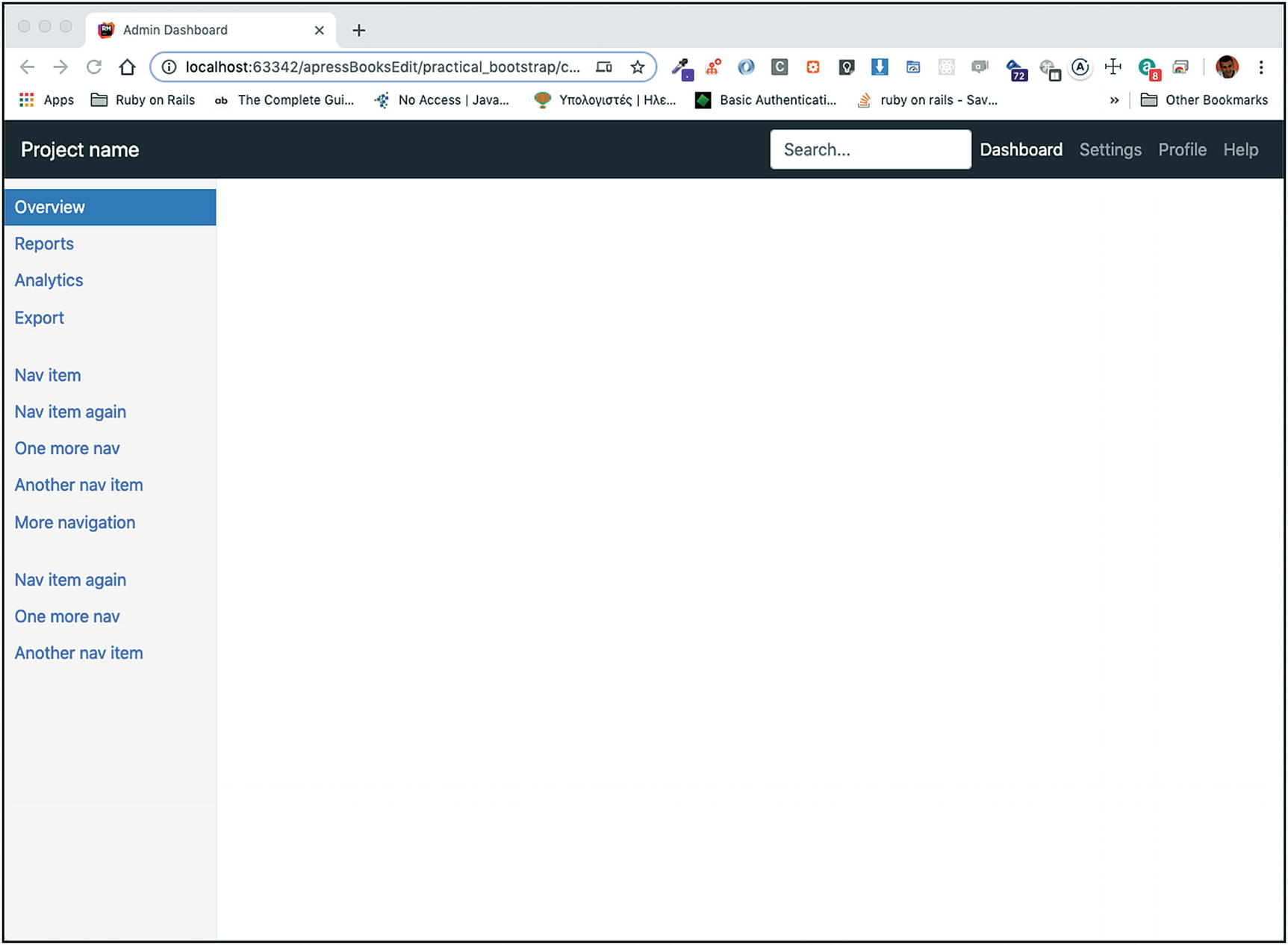


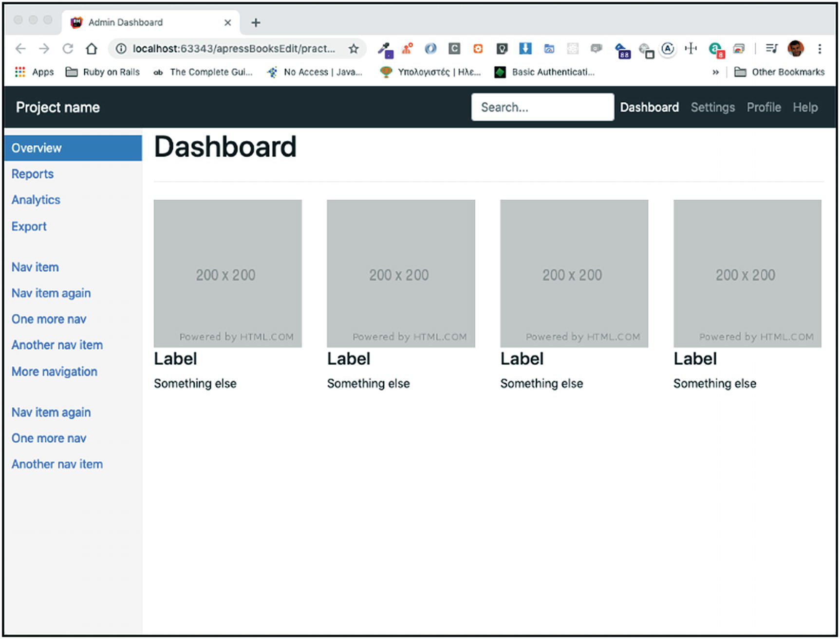
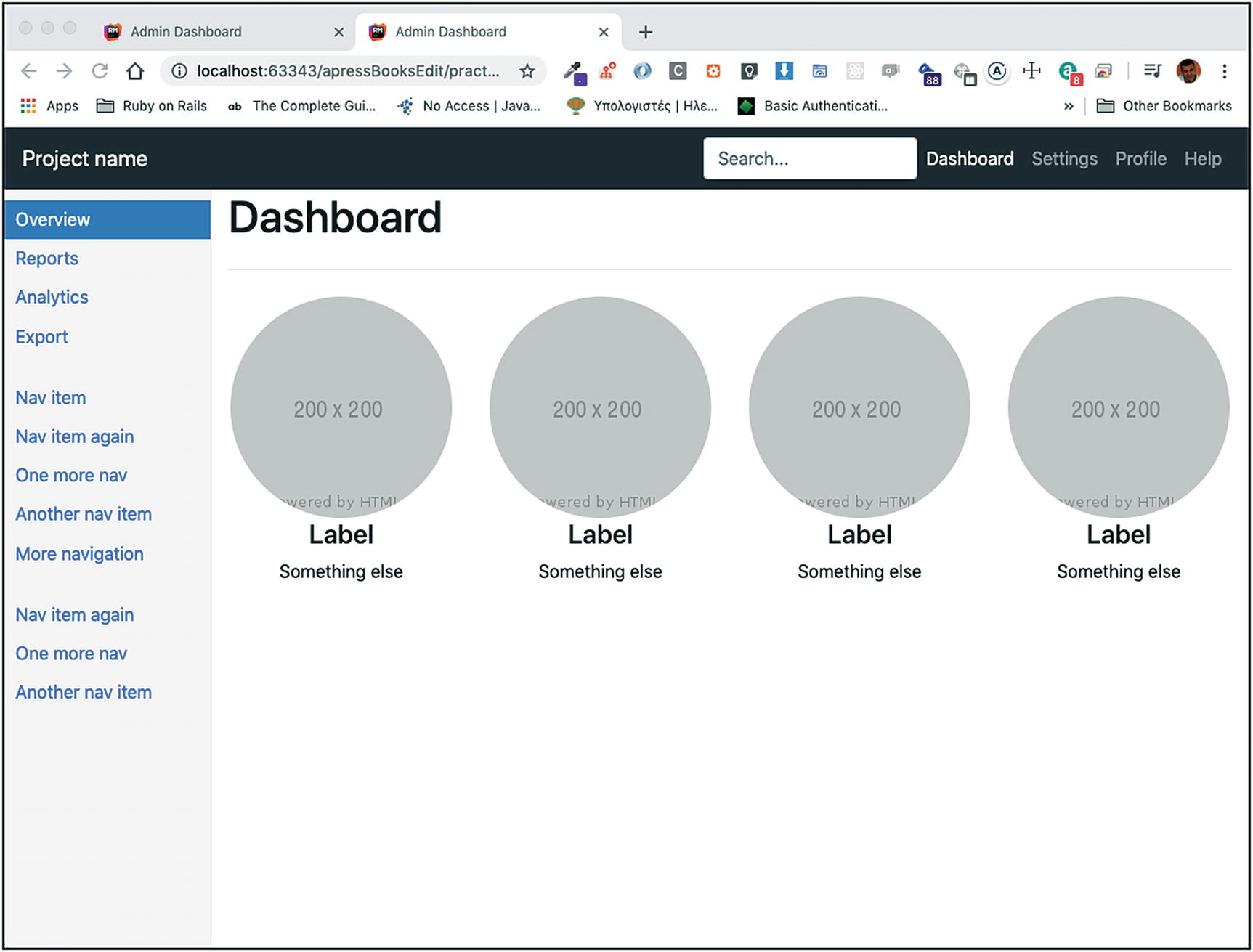
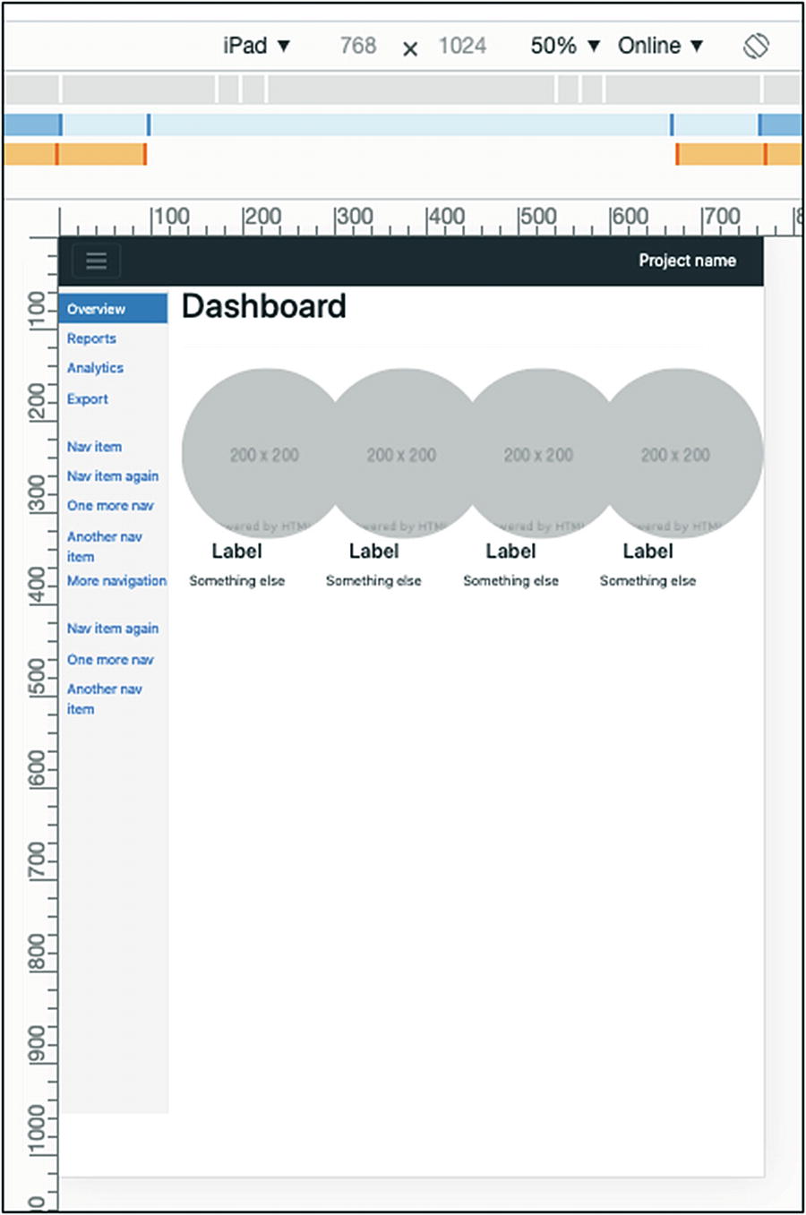


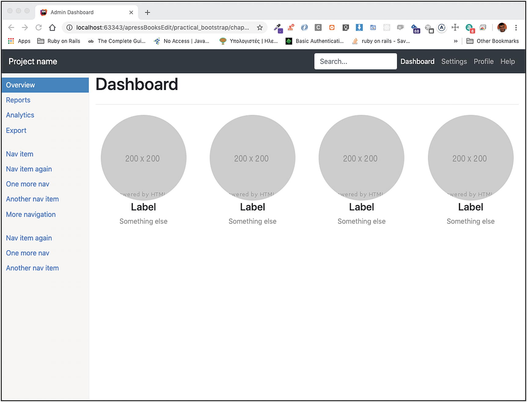
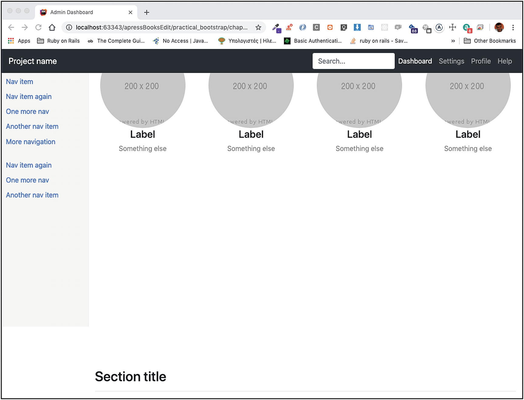
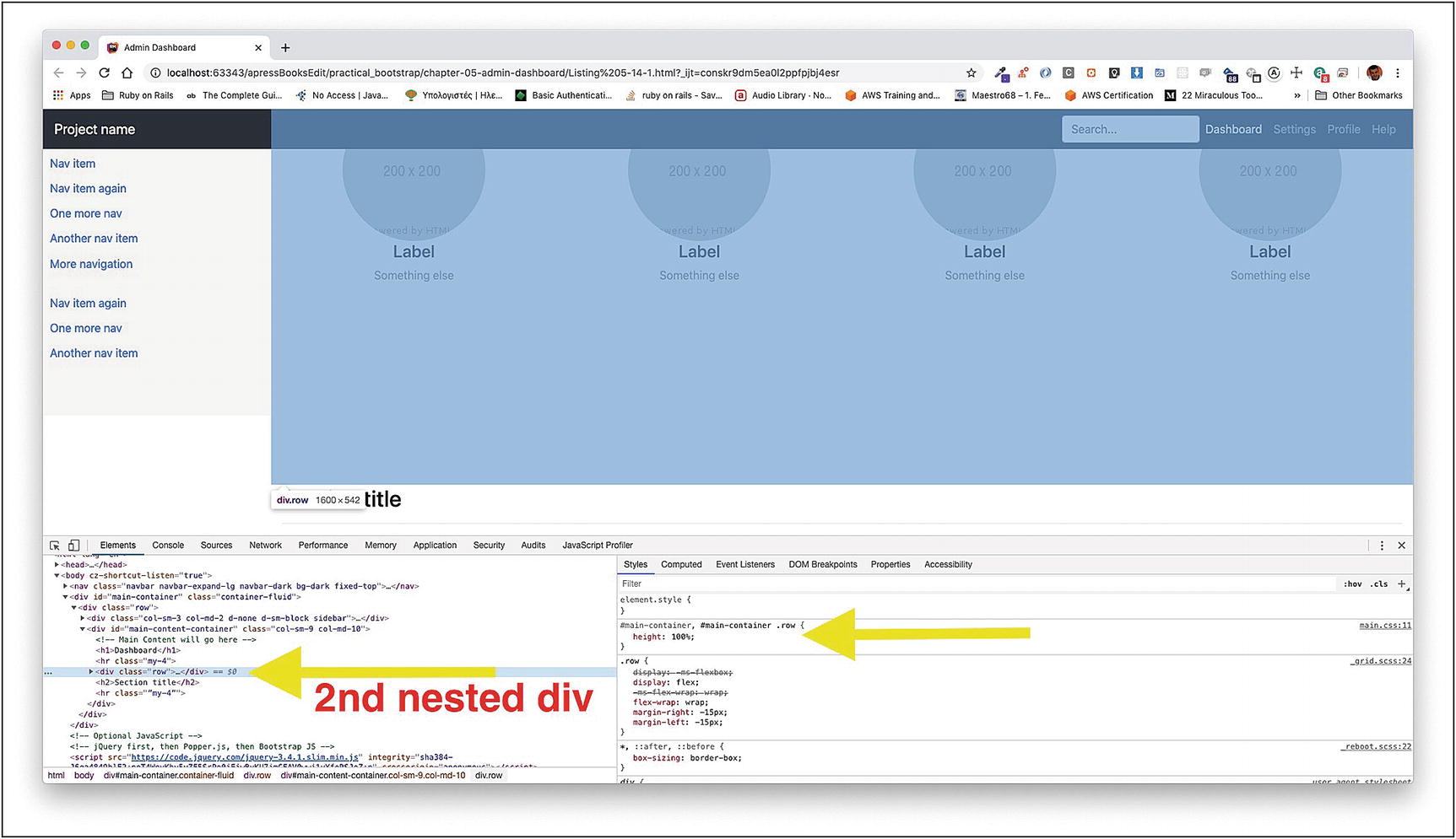


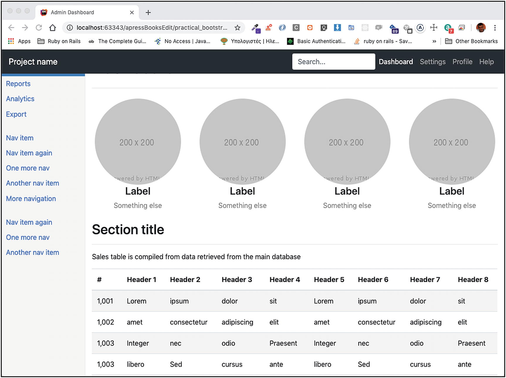
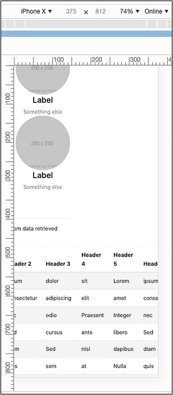

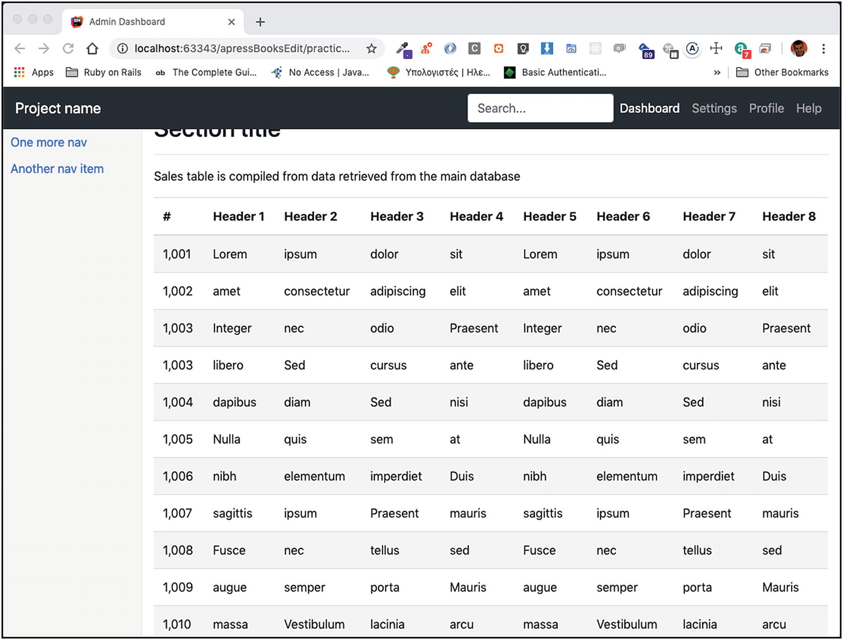

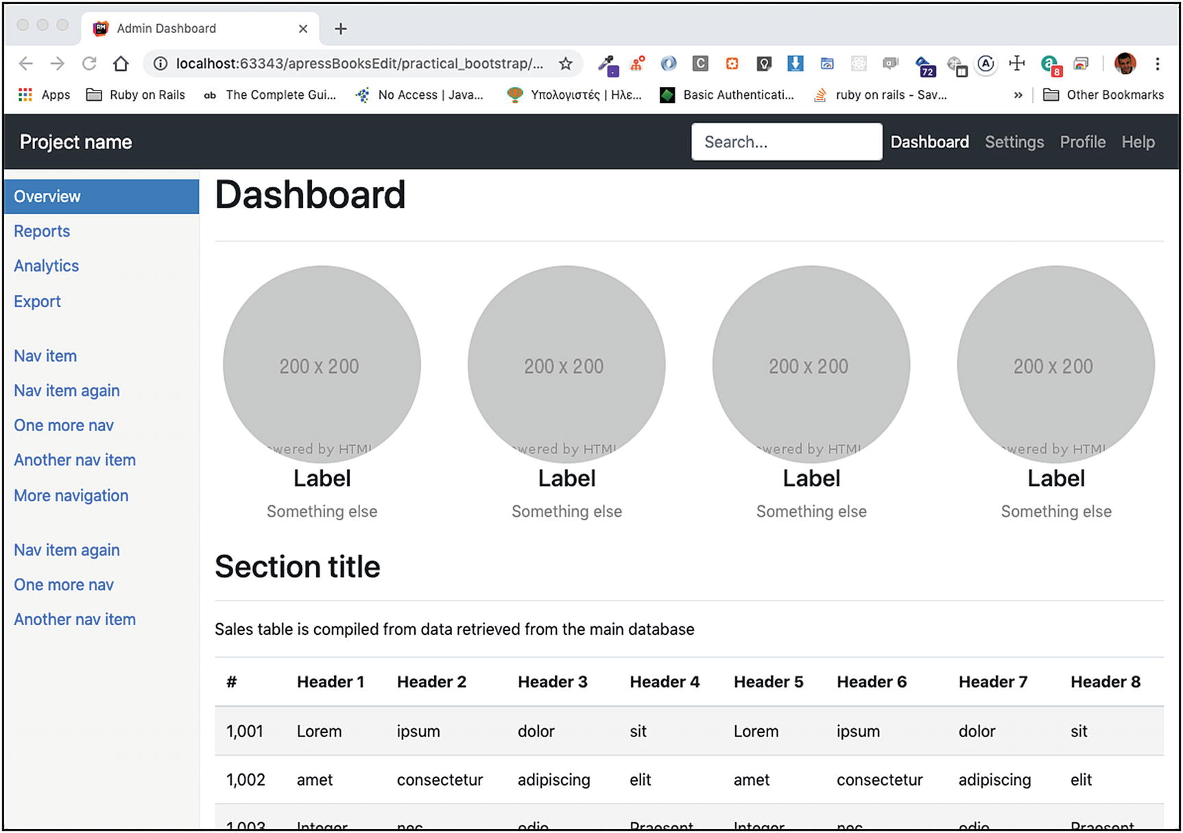


 Figure 7-52
 Figure 7-53
 Figure 7-54