In Chapter 4, "Theme Reference: Part 1," you have learned about some of the most important Twitter Bootstrap components, and you have started creating a reference page for all of them. In this chapter, the second part, you continue with some more components, within the same reference project.
Tabs, which are used to group information
Alerts, which are used to display a standout message
Progress bars, which are used to visually show to the user the percentage of a work under process already done
Cards, beautiful rectangular areas with rich content that draws viewers' attention
Carousel, a component that works like an image or some other rich content slideshow

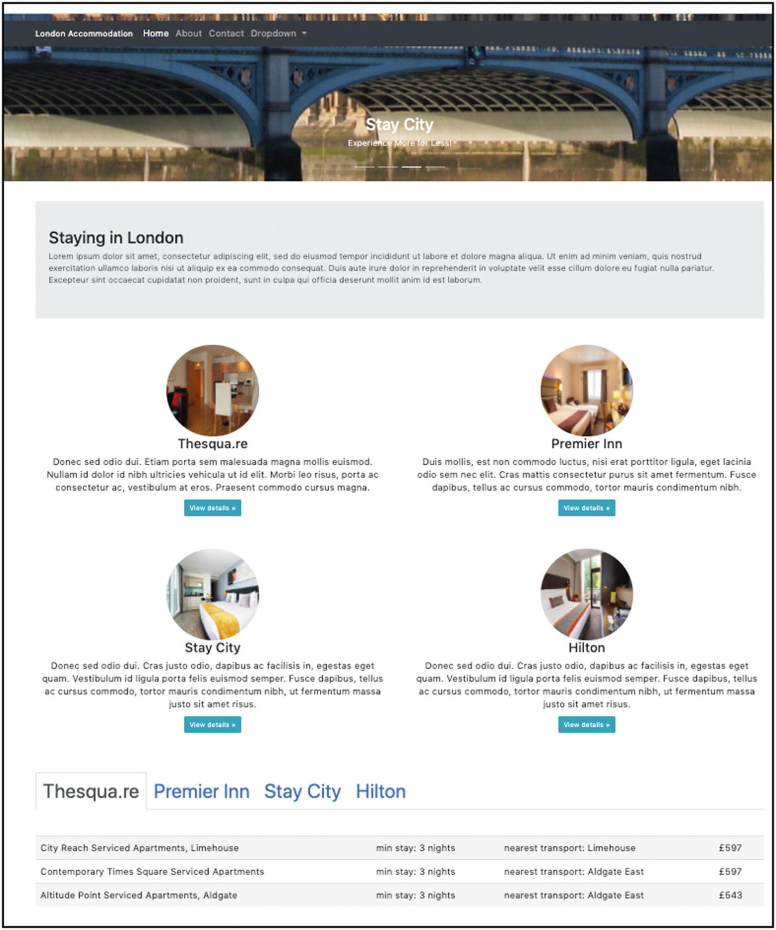
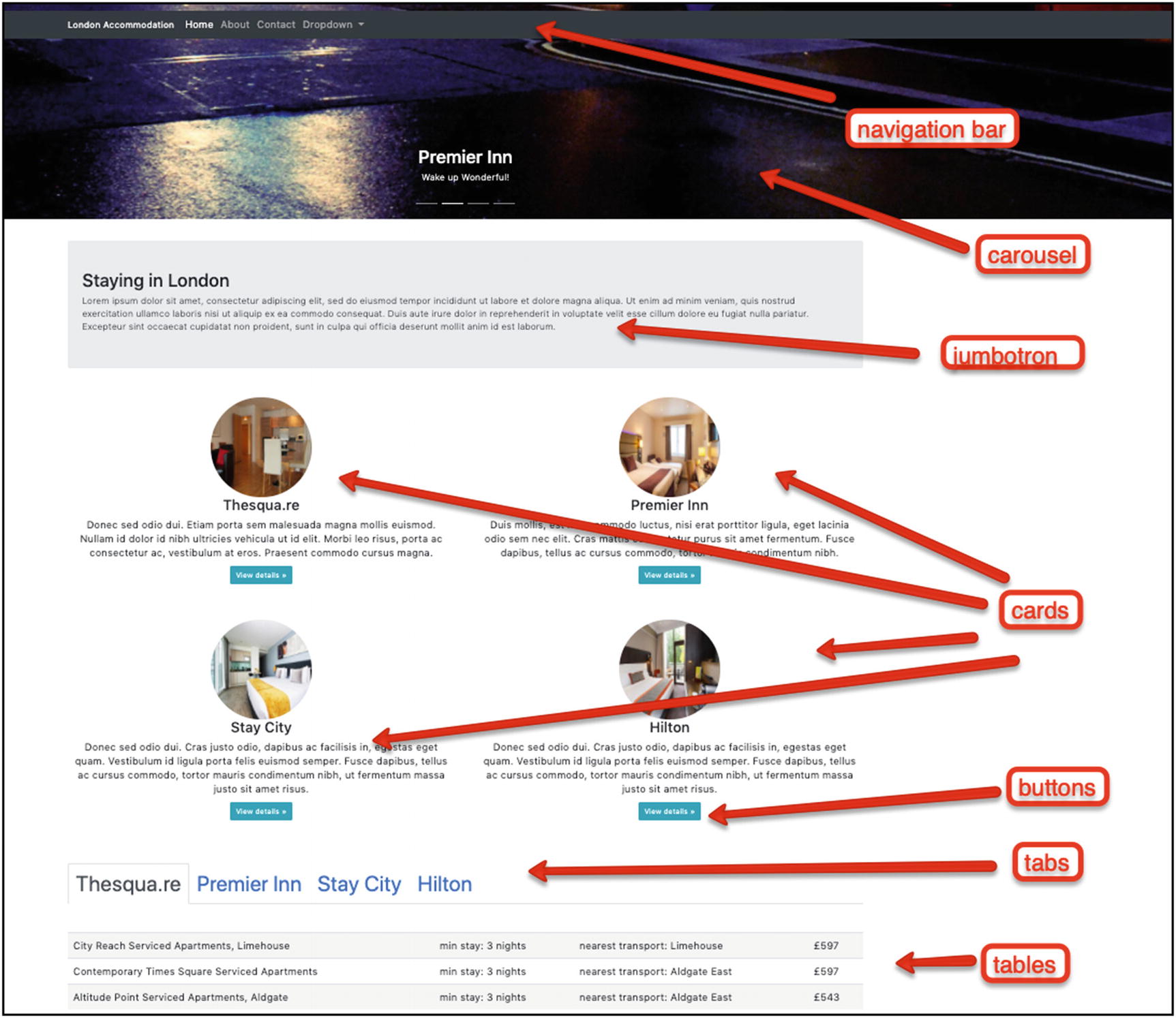
Twitter Bootstrap Example Page with Various Elements
Learning Goals
- 1.
Learn how you can create tabs.
- 2.
Learn how you can create alerts.
- 3.
Learn how you can create progress bars.
- 4.
Learn how you can create cards.
- 5.
Learn how you can create carousels.
Introduction
You continue working on the Twitter Bootstrap Theme Reference project that you started in the previous chapter. Let’s start adding more components into it.
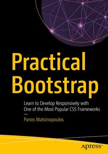
Tabs
Sometimes you want to organize the information on your page using tabs. The tabs are good because they group parts of the information under a title and they do not display all the information at the same time. The user selects which information group to see/read by clicking the corresponding tab header.

Example of Tabs
The information displayed is changed according to the tab header being clicked.
Let's see how we can implement the preceding tabs example.
- 1.
The tab headers
- 2.
The different contents with the actual information
The Tab Headers
The tab headers are an unsorted list ul with class nav nav-tabs. Each element in the list (li) corresponds to a tab header, and it has to have the class nav-item. The content of each li is an anchor with class nav-link and the data attribute data-toggle with value tab. Also, each anchor has an href value pointing to the corresponding information container. When this anchor is clicked, that information container is going to be displayed to the user. Note that the li corresponding to the information container that should be displayed to the user needs to have the class active too.
The ul HTML Fragment for the Tabs Example
Tabs Header
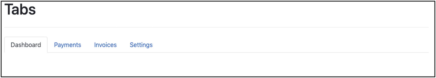
Tabs with Empty Content
That's a good step. You can see how the tabs are well put on the page. You can even click the headers in order to see how the active tab changes according to the tab that you click.
What is missing now is the information that should be attached at each tab.
The Tab Information
You put the tab information inside a div with class tab-content. Inside that, we create one div per information group/tab header. This div needs to have a class tab-pane. Also, it needs to have the correct id, different for each tab information panel and corresponding to the href value of the corresponding tab.
HTML Fragment for Tab Content
- 1.
You have a div that contains all the other individual divs.
- 2.
This parent div has class tab-content.
- 3.
Each div has id value equal to the href of the corresponding tab header anchor.
- 4.
Each div has the class tab-pane.
- 5.
The first div has the class active too, because this is the first information box that is displayed for the first tab header, which is also, initially, active.

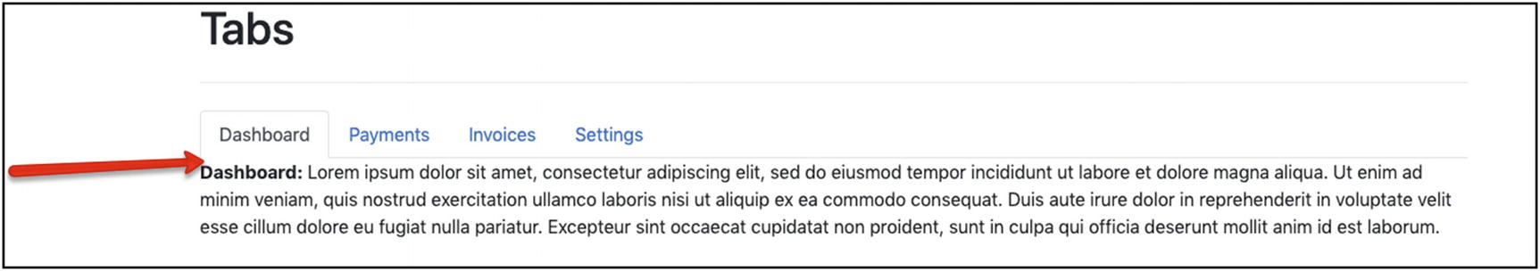
Tabs with Content
As you can see, the tab information is clearly displayed below the tab headers. Also, if you try to click different tab headers, you will see how the following information changes accordingly.
Problem with the Tab Content Being Too Close to Tab Headers
In order to fix this, you need some bottom margin on the ul that includes the headers. You can achieve that by adding the utility class mb-3 to the ul element.
Tab Content Now Has Some Free Space Above It
Twitter Bootstrap is encouraging the authors to make their content compatible with assistive technologies, such as screen readers. This means that instead of just using the styling classes, you may also have to add some extra HTML attributes specially designed for this purpose. For example, the role HTML attribute for the ul element with the tab list needs to have the value tablist. If you want to learn about how you can create accessible rich Internet applications, you have to read and apply the practices given here: WAI-ARIA Authoring Practices.
Checkpoint
Twitter Bootstrap Reference Page Checkpoint
Alerts

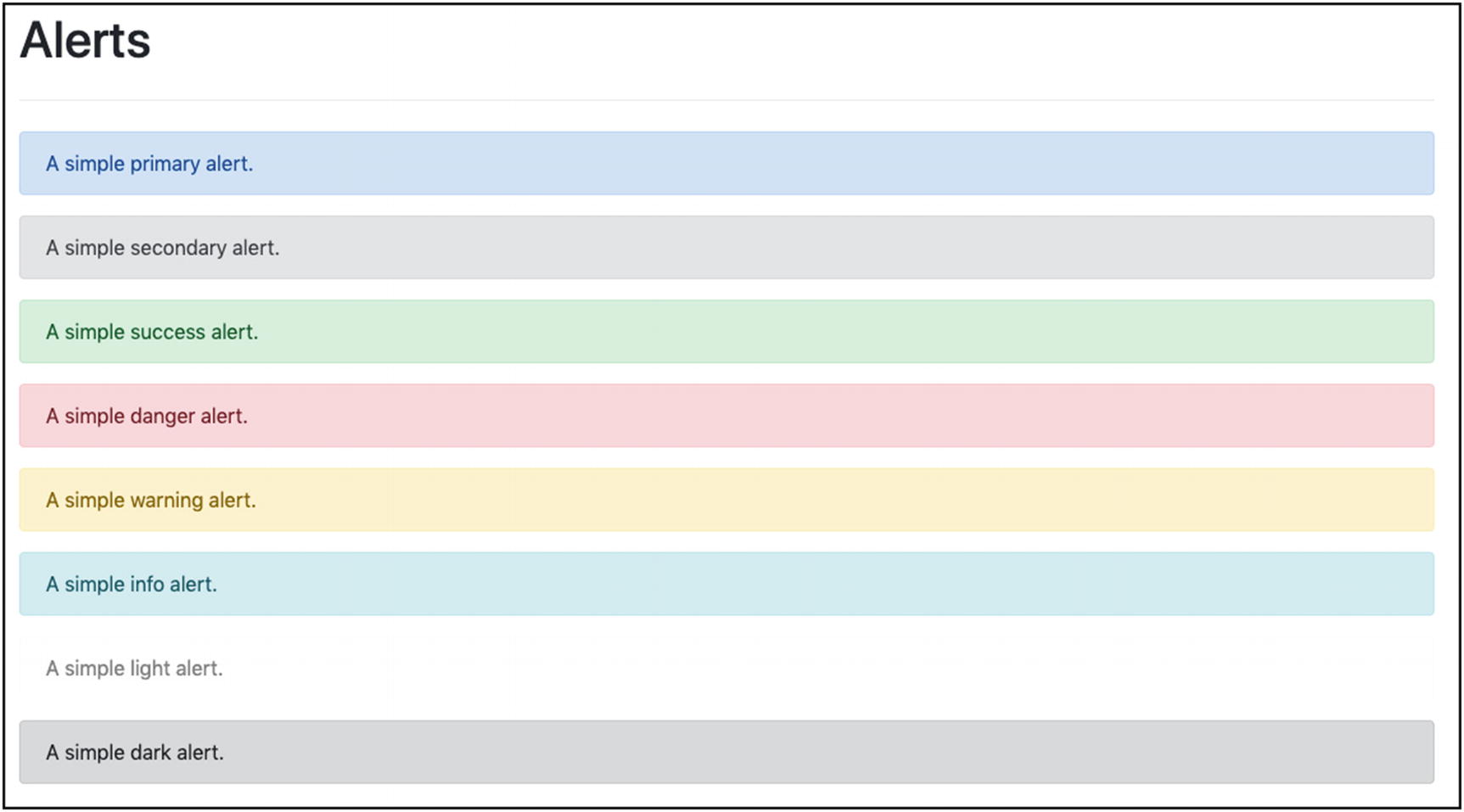
Alert Example
These messages are usually displayed at the top of the page, but not necessarily only there.
Twitter Bootstrap gives the class alert that should be used on a block element (like a div) in order to turn it into an alert block. Alongside that, you also need to specify a class that would color the alert so that it better conveys the message to the user. So, for a message that would indicate warning, you could use the alert-warning class, alongside the alert one.
- 1.
alert-primary
- 2.
alert-secondary
- 3.
alert-success
- 4.
alert-danger
- 5.
alert-warning
- 6.
alert-info
- 7.
alert-light
- 8.
alert-dark
HTML Fragment for Alerts Demo
Alerts Demo
Add an Alert with HTML Inside

Alert with Hyperlink Inside
Use the alert-link Class

Styling Links with alert-link
Progress Bars

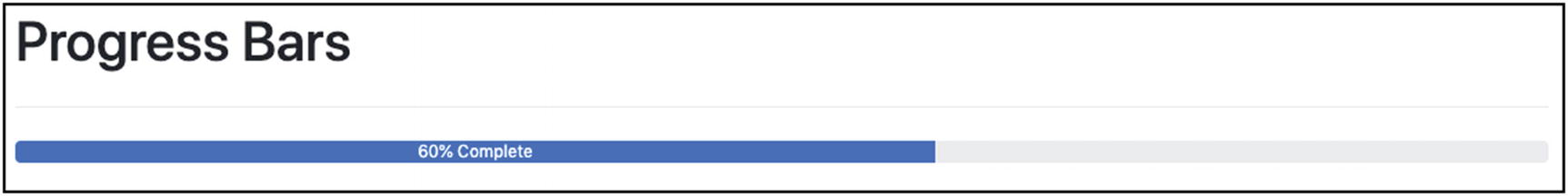
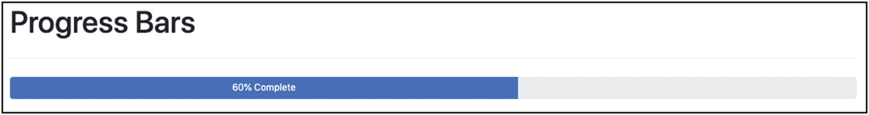
Progress Bar Example
As you can see in Figure 5-11, the progress bar has both a color and a text indication of how much of the process has been completed and how much is left to be done.
HTML Fragment to Add a Progress Bar
As you can see from the preceding fragment, the progress bars are very easy to build. A div has the class progress; and another div, inside the first, has the class progress-bar. The child div has the text that is displayed to give a textual info about the current progress. This text is not necessary. It might be empty. The important part here is that you correctly set the value for the width attribute of the child div, so that it is that big to indicate the actual progress. A good approach is to use a percentage here, because the percentage will make the child width be a percentage of the width of the parent div. The progress class on the parent div makes sure that the parent div occupies all the available width of the page, whereas the style="width: 60%" on the child div makes sure that the child div occupies exactly 60% of the parent div, hence these two div elements working as one to give the visual effect of the progress bar.
Standard Progress Bar
Progress Bar Height
Adjust the Height of the Progress Bar
Adjust the Height of the Progress Bar
Progress Bar Colors
bg-primary
bg-secondary
bg-success
bg-danger
bg-warning
bg-info
bg-light
bg-dark
Progress Bar Demo Code Fragment
Class h-4 Which Is Used in Listing 5-10
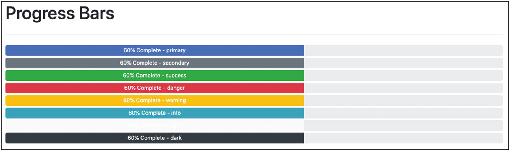
Progress Bars with Various Colors
Multicolored Progress Bar

Multicolored Progress Bar
Multicolored Progress Bar HTML Fragment
As you can see in the preceding code, all three different color divs are inside the parent div. Twitter Bootstrap is clever enough to draw each one of them at the correct position and, given the classes for the color of the progress bars, to draw them with the correct color.
Cards
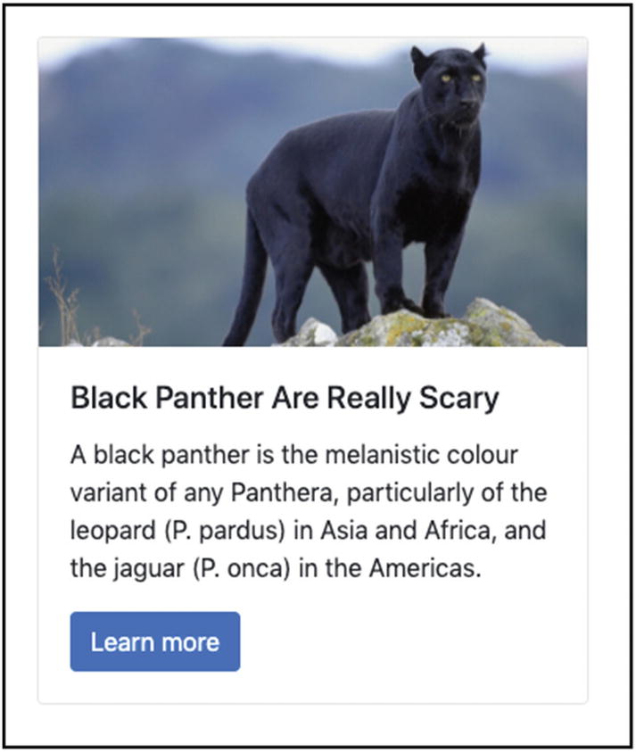
Card Example
A card usually has an image, a title, and a body. But it can also contain headers and footers.
Three-Card Layout

Cards in Your Twitter Bootstrap Reference Page
You are going to add three cards.
- The layout you will choose is responsive:
For displays up to 767px, it will display one card per row.
For displays up to 991px, it will display two cards per row.
For displays with width >=992px, it will display the three cards on the same row.
Three Cards
The Layout
The row-cols-* are the ones needed in order to lay out one or two or three columns on the desired breakpoints.
All of this is needed so that you can achieve the responsive layout that is required.
The HTML of Each Card
The whole card is enclosed inside a div with the class card.
Each card has a header, which is an h* element with class card-header.
The image is constructed with a standard img element that has the class card-img-top. You have also given a specific height so that all the images of all the cards are displayed on a specific height, but taking all the available width.
Then, the main content of the card, the one that follows the image, is put inside a div with class card-body.
- Inside the body, you can generally put any HTML code that you want. We have put
A card title using an h* and a class card-title.
A card subtitle using an h* and a class card-subtitle.
A paragraph with the main text. This has the class card-text.
A hyperlink with class card-link and some extra classes to make it look like a button.
After the body, we attach a div with the class card-footer. This is used to create the footer of the card.
That was it. If you save the HTML page and load it on your browser, you will see the cards that you have already seen in Figure 5-17.
Carousels
You will close this long Twitter Bootstrap reference page with a really cool feature which is called a carousel. Twitter Bootstrap allows you to create image and video carousels. Carousels are areas of the page that display a series of images (and/or videos) one by one. Each image stays visible for a while (about 5 seconds) before being replaced by the next one.
- 1.
Small indicators usually displayed at the bottom (Figure 5-18)
 Figure 5-18
Carousel Indicators
The number of indicators is equal to the number of items in the carousel. In the preceding example, there is a carousel with three items. Hence, you can see three bars. The one that is filled with white color indicates which item is currently displayed. You can also click a bar to quickly display the item at the corresponding position.
- 2.
Next and previous controls (Figure 5-19)
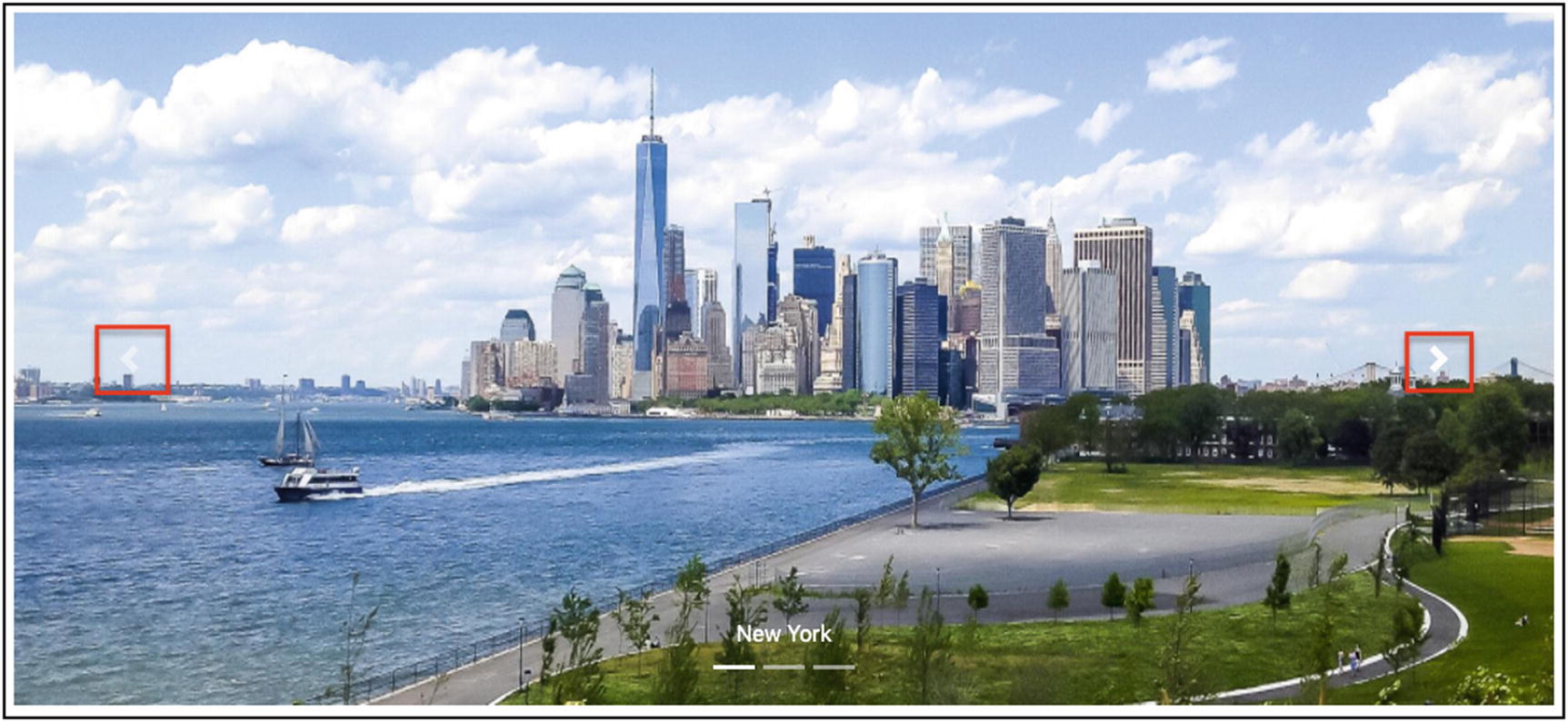 Figure 5-19
Carousel Next and Previous Controls
Next and previous buttons, like arrows, allow you to navigate, slide, from item to item, in either direction, left or right.
- 3.
The items (Figure 5-20)
 Figure 5-20
Carousel Items and Titles
The carousel has a list of items, each one referencing an image and having a title.
HTML Fragment for the Carousel
- 1.
The carousel needs to be enclosed inside a div with classes carousel and slide. If you also want to transition from one slide to the next with a fade effect, then you have to add the class carousel-fade too.
- 2.
The main div needs to have an id, like the one we have in the preceding HTML fragment (carousel-example-generic). This is necessary because it is then referenced by the indicators and the controls. This requirement becomes more important if you have more than one carousel on the same page.
- 3.For the indicators
- 1.
They need to be an ordered list (ol) with class carousel-indicators.
- 2.
Each item (li) is an indicator, and you need to have as many indicators as the number of your items. If you have three images, then you have to have three indicators, that is, li items.
- 3.
Each indicator needs to have a data-target attribute with the id of the carousel. Also, it needs to have a data-slide-to attribute with value equal to the index/position of the item it corresponds to. Note that indexing/positioning starts from 0. That is, the first carousel item is referenced with index 0, then the second with index 1, and so on.
- 4.
The first indicator needs to have the class active.
- 1.
- 4.
All the carousel items need to be wrapped in a single div with class carousel-inner.
- 5.For the carousel items
- 1.
Each one is a div that has the class carousel-item.
- 2.
The first one needs to have the class active; otherwise, the carousel will not be displayed.
- 3.Note that the images of the carousel need to have classes and styles that take care of their height and display attribute. In particular
- 1.
Classes d-block and w-100: The first (d-block) sets the image display attribute block value. The second (w-100) sets the image width to be 100%. Hence, the image will occupy the whole width available. Note that these are display and sizing Bootstrap utility classes.
- 2.
Style that sets the height of all images to be the same. In the example, it is set to 500px.
- 1.
- 4.Finally, the carousel items can have a div with class carousel-caption that works as the title/caption of the item. Note that you have set two extra display utility classes on the captions:
- 1.
d-none, which hides the captions.
- 2.
d-md-block, which displays the captions for medium displays and wider. In other words, you want the captions to be displayed on devices with width >=768px. Otherwise, they will not be displayed.
- 1.
- 1.
- 6.Below the inner content of the carousel (the div with class carousel-inner), you set the HTML content for controls, which are two anchor a elements:
- 1.
The first has the class carousel-control-prev, and it is used to navigate to the previous/left slide.
- 2.
The second has the class carousel-control-next, and it is used to navigate to the next/right slide.
- 3.
Both have attribute href pointing to the carousel id (#carousel-example-generic).
- 4.
Both have a child/content that is a span. This span is used to display the left (for the first control) and the right (for the second control) arrows. For the first control, the span needs to have the class carousel-control-prev-icon, so that it displays the left arrow. For the second control, the span needs to have the class carousel-control-next-icon, so that it displays the right arrow.
- 1.
Final Checkpoint
Twitter Bootstrap Reference Page
Closing Note
This closes a long encounter with Twitter Bootstrap. You have created a page with a big list of Twitter Bootstrap features that can be used as a reference to the most commonly used features.
However, there is a lot more to cover on Twitter Bootstrap. This will be done in the next chapters.
Tasks and Quizzes
Key Takeaways
Tabs
Alerts
Progress bars
Cards
Carousels
In the following chapter, you are going to learn how Twitter Bootstrap can help you create a page whose background is covered with an image.