
Chapter 2. Monitoring Design Patterns
In the last chapter we covered how good intentions can result in a well-meaning train wreck. I certainly don’t expect you to have solved all of those problems in your environment by the time you read this chapter, and that’s totally OK. Since you can now be mindful of the anti-patterns and work on solving them, you’re going to need new solutions for what to do in their place.
This chapter answers that question by presenting four design patterns that, if taken seriously and implemented, will lead you to monitoring nirvana. Let’s dig in.
Pattern #1: Composable Monitoring
Composable monitoring is the first pattern of modern monitoring design. The principle is simple: use multiple specialized tools and couple them loosely together, forming a monitoring “platform.” This pattern is directly in opposition to the monolithic tools many of you are familiar with, chief among them, Nagios. Composable monitoring can be thought of as the UNIX philosophy in action:
Write programs that do one thing and do it well. Write programs to work together.
Doug McIlroy
Back in 2011, conversations about why monitoring was so bad grew around the #monitoringsucks hashtag on Twitter. This grew into #monitoringlove and the founding of the Monitorama conference in Boston. Many, many conversations were had about what could be done to improve things. One of the biggest points raised was that we needed new and better tools. More specialized tools. Composable monitoring as an idea was thus born, and it has grown into a de facto standard in practice. With the rise of tools such as Graphite, Sensu, logstash, and collectd, we can clearly see that tying specialized tools together has resulted in a more flexible and less painful monitoring stack. Even commercial monitoring services, such as Librato, Loggly, and Pingdom, have extensive APIs to control and manage how monitoring is done through them.
One of the biggest perks of composable monitoring is that you are no longer committed long-term to a particular tool or way of doing things. If one tool no longer suits your needs, you can remove it and replace it with another, instead of replacing your entire platform. Such flexibility can lead to a more complex architecture, but the benefits far outweigh the costs.
The Components of a Monitoring Service
If we are to build a monitoring platform from loosely coupled specialized components, we first have to break down what the facets of a monitoring system are. A monitoring service has five primary facets:
-
Data collection
-
Data storage
-
Visualization
-
Analytics and reporting
-
Alerting
Even if you’re using a monolithic tool, you have these components in place—-they’re just in a single tool instead of multiple. In order to understand how composable monitoring helps, we’ll dig into each component. Each of these components is fairly straightforward in concept but can range from simple to mind-bogglingly complex in practice. Thankfully, we have plenty of options for how complex we make them when it comes to implementation.
Data collection
The data collection component does just that: it collects data. There are two primary ways for data collection to happen: push or pull. As silly as it sounds, this distinction has yielded more than its fair share of think pieces and conference talks. For those reading this book, the decision isn’t that important—use what works for you and move on.
In the pull model, a service will request that a remote node send data about itself. The central service is responsible for scheduling when those requests happen. You are likely familiar with SNMP and Nagios, both of which are pull-based monitoring tools. Some people argue that pull-based is always a bad idea, but I believe it’s more nuanced than that. When it comes to monitoring network gear, you’re pretty much stuck with SNMP, though that is slowly changing as network hardware vendors come to their senses. Another use case is the /health endpoint pattern in application monitoring, which exposes metrics and health information about an app to an HTTP endpoint, which can be polled by a monitoring service, service discovery tool (such as Consul or etcd), or by a load balancer.
When it comes to metrics, there are some annoying downsides for a pull-based mechanism: a pull model can be difficult to scale, as it requires central systems to keep track of all known clients, handle scheduling, and parse returning data.
In the push model, a client (a server, an application, etc.) pushes data to another location. The client may do so on a regular schedule or as events occur. syslog forwarding is a great example of a push model with irregular events, while the popular metrics collection agent collectd is an example of a push model on a regular schedule. A push model is easier to scale in a distributed architecture, such as those in cloud environments, due to the lack of a central poller (coordinating polling schedules across multiple pollers is tricky and you’ll still need to maintain a master list of all nodes to poll). Nodes pushing data need only know where to send it, and don’t need to worry about underlying implementation of the receiving end. As a result, the push model can have better redundancy and high availability.
Each approach has its own merits and use cases. In my experience, using push-based tools is easier to work with and reason about, but your mileage may vary.
As for what data we may be gathering, we’re concerned about two types: metrics and logs.
Metrics
Metrics come in different representations:
- Counter
-
A counter is an ever-increasing metric. The odometer in your car is an example of a counter. Counters are great for such things as counting the cumulative number of visitors to your website.
Traffic on a network interface is an example of a counter. Just like the odometer on your car, counters have an upper bound. Once that upper bound is crossed, the counter will “roll over” (or, “wrap”) and start over again at zero. A technical example of this is a 32-bit network interface counter. Under 100% load, a 32-bit counter on a 1 Gb interface will wrap in 32 seconds. Thankfully, most operating systems and network devices that implement counters are using 64-bit counters, which will take on the order of years to wrap (4.5 years, in fact). This is mostly only a concern on network gear, which will we go into more in Chapter 9.
- Gauge
-
A gauge is a point-in-time value. The speedometer in your car is an example of a gauge. The nature of a gauge has one big shortcoming: it doesn’t tell you anything about previous values and provides no hints for future values. However, by storing gauge values in a TSDB, you can retrieve them later and do such things as plot them on a graph. Most metrics you’ll be working with are gauges.
Logs
Logs are essentially strings of text with (hopefully) a timestamp associated with them to denote when the event occurred. Logs contain significantly more data than metrics do, and often require some parsing to get information out of them without a human reading through them. Logs come in two types: unstructured and structured.
Most of us are used to dealing with unstructured logs. Unstructured logs have no explicit mapping of meaning to a particular field. For example, consider this log entry from NGINX, a popular web server:
192.34.63.77 - - [26/Jun/2016:14:06:22 -0400] "GET / HTTP/1.1" 301 184 "-" "Mozilla/5.0 (Windows NT 10.0; WOW64) AppleWebKit/537.36 (KHTML, like Gecko) Chrome/47.0.2526.111 (StatusCake)" "-"
If I were to ask you to tell me what the status code and user agent were, would you immediately know? Semantics in unstructured logs are often implied by order, so if you’re unfamiliar with NGINX or web servers, you would have a difficult time answering the question without finding the NGINX documentation.
Let’s take this same log entry and turn it into a structured log entry with JSON:
{ "remote_addr": "192.34.63.77", "remote_user": "-", "time": "2016-06-26T14:06:22-04:00", "request": "GET / HTTP/1.1", "status": “301”, "body_bytes_sent": “184”, "http_referrer": "-", "http_user_agent": "Mozilla/5.0 (Windows NT 10.0; WOW64) AppleWebKit/537.36 (KHTML, like Gecko) Chrome/47.0.2526.111 (StatusCake)", "http_x_forwarded_for": "-" }
As you can see, we’ve turned our log entry into key-value pairs. Quickly understanding what a field means is so much easier now that semantics are explicit. Even better is that now we can let computers do what computers do and extract the information for us with ease. I encourage you to use structured logging where you can. There are plenty of guides online for switching various services over to use a structured format (JSON is the most popular).1
Log collection can be done in a couple different ways, but the most common (and easiest) is to set up log forwarding on your systems. Every major operating system and logging daemon supports log forwarding, including network gear. Log forwarding allows you to tell your systems to send their logs to another place instead of letting them sit locally on the system. The benefits are obvious, as you can now analyze logs for many systems from a single place instead of logging into multiple systems. On a large fleet of systems, this allows for easy aggregation of similar data for large-scale analysis. For example, consider the scenario where you might have a dozen web servers behind a load balancer. Instead of logging into each of the dozen web servers individually to check logs, log forwarding to a remote logging service allows you to analyze all dozen from a single place, giving you a more complete picture of what your web servers are up to.
If you are writing applications, you should be logging information from them. Most programming frameworks (e.g., Ruby on Rails and Django) have built-in logging capabilities with their own structure, though you can also define your structure. Once the files are on disk, you can easily have the syslog daemon on the server forward these files to a remote service.
Data storage
After collecting the data, you’ll need somewhere to store it. Depending on the data type, this might be a specialized solution.
Metrics, being time series, are usually stored in a Time Series Database (TSDB). A TSDB is a specialized sort of database designed for storing time series data, which is fundamentally key-value pairs made up of a timestamp (when the measurement was taken) and a value. We refer to the key-value pair as a datapoint. You may already be familiar with two common TSDBs: Round Robin Database (RRD) and Graphite’s Whisper. There are many others in various stages of maturity.
Many TSDBs “roll up” or “age out” data after a certain time period. This means that as the data gets older, multiple datapoints are summarized into a single datapoint. A common rollup method is averaging, though some tools support other methods such as summing datapoints.
For example, assume we had a rollup schedule of the following: metrics are collected every 60 seconds from a node, stored at native resolution (60 seconds) for 1 day, then summarized to 5 minutes after 3 days. This means that there would be 86,400 datapoints for the past 24 hours of metrics, but only 864 datapoints for the next 3 days. This occurs by averaging the values for every datapoint in a five-minute period into one datapoint. Metric rollup occurs as a result of compromises: storing native resolution for metrics gets very expensive for disks, both in storage and in the time it takes to read all of those datapoints from disk for use in a graph.
Many people are of the opinion that rolling up data is undesirable. Certainly, for some kinds of metrics, this could be true, but for the vast majority of operational data, do you really care what the CPU was doing at a 60-second granularity last week? Probably not. When it comes to operational data, you are far more concerned with recent events, and only with a general idea of older trends.
Log storage comes in a two different flavors. Some systems store the data as simple flat files. If you’ve ever told rsyslog to forward to another syslog receiver for remote storage, you’ve seen this in action. More advanced solutions store the log files in a search engine (such as Elasticsearch). If you actually want to use your logs, you will be interested in the latter. Most logging platforms will include the storage component, making this somewhat transparent.
While metric storage is inexpensive, storing logs can get expensive. It’s not uncommon to generate terabytes worth of data per day. There’s not a magic solution to this problem, but compression and retention policies can help.
Visualization
Everyone loves charts and dashboards, making them the most visible component to your monitoring platform. If you are using a monolithic tool (e.g., Nagios and SolarWinds’ NPM) then you’re basically stuck with the dashboard provided, with little (if any) room for building your own stuff. If you’re using tools built for composability, you have far more options.
Why would you want to build your own frontend? Having tons of data is fine, but it’s useless if you can’t make sense of it in a way that suits you and your team. What good is a bunch of metrics with cluttered, confusing dashboards? A driving principle behind great monitoring is that you should be building things in a way that works best for your environment.
There are lots of dashboard products and frameworks out there, such as Grafana and Smashing.
Note
When it comes to visualization, an entire book could written on the topic. Oh, wait a minute, many great books have been written on the topic!
Edward Tufte’s The Visual Display of Quantitative Information (Graphics Press) and Stephen Few’s Information Dashboard Design (Analytics Press) are excellent resources for going deeper into the world of data visualization. I cannot do these works justice in a short section such as this, so if you’re interested in the world of visualization, I strongly recommend reading them.
The most common visualization for time series data is the line graph (also called a strip chart), but there are certainly other representations that can be useful. Displaying data in a table format, a bar graph, a singular number, or even straight text can all have their value. For the most part, you’ll be working with line graphs in ops/software engineering.
But for the Love of God, Don’t Use a Pie Chart
The primary use of a pie chart is for a snapshot-in-time visualization. It doesn’t contain any context about history or trends is and therefore best used for data that doesn’t change often. The most common use for a pie chart is to show data in relation to the whole, but even still, a bar chart is often a better visualization for that purpose.
Speaking of dashboards, what makes a great one? Useful dashboards have different perspectives and scopes. A great dashboard answers questions you have at a particular time. You might have one dashboard that shows only a high-level overview of every major functionality and service of your company (WAN, LAN, applications, etc.), while you might have more dashboards for each of those major services. You might even have more dashboards for different aspects of those services.
The best dashboards focus on displaying the status of a single service (e.g., the internal email system or the corporate network routing topology) or one product (e.g., a single app). These dashboards are most effective if they are created and maintained by the people who understand the service the best. For example, if you have an internal email service, have the admins for that service create the dashboards for it.
Analytics and Reporting
For some types of monitoring data, it can be helpful to go beyond a simple visualization and into the realms of analytics and reporting.
One of the most common use cases here is determining and reporting on service-level availability (SLA) of your applications and services. An SLA is an agreement between you and your customer (whether that’s an external, paying customer or another internal team) regarding the expected availability of your application/service, typically determined month by month.2 Depending on the agreement, there might be contractual penalties for not meeting the SLA. SLAs with no penalty clause are generally considered to be more of a “target to hit.” Penalty or not, it’s important that your monitoring data is complete and accurate so you’re able to effectively report on availability.
Availability is referred to by the number of nines. That is, 99% is two nines, while 99.99% is four nines.3 In a simple infrastructure, the math is straightforward: determine how much downtime you had and compute that in terms of an availability percentage. The formula for this is equally simple: a = uptime / total time, where total time is the time the component was both up and down. The resulting a is a percentage measurement of availability. Let’s look at an example:
If your app ran for a complete month (43,800 minutes) and experienced 93 minutes of downtime, then the availability would be 99.7% (43,707 (uptime) / 43,800). Pretty simple, right?
Did You Spot the Sampling Error?
This calculation is actually naive and has a problem that’s easy to overlook: a sampling error.
According to the Nyquist-Shannon sampling theorem, to measure an outage of two minutes, you must be collecting data in minute-long intervals. Thus, to measure availability down to one second, you must be collecting data at sub-second intervals. This is just one more reason why achieving accurate SLA reporting better than 99% is so difficult.
Well, not quite. You might notice that computing uptime and total time in a complex architecture is tricky, and you would be right. In order to determine the required numbers, you would have to compute them for each and every component that your app depends on. If components of the app have redundancy, you have two options: accuracy or ease.
If you want to be completely accurate in your availability calculations and reporting, you’ll need to calculate the availability of each redundant component, then calculate the availability of the component as a whole. This math can get more complex than what you’re probably interested in, and in my opinion, isn’t that helpful.
Instead, I recommend calculating the availability of the component as a whole and ignoring the availability of the underlying redundant components. The calculation is much simpler and more directly answers what you’re really looking for anyway.
An oft-overlooked point about availability is when your app has dependency components: your service can only be as available as the underlying components on which it is built. For example, did you know that AWS EC2 only provides a 99.95% SLA for a single region? That’s about four hours of downtime a year. If you’re running your infrastructure in AWS in a single region, you can’t promise a higher SLA than that without potentially violating the SLA. Likewise if your underlying network is unreliable, the servers and applications higher in the stack can’t possibly be more reliable than the network.
A final point before moving on: 100% availability is unrealistic. The downtime that maps to nine nines (99.9999999% availability) is roughly 31 seconds of downtime per year. Recall that even AWS EC2 has an SLA guarantee of fewer than four nines, and there’s a good chance AWS invests more into the reliability of EC2 than your company makes in revenue per year. Each additional nine of availability has significantly more cost associated with it, and the investment often isn’t worth it: many customers can’t tell the difference between 99% and 99.9%.
Alerting
I have found that many people seem to build monitoring without understanding its purpose. They seem to believe that the driving purpose of a monitoring system is to alert you when things go wrong. While older monitoring systems like Nagios certainly lead you to that conclusion, monitoring has a higher purpose. As a friend of mine once said:
Monitoring is for asking questions.
Dave Josephsen, Monitorama 2016
That is, monitoring doesn’t exist to generate alerts: alerts are just one possible outcome. With this in mind, remember that every metric you collect and graph does not need to have a corresponding alert.
Pattern #2: Monitor from the User Perspective
By now, you’re probably itching to start building things, but where do you start? Your app and infrastructure are complex, with lots and lots of moving parts—failure could happen anywhere!
You’re totally right. There are a lot of places we are going to need to instrument things, but there’s one perfect place to start: the users (Figure 2-1).
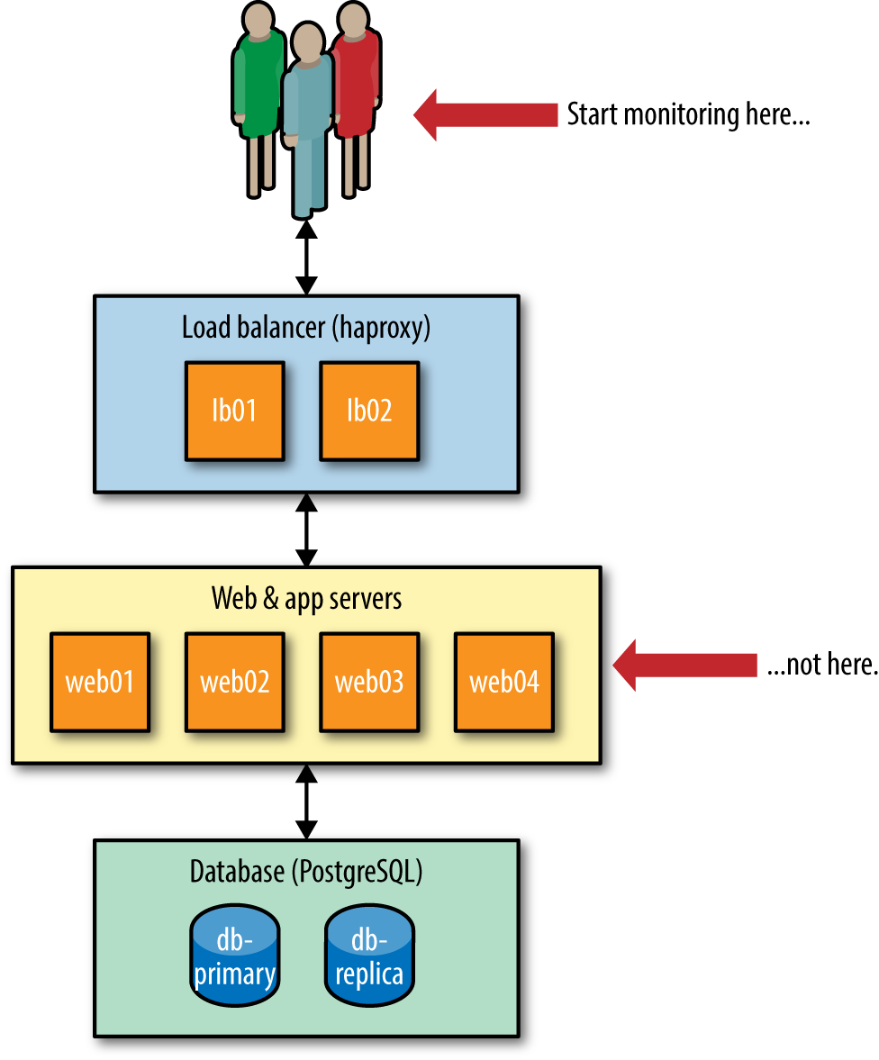
Figure 2-1. Start monitoring as close to the user as possible
The best place to add monitoring first is at the point(s) users interact with your app. A user doesn’t care about the implementation details of your app, such as how many Apache nodes you’re running or how many workers are available for jobs. Your users care about whether the application works. As such, you want visibility from their perspective first.
One of the most effective things to monitor is simply HTTP response codes (especially of the HTTP 5xx variety). Monitoring request times (aka latency) after that is also useful. Neither of these will tell you what is wrong, only that something is and that it’s impacting users.
By monitoring from the user’s perspective first, you begin to free yourself from the worry of caring about individual nodes. If your database server’s CPU has started to spike, but the user isn’t impacted, do you really have a problem?
Now, I’m not suggesting that this is the only place you instrument your app. You should be starting with the user, but you should quickly expand your efforts to instrumenting components, such as those web nodes and worker nodes. Go as deep and wide as you want, but always be asking asking yourself, “How will these metrics show me the user impact?”
Pattern #3: Buy, Not Build
We discussed the anti-pattern of tool obsession in Chapter 1. This design pattern is essentially the direct answer to that anti-pattern.
I’ve noticed a natural progression of monitoring tooling and culture as it matures within a company.
Companies often start off running purely SaaS services. This allows them to quickly get monitoring up and running, and gives them the ability to focus their efforts on building a great product.
At some point (a point that comes at different times for every company and team), monitoring is brought in-house. Sometimes it happens for financial reasons, sometimes it happens because the SaaS services are no longer meeting the needs of a growing product. The tools they transition to are the well-known FOSS monitoring tools, such as Graphite, InfluxDB, Sensu, and Prometheus.
A small group of companies will eventually outgrow even those and set out to build their own custom platforms, tailored specifically for the unique concerns and needs of their company. For example, Netflix, Dropbox, and Twitter are all in that final group.
There is often some overlap and mixing of the stages (e.g., you might have a custom metrics platform but use a SaaS logging service), but the important part here is that your first effort at monitoring probably shouldn’t be jumping right to building an in-house platform if you’re not already reasonably mature in your monitoring. You progress because the tools no longer serve your needs and you’ve outgrown them. If you have no monitoring or poor monitoring right now, you should put more work into the fundamentals of monitoring things and spend less time worrying about your tools.
I am a big proponent of SaaS solutions for many things. It’s my belief that within five years, it will be considered a no-brainer to use SaaS as your monitoring solution. Here’s why.
It’s Cheaper
What goes into building your own monitoring, whether it’s made of FOSS or homegrown tools? You will have to consider the cost of FTEs (full-time employees) to build it and maintain it over time, the lost opportunity cost of those FTEs working on a monitoring system instead of something else, the time to create and maintain documentation for the service, the time to train users on your internal tools, and the operational complexity costs stemming from having a mission-critical service running in-house.
Let’s take an example case:4
-
Average cost of an FTE (salary + benefits + overhead): $150,000
-
Number of engineers: 3
-
Time to build a decent solution (reliable, scalable, documentation, training): 4 weeks
-
Maintenance time: 20 hours a month
With these numbers, it will cost you $35,000 in raw engineering time to build a solution, plus another (roughly) $18,750 per year in maintenance. But don’t forget opportunity cost: three engineers spending a month on building a monitoring platform means three engineers spending a month on something that doesn’t generate any revenue for your company.
Opportunity cost is hard to quantify due to different roles and business needs. For example, unless your company manages networks for its customers, your network engineers are probably not as crucial to revenue generation as a software engineer at a SaaS company would be. Use your best judgment.
By comparison, a great SaaS monitoring solution will cost most companies between $6,000/yr and $9,000/yr. This seems like a big number, but you really do get quite a bit of bang for your buck.
You’re (Probably) Not an Expert at Architecting These Tools
You are probably not an expert at building and maintaining a high-throughput, mission-critical monitoring service. And even if you are, is it really the best use of your time?5 Many of us remember running our own mail servers and DNS servers, but few of us do that anymore thanks to the rise of SaaS solutions. SaaS solutions allow you to buy dedicated expertise thrown at a specific problem domain, at a price much cheaper than you can do yourself. Amazon is probably way better at running large-scale, highly-available infrastructure than you are, so it’s a no-brainer to consider them as a solution-provider. Likewise with Gmail/Google Apps.
SaaS Allows You to Focus on the Company’s Product
Using SaaS tools is easier and quicker to get up and running with. If you move quickly, it may take a few days to have a workable in-house solution. You’ll be missing any decent user documentation, high-availability, or any real automation, but it’ll be workable. On the other hand, SaaS allows you to have a working solution within minutes, and you get all of those things you were missing for free, right from the start.
No, Really, SaaS Is Actually Better
Of course, I’ve heard plenty of objections to using SaaS for monitoring, but frankly, most of them aren’t very good. The only two rational reasons for not using SaaS I’ve run across across:
-
You really have outgrown it. This is far less common than you might imagine.6
-
Security/compliance reasons. Despite even governments making use of SaaS for many services, getting into an argument with your corporate auditors is usually a losing proposition. Many companies resolve this by documenting what’s being sent in the logs and never sending any sensitive data to the SaaS service. Your mileage may vary.
By far the most common reason for people not wanting to use SaaS comes down to the perceived cost, which we covered a couple sections ago. As your infrastructure and applications grow, so too does the effort required for monitoring them. However, the time required for growing on-premises monitoring tends to outpace that for SaaS, leading to paying $120,000/yr for SaaS. This causes some people to freak out and staff a team for building their own monitoring. These teams are usually four to five people and cost between $600,000/yr and $750,000/yr in just staff. The short answer is that if you’re using SaaS, you’ve probably not outgrown it.7
Most people railing against using SaaS for monitoring are doing so out of bias, conscious or unconscious, and not out of any technical or financial reason.
Pattern #4: Continual Improvement
People look up to progressive companies like Google, Facebook, Twitter, Netflix, and Etsy and marvel at the amazing things they’ve done with monitoring. Countless blogs have been written to talk about how advanced monitoring is at these companies. However, people seem to forget that it took years for each of those companies to get to where they are today. Each of them has retired tools and built new ones as things changed and matured in their organizations.
While you probably aren’t responsible for building a world-class monitoring service at a company as large and mature as these, your efforts to improve monitoring will change over time, and you aren’t going to be at a world-class level tomorrow and not even a year from now. Even if you are doing well, you will find yourself completely rearchitecting your monitoring every two or three years as your needs change and the industry evolves.
In essence, world-class isn’t achieved in a week, but rather, over months and years of consistent attention and improvement. You’re in this for the long haul.
Wrap-Up
We’ve covered the four primary design patterns in this chapter:
-
Composable monitoring is more effective than monoliths.
-
Monitoring from the user’s perspective first yields more effective visibility.
-
Opt for buying your monitoring tools if at all possible, instead of building them yourself.
-
Always be improving.
While certainly not an exhaustive list, applying these four will get you further along to a great monitoring platform than most companies.
Now that you’ve got these patterns available to you, let’s move on to a specific topic that’s easy to screw up, hard to get right, and likely represents much of your pain in monitoring: alert design.
1 Here’s one guide for switching Apache and NGINX to JSON: http://bit.ly/2vAWbsX.
2 I encourage you to track this information even if you aren’t required to. It’s helpful to understand your own reliability in order to improve it.
3 I’ve included a full chart of availability numbers in Appendix B.
4 These numbers are very rough estimates.
5 Exceptions made for those whose products are monitoring services. More power to you, in that case.
6 There are some well-known, large companies that have gone from on-premises monitoring tools to SaaS, precisely because running it themselves cost too much money and engineering time. Keep that datapoint in mind.
7 Some very large companies are still using SaaS for monitoring: Airbnb, Pinterest, Yelp, Target—the list goes on.