
Chapter 7. Discrete Versus Continuous
The second big way Tableau classifies each field you are using is as discrete or continuous. This classification has an impact on what types of visualizations you can create as well as how they will look, so having a good grasp on what this distinction means is core to your understanding of how Tableau looks at your data.
It is easy to know if a field is being used as discrete or continuous based on its color. Blue indicates that a field is discrete, while green indicates that a field is continuous. If your first guess was that these colors represented whether a field was a dimension or measure, you are not alone. The thought that blue represents dimensions and green represents measures is the most common myth in Tableau. It’s easy to understand why because, by default, dimensions are categorized as discrete variables, and thus have a small blue icon in front of them in the Dimensions area of the Data pane. Measures are categorized as continuous variables, so they are prefaced with a green icon in the Measures area of the Data pane.
I assure you that the color-coding identifies discrete versus continuous fields and not dimensions versus measures. Measures can actually be used as discrete fields or continuous fields, and the same is true for some dimensions, such as dates.
So what does this mean for your visualizations? I will illustrate using two rules of thumb I have when considering if a field should be used as discrete or continuous: Discrete fields draw headers; continuous fields draw axes.
Take a look at the following visualizations that look at sales by month. In the first chart, I am using date as a discrete field:
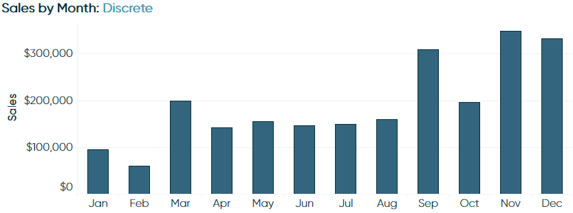
Notice that there is a discrete header for each month.
In the second chart, I am using the same exact data, but I have changed the Date dimension from discrete to continuous:
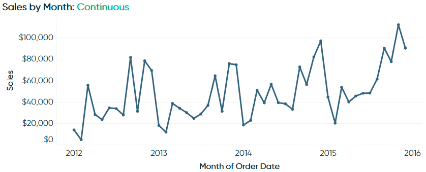
As you can see, I now have a continuous axis of time. Since the axis is continuous, I cannot change the order of the dates; they follow a chronological order from oldest date on the left to most recent date on the right. On the other hand, when the Date dimension is being used as discrete (as pictured in the first image), I am able to change the order of the dates. For example, I could sort the bars in descending order, with the month with the highest sales first, and the month with the lowest sales last. Which brings me to my second rule when determining whether I should use a field as discrete or continuous:
Discrete fields can be sorted; continuous fields cannot
So how might you use this in the real world? If you know that you want to look at a trend over a continuous period of time, you would want to use a continuous date, which will be colored green on the view. If your analysis requires you to have discrete marks that can be sorted, you would use the field as discrete, which will be colored blue on the view.
This date example is just one of many possibilities, but remembering the two rules outlined in this chapter will help you understand how the use of discrete and continuous fields are impacting the data visualizations you create in Tableau.