
To help you create intuitive products, this chapter will introduce UI patterns and highlight why they’re important and valuable.
What’s a UI pattern?
A pattern is a recurring solution to a problem in a context.

Photo of paper cranes by Rebecca Freeman
While you might create an orizuru using a proven solution, there are many ways to fold a paper crane with varying levels of ornamentation, like a flapping crane or consecutive cranes.
UI patterns (user interface patterns) are found in the digital sphere of web sites, applications, native mobile apps, and other software or devices. They provide a language for discussing interactive design. They suggest function, interaction, and intent. UI patterns document reusable parts of an interface that share a purpose.
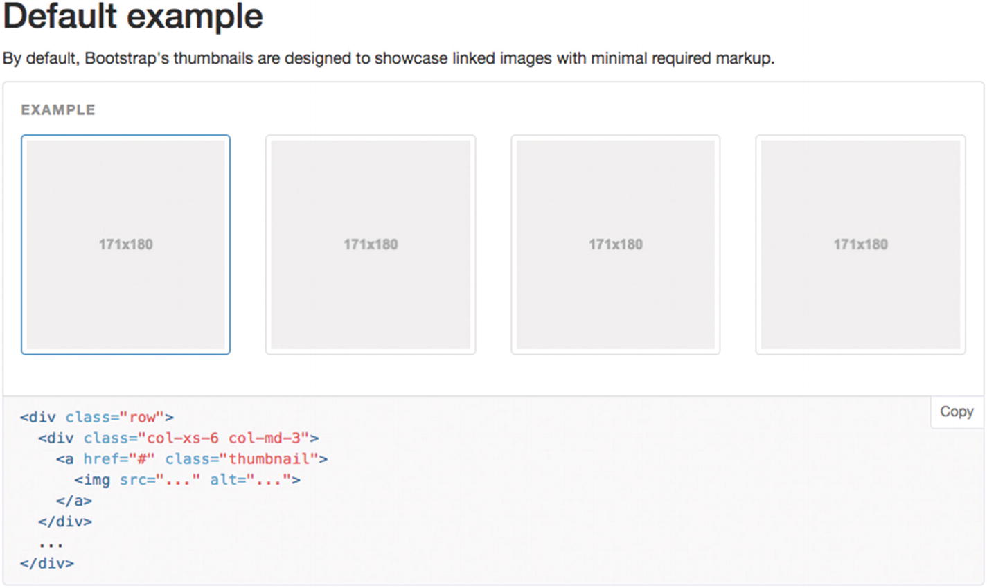
Screenshot of Bootstrap 3’s thumbnails component default example
Small images.
Linked resources.
It represents a collection.
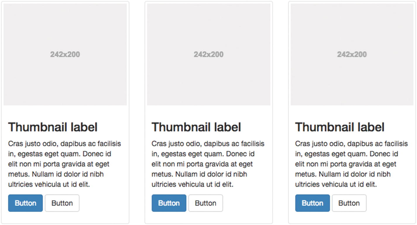
Screenshot of Bootstrap 3’s thumbnails component with custom content
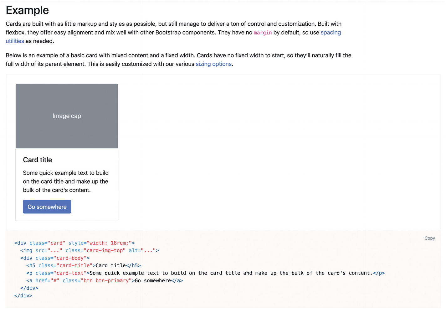
Screenshot of Bootstrap 4’s card component
This change more clearly separates the thumbnail’s purpose of previewing visual content—a content pattern—from the card layout’s purpose of segmenting content using repeating containers for images and text—a display pattern. The shift toward the display pattern makes sense for a flexible UI framework with built components. We’ll learn more about components in Chapter 4.
UI patterns are more abstract than visual style. While patterns can often be identified by visual similarity, these components demonstrate it’s not always so easy: a pattern describes behavior, which can be divorced from easily identifiable visual presentation. You can, for example, apply a strong, dramatic visual style or a subtle, muted flavor to a thumbnail collection.
Note
You might also see reference to user flow patterns or strategic patterns when a UI pattern spans multiple pages, like in the lazy signup pattern in Chapter 2. Similarly, you might read about behavioral patterns, persuasive patterns, or social patterns, where the characteristic behavior presents information, shares a message, or persuades a human, like in the good defaults pattern in Chapter 2.
Elements of a UI pattern
A named solution describing what the pattern does
The problem the user is facing or why this pattern is needed
The context for when to use the pattern
The named solution “thumbnails” suggests a collection of small image previews linked to larger resources.
The user’s problem is navigating a large collection of content and selecting only the items they want.
The context is when the user needs a preview before deciding—before downloading a large file or committing to watching an entire movie. You’ll often find thumbnails on product range pages or search result listings before you’ve decided which item to drill in on. In contrast, product or detail pages need fewer thumbnails because that product or item is what you came to see so they can be shown in full without a thumbnail.

Screenshot of Pinterest thumbnails
If Pinterest continuously loaded high-resolution images at their full size instead of thumbnails, that would slow down an otherwise immersive experience. Pinterest needs to present thumbnails to facilitate smooth browsing to help people discover ideas.
In a large collection like that, you won’t know what image will appear next or if it’s something you want to see in detail. By using thumbnails, you can quickly browse a larger set of choices before zooming in on particularly interesting items.

Screenshot of Adidas’s product images with thumbnails
Each small image (thumbnail) in this collection shows a preview of a product photo, linking to a larger photo. Unlike the Pinterest example, here the thumbnails are presented at the same time as the linked item. The selected thumbnail is indicated by different styling (black borders above and below), while the larger photo is shown.
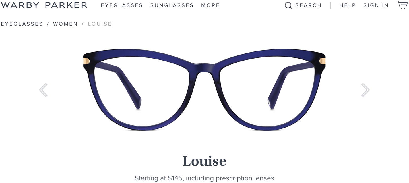
Screenshot of Warby Parker’s product images with no thumbnails
These images are the main subject of the page. There are fewer images to browse than most thumbnail collections (just three photos), so smaller previews would not save you much time. You can also predict what the next photo will be: the same glasses from another angle. You might as well jump straight to it than fill up the page with tiny thumbnails. This is an example of when you don’t need thumbnails.
Other pattern details
- Why?
Explanation of how it solves the problem
Supporting principles, such as usability principles
User research and other evidence
Motivation
Examples
How it works
- Consequences
Trade-offs and drawbacks
Result context and expected improvements
Implementation details
Sample code or design assets
Known uses “in the wild”
Author or resident expert
Related patterns
Alternative names or aliases
Links to more resources
These tend to be used to elaborate on the three main components—solution, problem, and context. Particularly—and importantly—it is common to suggest alternative, related patterns of interest in the context part of a pattern to clarify when not to use the pattern. I note these here so you may recognize them when you see them elsewhere and can consider them for yourself if you find yourself writing a pattern.
A specific collection of patterns for a project is often called a pattern library . Pattern libraries give teams a common language to improve their design processes. We’ll discuss pattern libraries further in Chapter 4.
Why care about patterns?
UI patterns compare approaches, distilling the considerations and successes of designers before you. Knowing the patterns and understanding the decisions that went into them let you take advantage of the mounting wisdom of whole generations and industries that brought about these patterns, without reinventing the wheel. The small, reusable UI solutions found in these patterns can then be composed together to build cohesive, intuitive experiences that resonate with people.
Let’s look at some of the other benefits of learning UI patterns.
Design efficiently
Knowing patterns can help you design efficiently by quickly recognizing the best tool for the job, understanding the value of different solutions, and solving the largest number of problems at once. For example, an autocomplete search box might help your site visitors navigate your site content, recognize the term they’re looking for without knowing the exact name or spelling, and select a result after only typing a few characters without needing to waste energy typing in the full search term. By learning about the autocomplete UI pattern, you’ll more quickly recognize when you need to use it, and likewise with all UI patterns. For example, if you need to redesign the navigation for a catalog of products by expanding the existing horizontal dropdown menu into a multilevel one, you can see how an autocomplete search box might solve the problem better. We’ll look at autocomplete again in Chapter 3.

Screenshot of Slackbot introducing itself
As conversational UIs have developed, we’ve seen some drastic changes in how we interact with technology; however, we’ve also noticed some similarities. You can see some familiar patterns, including identity and profile information, private chat, and feed updates. Increasing your familiarity with diverse patterns will help you efficiently solve design problems you face in new user interfaces, especially if you understand the underlying usability principles and can adapt patterns to new contexts.
Consistency and familiarity

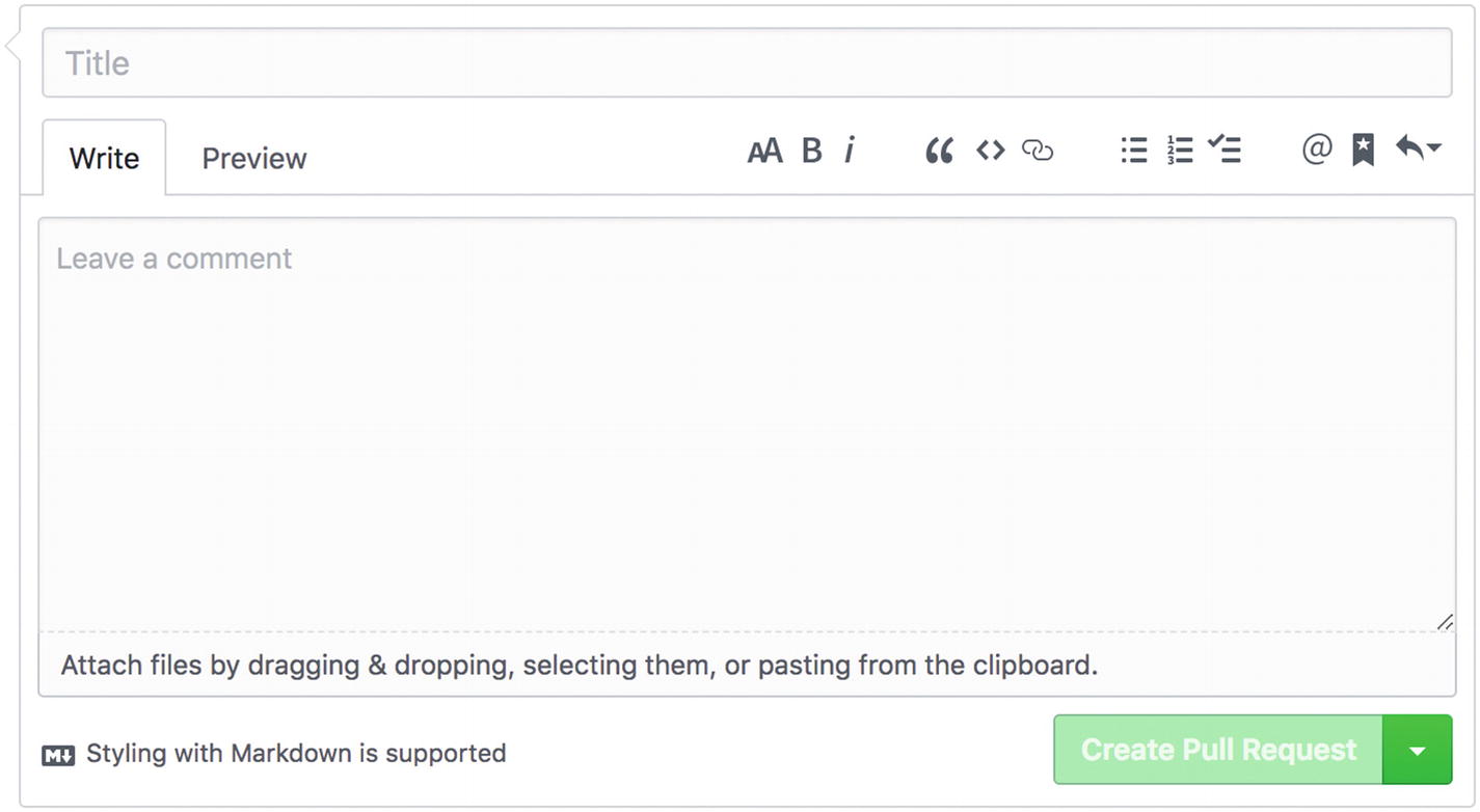
Screenshot of GitHub’s rich text editor for comments
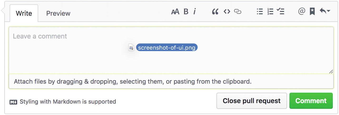
Screenshot of GitHub’s drag and drop shows the image filename and highlights the drop target area in green
Screenshot of GitHub’s drag and drop on a Pull Request
You can use consistency to set your visitors’ expectations about how your web site works, so they may quickly learn a new area or more advanced tool by building on what they’ve learned already about your site.
Consistency and reuse
By their recurring nature, patterns let you reuse design solutions both visually and within code. Visual repetition lets you build consistency and predictability into your interfaces, creating a learnable experience for your users. Reusability in code also saves time, letting you refactor and improve existing features instead of rebuilding new features every time (even when something similar exists already). A pattern incorporates many design decisions to solve a problem, while programming encodes those decisions; patterns ensure you Don’t Repeat Yourself (DRY), making each design decision only once. If the 548 unique colors and 261 declarations of Facebook blue ( www.lukew.com/ff/entry.asp?1469 ) have taught us anything, it’s to maximize reuse by minimizing inconsistency.
Communicating decisions
As a communication tool, patterns let designers persuade stakeholders and colleagues of the value of a solution. You can describe why your solution is the best for a given context. You know the purpose of a pattern, how it meets the users’ needs, the similar alternatives available, and how to implement it for your brand.
Design patterns let you reference existing proven solutions, which means you have support for your decisions. Agency designers working with skeptical clients and in-house designers facing internal deadlocks sometimes need to defend specific approaches or resolve roadblocks. In these scenarios it might be useful to show how Apple use this pattern to help customers connect with customer support or Amazon used that pattern to improve conversions. This shows a concrete, tangible example of the pattern executed in the real world and helps stakeholders and colleagues visualize the desired result.
Even better than competitive contrasts, patterns can be backed by user research. Use analytics, A/B testing, user testing, customer support feedback, and survey info to show evidence for decisions. For example, “we tested this with a sample of our most engaged customers and the research shows that given the age and expertise of our visitors, the dashboard pattern works better than table filters for directing attention to desired metrics.”
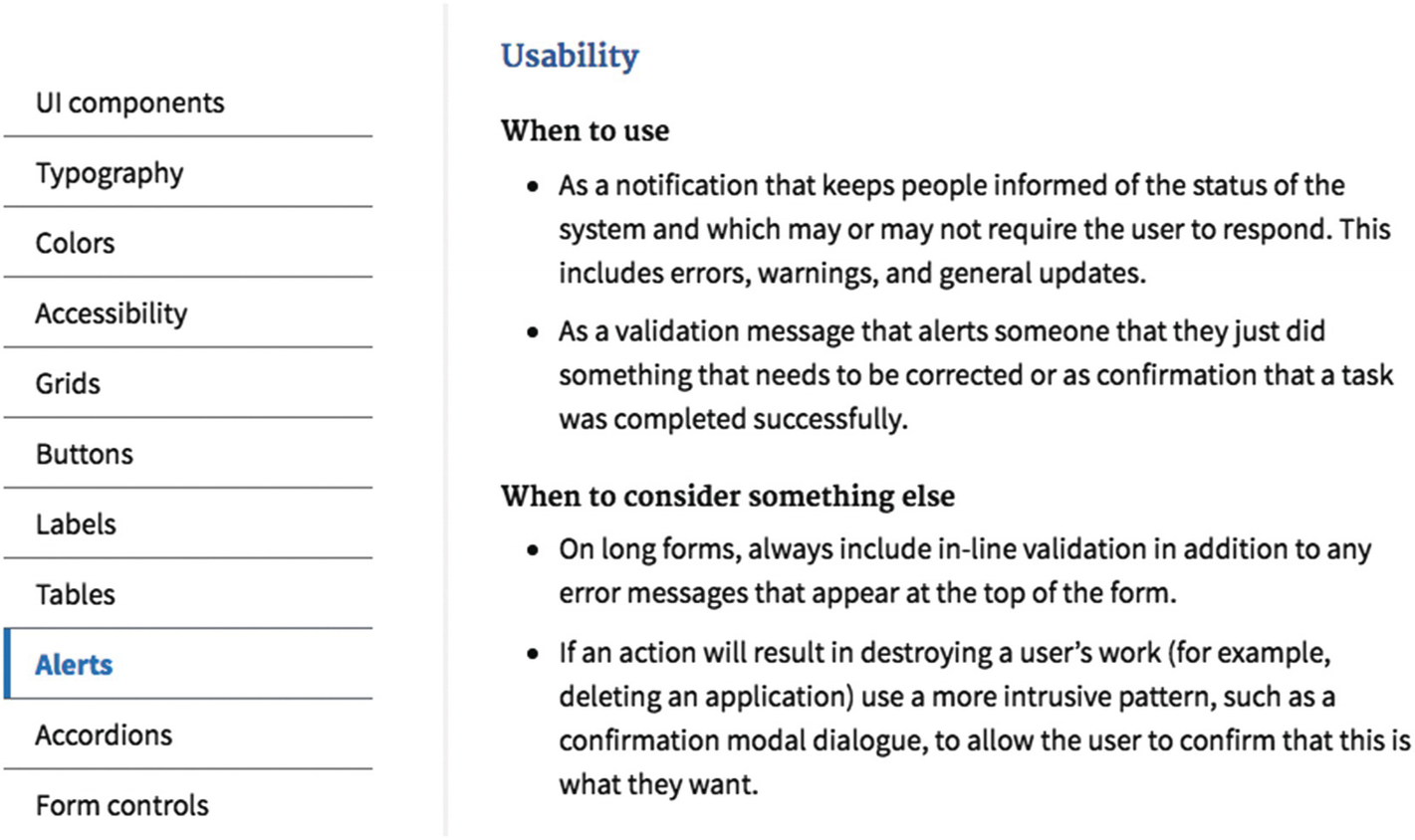
Screenshot of U.S. Web Design Standards shows when to use Alerts components and when to consider something else
Communicating within teams and tools

Screenshot of MailChimp badge pattern indicates badges appear inline to provide additional context
Note
It’s worth noting that even though one benefit of patterns is that they provide a shared vocabulary for people working together across a business (including designers, developers, marketers, customers, and so on), each person interprets terms using their own background and experience, which can sometimes lead to confusion. What a marketer might call a tracking pixel or tag, a developer might call a third-party script. What a developer might call letter spacing, a designer might call tracking. What a designer might call a pixel… you see where I’m going.
In UI patterns, an autocomplete pattern might be conflated with an autosuggest pattern or described only as a “search box” or “dropdown.” These discrepancies cause confusion when talking about patterns. To work around this, you’ll find some patterns in this book include alternative names, with the most prominent or unambiguous name listed first. Generally, pattern names are more useful when they describe the solution, for example, “good defaults,” instead of the problem, for example, “blank slate.” We’ll look more at pattern libraries as style guides and communication tools in Chapter 4.
Evidence-based solutions
As patterns are recurring solutions, they are only developed through repeated, successful use: if it didn’t work, we shouldn’t repeat it. Patterns gather up best practices and principles refined by previous designers but can also be compared with other solutions and tested with users. Patterns are also framed in terms of how they solve a problem. In contrast, a design principle like “give users control” is vague about how this solves problems for users. Extending our earlier thumbnail example, you can see how a collection of tiny, compressed images would be faster to download than all the high-resolution resources, so the preview collection could be perused in less time. If your images download faster, your users might stay longer. You could review your site analytics to see if their time spent on site is longer when you use thumbnails. This kind of evidence validates the success of the solution. With evidence, more people end up using the solution. This is how solutions become patterns.
You can use patterns to fast-track improvements by exploring how designers have used them before. We’ll look at resources for patterns in Chapter 2.
Context-specific, tailored solutions
Patterns are context-specific. Essentially they are tailored to the precise problem. This makes them more useful than design principles ( www.interaction-design.org/literature/topics/design-principles ), which are excellent theories to fall back on if you need to develop a solution from scratch but are far less practical than patterns.
Content contributors without a web design background
Relying on patterns lets content contributors who are unfamiliar with the practice of web design use smart defaults. You don’t always need to understand the details under the hood to get value out of existing patterns and can skip the pain of finding out the hard way that rolling your own from scratch means a lot of hard work. You can continue to specialize in your own area without sinking too much time into details.
Additionally, patterns formed by diverse contributors may be more effective and robust than, say, patterns only made by developers. More on that in Chapter 4.
Learning from the experts
Patterns let you leave the details of UI solutions to the experts in some cases and provide excellent learning material in others.
For example, by using a search filter pattern, you might be reminded to include a cancellation option to clear the filters to return to an unfiltered search, whereas designing and building search filters without reference to the pattern might leave you slowly figuring out these kinds of details one by one. Patterns let you accelerate design and development processes.
Development frameworks like Bootstrap have already considered accessibility details like role="tablist" aria- multiselectable="true".
The Devise ( https://github.com/plataformatec/devise ) authentication solution for account registration and sign in has already considered user flow patterns like email confirmation tokens, revealing valid usernames, and more.
Payment companies like Stripe ( https://stripe.com/ ) have already considered how to balance usability and security.
In each of these cases, you can either incorporate the expert’s approach into your own or dig into it further. This helps if you trust that the pattern has been executed well, but there are anti-patterns to look out for, which we’ll see in Chapter 5.
Learning how to improve experiences from patterns
Patterns are a fantastic learning tool. They demonstrate reusable components that have been proven and battle-tested—you can find real examples on live sites. Patterns describe the user need that prompted its existence in the first place, for example: “Our customers are nervous about financial decisions because money is a massive stressor, so let’s use reassuring words in our inline help hints, as well as live previews and confirmation patterns to improve their confidence.”
They document the decisions that have been made by other designers before you. They show you the forces or factors you need to consider in your design decisions—how many size variants do we need? Contextual colors? Should alert messages be dismissable? What’s the difference between a link with a button style and a button with a link style?
We’ll look more at learning through patterns in Chapter 2.
Summary
Efficiently solve design problems across evolving interfaces as technology changes
Produce intuitive products through consistency and familiarity
Save time instead of repeating yourself
Communicate design decisions
Communicate within teams to solve problems
Find evidence to support a solution
Use tailored solutions for a context
Use smart defaults without extensive product design experience
Stand on the shoulders of giants
Learn how to improve a user’s experience