
The world is full of obvious things which nobody by any chance ever observes.
—Sherlock Holmes, The Hound of the Baskervilles
In this chapter we’ll investigate how you can spot, and then learn, new patterns. We’ll explore some tactics using a theme of signup and onboarding—everything necessary to get a new customer started and engaged.
Learning new patterns (sharpening the saw)
I suggest learning about patterns—which ones exist, how to find them—before learning them in depth. This lowers the learning curve and ensures that when it comes time to apply the solution, you can see it in practice, making it far more tangible and interesting to learn. At that stage you can dig deeper into the pattern and explore the intricacies of all the design decisions incorporated that you need to consider.
I consider this study sharpening the saw1—not to immediately solve the problem in front of you but to sharpen your saw in preparation for the real work later.
So, where can you hear about new patterns? I suggest browsing and skimming collections and galleries. The following types of resources can help you develop your vocabulary, identify similarities and differences in different contexts, and learn new concepts (many of them provide design principles and philosophies as well). There’s a more comprehensive list in the Appendix.
Pattern collections

Screenshot of UI-patterns.com design patterns dealing with data
Pattern galleries
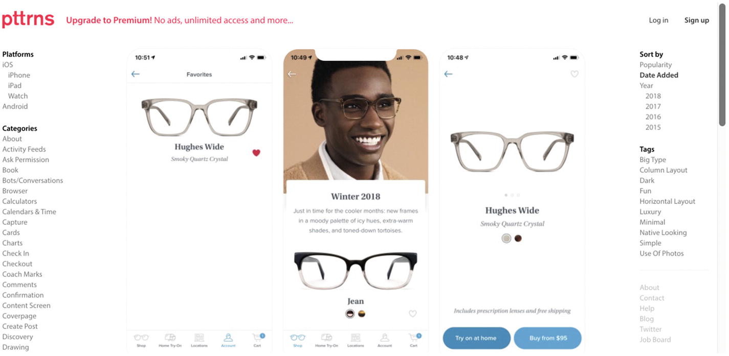
Screenshot of pttrns.com mobile design patterns

Screenshot of Mobile Patterns
Platform guidelines
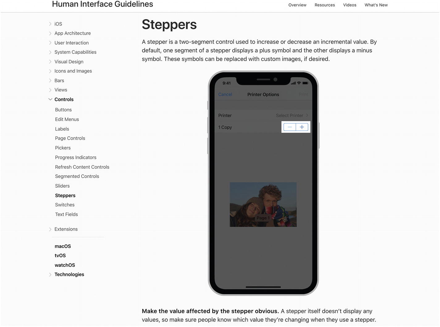
Screenshot of Steppers in Apple developers’ iOS Human Interface Guidelines
The stepper shown in Apple’s iOS guidelines is optimized for a touch device with a small screen.
As UI patterns are only relevant to a specific domain or context, these platform guidelines are only valuable insofar as they highlight the differences between platforms. Technological changes demand some push and pull, divergence and convergence, fragmentation and consolidation. We might expect movement toward cohesive cross-platform guidelines like Google’s Material Design guidelines ( https://material.io/design/guidelines-overview/ ) with more minimal guidance on platform adaptation.2 For a striking example, the guidelines on edge swipes suggest “an edge swipe starts from outside of the screen to reveal off-screen content,” and yet it might conflict with other swipe gestures, such as horizontal swipes through pages. The guidelines further describe that when there are no gesture conflicts, Android edge swipes from the left will reveal off-screen content, while iOS will navigate back through an app’s hierarchy.
UI frameworks
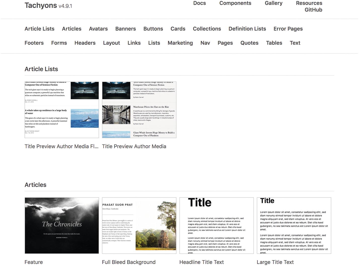
Screenshot of Tachyons components
Of course, you should lean on your framework if you’re already using one, but sometimes you might draw from others to fill in the gaps. For example, Zurb Foundation framework3 provides styled switch and slider components that Bootstrap does not, while Bootstrap provides inline forms that Foundation does not (at the time of writing).
Pattern libraries, design systems, style guides, and anti-patterns
Public pattern libraries and style guides from other companies and brands help demonstrate how they solved specific problems for their specific market. Design systems often include component libraries that bring patterns to life. We’ll explore those further in Chapter 4. If you really want a head start, check out the Adele repository of publicly available design systems and pattern libraries ( https://adele.uxpin.com ).
Similarly, sometimes you can learn by counterexample—what not to do. Learn more in Chapter 5 on anti-patterns.
Inspiring visual style
Site Inspire ( www.siteinspire.com )
Hover States ( www.hoverstat.es )
Dribbble ( https://dribbble.com )
Some folk are concerned about the dribbblisation of design4—the phenomenon of designs created to look good rather than solve real problems. I tend to believe the problem with dribbble5 is what we make of it. It’s only a platform; how we use it is up to us. It can be effective when used to test and stretch visual skills, encouraging designers to showcase and refine their visual designs as well as push the boundaries of what’s possible. Being removed from the constraints of real problems might help you design an efficient and satisfying experience.6 This can help drive innovation.
Awwwards ( www.awwwards.com )
IXDA ( http://awards.ixda.org/entries/ )
Front-end awards ( https://thefwa.com )
Next, we’ll explore some specific patterns helpful to onboarding to give you a feel for what they look like.
Pattern: Walkthrough
A walkthrough is a guided tour or demo of a feature or product. It’s presented in a specific order to every new user to introduce complex workflows or concepts.
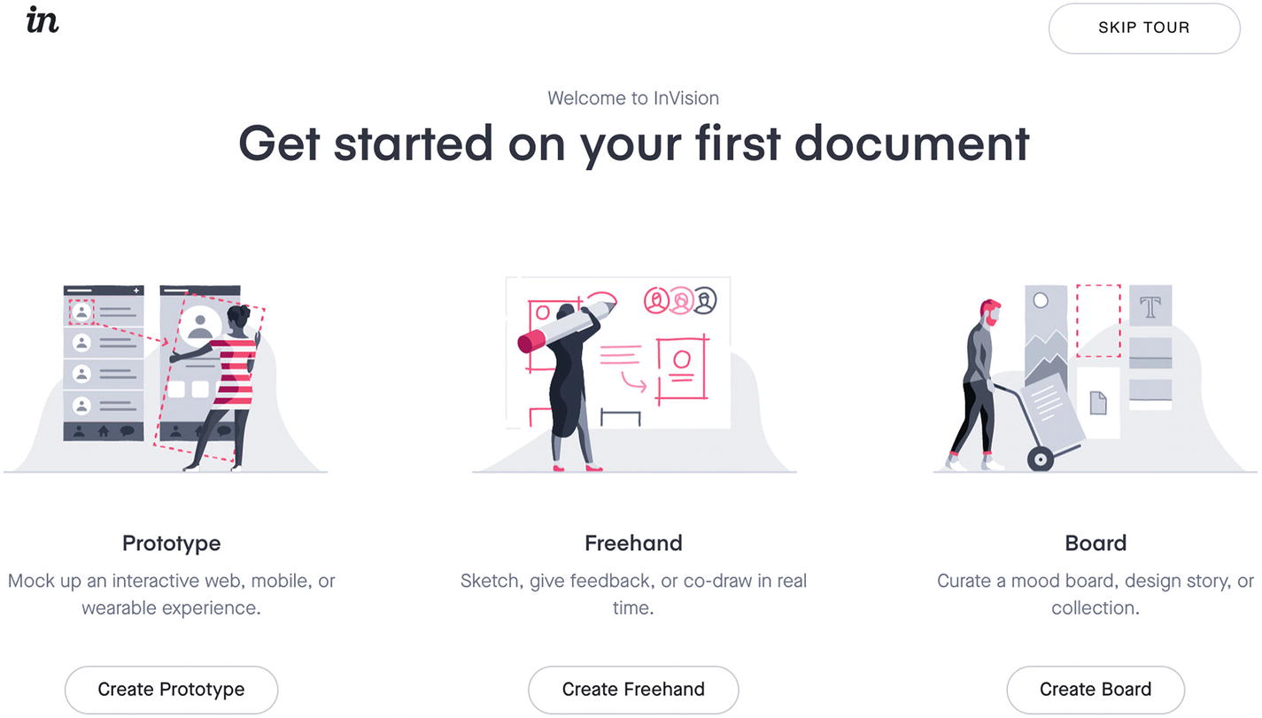
Screenshot of InVision’s walkthrough welcome
The crux of the walkthrough pattern is to literally walk the user through each step of their core task and then to direct their focus to only one step at a time and only steps critical to completing their task.
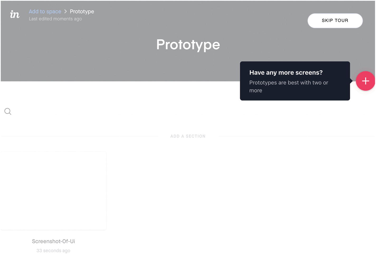
Screenshot of InVision’s walkthrough prompt to add another screen
This walkthrough prompt lets users know that prototypes are “best with two or more” screens, encouraging them to add at least one more, while reminding them where the button is to upload and sync screens.
By letting users navigate backward and forward through a walkthrough, as well as dismiss it, they can directly access the information of most interest to them. While your user is in the walkthrough, show a progress bar or indicator to represent where they are in the process. They may wish to be assured that it’s a short process containing only two more steps or otherwise keep track of which pieces of information they’ve seen already. For mission-critical walkthroughs that the user needs to see, such as a change in terms of use, password recovery, or recovery from a security compromise, you may need to ditch the additional navigation options.
Walkthroughs are a natural fit for first-time use. They’re handy for introducing new or complex concepts or workflows, so it’s important to make them available on the first page load, first site visit, first app open, and so on, considering if the user could have already seen the walkthrough on a different platform. A useful rule of thumb for when to employ a walkthrough is whenever the user may have doubts about the product.
Workflow walkthroughs

Screenshot of InVision’s walkthrough demo prototype project screen
Concept walkthroughs

Screenshot of Airbnb’s page about safety by design, showing three illustrations and supporting descriptions

Screenshot of Airbnb hosts, showing numbered steps with a brightly colored first step to draw attention
Airbnb first addresses how the host might be feeling: “sharing your space or passions with someone you’ve never met can feel like a leap of faith.” The prospective host can then see very clearly numbered steps to guide them through the process, with important explanatory details along the way.
A useful idea here is Nielsen Norman Group’s mental models7—what users believe about a system that might differ from the designer’s model. A user’s beliefs will affect how they use a product, so you might use a concept walkthrough to update the user’s mental model to bring it closer to how the system actually works.
Reserve walkthroughs for complex workflows and concepts. Instead of a walkthrough, see if you can break up the workflow further so that it’s simpler and more self-explanatory, or consider a playthrough instead.
Pattern: Playthrough
A playthrough is an interactive tutorial or warm up that lets a user learn by doing, in a safe environment such as a sandbox.
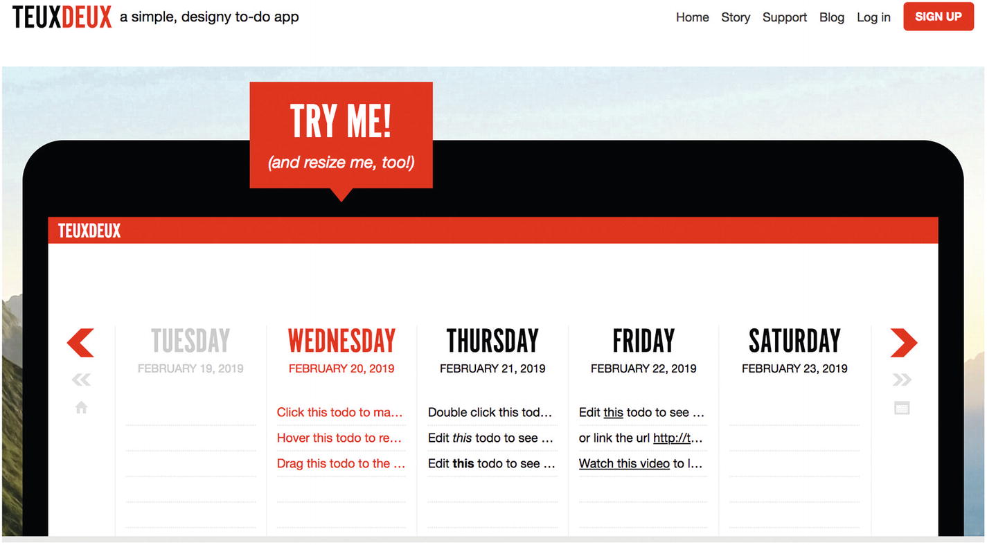
Screenshot of TeuxDeux’s homepage playthrough
TeuxDeux is a task management app. Their homepage playthrough shows a callout enticing visitors to resize the example app. The example app contains explicit instructions in its to-do items to click, hover, drag, and double-click different items, so you can “try before you buy.”
When a user wants to try your product’s features that are new to them, a playthrough provides a forgiving interface to let them explore safely and make mistakes without fear of repercussions. By stepping them through the product slowly, you can introduce features as needed and let them immediately play with them. There are two main scenarios for a playthrough: setup and sandbox.
Setup playthrough
Sometimes a playthrough is used as part of a setup process, for example, asking for a name, showing where it will be displayed, letting the user provide their name, then moving onto the next logical step in the product.
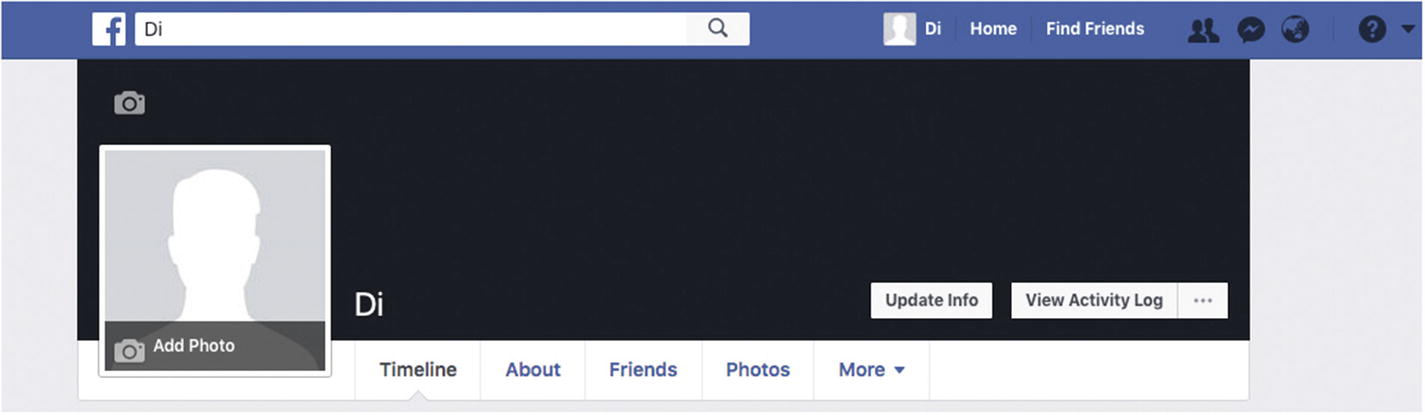
Screenshot of Facebook profile cover image playthrough empty state

Screenshot of Facebook profile cover image playthrough instruction

Screenshot of Facebook profile cover image playthrough preview and reposition
This illustrates how a user plays through the app to set up their profile.
Sandbox playthrough
A sandbox playthrough provides sample resources with instructions on how to use them. For example, TeuxDeux starts new users with a few pre-filled tasks that teach you how to use the app, just like their homepage.
Screenshot of Apple’s Swift Playgrounds
When to use a playthrough
Playthroughs let users immediately interact with the core tasks. This aspect in particular separates playthroughs from walkthroughs, demos, and other instructional content. It’s an excellent opportunity to demonstrate the value of the feature without delay. Likewise, interactivity can improve the learning experience, so it feels easy.
Screenshot of InVision’s Freehand tutorial with a pending instruction
This lets people draw with wild abandon. They may be free from concern of losing their own work by trying out new Freehand features in the tutorial. You can see the user has an opportunity to ask for help to complete the step if they want to move on.
Screenshot of InVision’s Freehand tutorial with a successful step done
As with Walkthroughs, some people might want to navigate through your product via unexpected paths, so consider if you need to show an easy exit, such as a “Skip all” link or links to navigate backward through previous steps. In InVision’s Freehand example, there’s an option on every step to “Skip tutorial,” and on every Freehand, there’s an option to “Review tutorial.”
After a new user has played through your product’s features, make it easy to take off the training wheels. They’ve learned what they need to know, so provide an easy method to remove any unwanted sample data. It can be frustrating to find that sample data contributes to account limits, like the number of projects you’re allowed to have before upgrading. In InVision’s Freehand example, the tutorial lets the user play without creating a Freehand that could clutter up their account.
This pattern demonstrates how the context of the user’s place in their journey drastically changes the relevance of the pattern. If they were an expert user, these playthrough experiences might be infuriating. This is a reminder that patterns are solutions to problems in a context.
Playthroughs can be overkill when the consequences of exploring unguided are minimal. Avoid them if users can make trivial mistakes and recover from them without guidance. For example, the consequences of searching for the “wrong” term in a search function might result in useless results, but the user can easily type in a new search term—no guidance is needed.
Pattern: Newsletter signup
A newsletter signup is a form that allows users to subscribe to a list. They may then be sent email news about the product to keep them informed about regularly changing content.

Screenshot of Web Animation Weekly signup
Label: Most newsletters provide an explicit “Email Address” label element to identify the component. Sometimes, it implied through a call to action. For example, on the newsletter signup section on the Bellroy web site for carry goods, there is the line: “Being In The Know Feels Great: Signup here for news and updates,” which you can see in Figure 2-19.
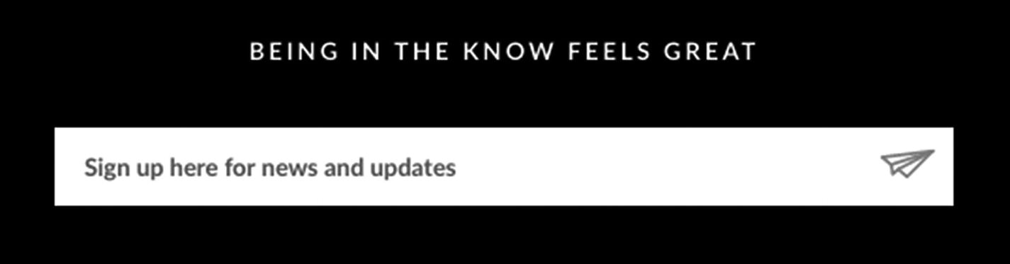
Screenshot of Bellroy newsletter signup
Input: Your visitor needs somewhere to provide an email address. In code, this is generally a standard HTML input element. It’s also common to use the attribute type="email" to ensure the correct keyboard appears on mobile devices (one that shows an “@” symbol to make it easy to type the email address) and to assist browser autofill behavior.
Submit button: Your visitor also needs a means of confirming and sending the email address when they’re finished typing. For example, you could use a submit button, press the Return/Enter key on a keyboard, or tap the “Go” button on mobile devices. “Submit” can be a jargon term though, so consider another label for your button that describes the action being taken, such as “Signup.”
List: When your visitor subscribes to your newsletter, you’ll need to add their email address to a list. This might seem obvious enough, but what happens next can vary wildly. Many email service providers will automatically send a “double opt-in” confirmation email to your visitor’s email address that they must confirm before being permanently added to the list. In another scenario, if it’s a manually collected and stored list, you’ll need to know how to pull this list of email addresses later into your email service provider app when it comes time to send your newsletter.
Validation: You’ll likely want to validate the email address input provided to you. For example, it is common to reject email addresses without an “@” symbol. Many products use a CAPTCHA (Completely Automated Public Turing test to tell Computers and Humans Apart) to weed out bots and other fake signups by presenting a test that is easy for a human and challenging for a computer to answer.8 You can learn more about form validation in the validation feedback section ahead. For a deeper look at forms, I recommend the book, Designing UX: Forms by Jessica Enders.
- Legal: When providing personal information, your users need to know how their information will be used. Either provide details inline or a link to further information about your privacy policy or terms and conditions. Critically, ensure your users know exactly what they are signing up for. When signing up for a free O’Reilly ebook, you’re also given an optional checkbox to subscribe to their newsletter while the button says “Get the free ebook,” so you know exactly what to expect. You can also follow the link “We protect your privacy,” to see the privacy policy, shown in Figure 2-20.
 Figure 2-20.
Screenshot of O’Reilly Design Newsletter
Use the newsletter signup pattern the first time a user wants to access email news. If they’ve already subscribed to your newsletter, avoid using this pattern. You can check if they’ve already subscribed before showing the signup form by examining their user account (if they are logged in) or by seeing if they have just come to your site by your newsletter. You can do this by or looking at the URL in the address bar (or in code by inspecting the HTML referer path9) to see if it includes tracking links from your newsletter such as /?utm_medium=email&utm_campaign=newsletter. If a visitor comes from your newsletter, don’t show the signup form.
Another time to avoid this pattern is if user’s email address is not subscribed to the newsletter list, but you already have their address for other reasons (such as account login). In this case, you could show an opt-in checkbox instead of asking them to type in their address again.
Let’s see another first-time signup pattern commonly seen with newsletter subscription: validation feedback.
Pattern: Validation feedback
Validation feedback is information shown to your user after they’ve provided data and you’ve processed it. The feedback might be a warning or suggestion, an error preventing further progress until it’s been fixed, or confirmation that the data was complete and correct. Validation feedback most often appears on forms.
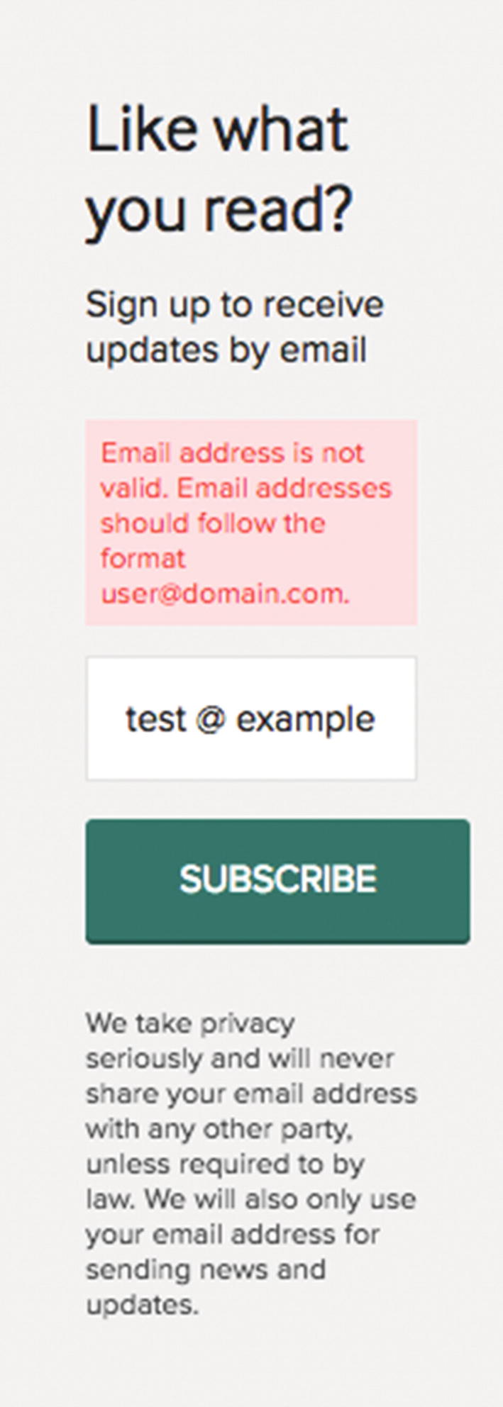
Screenshot of a newsletter warning validation feedback
This example suggests the “Email address should follow the format [email protected].” Often a validation warning lets the user continue at their own peril.
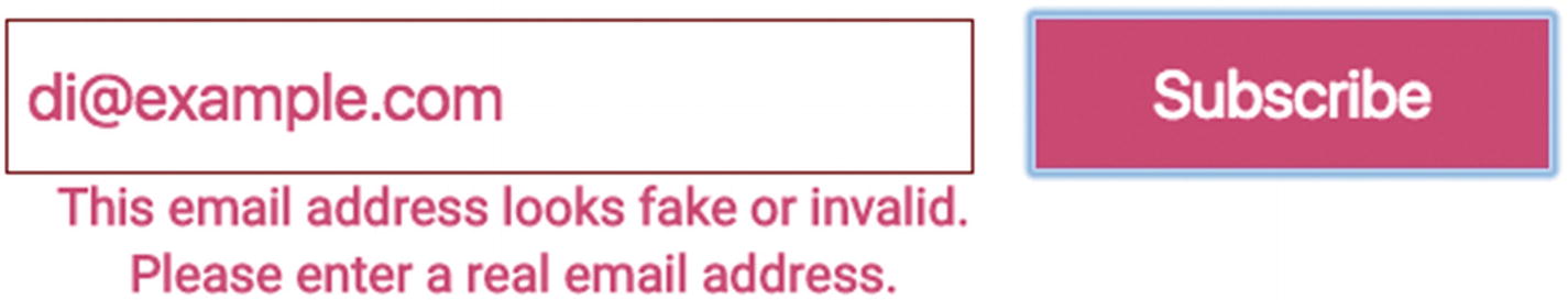
Screenshot of a newsletter warning with an error
This example shows the error message: “This email address looks fake or invalid. Please enter a real email address.” Usually an error prevents any further progress until it’s been corrected.
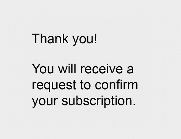
Screenshot of successful subscription
This example says, “Thank you! You will receive a request to confirm your subscription.”, encouraging further action to be taken to finish the process.

Screenshot of Atlassian’s confirmation message
This kind of validation feedback assures the user that their work is done and celebrates the effort they’ve put in.
Validating user input and providing feedback about it give them an opportunity to correct the input. If it’s likely you’ll receive incomplete or incorrect information that is needed for your visitor to use your product, help them recover using this pattern.
- 1.
Use plain language, front-load keywords, and omit needless words.
- 2.
Indicate any problems using concrete, specific, and precise nouns.
- 3.
Suggest next steps or solutions using positive, active verbs.
Another convenient method to assist your user is to preserve all their input during and after validation. Imagine your user says their date of birth is a date in the future yet to pass. You might be tempted to validate the date of birth against the current date, show feedback that the provided date is in the future and therefore needs to be changed, and clear the provided date, asking them to type in a new one. It is likely easier, however, for your user to adjust the year by one digit from 2091 to 2001 than to start all over again filling out the day, month, and year. Preserve their data. You might then draw attention to which part is incorrect by highlighting the year visually and providing a specific message to review the year.
Use the validation feedback pattern when it’s important to you to have accurate data. For a newsletter, having a lot of fake signups on your list can be costly if you are paying an email service provider per email address.
Using the validation feedback pattern lets you increase the user’s confidence that they’ve taken the right action (positive feedback) or help them recover from errors (negative feedback). For clarity, provide your feedback as close in proximity and time as possible to the action the user took.
In addition to warnings, errors, and confirmations, one underappreciated form of feedback is a gentle suggestion that hints at better steps rather than prevents further progress. One instance where it can help is inspecting phone numbers. Validating international phone numbers is a notoriously difficult task due to the wild variation in acceptable formats globally as well as how people format their numbers when they provide them. When asking for an optional phone number, you might include a validation warning or suggestion when the user provides a number that looks like it might be wrong, encouraging the visitor to check it, but avoid showing a validation error that prevents task completion. The visitor can then proceed with a fake or badly formatted phone number, but you’ve prompted them to check it twice for their own benefit. For example, consider this message:
Enter your phone number to help fast delivery of your order.
Identifying relevant patterns
In a collection, look at patterns in the same category.
In a pattern, look at “Related patterns.”
Competitive analysis (more on that ahead).
Image viewing
Image editing
Image annotation
Map annotation
Map regions
Videos
Video annotation
Flick books
In this way, I found some existing “best practices” for a seemingly new issue.
Useful patterns describe how they solve the problem, including salient details on why it works the way it does. These patterns can inform you even when the problem is actually slightly different.
This is how patterns may actually foster creativity—remixing existing solutions for new problems—rather than constrain creativity as they are sometimes blamed for doing.
Searching for patterns
The resources in this chapter highlight many available patterns to use. It’s helpful to see them in large collections like these, with similar patterns side by side, but sometimes specific patterns for unusual areas are harder to find. For example, admin interfaces pose their own interesting challenges. While UI patterns might have taught you about the existence of table filters, sort by column, and search filters, it may be challenging to bring all those patterns together effectively, and they’re far from comprehensive.

Screenshot of Magento signup form initial state style
By knowing the standard and alternative names of many patterns, you can find interesting information about patterns. Outside of “patterns,” you might add “UX” or “best practices” to your search queries to find more design considerations to explore. By having the vocabulary, you can ask concise questions about a pattern.
Let’s see some examples of discovering and learning new patterns using the resources and techniques in this book.
Pattern: Social signup
A detailed social signup pattern in UIPatterns.io’s social login pattern ( http://uipatterns.io/social-login )
Real-world examples in Pttrns’s signups ( https://pttrns.com/?scid=9 )
A social signup pattern in the specific domain of social interfaces: Designing Social Interfaces’ Signup or Registration pattern ( www.designingsocialinterfaces.com/patterns/Sign_Up_or_Registration )
From here, we learn that a social signup pattern uses integration with a visitor’s existing social media accounts to signup to a product without creating a new username or password, fast-tracking the signup process.
Mobiscroll: Social login pattern ( https://blog.mobiscroll.com/social-login-pattern/ )
Nic Werner’s Product Pattern: Social login ( https://medium.com/product-labs/product-pattern-social-login-3b50eb7e8db3#.oxs34buo3 )
Six Revisions: A Guide to Social Logins ( http://sixrevisions.com/web-development/social-logins/ )
Now we know a good deal about social signups. As we progress through the book, we’ll learn more about how to put patterns like this into practice.
Pattern: Lazy signup
Real-world examples in UXArchive’s signing up tasks ( http://uxarchive.com/tasks/signing_up )
A social signup pattern in the specific domain of social interfaces: Designing Social Interfaces’ Signup or Registration pattern ( www.designingsocialinterfaces.com/patterns/Sign_Up_or_Registration )
Mobile-specific signup patterns in mobile patterns signup flows ( www.mobile-patterns.com/search/patterns?q=sign-up-flows%3Asubtags )
Code example in Tachyons ( http://tachyons.io/components/forms/sign-up/index.html )
Code samples and examples under the “Signup” tag in Zurb’s pattern tap and building blocks library ( https://zurb.com/library/ )
Delightful signup examples in LittleBigDetails ( http://littlebigdetails.com/search/signup )
UXBooth’s lesson in gradual engagement ( www.uxbooth.com/articles/a-lesson-in-gradual-engagement/ ).
Luke Wroblewski on A List Apart talks about gradual engagement in Signup Forms Must Die ( https://alistapart.com/article/signupforms ).
I’d also suggest exploring other onboarding patterns,11 such as paywalls/signup walls. Something outside your initial ideas might be just right for your needs.
Great, now we know what a signup might look like and the kinds of design decisions we need to make. Next, let’s explore competitive analysis and learning from the best.
Competitive analysis
Continuing our research into patterns in the real world, we’ve reviewed successful visual concepts for patterns. It’s also useful to review patterns through the lens of business viability. Seeing patterns implemented by highly successful companies can give you extra reassurance that you’re on the right track. Likewise finding missed opportunities by your competitors can set your designs apart.
A custom solution or “innovation” where an existing pattern could work better
Poorly selected patterns, ineffective for the problem at hand
Poorly executed patterns, deviating from effective pattern usage
Sometimes you’ll find delighted comments on ease of use, showing where a pattern has worked effectively.
Largest Internet companies
Largest tech companies
Fortune 500 companies by revenue
Alexa top 500 sites on the Web by traffic
Industry leaders in your vertical market
The best web sites in your space: informational / e-commerce / NGO or non-profit / government / social
Seeing patterns used by larger brands also reveals some evidence that the solution has worked on a meaningful scale.
Learn from the best
When improving your skills, it’s best to draw guidance from the experts—both for learning efficient methods of achieving effective results and for gaining feedback on your own progress. When deconstructing a new skill12 you want to learn, interviewing an expert or reversing an expert’s final results lets you break down complex solutions into manageable pieces to study. Once you have a pattern you’d like to learn more about, see if there’s a specialist that can teach you more.
There are experts in specific niches that can help with particular qualities of the pattern your working on, such as Medium for reading experiences and typography13 or Apple for design-centric products and web sites (pro-tip: they do localization well too).
Animation, cinema, entertainment for motion design
Editorial magazines for blogs
Journals for article content sites
Stock market for displaying real-time data
Information architecture for navigation and search
Seek inspiration outside your own circles whenever you can. This provides diverse perspectives, resulting in stronger designs.
Let’s see some examples of how to bring patterns to life in your product.
Pattern: Notifications
A notification is a message object that presents timely information, including alerts, errors, reminders, cookie warnings, and requests.
When you need to provide time-sensitive, contextual information to a user, use a notification that appears close to the user’s point of focus or current task.

Screenshot of Commonwealth Bank’s post-task upsell notification
In this example, the Commonwealth Bank of Australia shows an upsell notification immediately after finishing a related task (making a payment) and immediately below that task.
An important design decision for notifications is whether and how it can be dismissed. A simple rule of thumb is asking yourself, “If the user dismisses the notification, does the page still make sense?” For example, Semantic UI’s Nag ( https://semantic-ui.com/modules/nag.html ) notifications “are used to present a user with a one-time message which will persist until a user acknowledges the message. This can be used for providing notices like the site’s use of cookies, an important change to a site like a security breach.” In this case, you’ll need to make a note somewhere in your system when they’ve acknowledged and dismissed the notification, in a cookie, session, or user account records. Then don’t show the notification again.
Another consideration is if you’ll need consecutive notifications and if they should fade away automatically. For example, snackbars14 and toasts15 provide transient messages that automatically time out and disappear. Only one is ever shown at a time, removing previous messages as they appear.
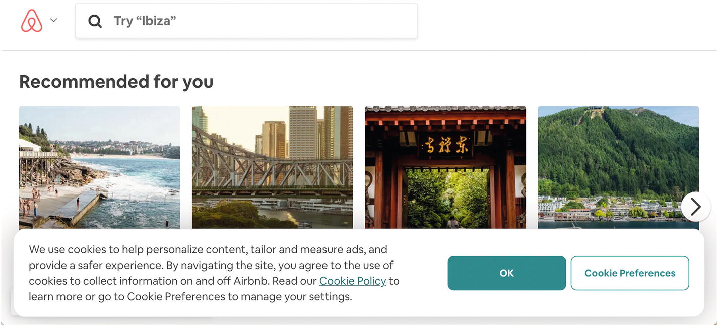
Screenshot of Airbnb’s cookie notification
This notification informs the user how cookies are used, what the user is agreeing to, and where to learn more or manage “Cookie Preferences.”
Containers for notifications
When presenting a notification, you’ll likely need to pair it with a content container pattern.
Screenshot of GitLab’s task-related notification

Screenshot of GitHub’s reload session banner

Screenshot of Digital Ocean’s new feature notification for returning visitor
Using one visual style for all of your notifications lets you establish a cohesive and predictable experience for your customers or visitors. On the other hand, adapting notifications to more precisely fit in close proximity to their trigger can provide more clarity. When a notification appears near the action that triggered it, the relationship is clear, and the user can figure out what steps to take next. The value of these trade-offs varies—as you might expect—by product or web site.

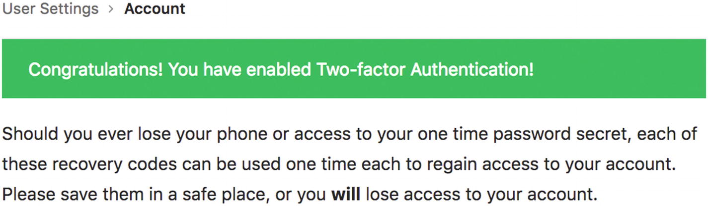
Screenshot of GitHub’s two-factor authentication with error
Next to the form field, there’s a link labeled “What’s this?” to learn more, as well as supplementary text below the form elaborating on how to find the data needed to enter into the form and proceed.
In most cases, you’ll want to include a clear call to action in your notification, such as a button to acknowledge the message (“Got it!”), a button to enable permissions (“Turn on notifications”), or a link to a task to take further action (“Go to Your Account Settings”).
The opportune moment
When making a request to enable permissions, wait until the user has requested the feature that needs extra permissions. This is an example of the Kairo pattern of waiting until the opportune moment to communicate, so that you improve the chances of your user making the change you want.24 In contrast, requesting desktop notifications for a first-time visitor to your site before they’ve read any of your content is unlikely to succeed compared to asking after they’ve read and shared your content.
Notifications are best used for short, time-sensitive messages. Don’t use them when inline copy would be better, or the message can wait until a better moment.
FWA’s Outside case study ( https://thefwa.com/cases/outside ) shows setting a push notification for weather forecasts.
Andrew McKay’s Atlassian notifications illustration animation ( https://dribbble.com/shots/2518631-Notifications-Illustration-Animation ) shows an animation for Atlassian’s notification to “turn on notifications” for first use.
Pattern: Good defaults
Good defaults for any information a user might need to provide can make it easier or faster for the user to provide it.

Screenshot of LinkedIn’s good defaults
For onboarding new users to an interface, use good defaults that demonstrate value, like delighting users with examples of the most common use case for the product. For example, a photo sharing site could use selfies. Similarly, to avoid boring empty states for new users, use placeholders that illustrate how the interface might look after the user refines it with their personalized choices. One option is to pre-fill applications with sample items and guide the user on how to interact with them as we saw in playthroughs.
Good defaults require some understanding of what data has a better than even chance of being selected, so user research is important here. You might use defaults chosen from data provided by the majority of existing users to pre-fill empty fields. In other cases, you could pre-fill empty fields using existing data known about the current user, such as their location (determined using IP address), screen size, time they are using the site, and so on.
Browser or device autofill by using the correct HTML labels and input types
Password managers for their own autofill behavior as well as password generation
Filling out profiles using existing info from elsewhere such as importing contacts from other address books
Good defaults are especially helpful when a new user has empty data sets or other empty states—avoid blank slates that paralyze users with ambiguity because they don’t know where to start.
You can also use good defaults when requesting information, including for any form, to make the process of providing information faster. Balance this with the tendency for people to skip fields that look complete already. You could do this by asking for confirmation or visually treating it as incomplete. Skip using good defaults completely if there are negative consequences for a field being incorrect and overlooked. For example, a phone case size selector could default to “iPhone X” because it’s the most popular choice, but the user still needs to consciously choose the correct size to match their phone or risk costly returns processes when receiving the wrong case.
Pattern: Coachmarks
A coachmark is instructional overlay content placed close to new features to help new users learn difficult interfaces.
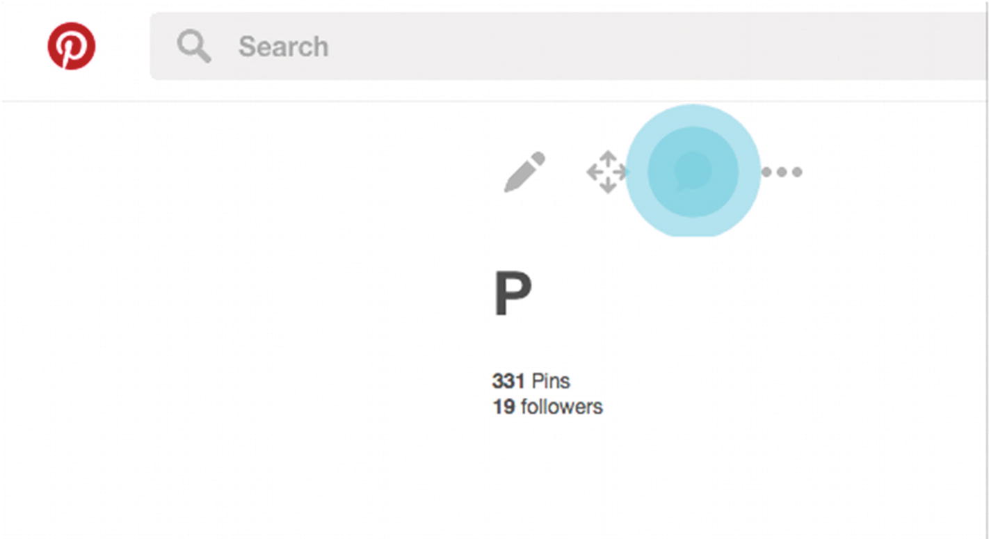
Screenshot of Pinterest’s animated coachmarks
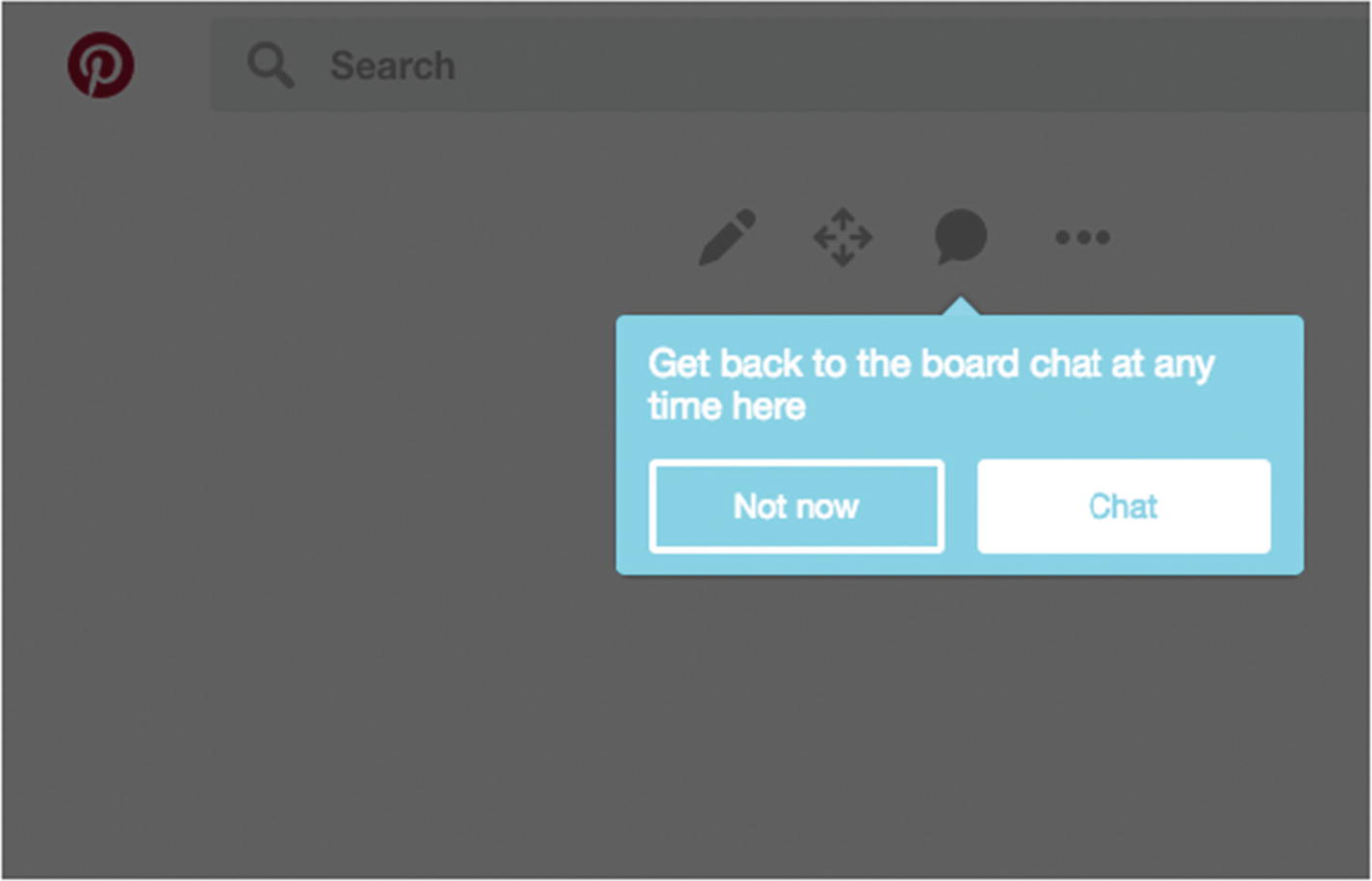
Screenshot of Pinterest’s animated coachmarks
This uses motion to draw your attention and a blue outline to highlight its newness, separating it from other, existing features. This style goes away as soon as you’ve acknowledged the feature.
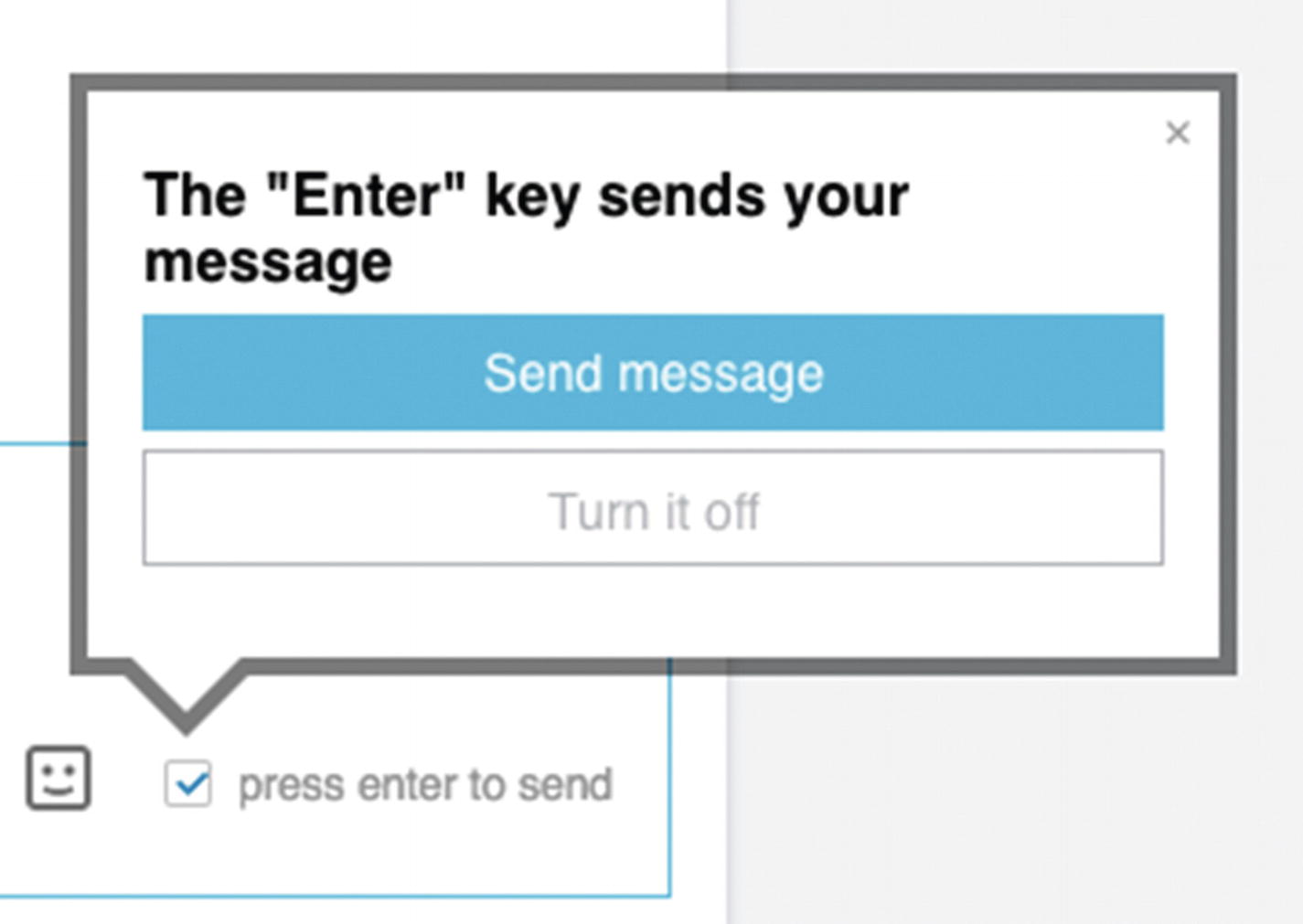
Screenshot of LinkedIn’s Enter key notification
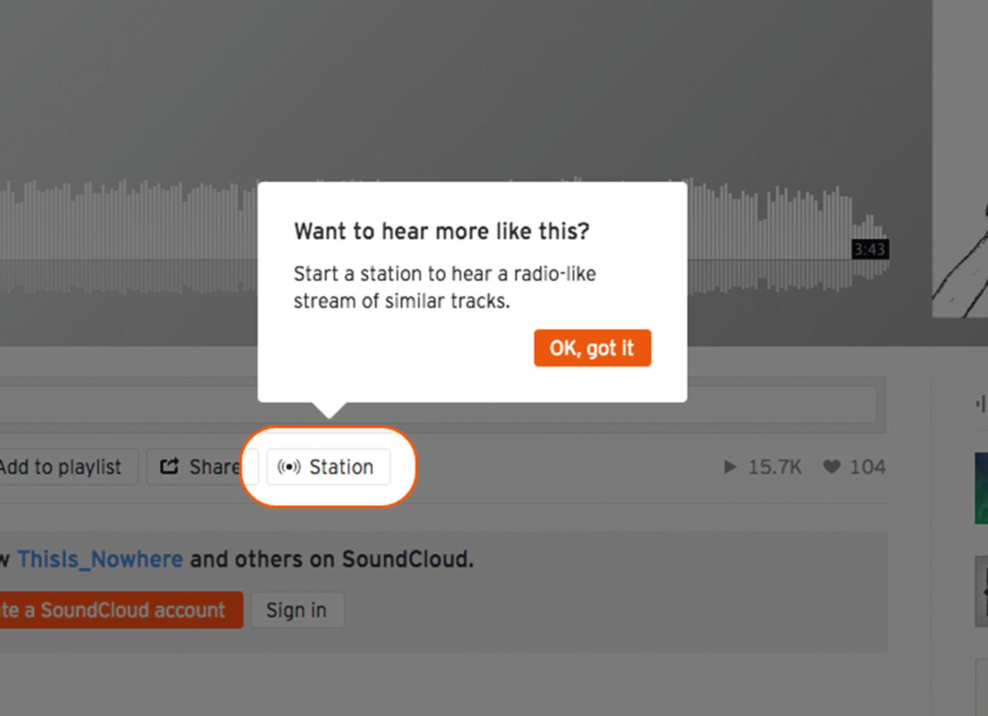
Screenshot of SoundCloud use coachmarks to introduce Stations
It would likely be unnecessary to clutter the interface with that explanatory text all the time, so it can be reserved for a coachmark.
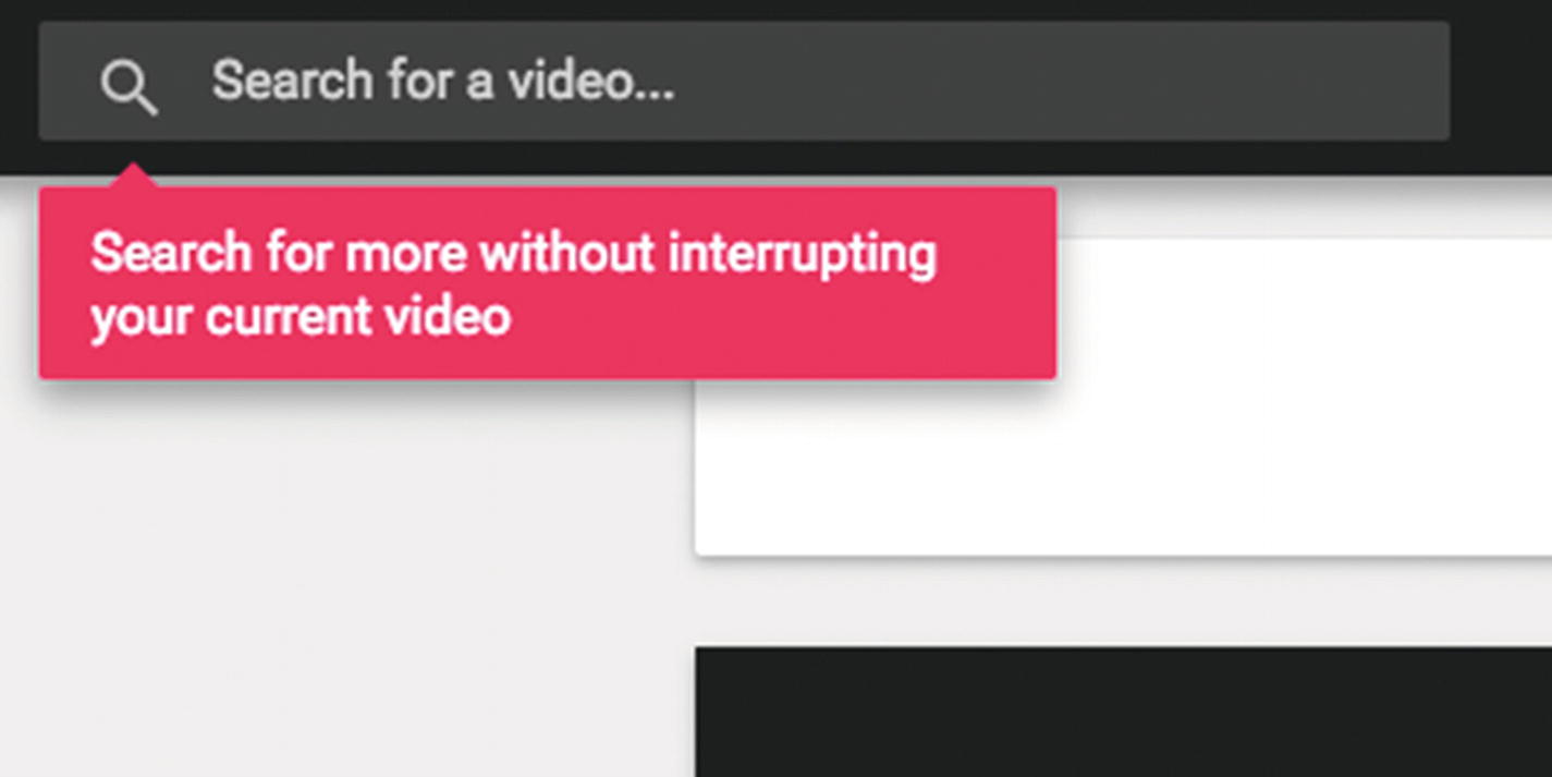
Screenshot of ListenOnRepeat’s coachmark lets visitors know they can search without interrupting their current video
Implementing and tailoring patterns
After learning new patterns, clarifying your design problem, and identifying patterns relevant to your interests, how might you tailor a pattern precisely to your needs? It’s not enough to name the solution to your problem in the given context; you need to flesh out all the implementation details. Many patterns will describe the list of things you need to think about (see Chapter 1). It’s also important to use your own user research—like the user journeys and personas we’ll look at in Chapter 3. Sometimes, you’ll need to specify how the pattern is implemented and how it might vary across your product—learn more in Chapter 4. Sometimes you’ll need to avoid them turning into anti-patterns—see Chapter 5. Finally, see Chapter 6 to string them altogether in your product.
One important thing is that you do user research. Test. Prototype. Test some more.
Pattern: Progressive disclosure
A previous version of Apple’s MacOS Human Interface Guidelines defined Apple’s “User Control” design principle as “The principle of user control presumes that the user, not the computer, should initiate and control actions.” Further, Apple described progressive disclosure as “hiding additional information or more complex UI until the user needs or requests it” to “help you provide the right level of user control.”25
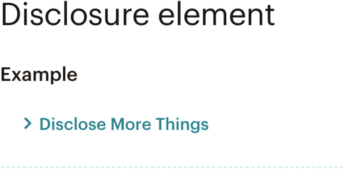
Screenshot of MailChimp’s disclosure element
To progressively disclose information, hide the extended information by default and provide a trigger that lets the user activate visibility of the hidden content, such as a link. After activation, bring more content into view in direct proportion to the user’s desire for more content.
Use progressive disclosure when most users do not need all the information and some users will need more information at some point in time.
Accordions
Tooltips
“View all” links (e.g., on comment threads or product ranges)
Read more links for inline content expansion
Pattern: Staged disclosure
Similar to progressive disclosure, staged disclosure presents additional information in steps (or stages) according to the user’s direct request. In contrast, however, staged disclosure refers to a linear flow tunneling through a larger process. It advances the distance through a process rather than the depth into optional information.

Screenshot of Apple’s multistep process
This pattern is commonly used in signup, setup, purchase flows, and workflows.
To stage disclosure of information, chunk extended information into smaller, logical groups and present one at a time. Similar to progressive disclosure, provide a trigger to navigate to the next step, but also back links as needed, and consider pairing staged disclosure with a progress indicator.
Use staged disclosure when providing all the information at once would be overwhelming—focus users on one task or piece of information at a time.

Screenshot of Dropbox two-factor authentication introduction
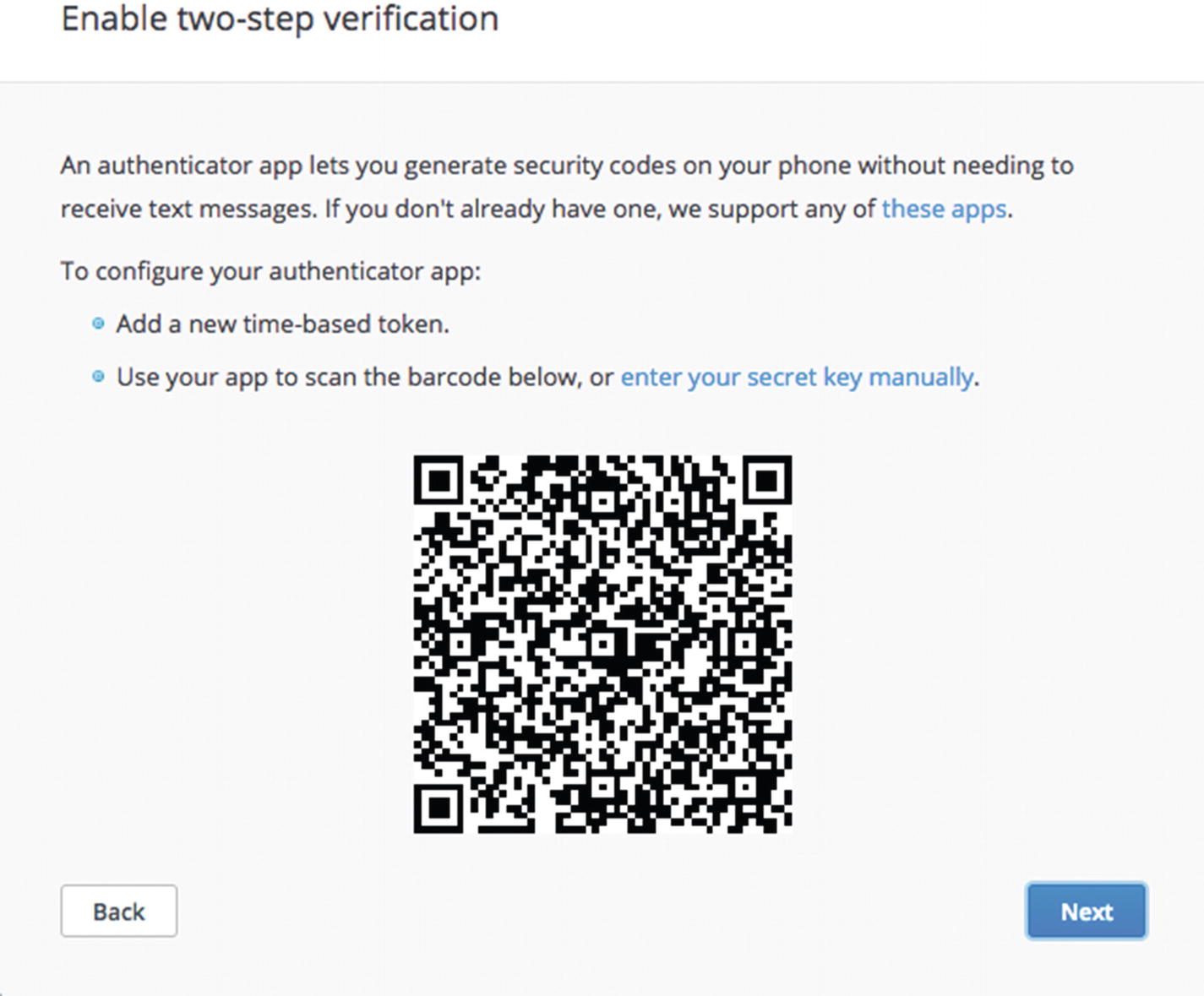
Screenshot of Dropbox two-factor authentication introducing generator app
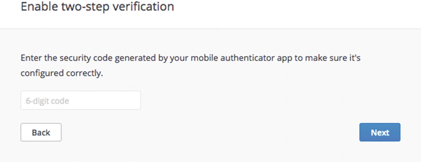
Screenshot of Dropbox two-factor authentication generated code input
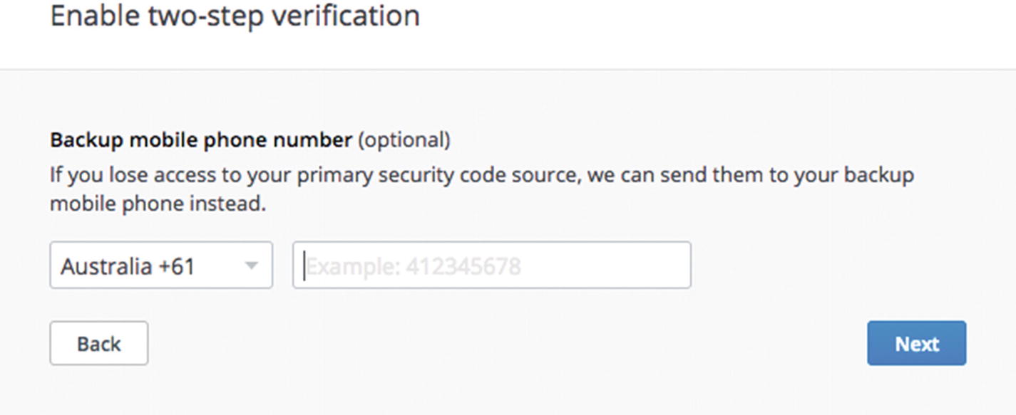
Screenshot of Dropbox two-factor authentication phone number input
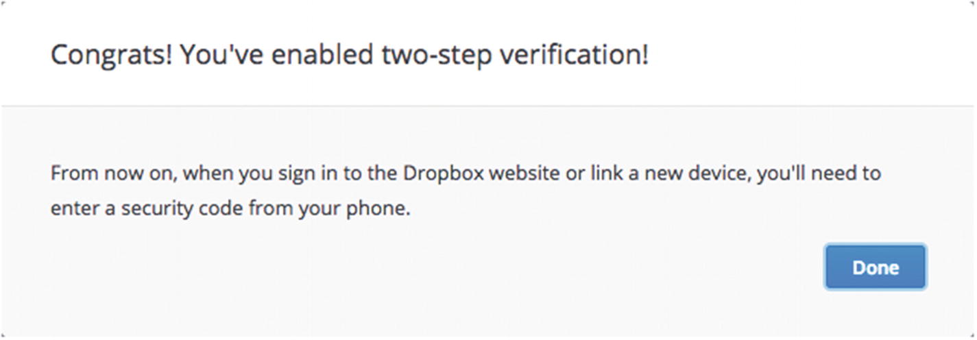
Screenshot of Dropbox two-factor authentication success message
Pattern: Progressive reduction
Finally, in contrast to progressive disclosure, rather than expanding on information as a user needs it, progressive reduction is the practice of reducing detail as a user no longer needs it. Expert users of an interface—loyal, repeat visitors, power users, subject matter experts, specialists—can learn an interface and no longer want the additional help provided to new users. You might reduce coachmarks and help tips after first use or start shrinking and removing labels on buttons. Expert users no longer need training wheels so stop cluttering the interface is with unnecessary information.
To progressively reduce information, remove coachmarks, tutorials, and feature explanations when they are no longer needed and help the expert focus on new content. Restore these extras when the user has not accessed the feature recently. Provide explicit user-initiated links to reduce interface noise, such as “Skip tutorial,” “OK, got it,” “Not now,” “Later | Close,” and “Hide this.” You might consider pairing progressive reduction with a temporary notification (as described previously) or an inline hint ( http://ui-patterns.com/patterns/inline-hints ) to indicate where the content may be found in the future, such as a reference guide or user settings. Alternatively, progressively reduce the visibility of features based on recency and frequency of use alone, without intervention from the user. This takes control away from the user, so use with caution.
Use progressive reduction when expert users get tired of seeing the same messages that they no longer need, specifically when the user has recently and frequently engaged with a feature.
“Remember me” checkboxes to stop asking for usernames and passwords.
“Don’t ask me again” checkboxes to stop asking questions every time a user initiates an action like deleting a file or dismissing a survey.
Reducing notifications as a user starts ignoring them. Code learning app, Enki, for example, turns off notifications if their daily reminders are ignored for too long.
Hiding old feed activity. If it’s been a long time since a Twitter user has looked at their feed, for example, Twitter will show the last tweet the user saw and fold away all the old activity that has passed since then in favor of showing recent content. The user, however, can tap a link to immediately restore the hidden content.
I think a direct comparison between progressive disclosure and reduction means that the reduction should directly support the user’s level of control—it should be user initiated. Slack, for example, automatically turns off email notifications for new users when they turn on push notifications to the mobile app. Technically this is not user initiated but system initiated. Slack does, however, provide a link to the user’s settings, so they may turn the emails back on if they wish. They delicately walk the line of giving the user control as well as making smart guesses at actions to take for the user.
Finally, my favorite example of progressive reduction is apps remembering windows I’ve collapsed and hidden in the past to let me clear up the interface and focus on my task uninhibited.
Bringing it all together
From here you can begin to recognize patterns across the Internet. Within your own products, you can recognize patterns and where pages differ, which can give you hints about opportunities to consolidate and refine inconsistencies. You’ve seen how to navigate resources for learning more patterns. Now we’ll wrap up how to make the most of pattern resources with an example task of redesigning a login form.
Pattern: Login form
A login form (or sign in) asks for an identifier, such as a username or email address, and authentication information, usually a password, to access a user account containing private, personalized information.

Screenshot of Litmus’s login form
Show a login form to visitors when they need to access their content, either right before performing an action that needs an account (such as following or friending a person) or when directly accessing a “log in” link. When a user submits the login form, you need to check their details, and if they are incorrect, show validation feedback and help them recover—it’s common to include a password recovery link in a login form. After successfully logging in, return the user to the content they requested before presenting the login form.
Using an email address as a username is an effective usability hack that’s extremely memorable. It also doubles as a unique identifier for the account and a communication channel, so you may contact the user about the account. In this way, a telecommunications company might use a phone number as a username to minimize the number of details the user needs to remember. Alternatively, an identifier could also be a socially recognizable username like a twitter handle, for example, @lara_hogan.
Naturally, you won’t need to use a login form if you don’t have account registration or if you use the social signup pattern where you’d need to connect to another service instead.
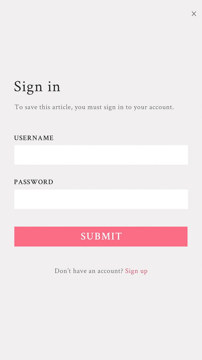
Example: Redesigning a login form
Given the task of redesigning an existing modal, you can explore the modal pattern to inform your design.

You’ve been tasked with redesigning this login form
From the pattern
From the details of the login form pattern we’ve just seen, we can see that we have design decisions to make about when to show the form, how to help people recover from errors, and what to use as an identifier.
A reason to log in
Now you can see why you need to log in to your account and that you can tap a closing “×” to leave.
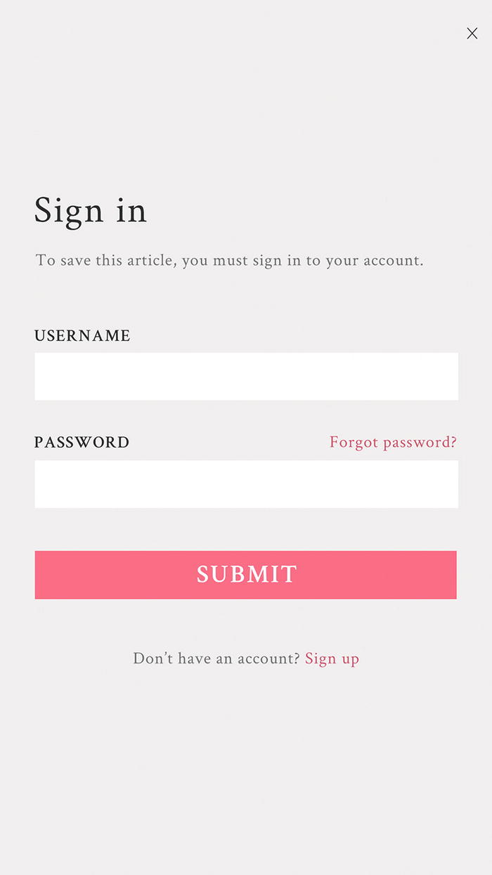
Password recovery
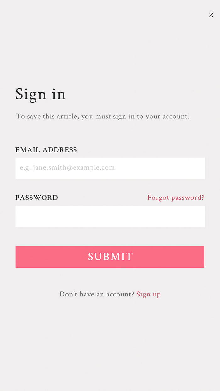
Email address as an identifier
Pattern resources

Remember me checkbox
This approach can help users avoid frequently needing to log in. There’s a risk though if your users are accessing your product on shared devices, such as in a university, library, or corporate network: other people may see their content when they leave the device. For this example, we’ll assume the majority of users are accessing the product privately on their own personal devices.
Searching for patterns
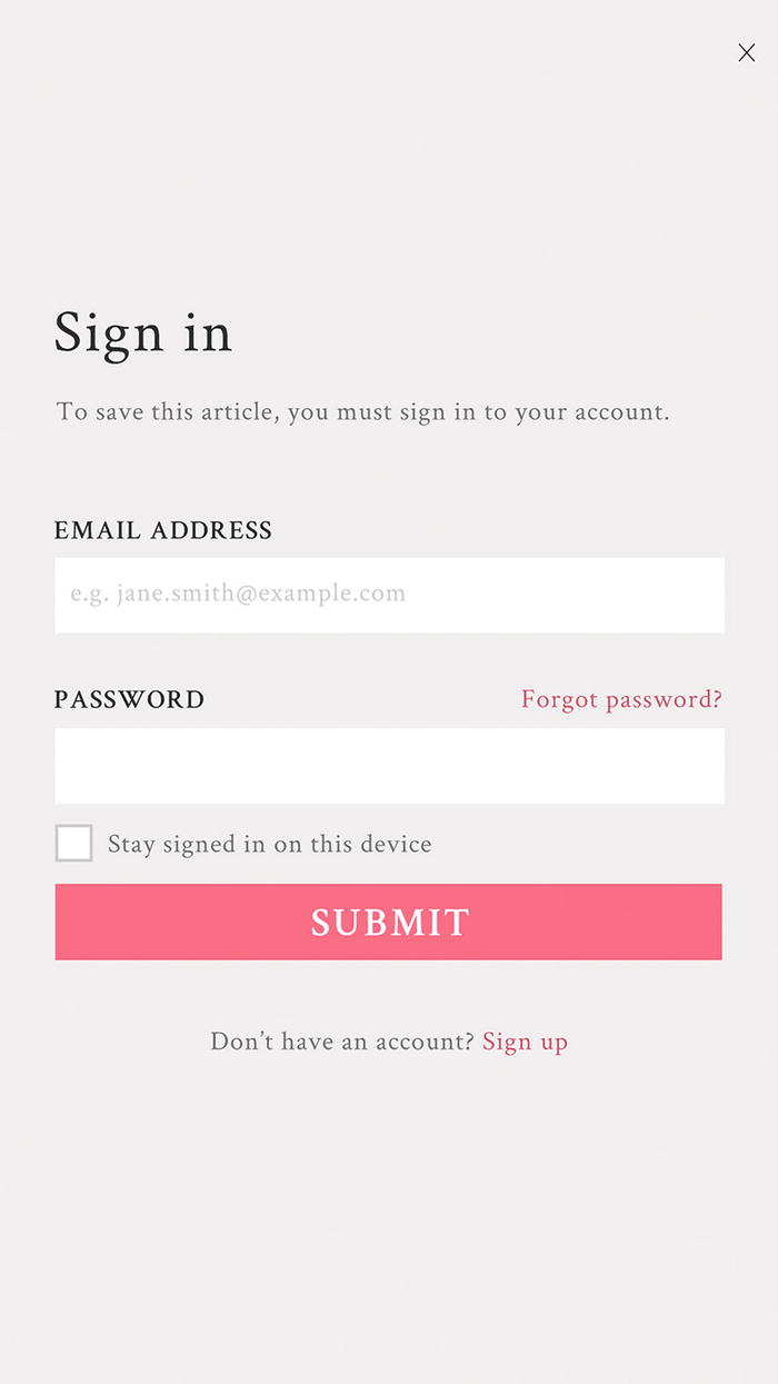
Stay signed in on this device checkbox
Our login form is complete.
Competitive analysis
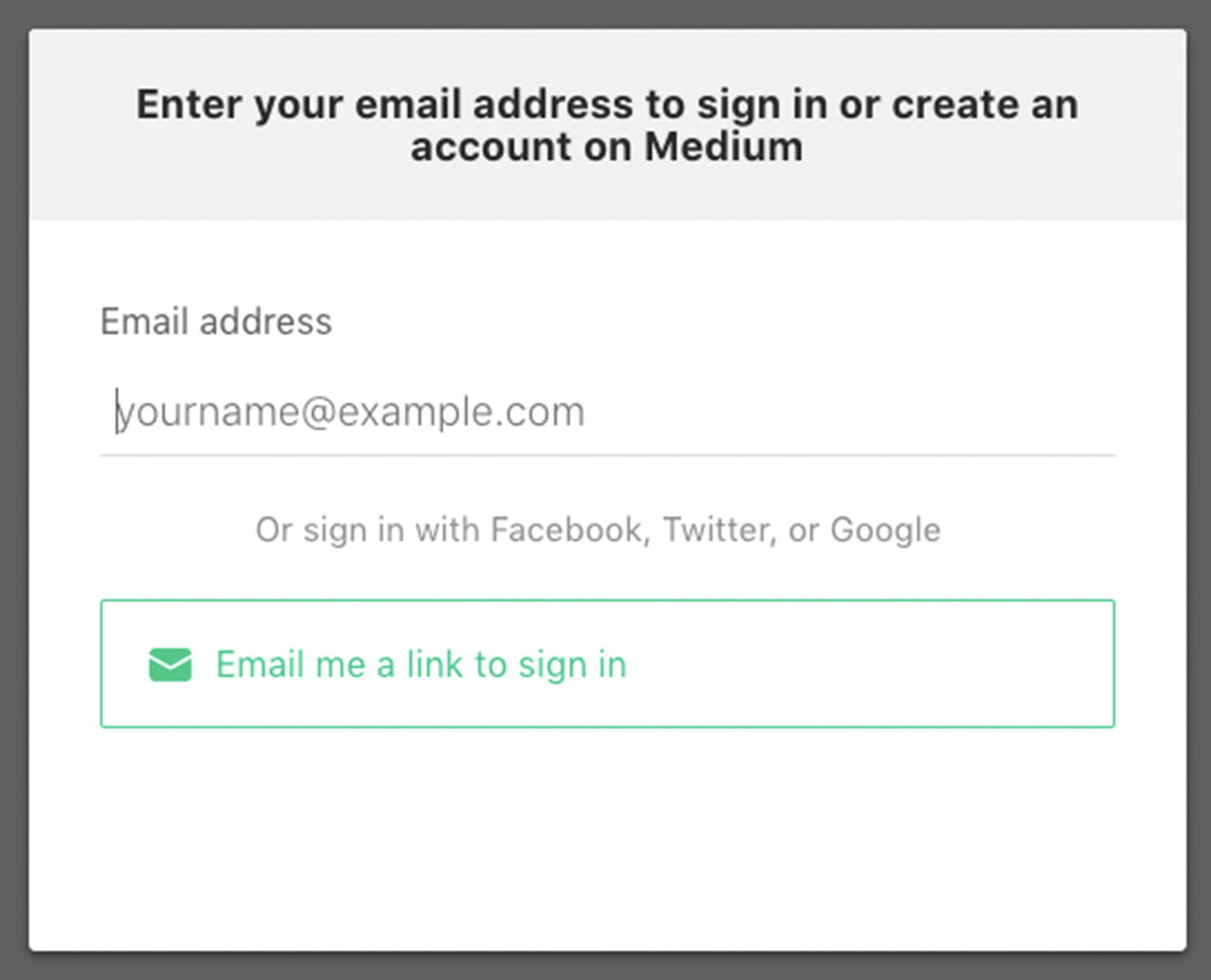
Screenshot of Medium asking only for your email address

Screenshot of Medium telling you they sent you a link to sign in
This means that your email account becomes the main point of failure for security. For our example, we’ll stick with the simple login form.
Innovation can occasionally make patterns redundant, so maybe in the future login forms won’t exist anymore.
Learning from the best
At the time of writing, Facebook is the virtual community with the largest number of user accounts in the world at over 2 billion.26 To learn from Facebook, we can look at their own login form as well as their login best practices ( https://developers.facebook.com/docs/facebook-login/best-practices ). In their best practices, they suggest you “provide a glimpse of the content available to people prior to logging in.” For products with visually compelling content, showing a glimpse of what’s to come in a background image could be enticing. For our example of logging in to save an article though, there’s not a lot to show. We’re done for now.
Summary
Walkthrough
Playthrough
Newsletter signup
Validation feedback
Social signup
Lazy signup
Notifications
Good defaults
Coachmarks
Progressive reduction
Progressive disclosure
Staged disclosure
Now that you’ve seen these patterns, be careful to avoid treating them like hammers; not everything is a nail. Next, we’ll explore how users find, read, and share content, as a lens for analyzing patterns in depth and deciding which pattern to use and when, so you might see when a pattern is the right tool for the job.