
Hitting the right note includes knowing when not to strike.
In this chapter, we’ll look at considering the context of your design problem so that you can evaluate a pattern’s suitability; not every pattern is appropriate to every problem. For context, we’ll consider user needs, technical challenges, and business implications for patterns. We’ll explore principles for evaluating the effectiveness of patterns.
Throughout the chapter, we’ll see patterns for finding, reading, collecting, and sharing content.
Context
There are a few particular aspects you may consider to define the context of design problems: user journeys, user tasks, personas, constraints, and content or data.
User journeys or customer journeys ( https://conversionxl.com/customer-journey-maps/ ) are the story of how a user navigates your product, including how they perceive your product at every touch point on their way toward their goal. They describe the setting and sequence of events. Journeys encompass discovery and awareness of your brand, first use of your product, conversation across channels including social media, loyal engagement, and actions taken with your product.
User tasks or Jobs to be Done ( https://blog.intercom.com/finding-jobs-your-product-is-used-for/ ) establish what your user is trying to accomplish, such as find a restaurant’s opening hours, play to kill time waiting for a train, update social status, or crop unwanted details out of a photo.
User groups or personas ( www.nngroup.com/articles/persona/ ) can be used to describe the identities and experiences of your users. A person’s interaction with your product is influenced deeply by their personality, motivations, expertise, location, mood, etc., and that’s not even touching on their demographics.
Constraints include all the limitations set on a solution. This ranges from the user’s environment including their devices (phone, TV, watch), Internet connection (fast, patchy, filtered), and input mechanism (track pad, keyboard, voice, touch screen) to your technology, business, and design needs. There might be ethical, legal, resource, or security constraints that influence your design choices.
Content and data include all the substance of your product. Content usually means copy (text), images, video, and all other media and information, including user-generated content like photos on social media. Data often describes information about the user or product like search results, current address, or filenames.
In the following text, we’ll see how each of these factors influences when a pattern is appropriate.
Pattern: Autocomplete
The autocomplete pattern automatically completes typed user input with matching results from a larger data set.
As human beings, as flawed, mere mortals, your site visitors cannot always recall the full name of what they’re searching for, or how it is spelled, or even what you happen to call it. As such, autocomplete lets your system match your visitor’s first few key strokes with possible solutions. Autocomplete will usually attempt to finish the word you have started, like in predictive text on mobile phones, saving you keystrokes and time, while efficiently finishing the task. This is extremely convenient when accurately typing a phrase is difficult, such as on mobile phones, graphic tablets, voice control, and so on.

Screenshot of the SwiftKey keyboard
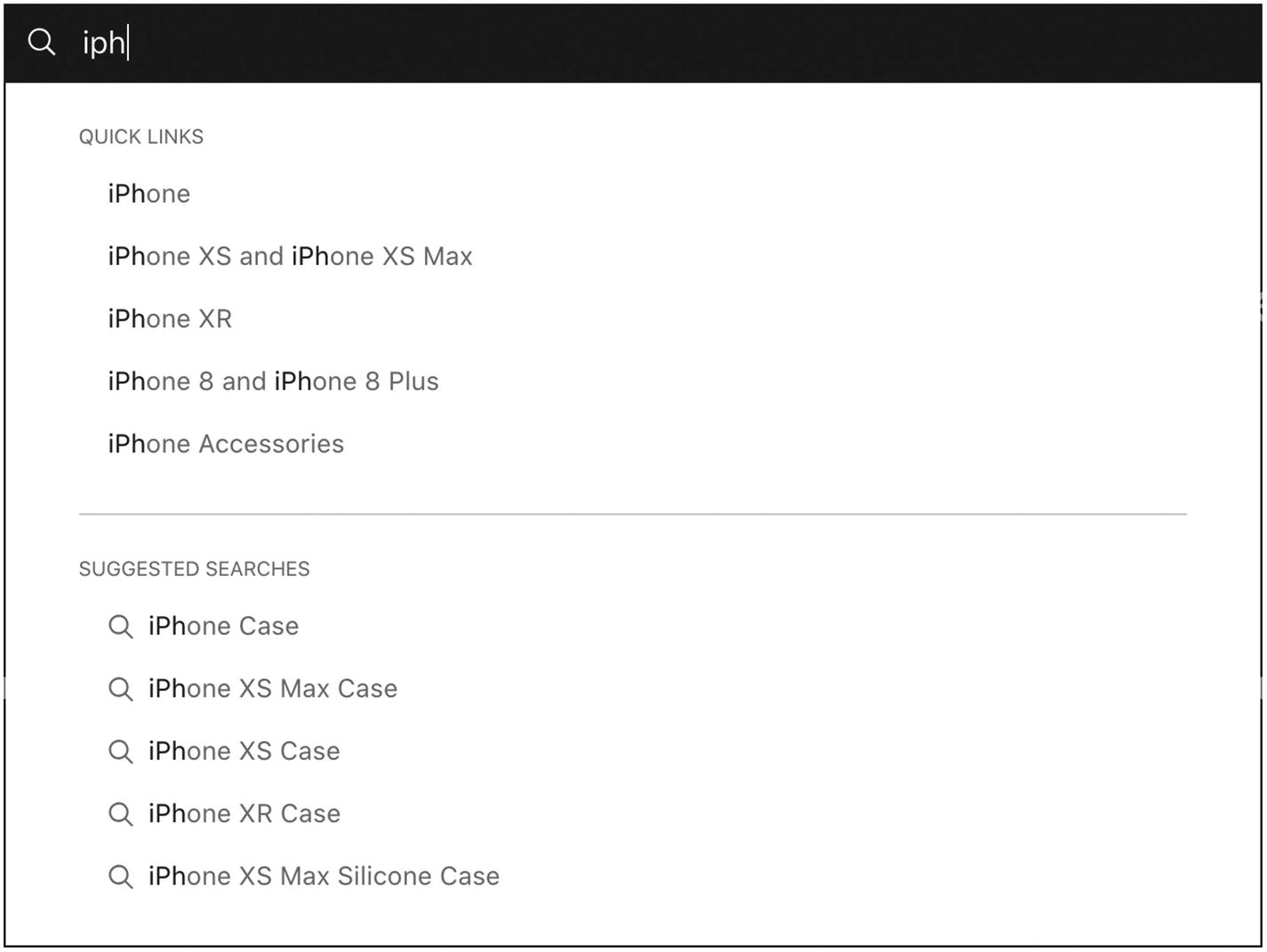
Screenshot of Apple’s autocomplete search that suggests quick links to specific products and suggested searches to related products like cases
Autosuggest
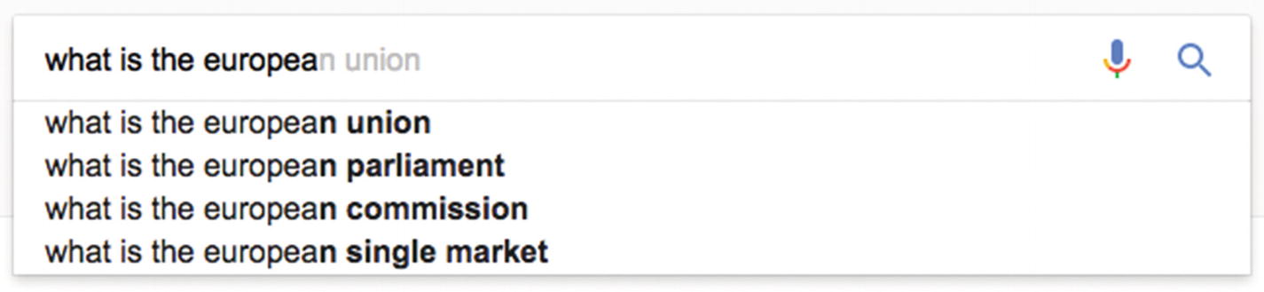
Screenshot of Google’s autocomplete highlights the differences in text that you can complete
Google also blends autocomplete and autosuggest by letting you autocomplete the whole sentence using other noun phrases, showing additional results below the search input field (emphasizing the available autocomplete text with strong, bold text).
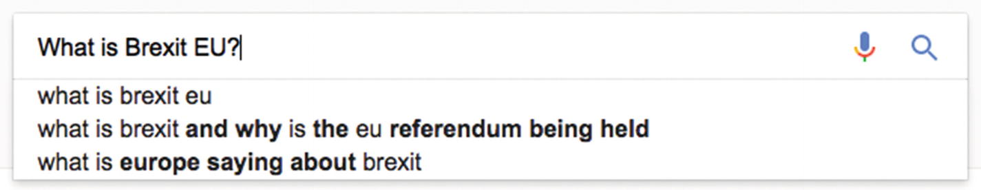
Screenshot of Google’s autosuggest that proposes alternative queries that might be relevant
Another occasion to use autocomplete is when you might use a different name for the same idea, like showing “autosuggest” in results for “autocomplete.”

Screenshot of a search for “iPhone 77” that shows the iPhone 7 as one of two results
User context and performance

Screenshot of Warby Parker’s site presenting product photos with their names in autocomplete search results
In these contexts, autocomplete is probably a poor solution. To otherwise help users navigate a large set of results, you might instead use pagination and search filters, which we’ll look at shortly. To be forgiving of a user’s misspellings, you might use spell check or present alternative (correctly spelled) results after they’ve finished typing.
To learn more about autocomplete pattern design, see Baymard Institute’s 8 Design Patterns for Autocomplete Suggestions ( https://baymard.com/blog/autocomplete-design ).
Pattern: Search filters
Search filters reduce search results by excluding irrelevant information using contextual filters to refine initial results.
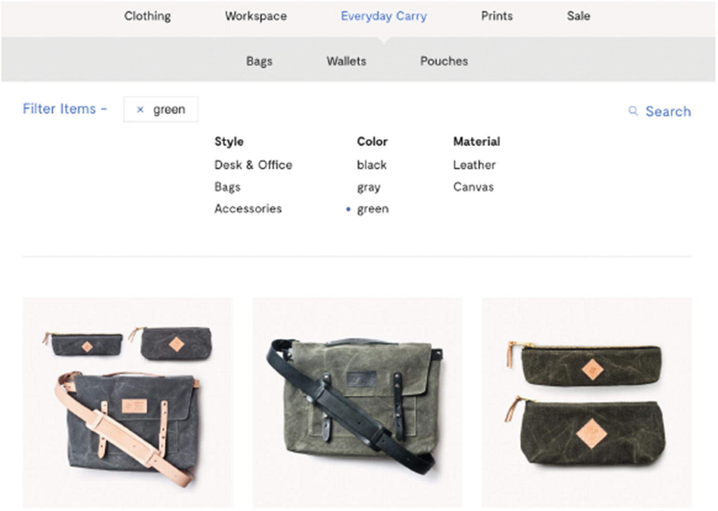
Screenshot of Ugmonk searches, which can be filtered by style, color, and material
Search results can be massive. The typical Google search produces millions of results, and most of the results will not be seen. To find a needle in a haystack like that, a searcher might try a different search term with fewer results, or you could provide search filters through which your user can indicate which aspect of the results they are most interested in.
Search filters are great when the searcher doesn’t know exactly what they’re looking for but have some criteria in mind by which they’ll recognize the right result when they see it. For example, your user knows they want to see a new movie and they don’t know which movie yet, but they do know what genres they like, directors or actors they admire, which cinemas nearby they’d like to see a movie at, and what time of day they can see a movie. In this scenario, your user can make their preferences known by using your filters to narrow the full list of currently showing movies down to those that fit their needs.

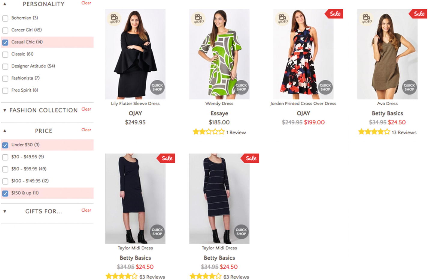
Screenshot of Birdsnest’s search filters that include body shape, occasion, and personality
Use the search filter pattern when traits are obvious like media type (maps, images, books), price, and size. Avoid this pattern when categorization is hard, when there are very few results, or when clear navigation and hierarchy is more suitable.
Search filter patterns are often seen with scoped search, where you first choose some larger exclusive category, like dresses or jeans, before showing search filters relevant to their results, like maxi dresses or straight cut jeans. We’ll look more at mixing and matching patterns and their implications in Chapter 6.
Using a filter is basically a crutch for being unable to instantly divine what the visitor is looking for. Ideally, you’d immediately present their exact desires. You might find alternatives to search filters for discerning their needs, such as seeing they’ve come to your site from an ad for blue hats, and instead of showing a search listing filtered to “hats” that are “blue,” show only a result listing containing blue hats. No clutter, no distractions. This illustrates how the user journey and task could prove the search filter pattern irrelevant in this context.
Information architecture
- 1.
Principle of objects: Treat content as a living, breathing thing with a lifecycle, behaviors, and attributes.
- 2.
Principle of choices: Create pages that offer meaningful choices to users, keeping the range of choices available focused on a particular task.
- 3.
Principle of disclosure: Show only enough information to help people understand what kinds of information they’ll find as they dig deeper.
- 4.
Principle of exemplars: Describe the contents of categories by showing examples of the contents.
- 5.
Principle of front doors: Assume at least half of the web site’s visitors will come through some page other than the homepage.
- 6.
Principle of multiple classification: Offer users several different classification schemes to browse the site’s content.
- 7.
Principle of focused navigation: The principle of focused navigation—don’t mix apples and oranges in your navigation scheme.
- 8.
Principle of growth: Assume the content you have today is a small fraction of the content you will have tomorrow.
These are solid foundations for evaluating patterns. The search filter pattern itself embodies the principles of choices and multiple classification. In applying the pattern, consider how the search filter labels might exemplify the items within each filter. Filter by “category” or “type” gives you no indication of whether these filters will help a user in their search. Alternatively, filter by “weather” or “color” gives them a sense of what they might find underneath. By considering the principle of growth, you might conclude that while your horizontal filter toolbar design3 looks fine now with just four filters, as the number of results grows, you might not fit the extra filters needed to sufficiently winnow the results. Conversely, as the collection grows, you might need to be more judicious in only showing the most valuable filters, occasionally culling some.
This brings us back to considering the context of your data and the user’s journey. For example, Airbnb shared in a video about search at Airbnb4 that filtering by price and deal-breakers were in the top four most important aspects to their users’ searches, and so they prioritized the price filter as well as easy access to the many deal-breaker filters (like pet-friendliness) in their design.
Multiple filters
Screenshot of Birdsnest’s search filters, which let you choose several filters
It might seem obvious for “price” that a dress is only one price, so selecting two price ranges (less than $30 and more than $150) should find products priced in both ranges rather than no results, but it’s less obvious if choosing “Casual chic” and “Classic” will find products in both those styles or only products that are classic and casual chic. Feedback is needed to clarify filter functionality.
Filter feedback
Screenshot of Birdsnest where product images match filters
There’s no need to add text to each result to say “shows off arms” when it can be seen from the photos. In contrast, the price needs to be shown as text next to each item.

Screenshot of Harvard Business Review, which shows the refined search results are case studies about the technology industry
Choosing filters
The filters offered must meaningfully classify and describe the results. To illustrate, a filter for “good movies” will be challenging because the criteria for deciding what’s good are highly subjective, so it will be unclear what results are in each filter. If, however, you clarified the filter as “BAFTA award-winning films,” some clear criteria for “good” are being used, and the results will be more predictable.
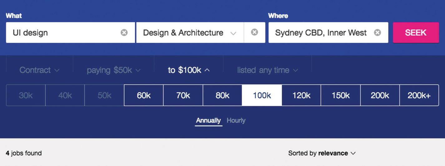
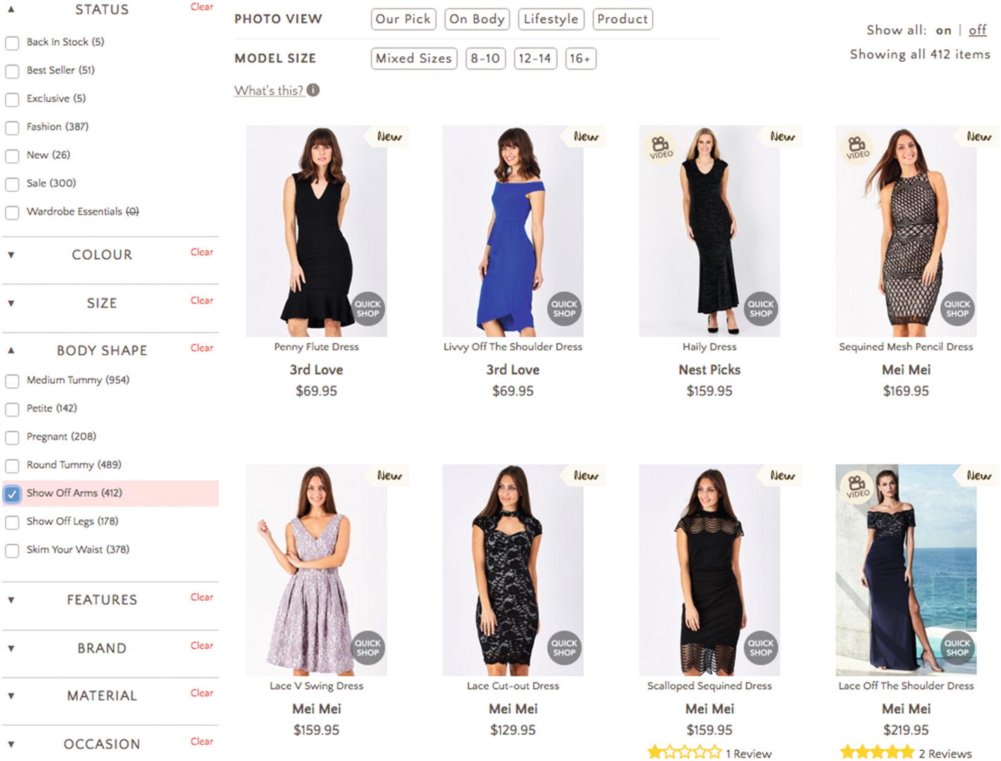
Screenshot of Seek’s filters, which show available filter options, selected filter options, and the number of results
Live filters
Refining results in real time using “live” filters—instantly updating results—lets your users directly manipulate the results and gives them control to respond to feedback: each set of new results lets them know whether they need to add another filter to find content right for them. For example, if your user’s first refinement still shows millions of results, they know they need to keep filtering. During the process of updating the results, you can convey what’s happening to your users by presenting a loading state and then a completed state. The loading state might animate the old results out and new results in to draw attention to their changes. The completed state might cease all movement or add a visible detail to the filter after results are loaded, which indicates it’s “on.” For tiny screens, you might be unable to fit the results next to the filters, requiring a different approach to how you present the loading state. Instead, you might batch filters.
Batch filters
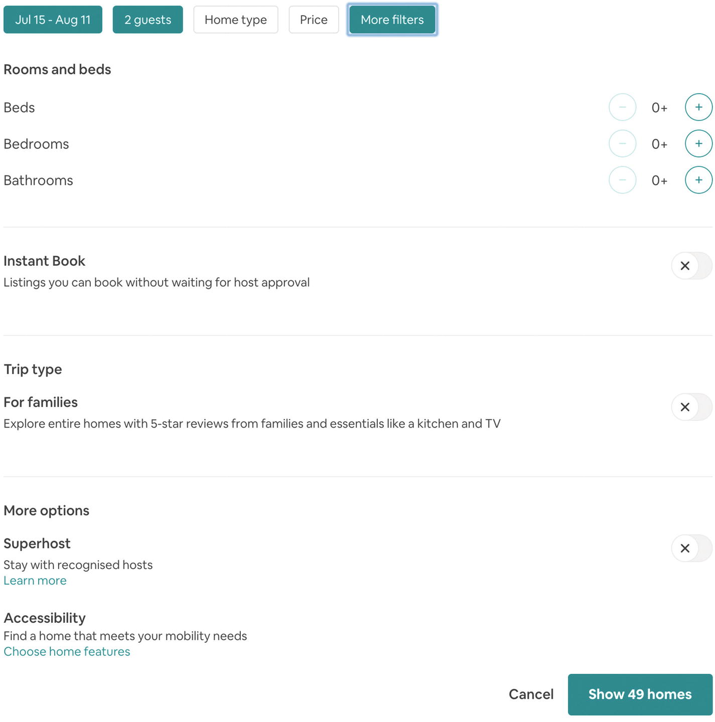
Screenshot of Airbnb’s batch filters
These filters let you select the number of rooms and beds, toggle “superhosts,” choose amenities, and tap “See homes” before processing results.
Error prevention and recovery
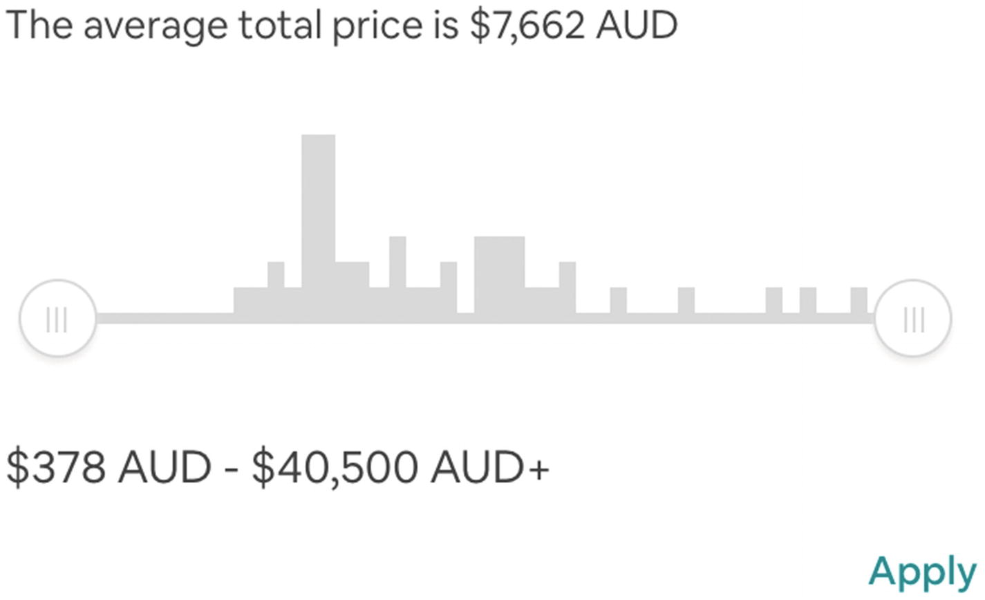
Screenshot of Airbnb’s price filter
This filter shows results at each price point using a miniature bar chart and a range slider, indicating areas that would produce zero results.
Using a “clear filters” option provides people with an emergency exit when the results are bad so they can abandon their choices so far and start over.
Pattern: Activity feed
An activity feed shows recent activity in a timeline—a list of events in chronological order. Activity feeds help users keep up to date on changing events and information that are important to them. They’re common staples of social media sites.
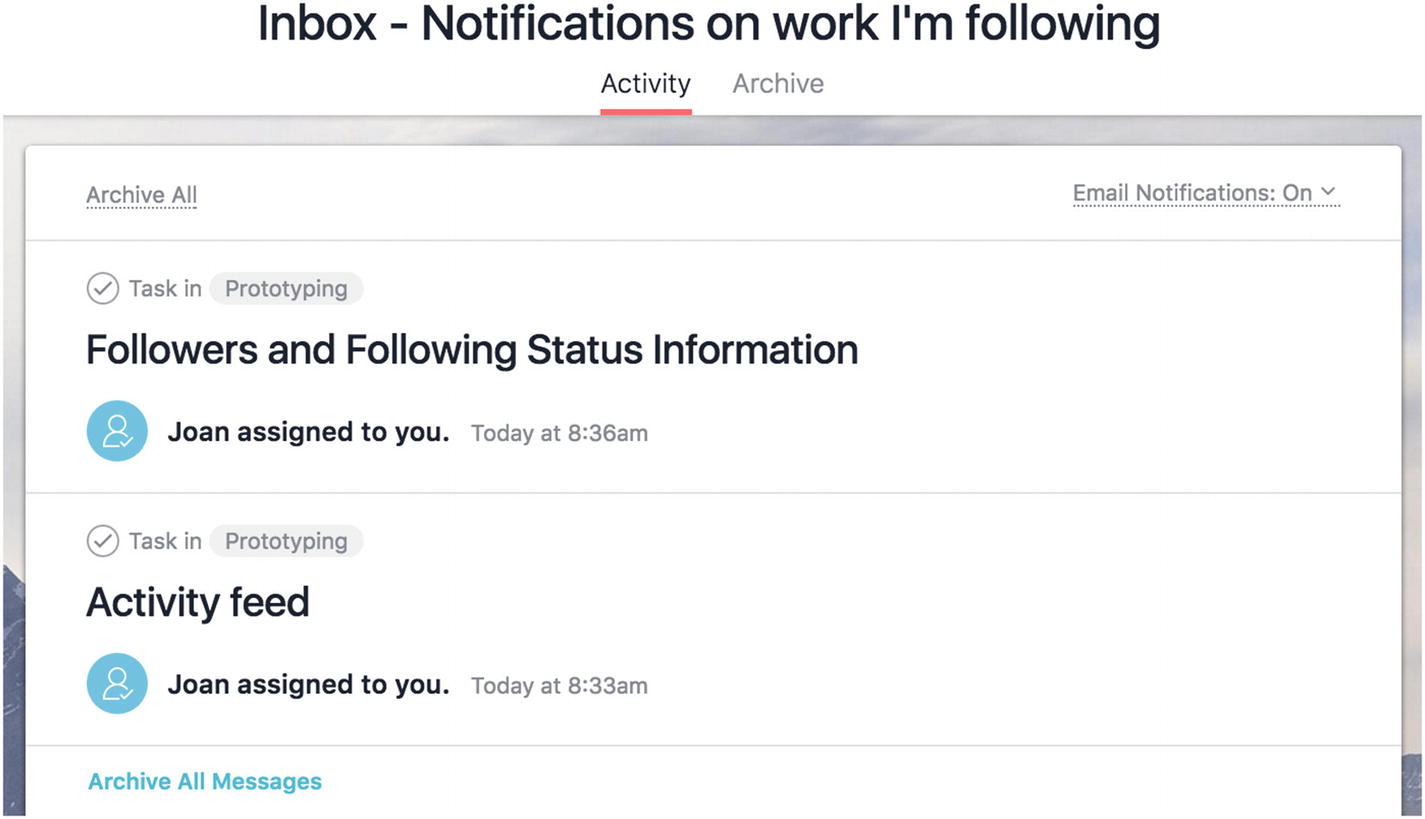
Screenshot of Asana’s activity feed, which shows tasks assigned to you by other members, the projects they belong to, and by whom
It can be difficult sometimes to keep up with everything that’s happening. Within a product, there might be a whole community and ecosystem of activity and countless events occurring at any moment. By using an activity feed, you can help people identify events that matter to them in a sea of noise, and then engage further with that event and your product. This is particularly helpful when a lot can happen between the times a user engages with your product, such as reading the world news in the morning and catching up on the last day’s events.
As activity feeds are used to enable users to look through information, scannability is a high priority. You can segment activity into digestible little chunks, where the visitor may then leap off into further related action on an activity, if they wish. Alternatively, they might continue on consuming the stream without acting on events.
Showing when an event occurred (more on that in the following text).
Exactly what happened—What’s the nature of the event? A photo uploaded? A status update? Money sent? An item shared? A new task to do?
- Clearly indicating who initiated an event, such as prominently showing a user’s display photo and name or handle in a social media activity feed.
If there are multiple parties involved, visually demonstrate the relationships between them, such as listing an individual user as well as the organization they belong to.
For a blog or news site, show the day, month, and year. Is the exact time a post was published useful to your users?
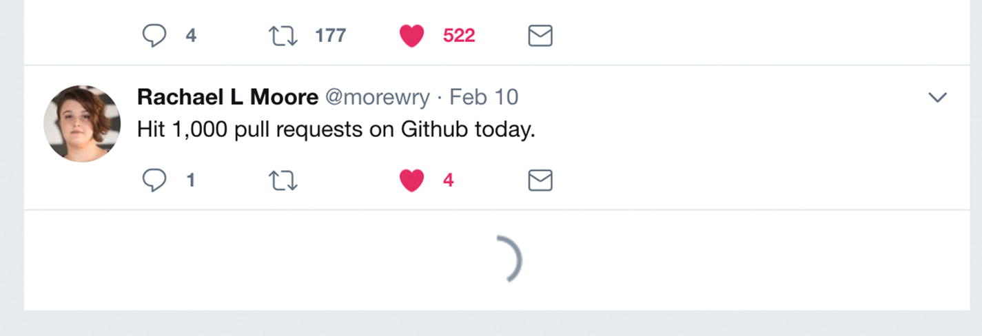
In a real-time social media feed like Twitter, where drama can unfold quickly, show the date and time down to the minute and maybe even seconds.
For a health and fitness app, show today’s events or this week’s progress. While the year’s summary might be useful, it’s unlikely each event like a workout or meal eaten is interesting in a timeline of that period.
Instead of absolute dates and times like “1 January, 3:24PM,” it’s sometimes more pertinent to show relative times like “3 minutes ago” or time between milestones, such as “While you were away” or “Yesterday.” The older content is, the more likely it should be archived in away in a larger category like “Older than 5 years ago.”
Follow a link to read more. For example, follow a news teaser to the full article.
Save the event. For example, bookmark a shared social object.
Manipulate or interact with the event. For example, comment on an event, complete a task, remove from the feed.
Given the repetition of these available actions for a large number of items in a feed, you might hide the actions a user can take until they interact with the event, such as showing “share buttons” and other controls on hover for nontouch devices or after tapping to select the event on touch devices.
To help users track recent events that matter to them, an activity feed needs to effectively manage the volume of activities. Too little activity might mean your product isn’t providing enough value and appears quiet or boring. Too much activity and the user might be overwhelmed, defeating the purpose of the feed. For high volumes of activities, some clustering may be needed. For example, you might collapse all of “Sam’s” recent activity—sharing hundreds of photos—into a single “Sam” photo album event.
Further, you might offer separate views of the same feed, such as Facebook providing a main feed as well as notifications for a particular activity you’re interested in, such as activity by certain people.
Note
Facebook kicked up a stink when they stopped showing content chronologically and started presenting information according to its perceived importance. This had the unfortunate side effect that conversations became difficult to follow when comments weren’t presented in order. Usually, activity feeds are shown in order according to time the event occurred. Conversely, Reddit masterfully elevates highly voted content in its comment activity feeds, making an effort to clearly show the filtering that’s happening and maintaining coherence.
An activity feed may be a poor choice when your most interesting content is not the most recent.
Pattern: Favorites
A list of favorites is a personalized, curated list of preferred items, stored for later use.

Screenshot of Twitter’s likes, which create a shorter feed of happy content
Favorites serve two primary functions. Firstly, users can return to content they adored in the past. Secondly, users can find favorited content recommended by others; favorites reveal exceptional and remarkable content in a saturated environment.
Note
In rare cases, favorites are private. This is akin to e-commerce “wish listing” when a user is shortlisting candidates or saving a product for later, such as when they’ve saved up enough money.
A rose by any other name
The favorite pattern can go by many different names, while the behavior underpinning stays the same. Pinterest, for example, lets you “save” a pin to mark it as a favorite. Twitter, by contrast, lists a user’s favorite tweets under “liked” tweets. Notably, both of these products have changed their naming conventions and features over the years to pare back and simplify their UIs. Pinterest experimented with both a “like” and a “save” button before retiring like as a redundant option next to the more powerful “save” that let users categorize their favorites. Twitter renamed their previously existing “favorites” as “likes,” which suits its more generic behavior. A liked tweet could have all sorts of social implications, according to personal use and behavior in particular circles. Some people treat it only as a reaction and never refer back to their likes.
To use the favorite pattern, you’ll need to let people mark an item as a favorite as well as refer back to the collection of favorites. You can let people add an item to their favorites by providing a button on or next to the critical items in your product, such as articles, photos, or activity. You can let your user—and in some cases, other users—refer back to the collection of favorites by keeping them all in one place and linking to each individual favorited item.
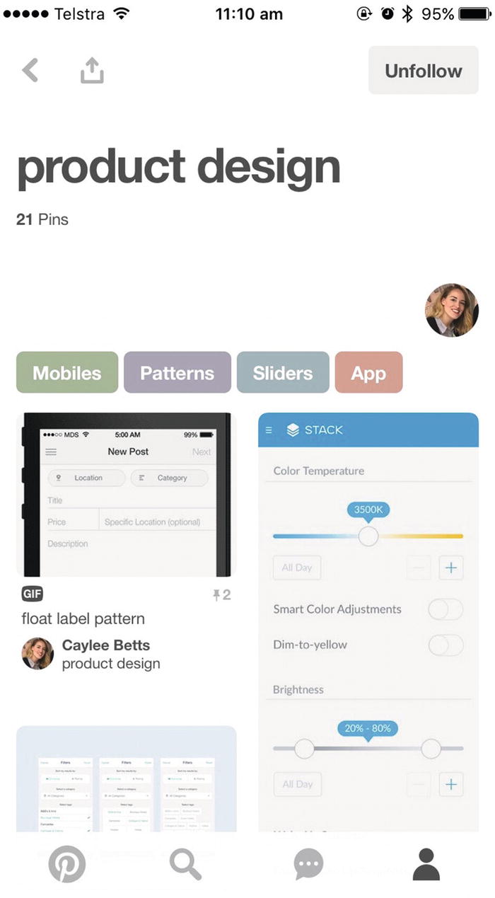
Screenshot of a product design board on Pinterest with 21 saved pins
On the other hand, housing favorites together in one list with a single name makes them more a versatile feature: a favorite could be a read receipt to acknowledge you’ve seen it, it could be a bookmark of bad content you want to fix later, it could literally be your single most loved item.
Favorites are often accompanied by a metaphor and iconography such as heart, star, thumbs up, or “+1” to like, love, promote, or collect an item. For usability, ensure consistency and standards are used instead of switching between a heart here and a star there. Likewise, showing both the icon and label in all the places a favorite appears can avoid the confusion of an unlabeled heart shown in one place and an ambiguous label like “saved” with no matching icon elsewhere. If for some reason you use both a thumbs up for favorites and a “+1” for up-voting content (e.g., in a democratic system promoting crowdsourced ratings), make it clear what the distinction is between them.
It’s worth considering how the favorite pattern is different from similar features.
Favorites tend to reflect particular affection toward an item and are usually shared, making it a social experience, distinguishing favorites from traditional browser “bookmark” or “save for later” features, which are personal and unremarkable. Further, bookmarks usually grab a whole page instead of one specific object within the page.
Favorites are also collected unlike reactions, such as a “like” on Facebook or “comments,” which are more ephemeral and transactional in nature, often forgotten, and rarely referred back to. In the case of Twitter, a user’s “likes” list is prominently displayed on their profile.
A favorited item also offers only a single indicator of a user’s general preference for it rather than showing on a scale just how much it matters to them. By contrast, “ratings” let a user specifically rate an item using, for example, an overall number out of 5 or on particular attributes like Airbnb’s “cleanliness” and “value” ratings.
Favorites and activity feeds are shaped around bite-sized, shareable content. As such, it’s easy for search engines to identify highly influential content produced from within these patterns. Here you can see how some patterns naturally support search engine optimization (SEO).
Microcopy
Link text, button text, headings, and navigation labels that help people find their way about, usually front-loaded with important, skimmable keywords
Validation feedback, inline help text, tags, labels, and tooltips, oriented around user tasks, suggesting specific solutions or next steps
Microcopy is necessary for people to navigate and complete tasks, as well as being useful in inspiring trust and credibility. Clear microcopy may also reduce customer support queries by addressing people’s concerns before they ask. As proof of the potential impact of these tiny words, read about The $300 Million Button by Jared M. Spool ( https://articles.uie.com/three_hund_million_button/ ), wherein 35 words increased the number of customers purchasing by 45%, by replacing the “Register” button with a “Continue” button and the message: “You do not need to create an account to make purchases on our site. Simply click Continue to proceed to checkout. To make your future purchases even faster, you can create an account during checkout.”
As with validation feedback (described in Chapter 2), good microcopy is concrete, precise, active, and positive and suggests solutions. It is also more important than ever to cull needless words.
Pattern: Pagination
Pagination separates large bodies of content into separate pages, accessed by a shared index of links.

Screenshot of WordPress pagination, which shows the number of items, the current page, the total number of pages, and navigation buttons
When navigating large data sets, it can be overwhelming to view a large quantity of data at once. Pagination can be used to reduce the results down to easy-to-digest chunks. In some cases, this has the added benefit of improving page performance and preventing data download issues. Each page shows some set number of results like 10 search results or 20 products.
Pagination is often combined with tools to customize display options like sorting, choosing number of results per page, and adapting content. We’ll look more at mixing and matching patterns and the resulting confusion in Chapter 6.
Where to draw the line
Pagination needs to adapt to the size of the results to effectively chunk content. For 1–5 pages, you might show a direct link to each page: 1, 2, 3, 4, 5. For 100 pages, you might collapse the index down to Start, Previous, Current, Next, End, or 1, 2, [...] 99, 100. For 1–5 results (larger items like products in a range), you might opt for “Previous: <Product name>” and “Next: <Product name>” (similarly for relevant articles: “Next: 10 things you didn’t know you were doing wrong with pagination”). For this latter example, you might also let touch devices swipe between paged results. Finally, you might consider a canonical “view all” page5 for medium data sets where you can display all items at once without melting your visitor’s device, but you start by showing a limited set. These little labels drastically change the clarity of the pattern.
Pagination is sometimes forced upon users to increase ad views per article, rather than user-centered reasons. To make sure pagination adds value to the experience, consider paginating where a user might want to bookmark or share a specific, digestible subsection in a longer piece. One benefit to pagination is its accessibility.
Accessibility
Perceivable (people can become aware of it)
Operable (people can use it)
Understandable (it naturally makes sense)
Robust (can withstand evolving technology and still be perceivable, operable, and understandable)
If you’re using semantic elements like links to navigate to different pages within your paginated content, you don’t need to do much extra to make it perceivable and operable.
Sometimes UI patterns are implemented with components using Accessible Rich Internet Applications (ARIA) attributes6 that give more information to Assistive Technologies to increase accessibility.
Let’s explore a related pattern with different accessibility challenges.
Pattern: Infinite scroll
Infinite scroll, sometimes more accurately called “continuous scroll,” loads and presents more results as you scroll without interruption in a single stream (seemingly forever, hence the moniker “infinite scroll”).
The content is loaded exactly in proportion to the user’s scroll effort, disclosing only as much information as they’re interested in and giving a hint of what’s to come, as we saw in the progressive disclosure pattern in Chapter 2. We can reduce clutter and minimize cognitive load on users with a minimal interface and give them control to expand it as they choose.

Screenshot of Facebook’s placeholder story hints at content to come
Infinite scroll is ideal when your visitor wants to keep consuming your content for extended periods, with limited deviations or engagement. Use this pattern when the user wants ever more content, such as social news feeds (e.g., Facebook, Twitter) and photostreams (e.g., Instagram, Google image searches). Unlike search results, you are not filtering for an exact place to stop, you are only looking for “more.”
Check out Etsy’s case study where continuous scroll ruined their user engagement ( http://danwin.com/2013/01/infinite-scroll-fail-etsy/ ) because no one would leave their infinite scroll to commit to a particular product to buy for Fear Of Missing Out (FOMO) on better things yet to be seen.
There are limited use cases where infinite scroll is appropriate, such as photostreams. Avoid infinite scroll when you want to bookmark, save, or share specific content in the stream. If you want to support that in an infinite scroll, you might take extra care to offer a “save for later” feature or a link that will take you directly to that item. Avoid it when you need to stop and engage with results like favoriting (see the favorites section ahead). Avoid infinite scroll when visitors need to compare items or find specific items. Avoid when visitors need to see your site footer.
As you can see, the task the user wants to accomplish shapes how appropriate infinite scroll is in a design problem’s context. Further, infinite scroll is notoriously challenging to implement well technically,7 so your technical resources and time may make this a poor choice. The success of infinite scroll is also heavily influenced by the context of what content and data you have. If there’s only one additional set of results to load, there’s little value to using the pattern.
Principle of choices in action
One design consideration for infinite scroll is how to offer a reader choices in navigating the content; they might want to skip a section of content and jump to another section further along. Twitter will hide old Tweets if you’ve been away awhile, so you can then choose either to skip to new Tweets or tap to expand more Tweets, seeing older, previously collapsed Tweets. If your user wants to jump to a specific section in your content like “results starting with U,” pagination indexed by letters might be more effective. See pagination earlier.
Note that as infinite scroll keeps loading more content, it can be difficult to reach the footer of a site (it will be pushed out of sight just as you arrive). You might handle this by removing the site footer on pages that use infinite scroll or offering adjacent links to skip to footer and stop loading content.
Principle of disclosure in action
A variation on infinite scroll is lazy-loading content on demand. That is, instead of scrolling to indicate your user wants more content, they can tap a button like “Show more results” to start loading more. Your user has a taste of what’s to come before choosing to disclose more.
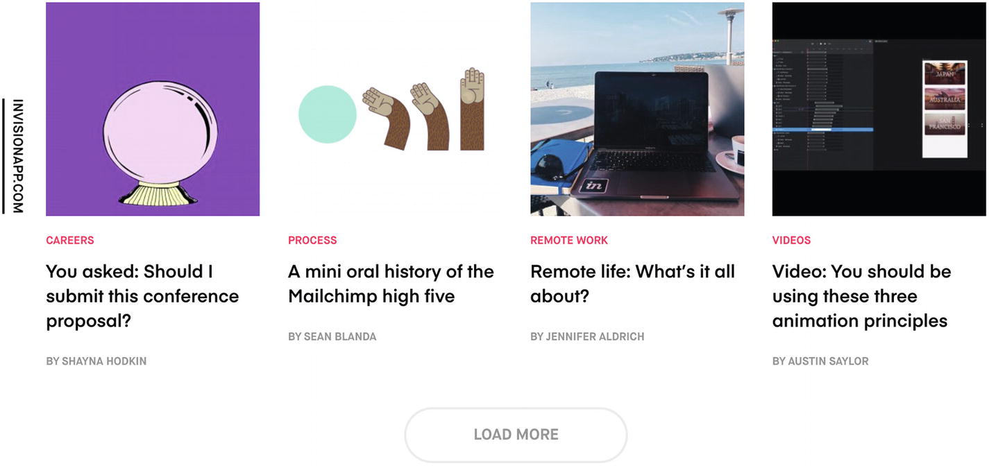
Screenshot of InVision’s load more button, which leaves space for more content to load inline
This distinction is important: it’s almost a pagination “Next” button that lets people access the site footer but sacrifices the ease and non-committal nature of scrolling. Imagine choosing to open another bag of cookies (a conscious decision) vs. continuously snacking from a very large bowl that’s constantly being topped up. There’s a decision point.
Inclusive design
Announce changes in the main content area where new content is loaded to screen readers using ARIA live regions ( https://developer.mozilla.org/en-US/docs/Web/Accessibility/ARIA/ARIA_Live_Regions ).
If you use a loading spinner or skeleton, ensure its content is perceivable by diverse users. You might, for example, announce the loading information to screen readers using the same aria-live method .
Manage content focus for users with keyboards or screen readers. If you offer an explicit button to load more content in your pagination component, you’ll need to move the user’s focus to the new content. You might use JavaScript to focus the first element of the newly loaded content and apply an attribute—tabindex="-1"—to the element if it’s not normally interactive, such as a static text heading.
To learn about implementing design patterns accessibly, check out The A11Y Project ( http://a11yproject.com/ ). For an in depth reference, I refer you to Heydon Pickering’s book, Inclusive Design Patterns.
Infinite scroll vs. pagination
Infinite scroll and pagination patterns both segment large collections of content. In both cases, users want to browse some smaller proportion of the total content available. In contrast, using neither of these patterns would mean loading huge amounts of content on one page (imagine Pinterest loading all its billions of images at once). Infinite scroll might make it feel like all the content is there, even though you know it’s loaded a chunk at a time, while pagination makes it clear you’re viewing just one segment at a time. The context for your design problem will suggest when each solution is a fine or frightful fit. If your user is a teenager casually indulging in photos to pass the time, infinite scroll is likely better. If your user is a nurse scavenging for an answer to a question, pagination may be the superior choice. In assessing these patterns for your case, explore how the user groups and personas, tasks, and constraints build the context.
Infinite scroll and favorites
As we saw in the section on favorites, it’s useful to refer back to favorited items. Twitter’s web site (at time of writing) offers no native ways to search your Twitter favorites and lists liked tweets on an infinite scrolling page. If you want to refer back to an older favorited item, you need to keep rapidly scrolling, nudging the bottom of the page, and waiting for more tweets to load until you find the one you were looking for.
Screenshot of the bottom of Twitter’s infinite scrolling “likes” feed
To avoid this clunky search behavior, you might use pagination instead or consider pairing your infinite scroll with search and filters. We’ll talk more about this in Chapter 6, on mixing and matching patterns.
Pattern: Follow
The follow pattern lets people subscribe to receive a stream of frequently updating content of interest to them, either around a certain topic or from an individual or organization.

Screenshot of Follow Sarah Drasner on Medium
The primary objective is to let people curate their information consumption, only hearing highly tailored, relevant news.
This lets followers consume content at their leisure, like trawling through a Twitter feed on the bus. Following also indicates which content a follower is interested in, so they might only receive updates about a specific person, organization, or topic. A fan might find following your Facebook page easier than checking your blog every day to see what’s new.
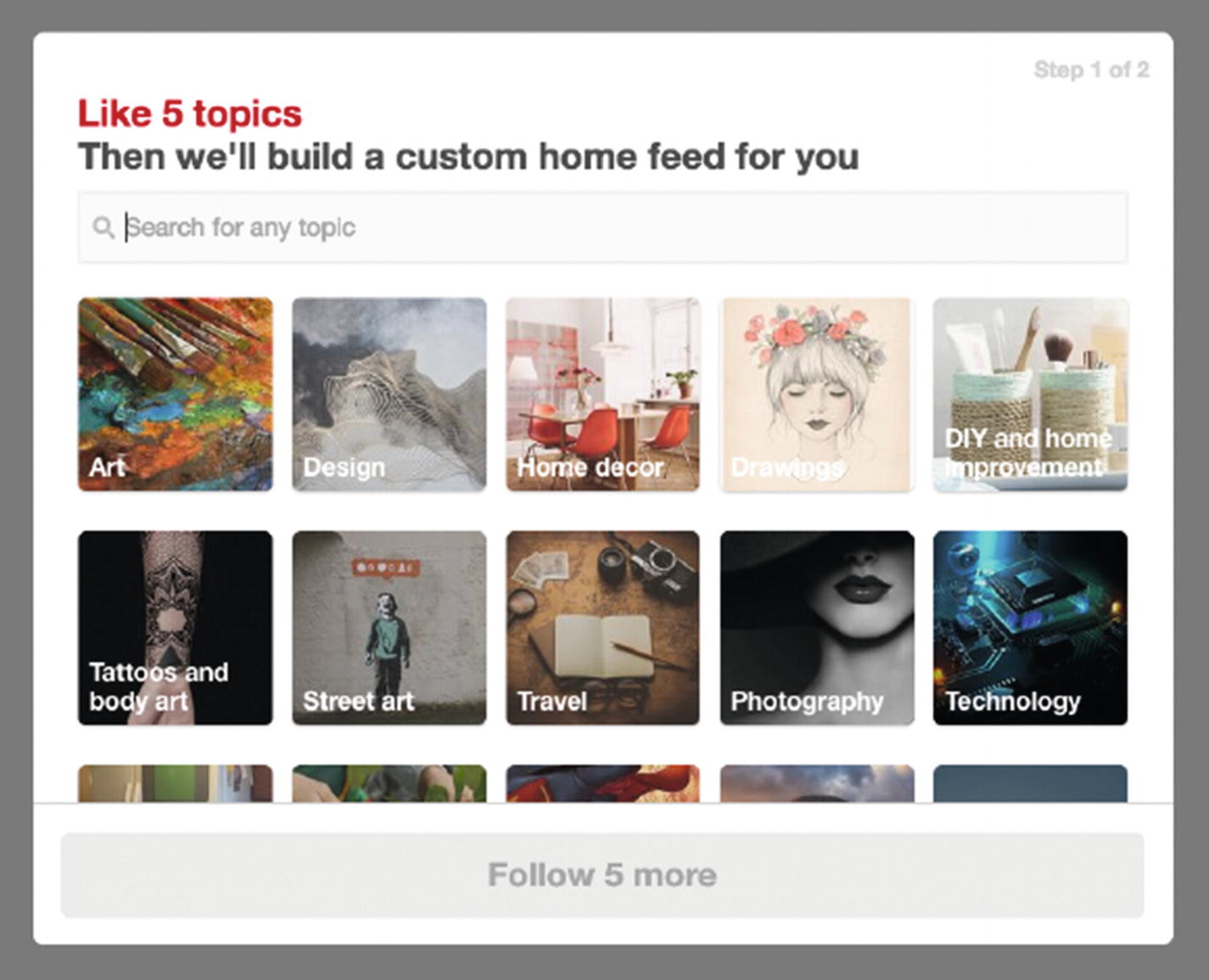
Screenshot of Pinterest asks you about five topics to customize your home feed
As you can see, followed entities can be used to populate activity feeds.
Use the follow pattern to increase engagement when you have evolving on-site content where a particular author or topic may be of interest while vast swathes of other content are not interesting to the follower.
Unlike the friend’s list pattern (ahead), there is no expectation that a followed party will follow someone back.
Pattern: Friend’s list
Similar to the follow pattern, the friend’s list pattern lets users signup to receive updates about other people’s content, as well as connect directly. Both parties must agree to be friends to share content. This helps people connect through their mutual interests.
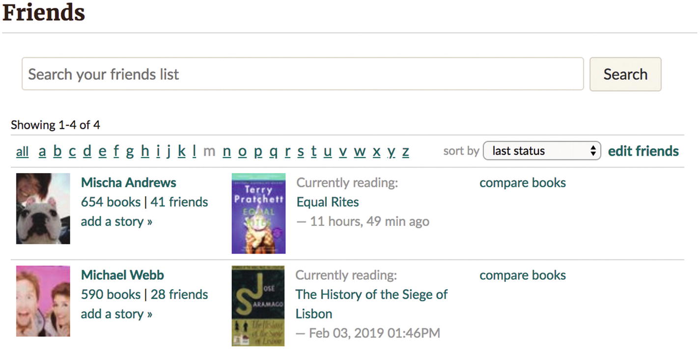
Screenshot of Goodreads friendships, which tell you what your friends are currently reading
It is necessary for each friend to confirm the relationship; therefore, it must be possible for users to find each other (potentially by searching for an address, name, username, or other identifier) and for one party to initiate the connection (usually by “adding a friend”). After connecting, the friend’s list pattern provides greater access to each friend to communicate and share content.
Use this pattern when social interaction between users is critical to the product. If connection between users is incidental to the product, then it might be better to support connections on another platform, such as helping users find each other via following your product on LinkedIn, rather than creating a redundant friend ecosystem.
The context for assessing the suitability of the friend’s list pattern includes consideration for where each party is in the user journey. Social networks often make friend suggestions for you to connect with people when they receive signals that you might have already met, such as sharing mutual acquaintances, attending similar events, and so on.
Friends and followers
As you can see, there is a lot of similarity between the friend’s list and follow patterns. They may also co-exist in a blended way within the one product or platform. For example, Twitter previously let you follow someone with no expectation of them following back, but then let you share direct messages only if you “friend” each other (by both following each other). In contrast, if you connect with a friend on Facebook, you mutually recognize the friendship, but it’s also possible to “unfollow” them to stop seeing their posts but stay friends, letting you both send direct messages and still access posts via your profiles.
We’ll look more at mixing and matching patterns in Chapter 6.
Interaction and motion design
Beyond the foundations of exploring patterns by context, it’s useful to consider the interactivity of patterns. Human–computer interaction has a long history. Fitts’s Law—which states the time to reach a target area is related to the distance and size of the target—has been around since the 1950s. In interaction design, it’s used to optimize interfaces by minimizing travel between targets or activities and increasing the size of targets, such as the clickable area of a link, so that users may perform tasks efficiently.
For some rules of thumb about usability, check out Jakob Nielsen’s 10 Usability Heuristics for User Interface Design ( www.nngroup.com/articles/ten-usability-heuristics/ ). Likewise, for interaction design heuristics, see First Principles of Interaction Design by Bruce “Tog” Tognazzini ( https://asktog.com/atc/principles-of-interaction-design/ ).
Animation on the Web, or motion design as it’s increasingly called, is only now growing into a mature field. Importantly, it can be used to orient and direct attention, improving user satisfaction through superior feedback and by expressing tone, as discussed in Navigating the World of UX Motion Design.
Note
For an approachable and comprehensive lesson in motion design, Val Head’s book Designing Interface Animation shares concrete examples of purposeful design, driven by user needs, built using modern performance and progressive techniques.
For use in evaluating patterns, let’s look at the triggers, action, and feedback of interaction.
Triggers
Every interaction must be initiated by some trigger, such as a button. That is, a trigger uses a visual or social signifier that some action will take place and, when triggered, will start the process.
Effective triggers are recognizable with a clear relationship between what they look like and what they do. For example, when using the favorite pattern, the trigger to favorite an item might be a heart button with the word favorite placed closely together with the item. A high-five emoji with no text might be less clear as a trigger to favoriting some content.
Some interactions have no visible signifiers to signify their existence. For example, when you pinch to zoom in on an image, there’s usually no visible evidence that this interaction is possible. Mostly these triggers are taught socially, and expectations are set through convention (picture galleries on phones can frequently be navigated by swiping). And yet you can hint at available behaviors using subtle signifiers, such as overlaying images with a magnifying glass to suggest zooming is possible.

Screenshot of Vermont Gant’s store locator showing “Use two fingers to move the map” on touch
This lets you both scroll the page—without being “caught” in a map—and pan the map with a different gesture if you want to traverse it.
Triggers can be reinforced with positive results to associate the trigger with good things and, in turn, encourage more interaction with the trigger. With this in mind, consider spending more time on designing triggers that are used with high frequency to ensure they’re satisfying and delightful. Twitter, for example, fill their gray heart icons with red on hover and animate their hearts with sparkles ( https://css-tricks.com/recreating-the-twitter-heart-animation/ ) when tapped so that the trigger itself is considered enjoyable.
Action
The action itself should be close to effortless. There’s no need for a drag and drop interface if there’s only ever one drop target area—a click/tap will do there.
Use well-spaced “steps” to ensure a price slider lands easily on $100 instead of $98.2
Provide keyboard shortcuts
Include “skip forward”/”skip backward” buttons with defined increments
Control scrubbing speed with upward/downward touch or mouse movement
Feedback
For feedback, keep the results of an action as close to the trigger as possible to keep the user’s attention and give them a sense of direct control or manipulation over the object they are interacting with. If the results need to be some distance away, as in the case of search filters, for example, you can use timing and animation to reinforce the relationship. You might provide additional contextual feedback, such as validation feedback or a notification (see Chapter 2).
This feedback is an opportunity to thank and reward the user for their effort. As with the Twitter heart animation example, you can jazz up the trigger itself or you can introduce the results with personality using delightful microcopy or animations that float, jiggle, or fade.
When is a pattern a bad idea?
Patterns are the natural result of successful, proven methods for solving user interface problems. In turn, a pattern is a poor choice when you’re faced with a totally novel problem that’s yet to be solved. While you might lean on the principles we’ve discussed in this chapter to evaluate a new user flow or interface solution, it’s a bad idea to shoehorn old solutions into new problems. We take a deeper look at breaking away from patterns in Chapter 6.
I’d also suggest not trying to use a pattern when you haven’t yet defined the problem! It might be tempting to reach for the comfort of a pattern when faced with the uncertainty of an ill-defined problem. Hold off until you can clearly articulate who your audience is, what their motivations are, and what they’re trying to achieve with your product.
Finally, patterns are useful as named solutions to clarify and communicate about user interfaces. If you find yourself splitting hairs trying to distinguish between very similar patterns, they’re no longer communicating the way patterns are supposed to.
Example: Login form
To expand on our example from Chapter 1, let’s see how we can use what we’ve learned in this chapter to make some changes.
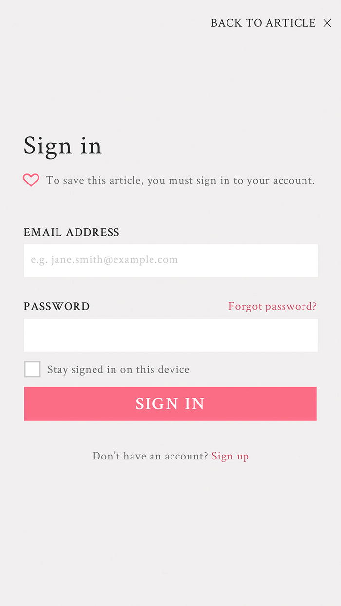
The precise label used is “back to article”
By using a text link to return to the article, we now have a descriptive label for the cross icon. Instead of adding an aria-label for "back to article" on a cross icon, we can use an aria-hidden attribute so the cross isn’t misread to screen readers. If we didn’t use aria-hidden, the full link might read as “back to article times operator.” Note that we’ve also updated the button’s call to action to match the title and avoided the jargon of “submit,” which can sound mechanical.
Using the information architecture principle of front doors—at least half of your visitors will come through a backdoor (or some page other than the homepage)—we can check that our login form makes sense when you’ve arrived from different places. When you’ve come from an article, you’ll see three clues to give you a sense of where you are and what to do next: “Sign in,” “Back to article,” and “To save this article, you must sign in to your account.” If you had clicked directly a “log in” link, we could hide the back link and help text, and the form would still make sense.
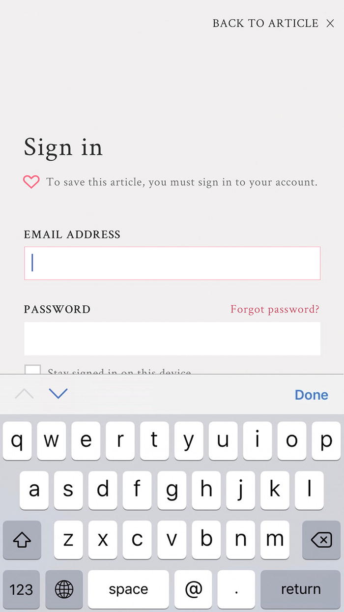
Example of the email keyboard on iOS devices include an easy-to-access at symbol (@) and a full stop (.)

Example of login form with more explicit impact described
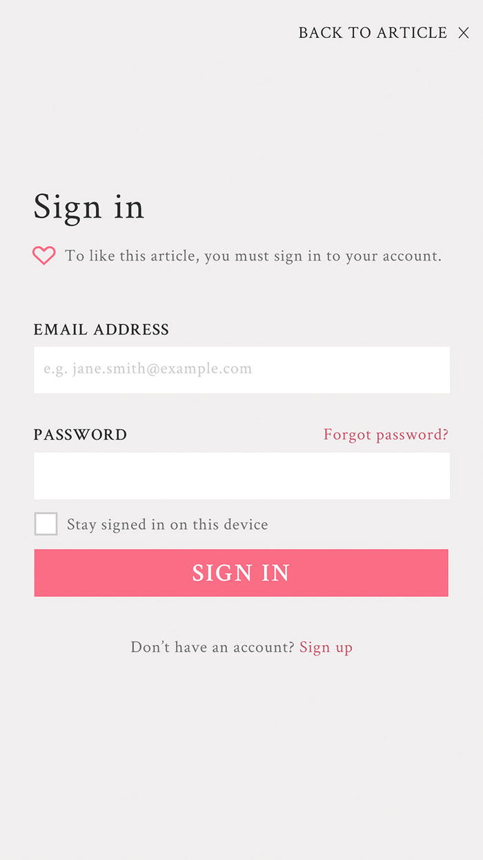
Example of login form with balanced microcopy and minimal aesthetic
Finally, in considering motion design and feedback in interactions, if a user submits the login form with an empty email address, we might jiggle the email input field to draw the user’s attention to it.
We’ve used our analysis of patterns to make a few tiny improvements. Achieving many tiny improvements can lead to big results.
Summary
Autocomplete
Search filters
Infinite scroll
Pagination
Activity feed
Favorites
Follow
Friend’s list
Next, we’ll dive into internal pattern libraries where patterns are tailored to the context of your organization.