
There is a saying that every nice piece of work needs the right person in the right place at the right time.
—Benoit Mandelbrot
In this chapter, we’ll clarify some terms around patterns and design systems, look at growing a design system, and along the way we’ll discuss some decisions you might need to make.
What’s in a name? The devil is in the details
A word of warning: language is a fickle thing and some people will attribute different meaning to one word, some people will use different words to describe one idea, and the meaning of all those words will evolve. This is particularly relevant in a young industry like digital design with rapidly changing technology and norms. We haven’t yet settled on a consistent understanding of patterns and design systems as an industry. Given that, I’ll do my best to paint a picture for you and discuss these ideas in terms of how you can use them, regardless of what you call them.
Pattern libraries
A pattern library is a collection of patterns, used to communicate and improve design decisions. This includes reusable solutions to problems focused around interaction and UX components. In a broad sense, a pattern library is a collection of abstract UI patterns, such as you would find in the pattern collections I mentioned in Chapter 2’s resources, including UI-patterns.com and UIPatterns.io. In these, you’ll find a single pattern might be illustrated with dozens of varied examples of its use in the wild.
Popularly though, you’ll find the term “pattern library” used to describe an internal library within a single organization, which is often more specific—tailored to the one entity’s needs. Here, you would find each pattern has only one main visual representation as it is applied to the organization (where it has a visual representation at all).
Note
In instances where you find more than one visual representation of a pattern in a library, you’ll usually find that the style is the same, and only subtle variations are shown. For example, there might be light and dark themes of the pattern to be used in different parts of the product.
Design systems
A design system is a single source of truth for shared parts and processes, such as components, patterns, and guidelines, to build consistent products. It’s the ecosystem in which the design process occurs and the output of design thinking reaches its intended audience. The term can encompass all of the design, code, and content resources we’ll discuss shortly. Design systems are tailored to organizational needs.
Additionally, design systems reflect the culture, team values, and visual language of an organization. Likewise, they address matters of “scaling” design quality. That is, design systems ensure high standards of design quality are maintained in a large and growing organization instead of falling into chaotic, splintered customizations. In large systems, they may inform design with user research.
That said, sometimes people use the term “design system” to refer to narrower definitions of design guidelines or visual language, which we’ll examine next.
Related design, code, and content resources
As a digital practitioner, you might be familiar with other design and code resources in the world related to patterns: style guides, style manuals, brand manuals, identity guidelines, front-end style guides, templates, and so on. In many cases, they’re complementary ideas that work well together. In other cases, you’ll find these housed together under one name (whether a “pattern library,” a “design system,” or something else). In order to know when and how to use each of these resources, you’ll need to understand the finer differences between them.
Let’s explore what you might use or encounter out in the world.
Editorial style guides
Style guides, style manuals, or tone of voice guidelines focus on the written word to set standards about communication styles to ensure consistency in tone, choice of words, punctuation, grammar, and other language decisions. You may recognize the more famous standards set by Chicago Manual of Style or The Oxford Style Manual. To differentiate style guides from other resources, you might consider them “editorial style guides.” Sometimes, style guides may also include material around content, such as imagery and laying it out.

Screenshot of Monash University’s editorial style guide
If your organization has a lot of text-heavy user-generated content, you may need publicly accessible editorial style guide content. Wikipedia, for example, is written collaboratively by more than 69,000 active contributors, providing a Manual of Style1 and a Simplified Manual of Style2 to help “editors write articles with consistent and precise language, layout, and formatting, making Wikipedia easier and more intuitive for users.”
Meanwhile, if your organization has a lot of text-heavy content created by many internal employees and contractors, such as a knowledge base or help documentation, you may need to provide a privately accessible resource covering how to communicate with your customers or audience.
These considerations may dictate whether or not your editorial style content is part of your design system. Atlassian’s design system ( https://atlassian.design/ ) takes the rare approach of including both public and restricted content including their public Voice and Tone guide,3 linking to their public Language & grammar page4 and their restricted page for “Writing error messages.”
Brand guides
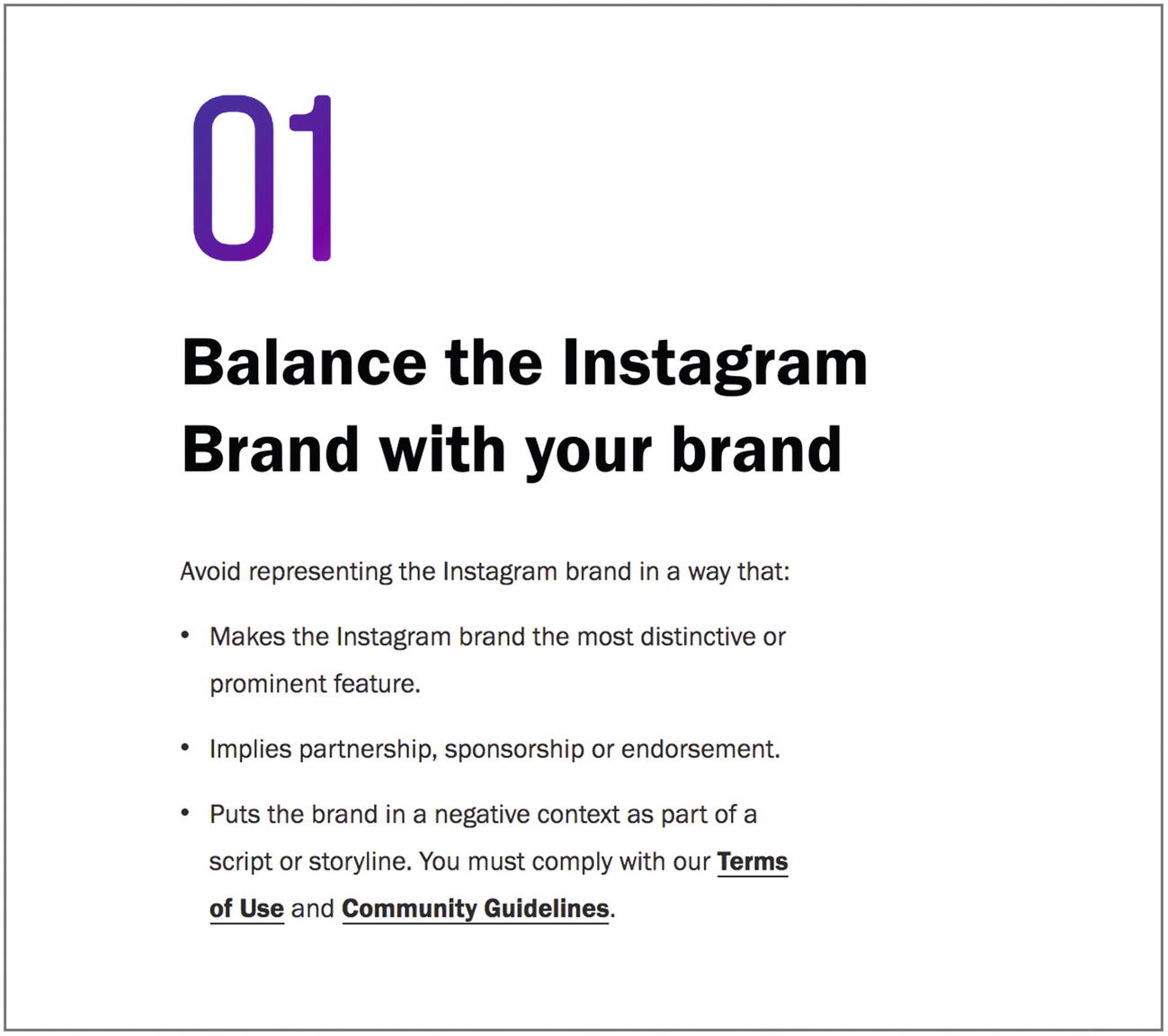
Screenshot of one of Instagram’s brand guidelines
For a business such as Instagram’s, it’s likely that people will want to show off their presence on Instagram in highly visible broadcast media such as film and television. They have a great incentive to help people use their brand assets correctly as well as respect their brand and its contributing members.
Downloadable assets such as logo files in vector formats and high-resolution bitmap formats
Specifications for colors and typography
Usage and attribution guidelines for names, taglines, photography, and icons
How to make requests for permission to use any element of a brand or access to assets
These might also be linked from a “media” or “press” page on your site.
Note
For more examples of brand assets and guides, check out Find Guidelines ( http://findguidelin.es/ ).
Design guidelines and visual language
Design guidelines describing visual language as distinct from brand or visual style guides usually address conceptual topics. Material Design, for example, defines a consistent metaphor to use throughout designs in the Material Design style.
Material Design is inspired by the physical world and its textures, including how they reflect light and cast shadows. Material surfaces reimagine the mediums of paper and ink.
—Material Design’s Principles ( https://material.io/design/introduction/#principles )

Screenshot of the goals of Material Design
Note
To learn more about the material metaphor, watch Google’s design video about Making Material Design ( https://design.google.com/videos/making-material-design/ ).
Dan Mall asserts in Researching Design Systems ( http://v3.danielmall.com/articles/researching-design-systems/ ) that design systems should have guidelines for perspective, point of view, and extending creative direction. What’s different about your organization? “Otherwise, we all might as well use Material Design and call it a day.”
On a similar note, Matthew Ström wrote What makes a good design principle? ( https://matthewstrom.com/writing/principles.html ) about thinking about design principles at The Wall Street Journal. He describes a shortcut that is one of my favorites for using with teams: format design principles as “Even Over” statements, such as “Accessibility even over aesthetics.” This is a great method for establishing meaningfully polarizing design principles that sets your organization apart from others as well as highlighting differences in what each designer in your organization values.
Style guides relating to code
Each of the following are extremely similar and tightly coupled forms of design resources touching code, but each is worth mentioning and some distinction can be useful.
Front-end style guides
Front-end style guides are kind of like patterns in action for an organization, shipped with code snippets, design assets, and anything else necessary to actually complete day-to-day design and development tasks affecting the front-end of product.

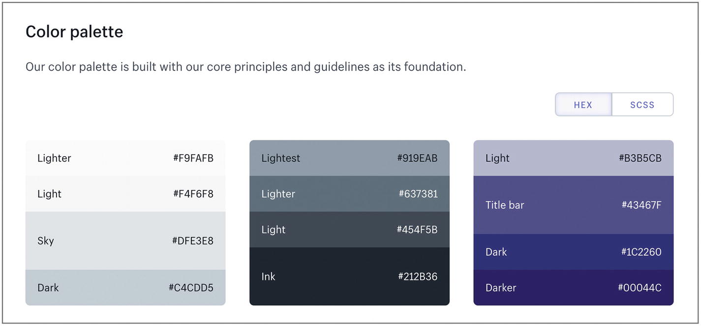
Screenshot of Lightning Design System Design Tokens
The design tokens for “Text Color” in the Lightning Design System include several examples of describing and showing colors, useful to day-to-day decision-making for designers and developers.
In her book, Front-End Style Guides ( www.maban.co.uk/projects/front-end-style-guides/ ), Anna Debenham describes a front-end style guide’s purpose: “to make building and maintaining a website easier.” Her book has a strong focus on development tools and processes to maintain a web site that adheres to intended styles. In her view, a front-end style guide is written in the same markup and uses the same CSS that is used on the “real” web site, and “grows organically with a site throughout its lifetime, acting as a reference and preventing duplication of code and design patterns.” These are useful distinctions from other resources and suggest a consideration for any design system: does the design system site need to be built using the same foundations as the product?
Note
The pioneers of UX, Nielsen Norman Group, propose 25 common UI components you’ll likely find in a front-end style guide ( www.nngroup.com/articles/front-end-style-guides/ ).
Living style guides
Living style guides refer to guides that are in sync with the production environment; change an element in a living style guide and it will change in production across your entire web site (or other digital products). They’re designed to give you space to share your design thinking about elements like typography decisions, but also keep guidelines in line with its actual execution. This avoids teams updating branding guidelines but having the development re-brand work to meet the new guideline falling behind.
In many living style guides, the style guide is built straight from the style source code.5 This can mean that the style guidelines are led by developers. In some cases, that may be prohibitive to designers and other parties wishing to contribute that are not working in the code base. That friction has potential to limit the growth of an organization’s design maturity.6 In other cases, however, that approach may be fine because design is “well integrated in the product development process,” indicating reasonable design maturity. Potentially, some designers and contributors may be comfortable working with markup and styles in code, so this approach could even help with collaboration in some organizations. This is a useful consideration for establishing processes in a design system.
Note
You may use UI development environments, such as Storybook ( https://storybook.js.org/ ), to build components separately from production code bases so that front-end development can move ahead of back-end development. Combined with a living style guide as in React styleguidist ( https://react-styleguidist.js.org/ ), this becomes a powerful workflow.
Code style guides
Code style guides or code standards often focus on the code formatting and naming conventions of a software engineering team, such as whether they use tabs or spaces to indent code and how they name methods. One example is the formalized standard “PSR-2” for PHP.7
Code style guides are often quite divorced from design matters. As such, they’re often stored separately from design-oriented style guides and design system resources, housed in a code base README page or a code repository’s wiki. Typically, only developers have access to these.
There might, however, be some crossover. For example, imagine if the brand guide proposes a color of #fe6481 that is referred to as the brand’s “primary brand color,” and yet the code style guide specifies a named Sass variable, $brink-pink: #fe6481; as per Name that Color.8 This discrepancy may lead to mis-communications when designers and developers are talking to each other about colors.
Google Style Guides,9 for example, specify their conventions for writing code. Their HTML and CSS guide10 specifies that CSS class names should not be “presentational” like .button-green, but they can be specific like .video. Meanwhile, Google’s Material Design design guidelines include presentational components like “cards” and “dividers.” This difference in attitude might not cause any issues if they’re used in different environments by different people, though there’s a chance they could cause conflict. One area it could produce an issue is when striving for matching names between design components and code components to improve communication and being limited by conflicting guidance on naming conventions.
You might consider sharing access to these resources, linking them to each other, or potentially storing them together in the one design system.
Component libraries
Component libraries, UI libraries, or code libraries provide front-end code for UI components (a.k.a. widgets, modules, chunks, blocks). Internally, you might use a component library as a shared collection of UI snippets implementing patterns that anyone in the organization can contribute to building. Check out the U.S. Web Design System’s open-source UI component library ( https://designsystem.digital.gov/components/ ). Unlike UI frameworks such as Bootstrap, component libraries are tailored to specific purposes, like an internal brand.
An internal component library comes with many of the same challenges that open-source projects do, including matters of versioning and deployment. They also come with product marketing and management challenges, such as roadmap planning, release planning, adoption challenges, and product announcement communication challenges.11
Note
There is an interesting relationship between component libraries and developing design patterns. Pure UI ( https://rauchg.com/2015/pure-ui ) lets you edit the width and height of a tooltip on the page and watch the tooltip adapt to the new sizes in real time, as illustrated in Figure 4-5.
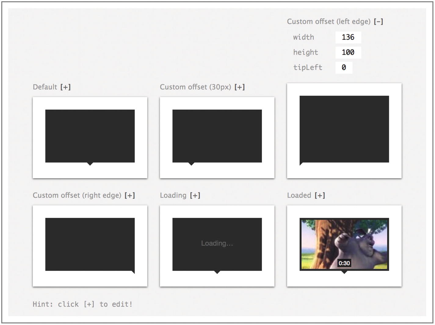
Screenshot of Pure UI with live editable components
By putting real data (such as desired width and height values) in a component library preview, you might start to see the limitations of a component for the problem you’re trying to solve. For example, if you want to display a lot of copy and imagery inside the tooltip pictured, that could suggest that you don’t really want a tooltip—which typically contains optional, supplementary information—and what you really want is a thumbnail. If the available components don’t support the behavior you need, you might be prompted to consider the patterns behind them and what different patterns and new components would fulfill your need.
Templates and Content Management Systems (CMSs)
Templates and CMSs help content contributors that write copy, produce imagery, and so on independently produce content without needing extensive design knowledge or technical expertise. A template is a kind of boilerplate, a bunch of preset layouts, elements, configurations that let you duplicate an existing solution and swap out specific copy and media for new instances of the template. CMSs let you create, view, edit, or delete content in a system using a predictable, repeatable system process, where each article can use a template.
To use templates effectively, your contributors might use guidance in your design system to suggest which patterns they need to use for the kind of content they’re working with.
Note
Products like Asana provide customers with templates ( https://asana.com/templates ) within their sites and products as “good defaults” (like we saw in Chapter 2) to help them get the most out of the product without learning good patterns of behavior and interaction from scratch by trial and error. Instead, these customers can lean on the expertise of Asana and others that have worked with countless organizations to discover best practices.
Building design systems using patterns
So we have a better idea now of the finer differences between different design, code, and content resources and how they’re used. Given that, what might motivate you to build a design system? How could you use a design system and what would you need to include?
Design systems aim to help teams communicate and improve design processes. Specifically, they help to document, share, and spark conversations around design decisions as well as to streamline workflows that maximize consistency and save time. These objectives in turn mean that for many smaller organizations that do not have rapidly changing products, a complete design system with encoded patterns is often unnecessary. A 10-minute conversation in a small team to review a new design element can provide clarity and share approaches faster than a designer can write down all the thinking around it, let alone everyone finding time to reading about it. With this in mind, let’s consider the factors affecting the appropriateness of a design system with patterns and components for a team or organization.
When to use a design system
There are so many people involved that conversations are inefficient or impossible
There are other challenges to fluid conversations like teams working across time zones, parents leaving early to pick up kids, part-time employees, or limited times allocated to the project
Handing over to another team, such as an agency building an inspirational pattern library for an in-house team
Onboarding new employees quickly, so they can understand what’s available, what decisions have been made in the past, and what the organization values
You have many content contributors writing copy, developing images, editing videos, and curating content from diverse teams
You have the time, skills, and resources to build a design system
Names for UI patterns are undecided and causing confusion
You want to have a single source of truth to ensure consistent design
If you decide that a few of the preceding factors apply to you and you want to build a design system, where do you start? Let’s have a look.
Framing
Framing a design system can be useful to let people know how to engage with it; consider the context, audience, and purpose of the design system.
Context
You might need to establish whether your design system guidelines take a practical stance or an inspirational stance. A practical system prioritizes speed and functionality. You would use it as lightweight documentation, covering the bare minimum to jot decisions down, share code snippets, and reuse components. An inspirational system motivates team members to create beautiful products, surfacing brand values, and encouraging cohesion in the user experience, even at the expense of efficient and consistent development.12
Audience
Consider who will use your design system, including designers, developers, writers, third-party plug-in creators, teams from other companies within your company group, other agencies, and other government organizations. For example, Salesforce’s Lightning Design System supports not only their internal contributors but anyone working on a custom application using the Salesforce platform,13 which has far greater reach than their internal teams. Similarly, the U.S. Web Design System provides patterns and design principles for all government organizations across the United States.
Beyond the size and shape of teams using your design system, you’ll need to think about their skills, tools, environments, and what tasks they might need to perform. For example, the Salesforce folk use rapid prototyping in the browser ( https://github.com/salesforce-ux/design-system-starter-kit ) to iterate quickly and test UI ideas. They describe this as being necessary to scaling their design process ( https://medium.com/salesforce-ux/the-salesforce-team-model-for-scaling-a-design-system-d89c2a2d404b ). On the other hand, the design team at Airbnb demand synced Sketch assets and React components ( https://airbnb.design/painting-with-code/ ) and thus have an elaborate design system to handle this. One key aspect of their design system is Airbnb’s React Sketch.app ( http://airbnb.io/react-sketchapp/ ) that uses a shared system to keep React (code) and Sketch (design) assets perfectly in sync.
Purpose
While there may be many benefits to using a design system, establishing the primary purpose will give clarity to how to design your design system. Efficiency and speed in design and development might focus on sharing vocabulary and integrating design and development processes. Consistency may mean facilitating reuse above all else.
Once you have this information in mind, it’s time to gather buy in and spark interest in the design system. Most people can get behind a movement to improve the quality of a product, but committing time and resources to it can be another story. Framing the vision of the design system, what it will achieve, how it will be used, and how it will be developed can build awareness among affected parties, desire to contribute and engage with it, and knowledge of how to proceed. It can be useful to build a sense of urgency about the drivers for a design system (“if we don’t do something now, at this rate our CSS will increase 10X by end of year, and page performance will suffer, losing a fifth of our customers for every second of lag introduced”).
In order for people to grow the ability needed to use the design system well, you’ll need to examine the workflow.
Workflows and design processes
Writing design specifications for a new feature to be developed. You can include the pattern to be used, linking to an existing reference and saving time.
During design reviews. To settle a debate about the use of a particular pattern, you might refer to documented design decisions in the system.
Prototyping or mocking up using existing design and code assets for patterns or components.
- Code testing.
Visual regression testing14 ensures code changes don’t affect designs over time. Learn more about testing with style guides ( https://tinnedfruit.com/articles/are-you-writing-legacy-css-code.html ).
Performance testing by measuring the size of style and script assets in your style guide as a proxy for site performance means you don’t need to track your whole site.
For more details, check out Jim Newbery’s comprehensive guide to pattern library testing ( https://tinnedfruit.com/articles/why-and-how-to-test-your-pattern-library.html ).
For onboarding new employees, a design system might be an interesting insight into what the brand values and how processes work, so include your design system in onboarding documentation.
During a design share where different designers in a team respectively showcase and discuss their new design work with the team. If you’re running regular design shares, integrating a design system will slide into the process seamlessly. Any newly designed components that haven’t existed before can be added to a “new” section of the design system. If it’s never used more than twice, it’s not really a “recurring solution,” so it may not be worth documenting thoroughly or refining. When a new component is used a few times or several similar components are created, they can undergo more thorough design and code reviews to refine a single component for reuse. Note that regular design shares can also identify inconsistencies if a “new” component is added where an existing one should have been reused. Read more about developing a process for making changes to patterns in Brad Frost’s book Atomic Design ( http://atomicdesign.bradfrost.com/chapter-5/#making-changes-to-patterns ).
Hand over. For example, design a mockup first and provide a .sketch file and a.png preview inside the design system but provide no code samples. Then a developer can build it out there in the library before using it in the product.
As we continue, we’ll explore further how to optimize your design system for each of the preceding different touch points.
For some people, the word “processes” sends shivers up their spine, associating it with unwanted changes and burdensome overhead. This is what you want to avoid when integrating a design system into a team making products.
Pattern previews

Screenshot of Culture Amp’s primary button
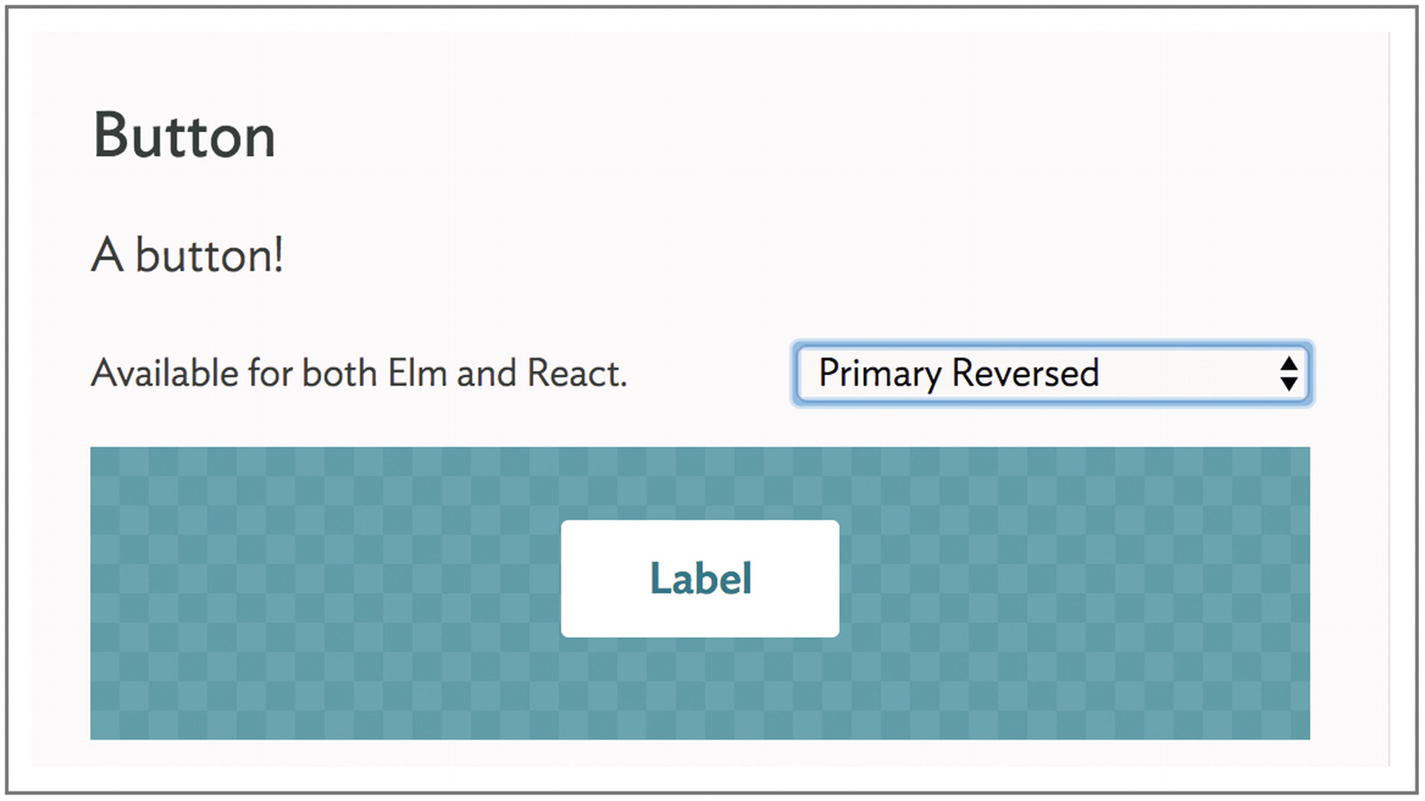
Screenshot of Culture Amp’s primary reversed button on a solid background
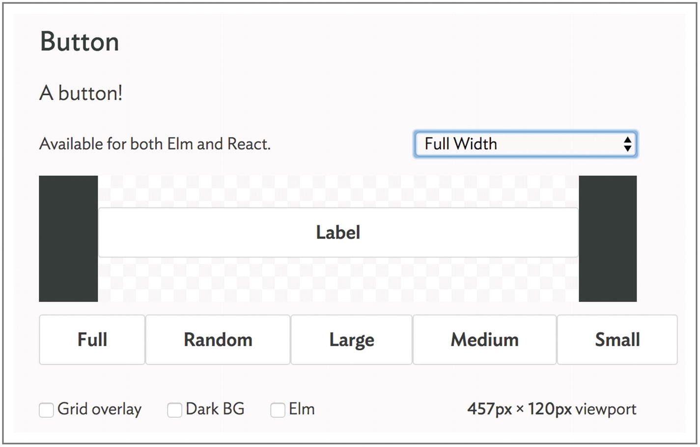
Screenshot of Culture Amp’s full-width button on a small screen
This is particularly valuable when presenting components that concern layout such as nav bars, so keep an eye out.
Interactive previews
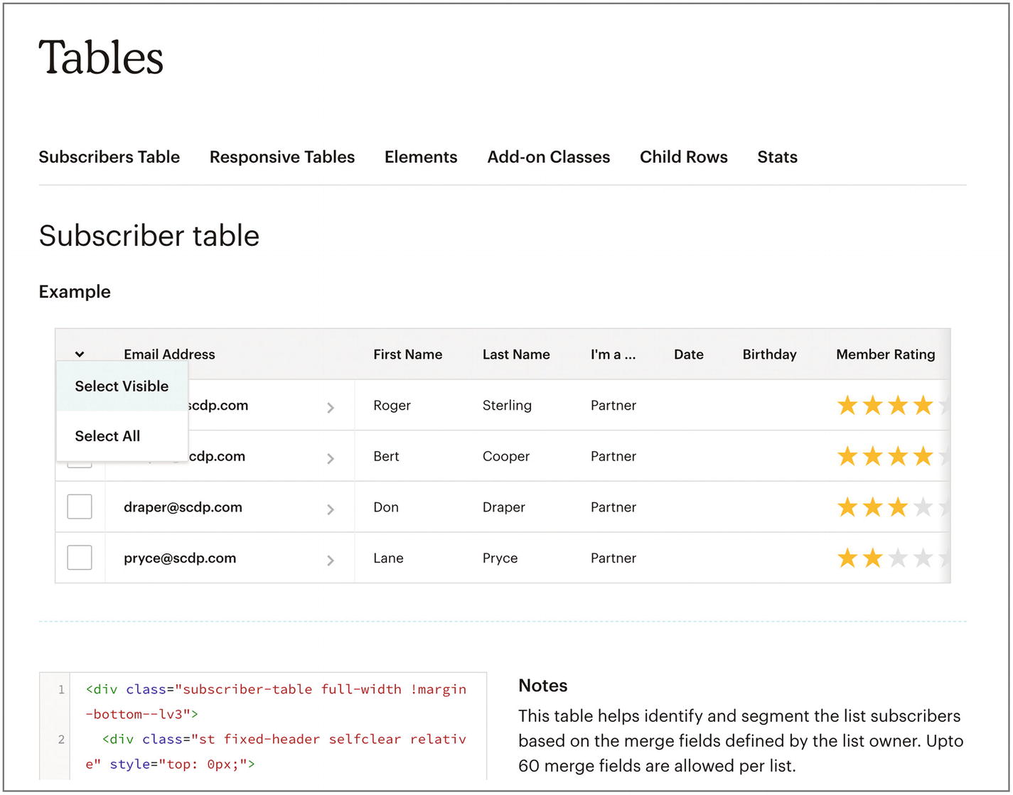
Screenshot of MailChimp’s Interactive Table Pattern
In MailChimp’s pattern library ( https://ux.mailchimp.com/patterns ), you can interact with the patterns, so a dropdown in a table will actually drop down when you click it.
This approach provides the highest level of fidelity in illustrating how a pattern operates. This needs work from developers (unlike a static image), which means building the library is more than a tweak to an existing workflow without a design system, but an actual piece of work. This may or may not be feasible within your constraints, so it’s something to bear in mind.
This approach is excellent for practical pattern libraries. It allows you to perform rapid prototyping in the browser. It also means you can more deeply understand the states and behavior of the element, such as seeing and feeling how hover styles appear and elements move when you interact.
Note
You might be familiar with prototyping using different levels of fidelity from a lo-fi sketch to a hi-fi interactive prototype to simulate real behavior. The main trade-offs are the speed you gain producing lo-fi prototypes vs. the realism you achieve with hi-fi prototypes. Each realistic detail removed from a prototype introduces a risk that it’s an inaccurate test. Realism in your design system carries similar trade-offs where you may not convey as much information in a static image as you could with motion and interaction.
One challenge to this approach is writing enough code to make it genuinely interactive without having real data to fill a component or destinations for links. For example, if you wanted to present a notification component containing an image and realistic text with a link, you would need to really upload an image and create a working link to somewhere. You may need to write extra code to handle when a component that needs data, such as a data table component, doesn’t have it (because it’s presented in the design system) as well as when it does (in actual product usage). Similarly, if a form component normally submits data when you click the submit button, not having that data might blow up in your design system preview unless you take special care to handle that. You may also need to use dummy data, which can cause confusion about what’s a part of the pattern and what’s a part of the demo.
A shortcut to achieving interactive previews might be to link to code demos on the Internet, such as a Codepen for morphing buttons ( https://codepen.io/angeliastefani/pen/WOozVx ), if you cannot include your own interactive patterns.
Live markup and styling
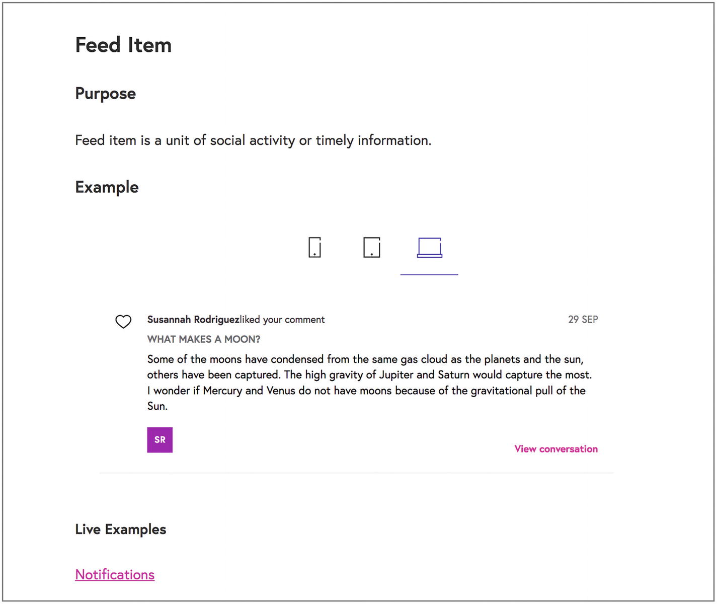
Screenshot of FutureLearn’s feed item preview and link to live examples
If you follow the live examples link, however, it will take you to an instance of the component in use within the app.
Feed item is a unit of social activity or timely information.
It contains a distinguishing element (an avatar or an icon), heading, and content. Optionally it can include a secondary heading, metadata, and user actions.
In addition to a single example, they describe modifiers—compact, indented, alt, and bordered. As you can see, this is a little more precise than our abstract activity feed, giving you detail about using it with visual content such as avatars or icons. Seeing how individuals and organizations execute patterns can give you fascinating insights into their flexibility and limitations, such as how a distinguishing avatar can make each feed item more interesting and valuable.
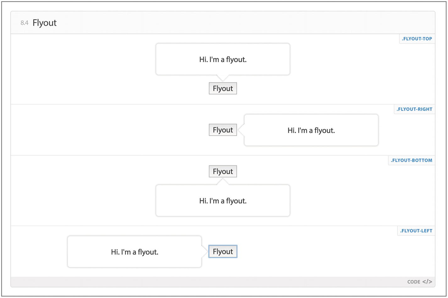
Screenshot of Walmart’s Flyout pattern
This approach lets you see all variations of a pattern side by side. If you make any style changes, you’ll see how it affects each version. The downside is that it might introduce some ambiguity. Can a flyout be trigged by hover alone or must you tap the toggle button?
Static images, animations, and videos
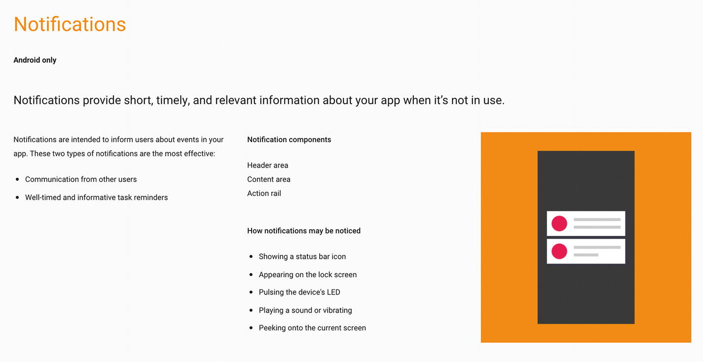
To create a preview or demo, one option is that you show an image of it without any real code behind it. Material Design’s notification ( https://material.io/design/platform-guidance/android-notifications.html#anatomy-of-a-notification ), for example, provides a static image using example apps and videos for animated elements.

Screenshot of Material Design’s notification static example image

Screenshot of Material Design’s notification video
Screenshot of Material Design’s abstract notification visual
Using static images and pre-recorded videos for previews means that you need not write any code and more people may be able to easily update your design system without spending time coding.
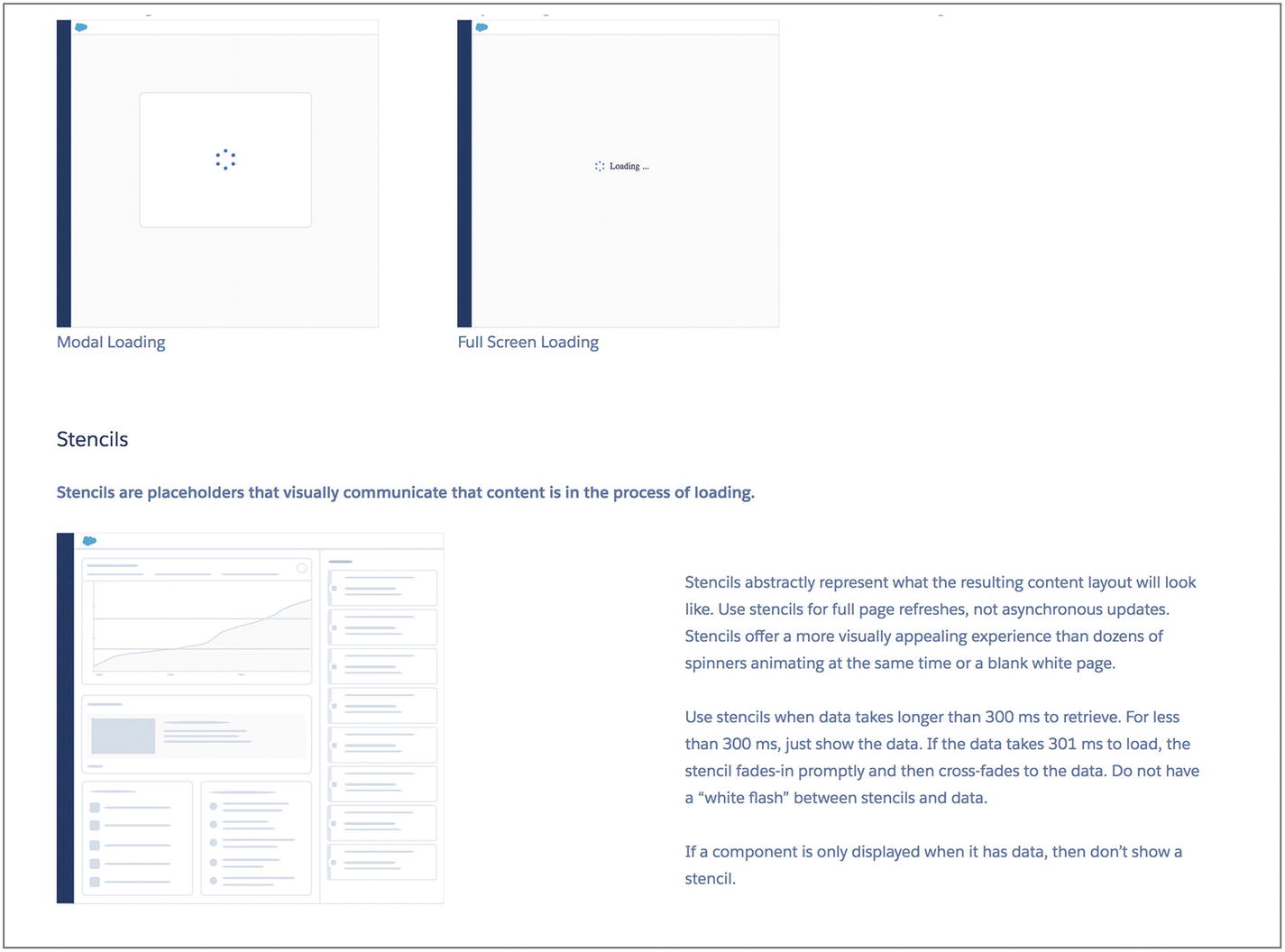
Screenshot of Lightning’s loading spinners and stencils
If they had presented a real stencil to preview the pattern, you’d only have a split second or so to see it before it loaded the full data, which limits the illustrative ability of it. Similarly, imagine chasing down an infinite scrolling page just to see the loading spinner.
This approach is excellent for inspirational pattern libraries.
The trade-off, however, is that more time may be spent on content creation whenever the tiniest detail changes and the preview assets need to be updated.
Code assets
For a practical pattern library to help teams achieve their product goals, you can provide direct access to the code needed to use patterns right next to them. To truly tailor these helpers to the team that will use the patterns, however, you’ll need to consider the tasks they might be doing. This next section includes more code than the rest of the book. If that’s not your cup of tea, feel free to skip over it.
Prototyping in the browser
You could mock up an icon button, but you’d be unable to produce a tooltip on hover. If the design system also included $('[data-toggle="tooltip"]').tooltip(), you could initialize the tooltip in your prototype and have it behave like a normal one.
Writing code
Converting design elements to code
In addition to patterns, design systems will often extend the elements of living style guides and brand guidelines that help makers build products efficiently. Icons, colors, typography, logos, and fonts, for example, will be included in a manner that helps developers use them in their workflows, even though they’re visual elements rather than patterns per se.
- Icons:
Names to reference them in code, such as an icon-heart produce a heart icon from an icon image sprite.17
Accessibility usage, such as adding aria-label="" to describe unlabeled icon buttons and when to use aria-hidden="true" to hide icons from screen readers where a label would provide redundant information on a labeled icon button. Alternatively, you might add a <title> element to an SVG icon to describe the visual content.
Utilities for sizing, coloring, etc., such as .icon .icon-small .icon-brand-red .icon-heart to indicate a small, red heart icon.
Sprite preparation, such as a script to run to collate existing and new icons into a single sprite image for serving quickly to users’ browsers.
- Colors:
Brand colors in different formats, such as hex values (#ff0000) or rgba(255, 0, 0, 0.8).
Sass variables and functions, for example, $state-danger-bg: lighten($brand-danger, 25%);.
Appropriate text colors on different background colors that are legible and aesthetically pleasing, meeting accessibility needs such as contrast requirements.
Logos:
How to reference SVG logo images, for example, <svg class="logo"><use xlink:href="path/to/logo.svg#lockup"></use></svg> or in React <Logo />.20Class names to indicate which color and arrangement of the logo to use, for example, <svg class="logo logo-reverse logo-stacked"> ... </svg> for a stacked, reversed logo on a solid fill background.
- Fonts:
Font stacks including the main brand font as well as fall back fonts, for example, font-family: 'Crimson Text', 'Lora', serif;
Design assets
Screenshot of Shopify’s Polaris Hex colors
Screenshot of Shopify’s Polaris SCSS colors
You’ll also likely need other standard information (often found in branding guidelines) like display and body font faces, and swatch files for design applications, such as Adobe Swatch Exchange files (.ase) for Illustrator and other Adobe products.
This is also a handy place to link directly to other design asset files like icon SVGs and UI source files like .sketch or .psd files or wireframing and prototyping assets like Axure or Omnigraffle files. That said, it’s also a great place for design assets that do not require design specific tools and licenses for folk other than designers in the organization, like public relations professionals. You might include high-resolution exported images and slide deck templates.
For an example of design assets in design systems, check out U.S. Web Design System’s designer resources ( https://designsystem.digital.gov/documentation/designers/ ) or Shopify’s Polaris UI Kit and other resources ( https://polaris.shopify.com/resources/resources ).
Writing and content
As your patterns and components will undoubtedly include text, the library is a good place to link to or include editorial style resources, especially as they pertain to digital products. For example, a traditional editorial style guide may not mention whether to use “Title Case” or “Sentence case” on buttons or how to localize interfaces into different languages.
When developing your internal library patterns, your copywriter can write good defaults into all the components like a clear and helpful validation feedback messages in your form components to streamline good copy practices and ensure interface microcopy is not missed.
For an example of this, check out Shopify’s Polaris Content Grammar and Mechanics section ( https://polaris.shopify.com/content/grammar-and-mechanics#basics ).
Documenting patterns or components
In practice, rather than creating pattern libraries and documenting patterns from scratch, individual organizations create design systems that encode patterns with a specific visual design language in component libraries with documentation. Sometimes they link to tools and resources that speak to the broader pattern but rarely do they describe an abstract pattern; they describe a specific execution of a pattern in their specific domain.
Nathan Curtis suggests that “Our Community, not Companies, Should Build Pattern Libraries.”21 He also suggests that most organizations would only need to craft their own patterns (rather than components) for “the most essential patterns unique to their customer experience,” such as “A bank’s pattern to move money from one account to another.” In many cases, the product’s unique value proposition can be encapsulated by this one, most essential pattern.
When it comes to creating and documenting new patterns in your design system, I suggest focusing your efforts on that one most essential pattern to your business, or the patterns that cause the most contention in your organization. Popular areas for arguments among digital practitioners outside the scope of their unique business include: when to use a link or a button,22 when to use target=“blank”23 to force a link to open in a new tab, and what cursor for a button or link.24
For more information on documenting UI patterns in your design system, Nathan Curtis again provides us with an excellent series on Documenting Components ( https://medium.com/eightshapes-llc/documenting-components-9fe59b80c015 ).
Extra design system features
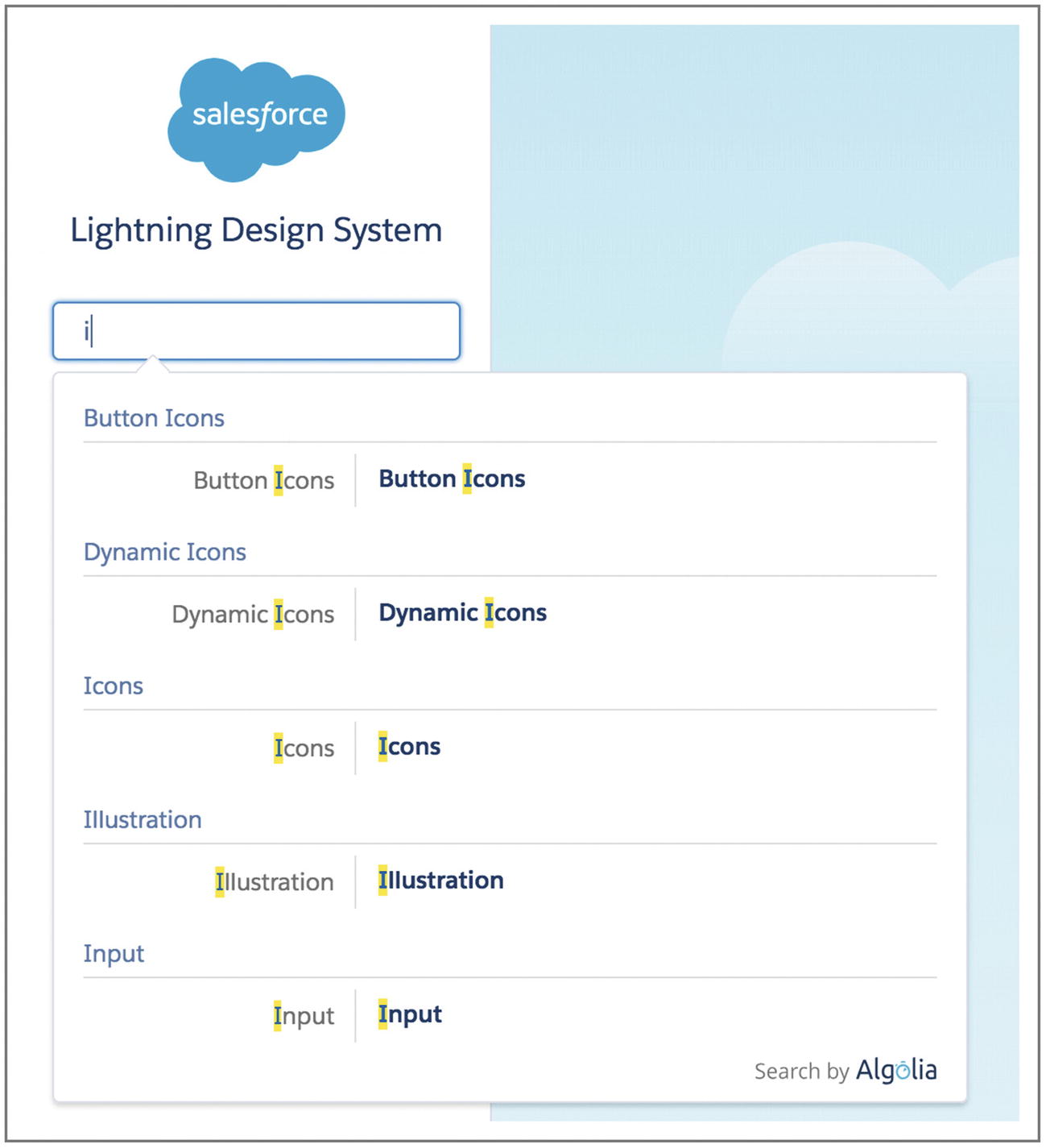
Screenshot of Lightning Design System’s autocomplete search

Screenshot of Walmart’s Chapter Paginator pattern
Using this method, you can include links directly in project management tools for describing upcoming feature specifications or to share in discussions over email or instant messaging. This is especially useful for distributed and remote teams.
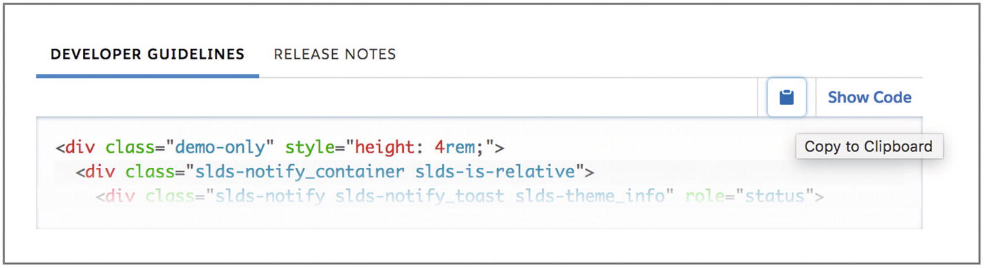
Screenshot of Lightning Design System developer guidelines including a copy to clipboard button
Growing a design system
Kick off
How do you kick off a new design system? One method is to use Nathan Curtis’s design system worksheet approach.25 This uses a workshop approach to collaboratively tackling the problem of which parts of a design system to solve (including whether a design system is even a priority), all of the products or digital “properties” (such as a web site, web app, social media presence) to consider, and the people needed to make it all happen—the individual contributors, influential leads, and distant leaders like directors. This approach builds consensus while actually solving the issues of how to build a design resource.
Alternatively, to instigate conversations, you might start with the compelling interface inventory26 to screenshot and collect all the different, inconsistent interface elements actually in use in your products. This identifies patterns already in use and the scope of the work ahead, but may also be used to highlight the severity of inconsistencies in your products. If your priority is in improving consistency, this is a useful starting point.
Which patterns exist that are successfully solving problems. This is the basis of your design system.
Which components are almost solving a problem that could be addressed with a standard pattern.
Where there’s wild variation in behavior and usage of components.
What’s actively having a negative impact. We’ll look at anti-patterns in Chapter 5.
Where there are special snowflakes that are never reused. Sometimes these represent unique, delightful, or signature experiences. Other times they highlight unnecessary customizations that could be removed.
Use these to discuss your product’s UI patterns with your team and start naming them.
Assembly
A wiki: While it might lack requisite tech details, anyone can write to it.
A Dropbox folder: It might lack versioning, but could be easily accessed and easily include a mix of design and development assets like Photoshop or Sketch source files and exports as well as code specifications.
A code repository: This might ensure versions are controlled, but be inaccessible to folk that don’t know how to read or write code. This could be augmented with a social coding interface like GitHub, where anyone can leave comments, raise issues, and attach files.
An internal web site with commenting features: Tech folk may directly build the site itself, while non-tech folk can write info about the patterns on the site.
Versioning
The designs, code, and underlying UI patterns will change over time. It’s not always possible to roll out every relevant change at the same time, such as moving a web site from one front-end framework to another, more powerful framework. As such, your design system might have multiple versions: one using the old framework for most patterns and one using the new framework for enhanced interactions. Like any software package, you could use semantic versioning ( https://semver.org/ ) to denote patches, minor changes, and major breaking changes in your design system.
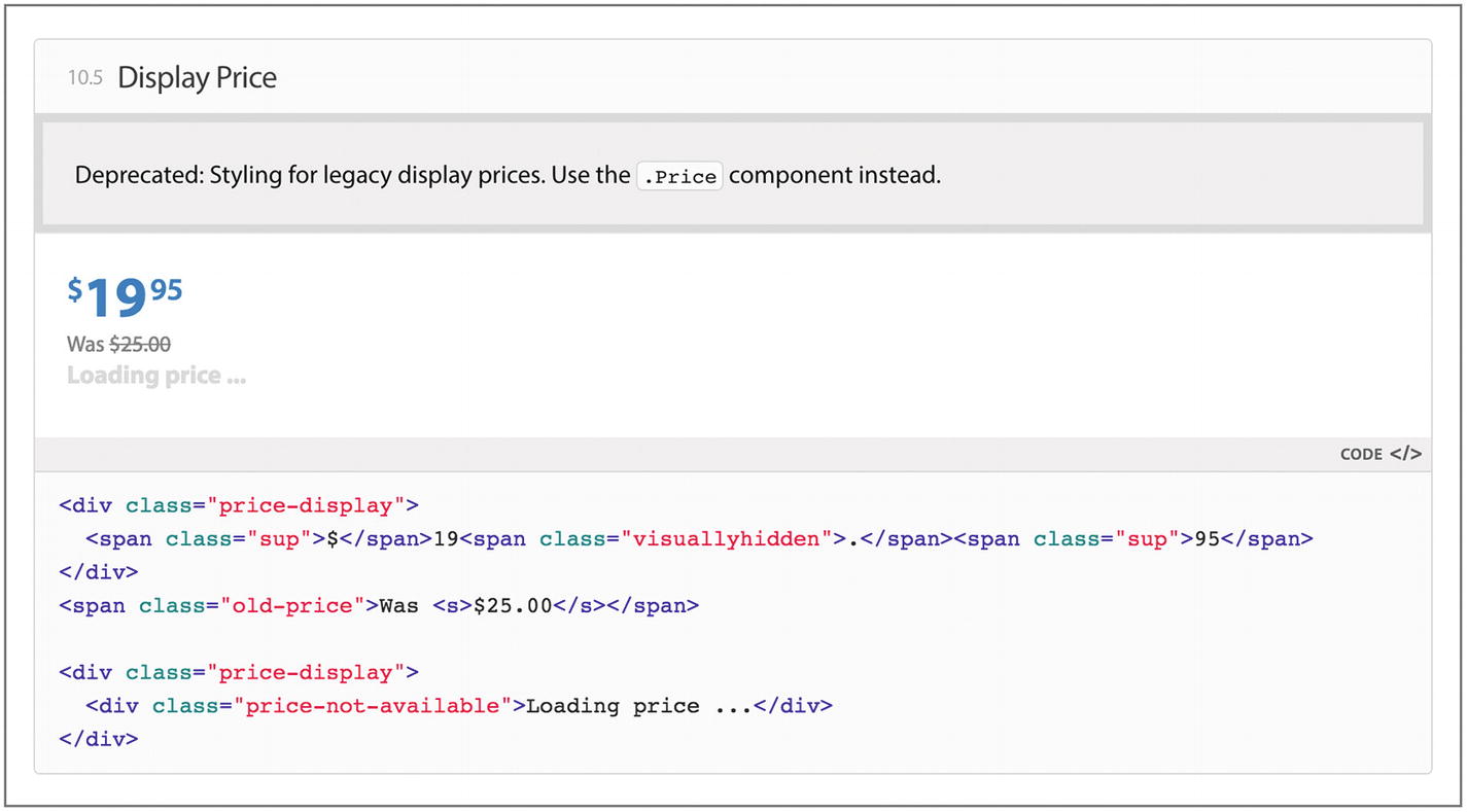
Screenshot of Walmart’s Display Price component with deprecation warning
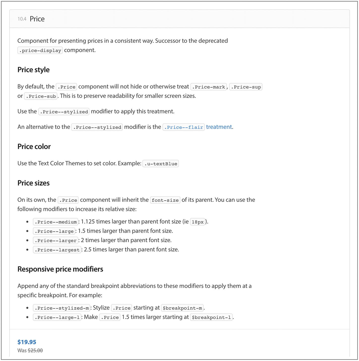
Screenshot of Walmart’s Price component with far more detail and variations
You’ll notice with UI frameworks such as Bootstrap that you can still use and find documentation for older versions.27 The more people using your library, the more care you’ll need to take supporting the constraints they’re working with that might limit them from keeping up with you.
Serving assets
If you’ve created a public-facing design system as part of product web site, be sure to avoid delivering unnecessary code to their browsers. For example, only serve the extra code needed to present the library to people visiting that library page instead of shipping it with the rest of your style and script assets for regular site visitors using the product. For the most part, if you’re using neatly encapsulated components, you won’t require much additional code. Effective code splitting and delivery can also help.
Tools
Color contrast, legibility, and color blindness testing tools
Accessibility testing tools
Performance testing or otherwise tracking the weight of files (such as your CSS) over time or number of files included (such as number of icons or font files used)
Readability testing tools, such as Hemingway app for highlighting reading levels and clear language
Helpers, such as Lonely Planet’s Closest Color tool ( https://rizzo.lonelyplanet.com/styleguide/design-elements/ui-colours ) for pasting in a hex value and returning the closest UI color in their design system as a hex value or Sass variable
Extra assets like a Sketch UI kit or React components28
Evolution
No doubt everyone will love your design system and want to be involved. Okay, this might be an optimistic view in some cases, but if your design system is ticking along smoothly, you might find more good ideas pouring in than you have time to process and address. You can triage all of the suggestions using a standard “issue tracker” like GitHub’s issues or even a customer support tool.
When changes are made to your design system, you’ll want to share everything and let people know what’s changed. This is an opportunity to celebrate progress so be sure to call out the effort people have made and how valuable that contribution is to the organization’s mission. Following another programming habit, you might use a “change log” to keep a log of changes made between design system versions, and share “release notes” to highlight the significant differences, including screenshots of what’s new.
For a list of design system resources, see the suggested reading in the Appendix.
Summary
Design systems include all manner of design communication documentation, such as internal pattern libraries, public pattern libraries, brand guides, editorial style guides, design guidelines, front-end style guides, and component libraries.
We’ve reviewed the varied uses of design systems and pattern libraries, especially for their abilities to clarify design decisions.
Finally, we’ve seen when a design system might be an appropriate tool to use (usually when design reviews aren’t possible).