
If you have literally tried every possible variation, you will have come across the best solution.
—Julie Zhuo
Now it’s time to weave together patterns into a cohesive whole. We have individual UI patterns under our belt, knowledge of how to learn more, and knowledge of how to develop a design system. We know what anti-patterns and dark patterns look like, so we can avoid them. In this chapter, we’ll bring together everything we’ve learned so far, check out how to mix and match patterns effectively, and explore when and how to break away from patterns. We’ll concentrate on the familiar and practical domain of e-commerce.
To begin, we’ll explore a common feature of e-commerce products: scoped searches.
How to combine patterns successfully to build a more complex UI: Scoped searches example
I’m going to share with you eight approaches to combining patterns successfully to build complex user interfaces.
In previous chapters, we explored search filters, autocomplete, pagination, infinite scroll, and thumbnail patterns. We’re now going to see how to combine these concepts into one feature: scoped search.
Scoped search isn’t exactly a pattern, as the context and details of the solution are completely different rather than recurring. The only recurring part is the problem. The majority of e-commerce stores share a common usability challenge: how to help shoppers swiftly find products they want to buy. Within a large product range of hundreds or thousands of items, the number of choices to be made can be paralyzing, and the task of navigating them can be overwhelming. In many cases, you’ll find categories of products that trim down the total possible search space of items by removing entire groups of products. Instead of searching all of Amazon, for example, you might explore just “horror” movies. This is the idea behind scoped searches.
We’ll explore a few variations on how scoped search can appear and function. This will demonstrate how patterns vary in the wild and how combining them in different ways can produce different results and give you ideas around the kinds of forces that influence the appropriateness of each approach.
Reuse elements across patterns: Categories as search filters
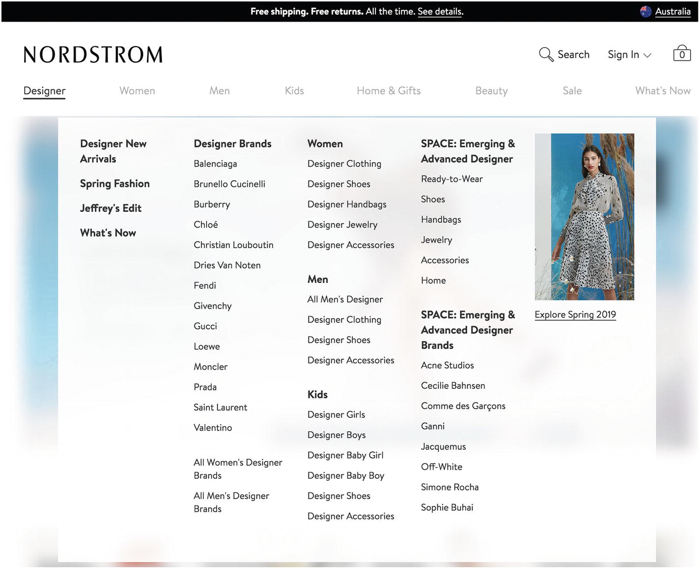
Screenshot of Nordstorm’s mega menu
Each category and subcategory is a link.

Screenshot of Nordstrom’s breadcrumb trail showing the hierarchy of this subcategory
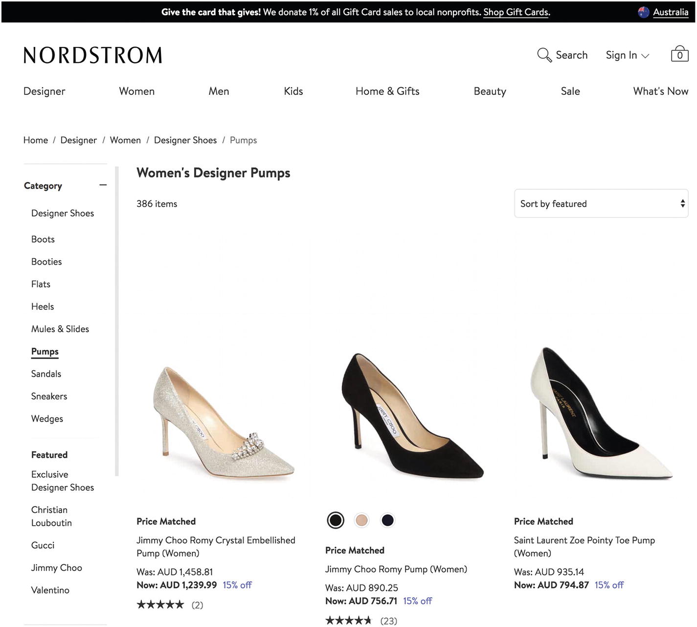
Screenshot of “Pumps” in the breadcrumb trail as well as the selected filter dimension
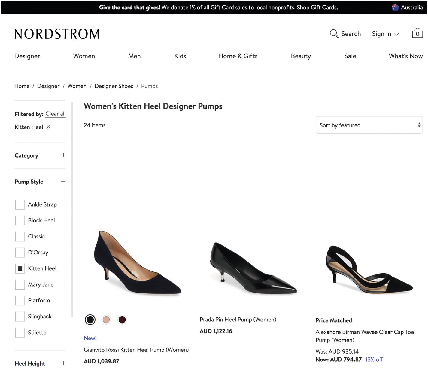
Screenshot of Nordstrom’s “Pump Style” filter options

Screenshot of “Women’s Designer Shoes” without a “Pump Style” filter
While in the “Women’s Designer Shoes” category, there’s no “Pump Style” filter dimension, which is specific to the “Pumps” subcategory.
While categories and filters are usually two sides of the same coin, the ability to have category-specific filters provides a useful distinction between what should be a visually prioritized category filter and what should be a regular search filter. That is, if a group of products can have its own special filters that don’t apply to other groups of products, it can be a category.

Screenshot of Nordstrom’s autosuggest categories, subcategories, and featured results
Here, the search term “shoes” shows results for different groups of products including “shoes for women” and “shoes for men” as well as just “shoes.”
In this Nordstrom example of scoped search, you can see elements reused across patterns. Categories are used as regular hierarchical categories to browse content as well as search filters. Nordstrom uses subcategories as search filters of categories. The “Pumps” category element is used as the category for browsing and a search filter for filtering the “Designer Shoes” category.
In Chapter 3, we studied the search filter pattern’s context, problem, and solution. The shopper problem in the Nordstrom example fits the search filter pattern problem: there are lots of items, and the shopper needs to reduce them so they can find the product that fits their criteria. It also fits the context of when to use this solution: there are thousands of items, and filter facets are straightforward.
Cut duplicate content from combined patterns: Categories as search terms

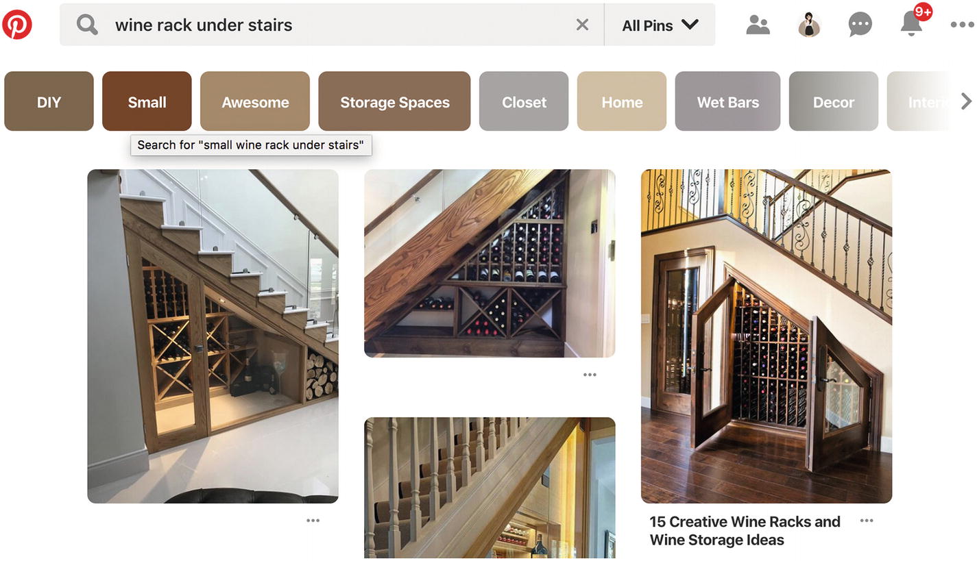
Screenshot of Pinterest’s category suggestions
Screenshot of Pinterest’s amended search query
This reinforces the relationship between search and categories in Pinterest’s world.
As you hover over a category, you see a tooltip, “Search for “small wine rack under stairs”.” Without this additional clue, sighted users might infer the relationship between the search term and the category by their visual proximity and prior familiarity with the search filters pattern. With the tooltip, however, sighted users can confirm that selecting this category is drilling deeper into the “wine rack” journey, instead of leaving wine rack for a new “Under Stairs” search. This text may be even more useful to visually impaired people navigating the page using a screen reader, potentially lacking the visual information to otherwise infer the behavior. This text might even be useful to alternative “user agents,” such as search engine bots to make sense of the page.
Elsewhere in the wild, you might find something similar to this but with more repetition. Pinterest could, for example, have included the text “Search results for wine rack” under the categories. They could have shown “wine rack DIY,” “wine rack ideas,” and so on, repeating “wine rack” in every option. They could have shown “Search for “wine rack”” and the category name for every category. They could have shown “wine rack >” in a breadcrumb trail. Instead, Pinterest’s approach to combining patterns is minimalist, cutting any potential duplicate content.
In the Pinterest example of scoped search, duplicate content is cut instead of repeating shared element across patterns. This makes sense for their business’s context. As a visual discovery tool that focuses on content1 and inclusive design,2 this minimal and accessible approach to scoped search is predictable for their product. In the Nordstrom example, we saw more repeated text in details such as the breadcrumb trails than in the Pinterest example. Pinterest’s approach suits its visual nature and endless discovery.
Efficiently combine patterns to avoid the need for others: Autosuggest and thumbnails
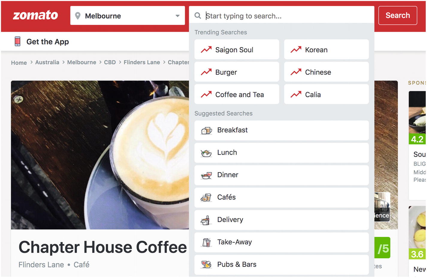
Screenshot of Zomato autosuggesting trending searches and meal time categories before you search for anything
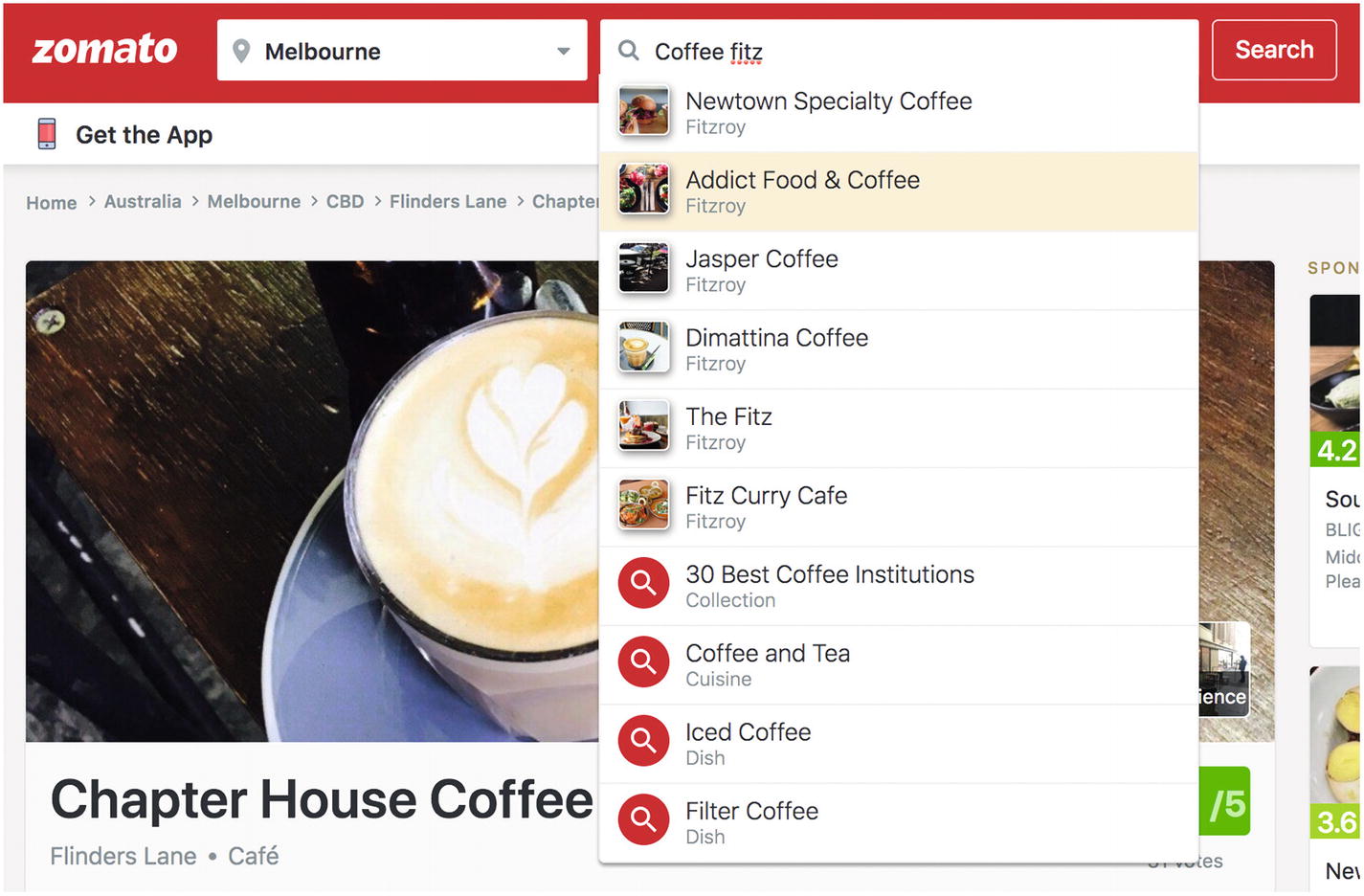
Screenshot of Zomato’s autosuggest results from a variety of categories
In that example, the results that show a photo link to specific results whereas the results with a search icon link to a search results page with more filtering options.
In contrast to Nordstrom, Zomato helps visitors visualize different categories and results using thumbnails (illustrations, photographs, and icons) to preview upcoming results. If there were no thumbnails, it might be harder for people to visualize the content and understand what each means. To discover what they mean, the user might need to go through a process of trial and error to test each one and see if it matches their desires or not. In that scenario, each time the user returned to the search, they’d need a method for restoring their previous search text and a way of knowing which items they’d tried already. That might lead to a “recent searches” feature or “visited links” styling. Using thumbnails could mean you don’t need to build these other elements.
This search is also scoped to “Melbourne” from the location category.
The thumbnails here are useful to preview a small number of items (up to ten) before choosing one. Without limiting the suggestions to ten items, there might be too many items to preview with thumbnails, requiring pagination or infinite scrolling in the autocomplete, which could be awkward.
In the Zomato example of scoped search, we see that thumbnails in autosuggest (rather than thumbnails in results as we saw with Pinterest) make it unnecessary to employ infinite scrolling, pagination, “recent searches,” or “visited link” styling. This is an efficient combination of patterns that achieves user goals while avoiding alternative technical work to build features that achieve fewer benefits.
We examined thumbnails in Chapter 1 and autocomplete in Chapter 3. Zomato’s example of scoped search aligns with the context of both patterns. Thumbnails are appropriate for previewing visual content in a collection of linked resources. Autocomplete is appropriate when you can quickly present matching results from a larger data set using common search terms that fit the search context. Together, they solve the problem of scoping searches.
Zomato’s approach of using thumbnails in autocomplete wouldn’t make as much sense for Pinterest. A single concept like “wine rack under stairs” could have thousands of visual representations. Using a single thumbnail to preview what will be found in that category’s level of detail might be misleading.
Interstitial patterns: Autosuggest and navigable categories
In addition to autosuggest with thumbnails, you might consider navigable categories with thumbnails.

Screenshot of RS search results includes available categories for the searched term as well as a result listing

Screenshot of RS’s categorized search results
This is important when an e-commerce store has a highly diverse product range, because there’s a higher chance of overlap in terms used in multiple categories that are completely irrelevant to others. The shopper may not think of their desired product as a “Sensor & Switch Magnet,” but indicating the different categories using imagery lets shoppers quickly identify the one that’s relevant to them through immediate recognition and ignore the other categories. If this category selection wasn’t available, they may not recognize irrelevant results as quickly in the table listing itself when they’re all jumbled up together, leaving them to wade through more noise.

Screenshot of RS’s filtering options for categorized search results

Screenshot of RS’s filtered results
The shopper can then remove one filter at a time or all of them at once (which in this case has the same result).

Screenshot of RS’s category browsing
This lets shoppers discover other content within the same section starting with something they know.

Screenshot of RS’s brand index page
As you can see, categories, filters, and searches each refine the total available results by the shopper’s needs using different methods. They can complement each other or be used independently to navigate content via different paths.
In the RS example of scoped search, there is a step in between the search and showing the full results listing—to present thumbnails for categories. These categories further scoped the search results using the thumbnail pattern. The shopper can then further refine results using standard search filters without thumbnails. This interstitial use of thumbnail categories might be used only when the primary path would lead to too many search results or mixed results that are difficult to understand.
The use of interstitial thumbnails for categories here fits the context of RS’s customer base and extensive product range. If a Nordstrom shopper searched for “shoes” and selected “shoes” instead of “shoes for men,” they’d still be in a good position to apply the “Men’s Shoes” search filter afterward and know what to expect about the appearance of men’s shoes. There’s less risk that they won’t understand what the other items are when they see women’s shoes in the results. They might intentionally want to see men’s and women’s shoes together and use other filters like price and color to reduce results. RS’s visual categories can help explain results and remove irrelevant ones. An intervening step like RS’s to show category thumbnails on Nordstrom’s site may just distract from the results without adding clarity.
Visually combine and distinguish patterns: Categories in tabbed navigation
A popular remix of search filters and categories includes tabbed navigation.

Screenshot of Google’s “All” results search scope
Here, Google shows a mix of content types, highlighting what might be the most relevant content across sections.

Screenshot of Google’s “Videos” search scope

Screenshot of Google’s “Personal” search scope
By showing the search input first, followed by the categories in the tab navigation underneath, Google reveals that the tab navigation groups content within the search. This works really well because Google provides sufficient content within each category that a visitor will rarely find a tab without any results (more likely millions of results).
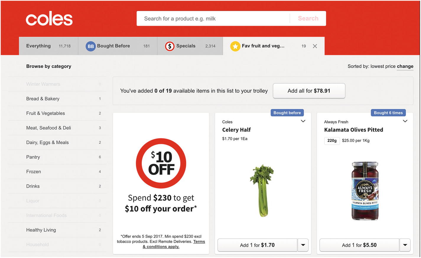
Screenshot of Coles “Fav fruit and vegetables” list category
Note
Coles shows the number of results contained within each category and within each filter and disables all filters with 0 results.
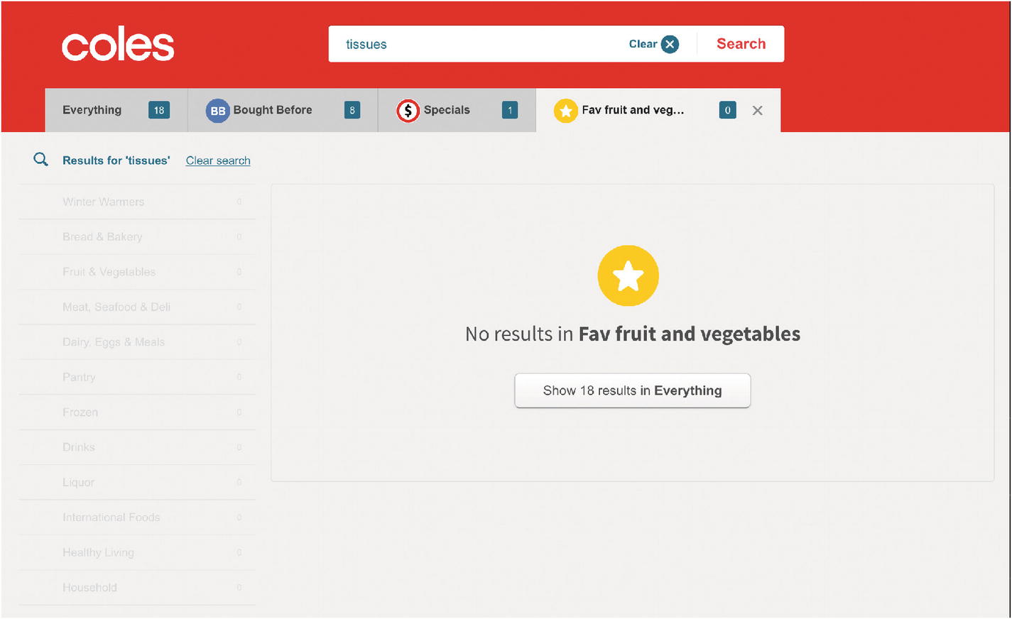
Screenshot of Coles “Fav fruit and vegetables” when searching for “tissues”
Because the shopper has used the filters as navigation first (instead of search before filters), they might be disoriented by the lack of results without recognizing that the new search did not clear the selected category filter. Imagine instead that the categories tab navigation appeared before the search input: it would then appear that the category was being filtered by the search results (rather than the search filtered by categories), more closely matching the shopper’s mental model formed by their user journey. As such, they might realize before searching for “tissues” that they’ll need to navigate out of this category.
In this scenario, Coles helpfully provides a Call To Action button on this category’s zero results screen to inspire shoppers to expand their search results by leaving this category and filtering instead by the “Everything” category, which shows all results for the “tissues” search. This is a good default to use instead of a blank slate, helping visitors recover from dead ends. Alternatively, to avoid zero results screens, you might suggest alternate words or spellings.
The tabbed navigation and scoped search examples illustrate two particular considerations to the category approach. One is that you can provide a smoother experience with fewer points of friction by avoiding zero results screens if search results can be found for all category filters. Secondly, depending on the path your user has taken, the relationship between search and category filters can be confusing. We’ll see more on establishing these relationships in a Flickr example in the section ahead.
In the Google search and Coles shopping examples of scoped search, we see how tabs can be used to indicate categories and filters used to refine searches. The intersection of these two elements can lead to confusion if they’re not visually distinguished with paths provided out of each.
Even though these companies are of quite a different scale, there is enough similarity in the context of their visitors’ and shoppers’ needs that a scoped search using tabbed navigation makes sense for both. The execution of each approach, however, changes to suit their business.
Preserve or discard data in repeated use of patterns: Clearing filters on new searches
When using these extra search filters and related features, you might consider the effect of clearing filters. Again, leaning on classic UI design principles, it’s often useful to preserve user’s data from previous interactions, but it’s necessary to balance that against the risk of dead ends produced by scoped searches.
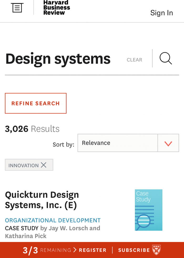
Screenshot of HBR search for “Design systems” filtered by “Innovation” showing 3,026 results
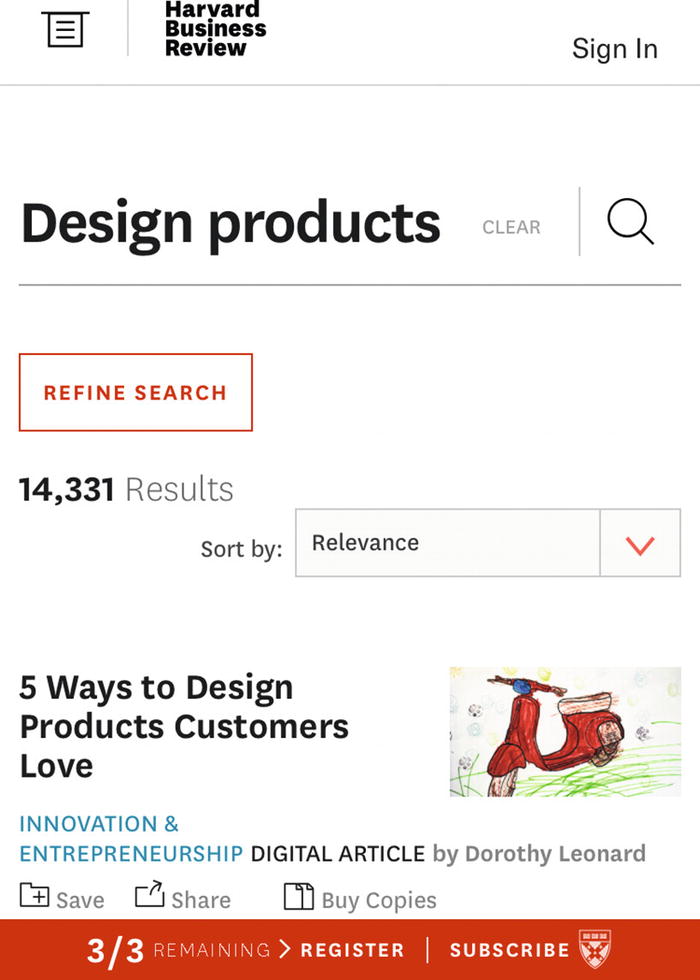
Screenshot of HBR search for “Design products” without “Innovation” filter showing 14,331 results
Unlike the Coles example, HBR opts to make every search a new search, clearing previous filters. This approach reduces the chances of zero results screens and clarifies the relationship between search and filters (where search trumps filters) but runs the risk that with a lot of filters selected, any change to the search query will undo the visitor’s hard work refining results.
In the HBR example of scoped search, subsequent uses of the search clear any search filters, starting over. Coles chooses to preserve all filters until the user makes an explicit choice to remove them.
Clarify repeated patterns: Inline tags

Screenshot of Flickr’s search that lets you scope a search for “airbnb” by Photos, People, or Groups

Screenshot of Flickr’s scoped search with inline input tags
This way, Flickr can provide just one search bar and yet preserve the in-page selections, such as “Airbnb Community” and “Photostream” in the example shown.
In the Flickr example of scoped search, you can clarify the relationships between patterns and steps in user interactions by repeating information and subtly adding additional cues to educate the user about what happened and how to interact with the pattern’s components.
Evaluate resulting trade-offs: Infinite scroll

Screenshot of L.L.Bean infinite scroll starting to load more content

Screenshot of L.L.Bean where one filter reduces the list of results dramatically
By contrast, if L.L.Bean shoppers instead typically paged through dozens of infinite scrolling sections of results, the balance of filtering and scrolling might be off, suggesting the filters weren’t effective enough at reducing results.
In the L.L.Bean example of scoped search, we see how the combination of infinite scrolling and search filters is balanced. The content and interaction path means infinite scrolling usually isn’t necessary so it isn’t shown. It’s only brought to light when the primary path has failed to reduce search space enough to make a decision.
Reflecting back on the Twitter example, infinite scrolling for favorites might have a small conflict in certain contexts. If favorites are used to store content for later and infinite scrolling is used to discover endless new content, the combination be a poor fit. This depends on who is using the favorites list. If the Twitter user is referencing their own favorites, search filters and pagination without infinite scrolling might help them find content more quickly, but if a user is exploring someone else’s favorites, an infinite list of surprising new items could be ideal. The infinite scrolling feed is also consistent with every other kind of content on Twitter, making it predictable. L.L.Bean’s context is quite different from Twitter’s, so the trade-offs to evaluate are also quite different.
Other forms of scoped search
We’ve seen a variety of scoped search approaches here, mixing and matching patterns we’ve explored in detail in previous chapters. It’s important to note how the intersection of patterns in each approach affects the overall experience. As with patterns, the context to each solution is critical to its success.
You’ll discover there are myriad variations out in the wild. It’s worth keeping an eye out and noticing when you see a different take on a pattern and try to understand the reasons behind an unusual remix. Often, you’ll find there’s something particular about the brand, content, constraints, or user context that compels a new design.
Favoriting becomes wish listing
In Chapter 3 we saw how to use favorites to help users track specific, excellent content. Now we’ll look at a specific variant of favorites in the world of e-commerce: wish lists. Together, you can drive user behavior and create experiences tailored to your product.
Wish lists/wish listing
A wish list is a personalized, curated list of preferred items, stored for later purchase. The subsequent purchase may be made by the wish lister or for the wish lister by their friends and family.

Screenshot of Amazon’s Add to List options

Screenshot of Amazon’s wish list containing one item
Unlike favorites, wish lists are typically used only by the wish lister and their direct connections. It is rarer for shoppers to browse strangers’ wish lists. As I mentioned in Chapter 3, wish lists are also more likely than favorites to be private.
As wish lists are sometimes used by a user’s friends to figure out what to buy as a gift, wish lists frequently offer alternative purchasing options such as gift cards. You see this in digital book stores such as iBooks where you may gift a book (such as this one!) to a friend.
Use wish lists when people may not make a purchase in the first visit, but keeping track of their top candidates for purchase increases their chance of purchase in a later visit.
If you don’t have a wish list, you might find that people treat the shopping cart as a wish list anyway and hold items there until they’re ready to make a decision.
Note
An astute reader may notice the “overall pattern” design smell here that we discussed in Chapter 5: Are we treating “favorites” as an “overall pattern” containing “wish lists”? If you’re using both wish lists and favorites in your product, you’d do well to clarify their differences and document them separately.
Combining wish listing and lazy signup
In Chapter 2 we investigated the lazy signup pattern. Let’s bring that into action with wish listing.
You can offer a wish list without account registration for a single shopping session. Using the wish list, the shopper can gather their top candidates of similar items for purchasing before making a decision on which or how many items they want to buy together. If they cannot make a final decision within a single session, you can provide optional registration to keep the wish list for later using lazy signup.

Screenshot of Saint Laurent’s wish list
Here, you can add items to your wish list and view your wish list without creating an account. If you choose “Save wish list,” you’ll be prompted to log in or register an account.
As you can see, the wish list and lazy signup patterns work seamlessly together without any changes or amendments. This is actually the ninth approach for combining patterns: do nothing special at all.
Next, we’ll explore what to do when patterns are the wrong approach.
When and how to break away from patterns
To reiterate our definition from Chapter 1, UI patterns are recurring solutions to UI problems in a context. They are recurring because they usually work and are therefore often quite reliable for designers and predictable for users. This does not, however, mean that they’re the only or best solutions. Even if they were, sometimes reality just doesn’t match up.
In this section we’ll look at how you might know when it’s time to break from convention and what to do when you do decide to steer clear of patterns.
Investigate design smells
In Chapter 5, we discussed design smells that may or may not be symptoms of deeper problem. If you’ve noticed a design smell in your product, such as the heavy use of modals, you might do some quick research to validate if there’s a real problem or not.
Using analytics ( www.uxbooth.com/articles/complete-beginners-guide-to-web-analytics-and-measurement/ ) for measuring aspects of user experience, you can see if this area is affecting your product’s desired outcomes. For example, if the checkout process of your e-commerce site presents the payment form in a modal and your analytics show that the payment step of your checkout has the biggest drop off in your sales funnel (i.e., it’s the biggest contributor to cart abandonment), that suggests your hunch about the modal smell might be right. Then it’s time to investigate why that is the case, validating your quantified usability problem with qualitative research to get the information needed to make a decision about it.
You might then perform some usability testing with three diverse representatives from your target audience. Suppose two of your testers sail through the test flawlessly and one stumbles because the payment form shows an alarmingly high shipping fee for their remote location. We can then circle back to our quantitative data to see if this could be the cause of the cart abandonment. Let’s imagine this shipping destination accounts for only 0.05% of your site traffic—this couldn’t explain the volume of cart abandonment. It’s worth considering, but let’s also test with two more people.
This time, we find the modal content isn’t scaling well and doesn’t fit on iPhone screens making it hard to scroll and navigate. This time we see iPhone accounts for 40% of site traffic. Sure enough, when we slice our traffic by device, we see 70% of cart abandonment at the payment step is on iPhone. Now we know it’s time to reconsider our modal.
In this way, we’ve followed the symptoms of a design smell to discover our misused modal has become a popup anti-pattern. Next, we’ll consider what to do with our identified problem.
Review pattern principles for identified usability problems
You might reconsider a pattern when you’ve identified a usability problem in its execution. Once you’ve identified it, you have a few options for addressing it.
You might be thinking that this usability problem doesn’t mean the modal is a poor choice, just that this modal is poorly done.
This moment is a useful prompt to reconsider if we’ve correctly aligned the problem and context with the modal solution. A modal is a disruption to a normal flow. Does is make sense to distract the shopper from the task of purchasing an item in a checkout by a change in flow? Possibly. A Baymard Institute study on checkout usability3 showed that people had a higher degree of trust in payment forms that were visually distinguished from the rest of the checkout, as if it is a more sensitive task so it needs a more “secure” design (even though that’s not really how security works). A modal might be a suitable method for visually distinguishing the payment form. So, updating the modal design and improving the engineering execution might be the best path forward to provide a better experience and improve conversions.
On the other hand, let’s revisit our modal pattern’s details and what other patterns we could use instead. A payment form rules out using a notification or tooltip. While we could display the form inline, it might be better to defer the payment form to another page, styled to engender trust in its security.
So, what would it take to update our modal’s visual style and implementation vs. replacing it with a new page? Are there other benefits to be gained from either approach? If you’re undecided, you might test a prototype of each approach before building either. Based on principles alone, you might decide to try the page. In that particular case, you might A/B test the new page on a small subset of your audience before rolling it out to everyone.
Review problem and context
One reason that usability problems might arise using perfectly reasonable patterns is that we sometimes fail to clarify the user problem in the first place.
In Chapter 3 we looked at a few methods for establishing the context in a design problem. Suppose the payment form had failed because it didn’t include a gift card redemption option and the true context of the situation was that the shopper was in fact a gift card recipient cashing in their gift from a friend. The challenge is not that your payment form solution was a poor fit for the problem (making a payment) but that the problem (sending money) didn’t match the context (redeeming a gift card instead of sending money).
When you’ve identified a usability problem, you may wish to clarify the context before assuming the solution is a bad fit.
With effective user research and collaboration within your organization, you can accurately identify all relevant aspects of the context that affect decision. These include the user journeys, user tasks, personas, constraints, content, and data we considered in Chapter 3. The very real business and technical constraints of your organization might prevent the use of a particular solution: sometimes reliable infinite scrolling just isn’t feasible.
Another scenario to consider which might lead to misaligned context and problem is the “but that’s what Google do” situation. You are not Google ( https://blog.bradfieldcs.com/you-are-not-google-84912cf44afb ). Sometimes a pattern used by a big player in the industry might be relevant to their business in a way that it just can’t be to yours. Conversely, just because they’re doing it doesn’t mean it’s the best choice—big companies can be at risk of inertia through bureaucracy, even when they’ve identified their own usability problems.
Strive for predictability
One of the strengths of using the proven solutions found in patterns is that they are familiar to users and therefore predictable. What happens then when there’s tension between external conventions and internal consistency?
Sometimes as designers we need to make a choice between the industry-leading approach and the internally consistent approach, particularly if we have lots of design debt holding us back. If we choose to push one part of a product forward with modern styles and proven patterns, while the rest of the product continues to have awkward, old styles and behaviors, our users might find it even harder to use because it’s inconsistent. On the other hand, sticking to weird, old quirks in the UI might be easier for repeat users once they’ve figured out how it works.
One way to address this problem is to update whole pages and sections of your product at a time with a new look and feel along with the new patterns. Your users might then be able to predict the product’s behavior by considering which part they’re in. Continuing in this way, you might avoid updating only one component in a page at a time. Leaving one part behaving the old way and another part in a different way could lead to more confusion overall.
Innovate
Sometimes the best path is the road less traveled. When you need your product to stand out in a crowded market, innovating away from the standard solutions to problems might help. In these cases, you can benchmark and user test your alternative solutions.
Despite the interface’s insanity, some Snapchat features were major breakthroughs in design. It was the first big social app to open directly to the camera. That unconventional choice encouraged people to actually create their own content, instead of just consume others’ posts.
She also quotes Airbnb designer Ben Wilkins saying “The reason people love this is because it requires some level of tribal knowledge.” It gives millennials “their own walled garden that their parents can’t reach.”
For the target audience in question, impenetrable design choices and rejecting standard patterns had an unusually positive effect on their product.
“Some designers resent its success because it doesn’t follow patterns we were taught to follow,” said Tara Mann, a mobile designer at Basecamp, a project management tool.
Sometimes it’s OK to break the rules. The only way to know for sure though is to actually test the difference. By benchmarking your product’s UI, you’ll be able to find out if an innovation improves or detracts from the original experience.
How to break the rules
If you’ve decided that you want to try something more adventurous, first, you have to know the rules to break them. Before throwing out the rule book, consider the strengths of the patterns to date and understand them in all their detail.
Obviousness comes from conforming to people’s existing mental models. Don’t waste time reinventing common UI patterns or paradigms unless they are at least 2x better, or you have some critical brand reason to do so.
—Julie Zhuo
You know you have a good design when you show it to people and they say, “oh, yeah, of course,” like the solution was obvious.
—Chris Pratley
In these examples you can see the appeal of conservative adherence to conventions and design patterns. Even then, one yardstick of a new approach’s success might be if people still say, “oh, yeah, of course.” Like the solution was obvious.
One sign that a successful radical innovation may be available is a change in technology. As voice-user interfaces become more reliable, we’re likely to see greater shifts in interaction as new opportunities become available. Maybe this is the time to quash hamburger basements and instead ask the web page to access standard menu items, such as the “About page,” or simply ask, “tell me about this company.”
Before embarking on this adventure, you might evaluate how much slack you have in your system to shoulder the cost of any risky experiments. Can you afford to lose $1.3 billion of market share5 if it goes wrong? If you cannot bear the impact, you might mitigate the risk by running smaller experiments or isolating smaller parts of the innovation to test. For example, you might independently validate UI copy out of context, test user flow using paper prototypes, and test usability in an interactive prototype before building a new alternative to a design pattern.
As I mentioned before, when you’re about to implement radical innovations, user test the UI before and after. If you have no prior UI to benchmark because you’re creating a new product, consider benchmarking a competitor’s product. You can also track the impact of your radical design changes on your key measurable outcomes, such as sales and conversion rates. In this way you can prove that the alternative is better for key outcomes as well as qualitative perceived experience and satisfaction.
When to break patterns in design systems
When consistency isn’t achieving predictability, break the pattern.
When consistency is detrimental, break the pattern.
When behavior is different, elements should look different—this demands a different pattern.
When inconsistency is inconspicuous, causing users to ask “why” something looks different in one place to another, even though they behave the same (or too similarly)
When the behavior is identical
For a rule of thumb, aim to be cohesive not consistent. Context trumps consistency when the design is still clearly in line with the spirit of the system, giving the impression of consistency and predictability, even with slight differences. Strong principles can help you here. If you have a design principle like “Insightful even over efficient,” you might choose a data visualization that brings to light new information, even over the standard visualization in your product that is faster to navigate.
That wraps up the main reasons to ditch a pattern and how to move ahead when you do. These won’t address every design system or solve every debate, but they can help guide decisions.
Summary
In this chapter we explored how to blend multiple patterns together into a seamless interaction experience by finding complementary patterns, minimizing duplication of shared elements across patterns when combining them, and finding large functional combinations of patterns with a bigger scope than the patterns we’ve seen in previous chapters. These larger functional “patterns” tend to appear less often in design systems and especially rarely in built component libraries as they often appear only once or twice in a single product.
We examined the unique impact specific applications of patterns might have, such as wish lists and how they relate to favorites. As we discussed in Chapter 5, the “Overall pattern” is a design smell, and you’ll likely find more value from separately describing your wish list pattern and favorite pattern rather than treating favorites as a parent to the wish list pattern in the unlikely event you have both in your design system.
Beyond mixing and matching patterns, we saw how to validate breaks from convention with user testing. You can identify a successful departure from convention when your audience still reports that it “feels obvious,” “easy,” or “intuitive.” You can identify the need for breaking from convention when an identified usability problem proves the pattern is failing you in its current form.
Altogether, this chapter has highlighted nine approaches to mix and match patterns and when to break away from them, including in design systems, all through the lens of modern e-commerce products and contemporary digital design.