
C H A P T E R 8
Using the Forms API
In this chapter, we'll explore all the new capabilities at your command with a longstanding technology: HTML Forms. Forms have been the backbone of the explosion of the Web since they first appeared. Without form controls, web business transactions, social discussions, and efficient searches would simply not be possible.
Sadly, HTML5 Forms is one of the areas in greatest flux in both specification and implementation, in spite of having been in design for many years. There's good and bad news. The good news is that the progress in this area, while incremental, is increasing fairly rapidly. The bad news is that you'll need to tread carefully to find the subset of new form controls that will work in all your target browsers. The forms specification details a large set of APIs, and it is not uncommon to find that each major new release of an HTML5-compliant web browser adds support for one or more form controls and some of the helpful validation features.
Regardless, we'll use this chapter to help you navigate through the virtual sea of controls and find which ones are ready to use today, and which are nearing release.
Overview of HTML5 Forms
If you are already familiar with forms in HTML—and we assume you are if you are interested in pro HTML programming—then you will find the new additions in HTML5 to be a comfortable fit on a solid foundation. If you aren't yet familiar with the basics of form usage, we recommend any of the numerous books and tutorials on creating and handling form values. The topic is well covered at this point, and you will be happy to know that:
- Forms should still be encapsulated in a
<form>element where the basic submission attributes are set. - Forms still send the values of the controls to the server when the user or the application programmer submits the page.
- All of the familiar form controls—text fields, radio buttons, check boxes, and so on—are still present and working as before (albeit with some new features).
- Form controls are still fully scriptable for those who wish to write their own modifiers and handlers.
HTML Forms Versus XForms
You may have heard references to XForms in the last few years, long before the HTML5 effort gained much traction. XForms is an XML-centric, powerful, and somewhat complex, standard for specifying client-side form behavior that has been developed in its own W3C working group for nearly ten years. XForms harnesses the full power of XML Schema to define precise rules for validation and formatting. Unfortunately, no current major browser supports XForms without additional plug-ins.
HTML5 Forms are not XForms.
Functional Forms
HTML5 Forms has instead focused on evolving the existing, simple HTML Forms to encompass more types of controls and address the practical limitations that web developers face today. There is an important note to keep in mind, especially as you compare form implementations across different browsers.
 Note The most important concept to grasp about HTML5 Forms is that the specification deals with functional behavior and semantics, not appearances or displays.
For example, while the specification details the functional APIs for elements such as color and date pickers, number selectors, and email address entry, the specification does not state how browsers should render these elements to end users. This is a great choice on multiple levels. It allows browsers to compete on innovate ways to provide user interaction; it separates styling from semantics; and it allows future or specialized user input devices to interact in ways that are natural to their operation. However, until your targeted browser platforms support all the form controls in your application, make sure you provide enough contextual information for the user to know how to interact with a fallback rendering. With the right tips and descriptions, users will have no trouble with your application, even if it falls back to alternate content when presented with unknown input types.
HTML5 Forms encompasses a great number of new APIs and elements types, and support for them is all over the map now. In order to wrap our heads around all the new functionality, we will address it by breaking it into two categories
- New input types
- New functions and attributes
However, before we even start with that, let's take a quick assessment of how the HTML5 Form specifications are supported in today's browsers.
Browser Support for HTML5 Forms
Browser support for HTML5 Forms is growing, but still limited. The major browser vendors all support many of the form controls, with Opera taking the lead in early implementations. However, the specification is stable.
Checking for browser support is less useful in the context of the new Forms, as they have been designed to degrade gracefully in older browsers. Largely, this means that it is safe for you to use the new elements today, because older browsers will fall back to simple text field displays for any input types that they do not understand. However, as we'll see later in this chapter, this raises the importance of multi-tier form validation, as it is not sufficient to rely on the presence of browser validators to enforce the data types for your form controls, even if you assume full modern-browser support.
Now that we have surveyed the browser landscape, let's take a look at the new form controls added in the HTML5 specification.
An Input Catalog
One of the best places to get a catalog of all the new and changed elements in HTML5 is the markup list maintained at the W3C site itself. The W3C keeps a catalog page file at http://dev.w3.org/html5/markup/
This page denotes all the current and future elements in an HTML page. New and changed elements are noted in the catalog list. However, “new” in this list only means that the element has been added since the HTML4 specification—not that the element is implemented in browsers or in a final specification yet. With that warning in place, let's take a look at the new form elements arriving with HTML5, starting with the ones that are being implemented today. Table 8-1 lists the new type attributes. For example, many HTML developers will be intimately familiar with <input type="text"> and <input type="checkbox">. The new input types follow a similar model to the existing ones.
What do these new input types provide? In terms of programmatic APIs… not a lot. In fact, in the case of the types for tel, email, url, and search, there are no attributes distinguishing them from the simplest input type of text.
So, what do you get exactly by specifying that an input is of a specialized type? You get specialized input controls. (Restrictions may apply. Offer void in many desktop browsers.)
Let's illustrate with an example. By specifying that an input is of type email
<input type="email">
rather than using the conventional standard, which states that a field is merely of type text
<input type="text">
you provide a hint to the browser to present a different user interface or input where applicable. You also provide the browser the ability to further validate the field before submission, but we'll cover that topic later in this chapter.
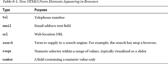
Mobile device browsers have been some of the quickest to take up support for these new form input types. On a phone, every key press or tap is a higher burden on a user who may not have a full keyboard. Consequently, the mobile device browsers support these new input types by displaying a different input interface based on the type declared. In the Apple iPhone, the standard onscreen keyboard display for an input with type text appears as it does in Figure 8-1.
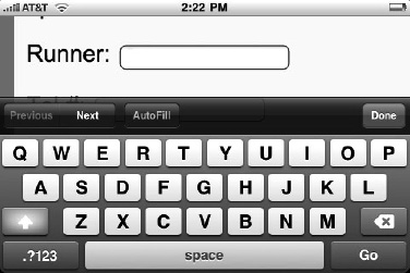
Figure 8-1. Onscreen keyboard display for an input with type text
However, when an input field is marked as being of type e-mail, the iPhone presents a different keyboard layout customized for e-mail entry, as shown in Figure 8-2.
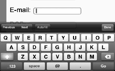
Figure 8-2. Onscreen keyboard display for an input with type e-mail
Note the subtle tweaks to the space bar area of the keyboard to allow for the @ symbol and easy access to the period. Similar tweaks to the keyboard layout are done for type URL and type search. However, in the desktop version of the Safari browser—and in any browser that does not explicitly support the types for e-mail, URL, search, and tel—only the normal text input field will be displayed. Future browsers, even the desktop versions, may provide visual hints or cues to the user to indicate that the field is of a certain subtype. Opera, for example, will display a small envelope icon next to a field to indicate that it is expecting an e-mail address. However, it is safe to use these types in your web applications today, as any browser will either optimize for the type or simply do nothing at all.
Another specialized type that is gaining traction in browsers now is the <input type="range">. This specialized input control is designed to let users pick from within a range of numbers. For example, a range control could be used in a form to select an age from a range that limits access to minors under the age of, say, 18. By creating a range input and setting its special min and max values, a developer can request that a page display a constrained numerical picker that only operates within the specified bounds. In the Opera browser, for example, the control:
<input type="range" min="18" max="120">
gives a convenient way to pick a suitable value for age-restricted material. In the Opera browser, it displays as follows:
Unfortunately, the range input itself doesn't display a numerical representation of the browser. Moreover, without one, it is practically impossible for the user to know what the currently selected value happens to be. To fix this, one can easily add an onchange handler to update a display field based on changes to the current range value as shown in Listing 8-1.
Note Why don't range elements contain visual displays by default? Perhaps it is so that user interface designers can customize the exact position and appearance of displays. Making the display optional adds a bit of work, but much more flexibility.
The new form controls now include a simple output element, which is designed just for this type of operation. An output is a form element, which simply holds a value. As such, we can use it to display the value of our range control.
Listing 8-1. onchange Handler to Update an output
<label for="age">Age</label>

<input id="age" type="range" min="18" max="120" value="18" onchange="ageDisplay.value=value">

<output id="ageDisplay">18</output>
This gives a nice display to our range input, as follows:
Opera and the WebKit-based browsers—Safari and Chrome—have now added support for the type range element. Firefox support is planned, but not yet scheduled as of this writing. Firefox will fall back to a simple text element when presented with a range input type.
Another of the new form elements that has gained widespread support is the progress element. The progress element does exactly what you might expect; it displays the percentage of a task that is completed in a handy visual format.
Progress can be either determinate or indeterminate. Think of indeterminate progress as a task that takes an unknown amount of time, yet one where you want to assure the user that some progress is being made. To show an indeterminate progress element, simply include one with no attributes:
<progress></progress>
An indeterminate progress bar usually displays a bar in motion, but with no indicator of the overall percentage complete.
A determinate progress bar, on the other hand, shows an actual percentage-style display of the completed work. To trigger a determinate progress bar display, set the value and max attributes on the element. The percentage of the bar displayed as completed is calculated by dividing the value you set by the max you set. They can be any values you choose, to make calculation easier. For example, to show 30% completion, we can create a progress element such as:
<progress value=”30” max=”100”></progress>
With these values set, the user can quickly see how much of your long-running operation or multi-step process is complete. Using script to change the value attribute, it is easy to update the display to indicate progress toward a final goal.
Here Be Dragons
Additional form elements that are planned but not widely supported yet include the ones listed in Table 8-2.
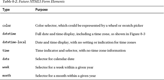
Although some early implementations of these elements are beginning to appear in leading edge browsers (for example, the datetime display in Opera as shown in Figure 8-3), we won't focus on them in this chapter as they are likely to undergo significant change. Stay tuned to future revisions!
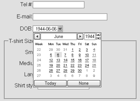
Figure 8-3. Display for an input of type datetime
Using the HTML5 Forms APIs
Now that we've spent some time familiarizing ourselves with the new form element types, let's turn to the attributes and APIs that are present on both the old and new form controls. Many of them are designed to reduce the amount of scripting needed to create a powerful web application user interface. You may find that the new attributes give you the power to enhance your user interface in ways that you had not considered. Or, at the very least, you may be able to remove blocks of script in your existing pages.
New Form Attributes and Functions
First, we'll consider new attributes, functions, and a few elements that did not previously exist in earlier versions of HTML. Like the new input types, it is generally safe to use these attributes today, whether or not your target browser supports them. This is because the attributes will be safely ignored by any browser on the market today if the browser does not understand them.
The placeholder Attribute
The placeholder attribute gives input controls an easy way to provide descriptive, alternate hint text which is shown only when the user has not yet entered any values. This is common in many modern user interface frameworks, and popular JavaScript frameworks have also provided emulation of this feature. However, modern browsers have it built-in.
To use this attribute, simply add it to an input with a text representation. This includes the basic text type, as well as the semantic types such as email, number, url, etc.
<label>Runner: <input name="name" placeholder="First and last name"></label>
In a modern browser, this causes the field to display a faint version of the placeholder text which will disappear whenever the user or application puts focus into the field, or whenever there is a value present.
The same attribute, when running in a non-supporting browser, will just be ignored, causing the default field behavior to display.
Similarly, whenever a value is entered in the field, the placeholder text will not appear.
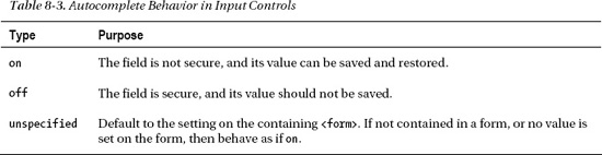
The autocomplete Attribute
The autocomplete attribute, introduced in Internet Explorer 5.5, has finally been standardized. Hooray! (Browsers have been supporting the attribute for nearly as long as its inception, but having a specified behavior helps everyone.)
The autocomplete attribute tells the browser whether or not the value of this input should be saved for future. For example:
<input type="text" name="creditcard" autocomplete="off">
The autocomplete attribute should be used to protect sensitive user data from insecure storage in the local browser files. Table 8-3 shows the different behavior types.
The autofocus Attribute
The autofocus attribute lets a developer specify that a given form element should take input focus immediately when the page loads. Only one attribute per page should specify the autofocus attribute. Behavior is undefined if more than one control is set to autofocus.
Note Only one autofocus control per page is difficult to achieve if your content is being rendered into a portal or shared content page. Do not rely on autofocus if you are not in complete control of the page.
To set the focus automatically to a control such as a search text field, simply set the autofocus attribute on that element alone:
<input type="search" name="criteria" autofocus>
Like other boolean attributes, no value needs to be specified for the true case.
Note Autofocus can annoy users if they are not expecting a focus change. Many users utilize keystrokes for navigation, and switching focus to a form control subverts that ability. Use it only when it is a given that a form control should take all default keys.
The spellcheck Attribute
The spellcheck attribute can be set on input controls with text content, as well as the textarea. When set, it suggests to the browser whether or not spelling feedback should be given. A normal representation of this element is to draw a red dotted line under text that does not map any entry in the currently set dictionary. This hints to the user to double-check the spelling or to get a suggestion from the browser itself.
Note that the spellcheck attribute needs a value. You can't just set the attribute alone on the element.
<textarea id=”myTextArea” spellcheck=”true”>
Also note that most browsers will default to leaving the spellcheck on, so unless the element (or one of its parent elements) turns off spellchecking, it will display by default.
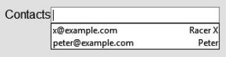
The list Attribute and the datalist Element
The list attribute and datalist element combine to let a developer specify a list of possible values for an input. To use this combination:
- Create a
datalistelement in your document with itsidset to a unique value. The datalist can be located anywhere in the document. - Populate the
datalistwith as manyoptionelements as needed to represent the full set of suggestions for values of a control. For example, adatalistrepresenting e-mail contacts should contain all of the contact e-mail addresses as individualoptionchildren.<datalist id="contactList">
<option value="[email protected]" label="Racer X">
<option value="[email protected]" label="Peter">
</datalist> - Link the input element to the
datalistby setting thelistattribute to a value which is theidof the associateddatalist.<input type="email" id="contacts" list="contactList">
On a supporting browser this produces a customized list control like the following:
The min and max Attributes
As seen before in our example for <input type="range">, the min and max attributes allow a numerical input to be constrained to minimum and maximum values. One, both, or neither of these attributes can be provided as necessary, and the input control should adjust accordingly to increase or decrease the range of acceptable values. For example, to create a range control representing a level of confidence in ability from zero% to 100%, the following code could be used as follows:
<input id="confidence" name="level" type="range" min="0" max="100" value="0">
This would create a range control with a minimum zero value and maximum of 100, which, coincidentally, are the default values for the same.
The step Attribute
Also, for input types which expect numerical values, the step attribute specifies the granularity of increments or decrements in value as the range is adjusted. For example, our confidence level range control listed above can be set up with a step attribute of five as follows:
<input id="confidence" name="level" type="range" min="0" max="100" step="5" value="0">
This would limit the acceptable values to be increments of five from the starting value. In other words, only 0, 5, 10, 15, … 100 would be allowed either through typed input or through a slider control, depending on the browser representation of the input.
The default step value is dependent on the type of control to which it is applied. For a range input, the default step is one. To accompany the step attribute, HTML5 introduces two functions on the input element that allow the value to be controlled: stepUp and stepDown.
As you might expect, these functions increment or decrement the current value, respectively. As you might also expect, the amount by which the value is increased or decreased is the value of the step. As such, the value of a numeric input control can be tweaked without direct input from the user.
The valueAsNumber Function
The new valueAsNumber function is a handy way to convert the value of a control from text to number… and back! That is the case because the valueAsNumber is both a getter and a setter function. When called as a getter, the valueAsNumber function converts the text value of an input field into a number type upon which calculations are allowed. If the text value does not cleanly convert into a number type, then the NaN value (Not-a-Number) is returned.
The valueAsNumber can also be used to set the value of an input to a numeric type. For example, our confidence range could be set using a call such as:
document.getElementById("confidence").valueAsNumber(65);
Make sure the number meets the requirements of the min, max, and step, or an error will be thrown.
The required Attribute
If any input control has the required attribute set, then a value must be set on it before its form can be submitted. For example, to set a text input field as required, simply add the attribute as shown here:
If no value is set on this field, either programmatically or by the user, the ability to submit this form is blocked. The required attribute is the simplest type of form validation, but the capabilities of validation are vast. Let's discuss form validation in more detail now.
Checking Forms with Validation
Before we get too deep into specifics, let's review what form validation really entails. At its core, form validation is a system for detecting invalid control data and flagging those errors for end users. In other words, form validation is a series of checks and notifications that let a user correct the controls of a form before submitting it to the server.
But what is form validation, really?
It is an optimization.
Form validation is an optimization because it alone is not sufficient to guarantee that forms submitted to the server are correct and valid. It is an optimization because it is designed to help a web application fail fast. In other words, it is better to notify a user that a page contains invalid form controls right inside the page, using the browser's built-in processing. Why bother with the expense of a network round trip just so the server can inform a user that there was a typo in the data entry? If the browser has all the knowledge and capability to catch errors before they leave the client, we should take advantage of that.
However, browser form checking is not sufficient to handle all errors.
Malicious or Misunderstood?
That being said, HTML5 does introduce eight handy ways to enforce correctness on form control entry. Let's examine them in turn, starting with the object that gives us access to their status: the ValidityState.
The ValidityState can be accessed from any form control in a browser that supports HTML5 Form validation:
var valCheck = document.myForm.myInput.validity;
This simple command grabs a reference to the ValidityState object of a form element conspicuously named myInput. This object contains handy references to each of the eight possible validity statuses, as well as an overall validity summary check. You can get the overall state of this form by calling:
valCheck.valid
This call will provide a Boolean value which informs us whether or not all validity constraints are currently met on this particular form control. Think of the valid flag as a summary: if all eight constraints are passing, the valid flag will be true. Otherwise, if any of the validity constraints fail, the valid attribute will be false.
Note The ValidityState object is a live object. Once you grab a reference to it, you can keep a hold of it and the validity checks it returns will update as needed when changes occur.
As mentioned before, there are eight possible validity constraints on any given form element. Each can be accessed from the ValidityState by accessing the field with the appropriate name. Let's look at what they mean, how they can be enforced on a form control, and how you can use the ValidityState to check for them:
valueMissing
Purpose: Ensure that some value is set on this form control
Usage: Set the required attribute on the form control to true
Usage example: <input type="text" name="myText" required>
Details: If the required attribute is set on a form control, the control will be in an invalid state unless the user or a programmatic call sets some value to the field. For example, a blank text field will fail a required check, but will pass as soon as any text is entered. When blank, the valueMissing will return true.
typeMismatch
Purpose: Guarantee that the type of the value matches expectations (number, email, URL, and so on)
Usage: Specify one of the appropriate type attributes on the form control
Usage example: <input type="email" name="myEmail">
Details: Special form control types aren't just for customized phone keyboards! If your browser can determine that the value entered into a form control doesn't conform to the rules for that type—for example, an email address without an @ symbol—the browser can flag this control as having a type mismatch. Another example would be a number field that cannot parse to a valid number. In either case, the typeMismatch will return true.
patternMismatch
Purpose: Enforce any pattern rule set on a form control which details specific valid formats
Usage: Set the pattern attribute on the form control with the appropriate pattern
Usage example: <input type="number" name="creditcardnumber" pattern="[0-9]{16}" title="A credit card number is 16 digits with no spaces or dashes">
Details: The pattern attribute gives developers a powerful and flexible way of enforcing a regular expression pattern on the value of a form control. When a pattern is set on a control, the patternMismatch will return true whenever the value does not conform to the rules of the pattern. To assist users and assistive technology, you should set the title on any pattern-controlled field to describe the rules of the format.
tooLong
Purpose: Make sure that a value does not contain too many characters
Usage: Put a maxLength attribute on the form control
Usage example: <input type="text" name="limitedText" maxLength="140">
Details: This humorously-named constraint will return true if the value length exceeds the maxLength. While form controls will generally try to enforce the maximum length during user entry, certain situations including programmatic settings can cause the value to exceed the maximum.
rangeUnderflow
Purpose: Enforce the minimum value of a numeric control
Usage: Set a min attribute with the minimum allowed value
Usage example: <input type="range" name="ageCheck" min="18">
Details: In any form controls that do numeric-range checking, it is possible for the value to get temporarily set below the allowable range. In these cases, the ValidityState will return true for the rangeUnderflow field.
rangeOverflow
Purpose: Enforce the maximum value of a numeric control
Usage: Set a max attribute with the maximum allowed value
Usage example: <input type="range" name="kidAgeCheck" max="12">
Details: Similar to its counterpart rangeUnderflow, this validity constraint will return true if the value of a form control becomes greater than the max attribute.
stepMismatch
Purpose: Guarantee that a value conforms to the combination of min, max, and step
Usage: Set a step attribute to specify the granular steps of a numeric value
Usage example: <input type="range" name="confidenceLevel" min="0" max="100" step="5">
Details: This constraint enforces the sanity of the combinations of min, max, and step. Specifically, the current value must be a multiple of the step added to the minimum value. For example, a range from 0 to 100 with steps at every 5 would not allow a value of 17 without stepMismatch returning true.
customError
Purpose: Handle errors explicitly calculated and set by the application code
Usage: Call setCustomValidity(message) to put a form control into the customError state
Usage example: passwordConfirmationField.setCustomValidity("Password values do not match.");
Details: For those cases where the built-in validity checks don't apply, the custom validity errors can suffice. Application code should set a custom validity message whenever a field does not conform to semantic rules.
One common use case for custom validity is when consistency between controls is not achieved, for example if password confirmation fields don't match. (We'll delve into this specific example in the “Practical Extras” section.) Whenever a custom validity message is set, the control will be invalid and return the customError constraint as true. To clear the error, simply call setCustomValidity("") on the control with an empty string value.
Validation Fields and Functions
Together, these eight constraints allow a developer to find out exactly why a given form control is failing a validation check. Or, if you don't care which specific reason is causing the failure, simply access the Boolean value valid on the ValidityState; it is an aggregate of the other eight constraints. If all eight constraints return false, then the valid field will return true. There are a few other helpful fields and functions on the form controls which can assist you in programming for validation checking.
The willValidate Attribute
The willValidate attribute simply indicates whether validation will be checked on this form control at all. If any of the above constraints—e.g. the required attribute, pattern attribute, etc.—are set on the control, the willValidate field will let you know that validation checking is going to be enforced.
The checkValidity Function
The checkValidity function allows you to check validation on the form without any explicit user input. Normally, a form's validation is checked whenever the user or script code submits the form. This function allows validation to be done at any time.
Note Calling checkValidity on a form control doesn't just check validation, it causes all resulting events and UI triggers to occur just as if the form had been submitted.
The validationMessage Attribute
This attribute isn't yet supported by any current browser versions, but it might be by the time you read this. The validationMessage attribute lets you query programmatically a localized error message that the browser would display based on the current state of validation. For example, if a required field has no value, the browser might present an error message to the user that “This field requires a value.” Once supported, this is the text string that would be returned by the validationMessage field, and it would adjust according to the current state of validation on the control.
Validation Feedback
On the subject of validation feedback… one topic we've avoided thus far is how and when the browser should present the user with feedback on a validation error. The specification does not dictate the terms of how the user interface is updated to present an error message, and existing implementations differ fairly significantly. Consider the case for Opera. In Opera 10.5, the browser indicates that a validation error has occurred by marking the field in error with a popup message and a flashing red field:
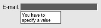
In contrast, at the time of this writing the Google Chrome 13 browser only navigates to the offending field and puts the focus there when an error is found. What is the correct behavior?
Neither is specified. However, if you would like to take control of the feedback shown to the user when a validation error occurs, there is an appropriate handler for you to do so: the invalid event.
Whenever a form is checked for validity—either due to the form being submitted, or due to the checkValidity function being called directly—any form in an invalid state will be delivered an invalid event. This event can be ignored, observed, or even cancelled. To add an event handler to a field which will receive this notification, add some code similar to Listing 8-2.
Listing 8-2. Adding Event Handlers for Invalid Events
// event handler for "invalid" events

function invalidHandler(evt) {

  var validity = evt.srcElement.validity;


  // check the validity to see if a particular constraint failed

  if (validity.valueMissing) {

    // present a UI to the user indicating that the field is missing a value

  }


  // perhaps check additional constraints here…


  // If you do not want the browser to provide default validation feedback,

  // cancel the event as shown here

  evt.preventDefault();

}


// register an event listener for "invalid" events

myField.addEventListener("invalid", invalidHandler, false);
Let's break that code snippet down a bit.
First, we declare a handler to receive invalid events. The first thing we do inside that handler is check the source of the event. Recall that the invalid event is fired on the form control with a validation error. Therefore, the srcElement of the event will be the misbehaving form control.
From the source, we grab the validity object. Using this ValidityState instance, we can check its individual constraint fields to determine exactly what went wrong. In this case, since we know that our field has a required attribute on it, we first check to see if the valueMissing constraint has been violated.
If our check succeeds, we can modify the user interface on the page to inform the user that a value needs to be entered for the field in error. Perhaps an alert or an informative error region could be displayed? This is up to you to decide.
Once we've told the user what the error is and how to correct it, we need to decide if we want the browser itself to display its built-in feedback. By default, the browser will do just that. To prevent the browser from showing its own error message, we can call evt.preventDefault() to stop the default handling and take care of the matter entirely ourselves.
Once again, the choice here is yours. The HTML5 Forms API provides you with the flexibility to achieve a customized API or to fall back to default browser behavior.
Turning Off Validation
In spite of the power behind the validation API, there are… (ahem) valid reasons why you might want to turn off validation on a control or an entire form. The most common reason is that you might choose to submit the temporary contents of a form to be saved or retrieved for later, even if the contents aren't quite valid yet.
Imagine the case of a user who is entering a complex order entry form, but needs to run an errand midway through the process. Ideally, you might present the user with a “save” button which stores the values of the form by submitting them to the server. However, if the form was only partially completed, validation rules might prevent the content from being submitted. The user would be very displeased if she had to complete or abandon the form due to an unexpected interruption.
To handle this, a form itself can be programmatically set with the attribute noValidate, which will cause it to forego any validation logic otherwise present and simply submit the form. Naturally, this attribute can be set either via script or original markup.
A more useful way to turn off validation is to set a formNoValidate attribute on a control such as a form submit button. Take the following submit button, set up as a “save” button, for example:
<input type="submit" formnovalidate name="save" value="Save current progress">

<input type="submit" name="process" value="Process order">
This snippet will create a two normal looking submit buttons. The second will submit the form, as usual. However, the first button is marked with the noValidate attribute, causing all validation to be bypassed when it is used. This allows the data to be submitted to the server without checking for correctness. Of course, your server will need to be set up to handle unvalidated data, but best practices dictate that this should be the case at all times.
Building an Application with HTML5 Forms
Now, let's use the tools we've described in this chapter to create a simple signup page which showcases new features in HTML5 Forms. Turning back to our familiar Happy Trails Running Club, we'll create a page for race registration that incorporates new form elements and validation.
As always, the source code for the demo files we show here is available in the code/forms folder. Therefore, we'll spend less attention on the CSS and peripheral markup, and more on the core of the page itself. That being said, let's start with a look at the finished page shown in Figure 8-4, then break it down into sections to tackle one-by-one.
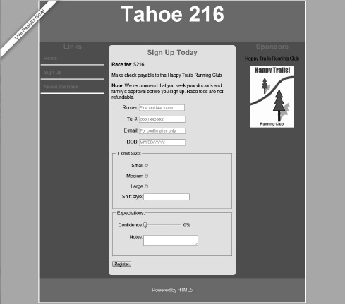
Figure 8-4. Example page with race signup form
This signup page demonstrates many of the elements and APIs we've explored in this chapter, including validation. Although the actual display may look somewhat different on your browser, it should degrade gracefully even if the browser does not support a particular feature.
On to the code!
The header, navigation, and footer have all been seen before on our previous examples. The page now contains a <form> element.
        <form name="register">

          <p><label for="runnername">Runner:</label>

             <input id="runnername" name="runnername" type="text"

                    placeholder="First and last name" required></p>

          <p><label for="phone">Tel #:</label>

             <input id="phone" name="phone" type="tel"

                    placeholder="(xxx) xxx-xxx"></p>

          <p><label for="emailaddress">E-mail:</label>

             <input id="emailaddress" name="emailaddress" type="email"

                    placeholder="For confirmation only"></p>

          <p><label for="dob">DOB:</label>

             <input id="dob" name="dob" type="date"

                    placeholder="MM/DD/YYYY"></p>
In this first section, we see the markup for the four primary inputs: name, phone, email, and birthday. For each, we've set a <label> with descriptive text and tied it to the actual control using the for attribute. We've also set placeholder text to show a description to the user of just what type of content belongs there.
For the runner name text field, we've made it a required value by setting the required attribute. This will cause form validation to kick in with a valueMissing constraint if nothing is entered. On the phone input, we've declared it to be of type tel. Your browser may or may not display this field differently or provide optimized keyboards.
Similarly, the e-mail field has been marked of type e-mail. Any specific handling is up to the browser. Some browsers will throw a typeMismatch constraint if they detect that the entered value is not a valid email.
Finally, the date-of-birth field is declared as type date. Not many browsers support this yet, but when they do, they will automatically render a date picking control on this input.
          <fieldset>

            <legend>T-shirt Size: </legend>

            <p><input id="small" type="radio" name="tshirt" value="small">

               <label for="small">Small</label></p>

            <p><input id="medium" type="radio" name="tshirt" value="medium">

               <label for="medium">Medium</label></p>

            <p><input id="large" type="radio" name="tshirt" value="large">

               <label for="large">Large</label></p>

            <p><label for="style">Shirt style:</label>

               <input id="style" name="style" type="text" list="stylelist" title="Years of

                          participation"></p>

            <datalist id="stylelist">

             <option value="White" label="1st Year">

             <option value="Gray" label="2nd - 4th Year">

             <option value="Navy" label="Veteran (5+ Years)">

            </datalist>

          </fieldset>
In our next section, we set out the controls to be used to T-shirt selection. The first few controls are a standard set of radio buttons for selecting a shirt size.
The next section is more interesting. Here, we exercise the list attribute and its corresponding <datalist> element. In the <datalist>, we declare a set of types that should be displayed for this list with distinct values and labels, representing the types of T-shirts available based on veteran status. Although this list is quite simple, the same technique can be used for lengthy lists of dynamic elements.
         <fieldset>

            <legend>Expectations:</legend>

            <p>

            <label for="confidence">Confidence:</label>

            <input id="confidence" name="level" type="range"

                   onchange="confidenceDisplay.value=(value +'%')"

                   min="0" max="100" step="5" value="0">

            <output id="confidenceDisplay">0%</output></p>

            <p><label for="notes">Notes:</label>

               <textarea id="notes" name="notes" maxLength="140"></textarea></p>

         </fieldset>
In our final section of controls, we create a slider for the user to express his or her confidence in completing the race. For this, we use an input of type range. Since our confidence is measured in percentages, we set a minimum, a maximum, and step value on the input. These force a constraint within normal percentage ranges. Additionally, we constrain the movement of the value to 5% step increments, which you will be able to observe if your browser supports a range slider interface control. Although it should not be possible to trigger them through simple control interactions, there are possible validation constraints on this control for rangeUnderflow, rangeOverflow, and stepMismatch.
Because a range control does not show a textual representation of its value by default, we will add an <output> to our application for that purpose. The confidenceDisplay will be manipulated through the onchange handler of the range control, but we'll see that in action in just a minute.
Finally, we add a <textarea> to contain any extra notes from the registrant. By setting a maxLength constraint on the notes control, we allow it to achieve a tooLong constraint, perhaps if a lengthy value is pasted into the field.
         <p><input type="submit" name="register" value="Register"></p>

        </form>
We finish off our control section with a submit button that will send in our form registration. In this default example, the registration is not actually being sent to any server.
There are a few scripts we still need to describe: how we will override the browser's built-in form validation feedback and how we will listen for events. Although you might find the browser's default handling of form errors to be acceptable, it is always good to know your options.
<script type="text/javascript">


    function invalidHandler(evt) {

        // find the label for this form control

        var label = evt.srcElement.parentElement.getElementsByTagName("label")[0];


        // set the label's text color to red

        label.style.color = 'red';


        // stop the event from propagating higher

        evt.stopPropagation();


        // stop the browser's default handling of the validation error

        evt.preventDefault();

    }


    function loadDemo() {

       // register an event handler on the form to

       // handle all invalid control notifications

       document.register.addEventListener("invalid", invalidHandler, true);

    }


    window.addEventListener("load", loadDemo, false);


</script>
This script shows how we override the handling of validation errors. We start by registering event listeners for the special event type invalid. In order to capture invalid events on all form controls, we register the handler on the form itself, making sure to register for event capture so that events will arrive at our handler.
// register an event handler on the form to// handle all invalid control notifications
document.register.addEventListener("invalid", invalidHandler, true);
Now, whenever any of our form elements triggers a validation constraint, our invalidHandler will be called. In order to provide more subtle feedback than some of the prominent browsers do by default, we will color the label of the offending form field red. To do so, first we locate the <label> by traversing to the parent.
// find the label for this form control

var label = evt.srcElement.parentElement.getElementsByTagName("label")[0];


// set the label's text color to red

label.style.color = 'red';
After setting the label to be a lovely red color, we want to stop the browser or any other handler from double handling our invalid event. Using the power of DOM, we call preventDefault() to stop any browser default handling of the event, and stopPropagation() to keep other handlers from getting access.
// stop the event from propagating higher

evt.stopPropagation();


// stop the browser's default handling of the validation error

evt.preventDefault();
And with just a few simple steps, we've provided a validated form with our own special interface validation code!
Practical Extras
Sometimes there are techniques that don't fit into our regular examples, but which nonetheless apply to many types of HTML5 applications. We present to you some short, but common, practical extras here.
The Password Is: Validation!
One handy way to use the HTML5 Form validation support for custom validators is to implement the common technique of verifying passwords during a password change. The standard technique is to provide two password fields which must match before the form is submitted successfully. Here, we provide a way to utilize the setCustomValidation call to make sure that two password fields are matched before the form submits.
Recall that the customError validation constraint gives you a chance to set an error on a form control whenever the standard constraint rules do not apply. Specifically, one good reason to trigger the customError constraint is when the validation depends on the concurrent state of multiple controls, such as the two password fields here.
Because the ValidityState object is assumed to be live once a reference to it is obtained, it is a good idea to set the custom error on the ValidityState whenever the password fields are mismatched and immediately clear the error whenever the fields match again. A good approach for achieving this is to use the onchange event handler for the password fields.
<form name="passwordChange">

    <p><label for="password1">New Password:</label>

    <input type="password" id="password1" onchange="checkPasswords()"></p>
<p><label for="password2">Confirm Password:</label>
<input type="password" id="password2" onchange="checkPasswords()"></p>
</form>
As you can see here, on a trivial form with two password fields, we can register a function to execute every time the value of one of the passwords changes.
function checkPasswords() {

  var pass1 = document.getElementById("password1");

  var pass2 = document.getElementById("password2");


  if (pass1.value != pass2.value)

    pass1.setCustomValidity("Your passwords do not match. Please recheck that your

          new password is entered identically in the two fields.");

  else

    pass1.setCustomValidity("");

}
Here is one way to handle the password matching. Simply grab the values of the two password fields, and if they do not match, set a custom error. For the sake of a validation routine, it is probably acceptable just to set the error on one of the two password fields. If they do match, set the empty string as the custom error to clear it; this is the specified way for removing a custom error.
Once you've got the error set on the field, you can use the approaches described earlier in this chapter to show feedback to the user and let her change the passwords to match, as expected.
Forms Are Stylin'
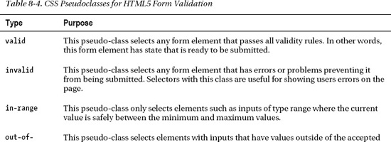
In order to help developers distinguish among form controls that have specific validation characteristics, the developers of CSS have helpfully added a set of pseudo-classes that can be used to set styles on form controls based on the state of their validity. In other words, if you desire form elements on your page to change style automatically based on whether or not they are currently complying with validation (or not), you can set these style pseudo-classes in your rules. These functions are very similar to long-standing pseudo classes such as :visited and :hover on links. Table 8-4 shows the new pseudo-classes proposed for the CSS Selectors Level 4 specification can be used to select form elements.
With these pseudo-classes, it is easy to mark form controls in a page with visual styling that changes as the form elements themselves adjust. For example, to show all invalid form elements with a red background, you can simply use the CSS rule:
:invalid {

    background-color:red;

}
These pseudo-classes will adjust automatically as the user enters input. No code is required!
Summary
In this chapter, you have seen how to take something old—HTML forms—and make it into something new by using new elements, attributes, and APIs available in HTML5. We've seen new controls for advanced input types, with even more to come. We've seen how client validation can be integrated directly into form controls in order to prevent unnecessary server round trips to process bad data. Overall, we've seen ways to reduce the amount of scripting you need to create full-featured applications user interfaces.
In the next chapter, we'll investigate how browsers give you the ability to spawn independent execution environments to handle long-running tasks: HTML5 Web Workers.