
The Dialog & Popup Widgets
In this chapter, I introduce the first two jQuery Mobile widgets: the dialog and popup. jQuery Mobile widgets behave slightly differently from those in jQuery UI, but – as you’ll learn – there is a common approach that underpins both libraries. Table 29-1 provides the summary for this chapter.
Table 29-1. Chapter Summary
| Problem | Solution | Listing |
|---|---|---|
| Create a dialog widget. | Add the data-role attribute with a value of dialog to a div element that contains the dialog content or the data-rel attribute, also with a value of dialog, to a navigation link that will open the dialog. | 1, 2 |
| Create a dialog programmatically. | Use the changePage method. | 3 |
| Add buttons to the dialog. | Add a elements to the dialog element. | 4, 5 |
| Configure the dialog. | Use the configuration data attributes or call the dialog method and use the configuration options. | 6, 7 |
| Close the dialog. | Call the close method. | 8 |
| Create a popup widget. | Add the data-role attribute with a value of popup to a div element within the jQuery Mobile page that will display the widget. | 9 |
| Configure the popup. | Apply data attributes to the a element that opens the popup, or to the div element that contains the popup or call the popup method. | 10–12 |
| Control the popup programmatically. | Use the open, close, and reposition methods. | 13 |
| Respond to changes in the popup. | Handle the popup events. | 14 |
Using the jQuery Mobile Dialog Widget
As its name suggests, the dialog widget presents the user with a dialog. Since this is the first of the jQuery Mobile widgets that I describe, I’ll show you different ways in which widgets can be created and managed to set the scene for the rest of this chapter and the chapters that follow.
jQuery Mobile will automatically create dialog widgets when it encounters an element whose data-role attribute is set to dialog, as shown in Listing 29-1.
Listing 29-1. Creating a Dialog Widget Declaratively with the data-role Attribute
<!DOCTYPE html>
<html>
<head>
    <title>Example</title>
    <meta name="viewport" content="width=device-width, initial-scale=1">
    <link rel="stylesheet" href="jquery.mobile-1.3.1.css" type="text/css" />
    <script type="text/javascript" src="jquery-1.10.1.js"></script>
    <script type="text/javascript" src="jquery.mobile-1.3.1.js"></script>
</head>
<body>
    <div id="page1" data-role="page">
        <div data-role="header">
           <h1>Jacqui's Shop</h1>
        </div>
        <div data-role="content">
            <a href="#dialog1">Show the dialog</a>
        </div>
    </div>
    <div id="dialog1" data-role="dialog">
        <div data-role="header">
           <h1>You clicked the link!</h1>
        </div>
        <div data-role="content">
            This is the content area of the dialog
        </div>
    </div>
</body>
</html>
This example contains a page with an a element that, when clicked, will navigate to the element called dialog1. The data-role attribute for the dialog1 element is set to dialog, which causes jQuery Mobile to display the element and its contents as a dialog, as illustrated by Figure 29-1.
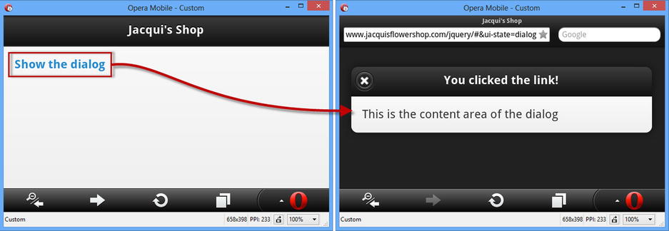
Figure 29-1. Displaying a page as a dialog
Dialogs can also be created through the application of the data-rel attribute to the navigation a element. In Listing 29-2, you can see how I have set the data-rel attribute to dialog in order to create an instance of the dialog widget from an element whose data-role attribute is set to page.
Listing 29-2. Using the data-rel Attribute to Create a Dialog Widget from a page
<!DOCTYPE html>
<html>
<head>
    <title>Example</title>
    <meta name="viewport" content="width=device-width, initial-scale=1">
    <link rel="stylesheet" href="jquery.mobile-1.3.1.css" type="text/css" />
    <script type="text/javascript" src="jquery-1.10.1.js"></script>
    <script type="text/javascript" src="jquery.mobile-1.3.1.js"></script>
</head>
<body>
    <div id="page1" data-role="page">
        <div data-role="header">
           <h1>Jacqui's Shop</h1>
        </div>
        <div data-role="content">
            <a href="#page2" data-rel="dialog">Show the dialog</a>
        </div>
    </div>
    <div id="page2" data-role="page">
        <div data-role="header">
           <h1>You clicked the link!</h1>
        </div>
        <div data-role="content">
            This is the content area of the dialog
        </div>
    </div>
</body>
</html>
In this example, there are two regular jQuery Mobile pages. The link in the first page is just like the links I was using for navigation in Chapter 28, with the exception that I have applied the data-rel attribute and set the value to dialog.
Creating the Dialog Widget Programmatically
The declarative approach is useful, but it requires you to fix the way that your content is displayed statically in the HTML. Sometimes you will want to decide to display a page as a dialog dynamically, which can be done through the changePage method and the role setting it supports. Listing 29-3 shows the use of the changePage method to create a dialog.
Listing 29-3. Creating a Dialog Programmatically with the changePage Method
<!DOCTYPE html>
<html>
<head>
    <title>Example</title>
    <meta name="viewport" content="width=device-width, initial-scale=1">
    <link rel="stylesheet" href="jquery.mobile-1.3.1.css" type="text/css" />
    <script type="text/javascript" src="jquery-1.10.1.js"></script>
    <script>
        $(document).bind("pageinit", function (event, data) {
            $("#dialogLink").click(function (e) {
                $.mobile.changePage(this.href, {
                    role: "dialog"
                });
            });
        });
    </script>
    <script type="text/javascript" src="jquery.mobile-1.3.1.js"></script>
</head>
<body>
    <div id="page1" data-role="page">
        <div data-role="header">
           <h1>Jacqui's Shop</h1>
        </div>
        <div data-role="content">
            <p><a id="dialogLink" href="#page2">Show the dialog</a></p>
            <p><a href="#page2">Show the page</a></p>
        </div>
    </div>
    <div id="page2" data-role="page">
        <div data-role="header">
           <h1>You clicked the link!</h1>
        </div>
        <div data-role="content">
            This is page 2
            <a href="#" data-role="button" data-rel="back">Close</a>
        </div>
    </div>
</body>
</html>
This technique means you can use the same content in different ways. In the listing, I have defined two links, one of which I allow to use standard navigation to load a page defined in the same HTML document. I have defined a handler function for the click event from the other a element, which I process by calling the changePage method with a role setting of dialog. This means the way that the page is handled will depend on which link is clicked, as shown in Figure 29-2.
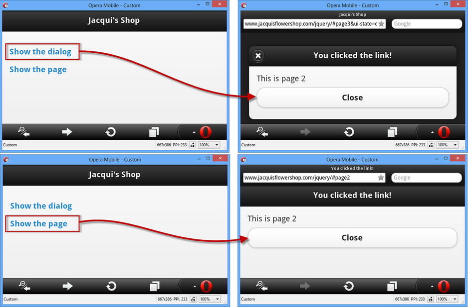
Figure 29-2. Creating a dialog programmatically
 Note Caution is required when using this technique because jQuery Mobile caches the role associated with content – and that means that once you have displayed a page as a dialog, it will always be displayed as a dialog, even if you call changePage again with a role setting of page (or until the HTML document is reloaded).
You can add a close button to the dialog by adding a button element to the dialog’s content, setting the data-role attribute to button and the data-rel attribute to back. I describe the jQuery Mobile button widget fully in Chapter 30, but you can see how it is applied for the dialog widget in Listing 29-4.
Listing 29-4. Adding a Close Button to a Dialog
<!DOCTYPE html>
<html>
<head>
    <title>Example</title>
    <meta name="viewport" content="width=device-width, initial-scale=1">
    <link rel="stylesheet" href="jquery.mobile-1.3.1.css" type="text/css" />
    <script type="text/javascript" src="jquery-1.10.1.js"></script>
    <script type="text/javascript" src="jquery.mobile-1.3.1.js"></script>
</head>
<body>
    <div id="page1" data-role="page">
        <div data-role="header">
           <h1>Jacqui's Shop</h1>
        </div>
        <div data-role="content">
            <a href="#page2" data-rel="dialog">Show the dialog</a>
        </div>
    </div>
    <div id="page2" data-role="page">
        <div data-role="header">
           <h1>You clicked the link!</h1>
        </div>
        <div data-role="content">
            This is the content area of the dialog
            <a href="#" data-role="button" data-rel="back">Close</a>
        </div>
    </div>
</body>
</html>
I don’t have to specify the target for the link. I just set the href attribute to # and leave jQuery Mobile to figure out what to do. This is useful because you may want to display a dialog from different pages, and you don’t know which of them caused the dialog to be shown and therefore where the browser should return to. Figure 29-3 shows the effect of adding this element to the dialog.
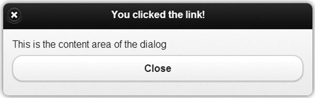
Figure 29-3. Adding a close button to a dialog
You can additional buttons to a dialog with further a elements whose href attributes point to the pages that you want to display. This is what I have done in Listing 29-5, where I have added a link to another jQuery Mobile page in the same HTML document.
Tip If you don’t want to respond to a button by navigating to a new page, then you can handle the click event from the a element and use the close method to close the dialog – see the “Using the Dialog Methods” section later in the chapter for an example.
Listing 29-5. Adding a Navigation Button to a Dialog
<!DOCTYPE html>
<html>
<head>
    <title>Example</title>
    <meta name="viewport" content="width=device-width, initial-scale=1">
    <link rel="stylesheet" href="jquery.mobile-1.3.1.css" type="text/css" />
    <script type="text/javascript" src="jquery-1.10.1.js"></script>
    <script type="text/javascript" src="jquery.mobile-1.3.1.js"></script>
</head>
<body>
    <div id="page1" data-role="page">
        <div data-role="header">
           <h1>Jacqui's Shop</h1>
        </div>
        <div data-role="content">
            <a href="#page2" data-rel="dialog">Show the dialog</a>
        </div>
    </div>
    <div id="page2" data-role="page" data-overlay-theme="d">
        <div data-role="header">
           <h1>You clicked the link!</h1>
        </div>
        <div data-role="content">
            This is the content area of the dialog
            <a href="#page3" data-role="button">OK</a>
            <a href="#" data-role="button" data-rel="back">Close</a>
        </div>
    </div>
    <div id="page3" data-role="page">
        <div data-role="header">
           <h1>Jacqui's Shop</h1>
        </div>
        <div data-role="content">
            This is page 3. You came here via the dialog.
        </div>
    </div>
</body>
</html>
In this example, I have added an a element that takes the user to page3, which I have also added to the document. Figure 29-4 shows the navigation from the dialog to the new page.
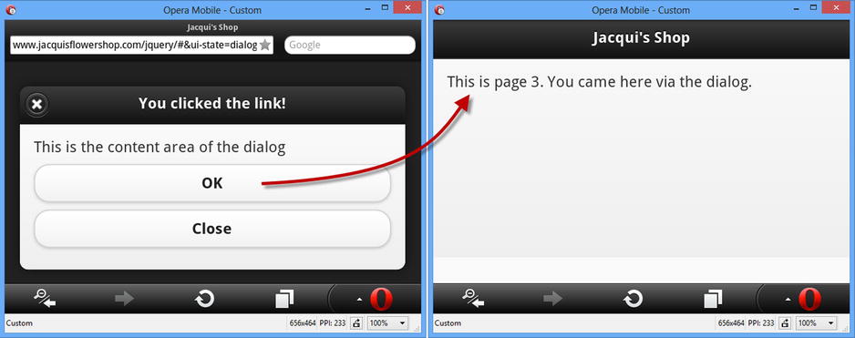
Figure 29-4. Adding a navigation link/button to a dialog
Configuring the Dialog Widget
The dialog widget defines a set of configuration options, which can either be set declaratively using data attributes or set using a JavaScript method call. I have listed both sets of options in Table 29-2, and below I describe how to use declarative and programmatic configuration.
Table 29-2. Settings for the Dialog Widget
| Data Attribute | Setting | Description |
|---|---|---|
| data-close-btn | closeBtn | Gets or sets the position of the close button in the dialog header. The supported values are left, right, and none. |
| data-close-btn-text | closeBtnText | Gets or sets the text for the close button in the dialog header. This text is not displayed to the user, but it is detected by accessibility software. |
| data-corners | corners | Gets or sets whether the dialog should be displayed with rounded corners. The default value is true. |
| data-overlay-theme | overlayTheme | Gets or sets the theme over which the dialog is drawn. The setting is case sensitive and must be expressed in lower case. |
In most situations it is simpler and easier to configure widgets using data attributes and let automatic enhancement apply your settings. This is the standard jQuery Mobile approach to configuration, and you can see how I have used it for the data-overlay-theme attribute in Listing 29-6.
Listing 29-6. Configuring the Dialog Widget with a Data Attribute
<!DOCTYPE html>
<html>
<head>
    <title>Example</title>
    <meta name="viewport" content="width=device-width, initial-scale=1">
    <link rel="stylesheet" href="jquery.mobile-1.3.1.css" type="text/css" />
    <script type="text/javascript" src="jquery-1.10.1.js"></script>
    <script type="text/javascript" src="jquery.mobile-1.3.1.js"></script>
</head>
<body>
    <div id="page1" data-role="page">
        <div data-role="header">
           <h1>Jacqui's Shop</h1>
        </div>
        <div data-role="content">
            <a href="#dialog1">Show the dialog</a>
        </div>
    </div>
    <div id="dialog1" data-role="dialog" data-overlay-theme="d">
        <div data-role="header">
           <h1>You clicked the link!</h1>
        </div>
        <div data-role="content">
            This is the content area of the dialog
        </div>
    </div>
</body>
</html>
I have specified that the D swatch should be used as the overlay on which the dialog is displayed. You can see the effect in Figure 29-5: the dialog is displayed on a light-colored background instead of the black background associated with the default A swatch. (I described the jQuery Mobile approach to themes and swatches in Chapter 28.)
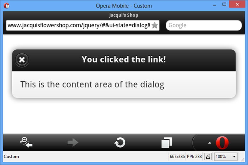
Figure 29-5. Configuring a dialog widget with a data attribute
You can configure a dialog widget after it has been created by calling the jQuery Mobile dialog method, passing in an object whose properties correspond to the settings from Table 29-2 that you want to change. In Listing 29-7, you can see how I have used the dialog method to configure the dialog.
Listing 29-7. Configuring a Dialog Widget Programmatically
<!DOCTYPE html>
<html>
<head>
    <title>Example</title>
    <meta name="viewport" content="width=device-width, initial-scale=1">
    <link rel="stylesheet" href="jquery.mobile-1.3.1.css" type="text/css" />
    <script type="text/javascript" src="jquery-1.10.1.js"></script>
    <script>
        $(document).bind("pageinit", function () {
            $("#dialog1").dialog({
                corners: false,
                overlayTheme: "e"
            });
        });
    </script>
    <script type="text/javascript" src="jquery.mobile-1.3.1.js"></script>
</head>
<body>
    <div id="page1" data-role="page">
        <div data-role="header">
           <h1>Jacqui's Shop</h1>
        </div>
        <div data-role="content">
            <a href="#dialog1">Show the dialog</a>
        </div>
    </div>
    <div id="dialog1" data-role="dialog" data-overlay-theme="d">
        <div data-role="header">
           <h1>You clicked the link!</h1>
        </div>
        <div data-role="content">
            This is the content area of the dialog
        </div>
    </div>
</body>
</html>
You can configure widgets in response to the pageinit event, and in the listing you can see how I select the element that underlies the widget and call the dialog method on it. The object that I pass to the dialog method has properties that correspond to the settings in Table 29-2, and you can see that I have defined new values for the corners and overlayTheme settings. The options passed to the dialog method override the data property values, and you can see the effect in Figure 29-6.
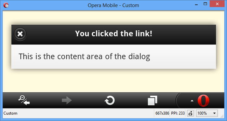
Figure 29-6. Configuring a dialog widget programmatically
Caution The jQuery Mobile API documentation suggests that you can use the jQuery UI style option method call to configure dialog widgets, like this: $("#dialog1"), dialog("option," "corners," false). However, if you use this approach, you will see an error message telling you that you can’t call methods before widgets are initialized. This method call will only work once the widget has been displayed, but which time it is too late to perform configuration tasks. Instead, use the technique shown in the listing: pass in a configuration object to the dialog method in response to the pageinit event.
The dialog widget only defines one method, which closes the dialog programmatically. I have described the method in Table 29-3 so that you can find it more easily when performing a quick search in the future.
Table 29-3. Dialog Methods
| Method | Description |
|---|---|
| dialog("close") | Closes the dialog. |
In Listing 29-8, I have created a dialog that is displayed for a fixed amount of time. In addition to the close method I have used the data-close-btn attribute to remove the close button from the menu bar.
Listing 29-8. Using the Dialog close Method
<!DOCTYPE html>
<html>
<head>
    <title>Example</title>
    <meta name="viewport" content="width=device-width, initial-scale=1">
    <link rel="stylesheet" href="jquery.mobile-1.3.1.css" type="text/css" />
    <script type="text/javascript" src="jquery-1.10.1.js"></script>
    <script>
        $(document).bind("pageinit", function () {
            $("#page1 a").click(function (e) {
                var duration = 15;
                $("#remaining").text(duration);
                var interval = setInterval(function () {
                    $("#remaining").text(--duration);
                    if (duration == 0) {
                        clearInterval(interval);
                        $("#dialog1").dialog("close");
                    }
                }, 1000);
            });
        });
    </script>
    <script type="text/javascript" src="jquery.mobile-1.3.1.js"></script>
</head>
<body>
    <div id="page1" data-role="page">
        <div data-role="header">
           <h1>Jacqui's Shop</h1>
        </div>
        <div data-role="content">
            <a href="#dialog1">Show the dialog</a>
        </div>
    </div>
    <div id="dialog1" data-role="dialog" data-close-btn="none" data-overlay-theme="d">
        <div data-role="header">
           <h1>Important</h1>
        </div>
        <div data-role="content">
            This in an important message that will be displayed
            for <span id="remaining"></span> seconds.
        </div>
    </div>
</body>
</html>
The script element in this example sets up a handler for the click event triggered when the link that opens the dialog is triggered. The only way to open a dialog programmatically is with the changePage method, so I just let the default event action take care of opening the dialog and start a timer that counts down 15 seconds. I update the contents of a span element displayed by the dialog every second and call the dialog close method when the timer expires. The result is the dialog shown in Figure 29-7.
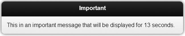
Figure 29-7. A self-closing dialog widget
There are a couple of points to note. The first is that I don’t have to explicitly refresh the content of the dialog to reflect the changes in the span element – the dialog automatically updates itself. The second point is that while I have created a dialog that doesn’t have close buttons, the user can still dismiss my dialog by using the browser back button.
The jQuery Mobile dialog widget defines a single event, which I have described in Table 29-4. I never use this event and tend to handle the page-level events that I described in Chapter 28 instead.
Table 29-4. Dialog Events
| Event | Description |
|---|---|
| create | This event is triggered when the dialog widget is created. |
Using the jQuery Mobile Popup Widget
The jQuery Mobile popup widget presents content in a popup. Popups are light-weight alternatives to dialogs but offer more programmatic control.
Popups are created by applying the data-role attribute to an element and setting the value to popup. Popups are not displayed automatically but are opened when the user clicks on an a element that targets the popup element and whose data-rel attribute is also set to popup. The popup and the link that opens it must be within the same jQuery Mobile page, as shown in Listing 29-9.
Listing 29-9. Creating a jQuery Mobile Popup Widget
<!DOCTYPE html>
<html>
<head>
    <title>Example</title>
    <meta name="viewport" content="width=device-width, initial-scale=1">
    <link rel="stylesheet" href="jquery.mobile-1.3.1.css" type="text/css" />
    <script type="text/javascript" src="jquery-1.10.1.js"></script>
    <script type="text/javascript" src="jquery.mobile-1.3.1.js"></script>
</head>
<body>
    <div id="page1" data-role="page">
        <div data-role="header">
           <h1>Jacqui's Shop</h1>
        </div>
        <div data-role="content">
            <a href="#popup" data-rel="popup">Show the popup</a>
        </div>
        <div id="popup" data-role="popup">
            <p>This is the popup content</p>
        </div>
    </div>
</body>
</html>
Clicking the link causes the popup to appear, as shown in Figure 29-8. Clicking outside of the popup dismisses it.
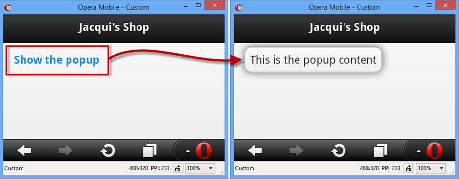
Figure 29-8. Creating a jQuery Mobile popup
As you can see from the figure, the popup is positioned over the link that opened it, which is rarely the effect that you want. You can configure the popup in two ways – either by configuring the a element that opens the popup or by configuring the popup itself.
Configuring the Link That Opens the Popup
The advantage of configuring the a element is that you can use the same popup several times, but apply different configurations. The drawback is that there are only two configuration options – but, fortunately, they are the ones that you are likely to want to adjust. I have listed the data attributes that can be applied to the a elements in Table 29-5.
Table 29-5. Data Attributes for a Elements That Open Popups
| Data Attribute | Description |
|---|---|
| data-position-to | Specifies the position of the popup relative to the a element that opens it. The options are described in Table 29-6. |
| data-transition | Specifies the transition used to display the popup – see Chapter 28 for the list of jQuery Mobile transitions. |
The data-position-to attribute specifies the position of the popup relative to the a element and can be set to the values shown in Table 29-6.
Table 29-6. Values for the data-position-to Attribute
| Value | Description |
|---|---|
| origin | Centers the popup over the a element. |
| window | Centers the popup in the window. |
| selector | Centers the popup on the first element that matches the selector. If that element is not visible, then the popup is centered in the window. |
In Listing 29-10, you can see how I have used the data-position-to attribute to change the position of the popup using a selector.
Listing 29-10. Configuring the Popup via the Link That Opens It
<!DOCTYPE html>
<html>
<head>
    <title>Example</title>
    <meta name="viewport" content="width=device-width, initial-scale=1">
    <link rel="stylesheet" href="jquery.mobile-1.3.1.css" type="text/css" />
    <script type="text/javascript" src="jquery-1.10.1.js"></script>
    <script type="text/javascript" src="jquery.mobile-1.3.1.js"></script>
    <style>
        #anchor { position: absolute; right: 10px; }
    </style>
</head>
<body>
    <div id="page1" data-role="page">
        <div data-role="header">
           <h1>Jacqui's Shop</h1>
        </div>
        <div data-role="content">
            <a href="#popup" data-rel="popup"
                data-position-to="#anchor">Show the popup</a>
            <span id="anchor">Anchor</span>
        </div>
        <div id="popup" data-role="popup">
            <p>This is the popup content</p>
        </div>
    </div>
</body>
</html>
I have used the selector option, specifying #anchor for the value for the data-position-to attribute on the a element that opens the popup. This selector matches the id of a div element that I have positioned at the right edge of the window with CSS. You can see the effect in Figure 29-9.
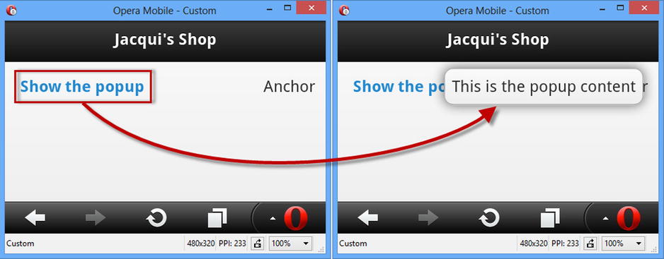
Figure 29-9. Configuring the position of the popup via the a element
Configuring the Popup Directly
There are more configuration options available when you configure the widget directly. As with the dialog widget, you can configure the popup with data attributes or via the popup method, and I have listed both in Table 29-7. Most of the configuration options are self-evident or similar to those used by the dialog widget.
Table 29-7. Settings for the Dialog Widget
| Data Attribute | Setting | Description |
|---|---|---|
| data-corners | corners | Specifies whether the popup is drawn with round corners. The default is true. |
| data-dismissable | dismissable | If set to false, the popup is not dismissed when the user clicks outside of the widget. The default is true. |
| data-history | history | Specifies whether a history item is created before the popup is open. The default is true, which means that the browser is closed when the browser back button is clicked. |
| data-overlay-theme | overlayTheme | Specifies the theme used for the overlay. The default is null, which presents a transparent background. |
| data-position-to | positionTo | Specifies the position of the popup using the values in Table 29-6. |
| data-shadow | shadow | Specifies whether the popup will be drawn with a shadow. The default is true. |
| data-tolerance | tolerance | Specifies the minimum distances between the popup and the edges of the window. The default values are 30, 15, 30, 15. |
| data-transition | transition | Specifies the transition used when the popup is opened and closed. |
The setting that causes the most confusion with the popup widget is data-history, which determines if a new entry in the browser history is created before the popup is opened. The effect of this setting means that the popup is closed by the browser back button – but this is a feature that doesn’t always make sense, especially when the popup is opened and closed in response to a touch event, as demonstrated by Listing 29-11.
Listing 29-11. The Effect of Popup History Entries and Mouse Triggers
<!DOCTYPE html>
<html>
<head>
    <title>Example</title>
    <meta name="viewport" content="width=device-width, initial-scale=1">
    <link rel="stylesheet" href="jquery.mobile-1.3.1.css" type="text/css" />
    <script type="text/javascript" src="jquery-1.10.1.js"></script>
    <script type="text/javascript" src="jquery.mobile-1.3.1.js"></script>
    <script>
        var mouseHandlerSet = false;
        $(document).bind("pageinit", function () {
            if (!mouseHandlerSet) {
                $("#page1 a").mouseenter(function (e) {
                    $("#popup").popup("open", {
                        x: e.pageX, y: e.pageY
                    });
                });
                $("#popup").mouseleave(function (e) {
                    $(this).popup("close");
                });
                mouseHandlerSet = true;
            }
        });
    </script>
</head>
<body>
    <div id="page1" data-role="page">
        <div data-role="header">
           <h1>Jacqui's Shop</h1>
        </div>
        <div data-role="content">
            <p><a href="#popup" data-rel="popup">Popup</a></p>
        </div>
        <div id="popup" data-role="popup" data-history="false">
            <p>This is the popup content</p>
        </div>
    </div>
</body>
</html>
This example uses the popup open and close methods, which I describe later in the chapter, so that the popup is shown when the user moves the mouse or pointer over the a element and hidden when the user moves the mouse out of the popup (I used a configuration option passed to the open method to ensure that the popup is opened under the mouse pointer).
In this situation, the user may not expect the back button to simply close the popup since no explicit navigation was performed to open it in the first place – and this is a good opportunity to consider the data-history attribute as to create a consistent experience.
Tip I am qualifying the use of this configuration setting carefully because understanding the mechanism is only part of the confusion that surrounds the use of popups. The other issue is deciding which approach to take – and this is something that can only be decided in the context of the rest of your application. User expectations in this kind of situation are hard to predict, and only user testing will show you which approach creates a natural experience for your web app. Don’t be tempted to skimp on testing and simply make this a configurable option – most users attribute inconsistent behaviors to bad implementation and won’t make the effort to see if it can be changed.
Using Popups to Present Rich Content
Popups can be used to present rich content, and a common use for popups is to present the user with a set of image thumbnails that open the full-size image in a popup, which is what I have done in Listing 29-12. (I included the images from this example in the free download from apress.com that accompanies this book.)
Listing 29-12. Using the Popup to Display Rich Content
<!DOCTYPE html>
<html>
<head>
    <title>Example</title>
    <meta name="viewport" content="width=device-width, initial-scale=1">
    <link rel="stylesheet" href="jquery.mobile-1.3.1.css" type="text/css" />
    <script type="text/javascript" src="jquery-1.10.1.js"></script>
    <script type="text/javascript" src="jquery.mobile-1.3.1.js"></script>
    <style>
        .smallImage { height: 40%; width: 40%; padding: 5px}
    </style>
    <script>
        $(document).bind("pageinit", function () {

            var data = ["beach.png", "clouds.png", "fishing.png", "storms.png"];
            for (var i = 0; i < data.length; i++) {
                $("<img>").addClass("smallImage").attr("src",
                    data[i]).appendTo("#contentHolder");
            }

            $("#popup").popup({
                corners: false,
                overlayTheme: "a"
            });

            $("#contentHolder img").bind("tap", function (e) {
                var maxHeight = $(window).height() - 10 + "px";
                $("#LgImage").attr("src", e.target.src).css("max-height", maxHeight);
                $("#popup").popup("open");
            });
        });
    </script>
</head>
<body>
    <div id="page1" data-role="page" data-theme="d">
        <div id="contentHolder" data-role="content"></div>
        <div id="popup" data-role="popup" data-history="true">
            <img id="LgImage" class="zoomImg" src="" />
        </div>
    </div>
</body>
</html>
I use a for loop to generate a set of four thumbnail img elements that I add to the jQuery Mobile page and use standard CSS to ensure that they are all the same size. I create a handler for the tap event (which I described in Chapter 27) that sets the selected image as the content of the popup and calls the open method to display it to the user (I describe the open method in the Using the Popup Methods section later in this chapter, but for now it is enough to know that calling it will display the popup). You can see the effect in Figure 29-10: the user taps one of the thumbnail images and a larger version is displayed in the popup.
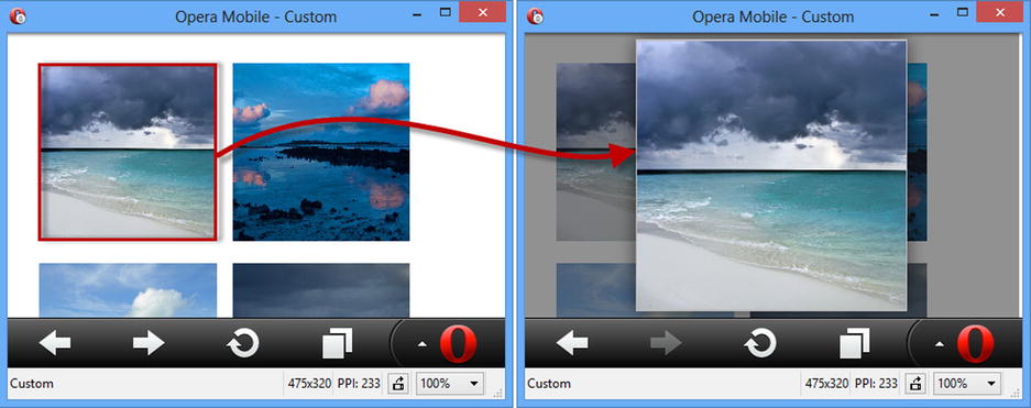
Figure 29-10. Using a popup to display images
I have used a mix of data attributes and settings to configure the popup, just to show both in use. The div element that underlies the popup has the data-history attribute, as follows:
...
<div id="popup" data-role="popup"data-history="true">
    <img id="LgImage" class="zoomImg" src="" />
</div>
...
This is the default value for the data-history attribute, but I like to be specific about this setting since it causes so much confusion. I used the popup method in the script element to set other options, as follows:
...
$("#popup").popup({
    corners: false,
    overlayTheme: "a"
});
...
Using rounded corners would clip part of the large image, so I specify square corners using the corners setting. I want to focus the user’s attention on the large image when the popup is displayed, and so I have used the overlayTheme setting to provide a dark background for the popup.
A little extra work is required when using a popup to display content that might be larger than the popup itself because, by default, the content will scroll. To avoid this, I get the height of the window and use it as the basis for setting the height of the image in the popup, like this:
...
var maxHeight = $(window).height() - 10 + "px";
$("#LgImage").attr("src", e.target.src).css("max-height", maxHeight);
...
I make the image 10 pixels smaller than the window, which gives me a small border around the image to emphasize the fact that the user is seeing a popup. In theory, I should align my border with the tolerance setting, but it is unreliable as I write this and so I just use an explicit value to get the effect I want. I made the beach.png image, which is the first thumbnail in the sequence, larger than the others, and in Figure 29-11 you can what happens if I don’t set the setting for the CSS max-height property: the top and bottom of the image are not displayed and there is no visual cue to indicate that the user can scroll to see the rest of the image.
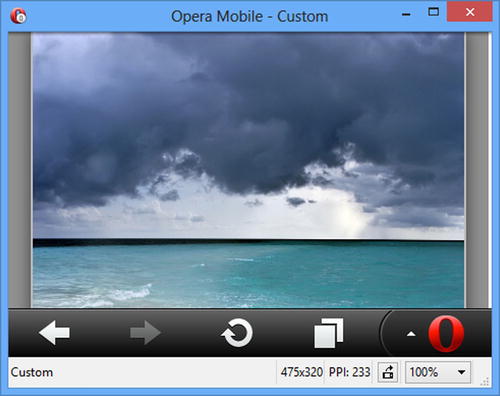
Figure 29-11. The effect of displaying content that is larger than the popup
The popup widget defines the methods shown in Table 29-8.
Table 29-8. Popup Methods
| Method | Description |
|---|---|
| popup("open") | Opens the popup. |
| popup("close") | Closes the popup. |
| popup("reposition") | Changes the position of the popup. |
I demonstrated the basic use of the open method in the previous example, but you can provide an optional argument that configures how the popup is opened, providing equivalent functionality to the data attributes that are used with a elements. The optional argument is an object whose property names are shown in Table 29-9.
Table 29-9. Properties for the Optional Argument to the open Method
| Name | Description |
|---|---|
| x | Specifies the X coordinate where the popup should be displayed. |
| y | Specifies the Y coordinate where the popup should be displayed. |
| transition | Specifies the transition used to animate the popup opening – see Chapter 28 for details of the jQuery Mobile transitions. |
| positionTo | Specifies the position of the popup, using the values described in Table 29-6. |
The reposition method also takes a configuration object argument and you can use the x, y, and positionTo properties to specify the new location for the popup. The close method doesn’t take any arguments and just dismisses the popup. In Listing 29-13, you can see all three methods in use.
Listing 29-13. Using the Popup Methods
<!DOCTYPE html>
<html>
<head>
    <title>Example</title>
    <meta name="viewport" content="width=device-width, initial-scale=1">
    <link rel="stylesheet" href="jquery.mobile-1.3.1.css" type="text/css" />
    <script type="text/javascript" src="jquery-1.10.1.js"></script>
    <script type="text/javascript" src="jquery.mobile-1.3.1.js"></script>
    <script>
        $(document).bind("pageinit", function () {
            $("button").bind("vmousedown", function (e) {
                var pop = $("#popup");
                switch (e.target.innerText) {
                    case "Open":
                        pop.popup("open", {
                            x: 10, y: 10, transition: "fade"
                        });
                        break;
                    case "Close":
                        pop.popup("close");
                        break;
                    default:
                        pop.popup("reposition", {
                            positionTo: e.target.innerText == "Window"
                                ? "window" : "#page1 button"
                        });
                        break;
                }
            });
        });
    </script>
</head>
<body>
    <div id="page1" data-role="page" data-theme="d">
        <div data-role="content">
            <button>Open</button>
        </div>
        <div id="popup" data-role="popup" data-history="true"
                data-dismissible="false">
            <button>Selector</button>
            <button>Window</button>
            <button>Close</button>
        </div>
    </div>
</body>
</html>
The jQuery Mobile page in this listing contains a button whose vmousedown event I handle by calling the open method on the popup. I pass in the optional configuration object to specify that the popup should be shown at a specific location (10 pixels from the top-left corner on the x- and y- axis) with the fade transition.
The popup contains additional buttons. The Close button calls the close method to hide the popup, and the others call the reposition method to specify different locations that the popup should be moved to. You can see the results in Figure 29-12.
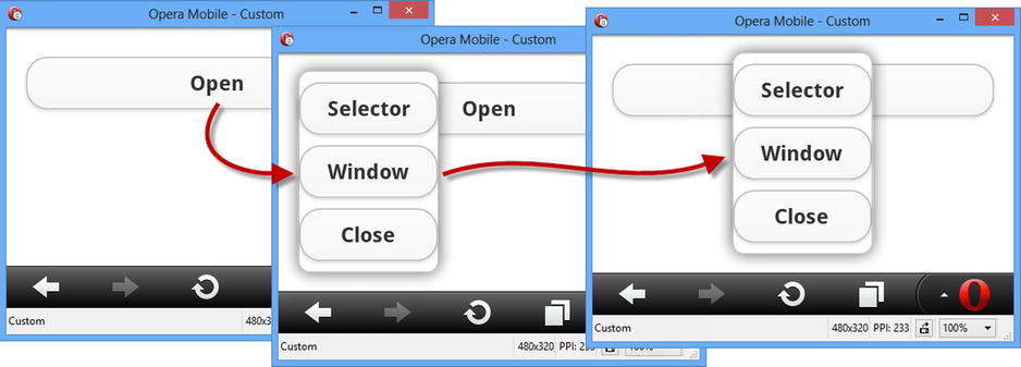
Figure 29-12. Using the popup methods
Tip Notice that I have set the data-dismissible attribute to false in this example. Without this setting, the synthetically generated mouse events that most touch browsers produce (as described in Chapter 27) are interpreted as clicks outside of the popup, causing the popup to be closed just after it is open. Setting the data-dismissible attribute to false ensures that this won’t happen, and the popup can only be dismissed by the button that calls the close method.
The jQuery Mobile popup widget defines the events shown in Table 29-10.
Table 29-10. Popup Events
| Event | Description |
|---|---|
| create | Triggered when the popup widget is created. |
| beforeposition | Triggered before the popup is repositioned. |
| afteropen | Triggered after the popup has been displayed. |
| afterclose | Triggered after the popup has been hidden. |
I rarely find these events useful and my use of the popup widget is generally limited to the methods and configuration options. The one exception is when I want to display a popup for a limited period of time, in which case the afteropen event can be useful, as Listing 29-14 demonstrates.
Listing 29-14. Handling Popup Events
<!DOCTYPE html>
<html>
<head>
    <title>Example</title>
    <meta name="viewport" content="width=device-width, initial-scale=1">
    <link rel="stylesheet" href="jquery.mobile-1.3.1.css" type="text/css" />
    <script type="text/javascript" src="jquery-1.10.1.js"></script>
    <script>
        $(document).bind("pageinit", function () {
            $("#popup").popup({
                afteropen: function (e) {
                    setTimeout(function () {
                        $("#popup").popup("close");
                    }, 5000);
                }
            });
        });
    </script>
    <script type="text/javascript" src="jquery.mobile-1.3.1.js"></script>
</head>
<body>
    <div id="page1" data-role="page">
        <div data-role="header">
           <h1>Jacqui's Shop</h1>
        </div>
        <div data-role="content">
            <a href="#popup" data-rel="popup">Show the popup</a>
        </div>
        <div id="popup" data-role="popup" data-position-to="window">
            <p>This is the popup content</p>
        </div>
    </div>
</body>
</html>
Caution I only use this technique when I can’t negotiate an alternative approach with the client. My feeling is that popups should be solely under the control of the user and that making them appear and disappear in ways that are not directly linked to user interactions can cause confusion.
In this example I handle the afteropen method be calling the setTimeout function to register a callback that will be executed five seconds later. The callback calls the close method to dismiss the popup.
Summary
In this chapter, I introduced the first two jQuery Mobile widgets: the dialog and the popup. jQuery Mobile widgets follow the same basic structure and philosophy as jQuery UI widgets, but with the obvious optimizations for mobile devices. In Chapter 30, I describe the button and collapsible block widgets.