
Buttons and Collapsible Blocks
In this chapter, I describe two additional jQuery Mobile widgets: buttons and collapsible blocks. The jQuery Mobile button widget works in a similar way to the jQuery UI buttons you saw earlier in the book, with the exception that you can create and use simple buttons without using any custom JavaScript code at all, relying instead on data attributes.
A collapsible block is like a single panel from an accordion; in fact, you can use collapsible blocks on their own or combine several together to form a simple accordion. Table 30-1 provides the summary for this chapter. I also show you widgets that offer variations on the same theme – Navbars, which group buttons to provide consistent navigation support and collapsible sets, which can be used to create accordion widgets.
Table 30-1. Chapter Summary
| Problem | Solution | Listing |
|---|---|---|
| Create a button widget automatically. | Add a button element or an input element whose type is submit, reset, or button. | 1 |
| Create button widgets from other elements. | Apply the data-role attribute with a value of button. | 2 |
| Create a group of buttons. | Use the data-role attribute with a value of controlgroup. Use the data-type attribute to change the orientation. | 3, 4 |
| Add and position icons on buttons. | Use the data-icon and data-iconpos attributes. | 5 |
| Create smaller buttons. | Use the data-mini and data-inline attributes. | 6 |
| Update a button to reflect changes in the underlying element. | Use the refresh method. | 7 |
| Respond to button events. | Handle events from the underlying element. | 8 |
| Provide consistent navigation buttons. | Use the navbar widget. | 9 |
| Position the icons in a navbar. | Use the data-iconpos attribute | 10 |
| Create a collapsible block. | Apply the data-role attribute with a value of collapsible. Ensure that there is a header element as the first child. | 11, 12 |
| Receive notifications when a block is collapsed or expanded. | Handle the collapse and expand events. | 13 |
| Create an accordion. | Use the data-role attribute with a value of collapsible-set value. | 14 |
Using jQuery Mobile Buttons
I already used some button widgets in earlier examples, but now it is time to loop back and explain how they work.
As part of the automatic page-enhancement process, jQuery Mobile creates buttons widgets from button elements or from input elements whose type attribute is set to submit, reset, button, or image. You don’t have to take any special action for these element types because jQuery Mobile does all the work for you. Listing 30-1 shows a page that contains some of these automatically enhanced elements.
Listing 30-1. Relying on the Automatic Creation of Button Widgets
<!DOCTYPE html>
<html>
<head>
    <title>Example</title>
    <meta name="viewport" content="width=device-width, initial-scale=1">
    <link rel="stylesheet" href="jquery.mobile-1.3.1.css" type="text/css" />
    <script type="text/javascript" src="jquery-1.10.1.js"></script>
    <script type="text/javascript" src="jquery.mobile-1.3.1.js"></script>
</head>
<body>
    <div id="page1" data-role="page" data-theme="b">
        <div data-role="header">
           <h1>Jacqui's Shop</h1>
        </div>
        <div data-role="content">
            <button>Button</button>
            <input type="submit" value="Input (Submit)" />
            <input type="reset" value="Input (Reset)" />
            <input type="button" value="Input (Button)" />
        </div>
    </div>
</body>
</html>
You can see how a button widget is created for each type of element in Figure 30-1.
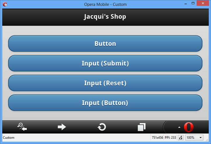
Figure 30-1. Button widgets created automatically by jQuery Mobile
Creating Buttons from Other Elements
jQuery Mobile can also create buttons widgets from other elements. In earlier chapters, you saw me create a button widget from an a element by applying the data-role attribute with a value of button. You can also do this for other types of elements, such as div. Listing 30-2 contains an example.
Listing 30-2. Creating Buttons from Other Elements
<!DOCTYPE html>
<html>
<head>
    <title>Example</title>
    <meta name="viewport" content="width=device-width, initial-scale=1">
    <link rel="stylesheet" href="jquery.mobile-1.3.1.css" type="text/css" />
    <script type="text/javascript" src="jquery-1.10.1.js"></script>
    <script type="text/javascript" src="jquery.mobile-1.3.1.js"></script>
</head>
<body>
    <div id="page1" data-role="page" data-theme="b">
        <div data-role="header">
           <h1>Jacqui's Shop</h1>
        </div>
        <div data-role="content">
            <a href="document2.html" data-role="button">A Element</a>
            <div data-role="button">DIV Element</div>
        </div>
    </div>
</body>
</html>
You can see how jQuery Mobile deals with the elements in this example in Figure 30-2.
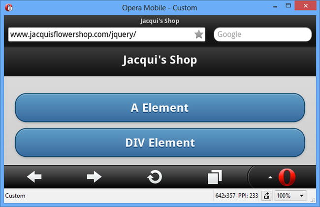
Figure 30-2. Creating button widgets using other elements
You can create a group of buttons that have no spacing between them by creating a control group. You do this by applying the data-role attribute with a value of controlgroup to the parent element for two or more button widgets. Listing 30-3 provides a demonstration.
Listing 30-3. Creating a Set of Grouped Buttons
<!DOCTYPE html>
<html>
<head>
    <title>Example</title>
    <meta name="viewport" content="width=device-width, initial-scale=1">
    <link rel="stylesheet" href="jquery.mobile-1.3.1.css" type="text/css" />
    <script type="text/javascript" src="jquery-1.10.1.js"></script>
    <script type="text/javascript" src="jquery.mobile-1.3.1.js"></script>
</head>
<body>
    <div id="page1" data-role="page" data-theme="b">
        <div data-role="header">
           <h1>Jacqui's Shop</h1>
        </div>
        <div data-role="content">
            <div data-role="controlgroup">
                <button>Back</button>
                <button>Home</button>
                <button>Next</button>
            </div>
        </div>
    </div>
</body>
</html>
In this example, there are three buttons, all of which are children of a div element whose data-role is control group. You can see the effect in Figure 30-3. Notice how only the top and bottom buttons have rounded corners.
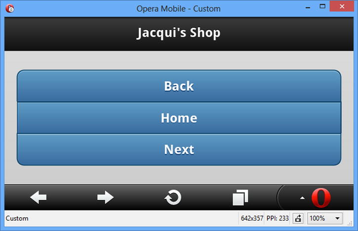
Figure 30-3. A set of buttons displayed in a group
You can change the orientation of the button group by setting the data-type attribute to horizontal, as shown in Listing 30-4.
Listing 30-4. Creating a Horizontal Button Group
<!DOCTYPE html>
<html>
<head>
    <title>Example</title>
    <meta name="viewport" content="width=device-width, initial-scale=1">
    <link rel="stylesheet" href="jquery.mobile-1.3.1.css" type="text/css" />
    <script type="text/javascript" src="jquery-1.10.1.js"></script>
    <script type="text/javascript" src="jquery.mobile-1.3.1.js"></script>
</head>
<body>
    <div id="page1" data-role="page" data-theme="b">
        <div data-role="header">
           <h1>Jacqui's Shop</h1>
        </div>
        <div data-role="content">
            <div data-role="controlgroup" data-type="horizontal">
                <button>Back</button>
                <button>Home</button>
                <button>Next</button>
            </div>
        </div>
    </div>
</body>
</html>
You can see how the browser displays a horizontal button group in Figure 30-4. Once again, notice how the rounded corners are applied only to the outside elements.
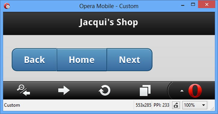
Figure 30-4. Creating a horizontal button group
Configuring jQuery Mobile Buttons
jQuery Mobile defines a number of data attributes and configuration settings you can use to configure buttons and to create buttons from different element types. These attributes are described in Table 30-2, and I demonstrate those that are unique to buttons in the sections that follow.
Table 30-2. Data Attributes and Configuration Settings for Buttons
| Data Attribute | Setting | Description |
|---|---|---|
| data-corners | corners | When true, buttons are drawn with rounded corners. A value of false means that square corners will be used. The default is true. |
| data-icon | icon | Specifies an icon to be used in the button. |
| data-iconpos | iconpos | Specifies the position of an icon, if one is used. |
| data-iconshadow | iconshadow | Applies a shadow to the icon when set to true. |
| data-inline | inline | Creates a button that is sized to its contents (rather than filling the screen). |
| data-mini | mini | When set to true, displays a compact button. |
| data-shadow | shadow | When true, buttons are drawn with a shadow. A value of false means that no shadow will be used. The default is true. |
jQuery Mobile includes a set of icons that can be used in buttons. These are included in a single image file in the images directory you installed in Chapter 27. Table 30-3 shows a list of the icon names and a brief description of each.
Table 30-3. Icons Included in jQuery Mobile
| Icon Name | Description |
|---|---|
| arrow-larrow-rarrow-uarrow-d | Arrows that are facing left, right, up, and down. |
| bars | A set of three horizontal lines. |
| edit | A pencil, used to indicate that the user can edit content. |
| checkdelete | A check and a cross. |
| plusminus | Plus and minus signs. |
| gear | A cog. |
| refreshforwardbackhomesearch | Browser style icons to refresh, advance to the next page, return to the previous page, return to the home page, or search. |
| grid | A grid of small squares. |
| star | A star. |
| alert | A caution warning. |
| info | A stylized letter i. |
You apply the icons to a button using the data-icon attribute, where the value specifies the name of the icon to use. You use the data-iconpos attribute to specify where the icon will be located in the button. The default is left, but you can also specify top, right, and bottom. If you set data-iconpos to notext, only the icon is displayed. Listing 30-5 provides an example of using both of these attributes.
Listing 30-5. Adding Icons to Buttons
<!DOCTYPE html>
<html>
<head>
    <title>Example</title>
    <meta name="viewport" content="width=device-width, initial-scale=1">
    <link rel="stylesheet" href="jquery.mobile-1.3.1.css" type="text/css" />
    <script type="text/javascript" src="jquery-1.10.1.js"></script>
    <script type="text/javascript" src="jquery.mobile-1.3.1.js"></script>
</head>
<body>
    <div id="page1" data-role="page" data-theme="b">
        <div data-role="header">
           <h1>Jacqui's Shop</h1>
        </div>
        <div data-role="content">
            <div class="ui-grid-b">
                <div class="ui-block-a">
                    <button data-icon="home">Home</button>
                </div>
                <div class="ui-block-b">
                    <button data-icon="home" data-iconpos="top">Home</button>
                </div>
                <div class="ui-block-c">
                    <button data-icon="home" data-iconpos="notext"></button>
                </div>
            </div>
        </div>
    </div>
</body>
</html>
In this example, I created three buttons, all of which display the home icon. The first button uses the default icon position, the second button uses the top position, and the last button uses the notext value, which creates an icon-only button. You can see how these buttons appear in Figure 30-5.
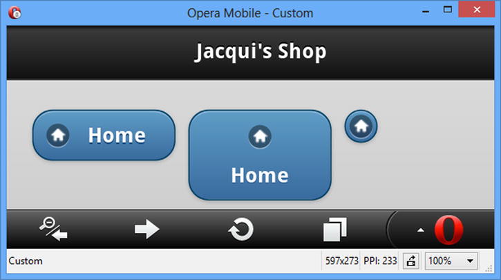
Figure 30-5. Creating icon buttons
You can see that each button has a distinctive style. The most striking is the last button, which displays no text. This looks visually appealing, but my experience with this kind of button is that they are hard to hit with a finger, and not all users immediately recognize them as a means of navigating elsewhere in the application.
Creating Inline and Mini Buttons
jQuery Mobile buttons span the entire width of the screen by default. You can see an example of the default button width in Figure 30-1. I used the layout grid to create smaller buttons in subsequent examples, but I could have achieved a similar effect using inline buttons, which are just big enough to accommodate their content and are created by setting the data-inline attribute to true.
I can also create mini buttons by setting the data-mini attribute to true. Mini buttons have the standard approach to width, but occupy less vertical space. Finally, you can combine both data attributes to create inline mini buttons, which are just wide enough to accommodate their content and occupy less vertical space than regular buttons. Listing 30-6 shows all three types of buttons.
Listing 30-6. Using Inline and Mini Buttons
<!DOCTYPE html>
<html>
<head>
    <title>Example</title>
    <meta name="viewport" content="width=device-width, initial-scale=1">
    <link rel="stylesheet" href="jquery.mobile-1.3.1.css" type="text/css" />
    <script type="text/javascript" src="jquery-1.10.1.js"></script>
    <script type="text/javascript" src="jquery.mobile-1.3.1.js"></script>
</head>
<body>
    <div id="page1" data-role="page" data-theme="b">
        <div data-role="header">
           <h1>Jacqui's Shop</h1>
        </div>
        <div data-role="content">
            <button data-icon="home" data-inline="true">Home</button>
            <button data-icon="home" data-mini="true">Home</button>
            <button data-icon="home" data-inline="true" data-mini="true">Home</button>
        </div>
    </div>
</body>
</html>
You can see the effect in Figure 30-6.
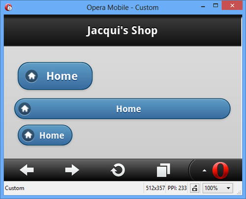
Figure 30-6. Using inline and mini buttons
Using the Button Methods
The button widget defines three methods, which I have described in Table 30-4.
Table 30-4. Button Methods
| Method | Description |
|---|---|
| button("disable") | Disables the button so that it can't be clicked. |
| button("enable") | Enables the button so that it can be clicked. |
| button("refresh") | Refreshes the widget to reflect changes in the underlying HTML element. |
The enable and disable methods are self-evident. The refresh method is required when the contents of the underlying button or input element changes, as demonstrated by Listing 30-7.
Listing 30-7. Updating the Contents of Button Widgets
<!DOCTYPE html>
<html>
<head>
    <title>Example</title>
    <meta name="viewport" content="width=device-width, initial-scale=1">
    <link rel="stylesheet" href="jquery.mobile-1.3.1.css" type="text/css" />
    <script type="text/javascript" src="jquery-1.10.1.js"></script>
    <script>
        $(document).bind("pageinit", function () {
            var counter = 0;
            setInterval(function () {
                var msg = "Counter " + counter++;
                $("#buttonElem").text(msg).button("refresh");
                $("#inputElem").val(msg).button("refresh");
                $("#divElem span.ui-btn-text").text(msg);
            }, 1000);
        });
    </script>
    <script type="text/javascript" src="jquery.mobile-1.3.1.js"></script>
</head>
<body>
    <div id="page1" data-role="page" data-theme="b">
        <div data-role="header">
           <h1>Jacqui's Shop</h1>
        </div>
        <div data-role="content">
            <button id="buttonElem">Button</button>
            <input id="inputElem" type="button" value="Input" />
            <div id="divElem" data-role="button">Div</div>
        </div>
    </div>
</body>
</html>
There are three button widgets in this example, created from a button element, an input element, and a div element. The script element handles the pageinit event (which I described in Chapter 29) by calling the setInterval function to update the contents of the elements that underpin the button widgets every second.
I have to call the refresh method for the button and input elements; otherwise the changes I make to the elements won't be reflected in the button widgets:
...
$("#buttonElem").text(msg).button("refresh");
$("#inputElem").val(msg).button("refresh");
...
A different approach is required when you create button widgets from other elements, such as a div element. In this situation, jQuery Mobile adds content elements so that it can apply CSS styles to shape the widget, and changing the content of the element affects the shape of the widget. Instead, you will need to look at the HTML that jQuery Mobile generates inside of the element and locate the textual content. The div element in my example is populated with span elements, and I can change the text content by locating the element that is part of the ui-btn-text class, like this:
...
$("#divElem span.ui-btn-text").text(msg);
...
 Tip I located this element by using the browser F12 tools to explore the content that jQuery Mobile generates during the enhancement process.
The button widget defines the standard create event that is triggered when the widget is created, but the widgets that underpin the widget will still trigger their own events, which will be supplemented by the jQuery Mobile events that I described in Chapter 29. This means that you can create handlers for the tap event, for example, to receive notification when the button is clicked, as demonstrated in Listing 30-8.
Tip Don’t forget that events can have a default action for some elements – for example, this means that button widgets created from input elements will submit the form they are part of. See Chapter 28 for details of jQuery event handling.
Listing 30-8. Handling Button Events
<!DOCTYPE html>
<html>
<head>
    <title>Example</title>
    <meta name="viewport" content="width=device-width, initial-scale=1">
    <link rel="stylesheet" href="jquery.mobile-1.3.1.css" type="text/css" />
    <script type="text/javascript" src="jquery-1.10.1.js"></script>
    <script>
        $(document).bind("pageinit", function () {
            $("button").tap(function (e) {
                $(this).text("Tapped!").button("refresh");
            });
        });
    </script>
    <script type="text/javascript" src="jquery.mobile-1.3.1.js"></script>
</head>
<body>
    <div id="page1" data-role="page" data-theme="b">
        <div data-role="header">
           <h1>Jacqui's Shop</h1>
        </div>
        <div data-role="content">
            <button>Button</button>
        </div>
    </div>
</body>
</html>
In this listing I use the tap method to register a handler function for the tap event on a button. When the button is clicked, I handle the event by changing the button text and calling the refresh method to update the widget content.
NavBars are groups of buttons that present navigation support in a header or footer, allowing the users to move through a set of content pages. NavBars are pretty simple, but they can be a useful tool when you have a set of related pages to display and you need to give the user a clear signal about which of those pages is currently displayed. NavBars are created using a specific element structure, which you can see in Listing 30-9.
Listing 30-9. Creating a NavBar
<!DOCTYPE html>
<html>
<head>
    <title>Example</title>
    <meta name="viewport" content="width=device-width, initial-scale=1">
    <link rel="stylesheet" href="jquery.mobile-1.3.1.css" type="text/css" />
    <script type="text/javascript" src="jquery-1.10.1.js"></script>
    <script type="text/javascript" src="jquery.mobile-1.3.1.js"></script>
</head>
<body>
    <div id="page1" data-role="page">
        <div data-role="header">
            <h1>Jacqui's Shop</h1>
            <div data-role="navbar">
                <ul>
                    <li><a href="#page1"
                        class="ui-btn-active ui-state-persist">Page 1</a></li>
                    <li><a href="#page2">Page 2</a></li>
                    <li><a href="#page3">Page 3</a></li>
                </ul>
            </div>
        </div>
        <div data-role="content">This is page 1</div>
    </div>

    <div id="page2" data-role="page">
        <div data-role="header">
            <h1>Jacqui's Shop</h1>
            <div data-role="navbar">
                <ul>
                    <li><a href="#page1">Page 1</a></li>
                    <li><a href="#page2"
                        class="ui-btn-active ui-state-persist">Page 2</a></li>
                    <li><a href="#page3">Page 3</a></li>
                </ul>
            </div>
        </div>
        <div data-role="content">This is page 2</div>
   </div>

    <div id="page3" data-role="page">
        <div data-role="header">
           <h1>Jacqui's Shop</h1>
            <div data-role="navbar">
                <ul>
                    <li><a href="#page1">Page 1</a></li>
                    <li><a href="#page2">Page 2</a></li>
                    <li><a href="#page3"
                        class="ui-btn-active ui-state-persist">Page 3</a></li>
                </ul>
            </div>
        </div>
        <div data-role="content">This is page 3</div>
   </div>
</body>
</html>
The NavBar is defined by a div element whose data-role attribute is set to navbar. The individual buttons within the NavBar are defined as a elements contained in li elements contained, in turn, in an ul element. In the listing, I have used the Navbar in its most common form, which is where it is duplicated across multiple jQuery Mobile pages to give a consistent reference to the user, as shown in Figure 30-7.
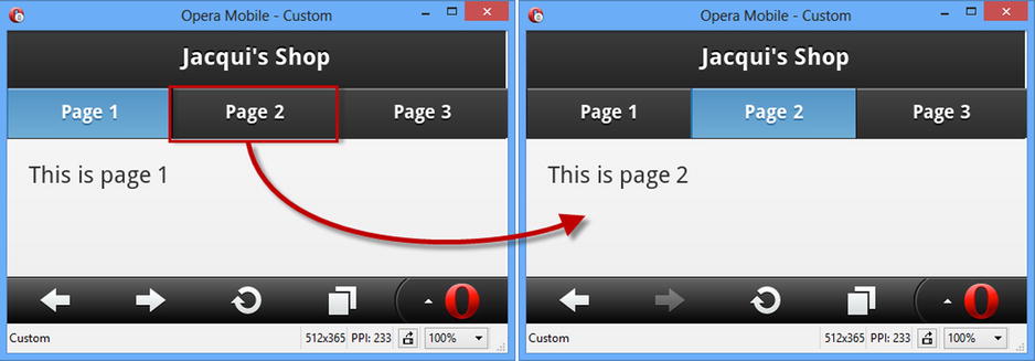
Figure 30-7. The NavBar widget
The NavBar widget allocates the available screen space equally between the navigation buttons, and clicking one of the buttons displays the page identified by the href attribute of the underlying a element.
There are two CSS classes that must be applied to the a elements to indicate to the user that page is being displayed. The ui-btn-active class marks the button as active, and the ui-state-persist class ensures that the active state is displayed if the user navigates back to a previously displayed page.
Configuring jQuery Mobile NavBar
The NavBar supports just one data attribute/configuration option, which I have described in Table 30-5.
Table 30-5. Data Attributes and Configuration Settings for NavBar
| Data Attribute | Setting | Description |
|---|---|---|
| data-iconpos | iconpos | Specifies the position of icons in the NavBar buttons. The supported positions are left, right, top (the default), and bottom. You can also use the notext value to display an icon without any text. |
I listed the jQuery Mobile icons earlier in the chapter. Individual icons are applied to the a elements using the data-icon attribute, and you can see how I have positioned the icons with the data-iconpos attribute in Listing 30-10.
Listing 30-10. Positioning the Icons in a NavBar
<!DOCTYPE html>
<html>
<head>
    <title>Example</title>
    <meta name="viewport" content="width=device-width, initial-scale=1">
    <link rel="stylesheet" href="jquery.mobile-1.3.1.css" type="text/css" />
    <script type="text/javascript" src="jquery-1.10.1.js"></script>
    <script type="text/javascript" src="jquery.mobile-1.3.1.js"></script>
</head>
<body>
    <div id="page1" data-role="page">
        <div data-role="header">
            <h1>Jacqui's Shop</h1>
            <div data-role="navbar" data-iconpos="left">
                <ul>
                    <li><a href="#page1" data-icon="alert"
                        class="ui-btn-active ui-state-persist">Page 1</a></li>
                    <li><a href="#page2" data-icon="info">Page 2</a></li>
                    <li><a href="#page3" data-icon="gear">Page 3</a></li>
                </ul>
            </div>
        </div>
        <div data-role="content">This is page 1</div>
    </div>
</body>
</html>
You can see the effect of the icons in Figure 30-8.
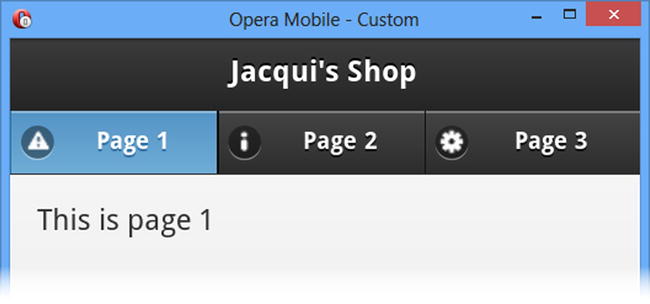
Figure 30-8. Adding and positioning icons in a NavBar
Using the NavBar Methods & Events
The NavBar widget doesn't define any methods and supports only the create event, which is triggered when the widget is instantiated.
Tip Handle the events from the a elements to respond to user navigation.
Using Collapsible Content Blocks
jQuery Mobile includes support for creating collapsible content blocks, which are sections of content with a header that can be closed so that only the header is available. This is similar to a single panel of a jQuery UI accordion, which I described in Chapter 19.
Creating the Collapsible Block
A collapsible block has a specific structure you need to follow in order to give jQuery Mobile the elements it needs. Listing 30-11 contains an example.
Listing 30-11. Creating a Single Collapsible Block
<!DOCTYPE html>
<html>
<head>
    <title>Example</title>
    <meta name="viewport" content="width=device-width, initial-scale=1">
    <link rel="stylesheet" href="jquery.mobile-1.3.1.css" type="text/css" />
    <script type="text/javascript" src="jquery-1.10.1.js"></script>
    <script type="text/javascript" src="jquery.mobile-1.3.1.js"></script>
</head>
<body>
    <div id="page1" data-role="page" data-theme="b">
        <div data-role="header">
           <h1>Jacqui's Shop</h1>
        </div>
        <div data-role="content">
            <div data-role="collapsible">
                <h1>New Delivery Service</h1>
                <p>We are pleased to announce that we are starting a home delivery
                service for your flower needs. We will deliver within a 20 mile radius
                of the store for free and $1/mile thereafter.</p>
            </div>
        </div>
    </div>
</body>
</html>
The first thing you have to do is create a div element and apply the data-role attribute with a value of collapsible. This tells jQuery Mobile that you want a collapsible block and that it should look for a header element as the first child of the div. You can use any of the header elements, h1 through h6. I used an h1 element, but jQuery Mobile treats all of the headers equally for this kind of widget. The remaining child elements of the div are used as the content for the collapsible element, creating the effect that is shown in Figure 30-9.
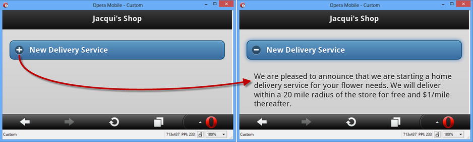
Figure 30-9. Expanding a collapsible block
The block is collapsed when it is first displayed, meaning that the content is hidden and only the header can be seen. As a cue for the user, a plus icon is drawn at the left edge of the header area (which is styled in the same way as a non-inline button). Clicking on the header reveals the content and replaces the icon with a minus sign, indicating that the block can be collapsed again.
Configuring jQuery Mobile Collapsible Content Blocks
jQuery Mobile defines the data attributes and configuration settings shown in Table 30-6.
Table 30-6. Data Attributes and Configuration Settings for Collapsible Blocks
| Data Attribute | Setting | Description |
|---|---|---|
| data-collapsed | collapsed | When true, the default value, the block is shown collapsed (that is, only the header is visible to the user). A value of false means that the block is shown expanded. |
| data-collapsed-icon | collapsedIcon | Specifies the icon displayed when the block is collapsed. |
| data-content-theme | contentTheme | Specifies the theme for the content area of the collapsible block. |
| data-corners | corners | When true, the collapsible block is drawn with rounded corners. A value of false results in square corners. |
| data-expanded-icon | expandedIcon | Specifies the icon displayed when the block is expanded. |
| data-iconpos | iconPos | Specifies the position of the icon in the header, using the same values as for the NavBar and Button widgets. |
| data-inset | inset | When set to false, the header will fill the window without any padding. The default is true. |
| data-mini | mini | When set to true, the header is drawn in a compact form. |
In Listing 30-12, you can see how I have applied some of the data attributes to the example.
Listing 30-12. Configuring the Collapsible Block Widget
<!DOCTYPE html>
<html>
<head>
    <title>Example</title>
    <meta name="viewport" content="width=device-width, initial-scale=1">
    <link rel="stylesheet" href="jquery.mobile-1.3.1.css" type="text/css" />
    <script type="text/javascript" src="jquery-1.10.1.js"></script>
    <script type="text/javascript" src="jquery.mobile-1.3.1.js"></script>
</head>
<body>
    <div id="page1" data-role="page" data-theme="b">
        <div data-role="header">
           <h1>Jacqui's Shop</h1>
        </div>
        <div data-role="content">
            <div data-role="collapsible" data-content-theme="e" data-collapsed="false"
                    data-inset="false" data-iconpos="top">
                <h1>New Delivery Service</h1>
                <p>We are pleased to announce that we are starting a home delivery
                service for your flower needs. We will deliver within a 20 mile radius
                of the store for free and $1/mile thereafter.</p>
            </div>
        </div>
    </div>
</body>
</html>
I have changed the values for the data-content-theme, data-inset, data-iconpos, and data-collapsed attributes. You can see the effect in Figure 30-10.
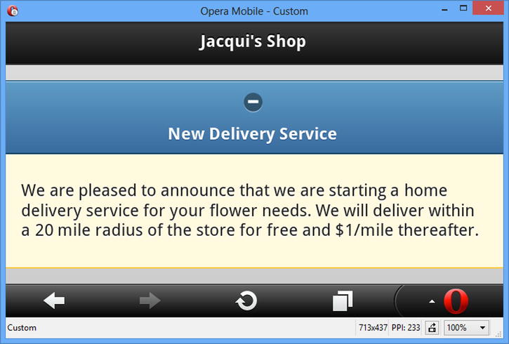
Figure 30-10. Configuring the collapsible block widget
Using Collapsible Block Methods
The collapsible block widget does not define any methods.
Using Collapsible Block Events
The collapsible block widget defines the events shown in Table 30-7.
Table 30-7. Collapsible Block Events
| Event | Description |
|---|---|
| create | This event is triggered when the widget is created. |
| collapse | Triggered when the collapsible block is collapsed. |
| expand | Triggered when the collapsible block is expanded. |
In Listing 30-13, you can see how I have handled the collapse and expand events to report on the status of a collapsible block. If this seems like a contrived example, it is because these events are rarely useful.
Listing 30-13. Using the Collapse and Expand Events
<!DOCTYPE html>
<html>
<head>
    <title>Example</title>
    <meta name="viewport" content="width=device-width, initial-scale=1">
    <link rel="stylesheet" href="jquery.mobile-1.3.1.css" type="text/css" />
    <script type="text/javascript" src="jquery-1.10.1.js"></script>
    <script type="text/javascript">
        $(document).bind("pageinit", function() {
            $('#colBlock').bind("collapse expand", function(event) {
                $('#status').text(event.type == "expand" ? "Expanded" : "Collapsed");
            })
        });
    </script>
    <script type="text/javascript" src="jquery.mobile-1.3.1.js"></script>
</head>
<body>
    <div id="page1" data-role="page" data-theme="b">
        <div data-role="header">
           <h1>Jacqui's Shop</h1>
        </div>
        <div data-role="content">
            The block is <b><span id="status">Expanded</span></b>

            <div id="colBlock" data-role="collapsible" data-content-theme="e"
                    data-collapsed=false>
                <h1>New Delivery Service</h1>
                <p>We are pleased to announce that we are starting a home
                delivery service for your flower needs. We will deliver within a
                20 mile radius of the store for free and $1/mile thereafter.</p>
            </div>
        </div>
    </div>
</body>
</html>
In this example, I use the bind method to listen for the expand and collapse events. I do this in a single call to the bind method by listing the events I am interested in, separated by spaces. When one of the events is triggered, I update the content of a span element to reflect the status of the collapsible block. You can see the change in status in Figure 30-11.
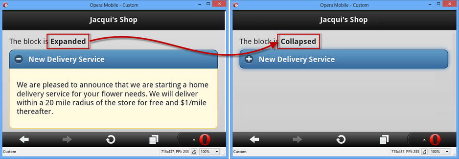
Figure 30-11. Responding to the expand and collapse events
Using jQuery Mobile Collapsible Sets (Accordions)
The collapsible set widget combines multiple collapsible blocks to create an accordion. Collapsible sets are defined by using a div element that wraps two or more collapsible blocks in a single parent element and applying the data-role attribute to the div element with a value of collapsible-set. You can see how this is done in Listing 30-14.
Listing 30-14. Creating a jQuery Mobile Accordion
<!DOCTYPE html>
<html>
<head>
    <title>Example</title>
    <meta name="viewport" content="width=device-width, initial-scale=1">
    <link rel="stylesheet" href="jquery.mobile-1.3.1.css" type="text/css" />
    <script type="text/javascript" src="jquery-1.10.1.js"></script>
    <script type="text/javascript" src="jquery.mobile-1.3.1.js"></script>
</head>
<body>
    <div id="page1" data-role="page" data-theme="b">
        <div data-role="header">
           <h1>Jacqui's Shop</h1>
        </div>
        <div data-role="content">
            <div data-role="collapsible-set" data-content-theme="e">
                <div data-role="collapsible">
                    <h1>New Delivery Service</h1>
                    <p>We are pleased to announce that we are starting a home
                    delivery service for your flower needs. We will deliver within a
                    20 mile radius of the store for free and $1/mile thereafter.</p>
                </div>
                <div data-role="collapsible" data-collapsed=false>
                    <h1>Summer Specials</h1>
                    <p>We have a wide range of special summer offers.
                        Ask instore for details</p>
                </div>
                <div data-role="collapsible">
                    <h1>Bulk Orders</h1>
                    <p>We offer discounts for large orders. Ask us for prices</p>
                </div>
            </div>
        </div>
    </div>
</body>
</html>
In this example, I defined a div element with the collapsible-set value for the data-role attribute, which contains three collapsible blocks.
Tip Notice that I applied the data-content-theme attribute to the outer container. This has the same effect as using the attribute on each individual collapsible block.
The default is for all of the collapsible blocks to be collapsed initially, so I applied the data-collapsed attribute to one of the blocks with a value of false so that it is expanded when the page is first displayed. When the user clicks on a header, the presently expanded element is collapsed. You can see the effect in Figure 30-12.
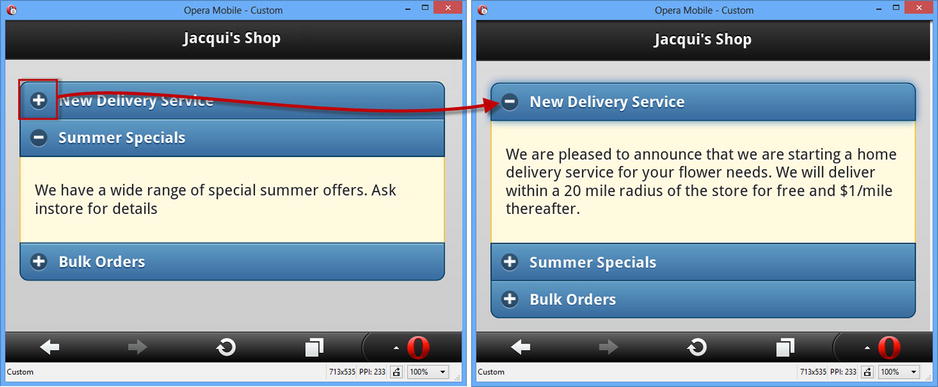
Figure 30-12. Expanding a block in a jQuery Mobile accordion
Configuring the Collapsible Set
The collapsible set supports the same set of data attributes and settings as the collapsible block widget.
Using the Collapsible Set Methods
The collapsible set widget supports one method, as described in Table 30-8.
Table 30-8. The Collapsible Set Method
| Method | Description |
|---|---|
| collapsibleset("refresh") | Refreshes the widget to reflect changes in the underlying HTML element. |
Using the Collapsible Set Events
The collapsible set widget only defines the create event, which is triggered when the widget is applied to an HTML element.
Summary
In this chapter, I described more jQuery Mobile widgets: buttons and collapsible blocks and widgets that offer variations on the same theme – NavBars and collapsible sets. In Chapter 31, I show you the jQuery Mobile form widgets.