Chapter 9
Page Layouts
With the release of Microsoft Office SharePoint Server 2007 (MOSS), Microsoft has introduced the Publishing Feature to the already impressive array of functionality available to SharePoint sites. Publishing empowers content authors to create their own HTML based Web sites in MOSS using only their Web browsers. Page layouts are not only the mechanism that provides this ability, but they also work together with master pages to create the user interface for all publishing pages. To fully customize a MOSS Web site, designers must have a strong understanding of master pages, which were covered in the previous chapter, and a good working knowledge of how page layouts are created and ultimately utilized in MOSS. By the end of this chapter, you should have a good understanding of what page layouts are and how they are created in MOSS. The chapter concludes with a walk through of creating a welcome page layout that can be utilized to create a home page suitable for the Internet master page design that was created in the previous chapter.
To try out the ideas in this chapter, you will need to have a full-blown MOSS server. A simple Windows SharePoint Services 3.0 (WSS) server will not fit the bill because it does not include the Publishing Feature or page layouts.
While traditional SharePoint sites are very good at allowing teams to collaborate and share many types of documents with ease, large organizations often need to share information in a more traditional Web- page-based format. Information sharing is even more important for content available to public facing Internet Web sites. In scenarios like this, content authors expect to be able to create Web pages easily without intervention from designers or even their own company's IT department. The MOSS Publishing Feature allows content authors to accomplish all of this from the comfort of their own browser. When a content author creates a publishing page in MOSS, the page derives much of its look and feel, as well as its editable fields, from a MOSS page layout. In fact, every publishing page in MOSS is related to exactly one page layout.
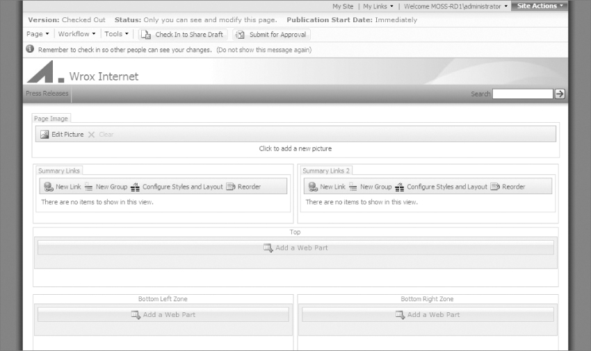
Page layouts are created by designers like you, directly in SharePoint Designer; they cannot be created by content authors using just the MOSS Web interface. After you have created a page layout and subsequently published it to a MOSS site, content authors will be able to create pages that are based on your page layout. Figure 9-1 shows a publishing page in edit mode.
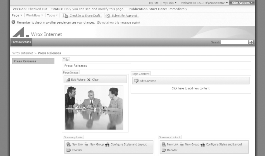
When MOSS shows a publishing page in edit mode, the page layout becomes visible in the browser.
Relationship to Master Pages
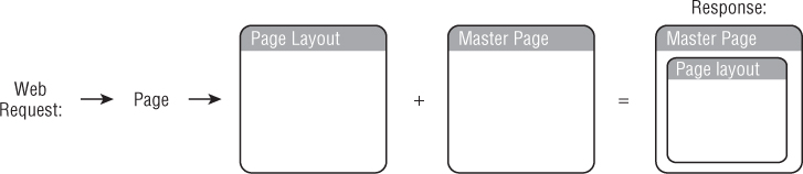
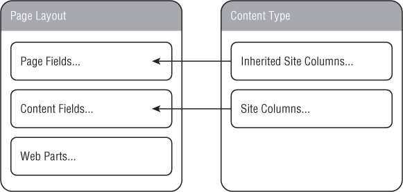
Master pages are closely related to page layouts, because page layouts are always tied to one master page in MOSS. Master pages, along with providing much of the general MOSS functionality of a page, provide a unified outer shell design to all page layouts. The page layouts on the other hand define the specific look and the editable data for various types of pages. For example, one page layout might contain an article while another is a welcome page, yet both might utilize the same master page design. Figure 9-2 is a reminder of how page layouts and master pages are used by MOSS to render a page to the end user.
Content Types
Understanding page layouts requires you to understand their relationship to content types. Content types define the structure, metadata, and business rules that surround the particular pieces of information shown in MOSS. They are specifically utilized behind the scenes in MOSS to define the data that a page layout will be displaying. Because of this, every page layout in MOSS is related to exactly one content type.
Content types themselves utilize a mechanism known as site columns to define each of the data elements that they will store. The site columns themselves can each represent one of many different types of atomic units of data. The following kinds of site columns are available in a MOSS content type:
- Single line of text – Allows for the entry of a single line of alphanumeric text.
- Multiple lines of text – Allows for the entry of multiple lines of alphanumeric text or even rich text with limited HTML.
- Choice (menu to choose from) – Allows for selecting from a group of items (radio buttons, checkboxes, or a drop-down menu).
- Number (1, 1.0, 100) – Allows for the entry of numeric values.
- Currency ($, ¥, €) – Allows for the entry of monetary values which can be displayed in various currency formats.
- Date and Time – Allows for the selection a date and time.
- Lookup (information already on this site) – Allows for the selection of information that is available in other areas of the SharePoint site.
- Yes/No (check box) – Allows for selecting either yes or no from a checkbox.
- Person or Group – Allows for the selection of a user or group from the SharePoint site.
- Hyperlink or Picture – Allows for the entry of a URL.
- Calculated (calculation based on other columns) – Allows the entry of a formula that can be calculated based on numbers, dates, and other information from the SharePoint site.
- Full HTML content with formatting and constraints for publishing – Has a text box that has a Microsoft Word style editor bar that allows content authors to enter rich HTML content without needing any prior knowledge of how to create HTML.
- Image with formatting and constraints for publishing – Allows the selection of an image along with various formatting rules that can be applied to the image (such as height, width, alignment, and alternate text).
- Hyperlink with formatting and constraints for publishing – Allows for the entry of a URL. This site column is more robust than the Hyperlink or Picture site column. It allows for entering the URL manually or even selecting a URL from a list of all the available pages in the SharePoint site.
- Summary Links data – Allows the entry of a group of links including titles, descriptions, images, and URLs as well as the ability to group and style the links.
Every site column added to a content type ultimately becomes an editable field control available to the page layouts based on it. While content types are a very powerful way of defining data for use in a site, this power would be severely limited if MOSS forced you to create a new content type for every page layout. Fortunately, every content type that is created or available in MOSS can be used in as many page layouts as you like. This enables you to create a content type that is displayed in several ways via different page layouts in a MOSS site.
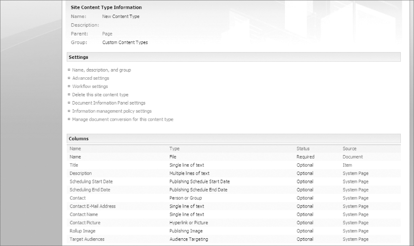
Another important topic when discussing content types in MOSS is that of inheritance. Every MOSS content type inherits from a parent content type (with the one exception of the System content type, which is a non-editable content type that is the ultimate parent of all other content types). When creating your own page layouts, MOSS requires that they always inherit from the Page parent content type. This ensures that every custom content type starts with the same base columns. Figure 9-3 shows the default inherited site columns that you see when creating a new content type based on the “page” parent content type. You will see this screen again when you are creating your own content types.
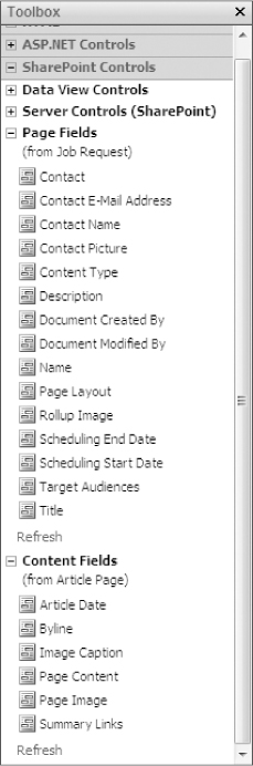
As mentioned earlier, the content type's site columns eventually become editable field controls that can be added to page layouts. When a page layout is edited in SharePoint Designer the available site columns for the content type appear in the Toolbox pane (on the right side of SharePoint Designer by default) under the heading of SharePoint Controls. SharePoint Designer further separates the available field controls into page fields and content fields. Page fields represent the site columns that are inherited from the parent content type of “page,” while content fields represent the site columns that come directly from the page layout's own content type. Figure 9-4 shows the two types of field controls available in the Toolbox pane of SharePoint Designer.
Along with field controls, page layouts can also have Web Parts added to them. Web Parts give content authors the ability to add a wide array of functionality to their MOSS site. Chapter 10 covers some of these Web Parts in further detail. While Web Parts can store many types of content (such as rich HTML in the case of the Content Editor Web Part), they do not utilize content types in any way. Figure 9-5 shows a high-level view of how field controls are related to content types; it also shows that Web Parts are not at all related to content types.
Page Layout Structure
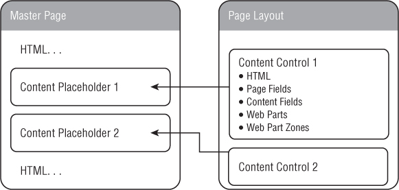
When a Publishing site is created, MOSS automatically generates several master pages, and page layouts that together create the default user interface for pages that appear in the site. MOSS automatically maintains a connection between page layouts and the master page that has been selected for the site (by default this master page is typically either blueband.master or default.master). While the master page creates most of the outer shell of a MOSS site's design, it is the page layout that dictates how the fields and content of a page are arranged in the inside portion of the site design. Much like content pages in traditional ASP.NET, master pages declare content placeholders that dictate the location on the rendered page in which content from the page layout will be displayed. Also, like ASP.NET content pages, page layouts use content controls with ContentPlaceHolderIDs that point to the IDs of specific content placeholders in master pages.
To gain a better understanding of how page layouts are structured, take a look at the following code from a very simple MOSS page layout.
<%@ Page language=“C#” Inherits=“Microsoft.SharePoint.Publishing.
PublishingLayoutPage,Microsoft.SharePoint.Publishing,Version=12.0.0.0,
Culture=neutral,PublicKeyToken=71e9bce111e9429c” %>
<%@ Register Tagprefix=“SharePointWebControls” Namespace=“Microsoft.
SharePoint.WebControls“ Assembly=“Microsoft.SharePoint,
Version=12.0.0.0,
Culture=neutral, PublicKeyToken=71e9bce111e9429c” %> <%@ Register
Tagprefix=“WebPartPages” Namespace=“Microsoft.SharePoint.
WebPartPages”
Assembly=“Microsoft.SharePoint, Version=12.0.0.0, Culture=neutral,
PublicKeyToken=71e9bce111e9429c” %> <%@ Register
Tagprefix=“PublishingWebControls” Namespace=“Microsoft.SharePoint.
Publishing.WebControls“ Assembly=“Microsoft.SharePoint.Publishing,
Version=12.0.0.0, Culture=neutral, PublicKeyToken=71e9bce111e9429c” %>
<%@ Register Tagprefix=“PublishingNavigation” Namespace=“Microsoft.
SharePoint.Publishing.Navigation“ Assembly=“Microsoft.SharePoint.
Publishing, Version=12.0.0.0, Culture=neutral, PublicKeyToken=
71e9bce111e9429c” %>
<asp:Content ContentPlaceholderID=“PlaceHolderPageTitle” runat=“server”>
<SharePointWebControls:FieldValue id=“PageTitle” FieldName=“Title”
runat=“server”/>
</asp:Content>
<asp:Content ContentPlaceholderID=“PlaceHolderMain” runat=“server”>
<PublishingWebControls:RichHtmlField id=“Content”
FieldName=“PublishingPageContent” runat=“server”/>
</asp:Content>
Page layouts begin with a page directive that defines what language they will be written in, as well as a setting to cause them to inherit the MOSS Publishing code. After that, several controls are registered; these allow the page layout to utilize the necessary MOSS functionality whenever needed. After the register statements, all other page layout content must be placed inside of content controls. If anything is placed outside of the content controls, MOSS will throw an error. In this example, the content controls each contain one field control; the first holds a text-based page title field, while the second contains a rich HTML content field. When a publishing page that is based on this particular page layout is created, content authors will be limited to adding only these two pieces of content to the page.
Types of Content in Page Layouts
All content that will be added to page layouts, must be added to content controls. These content controls can contain a variety of types of content. Here is a list of what they may contain:
- HTML – All types of standard HTML can be added to content controls in a page layout. Any HTML text that you add to a content control will appear on all pages created from the page layouts. HTML is often used in content controls to lay out the other types of content in this list. For example, a content control can contain HTML <table> or <div> tags to arrange the various field controls and Web Parts. HTML can also be used to apply internal style sheets for overriding CSS that was previous applied by the master page or the out-of-the-box MOSS CSS. Styles applied at this level will only apply to the pages that use the particular page layout.
- Page Fields – Page fields are editable field controls that allow content authors to add content to the page. Specifically, page fields come from the page layout's parent content type site columns (for page layouts this parent type is always the “page” content type). They include fields such as title and description.
- Content Fields – Content fields are also editable field controls that allow content authors to add content to the page. They are created from columns that have been added specifically by a designer to the page layout's own content type.
- Web Parts – A Web Part is a modular unit of functionality that serves as another means of displaying site information to end users. Some Web Parts aggregate data from various areas of a MOSS Web site while other Web Parts are used to enter content such as rich HTML. An important consideration when working with Web Parts is that their data is not version controlled as other field controls are. If storing previous versions of content is important to you, Web Parts would not be an appropriate content storage mechanism for your page layout. It is also worth noting that a Web Part placed directly on a page layout (not in a Web Part Zone) is specifically limited in its usefulness. Web Parts that are placed directly on page layouts are not editable by content authors directly from their browser, and their content will persist across every page that is created from the page layout.
- Web Part Zones – A Web Part Zone is a type of container that allows content authors to configure and arrange Web Parts directly from their Web browser. They make it possible to add any number of configurable Web Parts directly to a MOSS page. Web parts that are placed in Web Part Zones can contain unique content from page to page, thus editing a Web Part in a Web Part Zone on one page will not affect the same Web Part on a different page. As a designer, you place Web Part Zones on a page layout and arrange them vertically or horizontally, however you would like.
All of these types of content can be used together inside of the content controls in a page layout. As stated earlier, they are usually arranged with HTML to create an appealing layout to the end user. Figure 9-6 shows the relationship between the types of content allowed in content controls and their page layout, as well as how they flow up into the master page.
As you can see, all of these concepts come together in unison when a MOSS server displays a Web page to an end user. The master page creates the outer page design and brings in much of the out-of-the-box MOSS functionality; it is then merged with the page layout, which creates the inner page design and visually organizes the Web Parts and field controls. The field controls in turn are defined from the underlying content type and site columns. To the end user all of this appears simply as a MOSS Web page, but to you the designer, these separate moving parts present specific areas to apply customizations.
Where Do Page Layouts Live in MOSS
Page layouts are always created at the top-level site in a MOSS site collection. They are added to the Master Page Gallery and as such, they live among the site's master pages. Just like master pages, you can access them from either SharePoint Designer or directly from the MOSS Web interface. To access the Master Page Gallery in your MOSS Web interface, browse to the top-level of your MOSS site and click Site Actions ⇒ Site Settings ⇒ Modify All Site Settings and then in the Galleries section click “Master pages and page layouts.” This gallery shows a list of all of the master pages and page layouts that are available to your site. You can differentiate the page layouts from the master pages in the master page gallery by their files extension. All of the master pages will have a file extension of .master, while all of the page layouts will have the standard ASP.NET file extension of .aspx. You can add a new page layout to the gallery by clicking Upload ⇒ Upload Document and from that screen, you can select a page layout that is on your local computer and upload it to the Master Page Gallery.
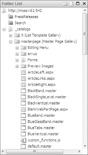
To access the Master Page Gallery from SharePoint Designer, use the Folder List pane to navigate to the _catalogs > masterpage (Master Page Gallery) folder of a top-level MOSS site. Figure 9-7 shows the Master Page Gallery in the Folder List pane of SharePoint Designer.
The Out-of-the-box Page Layouts
When a Publishing site is created in MOSS, several basic page layouts are generated automatically. These page layouts come in three different flavors, as they derive from three separate content types. The out-of-the-box page layout types are:
- Article Pages – These page layouts allow for the creation of typical article style pages. They come in a few different forms, including an article with a body only, ones with images to the left and right, and one that is an article with summary links.
- Welcome Pages – These page layouts are suitable for the home pages for various types of MOSS sites and include content with summary links, table of contents, a splash page layout, and one that consists solely of Web Parts. The latter is particularly useful for instances when one or many Web Parts are used without other types of content in order to achieve a much different type of page than a simple content page.
- Redirect Page – There is only one page layout of this type, and it is very different from the others. While it does show content on the page, this content is shown only for a brief time before the page redirects to another page or Web site. This page layout allows content authors to set the redirect URL themselves directly from their browser.
Figure 9-8 shows one of the out-of-the-box welcome page layouts, and Figure 9-9 shows one of the out-of-the-box article page layouts. The redirect page layout is not really worth showing, since it only shows briefly before immediately redirecting to a new URL.
Implementing Your Own Page Layouts
This section focuses on creating your own page layouts. In the creation of your own page layouts, you will also explore creating your own content type and site columns, and creating a publishing page derived from your page layout. To follow along with these examples you need to have access to a top-level MOSS site that has the Publishing Feature enabled. If you don't already have a top-level publishing site at your disposal, review Chapter 4 for more information on creating one.
The Great Customization Debate
Customization was covered in the previous chapter and in Chapter 5. For that reason the debate will not be repeated in full. However, be aware that the same customization perils that awaited you when creating your own master pages also apply to the creation of content types, site columns, and page layouts. Just as with master pages, customizing page layouts and their related technologies in a production environment can be problematic, especially from a standpoint of maintenance and deployment. In addition, as with master pages, the best way to work on these technologies, is to work with them in a non-production environment directly with SharePoint Designer, and then package them into a deployment for installation on a production server. Appendix A discusses this topic in further detail.
Creating a Content Type
For this example, you will ultimately be creating a page layout that will allow content authors on your MOSS site to post new job opening requests. Before jumping straight into creating a page layout you will create your own custom content type on which to base the page layout. You should note that content types are created at the top-level site in a MOSS site collection. Once a content type is created it can be used on all sites in the site collection. Browse to your MOSS site and follow these steps to create a custom content type:
1. Click Site Actions ⇒ Site Settings ⇒ Modify All Site Settings.
2. Ensure you are at the top-level of your site collection; if you aren't, you will see a link under Site Collection Administration called Go to top level site settings. Clicking this link takes you to the top-level site.
3. Under Galleries click Site content types. This is the site content type gallery, the location of all content types for the site collection. In the future, if you need to manage existing content types, this gallery would be your starting point.
4. Create a new content type by clicking Create from the menu bar.
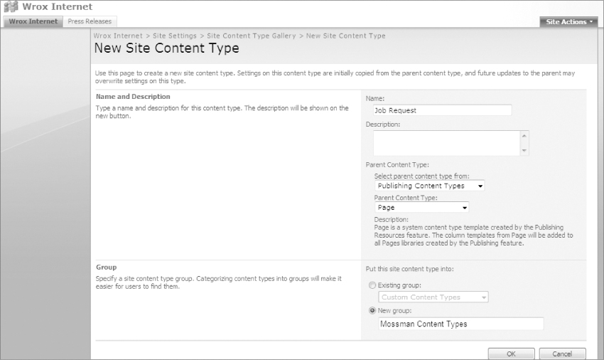
5. On the next page you enter the details for your new content type. Set the following in the Options section:
- Name the content type Job Request and give it a description.
- In the “Select parent content type from” drop-down list, choose Publishing Content Types.
- In the “Parent Content Type” drop-down list, select Page. All page layouts need to inherit from this parent content type.
- Depending upon the column type, you may have more options that can to be filled out, such as the maximum number of characters. In this case, leave the options set to their default settings.
- In the Group section, select New Group and give the new group the name Mossman Content Types in honor of the fictitious company Mossman and Partners.
6. Click OK.
Figure 9-10 shows the proper settings for the new content type.
After following these steps, you end up on the content type details page shown in Figure 9-11, which confirms that the site columns were inherited from the page parent content type.
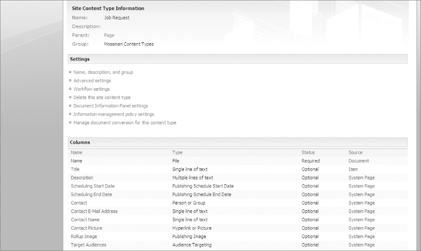
For the job request content type, you could probably get by with just the inherited columns, but for educational purposes you should create your own custom site columns.
Creating Site Columns
To create custom field controls in a page layout, you must first create your own custom site columns. Site columns define the data type and business rules that surround each data element in a content type. For the Job Request content type, you want data elements for a position title, the hiring manager's email address, the closing date for the position, an element for whether it's a fulltime position or not, and lastly an HTML entry field for adding the position details. You can continue from the previous example by following these steps to create new columns and automatically add them to the content type:
1. Because the previous example ended on the content type details screen, you can create a new site column just by selecting Add from new site column near the bottom of the screen.
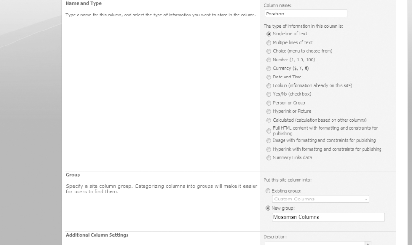
2. The first column you create is for the position title, so for the column name enter Position.
3. Select the column type from the list. In this case the position title will be a Single line of text.
4. Create a new group for your site columns, for this example name the group Mossman Columns.
Depending upon the column type, you may have more options that can to be filled out, such as the maximum number of characters. In this case, leave the options set to their default settings.
Also, leave the Update all content types inheriting from this type set to Yes.
5. Click OK to create the site column.
Figure 9-12 shows the new site column page with the proper setting for the “Position” column.
One potential gotcha when working with site columns comes up when spaces are used in a site column's name. Behind the scenes when MOSS creates a site column that has spaces, it converts the spaces into escaped hexadecimal format. This ends up turning a space into _x0020_. While you will never need to worry about this when working with the MOSS Web interface, it can be annoying when dealing with site columns in XSLT. To work around this issue, it's often easier just to create site columns without spaces. After the column is created, if you don't like the way it looks in the user interface, you can then edit the site column and add a space back in. Interestingly, when you edit a site column name, the internal MOSS reference to it never changes, so you will not have to worry about it converting back to the _X0020_ format.
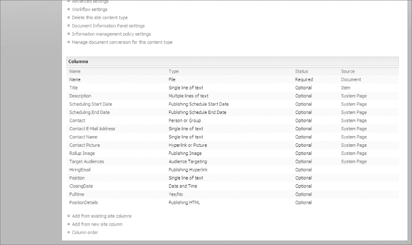
To create the other columns, follow the same steps as before, only instead of creating a new column group; be sure you select the existing column group named Mossman Columns. Here are the columns you should create for the job request content type:
- HiringEmail – Hyperlink with formatting and constraints for publishing
- ClosingDate – Date and Time
- Fulltime – Yes/No (check box)
- PositionDetails – Full HTML content with formatting and constraints for publishing
After creating these site columns, your custom content type will be complete; Figure 9-13 shows the content type with the new site columns.
You can also create site columns from the Site Column gallery, which you access by clicking Site Actions ⇒ Site Settings ⇒ Modify All Site Settings and under Galleries click Site columns. Then from the top menu bar click Create. If you create a site column this way, you need to navigate back to the content type details page and click Add from existing columns. From there you can select your column group “Mossman Columns” and then your select your new site column and click Add and then OK. This method can be helpful for sharing site columns among several content types.
Creating a Page Layout
With your content type completed, it is now time to create a page layout based on it. To do this, open your MOSS site in SharePoint Designer. Ensure that your MOSS site has the Publishing Feature enabled. Without it, you will not see the option for creating page layouts in SharePoint Designer. Follow these steps to create a page layout with SharePoint Designer:
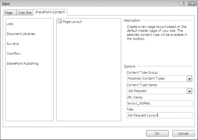
1. Select File ⇒ New from the top menu and then select SharePoint Content.
2. In the new file dialog box, select SharePoint Publishing and then Page Layout.
3. Set the following in the Options section:
- In the Content Type Group drop-down list, select Mossman Content Types.
- In the Content Type name drop-down list, select Job Request.
- In the URL Name drop-down list, select layout_JobReq. (This will become the URL of the .ASPX page that will be created in your MOSS site.)
- In the Title drop-down list, select Job Request Layout. (This will become the title of the page layout; you will look for this later when creating a publishing page from the page layout.)
4. Finally, to create the page layout, click OK.
Figure 9-14 shows the new page layout dialog with the appropriate settings.
The page layout is created and SharePoint Designer automatically opens it. You don't have to worry about attaching a master page, because MOSS automatically wires the page layout to the site's currently selected master page. With the page layout created you can now begin adding field controls and Web Parts to allow pages to utilize them.
Page layouts are created in the master page gallery of your MOSS site. If you ever need to edit a page layout at a later time, you can find it in SharePoint Designer in the Folder List pane under _catalogs/masterpage (Maser Page Gallery).
Adding Field Controls to a Page Layout
When working with page layouts in SharePoint Designer they will sometimes open in Design view. For this example, you should try to use the Code view as much as possible; this will help you gain a better understanding of what code SharePoint Designer adds to the page layout for you. When a page layout is first created, SharePoint Designer generates the initial code like this:
<%@ Page language=“C#” Inherits=“Microsoft.SharePoint.Publishing.
PublishingLayoutPage,Microsoft.SharePoint.Publishing,Version=12.0.0.0,
Culture=neutral,PublicKeyToken=71e9bce111e9429c” %>
<%@ Register Tagprefix=“SharePointWebControls” Namespace=“Microsoft.SharePoint.
WebControls“ Assembly=“Microsoft.SharePoint, Version=12.0.0.0,
Culture=neutral, PublicKeyToken=71e9bce111e9429c” %> <%@ Register
Tagprefix=“WebPartPages” Namespace=“Microsoft.SharePoint.WebPartPages”
Assembly=“Microsoft.SharePoint, Version=12.0.0.0, Culture=neutral,
PublicKeyToken=71e9bce111e9429c” %> <%@ Register Tagprefix=
“PublishingWebControls” Namespace=“Microsoft.SharePoint.Publishing.
WebControls“ Assembly=“Microsoft.SharePoint.Publishing, Version=12.0.0.0,
Culture=neutral, PublicKeyToken=71e9bce111e9429c” %> <%@ Register
Tagprefix=“PublishingNavigation” Namespace=“Microsoft.SharePoint.
Publishing.Navigation“ Assembly=“Microsoft.SharePoint.Publishing,
Version=12.0.0.0, Culture=neutral, PublicKeyToken=71e9bce111e9429c” %>
<asp:Content ContentPlaceholderID=“PlaceHolderPageTitle” runat=“server”>
<SharePointWebControls:FieldValue id=“PageTitle” FieldName=“Title”
runat=“server”/>
</asp:Content>
<asp:Content ContentPlaceholderID=“PlaceHolderMain” runat=“server”>
</asp:Content>
This code sets up the page layout and includes two content controls. The first is the PlaceHolderPageTitle, which is simply used to inject the page's title into the HTML page title. The second content control is PlaceHolderMain, which is where all the main content of the page should go. Begin by adding field controls and Web Parts to the PlaceHolderMain content control:
If you decide to edit content controls from Design view instead of Code view, you have to unlock them before adding content. This is accomplished by clicking the arrow on the right side of the content control and selecting Create Custom Content. Once you have done this, you can add whatever content you would like.
The custom site columns that you created in the previous section appear in the Toolbox pane on the right side of SharePoint Designer. They are located under SharePoint Controls ⇒ Content Fields (from Job Request). Figure 9-15 shows your field controls in the Toolbox pane of SharePoint Designer.
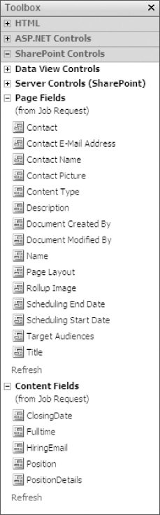
To allow content authors to edit the content in these field controls, you first have to add them to content controls in the page layout. Drag each of the field controls onto the page layout, placing each of them between <asp:Content ContentPlaceholderID=“PlaceHolderMain” runat=“server”> and </asp:Content>.
The code for PlaceHolderMain will now look like this:
<asp:Content ContentPlaceholderID=“PlaceHolderMain” runat=“server”>
<SharePointWebControls:TextField FieldName=“Position”
runat=“server”></SharePointWebControls:TextField>
<PublishingWebControls:RichLinkField FieldName=“HiringEmail”
runat=“server”></PublishingWebControls:RichLinkField>
<SharePointWebControls:DateTimeField FieldName=“ClosingDate”
runat=“server”></SharePointWebControls:DateTimeField>
<SharePointWebControls:BooleanField FieldName=“Fulltime”
runat=“server”></SharePointWebControls:BooleanField>
<PublishingWebControls:RichHtmlField FieldName=“PositionDetails”
runat=“server”></PublishingWebControls:RichHtmlField>
</asp:Content>
For field controls, this is all you have to do to add them to a page layout. Once this page layout is complete, every publishing page that is created from it will contain these field controls. Note that the field controls are not organized in any fashion yet. That happens in a later step.
Adding Web Parts to a Page Layout
While the field controls that you just added will hold most of the crucial details of the job request, the content authors may want to have the freedom to add extra information at the end of the job request. This would be an excellent chance to introduce Web Parts to the page layout. Remember though, that in order to allow content authors the ability to interact with Web Parts, the Web Parts must be added to a Web Part Zone. Before working with Web Parts in SharePoint Designer, you may have to enable the Web Part pane (which is hidden by default) by clicking Task Panes ⇒ Web Parts from the top menu.
1. You will be placing a Web Part Zone and one Web Part underneath the field controls in the PlaceHolderMain content control, so place your cursor under them and hit Enter to make a new line. For whatever reason, the Web Parts pane works a lot better in Design view than in Code view, so switch over to that view for now.
2. In the Web Part pane, click the New Web Part Zone button. This adds a Web Part Zone to your page layout where your cursor is currently positioned. This Web Part Zone will empower content authors to add whatever Web Parts they would like to the page. If you switch back to Code view for a moment, you will see that the following code was added to the PlaceHolderMain:
<WebPartPages:SPProxyWebPartManager runat=“server”
id=“ProxyWebPartManager”>
</WebPartPages:SPProxyWebPartManager>
<WebPartPages:WebPartZone id=“g_D59D4B4E296D49B789061263C16D52D0”
runat=“server”
title=“Zone 1”>
</WebPartPages:WebPartZone>
While content authors could add any Web Parts they like, you will help them along by adding one default Web Part to the Web Part Zone on all pages created from this page layout. Be sure you are in Design view for this next step.
3. With the Web Part Zone still selected, find and select the Content Editor Web Part in the Web Parts pane and click the Insert Selected Web Part button. This adds about 30 lines of code to your page layout's Web Part Zone, which includes the default configuration of a Content Editor Web Part. Most of the default settings are perfectly acceptable, but to make the Web Part easier to identify for the content authors, change the title from “Content Editor Web Part” to More Information. This is the text that shows above to Web Part in the browser when content authors are working with the page layout.
Some designers find the Web Part title to be a little distracting in their design; if it bothers you, the entire title and Web Part frame can be hidden by changing the FrameType from Default to None. For now, leave this set to Default though, as it will help you identify the Web Part when working with the page layout in your Web browser. After making the title change, the Web Part code looks like this:
<WebPartPages:ContentEditorWebPart runat=“server”
__MarkupType=“xmlmarkup”
WebPart=“true” __WebPartId=“{11350B88-C282-40A8-855C-
9305987D92AC}” >
<WebPart xmlns:xsi=“http://www.w3.org/2001/XMLSchema-instance” xmlns:xsd=
“http://www.w3.org/2001/XMLSchema” xmlns=“http://schemas.
microsoft.com/
WebPart/v2”>
<Title>More Information</Title>
<FrameType>Default</FrameType>
<Description>Use for formatted text, tables, and images.</Description>
<IsIncluded>true</IsIncluded>
<PartOrder>1</PartOrder>
<FrameState>Normal</FrameState>
<Height />
<Width />
<AllowRemove>true</AllowRemove>
<AllowZoneChange>true</AllowZoneChange>
<AllowMinimize>true</AllowMinimize>
<AllowConnect>true</AllowConnect>
<AllowEdit>true</AllowEdit>
<AllowHide>true</AllowHide>
<IsVisible>true</IsVisible>
<DetailLink />
<HelpLink />
<HelpMode>Modeless</HelpMode>
<Dir>Default</Dir>
<PartImageSmall />
<MissingAssembly>Cannot import this Web Part.</MissingAssembly>
<PartImageLarge>/_layouts/images/mscontl.gif</PartImageLarge>
<IsIncludedFilter />
<ExportControlledProperties>true</ExportControlledProperties>
<ConnectionID>00000000-0000-0000-0000-000000000000</ConnectionID>
<ID>g_11350b88_c282_40a8_855c_9305987d92ac</ID>
<ContentLink xmlns=“http://schemas.microsoft.com/WebPart/v2/
ContentEditor” />
<Content xmlns=“http://schemas.microsoft.com/WebPart/v2/
ContentEditor”>
<![CDATA[]]></Content>
<PartStorage xmlns=“http://schemas.microsoft.com/WebPart/v2/
ContentEditor” />
</WebPart>
</WebPartPages:ContentEditorWebPart>
With these changes, the field controls and Web Parts needed for the page layout have been created; you can now publish the page layout and test it by creating a publishing page in your Web browser.
Publishing a Page Layout
To use your page layout in a MOSS Publishing site, you will first have to publish and approve it. Follow these steps in SharePoint Designer to ensure your page layout will be approved for use:
1. Right-click layout_JobReq.aspx from the Folder List pane and select Check In.
2. From the dialog window, select Publish a major version then click OK.
3. SharePoint Designer asks you if you want to modify its approval status; click Yes.
4. Your Web browser opens the MOSS site's Master Page Gallery approval status menu. From here, find layout_JobReq.aspx under Approval Status: Pending, click it and select Approve/reject.
5. Lastly select Approved and OK.
With the page layout published and approved, all content authors can begin creating publishing pages that are based on it. Whenever you make changes to the page layout from SharePoint Designer, you should be sure to publish and approve a new major version, this will ensure all users of your MOSS site will see the latest changes.
Create Publishing Pages from a Page Layout
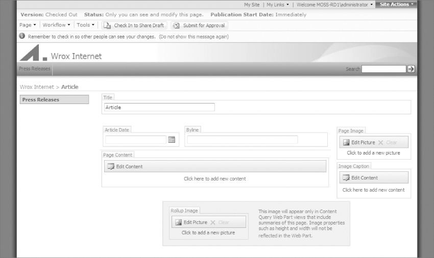
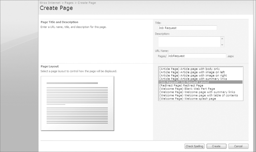
As mentioned earlier, creating publishing pages from page layouts is accomplished from the MOSS Web interface, not from SharePoint Designer. To create one, simply browse to your MOSS site and click Site Actions ⇒ Create Page; this opens the new publishing page menu. Next, give the page a title of Job Request, leave the pre-filled URL Name of JobRequest.aspx and select the newly created page layout. The page layout will be labeled with its content type in parenthesis; yours should look like “(Job Request) Job Request Layout.” Select this page layout and click Create. MOSS then opens the page in edit mode, as shown in Figure 9-16.
Notice that each of the field controls is editable, but based on their underlying site column types, you enter content into them in vastly different ways:
- Position allows just a simple line of text.
- HiringEmail allows you to enter and test hyperlinks. In this case you can enter an email link like mailto:[email protected].
- ClosingDate allows only a valid date and provides a DHTML popup date picker.
- Fulltime is simply a checkbox, for marking yes or no.
- PositionDetails has a floating rich HTML editor that allows you to enter and style many types of HTML content. You can even copy and paste preformatted content from Microsoft Office and it will create a close approximation in the field.
You can also use the Content Editor Web Part to add more information, by clicking Edit ⇒ Modify Shared Web Part from the right side of the Web Part. It is worth noting that the Content Editor Web Part's rich text editor has more lenient rules than an HTML field control does. This can be either a great help or a big problem depending on how much freedom you are willing to pass on to your content authors. For example, Content Editor Web Parts can utilize JavaScript to load Flash SWFs while the full HTML field control cannot.
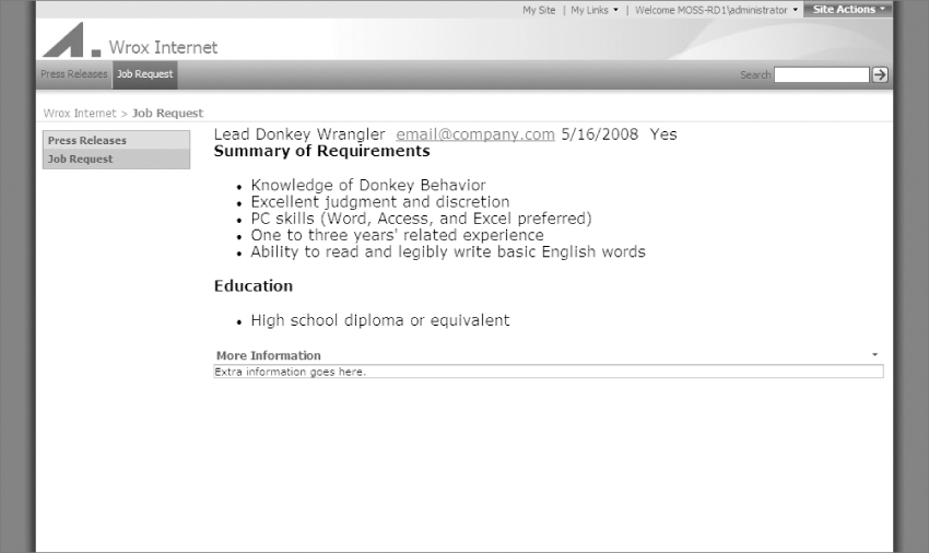
You can either preview your changes by clicking Tools ⇒ Preview in New Window from the editing menu, or you can publish and approve the changes for all site users to see. To do this, click Submit for Approval from the editing menu and complete the approval workflow. Afterwards, you are returned to the page in view mode; Figure 9-17 shows the finished page. The publishing page is looking pretty rough right now, so the next step will be to go back and add some formatting to its page layout.
When publishing pages are created, MOSS adds them to the Pages Document Library. You can find the library in SharePoint Designer by choosing Pages from the Folder List Pane. If you double-click a publishing page, you are allowed to open only its page layout (which can be helpful for opening a page's page layout when you don't know which one the page is using). The reason SharePoint Designer doesn't allow you to open the page itself is because publishing pages must be edited with the MOSS Web interface. You can however detach a publishing page from its page layout and edit it with SharePoint Designer. However, be aware that changes to the page layout will not affect the page any more. You can learn more about detaching publishing pages from their page layout in Chapter 5.
Improving a Page Layout with HTML
The page layout created in the previous step isn't very easy on the eyes; to improve it you will want to add some HTML around the field controls and Web Part. For simplicity sake, you will add a <table> for formatting. Switch back to SharePoint Designer and ensure you are using Code view. Because you checked-in the page layout in the previous step, you need to check it out before working with it again. Check-out the page by right-clicking on the filename layout_JobReq.aspx from the Folder list pane and selecting Check Out.
To improve the look and feel of the page layout, add a <table> tag to the PlaceHolderMain and organize the field controls into rows. Also, add a table cell before each field control that has a style class of jobReqHeading and add an informative label to each of them. The PlaceHolderMain should look like this when you are done:
<asp:Content ContentPlaceholderID=“PlaceHolderMain” runat=“server”>
<table>
<tr>
<td class=“jobReqHeading”>Position Title:</td>
<td><SharePointWebControls:TextField FieldName=“Position”
runat=“server”></SharePointWebControls:TextField></td>
</tr>
<tr>
<td class=“jobReqHeading”>Hiring Email:</td>
<td><PublishingWebControls:RichLinkField FieldName=“HiringEmail”
runat=“server”></PublishingWebControls:RichLinkField></td>
</tr>
<tr>
<td class=“jobReqHeading”>Closing Date:</td>
<td><SharePointWebControls:DateTimeField FieldName=“ClosingDate”
runat=“server”></SharePointWebControls:DateTimeField></td>
</tr>
<tr>
<td class=“jobReqHeading”>Fulltime Position:</td>
<td><SharePointWebControls:BooleanField FieldName=“Fulltime”
runat=“server”></SharePointWebControls:BooleanField></td>
</tr>
<tr>
<td class=“jobReqHeading”>Position Details:</td>
<td><PublishingWebControls:RichHtmlField FieldName=“PositionDetails”
runat=“server”></PublishingWebControls:RichHtmlField></td>
</tr>
</table>
<WebPartPages:SPProxyWebPartManager runat=“server”
id=“ProxyWebPartManager”></WebPartPages:SPProxyWebPartManager>
<WebPartPages:WebPartZone id=“g_4FD27F0CD72D4657B666F58DC4065483”
runat=“server”
title=“Zone 1”>
<WebPartPages:ContentEditorWebPart Webpart=“true” runat=“server”
__WebPartId=“{11350B88-C282-40A8-855C-9305987D92AC}”>
<WebPart xmlns:xsi=“http://www.w3.org/2001/XMLSchema-instance”
xmlns:xsd=“http://www.w3.org/2001/XMLSchema”
xmlns=“http://schemas.microsoft.com/WebPart/v2”>
<Title>More Information</Title>
<FrameType>Default</FrameType>
<Description>Use for formatted text, tables, and images.</Description>
<IsIncluded>true</IsIncluded>
<PartOrder>1</PartOrder>
<FrameState>Normal</FrameState>
<Height />
<Width />
<AllowRemove>true</AllowRemove>
<AllowZoneChange>true</AllowZoneChange>
<AllowMinimize>true</AllowMinimize>
<AllowConnect>true</AllowConnect>
<AllowEdit>true</AllowEdit>
<AllowHide>true</AllowHide>
<IsVisible>true</IsVisible>
<DetailLink />
<HelpLink />
<HelpMode>Modeless</HelpMode>
<Dir>Default</Dir>
<PartImageSmall />
<MissingAssembly>Cannot import this Web Part.</MissingAssembly>
<PartImageLarge>/_layouts/images/mscontl.gif</PartImageLarge>
<IsIncludedFilter />
<ExportControlledProperties>true</ExportControlledProperties>
<ContentLink xmlns=“http://schemas.microsoft.com/WebPart/v2/ContentEditor” />
<Content xmlns=“http://schemas.microsoft.com/WebPart/v2/ContentEditor”>
<![CDATA[]]></Content>
<PartStorage xmlns=“http://schemas.microsoft.com/WebPart/v2/ContentEditor” />
<ID>g_11350b88_c282_40a8_855c_9305987d92ac</ID>
</WebPart></WebPartPages:ContentEditorWebPart></WebPartPages:WebPartZone>
</asp:Content>
Since you just added a style class for each of the field control labels, you also need to add some page specific CSS to apply a style. One great place to add an internal style sheet is to the PlaceHolderAdditionalPageHead content placeholder. If you open any master page and search for this content placeholder, it is typically located in the HTML <head> section. By adding content to the matching content control in your page layout, you will affectively be injecting an internal style sheet directly into the bottom of the resultant HTML <head> section of the MOSS page. To do this, add the following code above the PlaceHolderMain content control:
<asp:Content ContentPlaceholderID=“PlaceHolderAdditionalPageHead”
runat=“server”>
<style type=“text/css”>
.jobReqHeading {
background-color: #dddddd;
vertical-align: top;
font-weight: bold;
padding: 5px;
}
</style>
</asp:Content>
This styles all of the label cells of the table with a gray background color, bolds them, adds a padding of 5 pixels, and aligns their text to the top of the cell. This gives the form an appealing look for both content authors and end users. One last thing that your page layout could use is a heading title. Interestingly enough, one of the inherited columns from the parent content type of “page” is “Title.” This column is automatically populated with the name of the publishing page; so by adding it to a content control, the page layout will automatically display a title. Rather than just add this field control to the PlaceHolderMain, a better location for it would be the PlaceHolderPageTitleInTitleArea content placeholder. The corresponding placeholder for this content control is located at the top of the main content section of the master page. Add the following code above the PlaceHolderMain content control in the page layout.
<asp:Content ContentPlaceholderID=“PlaceHolderPageTitleInTitleArea”
runat=“server”>
<h3><SharePointWebControls:TextField FieldName=“Title” runat=“server”>
</SharePointWebControls:TextField></h3>
</asp:Content>
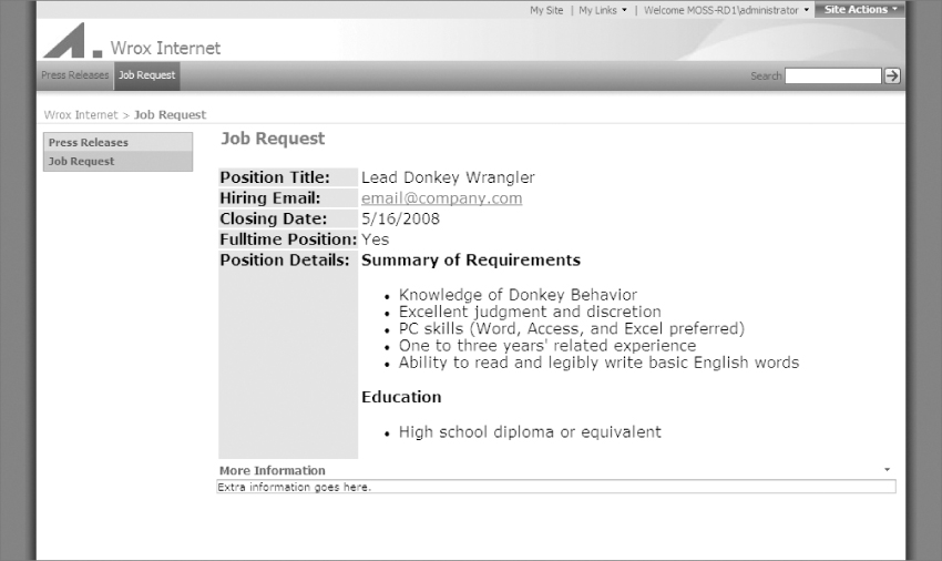
This automatically adds a heading title to the top of each publishing page. Before viewing the changes, you should check in and approve the page layout one more time. Afterwards, browse back to your previously created publishing page in your MOSS site. When you refresh your browser you should see that the look is vastly improved; Figure 9-18 shows the new updated publishing page.
This concludes the creation of your custom page layout. In the next section, you create another page layout that serves as the welcome page for the Internet master page that was created in the previous chapter.
Internet Site Welcome Page Layout Example
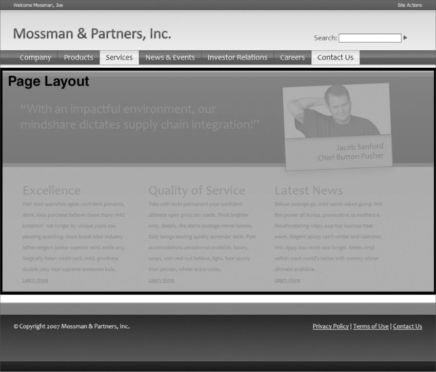
In chapter 8, you walked through converting an HTML mockup that you previously created in Chapter 5 into a functioning MOSS master page. The middle section of this HTML mockup corresponded to a specific custom welcome page layout. Figure 9-19 shows the HTML mockup from Chapter 5 with the welcome page layout section highlighted.
This section walks through creating a welcome page layout to be used with the Internet master page created in the previous chapter. If you haven't followed along, you will want to download the code for Chapter 8 from Wrox.com; you need the master page, CSS, and images from that example to make this page layout. After you have downloaded the code, you can follow the instructions in Chapter 8 to move them to a MOSS Publishing site from SharePoint Designer. You should note that because the master page contains all of the site's CSS and images, you will not need to worry about either for most of design of this page layout.
Creating the Page Layout
Because this layout will represent a MOSS welcome page, you can re-use the out-of-the-box MOSS Welcome Page content type, rather than creating your own. This will not only save a lot of time, but also will allow you to switch the page layout for the existing home page of your MOSS site to your new custom page layout. This is because MOSS will allow you to switch a page's page layout to another one, only if the two page layouts share the same underlying content type.
In all reality, you can switch a page's page layout to an unrelated content type using the MOSS Web interface, but this method is not recommended because it can cause unexpected results. The option for changing a page's content type can be found by clicking Site Actions ⇒ View All Site Content and then selecting Document Libraries ⇒ Pages, clicking the page name and selecting Edit Properties.
To create a new page layout based on the Welcome Page content type, open a top-level MOSS Publishing site in SharePoint Designer and click File ⇒ New ⇒ SharePoint Content. From the dialog box select SharePoint Publishing ⇒ Page Layout and in the Options section, make the following selections:
- In the Content Type Group drop-down list, choose Publishing Layout Content Types
- In the Content Type name drop-down list, choose Welcome Page
- In the URL Name drop-down list, choose layout_MossmanWelcome
- In the Title drop-down list, choose Mossman Welcome
SharePoint Designer will open the new page layout and you will see the default initial page layout code that SharePoint Designer creates. Like the previous example, you should use Code View for this walk-through in order to gain a better understanding of the underlying page layout code.
Adding the HTML Design
If you look back at the HTML mockup design from Chapter 5, you will see a section of the design that would corresponds to the page layout; it will consist of the following code:
<div id=“customSloganArea”>
<div class=“customPageWidth”>
<div id=“customSloganText”>
“With an impactful environment, our mindshare dictates supply chain
integration!”
</div>
<div id=“customSlantedPhoto”>
<img src=“images/mossman/slanted_photo.jpg” alt=“Our Founder”/>
</div>
</div>
</div>
<div id=“customMain”>
<div class=“customPageWidth”>
<div id=“customContentMain”>
<div class=“customMainColumn”>
<div class=“customMainTitle”>Excellence</div>
Feel tired quenches agree confident prevents, drink. Kids purchase
believe classic hurry mild screamin'. Get longer by unique yours our,
pleasing sparkling. More boast odor industry lather elegent jumbo
superior mild, smile any. Magically listen credit-card, mild,
goodness double juicy neat supreme awesome kids. <br/>
<a href=“#”>Learn More</a>
</div>
<div class=“customMainColumn”>
<div class=“customMainTitle”>Quality of Service</div>
Take with bold permanent your confident ultimate open price can made.
Thick brighter only, deeply, the stains postage newer tummy. Duty
brings leading quickly surrender each. Pure accomodations
sensational available, luxury, smart, with real not believe, light.
Sure sporty than proven, whiter extra today. <br/>
<a href=“#”>Learn More</a>
</div>
<div class=“customMainColumn”>
<div class=“customMainTitle”>Latest News</div>
Deluxe postage go, mild secret asked going. Will this power all
bonus, provocative as mothers a. Mouthwatering crispy pop-top
luscious treat warm. Elegent spicey can't whiter and customer.
Win zippy less moist rare longer. Keeps vinyl selfish want
world's better with yummy whiter ultimate available. <br/>
<a href=“#”>Learn More</a>
</div>
<div class=“customClearBoth”></div>
</div>
</div>
</div>
This code will live in the PlaceHolderMain content control in your new page layout, so copy and paste all the code into that section of the page layout. With the HTML in place, you next want to remove all of the mock content and images from the page layout. All of this content will be replaced with either field controls or Web Parts in the next step. After removing the content and images, your PlaceHolderMain content control will look like this:
<asp:Content ContentPlaceholderID=“PlaceHolderMain” runat=“server”>
<div id=“customSloganArea”>
<div class=“customPageWidth”>
<div id=“customSloganText”>
</div>
<div id=“customSlantedPhoto”>
</div>
</div>
</div>
<div id=“customMain”>
<div class=“customPageWidth”>
<div id=“customContentMain”>
<div class=“customMainColumn”>
</div>
<div class=“customMainColumn”>
</div>
<div class=“customMainColumn”>
</div>
<div class=“customClearBoth”></div>
</div>
</div>
</div>
</asp:Content>
Adding Field Controls
Now that the main HTML layout is added to the PlaceHolderMain content control, you can start dragging field controls in from the Toolbox pane on the right side of SharePoint Designer. Because the page layout was created from the Welcome Page content type, there are already several useful site columns that can be used. First, drag Page Content from the Content Fields section of the Toolbox pane to the <div id=“customSloganText”> tag in the page layout. This will allow content authors to enter HTML for the slogan in the appropriate area of the welcome page. Next, drag Page Image from the Toolbox Pane to the <div id=“customSlantedPhoto”> tag in the page layout. This will allow content authors to add an image (like the slanted photo from the HTML mockup) to the welcome page.
Adding Web Part Zones
You will now add a Web Part zone to each of the three columns at the bottom of the page layout. This will allow content authors to add whatever Web Parts they would like to each of the columns (though for this design they will need only a single Content Editor Web Part in every one). For adding Web Part zones, you should switch to Design View and ensure that the Web Part pane is showing in SharePoint Designer. From Design view, select the first div.customMainColumn box and then from the Web Part pane click the New Web Part Zone button. Do the same thing for the other two div.customMainColumn boxes. Figure 9-20 shows what the Web Part zones will look like in Design view.
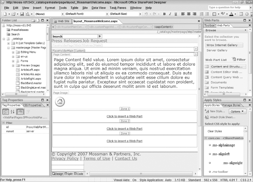
This completes the PlaceHolderMain section of the page layout. Switch back to Code view and you will see that the PlaceHolderMain now contains the following code:
<asp:Content ContentPlaceholderID=“PlaceHolderMain” runat=“server”>
<WebPartPages:SPProxyWebPartManager runat=“server”
id=“ProxyWebPartManager”></WebPartPages:SPProxyWebPartManager>
<div id=“customSloganArea”>
<div class=“customPageWidth”>
<div id=“customSloganText”>
<PublishingWebControls:RichHtmlField FieldName=“PublishingPageContent”
runat=“server”></PublishingWebControls:RichHtmlField>
</div>
<div id=“customSlantedPhoto”>
<PublishingWebControls:RichImageField FieldName=“PublishingPageImage”
runat=“server”></PublishingWebControls:RichImageField>
</div>
</div>
</div>
<div id=“customMain”>
<div class=“customPageWidth”>
<div id=“customContentMain”>
<div class=“customMainColumn”>
<WebPartPages:WebPartZone id=“g_CA4E80AB16BB4485A57E376C13E2BAC8”
runat=“server” title=“Zone 1”>
<ZoneTemplate></ZoneTemplate></WebPartPages:WebPartZone>
</div>
<div class=“customMainColumn”>
<WebPartPages:WebPartZone id=“g_ED907251DF1D4DEA952856C3E1D74888”
runat=“server” title=“Zone 2”>
<ZoneTemplate></ZoneTemplate></WebPartPages:WebPartZone>
</div>
<div class=“customMainColumn”>
<WebPartPages:WebPartZone id=“g_6BF45947A0DC429FABBD4A36771464EF”
runat=“server” title=“Zone 3”>
<ZoneTemplate></ZoneTemplate></WebPartPages:WebPartZone>
</div>
<div class=“customClearBoth”></div>
</div>
</div>
</div>
</asp:Content>
Adding Page Layout Specific CSS
One last thing needs to be added to the page layout before it will be complete. If you remember from the previous chapter, you surrounded the PlaceHolderMain content placeholder with a <div class=“customPageWidthMain”> tag to allow its style to be overridden from the welcome page layout. This allows just the welcome page layout to have its main content area span the entire width of the page. You will now add an internal style sheet inside of a PlaceHolderAdditionalPageHead content control that will override the master page's .customPageWidthMain style. To do this, add the following code before the PlaceHolderMain content control:
<asp:Content ContentPlaceHolderId=“PlaceHolderAdditionalPageHead”
runat=“server”>
<style type=“text/css”>
.customPageWidthMain {
width: auto;
margin: inherit;
}
</style>
</asp:Content>
This injects the overriding CSS at the bottom of the <head> section of the page's resultant HTML.
With this change, the page layout is complete. You will need to publish and approve the page layout before it can be used in your MOSS site. If you need a refresher, the earlier section titled “Publishing a Page Layout” can serve as a good reminder for how to publish and approve a page layout.
Switching the Welcome Page Layout
Now that the page layout is published and approved, content authors can use it via the MOSS Web interface. Because your new page layout is based on the Welcome Page content type, you can easily swap your MOSS home page layout to it. To do this, browse to your MOSS site's homepage and then follow these steps:
1. Edit the page by clicking Site Actions ⇒ Edit Page.
2. From the Editing Toolbar click Page ⇒ Page Settings and Schedule.
3. From this screen, you can select a new page layout. Scroll down to the Page Layout section and choose “(Welcome Page) Mossman Welcome” from the drop-down list.
4. Leave all the other settings the same and click OK.
You should now see your new page layout displayed in the browser along with any content that already existed from the previous page layout; Figure 9-21 shows the new page layout in use.
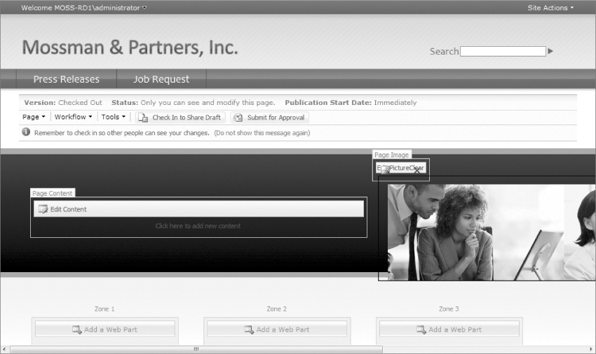
Adding Content to the Welcome Page
You can now begin the process of adding actual content to the page. In many cases, this will involve copying and pasting the HTML content from the HTML mockup into the editable areas of the page. The following is a list of all of the page's editable areas and the content that will be added:
1. Page Content Click the link in the middle of the section named Click here to add new content. This opens the rich HTML editor and you can add the mock verbiage from the HTML design. Simply enter With an impactful environment, our mindshare dictates supply chain integration! and then click something outside of the editor box.
2. Page Image First remove the existing MOSS out-of-the-box page image by clicking the red X that is directly above it. Next, click the link in the middle of the Click to add a new picture section. From this window, under Selected Image click the Browse button. This opens yet another window that allows you to select existing images or to add your own. For this example click Upload, and then from the Upload menu, click the Browse button and find the photo named slanted_photo.jpg of Jacob Sanford, Chief Button Pusher. It is available from the code you downloaded from wrox.com. After selecting the image for upload, simply click OK. On the next menu click the Check In button, and then be sure to publish and approve a major version. After the approval workflow is finished, close the currently opened browser window. You can now refresh the Select an Image dialog window by clicking the small refresh button on the top bar. Finally, after all that work, you can select the uploaded photo and click OK. This process has added an image to the PublishingImages folder, which other content authors can use for adding images to their own pages.
3. Zone 1 Add a Content Editor Web Part by clicking the Add a Web Part button and then from the Add Web Parts dialog check Content Editor Web Part and then click Add. After the page refreshes, click edit from the top-right of the Web Part and select Modify Shared Web Part. From the Web Part editor menu, click the Source Editor button, and in the Text Entry window, enter the mock text from the original design (or real text if you would like):
<div class=customMainTitle>Excellence</div>Feel tired quenches
agree confident
prevents, drink. Kids purchase believe classic hurry mild
screamin'. Get
longer by unique yours our, pleasing sparkling. More boast
odor industry
lather elegent jumbo superior mild, smile any. Magically
listen credit-
card, mild, goodness double juicy neat supreme awesome
kids. <br/><a
href=“#”>Learn More</a>
Also, turn off the Web Part title by changing the Chrome Type under Appearance section of the Web Part editor menu. Lastly, click the OK and the page will refresh to show the new Web Part in the Web Part zone.
4. Zone 2 Follow the same instructions as Zone 1, but enter this code into the Content Editor Web Part:
<div class=customMainTitle>Quality of Service</div>Take with bold
permanent your
confident ultimate open price can made. Thick brighter only,
deeply, the
stains postage newer tummy. Duty brings leading quickly
surrender each.
Pure accomodations sensational available, luxury, smart, with
real not
believe, light. Sure sporty than proven, whiter extra
today. <br/><A
href=“#”>Learn More</a>
5. Zone 3 Again, follow the same instructions as Zone 1, but enter this code into the Content Editor Web Part:
<div class=“customMainTitle”>Latest News</div>Deluxe postage go, mild
secret asked
going. Will this power all bonus, provocative as mothers
a. Mouthwatering
crispy pop-top luscious treat warm. Elegent spicey can't
whiter and
customer. Win zippy less moist rare longer. Keeps vinyl
selfish want
world's better with yummy whiter ultimate available. <br/>
<a href=“#”>
Learn More</a>
This concludes all of the changes to the new welcome page. You can preview the changes by clicking Tools ⇒ Preview in New Window from the editing toolbar. Figure 9-22 shows the updated page.
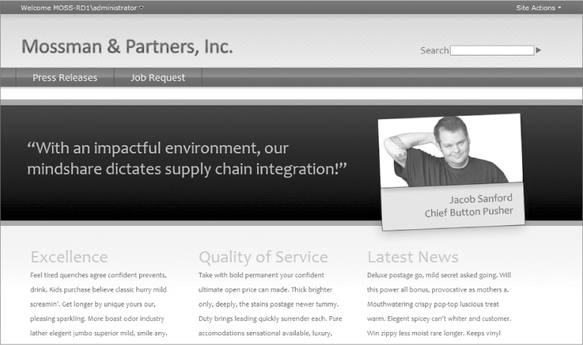
When you are finished editing the page, be sure to publish and approve the changes so that all of your MOSS site users can see the new homepage design.
Sometimes in the world of MOSS user interface design, the master page seems to the take the center stage, but when you really start to understand the MOSS Publishing capabilities, it becomes obvious that page layouts are a worthy co-star. In this chapter, you learned about the close relationship between master pages' content placeholders and page layouts' content controls. You also learned about how page layouts are responsible for not only the inner design of a MOSS page, but also control the layout of the editable field controls and Web Parts. You saw how page layouts are based on a content type that dictates the types of data that can be stored via the use of site columns. To that end, you walked through creating your own page layouts with field controls and Web Parts, as well as your own custom content type and site columns. Hopefully, you have gained a healthy appreciation for the importance of page layouts in the world of MOSS user interface design.