
Chapter 10
Working with Out-of-the-Box Web Parts
Okay, you have the basic shell set up. You have designed your template and your master pages and styled with CSS and now it's time to get to your content. But a Web site, any Web site, is more than just the shell. Most developers should recognize that, as much work as they put into the architectural design of the site; visitors typically care a lot more about the content. So, as a designer/developer, you must give due consideration to the content that will, in all honesty, be the biggest measure of the popularity of the site you develop. Don't misunderstand; having a site that looks good and functions appropriately for all visitors is monumentally important. But that is what gets people in to your site. The content is what keeps them coming back.
In the world of SharePoint, Web Parts play an important role as a secondary means of delivering content that is not handled by the typical WSS or MOSS Publishing content. This can, generally speaking, consist of custom made Web Parts or the ones that come as standard components of SharePoint. While there is certainly merit in creating your own custom Web Parts, there is a wealth of power and flexibility available through the out-of-the-box Web Parts that come with SharePoint.
At a high level, Web Parts may not seem like they fall into the scope of a design book. In a sense, most of this chapter won't be talking about aesthetics. But understand, good design isn't all about aesthetics. You have to know what your users want to see and provide them with an appropriate way to get it and, ideally, an appropriate and easy way to update it. And, in this regard, there are probably no better tools at manipulating, displaying, and retrieving the content your users want to see than with Web Parts.
So, in this chapter, you get at least a cursory exposure of some of the Web Parts that can really help in the design and layout of the content areas of your Web site. These will include:
- Content Query Web Part
- Data View Web Part
- Content Editor Web Part
- Image Web Part
- XML Web Part
- Page Viewer Web Part
While this is only a small sampling of the out-of-the-box Web Parts available to you, these will hopefully show you how powerful and flexible the Web Parts can be and what a crucial role they will play in the designs you create.
Using the Content Query Web Part
The Content Query Web Part (CQWP), which is only available within Publishing sites, is one of the most commonly used Web Parts when displaying content in SharePoint sites because it allows you to show content based on a query that you define with a few clicks. You can select the type of the content, the location to search for the content, and other criteria to define your search query. With the CQWP you can not only create a search query, you can also sort, filter, and group the content that the CQWP returns based on the search query. You can think of the CQWP as a custom search results screen; as the name states, it is a Content Query Web Part and it displays content based on a query. The CQWP also allows you to customize the look and feel of the content being returned to make the results look and feel the same as the rest of the site.
A Content Query Web Part is mostly used to display content in SharePoint sites when the content is scattered across multiple sites. In an intranet scenario you might have several department/division sites that have announcements lists where each department/division adds their announcements, and let's assume that you need to show an aggregated view of all of the announcements in one central view on the home page as company announcements. In such cases, using a CQWP is a no brainer, as it can aggregate similar content based on its settings.
The CQWP is also useful for Internet sites that have content that gets updated frequently. Since most content owners need to publish content to an Internet site quickly and easily, this pushes designers to think out-of-the-box, and this is where the CQWP comes into play. For example you might have a “Latest News” section on the home page of your Internet site and every time you wish to add a new news item to the site you would like to do it by adding a new item to an announcements list.
The following section details a real world scenario that will help you understand how CQWP can be used in your sites. This section will not detail how the CQWP works, since it is beyond the scope of this book.
Real World Scenario: Adding a “Latest News” CQWP to an Internet Site
Adding a “Latest News” section is a very common requirement for Internet sites. In this section, you set up an Internet site to use a CQWP to display the latest company news.
This requirement can be accomplished by using a SharePoint list to store the content and a CQWP to display the content. To accomplish these tasks you first design the list where the news will be stored, then you set up a Content Query Web Part to display the content and finally you modify the look and feel of the CQWP so that the content is displayed using your design standards.
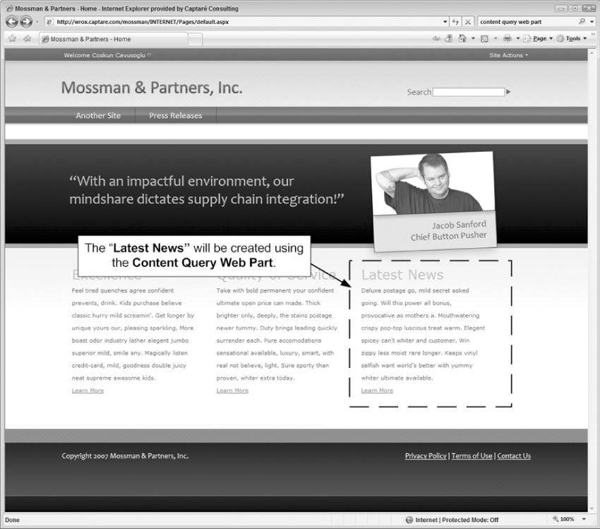
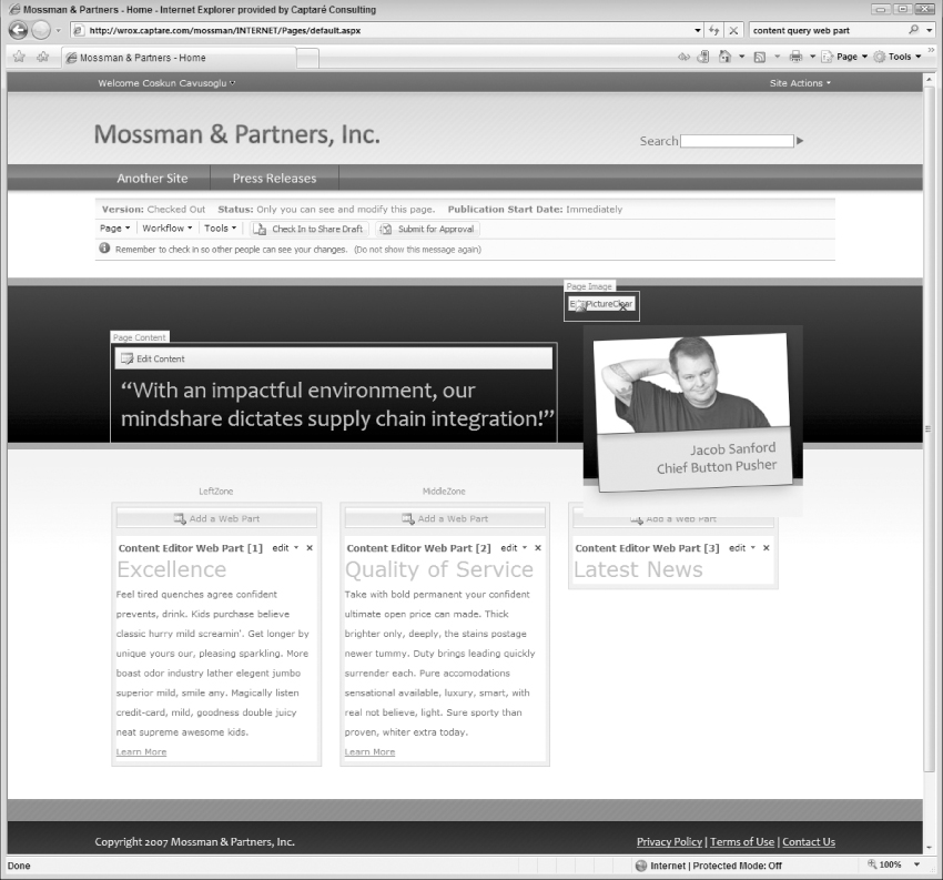
For this walkthrough, you will use the Internet site design that was created in Chapter 8. (See Figure 10-1.) This walkthrough updates the Latest News Web Part so that it is a CQWP that is getting the latest news from a custom announcements list. If you didn't create the site in Chapter 8, don't worry; you can still follow along. You will just need to have a site with a Web Part Zone available so that you can add the CQWP to your own project.
Step 1: Creating the List to Store the News
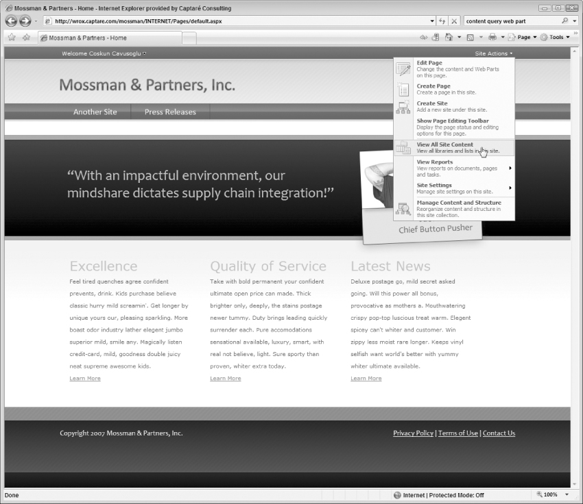
To store the News for the company, you use an announcements list in this solution, so the first thing you need to do is create an announcements list. To create the announcements list, click Site Actions ⇒ View All Site Content, as shown in Figure 10-2.
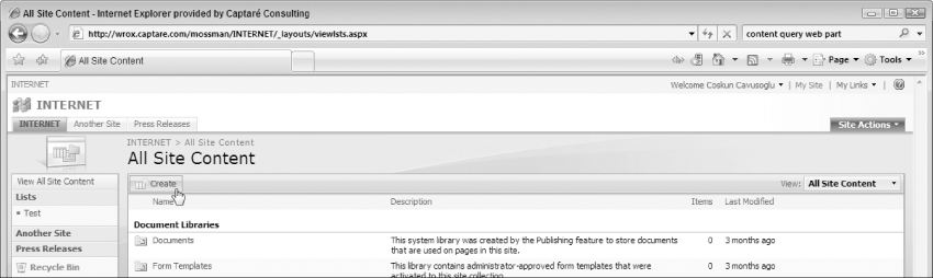
Clicking on View All Site Content will take you to the All Site Content page. On that page, click the Create button as shown in Figure 10-3.
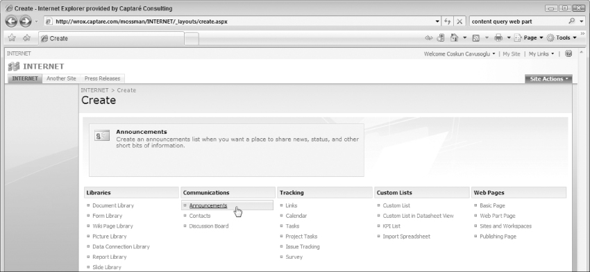
On the Create page click Announcements as shown in Figure 10-4. If you do not see Announcements make sure that the Team Collaboration Lists feature is enabled on the Site Features page. You can get to the Site Features page by following these steps:
1. Access the Site Settings page (click the Site Actions menu and then hover over Site Settings and, finally, select Modify All Site Settings from the options that are presented).
2. From the Site Settings page, you can click the Site feature link located in the Site Administration group to access the Site Features page.
3. Once on that page, you can click the Activate button next to Team Collaboration Lists to enable this feature.
4. Click Announcements to create a new SharePoint list that is using the Announcements list. The Announcement list is very close to what you are trying to accomplish so starting with this list will save you time.
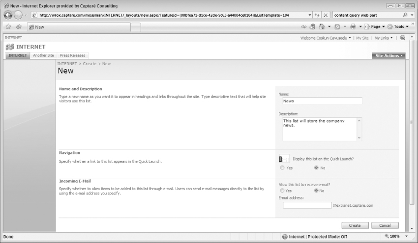
5. On the New Announcements page, fill in the required fields to create the list. In this example name the list News as shown in Figure 10-5.
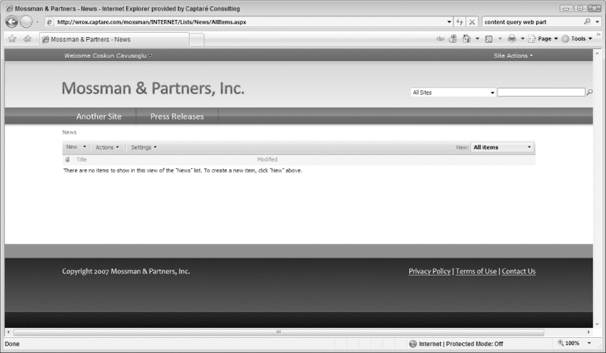
6. After you click Create, SharePoint creates the list and redirects you to the default page for the Announcements list named “News” as shown in Figure 10-6.
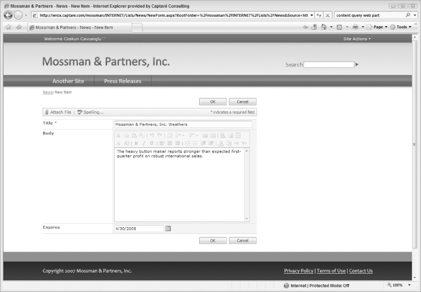
7. Now that you have your News list created, go ahead and create a few news items. To add a news item, click the New button, which takes you to the New Item page for the News list. On this page, fill in the required fields and click OK to add the news item as shown in Figure 10-7.
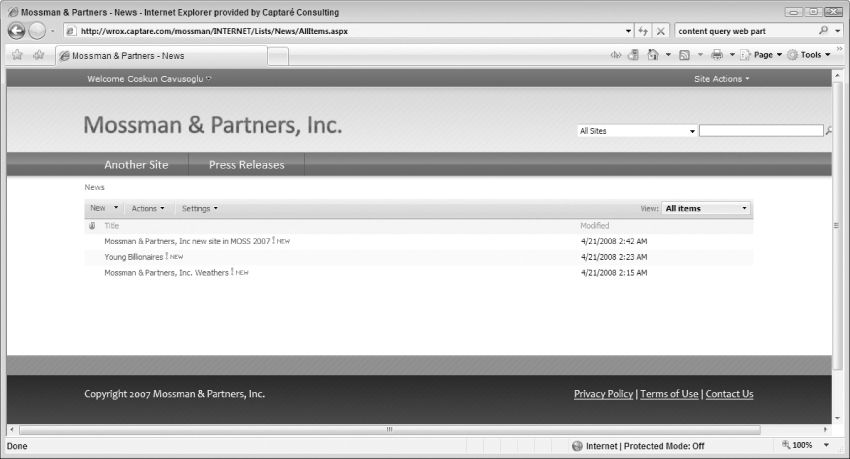
8. After you click OK, you see the list of announcements you have added to the list. At this point, go ahead and add a few more news items so that you have at least three news items, as shown in Figure 10-8.
Step 2: Adding the CQWP to the Internet Site
Now that you have created a list to store the News Items, go ahead and add a CQWP to the site that will display the news items on the home page. To add the CQWP click Site Actions ⇒ Edit Page to put the page in Edit mode, as shown in Figure 10-9.
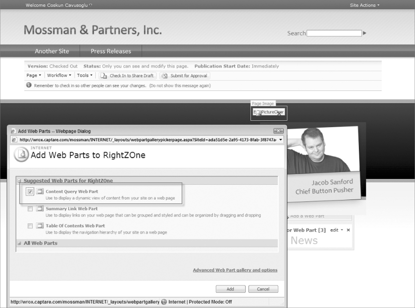
Now that the page is in Edit mode, click Add a Web Part on the Right Zone above the Latest News section. Clicking the Add a Web Part link brings up a pop-up window that allows you to select the Web Part you wish to add to the page. At this point select the checkbox next to the Content Query Web Part option, as shown in Figure 10-10, and click the Add button.
Step 3: Creating the Query for the CQWP
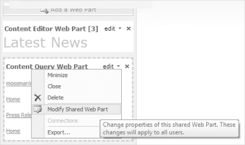
After you have added the CQWP, you need to modify its settings. To modify the settings of the CQWP click on the Edit ⇒ Modify Shared Web Part link as shown in Figure 10-11.
Clicking the Modify Shared Web Part link opens the CQWP's properties on the right of the screen as shown in Figure 10-12.
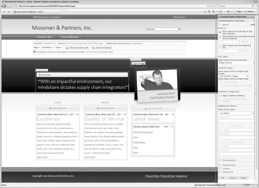
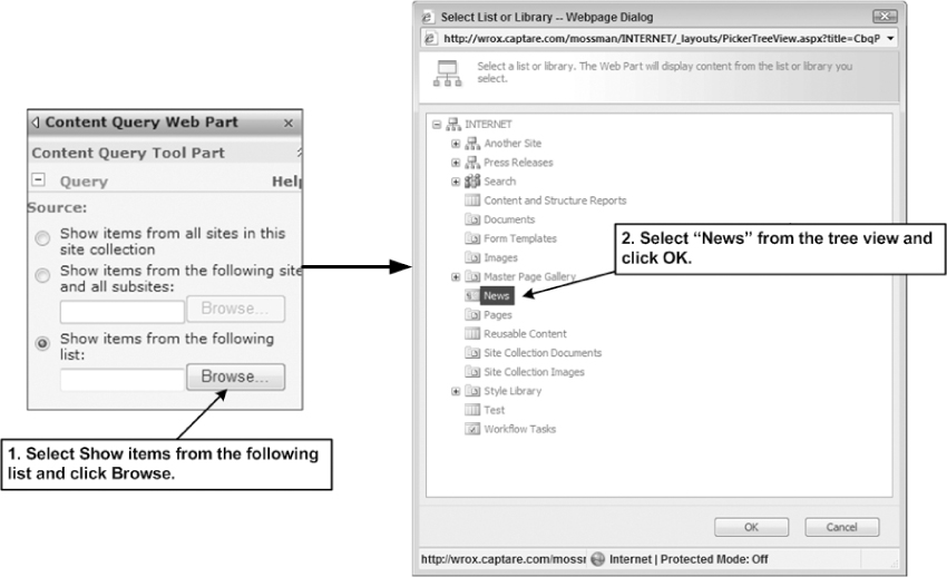
Under the Query section of the Web Part properties, select the “Show items from the following list” option because you want to display only the announcements from the News list. When you click Browse, the list selector opens. On that pop-up select News and click OK, as shown in Figure 10-13.
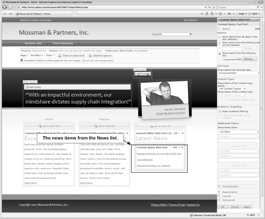
Now that you have defined the source of the CQWP, select Announcements under List type and click OK. When the page refreshes the CQWP shows your news items from the News list, as shown in Figure 10-14.
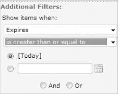
Since the Web Part should show only the latest news you will filter the news items so that the CQWP does not show the expired news items. To accomplish this, you update the Additional Filters section so that it shows items only when Today's date is greater than or equal to the Expires date as shown in Figure 10-15. After applying this setting, the news items older than Today's date will not appear in the latest news CQWP results.
Step 4: Customizing CQWP's Presentation Settings
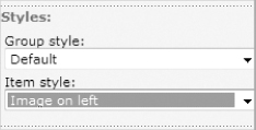
At this point, you have created the CQWP's query and now you have your CQWP showing the latest news items. The final step is to make the look and feel of the news articles match the look and feel of the site. To update the look and feel of the CQWP's content you can select one of the existing styles under the Styles section of the CQWP's Presentation settings. There are two styles you can select under the Styles section of the CQWP, the Group Style and the Item Style.
Currently, the Latest News CQWP shows the title of the news items as links. To make the news items user-friendly, you need to show the body of each news item. The CQWP utilizes three Extensible Style Language (XSL) files that are customizable to render its content. So to create a custom look and feel for the news items, you create a custom Item Style and you do not have to create a custom Group Style, since you are not grouping the content.
Adding Additional Fields to the CQWP
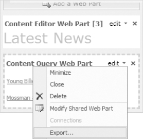
By default, the CQWP brings several fields back with the results, but the Body field from the Announcement list is not one of them. To request additional fields with the CQWP you need to update the Web Part's code behind. To do this, you must first export the CQWP by clicking the Content Query Web Part's edit dropdown list and selecting Export, as shown in Figure 10-17.
Save the file to your computer, and open it in SharePoint Designer. On the Web Part file you have exported a search for the property name CommonViewFields. This is the field that tells CQWP to request additional fields when returning results. To display an additional field, you must update the existing line
<property name=“CommonViewFields” type=“string” />
by adding the ColumnName and FieldType.
<property name=“CommonViewFields” type=“string”>
ColumnName, FieldType
</property>
Since you want to display the Body column, which has a field type of Note, update the CommonViewFields line with the following line.
<property name=“CommonViewFields” type=“string”>Body, Note</property>
After you make your change, save your Web Part file and import it back to the site by using the following steps:
1. Click the Add a Web Part link.
2. Click the Advanced Web Part gallery and options link in the bottom-right corner of the pop-up window.
3. Click Import as shown in Figure 10-18.
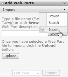
4. Click Browse, select the updated Web Part file, and upload it to the site.
5. Drag and drop the Web Part to the right zone. Also make sure you delete the old CQWP once the new one is uploaded so that the new one is the only CQWP on the site.
Creating a Custom Item Style
Now you are ready to create a custom item style for the CQWP. To create our custom style, you will need to modify the Item Style located under the Style Library of the site. To access the XSL Style Sheet, open the site in SharePoint Designer and expand the “Style Library” folder and then select the “XSL Style Sheets” folder as shown in Figure 10-19 (you may find that it is easier to perform the next steps if you expand the “XSL Style Sheets” folder similar to Figure 10-19).
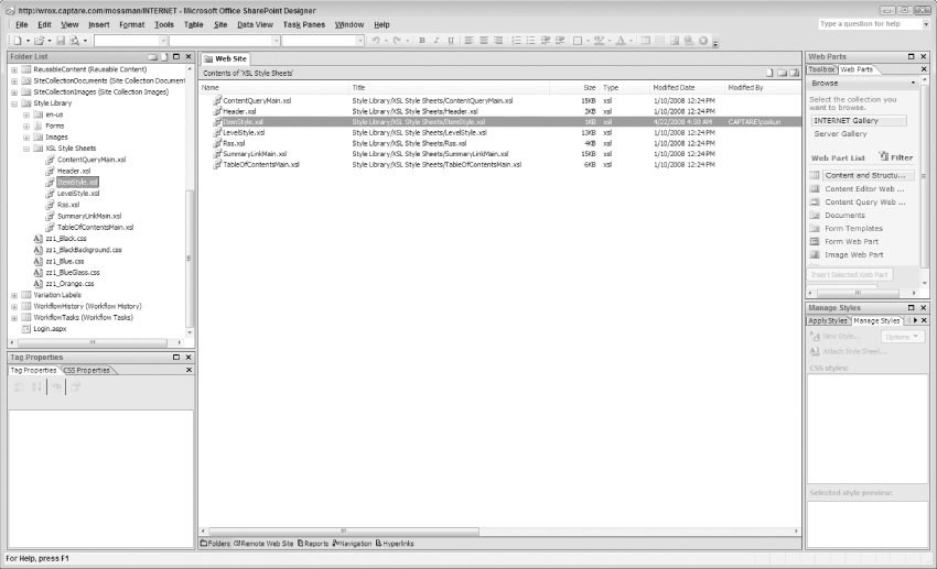
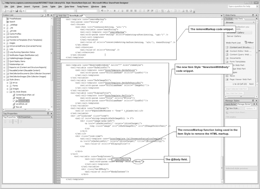
Once you're in the correct folder, open the ItemStyle.xsl file and check out the file (you will be asked if you want to check out the file when you attempt to open it; select “Yes”). By changing this file, you can customize (unghost) the XSL file. You can revert it to the site definition if needed (you can read more about customized and uncustomized files in Appendix A). At this point, you add your custom code to display the body. Copy the default template from the code and paste it to the bottom of the page.
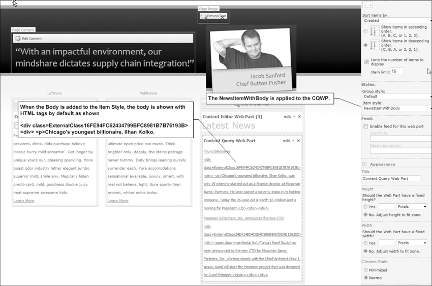
Now rename the template to be NewsItemWithBody; at this point you have created a new Item Style. Now you need to add the Body field to the template. You simply replace the @Description column with @Body to accomplish this. But this isn't enough. If you were to save the file and apply the style as is, the body is displayed, but it shows HTML markup around the content as shown in Figure 10-20.
There is a good article on how to remove the HTML markup on the Microsoft ECM Team blog located at http://blogs.msdn.com/ecm/archive/2006/10/25/configuring-and-customizing-the-content-query-Web-part.aspx. I will be using the code snippet named removeMarkup located in this article to replace the HTML markup around the content.
The following code is a representation of the code snippet you should add to the bottom of ItemStyle.xsl you have checked out earlier.
<xsl:template name=“removeMarkup”>
<xsl:param name=“string” />
<xsl:choose>
<xsl:when test=“contains($string, ‘<’)”>
<xsl:variable name=“nextString”>
<xsl:call-template name=“removeMarkup”>
<xsl:with-param name=“string” select=“substring-after($string, ‘>’)”
/>
</xsl:call-template>
</xsl:variable>
<xsl:value-of select=“concat(substring-before($string, ‘<’), $nextString)”
/>
</xsl:when>
<xsl:otherwise>
<xsl:value-of select=“$string” />
</xsl:otherwise>
</xsl:choose>
</xsl:template>
<xsl:template name=“NewsItemWithBody” match=“*” mode=“itemstyle”>
<xsl:variable name=“SafeLinkUrl”>
<xsl:call-template name=“OuterTemplate.GetSafeLink”>
<xsl:with-param name=“UrlColumnName” select=“‘LinkUrl’”/>
</xsl:call-template>
</xsl:variable>
<xsl:variable name=“SafeImageUrl”>
<xsl:call-template name=“OuterTemplate.GetSafeStaticUrl”>
<xsl:with-param name=“UrlColumnName” select=“‘ImageUrl’”/>
</xsl:call-template>
</xsl:variable>
<xsl:variable name=“DisplayTitle”>
<xsl:call-template name=“OuterTemplate.GetTitle”>
<xsl:with-param name=“Title” select=“@Title”/>
<xsl:with-param name=“UrlColumnName” select=“‘LinkUrl’”/>
</xsl:call-template>
</xsl:variable>
<xsl:variable name=“LinkTarget”>
<xsl:if test=“@OpenInNewWindow = ‘True’” >_blank</xsl:if>
</xsl:variable>
<div id=“linkitem” class=“item”>
<xsl:if test=“string-length($SafeImageUrl) != 0”>
<div class=“image-area-left”>
<a href=“{$SafeLinkUrl}” target=“{$LinkTarget}”>
<img class=“image” src=“{$SafeImageUrl}” alt=“{@ImageUrlAltText}” />
</a>
</div>
</xsl:if>
<div class=“link-item”>
<xsl:call-template name=“OuterTemplate.CallPresenceStatusIconTemplate”/>
<a href=“{$SafeLinkUrl}” target=“{$LinkTarget}” title=“{@LinkToolTip}”>
<xsl:value-of select=“$DisplayTitle”/>
</a>
</div>
</div>
<xsl:variable name=“bodyContent”>
<xsl:call-template name=“removeMarkup”>
<xsl:with-param name=“string” select=“@Body”/>
</xsl:call-template>
</xsl:variable>
<div class=“ms-WPBody”>
<xsl:value-of select=“$bodyContent”/>
</div>
</xsl:template>
When you're done making your changes, the code for removeMarkup and NewitemWithBody should display at the bottom of the ItemStyle.xslfile, as shown in Figure 10-21. At this point, go ahead and save ItemStyle.xsl and check in the item style by right-clicking the file in the Folder List palette and choosing the Check In option. You are presented with a Check In dialog box where you can choose to check in a minor or major version of the file and choose to just overwrite the current minor version. You can also add check in notes if you want. Once you determine the appropriate conditions for this check-in, you can simply click the OK button to finalize the check-in process.
Appling the Custom Item Style to the CQWP
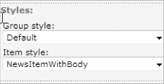
When you check in the file, the new Item Style will appear on the Style properties of the CQWP. Click on the Modify Web Part Settings and under the Styles section select the NewsItemWithBody item and click OK as shown in Figure 10-22.
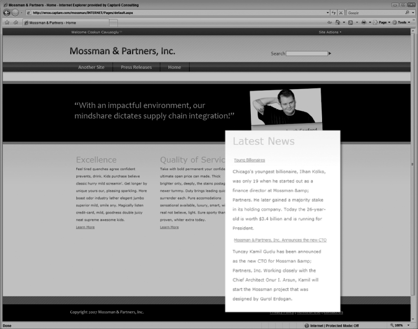
After you apply the new style, you have a dynamic “Latest News” list, as shown in Figure 10-23. It can be updated by using an announcements list.
You have successfully completed the Real World Scenario to add the latest news to the site as shown above in Figure 10-21. With this example, you should now understand the basics of how CQWPs work, but if you would like to get more information on CQWPs, here are a few links to articles that will be helpful.
- Configuring and Customizing the Content Query Web Part: http://blogs.msdn.com/ecm/archive/2006/10/25/configuring-and-customizing-the-content-query-Web-part.aspx
- Display data from multiple lists with the Content Query Web Part: http://office.microsoft.com/en-us/sharepointdesigner/HA101741341033.aspx
- How to: Customize the Content Query Web Part by using Custom Properties: http://msdn2.microsoft.com/en-us/library/aa981241.aspx
- Enhanced Content Query Web Part: codeplex.com/ECQWP
Even though it's a little bit trickier to use than, say, CQWP or the XML Web Part, since SharePoint Designer is needed to create a Data View Web Part for the extra work, you gain some interesting abilities—a big one being discovery of list data, Web service data, RSS feed data, database data—and XSL IntelliSense.
With Data View Web Parts, you can easily consume any Web service that you might have in your other applications and bring the data to a SharePoint site with a matter of clicks in no time. You can also join two lists that reside in completely different site collections if they have a column in common. You may be storing your client list in your Sales site, yet you might be storing the projects list in a Project site; with the Data View Web Part you can join both lists and show the data in another SharePoint site.
This section first details the steps to add a Data View Web Part. Then it details the steps to select and insert a data source. Finally it details the steps for customizing the look and feel of a Data View Web Part.
Adding a Data View Web Part to a SharePoint Page
To create a Data View Web Part, you must open the page you want to add the Web Part to in SharePoint Designer. This can be any page in SharePoint that has a Web Part Zone already created on the page. If you do not have a page with a Web Part Zone on it, you should create one before continuing.
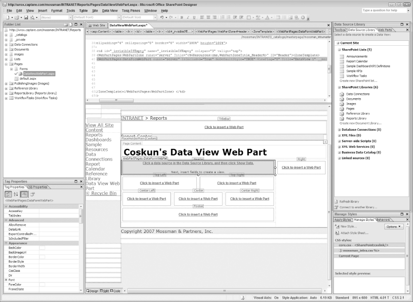
When the page is open in SharePoint Designer, select the Web Part Zone where you wish to add the Data View Web Part and then click Insert ⇒ SharePoint Controls ⇒ Data View as shown in Figure 10-24. In this example you add the Data View Web Part to the Header Web Part Zone.
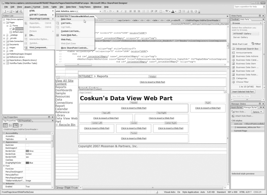
After you click Data View on the Insert menu, a Data View Web Part is added to the Header Web Part Zone, as shown in Figure 10-25.
Selecting a Data Source for the Data View Web Part
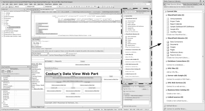
When you have the Data View Web Part in the Web Part Zone, the next step is to select the data source. This is one of the strengths of this Web Part, as Data View Web Parts can display data from SharePoint Lists and Libraries, Web Services, Databases (any database that has an OLEDB provider), Server-Side Scripts or RSS Feeds, Business Data Catalog, Linked Sources (Similar to SQL's JOIN but used to JOIN SharePoint lists or Libraries) and XML sources.
To select the data source, you use the Data Source Library tab on the SharePoint Designer window as shown in Figure 10-26.
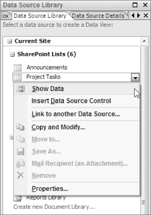
In this example, you create a Data View Web Part using the Project Tasks located under SharePoint Lists. To select Project Tasks as the data source, click the context menu of the Project Tasks and click Show Data, as shown in Figure 10-27.
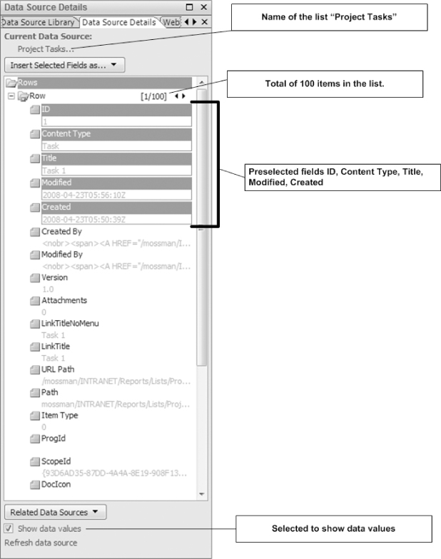
After you click Show Data, you will see all of the fields available for that list, and a few of them will be selected by default, as shown in Figure 10-28.
Inserting the Data Source Control to the Data View Web Part
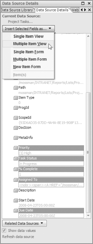
The next step is to select the fields you wish to display and insert the data source to the Data View Web Part. Your first step will be to select the following fields: Title, Priority, Task Status, % Complete, Assigned To, and Due Date. You can select multiple fields by pressing the CTRL key on your keyboard while clicking the fields you wish to display.
After you have selected the fields, your next step is to insert these fields into the Web Part. To add the fields to the Web Part, click the Insert Selected Fields As button. When you click this button, a menu appears, asking you what kind of view to add. There are several options, such as Single Item View, which shows the records on the list one item at a time; Multiple Item View, which displays multiple items; the Single Item Form, which allows you to update the content of each item one at a time, and so on. In this example, select Multiple Item View, as shown in Figure 10-29.
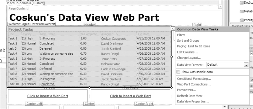
After you click Multiple Item View, SharePoint Designer automatically adds the code necessary to display the items as shown in Figure 10-30. SharePoint utilizes XSL to render the rows on Data View Web Parts and SharePoint Designer allows you to design the XSLT on the fly with the WYSIWYG editor. SharePoint Designer also provides IntelliSense for those of you who would like to write code instead of using the WYSIWYG editor.
Customizing the Look and Feel of the Data View Web Part
At this point you have added a Data View Web Part that uses the Project Tasks as the data source. By using the Common Data View Tasks and the WYSIWYG editor, you customize the look and feel of the Data View Web Part.
Modifying the XSLT Using the WYSIWYG Editor
With the help of the WYSIWYG editor, you customize the XSLT so that the Due Date is more user- friendly. The first thing to do is select the Due Date item and click the arrow for the context menu. On the properties window, click DateTime formatting options to open a Format Date and Time window. Deselect the Show Time, change the Date Format to use the 23-Apr-08 format, and click OK, as shown in Figure 10-31.
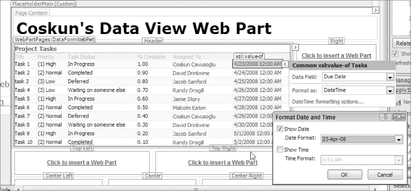
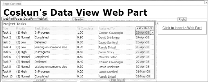
After you click OK, you will see that without typing any code, just by using the WYSIWYG editor you have updated the look and feel of the Date Column to not show the time and to use the 23-Apr-08 date format as shown in Figure 10-32.
The next column to update is the % Complete column, since it is not displaying the percentage correctly. To update this column, select it and click the arrow to see the context menu. On the context menu, click the Number formatting options link to open the Format Number window. Click the Percentage(%) option and click OK.
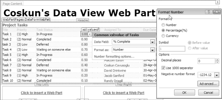
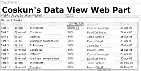
After you click OK, the % Complete will be formatted correctly as shown in Figure 10-34.
Grouping Items in the Data View Web Part
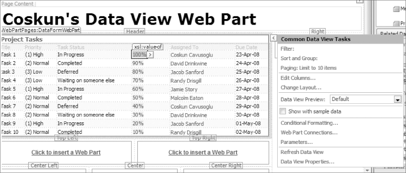
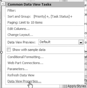
For this example, you want to group the items first by the Priority and then based on the Task Status field. To accomplish this, click the context menu for the Data View Web Part, which opens the Common Data View Tasks window. Click the Sort and Group link, as shown in Figure 10-35.
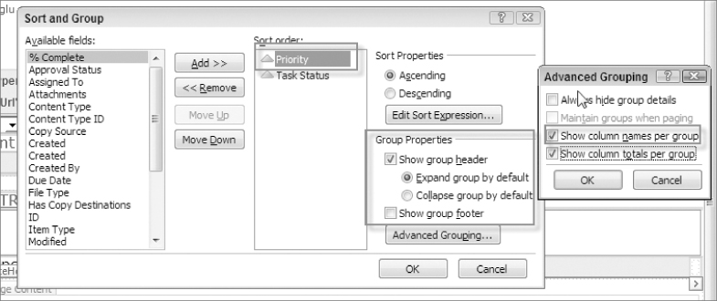
Clicking Sort and Group opens the Sort and Group window. On this window, select Priority and Task Status and move them over to the Sort Order section as shown in Figure 10-36. Once the Priority and Task Status columns are moved, select the Show group header check box which enables the Advanced Groupings… button. Click Advanced Grouping to open a new window and click Show column names per group and Show column totals per group as shown in Figure 10-36.
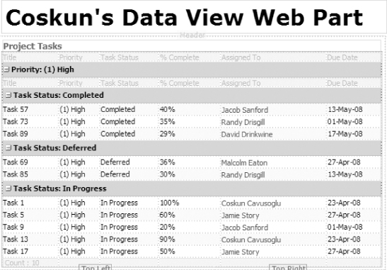
After you save the settings, the task list is grouped by Priority and then by Task Status, and the groupings display the group name and its totals per group, as shown in Figure 10-37.
You might ask why create a Data View Web Part for grouping since you can do this by creating a view. With the views you can only group by two columns at the most. With XSLT you can create more than two groups of data.
Applying Conditional Formatting in the Data View Web Part
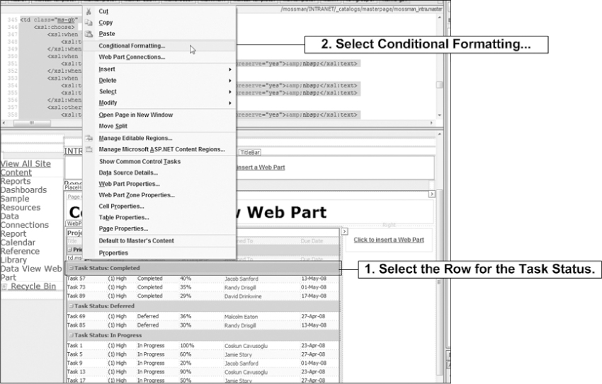
At this point you would like change the group color to green if the task status is complete. To accomplish this, select the grouping row and right-click. In the context menu that appears, click Conditional Formatting, as shown in Figure 10-38.
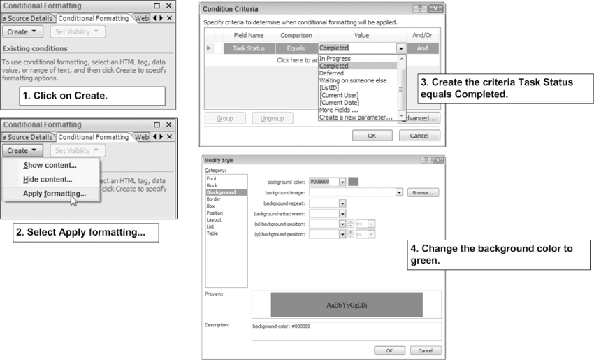
The Conditional Formatting window opens. Here, click Create and select Apply Formatting. On the Criteria window, set Task Status equals to Completed and change the background to green, as shown in Figure 10-39.
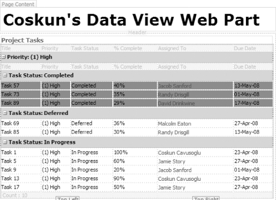
Creating the conditional formatting updates the background of each task row that has the task status of Completed, as shown in Figure 10-40.
Updating the Data View Web Part Properties
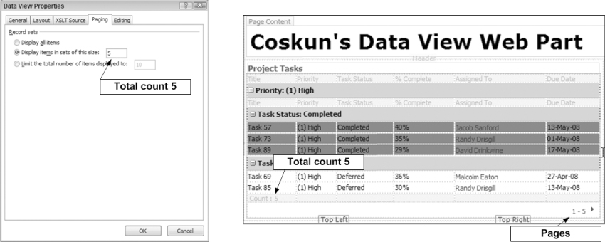
Finally, go ahead and update the paging properties of the Data View Web Part so that it only shows five items per page. To update the properties of the Data View Web Part, click Data View Properties on the context menu, as shown in Figure 10-41.
On the Data View Properties window, click the Paging tab. On this tab, select the “Display items in sets of this size” radio button and type 5 in the text box. When you click OK to apply the changes, your Data View Web Part has pages and it is showing five items at a time, as shown in Figure 10-42.
One of the requirements for any Web page is to have HTML code included. This may seem obvious, but in the world of SharePoint, this can be easier said than done. Being a portal provider, the intent of SharePoint is to allow most of the administration and content of the pages to be done within SharePoint. However, if you need something like a quick HTML header, a little JavaScript, or even some page-specific CSS rules, it's not easily done through the portal itself. In fact, the only way to do this, really, is to open up the page in SharePoint Designer and mark up the code there. And giving everyone rights to update SharePoint pages in SharePoint Designer is probably not a good idea.
So this is when a tool like the Content Editor Web Part can really come in handy. It allows you to inject HTML code into your SharePoint portal through an included Web Part.
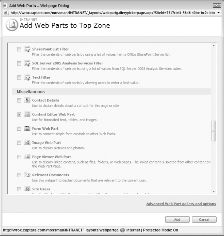
The best way to see how this Web Part works is to actually go through it. So the first step is to add the Content Editor Web Part to your page. You do this by first going into Edit mode for a page that has at least one Web Part Zone attached to it. While on that page in a browser, click Site Actions and then click Edit Page to go into Edit mode. At this point, you can see the Web Part Zone(s) clearly and, at the top of each, there is an Add a Web Part link. You can click this link to go to the Add Web Parts dialog box.
When you go to the Add Web Parts screen, you will find the Content Editor Web Part under the Miscellaneous section, as shown in Figure 10-43.
Click the Add button and your new Web Part displays on your page, as shown in Figure 10-44.
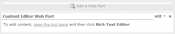
Click on the Rich Text Editor button, which is one of the options available to you with this Web Part, as shown in Figure 10-45.
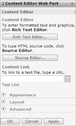
As shown in this figure, there is an option to use the Rich Text Editor or, right below it, an option to type out HTML source code. You can also link directly to a text file and bring the contents of that file into the page that way.
All options are fairly intuitive. The Rich Text Editor provides the same Rich Text Editor controls that, if you are familiar with SharePoint, you have seen in several other places. It basically provides a text editor that allows for things like making text bold and adjusting font size without having to write (or even know) any HTML code. You can see an example of the interface in Figure 10-46.
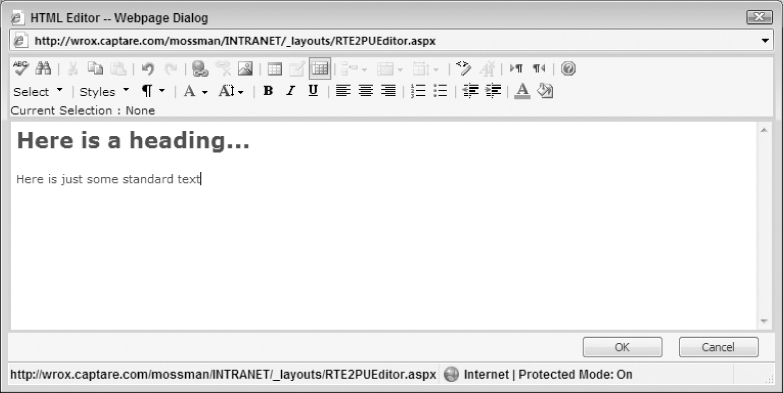
This Rich Text Editor allows users without any HTML experience to write things like page headers and basic content.
The next two options are much more interesting and, quite frankly, much more powerful.
The first of these, the Source Editor, allows you to actually write HTML code straight to your page. For example, the content shown in Figure 10-46 would now resemble Figure 10-47 in the Source Editor pane.
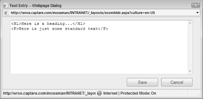
If you are acquainted with HTML, this should look fairly familiar to you. And maybe a bit exciting. This allows you to create pretty much any HTML code you want for your page. The only real exception to this is that it won't allow a new FORM element. But other than that, the sky's the limit.
Some uses for this might include:
- Adding custom JavaScript to your page For example, if you have a list edit page and you want a default dropdown field to be based on a URL parameter, you could create a quick JavaScript function that would read the URL and set the form control to the default based on that value. This gives you even more control over the other Web Parts because it allows you to include custom JavaScript to manipulate and interact with the other SharePoint objects in the rendered HTML.
- Adding Adobe Flash content to your page Yes, Flash works. Using the Content Editor Web Part, you can actually code the embedded objects that you need to generate the Flash object. (Of course, you have to have the Flash movie stored somewhere that you could access, but, assuming that, this will work.)
- Adding custom CSS rules for your page Granted, this may not be necessary that often since one of the advantages to CSS is that you can keep the rules in a central file that is cached and, therefore, doesn't have to be reloaded each page load. But, if you had the need to throw in a few style rules that really aren't necessary anywhere else in your portal, this would be a great way to get them on the page.
Obviously, these are just a few of the things you can do with the Content Editor Web Part. If you can think of how to do it with HTML, you can probably write it here. This might be a good way to start getting newer JavaScript-based technologies, like AJAX and Silverlight, to work in your SharePoint installation without having to create a custom Web Part to do so.
The last option—to link to an external text file—does pretty much the same thing as the source editor except that it allows you to store the HTML rules in a separate physical file. Essentially, you are creating HTML content in a text file that you link to and the Content Editor Web Part displays the rendered results. This, again, allows you the freedom of inserting HTML code without having to edit the ASPX page in SharePoint Designer. This probably makes a lot of sense as you can then edit the text file independently of SharePoint and have the changes immediately reflected in the page. You might then introduce a new area of risk in that you have content being sent to the browser that is as secure as any other text file (not very secure) and, if not maintained in some sort of source control, other problems could arise as well. But, at least in theory, this is a pretty cool way to get some HTML into your page.
To get an idea of the fun things you can do with the Content Editor Web Part, you should definitely check out: http://www.contenteditorWebpart.com/cewpandxmlinaction/.
This page is just a SharePoint page with a Content Editor Web Part and a lot of JavaScript. If this doesn't inspire you to use the Content Editor Web Part, you might be missing the point.
As an aside, that site actually has some great examples of the Content Editor Web Part. To see some of them, visit their main URL: http://www.contenteditorWebpart.com.
You should see a set of links called CEWP Examples on the right-hand side. There are some really good examples showing how to embed JavaScript or Flash (and a whole slew of others) that will give you some great ideas on how to get the most out of the Content Editor Web Part.
As this section wraps up, there are a few things to keep in mind when using this Web Part.
First, according to the Microsoft documentation, the Content Editor Web Part was not meant to link to another Web site. In other words, the recommendation is to not use it to create, say, an IFRAME element that references some other page. If you need to link to another page, the recommendation is to use the Page Viewer Web Part (also covered in this chapter). You can decide if you want to follow this recommendation or not, because the truth of the matter is that you can create an IFRAME element in the Content Editor Web Part just as easily as any other element. So it is certainly possible to do so. And it might make sense to do exactly that in some scenarios (especially if you need to create a dynamic link to the Web site being referenced in the IFRAME, which is frustratingly hard to do in the Page Viewer Web Part). But just be aware that the official Microsoft position is that this is not the intent or purpose of the Content Editor Web Part.
The last consideration is that of accessibility. The Content Editor Web Part is not inherently non-compliant. But it is, at its very core, a tool to inject HTML elements and JavaScript into your page. This means that it is a tool that opens the door to allow you (or those that have permissions to edit this Web Part) to totally decimate any accessibility compliance you were shooting for. For example, JavaScript is always suspect when analyzing compliance and, in the wrong hands, you can really be at risk that someone will provide functionality in this Web Part that is not accessible to assistive technology. And not just with JavaScript. If a user introduced new CSS that created color-based indicators used on that page or used tables for layout or added image elements without adequate properties associated with it, your site is now out of compliance.
So, while this tool is very powerful and provides a lot of cool functionality, it also brings in some additional risk. So make sure you take these issues into consideration when using this Web Part (and certainly when deciding who has access to edit its content).
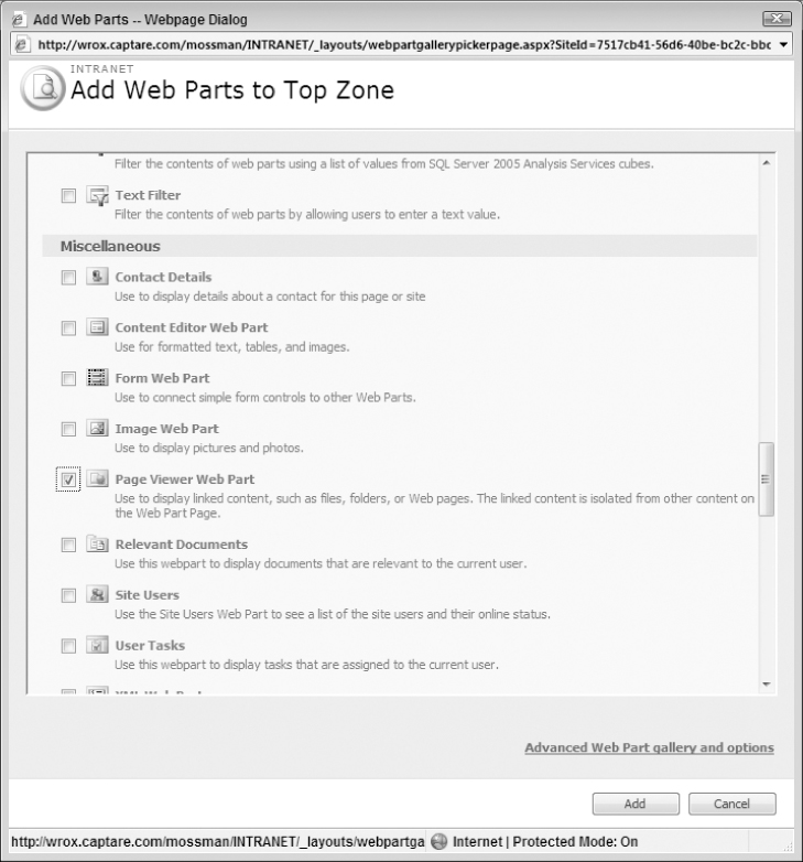
The Page Viewer Web Part does as its name implies: It allows you to view an external page in your SharePoint page. This means that, if you wanted to display Microsoft Live Search as part of your page, you could add it via the Page Viewer Web Part.
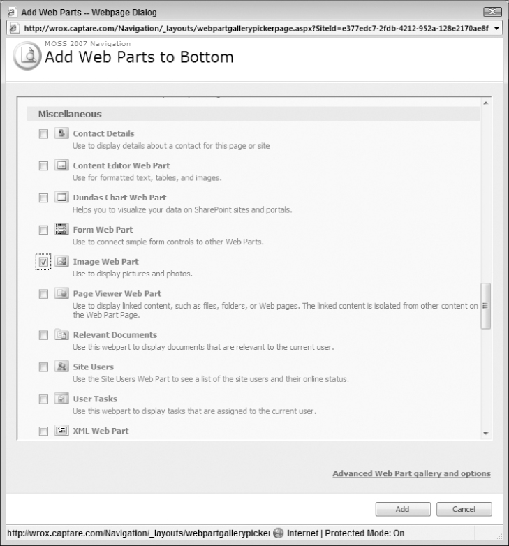
The basic functionality of this Web Part is that it takes a URL that you give it in its settings and creates an IFRAME element on your SharePoint page that references that URL. So, to see how this works, first, add a Page Viewer Web Part, which can be found under the Miscellaneous Web Part section shown in Figure 10-48.
After you check the Page Viewer Web Part option, click the Add button to get the Web Part added, as shown in Figure 10-49.
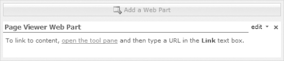
Now click the “Open the tool pane” link to get the settings for this Web Part, as shown in Figure 10-50.
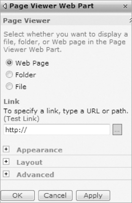
As you can see, you can select a Web Page (default), Folder, or File to link to. Typically, this is used to bring in another Web site. So, to see how this works, add a link to the Microsoft Live Search (http://www.live.com/) as the link and click the OK button. Your Web Part should now resemble Figure 10-51.
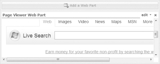
As with any other Web Part, you could go in and adjust the width of the part in the Appearance settings. However, for this walk-through, this isn't necessary. The important fact is that you can now see the Microsoft Live Search Web page in your SharePoint page.
And, to drive the point home, look at the rendered code that this generates in your final page:
<iframe title=“Page Viewer Web Part” frameBorder=“0”
id=“MSOPageViewerWebPart_WebPartWPQ6”
name=“MSOPageViewerWebPart_WebPartWPQ6” width=“100%”
src=“http://www.live.com/” ddf_src=“http://www.live.com/”>
<div class=“UserGeneric”>The current browser does not support Web pages that
contain the IFRAME element. To use this Web Part, you must use a browser
that supports this element, such as Internet Explorer version 5 or
later.</div>
</iframe>
As you can see, this Web Part generated an IFRAME element with a source property set to the URL you specified in the settings. One nice thing to note, especially if you have your accessibility hat on, is that it also generated text to display a message to users who have browsers that can't render the IFRAME element.
Obviously this can be used in any way a typical IFRAME would be used in any Web page. However, it might come in really handy if you need to create a lot of custom ASP.NET pages to fill the business requirements of your site. For example, imagine you have a lot of data that you want to maintain in an SQL database and not port into lists or other SharePoint data elements. There are obviously ways to use this data (the Business Data Catalog comes to mind). However, you might find it easier to use standard ASP.NET controls and ADO.NET to access the data and report it on your page. By default SharePoint does not allow code blocks and turning on that feature introduces additional security risks. You could also create code-behind files that you compile and put in the Global Assembly Cache (GAC) and reference from the SharePoint pages, but this can be difficult to maintain down the road.
In this scenario, it might make sense to keep a separate virtual directory that is used merely for your ASP.NET pages. These pages can then use standard ASP.NET controls and methods, and maybe even access the SharePoint object model, to report data in a manner more comfortable to ASP.NET developers.
If you do this, it would make sense, then, to bring those pages into SharePoint through the Page Viewer Web Part. This would give you the best of both worlds. You have the full power of ASP.NET pages but integrated in the secure realm of SharePoint.
Of course, you could also bring in external pages, like the link example, to add some content that your users might find helpful as well.
But be aware: These are, in fact, IFRAMEs being generated. And with that come all of the risks associated with IFRAMES (limited browser support, potential accessibility conflicts, and so on).
On top of that, it is difficult to create a dynamically linked page for the Page Viewer Web Part. For example, using the ASPX example from before, what if those pages required a querystring parameter to work? As an IFRAME child, the ASPX page cannot access the querystring of the parent (SharePoint) page. And there is no real way to modify the Web Part to dynamically set the source parameter (even in SharePoint Designer). So, when special business needs like this come up, this Web Part can be problematic.
But, if you just need a static reference to a page, this Web Part is ideal for that purpose. And, maybe best of all, this Web Part is really easy to implement (just put in one setting: the URL). So it definitely can help you bring extra content to your designs. When planning to use this Web Part, just be aware of how it works and the associated limitations.
One of the more common tricks of today's Web developers is to use a combination of Extensible Markup Language (XML) documents in combination with Extensible Stylesheet Language Transformations (XSLT) to create HTML output of XML documents. This allows developers to store serializable data in XML format, which is good for data storage and retrieval but, by itself, not so good at displaying the results. The World Wide Web Consortium (W3C) created XSLT as a means of formatting this XML data into a more human-readable format.
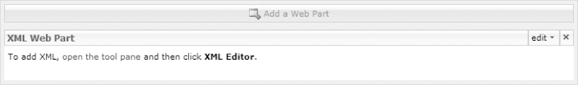
Knowing this, one of the handier Web Parts in a SharePoint designer's arsenal is the XML Web Part. This Web Part allows you to create XML data in a text editor that is a component of the Web Part or reference to an external source. Similarly, you can type XSLT code in the included editor or reference an external XSLT document to style the XML data for you.
An Example of the XML Web Part
To see how this works, add an instance of the XML Web Part to your SharePoint page by selecting the XML Web Part option in the Add Web Parts dialog box, as shown in Figure 10-52.
Clicking the Add button creates the Web Part on your page, as shown in Figure 10-53.
Click the open the tool pane hyperlink to set the properties for this Web Part through the settings pane, illustrated in Figure 10-54.
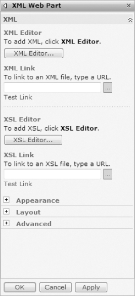
As you can see, you have two options for the XML and XSLT sources for this Web Part: You can create them in the editor or you can reference them through a link to an external document.
To see how this works, first create some dummy XML data that can be used in the Web Part. For example, you might want to display a listing of books from Amazon.com. In this scenario, your data would look similar to the following (you can download this data in the form of an XML file from the book materials available at www.wrox.com):
<wrox>
<book>
<title>Professional SharePoint 2007 Design</title>
<url>http://www.amazon.com/exec/obidos/ASIN/047028580X</url>
</book>
<book>
<title>Professional ASP.NET 2.0 Design</title>
<url>http://www.amazon.com/exec/obidos/ASIN/0470124482</url>
</book>
<book>
<title>Professional SharePoint 2007 Web Content Management Development</title>
<url>http://www.amazon.com/exec/obidos/ASIN/0470224754</url>
</book>
<book>
<title>Real World SharePoint 2007</title>
<url>http://www.amazon.com/exec/obidos/ASIN/0470168358</url>
</book>
</wrox>
To use the editor to store this data, simply click the XML Editor… button and type this data, as shown in Figure 10-55.
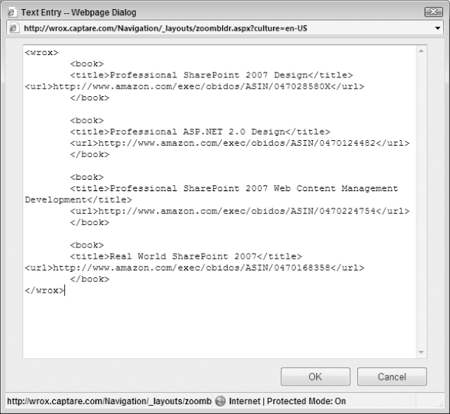
Click the OK button to save the XML data to the Web Part.
The next step is to add some XSLT styling rules for this XML data. This is a basic list so, with that in mind, you merely want to output the list in some sort of readable HTML format that uses the title and URL elements of the XML to display the data in a logical manner. To do this, use the XSL Editor to add the following XSLT rules for the XML data as follows:
<?xml version=“1.0” encoding=“UTF-8”?>
<xsl:stylesheet version=“1.0” xmlns:xsl=“http://www.w3.org/1999/XSL/Transform”>
<xsl:output method=“html”/>
<xsl:template match=“/wrox”>
<table>
<xsl:for-each select=“book”>
<tr>
<td><a><xsl:attribute name=“href”><xsl:value-of select=“url”/>
</xsl:attribute>Link</a></td>
<td><xsl:value-of select=“title”/></td>
</tr>
</xsl:for-each>
</table>
</xsl:template>
</xsl:stylesheet>
If you are unfamiliar with XSLT, this code is essentially locating the element wrox from the XML data and then iterating through each book element to generate table cells that have a hyperlink of Link using the URL property and then the title of the book in the next table cell. If you click the OK button in the XSL Editor, your Web Part should resemble Figure 10-56.
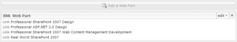
As this example illustrates, this can be a fun tool to integrate in the design of your SharePoint pages. It can allow you to pull in data in XML format and then properly format it through XSLT to be more manageable. And, even though this example didn't do it, you could have just as easily put CSS class references in the XSLT so that the rendered output would integrate with your CSS schema for the site. This means, to summarize, that you can bring in XML data and format it to fit into the look and feel you have established for your site.
A More Dynamic XML Web Part Example
While the book list was a good introduction to using the XML Web Part, a more useful, real-world example might include using an RSS feed, which is just XML data, and then formatting it with XSLT to display it the way you want it to look on your site.
So, to try this out, go back to the XML Web Part you set up in the previous example and remove all of the static XML data by utilizing the XMLEditor. While in the Web Part settings pane, you will also need to set the XML Link property to http://api.flickr.com/services/feeds/groups_pool.gne?id=685365@N25&lang=en-us&format=rss.
This link is an RSS feed from Flickr.com of free images that you can use for your site. Now, to format this feed for your SharePoint site, use the XSL Editor to modify the XSLT as follows:
<?xml version=“1.0” encoding=“UTF-8”?>
<xsl:stylesheet version=“1.0” xmlns:xsl=“http://www.w3.org/1999/XSL/Transform”>
<xsl:output method=“html”/>
<xsl:template match=“/rss/channel”>
<xsl:for-each select=“item”>
<xsl:value-of select=“description” disable-output-escaping=“yes”/>
</xsl:for-each>
</xsl:template>
</xsl:stylesheet>
In this code, you are iterating through the channel node of the RSS feed and looking for one of the properties called “description”. This field is the pre-formatted HTML of the item, which will display the images for you in the Web Part. However, you need to set the disable-output-escaping property to “yes” or the formatted HTML will be escaped, and instead of showing images you will see a large block of escaped HTML. In other words, instead of seeing an image in the browser, you will see the text code for that image (i.e., something like <img src=…/>). This is because the original HTML code will come through escaped (instead of < the text will be <, which is the code to render out a left angle bracket). So the code will not get converted properly in the output and, as a result, the browser will render out the text equivalent of the code instead of the anticipated results of the code. Obviously, this is not what you want.
Once you make all these adjustments, click OK on the XML Web Part Settings panel and, if you have set up everything properly, your Web Part should now resemble Figure 10-57.
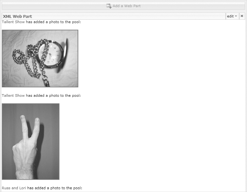
Because this Web Part is using an RSS feed from Flickr as the data source, the Web Part updates itself each time the RSS feed is updated. And, again, the XSLT in this case was pretty minimal and simple and requires only the outputting of the formatted HTML that the feed included. If you wanted, you could easily integrate the XSLT formatting to include references to your style rules and classes established in your own CSS architecture. One thing worth noting is that every time your page is refreshed, MOSS visits the external XML file (in this case the Flickr RSS feed). This can have important implications if you are accessing an XML feed that allows only a limited number of views per IP address in a given time.
You can learn more about using Flickr's RSS feeds by reading their documentation, available at http://www.flickr.com/services/feeds/.
To Learn More about XSLT
While this chapter wasn't necessarily meant to deep-dive into XSLT, it hopefully sparked some interest and, as such, you may want to find out more. To read more about XSLT, you can look at the W3C recommendations for XLT by accessing the following link: http://www.w3.org/TR/xslt.
You might also find it helpful to go through the XSLT tutorials at W3 Schools, located here: http://www.w3schools.com/xsl/.
For a more thorough understanding of XSLT, check out Wrox's XSLT 2.0 Programmer's Reference, by Micheal Kay (ISBN: 978-0-7645-6909-8).
More and more data is being serialized through XML documents with things like RSS feeds (it seems like every site has an RSS feed these days). So, if you want to start integrating this information into your sites, and especially if you want to try to incorporate it into the design you have created, you are going to want to get very familiar with XSLT. And, as you get more and more into it, hopefully you will get more and more usefulness out of the XML Web Part.
One of the seemingly simple Web Parts might be the Image Web Part. After all, its primary purpose is to, as the name implies, display an image. And, for the most part, it is quite simple. However, with a little deep-dive, you can see that it is more powerful than it first appears. And, since images are a big part of Web design, this Web Part might very well prove to be one of the most used in your toolbox.
An Example of the Image Web Part
To see the Image Web Part in action, first you need to add it by selecting it from the Add Web Parts dialog box, as shown in Figure 10-58.
Click the Add button to get the Web Part shown in Figure 10-59.
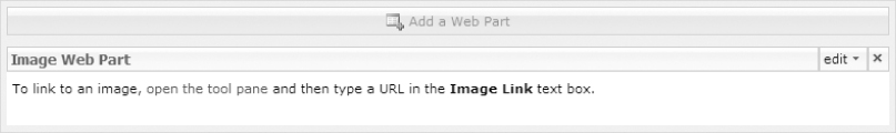
Now, click the “Open the tool pane” hyperlink to get to the settings of this Web Part, shown in Figure 10-60.
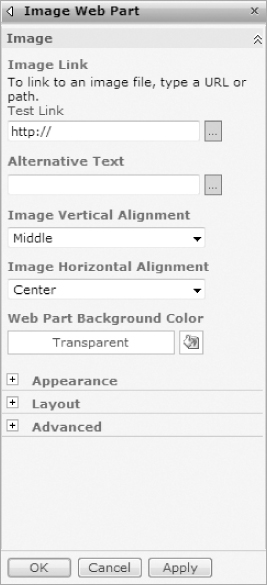
As you can see, there are relatively few settings you have to make. The obvious one is the link to the image, which can be an absolute or relative link to the URL of an image file. The supported image formats for this Web Part include:
- Windows Bitmap (BMP)
- Windows Enhanced Metafile (EMF)
- Graphics Interchange Format (GIF)
- Joint Photographic Experts Group (JPEG)
- Portable Network Graphics (PNG)
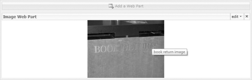
So, to continue the example from the XML Web Part, you can test the Image Web Part by linking to one of the photos in the Flickr RSS feed, such as the following: http://farm3.static.flickr.com/2400/2429967448_171cb36cf0_m.jpg
This will be the small (240 × 180) version of a book return repository.
The only other setting that you really should set is the Alternative Text field. While not a required field, it should be since there are serious accessibility concerns if you don't provide it. So, in your mind, just consider that field required and, for this example, enter in something simple like book return image and click the OK button. Your Web Part should now resemble Figure 10-61.
You can see that the image is centered horizontally within the Web Part. This is because, in this example, the Image Horizontal Alignment setting, part of the Image Web Part's settings shown in Figure 10-60, defaults to Center. Because the Web Part is only as big as the image, it's hard to tell that it is vertically centered as well. Again, this is because the Image Vertical Alignment setting, also one of the settings depicted in Figure 10-60, was not modified from its default of Middle. You certainly could have adjusted these if you saw the need. You could also change the background color of the Web Part (rather than leaving it with the default Transparent background). In fact, a nice color picker utility is available to help you do so. (You could also write out your own hexadecimal color code.) These settings are applied to the rendered table element that is hosting the image, which is why you can set the horizontal and vertical alignment fairly easily. But, again, these are optional settings and, if you are just trying to get an image on your page, this will do the trick with the minimal settings shown in this example.
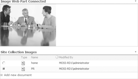
The Image Web Part – Connected
One of the really cool features of the Image Web Part that takes it beyond just holding images is that you can connect it to another Web Part just like any other SharePoint Web Part. In fact, in a Publishing site, you can actually hook the Image Web Part up to a document library.
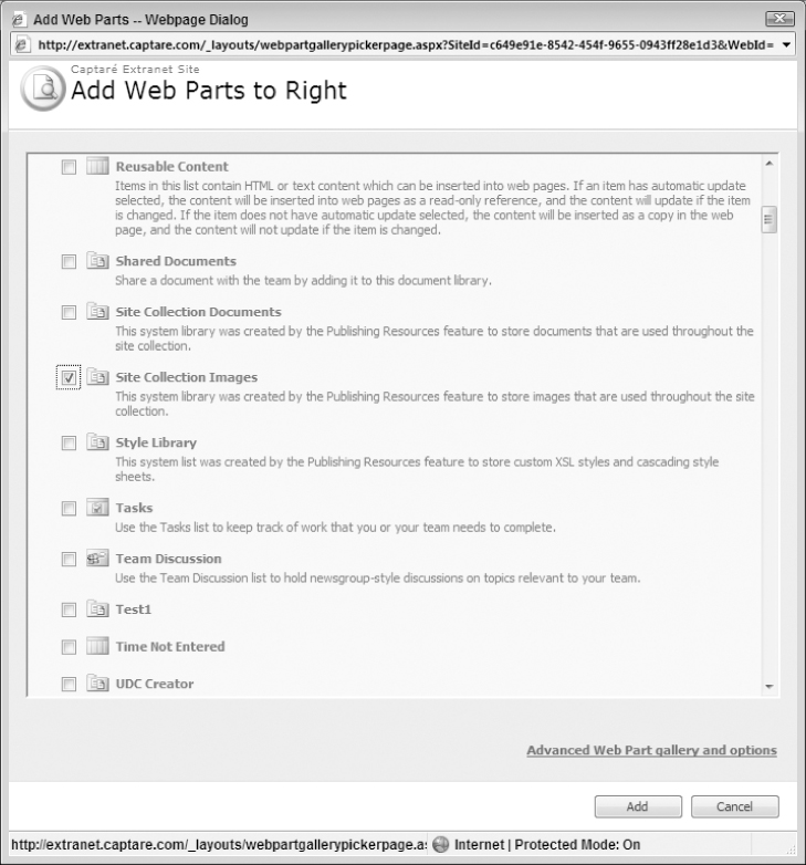
Working with your existing image Web Part, you can add a new Web Part that is an image library. For example, your Publishing site offers a Site Collection Images list that you can add, as shown in Figure 10-62.
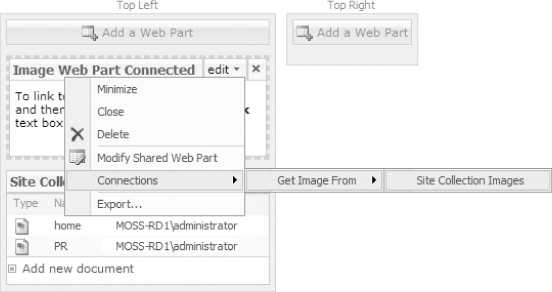
You may want to adjust your two Web Parts (the Image Web Part and the new Images List you just added) so that that the Image Web Part is on top of the Site Collections Image List. Now, on the Image Web Part, click on the Edit link and select Connections ⇒ Get Image From ⇒ Site Collection Images, as shown in Figure 10-63.
This presents a settings page that allows you to determine the field from the library to use as the image path, seen in Figure 10-64.
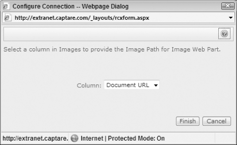
Select the appropriate column (Document URL in this case, which is already pre-selected for you) and click the Finish button. You will now notice a couple of things. First, the Site Collection Images listing now has radio button controls next to each description of an image. When you select any of the radio buttons, the Image Web Part displays the corresponding image. You can kind of see how this works in Figure 10-65.
And with this, you have an Image Web Part that is connected to an Images Document Library, which is a pretty fun toy to play around with and can add some really neat functionality to your pages.
As this chapter concludes, we hope that you have seen some really interesting ways of retrieving and displaying content to your users. If you are unfamiliar with Web Parts as a general concept, hopefully this chapter gave you an insight into what the Web Part is and how it is used in SharePoint. And, if you are familiar with Web Parts, even if you are familiar with the out-of-the-box Web Parts discussed in this chapter, hopefully you found something that inspired you to go work into your next or ongoing project. After all, that is the point of this book: to inspire you to make your own projects better.
Web parts are an increasingly popular way of managing data in today's Web sites. And, in the world of SharePoint, they are a near necessity. Sure, there are ways to include content without using Web Parts. But, in doing so, you negate much of the power of a portal. These Web Parts allow you to provide content from other Web sites, virtual directories, and local files to the visitors of your site in a way that makes sense. They allow you to apply style through standards like XSLT and CSS to ensure that the content is consistent with the design you have worked so hard to create. And, maybe most importantly, they can allow the owners of the information to maintain that information without having to involve the IT Professionals to provide updates all the time. Web parts are a really great tool to have at your disposal.
But, like anything else, there are some considerations and limitations with any given technology and hopefully you gained a few insights into those as well, at least for the Web Parts discussed here. Allowing such a free inflow of outside information can result in problems for your own site, not the least of which may be accessibility concerns. But, if you know these things, you can plan around them and figure out how to best hedge against these risks in your own environment.
With Web Parts, you leave the data to the consumers and owners of that data, which is exactly as it should be.