Chapter 11
Navigation
The two different versions of SharePoint give designers different navigation controls. With WSS 3.0 (aka the free version) you get simple navigation controls where as with MOSS 2007 you get the extended versions of the navigation controls.
Organizations that have seen the advantages of MOSS 2007 will get major benefits when using MOSS 2007 navigation controls on their sites. With MOSS 2007 designers and developers can build upon the navigation controls much faster and get better results. For those of you using WSS 3.0 no need to worry, this chapter details what you can accomplish with the simple WSS 3.0 navigation controls.
This chapter first details the WSS 3.0 basic navigation controls by explaining how to use the Top link bar, Quick Launch, and the Tree view menus and also by covering how each of them can be customized. Most common tasks, such as enabling SharePoint menus to have sub-menus, adjusting fly-out menu settings, orientation, style and hiding certain links from non-administrators are also covered in this chapter.
The second half of this chapter focuses on the MOSS 2007 navigation controls by first detailing how to enable MOSS 2007 navigation for your non-publishing sites and then how you can setup your sites.
Determining Whether Your Site Is WSS 3.0 or MOSS 2007
Knowing what type of site you have is really important before you start setting up the navigation for your SharePoint site. If this is your first time designing a SharePoint site and you don't know if you have a WSS 3.0 site or MOSS 2007 site, no need to worry; it's really easy to tell if you have a WSS 3.0 site or a MOSS 2007 site.
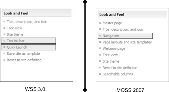
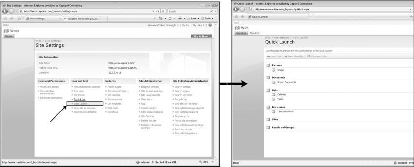
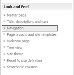
To determine the type of site you have, go to the Site Settings page by clicking Site Actions ⇒ Site Settings, and once you're on the Site Settings page find the Look and Feel section. If you see the links Top link bar and Quick Launch under the Look and Feel section, that means you have a WSS 3.0 site. If you have a link named Navigation under the Look and Feel section, you have a MOSS 2007 site. With MOSS 2007, after a site is enabled as a Publishing site, the Top link bar and Quick Launch links will no longer exist. It is replaced with the Navigation link, as shown in Figure 11-1.
If you have heavy customization requirements and you need to design navigation for a WSS 3.0, you it will take a good amount of work before your navigation looks the way you have designed it. For a site that needs heavy navigation customization, consider using a MOSS 2007 publishing site rather than a WSS 3.0 site because MOSS 2007 provides a lot of advantages over WSS 3.0 which will be covered later in this chapter.
So if your organization already has MOSS 2007, make sure you understand why you need to use WSS 3.0 for your site, because if it is not a major requirement you should definitely use the MOSS 2007 publishing site template for a site that requires heavy navigation customization.
Although it's difficult to brand or customize the WSS 3.0 site navigation, that's not an issue, since WSS 3.0 sites are typically used for collaborating. Having the ability to change your navigation on the fly without the need of a developer for the collaboration sites is very big plus for the WSS 3.0 navigation. Later in this chapter, you will see how easy it is to maintain a simple navigation for a WSS 3.0 site.
Having said that, it is now time to start looking at what WSS 3.0 has to offer for your navigation needs. Even though WSS 3.0 doesn't provide a lot of functionality with the default out-of-the-box navigation controls, it provides enough functionality for designers to implement basic navigation on their sites. With WSS 3.0, site owners can maintain the site navigation through three main navigation controls: the Top link bar, Quick Launch, and the Breadcrumb controls. The next sections detail these navigation controls and how you can customize them to reflect the design requirements for navigation on your WSS 3.0 sites.
Using the Top Link Bar
The Top link bar, as you can tell from its name, is located at the top of each site. The Top link bar can be thought as the top level global navigation for SharePoint sites because it appears consistently on every page. Typically the Top link bar is used when presenting information in broader categories, these categories in most cases are sites that reside under the current site. The Top link bar could also be used create your own categories that are not sites. An example of a custom category is an Administration tab that has direct sub-links to the administrative lists or pages. Another example of a custom tab on a Top link bar might be a tab named Documents. You can have direct sub-links to different views in the document library that allow users to go directly to different views like the Proposals view that shows only proposal documents.
To better understand how the Top link bar works, you can use any of your team sites to follow along with the examples given in this section as this section will be using a SharePoint site that was created using the basic team site template shown in Figure 11-2.
Modifying the Links (Tabs) on the Top Link Bar
You can modify the Top link bar by using the browser and the SharePoint object model. The easiest way to add or remove links from the Top link bar is to use the browser. An example will help you get a better feel for what you can do with the browser (SharePoint User Interface). Assume that you want to remove the Home tab and add two tabs called About Us and Services. About Us points to http://yoursite/AboutUs.aspx and Services points to http://yoursite/Services.aspx.
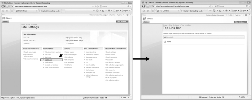
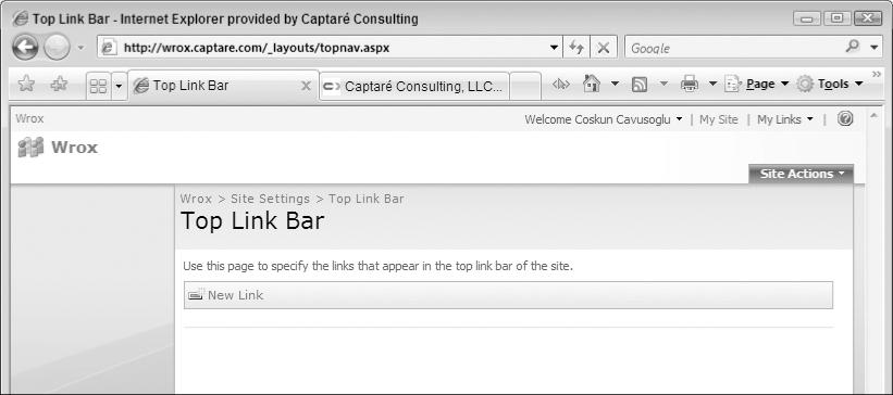
To accomplish this, go to the Site Settings page by clicking Site Actions ⇒ Site Settings. On the Site Settings page under the Look and Feel section, several links allow you to customize your site's look and feel. To modify the Top link bar, click Top link bar, as shown in Figure 11-3. This opens a page that enables you to specify the links that appear in your site's Top link bar.
Deleting Tabs from the Top Link Bar
To delete the Home tab, first click the Edit icon next to the Home link. This action takes you to the Edit Link page. You click the Delete button to trigger an alert window asking you if you're sure you want to delete the tab. Click OK on this alert to delete the tab, as shown in Figure 11-4. If the link that you are deleting has sub-menu items under it, the sub-menus of this tab will also be deleted.
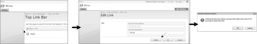
After you delete the Home tab, the page is refreshed and nothing is listed on the Top link bar page and no tabs are left on the site, as shown in Figure 11-5.
Adding Tabs to the Top Link Bar
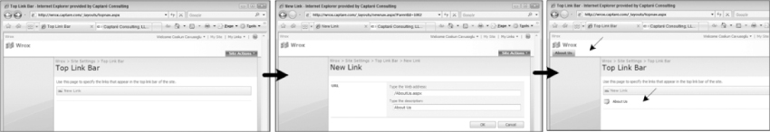
Now that you have deleted the Home tab, you can add the About Us and the Services tabs. To add a new tab/link to the Top link bar, click the New Link button. This takes you to the New Link page. Type /AboutUs.aspx in the Type the Web Address field, type About Us in the Type the description field, and click the OK button. After you click OK, the new tab About Us appears as a tab and a as link in the Top link bar page as shown in Figure 11-6. At this point, go ahead and add the tab for Services using the same steps.
What Are Relative Paths?
Note the slash in front of the URL that you typed in the Web Address field. Adding a slash in front of a link makes that link a relative link. If you are referring to an item that lives under the current site instead of typing http://yoursite/AboutUs.aspx, it is always better to give the relative path to that file which is /AboutUs.aspx. With relative paths, no matter what the domain name is, the Web application will automatically add the domain name before the slash. In this case, when you input /AboutUs.aspx, SharePoint understands the relative path and renders it as http://yoursite/AboutUs.aspx. So with relative paths, even if the domain name changes, the links always work.
This is why using relative paths in navigations is a best practice with not only SharePoint but any Web application. The navigation of a site should never be dependent of the site's domain name since the domain name can potentially change in the future.
Reordering Tabs on the Top Link Bar
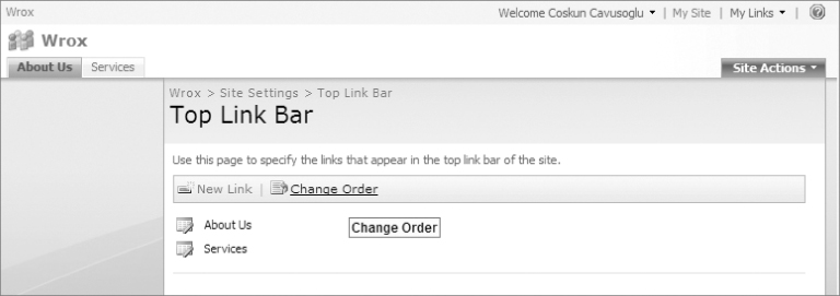
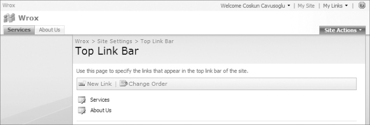
Now that you have created two tabs, let's make the Services tab the first tab. Once your site has more than one tab, a new button named Change Order will appear on the Top link bar page, as shown in Figure 11-7.
To change the order of the tabs, click the Change Order button. After you click this button, you are taken to the Change Order page. On this page click the Services drop-down list and select 1 to make it the first tab on the site. Note that when you select 1 for Services, this automatically updates the About Us tab to be second in the list, as shown in Figure 11-8. At this point you can also see that About Us is before Services in Figure 11-8.
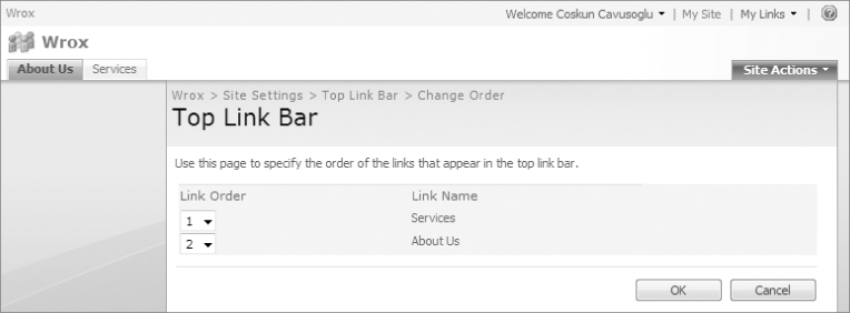
One thing to note here is that the WSS 3.0 Top link bar does not allow users to add child nodes to the top-level nodes using the browser. To add child nodes to WSS 3.0 sites Top link bar, you must create custom code that does this for you using the SharePoint object model. After you click the OK button, the Services tab becomes the first tab and About Us becomes the second tab, as shown in Figure 11-9.
Customizing the Look and Feel of the Top Link Bar
The look and feel of the Top link bar can be customized using SharePoint Designer (SPD). The Top link bar is a part of the default.master page and to customize the look and feel of the Top link bar, you must edit the master page that the site is using. In this example, you use the default.master page of the team site you created earlier to customize the look and feel of the Top link bar. To edit the master page first open the site in SharePoint Designer, browse to the /_catalogs/masterpage folder and double-click on the default.master page.
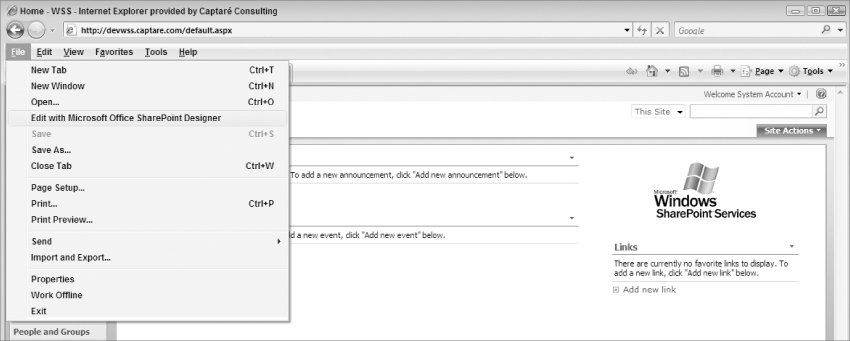
A quick way to open the site you wish to modify in SharePoint designer is to actually navigate to the site using Internet Explorer and once there click on File ⇒Edit with Microsoft Office SharePoint Designer, as shown in Figure 11-10.
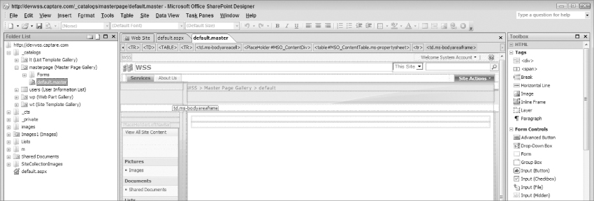
After you click Edit in Microsoft Office SharePoint Designer, a new instance of SharePoint designer starts up and asks for your credentials. If you are not the administrator, you must make sure that you have credentials to modify the master page. Once you're logged in, you have the site open in SharePoint Designer, as shown in Figure 11-11.
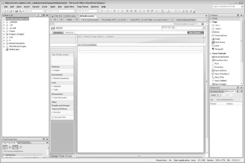
With the site open in SharePoint Designer, you open the master page so we can start customizing the Top link bar. The master pages are located under the _catalogs/masterpage folder. Expand the _catalogs folder, then the masterpage folder and double click the default.master page to open the master page for editing, as shown in Figure 11-12.
Now that the master page is ready for editing you are ready to start customizing the Top link bar. The best way to customize the Top link bar is to use Code view in SharePoint Designer. First select the Top link bar control by clicking it as shown in Figure 11-3. Once the Top link bar control is selected, Switch to the Code view by clicking the Code view icon on the bottom of SharePoint Designer, as shown in Figure 11-13.
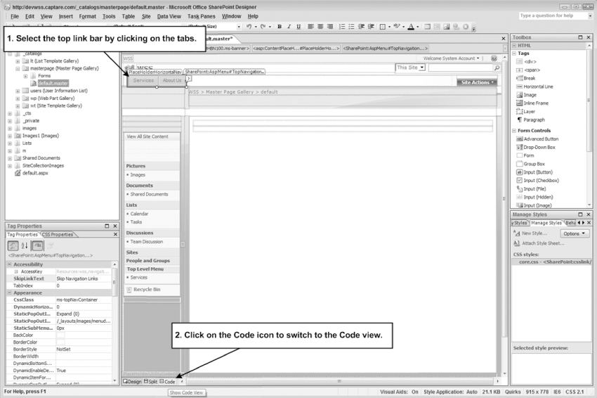
In Code view the Top link bar's code is already selected in the code because you selected the Top link bar in Design view before you switched to the Code view, as shown in Figure 11-14.
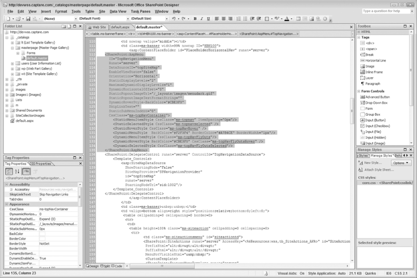
The following code is a representation of the default Top link bar code in the default master page.
<SharePoint:AspMenu
ID=“TopNavigationMenu”
Runat=“server”
DataSourceID=“topSiteMap”
EnableViewState=“false”
AccessKey=“<%$Resources:wss,navigation_accesskey%>”
Orientation=“Horizontal”
StaticDisplayLevels=“2”
MaximumDynamicDisplayLevels=“1”
DynamicHorizontalOffset=“0”
StaticPopoutImageUrl=“/_layouts/images/menudark.gif”
StaticPopoutImageTextFormatString=“”
DynamicHoverStyle-BackColor=“#CBE3F0”
SkipLinkText=“”
StaticSubMenuIndent=“0”
CssClass=“ms-topNavContainer”>
<StaticMenuStyle/>
<StaticMenuItemStyle CssClass=“ms-topnav” ItemSpacing=“0px”/>
<StaticSelectedStyle CssClass=“ms-topnavselected” />
<StaticHoverStyle CssClass=“ms-topNavHover” />
<DynamicMenuStyle BackColor=“#F2F3F4” BorderColor=“#A7B4CE” BorderWidth=“1px”/>
<DynamicMenuItemStyle CssClass=“ms-topNavFlyOuts”/>
<DynamicHoverStyle CssClass=“ms-topNavFlyOutsHover”/>
<DynamicSelectedStyle CssClass=“ms-topNavFlyOutsSelected”/>
</SharePoint:AspMenu>
<SharePoint:DelegateControl runat=“server” ControlId=“TopNavigationDataSource”>
<Template_Controls>
<asp:SiteMapDataSource
ShowStartingNode=“False”
SiteMapProvider=“SPNavigationProvider”
id=“topSiteMap”
runat=“server”
StartingNodeUrl=“sid:1002”/>
</Template_Controls>
</SharePoint:DelegateControl>
The SiteMapDataSource for the Top Link Bar
The site map data source is where all of the links are kept for a menu. In the default.master TopNavigationMenu uses topSiteMap as a data source which uses SPNavigationProvider as the Site map provider. The following code is a representation of a SiteMapDataSource code for a Top link bar.
<asp:SiteMapDataSource
ShowStartingNode=“False”
SiteMapProvider=“SPNavigationProvider”
id=“topSiteMap”
runat=“server”
StartingNodeUrl=“sid:1002”/>
One of the main attributes of the SiteMapDataSource is the StartingNodeURL. The StartingNodeURL is what tells the SiteMapDataSource which menu item the parent node is. In the default SiteMapDataSource for the Top link bar the StartingNodeURL is set to sid:1002 and the ShowStartingNode is set to False. So what does this mean? The starting node being set to sid:1002 means that the Parent Menu Item's (Root) id is 1002. The site map data source will use SPNavigationProvider as the site map provider to find the menu item with the id of 1002 and will set that as the Root of the menu.
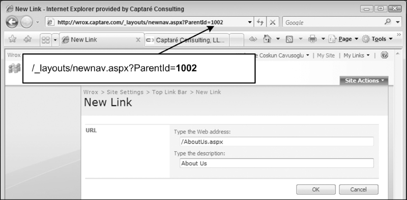
By design, the SharePoint product team has disabled the capability of users to add child nodes to the Top link bar in WSS 3.0. You can only add child nodes to menu item 1002, which is used as the root of the top navigation. When you add a tab such as the Home tab, what you're doing is adding a child node to the root tab which is menu item 1002. If you try to add a tab to the Top link bar, you can see that the URL's ParentId is set to 1002, which means that SharePoint adds the new link as a child node to menu item that has the id of 1002 as shown in the address bar in Figure 11-15. If you try to put another Id in the URL it will not work, because this is disabled by design.
Essentially, all of this leads to one of the main limitations of the WSS 3.0 navigation, which is that you can only have tabs and cannot add sub-menu items to these tabs.
Because the ShowStartingNode is set to False, the site shows only the child nodes of 1002 and this why you don't see the node 1002. To demonstrate the capabilities of the menu, let's try to show the root tab as well. To accomplish this, on the master page, change the value of ShowStartingNode to ShowStartingNode=“True” and click Save to save your changes to the master pages. This is going to tell the Top link bar control to show the starting node which will result in the Top link bar displaying the root menu item as well. Once you click Save, an alert pops up, as shown in Figure 11-16, stating that “Saving your changes will customize a page from the site definition.” Click Yes.
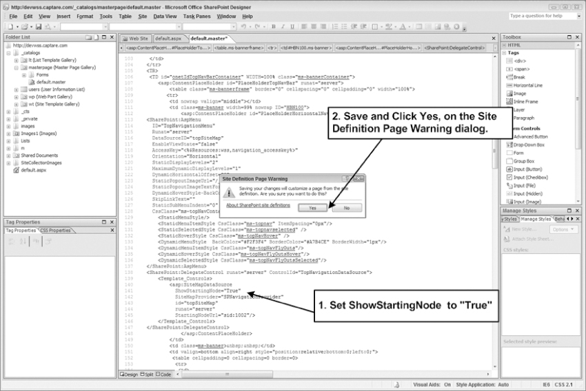
After saving your changes, go back to the site and refresh it. A new tab called SharePoint Top Navigation Bar appears next to the Services and About Us tabs as shown in Figure 11-17. With this we have demonstrated what the ShowStartingNode attribute is used for, but remember that almost always the ShowStartingNode is set to False and the root menu item is not shown in WSS 3.0 sites.
You can also change the start node to be another menu item. This allows you to create a new Top link bar that displays items under other menu items. By default, the site definition offers following menu items that you can set the start node to:
- 1002: SharePoint Top Navigation Bar. This is your default root menu item.
- 1025: Quick Launch Navigation Bar. This is the Quick Launch of the site and can be used when two levels of navigation is needed on a WSS 3.0 site.
- 1003: Lists Navigation Bar. You might use this as the root when you wish to display all of the lists on your site on the Top link bar, since SharePoint adds the selected lists as child nodes under this menu item by default. SharePoint will not add new lists to this menu item if you chose not to display it on the site's quick launch.
- 1004: Documents Navigation Bar. This menu item when set as the root menu will show the document libraries located on the site.
- 1005: Pictures Navigation Bar. This menu item when set as the root menu will show picture libraries located on the site.
- 1006: Discussions Navigation Bar. This menu item when set as the root menu will show discussions located on your site.
- 1007: Surveys Navigation Bar. This menu item when set as the root menu will show surveys located on your site.
Now try to change the starting node's URL to one of the other navigation bars and see what happens. For this example use 1025, which is the menu id for the Quick Launch menu. To accomplish this, open the master page's Code view, find the Top link bar control code segment and change the StartingNodeUrl value to “sid:1025” and save your changes.
Once you save your changes and refresh the page you will see that the Quick Launch is now the Root menu item and all of its child nodes are shown as tabs on the top navigation as shown in Figure 11-18.
Modifying the Orientation of the Top Link Bar
The orientation of the Top link bar can be modified by updating Top link bar control's Orientation attribute. The attribute accepts either Horizontal or Vertical as options. By default, the orientation of the Top link bar is set to Horizontal. To change the Top link bar's orientation open the master page's Code view as shown earlier in this chapter, find the Top link bar control code segment and update the Orientation attribute's value to Vertical and save your changes.
Once you save your changes and refresh the page, you will see that the Top link bar is now vertical, as shown in Figure 11-19.
Indenting Links and Modifying the Offset of the Sub-Menu
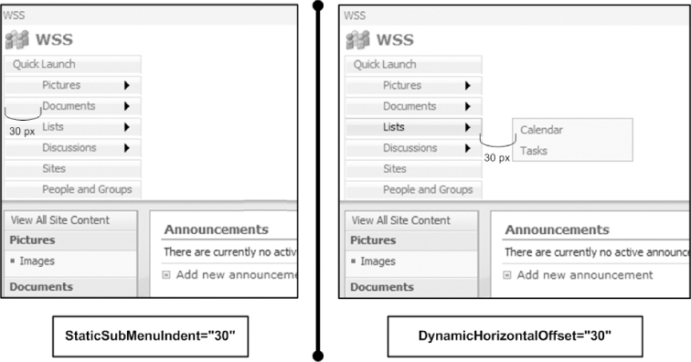
To indent the links of the menu, you must modify the StaticSubMenuIndent attribute, this attribute is “0” by default. With the DynamicHorizontalOffset the offset of the sub-menu can be updated. To change the Top link bar's offset open the master page's Code view as shown earlier in this chapter, find the Top link bar control code segment and update both StaticSubMenuIdent and DynamicHoriontalOffset attribute's values to be “30” and save your changes.
Once you save your changes and refresh the page, you will see that the Top link bar is now indented and has an offset, as shown in Figure 11-20. Please note that the indent only applies to the static submenus. Dynamic links are not affected by this change. For the offset you can also use negative integers to offset the menu to the left.
Displaying Levels of the Top Link Bar
The settings for the display levels are determined by StaticDisplayLevels and MaximumDynamicDisplayLevels, which are both attributes of the Top link bar control. The next two sections detail how these attributes affect the look and feel of the menu.
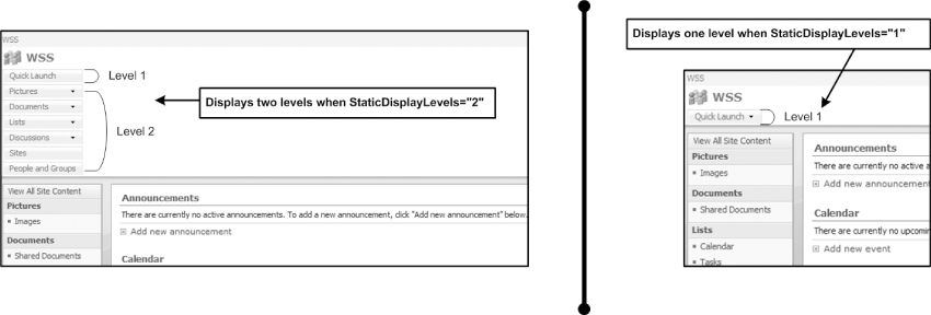
- StaticDisplayLevels: The StaticDisplayLevels attribute is used to define how many Parent levels/nodes will be displayed in the Top link bar counting the Root menu item if the Root is enabled (ShowStartingNode=“True”). Since the default value for StaticDisplayLevel is equal to 2 the Top link bar displays two levels, as shown in Figure 11-21. The first level is the root menu, which is Quick Launch, and the second level includes the child nodes of Quick Launch, but when the StaticDisplayLevel is set to 1, it only shows the first level/node is shown. In most cases, StaticDisplayLevel is set to 1.
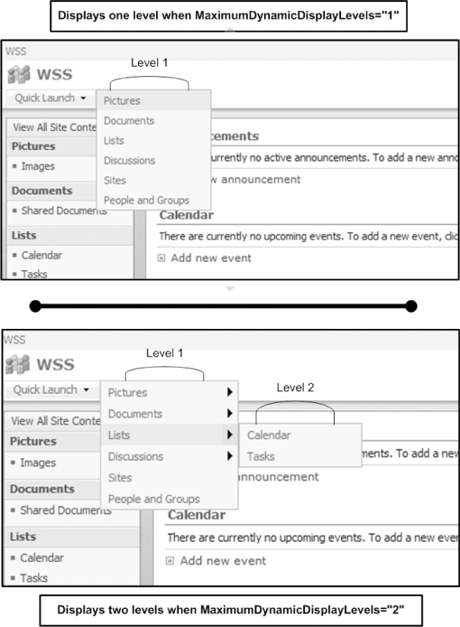
- MaximumDynamicDisplayLevels: The MaximumDynamicDisplayLevels attribute defines how many child levels/nodes will be displayed as fly-out menus. Since the default value for MaximumDynamicDisplayLevels is equal to 1 the Top link bar displays one child level, even though there is another level under the first level as shown in Figure 11-21. When the MaximumDynamicDisplayLevels is set to 2, the Top link bar will display two levels as shown in Figure 11-22.
Changing the Down Arrow on Top Link Bar
To change the down arrow on the Top link bar, you must modify the StaticPopoutImageUrl and StaticPopoutImageTextFormatString attributes. The StaticPopoutImageUrl is the URL to the picture to use next to the tab and the StaticPopoutImageTextFormatString field is the ALT text for the image.
By default, the Top link bar uses “/_layouts/images/menudark.gif” for the StaticPopoutImage. This image is located under the 12 Hive on the SharePoint server. You can create your own image and either upload it to the server's 12 Hive or to your images folder on your site. Once it's available, you can write in the URL of the image to the StaticPopoutImage attribute.
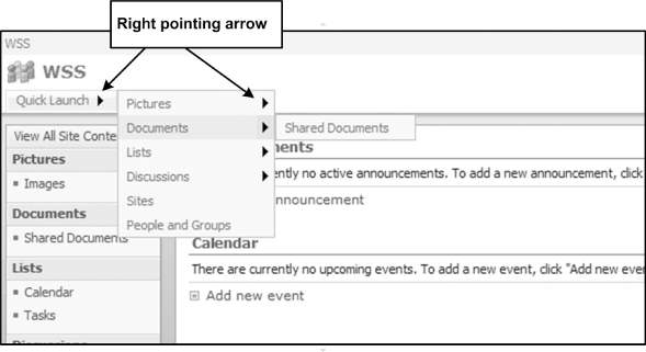
In this example, you have a vertical menu and the sub-menu is actually coming up on the right. Let's assume that you need update the image to a right-pointing arrow because the sub-menu is on the right. You can use any image you might have but for this example use an existing image in the SharePoint images directory, the largearrowright.gif, which is a right-pointing arrow.
To change the Top link bar's down arrow open the master page's Code view as shown earlier in this chapter, find the Top link bar control code segment and update the StaticPopoutImageUrl to /_layouts/images/largearrowright.gif and save your changes. When you refresh the page, the new image appears next to the Parent tab and it's pointing to the right as shown in Figure 11-23. If you are building a site that has accessibility requirements, you should use the StaticPopoutImageTextFormatString attribute to give an alt text for the menu image.
Changing the Style of the Top Link Bar
You can change the look and feel of the Top link bar easily by applying modifying its attributes. The following table details the design parameters for the Top link bar control.
| AspMenu Attributes | Description |
| StaticMenuItemStyle | This is style node for unselected tabs on the Top link bar. |
| StaticSelectedStyle | This is style node for selected tabs on the Top link bar. |
| StaticHoverStyle | This is style node for the hover over style of the Top link bar. |
| DynamicMenuStyle | This is style node for the dynamic menu. |
| DynamicMenuItemStyle | This is style node for unselected dynamic menu items. |
| DynamicHoverStyle | This is style node for the hover over style of the dynamic. |
| DynamicSelectedStyle | This is style node for selected dynamic menu items. |
With the style attributes of the Top link bar, not only can you assign a CSSClass; you can directly make changes by setting the parameters for the style. For example, the StaticMenuItemStyle has the ItemSpacing property set to 0px by default. To add spacing between your menu items, all you have to do is modify this property. Change the ItemSpacing to 5px as shown in the following code and save your changes. When you refresh you will see that the menu items are evenly spaced out by 5px.
<StaticMenuItemStyle CssClass=“ms-topnav” ItemSpacing=“5px”/>
To customize the look and feel of the fly-out sub-menus on the Top link bar, you must modify the DynamicMenuStyle attribute. The BorderWidth of the fly-out menus are set to 1px by default. Change the border to be 5px, as shown in the following code, and save your changes. When you refresh your site, the border of the fly-out menus is thicker.
<DynamicMenuStyle BackColor=“#F2F3F4” BorderColor=“#A7B4CE”
BorderWidth=“1px”/>
Resetting to the Site Definition
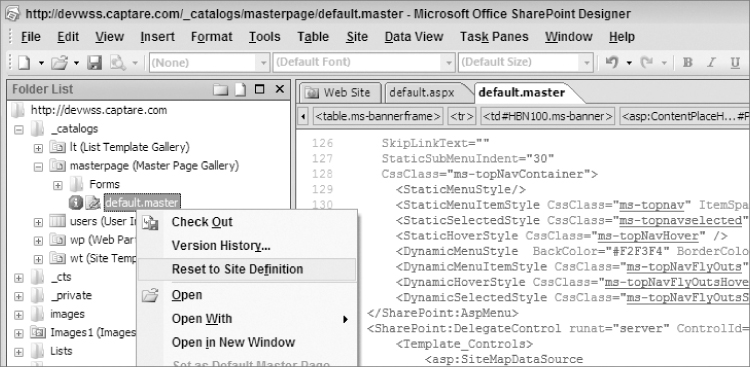
Now that you have a fully customized master page, how do you rollback your changes? This can be done by resetting the master page to the site definition. Resetting a customized page to the site definition restores the page to its original condition. When the master page is reset to the site definition, SharePoint Designer makes a backup of the current master page and brings back the original master page in a matter of seconds. To reset to the site definition, right-click on the master page in SharePoint Designer and click Reset to Site Definition, as shown in Figure 11-24.
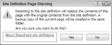
After clicking Reset to Site Definition, the Site Definition Page Warning dialog asks if you are sure you want to do this. Click Yes to continue, as shown in Figure 11-25.
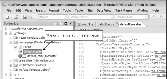
After you click on the Yes button, the original default.master is brought back and a backup of the customized master page is made with the name of default_copy(1).master as shown in Figure 11-26. Refresh your page to see the site reverted to its original state.
Inheriting Navigation with WSS 3.0
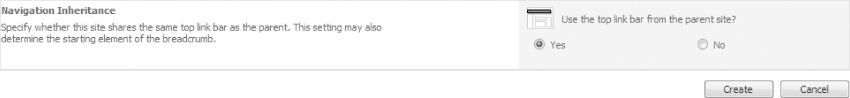
With WSS 3.0, sub-sites can be set to inherit the Top link bar. When inheriting is enabled, all sub-sites of a site use the same Top link bar. This is very useful when the Top link bar needs to look exactly the same, even though you have several sites in your site architecture. To enable inheriting, when creating a site, you must answer Yes the last question, on the New SharePoint Site page, “Use the Top link bar from the parent site?” as shown in Figure 11-27. After the site is created, you can stop inheriting from the parent site by going to Site Settings ⇒ Top link bar page.
One of the down sides of using the WSS 3.0 navigation controls is that even though sub-sites might have sub-sites and you customize the top navigation to display several levels, the Top link bar will only show one layer of sites. This quickly becomes an issue when there are several sites and you wish to have those items on the Top link bar. To overcome this issue, a custom data source for the Top link bar can be created, links can be added programmatically on site creation, or the publishing feature can be enabled if it is a part of a MOSS 2007 farm.
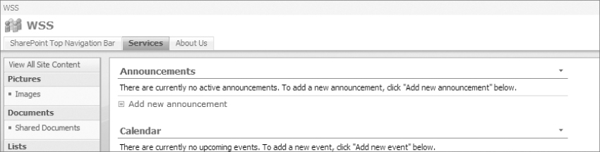
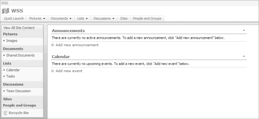
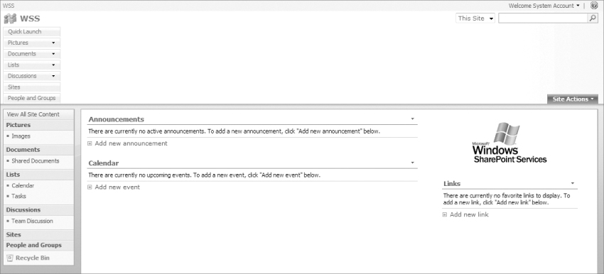
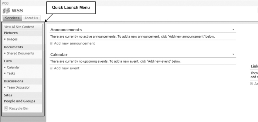
Quick Launch
The Quick Launch is located at the left side of the default SharePoint site, as shown in Figure 11-28. It is also known as the left navigation bar. Quick Launch by default will have links to View All Site Content, Pictures, Document Libraries, Lists, Discussions, Sites, and People and Groups. In SharePoint, users initially make their first selection on the top navigation bar then this is followed by a selection from the left navigation and subsequent selections from the left navigation. So typically the order of navigation in a SharePoint site is Top-Left-Left (TLL), which makes the Quick Launch a very important piece of SharePoint navigation. To better understand how the Quick Launch works, this section uses a basic team site template.
Modifying the Links on the Quick Launch
The way you modify the Quick Launch is similar to the way you modify the Top link bar, because the Quick Launch can be modified using the browser and using the SharePoint object model. The easiest way to add or remove links from Quick Launch is to use the browser. To get a better understanding of the Quick Launch menu, assume that you were tasked with adding a new heading in the Quick Launch named “Quick Links.” That heading needs to have child links named “Lunch Menu,” which points to lunch.aspx and “Corporate News,” which points to news.aspx. Assume that you were also asked to delete the People and Groups heading from Quick Launch.
To accomplish this, first go to your team site and click Site Actions ⇒ Site Settings. On the Site Settings page under the Look and Feel section, click the Quick Launch, as shown in Figure 11-29. The direct URL for the Top link bar page is http://yoursite/_layouts/quiklnch.aspx.
Deleting Links from Quick Launch
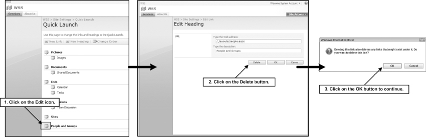
Once you are at the Quick Launch page to delete the People and Groups link, first click the Edit icon next to the People and Groups link. This action will then take you to the Edit Heading page where you click the Delete button. Clicking Delete button triggers an alert window asking you if you're sure Click OK on this alert to close the warning dialog box and delete the People and Groups link as shown in Figure 11-30. If the heading that you are deleting has sub-menu items under it, the sub-menus of this heading will also get deleted.
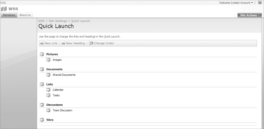
Note that after you delete the People and Groups heading, People and Groups will no longer be visible on the Quick Launch page, as shown in Figure 11-31.
Adding Links to the Quick Launch
Deleting the heading link from the Quick Launch is similar to deleting tabs from the Top link bar. Adding links to the Quick Launch is also similar only with one difference. With Quick Launch you are able to add Heading links, which you could not do with the Top link bar. So with Quick Launch you are able to create a two-tier menu with WSS 3.0's out-of-the-box functionality without any custom code.
The first requirement in this example's task was to add a new Heading called Quick Links that does not point to any link. To add the new heading go to the Quick Launch page as described earlier in this chapter and click on the New Heading button to open the New Heading page, on the New Heading page type Quick Links in the Type the description field and click the OK button. When you do this, the Web address becomes a required field, as shown in Figure 11-32.
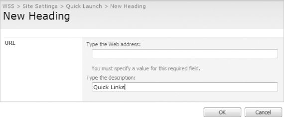
Sometimes you need to create headings just so that you can group links underneath them. The headings' only purpose is to group links and to have real links that they point to. So how do you add headings that do not point to a URL? If you need to use the heading for organizing purposes that do not point to any URL, type javascript: in the Web address as shown in Figure 11-33. This workaround enables you to bypass the required field validation when you are trying to add a heading with no link. The heading will appear as a link, yet nothing will happen when you click it.

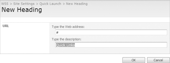
Some users might find the above approach confusing, since the expected behavior when you click a link is that a new page loads on the browser. So to avoid confusion, for an entry-level audience you could type “#” in the Web address field as shown in Figure 11-34, which would also allow you to bypass the required field validation without adding a link. With this approach, when a user clicks on the heading its behavior is the same because the page refreshes and the user understands that clicking on the link has worked.
Again, there is not a best way to do this and it's really up to you to decide which approach to take based on your requirements, but always remember to think out of the box when you run into issues like this. Don't be afraid to try some of your HTML tricks, as most of them usually work, since SharePoint after all is still a Web application.
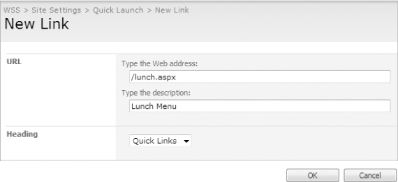
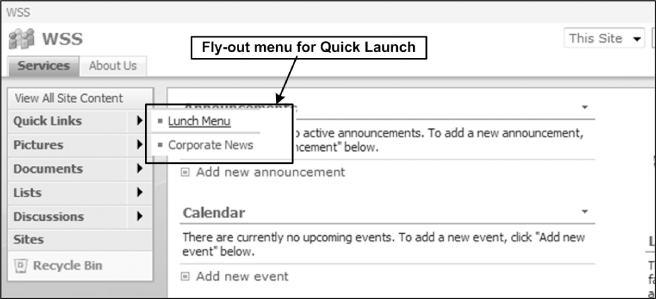
Now that you have added the Quick Links heading you can add the Lunch Menu and the Corporate News links. To add a new link to the Quick Launch, go to the Quick Launch page as described earlier in this chapter and click on the New Link button. This opens the New Link page where you will type /lunch.aspx in the Type the Web Address field and type Lunch Menu in the Type the description field. Once you click OK you are returned to the Quick Launch page where you will see all of your headings and links under your headings.
Note that now there is a Heading section where you can select the Heading (Parent Node) that you wish to add the link to. Here select Quick Link from the drop-down list and click OK as shown in Figure 11-35. You can follow the same steps to add the Corporate News link under the Quick Links heading.
Reordering Headings/Links on the Quick Launch
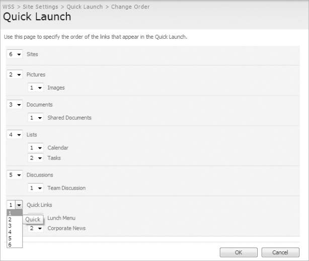
Now that you have created the links and the heading, let's make the Quick Links heading the first heading. To change the order of the headings and links, click the Change Order button. This opens the Change Order page. On this page, click the Quick Links drop-down arrow and select 1 to make it the first heading on the site.
Note that when you select 1 for Quick Links, this automatically updates the rest of the headings and links as shown in Figure 11-36. Once you click on the OK button the Quick Links will become the first heading.
Customizing the Look and Feel of the Quick Launch
Similar to the Top link bar, the look and feel of the Quick Launch can be customized using SharePoint Designer (SPD). The Top link bar is also a part of the default.master page and to customize the look and feel of the Quick Launch you need to edit the master page that the site is using. Open the master page using the same steps you used earlier in this chapter's “Customizing the Look and Feel of the Top Link bar” section. If you're reading this section before reading the Top Link bar section, I strongly recommend that you take a look at that section before reading this section as this section assumes that you have read the Top link bar section.
With the master page open, select Quick Launch and switch to the Code view in SharePoint Designer by clicking on the Code view icon on the bottom of SharePoint Designer. The code for Quick Launch is similar to Top link bar's code segment because they both use the AspMenu class of the SharePoint object model.
The following code is a representation of the default Quick Launch code in the default master page. This code segment is where you will be making most of your changes in the following sections.
<SharePoint:DelegateControl runat=“server” ControlId=“QuickLaunchDataSource”>
<Template_Controls>
<asp:SiteMapDataSource
SiteMapProvider=“SPNavigationProvider”
ShowStartingNode=“False”
id=“QuickLaunchSiteMap”
StartingNodeUrl=“sid:1025”
runat=“server”/>
</Template_Controls>
</SharePoint:DelegateControl>
<SharePoint:AspMenu
id=“QuickLaunchMenu”
DataSourceId=“QuickLaunchSiteMap”
runat=“server”
Orientation=“Vertical”
StaticDisplayLevels=“2”
ItemWrap=“true”
MaximumDynamicDisplayLevels=“0”
StaticSubMenuIndent=“0”
SkipLinkText=“”>
<LevelMenuItemStyles>
<asp:MenuItemStyle CssClass=“ms-navheader”/>
<asp:MenuItemStyle CssClass=“ms-navitem”/>
</LevelMenuItemStyles>
<LevelSubMenuStyles>
<asp:SubMenuStyle CssClass=“ms-navSubMenu1”/>
<asp:SubMenuStyle CssClass=“ms-navSubMenu2”/>
</LevelSubMenuStyles>
<LevelSelectedStyles>
<asp:MenuItemStyle CssClass=“ms-selectednavheader”/>
<asp:MenuItemStyle CssClass=“ms-selectednav”/>
</LevelSelectedStyles>
</SharePoint:AspMenu>
Adding Fly-Out Menus to the Quick Launch
To add fly-out menus to the Quick Launch, you must modify the StaticDisplayLevels and the MaximumDynamicDisplayLevels attributes of the Quick Launch AspMenu code segment. To get fly-out menu's, update the master page so that StaticDisplayLevels is set to “1” and MaximumDynamicDisplayLevels is set to “1”as shown in the following code.
StaticDisplayLevels=“1”
MaximumDynamicDisplayLevels=“1”
Save your changes. The Quick Launch is now a vertical menu with fly-outs, as shown in Figure 11-37.
Modifying the Orientation of the Quick Launch
The orientation of the Quick Launch can be modified by updating the Orientation attribute of the Quick Launch AspMenu code segment. The attribute accepts either Horizontal or Vertical as options. By default, the orientation of the Quick Launch is set to Vertical. Update this Orientation's value to be Horizontal, save your changes and refresh your site you will see that the menu is now vertical.
Hiding View All Site Content from Non-Administrative Users
Hiding the View All Site Content link so that non-administrative users can't see all content is something that site administrators and designers get asked to do frequently. This is very easy to accomplish with the help of the SPSecurityTrimmedControl, which controls security for the control that is under it. It gets the permissions required for the control and if the user does not have the rights, it does not show the control.
In the default.master master page, the View All Site Content link is located under a security trimmed control, and by default the PermissionString is set to ViewFormPages as shown in the following code segment.
<Sharepoint:SPSecurityTrimmedControl runat=“server”
PermissionsString=“ViewFormPages”>
<div class=“ms-quicklaunchheader”>
<SharePoint:SPLinkButton id=“idNavLinkViewAll” runat=“server”
NavigateUrl=“∼site/_layouts/viewlsts.aspx”
Text=“<%$Resources:wss,quiklnch_allcontent%>”
AccessKey=“<%$Resources:wss,quiklnch_allcontent_AK%>”/>
</div>
</SharePoint:SPSecurityTrimmedControl>
What this means is anyone who can view the form pages can view the View All Site Content link. To hide this link from all non-administrative users, set the PermissionsString must be set to ManageWeb as shown in the following code:
<Sharepoint:SPSecurityTrimmedControl runat=“server”
PermissionsString=“ManageWeb”>
Save your changes and refresh the site. Log in as a user who has only read access to the site. The View All Site Content link is no longer visible.
Please also note that this can be used for any control within the page. You can easily add the security trimmed control around the link, HTML code, Web part zone, etc. and viola your code will not visible to users who are not administrators. The blow code snippet shows how you can create a security trimmed control that displays “This message will only seen by users who have ManageWeb rights!” to users with ManageWeb rights.
<Sharepoint:SPSecurityTrimmedControl runat=“server”
PermissionsString=“ManageWeb”>
This message will only seen by users who have ManageWeb rights!
</Sharepoint:SPSecurityTrimmedControl>
Tree View Menu
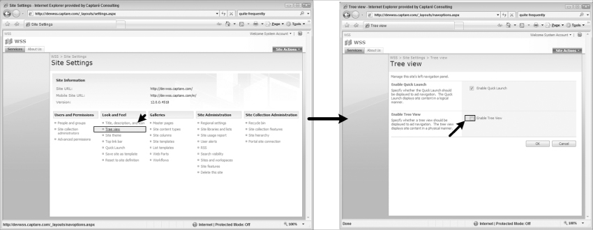
With WSS 3.0 you can enable a Tree view menu by using the SharePoint user interface. To enable the Tree view menu, go to Site Actions ⇒ Site Settings. On the Site Settings page, click the Tree view link located under the Look and Feel section as shown in Figure 11-39. You are taken to the Tree view page. Click Enable Tree view check box and then click OK, as shown in Figure 11-38. Also please note that you can uncheck the Enable Quick Launch check box to disable the Quick Launch.
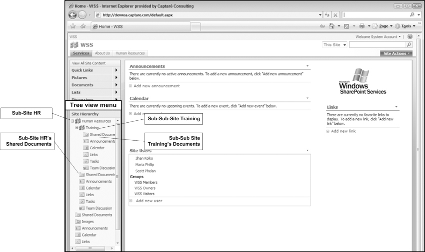
When the Tree view is enabled, the Tree view menu appears on the site. The Tree view displays all sites and lists under the current site. One other great feature of the Tree view is that you can access the content of a sub-site and even a sub-sub site without actually navigating to the site as shown in Figure 11-39.
Showing Only Sites on the Tree View Menu
In much the same way that you used master pages to customize the look and feel of Quick Launch and the Top link bar, you can customize the Tree view menu.
A good example of a Tree view customization is when you need to only show sub-sites and not document libraries, folders and lists under a site because the default out-of-the-box Tree view shows everything. In reality you might have a root level site called Projects with several project sub-sites. If you want to easily navigate through these projects, you probably want to use the Tree view and customize it so that it only shows sites and not the document libraries and folders under each site.
To do this, open the master page in SharePoint Designer and locate the following code segment:
<SharePoint:SPHierarchyDataSourceControl
runat=“server”
id=“TreeViewDataSource”
RootContextObject=“Web”
IncludeDiscussionFolders=“true”/>
<Sharepoint:SPTreeView
id=“WebTreeView”
runat=“server”
ShowLines=“false”
DataSourceId=“TreeViewDataSource”
ExpandDepth=“0”
SelectedNodeStyle-CssClass=“ms-tvselected”
NodeStyle-CssClass=“ms-navitem”
NodeStyle-HorizontalPadding=“2”
SkipLinkText=“”
NodeIndent=“12”
ExpandImageUrl=“/_layouts/images/tvplus.gif”
CollapseImageUrl=“/_layouts/images/tvminus.gif”
NoExpandImageUrl=“/_layouts/images/tvblank.gif”>
After you locate the code segment in SharePoint Designer, add the following lines to the last line of the SharePoint:SPHierarchyDataSourceControl control.
ShowDocLibChildren=“False”
ShowFolderChildren=“False”
ShowListChildren=“False”
Save your change and refresh your screen. Only sites will appear on the Tree view as shown on Figure 11-40.
MOSS 2007 navigation has more features, but it is similar to the WSS 3.0 navigation as they both use the same technology. The MOSS 2007 navigation is more advanced than the default WSS 3.0 navigation because the MOSS 2007 navigation is built for SharePoint's Web Content Management (WCM) functionality. Navigation is one of the most important pieces of any WCM solution and the enhanced version of the WSS 3.0 navigation available to users of MOSS 2007 since it provides WCM capabilities. This is why you will see that the MOSS 2007 navigation is mostly referred to as the WCM Navigation.
Sites that have MOSS 2007 navigation enabled still have the Top link bar and Quick Launch, but the navigation is maintained differently. On sites where the publishing feature is enabled, the Top link bar and Quick Launch links do not display under the look and feel section of the Site Settings page. They are replaced by the Navigation link, as shown in Figure 11-41.
Maintaining MOSS 2007 Navigation
Maintaining MOSS 2007 navigation is similar to WSS 3.0 navigation maintenance. As in WSS 3.0, you need to go to the Site Settings page to modify the links on the navigation. To go to the Site Settings page, click Site Actions ⇒ Site Settings ⇒ Modify All Site Settings. On the Site Settings page you click the Navigation link that is shown in Figure 11-41. This opens the Navigation page, which gives you several options for modifying the navigation of your MOSS 2007 site, as shown in Figure 11-42. You can also directly access the Navigation page by clicking on Site Actions ⇒ Site Settings ⇒ Modify Navigation.
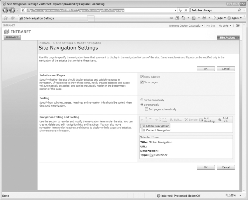
When you create a MOSS 2007 site using the Collaboration Portal template the Site Navigation Settings page will provide three (3) sections to modify the navigation:
- Subsites and Pages This section is used to specify whether the navigation should display sub-sites and publishing pages in navigation.
- Sorting This section is used to specify how sub-sites, pages, headings, and navigation links should be sorted in the navigation.
- Navigation Editing and Sorting This section is used to reorder and modify the navigation menu items.
Adding, Deleting, and Editing Links and Headers
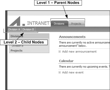
To modify the links on the site, you use the Navigation Editing and Sorting Section. Headings are the groupings of links. They can be thought as the parent of sub-links. The links under the heading appear in the drop-down menu. To add a Heading, click the Add Heading link on the toolbar to open a pop-up window that allows you to add the heading. In this window are several features you don't get with WSS 3.0 Navigation controls. These features are:
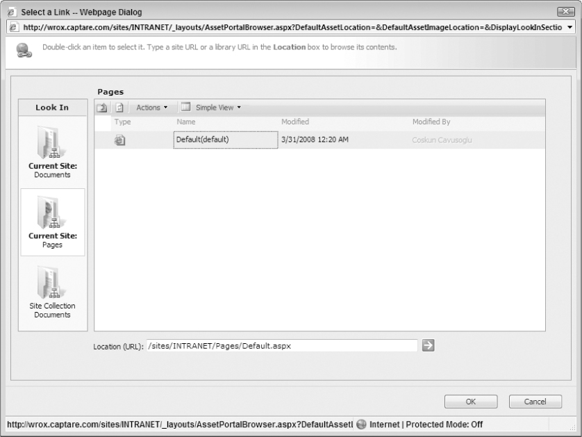
- Browse Using the Browse button you can easily find the items on your site that you are trying to link to as shown in Figure 11-43.
- Open Link in new Window When this check box is checked, the link opens in a new window.
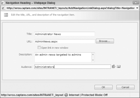
- Audience Audiences is a way to group specific types of users. When adding a link, you can select the audiences that can view the link. For example, if you have an audience created for Administrators, which is a group of users who are all Administrators, you can target a heading to this audience, which will show the links only to the members of the Administrator audience, as shown in Figure 11-43. If a user who is not a member of the Administrators audience logs in to the site, they will not see the “Administrator News” heading shown in Figure 11-44.
To add a link, you must select the node you wish to add the link to because SharePoint will add the link under the selected node. To add a link to the site, click Add Link on the toolbar. So to add the link under Administrator News, click the Administrator News Heading and then click Add Link as shown in Figure 11-45.
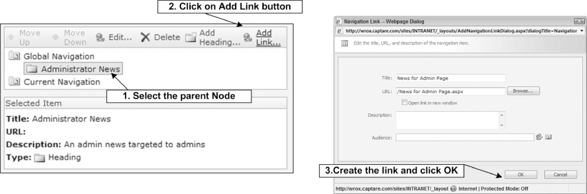
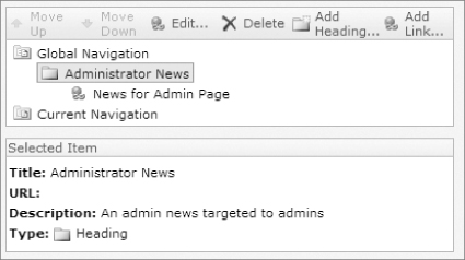
Figure 11-46 shows the News for Admin Page as a link under the Administrator News because that node was selected when adding the link.
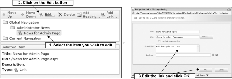
To edit an item, select it and then click Edit. A pop-up window opens, enabling you to modify the link or heading as shown in Figure 11-47.
To delete an item, select the item and then click the Delete link. You must be careful with the delete function because when you click on Delete the link is deleted without a confirmation. If you accidentally delete a link, you can cancel your operation by clicking on the Cancel button on the navigation page and your link will still be there because the modification you make to the navigation don't get applied until you save your changes. Also make sure you save your changes frequently, if you spend several minutes and the browser times out you will have to make all of your changes again since nothing get's applied until you actually click OK on the Site Navigation Settings page.
Show/Hide Sub-Sites as Links on the Navigation Bar
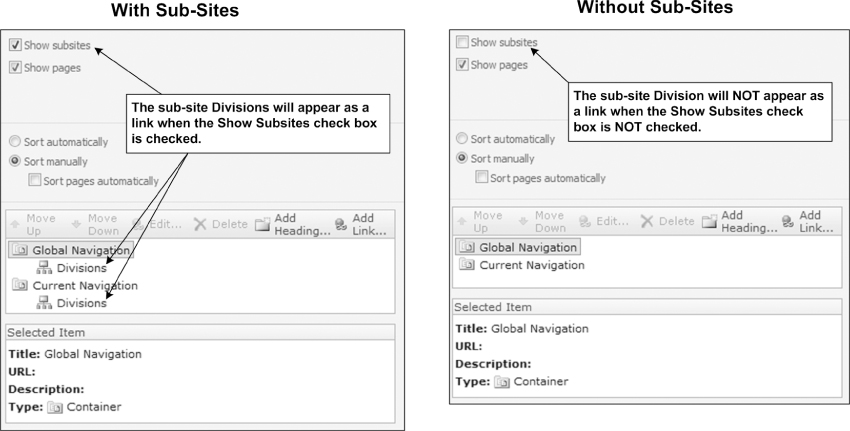
With the MOSS 2007 Navigation the show sub-site feature automatically shows all sub-sites. This is very useful when creating several levels of sites, as navigation gets tricky when you're deep in the site hierarchy. Showing sub-sites automatically is one of the major things you could not do with WSS 3.0 Navigation controls and is one of the main reasons why most site owners choose to use MOSS 2007 sites.
When the Show Subsites check box is checked, the MOSS 2007 navigation automatically shows sites as links as they get created. They also get added to the Navigation console immediately. If you do not wish to show all of the sites, uncheck the box and the sub-sites will not appear as links on the navigation as shown in Figure 11-48.
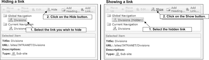
Hiding/Showing Links
If you wish to enable the Show sub-sites but do not wish to show all sites as links on the navigation bar, you can hide specific items. To hide a link, click the link to hide, and click the Hide button. The text “(Hidden)” appears next to the items that are hidden. To show a hidden link, click the link and click the Show button as shown in Figure 11-49.
Sorting Links
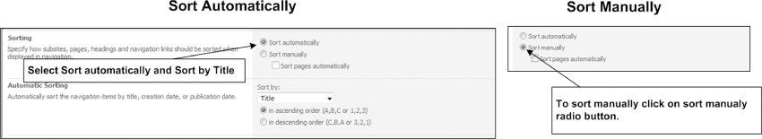
To sort the links on the site, you will use the Sorting section of the Navigation page. You can automatically sort by Title, creation date, or publication date. By default, Title is selected and it shows items in ascending order. You can also choose to sort them manually as shown in Figure 11-50. To sort sub-sites manually or publishing pages automatically click the Sort Manually radio button or the Sort pages automatically check box on the Navigation.
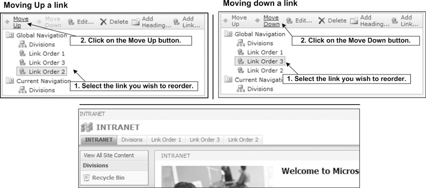
Reordering Links
Reordering links is something you do quite frequently. To reorder a link, go to the Navigation page as described earlier in this chapter and click the link you wish to move; then click either Move Up or Move Down. Clicking the Move Up button moves the link upward, and clicking the Move Down link moves the link downward, as shown in Figure 11-51.
MOSS 2007 Navigation Customizations
As mentioned earlier in this chapter, MOSS 2007 navigation is an enhanced version of the WSS 3.0 Navigation controls. You will see a lot of similarities between the WSS 3.0 Navigation and MOSS 2007. This section covers the key differences. Such knowledge can help you determine which navigation will be better for the site you're designing the navigation for.
MOSS 2007 Navigation Data Source Customizations
One of the first things you will notice with the MOSS 2007 menu when you look at its code is its data source. The Top link bar in a MOSS 2007 Navigation site uses a different type of data source. To see the code of the Top link bar you must first open the site in SharePoint Designer. The fastest way to open the site in SharePoint designer is:
1. Click File ⇒ Edit with Microsoft Office SharePoint Designer when you are viewing your site in Internet Explorer. This opens the site in SharePoint Designer and you can view the code.
2. Navigate to the _catalogs/masterpage folder and double click the default.master.
3. Click Yes to check it out. Once checked out, SharePoint designer opens the default.master page in design view.
4. Click the Top link bar control to select it. You will know that it is selected if it is highlighted.
5. Once highlighted, click the Code icon at the bottom of the SharePoint designer window page so that you can see the code. You can also click on View ⇒ Page ⇒ Code to see the Code view of the page. Once you're in the Code view of the page you will see that MOSS 2007 version of the Top link bar uses PublishingNavigation:PortalSiteMapDataSource as shown here:
<PublishingNavigation:PortalSiteMapDataSource
ID=“siteMapDataSource1”
Runat=“server”
SiteMapProvider=“CombinedNavSiteMapProvider”
EnableViewState=“true”
StartFromCurrentNode=“true”
StartingNodeOffset=“0”
ShowStartingNode=“false”
TreatStartingNodeAsCurrent=“true”
TrimNonCurrentTypes=“Heading”/>
The WSS 3.0 version of the Top link bar uses the asp:SiteMapDataSource as shown here:
<asp:SiteMapDataSource
ShowStartingNode=“False”
SiteMapProvider=“SPNavigationProvider”
id=“topSiteMap”
runat=“server”
StartingNodeUrl=“sid:1002”/>
PortalSiteMapDataSource is a MOSS-specific data source which uses the PortalSiteMapProvider object to get the data. With PortalSiteMapDataSource you get new attributes such as the StartFromCurrentNode and the TrimNonCurrentTypes that you do not have with the WSS 3.0 version of the data source. These new attributes of the data source allow you to create powerful menus when designing SharePoint sites.
The following table details attributes that are most commonly used to customize the navigation and their affects to the navigation menus.
| PortalSiteMapDataSource Attribute | Description |
| StartFromCurrentNode | This attribute defines where the data source will start when displaying the menu items. Typically this is set to True when using the PortalSiteMapDataSource. |
| ShowStartingNode | This attribute defines if the starting node (Root Menu Item) is returned by the data source, by setting this attribute to False the starting node is not shown and all of the sub-menu items are shown as top level links/tabs. |
| StartingNodeOffset | This attribute is an integer that defines the offset from the starting node that determines the top-level site hierarchy. |
| TreatStartingNodeAsStart | This attribute is used by the following trimming attributes. This attribute is set to True when you need to have trimming start from the StartingNode. By default, the StartingNode is not visible and the site that is being visited is treated as the Start Node. When this attribute is set to True trimming will always start from the starting node. |
| TrimNonCurrentTypes | This attribute enables you to trim the menu items based on their types that are not directly beneath the current node. Trimming can be based on Area, Page, Heading and AuthoredLink. Multiple types can be specified as a comma-delimited list (TrimNonCurrentTypes=“Area, Heading”). For example if you choose to trim based on Area, (TrimNonCurrentTypes=“Area”) this will remove all site links from the navigation. |
| TrimNonAncestorTypes | Similar to the preceding attribute this will also trim based on type. The only difference is that this attribute trims types that are not directly beneath the current site or one of its ancestors. |
| TrimNonAncestorDescendantTypes | This attribute trims selected types that are not beneath the current site or one of its ancestor or descendant sites. |
Data Providers in MOSS 2007 Navigation
PortalSiteMapDataSource is a MOSS-specific data source that uses the PortalSiteMapProvider object to get the list of nodes that are displayed in the navigation controls. But PortalSiteMapProvider brings more to the table: It not only returns nodes from WSS SPNavigation; it also merges the nodes with the site collection structure, which allows the navigation controls to display the site hierarchy automatically. Security trimming is also applied to the links based on the logged-in user, so that the users who do not have access to the sub-level sites do not see those links on the navigation control.
Three types of portal site map providers are used throughout publishing sites in MOSS 2007 and they are as follows:
- Global This provider displays all links from the defined TopNavigationBar links.
- Current This provider displays all links from the defined QuickLaunch links.
- Combined This provider brings back all links from the TopNavigationBar if the site is set to inherit and displays all links from the QuickLaunch links when set to not inherit.
The following table details attributes that are most commonly used to customize the PortalSiteMapProvider.
| PortalSiteMapProvider Attribute | Description |
| DynamicChildLimit | This attribute defines the maximum “dynamic” sub-sites and pages that will be shown for each Web site. By default, this is set to 50. |
| IncludeSubSites | This attribute determines if the provider returns sub-sites. |
| IncludePages | This attribute determines if the provider returns pages. |
| IncludeHeadings | This attribute determines if the provider returns headings. |
| IncludeAuthoredLinks | This attribute determines if the provider returns link nodes. |
Creating a Two-Level Horizontal Menu
In some cases, due to the design of the site, you might need to display the sub-level menu items under the top-level menu items as shown in Figure 11-52.
Out-of-the-box MOSS 2007 installations have a master page named BlueTabs.master, which displays the menu shown Figure 11-53. For details you can review that master page. To show both levels on the same page, you must use two horizontal menus. This is a great way of thinking out of the box; two controls looking at the same portal site map provider with different settings can help you accomplish a lot. Let's look at the code needed for the two top navigation controls to create the look and feel of Figure 11-53.
Open the BlueTabs.master page in SharePoint designer and you should see that the code behind for the first-level navigation control is as follows:
<SharePoint:AspMenu
ID=“topNav1”
Runat=“server”
DataSourceID=“SiteMapDataSource1”
Orientation=“Horizontal”
StaticDisplayLevels=“1”
MaximumDynamicDisplayLevels=“0”
ItemWrap=“false” SkipLinkText=“<%$Resources:cms,masterpages_skiplinktext%>”>
<StaticMenuItemStyle CssClass=“topNav1Item” ItemSpacing=“0”/>
<StaticSelectedStyle CssClass=“topNav1Selected” ItemSpacing=“0”/>
<StaticHoverStyle CssClass=“topNav1Hover”/>
</SharePoint:AspMenu>
<PublishingNavigation:PortalSiteMapDataSource
ID=“siteMapDataSource1”
Runat=“server”
SiteMapProvider=“CombinedNavSiteMapProvider”
EnableViewState=“true”
StartFromCurrentNode=“true”
StartingNodeOffset=“0”
ShowStartingNode=“false”
TreatStartingNodeAsCurrent=“true”
TrimNonCurrentTypes=“Heading”/>
The first top navigation uses CombinedNavSiteMapProvider, the StartFromCurrentNode attribute is set to True and the StartingOffset attribute is equal to 0.
The second-level navigation control's code is as follows:
<SharePoint:AspMenu
ID=“topNav2”
Runat=“server”
DataSourceID=“SiteMapDataSource2”
Orientation=“Horizontal”
StaticDisplayLevels=“1”
MaximumDynamicDisplayLevels=“0”
SkipLinkText=“<%$Resources:cms,masterpages_skiplinktext%>”>
<StaticMenuItemStyle CssClass=“topNav2Item” ItemSpacing=“0”/>
<StaticSelectedStyle CssClass=“topNav2Selected” ItemSpacing=“0”/>
<StaticHoverStyle CssClass=“topNav2Hover”/>
</SharePoint:AspMenu>
<PublishingNavigation:PortalSiteMapDataSource
ID=“siteMapDataSource2”
Runat=“server”
SiteMapProvider=“CombinedNavSiteMapProvider”
EnableViewState=“true”
StartFromCurrentNode=“false”
StartingNodeOffset=“1”
ShowStartingNode=“false”
TrimNonCurrentTypes=“Heading”/>
The only differences between the two top navigation controls are that the second top navigation control has StartFromCurrentNode set to “False” and StartingNodeOffset set to 1. With this modification, you have the second navigation menu display only the second level child nodes.
Enabling MOSS 2007 Navigation for WSS 3.0 Sites
The enhanced version of the SharePoint navigation which has been referred to as the MOSS 2007 Navigation in this chapter, by default, is enabled on all publishing sites that are SharePoint site templates bringing WCM functionality to SharePoint sites. If your organization has MOSS 2007, you can enable your WSS 3.0 sites to also have the MOSS 2007 navigation by enabling the publishing feature for the site.
You can enable MOSS 2007 Navigation on a WSS 3.0 site by following the next steps:
1. Go to the site settings page by following Site Actions ⇒ Site Settings.
2. On the Site Settings page click on the Site Features link.
3. Activate the Office SharePoint Server Publishing feature by clicking the Activate button.
These three steps place a Navigation link on your site settings and you will have the benefits of a Publishing site. If you do not want to use the publishing features and want only the navigation, you can deactivate the feature. Deactivating the publishing feature will not remove the navigation control. You can deactivate the feature by going to the Site Features page and clicking the Deactivate button. You are then redirected to a confirmation page where you click the Deactivate this feature link.
This chapter focused on the two types of navigation controls that come with WSS 3.0 and MOSS 2007 and detailed the different ways you can customize your navigation controls. You have seen an in-depth discussion of how to use the navigation controls in a WSS 3.0, including the basic navigation architecture, customizing the links and their orientation, and even how to show/hide buttons and create fly-out menus. You then learned the advantages of using the MOSS 2007 navigation and how it is better equipped to handle more customized sites and navigation schemas. You saw some cool tricks, like creating multi-level navigation, using the included functionality of MOSS 2007 navigation.
As this chapter ends, hopefully you have a good understanding of navigation as it relates to MOSS 2007 and WSS 3.0 sites. You need this information again as you get into Chapter 13 and you see how to override some of these navigation controls with more accessible counterparts. But for now, you should be able to decide whether to use a WSS 3.0 site or a MOSS 2007 site.