THE DESIGN OF SELF-PROMOTION
Keep your dreams alive. Understand to achieve anything requires faith
and belief in yourself, vision, hard work, determination, and dedication.
Remember all things are possible for those who believe.—Gail Devers
THE ART OF SELF-PROMOTION
I want to begin this book and this chapter with the idea that first you must believe in yourself. If you don't, who will? We can compare the process of trying to get your foot in the door of any job with that of dating and finding a spouse, or building any relationship, really. Most of the rules apply to both. In a way you're trying to sell yourself to a potential romantic partner just as you are trying to sell yourself to a potential employer. So there are some key concepts that you must keep in mind and they are as follows:
Show your value. How are you different from everyone else? What makes you the cream of the crop? Why are you worth the investment of time? Don't just blabber on about how wonderful and great you are. Prove it. Everything you do from this point forward in creating the best representation of yourself should illustrate how creative you are and show your talents and abilities. Learn how to problem-solve. Problem solving is probably the most important skill that you can have.
Show the best version of yourself without being phony or fake. The old adage of put your best foot forward definitely applies here. Be professional. Take time to groom yourself both physically and professionally. Have class. Show style. Show that you're a fun person to be around. Establish that you work well and play well with others. If you present yourself as something you are not, you may get the job, but you won't be able to keep it. The animation industry is very connected, and this information travels quickly.
Be confident, don't be arrogant. Know your abilities. Know your strengths but also know your weaknesses and be willing to work on those. Be humble. Be polite. Don't minimize yourself and don't put others down. Be open to ideas and suggestions. Don't be defensive when someone critiques you or your work.
Be open to change. Be open to ask questions. Accept the fact that this industry is in flux constantly. Show that you are flexible. Being able to remain calm and not let change upset you is extremely important.
Be focused and on target, but remember to look at the big picture. Know what you want to do. Everything you do should be done with that goal in mind. If you don't know what you want to do, then you will come across as both indecisive and unsure of yourself and your abilities. Realize that where you want to be may be out of reach at this moment, but continue to make decisions that will eventually lead you to where you want to go. Don't get frustrated. Don't give up. Keep on working toward that goal and you will eventually get there.
Don't waste anyone's time. Get to the point. Always be clear, be concise, be passionate, do your best, and stay on target.
It is not the strongest of the species that survives, nor the most intelligent, but the one most responsive to change.
Charles Darwin
Be willing to continue to work on improving both yourself and your portfolio. Don't burn yourself out. Stay motivated. Do things that help you stay inspired. Stay fresh. Get away from the computer. Be joyful. Get involved in your community. Stay active. Find a cause. Find a hobby. Take a class. Play games. Go to the movies for fun not to critique-leave that for the critics. Do something that brings life into who you are and what you do. Let your experience inspire your work and keep it fresh. Stop hanging around with people in your life who pull you down or squash your hopes and dreams. Fill your life with people who inspire you. Find balance and happiness.
DESIGN
There are plenty of books out there that talk about design and self-promotion. At the end of this chapter, I have listed a few that I've used, and I highly recommend them. This chapter defines a few basic rules and things you need to consider when it comes to logo, business card, letterhead, and website design, so that you can do it on your own, especially if you don't have the money to hire a designer.
So, why bother designing your portfolio? First, it shows that you are serious about your profession, and a unified, nicely designed portfolio looks professional. So, where do you start?
Probably the most important thing you have to decide when designing for self-promotion is who you are and how you want to be represented. How will you represent yourself visually? What is your style?
You should begin by asking yourself: What adjectives do you use to describe yourself?
Make a list of words that describe who you are. The following is a word bank of adjectives that you can use to help describe yourself and figure out how you want to represent yourself visually.1 This is a good start.
A abnormal action active adaptive adolescent agreeable aggressive aesthetic agrarian alert alluring ambiguous ambitious amusing animated annoying antique anxious appealing archival arctic artistic athletic atypical authoritative automated avant-garde awkward B basal basic beautiful bizarre black bland boisterous boundless brave brazen brief bright brilliant C calm captivating chaotic charm childlike choice classic classical cluttered coherent colorful cool comic compassionate compelling complicated confident conservative contemporary conventional convincing cooperative corporate creative cryptic cultured cutting-edge D dark dated dazzling delicate dependable dirty disheveled disordered distinctive drab drive dynamic E eager elaborate electric elegant emotional empathetic endurable energy enthusiasm enticing essential evil exciting excited extraordinary extreme F factual faint fancy fast feminine fine flamboyant flashy fleeting friendly fresh frigid fundamental fussy G gaudy gender-specific generous generational glitzy gloomy goal-oriented graceful gusto H happy harmonious heavy hidden high-tech hilarious historical hostile hued humorous I illustrative imaginative immediate impressive indecisive infantile innocent innovative instantaneous intelligent intense intricate inventive invigorating J jazzy juvenile K kinetic knowledgeable L lethargic laughable lavish light lively logical loud ludicrous M macho magnetic majestic manly masculine maternal maximum mechanical melodious memorable messy meticulous minimal moderate modern morbid muted mysterious N naïve native natural needy new nominal nostalgic Nosy O obscure observant obsessive old ominous oomph organic ornate ostentatious out-of-the-ordinary P placid passionate past pastel persuasive peaceful pizazz plain pleasant polite powerful prime productive psychedelic punch pure Q quick quiet quixotic R rare raw refined religious retro rich refreshing relaxed reminiscent representative responsible resonant retrospective revolutionary righteous robotic romantic S serene showy sloppy small soft somber soothing spiritual staid strong stylish suggestive swift symbolic T tacky tawdry techno tempting terse traditional typographic U ultimate uncommon uncultivated undeveloped unkempt unpolished unusual V vague verve and vigor vigorous vintage W wacky warm well-known whimsical whispered wild witty womanly Y young youthful Z zing.
Once you have your list, you now have to narrow down by using your creativity to visualize what these adjectives mean. Here are some suggestions and clever ideas to get your creative juices flowing.
USE YOURSELF
There is no better way to represent yourself and your style than to use something from what you have already created or to create something specifically to represent yourself. This is where your design should begin. Start looking through your own artwork with a different angle. Is there something that you have already created that can be used as in Figure 1.1? You should figure out what is your very best work and pull an image or idea from that. What better way to introduce yourself than with your very best creation? How about objects that represent your personality or identity? Perhaps you always wear a certain hat or glasses. Do you have a nicely drawn caricature of yourself or self-portrait as in Figure 1.2? Perhaps you have created a computer graphics (CG) version of yourself? What about a visual play or word play with your name as in Figure 1.3? Your monogram or initials as in Figure 1.4? How about creating a logo that shows your chosen specialty as in Figure 1.5?
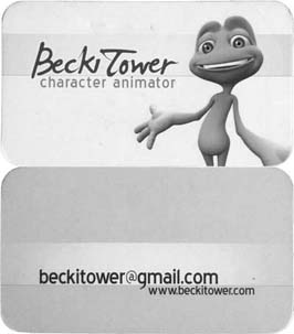
Figure 1.1 An Example Business Card for an Animator Who Used One of Her Characters as Her Identity for Self-Promotion
BORROW FROM THE MASTERS
The number 1 rule in being an artist is learn from the masters. Be inspired by real designers or artists. Borrow from them. Find something visual that you

Figure 1.2 An Example Business Card of a Self-Portrait Character of the Animator
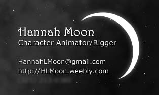
Figure 1.3 An Example Business Card With a Nice Visual Play of This Person's Last Name, Which Happens to be Moon
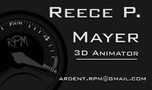
Figure 1.4 An Example Business Card With a Fun Interpretation of This Person's Initials RPM
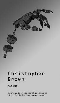
Figure 1.5 An Example Business Card of a Rigger
love. Take something that is already working and make it your own. Now I'm not saying to infringe on anyone's copyright, but what I am saying is what artists have done from the very beginning: appropriate and be inspired by something that is already out there. Below is an alphabetical list of art movements, followed by an alphabetical list of materials and techniques. Perhaps an artist during one of these movements fits your style, or maybe a particular material or technique will spark an idea.
List of Art Movements
A — Abstract Art — Art Brut — Abstract expressionism — Abstract illusionism — Academic Art — Action Painting — Aestheticism — Altermodern — American Barbizon School — American Impressionism — American Realism — American Scene Painting — Analytical Art — Antipodeans — Anti-Realism — Arabesque — Arbeitsrat für Kunst — Art Deco — Art Informel — Art Nouveau — Art Photography — Arte Povera — Arts and Crafts Movement — Ashcan School — Assemblage — Les Automatistes — Auto-Destructive Art — B — Barbizon School — Baroque — Bauhaus — C — Classical Realism — Color Field — Context Art — Computer Art — Concrete Art — Conceptual Art — Constructivism — Cubism — D — Dada — E — Expressionism — F — Fantastic Realism — Fauvism — Figurative Art — Figuration Libre — Folk Art — Fluxus — Futurism — G — Geometric Abstract Art — Graffiti — Gutai Group — H — Harlem Renaissance — Humanistic Aestheticism — Hypermodernism — Hyperrealism — Impressionism — I — Institutional Critique — International Gothic — International Typographic Style — L — Les Nabis — Letterism — Lowbrow (art movement) — Lyco Art — Lyrical Abstraction — M — Magic Realism — Mannerism — Massurrealism — Maximalism — Metaphysical Painting — Mingei — Minimalism — Modernism — Modular Constructivism — N — Naïve Art — Neoclassicism — Neo-Dada — Neo-expressionism — Neo-figurative — Neoism — Neo-primitivism — Net Art — New Objectivity — Northwest School — O — Op Art — Orphism — Photorealism — Pixel Art — Plasticien — Plein Air — Pointillism — Pop Art — Post-impressionism — Precisionism — Pre-Raphaelitism — Primitivism — Process Art — Purism — Q — Qajar Art — R — Rasquache — Realism — Remodernism — Renaissance — Rococo — Romanesque — Romanticism — S — Samikshavad — Shin Hanga — Shock Art — Sōsaku Hanga — Socialist Realism — Sots Art — Space Art — Street Art — Stuckism — Suprematism — Surrealism — Symbolism — Synchromism — T — Tachisme — Toyism — Transgressive Art — U — Ukiyo-e — Underground commix — V — Vancouver School — Verdadism — Vorticism.
List of Art Materials and Techniques
A Animation | Assemblage (Beads — Cardboard — Found Objects — Glue Paper-Textiles — Wire — Wood) C Carving (Granite — Ice — Ivory- Marble — Wood — Plaster — Stone — Wax) Casting (Aluminum — Bronze — Cement — Gold — Pewter — Plaster — Plastic — Silver — Synthetic Resin — Wax) Ceramics | Cartooning | Comic Book D Design (Advertising — Architecture — Fashion — Furniture — Graphic — Industrial — Interior — Jewelry — Production) Drawing (Chalk — Charcoal — Conté Crayon — Graphite — Ink — Marker — Pastel) F Finishes (Enamel — Patina — Polychrome — Wax) G Graffiti I Illustration M Mixed Media | Modeling (Clay — Digital — Papier-Mâché — Plaster- Sand) P Painting (Acrylic — Digital — Fingerpaint — Fresco — Gouache — Latex — Oil — Tempera — Watercolor) Paper Cut | Photography (Black & White — Color Tint — Film — Fisheye — Hand Coloured — Hipstamatic Hipstamatic — Infrared — Instagram — Polaroid — Sepia — Tilt-Shift) Printing | Printmaking (3D — Aquatint — Embossing — Engraving — Etching — Inkjet — Intaglio — Laser — Letterpress — Linocut — Lithography — Metalcut — Mezzotint — Moku Hanga — Monotype Relief- Etching — Screen — Styrofoam — Printing — Woodcut — Wood — Engraving) T Tattooing.
HOW TO CHOOSE THE RIGHT FONT
Your choice of font can portray your style very quickly. Fonts can be very individualistic. There are many different types of fonts available, and most fonts fit into one of these categories: Serif, Sans Serif, Script, Blackletter, Titling, and Decorative, as shown in Figure 1.6.
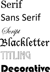
Figure 1.6 Sample Fonts of Serif, Script, Blackletter, Titling, and Decorative
Serif fonts have extensions from the ends of the character, which make the typefaces look more decorative and improves readability by adding a flow from one character to the next.
Sans Serif fonts are “without” serif (“Sans” means “without” in French). These typefaces are simple and clean.
Script fonts have derived from calligraphy and handwriting.
Blackletter fonts are very dense and the capitals are exceedingly decorated. They have developed from early liturgical writings and illuminated manuscripts.
Titling fonts are usually all capitals and look best at larger size.
Decorative fonts are more artistic, stylized, and eye-catching.
Without getting too technical or deep into the history of text and font, there are some basic vocabulary words that need to be understood and considered when it comes to text. See Figure 1.7.
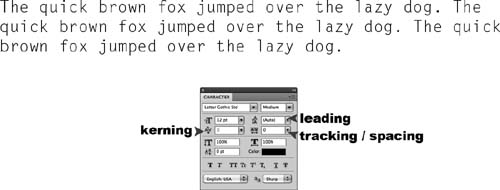
Figure 1.7 The Character Window in Photoshop Allows the Adjustment of Kerning, Tracking, and Leading
A character is an individual letter or symbol.
Spacing refers to the overall distance between two characters or words. Both characters and words should be well spaced (neither too close nor too far from other characters or words).
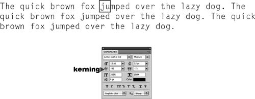
Figure 1.8 Characters Typed Using Default Spacing can be Adjusted Individually Using Kerning. This Image Specifically Looks at the Letters j u Before the Kerning Adjustment
Kerning, as seen in Figure 1.8, refers to the space (more or less) in-between two characters. In order to get some typeface to be spaced evenly between some character combinations, you might need to adjust certain character pairs, instead of the entire word, as in Figure 1.9.
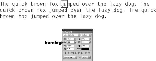
Figure 1.9 This Image Shows the Letters j u After the Kerning Adjustment
Tracking refers to the space in-between all characters of a selected block of text, such as a word, sentence, or paragraph. Figure 1.10 shows the entire block of text after adjusting the tracking.
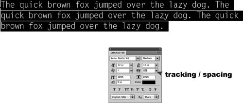
Figure 1.10 This Image Shows the Entire Block of Text After the Tracking Adjustment
Leading refers to the vertical space in-between lines of text. This is also referred to as Line Spacing. Leading usually needs to be adjusted, because the default is usually too far apart. Figure 1.11 shows the entire block of text after adjusting the leading.
Adjusting the spacing, kerning, tracking, and leading so that your text looks best is key. Don't just use the default settings dictate how your text will look.
You should limit your font choices to two but no more than three different types of font in your portfolio package. One font should be simpler and used for the majority of what you are writing. One or two other fonts can be used for highlighting certain words or using as headers. These fonts can
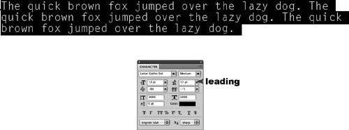
Figure 1.11 This Image Shows the Entire Block of Text After the Leading Adjustment
be fancier and more fun than the other, but make sure they are very easy to read. Remember, legibility, and readability are the goals here. You want whoever is looking at your materials to be able to understand it without a lot of work. Swirly and fancy font choices can become difficult to decipher and a real strain on the eyes if it is used for too much text. I would suggest using complicated fonts sparingly, perhaps only in a logo design or for your name. Figure 1.12 shows some sample font options.
Font size also plays a part in readability. Make sure that you aren't using a font size that is too small to read. Print it out and ask anyone that you know who is over the age of 40 to read it. This is the age where eyesight tends to begin to weaken, and if they can't read it, make sure to increase your font size. Don't let your font take over or detract from the point of your design: promoting yourself and your abilities.
Make sure anything that you type has been looked at by other eyes to ensure that there are no typos or misspellings. If things are spelled wrong, it shows the studio or potential client that you do not pay enough attention to detail. Modeling is not spelled modelling. Plus, there is a big difference between a composter and a compositor. There is nothing worse than spending money on printing your business cards and letterhead only to find out that, when you receive them, something has been spelled wrong. It happens all the time.
When choosing a font for self-promotion, remember, you must consider who you are and how you want to be represented. Hopefully you have decided that at this point. What is your style? What adjectives did you choose to describe yourself?
Create contrast. This makes your design visually interesting. Creating visual contrast can create emphasis and make a strong impact on the viewer. You can do this by mixing typefaces, mixing font categories like Sans Serif and script, choosing a Serif and a Sans Serif, picking a much heavier font and lighter font, making some words larger and some smaller, making some words bold or italicized, and using all CAPITAL letters for some words and all lower case letters for others. If you choose to use all caps, do so sparingly, because all caps can be harder to read.
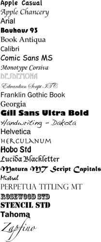
Figure 1.12 Some Sample Fonts
COLOR
COLOR THEORY
We can't think about color without a basic understanding of color theory. In the 1600s, Sir Isaac Newton was the first to prove that color comes from light, not objects, and that light can be refracted and reflected. From this developed two systems of light theory: additive and subtractive. The additive (refractive) system mixes or “adds” light waves to form colored light, and the “addition” of all light waves creates white light. The subtractive (reflected) system reflects the light waves that form the color of an object, and the object absorbs or “subtracts” the light waves that don't form the color of an object. The absorption of all light waves creates a black object, whereas the reflection of all light waves creates a white object. This is why it is a bad idea to own a black car and live in the Southeastern United States like I do. During the summer, the black car is extremely hot, because it is absorbing all of the light from the sun.
COLOR WHEEL
Before we discuss color harmony, we need to understand the color wheel. Color theory tells us that the primary colors for the subtractive system are RYB or red, yellow, and blue. The primary colors for the additive system are RGB or red, green, and blue. The definition of a primary color is a color that cannot be mixed from other colors. From these primary colors, we can theoretically mix every other color that exists. I have emphasized the word theoretically because mixing color with the subtractive system is not an exact science. There are many variables that can change the look of the resulting mixture, such as the type and quality of the pigment or paper. CMYK or cyan, magenta, yellow, and black is a second subtractive color model that was developed and perfected in the 19th century for printing, using the color separation process, when it was discovered through experiments that cyan, magenta, and yellow were the true subtractive primaries, not RYB. As a painter myself, I came to the realization several years ago that red and blue are not true reflective primaries, because red and blue can indeed be mixed from other combinations of colors, whereas cyan and magenta cannot. I can't help but make a comment here on how you cannot always believe what you were taught in school. After all, at some point in history, children were also taught that the world was flat.
If one says “red”—the name of color—and there are fifty people listening, it can be expected that there will be fifty reds in their minds. And one can be sure that all these reds will be very different.
Josef Albers
The K in CMYK actually stands for “Key” and not black. The key plate was the first plate to be printed, and it was the black plate. Black ink was added into the printing process because of the limitations and expense of the colored inks. Mixing all three colors didn't really create black, but rather, more of a muddy brown, and was expensive to mix. Black ink provided a less-expensive solution that created darker blacks in the final print.
By mixing the primary colors together, we obtain the secondary colors. By mixing the secondary colors, we get tertiary colors. Table 1.1 lists the primary, secondary, and tertiary colors of all three color systems, RYB, CMYK, and RGB. Figure 1.13 shows the primary, secondary, and tertiary colors of all three color systems as they exist on a color wheel.
Table 1.1 Color Chart
| Subtractive | Subtractive | Additive | |
| Traditional Reflective | True Reflective | Refractive | |
| Primary Colors | Red, Yellow, Blue | Cyan, Magenta, Yellow | Red, Green, Blue |
| Secondary Colors | Violet, Orange, Green | Blue, Red, Green | Yellow, Cyan, Magenta |
| Tertiary Colors | Red-Orange, | Cyan-Blue, | Orange, |
| Yellow-Orange, | Blue-Magenta, | Yellow-Green, | |
| Yellow-Green, | Red-Magenta, | Cyan-Green, | |
| Blue-Green, | Orange, | Cyan-Blue, | |
| Blue-Violet, | Yellow-Green, | Blue-Magenta, | |
| Red-Violet | Cyan-Green | Red-Magenta |
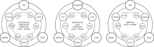
Figure 1.13 Subtractive and Additive Color Wheels
It is important to understand both the subtractive and the additive systems and realize that the color of red light looks differently if it is refracted or reflected. Why is this important? Because what you see on your computer monitor will probably not look the same once it is printed, and colors vary from monitor to monitor. The printed image is usually darker due to the quality of the inks or pigments and that of the paper, and because of the gamut range of a printed image is more limited than that of a computer monitor. The word gamut here refers to the complete range of intensity or subset of the color system when it is reproduced or output. As you are designing for pieces of your portfolio that will be viewed on both reflected (print) and refracted (computer monitor) systems, you must keep this information in front of your mind as you design. It's also a great idea to test print as you go so that you can make adjustments. You must also remember to work in CMYK for designing the print aspects of your package, or at the very least, convert the image from RGB to CMYK before sending it to the printer. You will notice that some of the colors become less intense on the monitor when switching from RGB to CMYK.
Colors are perceived differently by different people and are subject to change based on many circumstances:
■Reflected colors are affected by different light sources. For example, the same object will look differently inside, under fluorescent lighting, and outside, in sunlight. If the object is in sunlight, the time of day and conditions of the weather also affect the color perception of the object. Figure 1.14 shows both flourescent and incandescent lighting on the same bowl of oranges. A color version of this image can be found on www.reelsuccess.com
■Object colors are also affected by their surroundings. An object can be affected by light that has bounced off of other objects nearby. If a color is surrounded by another color, it is also perceived differently,
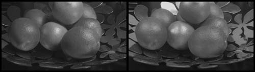
Figure 1.14 Reflected Colors Affected by Different Light Sources
as shown in Figure 1.15. A color version of this image can be found on www.reelsuccess.com. The exact same color, when surrounded by different adjacent colors, appears to have different values when compared visually side by side as it “interacts” with other colors.
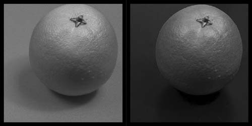
Figure 1.15 Object Color Affected by Bounce Light
■Refractive light, such as in the computer monitor or television, must be calibrated using a colorimeter for accuracy. If they are not, then the colors will differ from screen to screen. Calibrating a monitor will also give you a closer screen-to-print similarity.
ATTRIBUTES OF COLOR
Regardless of which color primary wheel you are working with, there are some basic facts and vocabulary that need to be remembered when working with color:
Hue is simply the name of the color: magenta, red, yellow, green, cyan, blue
Saturation | Chroma | Intensity are three words that synonymously refer to the pureness or brightness of a color. The use of bright, vivid, saturated colors draws attention and creates emphasis when paired with duller, less-saturated color.
Value is the lightness or darkness of the color. In order to create a focal point in your design, using highly contrasting colors (placing dark values next to light values) will cause the lighter values to leap forward visually. The lighter color can be used as an accent color in order to draw attention and create emphasis.
There is usually some confusion between saturation and value. How does lightness differ from brightness? Pure color equals brightest saturation. By adding white or black to a color, the value is changed, and at the same time the saturation becomes duller. By adding the same value gray, or the same value complimentary color, you would lose saturation without losing value. The color would then become less bright but not less dark. This means if both the pure color and the mixed color were converted to gray scale, they would be the same gray.
The following are color options available inside graphics software:
HSB in Photoshop or any other graphics software stands for hue, saturation, and brightness where hue is the color, and here, saturation is how much white is added to the color, and brightness is how much black is added. HSB is used to select a color, as well as RGB and CMYK options. The color # can be used to recreate that color in other software, such as recreating a color between Photoshop and Dreamweaver. The RGB values can also be used to recreate that color in other software, such as recreating a color between Photoshop and Maya. This sometimes requires changing the RGB scale from 0–1 to 0–255. Figure 1.16 shows the different HSB windows available in Photoshop. A color version of this image can be found on www.reelsuccess.com
HSL stands for hue, saturation, and lightness where hue is the color, saturation is how pure that color is in a range between pure color and removal of all color (which will give you a gray based on that color's value), and lightness is how much white or black is added in the value range. HSL is used to adjust the colors of an existing image. Figure 1.17 shows
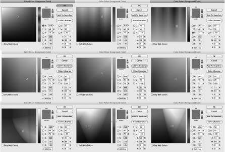
Figure 1.16 HSB Windows in Photoshop
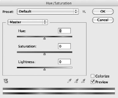
Figure 1.17 The HSL Window in Photoshop
the HSL window in Photoshop. A color version of this image can be found on www.reelsuccess.com
PSYCHOLOGICAL EFFECTS OF COLOR
Color has psychological effects on us that are very real. There have been studies done to show that certain colors affect people in predictable ways. For example, in 1979, Alexander G. Schauss, PhD, experimented with the use of the color pink and its effect on mood and behavior. After experimenting with various shades of pink, he found that a certain shade of pink (which he called Baker-Miller Pink, as seen in Figure 1.18. A color version of this image can be found on www.reelsuccess.com) decreased aggression approximately 30 minutes after the participants stared at the color for about 15 minutes. This color pink was utilized at Iowa State University in the 1970s as football coach Hayden Fry had the visiting team's locker room painted pink in an attempt to relax the players before heading onto the field. It has remained pink ever since. Color can also have physiological effects on humans. For example, red actually raises blood pressure and heart rate. This is why it is associated with both danger and love.
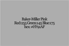
Figure 1.18 Baker-Miller Pink RGB Values and Its Hexadecimal Color Code
Warm Versus Cool
We consider half of the color wheel to be “warm” and the other half to be “cool.” Psychologically, we associate warmer colors with the heat of the day and cooler colors with coolness of the night. Magentas, reds, yellows, and oranges can actually physically “feel” warmer, whereas cyans, blues, greens, and purples “feel” cooler. Studies have actually proven that by painting a room “warm” or “cool” can affect the occupants inside that room accordingly.
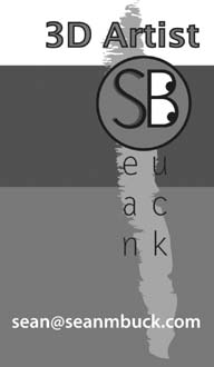
Figure 1.19 Warm Versus Cool Colors
Warm colors advance, and cool colors recede. High-contrast bright colors advance, and darker colors recede as well. By using this knowledge, you can use an accent color to “pop” a logo from the background or create emphasis and focus. An example business card, by Sean Buck using the warm and cool colors can be seen in Figure 1.19. A color version of this image can be found on www.reelsuccess.com
The Meaning of Color in Advertising
Don't forget that colors have meaning, and the meaning differs from culture to culture. You can use these meanings to help sell yourself, just as companies have been using marketing schemes that utilize this concept in their advertisements and brands. All colors have both positive and negative meanings attached to them.
Some common color associations:
Yellow: cowardly, sunny, cheerful, eye-catching
Orange: hot, playful, happy, childlike
Red: passionate, dangerous, excitement
Purple: contemplative, sensual, spiritual, regal, mystical
Blue: honest, dependable, sad, calm, tranquil
Green: new, earth-friendly, little experience, associations with money and prestige, nature, fresh
White: pure, clean, sterile, innocent
Grey: depressing, timeless, sophisticated, classic
Black: elegant, magical, mysterious
Brown: earthy, secure, rich
Following is a list of idioms and their meanings that are used in American culture, and from what I have found, many of them also hold true in other cultures as well.
COLOR SCHEMES
You are advertising yourself and your work. Use color wisely. One rule of thumb is to create a limited palate and work only from those chosen colors and their range of values. Perhaps choose two or three colors, with one being an accent. Too many colors can be overwhelming and distract the viewer from the overall impact of your design. Here is where an understanding of color harmony and color schemes can be useful.
Colors must fit together as pieces in a puzzle or cogs in a wheel.
Hans Hofmann
Color harmony is simply the ability to choose colors that work well together. By sticking to the tried and true color schemes below, you can achieve color harmony successfully. You can also choose colors that don't work well together to create what is called color discord. Usually, this leaves the viewer with an unsettled feeling. It is risky to utilize clashing colors because of the message that can be visually perceived. This may backfire as you represent yourself as either someone who likes to “ruffle feathers” or as someone who does not know how to work with colors. Always keep in mind what your intention is for the viewer. Be mindful of every design choice. Figure 1.20 shows the following color harmonies, using red as a base color.
Monochromatic color schemes use only one color, or hue, and can include the changes in value by adding white or black.
Analogous color schemes use hues that are next to each other on a color wheel and can also include value changes.
Complementary color schemes use two colors that are located opposite to each other on the color wheel.
Split complementary color schemes use three colors; one color plus the two colors that lie adjacent to its complementary color.
Triadic color schemes use three colors that are equally spaced on a color wheel. The primary colors are an example of a triadic color scheme.
If you're not good with color, stick with something that already works. Choose one of your best pieces and pull the colors from there. What if your work doesn't involve the use of color (you are a rigger perhaps)? Find one of your favorite paintings by your favorite artist and choose colors that come out of that work. Find your favorite shirt or fabric and use the colors that you find there. Look around. Color is everywhere. Think about the colors used in the products you consume on a daily basis, the restaurants and stores you frequently visit, and the packaging of the items you purchase. Look at the color schemes in nature. Limit yourself to two or three colors. Be very careful when choosing colors for fonts. Color and value can sometimes make the font more difficult to read.
Color can overwhelm. … one must understand that when it comes to color, “less” is often “more”-lesson taught us by the masters but ignored by many artists.
Joe Singer
Adobe has this great website and mobile app that will help you generate color themes. There are also existing themes that you can browse through (http://kuler.adobe.com/).
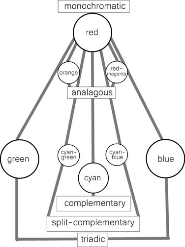
Figure 1.20 Color Harmonies Where Red Is the Base Color
If you want to learn more about color theory, there are several sources listed at the end of this chapter. As this book is in black and white, color examples can be found on the companion website at www.reelsuccess.com.
COMPOSITION OF DESIGN
The Merriam-Webster dictionary defines composition as the act or process of composing; specifically arrangement into specific proportion or relation and especially into artistic form. Composition of design is a thoughtful process. You want to be able to catch someone's eye and deliver a message in an esthetically intriguing or pleasing way. In self-promotion, the message you are delivering is you.
Composition is the art of arranging in a decorative manner the various elements which the painter uses to express his sentiments. In a picture every separate part will be visible and … everything which has no utility in the picture is for that reason harmful.
Henri Matisse
Form and function are important for design. Be cautious not to spend all your time making your design beautiful and artistically intriguing that you forget the reason it needs to be useful. You want people to contact you. Don't make them work to find your contact information. Make this information easy to find. While this seems like perfect common sense, I can assure you that many nondesigners and designers alike forget to put function in the forefront of their design. When designing, do not forget about the minimalistic approach. Too much clutter confuses the viewer and makes information hard to find. It is perfectly fine to use white space as a way to cause the viewer to focus on what is important.
When you begin designing any composition, begin by drawing thumbnails of as many ideas as possible. Never settle for your first idea. Research what other designers have done. Once you have several ideas, take each idea and develop about 10 different variations.
The following are some universal compositional rules that should be implemented to ensure a strong design. Utilize at least one of these rules when composing your design.
Before you compose your picture it's a good idea to ask yourself why you're doing it.
Anonymous
THE GOLDEN MEAN
Pythagoras was the father of math and music. He observed certain patterns and numbers reoccurring in nature. Pythagoras believed that beauty was associated with the ratio of small integers. He discovered that the pentagram diagonals, when cut apart into sections, created the proportions of the Golden Section when two sections were combined together (one section plus then next larger section) as seen in Figure 1.21. The Golden Section had the Golden Ratio of 1:1.6180339887…
Composing a picture, do many thumbnails, rejecting the obvious ones.
Irwin Greenberg
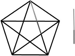
Figure 1.21 The Golden Section Derived from a Pentagon
Inside the pentagram were also the proportions of the Golden Rectangle, which is created by opening the sides of the hidden triangular shape of the pentagram, as seen in Figure 1.22.
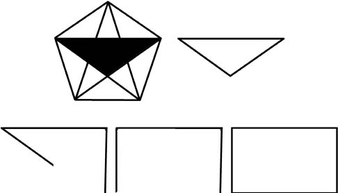
Figure 1.22 The Golden Rectangle
The Golden Rectangle can mathematically reproduce itself indefinitely by dividing the rectangle using the Golden Section proportions into both an internal square and another Golden Rectangle, as seen in Figure 1.23.
Drawing a quarter circle in each square of the segmented Golden Rectangle forms a Golden Spiral, as seen in Figure 1.24.
The Golden Section, Golden Rectangle, and Golden Spiral can be found throughout nature. The Greeks considered the Golden Rectangle as the mathematical basis for beauty and architecture. The Golden Rectangle is a universal rule used in design and art because the proportions are pleasing to the eye.
You can find a downloadable Golden Rectangle and Golden Spiral overlay to use when designing on www.reelsuccess.com.
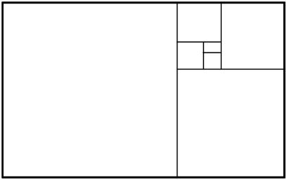
Figure 1.23 The Golden Rectangle with Internal Divisions
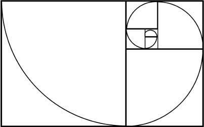
Figure 1.24 The Golden Spiral Inside the Golden Rectangle
THE RULE OF THIRDS
The rule of thirds is a compositional guideline that can be considered as a simplified version of the Golden Rectangle, as seen in Figure 1.25. The major difference is that this rule can be used on any proportioned composition, whether it is a rectangle, square, circle, and so forth. The rule of thirds states that dividing a composition into nine equal parts using two equally spaced horizontal and vertical lines can create a visual interesting composition by placing important compositional elements along these lines or at the point of their intersection.
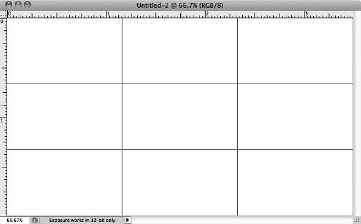
Figure 1.25 Rule of Thirds Grid for Business Card Dimensions
For overlaying a rule of thirds grid automatically for all work in Photoshop, all that needs to be done is to set the grid preferences and view the resulting grid. To set grid preferences on a mac, as seen in Figure 1.26:
1. From the Photoshop menu, select Preferences, then Guides, Grids, and Slices.
2. In the Preferences dialogue box, set the Grid Line to 33.33 percent and the subdivisions to 1.
3. You can also choose a more prominent color, like red, instead of gray.
4. Click OK.
5. From the View menu, select Show>Grid.
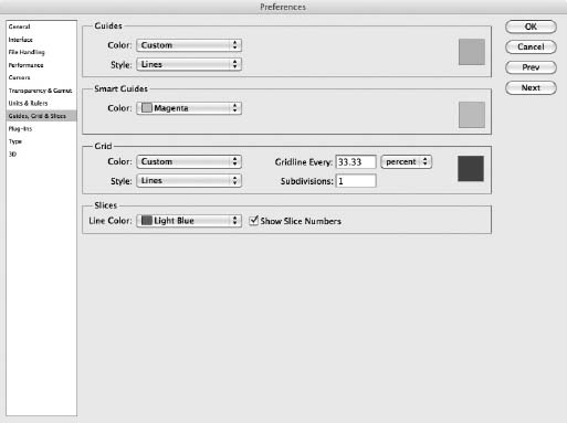
Figure 1.26 Photoshop Dialogue Box
GEOMETRICAL SHAPES
Geometrical shapes can also be used to create unified compositions and can help create movement by directing the viewer's eye across the surface. Important elements can be placed in a composition to create diagonals, S-curves, circles, and triangles. The triangular composition is probably the most recognized and used throughout art and design history.
PERSONAL PROMOTION
You must become your own personal promoter, unless you have the money to hire a professional artist representative. Hiring a representative will free up your time as a creative. An artist rep is different from an agent. Although agent representation is more common for writers and storytellers, other creative types will have a much more difficult time finding an agent, who helps their clients look for work and negotiate contracts.
A professional artist representative is someone who can help you get noticed. There are several agencies out there that are geared toward specific areas of art, such as illustration. Some of these agencies will help represent animation creatives. They usually have a website that lists the talent and the portfolios of the artists that they represent. The benefit of using a representative is networking. Their website becomes a “one stop shopping” location for anyone looking for artists. Chapter 7 goes into much more detail about the benefits and “how to's” of networking.
But really, the best thing you can do is become your own promoter or team up with a few friends and work together by promoting one another. So, once you have your professional package together, be sure to read through Chapter 7 and see how to get your name out there.
Recommended Reading List
Design Workshop by Robin Williams
Type Rules! by llene Strizver
Graphically Speaking by Lisa Buchannan
Design Basics by David Lauer and Stephen Pentack
Pantone Guide to Communicating with Color by Leatrice Eiseman
Interaction of Color by Josef Albers
Adobe Type Library Reference Book by Adobe Systems, Inc.
BASIC DESIGN RULES
DO's AND DON'ts
■ Direct the eye, don't over clutter your design.
■ Be aware of space. Look at the negative space.
■ Don't place images or text too close to the edges of anything.
■ You may conscientiously overlap objects, but if overlapping text, be sure that the text is still readable.
■ Don't choose colors or fonts that make reading difficult.
■ Colors that are too close in value are difficult to read when placed on top of each other.
■ Use no more than two or three different fonts.
■ Limit your colors to two or three.
■ Make sure that everything is legible.
■ Make sure that the design is functional. Will people know who you are and how to contact you?
ACTION LIST
BRAINSTORMING
■ Define who you are or how you want to present yourself using adjectives.
■ Choose two or three of your best pieces.
■ Create a list of objects that represent who you are.
■ Identify two or three of your favorite artists.
Establish your favorite two or three art movements.
■ Identify five or ten fonts that strike your interest.
■ Choose a color theme. Begin with your favorite colors.
CREATING
■ Collect images of different textures or patterns that reflect your interests.
■ Collect 30–50 images that reflect your choices of adjectives, objects, artists, art movements, and colors. This can include images you have already collected, like your artwork.
■ Design a logo or develop your identity: a theme or “look.”
■ Draw 30 thumbnails of different ideas. Start with the first ideas that come to mind. Try to come up with five completely different ideas. From these ideas, develop each one in six different ways. Our creative brains do amazing things when pushed to the limit, so do not settle for the first idea that pops into your head. Thoroughly explore various options.
■ From the thumbnails, narrow the ideas down to two or three. The layout process can begin once you have decided on a logo or look, or have narrowed it down to a couple of ideas. If designing a logo, remember that a good logo should be easily recognizable, and it should be easy to recognize on both a business card or a billboard.
NOTE
1 This word bank is from a book entitled Graphically Speaking by Lisa Buchanan, with my additions.