6
Big Beasts
If the interior design world was small in the 1950s, 1960s and 1970s, it had its own Big Bang in the early 1980s. With a series of seminal projects five individuals created templates that caused sensations and set standards. Those individuals were Ben Kelly, Eva Jiřičná, John Pawson, and David Connor and Julian Powell-Tuck, who are paired because they began by working together (although each evolved in distinctly different directions). They were the ‘big beasts’, and between them they created the profession’s DNA.
Versions of their particular languages have lodged, whether at one or more removes, in the imaginations of the practitioners who have followed them. None of those heirs speak the languages in quite the same way, but the best of them have evolved their own dialects in which hybrid traces of the originals are recognisable.
 Powell-Tuck, connor, and friends
The flat for Adam Ant began the renaissance. In the beginning of their collaboration, it was the Connor-led projects that established the Powell-Tuck & Connor practice profile, but Pierre d’Avoine, who briefly shared their office, remembers being intrigued by their collaborative ‘brain storming’1 and drawing, which was different from his own architectural methodology in which ideas evolved in plan and section. They were more ‘sketchy and three-dimensional’.2
Powell-Tuck and Connor were both from Birmingham but met as students at Casson’s RCA. The course, which still had aspirations to architectural respectability, had been rebranded ‘Environmental Design’ to avoid conflict with the RIBA and ARCUK, who would take unkindly to its using the words ‘architect’ or ‘architecture’. Although half the students came from interior courses the teaching was increasingly architecturally biased and the department was jockeying for RIBA recognition. Powell-Tuck and Connor graduated in 1976 and Powell-Tuck won the college’s drawing prize, although John Millar, who had succeeded Casson as course leader, and Derek Walker, the external examiner, both disliked the drawings – Powell-Tuck thinks he was fortunate to pass. He remembers it as a time when everyone was experimenting through drawing. Millar told him he was unemployable and, consequently, he was particularly pleased to be offered a few small projects on graduation. That he was among the first group of students to be offered the option to complete the course in two rather than three years may suggest either that his talent was appreciated, or that Millar wanted rid of him.
Powell-Tuck’s background was middle class; his father was a doctor and he had gone to public school. On paper he might have seemed set for an architectural career but he found architecture in the 1970s ‘a bit dull’3 and perceived architects to be ‘grand, pompous and corrupt’,4 bribing local government officials to get work; playing with clients on golf courses and in squash courts. Interior design offered a way to ‘keep options open’.5 He went to art school in Brighton. Coming from a landlocked city he was attracted to the seaside town and did not feel ready to tackle fashionable London. He was unexcited by the interior course but stimulated by events and people beyond the department; installations and performances suggested interesting possibilities for interiors. Without any particularly good reason he then went to the RCA.
He thought ‘Environmental Design’ a good title; it ‘allowed’ everything to happen, from interiors to landscape design.6 It brought together people interested in the built environment within a multidisciplinary institution. He appreciated the eclectic set of tutors and the robust critique sessions. He is another who fondly remembers Sir Hugh Casson taking part in project reviews, ‘charming and benign’, dispensing anecdotes and positivity.7 He considers that, until the 1980s, interiors had been an ‘expression of fashion…architecture à la mode’.8 He believes that it then became ‘expressionistic’,9 and that the flat for Adam Ant marks this shift. He thinks his own magnum opus, the Metropolis recording studio in Chiswick in West London, was ‘more serious in many ways’. He considers that interiors ‘express a piece of social action’; that, whatever a designer may say, the interior is ‘to do with a set of circumstances’, and that, as a designer, ‘you only have a moment in time you can lock into – then you’re an old fart’.10
Connor’s background was less mainstream. His parents were ‘left-wing’ and, in the alternative spirit of the 1960s, his father, a PPE graduate from Oxford, ran outreach courses in Birmingham and chose to live in an insalubrious quarter of the city. Connor remembers being confronted with a complexity of bespoke silverware when, at the RCA, Sir Hugh took him to lunch in the senior common room. He does not know why he got the invitation; possibly Casson recognised someone amiable and amusing like himself. But if his parents’ political and social predilections had consigned him to the local comprehensive school and left him unfamiliar with the better class of table dressing, his upbringing in an academic household was rarefied. While Powell-Tuck was dealing with his modest postgraduation commissions, Connor worked for John Stefanidis, a society decorator. Powell-Tuck joined him there briefly before they decided to set up their own practice.
Connor had also worked on the implementation of Malcolm McLaren’s ideas for the punk boutique Seditionaries. In 1972 the premises at 430 King’s Road that had previously been Hung On You and briefly Mr Freedom was taken over by Malcolm McLaren, his girlfriend Vivienne Westwood, and Patrick Casey, a friend from one of the several art schools McLaren attended. They renamed the shop Let It Rock and sold clothes to extant Teddy boys. It was successful but the customers were troublesome. In 1973 they changed the name to Too Fast to Live Too Young to Die but, after a visit to New York and a meeting with the proto punk band New York Dolls, McLaren and Westwood returned to London and renamed the shop again. It became SEX and began to specialise in fetish wear. After unsuccessful attempts to promote the Dolls in Britain, McLaren concocted the Sex Pistols in 1975, comprising three SEX customers and one of the shop assistants. In 1977 McLaren decided that the shop would be reincarnated yet again as Seditionaries. He invited Ben Kelly to design it, but Kelly turned the job down because he thought McLaren had already made the conceptual decisions and he was already committed to visiting New York. He recommended Connor who, he thought, would be better able to give McLaren what he wanted.
Connor’s contribution was enough to convince both McLaren and Westwood that he was equipped to change the façade when they revamped and renamed the shop again in 1980. It became World’s End, which was also the name of that particular section of the King’s Road. It then catered for the New Romantics, who had attracted McLaren’s post-punk entrepreneurial attentions. Connor’s façade evoked a multi-paned, 18th or 19th century bow-fronted shop window, crowned by a panel of vertically hung slates. In the centre was a large clock, the hands of which raced backwards. It was a quaint anachronism squeezed beneath two floors of what had been a very ordinary Victorian terraced house. If it belonged to any particular genre it was one that also included the Adam Ant flat: gently allusive but fundamentally iconoclastic. Two-dimensional drawings of the façade were, unusually, coloured but still steadfastly freehand.

World’s End as built.
The hands of the clock turned backwards rapidly.
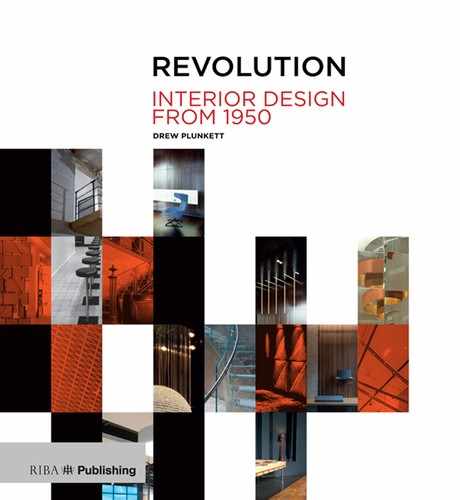
The Adam Ant flat could have been seen as a decoration project. With Stefanidis, Connor had learnt some of the techniques and made some of the connections that would enable him to work outside the familiar territories of the RCA-trained graduate. He made no structural alterations but blurred the distinctions between rooms by having all the walls and furniture finished in faux marble by David Campion, a specialist painter. The deceit (or conceit) was acknowledged in the kitchen, where the build-up of paint in the marbling process was progressively revealed, each regression bringing a simplification of the patterning before ending on the flat grey base coat.
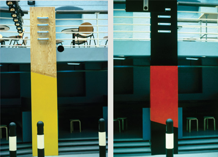
The furniture and fittings made even clearer the project’s evocative intent. Curtains, grey to tone with the marble, were so long that they crept across the floor and were padded to exaggerate their folds. Winged armchairs and a sofa were over-stuffed and draped with a cloth specially printed in classical motifs. An empty marbled mirror frame rested on the mantelpiece. Wooden poles – metaphorical ‘measuring sticks’ that Powell-Tuck had introduced into his RCA projects – were painted white, red, or blue and leant against the wall or lay on the floor. They could be rearranged for ‘the creation of set pieces’. Powell-Tuck says that Adam Ant saw the flat as ‘a little shrine to express New Romanticism’; that it was ‘expressionistic’.
Adam Ant flat, as before. The marbling ends in the kitchen: successive stages in the production of the faux marble are exposed until the flat base coat is revealed.
Writing about the Powell-Tuck & Connor practice in the interior supplement of the RIBA Journal in 1985, Godfrey Golzen described the flat as their ‘big breakthrough’ and summed it up as, ‘The faintly bizarre but arresting and influential melange of soft-edge drapery and hard-edged geometrical furniture’.11 It was, indisputably, theatrical; a deserted room in which Miss Havisham, Dickens’s fictional jilted bride, might have sat, desolate and hopeless, in her faded, fraying wedding dress. It was a space that clients, unburdened by concerns about violating Modernist orthodoxies, could respond to more intuitively than architects or established designers.
The publication of the photographs in the Architectural Review, and shortly after in the newly launched Interiors magazine, caused a sensation, giving shape to something dormant in the collective imagination of interior design students and young practitioners. That a project so patently outrageous had not only been conceived but translated into a viable interior suggested that there were extraordinary things to be done, and that the extraordinary could become mainstream. Such an awakening was brought about with surprisingly modest means – Powell-Tuck and Connor, operating frugally, were unable to afford specialist interior photographers. Connor took the photographs himself and explains that a pink tint at the top of the curtains in a frequently published image was due to his inadequate camera. One must wonder if the accidental flash of colour did not add crucially to the impact of the image.
The project offered an iconoclastic alternative to Benson and Forsyth’s cautiously tasteful, overly familiar flowing white spaces. It flagrantly enjoyed the possibilities inherent in the reworking of the familiar. Powell-Tuck and Connor said they were interested in the creation of rooms rather than amorphous spaces.
The Pirroni entrance hall.
The Ant flat was too intense and labour-intensive to spawn many direct imitations, but the few enthusiasts who could afford it commissioned specialist painters to eliminate their own white walls. The idea of breaking up flat colour planes caught on among both designers and householders. Mottled walls became commonplace in fashionable quarters and were an economic way of upgrading retail and hospitality interiors. ‘Rag rolling’ marked the temporary end of wallpaper.
The text explaining the full battery of paint texture techniques was to hand. In 1981 Jocasta Innes had published Paint Magic, demonstrating transformative effects that could be achieved by inexperienced professionals and determined amateurs. Draping furniture had equally enthusiastic emulators. And in 1986 Dulux announced the launch of its Colour Dimensions range, which offered hundreds of paint options mixed to order.
Connor, became ambivalent about the Ant project, which he thought a little too retrospective. It may also have been that the New Romantics lacked punk’s grittiness; Connor was intrigued by punk, without over-committing to its dress code. Adam Ant’s exoticism was, as Peter York said, a bit ‘panto’.
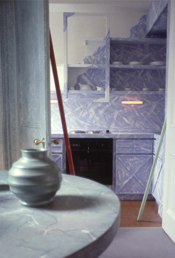
Connor preferred a project that had allowed him to rework the Ant elements in a decidedly more anarchic fashion. It was a flat for Marco Pirroni, then Adam Ant’s lead guitarist and co-songwriter, a well-established musician with a punk pedigree and described by Robert Elms as ‘stout, not so good looking [as Billy Idol and Adam Ant] but seriously clothes obsessed’.12 He had been an habitué of McLaren’s and Westwood’s boutiques and so was aware of Connor’s work.
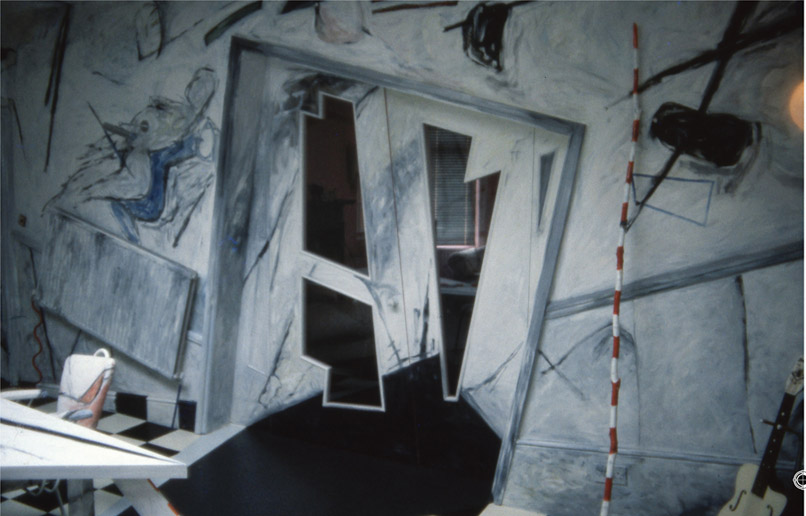
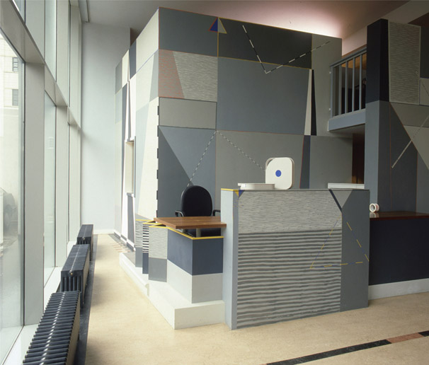
While Connor’s chronically expressionistic entrance hall received all the publicity, the other rooms, which were white and calm, were Powell-Tuck’s. He was interested in ‘order’. As in the Ant flat the entrance’s walls and furniture shared a finish but this time, in place of precisely executed marbling, they were daubed with deliberate slashes of paint, applied by Madeleine Palme. The distorted perspectives of the drawings were realised: conventional rectangular doors and frames were twisted out of shape, tops of skirtings were angled, wall-mounted radiators were hung askew, a table was aggressively triangular with a streaked paint pattern on its top. Connor insisted that the rather retro 1950s-style chairs should be upholstered‘in what he called “dog-fur”’, which was also spattered with paint.
Pirroni flat: An angled radiator.
The completion of the project in 1985 may have exorcised Connor’s appetite for the anarchic (or it may have convinced clients that they did not want to follow him down that particular route). It is likely that he is genetically predisposed not to repeat himself. The only aspect of his work that remained constant was the way he made drawings. While they remained emphatically his, the buildings that resulted were diverse enough to defy easy attribution. Powell-Tuck suspects that Connor was absorbing too much of the ethos of the Architectural Association while Powell-Tuck remained truer to the spirit of the RCA.
Whatever his prevailing influence Connor continued his uninhibited conceptual drawings and they were to be crucial in creating a small studio building in Los Angeles, Villa Zapu, an enormous country house in Napa Valley completed in 1988, and the tapering tower that contained Anish Kapoor’s installation at the 1992 Seville Expo. Thomas Lundstrom, his client for Villa Zapu, observed that the drawings, seemingly so self-indulgent, were in fact astonishingly close both dimensionally and proportionally to the completed building. In a video about the project Lundstrom also talks of his concern at the slow progress of both design and build but concedes that the success of the project owes a great deal to Connor’s thoroughness, his determination to work with the site, and to fine-tune detail. He sees Connor as a ‘theatrical’ designer.13
Powell-Tuck and Connor had a number of professional liaisons. They had been keen to bring Ben Kelly into the partnership but he preferred to continue on his own. They were more successful with contemporaries who had an architectural qualification and who could provide registered architects’ signatures when required. The first to appear on the letterhead was Pierre d’Avoine, who had been born in Bombay to a French-Indian father who was an architect for important sports stadia, and an Irish mother. He had known Connor when both were students in Birmingham, and later rented him and a crowd of creative others rooms in a house he owned in West London. The others included jewellers from the RCA, and Stuart Goddard, who transmogrified into Adam Ant.
Disillusioned after working for both small and large architectural practices, d’Avoine had decided to set up his own, and rented space in Powell-Tuck and Connor’s studio. He and Powell-Tuck collaborated on an interior for Research Recordings, a video editing company. D’Avoine introduced the textile designer Sally Greaves-Lord to the practice and she furthered their interest in decorative paintwork. When working alone she produced large, one-off textile pieces by painting directly on to silk. Her patterns were geometric and precise, using masking tape to make clean straight lines and applying her paint in flat blocks so that pattern and colour would transfer easily. For interior commissions she worked in situ, painting directly on to plastered surfaces.
Research Recordings.
The reception desk, with wall and floor patterns by Sally Greaves-Lord.
She completed two projects for the practice. The first was the Research Recordings offices: working with d’Avoine and Powell-Tuck, she painted walls in public areas and created patterns for the linoleum floor after developing ideas on scale models. She also designed the upholstery fabric for an Arts and Crafts-esque reception chair designed by Powell-Tuck.
Greaves-Lord was to be influential in interiors throughout the 1980s. She worked with David Chipperfield and Kenneth Armstrong during the brief partnership they formed to design the first Issey Miyake shop in London. Her profile was high and she agreed to join them on the condition that the work was credited to ‘Armstrong Chipperfield in association with Sally Greaves-Lord’, but she never received equal billing. While her physical contribution was painting the changing rooms in strong blues, in contrast to the monotonic white of the shop itself, she also made the presentation drawings in gouache. Her ambiguous forms and gentle colour palette convinced the client, who wanted subtle understatement. When the shop was finished she was asked to become creative director for Miyake’s London shops, a position she held from 1985 to 1991. Miyake wanted something special for the large windows of the shop and throughout 1986 Greaves-Lord created a series of installations herself but, as the number of shops grew, she commissioned animators, printmakers, sculptors, and photographers, and orchestrated experiments by three different designers working in three different locations each month. She continued to work on interiors, collaborating with, among others, Armstrong Associates, Sue Minter, and Nick Coombe, with whom she also shared a studio.
D’Avoine preferred to work alone and felt that he would not fit comfortably with either of Powell-Tuck’s and Connor’s contrasting personalities. He went on to specialise in residential design, but has produced some important interiors. His shop for the fashion designer Michiko Koshino was described by the journalist Jonathan Glancey as the first Minimalist shop in London. D’Avoine does not agree; it is an architect’s interior and, like all architects, he dislikes the implication that he might be drawn to the fashionable and the ephemeral. In fact, the shop did not last long, which frustrated his architect’s craving for permanence. When he went on to design a chain of shops in Japan for Koshino, he evolved a kit of parts that could be configured and dressed according to the needs of the site and the prevailing fashion.

Research Recordings: entrance area, chairs by Julian Powell-Tuck, upholstery fabric and wall painting by Sally Greaves-Lord.
In 1982 Powell-Tuck and Connor joined forces with Gunnar Orefelt, a Swede who had trained as an architect in Stockholm and at the Architectural Association in London. The trio were interviewed by Godfrey Golzen for the RIBA Journal’s interior section in December 1985, in an article headed ‘Doing What Architects Used To Do’.14 The title was taken from Powell-Tuck’s statement that, ‘We always try to persuade our clients to let us design everything – the interior, the furniture, even the rugs on the floor. In fact we do what architects used to do up until the 1940s.’15
Powell-Tuck, the more serious of the two founders, said, ‘Good architecture is a labour of love. In other words it’s uneconomic on its own’,16 and went on to describe the other income-generating strings to their bow: a cafe near their studio, and furniture and lighting design. They discussed changing their status from a partnership to a limited company to avoid personal liabilities, and described their management style, which was rather cavalier given that the practice was thirteen-strong.
Golzen suggested that their ‘Critical and popular success might give heart to architects who feel uneasy with the tough-minded views of those who regard architecture as just another service industry’.17 That they were offered as exemplars, even though their reputation was based on only a few modest projects that exploited familiar decorative techniques, reflected the burgeoning excitement surrounding interior design.
Only at the end of the article did Golzen reveal that Orefelt had qualified in Sweden and that neither Powell-Tuck nor Connor had trained as architects. However, the RCA course was focused on getting Part Two recognition from the RIBA for its architectural component and all students were increasingly working on larger-scaled architectural projects. Like Powell-Tuck and Connor, graduates from interior design courses tended to think of themselves as architects in all but the label, which was forbidden to them by law.

Metropolis.
The stair in the double-height entrance space.
The curriculum, although saturated in architectural theory, was criticised for its slim provision of technical teaching, but Powell-Tuck defended it with a variation of the course’s standard response to this criticism: ‘There’s a lot you learn as you go along…what really matters is learning to design.’ The course certainly gave its graduates the confidence, or the arrogance, to assume they could clear practical hurdles and deliver a project driven by aesthetic ambition rather than tectonics. The RCA perhaps had its architectural aspirations vindicated by its success in a 1981 student competition organised by the RIBA, ‘Building For a Corner Site’. Four out of 14 commended projects and one of the four finalists were from the RCA course, which may have either reassured or disconcerted the RIBA.
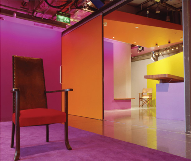
Powell-Tuck was himself to validate the course’s philosophy with his personal tour de force, the Metropolis recording studio. This, completed in 1990, was a perfect interior brief. The studio was to be housed in a lofty stone and red-brick building that had generated power for the London tram system and was much bigger than was strictly necessary for the studio’s practical needs. The client came from the music industry and his customers were successful musicians who wanted and could afford a spectacular place in which to cosset themselves during the protracted recording sessions that were becoming standard.
Powell-Tuck split the volume on its long axis, making a full-height entrance atrium lit by large, round-headed windows, and two levels of cellular spaces that contained studios, and technical and recreational areas against the ‘back’ wall. Areas such as the cafe borrowed light from the atrium. It clearly belonged to the building-within-a-building genus and became a conceptual template for many ambitious student projects.
Crucially, Powell-Tuck used the principles of acoustic design – that right angles and parallel planes should be eliminated and that surfaces should be textured or absorbent – to shape volumes and determine materials. The plans of the performance studios were irregular and, with thickened partitions, appeared on plan as organic excavations, as did the angled walls and ceilings. The material palette had architectural affiliations. The in situ concrete walls, which provided sound-deadening mass, and the convoluted steel stairs in the atrium contrasted with the unpainted plaster, plywood sheet, and linen clad padded accoustic panels of the two-storey internal elevation and the rooms behind it. All surfaces were defined by meticulous, delicate detailing. The accumulated diversity was wholly coherent.
Given the scale and complexity of construction, this was an unusual interior project – one that would more normally have been entrusted to an architect. While an architect might still have adopted the building-within-building strategy, it is doubtful whether the same richness of detail would have been generated, given architecture’s bias towards white minimalism.
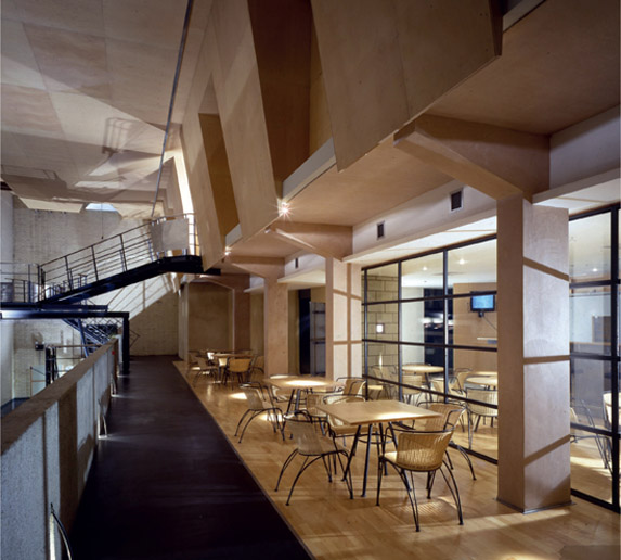
Metropolis: the mezzanine cafe, overlooking the entrance atrium.
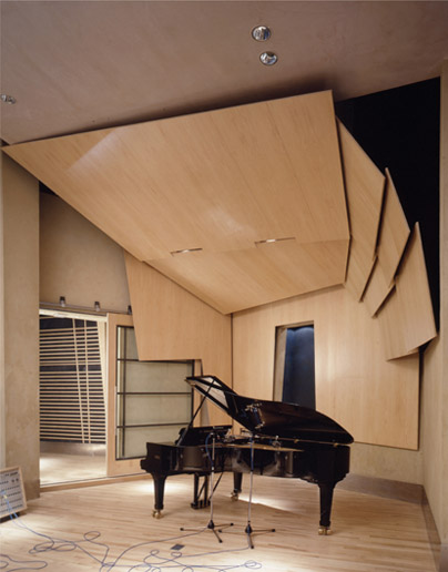
Metropolis: Plywood panels, angled to enhance accoustics complement the planes of the piano.

Metropolis: In the adjoining studio timber batterns on black accoustic panels suggest the piano’s colour and keys.
Metropolis was the last of the heroic 1980s interiors. There was some outrage in June 1989 when a showroom for the fashion designer Nicole Farhi, by the specialist retail designers Din Associates, was named best interior at the annual D&AD awards, beating Metropolis. There was further outrage when it was revealed that Rasshied Din had been on the judging panel, although he had left the room at the delicate stage of judging. The problem was that the Farhi project was extremely beautiful: a timber-floored space, punctuated by pale green painted cast-iron columns and bathed in natural daylight thanks to a long, pale green timber-framed roof light above a white painted timber folding glazed screen. Compared to Metropolis the project was calm and modest, even self-effacing in its willingness to cooperate with the existing building shell. The judges may have thought Metropolis just too architectural.
Orefelt brought a number of Swedish developer clients into the practice and with them bigger projects and financial stability. The partnership began to design and build its own projects, working in ‘backland’ sites – areas behind existing buildings that new legislation had freed for development. They had also been asked to design bars and clubs in Taiwan and established an office there, run by Mark Lintott, an experienced member of the London studio.
As the recession of 1989 intensified, they were unable to finance the bank loans on their developments and it became imperative to dissolve the partnership. There were differences of personality. According to Nick Coombe, who worked for them, Powell-Tuck was disciplined and organised and expected quiet concentration in the studio, while the exuberant and extrovert Connor preferred something closer to noisy anarchy.
Powell-Tuck considers that they made the mistake of collaborating for personal rather than professional reasons and he was obliged to take responsibility for business decisions. Over the decade their design predilections diverged but, when announcing the necessity of disbanding the partnership, he urged that they should remain friends and they did, which is rare among such dissolutions. Orefelt founded Orefelt Associates and worked principally on architectural projects while Lintott took over the Taiwan studio, which became Mark Lintott Design.
Powell-Tuck developed an increasingly architectural style with his new company, Powell-Tuck Associates. He increasingly specialised in bespoke houses and new tech offices and continued to find and develop backland sites, which gave him award-winning creative freedom. But his first project was the second phase of Metropolis and he took the phase one team with him, including Adrian Lees and Angus Shepherd, who took over the practice when he retired. He had discovered Shepherd when he was an external examiner at Glasgow School of Art and recruited him immediately to work on Metropolis. The twisting steel stair in the Metropolis atrium owes a great deal to Shepherd’s final student project.
Connor operated as David Connor Design and concentrated on interiors. His first independent project was for Atlantic Bar & Grill in Central London, in which he added new pieces to the extant elements of a Deco interior. He designed an office for a television company that doubled as a backdrop for programmes, shops for Westwood, and stores for the Monsoon fashion chain. He considers that Powell-Tuck’s personality attracted important clients with substantial briefs and budgets while he drew idiosyncratic clients with idiosyncratic challenges, and there were fewer of those.
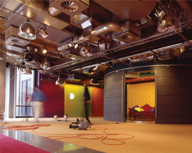
Television studio/office.
Walls for work places and meeting areas performed as backdrops for productions.
Television studio/office, as before. Production props doubled as office furniture.
Ben Kelly
Ben Kelly was born in a small Yorkshire village and studied at art college in Lancaster. A few tutors, wartime refugees from London who had settled in the Lake District, were especially influential. He became aware of Andy Warhol, from whom he learnt ‘attitude’ and whose Factory studio, in its silver-clad manifestation, was, he remembers, ‘amazing to me’.18 He also suspects that the home decoration magazines he leafed through in the houses of his mother’s ‘mildly eccentric’ friends prompted an interest in interiors and that, although the contents were conservative, he may have recognised qualities inherent in all good interiors, regardless of style – ‘Places that had been considered’.19
Kelly moved to London and the Royal College of Art in 1971, ready to be stirred, and to cause a stir. In the 1990 monograph about his practice, Plans and Elevations, he wrote: ‘Having arrived at the World’s End, I needed something to wear. I found it at a shop called Let It Rock.’20 He bought brothel creepers, fluorescent socks, and very tight jeans.
This personal reinvention evolved into an alter-ego he called ‘The Photo Kid’, which was a sartorial response to the disappointing normality of his fellow students, and owed something in spirit, if not detail, to fellow Yorkshireman David Hockney’s platinum hair and gold lamé suit. He credits his exotic appearance with helping him find holiday work with Peter Murdoch, who was experimenting with cardboard furniture while designing marble banking halls.
As Let It Rock was transmuting into Too Fast to Live Too Young to Die, Kelly was also evolving. The interior design department at the RCA was in the last years of the Cassons’ hegemony. Sir Hugh wrote in Plans and Elevations that although the course had become more ‘structured’, Kelly with his student co-provocateur, the industrial designer Geoff Hollington, were ‘obvious rebels’ and ‘the advance guard for the next stage’.21 The course was increasingly developing an architectural bias. Tutors, like Ed Jones and Tom Kay, were architects, as were models like Le Corbusier and Carlo Scarpa. Kelly was excited by the ad hoc qualities of Frank Gehry’s house in Santa Monica and disillusioned by his later effusion of ‘iconic’ public buildings.
In Plans and Elevations Hollington says that he and Kelly bonded because of a shared aspiration to be ‘ARTISTS’ (his capitals).22 Kelly discovered Marcel Duchamp’s ‘readymade’ sculptures and began to think about the potential of appropriating and referring to quotidian artefacts and iconography in his interiors. He and Hollington shared a reluctance to spend the three years of the course producing projects on paper while the rest of the college was making things. Accordingly, they collaborated on redesigning the student bar, Chair Art, the Duchamp-inspired monumentalising of utilitarian chairs, lithographs that transposed furniture for public places into private places, two fashion shows; and an installation.
RCA students had to complete a ‘discourse’, or thesis. In the spirit of post-1960s education the definition of such a piece was broad and Kelly produced what Hollington describes as an ‘autobiographical narrative’,23 which used words and pictures to pithily recount The Photo Kid’s visit to New York. Kelly had never been there. When Warhol came to London, The Photo Kid clamped on his own unconvincing silver wig and shook his hand at a book signing for The Philosophy of Andy Warhol (From A to B & Back Again). Warhol did not acknowledge the tribute.
At the beginning of the 1970s Kelly remembers being influenced by the King’s Road, LSD, and pop music rather than interior design, other than what he calls Max Clendinning’s ‘soft environments in primary colours with the odd dash of silver’.24 He was impressed by the work of the independent filmmaker Kenneth Anger, who also had ‘attitude’.25 Kelly says: ‘To pursue similar goals you must have sympathetic clients, to indulge in the activity of looking for a style of self-expression; this is not an easy road.’26
Commitment to personal evolution meant that Kelly was drifting into influential circles. In 1974, the year he graduated from the RCA, he met Paul Howie through his fashion designer girlfriend Chrissie Walsh. Howie had a menswear shop on the Fulham Road, a little off the beaten retail track, which he was moving to the emerging Covent Garden area. The new shop would occupy the ground floor above the basement office of his wife Lynne Franks’s PR company. This gave Kelly his first commission, to design the shop: an opportunity to, ‘Experiment and make a different statement about the art of fashion retail, and its possibilities…to experiment with materials and objects.’27 The result was an appropriate response to post-industrialism. The graphic designer Peter Saville was taken by the use of materials, particularly perforated metals, and he and Kelly worked together sporadically thereafter.

Howie: ‘found’ materials and gadgets, after Duchamp, make a rough and robust proto High-tech interior.
Ted Walters, who became Kelly’s builder of choice, explains that, at the time, ‘A shop-fitting aesthetic did not exist…the important thing was the object being displayed and not the environment.’ He talks about Kelly bringing ‘art into the world of interior design’, and how, as a former sculpture student, he ‘became obsessed with achieving [Kelly’s] aesthetic aims’.28 It may not be a coincidence that Kelly abandoned his ambition to become a sculptor when he realised the likelihood of making money from sculpture was slight. In a 2010 interview for Creative Review he suggested that his interior projects could be seen as installations.
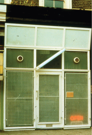
Kelly inevitably crossed paths with Malcolm McLaren, who offered him a series of projects. The first, in 1977–78, was Seditionaries. He felt that McLaren’s vision for the interior, inspired by the wartime bombing of Dresden, was too prescriptive and allowed only limited scope for his own input. He suggested that McLaren ask David Connor to deal with the interior. Kelly and Connor worked together on the shop’s façade, designed, in the tradition of Hung On You, to attract the brave and repel the timid. It was industrial, but punk industrial. Unlike Howie it did not suggest an ingenious application of industrial found objects but was a perfectly controlled pastiche of the window of a failing plumbers’ merchant. The only clues to the contrary were the bright brass nameplate and the neon ‘Open’ sign at ankle level, both partly obscured by metal mesh security screens that suggested the shop was in fact closed.
Seditionaries: a punk industrial façade that did not encourage casual browsing.
Kelly had a number of small jobs from McLaren and the Sex Pistols over the next two years: an office for their management company, a rehearsal studio, and a flat for the Pistols’ guitarist Steve Jones. None of these were complicated and all were conscientiously abused by their inhabitants.
Other shop commissions came from retailers moving away from the King’s Road and Carnaby Street to quarters colonised by pockets of affluent radicals. In 1979 Kelly designed The Last Resort, a shop for skinheads in the then cutting-edge East End of London, and in 1980 a shop for Franks and Howie in St Christopher’s Place. Throughout the 1980s his list of clothes shop projects grew – always one-offs for visionary retailers and progressive designers. He completed two offices for Lynne Franks’s PR company in 1981 and 1986. Contacts in the music business brought commissions for domestic interiors.
But the commission that secured his place as a pivotal figure in the new school of interior design was for a nightclub in Manchester. The five-strong client group, all with connections to Factory Records, was led by Rob Gretton, manager of the band New Order, and Tony Wilson, an opinionated and stubbornly Mancunian polymath. Wilson had an English degree from Cambridge and worked as a journalist and television presenter, involved in a gamut of programmes dealing with current affairs, politics, and both high and low culture (mostly low). In 1976 he was at the Sex Pistols’ sparsely attended performance in Manchester’s Free Trade Hall, which has been credited with inspiring the musicians who were to establish the city’s reputation. He booked the Pistols for his television programme, and it was the first televised manifestation of punk rock.
Wilson and his group, which included the graphic designer Peter Saville, were all fiercely loyal to Manchester and had established Factory Records specifically to record local bands. They sailed close to the wind financially but, as Kelly says of Wilson, ‘Making money was not on the agenda, creativity was’.29
New Order had seen the fashionable clubs in New York and wanted their own. Their record royalties would pay for the club’s construction in an old textile mill. Saville advised them to employ Kelly and encouraged him to persevere through difficult initial negotiations. The backers’ expectation of new lavatories, painted walls, and great sound and lighting systems escalated as they responded with financial insouciance to Kelly’s proposals.
Wilson’s commitment to cultural provocation was responsible for the club’s being named The Haçienda. Wilson had been taken by the phrase, ‘The hacienda must be built’, from Ivan Chtcheglov’s Formulary For A New Urbanism, the book that had inspired the Situationist International – a mid-century organisation of social revolutionaries, artists, intellectuals, and political theorists. The Haçienda inspired Manchester, provoking a new Mancunian urbanism. It demonstrated that design could repair the damage done by post-war regeneration schemes.
Wilson described The Haçienda as, ‘A community service…a space where things can happen…a place where people can meet’. In 1990 Kelly said that the original intention had been to:
Indeed, during its lifetime the club accommodated bands, DJs, comedians, acrobats, various artistic installations, and, for a time, a hairdressing salon. Kelly described the interior as a ‘big installation’.31
Sandra Douglas, Kelly’s chief collaborator on the project, wrote:
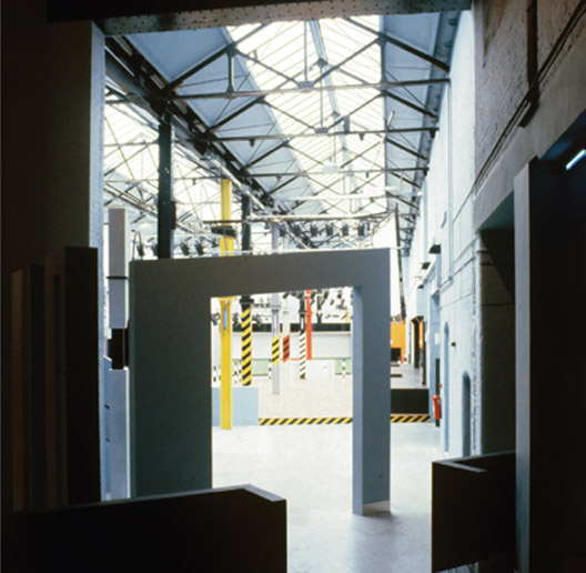
The red-brick exterior enclosed a huge volume under a pitched glazed roof. Clubbers entered through a galvanised shutter door, past a black granite sign with the Factory project number, ‘FAC 51’, and ‘The Haçienda’ cut into it, echoing the brass nameplate for Seditionaries. Once inside, among greyish blue walls and hard floor surfaces, the impression was of space. A freestanding square portico between bar and dance floor referred to the monolith in the film 2001: A Space Odyssey, and a semicircular double tubular arch at the bottom of the stairs to the balcony was the only remotely PoMo gesture.
The Haçienda.
The portico to the dance floor.
Paint and patterns pick out existing elements.
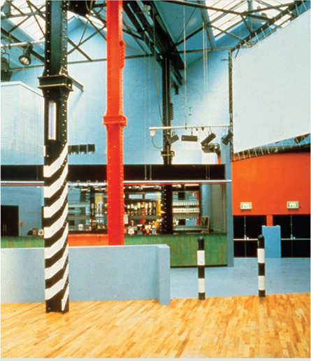
Everything else drew on the artefacts of industry. Portions of the existing I-section steel stanchions that emerged from the dance floor to support the roof were painted with diagonal ‘hazard’ stripes in black and yellow, and black and red. Black and white striped bollards with inset cats’ eyes lined the edge of the raised timber dance floor.
Mancunian menhirs.
The stanchions supporting the balcony were clad in tall, thin sheets of plywood, partly left unpainted and partly red, yellow, or black, like industrial Mancunian menhirs.
The Haçienda confounded stereotypes and, when published in music and design magazines, excited the same audience that had responded to Adam Ant’s flat two years before. But this, a public rather than private space, suggested other possibilities. Peter Saville described it as, ‘So groovy that instead of being a monument to the ’80s, it was the birthplace of the ’90s.’33
In the Architectural Review of September 1982 Alastair Best compared The Haçienda with Terry Farrell’s PoMo reworking of the Craft Council Gallery in London:
Kelly would have been delighted to be cleared of involvement with PoMo but he would have not been content to be lumped in with shop-fitting: while he might not have had an architectural axe to grind, he had a theoretical agenda that aligned him with art.
The Haçienda was not an immediate financial success due to the cavalier management style that characterised all Factory activities. It needed time to find its identity and it was not until 1986, with the advent of dance music, that it became profitable. Unfortunately the mechanism for its financial salvation also brought about its end. With dance came drugs, which meant that alcohol sales crashed, and, with characteristic perversity, the management refused to sell mineral water to thirsty dancers, thinking it too effete, perhaps too Londonish. There were shootings in and around the club and, consequently, trouble with the licensing authority. After sporadic attempts at resuscitation it closed in 1997, but not before Newsweek magazine declared it the most famous club in the world. The self-destructive predispositions that finished The Haçienda were also those that had brought it into being.
Kelly returned to work on the King’s Road, with a hairdressing ‘shop’ that opened in 1983. Keith Wainwright and Leslie Russell, partners in a Kensington hairdressers called Smile, decided to relocate to a site close to Seditionaries. Wainwright had, in his own words, ‘Pioneered a move away from natural hair to Punk aggression… including scarlet red and bright orange’.35 No doubt the orange endeared the project to Kelly, who had chosen to position ‘International Orange’, an industrial paint, at the core of his colour palette.
To distance it from traditional perceptions of hairdressing, Smile was described as a shop rather than a salon. Kelly’s proposal of granite worktops and a slate floor with a void to feed light to the basement was received enthusiastically, as was his strategic application of International Orange. In one of the most frequently published photographs of the shop, real oranges are lined up on a worktop.
Through his connection to Peter Saville, Kelly became involved in designing record sleeves. Saville suggested that Kelly struggled with ‘a system that wants innovation but hates inconvenience…he pushed his luck a little too far’, and that he was ‘better with the bigger pieces that you can walk around in’.36 Kelly however said, ‘It was a joy to work with the scale of a 300mm square, and felt like serious therapy.’37 After a few years of comparatively modest projects – some domestic, some shops, set designs, showrooms, and offices, including a second for Lynne Franks – he was called back to Manchester.
Encouraged by the post-1986 improvement in The Haçienda’s cash flow, Factory had decided to open a bar. Wilson’s idea was that it would do for bars what The Haçienda had done for clubs, and would become the meeting place of choice for those moving on to The Haçienda (also, those clubbers who refused to buy drinks in the club could instead be relieved of their cash in the bar).
Kelly describes the bar, called Dry, as a ‘permanent installation’.38 Its 900 square metres of former furniture warehouse joined two streets across the depth of a city block, and a 24-metre bar ran its length. Existing features were uncovered; sections of timber, concrete, and terrazzo floors were refurbished; leaded windows were renovated; glazed bricks were retained. A wall panel of red, fibrous plaster was uncovered, removed, restored, and reinstated, and complemented by areas of new pink plaster, sealed and unpainted. The spirit of Duchamp prevailed.
New elements were robustly industrial. Angled sheets of translucent glass hung off galvanised tubes over the bar. Half the floor area was designated for standing customers and subdivided by three high shelves attached to stout, unpainted telegraph pole bases. Once again the clients did not stint on cash or quality. Just as The Haçienda had stools by Aalto, so Dry had chairs by Jasper Morrison.
Factory now had a taste for developing extraordinary places and Kelly was their preferred designer. In 1990 he completed their new headquarters, again converting a redundant industrial building. Existing elements and materials were retained and a new round-headed, zinc-clad bulkhead sat over the stairwell like an oversized length of service trunking in the boardroom. New walls were finished with the same grey blue paint as used in the Haçienda, which sat well with the existing red brick. It was good enough to win the Pantone European Colour award for use of colour in architectural or interior design.
The Haçienda and Dry were feted well beyond Manchester, and another provincial city with a decided sense of its own worth gave Kelly a significant commission. Glasgow produced a steady stream of cafe bars throughout the 1980s and the stakes were high. Sam Piacentini, who had some Wilsonian traits, invited Kelly to design a bar, and when funding became problematic he sold part of the site to the DLC hairdressing salon. Kelly was retained to design both, a hybrid of Dry and Smile, but while his colour and material predilections were discernible both were distinct variations on themes rather than repetitions. Bar Ten occupied the greater part of the site and, with a more limited practical component, was marginally the stronger of the two, a tour de force that suffered at the hands of successive owners until the gradual erosion of detail moved Glasgow architects and designers to suggest it should be listed (the campaign failed).
Bar Ten was rich in finely considered detail. The terrazzo bases for the stools rose smoothly from the tiled terrazzo floor. The footrest for standing customers swept up to suit those sitting on bar stools. The underside of the bar top was curved, like a surfboard.
Kelly has championed interior design and disapproves of the concept of ‘interior architecture’ since he believes that affinity with art is more important. On this matter he takes affirmative action: when the Design Council considered appointing an architect to redesign its offices, Kelly objected and was given the job instead. His solution demonstrated that designers’ interiors are distinguishable from architects’.
A postscript comes from Peter York, who has said that there were three events in the 1970s which anyone with pretentions to the cutting edge should have attended: the Sex Pistols’ first live performance; the boat trip on the Thames, organised by McLaren, to allow the Pistols to play outside the Houses of Parliament during the Queen’s Jubilee Celebrations; and the opening of Blitz. Kelly could tick off the second, with a flourish (on disembarking he was arrested with McLaren and spent the night in custody), and the third. He missed the first but, in his defence, he was already working for the band.

A recent project, a cafe in the Science Museum, demonstrates that while the details of Kelly’s palette may change, his taste for richly diverse materials remains constant.
Eva Jiřičná
Eva Jiřičná was born in Czechoslovakia and studied both engineering and architecture. From those two disciplines she evolved, and determinedly persevered with, a very personal vision. Her architect father warned her that it was unlikely that a woman would be given interesting or responsible work and, after qualification, she was obliged to make a two-hour journey to and from her unrewarding post outside the city.39 Some luck came her way when she was asked to guide a visiting group from the Greater London Council’s architects’ department around examples of Czech Modernism; the group leader then offered to organise a year-long exchange for her in 1968. This meant she was in London when Soviet troops invaded Czechoslovakia to restore the Communist government. Having been active in the movement for liberalisation, she was sentenced in absentia to three years’ imprisonment. She decided to stay in London and completed her year at the GLC.
She joined the Louis de Soissons Partnership to work on the huge Brighton Marina project, leading an 80-strong team, and became an associate partner. In 1979, after winning a competition to design a pier on the Thames at Westminster, she set up a joint practice with David Hodges, a partner in de Soissons who was about to retire. The pier project was cancelled and, after two years with no other substantial work, they disbanded the venture.
Jiřičná had begun to forge a reputation through a number of competition entries. Of these, the most high profile was a 1979 ideas competition for the extension to the National Gallery in Trafalgar Square. Her winning entry demonstrated her taste for tectonic metal and glass architecture.
She attended the opening of the first Joseph shop, designed by Norman Foster for the womenswear designer and retailer Joseph Ettedgui, on Sloane Street. There she met Ettedgui’s wife, who invited her to carry out some work on their flat. Although a modest project it was enough to convince Ettedgui, after his divorce, to ask Jiřičná to find and design a flat for him. She removed walls and incorporated corrugated aluminium sliding doors to provide privacy when appropriate. The white floor tiles, common to all areas, blurred divisions between rooms. Mirrored and white tiled walls broke up the mass of the ‘service’ block. The published photographs of the restrained monochromatic interior established a different perception of her work from that given by her competition submissions. The black and white palette and finely wrought detailing was a foretaste of the interiors of the 40-odd Joseph shops she was to create.
She was making her name as an interior designer. In 1983 she was photographed for the cover of the first issue of Blueprint magazine, which suggested that she had arrived. She posed in the kitchen of her own very small flat in front of a green, dimpled rubber wall, holding an industrial light fitting. That was enough to have her categorised as a High-tech designer, although she says the aesthetic was determined by a lack of money rather than stylistic allegiance.40 The High-tech label was applied to designers who incorporated, and sometimes adapted, fitments and finishes manufactured for technical and industrial purposes. Jiřičná used Pirelli’s green rubber sheet extensively. With its pimpled finish, this was a High-tech flooring of choice, but she selected it principally because it was cheap. She dressed it up vertical fronts, and over the tops of shelves and worktops, and did the work herself to cut costs further. Gadgets with High-tech provenance decorated the walls; more delicate pieces were sourced from yacht chandlers and medical equipment suppliers.
Jiřičná was fortunate in her casual encounters. She had been asked by Joseph to design the interior of his franchised Kenzo shop on Sloane Street and she was on site when Richard Rogers and Norman Foster called in to see the work. Rogers was looking for someone who could detail wood for his Lloyd’s building and, seeing the serpentine timber steps that bisected the interior, offered her the job. She negotiated a degree of independence to enable her to carry out other commissions.41 The use of wood had not been her decision. She dislikes its surface patterns and structural limitations: ‘Timber does what timber does’.42
In the Lloyd’s building, apart from the prescribed timber, she introduced tensioned ‘sails’ as the ceiling of the ceremonial Nelson Room, and that rudimentary technology made the most obvious connection to her personal aesthetic. She led the Lloyd’s team for two and a half years while also making time to work on Joseph shops. In 1985, with Kathy Kerr, a member of the Lloyd’s team who had graduated from the RCA in 1982, she formed Jiřičná Kerr Associates and worked principally on projects for Joseph. Ettedgui was extending his interests. Joseph Pour La Maison sold homewear; Joe’s Café was a smart restaurant in the fashion enclave of Brompton Cross in which his eponymous shops were proliferating.
Ettedgui was another of the visionary clients who recognised the importance of interior design in the promotion of their business and was able to identify a designer who could create the appropriate image. Born in Casablanca in 1936, he moved to London in 1960 and trained as a hairdresser. In 1962 he and his brother opened a salon on the King’s Road and in 1979, his first clothes shop in its basement. His first independent Foster-designed venture in 1979 was one of the earliest High-tech retail interiors, and certainly the most sophisticated. Its double-height volume was dominated by a narrow mezzanine storage platform that ran round the space’s perimeter. It established Ettedgui as an innovative retailer but, as Foster was moving on to bigger projects, he needed to find a new designer. Jiřičná was more than capable of not only continuing the High-tech branding but refining it to suit and, indeed, influence the more sophisticated retail culture that was rapidly evolving in the mid-1980s. Her palette of black metal, clear glass, chromed tension wires, and delicately engineered elements did not conform to any preconceptions of how high fashion womenswear should be sold. It helped that Joseph’s clothes were almost invariably black and, occasionally, white.
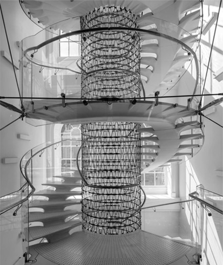
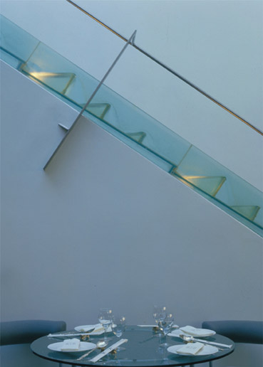
Usually the shops were installed in a conventional single-storey rectangular shop unit on a fashionable shopping street. When a unit occupied two floors, the reinforced glass used for counters and shelves, and the tension wires that supported them, also provided the components to make the extraordinarily delicate stairs that have become Jiřičná’s trademark and which owe a lot to the understanding of structure she learnt in Prague. Her first stair was unprecedented, the result of clear vision and sustained refinement. All her stair structures move slightly, which she describes as part of the drama. Tensions can be adjusted in situ, if necessary. She has stories of engineers struggling to understand her structural strategies.
Jiřičná understood the symbiosis of engineering and architecture. Kerr, whose undergraduate training was in interior design, could contribute little to what had become the practice’s signature style and the partnership was dissolved. In its place, Eva Jiřičná Architects was launched in 1988. Extraordinary stairs became Jiřičná’s trademark and she constantly refined the language, developing circular or segmental plan forms.

Jewellery shop, London. 2015
A late example of Jiřičná’s constantly evolving aesthetic.
Jiřičná’s first spiral stair structure, in Legends nightclub in 1987, was, by her standards, substantial, with metal treads and semi-closed risers. A steady evolution is clear in a late stair, made in 2013, which serves the conversion of the upper floors of Somerset House in London. The ‘essence and drama’ of the existing 18th century Nelson Staircase has discreetly influenced its detailing. The circular plan is a pragmatic response to the restricted space while the mesh of the central newel structure simulates the experience of climbing around a hollow core, in imitation of the paired flights of the Nelson, which wrap round a central void. The intricacy of the mesh also matches that of the tracery of the original balustrades. The cantilevered treads of the original have inspired the rounded modelling of the treads from the central support, but Jiřičná replaces stone with Ductal, an ‘ultra-high performance concrete’ that matches the solidity of the original and is shaped by the rationale of creative engineering. As with all her stairs, there is a seeming denial of gravity; the transparency makes for a vertiginous experience.
Somerset House.
Sculpted Ductal treads give solid expression to the spiral that wraps around the perforated central drum.
A few optimists try to imitate her pieces and fall short. Jiřičná’s aesthetic has occupied her imagination for 50 years and while it relies on an understanding of engineering, it is her aesthetic sense that makes it unique. Her work is easily attributable because no one else fine-tunes steel and glass detail so elegantly. When she stumbles across staircases that are obvious imitations of her own, she finds the structures irrational and the detailing clumsy. Refinement cannot be conjured up on a whim. None of the assistants who have passed through her studio have gone on to produce similar work. Hers is the outcome of an obsession.
She cannot identify a favourite project – ‘Every project has its story’, she says.43 While her output is consistent, she is not typecast. Clients do not ask her to replicate; she simply approaches each brief with the same aesthetic agenda. Her style attracts luxury retailers in expensive locations who can afford the build. It also attracts museums, and she has increasingly created permanent exhibitions in major public galleries. ‘For continuity’, she controls every project that goes through her modestly sized studios in London and Prague. She is the leading Czech architect and so the Prague office gets more architectural commissions than London, but she says she is as happy designing a chair as a building.
John Pawson
The final figure of the heroic age is John Pawson. Where Jiřičná’s visual language relies on the refinement of complex detail, Pawson refines details to eliminate complexity. He reduces interiors to their essential core, which is intellectual rather than architectonic. His work defines the Minimalist genre. Perhaps only his former partner, Claudio Silvestrin, can rival him in rigour. He has become a brand and, as a brand, he has spin-offs, producing furniture, kitchenware, even a cookbook. He is obsessive about achieving perfection on his terms, and has been known to specify the screws that fix his work to the wall in exhibitions.
The physical emptiness of his residential interiors is catnip to journalists whose middlebrow audience appears to be infinitely fascinated by the subject. His hold on a lay imagination means that his work, more than that of the other ‘big beasts’, has been published extensively in books about and by him, aimed at a market beyond professional interior designers. All are immaculately, minimally designed, biased towards images with text appropriately stripped back.
Phaidon, publishers of his A Visual Inventory, asked him to give his definition of Minimalism on their website. He said:
Journalists who interview him in his home enjoy spotting and reporting his own lapses from austerity. His wife is an interior designer in a more conventional mode, which also intrigues journalists who presume the minimalist lifestyle is forced upon her. Pawson claims she and their children have lots of possessions – in cupboards. ‘A lot of stuff’, he said in an online interview, ‘clouds the view.’45
Somehow, in the acquisitive 1980s, the idea of minimalism entered the collective aspirant consciousness and was interpreted with varying degrees of laxity by designers and consumers.
Whether because of Pawson’s frequent appearances in popular magazines or the fact that he had neglected to complete an architectural education, Jose Manser felt obliged to justify an article about him in the RIBA Journal interiors supplement of March 1986. She explained that the supplement was catholic in its tastes and aimed to give architects, in particular the ‘one-man bands working in debilitating isolation’,46 insight into what was happening across a diversity of styles. She offered Pawson’s work as ‘A draught of cold water to clear the way for some fresh thinking’.47 She thought that few interior designers would go to his extremes but suggested that they could learn from his elegant proportions, his lack of clutter, his monochromatic planes, and ‘the elimination of applied tat’.48 She argued against his being written off as a late Modernist:
(Claudio Silvestrin, Pawson’s partner from 1986 to 1988, said, ‘Some of the first articles about us in England were ridiculous, they tried to explain our style in terms of Zen. Do you think a Buddhist monk would understand what we do?’50)
Manser concluded that it would be interesting to observe his future career and whether he would attract a following. She anticipated stimulating rivalry between his followers and those more inclined towards ornamentation. Like Jiřičná, Pawson does attract imitators, but where they see Minimalism as a style, for Pawson it is an obsession.
In the article, entitled ‘The Minimalist Mr Pawson’, Manser elaborated her point about the difference between Modernism and Minimalism. She talked of Modernism’s ‘secular base, a devotion to the aesthetics of the machine age’.51 In Minimalism she saw a ‘spirituality, which in a sense rejects many of Modernism’s materialist values.’52 She suggested that he rejected consumerism, which may be difficult to reconcile with his having designed some of the most expensive saucepans on the market. His commitment is to purity of form and that is, and perhaps must inevitably be, about simplicity, which may sound cheap but seldom is. She described him as, ‘Disarmingly self-deprecating… displaying little of the humourless egotism which tends to blight such obsessional personalities’.53
When Pawson talks about his intentions, it is most frequently in terms of the effect of light on solids. His interiors are close to abstractions, but they are emotional, with implications of something spiritual. In 1982 he designed a flat for Bruce Chatwin, a writer with a reputation for spirituality, and Chatwin’s subsequent article further embellished the perception of Pawson as a mystic.
Recognised techniques of construction do not necessarily serve Pawson’s purpose and so he has evolved his own. Plastering, for example, gives smooth but not perfectly flat planes, interrupting the play of light across walls. To overcome this, Pawson used the hyper-smooth face of MDF sheets and eliminated joints with car body filler. Paint is then sprayed on to avoid the textures induced by manual application.
Pawson came comparatively late to design and architecture. Born in Halifax, Yorkshire into a prosperous textile manufacturing family, he was sent to Eton where he claims to have been mildly bullied because of his accent and plebeian haircut. Bored at school, he did not progress to university and went instead on the hippie trail to Afghanistan. He returned to design clothes for the family firm and, when this was not a success, decamped to Japan intending to become a Zen monk. He was not a wholly unlikely candidate: his family were Methodists and lived relatively modestly with no great inclination to accumulate possessions. He has said that this was ‘easy to say because they were comfortably off’,54 which might also apply to his wealthy clients.
He did not enjoy performing a monk’s menial tasks and retreated from the monastery to teach English for four years. He met the architect Shiro Kuramata, who advised him to go to architecture school. In 1979 he enrolled at the Architectural Association in London but left after just two years, bored, at thirty years old, by ‘student stuff’.55 He set up his practice in 1983.
Pawson lived with the art dealer Hester van Royen in a small flat on the first floor of a formerly grand Victorian house. He was seduced by its towering windows and lofty ceilings and felt compelled to demolish a partition wall that crassly subdivided the original space. He had form on this, having demolished walls in his family home to make himself an enormous room that contained only a bed. Van Royen’s flat was rented and he thought it best not to discuss his intentions with the landlord who, when he found out, evicted them. Pawson suggests he did so because he realised that the value of the flat had been increased.
It was published in World of Interiors and immediately resonated. People thought Modernist simplicity was extreme, but this went unfathomably further. Walls and ceiling were white, which was nothing new, but the most memorable image was of a black futon with white tassels, lying on bare floorboards in front of a Victorian fireplace, on which a book with a plain red cover lay open but face down. In the midst of the traditionally and lavishly decorated interiors that filled the rest of the magazine it was a disorientating but, for many, enthralling image. Another image showed pictures resting on the floor and leaning against the wall. Pawson explained that if one was truly interested in art, one did not hang it permanently on the wall only to become impervious to it (or perhaps he just could not bring himself to defile the white wall).
The images were, like those of the other seminal ‘big beast’ projects as nothing that had been seen before. Superficially a white painted, sparsely-furnished modern interior was familiar, but there was a tension in the photographs that suggested something far from the dull emptiness for which Lance Wright had rebuked Modernism. Objects, furniture, and artefacts were no longer tolerated as concessions to habitation, but were organised with such precision – the red book on the black futon, the leaning pictures – that they intensified the emptiness and implied something potentially spiritual.
Most of his early work was in residential conversions and therefore inaccessible. Designers who were admitted to these sancta confirmed that, while the photographs were beautiful, there was something else that could only be experienced within the rooms. Pawson would appear to agree with this, having constructed full-scale spaces for two major exhibitions of his work. In 2010, in London’s Design Museum, he built a modestly sized rectangular space under a barrel vault. It was entered from a narrow ante-space on one end and at the other a view across the Thames was filtered through gauze. Two pale wooden wall-mounted benches concealed light sources that washed the pale wooden floor. It was modest but emphatically special. For a larger show in 2012, at the Fondazione Bisazza in Vicenza, he constructed a much bigger and more substantial space: a high, top-lit, free-standing circular room, clad in white Bisazza mosaic and entered through a line of rectangular columns that stopped just short of the ceiling to maximise the impact of light, natural and artificial.
While residential projects remained the area in which he could most precisely express his aesthetic, he moved beyond them. During his partnership with Claudio Silvestrin they designed a Japanese restaurant, Wakaba. With its curved, translucent glass front and a single long wooden table, it became a place of pilgrimage for architects and designers. They revisited translucency in 1988 for a cake shop called Cannelle. The street elevation was a square of translucent glass; in the middle, set just below the exact centre for anthropometric reasons, was a clear glass cube just big enough to hold a single cake. Inside was equally sparse. A few cakes were displayed on shelves cantilevered from the wall behind the counter, the solid white front of which rose in three modest steps to the entrance. The frontage was as forbidding as any of the variations used at 430 King’s Road. For a cake shop, it was confrontational. Silvestrin said the aim was to remove ‘the vulgarity of commercialism’ from the façade.56 The proprietor, in desperation, taped a small handwritten note to the window that said takeaway coffee was available within.
In 1996 Pawson designed for the high street clothes retailer, Jigsaw, on New Bond Street. New Bond Street was not an average high street and Jigsaw were prepared to spend significantly on their shops (in 1991 they had commissioned Nigel Coates for their Knightsbridge branch). The shop was a large, double-fronted unit; Pawson took advantage of the site’s depth and modulated light from the street window by setting out hanging rails parallel to the front elevation and separating them with sheets of translucent glass. He also included his preferred stair, which rises in a single flight through a narrow slot hemmed between blank walls.
Jigsaw’s deep rectangle suited his strategies well. They were less effective in his larger, multi-level shop for Calvin Klein in New York. This tall corner unit, flooded with natural light on two sides, made it difficult for him to achieve atmospheric control. The detailing was otherwise perfect.
Pawson credits Klein’s patronage with giving him visibility and credibility, leading to a series of new build projects across the world. The most particular of these is a monastery in the Czech Republic. For it he favoured archetypical forms, pitched roofs, and simple fenestration, but all are subject to his concern for the interior and for the orchestration of solids and light. If his conversions require the intimacy of the domestic space, his new builds allow him to control configuration to get the intensity of experience that distinguishes his smaller projects.
His strength is restraint – but a restraint so marked that it becomes assertive. He has become the person to make Loos’s architecture of monuments and tombs. If he is indeed an exponent of a pure architecture it is ironic that his cavalier attitude to formal training has led to some difficulties. The Architects Registration Board, which protects the title of ‘architect’ in the United Kingdom, reprimanded the online design magazine Dezeen for describing him as such. There followed readers’ comments in support of the Board, presumably from those who had laboured to complete the statutory seven years’ training, and counter-comment from those who had not. Pawson scrupulously describes himself as an ‘architectural designer’, but describes what he does as architecture. The argument against his being described as an architect is that formal training ensures the technical knowledge necessary to evolve ideas and the administrative capacity to deliver the completed building. Pawson’s statement that, ‘When you feel something [is] special, it’s architecture’,57 suggests an elevated intention. He values the ‘architecture’ of the smallest space, even within the pots and pans he designs.
Pawson is usually seen as austere, but a more accurate description may be Julia Llewellyn Smith’s. Writing in the Telegraph in 2012, she described Pawson as, ‘Obsessive yet vague; bullish yet modest; a fallible perfectionist’.58
To Be an Architect Or Not to Be an Architect
For all the embarrassment caused by his lack of formal training and certification (although one might speculate that ARCUK should be more embarrassed than he is), Pawson thinks like an architect and designs like an architect and, like David Chipperfield, Pierre d’Avoine, and other architects who had dabbled in interiors, he has moved on to architecture. Architects frequently establish their reputations, pay the rents of their first offices, and learn their trade with interior projects. Once they can attract architectural projects, they move on. In the early days of his practice, David Chipperfield produced a number of fashion shops in Paris and Tokyo, all of them shaped by his evolving architectural principles. Rick Mather began with a clutch of Chinese restaurants that forewent the familiar decorative devices before graduating to major buildings and urban planning. He created white rooms but, recognising that restaurants needed something more, added cascading water. It was theatrical, but the palette of white planes, glass, and water was architectonic.
Architects tend to be commissioned for the more ambitious domestic interiors. Their scrupulous detailing suits work that will be scrutinised intimately and at length by clients who expect to see in it a reflection of their values, and value. One might suspect that such clients will feel better if they can say that their conversion is the work of an architect. Those interior designers like Powell-Tuck, who work in the field, acknowledge that their processes are necessarily close to those of architects.
Nick Coombe was among the first students to complete the RCA course after it received RIBA Part Two validation and went on to complete the Part Three examination to qualify as a registered architect. After working with Connor on Villa Zapu, he produced a number of domestic interiors that demonstrated an architect’s predilection for white planes and minimalist detailing, which he ‘decorated’ with a wash of coloured light.
Architects’ material palette and detailing, and their presumption that their work should live for ever, did not equip them for the quick turn-arounds of mainstream retail and hospitality projects. Instead these fell to interior designers, who were beginning to develop different palettes and techniques to deal with them. While architects’ work has obviously influenced what interior designers do, it is only one element among the social and cultural phenomena that increasingly matter more. As digital virtuality becomes more pervasive in interiors, solidity and permanence become less important.
In one of Mather’s London restaurants water cascaded down glass steps in a trough on the edge of the stair.
In Hong Kong a more vigorous cascade flowed through a series of suspended glass dishes.
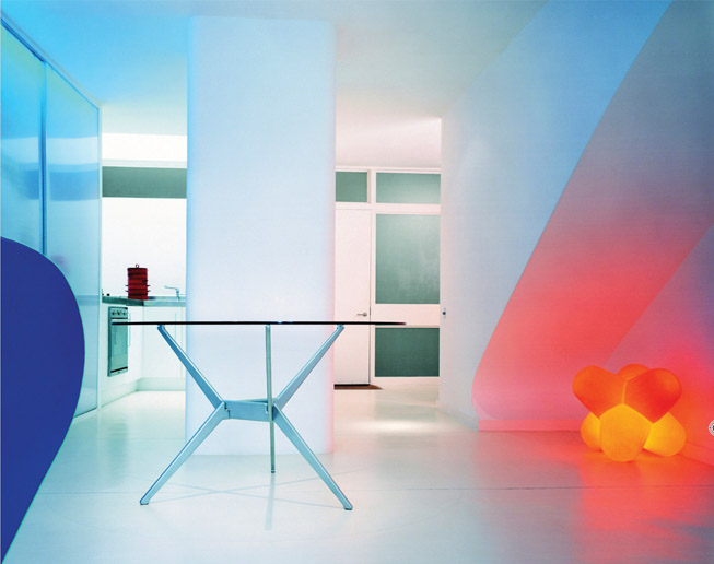
Nick Coombe’s conversion of a duplex apartment in a residential tower block: white planes are washed with coloured light.