2
The Times They Were A-Changin’ 1956–68
The 1950s segued into the 1960s. To locate a watershed shift in social attitudes between the decades, one might look to Philip Larkin’s facetious dating in his poem ‘Annus Mirabilis’:
Sexual intercourse began
In nineteen sixty-three…
…Between the end of the ‘Chatterley’ ban
And the Beatles’ first LP.
Relaxation of sexual mores is accepted as the signifier of what became known as the ‘permissive society’, but the post-1963 zeitgeist was comprehensively permissive, with all kinds of social norms and cultural yardsticks flouted.
Those who experienced both the 1950s and 1960s remember the former as a radical period that laid foundations for the social phenomena of the latter. The youthful independence first expressed in 1953 by Teddy boys and girls found its voice with the arrival of rock’n’roll. Bill Haley’s record ‘Rock Around the Clock’ appeared in 1955 and Elvis Presley’s ‘Heartbreak Hotel’ in 1956.
In 1956, Elvis fan and future textile designer Natalie Gibson enrolled at Chelsea School of Art. She lived with her parents just off the King’s Road in Chelsea, the future epicentre of all that was ‘trendy’, but she remembers it as a fairly conventional high street at the time, albeit at the heart of a ‘very bohemian’ neighbourhood with artists’ studios scattered throughout residential areas and the Chelsea Arts Ball as its principal social event. She recalls the department store Woollands selling conservatively fashionable clothing and furniture. A few residents aspired to the Scandinavian ethos of Robin Day’s furniture for Ercol, and taught themselves alien cuisines: European, via Elizabeth David, and Chinese, from Kenneth Lo.
Gibson remembers a compact and convivially inclusive social scene with designers, artists, actors, and a miscellany of others congregating in Finch’s pub on the Fulham Road, establishing formal and informal cross-disciplinary creative partnerships. After Chelsea School of Art she continued her education a little further north at the Royal College of Art. In 1961 she and her first husband moved to the seedier but more exotically bohemian Soho, with its pubs, cafes, delicatessens, and street markets.
In the nascent creative world that was then casually coalescing, she swapped Terence Conran one of her first textile designs for one of his sinks.
In 1955 Mary Quant opened Bazaar, her first shop, on the King’s Road. Her husband and business partner Alexander Plunket Greene’s restaurant was in the basement. She established the street’s reputation as a fashion hub: her clothes were not only radical but, she later acknowledged, naively under-priced and therefore magnetically attractive to the progressive young women for whom no other shops catered.
Soho saw the arrival of fashion shops for young men in 1956 when John Stephen, a Glaswegian and former welder’s apprentice, opened the first of his chain. When this burned down in 1957 he opened His Clothes in nearby Carnaby Street with his partner Bill Franks. They painted the exterior bright yellow and transmitted deafening pop music to the street, creating the prototype for the shops that were to become havens for the clothes-conscious young of both genders, and the basic formula for every fashionable clothes shop thereafter. Carnaby Street became the slightly less glamorous, more brashly proletarian central London counterpoint to the King’s Road.
The new dawn broke in January 1963, not with the Beatles’ first LP but their first single, ‘Please Please Me’. The well-groomed young men from the 2i’s coffee bar were superseded by equally well-groomed ‘beat groups’ from the northern industrial cities who, in the beginning, adhered strictly to the idea of a band uniform. Male fans rushed to buy the look. While the shared uniform fell quickly from favour, the idea of a ‘look’ remained paramount: group members might dress differently, to present distinct persona that would appeal to fans’ varying tastes and appetites, but the studied informality was orchestrated initially by managers and, as those managers became shrewder, by stylists.
In his 2007 book State of the Nation: British Theatre Since 1945, Michael Billington argued that 1959’s satirical revue Beyond the Fringe, which made politicians, clergymen, and all pillars and presumptions of the establishment targets of its humour, had a greater and longer-lasting impact than John Osborne’s very serious, very bad-tempered 1956 play, Look Back in Anger. He suggested that Beyond the Fringe’s funny, precocious mocking of established values set the tone for ‘an era of snook-cocking disrespect’.1 The Beatles’ mildly iconoclastic humour matched the mood, and was all the more effective because it was delivered in a working-class Liverpudlian accent. There were some curmudgeons who held out. Paul Johnson, writing in the New Statesman, regretted the ‘bovine’ conformity of Beatles fans, but a wide range of people of all ages and social strata found the Beatles’ persona and style irresistible.2 Serious music critics analysed Beatles tunes with the tools they brought to bear on the classical repertoire. There appeared to be a collective urge to adopt the trappings of trivia and embrace national infantilisation.
Pirate radio ships bobbing about on the seas around the British Isles nurtured the dumbing down. There was no longer a significant time lag between fashionable ideas originating in London and becoming currency in the remotest corners of the islands. The idiosyncratic values of localised working-class culture, eulogised in Richard Hoggart’s 1957 Uses of Literacy, were being swept away.
In February 1962 the Sunday Times launched its colour magazine, a means by which young provincials could keep abreast of what was happening in those parts of London that mattered to them – King’s Road and Carnaby Street – although even then they probably suspected that the latter was the naffer. In September 1964 the Observer and Sunday Telegraph launched their own supplements, adding to the reference material. Provincials with pretensions to being fashionable felt obliged to relocate to London. Some, like the hero of Keith Waterhouse’s novel Billy Liar, would never quite find the courage to follow their instinct, but others would, and some would inject vigour into the hermetic worlds of modish London. The idea of London as a place to which ambitious provincials should aspire was common to a number of the novels of the period and, unlike grimier and grittier 1950s works, tended to be comic. It was a time for good-humoured optimism.
The general air of prosperity and optimism was not confined to the young. Harold Macmillan, the patrician Conservative prime minister from January 1957 to September 1963, declared that the British people had ‘never had it so good’. Throughout his period in office unemployment was minimal and the standard of living had, alongside consumerism, risen steadily and remained buoyant despite heavy government borrowing from the International Monetary Fund and the devaluation of the pound in 1967 under Harold Wilson’s Labour government. The appetite for spending was facilitated by Barclays bank offering the first credit card in 1966 and the first cash dispenser a year later, fuelling both the retail and hospitality sectors. Half of all homes became owner-occupied and owners were keen to upgrade their interiors by downgrading the excesses of the Contemporary style.
Chelsea was the chicest, most desirable area. Woollands became tentatively modern and in 1964 Zeev Aram opened his small furniture shop and design consultancy across the street from Mary Quant. As well as selling his own designs, he helped to create and lead the market for the ‘Modern Classics’: pieces by the Castiglioni brothers, Mies van der Rohe, Le Corbusier, and Charlotte Perriand that sat well against the fashionable white-painted walls of rehabilitated terraced houses. In 1973 he obtained the right to produce and sell Eileen Gray’s work and decamped to much bigger premises in Covent Garden, smartly anticipating the area’s potential to become the next fashionable quarter.
Car ownership was also increasing precipitously. The Mini, designed to be affordable, was seen as innovative, chic, and cheeky: a car that, like the mini skirt, expressed the spirit of the time. France’s ultra-economy car, Citroen’s 2CV, was a little too rustic for the urban terrain of the early swinging 60s but would come into its own with the hippie sensibilities that emerged towards the end of the decade and the environmentalist anxieties of the next.
France further sharpened the cutting edges of retail and hospitality. Britons were increasingly holidaying abroad (despite each being allowed to take only £50 out of the country) and were becoming Francophiles. Shops became ‘boutiques’; venues for drinking and dancing became ‘discotheques’. The insouciantly glamorous singer FranÇoise Hardy made minor inroads into the hit parade.
Only French restaurants, which had hitherto held the culinary high ground, were losing out despite the vogue for all things French. Too formal for wealthy trend followers and too expensive for less wealthy conservatives, they were superseded by affordable Italian restaurants, generically dubbed ‘trattoria’, in which the messy consumption of spaghetti dishes (other pastas were rare) encouraged informality.
Italian food had begun to assert itself in 1959 when two Italian waiters, Mario Cassandro and Franco Lagattolla, formerly of the luxurious French restaurant Mirabelle, opened La Trattoria Terrazza in Soho, offering Southern Italian food in informal surroundings. Their interior designer was Enzo Apicella, a Neapolitan polymath freelance designer and cartoonist who came to Britain in 1954 and worked in graphics and television set design. His solution of tiled floors, white plaster walls hung with decorative modern art, and lights suspended over each table became the essential components of Italian restaurant design throughout the 1960s and 1970s. His hard finishes introduced cacophony to the restaurant experience. Altogether he created more than 150 restaurants, including 70 for the Pizza Express chain. Bevis Hillier hailed him as one of the creators of the swinging 60s.
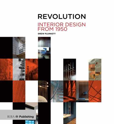
Chelsea Drugstore, Kings Road, London. Garnett Cloughley Blakemore, 1968.
Absurdly futuristic with its curves, circles, and metal-clad interior and exterior.
Le Drugstore was a small, fashionable department store selling food, records, clothes, and pharmaceuticals on the Champs Elysées in Paris. If the American name quickened French pulses, an association with glamorous Paris prompted the opening of a Chelsea Drugstore on the King’s Road. Completed in 1968, its aluminium-clad interior and exterior, pierced by enormous quadrant-cornered windows, was radical. It seemed to represent things to come. The designers, Garnett Cloughley Blakemore, were also responsible for a significant number of the better boutiques along the road, among them Just Looking, and Stop The Shop, in which a circular window display platform revolved slowly. It used technology GCB had evolved for the revolving restaurant on top of the Post Office Tower, but the practice was equally adept at creating fantasy. Erik Blakemore was a film designer who had created the original Beachcomber bar in the Mayfair Hotel; he repeated the theme in six bars for Butlin’s holiday camps, demonstrating that the classless inclinations of the 1960s were not entirely hypothetical. GCB also worked on interiors for the Queen Elizabeth II liner, Windsor Castle, the Palace of Westminster, and became house architects to the RIBA.
Boutiques appeared seemingly spontaneously, often without the benefit of interior designers: feral interiors in the public realm, vanity projects by the few individuals affluent enough to rent premises and buy stock. No one put their name above a shop, as every outfitter hitherto had done. Instead names strove to be witty, punning, or allusive. Most traders affected disregard for conventional business practice (or could not be bothered to grapple with its modest challenges). Some tentatively adopted a conventional business model that respected the precedent of the shop window display; the more radical favoured a strong, graphic street presence that obscured their interior and challenged customers to step inside, where the walls tended to be painted in strong colours on rough existing brickwork. Lighting was low and obscured by the closely packed racks of clothes. The long counter that traditionally divided staff from customers disappeared and was replaced by a till on a table. Customers wandered at will, and shoplifting flourished.
Idealistic alternative ‘philosophies’ accounted for some laxity but for most boutique owners the motivation was simply to own a boutique, and tackling the day-today running interfered with that pleasure. Most of the dilettantes failed but the energy of some prevailed, for a time. Nigel Waymouth and Sheila Cohen opened Granny Takes A Trip at 488 King’s Road in 1966, in good time to catch the market for vintage clothing. The shop front, which gave no clues about its content, was subject to a series of graphic upgrades, ending with the front half of an American car painted yellow and welded to the façade – the outcome of artistic instincts taking precedence over commercial ones; of innocent, if extravagant, gestures that inspired too many imitations. For its time, it was radical and far removed from the timber-framed, tidily dressed windows of conventional outfitters. The one permanent element of the façade, a text above the window saying, ‘One should either be a work of art or wear a work of art’, which might now be a marketing slogan, probably reflected the proprietors’ presumption that they were doing more than selling second-hand clothes.
Small, self-indulgent, and badly managed boutiques spread far beyond London but had, with few exceptions, fallen victims to what Dominic Sandbrook calls ‘excessive ambition, insufficient capital and commercial disaster’. Sandbrook estimates that, ‘As early as 1966 fifty fashion businesses were filing for bankruptcy every month, and as the economic picture darkened at the turn of the decade the culture of the boutiques disintegrated’.3 Others failed because they grew too large and the founders, who could manage only a modest thriving business, eventually found themselves out of their depth.
Biba, the most celebrated boutique of all, was a victim of its own success. It was established by Polish-born Barbara Hulanicki and her husband Stephen Fitz-Simon in 1964. The first shop opened on Abingdon Road, which, although a distance from King’s Road, was comfortably in the heart of prosperous Kensington. It moved in 1965 to the more central Kensington Church Street and in 1968 launched its elegant mail order catalogues. Fashion enthusiasts like Irene Martin, a student in the Belfast of riots, bombs, and street fighting, could now buy without having to travel to London, although for those marooned, like her, in the provinces the shop remained a place of pilgrimage.
In 1969 the shop moved again, to bigger premises on Kensington High Street. The interior was dark, with low lighting, matt black walls, and dark-leaved palms: Art Nouveau tending towards Art Deco, a style which inspired Biba’s black and gold logo. In 1971 the Angry Brigade, a small collection of radicals who had emerged from the student activists of the late 1960s, bombed the shop in protest against what they saw as an epitome of consumerism.
Biba’s next and final move was to the enormous shell of an old department store on the other side of Kensington High Street. In keeping with its predecessor each floor had a specialist function. There was now a floor for men and others for children, food, and household goods. It was, if not the first, a very early ‘lifestyle’ store. It continued the dark Art Deco theme but added brightly coloured Pop Art display stands for ironic merchandise, like baked beans and dog food. Unfortunately, the concept compromised retail strategy. Biba appealed primarily to young women shopping for clothes and they did not buy baked beans in enough bulk to justify the space devoted to them. Even on clothes floors theatricality took precedence over selling. Like so many smaller boutiques it was run by fashion enthusiasts disinclined to think about retailing strategies.
Financial difficulties made it necessary to join with outside backers and, inevitably, this led to frictions. The store finally closed in 1977. Peter York says that ‘it ended as a venue rather than a shop’ and, with no entrance charge, it could only fail. Nigel Coates describes it as ‘palatial’ but confirms that ‘everyone went there nicking’.
At the end of the 1960s, as youth culture and its fellow travellers were being comfortably integrated into the social fabric, another movement emerged that purported to reject familiar tropes. Hippies were a quasi-political youth cult from the West Coast of the United States who had inherited the ethos of beatnik counterculture and adopted a lifestyle of drug-taking to the accompaniment of ‘psychedelic’ music. Some opposed the war in Vietnam and initiated subsects committed to peace, and were prepared to use varying degrees of violence to achieve it. Their passion for peace was matched by their enthusiasm for (free) love. By the time hippie ideals arrived in Britain they were largely filleted of political content and found expression primarily in gaudily coloured and patterned clothes inspired by eclectic plundering of ethnic costumes. The predilection for psychedelic imagery had an impact on the graphics of boutiques catering to the cult; façades and interiors were painted in bright, swirling swathes.
Other than demanding free music festivals and the legalisation of drugs, British hippies initially had little political involvement. It was France, again, that set an example when in May 1968 strikes and occupations by students and workers across the country appeared to threaten national political and economic stability. Parisian students commanded the greatest attention and, with their stylish black and white posters, provided an irresistible model for British students who were keen to ape their challenge to established orders. Various universities saw protests, marches, and occupations of administration buildings, the most glamorous taking place at Hornsey School of Art. However, the most politically significant, and destructive, actions were instigated by students in Belfast and were the catalyst for the violent social disorder that was to last until the next century. Their black and white posters and banners were designed by an architectural student who had spent the summer in Paris.
 Meanwhile, Back on the Drawing Board…
Established interior designers, who trained and operated primarily as architects, continued to work on reception areas, airline offices, banks, and department stores. But one architect/designer would recalibrate perceptions of the interior: Max Clendinning.
Like Casson, Clendinning trained as an architect as much by default as by intention. He was born in 1924 in the small town of Richhill, County Armagh. As a child he drew obsessively and when his schoolteacher mother expressed her concerns for his future career, a colleague suggested that he should become an architect. He went to Belfast Art College, where there was no formal architecture course, but the principal organised appropriate classes for him and a few other interested students. In 1945, before finishing his course, he joined Henry Lynch Robinson’s new architectural practice as an apprentice. In 1947 he went to Paris and was surprised to find that several owners of Corbusian dwellings were happy for him to come in and see their interiors. Back in Belfast, he satisfied his new Francophilia by subscribing to l’Architecture d’Aujourd’hui.
In 1951, suspecting he had learnt all he could from Lynch Robinson, Clendinning won a scholarship to the Architectural Association in London. On graduating in 1953 he won a British Council scholarship to travel in Italy and, on his return, worked for the leading practices of Denys Lasdun and Maxwell Fry. He did not enjoy the heavy impositions of technical drawing that came with subsidiary roles and so moved to work for British Rail. There, with greater autonomy, he designed Oxford Road station in Manchester. The station, with its laminated timber conoid roof, was listed in 1995.
He moved to work for Brown Henson and Partners, where he was architect in charge of the Crawley Town Hall project. He also designed its furniture, which he showed to a friend who knew a buyer for Liberty department store. Liberty had a reputation for high-quality design and when it featured the furniture in one of its windows it attracted an appreciative crowd, including Neil Jordan of Race Furniture, who offered to manufacture the pieces. Race agreed that the plywood elements should be painted, and a bespoke tweed upholstery fabric complemented the paint colours. The range, which was also exported to the United States, is credited with reviving the fortunes of Race, and its exposure established Clendinning’s reputation.
He began to attract clients. One of the first was Christina Smith, who owned a significant amount of property in Neal Street, Covent Garden, and who was to play an important role in the regeneration of the area. He first designed her a flat in an old warehouse, retaining all the existing industrial elements, and went on to design seven shops for her using fat plywood window frames with radiused corners.
A second important client was Donald Gomme, who with his brother owned the G Plan furniture company that produced the lightweight and light-coloured furniture to which progressive householders of the 1950s and 1960s aspired. Gomme, who had been chief designer for the company, was looking for an interior designer and asked the editor of House and Garden for her recommendation. She had regularly featured Clendinning’s work in the magazine, and Gomme tried him out on his London flat before allowing him to tackle his houses in Hampshire and in Switzerland. Subsequent word of mouth recommendations provided Clendinning with a steady flow of commissions, but most clients were publicity-shy and many of the interiors went unpublished. It was the serial reworkings of his own house at 3 Alwyne Road in North London, which he shared with the theatre designer Ralph Adron, that brought his work to the attention of other designers.
Clendinning’s family owned a furniture factory in Ulster and it had been his habit to bring back to London pieces he designed for his own use, in flat-pack form. His first, very small, London flat was in Belgravia and its 1954 interior was, he claims, ‘no different’ from any of his later work. Certainly it contained a chair that incorporated elements characteristic of all that came after.
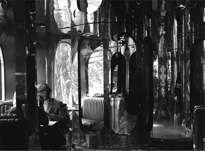
He collaborated with Robert McKinstry and Ian Campbell in Belfast and, with the latter, created a city centre Post Office showroom that was outrageously defined by brightly coloured, curved and bulbous plastic elements. In 1966, while working on a competition entry for a block of flats in the newly designated city of Craigavon, he created a flat for himself in the attic of McKinstry’s office that demonstrated his then enthusiasm for white surfaces and radiused cubic furniture. The painted band around the roof light anticipated the painted patterns that break and unite the wall and ceiling planes in his later work in Alwyne Road.
Clendinning’s own flat in Belfast, 1966.
The radiused forms and the painted band around the window anticipate his work in Alwyne Road.

Clendinning in the living room at 3 Alwyne Road.
Plastic furniture designed for Aerofoam in 1967.
It was the series of reworkings of Alwyne Road that made his reputation. Audrey Slaughter, who had founded the fashion magazine Honey, sent her assistant Janet Street-Porter along to check out his interior for a feature. The latter was excited by what she saw and suggested to her husband Tim Street-Porter that he photograph the interior.
The all-white room was not an entirely new idea. The English society decorator Syrie Maugham had created a white music room in her home at 213 King’s Road, and her other rooms were primarily white with accents of coloured fabrics. Elsie de Wolfe, the American decorator, had also favoured lighter colours and delicate furnishings in reaction to the dark tones and convoluted forms of late 19th century interiors.
The idea of the white interior had seduced architects since the 1920s. Although the first examples of Modern Movement architecture were not exclusively white, their reproduction as black and white images in Hitchcock and Johnson’s book The International Style: Architecture since 1922 cemented the presumption amongst architects and designers, who had not seen the originals, that they were wholly white. This sat comfortably with Modernist ideas of purity of form but ignored the propensity of Le Corbusier to paint interior walls in strong, flat planes of colour and, frequently, murals in the Cubist mode.
(Interestingly, Le Corbusier, an admirer of the Irish designer Eileen Gray and her house E-2107, chose, in her absence, to cover eight of her white walls with murals. One suspicion is that he was desperate to appropriate, or deface, a building that he considered as good as and possibly better than anything he had created. Alternatively, given that he is rumoured to have painted the murals in the nude and that some contain sexual imagery, it is conjectured that he was sexually obsessed with Gray. Either way, his defacings identify the interior as an arena for the expression of elemental emotions.)
Clendinning’s white spaces were important because, unlike those of Maugham and de Wolfe, their austerity was not relieved by intricately detailed and subtly coloured furniture. They also demonstrated that the white minimalism of Modernist architecture could be achieved within Georgian and Victorian terraces, whose high ceilings and extant mouldings were increasingly seen as desirable alternatives to austere new builds. His white rooms reached their apogee in 1969’s edition of Alwyne Road. A long, squashy ‘cloud’ floor cushion snaked across the floor around the other dominant object in the room: a large, papier-mâché, tulip-shaped standard lamp created by Ralph Adron. The floor was covered in square plywood tiles and their grid is the reference for the muted, stepped green and pink pattern that breaks the wall plane. When floor-sprawling failed to meet ergonomic imperatives in the dining room, he resorted to his signature plywood, flat-pack upholstered chairs.

The 3 Alwyne Road living room during the ‘cloud seat’ period in 1969.
The papier-mâché ‘tulip’ lamp is by Ralph Adron.
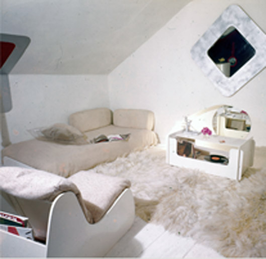
Profiles of the arms and backrests for the plywood chairs continually evolved. When assembled all had a cubic configuration. Side and back planes were softened with curved corners inspired by early computer fonts and a range of German geometric stacking ceramics by the Thomas company. In the dining room Clendinning also revealed early steps away from whiteness. Existing mouldings, window joinery, cornice, and ceiling rose remained white but walls and ceiling are dominated by painted bands that bend around corners and seem to disappear behind the cornice before reappearing on the ceiling. It was, he says, a way to ‘destroy the corner’. If it was a development of the significantly subtler wall painting in the living room it was also a first glimpse of the much more colourful decorative painting that was to transform the same space in 1973. While the colours and patterns owed something to psychedelia, Clendinning and Adron brought a mature finesse to the process that boutique owners could not match.
The dining room at 3 Alwyne Road, with ‘Maxima’ range furniture and painting by Ralph Adron, 1969.
Clendinning’s profile was high. While ‘decorators’ like David Hicks and Colefax and Fowler were well known, he
The living room at 3 Alwyne Road in 1973: the emphatic end of white.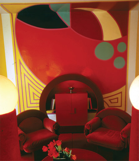
Sketch for a living room. Ralph Adron, 1970.
was probably the first interior designer with a significant public profile. As interior design started to peel away from mainstream architecture, he was regularly featured in the magazines and colour supplements that were alternatives to the more dedicated and ostensibly serious architectural publications. He was immensely influential on the young designers training in the late 1960s and throughout the 1970s but he never employed assistants, preferring to carry out the work on his own. When he was busier, he says, he simply worked harder.
In 1970 he had Ralph Adron make a presentation drawing for a project commissioned by the Telegraph newspaper. With its stylised perspective and flat surfaces, it demonstrated a different way of representing interiors, one that paid little attention to the conventions of architectural rendering. When it was shown in a lecture to students at the Royal College of Art, it had a dramatic impact: it suggested that there was a way of thinking about interiors that was unique to the discipline, an evocation of an idea rather than an attempt to represent precisely spatial concepts using architectural techniques.
Change of Lifestyle
If Clendinning’s interiors spoke directly to designers and the design-conscious laity, Terence Conran, born in 1931, was bringing ideas about modern, fashionable living to a wider audience of aspirational consumers, priming a market that designers in the 1980s would address.
Conran was instinctively entrepreneurial. After studying textiles and general design at the Central School of Art and Design, and a modest involvement in the Festival of Britain, he opened Soup Kitchen, selling soup by the mug, fresh bread by the hunk, and exotic French cheeses in a white-tiled room dominated by the noise of the second Gaggia coffee machine to arrive in Britain. George Freeman remembers that it was there he heard of President Kennedy’s assassination.
Conran had opened his design consultancy in 1956 and produced his Summa furniture range. When this failed to interest retailers other than the reliable Heals, and Woodlands, neither of which were obvious outlets for such self-assembly furniture, he decided to open his own shop in 1964. The first branch of Habitat opened on the Fulham Road, a few hundred yards north of the King’s Road. The store’s décor – brick walls painted white, a red quarry tiled floor, ceiling-mounted spotlights – was a statement of its stylistic intent and a medium to seduce and induct customers into the Habitat aesthetic. Displays of tall glass jars for storing spaghetti and earthenware ‘bricks’ in which to cook chickens made shoppers, until then unaware of the existence of such things, suddenly realise that they ‘needed’ them very badly. If the first, mid-1950s consumer boom had been driven by consumers’ determination to have the things they had been denied under rationing, Habitat offered them things – and a corresponding lifestyle – that they had not realised they wanted. Writing about Conran in the Architectural Review in 1977, Stephen Bayley talked of seductive spot-lit displays that emphasised the elegance of the objects offered; the rejection of Contemporary whimsicality. Bayley rightly credits Conran with doing more for ‘what used to be called “good design” than any of the educators who had laboured in the public interest in acts of persuasion on behalf of manufactured beauty’.4
And each year the increasingly glamorous Habitat mail-order catalogue, which had first appeared in October 1969, transmitted the message to supplicants across the country. New Habitat branches appeared in both major and minor cities. Catalogue photographs illustrated the range of furniture, fittings, and equipment in tableaux peopled by an eclectic but precisely orchestrated cast of model inhabitants who demonstrated how one should look when embracing the lifestyle.
Soup Kitchen might have grown into a chain but the Habitat chain was to become a retailing empire, and the design consultancy was to develop in various configurations, each drawing clients on the strength of Conran’s name.
Yvonne Roberts, writing in the Guardian online, 26 June 2011 to express regret for the disappearance of all but three London branches of Habitat talked about how, in the 1960s, the shop offered a way into a bright, light future for those who had grown up among their parents’ lumpy, dark brown furniture. The spirit of the time is encapsulated in two films: The Ipcress File and The Knack …and How to Get It, both released in 1965 and set in London. They present two quite different perceptions of the period but are both predicated on the presumption that times were changing and London was ‘swinging’.
In The Ipcress File the working-class hero, a truculent spy with an inclination to spend time in his well-equipped and elegant kitchen, is occupied for a significant proportion of the film’s running time buying tinned ‘champignons’ rather than bagged native mushrooms, expertly chopping capsicums, and cracking eggs. He is insolent to his world-weary, public school-educated, and therefore (it is implied) ineffectual and devious superiors who sit in sparsely furnished but very grand period rooms with views of soot-blackened London landmarks. The film, directed by Sidney J. Furie and designed by Ken Adam, was one of the first to help build the myth of stylish London and to whet the appetites of young interior designers for seedy, unaffordable elegance. Otto Heller’s cinematography relished the textures of brick walls and dark paint colours. Camera shots through grids and down through lampshades suggested that the interior was a place to be explored.
Len Deighton, the author of the original novel and the film’s screenwriter, trained as a graphic designer at St Martin’s School of Art and, as the Observer’s cookery writer, presented recipes inspired by European originals in strips of heavily delineated black and white illustrations. This extraordinary alternative to the detailed instructions of conventional cookbooks was symptomatic of the urge to refashion norms.
The Knack …and How To Get It was directed by Richard Lester, between his two Beatles films, and designed by Assheton Gorton. If The Ipcress File set out to be knowingly world-weary, The Knack took a surreally whimsical look at the life of three very different young men, each desperate to seduce a rather indifferent girl. All shared a flat in a desirable brick terraced house in Shepherd’s Bush, with action in neighbouring and fashionably gritty Notting Hill Gate. The flat was painted white throughout – walls, floors, ceilings, and mouldings – and there was no furniture: a tabula rasa that dispensed with the colours of the 1950s and the physical clutter of every period that had gone before. It was indisputably modern but not strictly Modern, relishing the pristinely whitened particularities of period mouldings.
Up Town
South Moulton Street in Mayfair was establishing itself as a fashion node quite distinct from Carnaby Street or King’s Road: more expensive, with aspirations to something closer to couture. At the end of the 1960s the young and provocative architectural practice Campbell Zogolovitch Wilkinson & Gough (now CZWG) completed two boutiques there.

Mary Farrin boutique, South Moulton Street, London. CZWG, 1968.
Round, sectioned, glass-reinforced framing held transparent and translucent panels.

Mary Farrin boutique, as before. The geometry of the façade is repeated in the hanging rails and paint patterns on the walls.
Their 1968 shop for Mary Farrin was, the Architectural Review said, ‘much imitated’, and certainly versions of its façade reappeared in considerably less expensive shops in considerably less fashionable streets. Its geometry was reminiscent of the increasingly fashionable graphics of Art Deco. Its transparent and translucent glass panels were set in heavy glass-reinforced plastic framing, which was painted to suggest the brass that had been the designers’ original intention. The interior was tiny, roughly 6.65m × 3.35m, but visually stretched by a mirrored rear wall. The geometry of the façade was repeated in blocks of colour on the walls and ceiling and in the semicircles of brass loops that connected the upper, sparsely hung, display rail and the lower, tightly packed, browsing rail. It was stylish and proficiently realised.
If Mary Farrin’s Deco façade could be seen as retro-Deco, Knitwit, the practice’s second shop, completed the following year, seems now to be a precocious exemplar of Postmodernism. Piers Gough, the partner primarily responsible for conceptual design at CZWG, described the project as ‘a walk-in Hockney’. Its sky-blue walls and sand-coloured ceramic floor tiles, its ziggurats, and its palm tree light fittings, designed and made by Ralph Adron and Andrew Walker, all easily evoked desert. The vertical planes of the ziggurats housed drawers while the horizontals were display surfaces. Two changing rooms were squeezed into the larger ziggurats and were described in Design magazine as, ‘Among the most sumptuous in London with their walls of quilted brown velvet and diamond shaped mirrors’.5
Most impressive was the cavalier manner in which the shop window was set back from and raised above the pavement line, the steps up to its entrance integral to the ziggurats inside.

Axonometric view of Knitwit boutique, South Molton Street, London. CZWG, 1969.
The steps that led customers up to the entrance and down again to the sales area doubled as display surfaces.

Knitwit boutique, as before. The steps ate into the floor area, but on South Moulton Street business was not about bulk sales.
Design also reported that within four months of the shop’s opening the clients had become ‘uncomfortable’ and were ‘currently making changes which threaten to destroy its character’.6 They painted the ceiling dark brown and covered the walls with ‘oatmeal flecked grass paper’7, and intended to cover the floor with dark brown carpet. Although Design described it as ‘an elegant, witty interior’8 the original project had a brief life span, even by the standards of boutiques. It was not unreasonable to have expected clients capable of naming a shop ‘Knitwit’ to have coped with the exotic simile that was their interior, but perhaps the serious shoppers of South Moulton Street found it too frivolous.
Getting to Grips
The Architectural Review grandly ignored, in both content and style, the cultural turmoil that obsessed the rest of the media and population after 1963. It continued to be the magazine of architectural record and discussion and yet, while it published its interiors section each month, it chose to be oblivious to the aesthetic upheaval around it until, eight years after its first issue dedicated to interior design, it devoted the ‘Inscape’ edition of May 1966 to a consideration of those aspects of interior practice that might distinguish it from architecture. Perhaps inevitably, Sir Hugh Casson was guest editor and chief contributor.
As it had in 1958, the magazine felt the need to begin with an apologia, presumably anticipating disappointment among readers whose familiar diet of large-scale public buildings was about to be usurped by ‘frivolity’. Casson tried to categorise types of interior and the qualities that distinguished them. It may have been that his category headings, particularly ‘Fantasy’, could only add to readers’ concerns. The editors’ implicit disclaimers explained that his categorisation would not conform to their normal criterion of classification by function; their suggestion that his naming of types might drift towards the arbitrary implies that they were uncomfortable with his taxonomy. They expressed regret for the inclusion of ‘superficial, even flippant’ content and for the lack of examples from the welfare and education sectors, which loomed large in their usual coverage.9
They thought that concentration on interior design had risks ‘beyond the obvious ones of stretching points, begging questions or evading issues’ and expressed concern that ‘visual standards…have been overplayed’.10 To counteract any impression of silliness they reminded readers of their habitual concern for the practical aspects of building design and ‘social responsibilities’.11 They finished by asking, with a reckless rhetorical flourish, why they should not concentrate on something superficial for once, implying that they and their readers deserved a break from struggling with bigger questions. We might mock their anxieties, but they at least suggest awareness of an arm of the building design industry poised to grow and which should not operate with familiar creative mechanisms. ‘Inscape’ – 75 pages edited by Casson, plus his introduction – is probably the single most significant piece of writing about interior design as a distinct discipline published up to that time, and quite possibly since.12 Misha Black’s companion piece on interior design education remains equally pertinent.
Casson’s essay is composed with his distinctive panache and defines the DNA of the discipline. He broke the ice by adding to the editorial’s justification for the subject matter and reminded any discontented subscribers that the Review ’s practice was to take the matter of interiors seriously. He acknowledged that it was difficult to find an acceptable descriptor for the activity: one that provided a cordon sanitaire between it (whatever it might be) and the trade of the decorators.
He talked of what remains for many interior practitioners the toxic connection with interior decoration and feared that functionalist machismo would cause architects to shy away from making emotional decisions. He reassured them that such un-objectivity has respectable architectural antecedents and excused them from the responsibility of creating artefacts, fabrics, and furniture, to fill their empty spaces. His suggestion that new architectural movements are most frequently inspired by poets and painters contradicted a less romantic thinker: Auguste Choisy, a French engineer, had argued in his 1899 Histoire de l’Architecture that significant changes in architectural style are initiated by engineering innovation, a proposition considerably more palatable to mainstream Review readers.
Casson’s essay is packed with challenging opinions and elegant supporting arguments, seasoned with literary allusions that sweeten the pill by inferring that its readers are persons of letters. Such references underline the potentially disconcerting breadth of his perspective. He was famously capable of mopping up, retaining, and strategically deploying quotations. He quoted Robert de Montesquiou’s, ‘An apartment is a mood’, which questioned the assumption that Modernism’s functionalist tropes would do perfectly well for interiors. The romantic decadence of Art Nouveau was finding a popular audience during the mid-1960s among those bored by Modernism’s rationality. The implied connection to Wilde and Beardsley, Mallarmé and Guimard would have reassured the disenchanted by confirming that ideas from the past could give directions for the present, that interior designers were not-quite-architects. Casson was not warning architects off but suggesting that if they had no appetite or aptitude for subjectivity then they should excuse themselves from interior commissions.
He argued that changes of use for existing buildings and changes in working conditions meant that interiors could no longer be treated as integral to the exterior. This argument has become more influential in succeeding decades with mandatory conservation of building shells, distinguished or not. To underpin the validity of a disjunction between exterior and interior he cited a cavalcade of historic examples, from the pyramids through Palladio and Perret to ‘even SOM’13 (the last added perhaps with mischievous intent but certainly some prescience given that their stacked office block floors, tectonically subdivided by demountable partitions, were to become clichés of inhumane and non-productive environments).
And so, he said, ‘Let us have no more talk of morality and admit that no justificatory gymnastics are needed to prove that the interior designer is as necessary [as an architect].’14 He argued that interior designers should be as well trained in their discipline as services consultants, landscape architects, town planners, and sociologists were in theirs.15 (Sociology was then very fashionable and the magazine New Society widely read by architects.)
Having flown the flag for interior design as a distinct activity Casson moved on, asking if its legitimacy should ‘however reluctantly be agreed’.16 To clarify the nature of separation he also asked, ‘How does the interior designer, once given his brief, go about his task, and what are the tools, elements, ploys and resources at his command?’ His answer: ‘First he must start with that architectural anathema, a preconception…’17
He appears to have enjoyed pointing out implied discrepancies and contradictions in the mechanics of architectural thinking, and cited the Oxford English Dictionary’s definition of preconception as ‘anticipation in thought’ – but adds, ‘not, please note, anticipation OF thought’.18
Preconception is, he said, ‘The reverse of the normal architectural process. Although it is born of intuition… it is not a mystic personal revelation, but the disciplined and imaginative application of insight which is the ability to penetrate with understanding into the character and circumstances of a problem’.19 He developed the idea of ‘mood’. Its assessment was, he said, ‘In itself a product of two elements – the mood inherent in the problem and the mood that the designer intends to impart to it in order to empathise or play down what is already there. Together these combine into the mood that the final job presents to all the senses when completed.’20
He talked of two categories of interior: the ‘Systematic’ (we might now say ‘systemic’) and the ‘Superimposed’. In the Systematic, the new interior is, ‘Closely integrated with the structure and where pattern, form, texture and lighting are part of the architecture and qualities of permanence and monumentality are sought.’21 In the Superimposed, the interior is, ‘Required to be more flexible, and easily modified or even transformed without mutilating the architecture in which it is temporarily contained’. He held that, although variations were ‘limitless’ for both categories, ‘atmosphere’ was paramount and ‘mood’, he said, ‘Must be consistently pursued with every weapon that lies to hand – colour, texture, scale, heat, light, sound, movement, even perhaps smell.’22
It is worth recording that in a lecture at the Architectural Association, also in 1966, David Hicks said:
This is an interesting perspective from an interior decorator who would certainly have agreed with the idea of ‘mood’ and apparently saw interior design as prosaic.
Casson made the ritualistic denunciation of ‘whims of fashion’24 but advocated keeping an eye on the zeitgeist, citing Arthur Koestler’s argument that art is appreciated in two ways: with a personal and biologically tuned judgment, and with an awareness of contemporary society. The problem occurred, Casson said, when one way outweighs the other; he warned that interior design’s short-lived projects might be open to ‘charges of modishness’.25
He suggested that interior design was a particularly democratic art, which might imply that he did not believe the same of architecture – a discipline he characterised as compromised by architects’ being ‘preoccupied with arbitrary and self-created criteria or…the illusion that there must be a technical solution to every question’.26
His conclusion was that a good interior allowed user participation and that one that ‘permits no contribution… may be a fine monument but it is nevertheless a tomb’.27
This allusion to Adolf Loos’s ruling that only the ‘monument’ and the ‘tomb’ could aspire to be ‘architecture’, and everything else was ‘building’ – the prosaic outcome of mechanistic construction processes – might have been intended to remind architects that most, if not all, of what they did was no more significant than the work of an interior designer. He also suggested that the designer and the user shared expectations of how certain buildings should look and perform but that the designer could, and should, exploit the ‘interplay between expectation and observation upon which, as Gombrich had observed, all culture, communications and thus experience of art depend’.28
The essay ended with an exhortation to exploit the particular possibilities of interior design to create an interior that ‘not only looks right, but feels right’.29 It introduced the taxonomy of interior types that followed in the next 50 pages. Each category, defined as a ‘mood’, was copiously illustrated and separated by longer essays: ‘Consciousness of space’ by C. A. Mace, ‘Furniture art’ by Bernard Myers, ‘Education of the interior designer’ by Misha Black, and ‘Graphics’ by Jock Kinnear.
Mood 1: Idiosyncrasy
The interior that has ‘uniqueness and privacy: Virginia Wolfe’s Room of One’s Own – qualities at first sight hostile (because introvert) to public appreciation’.30
Casson cited a restaurant as an ‘impersonal’ example, meaning that it was not unique to any individual but could be given ‘personality’ by a meaningful collaboration between designer and client, ‘Without resorting to the dressing-up box…exploiting to the full the physical and psychological elements of the problem to achieve the finished effect: an apartment with a mood of its own’.31
Mood 2: Integrity
The interior as ‘part of the architecture…not a matter of size nor grandeur…the inside of the outside.’32
Realising that awarding the heading of ‘integrity’, a word used to express the strongest praise in architectural criticism, might elevate the category above all others, Casson was keen to point out that projects under other headings could also deserve the accolade as long as they were ‘Imbued strongly and throughout with a feeling of “wholeness”, from which no separate part may be removed or even shifted without upsetting the balance.’33 He then seemed to contradict this by allowing that structure could be manipulated ‘to verge upon melodrama’34 but perhaps meant no contradiction since, in interiors, aesthetic ambition might prevail to create ‘mood’.
Mood 3: Ceremony
For this Casson advocated formal layouts, substantial materials, and a ‘minimum of design showmanship’.35 He wrote:
Mood 4: Geometry
He did not acknowledge that geometry could, and often did, generate ornament. He said:
Mood 5: Fantasy
This, and to a lesser extent Idiosyncrasy, was the contentious category: ‘Not all fantasy is frivolous and many so-called “follies” are not born of foolishness.’38 He argued that it was the designer’s job to take clients from the realities of their immediate world and to deliver them, for a time, to somewhere ‘more cheerful, more luxurious, more mysterious or just less familiar’.39 He identified the luxury hotel as, ‘The true home of fantasy…controlled opulence is carried through to flatter, protect and beguile the visitor in his temporary dream world.’40 He conceded that this environment could be temporary and constructed less solidly, like a stage set, and that it could occasionally risk ‘absurdity and sensationalism’; the designer should not, he said, ‘purse the lips of moral judgement’.41 He prescribed an interior where the impact should be ‘immediate and victory overwhelming’,42 but later made a more sober proposition:
Where to Begin
Misha Black’s essay was titled ‘Education of the Interior Designer’. Black, who was born in Azerbaijan in 1910 into a family that fled antisemitism when he was two, had little formal training besides evening classes at the Central School of Arts and Crafts and a few months’ study in Paris. This was not a handicap since formal design education at the time was rudimentary, and Black’s organisational and networking skills and native talent helped him build a reputation as a designer of exhibition stands and graphics. In 1943 he and Milner Gray co-founded Design Research Unit, a London-based architectural, graphics, and interior design consultancy. Inevitably he was involved in the Festival of Britain. Later he built a reputation as a transport designer and was professor of industrial design at the Royal College of Art from 1959 to 1975, concurrently with the Cassons. He was prominent in national and international professional bodies.
Despite his lack of formal training he knew what he, as an employer, expected from design education. He began by conceding that as many leading interior designers had emerged from architectural schools as had from specialised interior courses; in fact, probably more since, at that time, there were only five three-year undergraduate interior courses in the country – at Brighton, Kingston, Leeds, Leicester, and Manchester – a three-year postgraduate course at the Royal College of Art, and a four-year course at Glasgow School of Art in which only the last two years were specialised. Overall student numbers were low, with 104 in the English undergraduate schools, 30 at the RCA, and 20 in Glasgow. Academic qualifications for enrolment were equal to those for architectural courses. He defended art schools against charges of being ‘institutions of irresponsible bohemianism’,44 citing the introduction in 1963 of the government-monitored diploma in art and design, which was awarded to only 40 art schools, and 92 courses, of which five were in interior design. After years of lobbying, the diploma was designated a degree in 1974.
There was increasing pressure to differentiate between design courses and art courses, and colleges serially changed from colleges of art to colleges of art and design. Black complained that a total of 154 interior students was far fewer than was required to, ‘Transform interior design into the profession which it needs to become if standards in this country are to substantially to be improved, as they clearly should be.’45 His argument for increasing numbers and quality was that ‘our century’ needed old buildings to be adapted to new uses and speculative office blocks to be occupied creatively.
He acknowledged that ‘the easy answer is to leave it to the architects’46 but argued that the specialised training that packed out the architectural curriculum was largely irrelevant for interior designers who could better spend training time accumulating their own subject-specific knowledge. He also argued against interior design as a postgraduate course for architectural students, who would arrive burdened with redundant knowledge and presumptions. He did suggest that those who dropped mainline architectural practice for interior design, either from legitimate inclination or from inability, had created a perception of interior design as an inferior activity. The Bartlett School of Architecture, under Lord Llewelyn-Davies, had proposed a ‘broadened’ first degree in architecture which would have allowed differently-abled graduates to pursue other careers in the building industry, specialising in management, technology, research, planning, or other less heroic byways. A similar option existed at Nottingham but Black anticipated the complaints, which are still made by those who now run interior design courses within architecture schools, that the ‘most brilliant students and the tougher personalities would be enticed away by architecture’s status’.47 The current interior architecture label, attached to so many new and rebranded courses, attempts to appropriate some of this glamour.
Llewelyn-Davies argued that interior design would be more appropriately accommodated in an art school and the Bartlett closed its interior school in 1963, the year when it could be argued that the social climate was primed to germinate the seeds of a distinctive discipline. Black agreed with him, postulating that interior design was closer in scale and materiality to furniture, textiles, ceramics, and glass than to architecture.
Black differentiated further between architecture, ‘by historical definition, permanent – even if that axiom has been dented by industrialised building’, and the more ‘transitory’ life of interior design projects.48 He went on:
These risqué analogies served to confirm that interiors should be conceived as places for pleasures, albeit fine-tuned to suit their function. He agreed with Casson: ‘It is a design discipline in which atmosphere is more important than classical proportion, in which a sense of well-being is the ultimate requirement.’50
His ideas on professional qualification after academia were pragmatic; he quoted the National Advisory Council on Art Education: ‘The diploma cannot…be regarded as a full professional qualification for the practising designer… and the student should not be led to think so.’51 (The same could still be said about holders of degrees, both under-and postgraduate, who are without practical professional experience.) The Council recommended a further two years of post-diploma study before professional status could be awarded. Black, as a dedicated member and leader of professional bodies, wondered why an academic advisory body should feel able to decide when full professional status had been attained.
He went on to discuss course content, saying, ‘Interior design is to be practised as a profession and not a trade’, presumably meaning that professionals would act as objective consultants, paid by fee, rather than as traders who, while providing a design service, relied on profits or percentages from the sale of the artefacts and materials they specified.52 The argument for the studio rather than the shop remains valid. He said that a course should develop a student’s character and sense of social responsibility.
While conceding that those requirements were common to all professional training, he identified interior design and architecture as unique in that they also required ‘aesthetic sensibility and discrimination’.53 He described the range of necessary practical skills for interior design as ‘formidable’, listing knowledge of construction techniques, surveying skills, the performance of materials, heating, ventilating, plumbing, acoustics, lighting, costing, contract management, site supervision, and more. He acknowledged that the range of expertise was too great for small art school departments (the biggest at that time had 35 students). He suggested that teaching could be subcontracted to architectural schools but acknowledged the problems caused by separation of technical theory and studio practice.
In a final section headed ‘Fringe and Future’ he addressed the private schools that taught interior decoration. He conceded them to be ‘legitimate…well-organised [courses] of sufficient length to justify their pretensions’,54 but high-handedly accused them of teaching ‘decoration as a gentle art comparable to flower arrangement.’55 Like all interior designers he regretted being confused with decorators, fearing that the particular service offered by designers would not be understood by potential clients. One problem was that the Institute of British Decorators had a pedigree going back to its incorporation in 1899, and its status was further underpinned by its organising annual examinations for between 150 and 200 students, mostly from those art and technical schools that did not set their own.
‘Inscape’ ended with a ten-page ‘Skill’ section. There were four essays: ‘Interior Climate’ by Sean Mulcahy, ‘Interior Acoustics’ by Hugh Creighton, ‘Interiors and Electric Lighting’ by Derek Philips, and ‘Assembled Enclosure’ by Kenneth Agnew. All are practical and, with hindsight, rudimentary. Agnew however, introduced his piece by offering another explanation of the difference between the role of the architect, which he said was to enclose space, and that of the interior designer, which was to transform ‘enclosure into environment’.56 He pointed to the demountable partition systems that had become the essential element in the subdivision of office floors, confronting the product’s dire potential for creating ‘mood’: ‘A wall was once a visual plane; it is becoming a machine.’57
A View from the Future
In May 1988, in an editorial titled ‘Twenty Years On’, Designers’ Journal proclaimed that 1968 had been a crucial year, listing the USSR’s invasion of Czechoslovakia, the assassinations of Martin Luther King Jr and Robert Kennedy, the war in Vietnam, and the excesses of revolting students.58
It suggested that while the designers of the 1950s had been ‘bogged down with worthy long-term projects’, those who emerged in the late 1960s were ‘making their marks with boutiques, restaurants and night clubs’ and implied that a rush of blood to designers’ heads had resulted in ‘a series of witty boutiques which make today’s High Street – for all its professionalism – seem astonishingly tame and unadventurous’.59 One might have reservations about that.
The editorial perceived the ‘seeds of the 1980s’ design business’ being sown in the late 1960s but argued that many contemporary designers were also ‘politically active’, citing Rodney Fitch as an example of many who were concerned that ‘their talents might be exploited and abused by a society more concerned with trivia and obsolescence’ than with the beneficial results of which they imagined themselves capable.60 It is worth remembering that the most extraordinary boutique interiors of the 1960s were largely confined to a few fashionable streets in central London and tended to be exclusive rather than inclusive. Their radical flash was skin deep and their interiors were neglected in favour of their façades, whereas in the 1980s Fitch was facilitating inclusivity with high street interiors intended for aspiring workers rather than fantasists dabbling in an ‘alternative’ life-style.
The article proper was titled ‘The 1950s Remembered: the best of times; the worst of times’ and the title page featured photographs of a sports car painted in psychedelic patterns, and the window of Granny Takes A Trip (the Geronimo edition). It consisted of reminiscences by a spectrum of designers and activists. Contributors included Sir Hugh Casson, who concluded that in the midst of 1960s upheavals, architects, apart from a few leading practitioners producing major but unpopular buildings, were side-lined by planners proposing new towns, new city centres, and new universities:
He saw it as a time when architects, who had presumed to design everything – ‘carpets and radios, furniture and lettering, door handles and floor lamps’62 – were usurped as graphic designers infiltrated architecture. It may be that when he used the term ‘graphic designers’ he in fact meant those architects who worked ‘in a short-term world’, concerned only with the façade. He suggested that architects’ ‘well-meant bossiness’ was out of step with the time: ‘Scratch an architect and you will find a boy scout with a power complex.’63
Derek Walker confirmed that description, writing of his ‘bucketful of architectural arrogance’ as a young architect obliging ‘a Jewish couple with execrable taste’ to build a house that was decidedly not to their execrable taste.64
Nicholas Taylor, an architectural journalist, local councillor and housing activist complained of the quasi-socialist presumptions, which he had shared, that blighted public housing with ‘a sentimental, and patronising architectural rhetoric of poverty’ that promoted raw concrete as ‘emblematic of working class honesty’, even though the rehoused wanted ‘the classless terrace house’.65
Peter Hall summarised planners’ grandiose strategies, and pointed out that in 1965 opposition to the proposed elevated Westway motorway in London had brought comprehensive development to a halt. Instead it was in provincial cities that urban motorways sliced up fragile city centres.66
Michael Glickman, an architectural student in the first five years of the decade, missed not the ‘style’ but the optimism of the 1960s, when ‘everything appeared possible – not easy but possible’.67 In 1988, conversely, he perceived ‘heartbreaking acceptance and cynicism’. Architecture, he thought, had become ‘façadism, expediency and PR’; design had become ‘repackaging and restyling, problem-solving was no longer on the agenda’.68 But for the laity of the 1960s, it was the rationalist façades, the packaging and styling of buildings, that had been the problem.
Alastair Best worked at the Design Council, the official arbiter of good taste in all sectors of British design, and remembered the dismay when the ‘anarchy of Carnaby Street’69 called into question the organisation’s Modernist criteria for their official seal of approval. The Council had, he said, been the ‘enemy of all styles and fashions’ but was suddenly ‘out of touch’.70 He suggested that the upheaval was not the result of theorising or critical reappraisal but ‘a synthesis of all the most fertile minds of the mid 60s; the entrepreneurs, art school educated musicians, fashion photographers, magazine designers and advertising men. Architecture was just too slow on its feet.’71
Piers Gough, however, was one young architect who was not too slow on his feet. He found the Architectural Association extremely liberating after public school, remembering Janet Street-Porter’s ‘silver gumboots’ and Archigram with its black polo-necked protagonists opposing the Brutalists who ‘still wanted to liberate the masses through rough shuttered socialism’.72 He remembers being ‘turned on not just to Constructivism but to audacity in general’73 and realising that Pop Art suggested that ‘a building didn’t have to look like one’ – a freedom he had explored in his Knitwit boutique design.74
Martin Pawley’s account of the Isle of Wight Music Festival of 1968 described the sense that something seismic had happened, that it was no longer a time for ‘yuppies working like battery hens in dark satanic dealing rooms’.75 He referenced Polly Toynbee quoting a girl who had been removed from the stage for dancing naked: ‘Why can’t they let me be what I am? I just want to be free’. Fiery Creations, who organised the festival, went bankrupt.76
Stephen Bayley’s reminiscences confirmed that provincial youth could indeed be aware of design. As a schoolboy in Liverpool, he was thrilled by the elegance of the first Ford Cortina, snapped up the new Penguin paperbacks with their stylish cover photographs, and wore a black polo neck, black trousers, a black oilskin coat, black scarf, and a black beret to watch nouvelle vague films. Clothes were as important for a provincial boy as they were for Robert Elms’s metropolitans.77
Ken Garland was a graphic designer who had published a short manifesto, ‘First Things First’, in 1964. The manifesto articulated the mood of the ambitious, impatient young and found an audience in and beyond the ranks of design, but like most extremes of 1960s radicalism, initial enthusiasm petered out. Writing in 1988, Garland conceded that his piece had been ‘a little self-righteous’ but noted that the landscape had not changed since 1964: ‘Most of the priorities I care for are under threat by those cynical apostles of greed who call themselves our government and their gangster buddies in the serious money business to whom buying and selling are more important than what you buy or sell.’ That was a convincing echo of the rhetoric of the 60s.78
Terence Conran described himself as not really a ‘1960s person’, claiming to be disenchanted with ‘a certain tawdriness about the period’.79 He considered his ‘aesthetic views to be more or less fully formed when the decade began’.80 He questioned the idea that the 1960s were particularly affluent in contrast to the 1980s, when solidity and comfort had become important and people were prepared to pay for ‘quality’. He described the 1980s as, ‘A new retail challenge…it’s interesting to see how the new designer entrepreneurs, like David Davies, are responding to it.’ Interestingly, he also equated radical retail design with entrepreneurship.81
Rodney Fitch was the most enthusiastic contributor. He described the 1960s as a time when social barriers were shattered and ‘nothing was out of reach…just about everyone talented seemed to be working class’, as he was.82 He described it as, ‘A release of talent… London seemed like the only place to be.’83 However, he did not romanticise aspects of the decade that were cherished by its less successful relics considering that what he described as ‘the wilfulness of the working-class intelligentsia’ contributed to the problems that blighted the 1970s.84
He saw in the 1960s the beginning of the ‘design business’: ‘The rise and rise of Conran, Fitch, Pentagram, Minale Tattersfield, Peters and a host of others who are the foundation of the UK design scene’.85 He compared the happy demeanours captured in photographs of 1960s designers with those of the late 1980s, who looked like ‘stern, well-groomed, deal makers’.86 He enthused about his time working with Conran, describing the projects he worked on as ‘Tiny by today’s standards, but milestones at the time’.87.