7
The Next Generation
The ‘big beasts’ were not alone. Other designers, hot on their heels, learnt from their seminal projects without becoming imitators. They found their own adventurous clients and grabbed opportunities to develop the grammar of post-Postmodern interior design and enrich the profession’s collective imagination.
Dinah Casson and Roger Mann created an ice cream shop that became a place of pilgrimage. Casson was the youngest of Sir Hugh and Lady Margaret’s three daughters and unsure about following in her parents’ footprints – ‘A mixture of laziness and anxiety’.1 She had been to a libertarian girls’ boarding school. It was non-hierarchical, non-sporting, and forewent beating the pupils. It encouraged individuality and the inmates were broadly left to teach themselves. Casson considers herself ‘badly educated’2 but credits the school with offering good opportunities for music and art.
She thought ‘for about twenty minutes about going to the Architectural Association’,3 but decided she did not want think on that scale and joined the foundation year at Hornsey College of Art, leaving just before it became a hotbed of would-be Sorbonne petulance. She decided to study furniture design and asked her mother for advice on good courses. From the shortlist of High Wycombe, Kingston, and Ravensbourne, she chose Ravensbourne. She was inspired by the teaching of the goldsmith and industrial designer Naum Slutzky, who had studied at the Bauhaus and credits the course with teaching her to make and to read. She graduated in 1968.
After graduating, Casson worked for Lupton Morton, who produced the Campus furniture range that had become ubiquitous in new university buildings. They also began a mail-order company to slake the thirst for modern chic that went unserved beyond Central London, and subsequently went bankrupt. Had they taken up Casson’s suggestion that they should market the McLaren baby buggy, which became the essential infant transporter for all progressive young parents, they would have remained solvent.
Conran took over the Lupton Morton site for his new, large, out-of-town Habitat showroom and Casson was ‘moved over with the filing cabinets’.4 She left after two months and went to Italy. There she met important Italian furniture designers, including Sottsass and Magistretti. She thinks they agreed to meet her because she made it clear that she did not want a job; they might also have recognised her surname. When she returned to Britain she designed furniture for the disabled and, in 1978, applied to teach interior design at Kingston. Lady Margaret had been an awkward external examiner and the head of the design school, Peter Lloyd Jones, did not want ‘another fucking Casson’.5 Nevertheless, she got the job, with a brief to teach interior students how to ‘make things’.6 She also taught on the foundation, furniture, and architecture courses. Working with the students, she says, taught her spatial design. She considers it a ‘vintage period’,7 with a disproportionate number of talented students, including Jasper Morrison and Matthew Hilton.
In 1983 she got her first interior commission as a result of her trip to Italy. Vico Magistretti had met a Roman art dealer, in an Alitalia lounge, who was decamping to London and intended to open a gelateria because he could not tolerate the idea of being without Italian ice cream. Magistretti suggested Casson as a designer and, from a shortlist of three, she got the job. She contacted Roger Mann for support; he had graduated from Kingston a year earlier and had already had success with his entry for the Architectural Review jewellery shop competition, and an office also published in the Review. They split the fee and worked from her house.
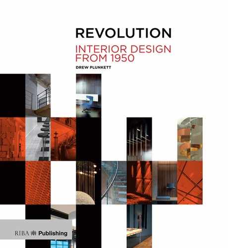
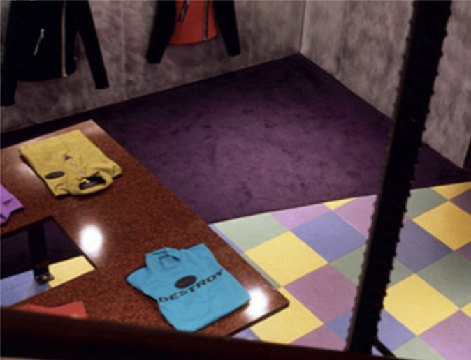
The ice cream shop lent itself wholeheartedly to a Postmodernist interpretation but with a palette less North American Disney and more Italian Memphis. Walls were horizontally striped in shades of grey, inspired by the walls of Tuscan churches and, perhaps, by the layering of Neapolitan ice cream. The greys were muted backdrops to the colours of the ice cream flavours displayed in the counter, at a time when ice cream in Britain tended to be white and scooped from a steel freezer drum. Wall lights suggested stacked cones and a red triangular ‘wafer’ pierced the street signage. The client was enthusiastic, only objecting to a small Cypress tree in a pot that reminded him of an urn in a cemetery.
Gran Gelato was, as Casson says, ‘a pretty shop’,8 but it caused outrage. It was in Knightsbridge, an expensive quarter still inhabited by old money, was extravagantly unconservative, and had been completed before receiving planning permission. The neighbours lodged their appeal but Casson counterpunched with supportive letters from architectural ‘big wigs’ including Sir Philip Dowson and Sir Denys Lasdun. It is doubtful if any of them were enthusiasts for Postmodernism but they were all Casson family friends. In truth, Gran Gelato deserved support. Its wit set it well apart from the dour PoMo façade-ism that was increasingly decorating office ‘sheds’. The published photographs excited students across the country.
Gran Gelato was the only shop Casson Mann ever designed. Their next influential project, in 1988, was for the headquarters of the Chartered Society of Designers in Bloomsbury, and also provoked excitement when published in Designers’ Journal. It was within a listed townhouse, which demanded ingenuity. The reception desk was on wheels to signal that it and the other new elements were making the lightest possible connections to the building fabric. Light fittings with polished satellite dish reflectors – a little reminiscent of Ralph Adron’s ‘tulip’ lights – hung with respectfully minimal fixings. Walls were papered with pages from old design magazines.
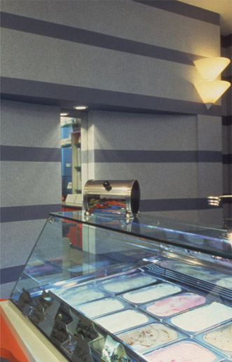
Gran Gelato.
Grey walls, inspired by Tuscan churches, were complemented by the colours of ice cream.
Gran Gelato, as before. An ice cream shop lent itself well to Postmodernist wit and allusion.
Commissioned by the Society’s independently minded director Michael Sadler-Forster, it drew ‘a lot of flak’9 because its aesthetic smacked of something not quite Modern, offending the crustier members. It did not suggest the headquarters of a moribund professional organisation.
The Society was, as ever, short of money but the interior looked expensive even if was not. There was ‘no cost control whatsoever’ and the work was ‘terribly improvised’,10 with many bespoke pieces made by RCA students. Casson describes it as ‘a bit arts and crafts’ and ‘a bit of a manifesto project’11 which used cheap, unglamorous materials like linoleum and plastic laminates. There was no money to furnish the bar so Casson Mann asked radical showrooms and shops to donate pieces. The eclectic mix of gifts excited further criticism from members chose to see it as indicative of an inability to make decisions.
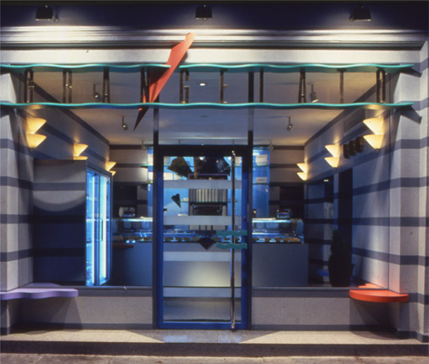
Institute of Practitioners in Advertising.
The chandelier of frosted television screens
Their next important project, in 1989, was for the headquarters in Belgravia of the Institute of Practitioners in Advertising. This followed more conventional processes but confirmed an early awareness of sustainability. Building blocks made from crushed drinks cans lined the entrance and a ‘chandelier’ of frosted television tubes hung above the stair landing, both alluding to the subject and the substance of advertising.
They received a series of office projects through a contact in the office fit-out sector but, apart from reception areas, these offered limited opportunities. Editorial offices for the Guardian newspaper in 1992 offered a little more scope.
In 1994 they created the exhibition space for ‘British Design: New Traditions’ in Rotterdam, using a line of television monitors to direct visitors through an awkward space. It was very successful, with short clips of the traditional particularities of British life – caravans and tea shops – contrasting with work by radical British designers such as the cutler David Mellor, and the fashion and textile designers Timney Fowler, Vivienne Westwood, Joseph, and others. They began to think there might be more creative opportunities in exhibition design.
Tim Molloy was responsible for design at the Natural History Museum and, in Casson’s words, was ‘trying to stir the pot’.12 They failed to get the commission for the main gallery, which went to Ben Kelly, but got the children’s gallery and laid down their marker. When they heard that the V&A’s British Galleries were to be reorganised, Casson phoned Christopher Wilkes, the relevant contact there, who had seen the children’s gallery and the Rotterdam exhibition and who encouraged them to apply.
They were appointed to deal with the ‘interpretative design’ while Arup was appointed for the architectural content and David Mlinaric for the interiors; initially it was not clear how responsibility would be divided. At the first meeting, Casson realised that none of the many representatives of the V&A knew how to set about making an exhibition and, though the architect and interior designer were in the room, they were looking to her for direction. She remembers turning to look behind her, expecting to see ‘a small man who would know what to do’ before realising that they had assumed she should be in charge.13 There was no opposition from Arup or Mlinaric to her taking the role. When the architect attempted to talk about technical matters, Mlinaric explained that his only concern was to ensure that the rooms looked right.
Every Tuesday morning for three years, Casson met with Mlinaric and his collaborator, John Cornforth, the architectural historian and editor of Country Life, to ‘talk about colour and only colour’.14 Both had a prodigious memory for colours and, when debating options, would cite rooms from various grand houses. They would have paints mixed to get solutions exactly right. A significant element of Casson’s work was to harmonise exhibits with their bespoke colours.
Cornforth was scruffy in the manner of an English eccentric and appeared to know more than the persons from the V&A about the museum’s contents. Mlinaric, of Slovenian descent, was as grand as the buildings he worked on. His rich American clients enjoyed the confidence with which he ordered rooms to be repainted if not ‘quite right’. He refused a contract from the V&A, preferring a letter of appointment, such as he would receive from his grander clients and which would not set out tedious contractual detail.
While Casson was working at the V&A, Roger Mann was leading their project for the Wellcome Wing at the Science Museum on the other side of Exhibition Road. If the V&A project was about exhibiting objects with modest supporting texts, the Science Museum was about ideas, in which text was supported by token objects.
The two projects quickly gave them an in-depth understanding of exhibition design, and they were able to consolidate their thinking when asked to establish principles for the display of objects in a provincial Russian city museum. They were soon typecast as exhibition designers, and became familiar with mustering and leading teams of specialists. The practice grew to around 20, including four associates – ‘a little top heavy’.15
In the beginning both partners went to project pitches until they were advised to drop the practice – if both attended they seemed too eager, desperate even, and they would often lapse into strategic discussion between themselves. Now they work together at the beginning of a project and once a direction emerges one takes leadership. Casson thinks this makes for better projects but says they ‘fight’.16 Mann stays with things; she ‘scuds’ about.17

‘Atmosphere: Exploring Climate Change’ at the Science Museum. Ideas are expressed in words, and words benefit from spectacle.
The British Galleries at the V&A museum.
Complementing the exhibits but letting them speak for themselves.
Mann’s father was an illustrator, making drawings showing how objects were assembled and how they functioned. Mann has inherited this capacity for precision and detail. He is a ‘detail man’ and his drawings are ‘immaculate’. He is interested in digital technologies and their impact on exhibitions. Casson is ‘slightly envious’ because he made a conscious decision to become an interior designer whereas she drifted into the family trade.18
Perhaps the most intriguing example of her reluctant emulation of her parents came when she took over leadership of what was then called Architecture and Interior Design at the RCA in 1995. Throughout the early years of Casson Mann, when fee income was modest, she had continued to teach and Derek Walker, who led the RCA course in the mid 1980s, asked her to teach there one day a week. Having been responsible for the master plan of Milton Keynes, he felt he needed support from someone with experience of working on a smaller scale.
Walker was succeeded by Theo Crosby, whose proposed direction for the course was eccentric, broadly in line with the ideas expressed in his essay for Designers’ Journal’s ‘Inside Edge’ edition. He declared that students would draw the classical orders on cartridge paper. Crosby had not taught before and invited Pedro Guedes, who had taught at the Architectural Association, to set up the architecture stream.
Casson believes that Guedes was a subversive presence in the department, eventually precipitating Crosby’s disenchantment and abrupt departure. Crosby suggested that the staff, who included Ben Kelly and Julian Powell-Tuck, should decide among themselves who should take charge; they put their names into a hat and dynastic imperative decreed that Casson’s was drawn out. Leadership at the RCA reverted to a Casson.
She needed someone to lead the architectural contingent and Guedes stayed on, now briefing against her to staff and students. When he revealed that he had been offered a job in Australia she did not dissuade him from taking it.
Despite having given the architectural component of the course validation for its Part Two examination in the early 1980s, the RIBA was again doubting its viability. The direction proposed by Crosby and the debacle of his departure reinforced their scepticism. Casson’s first year in charge was spent writing reports about possible futures for the course. The RCA’s deputy rector wanted to close it but a contingent from the RIBA visited, led by the professor of architecture at Glasgow School of Art, and agreed that the course should continue and this nepotistic appointment helped assure the future of architecture albeit with the proviso that the curriculum and course title were no longer shared with interior design. Nigel Coates was appointed professor of architecture. Interior design was dropped from the course title and, effectively, from the curriculum. Casson stayed on for a year to usher the remaining interior design students successfully off the premises.
 Rebel without a pause
Although he arrived just a little too late to be included among the original ‘big beasts’, Nigel Coates made his own substantial bang.
Born in 1949, he was brought up in the spa town of Malvern in rural Worcestershire. His mother encouraged his interest in architecture and his father helped him make model buildings. His local grammar school, encouraged him to concentrate on the sciences, and a careers advisor thought he might make a good bank clerk. The school did not offer A-level art so he commuted to a technical college in Worcester to pursue it. His ‘epiphany’ was the realisation that a combination of science and art was an approved starting point for studying architecture.19
He was wary of moving to London, which was a forbidding place to provincials in the late 1960s, and enrolled instead in the architecture school in Nottingham, content to graduate with his 2:1 (he thought getting a first would have been ‘creepy’20). He moved to London with ‘a bunch of mates’ and spent a year working for Lambeth Council’s architects department on ‘little cottagey developments’. He was, he says, ‘Bored to tears…only interested in moving to Kensington and discovering other aspects of London’.21
A tutor at Nottingham had encouraged him to apply to the Architectural Association and in 1970 he got a grant to study there. He found an understanding tutor in Bernard Tschumi, who eschewed drawing and tended to veer towards the philosophical. He graduated in 1974 and did his best to avoid working in the uninspiring professional world of the 1970s. He found occasional work at DEGW interesting. He identifies Postmodernism as a ‘marker of developing tastes’ and a ‘call to arms’. It ‘seemed fresh’.22
He was invited to take over Tschumi’s ‘unit’ at the AA in 1979 and began to gather about him a group of promising acolytes. He encouraged them to bring their ‘evening lives’ into their work and to consider how a ‘clunky but kind of dynamic’ fusion of art, science, and narrative had not only created the ‘utterly seductive’ Festival of Britain aesthetic but that this had been tolerated and its impact intensified because it was temporary. He began thinking about a populist architecture:
His year in New York, teaching at Bennington College and frequenting the galleries of SoHo, helped to develop his very particular drawing style. Like Connor’s, it was free and expressionistic, but with a little more colour. In a September 1987 Designers’ Journal article, Rick Poynter described Coates’s drawings, which were emulated by students far beyond his immediate followers, as:
Coates’s students adopted the style and in 1983 there was a scandal when the external examiners, James Stirling and Edward Jones, who were both dabbling in Postmodern Classicism at the time, refused to pass the group, declaring their content and presentation methods to be un-architectural. There was an impasse but Coates was supported by the institution and eventually Stirling and Jones gave up and the students were passed.

Caffe Bongo.
Nigel Coates’s concept drawing..
The Stirling/Jones furore was reported in the pages of both Building Design, the most utilitarian of architects’ journals, and in Tatler, the socialites’ periodical of record. Alvin Boyarsky, who headed the AA and supported Coates, suggested that Coates produce a book to explain and defend his position. Coates describes this as both a ‘punishment and an opportunity’25 and, with instinctive perversity, decided not to do a book but a magazine. It was titled NATO (Narrative Architecture Today), as was the inner group of acolytes, chosen for their ‘spirit and attitude’, who contributed to it.26
Coates thought the magazine, with photographs of people rather than buildings on its cover, a ‘clever’ way to get ‘under the radar’.27 He describes it as post-punk; there were fashionable graphics and the magazine format allowed each member of the group to contribute as an individual. He says it, ‘Appeared to have more authority than it did’.28
After the group’s exhibition in London’s Air Gallery, Peter Dormer wrote in the November 1985 Blueprint:
He praised them for understanding the relationship between trade and culture: ‘Commerce is to be read for what it is – not the vulgar hand that supports the pillar on which our culture soars but the vulgar heart of our culture – commerce is our art and aspiration.’30 Higher-minded interior designers would have been too disturbed by the two ‘vulgars’ to see in this a justification of their activity.
Dormer offered more encouragement to walk away from the higher ground by indulging his well-honed chastisement of fine artists:
Though primarily about architectural drawings in an art gallery, Dormer’s critique offered a franker, more provocative reading of the environment in which interior design operated (and still operates) than any of the timid perceptions offered by theorists from within the discipline.
Despite his appreciation for the enduring spirit of punk, Coates found early 1980s London dreary. In response, he ‘found a gang’ with whom to go clubbing, became ‘New Romantic in every way’,32 and began transforming his rented flat in South Kensington, which had high-ceilinged rooms and generous mouldings. Some walls were skimmed with pink plaster, which was left unpainted; tall double doors were partially stripped to reveal successive layers of ancient paints. He filled the rooms with an exotic collection of furniture and artefacts, some refined and some crudely wrought. In the entrance area an ornate desk sat on a patch of concrete flooring and, among the objets d’art that crowded its top, a woman’s shoe with pointed toe and stiletto heel served as a pencil holder.
It was devastatingly new and it was romantic, full of wit and invention. The style journalist Peter York, walking home on the opposite side of the street, could catch just enough glimpses of the interior to be intrigued. Then he met Coates, its creator, at a dinner party, and wrote about the flat in Harpers & Queen and Cosmopolitan. It might have had no place in the Architectural Review but fashion editors understood its significance. York’s article was reprinted in Brutus, a Japanese magazine, and Coates’s ball began to roll.
He was visited by Sy Chen from Tokyo, who wanted a restaurant that smacked of an English gentlemen’s club. In Tokyo, Coates helped him find a former garage in the fashionable Roppongi district that provided him with a double-height space – ‘something to play with’.33 The resulting Metropole was a dramatic change from the reductively modern cafes, bars, and restaurants that had proliferated in the city and which suddenly appeared very conventional. Coates credits Sy Chen with the success in Japan that made his reputation in Britain. Together they completed 20 interiors and three buildings in less than ten years before the Japanese economy crashed.
Metropole was entered through a row of four columns with capitals made of twisted steel reinforcing bars. The interior was emphatically retro-European. In the entrance area, on a mezzanine above the bar counter, customers could leaf through musty volumes of European novels and poetry. Opposite the counter, two black armchairs sat before a marble fireplace beneath a weighty chandelier and a gilded mirror. The restaurant area was entered through a proscenium arch; its walls were hung with antique plaster casts and mirrors which stretched it to infinity. A smaller room sported a mosaic floor and frescoed walls.
Metropole Tokyo.
An ‘intentional fiction’. The assemblage of artefacts fed Japanese expectations of European grandeur.
Mitsugu Okawaga, reviewing Metropole for the Architectural Review, talked of, ‘A strange sense of inhabiting a delicate balance between good taste and bad taste’, and the ‘intelligent use of an intentional fiction; the proscenium arch…clearly proclaims “fiction”’.34
Sy Chen, recognising the commercial potential of Coates’s work, set up Creative Intelligence Associates (CIA) to act as his agent in Japan and organise local professional support. Coates’s next Tokyo interior, and the one that he considers made his reputation, was 1986’s Caffe Bongo, inspired by Fellini’s 1960 film La Dolce Vita. Its collage of classical statues, hanging draperies, ceiling painting, and artefacts buried in the floor in clear acrylic aspic all evoked Roman decadence. Meanwhile, a stretched facsimile of an aircraft wing was wrapped around the room, serving as a shelf for classical statuary before bursting through the façade to form something like a canopy. All implied a calamitous melding of past and present. Coates was given a sum to spend on European antiques – or ‘carefully selected garbage’35 – bespoke pieces, and special finishes, which all hinted at ‘authenticity’. It fitted with NATO’s ‘multiple aesthetic’ and was the antithesis of reductive Japanese design. In the November Designers’ Journal, Rick Poynter described Coates’s Japanese work as, ‘Extravagant exercises in classical collage and post-holocaust baroque…a feast for the starving eye and Japanese clients bored with a diet of homegrown minimalism are beating a path to his door.’36
Charles Jencks described Bongo as a ‘crash’, but Coates dismissed this prosaic interpretation. It was, he said, ‘A fusion of the biggest object that symbolises movement and the architectural condition of the window’.37 It was sited on the busiest pedestrian crossroads in the world and he thought his creation was restrained compared to things that were happening further down the street. He was too modest: it excited Tokyo and stunned designers in Britain, who could only marvel that he had the nerve to conceive such a thing and that there was a client who would build it.

Caffe Bongo, as before. Internally the wing becomes an enormous shelf for classical sculptures, behind which brickwork and a classical cornice contrast with a fragment of the existing ribbed concrete cladding.
Proliferating projects in Japan and Britain meant that Coates needed a sizeable UK office and he set this up in partnership with Doug Branson, whom he had met at the AA and at DEGW. Jose Manser wrote in the June 1990 Designers’ Journal that Branson’s support helped Coates to prove that:
Coates gave up teaching in 1987. Work pressures, and stimuli, meant he ‘wasn’t listening to what students were saying’.39 NATO had also become problematic. There was infighting and some members thought Coates had appropriated ideas that had evolved collectively and exploited the publicity generated by NATO, which was questionable since his success had been built on Peter York’s article. Coates concluded that there were creative people outside NATO and, as recriminations increased, he became disillusioned and left.
His work was not popular with architects and designers who were still unhappy about the influence of Postmodernism. His professional success and the attention paid to him by fashionable magazines fed resentments; there was also a perception that he courted publicity and that he might just be frivolous.

Caffe Bongo, as before. The ‘wing’ isolates the interior from the concrete façade above and sweeps through the window to wrap around the room.
He had designed ranges of furniture for his Japanese interiors and licensed them under the guidance of Sy Chen. They shared a sizeable royalty each month and with it Coates bought an ancient, dilapidated house in Italy. He was now able to use both the flat in Kensington and the house as testing places for ideas. When the client for his The Wall project in Tokyo wanted a building that ‘looked as though it had been there forever’,40 Coates asked local Italian builders who had repaired the house’s stone and brick-patched walls to make similar composite elements. The Japanese not only liked European ideas and artefacts, they also enjoyed the particularities of European artisanal building techniques. Other Italian influences found their way into a shop for the fashion designer Jasper Conran, who, Coates says, had a ‘subtle vision’41 and, while all around him were going minimal, asked for a shop that was like a house with a fireplace.
By the end of the 1980s, sparse white ‘Modernist’ spaces seemed to be the future of retail. Coates challenged the model with visual extravaganzas. In his January 1989 Review article, ‘Retreats of Fashion’, Adrian Dannatt considered the implications of the fashion designer Katharine Hamnett’s decision to replace Foster Associates with Coates as her interior designer. There continued to be visceral frustration with persistent Postmodern revisionism in many architectural circles and the Review was, as always, doubtful about retail design’s integrity:
Foster Associates represented the acceptable face of late Modernism while Branson Coates seemed to be leading the way to chaotic bricolage. For Hamnett the switch of designers provided dramatic change. In 1986 Foster had converted a cavernous former garage building set in an irregular space behind a conventional brick street frontage of shops and flats. Customers entered through a narrow tunnel and crossed the shallow arc of a glass bridge, artificially lit from below, before stepping into what Dannatt called a ‘sudden vertigo of space’. The top-lit space, with its white walls and towering, mirror-clad changing room doors, was emphatically empty except for a few clothes racks distributed casually across an expanse of polished concrete floor, in the middle of which stood a grand piano.
It was theatrical but it was Modernist theatre – an empty set – and it suited the selling of the austere black clothes that architects favoured (Hamnett was, at the time, their designer of choice for baggy black suits). However, Hamnett had demonstrated her first doubts about austerity when she replaced the piano with a colourful pile of found objects – a hint that she was ready for the Coates aesthetic. The Foster interior was never completed because of ‘contractual difficulties’.
Dannatt dealt fairly perfunctorily with the Foster version. It was a few years old and he was obviously keen to move on to attacking Coates, whom he accused of being, ‘Undeniably old-fashioned, belonging irredeemably to that early ’80s world of nightclubs and faux-Baroque, the ultra-urban ideal, when pop videos still seemed somehow daring, even watchable’.43
He praised Coates’s work with NATO, which he described as, ‘A rebellious explosion of pleasure, a pirate aesthetic treating the city as a playground of sensual experience and literal semiotics’.44 He suggested that it represented an anarchy that might be used to attack the prevailing reductionist archetype:
He was right. However emphatically Modernism’s defenders might insist that it was a philosophy and not a style, it had become a ‘look’ that had circled the globe and lost its social agenda.
Coates created two shops for Hamnett. The first was in Glasgow, in a development that enclosed, with kitsch and clumsy Art Nouveau-esque detailing, a glazed courtyard lined with shops and restaurants. Hamnett’s name lent glamour to the development and her highly wrought interior gave a foretaste of the vocabulary of Coates’s second project in the short stretch of London’s Sloane Street that was dedicated to the most rarefied designer shops.
Dannatt seemed keen to attack Hamnett. She preferred the Sloane Street shop to both the Foster and the Glasgow projects, so he identified virtues in the latter. He found its fish tanks ‘calming’ rather than obstructive. The small changing cubicles that felt cramped in London were in Glasgow ‘handled with modesty and some wit’. He even claimed to enjoy the prosaic illusion of doubling the number of cubicles by a mirrored reflection. He thought the Moroccan-Moorish colours would work well not only with Hamnett’s then current collection but also that, ‘It would be hard to think of any clothes that would look tatty in the warmth of the space’.46
Katharine Hamnett, London: as in Caffe Bongo, a ‘wing’ sweeps round the room but is here appropriately scaled down and the references are clearly to Deco interiors.
Perhaps Dannatt had succumbed to the metropolitan’s determination, when Glasgow was fashionable in the 1980s and 1990s, to appreciate everything Glaswegian. He found the Glasgow interior as ‘convincing as a Coates drawing’, perhaps because the curved and scalloped walls and twisted metal lighting tracks were solid and precise while Sloane Street’s drapes were flimsy and imprecise.47 Coates described Glasgow’s scalloped walls as aircraft forms expressed in adobe. It is a moot point as to which was the superior: both were quintessentially Coates, but perhaps the kitsch surroundings of the Glasgow shopping centre did accommodate Coates’s extravagant layers of decorative detail better than Sloane Street, with its abundance of minimalist couture shops.
Interior Modernism was, Danatt said, influenced by the minimalism of the traditional Japanese interior, whereas Coates drew on the chaos of modern Tokyo. Both Foster and Coates, he said, wasted space: the former to accentuate emptiness and calm, the latter by packing too much in – ‘smearing it with detail’.48 He criticised the detail and its deployment in Sloane Street. He objected to the way the stacked fish tanks blocked the window and the view to the interior and, in true Architectural Review style, compared it unfavourably with an architectural precedent – Frank Lloyd Wright’s V. C. Morris gift shop in San Francisco, which presented a blank brick wall to the street. Dannatt saw Coates’s design as a compromise, neither obscuring completely nor accepting the orthodoxy of total disclosure. He declared that the detail of the finished interior lacked the panache of Coates’s exuberant concept drawings and that, without ‘interplay’, the ‘jokey tack’ did not add up to a humorous whole. While he conceded that the interior complemented Hamnett’s then current collection, he doubted that the compatibility would survive collection changes. He spread some blame to Hamnett herself, saying that had she not invited Coates to ‘pore over books on Beaton and Cocteau’ – and allowed him to ‘pore a little more over [his] own ideas’ – he might have done better.49 Coates, conversely, admires Hamnett for her ‘wonderful anarchic spirit’.50
Of course, the Architectural Review had never been comfortable with commerce or fashion, and Dannatt appears to have been a congenitally contentious commentator, so it is unsurprising that he chose to rough up Coates, then the doyen of interior design. (As a child actor, Dannatt played the lovable and funny antihero in a television series based on the Just William children’s books, and William’s capacity to cause trouble despite meaning well would seem to have remained with him.)

Jigsaw, Knightsbridge.
While the intensity of decorative elements matches the Hamnett shop, the references to a specific period are less obvious and suggest that Coates had evolved a more personal language.
Few critics were as belligerently blunt as Dannatt, but he was not alone in his criticism of Coates. There was also censure in Designers’ Journal, which might have been thought a more sympathetic organ. The November 1991 issue contained a review, of Coates’s new shop for the mid-priced fashion shop Jigsaw in Knightsbridge, that matched the Review for implicit spite:
Coates, however, considers himself good at shops because he enjoys and ‘understands shopping’.52 He is not unsettled by criticism.
In the 1990s Branson Coates were in demand less overseas but increasingly in Britain. Without having curbed their iconoclastic instincts, they were becoming rather establishment. They worked for cultural bodies such as the Glyndebourne Opera and the Geffrye Museum. They won a competition to design the building for the National Centre for Popular Music in Sheffield (but not the interior or the exhibition it was to house). This was funded by the National Lottery and, like most such projects, was a triumph of idealistic diversification of cultural resources over commercial pragmatism. Coates criticised the exhibition but was ignored, seen as a metropolitan outsider without empathy for the capital’s gritty hinterland. Ben Kelly had also coveted the interior job. Whether he or Coates could have salvaged the enterprise is unknowable, but either’s conceptual bravado might just have helped it to show a profit.
Branson Coates were also drawn into the chaos of the Millennium Dome of 1999. Coates’s conclusion on the whole enterprise is that the clients ‘just got it wrong’.53 Branson Coates were responsible for the Body Zone carapace: an enormous, Henry Moore-esque reclining figure covered in pixelating tesserae. Its enormity and clear symbolism made it the backdrop for the frequent television reports on the progress and unlikely profitability of the project. Coates also disapproved of its interior and assumes he would have done it better. He complains that when the two projects ‘failed’ he was blamed because he was responsible for the containers,54 which is ironic given the number of times architects take credit for a building’s success while the popularising efforts of the interior designers are ignored.
When Coates re-entered academia in 1995 as professor of architecture at the RCA. He thought it was a perfect post for him: a small department in a major artistic institution that did not know quite what it wanted that department to be. The broad brief was to ‘elevate its status’.55 Adopting the Architectural Association model, he divided the two years into ‘units’ with the intention of creating internal competition to drive up standards. When interior design was dropped from the course title and curriculum Coates was presumed to be the instigator of the purge, although responsibility lay with the RIBA’s visiting board. He now explains that he enjoys the freedom that interior design education and practice offers. Unimpeded by constraints imposed by professional bodies, he sees it as a potentially broader field of study that may embrace event and theatre.
He sat on the committee set up to determine a new RCA academic structure and wrote the document that argued for the reinstatement of interior design as an independent course within a school of architecture, which came to be in 2012. He did not fit comfortably within the revamped institution. He was criticised for giving too much time to practice and had a substantial row with the rector, who concluded that he did not respect management. Predictably he feels that practitioners are best equipped to give academic direction and is proud that during his time, RCA postgraduates initiated more new practices than those from the AA.
Branson Coates disbanded in 2006; Branson left to build his own house and concentrate on cycling. Coates says they were a ‘good team’. He now concentrates on furniture and product design from a small, elegant studio on the ground floor of a Georgian house on the edge of Bloomsbury. He has liaisons with luxury manufacturers and his furniture, primarily wooden and upholstered, is characterised by witty reconsideration of traditional detail. He takes on occasional interior projects, namely those that can be achieved by the strategic application of bespoke furniture.

Coates’s South Kensington flat is in a continual state of flux, a context for new furniture pieces. The ad hoc salvage elements that had characterised the first incarnation have been superseded by more crafted pieces from Coates’s collections for various manufacturers.
Speaking as the chairman of the 2013 Inside Festival jury in Singapore, Coates described a good interior thus:
Elsewhere he has declared that practical constraints make architecture ‘hard to make well’.
Moving On
At the end of the 1980s, David Fern and Nigel Green produced a project that had an impact comparable to those of the ‘big beasts’.
It began with Fern. Born in Burton upon Trent, a Midlands brewing town, he went to grammar school, where he was ushered towards science subjects. However, he was interested in mechanics and cars and, at 16, he applied for five apprenticeships in the car industry and was offered three: at Jensen, a small sports car company, Jaguar, and Rolls-Royce. He took the last but, after a year drawing aero engines, decided it was unstimulating.
Part of the apprenticeship involved classes at the local technical college and there he found a girlfriend from the art school that shared the building. She introduced him to Vogue and the Sunday supplements, giving him a glimpse of a more glamorous world, and suggested he study furniture design at High Wycombe. He put together a folio at night classes and, because of his age and experience, was accepted without having to submit himself to a foundation course. He rejected product design, which seemed a little too much like engineering. His parents, he says, were ‘alarmed but supportive’.57
He was tempted by interior design, which at Wycombe was strictly Modernist, with Mondrian and Rietveld held as exemplars, but opted for furniture because it involved making and offered time away from the drawing board. Lecturers in art and design history and visiting design tutors, who included Julian Powell-Tuck, ‘pointed towards things worth seeing’.58 He knew little about interior practice beyond Conran and Habitat. For his dissertation, ‘The Struggle For Youth Identity’, he interviewed Conran and Mary Quant and concluded that a distinctive youth culture had begun to emerge in the 1950s.
He had chosen Wycombe because he was wary of going to London, but after six months post-graduation spent in a kitchen/bathroom showroom, he was ready to make the move. In London he shared a house with a few Wycombe graduates and when one of them declined a job offer with Conran, he applied for it and got it. There were a significant number of Wycombe alumni in the interiors studio.
Conran Associates and Fitch & Co. were the two most glamorous studios at the time and Conran’s location, off Neal Street in Covent Garden, was the height of chic. Fern stayed for three years, during which he met Nigel Green, who had trained in interior design at Middlesex. Green had joined in 1983 and worked principally on Terminal 4 at Heathrow. Fern was occupied with smaller-scale projects, such as exhibitions and shops, which helped him develop the confidence to deal with clients and contractors. An exhibition stand for Pilkington, the glass makers, was his first ‘own’ project.
Conran himself was devoting more time to building his retail business with his Stonehouse group, and the design company was becoming increasingly involved in large-scale projects, shopping centres, and malls. David Dickery was creative director and was the primary influence on the studio’s aesthetic. There were three interior design associates: Peter Trickett, David Salter, and Graham Lusted, who had interviewed Fern and would later go into partnership with Green.
In 1984 three associates at Conran, two of them from the graphics section, decided it was time to set up their own company and formed Design Solution, where they were joined by an architect from Chapman Taylor, a leading commercial practice, who brought with him inroads to retail and office developments. They asked Fern to join them. Initially he was the only non-partner in the interiors department but, as was common in the mid-1980s, the company quickly ballooned to 30. Fern became a senior designer and was on the verge of becoming an associate but the increasing scale of the practice’s workload frustrated him.
As interior design was increasingly seen as a marketing tool, ‘account handlers’ were becoming an interface between designer and client in the bigger, harder-nosed commercial practices. Fern also saw that as the design business grew, graduates were being precipitated into positions of responsibility and quality was suffering. Increasingly, he felt, practices were churning out themed solutions that were ‘unconnected with anything other than marketing’.59 He began to think about moving into architecture, which he imagined to have more serious intent, but in 1988 he met Nigel Green at a party during the Milan Furniture Fair and they talked about setting up an interior practice together.
A PR friend of Fern’s had suggested Design Solution to Wayne Hemingway for his new shop, Red or Dead. Hemingway was uncomfortable about working with a large company, suspicious of its motivation and worried about its fees. Fern offered to do the project independently (and more cheaply). He concedes it was an unethical move, but it was clear that Hemingway was not going to appoint Design Solution. He handled the project after work and at weekends, discreetly taking time out of the studio to visit the site. The shop opened on his last day with Design Solution.
He said that he acquired clients through ‘luck, circumstance, serendipity’, making friends and contacts – ‘people knew people knew people’.60 He went to The Wag Club, The Soho Brasserie, Freud, and anywhere else that was fashionable. The Hemingway connection proved productive. Fern was working on his own for two years, renting space in a graphic design studio and not making much money, but then Hemingway recommended him to Michiko Koshino, who wanted to open a shop in Neal Street. She was already talking to other designers but gave him the brief, specifying that she wanted no references to Japan and that the shop should be a ‘total environment’, and invited him to come back in a week to make an unpaid pitch.
Fern suspected that Ben Kelly might also be pitching and realised that he had to make a serious bid for this ‘once in a lifetime chance to do something interesting’.61 Green and two others joined him to develop ideas and produce six A1 presentation boards and a model. They won, and the shop, jammed full of ideas, was an outpouring of pent-up creativity. A three-metre-high curved door made from oak strips slid back on a recessed track to remain open throughout the trading day. The interior was dominated by a line of three changing cubicles and a long counter, both of which perched on the edge of the higher floor level, centrally located as stipulated by Koshino. The sandblasted mild steel frame of the counter supported clear sealed MDF panels and a walnut top. The cubicles were clad in green neoprene sheet, a trademark Koshino material, which was stretched between angled steel uprights attached to floor and ceiling. The cubicles were slightly raised above the upper floor level and entered from the lower by three oak steps with curved steel handrails that helped brace the structure. They were lit from above by customised car lights supported on thin strips of plywood suspended from the ceiling and tensioned into arcs by steel wires. Large, clear sealed MDF frames were suspended in front of steel hanging rails at the front of the shop and the shelves at the back. The lower floor and steps were terrazzo. The carpet on the upper level was dressed two metres up the back wall. Walls, ceiling, and columns were painted the same light green to accent the particularity of the various freestanding elements. It was a rich mix. Nigel Green thinks Koshino wanted something more flamboyant than d’Avoine’s first project, and she may have been swayed by the Nigel Coates projects that were usurping minimalism in Japan.62

Michiko Koshino: changes of level and display elements overrode the characterless planes of the existing walls and floor.
The neoprene skin of the changing cubicles was a signature Koshino material and, like all the other elements of the interior, was pushed to an extreme of elaboration.
Hemingway was envious of the Koshino shop’s quality. Fern had designed his Red or Dead shop just across Neal Street but the budget had been tight and the workmanship poor. Koshino’s budget paid for a good shop-fitter and good materials. Taking the hint, Hemingway opened another shop further down the street, designed by the new Fern Green partnership, with a proper budget. At one time, five shops in the short, uber-fashionable stretch of Neal Street were by Fern Green, including a small, short-lived Biba for someone who had bought the name, and two shops for the designer John Richmond that developed the rough materiality made chic by the interior of Ron Arad’s One Off shop, also in Neal Street.
John Richmond shop.
Raw concrete walls and steel reinforcement bar balustrade were fashionably ‘industrial’.
Fern thinks the partnership did their most interesting work in the beginning, when the two of them worked with very few assistants – mostly students on placements. One small office project, on the ninth floor of a modest block off Tottenham Court Road, had long but unremarkable views over London. Fern Green cranked up their impact by filtering the vista through metal mesh and cutting small, clear ‘windows’ at standing eye level, demonstrating how to make a virtue of an undistinguished shell and undistinguished views.

Office conversion: ‘Television’ screens on stalks offer clear views through the fine metal mesh that otherwise covers the windows.
As their one-off projects received publicity, they began to attract middle-range fashion chains. They worked for Kookai, a French chain, in the UK, and Blanco in Spain. Such projects suited them. The budgets were good and the clients were interested in quality. By the end of the 1990s their clients were bigger. They were appointed by Boots to deal with their branches across the country; this relationship continued from 1997 until 2002 and the practice grew to be 20-strong.
Things began to fall apart in 2002. Commissions dried up after 9/11 and there were tensions between the partners. Both established their own practices. Fern also moved into teaching, at first part-time and eventually full-time at Middlesex University. Green set up new practices, first with his wife, who had worked with Fitch, and then with Graham Lusted, whom he knew from Conran. He sees both Fern Green and Lusted Green as occupying a ‘middle ground’ between retail design and architecture.63
When they joined forces, both Lusted and Green already had established reputations and a broad network of clients across the spectrum of interior design activity. Green’s work for Boots led to commissions from BUPA, the private health insurance company. They designed its first dental surgeries, high street presences that were also intended to connect the company with non-corporate clients. Subsequently they have been involved in the design of BUPA care homes, where they have created an aesthetic appropriate to the patients, whose average age is 38. Such commissions confirm that the business value of the interior is being understood beyond retail and hospitality.

F&C Reit office.
The reception area in a ‘boutique’ office. The stair balustrade is an example of how digital design and production technologies are making possible, and encouraging, a revival of decorative detail.

A BUPA dental centre.
The reception area for a dentists’ surgery designed to introduce potential subscribers to private health care.
Lusted’s work for the Queen’s Gallery has led to commissions from the National Maritime Museum, Blenheim Palace, and other public institutions.
Green expresses familiar anxieties about distinguishing what they do from interior decoration and is nervous about the ambiguity of an interior design label. Occasionally they recruit an architect, but the staff are predominantly trained as interior designers. When necessary to pre-empt client anxieties, Green describes himself as a design consultant.
On their website they describe their work as ‘interior architecture’ and justify that by saying that the developers for whom they work are accustomed to working with architects and could feel short-changed by what they would perceive as a less august title. Green further justifies the distinction by claiming a methodology similar to that of architects, in which the plan is the driver of a project, but leavened by consideration of the user experience and an un-architectural concern for the ‘emotional feel of the space’.64 He acknowledges that for the latter, and in particular for restaurant projects, it is necessary for the two long-serving partners to surround themselves with younger designers. Occasionally they collaborate with other design practices more at ease with what he calls ‘set dressing’.
Staff numbers hover around eight and have never been higher than 11. Green considers the company, which emerged after the 2008 recession, as young and thinks that the optimum staff number would be fifteen, allowing them to take on bigger projects. They recognise that retail and hospitality are becoming increasingly experiential and shaped by digital possibilities. Younger members of staff bring awareness of innovation and how it is likely to impact on work and leisure. They are given time to attend events that will add to that knowledge.
Crossing Boundaries
The David Collins Studio has a reputation for sumptuous retro interiors, working on homes for wealthy private clients and expensive hotels and restaurants. Those are the projects that get most publicity in glossy magazines, but the Studio also works more anonymously on high streets and in malls for fast food and cafe chains.
Collins was Irish, born in 1955. The son of an architect, he studied architecture at the Bolton Street School in Dublin, an institution with a modest reputation, unlikely to inculcate its alumni with an inflated sense of their worth or a mission to fight the good Modernist fight. He completed his professional qualification in Dublin before moving to London, where he worked for a number of the bigger practices, principally on large-scale office and residential projects. He set up his own studio in 1985, working alone.
Advocates of Modernism like to declare that it is not a style but a philosophy that, properly applied, will benefit its recipients (even if, like medicine, its initial taste may be unpleasant). Collins was Postmodern in spirit and interested in working with a richer palette; for him Modernism was just another style that he could add to the mix as appropriate. He worked on a presumption that the spirit of a time is not expressed by the rejection of all that went before it; that the present is part of a continuum enriched by the past; that the forms and the materials of the past have a resonance in the present.
When he arrived in London he was not part of an architectural inner circle but his social skills quickly saw him moving in milleux where drab 1970s architecture held no appeal and clients were rich and adventurous. His first major project was a 6,000 sq m house in Chelsea for an art collector. It was published in Tatler, with the elegant Collins posed in front of significant pieces of art. The chef Pierre Koffmann saw the article and invited Collins to design La Tante Claire, his restaurant in Chelsea. Collins orchestrated chrome, glass, and birdseye maple in a delicately detailed retuning of Art Deco. It was a taster of his ability to confect a convincing melange of forms and materials.
In 1987 Marco Pierre White, who had worked at La Tante Claire, asked him to design his first independent restaurant, Harveys. It was a long way from Chelsea, on the edge of Wandsworth Common, but, as White accumulated Michelin stars, it became celebrated and Collins’s reputation for creating sumptuous restaurants grew. He had embellished the room with carved plaster flowers inspired by Syrie Maugham’s, mirrors inspired by those in the Waldorf Astoria, and metalwork inspired by Gilbert Poillerat’s. These new elements were deployed to give structure to the room. He understood that successful decorative detail should be integral to strategic and tactical planning. He also understood that a restaurant, no matter how beautifully embellished, would not survive without a sound infrastructure.
Harveys, the quality of the high-relief plaster moulding represented culinary aspirations and achievement.
In 1988 he bonded with Iain Watson at a party because they were both wearing the same Dries Van Noten jacket. Watson, a Scot, had studied business and economics in London but was enthusiastic about design. He offered to look after things while Collins was holidaying in the south of France and, when Collins returned, he had reorganised the office. Collins, still working alone, was happy to be relieved of operational mechanics and Watson became PA and office manager.
Probably best known of the Collins’s restaurants is The Wolseley. Housed in the shell of a former car showroom, the space had also previously been a bank before it was transformed once more by Collins to fit seamlessly into the grandeur of the poshest stretch of Piccadilly. At first and several subsequent glances the interior appears to be a century old, but in was completed only in 2003. The immaculate retrospective detailing offends only those loyal to mid-20th century Modernism. The layout supports a contemporary informality and there are elements, like the black painted columns, that have no obvious precedents. The columns make a first impression that satisfies an appetite for period and privilege. But the thin vertical lines that striate their surface, achieved by the very traditional technique of gesso, suggest lengths of bamboo rather than classical fluting. The faux-bamboo is complemented by chinoiserie pieces that sit above a structure too grand to be called a mere waiter station.
Not all Collins’s restaurants are exclusive. Karen Jones, who launched the Café Rouge chain, asked him to develop the concept for a programme of nationwide expansion. The chain was committed to opening 100 units and floating on the Stock Exchange to generate further investment. At the same time, Collins was also working with the smaller Dome chain. Both satisfied the aspirations of the modestly affluent to have better food in better places at modest prices. The Studio necessarily expanded as, during an 18-month period, a restaurant opened every 10 days. Each chain had a dedicated team.
The Wolseley.
Intricate detail and patination engage the eye and imagination. The stairs lead to a narrow mezzanine.
The Studio continues to work on the high street – the Pret A Manger and Eat chains have been recent projects. With an established chain it is possible to identify both the customers they have already attracted and those on the cusp of becoming customers, and to retune the interiors to suit these groups more precisely. Pret started out with dark colours and metal tread plate floors. The Studio moved to something lighter and more organic, with walls of white painted brick slips, substantial wooden furniture, and small, superficially inconsequential details like the small wooden blocks that sit on table tops and into which are slotted cards detailing special offers.

Pret A Manger.
A fast-food restaurant and takeaway elevated by high-quality materials, such as the marble that lines the sides and soffit of the window seating, and the broad planks of the lower wall lining.
The detail in both Eat and Pret is demonstrably different from that of Collins’s signature extravaganzas. It is closer to the consensus that prevails among high street hospitality chains. Their customers are different: some might buy takeaways and some might eat in, neither interior intends to be a mise en scène for protracted social interaction. In both there is the same concern for detail and materiality that characterises the Studio’s higher-end projects, and both validate the truism that a designer accustomed to finessing expensive elements will bring the same concern for detail to modest projects.
Watson became commercial manager and was responsible for initial briefings with clients, dealing with contracts, client services, and the formation of project teams. He identifies the period when the Studio had 12–20 staff as one of ‘growing pains’ because, with more delegation, changes to infrastructure, new systems, and more formal meetings were necessary.65 Subsequent growth in staff numbers required stabilisation and adjustments rather than a change of culture. Detailed analysis of studio time allocation became crucial in improving and sustaining operational efficiency.
While Watson was taking care of business, Collins continued to contribute to the development of all projects. Clients, particularly on residential projects, would ask how much of his attention they might expect – and they expected to be told that it would be a lot. Commercial clients required a less dedicated presence. Typically he would spend twice as long on residential work. He aimed to have an overview on all projects and was particularly interested in the production of artefacts, updating clients on decision making and prototyping. If he left the mechanics of planning and value engineering to others, it was to allow him time to concentrate on refining concept and content. He wrote:
Collins was, as the Studio continues to be, actively and intimately involved in the prototyping and making of project-specific pieces. Favourite devices and techniques evolved. The plaster relief panels that first appeared in Harveys were reconfigured for the Alexander McQueen shops, with the flowers replaced by motifs more appropriate to McQueen’s themes.
Alexander McQueen Tokyo.
The white-on-white plaster relief that began in Harveys is here more extravagantly intricate and matches the spirit of McQueen.
Collins’s eclectic taste led him to Paris flea markets and Left Bank shops specialising in early 20th century artefacts. He bought for both clients and himself, and the things he saw and acquired often inspired new pieces he designed. His enthusiasm for Art Deco pieces is revealing. Deco accepted the simplification that was endemic to Modernism but added to it a geometric detail that satisfied the popular appetite for decoration.
It is easy to assume that the retro-industrial and quasi-minimalist gestures that clad the bare bones of our contemporary restaurants are superior to Collins’s period allusions because they are superficially more ‘of their time’. But both extremes are no more than veneers applied to provoke association; the past is always with us.
Variations on themes are crucial for rollouts; fine-tuned for flagships, malls, stores within stores, and concessions. The studio produces a digital handbook that allows the client to operate independently. But the Studio protects its own and the client’s reputation for quality. Employees check completed iterations as they travel the globe on other assignments.

Private residence, at first glance the elements are conventional, but then the fine-tuning becomes clear.
The marble that frames the fireplace stretches beyond the edges of the chimney breast, the lines incised in the plaster, the flat angled cornice: everything has been tweaked. If it were to be categorised, it might be closest to Art Deco.
The profile of the Studio is high and Collins’s involvement was crucial to the business’s identity. A case in point: Quirinale, a small restaurant in Westminster with an elegant Modernist interior entered down an immaculately detailed stair, considers his involvement worth mentioning on its website.
The Studio recruits from both interior and architecture courses, attracting applicants interested in working with rich materials and diverse detailing. Occasionally a specialist will be recruited, particularly to deal with languages and local building codes. They think it important that clients understand the rigour necessary to get the quality they want and warn them that projects are likely to take longer and cost more than they anticipate. They turn down projects that they think will be compromised by timescale or budget.
They divide their work into categories and, given the concern interior designers have for defining their role, it is worth recording their demarcations. ‘Interior design’ is the conceptualising and embellishment of spaces; ‘interior architecture’ is the reconfiguration of existing spaces; ‘architectural concept’ is the determination of the building shell appearance when they collaborate with architects at conceptual and developmental stages. They finalise lighting and sometimes landscaping concepts before handing them over to specialist consultants. They claim to have no particular problems working with high-profile architects as long as the ‘interface’ is clear. Sometimes they lead, sometimes they support. They accept the pragmatics of working with existing branding. They understand that clients may be confused about the difference between interior designers and interior decorators. The latter Watson describes as ‘whizzing around with a client to shops’,67 probably lacking the Studio’s ‘technical underpinning’,68 but he readily recognises that decoration is part of the Studio mix.
The sudden death of David Collins at 57 years old, within three weeks of his being diagnosed with skin cancer, posed questions about the future identity of the company. Watson says that it had its own momentum. It was 45-strong when Collins died in 2013 and 60-strong in 2015. The percentage of work is broadly 20% retail, 40% hospitality, and 40% residential. 30% of work is in the UK, 30% in the Americas, 20% in Asia, and 10% in the Middle East. Inevitably the proportion of overseas work varies but in 2015 it was at its highest at 80%.
Collins wanted his brand and its aesthetic to evolve and had a succession plan in place for some time before his death. A management team of four carries on. Watson is managing director. Simon Rawlings, who worked closely with Collins in the evolution of the Studio’s aesthetic, is creative director and monitors standards of design, quality, and delivery. Lewis Taylor is design director and leads projects across the breadth of the studio’s interests. David Kendall is communications director, responsible for generating new business, and client liaison.
When he died, Madonna wrote at length of Collins’s charm, joie de vivre, and their camaraderie. He had a writing credit on her 1998 single, ‘Drowned World’.
Meanwhile and Elsewhere
The world of London’s interior designers was not quite hermetic. In 1985 photographs of Philippe Starck’s Café Costes in Paris had an impact that matched that of the local ‘big beasts’. Starck said his intention had been to recreate the ‘poignancy’ of Prague railway station between the wars, although he also compared it to a third-class waiting room in Budapest, circa 1956. Even those unfamiliar with either terminus understood what he meant when they saw the photographs. He continued to lead the field with a series of restaurants, bars, and shops that were utterly radical and engaged fully with the popular imagination.
With two hotels in New York – the Royalton in 1988 and the Paramount in 1990 – he introduced a contemporary flamboyance that matched the splendour of traditional grand hotels and routed International Style blandness from the sector. He could design similes and metaphors and was the antithesis of those designers and architects burdened with Modernism’s stultifying ‘honesty’. He created a battery of chairs which, like him, exuded wit and charm. Those who took design (and themselves) very seriously bristled.
Barcelona was a dissenting Catalonian anachronism in the totalitarian Spain of Generalissimo Franco. In the political liberalisation that followed his death in 1975, the city began to upgrade its public spaces. Its array of traditional buildings, dominated by GaudÍ’s spectacular assemblages, was complemented by an outburst of new interiors. Fashion shops broke the ice and bars followed. In his New Spanish Design, published in 1991, Guy Julier wrote: ‘Such was the strength and popularity of these bars that they virtually became a design movement in their own right.’69 Barcelona became a holiday destination and point of reference for British designers.
In the UK, Glasgow was a significant provincial centre and was compared, with some justification (and a pinch of salt), to Barcelona. The upgrading of the city’s image was initiated by the city council and became a model for the reclamation of northern England’s industrial cities.
While London’s designers were concentrating on the retail sector, the relaxing of licensing laws in Scotland in 1976 encouraged the development of a new type of bar that was closer to the Barcelona template. Coffee and mineral water became as acceptable as beer, and croissants were consumed far into the evening. Nico’s, the pioneer of these cafe-bars, was a full-blooded pastiche of a French brasserie. Those that followed it were decidedly Postmodern. Glasgow gained a reputation as a centre of design activity and became a weekend-break destination for London designers.
England’s licensing laws did not encourage cafe-bar culture, but an important exception appeared in 1986. Freud was a fashionable cafe-bar that introduced the sophistication of the European coffee house to the capital. David Freud opened the cafe-bar cum shop and gallery, designed by Basil Smith, after being inspired by his father’s descriptions of the social and intellectual catalysts that were Central European cafes during the interwar years. He described it as a ‘cafe-bar’ because, at the time, neither word alone quite suggested the ambience. It was not Café Costes but it was a beginning.
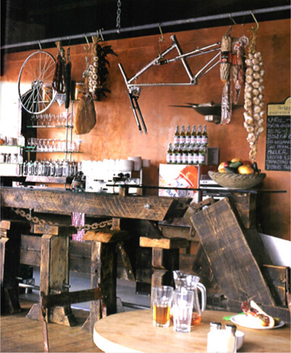
Mud Dock Café, Moultrie and Mortimer, 1994.
Rust on chains and chairs and marks on wood provide visual ‘detail’. The wall has been mottled and ‘aged’ by umber pigment painted and varnished over raw plaster.

Mud Dock Café, as before. Boorish lumps of salvaged timber support the delicate transparency of the table top.
If a minimalist consensus was dominating retail design, bars and cafes were veering towards what might be labelled ‘Bricolage Baroque’. It was Postmodernist, or, more appropriately, Post-industrialist. Recycled and up-cycled objects, and naturally and artificially patinated materials, were orchestrated in the cause of gritty decoration. If it began with Ron Arad’s One Off shop, it was nourished by a school of furniture making that flourished in the middle and late 1980s and favoured bulky timbers and twisted metals. In the December 1988 Blueprint, Deyan Sudjic wrote of Tom Dixon’s ‘bent and bashed metal and his creative recycling’, of his ‘neo-Baroque welding’. André Dubreuil caricatured classical forms in skeletal metal. Danny Lane assembled furniture and partitions from irregularly fragmented glass sheets.
Mud Dock Café, which opened in Bristol in 1994, was interesting on two counts. Firstly, it demonstrated how the spirit of bricolage could be incorporated into the making of an interior. Secondly, its proprietors, Beverly Newman and Jerry Arron, chose to pair a cafe and bicycle shop, in prescient anticipation of the businesses that would blossom in fashionable East London in the next century. It exemplified the salvage aesthetic that was to become a norm for the start-up bars, cafes, and restaurants of Spitalfields and beyond. Mud Dock’s designers met at the RCA. Bill Moultrie, a graduate of North Staffordshire, had joined the architecture and interior course, and Colin Mortimer was a maker of large-scale lighting pieces. They were hands-on designers, comprehensively equipped to collage timbers and mechanical detritus that might have been dredged from the docks where the business was sited.
In the beginning, designer-makers dominated the sector, since the steampunk aesthetic relied on a creative response to found materials and artefacts. Sam Booth had attended a libertarian boarding school where, left to construct his own curriculum, he developed a battery of hand making skills. In 1987, after graduating from interior design at Glasgow School of Art, he set up his own design and making practice; his first projects, incorporating chunky lumps of wood and wrought iron, were characterised by overt handcrafting. His work was always refined and beautifully crafted but as his workload grew, he realised that making was not as profitable as designing. He tried to restrain his hands-on instinct but for his project for Hallion, an Edinburgh private members’ club, he was unable to resist making some of the more intricate pieces. This allowed him to ensure quality and to evolve and refine details more intimately than was possible on drawings. Hallion pieces do not flaunt evidence of their making but imply that they are old and picturesquely worn. Finely tuned detail is finely wrought. It is ‘Bespoke Eclecticism’.
The Hallion, Sam Booth.
The incorportaion of decorative motifs in the etched glass table top and the ‘shattered’ image of the room reflected in the panel of angled mirrors suggests the presence of something from the past.

The Hallion, 2002: By leaving bark on and fissures in the tree trunk bench, by etching the glass table top with patterns that suggest faded embroidery, and by aggregating angled mirrors to make a faceted whole that ‘shatters’ the reflection of the room, Booth creates the character for which the salvaged and the savaged was prized in the 1980s.

The Hallion, as before. Bark and fissures on the handcrafted tree trunk bench provide a savage and salvaged counterpoint to the refined and factory made objects.