
User interface design has been evolutionary rather than revolutionary over the past decade. Most would argue that Mac OS X and Windows 7 both have much more refined UIs than their predecessors. As true as that may be, their changes improve upon existing ideas rather than offer groundbreaking new ways of interacting with the computer. Web design is no different. All the innovations that have transpired — such as Ajax and HTML 5 — have revolutionized the structure and composition of a Web site, but not how users interact with it. Moreover, mobile and handheld devices offered a variety of new platforms to design for, but these were either lightweight versions of a desktop OS or a simplistic character-based menu.
Enter the iPhone.
The iPhone interface is not a traditional desktop interface, although it has a codebase closely based on Mac OS X. It is not a traditional mobile interface either, despite that it is obviously a mobile device. You build Web apps using Web technologies, but the iPhone interface is not a normal Web application interface either.
Because the underlying guts of iPhone Web applications are based on tried-and-true Web technologies, many will be tempted to come to the iPhone platform and naturally want to do the same things they've always done — except customizing it for the new device. That's why the biggest mindset change for developers is to grasp that they are creating iPhone Web apps, not Web applications that run on iPhone. The difference is significant. In many ways, iPhone Web applications are far more like Mac or Windows desktop applications — users have a certain look and feel and core functionality that they will expect to see in it.
On the Web, users expect every interface design to be a one-off. Navigation, controls, and other functionality are usually unique to each site. However, when working on a platform — be it Windows, Mac OS X, or iPhone — the expectation is much different. Users anticipate a common way to perform tasks — from application to application. Operating systems provide application program interfaces (APIs) for applications to call to display a common graphical user interface (GUI).
Because iPhone web apps do not have such a concept, it is up to the application developer to implement such consistency.
This chapter provides the high-level details and specifications you need to consider when designing a UI for iPhone. The rest of the book builds upon this by diving into the actual code needed to implement these user interfaces.
A viewport is a rectangular area of screen space within which an application is displayed. Traditional Windows and Mac desktop applications are contained inside their own windows. Web apps are displayed inside a browser window. A user can manipulate what is seen inside the viewport by resizing the window, scrolling its contents, and in many cases, changing the zoom level. The actual size of the viewport depends entirely on the user, although the average size for a desktop browser is roughly 1000 • 700 pixels.
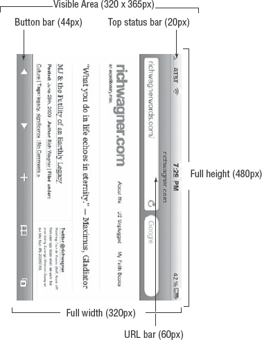
The entire iPhone display is 320 • 480 pixels in portrait mode and 480 • 320 in landscape. However, application developers don't have access to all that real estate. Instead, the viewport in which an iPhone developer is free to work with is a smaller rectangle: 320 • 416 in portrait mode without the URL bar displayed (320 • 356 with the URL bar shown), and 480 • 268 in landscape mode (480 • 208 with the URL bar). Figures 4-1 and 4-2 show the dimensions of the iPhone viewport in both orientations.
Users can scroll around the viewport with their fingers. However, they cannot resize it. To use desktop lingo, an iPhone application is always "maximized" and takes up the full available space.
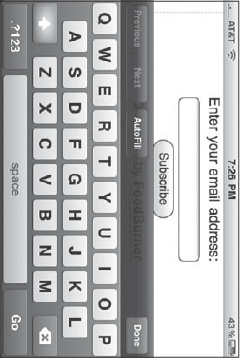
If the on-screen keyboard is displayed, the visibility of the viewport is further restricted with the keyboard overlay, as shown in Figures 4-3 and 4-4.
Because users have a much smaller viewport than they are used to working with on their desktop, the iPhone viewport has a scale property that can be manipulated. When Mobile Safari loads a Web page, it automatically defines the page width as 980 pixels, a common size for most fixed-width pages. It then scales the page to fit inside the 320 or 480 pixel-width viewport. Although 980 pixels may be acceptable for browsing a scaled-down version of ESPN.com or CNN.com, an iPhone application will almost certainly want to avoid this type of scaling by customizing the viewport meta tag.
The viewport meta tag sets the width and scale of the viewport. If you are creating an iPhone Web app, you'll want to set the viewport to be the exact width of the device — 320px in portrait mode and 480px in landscape mode. To make things easier, Safari on iPhone supports constants so you can avoid the specific numeric values. Therefore, to set the viewport for a normal iPhone Web app, you should add the following meta tag to the head of your HTML document:
<meta name="viewport" content="width=device-width; initial-scale=1.0;
maximum-scale=1.0; user-scalable=no;"/>
The width=device-width attribute sets the width to a fixed size and ensures that the viewport is not resized when the user rotates to landscape mode. The initial-scale=1.0 sets the scale at 1.0, whereas the maximum-scale and user-scalable settings disable user zooming of the Web page.
Before you begin designing your iPhone Web application, a valuable exercise is exploring the native iPhone applications on the iPhone or from the App Store. As you do so, you can consider how other designers handle a small viewport as well as how to design an intuitive interface for touch screen input.
However, to fully appreciate the design decisions that went into these applications, you need to understand the differences in the way in which users use iPhone applications compared to their desktop counterparts. After all, consider the types of applications that you will find installed on your desktop computer. An overly simplistic categorization is as follows:
Task-based applications: The typical desktop application, whether it is on Mac, Windows, or Linux, is designed to solve a particular problem or perform a specific task. These applications (such as Word, Excel, PowerPoint, Photoshop, or iCal) tend to act upon one file or a few files at a time. The UI for these applications is often quite similar, including a top-level menu, a toolbar, common dialogs for open/save, a main destination window, and side panels.
Aggregators: The second category of desktop application is aggregators — those applications that manage considerable amounts of data. You tend to work with many pieces of data at a time rather than just one or two. iTunes manages your songs and videos. iPhoto and Picasa manage your photos, and Outlook and Apple Mail store your e-mails. The UI for aggregator applications is typically navigation based, consisting of top-level navigable categories in a left-side panel (playlists in iTunes, folders in Mail, albums in iPhoto), and scrolling listings in the main window.
Widgets: A third category is "widget"-style applications, which are mini applications that display system or other information (battery status meter, weather, world clock) or perform a specific task (lyrics grabber, radio tuner). A widget UI typically consists of a single screen and a settings pane.
On the desktop, task-based applications have traditionally been the dominant category, although aggregators have become more and more important over the past decade with the increasing need to manage digital media. Although widgets are quite popular now that Apple and Microsoft have added this functionality directly into their OS, they remain far less important.
When you look at built-in iPhone applications, you can see that they generally fall into these three categories. However, because of iPhone's viewport and file storage constraints, task-based applications take a backseat role to the aggregators (see Table 4-1).
Although the document is the primary point of focus in a traditional desktop application, a document is often consumable and nonpermanent on the iPhone device. Most of the documents that users work with are consumable: Web pages, SMS messages, YouTube videos, quick notes, Google maps. Even Word, Excel, and Acrobat documents are read-only and are only accessible as e-mail attachments. What's more, for the more permanent storage pieces of information, you tend to sync with a master copy on your desktop — iPod songs, videos, and photos. In fact, there are only three cases in which you actually create data on the iPhone that you then store permanently — calendar appointments, e-mailed photos, and contacts.
The focus of iPhone usage is consuming information far more than creating information. If your application conforms to this usage model, your UI design needs to account for that reality.
Because the focus of the iPhone is to consume various amounts of information, navigation list-based design becomes an essential way to present large amounts of information to users. As I mentioned earlier, desktop applications typically relegate navigation lists to a side panel on the left of the main window, but many iPhone applications use "edge-to-edge" navigation as the primary driver of the UI.
Not all navigation list designs are equal. In fact, the iPhone features at least eight distinct varieties of navigation lists. For example, the Contacts list uses a single line to display the name of a contact in bold letters (see Figure 4-5), whereas Mail uses a 4-line list style to display both message header information and optional text preview (see Figure 4-6). Finally, YouTube sports a wealth of information in its 4-line item (see Figure 4-7). Table 4-2 lists each of the various navigation style lists.
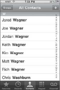
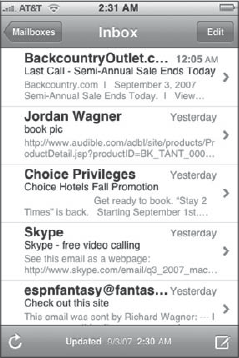
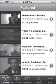
Table 4-2. Different Types of Navigation Lists
Style | Displays | |
|---|---|---|
Contacts | 1 line | Name of contact (last name bolded) |
2.7 lines (default 4) | Message title and optional text preview | |
Google Maps List | 2 lines | Location name and address |
SMS | 3 lines | Message title and text preview |
Photos | 1 line | Album title and thumbnail image |
YouTube | 3 lines | Thumbnail, title, rating, length, views, and submitter |
Notes | 1 line | First line of note text |
iPod Playlists | 1 line | Playlist name |
Settings | 1 line | Grouped items with icons |
However, no matter the style of the navigation lists, they are designed to quickly take you to a destination page in as few interactions as possible.
What's more, the top title bar of the app usually provides contextual information to help users understand where they are in the hierarchy of the application. The left side often has a Back button that enables users to return to the previous screen that they were on. More on this in the "Title Bar" section to come later.
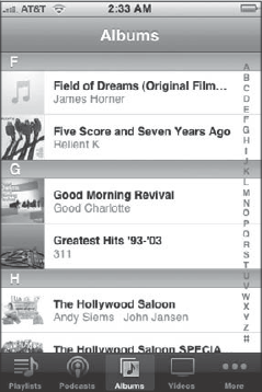
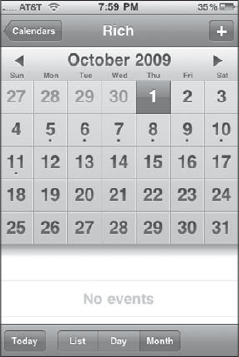
Native iPhone applications also often have modes or views to the information or functionality with which you can work. These modes are displayed as icons or buttons on the bottom toolbar (see Figure 4-8). Interestingly, in the initial release of iCal, the buttons were on the top. However, in subsequent releases, Apple moved the buttons to the bottom to adhere to the convention of navigation on top, modes on bottom (see Figure 4-9).
Table 4-3 details these modes.
Table 4-3. Application Modes and UI Access
Application | Modes | UI Controls |
|---|---|---|
iCal | List, Day, Month | Bottom button bar |
Phone | Favorites, Recents, Contacts, Keypad, Voicemail | Bottom toolbar |
iPod | Playlists, Podcasts, Albums, Videos, and so on | Bottom toolbar |
YouTube | Featured, Most Viewed, Bookmarks, Search | Bottom toolbar |
Clock | World Clock, Alarm, Stopwatch, Timer | Bottom toolbar |
Therefore, as you begin to examine how the UI of your application should be designed, look to see what parallels exist with the built-in iPhone application design, and emulate its general look and feel.
By the time you have studied and evaluated the UI design of the built-in applications, you can begin to determine what parallels may exist with the type of application in which you are building.
For applications that need to use a navigation list design, download one of the frameworks that I discussed back in Chapter 3, "Building with Web App Frameworks." Each of these enables you to easily implement edge-to-edge navigation list-based applications.
The four components of a typical iPhone application are a title bar, a navigation list, a destination page, and a button bar.
Most iPhone Web applications will want to include a title bar to emulate the look of the standard title bar available in nearly all native iPhone applications. When the URL bar is hidden (and I explain how to do this later in this chapter), the custom title bar appears just below the status bar at the top of the viewport (see Figure 4-10).
The title bar includes the following elements:
Back button: A Back button should be placed on the left side of the toolbar to allow the user to return to the previous page. The name of the button should be the same as the title of the previous screen. This "bread crumbs" technique lets users know how they got to the page and how to get back. If the page is at the top level of the application, remove the Back button completely.
Screen title: Each screen should have a title displayed in the center of the toolbar. The title of the page should be one word and appropriately describe the content of the current screen. You will not want to include the application name in each screen title of the application, as you will for a standard Web application.
Command button: For some screens, you will want to employ a common command, such as Cancel, Edit, Search, or Done. If you need this functionality, place a command button at the top right of the title bar.
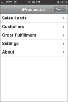
If your application aggregates or organizes lists of information, you will typically want your UI to emulate iPhone's edge-to-edge navigation list design, as shown in Figure 4-11. Each of the cells, or subsections, is extra large to allow for easy touch input. In addition, to ensure that users never lose context and get lost, the title shows the current page, while a Back button indicates the screen to which users can return if they choose. And, when a list item expands to a destination page or another list, an arrow is placed on the right side indicating a next page is available to the right.
When a list item is selected, the navigation list should emulate Apple's slide-in animation, appearing as if the new page is coming in from the right side of the screen, replacing the old.
Table 4-4 lists each of the specific metrics to emulate the same look and feel of the Apple design in edge-to-edge navigation lists. Note that iUI defines navigation lists based on these specifications and implements the slide-in animation effect.
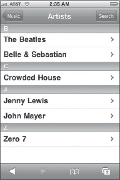
Table 4-4. Metrics for Apple's Edge-to-Edge Design
Item | Value |
|---|---|
Cell height (including bottom line) | 44px |
Cell width | 320px (portrait), 480px (landscape) |
Font | Helvetica, 20pt bold (normal text acceptable for less important text) |
Font color | Black |
Horizontal lines (between cells) | #d9d9d9 (RGB=217, 217, 217) |
Left padding | 10px |
Bottom padding | 14px |
Control height | 29px |
Control alignment | Right, 10px |
Control shape | Rounded Rectangle of 7-degree radius |
Control text | Helvetica, 12pt |
Background color | White |
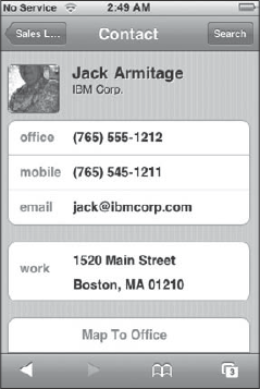
In a navigation list UI design, users will ultimately wind up at a destination page that provides a full listing of the specific piece of information in which they were looking. Apple implements a rounded rectangle design, as shown in Figure 4-12. Labels are displayed on a blue background, while items are grouped logically and surrounded by a rounded rectangle box. Table 4-5 describes the specifications you should follow to implement this Apple design.
Table 4-5. Metrics for Apple's Rounded Rectangle Design
Item | Value |
|---|---|
Cell height | 44px |
Rounded rectangle corner radius | 10px × 10px radius ( |
Rounded rectangle left and right margins | 10px |
Rounded rectangle top and bottom margins | 17px |
Horizontal lines (between cells) | #d9d9d9 (RGB=217, 217, 217) |
Label font | Helvetica 17pt, bold |
Label font color | #4c566c (RGB=76, 86, 108) |
Cell font | Helvetica 17pt, bold |
Cell font color | Black |
Cell text position | 10px from left edge, 14px bottom edge |
Background color | #c5ccd3 (RGB= 197, 204, 211) |
One of the most critical design considerations you need to take into account is that you are designing an interface that will interact with a finger, not a mouse or other mechanical pointing device. Whereas a mouse pointer has a small point just a couple pixels in height, a finger can touch 40 pixels or more of the screen during a typical click action. Therefore, when laying out controls in an application, make sure the height of controls and spacing between controls are easy to use even for someone with large fingers.
Because iPhone is a mobile device, keep in mind that users may be on the go when they are interacting with your application. Maybe they are walking down the street, waiting in line at Starbucks, or perhaps even jogging. Therefore, you will want to allow enough space in your UI to account for shaky fingers in those use case scenarios.
Standard navigation list cells should be 44px in height. Buttons should be sized about the size of a finger — typically 40px in height or more — and have sufficient space around them to prevent accidental clicks. You can get by with a button of 29-30 pixels in height if no other buttons are around it, but be careful. Table 4-6 lists the recommended sizes of the common elements.
In addition to sizing and spacing issues, another important design decision is to minimize the need for text entry. Use select lists rather than input fields where possible. What's more, use cookies to remember last values entered to prevent constant data reentry.
With its 160 pixels-per-inch display and anti-aliasing support, the iPhone is an ideal platform to work with typefaces. Quality fonts render beautifully on the iPhone display, enhancing the overall attractiveness of your application's UI.
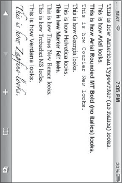
Helvetica, Apple's font of choice for the iPhone, should generally be the default font of your application. However, the iPhone does offer several font choices for the developer. Unlike a typical Web environment in which you must work with font families, the iPhone allows you make some assumptions on the exact fonts that users will have when they run your application. Figure 4-13 shows the fonts that are supported on the iPhone.
Safari automatically substitutes three unsupported fonts with their built-in counterparts. Courier New is substituted when Courier is specified. Helvetica is substituted for Helvetica Neue, and Times New Roman is used in place of Times.
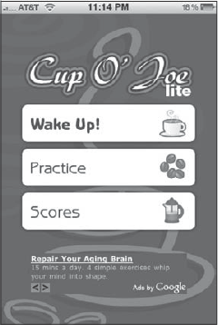
When you are designing for the iPhone, you should keep in mind several best practices:
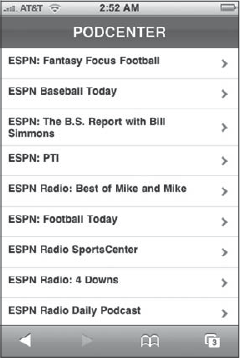
Remember the touch! Perhaps no tip is more critical in iPhone UI design than double-checking every design decision you make with the reality of touch input. For example, ESPN's Podcenter, shown in Figure 4-14, uses a UI that roughly simulates the Apple navigation list design. However, notice the rows are thinner, making it harder to touch the correct podcast item, especially if the user is walking or performing another physical activity.
Make sure you design your application UI to work equally well in portrait and landscape modes. Some native applications, such as Mail, optimize their UI for portrait mode and ignore changes that users make to orientation. Third-party iPhone Web app developers do not have that same level of control. Therefore, any UI design you create needs to work in both orientation modes.
Avoid UI designs that require horizontal scrolling. If your interface design requires users to scroll from side to side within a single display screen, change it. Horizontal scrolling is confusing to users and leaves them feeling disoriented within your application.
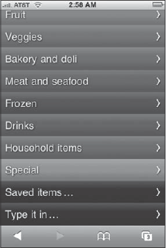
Keep your design simple. As attractive as the iPhone interface is, perhaps its most endearing quality is its ease of use and simplicity. Your UI design should follow suit. Avoid adding complexity where you do not need to — either in functionality or design (see Figure 4-15).
Use standard iPhone terminology. You know the saying, "When in Rome." Well, when designing for the iPhone, be sure you do not bring along the UI baggage you are used to in the Windows, Mac, or the Web world. For example, "Preferences" are "Settings" and "OK" should be "Done."
Use UI frameworks, but use them wisely. iPhone Web app frameworks (see Chapter 3) are major assets to the iPhone Web app developer community and provide a major head start in developing applications. However, don't automatically assume that their prebuild designs are the best way to go for your application. You may find another approach is better for your specific needs.
Restrict the use of a black button bar. A translucent black button bar (such as the one used by the iPod app in Figure 4-8) should only be used in your application for displaying modes or views, not for commands. Use the other button types for commands.
Minimize the rabbit trail. Because iPhone users are primarily concerned with consuming data, you will want to get them to their destination page as soon as possible. Therefore, make sure you are optimally organizing the information in a way that enables users to get to the data they need in just a couple of flicks and taps.
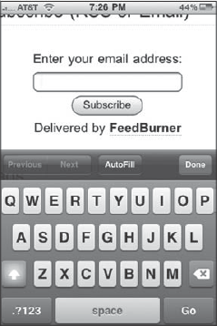
Place text entry fields at the top of the page. When your application requires data entry fields, work to place these input fields as near to the top of the page as possible. Top positioning of text entry fields helps minimize the chances of the user losing context when the on-screen keyboard suddenly appears at the bottom of the screen when the user selects the field.
Communicate status. Because your application may be running via a 3G or even an EDGE connection, its response may be relatively slow. As a result, be sure to provide status to the user when performing a function that requires server processing. This visual clue helps users feel confident that your application is working as expected and is not in a hung state.
Label the title bar appropriately. Make sure each screen/page has its own title. The Back button should always be titled the same as the previous screen.
Unselect previously selected items. When a user clicks the Back button in a navigation-list UI, be sure that the previously selected item is unchecked.
Break the rules — competently. Although you should generally adhere to the Apple UI design guidelines that I've been discussing in this chapter, not every iPhone application UI needs to rigidly conform to a design implemented already by Apple. You may have an application in which a different look-and-feel works best for its target users. However, if you decide to employ a unique design, be sure it complements overall iPhone design, not clashes with it.
To transform your Web app into something that looks and feels like a native iPhone app, you need to put some finishing touches onto it. In this final section, I will show you how to launch the app in full-screen, customize the status bar, and create a WebClip icon.
By default, when you run your Web app in Safari on iPhone, Safari still takes up a sizable majority of the viewport with its URL bar and bottom bar. However, to take back that wasted space and to make your app look more like a native app, you'll want to launch your application in full-screen mode (see Figure 4-16).
To do so, add an apple-mobile-web-app-capable meta tag to the document head and assign it a yes value. For example:
<meta name="apple-mobile-web-app-capable" content="yes" />
Note that full-screen mode does not take effect unless you launch your app from the Home screen via a WebClip icon (see the later section titled "Adding a WebClip Icon"). When you access the page from the URL bar, Safari retains its URL bar and button bar.
When you use the apple-mobile-web-app-capable meta tag to go into full-screen mode, Safari still displays the top status bar. This behavior is not that unexpected, because most native apps show it in the same way. However, if you would prefer to mark the status bar, you can customize its appearance to be transparent black by using the status-bar-style meta tag and setting it to a value of black. For example:
<meta name="apple-mobile-web-app-status-bar-style" content="black" />
Note that this meta tag only takes effect if you also use the apple-mobile-web-app-capable meta tag to turn on full-screen mode.
Figure 4-17 shows a customized status bar.
Web apps can be added to the home screen just like a native application. Developers can specify custom WebClip icons by adding the following link tag to the head of an HTML document:
<link rel="apple-touch-icon" href="apple-touch-icon.png"/>
The graphic file you point to needs to adhere to the following conventions:
Be in PNG format.
Be located in the root directory.
Measure 57 × 57 pixels (different sizes are scaled to 57 ? 57).
Be a rectangle — the OS automatically adds the rounded corners.
Be named
apple-touch-icon.pngorapple-touch-icon-precomposed.png. If you useapple-touch-icon.png, the iPhone OS adds round corners, a drop shadow, and a "shiny coating" to the graphic. If you useapple-touch-icon-precomposed.png, the OS won't add these effects.
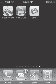
Figure 4-18 shows WebClip icons from three iPhone Web apps.
It's probably not recommended under most Web app circumstances, but if you want to assign a WebClip icon for a specific page in your Web app, you can use a custom PNG name instead. For example:
<link rel="apple-touch-icon" href="page_icon.png"/>
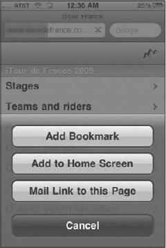
Users can add the WebClip icon of your app by clicking the + button on the button bar when they navigate to the URL. In the popup dialog, users click the Add to Home Screen button (see Figure 4-19).
Unfortunately, because there is no formal install process of a Web app, there is no programmatic way to automatically add a WebClip icon to the home screen. The user must carry out the process.
This chapter focused on creating a navigable user interface for iPhone web apps. It began with a discussion of the viewport and how designing for it is different than a traditional web site. The chapter then explored core concepts and styles of native iPhone app UIs, providing exact measurements, sizes, and colors to utilize when you plan to create a user interface to emulate standard iPhone UI conventions. It continued by providing a list of best practices to consider when you design your web app. By following these tips and strategies, you'll avoid common pitfalls that web app developers can fall into when they initially develop for the iPhone platform. Finally, the chapter closed with a look at how to add important finishing touches that give an added level of professionalism.