CHAPTER 1
Introduction
As you know from the preface, Mo works at Motorland in this city to supplement his college expenses. Presently, his boss wants him to estimate the demand for Honda motorcycles from their store next quarter so that they can place an order with their supplier. Here is what his boss says, “Hey Mo, we cannot afford to go by ear any more. Two years ago, we under-ordered and lost at least $10,000 in sales to our local competitors. The following year, we compensated by doubling our order, which left us with a warehouse full of unsold motorcycles. I want to limit our error. I don’t want to under-order or over-order by more than 20 percent. Let’s try to work on it.”
Mo understands his boss’ frustration and collects data on the sales of motorcycles from his store for the past 12 quarters. However, the first day of class will not start until the following week, and Mo does not know how to start his forecasting. Thus, he contacts Dr. Theo, who advises him to read this chapter and says that once he completes it, he will be able to:
1.Describe the basic steps of forecasting.
2.Distinguish qualitative from quantitative forecasting and choose the right method for his estimations.
3.Explain basic concepts of statistics.
4.Apply Excel operations into simple calculations, and chart, and obtain descriptive statistics for his data.
Mo sails through the section on “Starting” and one half of the section on “Basic Concepts” with ease. Here is what he reads in these sections.
Starting
Forecasting is used whenever the future is uncertain. Although forecast values are often not what actually occur, no one can have a good plan without a reasonable approach to form an educational guess on the future, which is called forecasting.
There are four basic steps in forecasting.
Step 1: Determining the Problem
A forecaster has to define what future information is needed and the time frame of the forecasts. For example, a firm must forecast how much of each good it should produce in the next several months so that it can order inputs from the supply chain and make a delivery plan to the market. To make this decision, the forecaster for the firm needs to understand the basic principles in production planning and communicate with people who have access to the monthly output data. The firm’s leaders, then, have to decide how far into the future the information is needed (e.g., a month or a quarter ahead). This future period is the forecast horizon. Finally, the firm needs to decide how often the forecasts have to be updated and revised (e.g., weekly or monthly). This is the adjustment interval or forecast frequency.
Step 2: Selecting the Forecasting Method
Depending on the problem and the availability of the information, an appropriate method of forecasting should be decided. For the preceding example, historical data on the firm’s production, constraints in labor, capital, and raw materials can be obtained. Hence, a quantitative method of a data analysis is appropriate. For many other situations, when historical data are not comprehensive or experiences are more important, a qualitative method utilizing the expertise of the professionals can be employed.
Step 3: Collecting and Analyzing the Data
Data can be collected directly by the user (primary data) or by someone other than the user (secondary data). Data analyses consist of constructing time series plots, obtaining descriptive statistics, and calculating the forecast values. Data analyses are crucial in the process of selecting a reliable model. No single model is good for all situations. When a theoretical model is introduced, data analysis should be performed based on this model. When no theoretical model is developed, a forecaster should experiment with several models. For the example in Step 1, a theoretical model of profit maximization or cost minimization is available and should be used.
Step 4: Evaluations and Adjustments
Evaluations are performed based on historical data to select the best model with the smallest forecast errors. Based on the magnitude of the forecast errors, adjustments are made to the existing models. Monitoring is then carried out because forecasting is a long-term process. Business and economic conditions change over time as do the forecasts. A good forecaster needs to track the changes so that the causes are pinpointed. New forecast errors need to be calculated. Either a new model might be developed, or a combination of several models might be introduced.
Basic Concepts
Qualitative Forecasting
There are three main qualitative methods in addition to the naïve approach of taking the current-period value as the forecast of the next-period value.
Individual judgment is a forecast made by an expert in a field based on the person’s experience, the past performance of the market, and the current status of the business and economy. The expert can employ: (i) analogy-analysis technique by comparing similar items, (ii) analyzing possible scenarios in the near future, or (iii) collecting qualitative data by sending out survey forms to the respondents and performing a qualitative analysis of these data.
Panel of experts is a forecast made by a group of professionals, whose opinions are combined, averaged, and adjusted based on discussions and evaluations by all members of the group. An executive officer can lead the discussions but consensus has to be obtained at the end. All the techniques used in the individual judgment can be utilized.
Delphi method is similar to the panel of expert method, but the experts are not allowed to discuss the problem with each other. Instead, they are given an initial set of questions, to which their answers are anonymous to guarantee the objectivity of each member. Their answers to the first set of questions are the basis for the next set, and the process is repeated with the hope that the answers gradually converge. (Sometimes they do not obtain any consensus, and the process breaks down.)
Quantitative Forecasting
There are two large groups of quantitative forecast methods. The first group comprises time series analyses, and the second consists of associative analyses. Both share a common denominator of performing data analyses to draw conclusions on possible future outcomes.
Time series analyses examine only historical data of the time series itself instead of adding any external factor. The method comes from the notion that past performance might dictate the future performance of a market. Techniques for the time series analyses comprise moving averages, exponential smoothing, decomposition, autoregressive (AR), and autoregressive moving average (ARMA/ARIMA) models.
Associative analyses are based on the investigation of various external factors that affect the movements of a market. The associative analysis contains regression analysis and nonregression analysis. The regression analysis is based on the econometric technique and always involves an equation with a dependent variable on the left-hand side and one or more explanatory variables on the right-hand side. For example, spending on motorcycles at Motorland depends on the income level of the city residents.
The nonregression analysis involves variables that are related to each other in a certain manner that is not appropriate for the regression technique. For example, to forecast a turning point in the economy, various measures called economic indicators are developed. Each indicator depends on several factors. A composite index, which involves the most important indicators, is then calculated for each month. A forecaster can predict a turning point based on the changing direction of this index over time. Thus, a nonregression technique is appropriate for this case.
The focus of this book is on quantitative forecasting. Hence, all the aforementioned techniques for quantitative forecasting will be discussed. Most of them will be followed by Excel demonstrations. Once you master the quantitative forecast methods, you can combine quantitative and qualitative methods to obtain the best forecasting results.
Statistics Overview
Probability
Mo learns that probability is the likelihood of an event occurring and is measured by the ratio of the favorable case to the total number of possible cases. As an example, we can conduct the following experiment.
Let variable X equal throwing a coin, and let getting a head side of the coin be the objective, which is the favorable case in our question, then
x1 = getting a head side = 1
x2 = getting a tail side = 0
If the coin is fair, then you have the probability of getting a head P(1) = f(x1) = 0.5 = ½ and the probability of getting a tail P(0) = f(x2) = 0.5 = ½.
Throw the coin three times, and we will have a table of all probabilities as follows:
| Probability | Number of heads |
| P(0,0,0) = 0.5 * 0.5 * 0.5 = 0.125 | 0 (= probability of getting no head three times in a row) |
| P(0,0,1) = 0.125 | 1 |
| P(0,1,0) = 0.125 | 1 |
| P(0,1,1) = 0.125 | 2 |
| P(1,0,0) = 0.125 | 1 |
| P(1,0,1) = 0.125 | 2 |
| P(1,1,0) = 0.125 | 2 |
| P(1,1,1) = 0.125 | 3 |
The graph of this table is the probability distribution function (pdf).
A discrete variable has only a handful of values. The variable X in the preceding example is a discrete variable. A continuous variable has numerous values, so its distribution is the area under a smooth curve. For example, if we let variable Y equal throwing the coin 10,000 times, then the variable Y can be considered a continuous variable. Graphing the pdf of this variable yields a smooth, bell shaped curve, which is called a normal distribution.
Measures of Central Tendency
Mo also understands that descriptive statistics are usually obtained before performing forecasts, and the following concepts are important to remember.
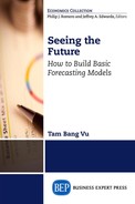
If X and Y are any two random variables whereas a and b are any two constants, then the expectation of X is the weighted mean (the weighted average) of all xs:

At this point, Mo gets lost. The formulas scare him. Luckily, time flies fast, and the class starts today. The following is Dr. Theo’s example of the expectation concept.
“Think of a student’s GPA for this course. Suppose there are equal weights to the two midterm exams and the final exam. If the student makes a C (2 points) in Midterm 1, a B (3 points) in Midterm 2, and an A in the Final Exam (4 points), what is your expectation of the student’s GPA for this course?”
We all can answer this question as GPA = (2 + 3 + 4)/3 = 3
“So the student makes a B,” we say in unison. Dr. Theo agrees and continues.
“Suppose that Midterm 1 receives a 20 percent weight, Midterm 2 receives a 30 percent weight, and Final Exam receives a 50 percent weight in this class. What is your expectation of the student’s GPA for this course?”
We apply the new weights: GPA = 0.20 * 2 + 0.30 * 3 + 0.5 * 4 = 3.3.
“Wow, the guy now makes a B+. That is cool! This is because he scored best (an A) on the highest-weighted exam (the final),” we exclaim. We now understand the concept of expectation and move on to the variance.
The variance of X is the average of the squared difference between X and E(X).
The variance measures the dispersion of a distribution:
Alte raises her hand and asks, “Why do we need to calculate the square of the difference?”
Dr. Theo replies with another example, “There is an avocado tree in my backyard with a lot of ripe avocados, but they are very high above the ground. I tried to hit a fruit with a long pole. At the first strike, I missed the fruit roughly five inches to the right. At the second strike, I missed it roughly five inches to the left. May I boast to you that on average I got the avocado because the average distance from my hits to the avocado is D = (5 − 5)/2 = 0?”
We all laugh. Of course, the value cannot be zero.
Hence, Dr. Theo concludes, “If we do not square the distance before taking the average of the difference, then the negative values cancel out the positive ones, and the average is zero, so we cannot measure the dispersion of X. The covariance is also easy to understand if you think of your relationship with your mom, who is much closer to you than to a person on the street.”
We find that the formula for the covariance is similar to the one for the variance, except that we enter Y in place of another X. And thus, the covariance of X and Y measures the linear association between them:
Cov(X, Y) = E{[(X − E(X)][Y − E(Y)]}
If the two are independent, they have zero covariance, but the reverse is not true. For example, Y and X in the function Y2 + X2 = 1 have zero covariance because the equation is not linear. However, these two variables belong to a nonlinear equation, so they are not independent of each other:
Var(X + Y) = Var(X) + Var(Y) + Cov(X, Y)
Var(aX + bY) = a2 Var(X) + b2 Var(Y) + ab Cov(X, Y)
If the two are independent or not correlated linearly, then:
Var(X + Y) = Var(X) + Var(Y)
Var(aX + bY) = a2 Var(X) + b2 Var(Y)
We all understand now. The next several concepts are easy and so we do not need further explanations.
The median is the value of the middle observation.
The standard deviation (SD = s) is the square root of the variance.
The standard error (SE = s) is the sample version of the SD.
The skewness is the asymmetry of a distribution.
SKEW(X) = E[X − E(X)]3
A left-skewed (negatively skewed) distribution has a long left tail.
A right-skewed (positively skewed) distribution has a long right tail.
Also, a left-skewed sample has the mean smaller than the median.
A right-skewed sample has the mean greater than the median.
A symmetrical dataset has the mean equal to the median.
A perfectly normal distribution has skewness = 0.
Any distribution with |SKEW| > 1 is considered far from normal.
Next, we come to a little more abstract concept: the Kurtosis.
The Kurtosis is the peakedness (the height) of the distribution (Poirier 1996).
It can also be a measure of the thickness of the tail (Greene 2012):
KUR(X) = E[X − E(X)]4
Excess Kurtosis = EK = |KUR| − 3 (Davidson and MacKinnon 2004)
Dr. Theo reminds us that details of Kurtosis are explained in Brown (2014).
A perfectly normal distribution has KUR = 3 or an EK = 0.
Any distribution with EK > 1 is considered far from normal.
Rea raises a doubt, “Does that mean that if KUR = 5, then we do not have a normal distribution?” Sol volunteers to answer, “I think so, because in that case, EK = 5 – 3 = 2 > 1.”
Dr. Theo commends Sol on her correct answer and asks if we have any question on the next two terms. We think these new terms are easy to understand:
The mode is the value that occurs most frequently.
The range is the difference between the highest and the lowest values.
Hence, nobody asks anymore questions. Dr. Theo concludes the theoretical section with a summary of the important concepts and reminds the class to read the next section, which will be taught by Dr. App.
Basic Excel Applications
Dr. App starts with easy mathematical operations in Excel.
Mathematical Operations
We learn that all Excel calculations start with an equal sign (=). For example, to add variable X in cell A2 to variable Y in cell B2, type
= A2 + B2 and press Enter.
To form a product (or quotient) of X and Y, type
= A2 * B2 (or A2/B2) and press Enter
For consistency, the notation * will denote a multiplicative operation throughout this book.
= A2^(1/2) and press Enter
To take the logarithm of variable X, type
= ln(A2) and press Enter
Excel uses only parentheses for all mathematical operations. For example, to enter this mathematical formula, {[(XY − Y) + (X + Y)2] − Y3}/X, type in Excel
= (((A2 * B2 − B2) + (A2 + B2)^2) − (B2)^3)/A2 and press Enter.
Dr. App reminds the class that once a formula is formed, you can copy and paste it into any cell using the copy and paste commands. She also assures us that more operations will come later. We then proceed to play around with the data. The following are the topics that we are learning.
Data Operations
Three Types of Data
There are cross-sectional, time series, and longitudinal (panel) data. Cross-sectional data are for many identities in a single period. The identities could be persons, companies, industries, regions, or countries. Time series data are for a single identity over many periods. The periods could be days, weeks, months, quarters, years, or many years. Longitudinal and panel data are for many identities over many periods.
Figure 1.1 provided an example of the three datasets on the number of associate degrees awarded for three economic regions in the United States from 2002 to 2010. Dr. App reminds us that all demonstrations are available in the Excel Demos folder. Data for Figure 1.1 are in the file Ch01.xls (see sheet Fig. 1.1). The cross-sectional dataset is for three economic regions in the United States in one period (2002–2004). The time series dataset is for one region over three periods (2002–2004, 2005–2007, and 2008–2010), and the panel dataset is for the three regions over the three periods.

Figure 1.1 Three types of data
Data Source: Adapted into three-year intervals from the yearly data from National Center for Education Statistics, United States.
Charting Tools
These tools can be used to construct a time series plot and examine its pattern and trend.
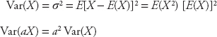
Alte raises her hand and says that she has a dataset from her Alcorner with which she wishes to construct a plot. We are happy to accommodate her. Its plot is displayed in Figure 1.2, where her weekly sale values are rounded off to hundreds of dollars. Dr. App tells us to open the file Ch01.xls, Fig. 1.2. She says that we should first obtain a simple image of the time series and then perform the following steps:

Figure 1.2 Obtaining a simple image of a time series
Remove the label in cell B1 if there is any.
Highlight cell B1 through C10.
Click on the Insert tab from the Ribbon.
Click on Line icon under the Chart section.
Select any 2D line you wish to use.
For example, clicking on the first choice beneath the Line icon gives us the plot in Figure 1.2.
We now have a simple plot sketched and decide to retype the label in cell B1 (Time in Figure 1.3). Dr. App says that to label the axes, we have to open the file Ch01.xls, Fig. 1.3, and perform the following steps:
Figure 1.3 Obtaining a detailed time series plot
Click on the graph and go to Layout under the Chart Tools section.
In the Layout click on Axis Titles.
In Primary Horizontal Axis Title, choose Title below Axis.
Type a title in the box below the axis.
Repeat the same for the vertical axis if you wish to add a title to it.
To add a trend line, right click on the chart line.
A list of commands will appear. Choose Add Trendline.
A new dialog box will appear. Choose Linear (nonlinear is possible) and click Close.
We can also change the line style and color style in the file Ch01.xls, Fig. 1.4, by following these steps:

Figure 1.4 Changing line style
Right click on the chart line.
Choose Format Data Series from the dropdown menu.
A dialog box will appear.
Click on Line Style from the menu on the left-hand side column.
To experiment, click on the arrow in the Dash Type box to open a drop down menu.
Click on the Round Dot option and then click Close to obtain the result shown in Figure 1.4.
We learn that we can follow the same procedure to change the color.
Add-in Tools
Next we need to install a tool to perform data analysis, so we work with Dr. App, who gives the following instruction.
For Microsoft Office (MO) 1997 to 2003:
Go to Data Tools, click on Add-Ins from the drop down menu.
Click on Analysis Toolpak from the new drop down menu then click OK.
Whenever you need this tool, click on Data Tools and then Analysis ToolPak.
For MO 2007:
Click on the office logo at the top left that you have to click to open any file.
Click on Excel Options at the bottom center.
Click on Add-Ins from the menu at the bottom of the left column in the Excel Options.
The View and Manage Microsoft Office Add-Ins window will appear.
In this window, click on Go at the bottom center.
A new dialog box will appear, check the Analysis ToolPak box and then click OK.
Whenever you need this tool, click on Data and then Data Analysis on the Ribbon.
For MO 2010:
Click on File and then Options at the bottom left column.
Click on Add-Ins from the menu at the bottom of the left column in the Excel Options.
The View and Manage Microsoft Office Add-Ins window will appear.
In this window, click on Go at the bottom center.
A new dialog box will appear, check the Analysis ToolPak box and then click OK.
Whenever you need this tool, click on Data and then Data Analysis on the Ribbon.
Data Manipulations
We learn that if a column is not wide enough, Excel displays ##, as shown in the left-hand cells of Figure 1.5, instead of values. To change the display, we need to open the file Ch01.xls, Fig. 1.5, and follow these steps:

Figure 1.5 Changing column width
Data Source: U.S. Department of Agriculture.
Highlight columns B, C, and D.
Click on Format on the Ribbon then choose Column Width.
A dialog box will appear.
Enter a value larger than the default value.
In this case, enter 12 and then click OK.
The results are shown in the right-hand cells of Figure 1.5.
Fligh discovers that we can follow a similar procedure to change the row height, and we are delighted to follow him.
Dr. App points out that data are always analyzed with time displayed vertically. However, many data sources have time displayed horizontally to ulilize the available space as shown in the left-hand cells of Figure 1.6. She says that to change from a horizontal to a vertical time arrangement, we need to open the file Ch01.xls, Fig. 1.6, and perform the following steps:

Figure 1.6 Transposing the data
Data Source: U.S. Department of Agriculture.
Copy cells A2 through D5 then right click cell F2.
Under Paste Options choose Paste Special.
A dialog box will appear. Choose Transpose and then click OK.
We now see the new vertical time arrangement displayed in the right-hand cells of Figure 1.6.
Formating Cells
Arti, the director of Artistown, raises her hand and says that her school usually keeps a spreadsheet of the books demanded from her students with reserve quantity equaling 50 percent of the demand. She shows us Figure 1.7, which displays the reserved books with decimal places in column D. This is incorrect because the numbers of books are always in integers. So she asks, “How can I change the quantity of books to integers?” Dr. App commends her on the question and says that we need to open the file Ch01.xls, Fig. 1.7, and perform the following steps:
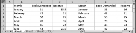
Figure 1.7 Removing decimal places in column D to obtain integers in column H
Highlight colum D then right click on this column.
Click on Format Cells from the dropdown menu.
A dialog box will appear.
Click on Number that is on the left-hand side of the box.
Use the arrow in the Decimal Places box to select 0 then click OK.
We now see that the correct quantities are in column H of Figure 1.7.
We learn that we can change any cell’s format by following similar steps in the Format Cells dialog box.
Descriptive Statistics
This is an abstract concept, so Dr. App reminds us that descriptive statistics provide information on a specific sample used in forecasting instead of information on a whole population. It gives an overall feeling on the data without concerns on the whole market it represents. She then tells us to open the file Ch01.xls, Fig. 1.8 and Fig. 1.9, and perform the following steps to obtain descriptive statistics:

Figure 1.8 Dialog box for the descriptive statistics
Go to Data and click on Data Analysis on the Ribbon in Excel.
A dialogue box will appear; select Descriptive Statistics and click OK.
Another dialog box will appear as shown in Figure 1.8.
Enter C1:C10 in the Input Range box.
Choose Label in the First Row and Summary Statistics.
Check the Output Range button and enter E1.
Click OK. A new dialogue box will appear.
Click OK to overwrite data in range.
The Descriptive Statistics are shown in Figure 1.9.

Figure 1.9 The descriptive statistics and sorted data
Ex points out that it is also helpful to sort the data so that we can have a visual image of the series. He shares his experience in sorting the data with the class.
To sort the data from the smallest value to the largest one in Figure 1.9:
Copy the series in cells C2 to C10 and paste it into cells D2 to D10; name the column as Sorted Data.
Highlight D1:D10 then go to Data on the Ribbon and click on Sort.
Choose Continue with the Current Selection and then click Sort.
A new dialog box will appear as shown in Figure 1.10.

Figure 1.10 Sorting a time series
Choose Sorted Data in the 1st box and Values in the 2nd box.
Choose Smallest to Largest in the 3rd box and click OK to obtain the results in column D of Figure 1.9.
Dr. App says that the descriptive statistics provide a hint of what the sample looks like and what you should do with it in order to obtain reliable forecast values. For example, if the mean and the median are very different from each other, you might have an outlier that needs to be eliminated before data analyses can be performed. In Figure 1.9, since the mean and the median are close to each other, there is no need to eliminate any observation. A glance through the sorted data reveals that the median and the mode are indeed $6,000 and $5,000, respectively.
We finish with the applied section of the chapter and look forward to the next chapter, where we will learn about the simplest techniques of forecasting.
Exercises
1.Given a discrete variable X that is a single roll of a fair die,
a. What is the probability that X = 2?
b. What is the probability that X = 2 or 3?
2.Let X be a discrete random variable with the values x = 0, 1, 2 and let the probabilities be
P(X = 0) = 0.25
P(X = 1) = 0.50
P(X = 2) = 0.25.
b. Find E(X2)
c. Find Var(X)
d. Given a new function
g(X) = 3X + 2
Find the expectation and variance of this function.
3.Data for the Alcorner are provided in the file Alter.xls of the folder Exercise Data. Provide a time series plot of this sample, including the axis labels and a linear trend line. Give comments on the trend.
4.Data on sale values from Solarists are provided in the file Sales.xls of the folder Exercise Data. The sale values are in hundreds of dollars. Sort the data and then obtain descriptive statistics for this sample. Compare the mean to the median. Are they very close? What is the implication?