Price break charts can assist the trader in deriving option trading strategies and tactics. The option trader is essentially making a directional decision on the trade. He anticipates the move based on his evaluation of market conditions, and the strength of that evaluation will essentially determine the outcome. This is in contrast to the spot trader, who reacts to the action and tries to join a move. Since the proposed option trade is either a pattern or trend continuation trade or one that anticipates a reversal of the trend, price break charts can become a key tool in confirming the strength of that analysis. Additionally, once the anticipated direction is established, the trader needs to select the strike prices. Price break charts offer a methodology for choosing the strike price locations. This chapter will explore innovative uses of price break charts in option trading.
An option trader's first priority is to establish a direction for a trade. Being wrong on the underlying direction will reduce the probability of being in a winnable option trade. A trader can make this directional decision in many ways, but we will focus on price break charts as a useful tool for selecting direction. Tom DeMark, a noted leader in technical analysis, writes in his book, DeMark on Day Trading Options about rules for buying calls and puts.
Rule No. 1: Buy calls when the overall market is down; buy puts when the overall market is up.[7]
Rule No. 2: Buy calls when the industry group is down; buy puts when the industry group is up.
Rule No. 3: Buy calls when the underlying security is down; buy puts when the underlying security is up.
The application of these rules with price break charts is nearly perfect. Let's give them a price break charts perspective.
Rule No. 1: Buy calls when the overall market is down and the day price break is in a sequence of consecutive lows.
Rule No. 2: Buy calls when the industry group is down and the day price break of a key industry index is in a sequence of consecutive lows.
Rule No. 3: Buy calls when the underlying security is down and the day price break is showing consecutive lows; buy puts when the underlying security is up and the day price break of that security is showing consecutive highs.
What price break charting does is calibrate the trader's ability to implement Tom DeMark's rules. It also goes further and helps the trader select the strike price location for the call or put.
Once the trader selects a direction, the critical next step is to identify which strike price to put on the trade. There are several considerations to assess. First, how far should the strike price be from current market prices? A strike price close to the money will be expensive, but will have a higher percentage move with the price (known as the delta). A strike price further away from the money will be less expensive, but the sensitivity of the option price movement to the underlying price also will be less. Can price break charts help in deciding on strike price location? Let's explore how they can.
Price break charts give powerful criteria for selecting an option strike price, and can be particularly useful for spread positions. The reason they can be of great significance is that there is maximum sentiment expression or force at the moment of a price reversal. Remember that the criterion for a reversal using three-line price break chart settings is that the sentiment was powerful enough to take out the three previous highs or lows. This phenomenon suggests that price break chart points are natural locations for strike prices.
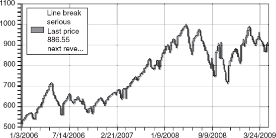
Let's look at the S&P 500 cash index using three-line weekly price break chart settings and see what it suggests regarding selecting a strike price. An initial scan of Figure 7.1 suggests that the direction is down, with two attempts to reverse back up.
We can confirm either a bullish or a bearish strategy by using price break charts. Consider that on May 20, 2008, the S&P had just set two consecutive highs in a row. A trader looking to play a reversal in an option play would locate three previous low closes. This line would be the location for the strike price for a put position. The expiration date can vary, but a three-month duration would be acceptable and would give time for the market sentiment to reverse and move down further. In March 2009, the S&P 500 was down with three consecutive lows. Therefore, a trader playing a bullish reversal would have counted back three consecutive highs and selected 900 as the strike price.
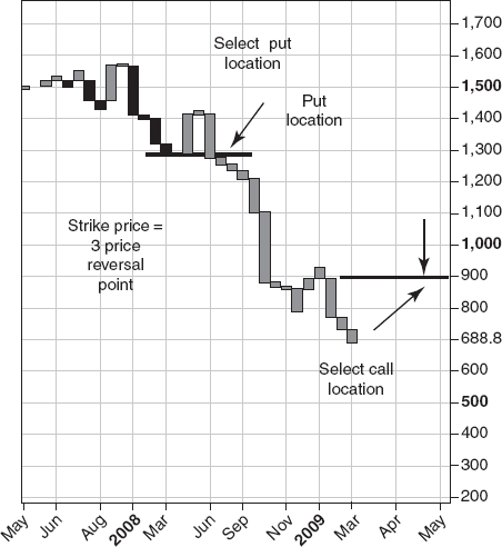
Figure 7.1 thereby illustrates how both strategies can use price break charts as a guide to strike price selection.
Variations in price break chart settings allow strategies and tactics for shorter option plays. Taking the same S&P data, let's look at the day chart from a six-line price break chart perspective. Shifting to the six-line price break chart gives the trader a very clear confirmation that there is a stability in the sentiment. The bearish sentiment is quantifiable, with powerful sequences of consecutive new lows and intermittent retracements. A trader looking to be bearish on an options play would like the conditions depicted in Figure 7.2. The price action demonstrates a retracement up with eight consecutive new day highs. The trader would count back six lines to 829.39 and select a strike price right below it for selling a put. If the trader was also considering a spread, the location of the other side of the spread for buying a put would be at 675.
An interesting aspect of the six-line price break chart setting appears when traders play a potential flip-flop. As we indicated in an earlier chapter, this occurs when a reversal column reverses immediately back again. With a six-line break setting, we can assume that there is a great deal of momentum coming with the second reversal back. The Gold price action, which Figure 7.3 illustrates with a six-line price break chart, has witnessed several of these flip-flops, demonstrating an option trading opportunity.
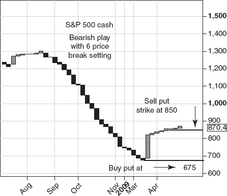
Figure 7.2. S&P 500 Cash: Bearish Play with Six-Line Price Break Setting.: Source: Chart copyright www.ProRealTime.com
The general strategy is as follows: Once a reversal column appears, place a one-month-away option, playing a reversal again back to the origin of the move. A flip-flop will be powerful enough to continue with consecutive highs on a reversal back up, or consecutive lows on a reversal down.
On November 19, 2007, gold closed at 781.75 and generated a down reversal column. The trader would play a flip-flop by putting on a gold call at the projected reversal point of 833.59, which was the previous high. Remember that a six-line reversal had occurred down; an immediate six-line reversal up would take the price to the high that had occurred right before the reversal. In this case, the strike price one or two months out would be 835. The flip-flop occurred on December 28, 2008 at 840.5 and proceeded to move in twelve consecutive highs to a high of 929.40 on January 30, 2009. The central idea is to use the projected six-price reversal point as an entry location.
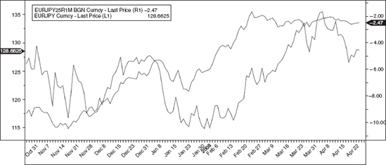
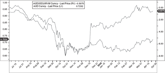
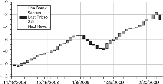
The risk reversals (also known as the 25 Delta R/R) relating to a currency pair comprise a special set of data that is important to currency traders. The risk reversal is the implied volatility of the 25-delta call minus the implied volatility of the 25-delta put. Theoretically, if the market were neutral in sentiment on the direction, the implied volatilities would be the same. If the market favors one direction over the other, then the implied volatility of one 25-delta option (put or call) will be higher than that of the other. Often, the market skews in one direction. The degree of the skew is called a risk reversal. For the purposes of this book, risk reversals (RRs) are important because they often correlate with the direction of the underlying spot position. Essentially, RRs mirror market sentiment relating to the direction of the spot. We can see this in the chart of the AUDUSD currency pair overlaid with its risk reversals (Figure 7.4).
Serious forex option traders pay close attention to risk reversals as a directional indicator. There are two risk reversal strategies to employ. The first one is to go with the flow; if the smile is skewed one way, the direction of your next option trade should be, if this strategy is followed, in the direction of the skew. On the other hand, there may be times when the skew is very extreme, and at those moments, a strategy of trading in the reverse direction could be justified. In both cases, price break charts help. In the first scenario (trading in the direction of the skew), converting the RR line chart to a price break chart will indicate if the RR wave has in fact significantly reversed its direction. It is always better to ride the RR wave when it begins, as that is when there is strong trend sentiment. Price break charts help identify such a beginning. Playing a contrarian move would also be easier to implement with a price break chart, because the price break patterns would indicate whether the RR direction is becoming tired. If so, going against it may simply be anticipating an impending reversal.
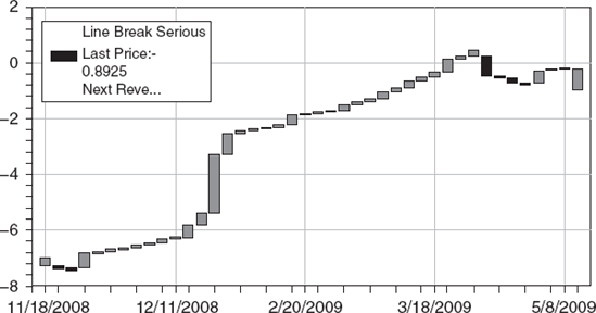
Let's look again at the AUDUSD currency pair and its risk reversal chart. There is a close relationship between the RRs and the spot price movements. A trader who looks to the RR to decide in which direction to trade would have a high level of confidence that the RR chart is a powerful clue. Even greater confidence is achieved by converting the RR chart into its own price break chart. The resulting price break chart provides increased detail as to when there would be a change in direction and where it would occur. In Figure 7.5, which is the price break chart version of the RR chart in Figure 7.4, the reversal up on Dec 15 th signaled that the option sentiment had changed from a trend of consecutive lower RR levels, showing a favoring of put. The reversal up, while still showing negative RR levels demonstrated a change in the tone of the sentiment. Using the price break chart reversal meant that going short on the AUDUSD was no longer supported by the risk reversal price break charts. Additionally, a trader following the RR logic and going long on the AUDUSD on Dec 15th, would have witnessed a sustained rise in the AUDUSD from approximately .70 on Dec 15th to .95 in March. On March 26th the AUDUSD25R1M price break chart reversed down for an exit signal. The price break signals provided the ability to ride the action to over 2000 pips.
We can look at the EURJPY currency pair as another example of how a price break view of the RR curve is helpful. First, we can see that there is a strong co-movement of the spot and the RR. The RR chart (Figure 7.6) shows a leveling off of the option sentiment that had favored the call side. Should the trader consider puts? The next step would be to see if the price break version of the RR (Figure 7.7) shows a reversal. It does! This would be a confirming signal to sell.
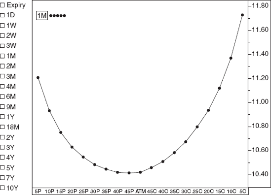
Another way to use price break charting with currency option trading is to apply it to volatility smiles. The term volatility smile refers to the shape of the curve generated by the implied volatility at different delta strike prices. These smiles are considered important in currency markets. Theoretically, there should be a simple smile where the market has no bias in direction. But markets can be skewed, and when you see a volatility smirk leaning to one direction, it shows that sentiment is biased for calls or puts. The trader's challenge is to interpret the volatility smile. Is it leading or lagging? Is it overextended? By using price break charting in relationship to volatility smiles, the trader can get a handle on whether the smile shape is also confirming a reversal.
For example, consider the volatility smile in Figure 7.8a, which shows option opinion leaning to the call side. An option trader looking at this chart may consider placing calls on the EURUSD pair. An alternative view would be to consider the smile to be overextended and buy a put playing the opposite view. Here is where price break charts can make a difference and augment the decision process. The price break chart of the EURUSD (Figure 7.8b) shows that there is a reversal break downward, with two consecutive new day lows. It is probable that a trader using these price break results would conclude that the smile was not likely to last, because the price break direction did not confirm it.
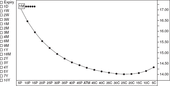
Consider the example of the currency pair AUDUSD. In Figure 7.9a, we see a volatility smile that is heavily skewed to the put side. Traders call this a smirk. In fact, it is very severe. Based on this chart, a trader could conclude that going with the option opinion was the way to go, and so he would place a put on the AUDUSD. However, the price break chart in Figure 7.9b shows that the AUD is still in a long sequence of new highs. In this case, the smile is opposite the trend direction and may be leading it. But there are interesting clues in the price break chart. Notice that the size of the price break high sequences are getting short, almost flat. This indicates a tired trend. If the trader was to put on a put anticipating a reversal, he would count back 3 lines from the latest low and use that point as a nearby strike price. On Figure 7.9b that point is .8624. Therefore .86 would be a desireable strike location for a put.