THE USER EXPERIENCE IS not just what your product looks like, it’s how it works, too. Shipping greatness means shipping a great user experience. If nobody can use your product, or people hate the way it looks, or if they can’t figure out how to log in, greatness is out of your reach. So even though you’ve hired or borrowed a talented user experience designer, you can’t pass the buck down the line and expect to keep shipping. You need to plan on sharing ownership of the user experience of your product. It’s not your job to solve all user experience problems; it is your job to ensure that your product provides the best user experience possible, and that means getting the best out of your design team.
To get the most out of your design team, seek first to understand design, then to be understood by your design team. You can start understanding design by understanding the varying roles of designers. After you know what each role does, the second thing you need to understand is how to evaluate designs so that you can have a meaningful interaction with your designer. After you know what to say, the third thing to understand is how to communicate with each design role effectively, which includes understanding how to review designs and provide feedback to the designers. The fourth and final element of understanding design is learning how to communicate with pictures, through simple wireframes and mockups that you can create in Photoshop or a paint program.
Designers have different titles depending on their area of focus, and even when they don’t have different titles, you’ll find that designers tend to specialize in specific areas. Even though designers are flexible, it can be beneficial to understand where a given designer will thrive, and adjust expectations accordingly.
User experience (UX) focuses on how users work through tasks and optimizing the presentation of information to those users. Frequently UX designers will build flowcharts that explain the user experience in addition to “mocks.” “Mocks” is shorthand for mockups, or pictures of what parts of the user interface will look like. Sometimes UX designers will build clickable prototypes, which are a collection of mocks that have embedded click targets intended to simulate the usage of a product in a narrow scenario. Clickable prototypes can help you get a better feel for your product.
UX designers care a lot about information architecture (IA). Unlike engineering architecture, IA means designers are focused on what the user interface presents to users, regardless of what the underlying data structure is. For example, all data in a purchase confirmation form may be keyed off an order number or the customer’s email address. Therefore, the order number is critical to the system. A designer will probably want to focus on the primary task the user must complete: approve the purchase. IA asks the question “what’s the most important data on this page?” In our example, it’s probably the items, followed by their quantity and price—not the order number. IA focuses on understanding how users must perceive information, not how systems must handle it.
There’s generally no absolutely correct answer to IA questions, which is why team leads get closely involved in the design process. As the product lead, you might know that your baseball website’s users care more about news than they do about team standings, so you would work with designers to define an IA that prioritizes news over standings.
User interface (UI) is the old name for user experience and focuses more on design of individual pages or screens. It’s a subset of UX.
Visual design (VisD) is the discipline of laying out content in an aesthetically compelling and clear way. Visual designers tend to have a strong background in graphic design, typography, and the fine arts. They use tools like color palettes to enhance or reduce the prominence of information in the UI based on the prescribed IA. A good visual designer will help align buttons, text blocks, and other controls into a “grid” that will add consistency to your product. By drawing imaginary lines through the interface, the designer creates an organized framework with clear whitespace and content areas that make it easier for your users to know where to look and make the UI consistent from one view to the next.
User experience research (UXR) is a specialized subset of design focused on learning what users think about your product. User experience researchers are great at running studies that bring statistically significant and conceptually relevant data about failures and successes in your product to your engineering team. UXRs know how to select participants, construct studies that are organized and unbiased, and coach users through a study without biasing their feedback. Even better, a great UXR will create a report that provides meaningful guidance about what works and doesn’t work in your UX. Unfortunately, the job of a UXR is not to provide solutions to your problems. That’s for you and your UX designer to figure out, but if your researcher has ideas, you’d better listen!
“But wait,” you’re thinking, “how can I have statistically significant data from a group of 5–10 UXR participants?” The answer is that you can establish significance by comparing all the questions that were asked. For example, if all five participants have the same experience in 15 tasks, but diverge on one task, you don’t have just one set of five divergent data points: you have 5x16 data points, and you can establish significance. If you feel a little dubious about this logic, it’s OK—you and your UXR’s assessment of individual participants in studies is critical, since participant selection can introduce a high degree of bias into studies. In our Seattle-based studies, for example, everyone is jittery and sad, on account of the coffee and rain. We correct for that.
Personas are a tool popularized by Jacob Nielsen and are intended to give you, your design team, and your engineering team a framework you can use to evaluate your designs. Your design and business teams will create a small group of imaginary people who represent your target customers. These personas will have names, salaries, and objectives. You can assign them any attributes that you might know about the customer that each represents. You will then use your personas to evaluate the effectiveness of a design. For example, in a vacation planning application you might find yourself saying, “Paul Planner is a power user; he’s been using this tool every month, so he doesn’t want to re-enter his departure address…perhaps we can save that for him? And then give him the ability to override?”
Many people who work in software, particularly those who come from a purely engineering or business background, are initially stymied when it comes to understanding UX design. Most team leads are not trained to be designers, nor do they want to be designers. And yet, the team lead is somehow responsible for ensuring that the user experience is “beautiful!” Or “intuitive.” Or, heaven forbid, “as good as the Apple iPhone launch.” Yes, I’ve been in this latter category.
If you are responsible for shipping a great user experience, you must ask the Six UX Questions. You will also need to be reasonably thoughtful in your answers and make sure they make sense. If you do, you’ll end up with a well-designed product. Remember to ask these questions every single time you review a set of mocks or designs.
What’s the most important task the UI asks the user to accomplish?
Is this the simplest solution?
Is the information arranged logically?
Is the design usable and discoverable?
Are the standards consistent?
Can you reduce the number of clicks or taps?
When you approach a new user interface, you should start by asking yourself “what’s the primary task our primary persona must accomplish?” and “what’s the most important task the UI asks that persona to accomplish?” Focusing on your primary persona, instead of all your users, will help you prioritize better. If the answers to these questions are the same, you’re in good shape. If they’re not, you’ll need to do some work. In some UIs, such as in a checkout workflow, these questions are simply answered. In other UIs, such as a home page for a baseball site, the question is much harder to answer. You can make the problem more manageable by talking through how your personas will experience the UI.
In the baseball example, you might say that both Paul the Power User and Chuck the Casual User want to know the latest scores. So let’s organize the IA such that this information is most prominent. A third persona, Ellen the Emerging User, may want to focus on a favorite team. But since we know that Ellen is somewhat more motivated to customize her experience, our primary task is not to make the customization easy to perform from the home page. Instead, it’s to make it easy for Ellen to discover the ability to customize. Similarly, since Paul the Power User has already specified a favorite team, we must give him a very quick way to log in or precustomize the UI since we recognize him.
In this example, it’s important to clearly balance your goals and communicate them to your design team. If you’re building an application for fantasy baseball players—whom you know from market research are pretty technical and want power tools—you’ll tell your design team that the most important persona on which to focus is Paul the Power User, followed by Ellen the Emerging User, and lastly Chuck the Casual User, since he’s probably getting his baseball information from ESPN anyway. However, if you’re the New York Times, the vast majority of your users will likely be casual users like Chuck, and some substantial population will be from New York! Therefore, your priorities might be New York Casual Users, Other Casual Users, Emerging Users, and then Power Users.
It’s important not to say, “Make the login button less prominent.” We also didn’t say, “Move the ‘What’s your favorite team?’ promo up to the top.” Rather, we empowered the design team to make a collection of optimizations based on our prioritized business objectives, which we clearly stated.
Another way to approach this is to ask direct questions, such as “Why is the login button in the middle of the screen?” If the designer says, “I wanted to make it really obvious!” you can say, “Mission accomplished! But our goal is to cater first to New York Casual Users—is that the right choice, given our prioritization of personas?” A good designer will be able to take this feedback and adjust the UI accordingly.
The design, business, and engineering teams must work closely together to define the priority of each persona. If you waffle or fail to communicate clear priorities, then the design team will grow frustrated and do your job for you, and you’ll end up with a compromised user experience. Therefore, when you see a design for the first time, ask yourself these three questions:
Who is the most important user?
What is the most important task that the most important user must accomplish?
Is the important user’s important task the most important and simplest element in the UI?
The answers to the first two questions are business questions that set the context for the last question, which is a design question. If you find that your user has to go through a series of convoluted steps to accomplish the task, or has a hard time discovering how to start the task, then you want to stop where you are and redesign the UI. If your design team seems frustrated at this point, it’s probably because you’re asking them to juggle too many competing priorities, and you need to go back and answer questions one and two again.
A user’s ability to complete a task is a nonlinear function of its complexity. To restate for the less geeky reader: as you ask more from a user, the user’s ability and willingness to do what you ask decreases. A lot. Ask yourself if your solution is the simplest possible solution to a user’s problem. If the user wants to email an article about a baseball player to a friend, must the user create an account? Or can you enable the user to send the article as a courtesy and then upsell him or her to create an account? This latter approach is far more satisfying for users and saves a few substantial steps. It may also increase your abuse problems, so you need to make a smart product decision here. In this case, a good rule of thumb is to optimize for usability and solve the abuse problems when they become real. I’ve rarely seen this approach fail, and I have seen products stumble by trying to solve abuse problems that might never occur.
John Maeda proposes a framework for thinking about simplification in his book The Laws of Simplicity (MIT Press). He calls the framework SHE—simplify, hide, and embody. Similar to my previous suggestions, Maeda advocates “simplifying” features so they do only what they absolutely must. For advanced features that are used occasionally or by users of secondary importance, “hide” those more complicated features. One way to hide complexity is to put power-user features into an “advanced options” dialog or collapse them with a “zippy” arrow or +/– box, but remember that they must remain discoverable.
For features that can be transformed into something simpler, “embody” them with a parallel structure. For example, if you’re trying to provide a color picker for shirts, you might be able to more simply embody the choice by showing pictures of each colored shirt, thereby eliminating the confusion a user would see in a text box drop-down that says “Color: Salmon.” Is salmon pink or silver-blue? I guess it depends on whether you’re a vegetarian.
In some cases, you need to balance the information you want to present with a call to action. The classic example is Amazon’s product detail page. There’s a tremendous amount of information on Amazon’s pages, and the great beauty of them is that nearly every element is measured and sorted by how much money it makes. It is hard to measure the direct impact of some features, like customer reviews, and as a result, those features are at the bottom of the page! Other features are measured easily, such as the “What other items do customers buy after viewing this item,” which is featured near the top of the product detail page.
In your case, you’re unlikely to have such a simple-to-design (and hard-to-engineer) feature. You must think through the arrangement of your data and features logically. To arrange your data and features logically, you want to ensure that the following conditions are true:
The most important information, for the most important customer type, is the most prominent.
The information moves from headline to summary, just like a newspaper article.
Wherever possible, information is personalized and real time. It’s also good to provide as much detail as is reasonable. Why report “Sales rank: in the top 1000” when you can report “Sales rank: 1327”? Users appreciate precision, within limits.
The most frequently used controls are the easiest to access.
After you’ve identified the core tasks that users want to perform, you should ask yourself if those tasks are discoverable and understandable. Discoverability speaks to the ability of a user to find the call to action, such as “Add to Cart.” If your users have a hard time discovering the “Add to Cart” button, your career will be short-lived. Similarly, what if the “Add to Cart” button is actually a plus sign in a button and you were at the helm? That design fails the understandability test, so you’re probably fired.
There are many ways to solve discovery problems. Here are three common solutions you can try:
- Positioning
The priority of information starts at the top left and descends to the lower right in Western cultures. If you want to place your call to action in the most obvious place, you probably want to put it on the top left of your content.
There are key exceptions to this rule, however. One exception is “banner blindness,” wherein users have become so used to “punch the monkey” ads in the top center of their browser that they ignore any content located there. Similarly, many websites use a left-justified navigation scheme, and any context-based call to action placed there will likely be lost.
You may hear designers say that a visual element is “below the fold.” This is an old print expression that means some story is on the bottom half of the newspaper page, or “below the fold” and therefore not visible on the newsstand. In web browser terms, the “fold” is located where the browser ends on a common screen, about 600 px from the top. iPads, Androids, and other devices have different folds based on their screen resolution. If an item is below the fold, its discoverability drops dramatically.
- Visual design
Making your call to action prominent by adjusting size, using color strategically, or breaking the grid can go a long way toward solving discovery problems. Unfortunately, visual design can also create major problems. One of the best ways to make things pretty is to simplify and streamline them, like shaving the door handles off a car. The car looks pretty, but you can’t open the door. Beware of very slick visual affordances that cripple usability and discoverability.
- Conventions
Applications, sites, and businesses all rely on a design language to make tasks understandable. For example, the streets on Google Maps are white and yellow, just as they are in cartography. If your designer were to make lakes white, chaos would ensue. Similarly, if you were to reverse the positions of the OK and Cancel buttons in your dialogs willy-nilly, users would constantly click the wrong button. You can make your software much better by asking the design team to articulate conventions and then checking to make sure they follow the conventions.
If you have questions about the discoverability or usability of a feature, one of the best ways to test is on real users. Usability tests can expose whether users see your call to action. In addition, placing metrics on click targets through tools like Google Analytics can measure conversion, and running A/B comparison experiments will help you understand which designs work best.
Leveraging conventions gives you design shorthand that enables users to almost skip ahead in your UI. For example, on Mac interfaces, the OK button is always on the lower-right side of a UI, so users can click the button without having to read the copy above the button or read the name of the button. Sadly, PCs are different, and the OK button appears to the left of the Cancel button on the bottom-right side. If you’re building a web application, this convention doesn’t help. But you’d best make sure that within your application the buttons are in a consistent place, especially if you’re working in iOS or Android.
Here are some other conventions you can leverage to make your UI more understandable:
Make all primary buttons large and the same color.
Have only one primary button in a UI.
Use multiple buttons for choices like yes or no.
Use a different style for primary, secondary, and tertiary calls to action. For example, on Amazon.com there’s a “Buy Now” button (the primary action, we can only hope) and lots of little “Learn more” links (the secondary action). Amazon’s system works well because buttons are more obvious than links and because Amazon maintains this convention throughout the site, all the way to the “Your Account” section.
For three or more pages in a workflow, show what step the user is in and the total number of steps.
Use underlines or a color that strongly diverges from the text in your application for links.
Follow Internet standards for CSS (e.g., mouseover on a link should change the pointer to a hand).
Now that you’ve addressed the general workflow a user experiences, try to reduce the number of clicks. You might ask yourself if you can combine a form that’s two pages into one page, for example. The number of clicks a user must make has such a strong impact on the user’s ability to complete a task that Amazon holds a patent on “1-Click” buying (US PAT NO. 5960411).
You should also carefully consider the default settings for user options. If your defaults are correct, users will click fewer times and experience fewer unexpected consequences. Designers typically refer to checkboxes that are checked by default as “opt-out” and checkboxes that are unchecked as “opt-in.”
Another important aspect of reducing clicks is reducing the number of times that a user switches from the keyboard to the mouse and vice versa. There is a substantial cost to users each time they must reacquire the mouse and its pointer. Do your best to eliminate these switching events.
Designers have a hard job because everyone has an opinion about design. As a result, designers are rarely treated like experts. If you treat them like the experts they are, however, and focus on asking the right questions, you can drive very high-quality design and help designers own their work. That said, people work in different ways, and designers are people. Some designers are more sensitive than others and some are more tolerant than others. Some designers may want to hear “it feels crowded,” while others may want to slug you if you say that. Adopt and modify the following communication tips for your unique designer:
- Use the user’s voice
Start feedback with the words, “As a [user type] I want to…” This approach works so well that the Scrum approach to project management uses this format to create “user stories” to which developers code.
- Ask questions to drive understanding
For example, you might ask, “What is the convention for a back button on iOS? Is this consistent?” Your goal should not be to dictate a specific experience, but rather to get to an agreement on design rationale that will inform specific designs that your team will create.
- Reiterate business goals and relative priority of conflicting goals
Help your designer understand the problem that he or she must solve. Designers make a thousand judgment calls per day, and they use extensive experience to make great optimizations. You can help guide their decision making by ensuring that they understand your goals. Make your goals concrete. For example: “Most users should not need to scroll. Therefore, we should try to keep input fields above the fold, right?”
You can also help your team by not setting subjective goals. Goals like “Users must feel at home in the app” or “It needs to feel friendlier” make me cringe. How do you know you’ve achieved these goals? When a usability participant shows up and takes a nap? Instead, look for the root cause of your design problem. For example: “We’re asking users to pay $10 on the home page before they see any value. Let’s come up with an experience that lets users understand what we have to offer before we ask for their credit card!”
- Be quantitative
You can count clicks, screens, and page load time to make conversations concrete. Embrace usability testing. Similarly, avoid saying things that are subjective, like sentences that start with “This feels…” or “I like…”
- Provide examples from competitors or similar experiences that work well
Dissecting competitive experiences with your designer will help you create a collective design language. You can also ask your user experience researcher to review competitive products and analyze the industry’s best practices.
Mockups come in a few different flavors. One of the most simple and powerful tools is a whiteboard drawing. When you find your designer staring blankly at you like you’re speaking Klingon, turn to the whiteboard and draw a picture. You can go one step further and clean the picture up a bit and take a picture with your cell phone. These cell phone and white-board drawings are remarkably powerful as a communication tool and are simple to make. I’ve seen teams like the style of these drawings so much that they build animated videos out of collections of photos.
The simplest form of formal mockups are grayscale wireframes that show the structure of your app and emphasize the text and layout but not the visual design. Comps, or more refined visual mocks, are useful for understanding the visual weight of elements and provide a great specification for your team, especially when they are turned into redlines. Redlines are just detailed mocks with red callouts that specify the size and color of elements. The final major type of mock is the clickable prototype, which is an extension of the wireframe and the most expensive mock to build. Clickable prototypes are incredibly useful because you can give them to users in usability studies and see how users actually experience your product.
When I need to use mocks to communicate an idea in a document or presentation, I start with wireframes because they’re the simplest form of mocks. If you add too much detail, such as colors, images, and other flourishes, you’ll find that some of the people who review your mocks will get lost in the details. When making wireframes, focus on these basics:
Mock up only the relevant parts of the UI.
Always use the full, properly edited text.
Limit the amount of time you spend on visual design.
Use grayscale, not color.
Assume that your wireframes will change a lot.
Watch out for cheats.
- Mock up only the relevant parts of the UI
For example, you can start with a full web page and then show just a dialog box and a snippet of an email confirmation. The advantage of this approach is that it saves you time, avoids creating details that are inconsistent, and eliminates duplication that you’ll have to adjust many times later.
- Always use the full, properly edited text
Text, or “copy,” is incredibly useful for explaining what the intent of the interface is. You can use the Latin Lorem ipsum filler that designers use if you have blocks of placeholder text, but for any forms, buttons, dialogs, or other meaningful controls, you really must use ship-quality copy. This copy will help your team understand precisely what various elements of the UI are supposed to do. Copy is also your canary in a coal mine; if you find that you have to write a paragraph to explain how a feature works, you should redesign the feature because users don’t read paragraphs of instructions.
- Limit the time you spend on visual design
Visual design, branding, naming, and other elements are subjective. They are also rarely focused on enabling the user to complete a task. Unlike copy, these fancy elements don’t help you understand the user experience, and if you do add them they will likely create style-focused discussions that are unrelated to the problem you’re trying to solve. Instead, put clearly labeled placeholder boxes where these visual elements will go, and then move on.
- Use grayscale, not color
For the most part, color will overcomplicate your wireframes and raise questions of visual design and branding. See the preceding wireframe tip.
- Assume that your wireframes will change a lot
Wireframes are great for quickly communicating an idea and promoting discussion. When you reach consensus, your design team will build high-fidelity mocks, but until then your wireframes will change a lot. Therefore, wireframes should be made in such a way that you can modify them quickly. Don’t worry when people tear your wire-frames apart, because that means you’re doing a good job driving the conversation forward.
- Watch out for cheats!
It’s easy to cheat when you’re pushing pixels, not code. For example, rounding corners or adding transparency tends to make things look slick. It’s easy to forget to include opt-out checkboxes and legal copy that the lawyers say you have to show. And it’s easy to pretend that the user has tons of personal information that make pages or interfaces look rich and full. Be wary of these traps. Consider both the new user and the experienced user when you build these mocks, and make sure that what you’re building isn’t using visual tricks that you can’t actually deliver.
If you’re lucky enough to have a designer build mocks with you, then you might not need to know how to make them. Knowing the basics of wireframes will help you have empathy, and that’s probably good enough. But most leaders in the software industry need to draw a picture at some point, and designers have developed some nice ways of making simple pictures quickly that you might benefit from. There are two simple processes that most designers use. The first is using a flowcharting program like Visio or Omnigraffle to make wireframes, and the second is using Fireworks, Photoshop, or Paint to make small, near-pixel-perfect changes to existing UIs. Both of these techniques are great to know, so we’ll cover them next.
I make wireframes in Omnigraffle. It is a fantastic program, and you will learn a lot about design just by working in it since its creators made so many good decisions about how to use the software. You can perform similar operations in Visio, but it lacks some of Omnigraffle’s nice features.
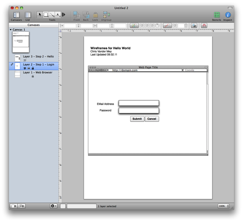
If you’re going to build a series of slides for a linear walkthrough of the user experience, you probably want to use layers. Layers are like pieces of tracing paper that can be displayed, hidden, or overlaid any which way. They enable you to create the common elements, like an image of an empty browser, as a layer that you can put on the bottom of your stack. By doing so, that empty browser will show through all the other layers and make your wireframes look like they’re in a web browser. You’ll want to “lock” that layer so you don’t accidentally edit it while you’re working on another layer. In Figure 3-1, I’ve created a browser template with my title and locked it.
Next, create layers for each slide you’re going to show. In other words, create a layer for each click or step in the UX.
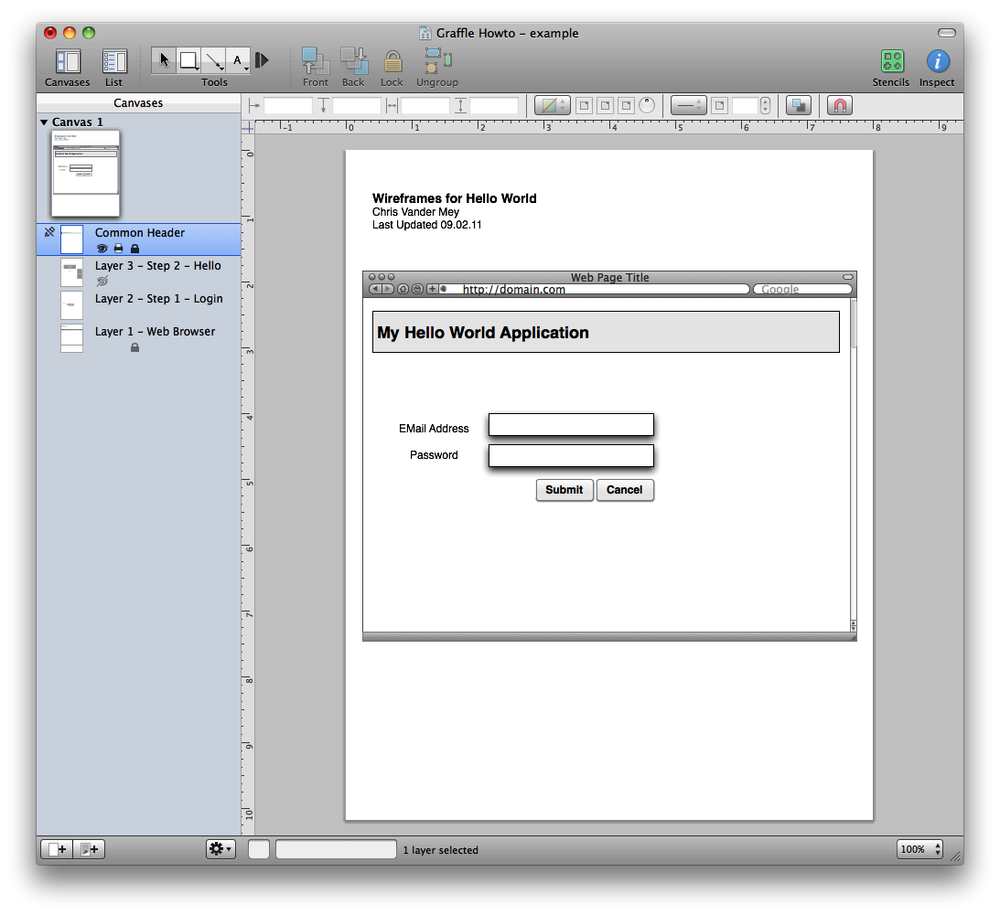
At this point, you have a basic wireframe template that you can easily modify. Now, say you want to extend this template to make it more easily modifiable, such as by adding a common header. To do so, just make a new layer, and position it at the top of all the other layers so it overlays the other steps (Figure 3-2). Then, lock it to make subsequent edits easier.
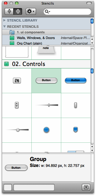
Now you’re ready to make your individual pages. One of the things that makes Omnigraffle great for making wireframes is the stencil feature. (Visio has a similar feature.) Stencils, shown in Figure 3-3, are editable stamps that allow you to drag and drop UI elements into your wireframes. I use a wonderful library of wireframe stencils from Konigi; the library contains just about everything you’d ever need. You can find it here: http://konigi.com/tools/omnigraffle-wireframe-stencils.
Turn off the visibility of all unlocked layers and then click on the layer that represents the step you want to edit. Drag in buttons, text boxes, labels, and other elements from your stencil to make your wireframe.
If you need to add notes, you can use red callouts—or redlines, as mentioned earlier—to point to the things you want to annotate. This feature works well, doesn’t it?
Up to this point we’ve focused on linear workflows, and you’ve been able to create slides for a presentation. But users frequently have different ways to approach a given task, and there are error states that you need to account for. In cases like these, you can build your wireframes more like a flowchart.
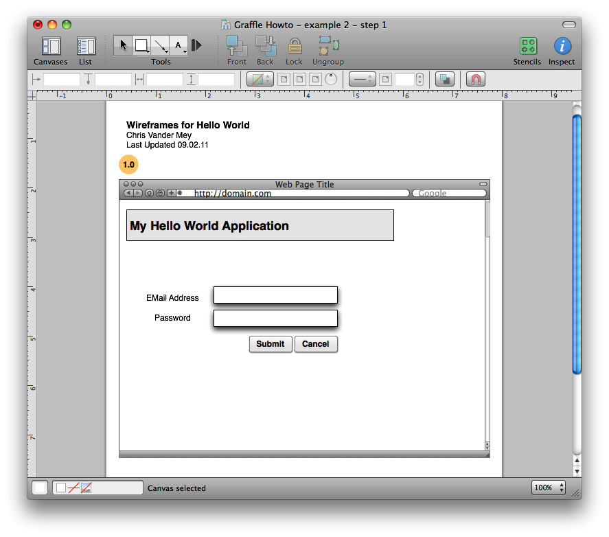
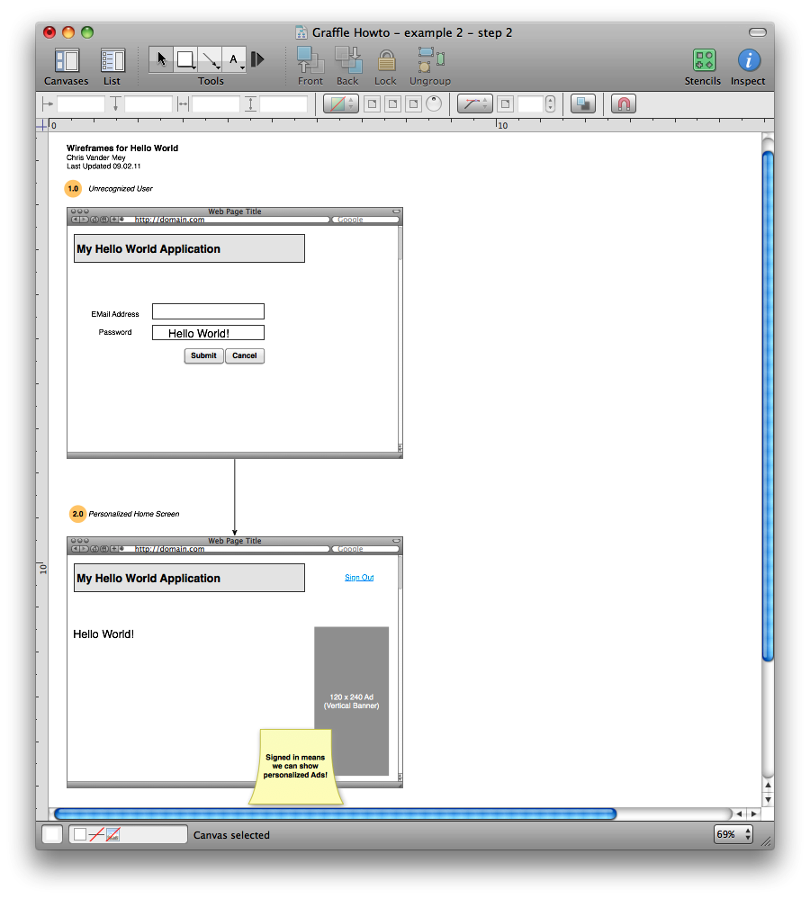
To make a wireframe-based flowchart, draw the first wireframe, just as you did previously, but don’t worry about layers. See Figure 3-4 for a simple example of a Hello World application.
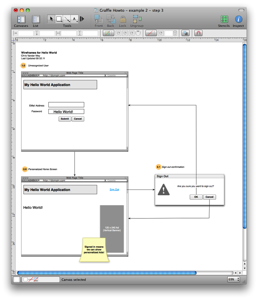
Next, add the second step, connect the two images with lines, and put the step number on it (Figure 3-5). You’ll probably want to add comments to explain what happens.
Here’s a nice optimization: for the third step, you can make a dialog instead of building the whole UI again (see Figure 3-6).
Omnigraffle is a powerful tool, and using boxes and simple text elements makes absorbing design changes easy. If you want to build even more sophisticated mocks, you can create referenced components as objects to make changes even quicker to apply. You can set properties and scripts on objects to create clickable mockups for tests. You can do many of the same operations in Visio or in Fireworks—and Fireworks will even export production-ready art for you. But your goal is to communicate requirements clearly and quickly. You will be best served leaving the advanced tools to the designers and keeping your mocks simple.
Sometimes wireframes won’t cut it, though. Perhaps the change is so small that making wireframes seems too complicated. Or perhaps you really do need to be extremely clear about a focused change to some feature. For these kinds of changes, I prefer to use Photoshop, Fireworks, or another image editor because I get a higher-fidelity representation with less work than I would in Omnigraffle. Luckily, you don’t need to be a Photoshop or Fireworks wizard to build simple, high-fidelity mocks quickly.
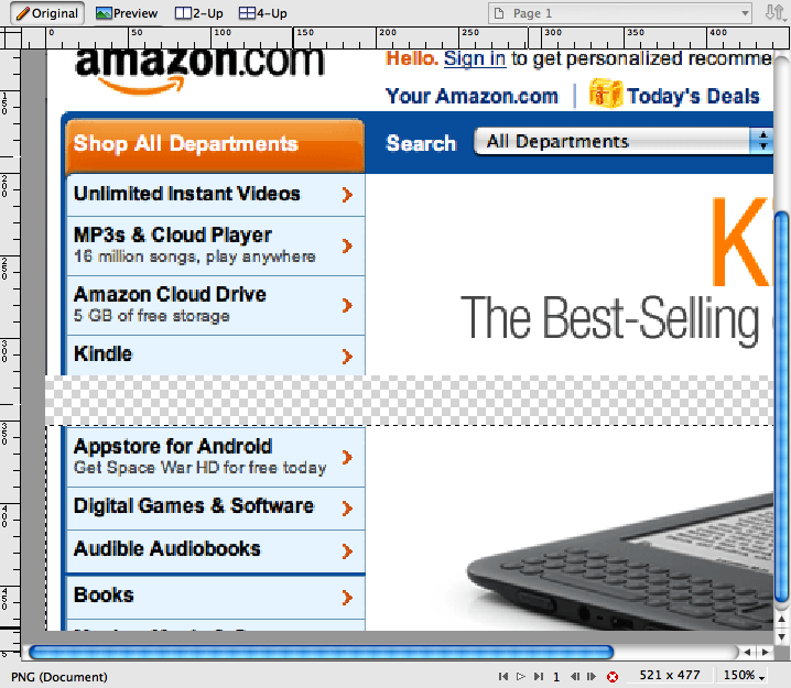
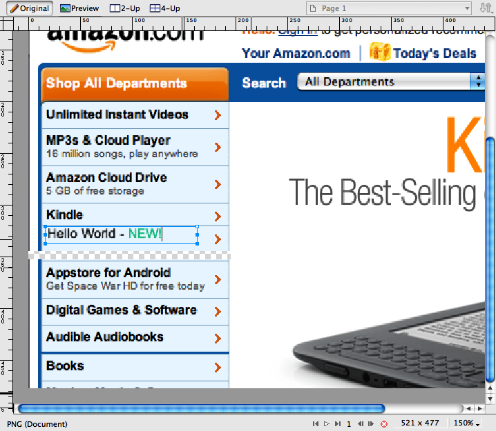
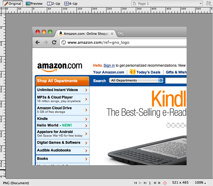
Let’s say we want to list our Hello World application underneath the Kindle heading on Amazon’s home page. You would start by taking a screenshot of the UI you need to change. Open it in your program (in these examples, Fireworks) and resize the canvas to give you space to work.
Using the marquee tool, cut out the part you need to change or make space for your addition. I cut and moved the part down the page because I intend to insert a new option (Option-Shift-drag on the marquee); see Figure 3-7.
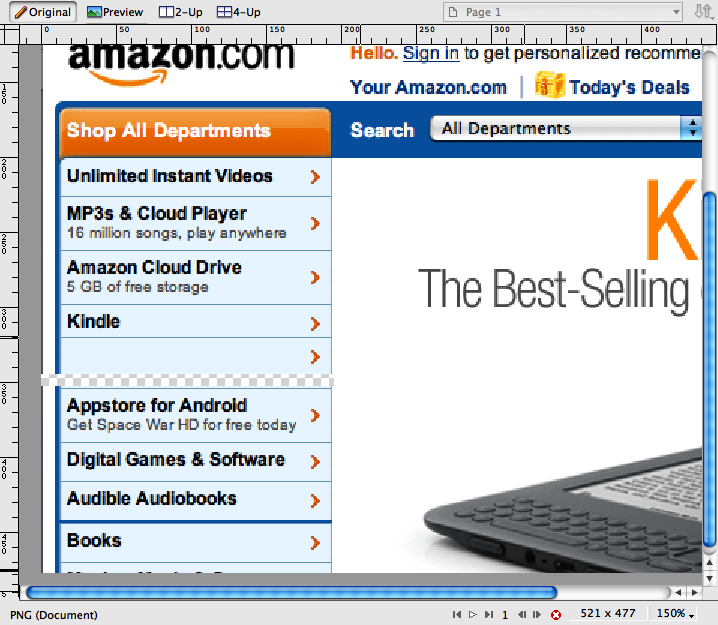
Copy the basic element you need using the marquee and Command-Option-dragging. In this case, I’ll use the Kindle entry. Paste it in, then delete and fill in the Kindle-specific space and other areas with the appropriate background. (See Figure 3-8.) One trick you can use is to keep using the marquee tool to copy and paste the background color from another area to do the filling, rather than trying to use the paint bucket and eraser.
Add your element. As shown in Figure 3-9, I’m adding my Hello World with a green “NEW!” prompt. You won’t do anything quite so stupid. (Jeff would never approve.) I guessed at the font, but you’ll probably know what your production fonts are. Or you can inspect the CSS!
Clean up the bottom and crop the image back down to the basic size. Done! (See Figure 3-10.)
This example is trivial, but you’ll find that you can generate a remarkable number of high-quality mocks in a short period of time using this technique.

