Chapter 4. Handling user interaction
| This chapter covers |
|
Chapter 3 set the launchpad for your applications by covering the flexible layout model and text management features available in Silverlight. Considering all Silver-light elements must be bound within a layout panel and almost all applications include textual components, it only seemed natural to address those items right from the start. After layout and text, managing a user’s input probably comes in as a close second.
User input is a vital part of virtually every web application. Over the course of this chapter, you’ll learn how to collect this input. We’ll first discuss Silverlight’s deep device support. From there, you’ll see the various text, button, list, date, and prompt controls. This chapter will end with a discussion of a hodgepodge of controls that don’t fit elsewhere. These controls provide interesting features that will be used in other controls in the future.
4.1. Understanding device support
Real-world applications need a way to accept input from users. This process of collecting input is managed by a wide range of input devices including the keyboard, mouse, and stylus. Silverlight provides direct support for these devices through the System.Windows.Input namespace. This namespace will be covered throughout this section. This discussion will include an explanation of how to capture the events fired from the keyboard. Then, you’ll see how to handle events triggered from the mouse and stylus.
4.1.1. Capturing the keyboard
Have you ever considered how an application determines how to handle your keystrokes? Often, we click and clack our way through our days and take for granted how our information gets where we intend. But if we’d slow down for a second, we’d notice that there’s an intermediary step.
Before typing any information, you must target an element and give it the focus. This section will provide an explanation of the concept of focus. Once an item has focus, it can begin receiving keyboard events, which will also be handled. Finally, for the special situations where you want to handle key combinations, you must learn to deal with modifier keys.
Understanding Focus
When an element has focus, it becomes the primary target for any information entered through the keyboard. This target element must be a System.Windows.Controls.Control element because only Control elements can be given focus in Silver-light. You can give these elements focus by selecting them with the mouse, by tabbing into them through the keyboard, or via the Focus method. Regardless of your approach, the concept of focus is especially important within the realm of the World Wide Web.
Web pages provide a unique challenge with focus because Silverlight plug-in instances are part of a larger ecosystem. In chapter 2, this ecosystem was shown to begin with an HTML document. This document may have multiple Silverlight controls or a mix of Silverlight controls and other control types such as Flash. In order for a Silverlight control to accept input from the keyboard, the Silverlight control itself must first have the focus. To accomplish this, you can use the JavaScript shown in snippet 4.1.
Snippet 4.1. JavaScript: The JavaScript that gives focus to a Silverlight control so that it can accept input from the keyboard
var silverlightControl = document.getElementById('SilverlightControl'),
if (silverlightControl)
  silverlightControl.focus();
This snippet uses the HTML DOM to manually give the focus to an instance of the Silverlight plug-in. This approach can be useful if you want to give your Silverlight application the focus when a web page is loaded. If you don’t do this, a user will either have to click or tab into your Silverlight plug-in instance. Once this plug-in instance does have the focus, your Silverlight application will automatically have the focus, and you can begin handling keyboard events within your Silverlight application.
Handling Keyboard Events
Silverlight provides two events directly related to the keyboard. These events, KeyDown and KeyUp, are available through the UIElement class. The KeyDown event happens when a user presses a key. Once that key is released, the KeyUp event will fire. When either event is triggered, its event handler will receive a KeyEventArgs parameter. This parameter, and the KeyDown and KeyUp events, is shown in snippet 4.2 .
Snippet 4.2. C# XAML: A page in Silverlight that responds to the KeyDown and KeyUp events. The event handlers associated with these events update the TextBlock to show the key that was used.
<UserControl x:Class="Keyboard01.Page"
 xmlns="http://schemas.microsoft.com/winfx/2006/xaml/presentation"
 xmlns:x="http://schemas.microsoft.com/winfx/2006/xaml"
 Width="400" Height="300"
 KeyDown="Page_KeyDown">
 <Canvas x:Name="LayoutRoot" Background="Black">
  <TextBlock x:Name="myTextBlock" Foreground="White" Text="Waiting..." />
 </Canvas>
</UserControl>

public partial class Page : UserControl
{
 public Page()
 {
   InitializeComponent();
   this.KeyUp += new KeyEventHandler(Page_KeyUp);
 }
 private void Page_KeyUp(object sender, KeyEventArgs e)
 {
   myTextBlock.Text = "Key (" + e.Key + ") was released.";
 }
 private void Page_KeyDown(object sender, KeyEventArgs e)
 {
   myTextBlock.Text = "Key (" + e.Key + ") is down.";
 }
}
This snippet shows a page in Silverlight that responds to the KeyDown and KeyUp events. These events are watched through the UserControl element, which is inherently a UIElement. We’ll discuss this element further in chapter 12 (section 12.1), but for now, notice how the keyboard events are attached in two different ways. In one, the KeyDown event is attached to through the XAML declarative approach  . The other approach uses traditional procedural code
  . Regardless of the method, the appropriate keyboard event handler will receive a KeyEventArgs parameter
  .
.
The KeyEventArgs class empowers you to fetch data relayed from a user’s keyboard. Once a user begins typing, you can use this object to interpret a user’s keystrokes and act accordingly. For you to appropriately react, the KeyEventArgs class provides the properties shown in table 4.1.
Table 4.1. The properties of the KeyEventArgs class
|
Property |
Description |
|---|---|
| Handled | A bool that signals whether or not the key event has been handled. |
| Key | This integer value identifies which key has been pressed. Unlike the PlatformKeyCode property, this value is consistent across all operating systems. |
| PlatformKeyCode | An integer value that provides the key code of a pressed key. This value is specifically tied to the operating system the user is using. |
After reviewing this table, you may be scratching your head and thinking, Why would I ever use the PlatformKeyCode property? The reason is because some keys are irrelevant on other operating systems. For instance, checking for a Windows Logo keystroke on OS X makes as much sense as checking for a Command key press on Windows. If handling these or other operating-system-specific keystrokes is necessary, you can use the PlatformKeyCode. Otherwise, we recommend sticking with the Key property. But, if you need to handle key combinations such as Ctrl-C, you need to rely on modifier keys.
Dealing with Modifier Keys
Modifier keys are those used in combination with other keys. Modifier keys are necessary because the KeyEventArgs class only exposes information about the currently pressed key. If you select something like the Shift key or Ctrl key and then another key, the initially selected key data will be lost. You can overcome this problem with the help of the statically visible Keyboard class.
The Keyboard class, in the System.Windows.Input namespace, exposes information directly related to the selected modifier keys. This information is available through the lone visible property Modifiers, which is a bit field enumeration that represents the set of ModifierKeys that are pressed. These ModifierKeys represent options of an enumeration (table 4.2).
Table 4.2. The ModifierKeys available within Silverlight 2
|
Option |
Description |
|---|---|
| Alt | Represents the Alt key. This key is available on all supported platforms. On an Apple keyboard, this key is also referred to as the Option key. |
| Apple | Signal for the Command key on an Apple keyboard. |
| Control | Flag for the Ctrl key. This key is available on all supported platforms. |
| None | Signals that no modifier keys are pressed. |
| Shift | Represents the Shift key. This key is available on all supported platforms. |
| Windows | Signal for the Windows Logo key on a Windows keyboard. |
Table 4.2 shows the options available in the ModifierKeys enumeration. Notably, the Apple option is equal to the Windows option. The reason for this enumeration is to allow for bitwise operations. This is important because these operations allow you to check to see if multiple keys are selected at the same time. For instance, if you want to change the KeyDown event used in snippet 4.2 to listen for Shift-B, you could use the code in snippet 4.3.
Snippet 4.3. C#: A basic example using ModifierKeys
private void Page_KeyDown(object sender, KeyEventArgs e)
{
  if (e.Key == Key.B)
  {
    if ((Keyboard.Modifiers & ModifierKeys.Shift) == (ModifierKeys.Shift))
     myTextBlock.Text = "You have selected SHIFT+B!";
  }
}
This snippet shows how you can go beyond individual key events in Silverlight. These events give you a key to the gates of an interactive kingdom. By appropriately listening to and responding to these events, you can easily deliver engaging games and illustrations. In addition to the keyboard, there’s another familiar friend in the interactive kingdom: the mouse.
4.1.2. Trapping the mouse
The mouse is slightly more complex than the keyboard. In addition to responding to button-related events, the mouse can also respond to movement. Movements can be measured to enhance the interactive experience along with the keyboard. As you’ll see shortly, you can take these measurements and deliver a user-friendly drag-and-drop environment. But, before you can provide this type of functionality, you need to have a complete and thorough understanding of the mouse-related events available in Silverlight.
Mouse Events
Silverlight supports a range of movement and click-related events emitted from the mouse. These events can be handled by any UIElement. The most familiar of these events are probably the click-handling events because they behave similarly to the keyboard events. Table 4.3 shows these click-related actions along with their descriptions. This table shows a pair of events tied to the left mouse button. Noticeably, table 4.3 omits any mention of support for the right mouse button. Most OS X machines don’t have a right mouse button.[1] In order to be consistent across platforms, Silverlight 2 doesn’t have any event handlers for the right mouse button. With that said, there’s still a lot of opportunity to provide interactivity with the left mouse button.[2]
1 OS X supports right-click context menus when using a single button mouse by holding the Ctrl key when clicking. OS X also supports multibutton mice, and Apple ships a multibutton mouse as standard equipment with new computers.
2 If right-mouse-button click support is required, hook the right click event in JavaScript and use the JavaScript integration techniques shown in chapter 2 to route a message to Silverlight code.
Table 4.3. The click-related events associated with the mouse
|
Event |
Description |
|---|---|
| MouseLeftButtonDown | Responds to the user depressing the left mouse button |
| MouseLeftButtonUp | Reacts to the user releasing the left mouse button |
When the left mouse button is selected, the corresponding event handlers will receive a MouseButtonEventArgs object. This object derives from the MouseEventArgs class, which details the mouse at the time the event was fired. You can receive the location of the mouse cursor in relation to a specific UIElement through the GetPosition method. This method is part of the MouseEventArgs class and will be discussed more in a moment. For now, please take a look at the properties available in the MouseEventArgs class (table 4.4).
Table 4.4. The properties exposed by the MouseEventArgs
|
Property |
Description |
|---|---|
| Handled | A bool that flags whether or not the mouse event has been dealt with |
| StylusDevice | Details the information associated with a tablet pen |
Table 4.4 lists the properties available through the MouseEventArgs class. As this table shows, Silverlight has built-in support for working with a stylus, which we’ll discuss in a bit. A method in the MouseEventArgs class demands more immediate attention. This method is called GetPosition.
The GetPosition method gives you immediate access to the current location of the mouse. This location is returned from the GetPosition method as a Point in relation to any UIElement. This UIElement is determined by passing it as the sole parameter to the method. Optionally, you can pass null as the parameter to the GetPosition method to get the location of the mouse in relation to the Silverlight plug-in instance. Regardless of how you use it, this method is useful when handling both click and movement events. The UIElement class exposes the mouse-movement events shown in table 4.5.
Table 4.5. The mouse-movement-related event handlers
|
Description |
|
|---|---|
| MouseEnter | Triggers when the user enters the boundary of a UIElement. |
| MouseMove | Reacts to mouse movement within the boundary of a UIElement. |
| MouseLeave | Fires when the move leaves the boundary of a UIElement. |
The events in table 4.5 undoubtedly separate the mouse from the keyboard. These movement-related event handlers are passed a MouseEventArgs parameter, so you can be readily informed of a mouse’s position as it moves around a surface. This feature can be especially useful if you want to implement drag-and-drop features in Silver-light.
Drag and Drop
Dragging and dropping visual components is an interactive experience that desktop users are used to. Although it’s possible to deliver this functionality with DHTML, Silver-light makes it more flexible by allowing any UIElement to respond to mouse-related events. You can implement this functionality by mastering a three-step process:
1.
Select the object to drag.
2.
Move the object to the new location.
3.
Release the object and drop it.
The first step in the drag-and-drop process involves selecting the object to drag. In order to enable a user to select an object, you listen for the MouseLeftButtonDown event. When this event occurs, you keep track of the fact that the mouse is depressed, as well as the original position of the selected element. You signal that the mouse has been depressed in order to effectively communicate with the other mouse-related events. In addition, you define an offset between the mouse cursor and the upper-left corner of the UIElement. This offset will enable you to update the location without making the element seemingly jump to a location when it’s selected.
In order to appropriately react to mouse-related events, you need to capture the mouse’s attention. To claim ownership of the mouse’s input, you call the Capture-Mouse method. This method essentially locks a mouse’s events to a specific UIElement, empowering you to let an element respond to the mouse, even if the mouse cursor is outside the bounds of the element.
After you have the mouse’s attention, you can then turn your focus to movement. By utilizing the MouseMove event on an object, you can programmatically update an element’s location by accessing the location of the mouse via the GetPosition method. Even though this method returns a Point of the current x- and y-coordinates of the mouse, you also need to use this in conjunction with the offset you set in the first step.
Finally, once the user decides an element is in its proper position, you can enable the drop by responding to the MouseLeftButtonUp event. When this event occurs, it’s your responsibility to free the mouse’s attention by calling the ReleaseMouseCapture method, which restores the mouse-related events to the realm of the plug-in instead of a single element. Snippet 4.4 shows this entire three-step process.
Snippet 4.4. C#: The mouse-related event handlers for implementing drag-and-drop

This snippet shows the three steps necessary to implement the powerful drag-and-drop functionality . This snippet uses the TextBlock from snippet 4.2 as the target UIElement. It should be assumed that this TextBlock has its MouseLeftButtonDown, MouseMove, and MouseLeftButtonUp events wired-up through XAML. Snippet 4.4 shows the general way to enhance your applications with drag-and-drop. Another way to enhance your applications is with the
rich set of input controls available within Silverlight. The most basic of which are the text controls.
4.2. Delivering text controls
Once you can respond to events from an input device, you can begin collecting items such as text. Collecting and displaying text is a vital part of almost every web application. Silverlight provides a pair of controls designed to make this important task an easy one. Over the course of this section, you’ll learn how to handle basic text entry with the TextBox. In addition, you’ll see how to collect sensitive information, such as passwords, that needs to be secured.
4.2.1. Handling basic text
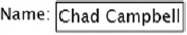
The TextBox control enables your users to edit and view text. As basic as this may sound, it would be difficult to consider a UI technology that didn’t include this type of functionality. When a user enters text into a TextBox, it gets stored as a string in the Text property. This property can be programmatically set at runtime giving you the ability to prepopulate a form. Optionally, this property value can be set at design time if you have a more static value. Regardless of which approach you use, the TextBox uses a basic syntax and has a plain default appearance as shown in snippet 4.5 .
Snippet 4.5. XAML Result: The default look of a TextBox. The TextBox in this case is defined within a StackPanel.
<StackPanel Orientation="Horizontal">
  <TextBlock Text="Name: " />
  <TextBox Text="Chad Campbell" />
</StackPanel>
This snippet shows a basic TextBox with a preset Text value. This value will change if a user decides to change the contents of a TextBox. This change will cause the Text-Changed event to fire asynchronously. This event gives you the opportunity to respond to characters after they’re entered. You can
also limit how many characters a user can enter by setting the MaxLength property. Limiting the number of characters can be useful for ensuring that data isn’t truncated when it’s sent back to a
data source. In addition, some of the values from a data source should only be seen, not edited. In these cases, you can change
the IsReadOnly property to true to prevent a user from editing a TextBox. These basic members of a TextBox are useful, but the multiline and text selection features are, perhaps, even more interesting.
Enabling Multiline Text Support
The TextBox has built-in support for handling multiline text input. By default, this feature is turned off. You can turn it on by toggling two of the properties of a Text-Box control. These two properties, AcceptsReturn and TextWrapping, are shown in snippet 4.6.
Snippet 4.6. XAML Result: A multiline text box. In line-of-business applications, multiline text boxes are usually used for descriptions as shown here, or for simple text editors. The text in the TextBox shown was entered at runtime.

<Grid>
 <Grid.RowDefinitions>
   <RowDefinition Height="Auto"></RowDefinition>
   <RowDefinition></RowDefinition>
 </Grid.RowDefinitions>
 <TextBlock Text="Description:" FontFamily="Verdana" FontSize="14" />
 <TextBox x:Name="myTextBox" AcceptsReturn="True" TextWrapping="Wrap"
   FontFamily="Verdana" FontSize="14"
   Grid.Row="1" Height="150" Width="450" />
</Grid>
This snippet shows a multiline TextBox enabled through the AcceptsReturn and TextWrapping properties. The AcceptsReturn property is a bool that tells the Text-Box whether or not to show and permit newline characters. This property is important because this is what enables a user to press the Enter key and go to a new line within a TextBox. A true multiline TextBox isn’t complete until the TextWrapping property is set to Wrap. We discussed this property in chapter 3 (section 3.4.3), and those same rules apply with the TextBox. With this property and the AcceptsReturn property, you can easily implement a multiline TextBox.
Implementing a multiline TextBox in Silverlight is simple. This approach is slightly different than the approach used in HTML that requires a separate element altogether (the TextArea). The Silverlight approach simplifies the overall API and provides exciting text selection features not found in HTML.
Mastering Text Selection
The TextBox has built-in support for selecting portions of text within a TextBox. A user can highlight, and you can programmatically retrieve that information through three properties, appropriately named SelectedText, SelectionStart, and SelectionLength. Each is shown in figure 4.1.
Figure 0.1. The text selection parts

This figure shows the three properties associated with text selection. The first property is a string called SelectedText that represents the content currently selected within a TextBox. This content has a specific length, which is available through the SelectionLength property. This int gives you the number of characters currently selected within a TextBox. These characters begin at a specific index, which is accessible through the SelectionStart property. When text isn’t selected, the SelectionStart property will return the index of the carat. The selection properties are read/write and allow you to programmatically change their values.
A multiline TextBox may be used to implement a simple text editor. Many text editors provide a Find/Replace feature that searches for a word or phrase, highlights the phrase in the editor, then replaces the selected phrase with new text. A find/replace feature would use the SelectionStart and SelectionLength properties to find and highlight a word, and the SelectedText property to perform the replacement.[3] The selection properties give you the ability to manipulate selected text at a more granular level than in HTML.
3 Programmatically changing the SelectionStart and SelectionLength properties only works when the control has the input focus.
The HTML text box doesn’t provide a way to select only portions of text. As shown here, the TextBox in Silverlight does enable you to select text at a more atomic level. At the same time, Silverlight still has support for both single and multiline text boxes. Silverlight also supports another feature from HTML: the ability to collect sensitive data.
4.2.2. Collecting sensitive data
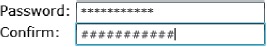
Silverlight provides a special control called the PasswordBox. This element is designed to hide information that may be lurking behind a user. This is accomplished by hiding the contents of a PasswordBox behind asterisks (*), which serve as familiar reminders to end users that they’re entering a password. But, if you’d like to use something other than an asterisk, you’re free to use any char you like by setting the PasswordChar property. This property, as well as the syntax of a PasswordBox, is shown in snippet 4.7.
Snippet 4.7. XAML Result: The syntax of the PasswordBox. Notice the mask used in each field.
<Grid>
 <Grid.RowDefinitions>
   <RowDefinition Height="Auto" />
   <RowDefinition Height="Auto" />
 </Grid.RowDefinitions>

 <Grid.ColumnDefinitions>
   <ColumnDefinition Width="Auto" />
   <ColumnDefinition Width="Auto" />
 </Grid.ColumnDefinitions>

 <TextBlock Text="Password: " FontFamily="Verdana" />
 <PasswordBox Width="200" Grid.Column="1" />

 <TextBlock Text="Confirm: " FontFamily="Verdana" Grid.Row="1" />
 <PasswordBox PasswordChar="#" Width="200"
   Grid.Column="1" Grid.Row="1" />
</Grid>
This snippet shows the syntax used to create a PasswordBox . This snippet also uses a custom PasswordChar to show how Silverlight takes a small step beyond the masking approach used in HTML . Still, once a user enters information into these fields, you’ll probably need to retrieve it. This is possible thanks to
the Password property.
The Password property is a string that represents the value in a PasswordBox. This property can be programmatically set and retrieved. Interestingly, this value can’t be copied or cut at runtime by a user. This restriction is designed to help ensure a user’s password remains protected. To provide this feature, along with the general input control features, the PasswordBox needs to derive from the Control class instead of the TextBox class. Either way, the PasswordBox and TextBox represent two of the most traditional input controls. But, when it comes to traditional input controls, none is more traditional than the button.
4.3. Button controls
Section 4.2 showed the text controls available within Silverlight. Most of those options were probably similar to other controls you’ve worked with in other technologies. Yet, another set of controls may be as familiar and equally important: buttons.
A button is a type of control that responds to a single-click event. This event can be triggered by either a mouse or a keyboard. With a mouse, a user can click a button by pressing and releasing the left mouse button while hovering over it. With the keyboard, a button can be clicked by pressing Enter or the spacebar when the button has the focus. Either way, the general implementation of a button is spread across two classes, ButtonBase and ContentControl.
ButtonBase is an abstract base class used by all buttons in Silverlight. This class provides three members that are directly related to a user’s interaction with a button: IsPressed, Click, and ClickMode. IsPressed returns whether a button is currently depressed. By default, this bool property is set to false. If a user clicks and holds a button, this property will change to true. But, once a user releases the mouse button, the IsPressed property will change back to false. At that point, the Click event will fire, assuming the default ClickMode is used.
The ClickMode property specifies when the Click event will fire. Setting this property can be useful if you want to fully customize a user’s experience with your buttons. This experience can be set to any of the options available within the ClickMode enumeration. These options are shown and described in table 4.6.
Table 4.6. The options available within the ClickMode enumeration
|
Option |
Description |
|---|---|
| Hover | Fires the Click event when the user moves the mouse pointer over a button. |
| Press | Causes the Click event to execute when the use depresses a button. |
| Release | Triggers the Click event when the user releases the left mouse button within the bounds of the button. This is the default ClickMode used for a button. |
The ClickMode enumeration can be used to define a small part of the behavior of a button. The rest of the behavior is defined in the ButtonBase class itself, but the appearance of a button is delivered through the parent of the ButtonBase class, ContentControl.
A ContentControl is a type of element designed to display a single piece of content. This content can be virtually any kind of object, which allows you to define the entire visual tree for a ContentControl. This is a large departure from the approach used in HTML where you can only use a text value and some basic styling options to create a standard button. If you wanted to go beyond this in HTML, you’d have to create an image and then simulate a button through an HTML element. In Silverlight, you can get downright crazy with your buttons (table 4.7)
Table 4.7. The flexibility of a ContentControl is displayed in these three buttons.

This table begins to show the flexibility provided with a ContentControl. As you progress through this book, you’ll learn how to make the contents of a ContentControl look exactly how you want. In fact, in chapter 10 (section 10.3), you’ll learn how to change the entire look of a ContentControl. For now, notice how the innards of a ContentControl are specified through the Content property . This property is available on all ContentControl elements, a category that naturally includes all ButtonBase elements such as the Button, HyperlinkButton, RadioButton, and CheckBox elements.
4.3.1. The Button
The traditional Button is a simple ContentControl that a user can click to perform an action. This control is defined by the Button class, which derives directly from the ButtonBase class. The Button automatically exposes the Click event. The thing that makes the Button class special is the default appearance it creates around the Content. This appearance and the syntax of a Button are shown in snippet 4.8 .
Snippet 4.8. XAML Result: The general syntax for a Button
<Button x:Name="myButton" Content="Save" Height="30" Width="90" />
As you can see, the buttons in table 4.7 are slightly more complex than the one shown in this snippet, but it is intended to show only the basic syntax and look of a Button. This appearance includes a small container that makes a Silverlight Button look similar to buttons seen in other technologies. This container is designed to hold a Button element’s Content. Occasionally, you may want this Content to behave more like a hyperlink. For these situations, you should look to the HyperlinkButton.
4.3.2. The HyperlinkButton
The HyperlinkButton control is designed to create a button that looks and behaves like a hyperlink. This behavior is provided through two publicly visible properties called NavigateUri and TargetName, which are shown in snippet 4.9 .
Snippet 4.9. XAML Result: A HyperlinkButton in action
<HyperlinkButton x:Name="myHyperlinkButton"
Content="Search in a New Window"
NavigateUri="http://www.live.com"
TargetName="_blank" />
This snippet shows a basic HyperlinkButton in action. This control uses the NavigateUri property to determine which page to load . By default, this Uri will be loaded in the current window, forcing your Silverlight application to unload. As you can imagine, this side effect
may not be desirable. But, you can take control of this behavior with the TargetName property .
The TargetName property is a string that represents the name of the frame or window to load the NavigateUri within. By default, the TargetName value will be an empty string. This value will cause the NavigateUri to load in the current browser window, forcing your Silverlight application to unload. You can use any of the values in table 4.8 to create the intended experience.
Table 4.8. The acceptable options for the TargetName property
|
Target Value |
Description |
|---|---|
| _blank, _media, or _search | Launches the URL specified in the NavigateUri property in a new browser window. |
| _parent, _self, or _top | Loads the URL specified in the NavigateUri property in the current browser window. |
This table describes the values that can be assigned to the TargetName property. If you happen to assign an unrecognized value to the TargetName property, one of two things will happen. If the value has one or more whitespace characters, an InvalidOperationException will be thrown. Alternatively, if the TargetName doesn’t have any whitespace characters, the NavigateUri will load in a new window. It’s important to remember that, despite its behavior as a hyperlink, the HyperlinkButton is still a type of button.
The HyperlinkButton class derives from the ButtonBase class; it still acts like a button and supports the Click event. In the case of a HyperlinkButton, the Click event will fire before the NavigateUri is evaluated, so you can dynamically change the location of the NavigateUri just before it gets loaded. In addition, this event can be useful for performing cleanup operations if you’re redirecting the user away from your Silverlight application. As you’ve seen, the HyperlinkButton does allow you to re-create a staple from the HTML world. Another popular element from this world is the radio button control.
4.3.3. The RadioButton
A RadioButton represents a choice within a group of options. For instance, imagine having to choose your favorite pizza topping or flavor of ice cream. Each of these situations requires one, and only one, choice to be selected. To properly deliver this kind of functionality, you need to familiarize yourself with the selection and grouping behaviors of the RadioButton.
RadioButton Selection
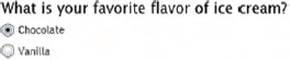
A RadioButton is a kind of ToggleButton. A ToggleButton represents a button that can change states. For a RadioButton, this state can change between a checked state and the default unchecked state. The state can be set at design time through the Boolean-based IsChecked property. The value of this property affects both behavior and appearance, as shown in snippet 4.10 .
Snippet 4.10. XAML Result: The default appearances of a checked and unchecked RadioButton
<StackPanel>
<TextBlock Text="What is your favorite flavor of ice cream?" />
<RadioButton Content="Chocolate" IsChecked="true" />
<RadioButton Content="Vanilla" />
</StackPanel>
This snippet shows two options for a single question. You can see that the first option is selected by default when the application
starts . Once a RadioButton has been selected, it can’t be unselected by clicking it again. A RadioButton can only be unselected by using one of two approaches: set the IsChecked property to false at runtime, using code, or second select a different RadioButton within the same grouping.
RadioButton Grouping
A grouping of RadioButton items represents the choices available for a single situation. In snippet 4.10 you saw a StackPanel that grouped together a couple of ice cream flavor choices. These choices were grouped because the StackPanel was the immediate parent of both of the RadioButton items. A problem begins to emerge if you add unrelated RadioButton items to the scenario. For these situations, you use the GroupName property.
The GroupName property allows you to control how RadioButton elements are grouped together. By default, this string-typed property is set as an empty string, indicating there’s no group. Because of this, all RadioButton elements with a direct parent will belong to the same group. By explicitly setting this property, you can control the groupings. You can even do this for RadioButton elements that share the same parent, as shown in snippet 4.11 .
Snippet 4.11. XAML Result: Manually controlling RadioButton groupings

This snippet shows how the GroupName property can empower you throughout your development tasks . These tasks may require you to ask your user yes/no or true/ false types of questions. Although the RadioButton can be used in these scenarios, there’s actually a more compact option: the CheckBox.
4.3.4. The CheckBox
The CheckBox control enables a user to select whether or not an option is chosen. Unlike the RadioButton, the CheckBox control allows you to select multiple elements that belong to the same grouping, so you could do something like select multiple pizza toppings (snippet 4.12).
Snippet 4.12. XAML Result: A basic CheckBox setup

<StackPanel>
 <TextBlock Text="Please select your favorite pizza toppings:" />
 <CheckBox Content="Green Peppers" IsChecked="true" />
 <CheckBox Content="Onions" />
 <CheckBox Content="Pepperonis" IsChecked="true" />
</StackPanel>
Selecting multiple CheckBox elements at the same time is possible because the Check-Box isn’t bound to a specific group. In fact, the CheckBox does little more than extend the ToggleButton class. Because the CheckBox does extend the ToggleButton class, you can use three-state checkboxes by switching the IsThreeState bool property to true. What happens to the IsChecked property? Well, this property is actually a nullable type, so it also supports three states. These states, and the look of a three-state CheckBox, are shown in snippet 4.13.
Snippet 4.13. XAML Result: Using three-state mode check boxes.
<StackPanel>
 <CheckBox IsThreeState="True" IsChecked="False" Content="Unchecked" />
 <CheckBox IsThreeState="True" IsChecked="True" Content="Checked" />
 <CheckBox IsThreeState="True" IsChecked="" Content="Interdeterminate" />
</StackPanel>
Snippet 4.13 shows the look and syntax of a three-state CheckBox. The fact that the CheckBox can support three different states demonstrates one way that Silverlight is an improvement over HTML. Another improvement is found in the flexibility of the ContentControl structure in general. This structure was discussed at the beginning of section 4.3 and can be used in the CheckBox, RadioButton, HyperlinkButton, and Button controls. In addition, the flexibility of the ContentControl can be used with Silverlight’s item controls.
4.4. The ItemsControl
In section 4.3, we discussed the controls derived from the ButtonBase class that represent buttons available within Silverlight. Often, these controls are used to trigger an action. Occasionally, you may need to provide your users with a way to select from a list of options. This type of functionality can be delivered through an ItemsControl.
An ItemsControl is a type of control designed to show a collection of items. This control exposes the collection of items through a publicly visible property called Items. This property represents an ItemsCollection where each element in the collection is some kind of object. This object can be added at design time through XAML or at runtime through code. Two controls in the Silverlight API are descendents of the ItemsControl class: the ListBox and the TabControl.
4.4.1. The ListBox
The ListBox is probably the most basic items control. This control enables you to show multiple items from a collection of items at the same time. If there are more items than space allowed for the control, the ListBox will empower a user to scroll through the collection of items. An example of this scrolling feature, as well as the syntax of a ListBox, is shown in snippet 4.14 .
Snippet 4.14. XAML Result: A ListBox that displays the days of the week

<ListBox x:Name="myListBox">
 <ListBox.Items>
  <ListBoxItem><TextBlock>Sunday, June 1</TextBlock></ListBoxItem>
  <ListBoxItem><TextBlock>Monday, June 2</TextBlock></ListBoxItem>
  <ListBoxItem><TextBlock>Tuesday, June 3</TextBlock></ListBoxItem>
  <ListBoxItem><TextBlock>Wednesday, June 4</TextBlock></ListBoxItem>
  <ListBoxItem><TextBlock>Thursday, June 5</TextBlock></ListBoxItem>
 </ListBox.Items>
</ListBox>
This snippet shows a very basic ListBox in action. This ListBox uses the Items property to load options at design time. You also have the option of binding to a data source to make this list of items more dynamic. Binding to a data source will be covered in the next chapter. Regardless of whether you’re binding to a data source or defining items at design time, each item represents a ListBoxItem. A ListBoxItem is a kind of ContentControl, so you can use any visual tree you want for an item, as shown in snippet 4.15 .
Snippet 4.15. XAML Result: Using a ListBoxItem as a ContentControl

<ListBox x:Name="myListBox">
 <ListBox.Items>
  <ListBoxItem>
   <StackPanel Height="80" Orientation="Horizontal">
    <Canvas Width="87" Height="77">
     <Image Source="http://www.silverlightinaction.com/month.png" />
     <TextBlock Width="77" TextAlignment="Center" FontFamily="Arial"
      FontWeight="Bold" FontSize="32" Padding="30" Text="1" />
    </Canvas>
    <TextBlock FontFamily="Arial" FontWeight="Bold" FontSize="44"
     Padding="20">Sunday</TextBlock>
   </StackPanel>
  </ListBoxItem>
  <ListBoxItem>
   <StackPanel Height="80" Orientation="Horizontal">
    <Canvas Width="87" Height="77">
     <Image Source="http://www.silverlightinaction.com/month.png" />
     <TextBlock Width="77" TextAlignment="Center" FontFamily="Arial"
       FontWeight="Bold" FontSize="32" Padding="30" Text="2" />
    </Canvas>
    <TextBlock FontFamily="Arial" FontWeight="Bold" FontSize="44"
     Padding="20">Monday</TextBlock>
   </StackPanel>
  </ListBoxItem>
  <ListBoxItem>
   <StackPanel Height="80" Orientation="Horizontal">
    <Canvas Width="87" Height="77">
     <Image Source="http://www.silverlightinaction.com/month.png" />
     <TextBlock Width="77" TextAlignment="Center" FontFamily="Arial"
      FontWeight="Bold" FontSize="32" Padding="30" Text="3" />
    </Canvas>
    <TextBlock FontFamily="Arial" FontWeight="Bold" FontSize="44"
     Padding="20">Tuesday</TextBlock>
   </StackPanel>
  </ListBoxItem>
  <ListBoxItem>
   <StackPanel Height="80" Orientation="Horizontal">
    <Canvas Width="87" Height="77">
     <Image Source="http://www.silverlightinaction.com/month.png" />
     <TextBlock Width="77" TextAlignment="Center" FontFamily="Arial"
       FontWeight="Bold" FontSize="32" Padding="30" Text="4" />
    </Canvas>
    <TextBlock FontFamily="Arial" FontWeight="Bold" FontSize="44"
     Padding="20">Wednesday</TextBlock>
   </StackPanel>
  </ListBoxItem>
 </ListBox.Items>
</ListBox>
This snippet shows a ListBox control with much richer ListBoxItem elements than those shown in snippet 4.14.[4] Ultimately, one of the main reasons for using a ListBox is to enable your users to select an item from it. Luckily, the ListBox exposes some items for this.
4Snippet 4.14 merges the UI with the data used in the list. In chapter 5, you’ll see how to use a DataTemplate to separate the UI definition from the data.
The ListBox exposes three valuable items, SelectedIndex, SelectedItem, and SelectionChanged, all of which help you handle item selection. The SelectedIndex is a zero-based int that reflects the index of the currently selected item in the List-Box. If no item is selected, this property will return–1. Even more informative is the SelectedItem property, which returns the current selection in object form. This property type is a powerful improvement over the value/text property of items in HTML. Regardless, whenever an item is selected, whether by the user or programmatically, the SelectionChanged event will fire. This event, as well as the SelectedItem and SelectedIndex properties, is also available on the ComboBox.
4.4.2. The ComboBox
The ComboBox gives users the ability to select a single option from a list of choices. These choices are visible to a user as long as the ComboBox is in an open state, which is set when a user interacts with a ComboBox. Alternatively, this state can be set program-matically through the IsDropDownOpen property. This bool property is by default set to false, so a ComboBox starts in a compacted, closed state, as shown in snippet 4.16.
Snippet 4.16. XAML Result: A ComboBox that has been used to select an item
<ComboBox x:Name="myComboBox" Height="28" Width="180">
 <ComboBox.Items>
  <ComboBoxItem><TextBlock>Sunday, June 1</TextBlock></ComboBoxItem>
  <ComboBoxItem><TextBlock>Monday, June 2</TextBlock></ComboBoxItem>
  <ComboBoxItem><TextBlock>Tuesday, June 3</TextBlock></ComboBoxItem>
  <ComboBoxItem><TextBlock>Wednesday, June 4</TextBlock></ComboBoxItem>
  <ComboBoxItem><TextBlock>Thursday, June 5</TextBlock></ComboBoxItem>
 </ComboBox.Items>
</ComboBox>
Snippet 4.16 shows the appearance of a closed ComboBox. As you can see, this control delivers a compact approach for displaying a list of items. In fact, this control resembles the DropDownList found in ASP.NET and the select element used in HTML. But, unlike those controls, each item in the ComboBox can have a fully customized appearance; each item is a ComboBoxItem, which happens to be a kind of ContentControl. This fact enables you to re-create the list shown in snippet 4.15 in the more compact form a ComboBox.
The ComboBox also provides three members that make it unique from the other list controls. The first member is a double property called MaxDropDownHeight that allows you to customize the maximum height of the drop-down list. The second member is an event named DropDownOpened that fires when the drop-down list is shown. The third member is an event that triggers when the drop-down list closes. This event is called DropDownClosed. Collectively, these three members make the ComboBox special—they won’t be found on the third and final type of ItemsControl, the TabControl.
4.4.3. The TabControl
The TabControl is another ItemsControl available within Silverlight. This ItemsControl is designed to empower you to share a small amount of space with multiple pieces of content. Each of these pieces of content is defined within a TabItem, which happens to be a ContentControl. Because of this, you can define the complete visual tree for each TabItem.[5] Before you can do this, you must reference the System.Windows.Controls assembly. The tab-related controls are extended controls like the GridSplitter mentioned in chapter 3 (section 3.3), so the ext prefix will be used once again throughout this section, as shown in snippet 4.17.
5 When the TabControl is constructed, every element in each tab is also constructed, but the Loaded event isn’t called for hidden elements until a tab is clicked and the element is displayed. An element’s Loaded event is called each time the tab is displayed.
Snippet 4.17. XAML Result: The basic syntax of a TabControl

<UserControl x:Class="Snippet4_17.Page"
 xmlns="http://schemas.microsoft.com/winfx/2006/xaml/presentation"
 xmlns:x="http://schemas.microsoft.com/winfx/2006/xaml"
 xmlns:ext="clr-namespace:
   .System.Windows.Controls;assembly=System.Windows.Controls"
 Width="400" Height="300">
 <StackPanel x:Name="LayoutRoot" Background="White"
  HorizontalAlignment="Left">
  <TextBlock Text="My Grocery List" />
   <ext:TabControl x:Name="myTabControl" Height="200" Width="240">
    <ext:TabItem>
     <ListBox>
      <ListBoxItem Content="Apples" />
      <ListBoxItem Content="Bananas" />
      <ListBoxItem Content="Grapes" />
     </ListBox>
    </ext:TabItem>
    <ext:TabItem>
     <StackPanel Orientation="Vertical">
      <ListBox>
       <ListBoxItem Content="Beef" />
       <ListBoxItem Content="Pork" />
       <ListBoxItem Content="Chicken" />
      </ListBox>
      <TextBlock TextWrapping="Wrap" Width="200"
       Text="NOTE: You may want to pick up some barbeque sauce." />
     </StackPanel>
    </ext:TabItem>
   </ext:TabControl>
  </StackPanel>
</UserControl>
This snippet shows an entire page, which includes a basic TabControl. Because Tab-Control is an extended control and is part of the System.Windows.Controls.dll, we’ve shown the entire page XAML to demonstrate the use of the ext namespace. Now that you can use a TabControl, it’s important to understand the behavior of the headers.
Each of the tab headers in snippet 4.17 is hardly visible because each header is set by a TabItem property called Header. This property represents the object used when rendering the Header, so you should consider using some UIElement, such as a Panel, for the Header. Snippet 4.18 shows a TextBlock being used for one Header and a StackPanel for the other.
Snippet 4.18. XAML Result: Customizing the Header of a TabItem

<StackPanel x:Name="LayoutRoot" Background="White"
 HorizontalAlignment="Left">
 <TextBlock Text="My Grocery List" />
 <ext:TabControl x:Name="myTabControl" Height="200" Width="240">
  <ext:TabItem Header="Fruits">
   <ListBox>
    <ListBoxItem Content="Apples" />
    <ListBoxItem Content="Bananas" />
    <ListBoxItem Content="Grapes" />
   </ListBox>
  </ext:TabItem>
  <ext:TabItem>
   <ext:TabItem.Header>
    <StackPanel Orientation="Horizontal">
     <Image Source="http://www.silverlightinaction.com/meat.png" />
     <TextBlock Text="Meats" />
    </StackPanel>
   </ext:TabItem.Header>
   <StackPanel Orientation="Vertical">
    <ListBox>
     <ListBoxItem Content="Beef" />
     <ListBoxItem Content="Pork" />
     <ListBoxItem Content="Chicken" />
    </ListBox>
    <TextBlock TextWrapping="Wrap" Width="200"
     Text="NOTE: You may want to pick up some barbeque sauce." />
   </StackPanel>
  </ext:TabItem>
 </ext:TabControl>
</StackPanel>
This snippet shows a TabControl with two TabItem elements. Each element has a Header. Note that, if a TabItem has its Header property set, the HasHeader property of the TabItem will change to true. This bool property defaults to false and is useful in the event that you need to check if a TabItem has a header at runtime. For situations where you want to change the location of the tabs, there’s another property.
The TabStripPlacement property determines how the tabs align in relation to the tab content area. This property represents an enumeration that can be set to Bottom, Left, Right, or Top. By default, this property value is set to Top on a TabControl.
The TabControl and ListBox represent two ItemsControl elements available in Silverlight 2. ItemsControl elements give you the flexibility to allow a user to select from any kind of content. In situations where you want to specifically target dates, Silverlight provides two alternatives, known as date controls.
4.5. Date controls
In section 4.4, we discussed the available list controls, which mimic a lot of the functionality that you’ve probably seen in HTML. As you can imagine, implementing the functionality of a TabControl in HTML isn’t nearly as easy as it is in Silverlight. The same can also be said for implementing date selection features.
Silverlight provides two controls designed to allow your users to quickly and easily select a date. These controls, Calendar and DatePicker, directly derive from the Control class. Interestingly, these controls aren’t part of the System.Windows assembly like most other controls. Instead, the Calendar and DatePicker controls are extended controls like the TabControl, so the ext namespace used in snippet 4.17 will also be used throughout this section.
4.5.1. Calendar
The Calendar control provides a rich, visual interface for selecting one or more dates. If you only care about the first selected date, you may manage this value through the SelectedDate property. If you want to set or retrieve multiple dates, there’s a collection called SelectedDates. Regardless of whether you’re working with one or multiple dates, the value is a nullable DateTime value. This value defaults to null, causing the Calendar to select the current date (snippet 4.19 ).
Snippet 4.19. XAML Result: The default appearance and basic syntax of a Calendar

<UserControl x:Class="Snippet4_19.Page"
 xmlns="http://schemas.microsoft.com/winfx/2006/xaml/presentation"
 xmlns:x="http://schemas.microsoft.com/winfx/2006/xaml"
 xmlns:ext="clr
   .namespace:System.Windows.Controls;assembly=System.Windows.Controls"
 Width="400" Height="300">
 <Grid x:Name="LayoutRoot" Background="White">
  <StackPanel Width="225">
   <TextBlock x:Name="myTextBlock" FontWeight="Bold"
    Text="Please select your birthdate:" />
   <ext:Calendar x:Name="myCalendar" />
  </StackPanel>
 </Grid>
</UserControl>
This snippet shows the basic look and syntax of a Calendar. This Calendar defaults to a traditional-looking month view. As you’ll see in this section, you can configure how a calendar displays a date range. In addition, you’ll also see how you can shape the way in which a user can select dates.
Configuring the Display
By default, the Calendar control provides a familiar way to select a date, but there may be some situations where you need to configure this experience. For these situations, the Calendar control provides three properties designed to help you configure the Calendar display. These three properties are IsTodayHighlighted, DisplayMode, and FirstDayOfWeek.
The IsTodayHighlighted bool property signals whether or not the current date is marked on the Calendar. By default, this property is set to true, but you’ll only be able to see the current date as marked if the DisplayMode is set to Month. By default, it is. In reality, this property can be set to any of the values in the CalendarMode enumeration. This enumeration gives you the flexibility to alter the entry point into a date range. The CalendarMode values and their impact on a Calendar are shown in table 4.9.
Table 4.9. The CalendarMode options that can be used for the DisplayMode property

This table shows the CalendarMode options that can be used for the DisplayMode of a Calendar.[6] In addition to the DisplayMode, the Calendar allows you to set the day that the Calendar uses as the beginning of the week. This feature is made possible by the FirstDayOfWeek property, which happens to be a DayOfWeek value. This value defaults to Sunday, but it can be set to any other day of the week. This day will be set as the leftmost column in a Calendar, as long as the DisplayMode is set to Month. Once you’ve settled on a Calendar display, you may need to decide what dates can be selected within the Calendar.
6 Although the DisplayMode property can be set at startup, the user can always change the Calendar to a different mode. The Calendar is a control for picking dates and can’t be used to pick a month or year.
Empowering Date Selection
The Calendar control enables you to restrict the dates that can be selected. By default, the Calendar will let a user select any date between 01/01/0001 and 12/31/9999. In reality, you’ll probably want your users to select from a narrower series of dates. To help you define this series, Silverlight provides four properties: DisplayDateStart, DisplayDateEnd, BlackoutDates, and SelectionMode.
The DisplayDateStart and DisplayDateEnd properties are nullable DateTime values that define the range a user can select from. To further limit this range, you can add values to the BlackoutDates collection to ensure that certain dates can’t be selected. Finally, to control how a user can select dates, you can set the SelectionMode property. This property reflects a CalendarSelectionMode value whose options are shown in table 4.10.
Table 4.10. The options available within the CalendarSelectionMode enumeration
|
Option |
Description |
|---|---|
| MultipleRange | Enables a user to select multiple date ranges from a single Calendar instance. |
| None | Prevents a user from selecting any dates in a Calendar. |
| SingleDate | Allows a user to select only one date at a time. |
| SingleRange | Empowers a user to select one range of dates. |
This table shows the options that you can use as the SelectionMode of a Calendar. By default, this value is set to SingleDate. This value definitely has its uses, but if you only want your users to select a single date, you may want to consider the DatePicker.
4.5.2. DatePicker
The DatePicker control empowers the user to choose a single date. Unlike the Calendar control, the DatePicker enables this in a much more compact format. This format uses a text box to show and collect the SelectedDate. Alternatively, the user can select a date from a pop-up calendar launched when the calendar icon is selected. This icon and the general look and syntax of a DatePicker are shown in snippet 4.20 .
Snippet 4.20. XAML Result: The default appearance and basic syntax of a DatePicker
<UserControl x:Class="Snippet4_20.Page"
 xmlns="http://schemas.microsoft.com/winfx/2006/xaml/presentation"
 xmlns:x="http://schemas.microsoft.com/winfx/2006/xaml"
 xmlns:ext="clr
   .namespace:System.Windows.Controls;assembly=System.Windows.Controls"
 Width="400" Height="300">
 <Grid x:Name="LayoutRoot" Background="White">
  <StackPanel Width="225">
   <TextBlock Text="Please select your birthdate:" FontWeight="Bold" />
   <ext:DatePicker x:Name="myDatePicker" />
  </StackPanel>
 </Grid>
</UserControl>
This snippet shows the basics of the DatePicker control. If a user were to select the calendar icon on the right side of the control, a calendar would appear. This action would cause the IsDropDownOpen bool property to change to true. This property is, by default, set to false, but you can set it at design time if you want to show the calendar. Once a date is selected, it will be set as the SelectedDate and displayed in the DatePicker text box. Interestingly, it isn’t the SelectedDate that gets shown; it’s the Text property.
The Text property is a string that represents the value shown to the user. This value can be set programmatically or via the text box. If this value represents a valid date, it will be converted to a nullable DateTime and assigned to the SelectedDate field. If the Text value doesn’t represent a valid date, the DateValidationError event will fire, and the SelectedDate won’t change. This situation will, in turn, cause the value shown to the user to revert to the last valid SelectedDate. Before this DateTime is shown, it will be formatted based on one of the values shown in table 4.11.
Table 4.11. The options that can be used to format the SelectedDate. These options can be used with the SelectedDateFormat property and reflect options available in the DatePickerFormat enum.
|
Format |
Example |
Description |
|---|---|---|
| Long | Thursday, May 01, 2008 | This option displays the SelectedDate in a verbose format. No abbreviations will be used when displaying the SelectedDate. |
| Short | 5/1/2008 | This is the default option for formatting the SelectedDate. This format uses abbreviations when possible. |
This table shows the options you can use for the SelectedDateFormat property. As you’ve probably guessed, this property formats the SelectedDate shown in a DatePicker. As mentioned earlier, the DatePicker is a more compact version of the Calendar control. These two controls are designed to select from a range of DateTime values. But, if you need to select a value from a numeric range, you may consider using one of the built-in range controls.
4.6. Choosing from a numeric range
Imagine a scenario where you need to select or see a value between two endpoints. For instance, viewing the overall progress of a fund-raising campaign or choosing a value between 1 and 10. These types of situations involve working with a value between two numeric endpoints, so they’re perfectly positioned to take advantage of the controls that derive from the RangeBase class.
The RangeBase class is designed for controls that have a value between two numeric endpoints. This value can be set programmatically and may be set interactively if the specific control allows for it. Either way, the abstract RangeBase class defines three properties that define the range that the control can operate within. These three double-precision properties, and their descriptions, are listed in table 4.12.
Table 4.12. The properties associated with defining the range of a RangeBase instance
|
Property |
Description |
|---|---|
| Value | Signals the current amount at which a range control is set. By default, this value is set to 0. |
| Minimum | Determines the lower bound of the range within which the Value property must fall. If the Value is set to an amount less than the Minimum value, the Value property will automatically be set to the Minimum value. The Minimum value defaults to 0. |
| Maximum | Exposes the upper limit of the range within which the Value property must fall. If the Value exceeds the Maximum value, the Value property will automatically be set to the Maximum value. This Maximum value defaults to 1. |
This table shows the properties that make up the bounds of a RangeBase instance. Because the RangeBase class is an abstract base class, you must rely on one of the classes that derive from it. Over the course of this section, you’ll see two such controls: the ProgressBar and the Slider.
4.6.1. Using the ProgressBar
A ProgressBar can be used to show the overall progress of an action. This can be useful for long-running operations that may take longer than expected. This control can be especially valuable when you are working with a BackgroundWorker. The Back-groundWorker will be discussed in chapter 11 section 11.3. For now though, look at the snippet 4.21 which shows the basic syntax and default look of a ProgressBar.
Snippet 4.21. XAML Result: A basic ProgressBar
<StackPanel>
 <ProgressBar x:Name="myProgressBar" Height="30"
  Minimum="1" Maximum="100" Value="33" />
</StackPanel>
This snippet shows a basic ProgressBar. This ProgressBar sets the Maximum value to 100. Note that you can skip this step because the ProgressBar sets the Maximum value to 100 by default. The ability to set the Maximum value makes it great for working with ranges of values. In addition, it provides a way to provide explicit feedback about the progress of a task. But, there may be some situations where you don’t know how long a task will take. For these situations, there’s the IsIndeterminate property.
The IsIndeterminate property is usually used when a ProgressBar reflects a process that’s running for an unknown amount of time. By default, the IsIndeterminate field is set to false. But, when the IsIndeterminate property is set to true, the user will see an animation informing him of the progress. This animation includes the diagonal progress bars shown in snippet 4.22.
Snippet 4.22. XAML Result: An indeterminate ProgressBar
<StackPanel>
 <ProgressBar x:Name="myProgressBar" Height="30" IsIndeterminate="True" />
</StackPanel
This snippet creates a radically different effect than the ProgressBar shown in snippet 4.21. As you can see, the ProgressBar is only about relaying feedback to a user. To let a user select from a range of values, you need to use a Slider.
4.6.2. Implementing a Slider
A Slider provides an intuitive way to enable a user to select from a range of values. These values are arranged in order from the Minimum to the Maximum value, across an item known as the “track.” The track is used to provide a path along which the “thumb” can slide. The thumb represents the current Value within the range of values. The thumb, track, and general syntax of a Slider are shown in snippet 4.23.
Snippet 4.23. XAML Result: A basic Slider to choose between 1 and 10
<StackPanel>
 <Slider x:Name="mySlider" Minimum="0" Maximum="10" Value="5" />
</StackPanel>
This snippet shows a basic Slider that enables a user to select a value between 0 and 10. Interestingly, the Maximum property doesn’t have to be set to enable this functionality because, by default, the Slider overrides the default value set by the RangeBase class and changes it to 10. But, the Slider does a bit more than just change the default value of the Maximum property.
The Slider control exposes two properties that enable you to alter the orientation of the control. The first property is called Orientation and enables you set the direction the control is rendered. By default, this property is set to Horizontal. But, you can set it to the other option in the System.Windows.Controls.Orientation enumerator—Vertical—to orient the control vertically. The other property related to orientation is called IsDirectionReversed. This property is a bool that determines to which sides of the track the Minimum and Maximum values are set.
4.7. Displaying visual prompts
Let’s face it: There are certain times when you need to really grab the user’s attention. Maybe you need to display details about a critical error. You could do this with the prompts in the HTML DOM APIs mentioned in chapter 2 (section 2.5), but these prompts are quite limiting. For more intricate prompts, you may want to consider the other two alternatives available in Silverlight.
Throughout this section, you’ll learn about the two visual prompts available in Silverlight. We’ll cover the Popup prompt first. This visual prompt is designed to simulate a dialog box. The other prompt type is an OpenFileDialog, which is useful for getting a file from the user’s local filesystem.
4.7.1. Popping up a dialog box
Silverlight enables you to simulate a dialog box through a control called the Popup. This control can be used to temporarily display any amount of content you want. This content must be in the form of a UIElement, which gets associated with a Popup through the Child property. This property enables you to create any visual tree you want. For instance, you could create a Popup that looks like that shown in snippet 4.24.
Snippet 4.24. XAML Result: A basic Popup

This snippet shows a basic Popup element . This Popup element uses a Border as its Child. The Border element will be covered in section 4.8. The Popup Child property is automatically set to the first descendent of a Popup ; you don’t have to explicitly set the Child property in XAML. But, because a Popup can have only one UIElement as a descendent, you should generally use one of the Panel elements from chapter 3, or a Border, as the Child. Before this content can be seen, the IsOpen property must be set.
The IsOpen property is a bool that signals whether or not a Popup is displayed. By default, this property is set to false. By switching this bool to true, you can show the contents of a Popup. These contents will then be shown above all other elements in your Silverlight application, creating interesting behavioral and positioning considerations—both of which will be covered in this section.
Understanding the Popup Behavior
Unlike most controls, the Popup doesn’t derive from the Control class. Instead, the Popup directly derives from the FrameworkElement class, so the Popup doesn’t have any built-in support for tab navigation. You must manually set the focus to a Control in your Popup when it’s displayed. Although this isn’t difficult, it is important to recognize. It’s also important to recognize the relationship between a Popup and the other elements within Silverlight.
A Popup rests above all other elements in a Silverlight application to ensure that the contents of your Popup will always be seen. But, because of this behavior, a Popup won’t inherit any effects from its ancestors. This means that items such as animations (chapter 9) or the Background of a parent element won’t be automatically applied to a Popup. Instead, you must manually set them. This is also true when you are deciding on positioning a Popup.
Positioning the Popup
Positioning a Popup is slightly different than positioning other FrameworkElement objects. Most FrameworkElement objects rely on the HorizontalAlignment and VerticalAlignment properties for positioning. In addition, they may take into account the Left and Top or Column and Row attached properties of a Canvas or Grid. But, because a Popup rests above all other elements, these properties have no bearing on a Popup. Instead, a Popup relies on the HorizontalOffset and VerticalOffset properties.
The HorizontalOffset and VerticalOffset values represent the distance, in pixels, between the origin and a Popup. By default, these double-precision values are set to 0, but you can set them to any double value you want in order to move the Popup away from the upper-left corner of your Silverlight application. Note that the HorizontalOffset and VerticalOffset properties work independently of other property values, forcing you to manually create the calculations if you want to center a Popup to simulate a dialog box.
Although using a Popup to simulate a dialog box is nice, Silverlight doesn’t allow you to create a true dialog box. In fact, the closest you can get to a true dialog box is through the prompt options supported in the HTML DOM APIs discussed in chapter 2 (section 2.5). The reason for this is simply because Silverlight ultimately runs within the bounds of the web browser. Interestingly, Silverlight does borrow another feature from the browser world: the ability to prompt a user for a file.
4.7.2. Prompting for a file
The OpenFileDialog class empowers you to ask users for one or more files from their filesystems. From there, you can load the data from the selected files into memory, giving you the flexibility to do any number of things. For instance, you can send the contents of a file to a server or load the contents into your Silverlight application. Either way, before you can do any of these items, you must understand how to interact with the OpenFileDialog class.
Throughout this section, you’ll learn the three steps involved in interacting with an OpenFileDialog. The first step involves launching and configuring an instance of the OpenFileDialog class. Next, you must wait for and retrieve the results of a user’s interaction with an OpenFileDialog. Finally, you’ll parse the results if a user has selected at least one file.
Launching the Dialog Box
To give your users the opportunity to select a file, or multiple files, you must instantiate an instance of the OpenFileDialog class from procedural code; you can’t create an OpenFileDialog from XAML. Once it’s created, you can use several properties to customize the selection experience. These properties, and their descriptions, are provided in table 4.13.
Table 4.13. The configuration properties available on the OpenFileDialog
|
Description |
|
|---|---|
| Filter | This string represents type of files that will be displayed within the dialog. |
| FilterIndex | Determines which filter is specified by default if the filter specifies multiple file types. |
| Multiselect | Specifies whether or not users may select multiple files. By default, users may select only one file. |
As this table displays, you have flexibility in customizing the selection experience, but you don’t have complete control over the dialog box. For instance, you can’t dictate the appearance of the OpenFileDialog. Instead, the OpenFileDialog class leverages the user’s OS to determine the general look of the dialog box. By using the values in table 4.13, you can guide the selection experience, as shown in snippet 4.25 .
Snippet 4.25. C# Result: Creating an OpenFileDialog using the properties from table 4.13

OpenFileDialog openFileDialog = new OpenFileDialog();
openFileDialog.Filter =
  "Text files (*.txt)|*.txt|Xml Files (*.xml)|*.xml";
bool? fileWasSelected = openFileDialog.ShowDialog();
This snippet shows a basic OpenFileDialog box that enables a user to select a text or XML file. You can accomplish this by appropriately setting the Filter property of the OpenFileDialog object . The dialog is then launched by calling the ShowDialog method . This method will prevent the execution of any additional code until the user exits the OpenFileDialog. Once the user does exit the OpenFileDialog, the ShowDialog method will return a nullable bool that signals the end of a user’s interaction with the dialog. The code will then continue executing, giving you the opportunity
to retrieve and analyze the results.
Retrieving the Results
Once a user exits an OpenFileDialog, the ShowDialog method will return a nullable bool value. This value will be false if the user chose to close out of or cancel the OpenFileDialog. If the user selected the OK button, a true value will be returned. Once the value is returned, you can access the file(s) that the user selected.
The file(s) selected within an OpenFileDialog are available through the File and Files properties. These properties will be null if a user left the OpenFileDialog without selecting the OK button, so you should check the value returned from the Show-Dialog method before attempting to retrieve the selected file(s). An example of this is shown in snippet 4.26 .
Snippet 4.26. C#: Retrieving the selection of an OpenFileDialog
bool? fileWasSelected = openFileDialog.ShowDialog();
if (fileWasSelected == true)
{
 FileInfo fileInfo = openFileDialog.File;
 StreamReader reader = fileInfo.OpenText();
}
From this snippet, you can see that once a user opens the dialog box, you can get the selected file through the File property. If the Multiselect property had been set to true, the Files property would have been more applicable. Either way, if a user hadn’t selected a file, both those property values would have been null. If a file or multiple files had been selected, you could have retrieved the details of each file through the FileInfo object.
Reading the Results
The FileInfo class provides a special bridge from the local filesystem to the security sandbox that Silverlight runs within. This class is specifically designed for use with the OpenFileDialog. This object empowers you to read the contents of a file through two methods: OpenRead and OpenText.
The OpenRead method is designed to handle binary file scenarios. This method returns a System.IO.Stream object, which is well-suited for handling bytes of information. Alternatively, the OpenText method is better suited for text-related files. This method returns a basic System.IO.StreamReader, as shown in snippet 4.27 .
Snippet 4.27. C#: Retrieving the selection of an OpenFileDialog. The contents of a selected file are loaded into a fictional TextBlock called myTextBlock.
FileInfo fileInfo = openFileDialog. File;
StreamReader reader = fileInfo.OpenText();
myTextBlock.Text = reader.ReadToEnd();
As this snippet shows, working with a text file in Silverlight is incredibly trivial. It’s just as easy to work with a binary file. The key to either approach is to have an understanding of working with streams of data. This topic is a general concept in .NET development that’s beyond the scope of this book. The OpenFileDialog does provide a way to ask a user for a file. The Popup element provides another way to prompt your users. These two options help Silverlight deliver a richer experience than HTML. In addition, there are other controls that haven’t been covered that also provide a rich experience.
4.8. Miscellaneous controls
This chapter has covered fifteen of the controls available in Silverlight 2. This rich control library uses a variety of common constructs, such as the ContentControl and ItemsControl, to deliver a consistent API. This API includes two other incredibly valuable constructs that are hard to group with the other controls. These two controls are the Border and InkCanvas.
4.8.1. Creating a border
The Border element is designed to provide trimming around content. This content can be any UIElement, and it will be set as the Child of the Border. This Child element will be surrounded by a non-bounding border defined by three properties: BorderBrush, BorderThickness, and CornerRadius.
The BorderBrush property defines the Brush of the surrounding border. Brushes will be covered in chapter 8. For now, know that you can use a color name for this property value. The BorderThickness is a series of four double-precision values that define the width of the BorderBrush on each side. These values follow the same numbering system used by the Padding and Margin properties mentioned in chapter 3. Finally, the CornerRadius property is a series of four double values that represent the amount to round the corners of a Border. These values follow a comma-delimited format like the BorderThickness. The Border element is primarily used in two scenarios. The first scenario is when you want to provide a frame around an element such as the Popup in snippet 4.24 . The other scenario is for templating, which will be covered in chapter 10 (section 10.3). Either way, the Border provides very unique options as you’ll see. Another control also provides you with equally unique options. This control is called the InkPresenter, and it allows you to collect drawings.
4.8.2. Collecting drawings
Silverlight provides an intuitive way to collect handwritten information through an element known as the InkPresenter. This element empowers you to collect and display a kind of content known as ink, a term that refers to a series of points related to the movement of a device. These points can be collected from a mouse, stylus, or touch screen and are stored as a Stroke. The process of collecting Stroke elements is handled through the InkPresenter.
Over the course of this section, you’ll learn how to gather and display ink with the InkPresenter. This process involves three simple, but important, steps. The first step involves creating a canvas to collect the ink. After that, you must wire-up the canvas to collect ink-related information. Finally, once the ink has been collected, you can decide how to style the content.
Creating the Ink Canvas
To create an ink’s canvas, you must define an InkPresenter object. This object can be thought of as a Canvas because the InkPresenter class derives from this type. And like the Canvas, you can create an InkPresenter in XAML, as shown in snippet 4.28 .
Snippet 4.28. XAML: A basic InkPresenter
<UserControl x:Class="InkPresenter01.Page"
 xmlns="http://schemas.microsoft.com/winfx/2006/xaml/presentation"
 xmlns:x="http://schemas.microsoft.com/winfx/2006/xaml"
 Width="300" Height="300">
 <StackPanel x:Name="LayoutRoot" Background="White">
  <InkPresenter x:Name="myInkPresenter" Background="Silver"
   Height="300" Width="300" />
 </StackPanel>
</UserControl>
This snippet creates a basic InkPresenter within a Canvas. If you were to create a Silverlight application using this XAML, it would look like the InkPresenter doesn’t do anything. In fact, the InkPresenter doesn’t do anything. The InkPresenter is designed to dynamically render ink as it’s drawn, so let’s look at how to dynamically collect ink content.
Collecting Ink
Collecting ink within Silverlight is similar to the drag-and-drop process discussed in section 4.1.2. The first step involves listening for the mouse button, or stylus, to be depressed. When this event occurs, the MouseLeftButtonDown will fire, and you can signal that the input device is depressed. At that point, you can begin to construct a Stroke object that can be added to an InkPresenter.
The Stroke object represents a continuous series of points. As a user moves a device around an InkPresenter, you build on that Stroke until the user releases the device. It’s a general practice to define a Stroke object as a member variable of your Silverlight page, so you can interact with the same instance within the MouseLeft-ButtonDown, MouseMove, and MouseLeftButtonUp events. The MouseLeftButtonDown event is generally responsible for instantiating or resetting the Stroke, as shown in snippet 4.29 .
Snippet 4.29. C#: Beginning to construct the Stroke. This class is defined in the System.Windows.Ink namespace.

The member variable stroke is reset each time the user depresses the input device . This reset process involves retrieving the styles points that have been collected. This task is handled by the GetStylusPoints method of the StylusDevice object hinted at in table 4.4. Because of the reset, you must also reapply the styling settings , which we’ll discuss shortly. With the styled Stroke in hand, you can add it to the InkPresenter , which will be immediately rendered. You can even do this as the move moves around an InkPresenter, as shown in snippet 4.30
.
Snippet 4.30. C#: Adding to the Stroke through the MoveMove event

This snippet adds to the Stroke initialized in snippet 4.29. You’ll notice that this task is wrapped in a null check statement. The reason for this will become apparent as you complete the final step of drawing ink.
The final step in drawing ink involves completing the Stroke. The Stroke needs to be completed when the user releases the input device or leaves the InkPresenter. For this reason, you need to handle two events: MouseLeave and MouseLeftButtonUp. These two events perform the tasks of nullifying the Stroke and releasing the input device, as shown in snippet 4.31 .
Snippet 4.31. C#: Finishing the Stroke
public void ipMouseLeftButtonUp(object sender, MouseButtonEventArgs e)
{
 myInkPresenter.ReleaseMouseCapture();
 this.stroke = null;
}
public void ipMouseLeave(object sender, MouseEventArgs e)
{
 myInkPresenter.ReleaseMouseCapture();
 this.stroke = null;
}
This snippet completes the process of drawing a Stroke on an InkPresenter. By setting the Stroke to null, you can determine whether or not you should build on it when the MouseMove event occurs. In the event that you do draw a Stroke, you should know how to stylize it.
Styling the Ink
The Stroke element provides a property called DrawingAttributes that empowers you to alter its appearance. This utility class is defined within the System.Windows.Ink namespace. It provides four properties that allow you to specify a Stroke element’s Color, Height, OutlineColor, and Width. Collectively, you can use these values to deliver truly expressive web content.
The Color property represents the System.Windows.Media.Color used to paint the interior of a Stroke. By default, this value is set to Colors.Black. This default value is different than the default OutlineColor property, which defaults to Transparent. This property must be set if you wish to specify the Color surrounding a Stroke. If this property is set, a two-pixel boundary of the given Color will be added around the Stroke. The dimensions of the Stroke are just as important as colors.
The dimensions of a Stroke are defined through the Height and Width properties of the DrawingAttributes. These two double-precision values do exactly what you’d expect them to do. These properties can be used to help create Stroke elements that represent different drawing tools. So you can get a feel for all these DrawingAttributes, snippet 4.32 shows their usages within XAML.
Snippet 4.32. XAML: Stylizing a Stroke
<InkPresenter x:Name="myInkPresenter"
 Background="Silver" Height="300" Width="300">
 <InkPresenter.Strokes>
  <Stroke>
   <Stroke.DrawingAttributes>
    <DrawingAttributes Color="Blue" OutlineColor="Black"
     Height="4" Width="6" />
   </Stroke.DrawingAttributes>
   <Stroke.StylusPoints>
    <StylusPoint X="10" Y="10" />
    <StylusPoint X="10" Y="50" />
   </Stroke.StylusPoints>
  </Stroke>
 </InkPresenter.Strokes>
</InkPresenter>
As this snippet shows, you can define the DrawingAttributes of a Stroke within XAML . This snippet also shows the one property that the InkPresenter exposes that the Canvas doesn’t: the Strokes property . As these two properties remain consistent with the relationship between XAML and code, so too does the StylusPoints collection . This collection defines the continuous line of a Stroke, which is composed of a series of StylusPoint elements.
A StylusPoint, which is found in the System.Windows.Input namespace, represents an individual point within a Stroke. This point is positioned based on the values of two properties called X and Y. These values are double-precision values that represent a coordinate. This coordinate is relative to the containing InkPresenter.
4.9. Summary
This chapter showed a variety of the rich and extensive controls found in Silverlight 2. This chapter didn’t cover every control available within Silverlight 2 because some will be covered later, such as the DataGrid in chapter 5 and the MultiScaleImage in chapter 7. Alternatively, some controls, like the ComboBox, weren’t available at the time of writing. But you should be a lean, mean Silverlight-development machine when you come across those controls because they build on top of the components discussed in this chapter.
In reality, controls are ultimately about interacting with data, and data can be easily collected with the controls discussed in this chapter. These controls also give you a way to present some information in an interactive format. Regardless of your need, data is usually part of a data source. Silverlight makes it easy to interact with the data source with its powerful data-binding features—the topic of chapter 5.