
Chapter 3. Back to the basics: Layout and text
| This chapter covers |
|
In chapter 2, you learned about Silverlight’s tight integration with the well-established web architecture. This thoughtful design decision makes it easy to add Silverlight to any web page by adding a few lines of JavaScript. Once these lines are added, you can use Silverlight to edit the HTML DOM from managed code. This can be extremely useful for any number of integration scenarios. The real excitement around Silverlight is its ability to deliver rich interactive applications (RIAs). This chapter will be the beginning of the journey to create these exciting RIAs.
Throughout this chapter, we’ll examine the basic elements involved in creating a Silverlight application. We’ll begin by covering the three options used to arrange content within Silverlight. These options are the Canvas, StackPanel, and Grid layout panels. After discussing these layout panels, we’ll shift our focus to another staple of development: text. Finally, we’ll end this chapter by discussing what makes these elements tick. But first, allow us to introduce the Canvas.
3.1. A Canvas for your Imagination
Envision a painter inspired to re-create a mountainous landscape. As you can imagine, a tremendous amount of artistic freedom is required to adequately mimic this majestic view. Painters have the luxury of a conventional canvas, which gives them free rein over their illustrations. Unfortunately, traditional web technologies can occasionally be overly rigid, imprisoning you and making it difficult to deliver awe-inspiring content over the internet.
Thankfully, the Canvas element liberates you from the boxy prison cell of the traditional web: you can now enjoy the same type of freedom that painters have long taken for granted. This Panel allows you to say, “I want this element at this location”—and accomplish it. And although you can use the CSS absolute-positioning approach to provide the same type of functionality in HTML, the Canvas offers something else. The Canvas enables you to deliver rich ink content, which is covered in chapter 4. Before we discuss ink or the details of the Canvas, we should look at the basic syntax of a Canvas, as shown in snippet 3.1 .
Snippet 3.1. XAML: A basic Canvas element.
<Canvas Height="200" Width="300" Background="White">
</Canvas>
This snippet shows an empty Canvas with a white background. This serves as a great example because of its simplicity. But, it doesn’t do or show anything. To show something, you need to add some content such as a basic block of text (snippet 3.2 ).
Snippet 3.2. XAML Result: A basic Canvas with some content. In this case the content is TextBlock.
Hello, Silverlight

<Canvas>
 <TextBlock Text="Hello, Silverlight" />
</Canvas>
This snippet shows a basic Canvas with a small amount of content  . The content of a Canvas consists of the elements inside the Canvas. These child elements are added to a collection, called Children, which is accessible from code. Each item in this collection derives from the UIElement type. Although this type is discussed toward the end of the chapter, for now, think of a UIElement as something shown on the screen. We’ll use a UIelement called TextBlock to show how to arrange content within a Canvas.
3.1.1. Arranging Content of a Canvas
You can arrange content within a Canvas by using at least one of two approaches. The first approach involves setting the vertical and/or horizontal offsets of an element within a Canvas. The other method revolves around setting the stack order of an element within a Canvas. These methods can be used in combination for full control over how each piece of content is shown. Let’s take it one step at a time and investigate how to set an element’s offsets.
Setting the Offsets
By default, the content within a Canvas is automatically arranged. But, this approach places all the content in the upper-left corner of a Canvas. To move content out of this corner, you must take advantage of two attached properties—Left and Top—which are shown in snippet 3.3 .
Snippet 3.3. XAML: A basic TextBlock using the Canvas element Left and Top attached properties
<TextBlock x:Name="tb" Text="Hello" Canvas.Left="20" Canvas.Top="30" />
The TextBlock uses the Left and Top attached properties to set its position within an imaginary Canvas. The Left property specifies the distance, in pixels, from the left edge of the TextBlock element to the left edge of the parent Canvas. Likewise, the Top property sets the number of pixels between the top edge of the parent Canvas and the top edge of the TextBlock. This specific sample places the TextBlock 20 pixels from the left and 30 pixels from the top of a parent Canvas. Alternatively, though, you may need to set these values at runtime.
To set the position of an element within a Canvas at runtime, you must do so pro-grammatically. The Canvas element exposes two statically visible methods that enable you to set an element’s position at runtime. There are also two other methods that enable you to retrieve an element’s position at runtime. All four of these methods are shown in snippet 3.4 , using the TextBlock from snippet 3.3 .
Snippet 3.4. C#: Changing the position of an element at runtime

This snippet shows how the GetLeft and SetLeft methods are used to move a Text-Block 15 pixels to the right . Alternatively, you could’ve subtracted a value to move the TextBlock to the left. This snippet also moves a TextBlock down by 30 pixels by using the GetTop and SetTop methods  . In a similar approach, you could’ve subtracted a value to move the TextBlock up. Either way, it’s important to note that you could’ve passed any UIElement to this method in place of the TextBlock.
Anytime you set the location of an element, you must use a double value. This double-precision value represents a specific number of pixels. If you aren’t careful, you may inadvertently overlap the content within a Canvas. Although this overlapping effect can occasionally be desirable, it’s still useful to know how to set the stacking order.
Setting the Stack Order
By default, when content is rendered within a layout panel, each element is rendered on its own imaginary layer. This ensures that the last element in a layout panel is shown on top of all the others. The other elements are, in fact, still present; they’re just overshadowed by the overlapping content, as shown in snippet 3.5 .
Snippet 3.5. XAML Result: The default stacking order of elements

<Canvas Width=180" Height="180" />
 <Canvas Width="60" Height="60" Background="LightGray"/>
 <Canvas Width="60" Height="60" Canvas.Left="20" Canvas.Top="20"
  Background="Gray" />
 <Canvas Width="60" Height="60" Canvas.Left="40" Canvas.Top="40"
  Background="Black"/>
</Canvas>
This snippet shows the default stacking approach used when rendering overlapping content. The content overlaps in this orderly fashion because, by default, its ZIndex is set to 0.
Tip
You may want to use a Canvas inside another one of the layout options discussed later because the Canvas is the only Panel with the option to set the ZIndex property. This approach is slightly different, but still upwards compatible with, the WPF approach which allows you to set the ZIndex on any of the layout Panel options.
You can change the ZIndex value to a value greater than 0 to move the Canvas farther into the foreground—the element will be placed on top of the elements that have a smaller ZIndex (snippet 3.6 ).
Snippet 3.6. XAML Result: Using the ZIndex to move an element into the foreground

<Canvas x:Name="myCanvas">
 <Canvas Canvas.ZIndex="2" Width="60" Height="60" Background="LightGray"/>
 <Canvas Canvas.ZIndex="1" Width="60" Height="60"
  Canvas.Left="20" Canvas.Top="20" Background="Gray" />
 <Canvas x:Name="myElement" Width="60" Height="60"
  Canvas.Left="40" Canvas.Top="40" Background="Black"/>
</Canvas>
This snippet shows the effects of setting the ZIndex attached property. In addition to setting the ZIndex at design time in XAML, you can also set it at runtime. Snippet 3.7 shows how to retrieve and set the ZIndex of an element at runtime.
Snippet 3.7. C#: Changing the position of an element at runtime
int newZIndex = Canvas.GetZIndex(myElement) + 10;
Canvas.SetZIndex(myElement, newZIndex);
This snippet shows how to move an element further into the foreground of a Canvas. You add a value to the integer value represented by the ZIndex. Alternatively, you could’ve moved the element somewhere into the background by subtracting a value. Either way, the Canvas gives you the ability to set the stack order and offsets to your liking. In addition, the Canvas provides some performance features that really pack a punch.
3.1.2. The Canvas: Packing a Punch
One of the areas where the Canvas packs a punch is performance. The process of determining where elements are positioned can be quite involved. As each element is nestled within its container, any number of calculations must be performed. The number of calculations is usually based on the requirements placed on an element by its ancestors. As a general rule of thumb, as the number of relative elements grows, so does the number of necessary calculations.
Because of its explicit nature, the Canvas is able to minimize the number of necessary calculations. This fact makes the Canvas the most performant layout option. As an application grows in complexity, this fact can have a significant impact on the overall performance of an application. With the Canvas in the driver seat, you’re able to put your layout pedal to the metal and deliver rich content efficiently, but this power isn’t without cost.
The Canvas can sometimes be like the roommate who “explicitly” positions pizza boxes and beer bottles where they were last used. As more pizza and beer are consumed, the room becomes cluttered and disorderly. Before long, no one wants to visit anymore.
Likewise, users may not want to visit your application if the layout becomes cluttered. To illustrate how the Canvas can introduce clutter, let’s pretend you’re developing an application that’s going to be used by people all over the world. When users access your application, you’ll greet them in their own language with a basic Welcome message. Unfortunately, you have limited real estate on the screen because the original specification only accounted for the English language. The real problem arises when you begin to translate the Welcome text to other languages. Table 3.1 illustrates the different text lengths associated with the word Welcome as it’s translated into Dutch and German.
Table 3.1. The word Welcome translated across several languages
|
Language |
Greeting |
|---|---|
| English | Welcome |
| Dutch | Welkom |
| German | Wilkommen |
As this table shows, different translations can take up a varying amount of space. Although this illustration uses only a single word, you can imagine how this problem can spiral out of control as you begin to use sentences and paragraphs. Without the use of a more flexible layout control, you can quickly run into territorial battles between UI elements. Thankfully, Silverlight provides flexible alternatives such as the StackPanel.
3.2. The StackPanel: Stack ’em Deep
Personally, after I (Chad) awoke this morning, I found myself immersed in a fun-filled crossword puzzle. The layout of the puzzle looked a bit like that shown in figure 3.1.
Figure 3.1. A sample crossword puzzle

If you look at the overall structure of this crossword puzzle, you can derive that each word consists of either a horizontal or vertical stack of letters. Each of these stacks represents a small segment of the overall puzzle. This representation is used to position each letter successively to create a recognizable word within a smaller context.
Much like a word is a grouping of letters in a crossword puzzle, a StackPanel is a grouping of visual elements. Each successive visual element is positioned vertically or horizontally within a single row or column. Snippet 3.8 shows how to create a basic StackPanel.
Snippet 3.8. XAML Result: A basic StackPanel with three elements

<StackPanel>
 <Canvas Width="90" Height="30" Background="Red"/>
 <Canvas Width="90" Height="30" Background="Green"/>
 <Canvas Width="90" Height="30" Background="Blue"/>
</StackPanel>
As this snippet displays, elements within a StackPanel are rendered one after another from top to bottom. The StackPanel exposes an Orientation property, which allows you to specify whether child elements are stacked in a Vertical or a Horizontal manner. Snippet 3.9 shows a Horizontal StackPanel in action.
Snippet 3.9. XAML Result: A basic StackPanel that uses a Horizontal Orientation
<StackPanel Orientation="Horizontal">
 <Canvas Width="90" Height="30" Background="Red"/>
 <Canvas Width="90" Height="30" Background="Green"/>
 <Canvas Width="90" Height="30" Background="Blue"/>
</StackPanel>
As you can see in this snippet, shifting the layout from a vertical to horizontal orientation is as simple as including a single property. In addition, layout panels, of any type, can be nested within one another to fully dictate an application’s arrangement.
Nesting layout panels is incredibly important when you begin to consider the entire scope of an application. Although the StackPanel is great for one-dimensional (vertical or horizontal) content, it is not suited for organizing large amounts of elements. Consider the illustration in figure 3.2.
Figure 3.2. A basic purchase order

Imagine attempting to re-create the purchase order shown in this figure using a series of StackPanel elements. Up front, you’d have to decide if you wanted to create a number of vertical or horizontal elements. Then, you’d have to specify the Width of each StackPanel because StackPanel elements are arranged and sized independently of each other. There has to be a better way to organize tabular data. Thankfully, Silverlight provides the powerful Grid panel to do just that.
3.3. The Power Grid
The Grid panel gives you the ability to easily lay out content in a tabular format. This tabular format is similar to the table element in HTML but the table element in HTML can occasionally be difficult to work with during development. For instance, it can be challenging to determine how many rows or columns exist in a table while coding. To help overcome this challenge, the Grid in Silverlight defines its rows and columns in two distinct collections. Appropriately, these collections are called ColumnDefinitions and RowDefinitions.
The RowDefinitions collection stores the definitions of the rows of a Grid. Each row is set through an element called RowDefinition. This element is primarily responsible for defining the dimensions of a single horizontal row. Similarly, the Grid also enables you to create a ColumnDefinition element. This element must be defined within the ColumnDefinitions collection. As you’d expect, this element generally sets the dimensions of a vertical column within a Grid. By default, you don’t have to set these dimensions, as shown in snippet 3.10 .
Snippet 3.10. XAML Result: The basic syntax of a Grid

This snippet defines a Grid with three columns  and three rows
  . The rows and columns of this Grid are defined within the Grid.RowDefinitions
  and Grid.Column-Definitions elements . These elements represent strongly typed collections that serve as containers for the row and column definitions. The row
and column definitions are shown by the RowDefinition and ColumnDefinition elements. These elements intersect at different points across the Grid, creating a total of nine cells.
and Grid.Column-Definitions elements . These elements represent strongly typed collections that serve as containers for the row and column definitions. The row
and column definitions are shown by the RowDefinition and ColumnDefinition elements. These elements intersect at different points across the Grid, creating a total of nine cells.
Each cell represents the area allocated to a specific region within a Grid. This region is created by the intersection of a row and a column within a Grid. The easiest way to see the boundaries of each cell is to use the Grid element’s ShowGridLines property . Although this property defaults to a value of false, you can set it to true to see the area reserved for each cell. Because these particular grid lines aren’t customizable, they’re generally only used
during development. As you’ll see in section 3.3.4, you can add several GridSplitter elements to customize the cell boundaries while giving the user control of cell sizing. Either way, the ShowGridLines property and GridSplitter element are both useful when sizing a Grid’s rows and columns or arranging its content.
3.3.1. Arranging Grid Content
The content of a Grid consists of the elements that you want to arrange in a tabular fashion. These elements could be controls such as the TextBox and TextBlock. The TextBlock will be covered at the end of this chapter, but the TextBox won’t be covered until the next chapter. For now, we’ll use these very basic controls to show how to arrange content in a Grid, which will be used to create a basic input form (snippet 3.11 ).
Snippet 3.11. XAML Result: Arranging content within a Grid

This snippet shows a basic input screen that uses a Grid to arrange its content. This content is arranged using a number of the Grid’s attached properties. The first attached property is ColumnSpan . This property gives you the ability to span an element across multiple cells. We’ll discuss this feature in greater detail
in a moment. But first, we’ll cover the attached properties shown in . These properties are used more often and enable you to position content within a Grid.
Positioning Grid Content
Positioning content within a Grid is handled mainly by two attached properties. These two attached properties are called Column and Row and store integer values. These values specify which row and/or column to place the content in. To illustrate the syntax of these attached properties, we’ll use the TextBlock shown in snippet 3.12 .
Snippet 3.12. XAML: The basic syntax of the Column and Row attached properties
<TextBlock Text="Rock On!" Grid.Row="3" Grid.Column="2" />
This line of XAML illustrates how to use the Row and Column attached properties. The properties in this example are assigned explicit integer values. If these values aren’t assigned, they default to 0. Alternatively, if you provide a value outside the available row or column range, something rather interesting happens.
If you attempt to assign an element to a row or column that doesn’t exist, the element will be placed in the last row or column. As an example, pretend there’s a Grid with four rows. If you attempt to place an element in the sixth row of this Grid, it will be shown in the fourth row at runtime. This is important to remember because it can cause unwanted overlapping.
Although overlapping can be an unwanted side effect, truncated content is also undesirable. Truncated content can happen when a row or column is too small for its content. One way to overcome this problem is to size your row or column using one of the techniques discussed in section 3.3.2. Another option is to let your content span multiple cells.
Spanning Cells
Occasionally, you run into situations where you need to allow content to span multiple cells. You saw this in snippet 3.10 where the heading (Please enter your name and email address) demands this kind of functionality. You also saw that, to accomplish this, you need to use the ColumnSpan attached property.
The ColumnSpan attached property empowers you to spread content across several cells horizontally. By default, this integer value is set to 1. Any value greater than 1 is used to define how many cells the content can extend across. If this value is larger than the number of cells available in the row, the content extends across the row, but not beyond it. In addition to the ability to span horizontally, you can span vertically with RowSpan, which works just like ColumnSpan. Both of these attached properties are demonstrated in snippet 3.13 .
Snippet 3.13. XAML: The syntax of the ColumnSpan and RowSpan attached properties
<TextBox Grid.Row="1" Grid.RowSpan="1" Grid.Column="1" Grid.ColumnSpan="2"
  />
The ColumnSpan and RowSpan properties are easy to add to any piece of content in a Grid. Occasionally, though, allowing content to span multiple cells isn’t a desirable option, but you may need more space for content. Let’s take a look at the Grid’s sizing options.
3.3.2. Sizing it Up
The overall dimensions of a Grid can be set to a specific number of pixels through the Height and Width properties. These dimensions are set just like almost every other element in Silverlight. Defining the dimensions of a row or column within a Grid is an entirely different story because the Height of a RowDefinition and Width of a ColumnDefinition are represented as GridLength values.
The System.Windows.GridLength type provides three different ways to specify how to allocate space. We’ll discuss each of these options throughout this section. It’s important to understand how each approach works because these options can be intertwined within the same Grid. Based on this fact, we’ll naturally cover the typical pixel approach to sizing. In addition, we’ll also cover the more dynamic auto-sizing approach. But first, we’ll cover the default option used for sizing rows and columns: star sizing.
Wish Upon a Star
Star sizing enables you to equally distribute the available area of a Grid across its rows and columns. This is the default approach used within a Grid. But, if any of these rows or columns is using something other than star sizing, the other approach will take precedence. It’s more appropriate to say that star sizing is used by the remaining available area. To illustrate this concept, please examine snippet 3.14 .
Snippet 3.14. XAML Result: A basic Grid using star sizing.

This snippet shows a Grid using star sizing in addition to absolute sizing. Absolute sizing will be discussed in just a moment; for now, though, observe
the values with the *s in them. Note that the * is appended to the Height and Width property values. This asterisk signals that the element will use star sizing. Although this example only uses integer values,
you can use any positive, double-precision value. This value specifies the proportion of the remaining space to allocate to
the element.
Star sizing works by determining how much space is available after the other sizing schemes have rendered. These calculations will give a remaining amount of available space. This space is divided proportionally across all the items using star sizing. As you can see, this approach provides an easy way to provide a proportionate-looking interface. Occasionally, you may want the size of the cells to be automatically determined based on their content. For these situations, it’s appropriate to use the Auto Grid-Length option.
Automagically
The Auto GridLength option automatically determines how large or small to make an element. With this option, the element’s size is based primarily on the content that occupies it, but there are also other factors that can dictate the size of an element using the Auto approach. These factors are shown in snippet 3.15 .
Snippet 3.15. XAML Result: A basic Grid using auto sizing

This snippet uses the Auto sizing approach for the Grid’s columns and rows . The result produced from this XAML depicts two key factors based on the use of Auto sizing. First, if a row or column uses Auto sizing, the size of the largest item in the row or column determines the size of the others. Second, any remaining space
is allocated to the last row or column—this is why the cells in the last row look so bloated. If you want to have complete
control over the size of your cells, you need to use a more verbose approach.
Absolute
The final approach for allocating the available area to a row or column involves using a double. This double-precision, floating-point value represents a number of pixels. These pixels single-handedly dictate the area reserved for a row or column. If this space is larger than the content, there’s no problem. If the amount of space is smaller than the content, you may get some undesired results because the overlapping content is essentially truncated (snippet 3.16 ).
Snippet 3.16. XAML Result: A Grid using absolute sizing

<Grid x:Name="myGrid" Height="100" Width="300"
 ShowGridLines="True" Background="LightGray">
 <Grid.ColumnDefinitions>
  <ColumnDefinition></ColumnDefinition>
 </Grid.ColumnDefinitions>
 <Grid.RowDefinitions>
  <RowDefinition Height="68.5"></RowDefinition>
  <RowDefinition Height="12"></RowDefinition>
  <RowDefinition Height="19.5"></RowDefinition>
 </Grid.RowDefinitions>

 <TextBlock Text="This row is too tall" />
 <TextBlock Text="This row is too small" Grid.Row="1" />
 <TextBlock Text="This row is just right!" Grid.Row="2" />
</Grid>
This snippet shows the absolute sizing approach in action. The rows use a double-precision value to specify their Height. The third row displays the text: This row is just right! . Although you could use the Auto sizing approach for this row, we chose the absolute approach, primarily for illustration. It’s important to know that the
absolute approach takes precedence over all other sizing options, giving you some flexibility to get a Grid to look exactly how you want.
As you’ve seen, the Grid provides three valuable sizing options. These options give you the flexibility to create a great-looking layout at design time. Occasionally, you may need to set the sizing options at runtime. Alternatively, you may need to add or remove rows and columns at runtime. For both these reasons, it’s important to understand how to work with the Grid programmatically.
3.3.3. Working with the Grid Programmatically
Usually, the rows and columns of a Grid are created at design time using XAML. This approach ensures that you can easily arrange the content of a Grid before an application is up and running. Once it’s running, there may be situations where you need to dynamically add or remove rows or columns from a Grid. In times like these, it’s nice to know how to both add and remove these items at runtime.
Adding Rows and Columns at Runtime
Adding rows or columns programmatically at runtime is as simple as writing two lines of code. The first line of code is responsible for creating either a RowDefinition or ColumnDefinition object. The other line of code is then responsible for adding the newly created object to the appropriate collection. Significantly, there are two different ways to add the object to the collection. Both of these approaches are shown in snippet 3.17 .
Snippet 3.17. C#: Programmatically adding a row and a column while setting the height and width
//Programmatically add a Row
RowDefinition myRow = new RowDefinition();
myGrid.RowDefinitions.Add(myRow);

// Programmatically add a Column
ColumnDefinition myColumn = new ColumnDefinition();
myGrid.ColumnDefinitions.Insert(0, myColumn);
This snippet adds a row and a column to the Grid created in snippet 3.16
. The first approach, shown in , adds a single row to the bottom of the Grid because the Add method always appends an object to the end of a collection. In situations where you need to have more control over where
a column or row is added to a Grid, you may consider using the Insert method.
The Insert method enables you to specify where in a collection an item should be placed. In snippet 3.17
, you use this method to add a column to the far left of the Grid by providing an index value of 0. This index can be any positive integer as long as it’s within the available range of the
collection. Either way, you can see how easy it is to add rows and columns on the fly. And, fortunately, it’s just as easy
to remove them.
Removing Rows and Columns at Runtime
To remove either a row or a column from a Grid, you must use one of two approaches. These approaches are shown in the snippet 3.18 .
Snippet 3.18. C#: Programmatically removing a row and a column
// Programmatically remove the first Row
RowDefinition myRow = myGrid.RowDefinitions[0];
myGrid.RowDefinitions.Remove(myRow);

// Programmatically remove the last Column
int lastColumnIndex = myGrid.ColumnDefinitions.Count - 1;
myGrid.ColumnDefinitions.RemoveAt(lastColumnIndex);
This snippet shows two methods for programmatically removing rows and columns from a Grid. The first approach uses the Remove method , which attempts to remove the first occurrence of the object provided. If the row or column is successfully removed, this
method returns true. Otherwise, if something unexpected has occurred, this method returns false. Occasionally, you may want to explicitly state which row or column to remove based on an index. For these situations, you
should consider using the RemoveAt method .
The RemoveAt method enables you to specify which row or column to remove by using a specific index. This index is based on the zero-based indexing scheme used by the RowDefinitions and ColumnDefinitions collections. Once the row or column is removed though, the remaining rows or columns will simply move up in the collection. This process occurs completely during runtime and demonstrates how powerful the Grid can be. Another feature that shows the power of the Grid is the ability to customize the cell boundaries.
3.3.4. Customizing Cell Boundaries
Silverlight provides a way to customize the cell boundaries of a Grid that’s similar to the border property in CSS. But, Silverlight goes one step further and gives the user the ability to use this boundary to dynamically resize the cells of a Grid. This user-controlled sizing feature enables a user to reallocate space from one cell to another. During this process, as one cell increases in size, other cells in the Grid may decrease in size. Significantly, this resizing process doesn’t change the dimensions of the overall Grid. To take advantage of this powerful feature, you use a GridSplitter.
A GridSplitter is an element in the System.Windows.Controls namespace. But, this item isn’t part of the core Silverlight runtime. Instead, this element is known as an extended control. These types of controls must be accessed slightly differently than a standard element such as the Grid. Over the course of this section, you’ll learn how to access the library of extended controls. Then you’ll learn how to use the GridSplitter within a Grid.
Accessing Extended Controls
The extended controls, which include the GridSplitter, are part of an assembly called System.Windows.Controls. This assembly includes a number of controls designed to complement the core Silverlight controls. You’ll learn about the core Silverlight controls in chapter 4 and the other extended controls throughout this book. For now, it’s important to recognize that this assembly is not part of the core Silverlight runtime; if you wish to use any of the extended controls, you must reference the System.Windows.Controls assembly. You can do so by adding a reference to the assembly in Visual Studio and then referencing the namespace through a prefix as shown in snippet 3.19 .
Snippet 3.19. XAML: Referencing the extended controls assembly
<UserControl x:Class="Snippet3_19.Page"
 xmlns="http://schemas.microsoft.com/winfx/2006/xaml/presentation"
 xmlns:x="http://schemas.microsoft.com/winfx/2006/xaml"
 xmlns:ext="clr-
   namespace:System.Windows.Controls;assembly=System.Windows.Controls"
 Width="400" Height="300">
 <Grid x:Name="LayoutRoot" Background="White" />
</UserControl>
This snippet shows how to reference the extended controls assembly.
Warning
Referencing the System.Windows.Controls assembly will cause it to be bundled with your application’s.xap, increasing the size of the.xap file by about 266 KB (as of the time of writing). This can cause your application to take slightly longer to download.
We’ve given this assembly the friendly prefix ext to reference the extended controls . This prefix will be used whenever an extended control is used in this book. These controls include the Calendar, DatePicker, and TabControl elements that will be detailed in chapter 4. The ext prefix will also be used in relation to our current discussion involving the GridSplitter.
Using the Gridsplitter
The GridSplitter defines a divider within a Grid. This divider can be used to style the boundaries of the cells in the Grid. Alternatively, a GridSplitter can be moved by a user with the mouse or keyboard. To get a feel for how this works and the basic syntax of a GridSplitter, take a look at snippet 3.20 .
Snippet 3.20. XAML Result: The basic syntax and usage of a GridSplitter

This snippet creates a 3-by-3 Grid that has two GridSplitter elements. The first Grid-Splitter shows the most basic implementation of a GridSplitter . At the same time, the second GridSplitter goes a step further and shows how to control the appearance . The appearance of a GridSplitter is based on a variety of properties including Width and Background.
The Width property is a double-precision value that defines the thickness of a GridSplitter. By default, this property is not set to a value, so the GridSplitter takes on a default appearance of a bar that appears to have a handle the user can grab. When the Width is set to a value greater than 0, the GridSplitter takes the shape of a basic line. This line will be visible as long as the Background isn’t Transparent.
The Background property defines how a GridSplitter is painted. We use the term painted because the Background property is defined as a Brush. We’ll cover brushes in chapter 8 section 3. For now, just know that the Background defaults to being transparent. Also know that you have the GridSplitter to empower a user to resize the columns of a Grid at runtime.
In general, the Grid is the most powerful layout panel in Silverlight because it can do almost everything that the other layout panels can do. There may be times where you don’t want the additional bulk of the Grid. For these situations, it’s nice to know you have the StackPanel and Canvas layout options. Every Silverlight application you write will use at least one Canvas, StackPanel, or Grid element because every Silverlight application requires at least one layout panel (and these are the only layout panels available). Once you’ve added a layout panel, you can add another highly used element: the TextBlock.
3.4. Displaying Text
Text is an important part of any presentation technology, and Silverlight is no exception. This vital requirement is primarily addressed by an element called TextBlock. The TextBlock element, which belongs to the System.Windows.Controls namespace, is designed to flexibly display text within a variety of scenarios. Snippet 3.21 shows one such scenario, as well as the basic syntax of a TextBlock.
Snippet 3.21. XAML Result: A basic TextBlock in action
<Canvas x:Name="LayoutRoot" Background="White">
 <TextBlock x:Name="myTextBlock"
  Text="Eating a lot of fruit can help you live to a ripe old age." />
</Canvas>
This snippet shows a basic way to include text within your Silverlight applications. This particular TextBlock is hosted within a Canvas, but you can use any layout panel. More relevant to the TextBlock, though, is the Text property .
As you’ve probably guessed, the Text property of a TextBlock is used to set the text to display. In Silverlight 2, this text will always be displayed from left to right because there’s no direct support for right-to-left text. In addition, the text will be shown using gray-scale antialiasing with gamma correction because Sivlerlight 2 doesn’t support ClearType. Regardless, the TextBlock provides a rich set of other styling options that mimic, or exceed, those found in CSS. We’ll cover all these styling options including setting the font properties, controlling the flow of text, setting the text-related properties, and specifying the spacing options.
3.4.1. Font Properties
The TextBlock has five properties related to the styling of a selected font. These properties replace a lot of the familiar friends from CSS. Table 3.2 shows a font-related CSS property and its equivalent Silverlight TextBlock property.
Table 3.2. The font-related properties available in Silverlight and their CSS equivalents
|
CSS property name |
TextBlock property name |
Summary |
|---|---|---|
| font-family | FontFamily | A list of font names for an element |
| font-size | FontSize | The size of the font |
| font-weight | FontWeight | The weight of the font |
| font-stretch | FontStretch | Expands or compresses the font |
| font-style | FontStyle | The style of the font (for example, italic) |
These items are related specifically to the font capabilities of Silverlight. We’ll now cover each of these items in detail, in the order they appear in the table.
FontFamily
By default, the TextBlock displays text using the Lucida Sans Unicode font on Windows machines. On Apple Macintosh computers, an almost identical font, known as Lucida Grande, is used. Alternatively, you can specify a different font by using the FontFamily property.
The FontFamily property enables you to specify what font to use. More specifically, the FontFamily property represents the name of the top-level font family. This is important to recognize because some fonts share a common family name; the differences between them lie in their individual features—things like bold and italic options. Silverlight has built-in support for the font families shown in figure 3.3.
Figure 3.3. A sampling of the font families supported within Silverlight

Figure 3.3 shows the nine TrueType fonts supported within Silverlight. In addition to these fonts, Silverlight 2 has support for Eastern Asian fonts. Collectively, the nine true-type and Eastern Asian fonts are guaranteed to look the same on all the platforms supported by Silverlight. If you need to use a custom font, you can do so by using the WebClient object. This object can be used to download a font to a user’s machine. (See chapter 11 section 4 for a discussion of this process.)
Once the FontFamily has been set, this will be the font used within the TextBlock. If your users don’t have the font on their machines, the TextBlock will fall back to the default font. You can set fallback priority by providing a comma-delimited list of font family names. The FontFamily is one of the more widely used font options. Another one of the more widely used options is the FontSize property.
FontSize
The FontSize property empowers you to set the size of a TextBlock using a double-precision value. This value is set by default to 14.66 pixels, which is roughly an 11pt font. This fact is significant because the FontSize property always represents a specific number of device-independent pixels. This can have undesired effects because fonts are generally discussed in terms of points (pt). Thankfully, you can easily convert points to pixels by using the formula found in figure 3.4.
Figure 3.4. The formula to convert font points to pixels in Silverlight
This formula is based on the fact that Silverlight uses 96 pixels per inch and a point is defined as 72 points per inch. If you want to use a 24pt font in a TextBlock, you need to set the FontSize property to 32 (32 = 24*96/72). The syntax is shown in snippet 3.22 .
Snippet 3.22. XAML: Setting the FontSize at design time
<TextBlock Text="I’m a Big Boy Now." FontSize="32" />
This basic line of XAML sets the FontSize to a 24pt font. In addition to setting the FontSize, there are also times where you may need to work with the heaviness of a font.
FontWeight
The FontWeight property represents the heaviness of the displayed text. This heaviness is often depicted as a bolding effect, but you can also go the other way and make text appear lighter or thinner. This is made possible by the fact that the FontWeight property accepts any numeric value between 1 and 999. Alternatively, you can use one of the friendly constants available in the FontWeights class, as shown in table 3.3.
Table 3.3. The acceptable values for the FontWeight property
| 1. Thin | 2. ExtraLight |
| 3. Light | 4. Normal |
| 5. Medium | 6. SemiBold |
| 7. Bold | 8. ExtraBold |
| 9. Black | 10. ExtraBlack |
These values are shown in order of increasing heaviness. Note that not all fonts support varying weights. In fact, most fonts support only two font weights: Normal and Bold. If the font specified within the FontFamily property doesn’t support a specific weight, it defaults to Normal. No harm, no foul. The lack of font support for this property is also shared by another property called FontStretch.
FontStretch
The FontStretch property gives you the ability to either condense or expand the font associated with a TextBlock. The CSS equivalent of this property is defined within the third version of CSS (CSS3), but there are few browsers that currently implement it. For this reason, this property is one text-related feature not usually seen within a traditional web application. But with Silverlight, you can stylize your text with this feature by using one of the FontStretches values shown in table 3.4.
Table 3.4. The acceptable values for the FontStretch property are listed under the Name column.
|
Name |
Stretch percentage |
|---|---|
| UltraCondensed | 50.0% |
| ExtraCondensed | 62.5% |
| Condensed | 75.0% |
| SemiCondensed | 87.5% |
| Normal | 100.0% |
| Medium | 100.0% |
| SemiExpanded | 112.5% |
| Expanded | 125.0% |
| ExtraExpanded | 150.0% |
| UltraExpanded | 200.0% |
These values represent the acceptable values for the FontStretch property. The percentages represent the proportion by which the normal font size is stretched. Any value less than 100% will condense a font, and any percentage greater than 100% will expand a font. Either way, the percentage is only taken into consideration if the selected FontFamily has support for font stretching. Even if a font does have support for stretching, it may not have support for all the stretch values. If the font doesn’t support the stretch value you’ve selected, the FontStretch resorts to using an algorithm that searches the available fonts for one that matches the properties as closely as possible.
FontStyle
The FontStyle property gives you the ability to switch the text of a TextBlock into italic mode. As you’ve probably guessed, by default, this property is set to a value of "Normal". You can easily change this to "Italic" to give your text an italic effect, as demonstrated in snippet 3.23 .
Snippet 3.23. XAML: Setting the FontStyle at design time
<TextBlock x:Name="myTextBlock" Text="Going Italic" FontStyle="Italic" />
This snippet shows how to set the FontStyle at design time. Setting the FontStyle during runtime involves using a slightly different approach. To set a TextBlock to italic during runtime, you use the FontStyles class as shown in snippet 3.24 .
Snippet 3.24. C#: Setting the FontStyle at runtime
myTextBlock.FontStyle = FontStyles.Italic;
Notice how this snippet uses a FontStyles static property called Italic. This static property represents a FontStyle definition. This fact is significant because, even though you can only set a FontStyle to italic in Silverlight, WPF is a different story. WPF, which is Silverlight’s parent technology, provides additional FontStyle options. Although these are outside of the scope of this book, it’s important to have an idea of where Silverlight is heading.
The FontStyle is but one of the five font styling options available within a Text-Block. The other four are the FontStretch, FontWeight, FontSize, and FontFamily options. Collectively, these give you a significant amount of control over the font styling of a TextBlock. Silverlight goes beyond basic font styling and gives you the ability to control the overall flow of text.
3.4.2. Flow Control
The TextBlock enables you to control the overall flow of text through two nested elements. These elements, called Run and LineBreak, belong to the System.Windows.Documents namespace. Both elements derive from the Inline class and have built-in support for the font features we discussed in section 3.4.1. To see how these elements can be used, please refer to snippet 3.25 .
Snippet 3.25. XAML Result: A TextBlock with Inline elements

<TextBlock Text="Scene 1: The Greeting" FontWeight="Bold" FontSize="17">
 <LineBreak />
  <Run FontWeight="Bold" FontSize="14" Text="Actor 1:" />
  <Run FontWeight="Normal" FontSize="14" Text="Hello, how are
   you?" />
 <LineBreak />

 <Run FontWeight="Bold" FontSize="14" Text="Actor 2:" />
 <Run FontWeight="Normal" FontSize="14" Text="I am fine, thank
   you!" />
</TextBlock>
The conversation in this snippet shows one way to use the Run and LineBreak Inline elements. These elements get appended, in succession, to the text defined in the Text property of the hosting TextBlock. In fact, the value inside the Text property itself gets converted to a Run element at runtime. This element and all the other Run and LineBreak items get stored in a collection called Inlines.
The Inlines collection stores the Inline elements of a TextBlock. By default, all the items in this collection use the styling options set by the parent TextBlock. You can overpower these settings by specifying new values for them within the Inline item itself. This is the approach used in snippet 3.25 . But, to fully demonstrate how the LineBreak and Run items can be customized, we should jog through several text properties.
3.4.3. Text Properties
Silverlight gives you the ability to further customize your text through four useful properties. These properties focus on rendering text in combination with the font properties we discussed in 3.4.1. To further control how the text is rendered, you can use the Foreground, TextDecorations, TextWrapping, and TextAlignment properties.
Foreground
The Foreground property allows you to set the color of a block of text. More specifically, this property represents a Brush, which allows you to do a lot more than just solid colors. The various Brush options are not covered until chapter 8, section 3. For now, though, just know that you can use the name of a color, as shown in snippet 3.26 .
Snippet 3.26. XAML: Setting the Foreground of a TextBlock at design time
<TextBlock Text="I'm feeling blue." Foreground="Blue" />
This snippet changes a TextBlock from the default black SolidColorBrush (covered in 8.3.1) to blue. Significantly, you can use the Foreground property with the Inline elements we discussed in 3.4.2. These Inline elements also have baked-in support for the TextDecorations property.
TextDecorations
The TextDecorations property gives you the ability to underline text. This can be accomplished by using the Underline TextDecorations property as shown in snippet 3.27 .
Snippet 3.27. XAML: Underlining text in a TextBlock.
<TextBlock Text="I'm Serious" TextDecorations="Underline" />
Much like the FontStyle property, the TextDecorations property has more options in WPF—the reason for such an abstract name. In Silverlight, the TextDecorations property allows you to accomplish a very common text styling feature. Another common text styling feature is tackled by the TextWrapping property.
TextWrapping
The TextWrapping property enables you to specify how text should wrap across multiple lines within a TextBlock. By default, Silverlight does not wrap text within a TextBlock. You can set the TextWrapping attribute to Wrap, and the text will break and resume on the next line if the Width of the TextBlock is exceeded. This wrapping effect is shown in snippet 3.28 .
Snippet 3.28. XAML Result: Wrapping text within a TextBlock

<Canvas Width="200" Height="140">
 <TextBlock Text="Eating a lot of fruit can help you live to a
      ripe old age." Width="150" TextWrapping="Wrap" />
</Canvas>
This snippet shows how to change the TextWrapping property from its default value of NoWrap. The value, and its destination value of Wrap, belongs to the TextWrapping enumeration. This type is only available to TextBlock elements—you can’t use it in Inline elements such as Run. The Run element also lacks the ability to specify its own TextAlignment.
TextAlignment
The TextAlignment property gives you the ability to align the text within a TextBlock. You can specify whether information should be aligned to the Left, Center, or Right of the rectangular region defined by the Height and Width properties of a TextBlock. Snippet 3.29 shows all three options in action.
Snippet 3.29. XAML Result: The Left, Center, and Right TextAlignment options

<Canvas Width="640" Height="480" Background="White">
 <TextBlock Text="Everybody to the Left side of the Canvas."
  TextWrapping="Wrap" Width="75" Canvas.Left="5" Canvas.Top="5" />
 <TextBlock Text="Everybody to the Center of the Canvas."
  TextAlignment="Center" TextWrapping="Wrap" Width="75"
  Canvas.Left="100" Canvas.Top="5" />
 <TextBlock Text="Everybody to the Right side of the Canvas."
  TextAlignment="Right" TextWrapping="Wrap" Width="75"
  Canvas.Left="195" Canvas.Top="5" />
</Canvas>
This snippet demonstrates the invaluable TextAlignment options. These options provide one way to stylize your text. The TextWrapping, TextDecorations, and Foreground properties empower you to further format this text. There’s one more important feature that shouldn’t be overlooked: the ability to control text spacing.
3.4.4. Spacing
Spacing is effective for making text easier to read. This can help individuals with diminished eyesight or just make an application look better. To control the spacing of text, the TextBlock exposes two properties: LineHeight and Padding.
LineHeight
The LineHeight property determines the height of the bounding box that your text will be contained within. This height is represented as the number of pixels and specified as a double-precision value. Snippet 3.30 demonstrates this property, as well as its relationship to the FontSize.
Snippet 3.30. XAML Result: The relationship between the FontSize and LineHeight properties

As this snippet illustrates, the LineHeight property often alters the layout of wrapped text . Notably, if the LineHeight is smaller than the FontSize, the LineHeight value is ignored. If the LineHeight is larger than the FontSize, some extra padding is generated around the text. The LineHeight doesn’t affect the FontSize.
The LineHeight property is useful for creating a double-spacing effect as seen in many word processors. Realistically, this is only one example of how the LineHeight property can be used. Another popular feature of word processors is the ability to set the padding around elements.
Padding
The Padding property represents the amount of cushion to use within a TextBlock. This space represents the area between the border of the TextBlock and the text of the element. By default, this property doesn’t specify any spacing. By using a double-precision value, you can provide a consistent buffer between the text and the fictional borders of a TextBlock. This buffering effect is demonstrated in snippet 3.31 .
Snippet 3.31. XAML Result: The effects of the Padding property on a TextBlock

<StackPanel x:Name="myStackPanel" Background="LightGray">
 <TextBlock Text="Give Me Some Space!" />
 <TextBlock Text="I'll Give You Some Space!" Padding="20.2" />
</StackPanel>
This snippet shows how a Padding of 20.2 pixels creates a nice bubble around some text. You probably notice that the size of this buffer is the same on each side of the content. The Padding property also enables you to use a more granular approach when defining the buffer. This more definitive method is shown in snippet 3.32 .
Snippet 3.32. XAML Result: A more granular way to use the Padding property
<StackPanel Background="LightGray">
 <TextBlock Text="HELLO" Padding="3.5,6,9.7,12"></TextBlock>
</StackPanel>
This snippet shows the Padding property using a comma-delimited list of values. This list of values represents the amount of spacing to use on each side of the text. The first value in the list represents the thickness of the spacing on the left side of the text. The proceeding values represent the top, right, and bottom thicknesses of the buffer. As you can see, these values specify the thicknesses in clockwise order. This granular approach gives the Padding property a significant amount of flexibility.
The Padding property represents one of the more basic features of the TextBlock, which is one of the more basic elements in Silverlight. This element will be used in most Silverlight applications you write. At the same time, at least one of the layout panels we covered earlier is guaranteed to be in all your Silverlight applications. Regardless, both the TextBlock and layout panels represent visual elements. These visual elements represent FrameworkElement instances, so they are also UIElement items.
3.5. The UIElement and FrameworkElement
Throughout this chapter, you’ve seen a variety of layout Panel options, as well as the invaluable TextBlock. As core as these items are, they share an even more important common bond. In fact, they share a common bond with all the other visual elements in Silverlight. All these items are FrameworkElement items, so they are also inherently UIElement items.
A UIElement is an object that represents a visual component. These types of elements have built-in support for layout, event handling, and rendering. Although this extremely generic description may seem pointless, it isn’t. In fact, by deriving from this type, a large majority of the elements within Silverlight share the same types of features. These features are exposed through a number of extremely valuable methods and properties.
Throughout this section, we’ll cover the methods and properties that you’ll probably use the most often. It’s important to recognize that some of these belong to the FrameworkElement class, whereas others belong to the UIElement class. We’ll point this out as we go along; but, for now, let’s begin by addressing some of the common properties.
3.5.1. Properties
The UIElement and FrameworkElement classes expose a number of valuable and interesting properties. These properties give you a significant amount of flexibility to enhance your applications in new ways. Because of the abstract nature of the UIElement and FrameworkElement classes, it’s difficult to say when and where you’ll use these features. For this reason, we’re going to cover some of the more interesting properties, beginning with the Cursor.
Cursor
When a user navigates the mouse cursor over a FrameworkElement, the cursor will change to indicate a function. For instance, when you hover around a Canvas, you’ll see a basic arrow. Alternatively, if you move your mouse over a TextBox, you’ll see a cursor that looks like a dot. But, you can use whatever cursor you want by setting the Cursor property, as demonstrated in snippet 3.33 .
Snippet 3.33. XAML: Setting the Cursor of a FrameworkElement at design time
<Canvas Cursor="Hand" Background="Green" Height="60" Width="180">
 <TextBox Cursor="Stylus" Height="20" Width="60"></TextBox>
</Canvas>
This snippet uses two non-default cursor options. These options represent Cursor items, each of which is accessible through the System.Windows.Input.Cursors class. This class exposes nine statically visible Cursor properties, which are shown in table 3.5.
Table 3.5. The Cursor elements defined in the Cursors class
| Arrow | SizeNS | Eraser |
| SizeWE | Hand | Stylus |
| IBeam | Wait | None |
This table shows the values you can use in the Cursor property of a FrameworkElement. These cursor options provide an excellent way to communicate with your users. Most of these options reflect the cursor options found in CSS. But, it would be a challenge to find a W3C CSS equivalent for our next property: Opacity.
Opacity
The Opacity property represents the transparency of an element. By default, this double-precision value is set to 1.0, which means the element is completely visible. You have the flexibility to set this value as low as 0.0, making it completely transparent. To get a feel for how the Opacity property renders content, take a look at figure 3.5, which shows a TextBlock with varying Opacity values.
Figure 3.5. An example of the Opacity property
The Opacity values ensure that a UIElement is visible. If you set the Opacity value to 0.0, the element wouldn’t be visible. But, just because a UIElement can’t be seen, doesn’t mean it isn’t there. Instead, even if a UIElement has an Opacity of 0.0, it will still behave as though it can be seen. For instance, a transparent element will still respond to mouse events. If you want to completely hide an element, you must change the Visibility property.
Visibility
The Visibility property gives you the ability to toggle whether or not a UIElement can be seen. By default, all UIElement objects have a Visibility of Visible. This ensures that a UIElement can be seen and occupies its allotted layout area. If you set the Visibility of a UIElement to Collapsed, something interesting happens. The layout area dedicated to the UIElement is released. Consider the StackPanel in snippet 3.34 .
Snippet 3.34. XAML Result: A StackPanel with three Visible UIElement items

<StackPanel x:Name="myStackPanel" Background="Orange" Width="90">
 <TextBox x:Name="tb1" Width="60" Background="LightGray" />
 <TextBox x:Name="tb2" Width="60" Background="DarkGray" />
 <TextBox x:Name="tb3" Width="60" Background="Gray" />
</StackPanel>
This snippet shows three TextBox elements. By default, each of these elements has a Visibility of Visible. Watch what happens the Visibility of the middle TextBox is set to Collapsed (snippet 3.35 ).
Snippet 3.35. XAML Result: A StackPanel with a Collapsed UIElement

<StackPanel x:Name="myStackPanel" Background="Orange" Width="90">
 <TextBox x:Name="tb1" Width="60" Background="LightGray" />
 <TextBox x:Name="tb2" Width="60" Background="DarkGray"
  Visibility="Collapsed" />
 <TextBox x:Name="tb3" Width="60" Background="Gray" />
</StackPanel>
This snippet highlights the effects of Collapsed. The TextBox with the name tb2 isn’t shown. You could just set the Opacity to 0.0, but the layout space wouldn’t be freed. In addition, using the Opacity property to hide an element is considered wasteful. The reason is because an element with an Opacity of 0.0 is still drawn. Elements with a Visibility of Collapsed skip this step. You can use this feature in combination with the Tag property to imitate the HTML hidden element.
Tag! You’re It
The Tag property gives you the ability to store an in-memory object within a FrameworkElement. The fact that this property represents an in-memory object is radically different from the string-based property values used within HTML. Within HTML, you’re generally limited to using one value at a time. By storing an object, you gain the flexibility of storing multiple values within a single container (an object). There are a number of possibilities with this approach, as demonstrated in figure 3.6.
Figure 3.6. The figure on the left represents a page that displays a grid. This grid contains several items from the periodic table of elements. A user can click an element to retrieve its details, which are displayed on another page. This page is shown on the right side of the figure.
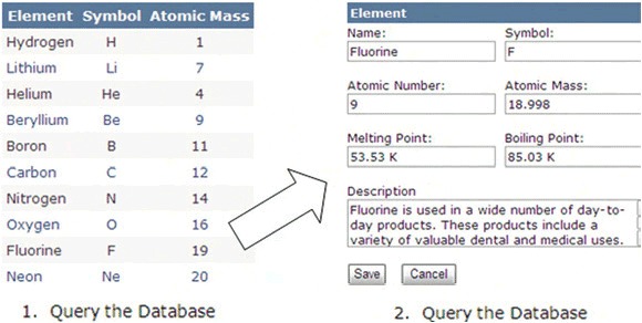
This figure shows a common feature found in almost any web application. Within an application, it isn’t uncommon to display a summarized view of some data. This view is often displayed in some sort of tabular structure like a grid. Users can then select an individual item to see its details. Traditional web development practices generally require two time-consuming database hits for this type of functionality. There has to be a better way.
With the Tag property, you can store the details of each element on the client side. You can populate the detail view without having to perform a second database hit. This approach can be useful if you’re working with small amounts of data. If you attempt to load large amounts of data on the client side, the application may become clunky. In addition, this approach should only be used if the underlying data is isolated to the user. Otherwise, you could be displaying dirty data. Note that this is just one potential use for the Tag property.
Horizontalalignment and Verticalalignment
Every FrameworkElement gives you the opportunity to specify how it should be aligned within its parent. This alignment setting will trickle down through the object tree and affect the alignment of all child elements—well, at least until another FrameworkElement sets its alignment. You have two ways to align visual elements.
Visual elements can be aligned both vertically and horizontally by setting the VerticalAlignment and HorizontalAlignment property values to one of the acceptable values. These values belong to two separate enumerators, aptly called Vertical-Alignment and HorizontalAlignment. The values associated with these enumerators and their behaviors are shown in snippet 3.36 .
Snippet 3.36. XAML Result: Demonstrating the various VerticalAlignment and HoriztonalAlignment options

This snippet shows the effects of all four HorizontalAlignment options and all four VerticalAlignment options. The HorizontalAlignment property accepts the Left, Center, Right, and Stretch values, whereas the VerticalAlignment property accepts the Top, Center, Bottom, and Stretch values. Both properties default to their Stretch values. Because the Stretch options alter the rendered height or width of an element, you may want to strongly consider setting the Height or Width properties. In addition, you may want to consider giving this element some breathing room with the Margin property.
Margin
Similar in nature to the Padding property, the Margin property enables you to specify a cushion, but this specific cushion works outside the bounds of a FrameworkElement. This cushion can be set using a single value, or a comma-delimited list of four values just like the Padding property. Snippet 3.37shows both the Margin and Padding properties working in coordination.
Snippet 3.37. XAML Result: The darker area represents the Margin; the lighter area represents the Padding.

<StackPanel Background="Gray">
 <TextBox Background="LightGray" Margin="10" Padding="10"
  Text="Margin is outside, Padding is inside" />
</StackPanel>
This snippet shows the Margin and Padding properties working together. This may cause a bit of confusion. After all, the Padding property is defined in relation to the TextBlock in section 3.4.4. The Padding property is valid in this snippet because this property is also exposed by the System.Windows.Controls.Control class. This is explained in further detail in the next chapter. For now, it’s important to recognize that the Padding property is not accessible to all FrameworkElement items, but the Margin property is.
The Margin property is one of the universal all-stars of the Silverlight framework. The others we covered were the valuable HorizontalAlignment and VerticalAlignment properties. In addition, we also highlighted the value of the Tag, Visibility, Opacity, and Cursor properties. Collectively, these represent some of the more widely used properties of the FrameworkElement and UIElement classes. But these properties only serve to describe an element. There are times when you need to perform an action on them; in these scenarios, you need to rely on their methods.
3.5.2. Methods
Two common tasks are often performed during runtime. The first task involves managing attached properties. The second involves finding an element within the element tree. We’ll cover each of these in detail.
Managing Attached Properties
Every UIElement represents a DependencyObject. A DependencyObject gives you the ability to retrieve and change attached property values. Let’s consider the process of altering the position of an element within a Canvas. Although you might initially think to set the Canvas.Left and Canvas.Top properties, you’ll quickly run into a wall. Instead, you must take advantage of the SetValue method as shown in snippet 3.38 .
Snippet 3.38. C# XAML: Moving a TextBlock 5 pixels at a time by using the GetValue and SetValue methods

When a TextBlock is clicked , it will move five pixels down and to the right. This is made possible by retrieving the current position of the TextBlock within the Canvas through the GetValue methods . Then, the TextBlock is moved within the Canvas using the SetValue methods . But where do the TopProperty and LeftProperty values come from that are used in and ?
These properties are DependencyProperty elements—a special type of property designed to depend on information from multiple sources. For instance, as shown in snippet 3.38 , you use two DependencyProperty attributes (Canvas.Left and Canvas.Top) to position the TextBlock. At the same time, there could be an animation affecting the TextBlock, so the position of the TextBlock would be dependent upon both the layout panel (the Canvas) and the animation. (Animations are discussed in chapter 9.)
Thanks to the DependencyProperty, it’s incredibly easy to manage or retrieve the value associated with an attached property. Dependency properties also provide several other advantages. These advantages will be discussed in chapter 12, section 1, when we discuss creating custom controls. For now, let’s look at how to find elements within the element tree.
Finding Elements
As described in chapter 2, the Silverlight Object Model is represented as a hierarchical tree of elements. Considering each element in this visual tree is, at its core, a FrameworkElement, you have the flexibility to navigate this tree. With this element, you have the ability to either go up the tree or down the tree.
To go down the tree, you must call the FindName method. This method takes the name of an element and retrieves it. It doesn’t matter if the element is a child, grandchild, or even further down the tree. The FindName method will retrieve it as long as it’s a descendent. If it isn’t found, the method will return null.
Alternatively, if you need to find an element up the tree, you use the Parent property to recursively navigate up the tree and search the sibling nodes. Once the root of the tree has been reached, the value of the Parent property will be null.
Finding elements is a task that you’ll, more than likely, have to do sooner rather than later. Once these elements are found, you can readily get or set the attached property values of a UIElement using the GetValue and SetValue methods. These methods aren’t difficult to understand, but the process of using a DependencyProperty to set the value of an attached property may seem a little strange at first. As you grow more familiar with it, it’s easier to see the power of this approach. This approach can lead to new ways of delivering a rich and interactive user experience.
3.6. Summary
A rich and interactive user experience is primarily about presenting information. Your users’ acceptance and adoption of your application can hinge on how that information is presented to them. It’s important to understand how to show this information in a pleasing way. To help accomplish an orderly UI, Silverlight provides the Canvas, StackPanel, and Grid layout options.
In addition to layout, one of the most fundamental items in an application is text. Without text, users would often be misinformed or confused while using an application. This is especially true for applications that accept user input. These types of applications require an in-depth knowledge of Silverlight’s input control library. This library is the topic of the next chapter.