
Chapter 5. Getting down with data binding
| This chapter covers |
|
Throughout chapter 4 you saw the garden of input controls that empower you to harvest data from your users. Once collected, data is often planted within a persistent data source so that it can be used at a later time. If that point comes, the data is often retrieved via an in-memory object, through some services, or over a network. These services are the topic of the next chapter. But first, you’ll see the data part of the equation because it’s closer to the UI.
Throughout this chapter you’ll see how to handle data once it’s in memory. This discussion will include an overview of the concept of binding to data. From there, you’ll see the different sources of data that you can bind to. Then, because data may come in any format, you’ll learn how to convert it if necessary. From there, you’ll experience how to work with data through a new control called the DataGrid. This chapter will end with an overview of the distinguishing data querying enhancement known as LINQ.
5.1. Binding with your data
Data binding is a powerful way to create a connection between your UI and a source of data. This simple technique can be used to create a clean separation between your user interface and its underlying data. This segregation makes it easier to maintain an application down the road. In addition, this approach promotes fewer round-trips to the server, so it can be argued that data binding can help increase the performance of your application. Regardless of the reason, you can use data binding in your application by creating an instance of the Binding class.
The Binding class is used to define a connection between a CLR object and a UI component. This connection is defined by three essential elements: the source of the data (the CLR object), the binding mode, and the target for the data (the UI component). These three items are part of a conceptual model that explains binding. This model is shown in figure 5.1.
Figure 5.1. A conceptual view of data binding.

This illustration uses the situation of binding the current time of day to a TextBox to give a high-level overview of how a data binding looks. This conceptual binding sets the Text property of a TextBox to the current TimeOfDay. To create a binding like this, you must use one of two available binding syntaxes. These syntaxes require you to define both the source and the target of a binding. Each approach is appropriate at a different time, so we’ll cover each in its own right in section 5.1.1. Once you’ve decided which syntax is appropriate for your situation, you must decide how data can pass between the source and the target. This is the responsibility of the BindingMode, which will be covered in section 5.1.2.
5.1.1. Mastering the binding syntax
Silverlight gives you the ability to create a Binding using two different approaches. The first approach allows you to dynamically create a binding at runtime. The second gives you the opportunity to specify a binding at design time. Either way, the scenario from figure 5.1 will be used to show both approaches.
Binding at Runtime
Binding to a data source at runtime is a common approach used in event-driven application development. For instance, you may decide to display a list of basketball games based on a date selected by a user. Or, you may decide to show the current time when an application is loaded. Either way, creating a Binding at runtime follows a common pattern, which is shown in snippet 5.1.
Snippet 5.1. C# XAML: Adding a Binding to a TextBox from C#

This snippet shows how to bind the value of a CLR property to a UI element at runtime. This snippet binds the current time of day to the TextBox created in XAML  . You first retrieve the DateTime object that represents the current moment in time
  . This object is then bound to the UI element (the TextBox) in just four lines of code
  . These four lines of code specify the source, the binding mode, and the target of a binding.
The source of a binding is made up of two codependent items that specify which property of a CLR object to bind to. The name of the property to bind to is set when you create a Binding instance through the constructor. This constructor takes a single string parameter, which represents the name of the property to bind to. This property belongs to a CLR object that must be associated with a Binding through the Source property. Once this happens, the source of the binding is officially set. You can then choose a BindingMode, which we’ll cover in section 5.1.2. Once the source and binding mode have been set, you need to turn your focus to the target.
The target element of a binding will always derive from the FrameworkElement class. Virtually every visual element in Silverlight can be a target (see chapter 3 section 5.1.1 section 5) because the FrameworkElement class exposes a method called SetBinding. This method associates a target property, which must be a dependency property, with a Binding instance. After this method is called, the source will be bound to the target.
Occasionally, there may be times when you want to unbind a data source. Fortunately, data binding can be halted by manually setting the target property of a binding. For example, look at snippet 5.2.
Snippet 5.2. C#: Removing a Binding from a TextBox
myTextBox.Text = "Binding Removed";
Text = "Binding Removed";
This snippet shows how easy it is to remove a binding after it has been set. This feature is only available at runtime because that’s the only time it makes sense. Using a Binding at runtime is a powerful option—equally as powerful, though, is the ability to create a Binding at design time.
Binding at Design Time
Binding to a data source at design time is a common feature in declarative markup languages such as XAML. You’ve probably seen the power of this data binding approach if you’ve used ASP.NET or WPF. If you haven’t, don’t worry. In essence, this approach allows you to keep your code separate from its presentation so that you can take advantage of the developer/designer workflow available within Silverlight. It also helps to keep your code clean and maintainable. To see how a binding in XAML can help clean up your code, look at the snippet 5.3.
Snippet 5.3. C# XAML: Binding a property to a TextBox in XAML
<TextBox x:Name="myTextBox" Text="{Binding TimeOfDay, Mode=OneWay}" />

DateTime currentTime = DateTime.Now;
myTextBox.DataContext = currentTime;
This snippet shows how to create a binding at design time. This binding is associated with a target through the use of a special
syntax that uses curly braces ({}). These braces, along with the word Binding, inform a property that a data source will be bound to it . This data source will be a CLR object that has some property to retrieve data from and possibly send data to. The property
is identified within the curly braces after the word Binding. (In snippet 5.3, it’s TimeOfDay.) The other properties associated with the binding are set using a propertyName=propertyValue syntax (Mode=OneWay).
When creating a data binding in XAML, the data source must be set in procedural code. This code is responsible for setting
the context in which a data source can be used through the appropriately named DataContext property . This property will be explained in further detail in section 5.2.2. For now, know that this is how a CLR object can be bound to a FrameworkElement.
Binding at design time is a valuable option when it comes to working with data. It empowers you to separate your UI from your code. This functionality allows a designer to enhance a UI without worrying about the data connections themselves. In a similar light, binding at runtime enables you to create a more dynamic form of data binding. Regardless of where you define the binding, both approaches define a bridge between a source and a target. Data can flow in multiple directions across this bridge. To control the direction of that flow, you must learn about the various binding modes.
5.1.2. Choosing a binding mode
The Binding class gives you the ability to determine how data can flow between the source and the target. This flow can be controlled by setting the Mode property of a Binding instance. This property represents one of the three options available in the BindingMode enumerator. This enumerator exposes the OneTime, OneWay, and Two-Way options.
Onetime
The OneTime option sets the target property to the source property when a binding is initially made. When this BindingMode is used, any changes to the data source will not be automatically sent to the target. Instead, the target will be set only when the source is initialized, as shown in figure 5.2.
Figure 5.2. A conceptual view of OneTime binding to a data source
This figure shows the simplistic nature of the OneTime BindingMode. As you can imagine, this BindingMode is appropriate in situations where you only care about the initial value of a property. For instance, you may want to display the creation date of a database record. Because this value shouldn’t change, the OneTime BindingMode is a great choice. For property values that will change, such as the date/time that a database record was last modified, you may want to use the OneWay binding option.
Oneway
The OneWay BindingMode is the default option used when you create a Binding. This option gives you the ability to automatically receive changes from a source property. Whenever the binding source property changes, the target property will automatically change, but the source property will not change if the target is altered. This process is shown in figure 5.3.
Figure 5.3. A conceptual view of OneWay binding to a data source

This figure shows how the OneWay BindingMode works at a high level. Think of the speedometer in your car as OneWay binding from your gas pedal. When you press or release your foot from the gas pedal, the speedometer changes; but, if you somehow changed the value of the speedometer itself, your gas pedal would not change. This inability to send a change from the target back to the source shows how OneWay binding works. For situations where you do want to send changes in the target back to the source, you use the TwoWay option.
Twoway
TwoWay binding enables two properties that are bound to change each other. This may sound recursive, but it’s not. A TwoWay binding changes the target when the source changes. If the target changes, the source is updated. This process can be seen in figure 5.4.
Figure 5.4. A conceptual view of TwoWay binding to a data source

This figure shows a conceptual view of TwoWay binding. This binding approach is useful for web-based forms using Silverlight because forms generally allow users to add, as well as edit, data. This process of editing preexisting data practically begs for TwoWay binding.
The TwoWay BindingMode is one of the options available to control the flow of your data. The other alternatives are available through the OneWay and OneTime options. Collectively, these options are an important part of setting up a binding. After the target and binding mode have been selected, you need to choose an appropriate source.
5.2. Understanding your data source
In section 5.1, we skimmed over the general concept of data binding. We discussed this concept in the limited scope of binding to an individual property. This approach can be valuable in certain situations; but, to truly harness the power of data binding, we must build a better understanding of data sources. We’ll build that understanding over the course of this section.
We’ll discuss what it takes to bind to a property of a CLR object, but we won’t cover just any old property. We’ve already done that. Instead, we’ll discuss what it takes to bind to properties in your CLR objects and how to bind to entire CLR objects themselves. We’ll close out the section by talking about binding to entire collections of objects. Collectively, these items will help you fully wield the power of data binding.
5.2.1. Binding to a property
Silverlight gives you the flexibility to bind to any CLR property you want. You saw this with the examples using the TimeOfDay property in section 5.1. Significantly, if you visited http://www.silverlightinaction.com and ran the application, you saw that once the time was displayed, it just sat there. It didn’t automatically update with each passing second because, by default, CLR properties don’t broadcast their changes—that, and the fact that the TimeOfDay property doesn’t automatically continue ticking. To update a target with a change in a CLR property, you must create a change-notification handler.
A change-notification handler notifies a binding target that a change has been made. This enables a target to automatically respond to changes. Dependency properties (chapter 3 section 3.5) already have this feature built in, but CLR properties don’t. If you want your CLR properties to broadcast their changes, you must implement the INotifyPropertyChanged interface, which is demonstrated snippet 5.4.
Snippet 5.4. C#: Implementing the INotifyPropertyChanged interface
public class Emoticon : INotifyPropertyChanged
{
 public event PropertyChangedEventHandler PropertyChanged;

 private string name = string.Empty;
 public string Name
 {
  get { return name; }
  set
  {
   name = value;
   UpdateProperty("Name");
  }
 }

 private BitmapImage icon = null;
 public BitmapImage Icon
 {
  get { return icon; }
  set
  {
   icon = value;
   UpdateProperty("Icon");
  }
 }

 public Emoticon (string _name, string _imageUrl)
 {
  name = _name;
  icon = new BitmapImage (new Uri (_imageUrl));
 }

 public void UpdateProperty(string propertyName)
 {
  if (PropertyChanged != null)
  {
   PropertyChanged (this, new PropertyChangedEventArgs (propertyName));
  }
 }
}
This snippet shows how to implement the System.ComponentModel namespace’s INotifyPropertyChanged interface on a class . This class represents an emoticon[1] that uses the INotifyPropertyChanged interface as a guide for broadcasting changes in property values. The interface can be used to ensure that your UI component and desired CLR property are in sync during
OneWay and TwoWay binding. This synchronization effort will take effect as long as you’ve implemented the PropertyChanged event / .
1 An emoticon is a symbol that represents a feeling or emotion. For instance, :) is the sign for happy.
The PropertyChanged event is what keeps things in sync, so you must make sure this event is triggered whenever a property value has changed. You can accomplish this by firing the event in a property’s set accessor. Alternatively, if you plan on keeping multiple properties in sync, you may want to refactor the PropertyChanged event to a common method—as shown in snippet 5.4. Either way, the binding system’s PropertyChanged event handler uses reflection to examine the value of a property and pass it on to the binding target. This is the reason the PropertyChangedEvent-Args type takes a string parameter that represents the name of the CLR property that changed.
Binding to a CLR property is a powerful way to work with your objects. These objects generally represent real-world entities that may also need to be bound to. Fortunately, Silverlight also provides an elegant way to bind to a CLR object.
5.2.2. Binding to an object
Up to this point, we’ve primarily focused on binding individual properties to UI components. This technique is pretty simple, but it can also be somewhat tedious if you need to bind multiple properties of an object to a UI. You can make this task less tiresome by using the DataContext property.
The DataContext property allows you to share a data source throughout a Frame-workElement. This data source can be used by all the child elements of a Frame-workElement that define a Binding. Binding uses the most immediate ancestor’s DataContext unless another data source is set to it. If another data source is set, that source is used for the Binding. Either way, by relying on the DataContext of an ancestor, you can easily bind several properties of an object to a UI. This approach is shown in snippet 5.5.
Snippet 5.5. C# XAML: Binding an Emoticon object (defined in snippet 5.4) to a Grid

This snippet shows how an object can be bound to elements within a FrameworkElement. The TextBox and Image elements in this snippet show their intent to bind to two different properties of an object . These elements don’t have their DataContext property set in the code behind, so the elements look to their immediate parent, myGrid, and try to use its DataContext . This DataContext has been set in the code behind  . The object assigned to the DataContext serves as the data source for the Grid and its children. If the DataContext of the Grid hadn’t been set, the elements would have continued up the tree and checked the UserControl element’s DataContext . If that DataContext were set, it would have been used. Either way, this snippet shows how much more succinct and maintainable the DataContext approach can be.
The DataContext property makes it easy to bind your UI to a property or an entire CLR object. A CLR object is often part of a larger grouping. This grouping is more commonly referred to as a collection. A collection is a type that often has useful properties that can be bound to using the DataContext approach. Silverlight gives you the ability to bind to an entire collection at once, using a slightly different approach.
5.2.3. Binding to a collection
Binding to a collection is an important task in a lot of applications. There are numerous times where you need to show a list of the items in a collection. You may want to display a collection of emoticons, or you may want to show a list of the days of the week. Either way, these lists are made up of individual items, so it’s only natural to use an ItemsControl.
An ItemsControl is a basic control used to show a collection of items. We discussed this control in chapter 4, but we didn’t talk about the process of binding data to the control. Instead, you saw the manual approach of adding items one by one to the Items collection. Although this technique is useful in some situations, the ItemsControl provides a more elegant approach through the ItemsSource property (snippet 5.6).
Snippet 5.6. C# XAML Result: Binding a collection of Emoticon objects (from snippet 5.4) to a ListBox through the ItemsSource property
<ListBox x:Name="myListBox" Height="100 /"></ListBox>


List<Emoticon> emoticons = GetEmoticons(); // Assume GetEmoticons() exists
myListBox.ItemsSource = emoticons;
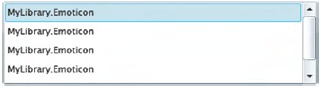
This snippet shows how to bind a collection of objects to an ItemsControl, in this case a ListBox control (which derives from ItemsControl). This ListBox loads a collection of Emoticon objects (from snippet 5.4) into view using the ItemsSource property .
The ItemsSource property is used solely for the sake of data binding. This property can be used to bind to any collection that implements IEnumerable. This property is necessary because the Items collection of the ItemsControl class isn’t a DependencyProperty—and only DependencyProperty-typed members have support for data binding. The ItemsSource property must be used if you want to use the time-saving data binding approach. If you choose this approach, you must be careful.
The ItemsSource property can only be used if the Items collection of an Items-Control is empty. If the Items collection isn’t empty, your application will throw an InvalidOperationException if you try to set the ItemsSource property. If you intend to use data binding on an ItemsControl, you must commit to using the ItemsSource property. If you intend to use this property, you should also consider using the DisplayMemberPath property.
The DisplayMemberPath property determines which CLR property value to use for the text of a list item. By default, each list item will use the ToString method of the object it’s bound to for the display text—the reason each of the items in snippet 5.6 is shown as MyLibrary.Emoticon. You can override the ToString method to fully customize the text shown for an item. If you want to go a step further, you can customize the entire look of an item by using the data template information discussed in section 5.3.2. But, for the quickest approach, you can use the DisplayMemberPath as shown in snippet 5.7.
Snippet 5.7. C# XAML Result: Using the DisplayMemberPath to improve the display of a list of items
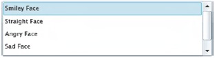
<ListBox x:Name="myListBox" DisplayMemberPath="Name" Height="100" />


List<Emoticon> emoticons = GetEmoticons(); // Assume GetEmoticons() exists
myListBox.ItemsSource = emoticons;
This snippet shows the impact of the DisplayMemberPath property on binding items . As you can see, this property makes the items in a list much more meaningful. This snippet also shows the elegance of data binding in general. This approach allows you to easily display information from a
CLR property, an object, or a collection. Unfortunately, sometimes these items won’t render as you want, so you may need to
customize the display.
5.3. Customizing the display
As you saw throughout section 5.2, data binding is a powerful way to show data. Occasionally, this information may be stored in a format not suitable to display in a UI. For instance, imagine asking your user: Does two plus two equal four? This question clearly demands a yes or no response. The problem begins to arise when the response gets saved to a more persistent data source.
A lot of times, a piece of data, such as a property, will be saved one way but need to be presented in another. In the case of a yes-or-no question, the answer may be stored in a bool CLR property. This property may run under the assumption that yes is equivalent to true and no is the same as false. This assumption can become a problem if you need to bind to that data because, by default, data binding calls a type’s ToString method. Your users could see a statement that looks like: Does two plus two equal four? True. When in reality, it would be better to show: Does two plus two equal four? Yes. This small, but common problem, demands a better approach.
Throughout this section, you’ll see how to customize the visual representation of your data. We’ll begin with a discussion around converting values during binding. Then, you’ll see how to customize the way your data looks through data templates. These two items will empower you to fully customize how data is shown to your users.
5.3.1. Converting values during binding
Silverlight allows you to dynamically convert values during data binding. You can accomplish this by first creating a custom class that represents a value converter. This value converter can then be referenced in an XAML file. Once it’s referenced, you can use the value converter along with the rest of your XAML. This approach is recommended because it keeps the design separate from your code. Let’s begin by discussing how to create a value converter.
Creating a Value Converter
To create a value converter, you must create a class that implements the IValueConverter interface, which enables you to create some custom logic that transforms a value. This transformation may take place in one of two methods, based on the flow of your data. The first method, Convert, is used when the data is moving from the source to the target. If the data is flowing from the target back to the source, a method called ConvertBack is used. Both methods are members of the IValueConverter interface. This interface and its methods are demonstrated in snippet 5.8.
Snippet 5.8. C#: A sample value converter. This converter changes a bool to Yes or No and back again.

This snippet shows a value converter that converts a bool to Yes or No. This converter uses the Convert method when data is being bound to your UI . It’s this method that converts a bool to Yes or No. When the UI is passing data back to its source (TwoWay binding), the ConvertBack method is used . This method converts Yes to true and No to false. Either way, these methods control the conversion process. To assist in this process, both these methods give you the opportunity
to provide custom information.
Both the Convert and ConvertBack methods give you the option to use two valuable, but optional, pieces of information. The first piece of information is an arbitrary object called parameter that can be used by your conversion logic. By default, this object will be null, but you can set it to any value that you find useful. The other piece of information specifies the CultureInfo to use when converting the values. We’ll discuss both parameters in a moment. But, to set the CultureInfo or pass along a custom parameter, you first must know how to use a value converter.
Using a value Converter
Using a value converter involves setting the Converter property of a Binding object. This property determines which IValueConverter to use when transforming data. By default, this property isn’t set to anything (null), but you can set it to reference an IValueConverter you’ve created. Before you can reference an IValueConverter, you must add it as a resource. Resources will be discussed in chapter 10. For now, just know that you can reference an IValueConverter by first adding it to the Resources collection as shown in snippet 5.9.
Snippet 5.9. XAML: Exposing the YesNoValueConverter from snippet 5.8 to XAML
<UserControl x:Class="Snippet5_9.Page"
 xmlns="http://schemas.microsoft.com/winfx/2006/xaml/presentation"
 xmlns:x="http://schemas.microsoft.com/winfx/2006/xaml"
 xmlns:my="clr-namespace:Snippet5_9"
 Width="400" Height="300">

 <UserControl.Resources>
  <my:YesNoValueConverter x:Key="myConverter"></my:YesNoValueConverter>
 </UserControl.Resources>

 <Grid x:Name="LayoutRoot" Background="White" />
</UserControl>
This snippet shows how to introduce a custom IValueConverter to the XAML world. The my prefix is assumed to be defined as a namespace (chapter 1 section 1.3.2. The key myConverter is to reference the IValueConverter in XAML. An example of referencing an IValueConverter is shown in snippet 5.10.
Snippet 5.10. XAML: Using an IValueConverter in a Binding
<TextBlock x:Name="myTextBlock"
 Text="{Binding IsCorrect, Converter={StaticResource myConverter}}" />
This snippet shows a basic Binding that uses a custom converter. This converter alters the displayed text of a bool property called IsCorrect. This property wasn’t shown in this snippet, but you can see it, and the rest of code used for this snippet, by visiting http://www.silverlightinaction.com. Snippet 5.10 does show that the custom converter is referenced through the Converter property. This property uses the curly-brace syntax, just like the Binding syntax, because it’s the syntax used to reference a resource. You can also pass a custom parameter or the culture information if you need to.
The Binding class exposes an object property called ConverterParameter, which can be used to pass an arbitrary value to an IValueConverter. The IValueConverter uses the value of the ConverterParameter in the Convert and ConvertBack methods. By default, this value is null, but you can use it to pass along any data you want. If you need to pass along culture-related data, we recommend using the ConverterCulture property.
The ConverterCulture property of the Binding class allows you to set the culture to use. This culture is passed along as a CultureInfo object that can be used by the Convert and ConvertBack methods. By default, the CultureInfo object reflects the value of the Language attribute of the calling FrameworkElement. The Language attribute is used for localization and globalization. This value uses a string that defaults to "en-US", which represents U.S. English.
Creating and using a value converter can be valuable when working with data, as was shown with our basic yes/no example. Value converters can be useful in even more complex scenarios. For instance, Silverlight doesn’t have support for HTML tags, so you may consider using a value converter to scrub the HTML tags from a string before binding it to your UI. Once you have the data that you want to display, it can be nice to dictate how it will be displayed. This kind of job can be easily handled with a data template.
5.3.2. Creating data templates
A data template is a way to define how a piece of information will be shown. Imagine looking at the statistics of a baseball player. Although these statistics can be easily viewed in tabular format, it’s much more interesting to look at them on a baseball card. For an example, see table 5.1.
Table 5.1. One example of a data template
|
Raw data (statistics) |
Presentation via data template |
|---|---|
| Player: Scarpacci Position: Pitcher (P) Team: J-Force Picture: [A URL] |
 |
This table demonstrates the general idea of a data template: It gives your data a face. The value in this approach is that it allows you to quickly change the way your data looks without changing your code. Just as baseball card designs change each year, your data may change its look based on its context. Data templates allow you to make this change easily. In a sense, data templates are like Cascading Style Sheets (CSS) on steroids! To take advantage of this feature, you must create a DataTemplate object.
A DataTemplate object describes the visual representation of a piece of information. This object can be used with two types of controls within the Silverlight class library. The first is a ContentControl. More interesting, and probably more valuable, is the ItemsControl. Within this section, you’ll see how to create a data template with each of these control types.
Using a Datatemplate with a ContentControl
A ContentControl is a type of control defined by a single piece of content, which we discussed in chapter 4. Every ContentControl exposes a property called Content-Template, which specifies the DataTemplate to use when displaying the content of a ContentControl. This content can be styled with a DataTemplate using an approach similar to that shown in snippet 5.11.
Snippet 5.11. C# XAML Result: A DataTemplate used with a ContentControl (a Button, to be precise).
<Button x:Name="myButton" Height="70" Width="210">
 <Button.ContentTemplate>
  <DataTemplate>
   <StackPanel Orientation="Horizontal">
   <Image Source="{Binding Icon}" Height="40" Margin="10" />
   <TextBlock Text="{Binding Name}" FontSize="20"
    VerticalAlignment="Center" />
   </StackPanel>
  </DataTemplate>
 </Button.ContentTemplate>
</Button>

Emoticon emoticon = new Emoticon("Smiley Face",
 "http://www.silverlightinaction.com/smiley.png");
myButton.Content = emoticon;
This snippet shows a basic DataTemplate applied to a Button. This DataTemplate is applied to an assumed Emoticon (snippet 5.4) assigned to the Button object’s Content property. This property must be set at runtime when using a DataTemplate. If the Content property is set at design time, it will be trumped by the DataTemplate, resulting in no data being shown in your UI. In addition, if you set the DataContext property at runtime instead of the Content property, your data won’t be shown. When you’re binding data to a ContentControl, you may want to remember the following:
- When assigning your data source to the DataContext property, use the binding syntax within the control’s Content.
- When assigning your data source to the Content property, use a DataTemplate instead.
These two points make it seem like you’re running in circles. You may be wondering, Why should I use a DataTemplate? Well, a DataTemplate can be defined as a resource (discussed in chapter 10), which makes it usable across multiple ContentControl elements simultaneously. The DataTemplate approach is much more flexible. In reality, you probably won’t use a DataTemplate with a ContentControl very often, but you should expect to use data templates quite frequently with ItemsControl elements.
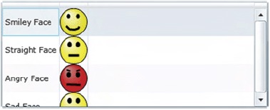
Rendering an ItemsControl with a DataTemplate
The ItemsControl element is designed to display a collection of items, which are bound to a control through the ItemsSource property. By default, each item is displayed by using an object’s ToString method. By setting the DisplayMemberPath property, you can use a specific CLR property for the text of an item, but you can go one step further using the ItemTemplate property.
The ItemTemplate property of the ItemsControl class allows you to fully control how each item will be displayed. This property uses a DataTemplate to determine how to show each item in an ItemsControl. A basic ItemTemplate for a collection of Emoticon objects (defined in snippet 5.4) is shown in snippet 5.12.
This snippet shows a basic DataTemplate associated with an ItemTemplate. There isn’t anything complex about this snippet—the main thing is to understand that this DataTemplate is used with the items bound through the ItemsSource property. In addition, this snippet begins to show the power of using data templates.
Snippet 5.12. C# XAML Result: An ItemTemplate used in an ItemsControl (a ListBox, to be precise).

<ListBox x:Name="myListBox" Height="200">
 <ListBox.ItemTemplate>
  <DataTemplate>
   <StackPanel Orientation="Horizontal">
    <Image Source="{Binding Icon}" Height="40" Margin="5" />
    <TextBlock Text="{Binding Name}" FontSize="20"
     VerticalAlignment="Center" />
   </StackPanel>
  </DataTemplate>
 </ListBox.ItemTemplate>
</ListBox>

List<Emoticon> emoticons = GetEmoticons(); // Assume GetEmoticons() exists
myListBox.ItemsSource = emoticons;
Throughout this chapter, you’ve seen how to fully customize the look of your data with data templates. You’ve seen how to transform a piece of data with a value converter. More importantly, you’ve witnessed how to bind to data in general. All these concepts are valuable when working with the controls mentioned in chapter 4, but you’ll probably find these concepts most valuable when working with a new Silverlight control known as the DataGrid.
5.4. The DataGrid
The DataGrid is a list-style control that belongs to the System.Windows.Controls namespace. This control empowers you to display a collection of entities in a tabular format. In addition, it enables a user to add, edit, delete, select, and sort items from a data source. This data source is bound to a DataGrid through the ItemsSource property just like an ItemsControl, so the data binding features you’ve seen so far are applicable within the realm of the DataGrid. Before you can bind data to a DataGrid, you must first reference the correct assembly.
The DataGrid control is defined in its own assembly called System.Windows.Controls.Data.dll. This assembly can be found within the Silverlight SDK, which is available at http://www.silverlight.net. Note that the DataGrid control’s assembly isn’t part of the default Silverlight runtime installation; it’s an extended control like the date controls mentioned in chapter 4, so you must reference the System.Windows.Controls.Data assembly within your Silverlight application. The process of referencing an assembly like this was discussed in chapter 1 (section 1.3.2). Part of this process involves choosing a prefix in order to use the control at design time. Throughout this section, we’ll use a prefix called Data. Referencing the DataGrid control’s assembly will package it up with your application, ensuring that your users can enjoy the power of the DataGrid.
Throughout this section, you’ll experience the power of the DataGrid. You’ll first see how easy it is to use the DataGrid to display data. From there, you’ll learn how to leverage the built-in features to enable a user to edit the data within a DataGrid. Finally, you’ll see how to empower your users to sort the data in a DataGrid.
5.4.1. Displaying your data
The DataGrid was designed to make displaying data easy. The easiest way to display data from an ItemsSource is to use the AutoGenerateColumns property. This Boolean property defaults to true, causing the content within the ItemsSource to be rendered in tabular format. This ability is demonstrated in snippet 5.13.
Snippet 5.13. C# XAML Result: A basic DataGrid. Assume that the ItemsSource property is set in the code behind.

Voila! This snippet relies on the System.Windows.Controls.Data assembly to deliver the DataGrid . This Control instance relies on its default behavior to automatically create columns based on the data that it’s bound to. This approach
is the fastest way to show the data bound to a DataGrid, and it also has some details that are worth examining.
Let’s look at what makes a bound column tick. From there, you’ll learn how to customize the columns, rows, and headers of a DataGrid.
The DataGrid takes advantage of a feature known as UI virtualization. UI virtualization means only the items that are visible to the user are created in memory. This performance enhancement ensures that the DataGrid can support millions of rows of data. In Silverlight 2, the ItemsControl elements mentioned in chapter 4 don’t have support for UI virtualization. But, these same ItemsControl elements do support UI virtualization in Silverlight’s parent technology, WPF.
Exploring Bound Columns
When the AutoGenerateColumns property is set to true, the columns in a DataGrid are automatically ordered and rendered based on the type of the underlying data. Regardless of the type of data, the column type will always derive from the abstract base class DataGridBoundColumn, which serves as the base for the two types shown in table 5.2.
Table 5.2. The types of columns that can be automatically generated within a DataGrid
|
Type |
Description |
|---|---|
| DataGridTextColumn | This type of column is used to display textual data. Most of the data from a binding source will be rendered in a DataGridTextColumn through calling the binding property’s ToString method. This column type won’t show the default Silverlight TextBox, but the rendered content can be edited as if it were in a visible TextBox. |
| DataGridCheckBoxColumn | This column type generates a CheckBox within a cell. When the AutoGenerateColumns property is true, any bool will be rendered using this column type. |
This table shows the kinds of columns that can be automatically generated within a DataGrid. If you want to manually create a column, you can also use these types. But, when you are manually defining your columns, you must set the Binding property, which represents the Binding associated with a column (the property name and the type name are in fact the same). Because of this, you can use the Binding syntax explained in section 5.1. This Binding declaration may be necessary because, by default, when you use a DataGridBoundColumn, TwoWay binding is used.
The DataGridBoundColumn is one of the main types of DataGrid columns. The other main type is a DataGridTemplateColumn which uses a DataTemplate to determine how to render the binding source. Note that every type of column that can be added to a DataGrid derives from the DataGridColumn class, which is used to represent the column of a DataGrid. Objects of this type can be manually added to a DataGrid at design time and managed at runtime.
Manually Working with Columns
The DataGrid can use any column that derives from DataGridColumn. These columns can be added to a DataGrid at design time through the Columns property. This approach is demonstrated in snippet 5.14.
Snippet 5.14. XAML Result: Manually adding columns to a DataGrid
<Data:DataGrid x:Name="myDataGrid" AutoGenerateColumns="False">
 <Data:DataGrid.Columns>
  <Data:DataGridTextColumn Binding="{Binding Name, Mode=OneWay}" />
  <Data:DataGridTemplateColumn>
   <Data:DataGridTemplateColumn.CellTemplate>
    <DataTemplate>
     <Image Source="{Binding Icon}" />
    </DataTemplate>
   </Data:DataGridTemplateColumn.CellTemplate>
  </Data:DataGridTemplateColumn>
 </Data:DataGrid.Columns>
</Data:DataGrid>
This snippet shows how to add columns manually to a DataGrid at design time. These columns are added to the Columns attached property . The items of this read-only collection will be displayed in the order they appear in XAML, but you can change this through
the DisplayIndex property.
The DisplayIndex property represents the position of a DataGridColumn in a DataGrid. This zero-based integer can be set at design time to override the default ordering approach. Alternatively, the DisplayIndex property can be set at runtime. This property empowers you to create a truly dynamic DataGrid, but the dynamic features don’t stop there. They also continue at the row level.
Customizing the Rows
A row within a DataGrid will most likely represent a summarized view of an item. In these situations, it’s not unusual to redirect the user to another page to get the details associated with the item, but the DataGrid provides the ability to display these details within the row itself. This approach can reduce the strain of waiting for another page to load for the user. To make this happen, you define the RowDetailsTemplate.
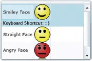
The RowDetailsTemplate is a DataTemplate that can be used to show the finer points of a specific row. This information may be shown if the RowDetailsVisibilityMode property is set accordingly. You’ll learn more about that in a moment. For now, just assume that a row will show its details when a user selects it. When this occurs, the DataGrid will reveal the details using a smooth sliding animation. The details can take up as much, or as little, space as needed. To demonstrate how this works, imagine adding a string property called "Keys" to the Emoticon class defined in snippet 5.4. This property represents the keyboard shortcut to use for an emoticon. The DataTemplate for revealing this information is shown in snippet 5.15.
Snippet 5.15. XAML Result: Using the RowDetailsTemplate. This DataTemplate shows the keyboard shortcut for an emoticon.

This snippet shows how to use the RowDetailsTemplate property . This property uses a DataTemplate to display additional details about a row when it’s selected. In reality, the details of a row are displayed based partially
on the value of the RowDetailsVisibilityMode property .
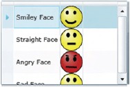
The RowDetailsVisibilityMode property determines when the details associated with a row are shown. By default, this property is set to Collapsed, but you can change this value to any option available within the DataGridRowDetailsVisibilityMode enumeration. This enumeration provides three options. All are shown in relation to the DataGrid with the emoticons (table 5.3).
Table 5.3. The options available through the DataGridHeadersVisibilityMode enumeration
|
Option |
Example |
Description |
|---|---|---|
| Collapsed |
 |
When this option is used, the content in the RowDetailsTemplate won’t be shown. |
| Visible |
 |
This option forces the content in the RowDetailsTemplate to be shown for every row. The content will be shown regardless of user interaction. |
| VisibleWhenSelected |
 |
This option will show the content in the RowDetailsTemplate for each selected row. |
This table shows the options available within the DataGridRowDetailsVisibilityMode enumeration. These options, coupled with the RowDetailsTemplate property, give you the ability to customize the experience with item-level details. The DataGrid extends the same type of power to the column headers.
Customizing the Headers
The DataGrid gives you the ability to customize every part of it, including the headers. The headers of a DataGrid are split across two separate categories: row and column. By default, your DataGrid will show both, but you can control this by changing the HeadersVisibility property. This property uses one of the options available in the DataGridHeadersVisibility enumeration. These options are shown in table 5.4.
Table 5.4. The options available through the DataGridHeadersVisibility enumeration


This table shows the options available through the DataGridHeadersVisibility enumeration. This enumeration is clearly used to set whether or not a header type is visible. You can also customize what the header looks like and how it behaves through the Header property of the DataGridColumn class. This property simply represents the column header content, so it uses the same content related information you’ve already learned about.
As you’ve seen, the DataGrid empowers you to fully customize how your data is presented. These customizations can be applied at the header, row, and column levels. Note that you don’t have to make any of these adjustments at all. If you’re looking for a quick way to show your data in a tabular format, you can rely on the fact that the AutoGenerateColumns property defaults to true. Either way, once your data is loaded, you can enable your users to edit the data directly within the grid.
5.4.2. Editing grid data
In addition to presenting data, the DataGrid has the ability to edit data. Users will be able to edit the contents of a DataGrid as long as the IsReadOnly property is set to false. By default, it is, so your users have the flexibility to interact with their data in a familiar interface. As users interact with the data, you can watch for the beginning of the editing process through two events. These events are triggered by the DataGrid and are called BeginningEdit and PreparingCellForEdit.
The BeginningEdit event gives you the opportunity to do any last-minute adjustments just before users do their thing. In some situations, you may want to prevent a user from editing a cell due to previous inputs. For these occasions, the BeginningCellEdit event exposes a bool Cancel property within its DataGridBeginningEditEventArgs parameter. By setting this property to true, the event will stop running. If the event does complete in its entirety, the PreparingCellForEdit event will also be fired.
The PreparingCellForEdit is fired when the content of a DataGridTemplateColumn enters editing mode. The PreparingCellForEdit event exists to give you the opportunity to override any changes that may have been made in the BeginningEdit event. Once this event and/or the BeginningEdit event have completed without cancellation, users will be given the reins. After they are done editing the data in the DataGrid they may decide they want to re-sort the data.
5.4.3. Sorting items
The DataGrid has built-in support for sorting collections that implement the IList interface. This interface is a part of the System.Collections namespace and is heavily used throughout the Silverlight. NET framework, so you can readily sort almost any collection of objects. If you don’t like the way that the DataGrid sorts your collection, you are free to customize the sorting by binding to a collection that implements the ICollectionView interface. Either way, the DataGrid can be used to sort these collections by using the SortMemberPath property.
The SortMemberPath property is a string available on the DataGridColumn class, so this property can be used by any of the options shown in table 5.2. Regardless of which option you use, the user will be empowered to sort the column in either ascending or descending order, as demonstrated in snippet 5.16.
Snippet 5.16. XAML Result: Empowering your users to sort the columns of a DataGrid

<Data:DataGrid x:Name="myDataGrid" AutoGenerateColumns="False">
 <Data:DataGrid.Columns>
  <Data:DataGridTextColumn Binding="{Binding Name}"
   Header="Name" SortMemberPath="Name" />
  <Data:DataGridTextColumn Binding="{Binding Keys}"
   Header="Shortcut" SortMemberPath="Keys" />
  <Data:DataGridTemplateColumn>
   <Data:DataGridTemplateColumn.CellTemplate>
    <DataTemplate>
     <Image Source="{Binding Icon}" />
    </DataTemplate>
   </Data:DataGridTemplateColumn.CellTemplate>
  </Data:DataGridTemplateColumn>
 </Data:DataGrid.Columns>
</Data:DataGrid>
This snippet shows two DataGridColumn instances enabling the user to sort the underlying ItemsSource. The first DataGridColumn enables the user to sort the Emoticon objects by their Name property . The other DataGridColumn gives the user the flexibility to sort the Emoticon objects by the Keys property . If a user were to select a column header, it would first be sorted in ascending order. Then if the column header were to
be selected again, it would be sorted in descending order. The SortMember-Path property is what makes this feature of the DataGrid possible.
As you’ve just seen, the DataGrid has an incredibly rich development model. This model is important because it can help you assist your users in their data entry tasks, which may include editing data or simply viewing it. Either way, the DataGrid provides you with the ability to efficiently deliver items from a data source in a tabular format. Note that these items may come from a wide variety of data sources, so you may want to consider taking advantage of a powerful feature that abstracts data from its source: LINQ.
5.5. Language Integrated Query (LINQ)
Throughout this chapter, you’ve seen how to bind to data and how to display that data, but you haven’t seen how to manage that data. To help with this process, Silver-light provides a powerful feature designed to manage data from multiple sources. This distinguishing feature is known as Language Integrated Query (LINQ).
Throughout this section, you’ll get a quick overview of the features of LINQ. This section will start with an introduction of this red-hot topic. From there, you’ll see two of the main flavors of LINQ : LINQ to Objects and LINQ to XML. Finally, this section will conclude by showing you how to join disparate data with these two LINQ variants.
5.5.1. Introducing LINQ
LINQ enables you to query disparate data types within your C# or Visual Basic code. This language enhancement provides a single, consistent querying syntax, regardless of the type of data you’re working with. This feature enables you to perform many of the same types of functions that you’ve probably long relied on other technologies such as SQL or XQuery to handle. These functions include a superb assortment of query, set, and transform operations that can be executed directly from your managed code. As illustrated in figure 5.5, LINQ makes it possible to perform these operations across varying data types via a single API.
Figure 5.5. LINQ enables you to seamlessly integrate disparate data types through managed code.

This rich LINQ API provides a number of useful and familiar methods that give you a great deal of flexibility. As an added bonus, because this API is part of the. NET framework, you can be assured that you’ll get the IntelliSense and Auto-Completion features that you’re used to within Visual Studio. But, because this book doesn’t have the IntelliSense feature built into the text, here’s a condensed list of some of the most often-used querying functions grouped by their type (table 5.5).
Table 5.5. A condensed list of operations available through LINQ
|
Type |
Operation |
|---|---|
| Aggregate | Average(), Count(), Min(), Max(), Sum() |
| Convert | Cast(…), ToArray(), ToDictionary(), ToList() |
| Group | GroupBy(…) |
| Join | Join(…) |
| Order | OrderBy(…), OrderByDescending(…), Reverse() |
| Projection | Select(…), SelectMany(…) |
| Restrict | Where(…) |
| Set | Concat(…), Distinct(…), Except(…), Intersect(…), Union(…) |
| Singleton | Element(…), ElementAt(…), First(…), Last(…) |
As you may have noticed, most of the functions listed in table 5.5 resemble SQL elements—which should allow you to easily transition to LINQ and quickly take advantage of its many compelling benefits. Let’s delve deeper into a number of innovative language features that you need to incorporate the SQL-esque syntax within your managed code.
To build a firm understanding of these inventive additions, and LINQ in general, we’ll walk through a number of querying situations to show how LINQ can benefit you. These situations will be bundled within the context of a person’s musical collection. We’ll begin by using LINQ to query an array of fictional band names (snippet 5.17).
Snippet 5.17. C# XAML Result: A basic LINQ query over an array of strings

This snippet initially creates an array of musical group names . Then, so we can illustrate the simple, straightforward LINQ syntax, the group names are filtered down to only those that
begin with S and alphabetically arranged in ascending order . This sample also introduces new syntactical advances.
The first innovative feature introduced in this snippet is the addition of the implicitly typed variable. Implicitly typed variables are defined with the var keyword, and they give you the ability to create a variable without specifying a type. The type is inferred by the compiler when the variable is initialized. This general-purpose variable type gives you the flexibility to create a strongly typed variable in times when you may not know what type of data you’re working with.
On the right side of the assignment statement is a novel enhancement that echoes a familiar friend from SQL. With the addition of LINQ, both C# and Visual Basic languages
can use query operators within code. As you’ll see shortly, these query operators empower you to perform projections, restrictions,
sorting, and grouping over a variety of data types.
It’s important to understand that when queries are employed through LINQ, they aren’t evaluated until you iterate over the query. This approach is called deferred query execution. Deferred query execution puts you in the driver seat, giving you the flexibility to determine if and when a potentially intensive query operation is executed. To illustrate how this approach works, we’ll expand our code from snippet 5.17 to that in snippet 5.18.
Snippet 5.18. C# XAML Result: Deferred querying in action

In this snippet, the first foreach loop displays two band names . What may come as a surprise is that the second foreach loop prints only Super Rad Band . This occurs because queries within LINQ are deferred until they’re summoned; but, as in this snippet, they can be invoked
multiple times with varying results. This default behavior can easily be overridden by using a conversion function such as
ToArray() or ToList() if so desired.
Over the next two sections, we’ll expand our taste for LINQ by examining the basic querying functionality within two flavors of LINQ. Although the complete details of this distinguishing feature are beyond the scope of this book, it would be incomplete without introducing it. LINQ itself comes in many varieties, which generally describe the type of data it operates over; Silverlight supports three variants: LINQ to JSON, LINQ to Objects, and LINQ to XML. This section will cover LINQ to Objects and LINQ to XML.
5.5.2. LINQ to Objects
LINQ to Objects empowers you to create queries over collections of objects directly within your managed code. For instance, let’s pretend you’re extending the previous example from a query over primitive data elements to more complex objects. For this exercise, each object will represent a MusicalGroup that has a unique identifier, a name, and a genre. For the sake of illustration, we’ll assume the information found in table 5.6 is already stored within the collection.
Table 5.6. A collection of fictional MusicalGroup objects
|
ID |
Name |
Genre |
|---|---|---|
| 1 | Super Rad Band | Ska |
| 3 | Sir Prize | Hip Hop |
| 7 | Angry Flubber | Rock |
| 41 | Goop | Alternative |
| 9 | Fingernail | Rock |
Before LINQ, you’d have relied on crude tactics that generally involved creating a temporary collection, looping through the original collection, and filtering via some if statements. This clumsy approach is illustrated in snippet 5.19.
Snippet 5.19. C#: A traditional sample that retrieves all the bands within the Rock genre ordered by the band’s name.
// Retrieve all of the musical artists from the data source
List<MusicalGroup> musicalGroups = MusicalGroup.FindAll();

// Retrieve all rock groups
List<MusicalGroup> rockGroups = new List<MusicalGroup>();
foreach (MusicalGroup musicalGroup in musicalGroups)
{
 if (musicalGroup.Genre == "Rock")
 {
  rockGroups.Add(musicalGroup);
 }
}

// Sort the results by name via a bubble sort
MusicalGroup rockGroup = null;
for (int i = rockGroups.Count - 1; i >= 0; i--)
{
 for (int j = 1; j <= i; j++)
 {
  string name1 = rockGroups[j - 1].Name;
  string name2 = rockGroups[j].Name;
  if (name1.CompareTo(name2) > 0)
 {
   rockGroup = rockGroups[j - 1];
   rockGroups[j - 1] = rockGroups[j];
   rockGroups[j] = rockGroup;
  }
 }
}
This example shows a basic query whose results are then filtered down into a smaller subset. After the results are filtered, they are sorted by an inefficient bubble sort. If you analyze this unwieldy approach, it quickly becomes apparent that there has to be a better way.
By including the System.Linq namespace, you can query in-memory objects such as arrays and collections, in a fashion similar to the way that you generally query database entities. LINQ can query any collection as long as it implements either the IEnumerable or IQueryable interface. As snippet 5.20 shows, the LINQ approach significantly condenses the code from snippet 5.19.
Snippet 5.20. C#: A LINQ statement that retrieves all the bands in the Rock genre ordered by their name.
// Retrieve all of the musical groups from the data source
List<MusicalGroup> musicalGroups = MusicalGroup.FindAll();

// Retrieve all of the rock groups
var rockGroups = from musicalGroup in musicalGroups
            where musicalGroup.Genre == "Rock"
            orderby musicalGroup.Name
            select musicalGroup;
As you can see, the code in this snippet is significantly more compact than that in snippet 5.19. In addition, the new code segment is also more convenient. In snippet 5.19, you’d go through the pain of implementing a sorting algorithm. With LINQ, this standard procedure is handled for you!
This snippet only gives you a peek into the realm of querying objects with LINQ. The real power of LINQ lies in the fact that the syntax you just learned for querying collections of objects is also applicable to other data types, including XML.
5.5.3. LINQ to XML
LINQ to XML, or XLinq, gives you the ability to easily create and query XML data without having to rely on convoluted XML APIs. If you’ve worked with XML data in the past, this will come as a welcome addition to the. NET framework. Snippet 5.21 shows the XML that will be used to demonstrate the features of XLinq.
Snippet 5.21. XML: Albums.xml: A catalog of Albums represented within XML
<?xml version="1.0" encoding="utf-8" ?>
<Albums>
 <Album ArtistID="1">
  <Name>Trumpets and Tubas: Kicking Brass</Name>
  <ReleaseDate>10/19/1993</ReleaseDate>
 </Album>

 <Album ArtistID="7">
  <Name>Anarchy</Name>
  <ReleaseDate>07/01/1997</ReleaseDate>
 </Album>
 <Album ArtistID="9">
  <Name>The Chalkboard</Name>
  <ReleaseDate>08/27/2007</ReleaseDate>
 </Album>

 <Album ArtistID="7">
  <Name>Callous</Name>
  <ReleaseDate>04/20/1993</ReleaseDate>
 </Album>

 <Album ArtistID="7">
  <Name>Against</Name>
  <ReleaseDate>04/04/1995</ReleaseDate>
 </Album>
</Albums>
Although XPath and XQuery are widely used, these techniques are often inefficient because iterating through nodes is generally a memory-intensive operation. In addition, as snippet 5.22 shows, utilizing XML-related APIs in managed code often requires a fair amount of code.
Snippet 5.22. C#: A query statement that retrieves all the albums by the artist with ID of 7
// Load all of the Albums from a data source
XmlReader reader = XmlReader.Create("Albums.xml");
string artistID = "7";

// Retrieve all of the albums by the artist
List<Album> albumsByArtist = new List<Album>();
while (reader.Read())
{
 if (reader.NodeType == XmlNodeType.Element)
 {
  if (reader.Name == "Album")
  {
   if (reader.GetAttribute("ArtistID") == artistID)
   {
    Album album = new Album();
    album.ArtistID = Convert.ToInt32(artistID);

    while (reader.Read())
    {
     if (reader.NodeType == XmlNodeType.Element)
     {
      string elementName = reader.Name;
      if (elementName == "Name")
       album.Name = reader.ReadElementContentAsString();
      else if (elementName == "ReleaseDate")
      {
       string releaseDate =
        reader.ReadElementContentAsString();
       album.ReleaseDate =
        Convert.ToDateTime(releaseDate);
      }
     }
     else if (reader.NodeType == XmlNodeType.EndElement)
     {
      if (reader.Name == "Album")
      {
       albumsByArtist.Add(album);
       break;
      }
     }
    }
   }
  }
 }
}
This monstrous block of code performs a basic query using the efficient XmlReader object. Unfortunately, for the sake of brevity, this block of code doesn’t even perform the typical task of sorting the results. If you convert the previous example into an equivalent LINQ statement, as in snippet 5.23, you can drastically condense your code segment and easily incorporate sorting.
Snippet 5.23. C#: A LINQ to XML example that retrieves all the albums by a specific artist from an XML file
// Load all of the orders from a data source
XElement element = XElement.Load("Albums.xml");
string artistID = "7";

// Retrieve all of the albums by the artist
var albums =
 from album in element.Descendants("Album")
 where (string)album.Attribute("ArtistID") == artistID
 orderby (DateTime)(album.Element("ReleaseDate")) ascending
 select new Album
 {
  ArtistID =
   Convert.ToInt32(album.Attribute("ArtistID").Value),
  Name = album.Element("Name").Value,
  ReleaseDate =
   Convert.ToDateTime(album.Element("ReleaseDate").Value),
 };
You may have noticed the XElement object within this snippet. The XElement class is part of the System.Xml.Linq namespace which provides a rich LINQ-able XML API that enables you to employ LINQ tactics when you’re working with XML data. The System.Xml.Linq namespace is part of an assembly of the same name. This assembly must be referenced before you can LINQ to XML. You might wonder if it is worth it to use LINQ to XML. The answer becomes apparent when you need to link various data types.
5.5.4. LINQ-ing it together
After looking at LINQ to Objects and LINQ to XML it becomes apparent that this consistent querying syntax can dramatically reduce your coding efforts. LINQ provides another significant advantage that may not be immediately apparent.
Let’s imagine that you’re asked to find all the rock artist albums. From the example given in the LINQ to Objects section 5.5.2 section (5.5.2), you know how to retrieve a list of bands per genre. In addition, you could connect to an XML web service and retrieve the albums for a specific artist. Once you’ve retrieved the XML, you could use the LINQ to XML functionality (section 5.5.3) and retrieve your information for the bands that match your genre query. But wouldn’t it be nice if you could use the LINQ functionality to join these two disparate data types? As snippet 5.24 shows, you can!
Snippet 5.24. C# XAML Result: An example that shows using LINQ to join to two different types of data (in-memory objects and XML)

<UserControl x:Class="Snippet5_24.Page"
 xmlns="http://schemas.microsoft.com/winfx/2006/xaml/presentation"
 xmlns:x="http://schemas.microsoft.com/winfx/2006/xaml"
 xmlns:Data="clr
 namespace:System.Windows.Controls;assembly=System.Windows.Controls.Data"
 Width="400" Height="300">
 <Grid x:Name="LayoutRoot" Background="White" Margin="10">
  <Data:DataGrid x:Name="myDataGrid" AutoGenerateColumns="False"
   Width="375" Height="125">
   <Data:DataGrid.Columns>
    <Data:DataGridTextColumn Header="Artist"
     Binding="{Binding Artist}" />
    <Data:DataGridTextColumn Header="Album"
     Binding="{Binding Album}" />
    <Data:DataGridTextColumn Header="Release Date"
     Binding="{Binding ReleaseDate}" />
   </Data:DataGrid.Columns>
  </Data:DataGrid>
 </Grid>
</UserControl>

// Retrieve two disparate data sets
List<MusicalGroup> groups = MusicalGroup.FindAll();
XElement albumsXML = XElement.Load("Albums.xml");

// Get all of the albums for a specific genre
string genre = "Rock";
var rockAlbums =
 from rockGroup in groups
 join album in albumsXML.Elements() on
  new { GroupID = rockGroup.ID } equals
  new { GroupID =
   Convert.ToInt32(album.Attribute("ArtistID").Value)
  }
 where
  rockGroup.Genre == genre
 orderby
  rockGroup.Name,
  Convert.ToDateTime(album.Element("ReleaseDate").Value)
  select new Result
  {
   Artist = rockGroup.Name,
   Album = album.Element("Name").Value,
   ReleaseDate = Convert.ToDateTime(album.Element("ReleaseDate").Value)
 };

myDataGrid.ItemsSource = rockAlbums;
This snippet shows that you are able to join two different types of data through LINQ. In addition, this snippet demonstrates
how to bind to an implicitly typed variable. In order to bind to LINQ’d data, you must use a class wrapper. In snippet 5.24, the class wrapper was named Result . This class declaration is not shown in snippet 5.24, but it just defines three automatic properties. The full code for this snippet can be downloaded from http://www.silverlightinaction.com. LINQ empowers you to work consistently across different types of data. These types include JSON, XML, and in-memory objects.
The full details of LINQ are beyond the scope of this book, but LINQ is a special feature that enhances the data story in
Silverlight 2.
5.6. Summary
Throughout this chapter, you’ve seen the power of the Binding object. This object gives you the flexibility to bind to individual entities. In addition, it enables you to readily bind to a collection of objects. This binding feature is valuable when used in cooperation with the irreplaceable DataGrid control. This control enables you to display a collection of entities in a tabular format.
LINQ gives you the ability to easily work with in-memory objects as well as XML-based data. The power of LINQ is nested in the fact that it empowers you to abstract your data from its type. This abstraction enables you to focus more on the results and less on working with type-specific APIs. Before you can take advantage of the features of LINQ, you must first retrieve some data. Thankfully, Silverlight provides a rich set of communication and networking APIs that enable you to easily retrieve data from a variety of sources. These communication and networking APIs are covered in chapter 6.