
Chapter 7. Managing digital media
| This chapter covers |
|
Chapter 6 introduced you to the rich and powerful communications framework found in Silverlight. This framework empowers you to effectively work with your information and other publicly visible data found on the internet. In general, these communications-related tasks happen behind the scenes. But, this chapter will turn the focus back to the UI, primarily the use of digital media.
Every day, individuals are increasingly incorporating digital media into their lives. As social networks have emerged, digital media experiences have moved to the forefront of web application interfaces. These media experiences can be entertaining, instructive, and valuable interactions with your users. These interactions can leave a lasting impression and win precious kudos for your application. To illustrate how this type of impression can be achieved, I (Chad) will share an example from my personal life.
During the 2007 tax season, I witnessed firsthand how valuable media within a web application can be. I was using the TurboTax® Online application to complete my 2006 income taxes, when I came across a frustratingly ambiguous section. Thankfully, the application had an embedded video that explained the confusing tax law and provided a walkthrough of how the application could be used to solve my problem. This effective use of media and its positive impression has ensured that I’ll use TurboTax® Online in the future.
Allowing your users to experience digital media in a meaningful and personal manner can be challenging and exciting. Throughout this chapter, you’ll learn how to use various items from within the System.Windows.Controls namespace to help accomplish this. You’ll first see the exciting and flexible MediaElement control. Then, you’ll learn how to manage the media experience through the use of playlists and interactive playback. From there, you’ll learn about accessing protected content. Finally, you’ll see how to incorporate traditional images and use the exciting Deep Zoom features of Silverlight.
7.1. Stunning audio and video
As you saw in chapter 1, integrating media into a Silverlight application is incredibly simple. To include a rich media experience, you employ the use of a MediaElement object. This general-purpose object empowers you to deliver rich audio and video content. For a user to enjoy this high-fidelity content, though, the media item must first be loaded and configured.
Throughout the course of this section, you’ll learn how to load and configure audio and video content. This section will begin with an in-depth discussion about the Source property of the MediaElement. From there, you’ll see the properties that you can use to configure both audio and video items. Next, you’ll see the items directly related to audio content. We’ll then shift toward a focus on video content. This section will conclude with an explanation of the lifecycle of a media file within a MediaElement.
7.1.1. Getting to the source
The Source property of the MediaElement specifies the location of the audio or video file to play. This file can be referenced by using either a relative or absolute URL. For instance, if you have a video file called video.wmv in a subdirectory called Media within your web application, you could use it by setting the Source property to Media/ video.wmv. Snippet 7.1 shows a MediaElement that uses a relative media file.
Snippet 7.1. XAML: A MediaElement that uses relative syntax
<UserControl x:Class=";Snippet7_1.Page";
  xmlns="http://schemas.microsoft.com/winfx/2006/xaml/presentation"
  xmlns:x="="http://schemas.microsoft.com/winfx/2006/xaml"
  Width="400" Height="300">
  <Grid x:Name="LayoutRoot" Background="White">
    <MediaElement x:Name="myMediaElement" Source="Media/video.wmv" />
  </Grid>
</UserControl>
This snippet shows a video that belongs to the same web application as the Silverlight application  . Note the use of the forward slash (/) in the Source property. This property allows you to use forward slashes, but not backslashes (). In addition, the Source property also has support for cross-domain URIs.
Cross-domain URIs allow you to specify an absolute path to a media file.[1] This feature gives you the flexibility to use a media asset stored on another server. If you choose to use this approach, it’s important to gain permission to use the file before doing so. You do have our permission to reference the video shown in snippet 7.2.
1 When developing Silverlight applications that use cross-domain URIs, you’ll need to run the application through a web server. If you just press F5 within Visual Studio, you may not see the media content.
Snippet 7.2. XAML: A MediaElement that uses absolute syntax
<UserControl x:Class="Snippet7_2.Page"
  xmlns="http://schemas.microsoft.com/winfx/2006/xaml/presentation"
  xmlns:x="http://schemas.microsoft.com/winfx/2006/xaml"
  Width="400" Height="300">
  <Grid x:Name="LayoutRoot">
     <MediaElement x:Name="myMediaElement"
       Source="http://www.silverlightinaction.com/video2.wmv" />
   </Grid>
</UserControl>
This snippet shows a video, which doesn’t include sound, being accessed from a remote server . When accessing content from a remote server, you must use one of the three acceptable protocols. Silverlight supports the
HTTP, HTTPS, and MMS protocols. In addition, the Source property expects certain formats.
Supported Formats
Have you ever wanted a snack or soda and accidently put foreign currency in your local vending machine? Or, have you ever accidently put a DVD into a CD player? What happened? Most likely, either nothing happened or some type of error was displayed. These scenarios show that devices are created with specific formats in mind. Likewise, the MediaElement expects certain formats.
The MediaElement supports a powerful array of audio and video formats that empower you to deliver high-quality media experiences over the internet. The accepted audio formats ensure a truly high-fidelity aural experience. At the same time, the supported video formats ensure a viewing experience that can scale from mobile devices all the way up to high-definition displays. Table 7.1 shows the most widely used formats supported by the MediaElement.
Table 7.1. The major media formats supported by the MediaElement
|
Type |
Description |
|---|---|
| Audio | MP3 Audio File |
| Audio | Windows Media Audio 7, 8, 9 |
| Audio | Windows Media Audio 10 Pro |
| Video | VC-1 |
| Video | Windows Media Video 7, 8, 9 |
Table 7.1 shows the most commonly used media formats supported within Silverlight.[2] By targeting these media formats, the Silverlight runtime can be a self-contained environment for media experiences. Once your users install the Silverlight runtime, they can run all the supported media formats without having to download and install additional codecs. In addition to supporting a variety of high-quality media formats, the MediaElement also gives you a way to stream these formats.
2 A future version of Silverlight will support both H.264 and AAC.
Streaming Media
Silverlight supports streaming media content through the MMS protocol. The MMS protocol simply refers to a URI that begins with mms://instead of http://or https://. When a media file is streamed through this protocol, your Silverlight application is maintaining an open connection with the hosting server. This has two advantages. It enables you to jump to any point in time within a media file and, streaming usually provides a more cost-effective approach for delivering audio and video content because only the requested content is downloaded, plus a little extra. This content is configurable through the BufferingTime property.
The BufferingTime property enables you to view, or specify, how much of a buffer should be downloaded. By default, this TimeSpan value is set to buffer 5 seconds worth of content. If you’re streaming a 1-minute video, the video won’t begin playing until at least 5 seconds worth of it has been retrieved. While this retrieval is occurring, the CurrentState property of the MediaElement (which we’ll discuss shortly) will be set to Buffering. While the MediaElement is in a Buffering state, it will halt playback. You can check to see what percentage of the buffering is completed by checking the BufferingProgress property.
The BufferingProgress property gives you access to the percentage of the completed buffering. Because this property value is always between 0.0 and 1.0, you need to multiply it by 100 to get the percentage. When this property changes by a value greater than 5%, the BufferingProgressChanged event will be fired. This event gives you the flexibility to keep your users informed through a progress bar or some other UI construct. As you can imagine, this type of component can be valuable when you are streaming content.
Often, streamed content can be quite lengthy. Because of this; it can be advantageous to use multiple bit rate (MBR) files. MBR files enable you to provide the highest quality experience based on the available bandwidth. The really cool part is that the MediaElement will automatically choose which bit rate to use based on the available bandwidth. In addition, the MediaElement will automatically attempt to progressively download the content if it can’t be streamed. That’s thinking progressively.
Thinking Progressively
Progressive downloading involves requesting a media file over the HTTP or HTTPS protocol. When this occurs, the requested content is temporarily downloaded to a user’s computer, enabling a user to quickly access any part of the media that has been downloaded. In addition to fast access, using a progressive download generally provides a higher quality media experience. Progressive downloading usually requires a longer initial wait time than streaming, so you may want to keep your users informed of how much wait time is left.
Keeping your users informed is made possible through two key items within the MediaElement. The first item is a property called DownloadProgress. It gives you access to the percentage of the content that has been downloaded. The other item is an event called DownloadProgressChanged. This event gives you the ability to do something like update a progress bar whenever the DownloadProgress property changes. In snippet 7.3, both these items are used to show the percentage of requested content that’s available.
Snippet 7.3. C# XAML: An example that shows the percentage of content ready for use within a MediaElement

This snippet shows a large video file (~13MB) being progressively downloaded  . As this download progresses, the completion percentage is calculated
  . This percentage is then formatted to two decimal places to present it in a friendlier format
  . This string is presented to the user as the video is downloaded /
 . Had this progressive request failed, the MediaElement would have attempted to retrieve the content using the streaming approach.
Whether you stream content or progressively download it, the MediaElement expects certain formats. These file formats are then retrieved over one of the accepted protocols (HTTP, HTTPS, or MMS). The Source property simplifies this retrieval process, and it works with both audio and video files. Once the media source is loaded, the MediaElement can be used to configure the playback of a media item or obtain status information. These items are available through a set of commonly used properties.
7.1.2. Common properties
The MediaElement provides a number of properties that are common to both audio and video files. Interestingly, you’ve already seen several of them—the Source, BufferingTime, BufferingProgress, and DownloadProgress properties. There are five other properties that are so fundamental to the MediaElement that we should discuss them now. These properties are AutoPlay, CanPause, CurrentState, NaturalDuration, and Position.
Autoplay
The AutoPlay property specifies whether or not the MediaElement will automatically begin playing. By default, a MediaElement will begin playing as soon as the content referenced in the Source property is loaded. You can disable this default behavior by changing the AutoPlay bool property to false. As you can imagine, once a media file has begun playing, there may be times when you want to be able to pause it.
Canpause
Sometimes you may want to allow a user to halt the playback of a MediaElement. By default, the MediaElement will allow you to do this. But, by setting the CanPause property of the MediaElement to false, you can completely prevent your users from pausing the playback. If you allow the pausing function and a user decides to halt the playback, it will change the value of the CurrentState property.
Currentstate
The CurrentState property represents the mode the MediaElement is in. This mode is exposed as a value of the System.Windows.Media.MediaElementState enumeration. This enumeration provides all the possible states a MediaElement can be in. These states are listed and described in table 7.2.
Table 7.2. The options available within the MediaElementState enumeration
|
Option |
Description |
|---|---|
| AcquiringLicense | Occurs while a protected file is obtaining a license key (see section 7.4.3). |
| Buffering | This signals that the MediaElement is in the process of loading a media file. |
| Closed | The media has been unloaded from the MediaElement. |
| Individualizing | Occurs while Silverlight is obtaining PlayReady components (see section 7.4.2). |
| Opening | The MediaElement is trying to open the media item referenced through the Source property. |
| Paused | This represents that the MediaElement has halted playback. |
| Playing | This signals that the MediaElement is moving forward and the media is being enjoyed. |
| Stopped | The MediaElement has media loaded. It isn’t currently playing, and the Position is located at the start of the file. |
Table 7.2 shows the options available within the MediaElementState enumeration. This enumeration is used by the read-only CurrentState property. Considering this property is read-only, how does it get set? This property is altered through a variety of methods you’ll learn about later in this chapter. Anytime the CurrentState property value is changed, an event called CurrentStateChanged is fired. The state of the media item is a natural part of working with the MediaElement —as is the duration.
Naturalduration
The NaturalDuration property gives you access to the natural duration of a media item. This duration is available once the MediaElement has successfully opened a media stream, so you shouldn’t use the NaturalDuration property until the Media-Opened event has fired. This event will be discussed in section 7.1.5. Once the Media-Opened event has fired, you can access the total length of a media item, as shown in snippet 7.4.
Snippet 7.4. C#: An example that shows the NaturalDuration of a MediaElement

This snippet displays the total length of a media item in an assumed TextBlock. This task takes place when the MediaOpened event of a MediaElement has triggered , so you can assume that the media stream has been successfully accessed. Then, you use the NaturalDuration property to show the length of the media stream . This length is stored as a TimeSpan within the NaturalDuration property.
The NaturalDuration property is a System.Windows.Duration entity. This type of entity is a core element of the. NET Framework, and it exposes a property called HasTimeSpan that signals whether or not a TimeSpan is available. In the case of a MediaElement, this property value will always be true, enabling you to access highly detailed information about the length of a media stream through the TimeSpan property. This property is demonstrated in snippet 7.5.
Snippet 7.5. C#: An example that shows the NaturalDuration of a MediaElement
void myMediaElement_MediaOpened(object sender, RoutedEventArgs e)
{
 StringBuilder sb = new StringBuilder();
 sb.Append("Your video is ");
 sb.Append(myMediaElement.NaturalDuration.TimeSpan.Minutes);
 sb.Append(" minutes, ");
 sb.Append(myMediaElement.NaturalDuration.TimeSpan.Seconds);
 sb.Append(" seconds, and ");
 sb.Append(myMediaElement.NaturalDuration.TimeSpan.Milliseconds);
 sb.Append("milliseconds.");

 myTextBlock.Text = sb.ToString();
}
This snippet shows how to access detailed information about the length of a media item. As you probably know, this information, as well as the position of the playback, is part of almost any online media player.
Position
The Position property represents a point, or location, within a MediaElement. This value can be read regardless of the CurrentState of the MediaElement, and it can be set if the MediaElement object’s CanSeek property is true.
The CanSeek property determines whether the Position can be programmatically changed. This read-only property is set when a media item is loaded into a MediaElement. If the referenced media item is being streamed, this property will be set to false. If the referenced media item is being downloaded progressively, the CanSeek property will be set to true.
When the CanSeek property is set to true, you can set the Position property to any TimeSpan value. It’s recommended that you use a TimeSpan within the NaturalDuration of a MediaElement. If you use a TimeSpan beyond the NaturalDuration, the MediaElement will jump to the end of the media item.
The Position is an important part of any media item—and so are the other common properties shared across audio and video files. These properties include the NaturalDuration, CurrentState, CanPause, and AutoPlay properties. Interestingly, several properties are specific to the audio part of a media stream.
7.1.3. Audio specifics
The MediaElement exposes several properties that are directly linked to audio features. These features can be used to give users greater control over their listening experiences and to engulf your users in your Silverlight application. These features can be delivered through the AudioStreamCount, AudioStreamIndex, Balance, IsMuted, and Volume properties.
Audiostreamcount/Audiostreamindex
Occasionally, audio or video files will contain more than one audio track. As an example, a song may have one track for the guitar, one for the drums, and one for the vocals. Usually, you won’t work with these kinds of audio files. Instead, you may come across multilingual videos where each language has its own track. In both these situations, you can access the track-related information through the AudioStreamCount and AudioStreamIndex properties.
The AudioStreamCount and AudioStreamIndex properties give you access to the individual audio tracks of a media file. The read-only AudioStreamCount property stores the number of tracks available. The AudioStreamIndex property specifies which of the available tracks to play, or is playing. Neither of these properties means anything until the MediaOpened event has fired.
When the MediaOpened event is fired, the AudioStreamCount and AudioStreamIndex properties get set on the client’s machine. When this occurs, the audio tracks in the media file are read. While these tracks are being read, a collection is being created in the background. When this collection is fully created, the AudioStreamCount property is set to match the number of tracks in the collection. Then, the AudioStreamIndex property is set to begin using the first track in the collection. Alternatively, if the AudioStreamIndex property is set at design time, that track will be used. Either way, once an audio track is playing, it’s important to make sure that the sound is balanced.
Balance
The Balance property enables you to effortlessly simulate sounds like a wave gently lapping a sandy shoreline or a swirling wind. These types of sounds often involve sound shifting from one ear to the other; it would be quite startling if the sounds spastically jumped from one ear to the other. The balance of the volume across your ears makes these sounds much more natural.
With the Balance property, you can gracefully spread out your sounds by specifying a double-precision value between -1.0 and 1.0. If you set the property value to -1, you can project sound entirely from the left-side speakers. If you set the value to 1, the sound will leap from the right speakers. If you’re seeking a balance between the left and right speakers, you set the value to 0.
This property is more than an enumerator between the left, right, and center positions. It gives you the flexibility to do things like project 70% of a sound from the right speaker by using a value of 0.7. The remaining 30% projects from the left speaker. As you can imagine, you can easily depict a lifelike audible environment. But, sometimes it’s nice to shut out the sounds of life—enter IsMuted.
Ismuted
Personally, when I (Chad) am working, I usually listen to music through my computer. For this reason, websites that unnecessarily or unexpectedly start audible elements severely annoy me. I refuse to visit a site that invades my aural environment; these jarring experiences should be left to suspenseful thriller movies.
Thankfully, the MediaElement exposes an IsMuted property. This property allows you to programmatically determine whether or not the sound associated with a MediaElement is audible. If a MediaElement is playing and this Boolean property is set to true, the MediaElement will continue to play, but it won’t be audible. As a bool, the IsMuted property can be somewhat rigid. Usually, you’ll need to find a happy medium between audible and inaudible. Silverlight also gives you this type of control through the Volume property.
Volume
The Volume property is a double-precision, floating-point value that specifies the audible level of a MediaElement. This property value can range from an inaudible 0.0 all the way up to a room-shaking 1.0. The room-shaking capabilities are ultimately restrained by the user’s computer volume. By default, the Volume value is nestled in the middle of this range at 0.5.
The Volume property is one of the five properties that address audio-related features. The other properties are the IsMuted, Balance, AudioStreamCount, and AudioStreamIndex properties. The MediaElement also exposes a pair of properties that are specific to the visual part of a media file.
7.1.4. Video specifics
The MediaElement exposes four properties directly related to videos. In reality, there is a fifth property, which we’ll cover at the end of this chapter. But first, you’ll see the DroppedFramesPerSecond and RenderedFramesPerSecond properties, both of which deal with video frame rates. The other two properties, NaturalVideoHeight and NaturalVideoWidth, deal with the dimensions of a video.
The MediaElement exposes two read-only, double-precision values related to the frame rate of a video. RenderedFramesPerSecond gives you the number of frames that are rendered per second. The other property, DroppedFramesPerSecond, lets you know how many frames are being dropped per second. You can use these two properties to monitor the smoothness of a video. If a video begins to become jerky, the DroppedFramesPerSecond value will increase. In this scenario, you may want to consider using a video with smaller natural dimensions.
The natural dimensions of a video are provided through two read-only properties. The NaturalVideoHeight property represents the height of a video, whereas the NaturalVideoWidth property represents the width of a video. These int properties are both read-only because they represent the original dimensions of a requested video. These values are useful when a video is the primary focus of your UI. If you’re using an audio file instead of a video file, these two properties will stay at their default values of 0. For this reason, these properties are specific to video scenarios. But, both video and audio files are involved in a standard lifecycle.
7.1.5. The lifecycle of a media file
Throughout this section, you’ve seen a wide variety of properties. Some of these property values are likely to change throughout the life of a media file, so it’s beneficial to listen for those changes. As you might expect, the MediaElement provides a rich set of events that enable you to watch for those changes (table 7.3).
Table 7.3. The events of the MediaElement
|
Description |
|
|---|---|
| BufferingProgressChanged | Triggered anytime the BufferingProgress property changes. |
| CurrentStateChanged | Fired anytime the CurrentState property is altered. |
| DownloadProgressChanged | Occurs whenever the DownloadProgress property changes. |
| MarkerReached | Discussed in section 7.3.2. |
| MediaEnded | Fired when the MediaElement is no longer playing audio or video. |
| MediaFailed | Triggered if the media item referenced in the Source property can’t be found. Alternatively, this event will trigger if there’s a problem with the media file itself. |
| MediaOpened | Occurs after the information associated with the media has been read and the media stream has been validated and opened. |
This table shows the events exposed by the MediaElement. Note that some state changes trigger multiple events. For instance, if a video file runs its route within a MediaElement, the CurrentStateChanged and MediaEnded events will both fire. As a result, you may need to create checks and balances within your code. To better understand the life of a media file, please review figure 7.1.
Figure 7.1. The cycle of events as a media item plays progressively within a MediaElement

This figure shows the lifecycle of a media item that has played progressively through a MediaElement. The Loaded event used in the figure is of the FrameworkElement variety. This event shows when the NaturalDuration is set. As you can see, this property is set when the CurrentState is switched to Playing.
If you reference a media item that can’t be found, the MediaFailed event will fire, but the CurrentStateChanged event won’t be triggered. In other words, if you reference a media file that doesn’t exist, only the Loaded and MediaFailed events will be triggered.
The events of the MediaElement reflect the lifecycle of a media item. This item can be impacted by a variety of audio- or video-related properties. Several properties are common to both audio and video files. One of these properties represents the Source of the media and can be referenced through a relative or remote Uri. Even more interesting, is the fact that you can use the Source property to reference playlists.
7.2. Playlists: for that web-based mixtape
A playlist is a list of audio or video tracks that are arranged in a specific order. These lists give you a way to manage media elements that are part of a larger scheme such as a CD. Playlists are more than ordered media items, though. Playlists give you a way to generate revenue through advertising. Regardless of how you intend to use them, Silverlight has support for two playlist types.
Throughout this section, you’ll learn about the two types of playlists supported in Silverlight. The first kind of playlist, a client-side playlist, enables your Silverlight application to fully control interaction with the playlist. The other kind of playlist, a server-side playlist (SSPL), gives the hosting server complete control over the media experience.
7.2.1. Understanding client-side playlists
A client-side playlist is an XML file that can be interpreted by a MediaElement. This XML file follows a special format known as ASX, which we’ll detail in a moment. Once this file has been parsed by a MediaElement, the MediaElement will decide whether to begin playing. This decision will be based on the AutoPlay property. If this property is set to true, each of the items in the client-side playlist will begin playing one after the other. Amazingly, all this happens naturally by pointing the Source property to an ASX file as shown in snippet 7.6.
Snippet 7.6. XAML: A MediaElement referencing a client-side playlist
<MediaElement x:Name="myMediaElement"
 Source="http://www.silverlightinaction.com/myPlaylist.asx" />
This snippet shows how to request a client-side playlist. Note that this playlist uses the. asx file extension. This file extension is the one typically used for client-side playlists, but you can reference an ASX file with an extension of .asx, .isx, .wax, .wvx, .wmx, or.wpl. This restriction may seem odd considering an ASX file is an XML file. But, without this distinction, the MediaElement would be unable to quickly tell the difference between a client-side playlist and the formats mentioned in 7.1.1.
A client-side playlist can be an effective way to deliver multiple media tracks. To take advantage of client-side playlists, you must understand how to masterfully use ASX files. These files can have rich, descriptive information, known as metadata, surrounding each of the tracks.
Using Asx Files
Client-side playlists are defined as Advanced Stream Redirector (ASX) files—this is just a fancy name for a specific XML format. Because this format is XML, you can create a client-side playlist with your favorite text editor, Windows Media Player, or server-side application. Regardless of your choice, this file will always follow a common structure, which is shown in snippet 7.7.
Snippet 7.7. XML: An example of an ASX file
<ASX Version="3.0">
 <Title>Silverlight in Action Videos</Title>
 <Entry>
  <Title>Greetings</Title>
  <Author>Chad Campbell</Author>
  <Ref Href="http://www.silverlightinaction.com/video1.wmv" />
 </Entry>
 <Entry>
  <Title>City Scape</Title>
  <Author>Dan Herrenbruck</Author>
  <Ref Href="http://www.silverlightinaction.com/video2.wmv" />
 </Entry>
</ASX>
This snippet shows a pretty basic client-side playlist that uses a small portion of the full ASX schema. This segment isn’t that far off from the full schema supported within Silverlight. Silverlight only supports a subset of the full ASX schema, but this subset still provides plenty of elements that can be used to deliver a rich client-side playlist (table 7.4).
Table 7.4. The ASX elements supported within Silverlight
This table shows the ASX elements supported within Silverlight 2. As you can see, an ASX file is more than a list of URLs that point to media files. The ASX file format gives you the opportunity to provide a lot of valuable metadata with a playlist. In fact, the ASX format lets you specify metadata for the media items within the playlist, so it’s important to understand how to access that metadata.
Accessing the Metadata
The metadata for a media item can be found within a read-only property called Attributes. This member of the MediaElement class exposes the metadata as a Dictionary<string, string>. There are two interesting characteristics about this property that deserve mentioning.
The first interesting aspect is in regard to what metadata is exposed. Surprisingly, the metadata embedded within a media item isn’t included. Unfortunately, there isn’t an elegant way to get this information. But, the descriptive information stored within the ASX file is included, so if you’re using client-side playlists you should provide as much metadata as you can.
The other interesting item is related to the lifecycle of the Attributes property. This property stores the metadata associated with an individual media item, so the Attributes property is cleared and repopulated each time a different track in an ASX file is started. If you’re changing your UI based on the values within the Attributes property, you may consider doing this in the MediaOpened event. Alternatively, you may decide to bypass client-side playlists altogether and use a server-side playlist.
7.2.2. Using server-side playlists
Server-side playlists empower content administrators to dynamically determine what, and when, content is played. The server streaming the content has complete control over how the content is distributed. This approach provides several advantages over client-side playlists, including:
- Lower bandwidth costs— Generally client-side playlists serve content as separate streams for each entry. This causes your Silverlight application to reconnect to the server multiple times, wasting precious bandwidth. Because server-side playlists use a continuous stream, the Silverlight application only has to connect once.
- Dynamic playlist creation— Server-side playlists allow you to change a playlist even after a Silverlight application has connected.
To take advantage of these features, you must write a script using the Synchronized Multimedia Integration Language (SMIL). This script must be placed inside of a file with the .wsx extension. As you’ve probably guessed, this file extension is used for server-side playlists. Once these server-side playlists are created, you can use a MediaElement to reference them.
Creating Wsx Files
Server-side playlists are defined as .wsx files. These files are XML files that follow a specific XML forma, which is demonstrated in the following sample.wsx file (snippet 7.8).
Snippet 7.8. XML: A sample WSX file
<?wsx version="1.0"?>
<smil>
 <seq id="sq1">
  <media id="advertisement1" src="advertisement1.wmv" />
  <media id="movie" src="myMovie.wmv" />
  <media id="advertisement2" src="advertisement2.wmv" />
 <seq>
</smil>
This snippet shows a basic.wsx file. This playlist uses three of the elements supported by the SMIL format in Silverlight 2. These elements are the Media, Seq, and Smil elements. In reality, Silverlight 2 has support for a total of five elements, which are listed and described table 7.5.
Table 7.5. The SMIL elements supported within Silverlight
|
Element |
Description |
|---|---|
| Excl | A container for media items. These items can be played in any order, but only one will be played at a time. |
| Media | References an audio or video file through an src attribute. |
| Seq | A container for media items. These items will be played in sequential order. |
| Smil | The root element for a server-side playlist. |
| Switch | A container for a series of items that can be interchanged if one of the items fails. |
The elements listed in this table give a content administrator the flexibility to control how content is distributed. To distribute this content, you use a MediaElement to reference the.wsx file.
Referencing Server-Side Playlists
After your .wsx file has been created, you can publish it on your server. You must publish a server-side playlist before a Silverlight application can use it. Although publishing a server-side playlist is beyond the scope of this book, connecting to one isn’t. You can do this from a MediaElement as shown in snippet 7.9.
Snippet 7.9. XAML: Referencing a server-side playlist. Note: This stream doesn’t actually exist.
<MediaElement Source="mms://www.silverlightinaction.com:1234/myPlaylist" />
This snippet shows how to reference a server-side playlist from a MediaElement. You may have noticed that the playlist doesn’t include the.wsx file extension. This extension usually gets removed during the publishing process. A MediaElement must use the MMS protocol to request a server-side playlist. This playlist can be used to stream content but can’t be used to serve downloadable content in Silverlight 2.
Server-side playlists provide a way for content administrators to control the distribution of their content. Client-side playlists turn that control over to the requesting application. Either way, both options give you a way to distribute that web-based mix-tape you’ve wanted to send. To make these playlists even more valuable to your users, you should learn how to let them interact with the playback.
7.3. Interactive playback
As you’ve seen up to this point, Silverlight makes it easy to deploy media content with the MediaElement. This content could come in the form of an individual media item or playlist. Regardless of where that media comes from, users generally want to control their own media experiences, and Silverlight makes it easy to make each experience an interactive one.
The interactive playback features of Silverlight empower you to interact with media in a variety of ways. Over the course of this section, you’ll see three key items that can enhance a media experience. For starters, you’ll see how to control the play state on the fly. Then, you’ll learn about interacting with your users throughout the course of an audio or video file. Finally, you’ll see how to take advantage of Silverlight’s full-screen mode to deliver a memorable media experience.
7.3.1. Controlling the play state
The MediaElement gives you ability to programmatically change the play state of a media item. This can be useful for providing things like play, pause, and stop buttons. Note that you can’t change the play state directly through the read-only CurrentState property; you must rely on three basic methods to control the momentum of a media item. These methods are part of the MediaElement class and are described in table 7.6.
Table 7.6. The methods that control the progress of a MediaElement
|
Method |
Description |
|---|---|
| Play | Begins moving the Position of the MediaElement forward from wherever it is currently located. If you’re 5 seconds into a video and you pause it, this method will start playing the video 5 seconds in. Calling this method will change the CurrentState property to Playing. |
| Pause | Halts the playback of a media item at the current Position. This method will change the CurrentState property to Paused. |
| Stop | Stops the playback of a media item. In addition, this method resets the Position to the beginning of the media item. Calling this method changes the CurrentState property to Stopped. |
This table shows the three methods that can be used to control the play state. These methods are pretty straightforward and hardly worth mentioning, but this section would be incomplete without them. You probably expected the ability to play and stop a media item before seeing this list. In addition, you probably expected the ability to pause an item, but you may not have anticipated the fact that pausing a media item isn’t always an option.
The Pause method will only work if the CanPause property is set to true. This read-only property will be set to true if the user’s machine has the ability to halt playback of a media file. Regardless of the user’s machine, a streaming media file will always set the CanPause property to false. In these situations where the CanPause property is false, you can still call the Pause method—it just won’t do anything.
Providing an interactive experience often involves controlling the play state. This ability empowers users to send a message to the MediaElement about what they want. Significantly, the MediaElement enables you to send something back to the user when you want. This statement is really only partially true. You’ll see what we mean as you learn about interacting with your users in a timely fashion.
7.3.2. Timely interaction
The MediaElement enables you to interact with your users at specific points in time. This can be a great way to provide captions or subtitles in your videos. In addition, this feature enables you to deliver advertisements, or other types of information, that are relevant to a portion of a video. Regardless of your need, time-sensitive information can be bundled with your media in the form of a timeline marker.
A timeline marker is metadata that’s relevant to a specific point in time. This information is generally part of a media file itself and is bundled during encoding. Significantly, there are two different kinds of timeline markers. The first type is known as a basic marker. It’s intended to be used when you need to provide fixed information. The other kind of timeline marker is a script command; it can be used to run a piece of code. Both kinds of markers will be represented as a TimelineMarker whose properties are shown in table 7.7.
Table 7.7. The properties associated with a TimelineMarker
|
Property |
Description |
|---|---|
| Text | A value associated with marker. This string can be any value you want. You may want to think of this as the value of a parameter. |
| Time | The position of the marker within the media. This position is represented as a TimeSpan |
| Type | This string exposes the kind of marker for a script command. If a basic marker is being used, this value will be "NAME". |
This table shows the properties of a System.Windows.Media.TimelineMarker. In general, these properties get populated when a TimelineMarker gets created. Time-lineMarker objects are usually created when a MediaElement initially reads a media file. During this process, the metadata within the header of the file is used to create TimelineMarker objects. These objects then are added to a publicly visible collection called Markers.
The Markers collection is a collection of timeline markers associated with a media file. The items associated with this collection can’t be added through XAML, unlike the majority of other collections in Silverlight, because the markers come from the media item set as the Source of the owning MediaElement. Whenever one of these timeline-marker element’s Time has come, the MediaElement will fire the Marker-Reached event. This event provides an opportunity to recapture the data associated with a marker. This can be useful for any number of things, including showing a caption (snippet 7.10).
Snippet 7.10. C# XAML: A sample of using the MarkerReached event to show a caption on a MediaElement
<Canvas x:Name="myCanvas">
 <MediaElement x:Name="myMediaElement"
  Source="http://www.silverlightinaction.com/video3.wmv"
   MarkerReached="myMediaElement_MarkerReached" />
 <TextBlock x:Name="myTextBlock" Canvas.Top="330"
  Foreground="White" FontSize="20" FontWeight="Bold" />
</Canvas>

void myMediaElement_MarkerReached(object sender,
 TimelineMarkerRoutedEvent-Args e)
{
 myTextBlock.Text = e.Marker.Text;
}
This snippet shows one way you can use the MarkerReached event . This event provides a TimelineMarkerRoutedEvent-Args parameter that gives you access to the TimelineMarker that tripped the event . As you can imagine, this event, along with the timeline-marker information, can be used to create some interesting media
scenarios. You can go one step further and create an interesting media scenario by enabling the user to go into full-screen
mode.
7.3.3. Going full screen
In keeping with the promise of delivering rich interactive experiences, Silverlight goes far beyond standard web capabilities by providing a full-screen mode. This mode enables a user to enjoy immersive visual experiences and interactive media outside the bounds of the web browser. This full-screen experience comes with some limitations that you’ll see in a bit. Because of these limitations, the full-screen mode is generally used strictly with media. This section will show you the differences between full-screen and normal screen modes. Then, you’ll learn how to programmatically toggle between the screen modes.
Understanding the Screen Modes
Silverlight enables you to view content in two different modes. The first mode is called embedded mode. This option is the default approach for viewing a Silverlight application. Another option enables you to fill the entire screen with Silverlight content— full-screen mode. Both options are demonstrated in figure 7.2.
Figure 7.2. The difference between embedded and full-screen modes

This figure shows the same Silverlight application running in the two different modes. The embedded mode clearly runs within the bounds of the web browser. The full-screen mode only shows the Silverlight content. Note that any surrounding or overlaid HTML won’t be shown while in full-screen mode. If a Silverlight application is put into full-screen mode, the user will be greeted with a brief message that looks like figure 7.3.
Figure 7.3. The prompt displayed to users when they enter full-screen mode

This figure shows the prompt shown to users if they enter full-screen mode. This message will overlay the Silverlight content for approximately 3.5 seconds. After that time, the prompt will gracefully fade out of view. While the message is in view, it will explain how to leave full-screen mode and give the name of the hosting domain. This prompt can’t be customized, and it can’t be turned off because this prompt is designed to prevent spoofing.
Spoofing is a security attack used by evil developers who try to deceptively mask their application as another. The purpose of this malicious attempt is to collect other-wise sensitive information such as bank account numbers and passwords. Because of the severity of this type of attack, Silverlight imposes two safeguards. The first safeguard limits user input to the arrow, Tab, Enter, Home, page up, page down, and space keys, as well as mouse events. Additional information entered through a keyboard won’t be passed to the Silverlight application. The other safeguard ensures that full-screen mode can only be entered through a user-initiated event. This type of event includes things such as a button click. Once this happens, you can switch the Silverlight plug-in into full-screen mode through the SilverlightHost.
Toggling Between Screen Modes
The SilverlightHost class gives you access to the information associated with a plug-in instance. This class was discussed in chapter 2 (section 2.4.2); at that time, you didn’t see how to switch between the screen modes. This switch can be accomplished through the nested Content property, which exposes a bool property of its own called IsFullScreen. As you might expect, this property can be used to toggle between the full-screen and embedded modes (snippet 7.11).
Snippet 7.11. C#: Switching a plug-in into full-screen mode
Application.Current.Host.Content.IsFullScreen = true;
This snippet shows how to switch a plug-in into full-screen mode. As you probably already guessed, you can set the IsFullScreen property to false to go back to embedded mode. Regardless of which direction you’re going, a change in the screen mode will cause the FullScreenChanged event to be triggered. This event is useful for resizing content so that it scales to an appropriate size based on the screen mode.
In general, the full-screen mode available within Silverlight offers a way to deliver an immersive media experience. This experience can be enhanced by timely effects triggered through timeline markers. These markers allow you to meet a user’s wants and needs at a specific point in time. But, sometimes the only thing your user needs is a basic media experience. For these situations, the MediaElement provides three simple methods that let you control the play state. Regardless of how you intend to control the media experience, it must come from some server. Interestingly this server may serve up the experience as protected content.
7.4. Using protected content
The interactive playback features within Silverlight can be used to give your users an engaging media experience. Sometimes you may want to control who has access to this experience. To enable you to do this, Silverlight has built-in support for a client-access technology known as PlayReady for Silverlight 2.
PlayReady for Silverlight 2, or PlayReady, is a content-access technology that enables you to protect your media assets. These assets may be requested from a Silverlight application through a MediaElement instance. This control’s Source property can be used to request protected content from a hosting server. Throughout this section, you’ll see an overview of how Silverlight uses PlayReady technology. This overview includes requesting protected content, retrieving PlayReady components, and unlocking protected content.
7.4.1. Requesting protected content
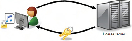
A Silverlight application can request protected content, which may be in the form of a protected stream or media file. This item can be requested through the Source property of a MediaElement, so it’s safe to say that there’s no difference on the client side between requesting protected and unprotected content. In fact, Silverlight doesn’t know if content is protected until it’s downloaded. This download happens naturally when a request is made, as shown in figure 7.4.
Figure 7.4. A user requests protected content from a server. This content is downloaded, in encrypted format, to the Silverlight application.

Figure 7.4 shows the general idea of requesting protected content from a fictional domain. After this request is made, the server will send an encrypted version of the protected file back to the Silverlight application. This file will have a special header that tells the Silverlight runtime that it’s a protected file. This header will provide the location of the licensing server to Silverlight. Before the licensing server can be reached, Silverlight must ensure that the user has the necessary PlayReady components installed.
7.4.2. Retrieving the PlayReady components
By default, Silverlight 2 has the infrastructure for PlayReady, but the Play-Ready components aren’t installed along with the Silverlight runtime. Instead, they’re automatically downloaded and installed when a user requests a protected item. During this one-time installation process, Silverlight goes to the Microsoft.com site and grabs the necessary components. This transparent process is shown in figure 7.5.
Figure 7.5. The process of installing the content access components. This one-time process happens the first time a user attempts to use a protected item. Future attempts to access protected content won’t go through the process of downloading and installing PlayReady.

Figure 7.5 shows how the content access components are retrieved. These components may be customized for a user’s machine, solely for the sake of ensuring a robust licensing experience. The user’s machine is sometimes referred to as an Individualized DRM Client. This process happens automatically behind the scenes—you literally don’t have to do a single thing. Even after the PlayReady components have been installed, the content is still locked (as shown in figure 7.5). To unlock this content, a request must be made to the licensing server.
7.4.3. Unlocking protected content
Once a protected item has been downloaded to your Silverlight application, it’s still encrypted. This encryption can only be unlocked by a key sent from a licensing server, so if you try to play an encrypted file, Silverlight will search the encrypted file’s header for the location of a licensing server. Silverlight will use this location to automatically request a key from the licensing server to decrypt the protected content.
When a licensing server retrieves a request for a key, it can either accept or deny the request.
The licensing server can be used to implement some custom logic to make that decision. This custom logic must be implemented using the server-side PlayReady SDK. Unfortunately, this SDK is outside of the scope of this book, but you can probably imagine how it could be used in a key request. A basic key request is shown in figure 7.6.
Figure 7.6. The media content in this figure is locked until a key is retrieved from the licensing server. This server can implement some custom logic through the PlayReady SDK.
This figure shows what the request for a content-access key looks like. If this request is accepted, the licensing server will return a key. This key will unlock the protected content and begin playing it within the requesting MediaElement. If the request is denied, a key won’t be returned. Instead, the requesting MediaElement will raise a MediaFailed event.
Silverlight has built-in support for the PlayReady content-access technology, which works behind the scenes to retrieve and unlock protected content. This content can include things such as audio and video items. Another form of media is just as valuable but not supported by PlayReady for Silverlight 2. This media format is one of the most familiar on the web: images.
7.5. Using images in your application
Images are used on web pages all across the internet. They’re used in the form of application icons, corporate logos, and photos of you and your friends. Naturally, Silverlight includes a mechanism for displaying these types of content. In fact, Silverlight provides two different elements for showing them. These elements belong to the System.Windows.Controls namespace and target two different scenarios. We’ll cover the basic Image element first. Then, we’ll discuss the MultiScaleImage control, which enables a feature known as Deep Zoom.
7.5.1. Basic imaging
The Image element empowers you to display images from across the internet. In addition to loading images relative to your project, the Image element allows you to retrieve images from another domain. Take a look at how snippet 7.12 uses the Source property to get an image from the http://www.silverlightinaction.com website.
Snippet 7.12. XAML Result: An Image that uses a picture from another domain

<StackPanel Height="200" Width="100">
 <Image Source="http://www.silverlightinaction.com/man.png" />
</StackPanel>
The Image in this snippet retrieves an image from the silverlightinaction.com domain. This image is referenced through the Source property, which is set with a Uri through XAML. If this property needs to be set programmatically, you must use an Image-Source instead. Because this abstract class can’t be used directly, you use a derivation known as BitmapImage. This class name is a bit misleading because only the types listed in table are 7.8 supported.
Table 7.8. The image formats supported by the BitmapImage class. These formats are inherently supported formats of the Image element.
|
Format |
Extension(s) |
|---|---|
| Joint Photographic Experts Group | .jpg,.jpeg,.jpe,.jfif,.jfi,.jif |
| Portable Network Graphics | .png |
This table shows the image formats supported by the BitmapImage class. Because this is the type used by the Source property, these image formats also represent those supported by the Image element in general. These formats represent the types of image files supported, but in this day of digital photography, the size of an image is probably just as important.
The Image element will support images up to four gigapixels (four billion pixels) in size. As you can imagine, using images this large can force your users to endure painful wait times. In addition, with advancements in digital photography, what are you supposed to do with images larger than four gigapixels? Well, to address these types of situations, Silverlight exposes a slick new feature called Deep Zoom.
7.5.2. Deep Zoom
Deep Zoom is a feature of Silverlight that empowers a user to explore groupings of high-resolution images. Traditionally, viewing high-resolution images over the internet is associated with painful wait times because high-resolution images are generally larger in size. The deep zooming feature of Silverlight removes the usual long wait times. In addition to removing wait times, Deep Zoom natively allows a user to drill into an image and see its most intricate details. All this is delivered in a smooth viewing experience that runs with unprecedented performance. This kind of experience is made possible by the MultiScaleImage control.
The MultiScaleImage control, similar to the Image control, has the ability to efficiently show incredibly high resolution images. These images can be zoomed into, giving the user a close-up view of the content. Alternatively, the user can zoom away from the image to get a bird’s-eye view of the image. Either way, these zooming features are constrained to an area known as the viewport. This viewport can be zoomed into, zoomed out of, and moved around the surface of an image, but this image really isn’t an image at all—it’s a collection of images. These images are created by a tool that you’ll soon learn about. Using this tool is part of deploying a multiscale image.
Showing An Image
Showing an image within a MultiScaleImage control is nearly identical to showing an image within an Image control. As with the Image control, the only property you need to set to display an image is the Source property. This property is a MultiScaleTile-Source that can be used to reference a file, but this file isn’t a typical image file. Instead, this file is an xml file that describes a multiscale image. We’ll share more about this file type in a moment; for now, look at how a MultiScaleImage is created in XAML (snippet 7.13).
Snippet 7.13. XAML: Referencing a relative multiscale image in XAML
<MultiScaleImage x:Name="myMultiScaleImage"
 Source="images/dzc_output.xml" />
This snippet shows the XAML to load a relative multiscale image at design time. In the event that you need to load a multiscale image at runtime, you use a DeepZoomImageTileSource instance. This type derives from the abstract base class MultiScaleTile-Source, so it can be used at runtime as shown in snippet 7.14.
Snippet 7.14. C#: Referencing a relative multiscale image at runtime
myMultiScaleImage.Source = new DeepZoomImageTileSource(
 new System.Uri("images/dzc_output.xml", UriKind.Relative));
This snippet shows how to load a multiscale image at runtime. If the referenced image can’t be found, the MultiScaleImage object’s ImageOpenFailed event will be fired. If the image is found, the ImageOpenSucceeded event will be triggered, and the image will be shown. Once this happens, you may consider giving your user the ability to zoom in and out of the high-resolution image.
Zooming In and Out
The MultiScaleImage control has the ability to show an extremely high-resolution image. This control helps remove the traditional limitations associated with screen real estate. This is accomplished by enabling your users to zoom in from a view as if they were standing on top of a mountain.
Zooming within a MultiScaleImage is handled by a method called ZoomAboutLogicalPoint. The ZoomAboutLogicalPoint method takes three parameters that describe the zoom attempt. The first parameter determines how much to zoom by. The second and third parameters specify from where in the image the zoom originates. These parameters and the ZoomAboutLogicalPoint method are shown in snippet 7.15.
Snippet 7.15. C#: Implementing a zoom functionality. A zoom-out will occur if the user presses Shift and clicks the MultiScaleImage. If the user presses Shift and clicks the MultiScaleImage, a zoom-out will occur.

This snippet looks like a lot of code. In short, this code empowers a user to zoom in or out of the MultiScaleImage defined in snippet 7.13. To enable this functionality, you first listen for a key press . If the key press is made from the Shift key, the user is saying to zoom away from the image. If the Shift key hasn’t been pressed, the zooming feature will default to zooming in, so you
also need to listen for a user releasing a key through the KeyUp event . This event resets the zoom mode to the default after the Shift key has been pressed. The real meat of this feature is demonstrated
when the user clicks the MultiScaleImage . This action forces a call to the ZoomAboutLogicalPoint method, which zooms according to the three parameters passed to it .
The first parameter passed to the ZoomAboutLogicalPoint method determines how to zoom on the image. If this double value is less than 1, the method will zoom away from the image. If the value is greater than 1, the method will zoom into the image. Either way, you can play around with this value to also adjust the speed in which the zoom is applied. To determine where the zoom begins, you must rely on the second and third parameters.
The second parameter represents the logical X-coordinate to zoom from, whereas the third parameter represents the logical Y-coordinate to zoom from. Both parameters are double values that fall between 0 and 1. The fact that these values fall between 0 and 1 is what defines them as part of a logical coordinate system, but most items use a standard Cartesian coordinate system. Fortunately, the MultiScaleImage class exposes two methods that enable you to convert Point objects between the two coordinate systems. Both methods are listed and described in table 7.9.
Table 7.9. Coordinate-system conversion methods
|
Method |
Description |
|---|---|
| ElementToLogicalPoint | |
| Converts a Cartesian Point to a logical Point. This is generally used to convert the position of the mouse cursor before zooming
because the ZoomAboutLogicalPoint method expects a logical point. Here’s an example:
// Assume the user clicked the mouse at (125, 200) Point cartesianPoint = new Point(125, 200); Point logicalPoint = myMultiScaleImage.ElementToLogicalPoint(cartesianPoint); myMultiScaleImage.ZoomAboutLogicalPoint(1.5, logicalPoint.X, logicalPoint.Y); |
|
| LogicalToElementPoint | |
| Converts a logical Point to a Cartesian Point. This allows you to work with a point in a more familiar interface. Here’s an
example of how to use this method:
Point logicalPoint = new Point(0.25, 0.75); Point cartesianPoint = myMultiScaleImage.LogicalToElementPoint(logicalPoint); |
|
This table shows how to convert between the two coordinate systems. The logical coordinate system is necessary because it’s used for two important tasks. The first task is zooming in and out of an image—which you just saw. The other major task is selecting what part of a multiscale image to zoom in on. You’ll learn how to do this in a moment. Regardless of your task, both require some knowledge of how to manage the viewport.
Managing the Viewport
The viewport is a rectangular region used to view a specific area of an image. This region empowers you to zoom in and focus on the details of a specific part of an image, so you may want to think of the viewport as a way to interact with an image three-dimensionally. By default, this region is the size of the entire MultiScaleImage control, but you can change the size of the viewport through the ViewportWidth property.
The ViewportWidth property sets the size of a viewport in relation to the logical coordinate space. Anytime you change the ViewportWidth property, it will be in relation to the hosting MultiScaleImage. For instance, if you set the ViewportWidth property to 1.0, the viewport will be the same size as the hosting MultiScaleImage control. If you change the View-portWidth property to a double greater than 1.0, you’ll make the viewport larger than the MultiScaleImage. This approach would give the user a sense of zooming away from the image. Alternatively, you can focus on a smaller portion of a multiscale image by providing a value less than 1.0. To illustrate this zooming-away effect, please look at figure 7.7.
Figure 7.7. A MultiScaleImage with a ViewportWidth of 0.33

This figure shows the effects of changing the ViewportWidth property to a double less than 1.0. The figure on the left represents the original multiscale image. As you can see, the Silverlight logo in this image is only a small portion of the area shown to the user. By setting the ViewportWidth property to 0.33, the Silverlight logo becomes the focus of the entire MultiScaleImage. In reality, the ViewportWidth is only part of the story. The other part of the story involves using the ViewportOrigin property.
The ViewportOrigin specifies the position of the upper-left corner of the view-port. This position is a logical Point relative to the upper-left corner of the MultiScaleImage. Each of the coordinates within the Point will be between 0.0 and 1.0. Note that you can still define this value at design time. To do this, you have to set the View-portOrigin property with the syntax shown in snippet 7.16.
Snippet 7.16. XAML: Defining the ViewportOrigin in XAML. Notice the syntax of the ViewportOrigin property.
<MultiScaleImage x:Name="myMultiScaleImage" Source="images/dzc_output.xml"
 ViewportOrigin=".33,.33" />
This snippet shows how to set the ViewportOrigin property value at design time. As you might expect, this value can also be set at runtime by creating an instance of the Point class. This explanation hardly details the real value of the ViewportOrigin property. The value of this property is that it enables you to navigate around the surface of an image once you’re zoomed in. By handling a user action (see chapter 4), you can change the viewport position as necessary. Snippet 7.17 shows how to change the position of the viewport on a mouse click.
Snippet 7.17. C#: Defining the ViewportOrigin in C#. Notice the syntax of the ViewportOrigin property.
void myMultiScaleImage_MouseLeftButtonUp(object sender,
 MouseButtonEventArgs e)
{
 Point newOrigin = e.GetPosition(myMultiScaleImage);
 myMultiScaleImage.ViewportOrigin =
  myMultiScaleImage.ElementToLogicalPoint(newOrigin);
}
This snippet shows how to reposition the ViewportOrigin based on where a user clicked. Once it’s clicked, the viewport will move to the new Point. This process begins with a nice smooth animation called a spring animation. This animation will play anytime the viewport changes size or location—anytime you zoom in or out of an image or pan the surface. This animation can be turned off by changing the UseSprings bool property to false, but you won’t usually want to do this.
In general, it’s recommended that you leave the UseSprings property set to true because the animation creates a rich viewing experience. In addition, it gives the MultiScaleImage control more time to download any necessary data. Once the viewport does change size or location, the MotionFinished event will be triggered, giving you an opportunity to perform any UI updates that you may want to make to the display.
The viewport is an important concept within the MultiScaleImage control. This item gives you the power to scan the surface of a high-resolution image. In addition, the viewport enables you to readily zoom in and out of an image. To enable this zooming functionality, you first load an image into the MultiScaleImage control. This image is loaded through the Source property, and the Source should reference a. xml file, which can be created by a tool. This tool is used when you are ready to deploy a multiscale image.
Deploying Multiscale Images
The MultiScaleImage control has built-in support for handling XML that details a multiscale image. This type of file can be generated programmatically or by a tool called Deep Zoom Composer. We won’t cover this tool in detail because of its simplistic nature. Once you download and install the tool from the Microsoft Expression website, you can quickly create XML files that can be used by the MultiScaleImage. These files can be generated within the tool by going through a basic wizard. This wizard goes through the following steps:
- Import — Enables you to import your own images.
- Compose — Empowers you to lay out how the images should appear.
- Export — Determines where the result will be stored.
These three steps will generate an. xml file and a file/folder structure. These two items must then be added to your web application so that the MultiScaleImage control can access them. Once this has been done, you can then use Deep Zoom on your own images.
Deep Zoom is a powerful feature available within Silverlight. Because this technology relies on basic images and an XML file, there are no server-side requirements. In addition, the only client-side requirement is Silverlight itself. This is great news because, as you play with Deep Zoom, you’ll see the rich experience it provides. This experience truly makes viewing high-resolution images over the internet enjoyable.
7.6. The 7th inning stretch: Dealing with dead space
Throughout this chapter you’ve seen a variety of ways to deliver different kinds of media. Often, media is intended to be a secondary part of an application instead of the main attraction. For instance, a user’s profile picture is part of an application but not as important as the profile information itself. As you can imagine, there is the possibility that these profile pictures are of different sizes. This can lead to dead space, or areas that don’t include content. Fortunately, there’s a way to gracefully deal with these situations. Please look at figure 7.8.
Figure 7.8. The boundary of an Image element in comparison to the actual size of the photo
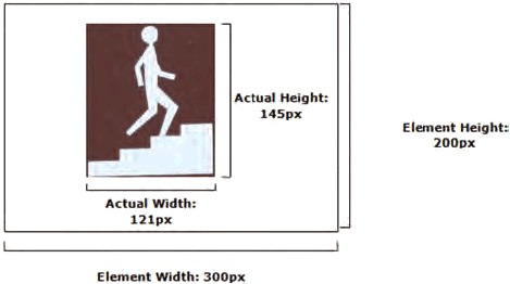
The Image, MediaElement, and Shape (discussed in the next chapter) classes expose a property called Stretch. This property determines how the area devoted to an element will be filled. This description will become clearer as you see the examples available in this section. This property must be set to one of the four options available in the System.Windows.Media.Stretch enumerator, which exposes the None, Uniform, Fill, and UniformToFill options.
7.6.1. I’ll have none of this stretching business
Most of the time, photos are represented as raster-based graphics. Raster-based graphics often become pixilated and lose their detail when they’re enlarged. You can prevent this from happening by using the None Stretch option. This option commands an element to maintain the original size of the requested content—this option doesn’t make the content stretch at all. As you probably expected, you can set this property value at design time, as shown in snippet 7.18.
Snippet 7.18. XAML: Use of the None option on an adequately sized Image element
<Image x:Name="myImage"
 Source="http://www.silverlightinaction.com/man.png"
 Stretch="None" />
The XAML in this snippet loads an Image and prevents it from stretching. The result from this XAML can be seen in figure 7.8, which shows the results of the None option when there’s plenty of space for a piece of content. Consider the scenario where the content is larger than the hosting element. Take a look at Walker’s picture (the content) in an Image element (the hosting element) smaller than the picture (snippet 7.19).
Snippet 7.19. XAML Result: Use of the None option on an adequately sized Image element

<Image x:Name="myImage" Width="75" Height="75"
 Source="http://www.silverlightinaction.com/man.png"
 Stretch="None" />
Unfortunately for Walker, his legs got cut off! As the result in this snippet shows, the original photo remains the same size, so the bottom and right edges of the photo are cropped so that the image fits within the 75px-by-75px dimension of the Image element. This illustration also erases any fears of an exception being thrown in the case of an element being smaller than its content.
At first glance, the None option may seem like the most obvious default option. It may come as a surprise to find out that another option makes even more sense as the default. When you begin to consider the fact that the Stretch option is applicable to Image, MediaElement, and Shape elements, it makes much more sense to stretch items by default, uniformly.
7.6.2. Uniform sizing
If you set the Stretch property to Uniform, the content of the element will symmetrically expand or contract to occupy most of the available area. While the content expands or contracts, the native aspect ratio will be preserved. This means that if you revisit Walker’s picture, it will be stretched vertically, making him stand tall and proud (snippet 7.20).
Snippet 7.20. XAML Result: A uniformly stretched Image with a photo smaller than the element

<Image x:Name="myImage" Width="300" Height="200"
 Source="http://www.silverlightinaction.com/man.png"
 Stretch="Uniform" />
The gray backdrop in this snippet represents the area that could be filled by an image. Because the Uniform option stretches content proportionally, it must stop once either a vertical or horizontal boundary is met. But, what happens if the content is larger than the bounding element?
Snippet 7.21. XAML Result: A uniformly stretched Image with a photo larger than the element

<Image x:Name="myImage" Width="75" Height="75"
 Source="http://www.silverlightinaction.com/man.png"
 Stretch="Uniform" />
As this snippet illustrates, the content remains intact. Instead of cropping the image, as was the case in snippet 7.19, the content scales to a smaller size. As the content scales down, the aspect ratio stays the same. Although maintaining the aspect has its benefits, occasionally, you might need to fill the entire area, no matter what. For these situations, you have the Fill option.
7.6.3. Fill the area
The Fill option allows you to expand, or contract, the content of an element to fully occupy the space allocated to it. You’ll most likely use this option in backdrop scenarios where you want an Image to serve as wallpaper. Snippet 7.22 shows what the Fill option does to Walker’s picture.
Snippet 7.22. XAML Result: An image using the Fill option to stretch an Image

<Image x:Name="myImage" Width="300" Height="200"
 Source="http://www.silverlightinaction.com/man.png"
 Stretch="Fill" />
Walker looks a little bloated in this snippet because, although the Fill option will expand to ensure that every pixel allotted to an element is used, the aspect ratio of the content won’t be preserved. Because of the oblong dimensions of the photo, the photo is stretched horizontally—in turn, horizontally stretching Walker. Sometimes, you may need the flexibility to fill an element while maintaining the aspect ratio. For these circumstances, you have the UniformToFill option.
7.6.4. UniformToFill
As the name implies, this option is a hybrid between the Uniform and Fill options. The content within an element will maintain its aspect ratio while filling the entire bounding area. If the content has a different aspect ratio than the housing element, the overflowing content will be clipped. See snippet 7.23 for a small sample using our friend Walker.
Snippet 7.23. XAML Result: An Image using the UniformToFill Stretch option

<Image x:Name="myImage" Width="300" Height="200"
  Source="http://www.silverlightinaction.com/man.png"
  Stretch="UniformToFill" />
This snippet illustrates how a raster-based graphic can become pixilated when inflated. It also shows how the aspect ratio is maintained as the picture is enlarged to fill every allocated pixel. As you’ve probably noticed, Walker’s legs are removed from this picture. This is because the bottom edge has been removed to ensure that the image fits within the allocated boundaries.
Stretching can help you address a wide variety of filling situations. Silverlight allows you to easily address any type of stretching situation through the Stretch property. This property can be used with the Image and MediaElement items discussed earlier in this chapter. Interestingly, the Stretch property isn’t supported by the MultiScaleImage control. But, with those powerful deep-zooming capabilities, does it really make sense to stretch? We think not.
7.7. Summary
Over the course of this chapter, you saw the rich media features available within Silverlight. The audio and video features are covered by a single element known as the MediaElement. Your imaging needs can be addressed through two separate items. The first item, Image, is used to display images in the traditional sense. For high resolution images, you should use the MultiScaleImage control, which delivers the immersive deep zoom capabilities.
Although images are great, most image formats are raster-based and don’t scale well. Sometimes you may need to dynamically construct an image on the fly. As the next chapter will show, Silverlight has an impressive vector-based graphics API that gives you the power you need to put an engaging graphical experience in action.