
4. Timing Is Everything
Time flies over us, but leaves its shadow behind.
—Nathaniel Hawthorne [1]
Most people think of social media outlets (Twitter, Instagram, Vine, and so on) as an “in the moment” type of media. What does that mean? Well, think about this: You walk into your favorite store and encounter one of the most unprofessional sales assistants you’ve ever come across. What do you do if you’re active in social media outlets like Twitter? You open your smart phone and tweet something like this:
Worst customer service I’ve ever encountered—shame on you #company
There are times when we feel compelled to express our thoughts and feelings in this fashion and more often than not, someone listening to our rants responds with a sense of sympathy or consolation. By “in the moment,” we’re referring to being mindfully aware of what is going on right here and now.
This ability to immediately share our thoughts is one of the great powers of social media. This power, in turn, can be leveraged to derive business value. For example, we can monitor the pulse of a community of individuals pertaining to a specific event that is occurring right now. Trending topics are those being discussed more than others. These topics are being talked about—in Twitter or any other social media venue, for example—more right now than they were previously. This is the reason that Twitter lists the trending topics directly on its site. This list allows users to see what a large group of individuals are talking about. In addition to identifying trends, we are able to perform additional analytics to derive insights from such conversations. We cover these types of analysis in more detail in Chapter 6 of this book.
So far, we have talked about communications happening right now, but what about communications that have already occurred at some point of time in the past?
![]() Have people talked about that particular topic in the past?
Have people talked about that particular topic in the past?
![]() Has the sentiment surrounding the topic changed over time?
Has the sentiment surrounding the topic changed over time?
![]() Are there different themes surrounding the topic now as opposed to, say, last year?
Are there different themes surrounding the topic now as opposed to, say, last year?
In Jay Asher’s book Thirteen Reasons Why, character Hannah says:
“You can’t go back to how things were. How you thought they were. All you really have is...now.” [2]
Luckily for us, this isn’t the case in social media analytics. As a matter of fact, looking back in time is often just as important as (if not more so than) looking at the present.
Predictive Versus Descriptive
Most of what we think of when we talk about business analytics are what we would call “descriptive analytics.” Descriptive analytics looks at data and analyzes past events for insight as to how to approach the future. Here, we look at past performance and, by understanding that performance, attempt to look for the reasons behind past successes or failures. Descriptive statistics are used to describe the basic features of the data in a sample. They provide simple summaries about the data and what was measured during the time it was collected. Descriptive analytics usually serves as the foundation for further advanced analytics.
Descriptive statistics are useful in summarizing large amounts of data into a manageable subset. Each statistic reduces larger “chunks” of data into a simpler, summary form.
For example, consider the analysis of a large block of social media data surrounding an industry trade show. If we break down the topics seen in all of the social media conversations from the show, we could produce a set of descriptive statistics similar to those shown in Table 4.1.
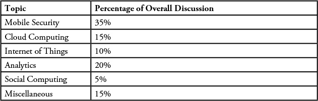
In this case, the metric “Percentage of Overall Discussion” describes what the conversations are generally about. We could have just as easily reported on the number of males or females who made comments or the number of comments made by people claiming to be from North America, Europe, or Asia Pacific (for example). All these metrics help us understand (or describe) the sample of data; thus, they are descriptive statistics. The purpose of descriptive analytics is simply to summarize a dataset in an effort to describe what happened. In the case of social media, think about the number of posts by any given individual, the number of mentions by Twitter handle, a count of the number of fans or followers of a page, and so on. The best way to describe these metrics is to think of them as simple event counters. We should also remember that the ultimate business goal of any analysis project will drive the data sources we are interested in as well as the aspects of the data we need to focus on. This dimension of time helps us collect a suitably large set of data depending on the goal of the project.
Predictive Analytics
Predictive analytics can be thought of as an effort to extract information from existing datasets to determine patterns of behavior or to predict future outcomes and trends. It’s important to understand that predictive analytics does not (and can NOT) tell us what will happen in the future. At best, predictive analytics can help analysts forecast what might happen in the future with an acceptable level of reliability or confidence.
Refer again to the value pyramid from Chapter 1. The supposition was that as we continued to refine a data source (over time), the more valuable the residual, or resulting, dataset would become. Perhaps that same diagram can be drawn with respect to time, as shown in Figure 4.1. The more temporal the data becomes, the wider view we obtain, and therefore the greater understanding can be derived. If we are focusing on a given data source, we can improve our level of understanding of that dataset by not only gaining a wider understanding, but perhaps by modifying our perception of the data as it evolves over time. For example, if we are monitoring conversations in a community about a new email system that has been rolled out to all employees, over a period of time, we get an idea of which features are being talked about more than others, which types of users are having difficulties with a certain set of features, and who are the most vocal about their experience. This is possible because over time, we are able to refine our filters to look at the most relevant data, and then we are able to revise and refine our analytics model to expose key combinations of parameters that we are interested in.

Often, when we are looking at trends or predictive behavior, we are looking at a series of descriptive statistics over time. Think of a trend line, which is typically a time series model (or any predictive model) that summarizes the past pattern of a particular metric. While these models of data can be used to summarize existing data, what makes them more powerful is the fact that they act a model that we can use to extrapolate to a future time when data doesn’t yet exist. This extrapolation is what we might call “forecasting.”
Trend forecasting is a method of quantitative forecasting in which we make predictions about future events based on tangible (real) data from the past. Here, we use time series data, which is data for which the value for a particular metric is known over different points in time.
As shown in Figure 4.2, some numerical data (or descriptive statistic) is plotted on a graph. Here, the horizontal x-axis represents time, and the y-axis represents some specific value or concept we are trying to predict, such as volume of mentions or, in this case, consumer sentiment over time. Several different types of patterns tend to appear on a time-series graph.
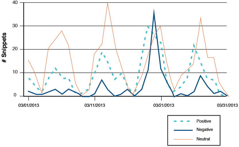
What’s interesting in this graph isn’t the size (or amount) of positive, negative, or neutral sentiment over the month of March, but the pattern that seems to emerge when looking at this data over time. This analysis of industrywide mentions of topics in and around cloud computing was done by Shara LY Wong of IBM Singapore (under the direction of Matt Ganis as part of a mentoring program inside of IBM). A close inspection of this temporal representation of the data shows that every 10 days or so, there is a peak of activity around the topic. All three dimensions of sentiment (positive, negative, or neutral) seem to peak and rise at the same time in a fairly regular manner. Given that the leader of the metrics in all cases is the line representing neutral sentiment, we were able to quickly determine that on a very systematic schedule, there are a number of vendor advertisements around the topic, most with a slant toward positive sentiment. One anomaly appears to be the March 21 discussions that generated not only the largest spike in discussion, but also the largest negative reaction by far.
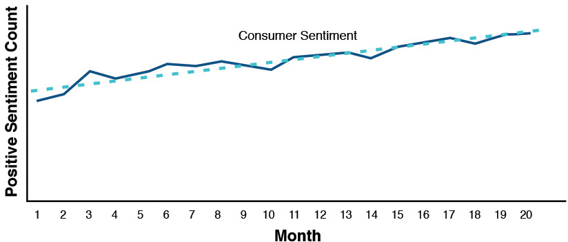
The essence of predictive analytics, in general, is that we use existing data to build a model. Then we use that model to make predictions about information that may not yet exist. So predictive analytics is all about using data we have to predict data that we don’t have. Consider the view of consumer sentiment about a particular food brand over time (in this case, a 20-month period). We’ve plotted the values obtained for the positive sentiment with respect to time and done a least-squares fit to obtain the trend line (see Figure 4.3). The solid line in this figure is drawn through each observation over a 20-month period. The broken line is derived using a well-known statistical technique called linear regression analysis that uses a method called least-squares fit. In this simplistic example, it is easy to see that the trend line can be utilized to predict the value of positive sentiment in future months (like months 21 and 22 and so on). We can have confidence in this prediction because the predictions seem to have been quite close to reality in the past 20 months.
From high school math, this derived trend line is nothing more than the familiar equation for a straight line:
Y = mx + b
where the value of m is the slope of the line and b represents the y-intercept (or the point where x—in this case, time—is zero) are constants. From this, we can examine any time in the future, by substituting a value for x (in this case, we would use a value of x greater than 20 to look into the future, since anything less than 20 is already understood) and, with a fairly good level of confidence, predict the amount of positive consumer sentiment (the value of y). While simple in nature, this is a perfect example of a predictive model.
If we want to know what the sentiment will be around this brand over the next 24 to 36 months (assuming conditions don’t change), this simple relationship can be a “predictor” for us. As we said previously, it’s not a guarantee, but a prediction based on prior knowledge and trending of the data.
Descriptive Analytics
When we use the term descriptive analytics, what we should think about is this: What attributes would we use to describe what is contained in this specific sample of data—or rather, how can we summarize the dataset?
To further illustrate the concept of descriptive analytics, we use the results from a system called Simple Social Metrics that we developed at IBM. It’s nothing more than a system that “follows” a filtered set of Twitter traffic and attempts to provide some kind of quantitative description of the data that was collected (we talk more about this in Chapter 8, where we address real-time data).
In this example, we use a dataset of tweets made by IBMers who are members of IBM’s Academy of Technology. The IBM Academy of Technology is a society of IBM technical leaders organized to advance the understanding of key technical areas, to improve communications in and development of IBM’s global technical community, and to engage its clients in technical pursuits of common value. These are some of IBM’s top technical minds, so an analysis of their conversation could be quite useful.
One of the first questions we want to answer is this: “Who is contributing the most?” or rather, “Who is tweeting the most or being tweeted about?” One way to do this is to analyze the number of contributions. We simply call this the “top authors,” and for the month of November, a breakdown of the top contributors looked something like that shown in Figure 4.4. Even though this diagram tells us which author had the most number of tweets, we need to go beyond the machine-based analysis and leverage human analysis to determine who really “contributed” the most.
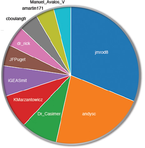
While this data is interesting, we need to remember that these types of descriptive metrics represent just a summary over a given point in time. The view could be quite different if we look at the data and take the time frame into consideration. For example, consider the same data, but a view of the whole month versus the last half of the month (see Figure 4.5).
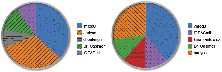
An important fact that comes across here is that one of the users, kmarzantowicz, came on strong during the last half of the month with a heavy amount of tweeting to move into the top five of all individuals. Perhaps this person was attending a conference and tweeting about various presentations or speeches; or perhaps this person said something intriguing and there was a flurry of activity around him or her. From an analyst’s perspective, it would be interesting to pull the conversation that was generated by that user for the last 15 days of the month to understand why there was such a large upsurge in traffic.
Sentiment
One of the more popular descriptive metrics that people like to use is sentiment. Sentiment is usually associated with the emotion (positive or negative) that an individual is feeling about the topic being discussed. In this chapter, which is focused on time, we discuss sentiment as it changes over time.
Sentiment analytics involves the analysis of comments or words made by individuals to quantify the thoughts or feelings intended to be conveyed by words. Basically, it’s an attempt to understand the positive or negative feelings individuals have toward a brand, company, individual, or any other entity. In our experience, most of the sentiment collected around topics tends to be “neutral” (or convey no positive or negative feelings or meanings). It’s easiest to think about sentiment analytics when we look at Twitter data (or any other social site where people express a single thought or make a single statement). We can compute the sentiment of a document (such as a wiki post or blog entry) by looking at the overall scoring of sentiment words that it contains. For example, if a document contains 2,000 words that are considered negative versus 300 words that are considered positive in meaning, we may choose to classify that document as overall negative in sentiment. If the numbers are closer together (say 3,000 negative words versus 2,700 positive words—or an almost equal distribution), we may choose to say that document is neutral in sentiment.
Consider this simple message from LinkedIn:
Hot off the press! Check out this week’s enlightening edition of the #companyname Newsletter http://bit.ly/xxxx
A sentiment analysis of this message would indicate that it’s positive in tone. The sentiment analysis being done by software is usually based on a sentiment dictionary for that language. The basic package comes with a predefined list of words that are considered as positive. Similarly, there is also a long list of words that can be considered negative. For many projects, the standard dictionary can be utilized for determining sentiment. In some special cases, you may have to modify the dictionary to include domain-specific positive and negative words. For example, the word Disaster can be a negative sentiment word in a majority of contexts, except when it is used to refer to a category of system such as “Disaster Recovery Systems.”
Understanding the general tone of a dataset can be an interesting metric, if indeed there is some overwhelming skew toward a particular tone in the message.
Consider the descriptive set of metrics of sentiment shown in Figure 4.6, taken from an analysis we did for a customer in the financial industry over a one-month period. This represents the tone of the messages posted in social media about this particular company.
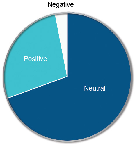
On the surface, this looks like a good picture. The amount of positive conversation is clearly greater than the amount of negative, and the neutral sentiment (which is neither bad nor good) overwhelms both. So in summary, this appears to be quite acceptable.
However, if we take the negative sentiment and look at it over time, a different picture emerges, as illustrated in Figure 4.7.
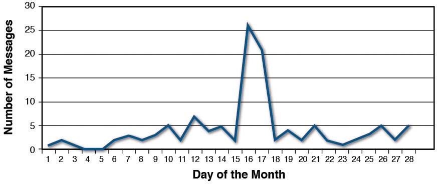
While cumulatively the negative sentiment was much smaller than the positive, there was one particular date range (from approximately the 16th to the 18th of the month) when there was a large spike in negative messaging centered around our client. While just an isolated spike in traffic, the event could have lingering effects if not addressed.
Time as Your Friend
Access to historical information can be vastly informative (and useful) if utilized in the proper way. Up until this point in our discussion, we’ve described the collection of data as it appears but really haven’t mentioned the use of a data store or the collection of historical information.
We talk more about this topic in the later chapters, but for now the question to ask is: How could we take advantage of a historical data collection? One answer is that we could look for a baseline so that, as we take measurements now, in the present, we can better understand if those measurements have any real meaning.
For example, in the previous example where we discussed positive versus negative sentiment, on average for the month shown, we had a ratio of 1:8 negative to positive comments (for every one negative comment, we were able to see eight positive comments).
The question is: Is that good or bad? The answer to this question depends on the specifics of the situation and also on the goal of the social analytics project that we are working on. Looking back in time, we were able to compute that in previous months, the ratio remained relatively constant. So there was no need for alarm in seeing the negative statements (note that this is not to say we need to ignore the negative things being said—far from it—but there doesn’t appear to be an increase in any negative press or feelings).
But there is another interesting use case for data stores, and it’s that of validating our models.
In one interesting use case we had, we were asked to monitor social media channels in an attempt to identify a hacker trying to break into a specific website. The idea sounds a bit absurd: What person or group would attempt to break into a website and publish their progress on social media sites?
While we didn’t have high hopes for success, we followed our iterative approach and built an initial model that would describe how people might “talk” when (or if) they were attempting a server breach. It was a fairly complex model and required a security specialist to spend time looking over whatever information we were able to find. Over the months of running our model, watching as many real-time social media venues as we could, we ended up returning a large number of false positives.
This inevitability leads to the question: Is the model working, or is it just that nobody is trying to break in? It’s a valid question. How do we validate that we can detect a specific event if we don’t know that the event has occurred?
Well, we took the data model and changed it to reflect IBM. We wanted to run the model against a site that had been hacked in the past, and a widely reported incident around IBM’s DeveloperWorks site defacement was a perfect candidate.
Using a data aggregator called Boardreader (which is closely integrated with IBM’s Social Media Analytics [SMA] product), we pulled data from around January 1, 2011, until January 31, and processed that data within our model. Sure enough, we saw that our model identified the hacking instance almost as soon as it was reported (within minutes). This data was important to us because it served to validate our model and assure us to a certain degree that if a group was going to do this again (to our client), we could at least catch it as soon as possible.
Summary
In this chapter, we discussed how the concept of time can be factored into an analysis in several ways:
![]() Accumulation of larger datasets
Accumulation of larger datasets
![]() Descriptive analytics
Descriptive analytics
![]() Predictive analytics (establishing trends and using the trends to predict the future)
Predictive analytics (establishing trends and using the trends to predict the future)
![]() Validation of hypotheses using historical data
Validation of hypotheses using historical data
In general, the level and depth of analysis are directly proportional to the amount of properly selected and filtered data that went into that analysis. However, in some use cases, it is important to get a quick “point in time” analysis, as we discussed with a trade show or presentation and audience reactions. Of course, if we want to deliver a more relevant message, our datasets for analytics may need to look back over time to establish a trend. For example, if IT professionals had been discussing security around cloud computing for the last several months, chances are, that’s a topic they would be interested in hearing about during a presentation.
One perhaps not-so-obvious use of historical data could be to validate models for an upcoming analysis. Many times we assume we have configured models and data engines to capture the “right” data, but do we know for sure they work? Using historical data provides an easy testbed to ensure, or at least test, that our assumptions and models are correct so that our current analysis can be as accurate as possible.
Endnotes
[1] Hawthorne, Nathaniel. Transformation: The Marble Faun, And, The Blithedale Romance. George Bell and Sons, 1886.
[2] Asher, Jay. Thirteen Reasons Why. Ernst Klett Sprachen, 2010.