
9. Troubleshooting the Project

Program Manager
Project Manager
“Happy families are all alike; every unhappy family is unhappy in its own way.”
—Leo Tolstoy, Anna Karenina1

Figure 9.1 Leo Nikolayevich Tolstoy.
Tolstoy’s aphorism applies to software projects, too. There are many patterns of unhappiness in a software project, which are usually manifested in a couple dozen symptoms.
This chapter focuses on these patterns, the symptoms, and how to recognize them. By now, I hope you are convinced of the value-up paradigm, which asserts that we apply systems to look continually for ways to improve the flow of value. In Chapter 1, “A Value-Up Paradigm,” I contrasted this to the “iron triangle” view of the work-down paradigm, which assumes fixed capacity and reduces problems to time, resources, functionality, and quality.2
The metrics warehouse, like the work item database, enables you to run a project based on trust and transparency. Everyone on the team gets to see the same data, ask the same questions, look for the answers, and be part of finding the solution. This chapter might be criticized for being unnecessarily quantitative. By no means do I mean to suggest that you always need numbers to grasp problems or that solutions and improvements should be numeric. As discussed in Chapter 4, “Project Management,” the metrics need to be descriptive, not prescriptive.
Pride of workmanship, one of the MSF mindsets, is assumed for everyone, and the metrics are a tool to reinforce that pride, not supplant it. You win at sports by playing well and keeping your eye on the ball, not on the scoreboard. The scoreboard just keeps count so that you don’t have to be distracted by arguing about whose numbers are right.
Many symptoms require no metrics warehouse. A well-known example is the Inverse Dilbert Correlation Factor: The more Dilbert cartoons there are pasted on office doors and bulletin boards, the less well off the project is.3 (Of course, an absence of cartoons might be a warning sign of a certain company policy, too.) Another example is the morale of the team, which is visible in the energy level and enthusiasm. If team members are losing sleep over project problems, they should be able to tell you what’s bothering them. And if you aren’t seeing it, then you’re not spending enough time with the rest of your team.
On the other hand, we are all susceptible to blind spots. Trends and drilldowns are great for identifying possible risks and oversights, and the health charts are a great starting point. They give you the data to ask the right questions, but only the team can find the answers. The greatest benefit of the metrics charts is their capability to complement what you sense or suspect from interacting with your fellow team members, trying current builds of the software, reviewing code, researching bugs, planning iterations, and so on. The charts give you indicators of the overall health of the project and, when you suspect a problem, the ability to look at the data to confirm or deny the suspicion.
For the rest of this chapter, I catalog a series of potential problems, many of which you may recognize from personal experience, and how they can show up in the VSTS project health charts. The goal here is to show how VSTS, with its daily reporting, can provide early warnings and help you with continuous course correction to improve capacity.
Underestimating
One of the most frequently reported problem symptoms is underestimation. When progress falls short of the plan and effort is greater than estimated, project members are underestimating the resources, difficulty, time, or other factors (see Figure 9.2).
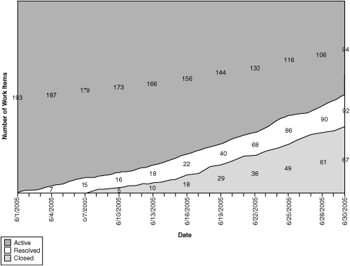
Figure 9.2 Based on the slope of the Closed line, the Closed line will hit the iteration end date well below the planned level, meaning that not all the scenarios planned for this iteration will be completed before iteration exit.
If you see this pattern, you will, of course, want to drill down into the root causes. There are several possible reasons for underestimating, covered in Figures 9.3–9.10.
Uneven Task Decomposition
Check the degree of variation in the task definition and the size range of the task granularity. You would hope to see tasks planned to the scale of one to three days (see Figures 9.3 and 9.4).
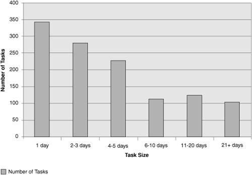
Figure 9.3 This histogram of number of tasks against size shows that task size varies significantly.
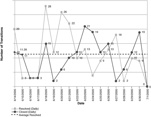
Figure 9.4 Correspondingly, the Project Velocity chart shows a high variance in the number of tasks closed per day.
Architectural Blind Spots
Sometimes the team discovers a need for an architectural change. This could be the need to focus more heavily on integration, reconsider QoS, change the component structure, introduce new common services, change the planned deployment environment, or otherwise make extensive architectural changes.
Examining the Remaining Work charts in Figures 9.5 and 9.6 shows the pattern. Scenarios and QoS requirements are staying active longer than expected (in fact, some need to be cut from the iteration), while development tasks are rising significantly. This late discovery of tasks may indicate undiscovered architectural work.
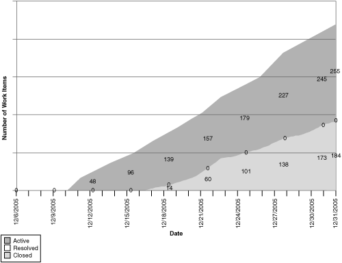
Figure 9.5 This Remaining Work chart, filtered for tasks, shows significant growth in tasks being added to the backlog.
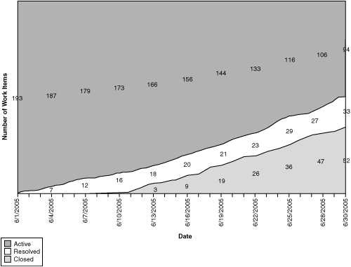
Figure 9.6 Simultaneously, when filtered for scenarios, the Remaining Work chart shows the scenarios stuck in the active state, and the total number planned for the iteration is declining.
Scope Creep
“Scope creep,” depending on your perspective, is the usual term for the late piling on of requirements or the inability of the project manager to keep the current iteration focused on its initial target. In other words, at the start of an iteration, you normally know which scenarios are chosen for the iteration. If this list shifts, the team can be seriously disrupted (see Figure 9.7).
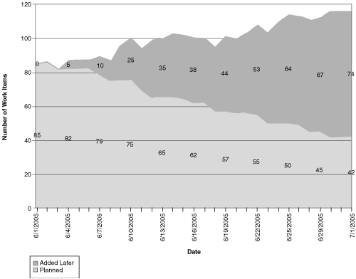
Figure 9.7 The Unplanned Work chart, filtered for scenarios, shows a significant climb in the Added Later area.
On the other hand, it is entirely appropriate to rethink the future between iterations. A purpose of iteration chunking is to give you the opportunity to correct your course based on new learning and new information.
Inadequate Bug Allotment
If you plan tasks that consume 100% of your available resources, then you have no capacity left to handle unplanned work. It is necessary to schedule time for handling bugs and other work that will arise but that might not be known at iteration start.
Sometimes, especially in feature-boxed planning, this pattern is a sign of political dysfunction. One example is “schedule chicken,” where competing teams bluff the schedule because they expect someone else to miss the dates by a larger margin than they will (see Figures 9.8 and 9.9).
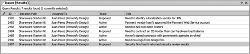
Figure 9.8 Trying to bluff the schedule shows up in an accumulating list of issues that aren’t being resolved.
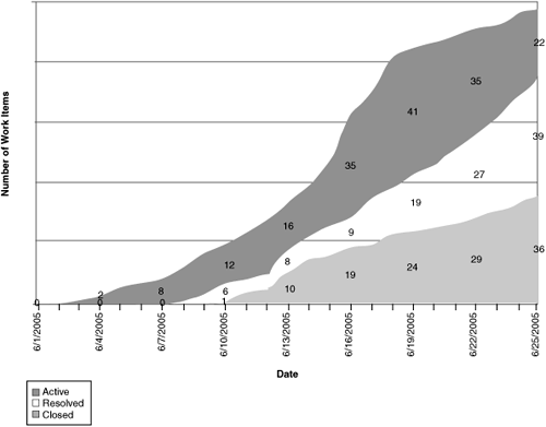
Figure 9.9 This cumulative flow diagram for bugs shows a steeply rising top line because most bugs are not known at the start of the iteration. The widening Active band indicates a find rate higher than the current fix rate, growing the bug backlog. This could happen for a variety of reasons, such as newly integrated functionality being available for test, a bug bash, new reports from beta users, and so on. On the other hand, the bubble in the Resolved band shows a period when testers cannot verify the number of bug resolutions as quickly as they are being delivered.
Resource Leaks
In some environments, a team does not fully control its own time. For example, developers might be pulled off new development to fix bugs on production releases, or people might be pulled into someone’s pet project. (“Can you set up this demo for me?”) These are resource leaks because the resources you scheduled are being reallocated to unplanned work that does not benefit your project. To spot resource leaks, look for unusual variations in the Project Velocity graph (see Figure 9.10) or flat spots in the Remaining Work chart.
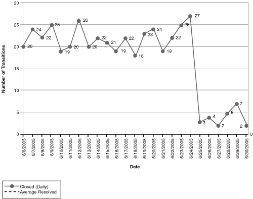
Figure 9.10 On this Project Velocity graph, the number of development tasks closed takes a sudden dip in week 4. There may be a known reason (vacation, scheduled training, illness, and so on), or it may be a sign that something is interfering with the expected work. It’s a good question for your standup meetings.
Development Practices Too Loose
It is a development responsibility to deliver working software for testing. If the software isn’t passing the build verification tests (BVTs), or the BVTs and unit tests are inadequate, then fix the problem at its source. Ordinarily, the team will know if these are problems, but if you are a manager and therefore are one step removed, you might first see signs in these reports.
Build Failures
A nightly build is the heartbeat of your project (refer to Chapter 6, “Development”). If your builds are not completing successfully or are not passing BVTs, as shown in Figure 9.11, then you need to do what is necessary to fix the problem immediately. Usually the team will self-correct and restore the working build without much management intervention.
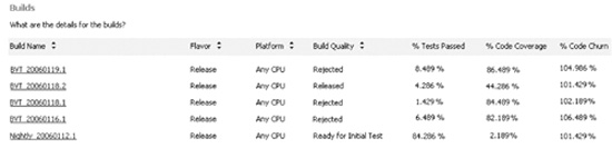
Figure 9.11 This build summary shows that some builds are not completing and others are failing BVTs.
Inadequate Unit Testing
Code should be delivered with adequate unit tests—that’s pretty well accepted nowadays. The best automated approximation for the breadth of the unit tests is code coverage (refer to Chapter 7, “Testing,” on the use and misuse of code coverage). If you are practicing Test Driven Development or similar techniques, then your code coverage should approach 100%, except where you have good reasons for exclusions. If your unit tests are reused as BVTs, then the coverage should be visible with the Quality Indicators and Build reports (see Figures 9.12 and 9.13).
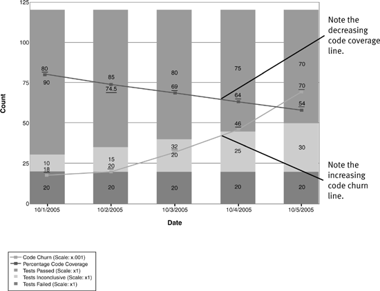
Figure 9.12 This Quality Indicators report shows a decrease in code coverage and an increase in code churn over the five days. This is a clear warning that new code is being checked in without corresponding unit tests to cover it.
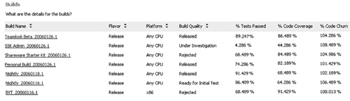
Figure 9.13 This Build Details report shows that code coverage varies widely across the different source projects. This indicates uneven unit testing or at least uneven coverage from the BVTs.
Reactivations
Another warning sign is a high reactivation rate, sometimes called a “fault feedback ratio.” Reactivation rate counts the number of supposedly fixed bugs whose fixes don’t work (see Figure 9.14). These reactivations create a vicious cycle of rework that crowds out planned tasks.
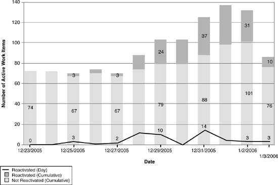
Figure 9.14 This Reactivations graph shows a high and rising rate of bug fixes that were rejected in testing. This trend is clearly digging a hole that will consume resources for no visible customer benefit.
Note that if you encounter high reactivations, it’s worth looking into the root causes. Although sloppy development practice is an obvious possibility, other potential causes include poor bug reporting, poor test lab management, and overly aggressive triage.
Bluffing
Bluffing, that is, reporting work as complete when it isn’t, is hard to achieve when you have the transparency of a value-up process with VSTS. If someone is bluffing, you would expect to see a combination of the patterns shown previously—build breaks, high reactivations, rising code churn, and decreasing code coverage from unit testing and BVTs. There will be enough anomalies that the behavior might correct itself through pride of workmanship and peer pressure. Of course, if it doesn’t, you need to intervene.
Tests Passing; Solution Doesn’t Work
One of the more frustrating project situations is to find that tests are reported as passing but the solution under the test still doesn’t work for observers outside the test team. In these cases, you want to identify why the tests do not seem to find the same issues that other users do. Figures 9.15–9.18 are examples of this case.
High Bug Find Rate
Frequently you see a high test pass rate but still see a large incoming bug rate (or worse, customers or beta users are reporting lots of bugs that testing seems to be missing).
This can occur for several reasons:
• The tests might be too gentle for this stage of the solution. In early iterations, gentle tests are good, but as the solution matures, tests should exercise broader scenarios and integrations. These tests might be missing.
• Tests might be stale or be testing the wrong functionality.
• It might be time to switch test techniques. (See Chapter 7.)
Consider Figures 9.15, 9.16, and 9.17.
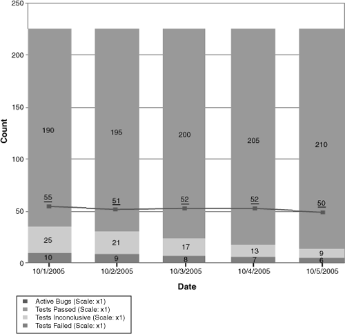
Figure 9.15 On the Quality Indicators chart, the test pass rate is high, but active bugs are also high.
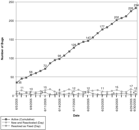
Figure 9.16 Correspondingly, on the Bug Rates chart, active bugs are high because find rate stays high.
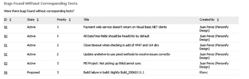
Figure 9.17 Tests aren’t finding the bugs. On this report, many of the bugs found have no corresponding test. This might be a sign that testing is looking elsewhere. And, if you are expecting regression testing to prevent their undiscovered recurrence, you will need regression tests that you don’t have yet.
Tests Are Stale
Tests do not necessarily evolve at the same rate as the code under test. This risk is present especially when tests are heavily automated. In this situation, you see high test pass rates with ongoing code churn and diminishing code coverage (see Figure 9.18).
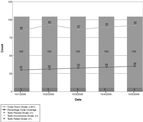
Figure 9.18 This Quality Indicators chart shows a high rate of code churn and a low rate of code coverage from testing, yet test pass rates remain high. This suggests that the tests being run are not exercising the new code. Don’t be lulled by the high test pass rate—these tests are clearly not testing all the new development work.
Solution Stuck in Testing
Sometimes it appears that there is a bottleneck in testing, as indicated by the Remaining Work chart (see Figure 9.19).
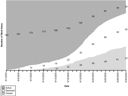
Figure 9.19 This Remaining Work chart shows a bulging line in Resolved, meaning that the developers are reporting work items resolved, but testers haven’t closed them. Further drilldown is warranted.
This bulge in testing can happen for very different reasons. It always merits further drilldown.
Tests Failing
One case is that lots of tests are failing, requiring effort to diagnose the failures and report the bugs. This should prompt you to investigate why the software is failing so often. Note that code churn is stuck at a high level as well, indicating that lots of new code is being written (see Figure 9.20). The next patterns to look for are the ones shown previously in this chapter under “Development Practices Too Loose” (see Figures 9.12 through 9.14).
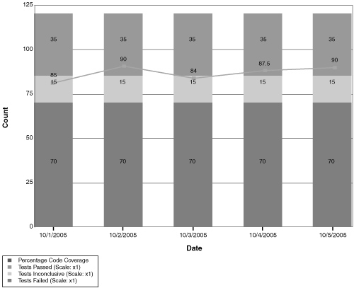
Figure 9.20 The Quality Indicators chart shows that lots of tests are being run with reasonable code coverage, but the tests are failing. This is probably an indicator of loose development practices, although in early iterations, it might be an indicator that the tests are too harsh for this stage of the solution.
It’s also possible that tests are failing because the team discovered an unexpected need to refactor the code. This might be entirely healthy and foreseen—it is exactly the kind of answer that the metrics alone cannot tell you.
Too Little Testing
On the other hand, the problem might be that not enough testing is being done to process the incoming work quickly enough (see Figures 9.21 and 9.22). This could be a limitation of resources, planning, or logistics.
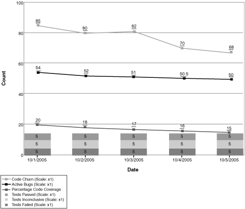
Figure 9.21 This Quality Indicators chart shows a low rate of tests being run. This would probably mean that too little testing has been happening. This could be due to inadequate resource allocation for testing, or it could be that testers are doing something else, such as writing test automation rather than testing the current functionality. In either case, resource balancing may be warranted.
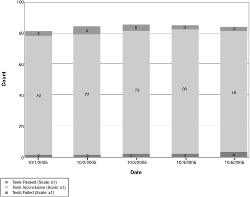
Figure 9.22 A variant pattern that occurs with automated test generation is that the developers have generated tests, but no one has finished the logic, so the tests are inconclusive.
Summary
In this chapter, I showed a large number of antipatterns that projects experience, using examples from the VSTS metrics warehouse. None of these are direct prescriptions for a cure, but they are illustrations of data that allow you to ask the right questions of the team.
When everyone on the team can see the same metrics across all the dimensions, discussions shift from trying to determine the data to trying to answer the questions posed by the data. With trust and transparency, it becomes possible for everyone to participate in identifying and executing solutions.