
10 Reporting results
After you have finished the difficult part, and produced and tested your results, it is time to publish them. Usually this works fairly well, yet some things should be considered in order to reach a professional appearance. It is never a good idea to copy and past Stata output directly into a paper, as it will probably lower your grade. The first problem is that Stata produces a great amount of information that is often not needed in publications, as tables are already large enough and researchers don’t have time to deal with every bit of information. The second aspect is that the Stata format is usually not what editors or professors expect when they think of a nice layout. It is always a good idea to study the most important journals of your field, to get an impression of what a table looks like there, so you can try to adopt this style in your own paper. Otherwise, ask your advisor for examples. We will use a quite generic formatting that could probably be used in any modern journal. We will use the results of the linear regression models from chapter six to produce tables and output.
10.1 Tables
Tables are at the heart of scientific research, as they compress a lot of information into a small area. It might be the case that other methods, like graphs, are better for visualizing your results, yet you are often required to also include a table, so numerical values can be studied when so desired. For our example, we will use a nested regression with three models, which is a very common procedure in sciences. We will, therefore, run three different regression models, and save the results internally, so Stata can produce a combined output.
sysuse nlsw88, clear                                      //Load data

quietly regress wage c.ttl_exp                            //M1

estimates store M1

quietly regress wage c.ttl_exp i.union i.south            //M2

estimates store M2

quietly regress wage c.ttl_exp i.union i.south i.race     //M3

estimates store M3

estimates table M1 M2 M3, se stats(r2 N)

The last line will tell Stata to produce a table which includes all three models, shows standard errors and also adds information about R-squared and the number of cases used. This looks quite fine, but still requires some more work. One problem is that the stars, which should indicate the p-levels, are missing. Also, it is a good idea to round numbers, say, to three decimal places.

estimates table M1 M2 M3, se stats(r2 N) ///

   b(%7.3f) se(%7.3f)
This looks better. Getting this data into your text editor, for example Microsoft Word or LibreOffice Writer, can still be tricky. Highlight the table in Stata, right-click it and select “Copy Table”. Then either go directly to your text editor, right-click and choose “Paste as…” and see which option works best. Sometimes it can be helpful to paste the data into calculation software first, like Excel or Calc, to get better formatting, and copy this table into the text editor. After you have done this, add the stars manually and adjust options for a pretty look. A finished table might look something like this65 (Table 10.1):
Table 10.1: Exemplary regression result table.
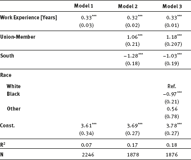
Data Source: NLSW88, own calculations.
The problem is that when using Stata onboard functions, you will need to do some extra work to create these tables, just as we want them. An alternative is a user-written package that can do most steps automatically.
Now we run each model again and store the results using the eststo command:
eststo M1: regress wage c.ttl_exp

eststo M2: regress wage c.ttl_exp i.union i.south

eststo M3: regress wage c.ttl_exp ///

   i.union i.south i.race

esttab M1 M2 M3 using “new_table.rtf”             //Output table
The last command produces the table, and saves it in rtf-fomat in the current working directory. It can be opened in any word processing editor. When you want, you can also export the following file types: txt, csv, html and tex. Esttab offers a great variety of options, so you can customize your tables as you like them, and then save the code in a do-file, so you can use it for future work. The following example shows how powerful the command can be:
esttab M1 M2 M3 using “new_table.rtf”,nogaps ///

   nomtitles r2 star(# 0.10 * 0.05 ** 0.01 *** 0.001) ///

   b(3) se label replace
Nogaps makes the table more compact, nomtitles hides the model names, r2 shows R-squared for each model, star modifies which significance levels should be indicated, b(3) sets the numbers, rounded to three decimal places, se shows standard errors instead of t-values, label shows variable labels and replace overwrites any existing table with the same name in your working directory. If you also want to hide reference categories, include nobase.
10.2 Graphs
Regression tables are important, but can be hard to interpret, especially, when there are interactions present in your models. Graphs are an excellent way of visualizing desired effects, so even people who are not immersed in the topic can understand them (never forget: when you want to influence policy, you have to be understandable by the public). Stata brings some great tools to create these graphs.
Let’s start with the basics. Maybe you just want to show your regression coefficients with standard errors, or even better, confidence intervals. There exists a CCS that can do this for you. Try
ssc install coefplot, replace        //Install CCS
regress wage c.ttl_exp i.union i.south i.race

coefplot, xline(0)

We use coefplot (Jann, 2014) to visualize the coefficients. The xline option adds a vertical bar. When the confidence interval of a variable crosses this line, we know that it is not significant. As we see clearly, all variables have a significant effect (except “other” in race, which is probably due to the low case number for this category 0.
This way we can visualize coefficients neatly. What if we want to predict wages at special values, or for certain groups? No problem. But let’s see how it works before we get fancy. Just type
margins

or click Statistics → Postestimation → Marginal means and predictive margins and click Submit.
You will receive a single number (7.57). How can Stata summarize all variables used in just one number? The estimated coefficients from the regression model above are used to calculate the predicted wage for every person separately. Then Stata calculates the arithmetic mean of these predicted wages, which is our result. We can also calculate the marginal outcome at the mean, which (only in linear models) is identical to the current result:

Stata also presents the empirical means found in the sample. You see that our “average” person has 12.8 years of job experience, and is 24.5% a union member. Calculating means for binary or ordinal variables is easy but a little nonsensical. Therefore, it is a good idea to move on and compute some better statistics, and not use the mean of all variables. Try
margins, at(ttl_exp=(0(5)30))

Stata uses the last regression command to compute the wage of people at several numerical values of job experience, in our case from zero years up to 30 years, in steps of five years. Stata even produces a small table that tells you which values it uses, and then shows the results, including standard errors, in another table. This seems nice, but it gets even better by typing
marginsplot

or click Statistics → Postestimation → Margins plots and profile plots and click Submit.
This is called a conditional-effects plot. What happens here is the following: Stata starts with the first number, which we specified in the command above (which is 0), and internally changes the experience of every single person to that value. Then it predicts, separately for each case, the wage, using the estimated regression coefficients with the individual information, except work experience, which was changed to zero. After that, it averages the predicted wages and reports them to repeat the process with the second specified value. This answers the question, what wages would be if every person had work experience of zero, with all other variables remaining unchanged.
We can do even better, when we differentiate not only by work experience but also by the status of union membership, so try
quietly margins union, at(ttl_exp=(0(5)30))

marginsplot
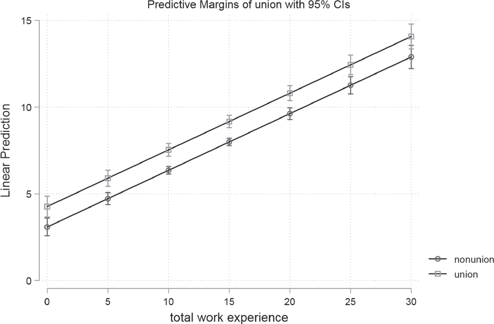
Here the list of computed values gets large so the marginsplot command is really a boon. We can clearly see that union members will always make more than non-members.
We can include as many variables as we want in the at option, for example, to differentiate by region. But this brings a lot of information into one graph, so instead we want subgraphs by union membership:
quietly margins union, at(ttl_exp=(0(5)30) south=(0 1))

marginsplot, by(south)

You can run the last command again (marginsplot), without any options, and decide which you prefer (one VS two graphs). The general interpretation is easy: union-members make more than others, but there are also differences for the regions, as people from the south seem to make less than other people.
Until now the graphs presented only consist of straight lines, as there are no interactions present (for an explanation see page 94). Let’s change that by typing
regress wage c.ttl_exp##c.ttl_exp i.union i.south ///

   i.race
- output omitted -
For the sake of demonstration, we introduced an interaction between job experience and itself (higher ordered term), although usually these decisions should be theory-
driven. We can obtain results by typing
quietly margins union, at(ttl_exp=(0(5)30) south=(0 1))

marginsplot, by(south)

The lines are not straight anymore. Yet we can also learn from the regression output that, in general, the interaction does not make our model any better and we would not report this in a paper (see the p-values for the interaction-term).
You have learned that margins is a very powerful command, with a great number of options and possibilities that cannot be introduced here. To see more, refer to Williams (2012)66 or have a look at the Stata help files for margins and marginsplot. On the website, you will find another do-file that contains more information about graphics and interaction effects.