
11. Analysis of Variance: Further Issues
The sort of statistical analysis that Chapters 8 through 11 examine is called factorial analysis. The term factorial in this context has nothing to do with multiplying successively smaller integers (as Excel does with its FACT() function). In the terminology used by experimental design, a factor is a variable—often measured on a nominal scale—with two or more levels to which the experimental subjects belong.
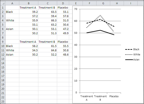
For example, the research that was depicted in the previous chapter’s example and illustrated in Figure 10.11 is an experiment in which the factor—the type of treatment—has three levels: Treatment A, Treatment B, and Placebo. Each subject belongs to one of those levels, and treatment is the single factor considered in the example.
Factorial ANOVA
It’s not only possible but often wise to design an experiment that uses more than just one factor. There are different ways to combine the factors. Figure 11.1 shows two of the more basic approaches: crossed and nested.
Figure 11.1. Two factors can be either crossed or nested.
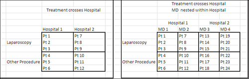
The range B5:D11 in Figure 11.1 shows the layout of a design in which two factors, Hospital and Treatment, are crossed. Every level of Hospital appears with every level of Treatment—and that’s the definition of crossed. The intent of the design is to enable the researcher to look into every available combination of the two factors.
This type of crossing is at the heart of multifactor research. Not only are you investigating, in this example, the relative effects of different treatments on patient outcomes, you are simultaneously investigating the relative effect of different hospitals. Furthermore, you are investigating how, if at all, the two factors interact to produce outcomes that you could not identify in any other way. How else are you going to determine whether laparoscopies, as compared to more invasive surgical techniques, have different results at University Health Center than they do at Good Samaritan Hospital?
Note
It’s perfectly logical to term an experiment that has only one factor a “factorial” design. In another example of the many idiosyncrasies in statistical diction, though, most statisticians reserve the term factorial for a design with at least two factors and use any one of a variety of other terms for a design that uses one factor only.
Contrast that crossed design with the one depicted in G5:K11 of Figure 11.1. Treatment is fully crossed with Hospital as before, but an additional factor, Doctor, has been included. The levels of Doctor are nested within levels of Hospital: In this design, doctors do not practice at both hospitals. You can make the same inferences about Hospital and Treatment as in the fully crossed design, because those two factors remain crossed. But you cannot make the same kind of inference about different doctors at different hospitals because you have not designed a way to observe them in different institutions (and there may be no way to do so). However, there are often other advantages to explicitly recognizing the nesting.
Note
Actually, nesting is going on in the design shown in B5:D11. Patients are nested within treatments and hospitals. This is the case for all factorial designs, where the individual subject is nested within some combination of factor levels. It’s simply not traditional in statistical terminology to recognize that individual subjects are nested, except in certain designs that recognize subject as a factor.
Other Rationales for Multiple Factors
The study of interaction, or how two factors combine to produce effects that neither factor can produce on its own, is one primary rationale for using more than one factor at once. Another is efficiency: This sort of design enables the researcher to study the effects of each variable without repeating the experiment, probably with a different set of subjects.
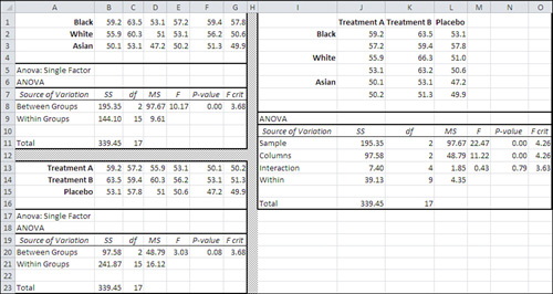
Yet another reason is statistical power: the sensitivity of the statistical test. By including a test of two factors—or more—instead of just one factor, you often increase the accuracy of the statistical tests. Figure 11.2 shows an example of an ANOVA that tests whether there is a difference in cholesterol levels between groups that are given different treatments, or between those treatment groups and a group that takes a placebo.
Figure 11.2. There is no statistically significant difference between groups at the .05 confidence level, but compare to Figure 11.3.
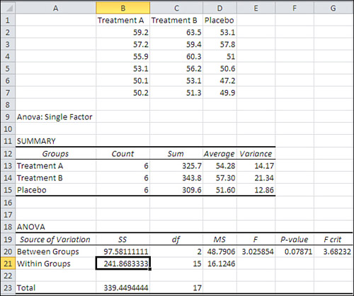
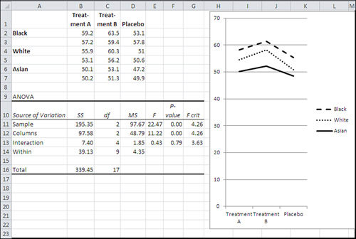
The analysis of variance shown in Figure 11.2 was produced by Excel’s Data Analysis add-in: specifically, its ANOVA: Single Factor tool (discussed in Chapter 10, “Testing Differences Between Means: The Analysis of Variance”). But Figure 11.3 shows how adding another factor makes the F test sensitive enough to decide that there is a reliable, nonrandom difference between the means for different treatments.
Figure 11.3. Adding a factor that explains some of the error variance makes the statistical test more powerful.
Note
I am assuming that you have already read the section in Chapter 2 titled “Understanding Formulas, Results, and Formats.” That section explains why the F ratio in cell E11 might appear to be off by a couple of hundredths when you divide, by hand, the “Mean Square Sample” by the “Mean Square Within.” In fact, the result is accurate to sixteen decimal places. There is no rounding error. I simply chose to show only two decimals in the numerator and denominator, instead of inflicting sixteen decimals on you in cells D11 and D14.
In Figure 11.3, the ANOVA summary table is shown in cells A9:G16. Some aspects of its structure look a little odd, and this chapter covers them in the section titled “Using the Two-Factor ANOVA Tool.” The ANOVA in Figure 11.3 was produced by the Data Analysis add-in named ANOVA: Two Factor with Replication. That tool was used instead of the single-factor ANOVA tool because the example now has two factors: Treatment and Ethnicity.
The numbers for the input data are precisely the same as in Figure 11.2. The only difference is that the patient ethnicity factor has been added. But as a direct result, the Treatment effect is now significant at below the .05 level (see cell F12) and the Ethnicity factor is also significant below .05 (see cell F11).
How does that come about? If you look at the row in the ANOVA table for Between Groups in Figure 11.2, you’ll see that the Mean Square Between in cell D20 is 48.79. It’s the same in cell D12 in Figure 11.3. That’s as it should be: Adding a factor, Ethnicity, has no effect on the mean values for Treatment, and it’s the variability of the treatment means that is measured by the value of 48.79 as that factor’s mean square.
However, the value of the F ratio in Figure 11.2 (3.026 in cell E20) is smaller than the F ratio in Figure 11.3 (11.22 in cell E12)—the value in Figure 11.3 is more than three times as large, even though the numerator of 48.79 is identical. The cause of the much larger F ratio in Figure 11.3 is its much smaller denominator.
In Figure 11.2, 48.79 is divided by the Mean Square Within of 16.12 to result in an F ratio of 3.026, too small to reject the null hypothesis with so few degrees of freedom.
In Figure 11.3, 48.79 is divided by the Mean Square Within of 4.35, much smaller than the value of 16.12 in Figure 11.2. The result is a much larger F ratio, 11.22, which does support rejecting the null hypothesis at the .05 confidence level.
Here’s what happens: The amount of total variability stays the same when the Ethnicity factor is recognized. However, that Ethnicity factor accounts for 195.35 of the sums of squares that in Figure 11.2 are allocated to Mean Square Within. The remaining sums of squares for the within-cell variation drops dramatically, from 241.87 (cell B21 in Figure 11.2) to 39.13 (cell B14 in Figure 11.3). The mean square also drops, along with the sum of squares, the denominator shrinks, and the F ratio increases to the point that the observed differences among the treatment means are quite unlikely if the null hypothesis is true—and so we reject it.
And this happens to the Treatment factor because we have added the simultaneous analysis of the Ethnicity factor.
Using the Two-Factor ANOVA Tool
To use the Data Analysis add-in’s ANOVA: Two Factor with Replication tool, you must lay out your data in a particular way. That way appears in Figure 11.3, and there are several important issues to keep in mind.
You must include a column on the left and a row at the top of the input data range, to hold column and row labels if you want to use them. You can leave that column and row blank if you want, but Excel expects the row and column to be there, bordering the actual numeric data. When I ran the ANOVA tool on the data in Figure 11.3, for example, the address of the data range I supplied was A1:D7, where column A was reserved for row headers and row 1 was reserved for column headers.
You must have the same number of observations in each cell. A cell in ANOVA terminology is the intersection of a row level and a column level. Therefore, in Figure 11.3, the range B2:B3 constitutes a cell, and so does B4:B5, and C6:C7 and so on; there are nine cells in the design.
Note
The remainder of this chapter, and of this book, attempts to distinguish between a cell in a design (“design cell”) and a cell on a worksheet (“worksheet cell”) where the potential for confusion exists. So a design cell might refer to a range of worksheet cells, such as B2:B3, and a worksheet cell might refer to B2.
Each design cell in your input data for the two-factor ANOVA tool must have the same number of observations. To understand how the add-in ensures that you’re not trying to cheat and sneak an extra observation in one design cell or another, it’s best to take a look at how the dialog box forces your hand (see Figure 11.4).
Figure 11.4. Notice that the dialog box does not ask you if you’re using labels: It assumes that you are doing so.
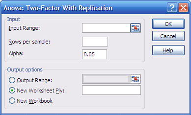
The input range, as noted earlier, is A1:D7. If you fail to reserve a row and a column for column and row labels, Excel displays the cryptic complaint that “Each sample must contain the same number of rows.”
Note
The tool discussed in this section is named ANOVA: Two Factor with Replication. The term replication refers to the number of observations in a design cell. The design cells in Figure 11.3 each have two observations, or “replicates.” The third ANOVA tool in the Data Analysis add-in allows for a special sort of design that has only one replicate per design cell—hence the tool’s name, “ANOVA: Two Factor Without Replication.” The final section in this chapter provides some information on that special type of design.
That initial column for row headers excepted, the add-in assumes that each remaining column in your input range represents a different level of a factor. In Figure 11.3, for example, more data could have been added in E1:E7 to accommodate another level of the Treatment factor.
So that Excel can check that all your design’s cells have the same number of observations, you’re required to enter the number of “rows per sample.” This is more idiosyncratic terminology: more standard would have been “observations per design cell.” However, for the data in Figure 11.3, there are two observations (in this case, two patients) per design cell (or two rows per sample, if you prefer), so you would enter 2 in the Rows Per Sample text box.
You could enter 1 in the Rows Per Sample box if you wanted, and the add-in would not complain, even though with one observation per cell there can be no within-cell variance and you’ll get ridiculous results. But Excel does complain if you don’t provide a row and a column for headers. It’s a funny world.
Missing data isn’t allowed. In the Figure 11.3 example, no worksheet cell may be blank in the range B2:D7. If you leave a cell blank, Excel complains that nonnumeric data was found in the input range.
The edit box for Alpha serves the same function as it does in the ANOVA: Single Factor tool discussed in Chapter 10: It tells Excel how to determine the F Crit value in the output. For example, cell G12 in Figure 11.3 gives 4.26 as the value of F Crit, which is the value that the calculated F ratio must exceed if the differences in the group means for the Treatment factor are to be regarded as statistically significant. Excel uses the degrees of freedom and the value of alpha that you specify to find the value of F Crit. Suppose that you specify .05. Excel uses either the F.INV() or the F.INV.RT() function. If you prefer to think in terms of the 95% of the distribution to the left of the critical value, use F.INV():
=F.INV(0.95,2,9)
Here’s the alternative if you prefer to think in terms of the 5% of the distribution to the right of the critical value:
=F.INV.RT(0.05,2,9)
In either case, Excel knows that the F distribution in question has 2 and 9 degrees of freedom. It knows about the 2 because it can count the three levels of the Treatment factor in your range of input data, and three levels less one for the grand mean results in 2 degrees of freedom. It knows about the 9 because it can count the total number of observations in your input data range (18), subtract the degrees of freedom for each of your two factors (4 in total), and subtract another 4 for the interaction (you’ll see shortly how to calculate the degrees of freedom for an interaction). That leaves 10, and subtracting another 1 for the grand mean leaves 9.
In sum, you supply the alpha and the input range via the dialog box shown in Figure 11.4, and Excel can use that information to calculate the F Crit values to which you will compare the calculated F values.
By the way, don’t read too much significance into the labels that the ANOVA: Two Factors with Replication tool puts in its ANOVA summary table. In Figure 11.3, notice that the tool uses the label “Sample” in cell A11, and the label “Columns” in cell A12.
In this particular example, Sample refers to the Ethnicity factor and Columns refers to the Treatment factor. The labels Sample and Columns are defaults and there is no way to override them, short of overwriting them after the tool has produced its output. In particular, Samples representing Ethnicity does not imply that the levels of Treatment are not samples, and Columns for levels of Treatment does not imply that levels of Ethnicity are not in rows.
Further, the two-factor ANOVA tool uses the label “Within” to indicate the source of within groups variation (cell A14 in Figure 11.3). The one-factor ANOVA tool uses the label “Within Groups.” The difference in the labels does not imply any difference in the meaning of the associated statistics. Within Groups Sum of Squares, regardless of whether it’s labeled “Within” or “Within Groups,” is still the sum of the squared deviations of the individual observations in each design cell from that cell’s mean. Later in this book, where multiple regression is discussed as an alternative approach to ANOVA, you’ll see the term Residual used to refer to this sort of variability.
The Meaning of Interaction
The term interaction, in the context of the analysis of variance, means the way the factors operate jointly: They have different effects with some combinations of levels than with other combinations. Figure 11.5 shows an illustration.
Figure 11.5. Treatment B has a different effect on white participants than on the other two groups.
I changed the input data shown in Figure 11.3 for the purpose of Figure 11.5: The scores for the two white subjects in Treatment B were raised roughly 6 points each. All the other values are the same in Figure 11.5 as they were in Figure 11.3. The result—as you can see by comparing the charts in Figure 11.3 with the chart in Figure 11.5—is that the mean value for white subjects increases to the point that it is higher than for black subjects in Treatment B.
In Figure 11.3, interaction is absent. Regardless of Treatment, blacks have the highest scores, followed by whites and then by Asians. Treatment B yields the highest scores, followed by Treatment A and then Placebo. There is no differential effect of Treatment according to Ethnicity.
In Figure 11.5, interaction is present. Of the nine possible combinations of three treatments and three ethnicities, eight are the same as they were in Figure 11.3, but the ninth—Treatment B with whites—climbs markedly, so that whites’ scores under Treatment B are higher than both blacks’ and Asians’. There is a differential effect, an interaction, between ethnicity and treatment.
The researcher would not have been able to determine this if two single-factor experiments had been carried out. The data from one experiment would have shown that blacks have the highest average score, followed by whites and then by Asians. The data from the other experiment would have shown that Treatment B yields the highest scores, followed by Treatment A and then Placebo. There would have been no hint, no reason to believe, that Treatment B would have such a marked effect on whites.
The Statistical Significance of an Interaction
ANOVA terminology calls factors such as Treatment and Ethnicity in the prior example main effects. This helps to distinguish them from the effects of interactions.
In a design with the same number of observations in each design cell (such as the example that this chapter has discussed, which has two observations per design cell), the sums of squares, degrees of freedom, and therefore the mean squares for the main effects are identical to the results of the single-factor ANOVA. Figure 11.6 demonstrates this.
Figure 11.6. The main effects in the single-factor ANOVAs are the same as in the two-factor ANOVA.
The same data set used in Figure 11.3 is analyzed three times in Figure 11.6. (In practice, you would never do this. It’s being done here only to show how main effects are independent of each other and of interactions in an ANOVA with equal group sizes.) The analyses are as follows:
• The range A1:G11 runs a single-factor ANOVA with Ethnicity as the factor.
• The range A13:G23 runs a single-factor ANOVA with Treatment as the factor.
• The range I1:O16 runs a two-factor ANOVA, including the interaction term for Ethnicity and Treatment.
Compare the Between Groups Sum of Squares, df, and MS in worksheet cells B8:D8 with the same statistics in J11:L11. You will be comparing the variance due to Ethnicity group means in the single-factor ANOVA with the same statistics in the two-factor ANOVA. Notice that they are identical, and you’ll see the same sort of thing in any ANOVA that has an equal number of observations, or equal n’s, in each of its design cells. The analysis of the main effect in a single-factor ANOVA will be identical to the same main effect in a factorial ANOVA, up to the F ratio. The sums of squares, degrees of freedom, and mean squares will be the same in the single-factor ANOVA and the factorial ANOVA.
As a further example, compare the Between Groups Sum of Squares, df, and MS in cells B20:D20 with the same statistics in J12:L12. You will be comparing the variance due to Treatment group means in the single-factor ANOVA with the same statistics in the two-factor ANOVA. Notice that they are, again, identical.
In each case, though, the associated F ratio is different in the single-factor case from its value in the two-factor case. The reason has nothing to do with the main effect itself. It is due solely to the second factor, and to the interaction, in the two-factor analysis. The Sums of Squares for the second factor and the interaction in the two-factor analysis were part of the Within Group variation in the single-factor analysis. Moving these quantities into the interaction in the factorial ANOVA reduces the Mean Square Within, which is the denominator of the F test here. Thus, the F ratio is different. As this chapter has already pointed out, that change to the magnitude of the F ratio can convert a less sensitive test that retains the null hypothesis to a more powerful statistical test that rejects the null hypothesis.
Calculating the Interaction Effect
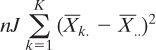
You can probably infer from this discussion that there is no difference between the single-factor and the multiple-factor ANOVA in how the sums of squares and mean squares are calculated for the main effects. Sum the squared deviations of the group means for each main effect from the grand mean. Divide by the degrees of freedom for that effect to get its mean square. Nothing about the two-factor ANOVA with equal n’s changes that. Here it is again in equation form:
![]()
In this equation, n is the number of observations (also known as “replicates”) per cell, K is the number of levels of the other main effect, and J is the number of levels of Ethnicity. Similarly, the sum of squares for Treatment would be as follows:
![]()
Tip
If you ever have to do this sort of thing by hand in an Excel worksheet, remember that the DEVSQ() function is a handy way to get the sum of the squared deviations of a set of individual observations or a set of means that represent a main effect. The DEVSQ() function could replace the summation sign and everything to its right in the two prior formulas. You can see how this is done in the Excel workbooks for Chapter 10 and Chapter 11, which you can download from www.informit.com/title/9780789747204.
The interaction calculation is different—by definition, really, because there can be no factor interaction in a single-factor ANOVA. Described in words, the calculation sounds a little intimidating, so be sure to have a close look at the formula that follows. In this example, the interaction sum of squares for the Treatment and the Ethnicity main effects is the squared sum of each group mean, less the mean of each level that the group belongs to, plus the grand mean, multiplied by the number of observations per design cell.
Here’s the formula:
![]()
Figure 11.7 repeats the data set given earlier in Figure 11.5, with increased values for whites in Treatment B so as to create a significant interaction. The data set is in A1:D7.
Figure 11.7. This figure shows how worksheet functions calculate the sums of squares that are the basis of the two-factor ANOVA.

The range F1:L8 contains the ANOVA table for the data in A1:D7, and you can see that the interaction is now statistically significant at the .05 level. (It is not significant in Figure 11.3, but I have raised the values for whites under Treatment B for Figure 11.7; so doing makes the interaction statistically significant and also changes the sums of squares for both main effects.)
In Figure 11.7, the range F10:J14 contains the group averages, the main effects averages, and their labels. For example, cell G11 contains 58.20, the average value for blacks under Treatment A. Cell J11 contains 58.37, the overall average for blacks, and cell G14 contains 54.28, the overall average for Treatment A. Cell J14 contains 55.12, the grand mean of all observations.
With that preliminary work in F10:J14, it’s possible to get the sums of squares for both main effects and the interaction. After that it’s easy to complete the ANOVA table, dividing the sums of squares by the degrees of freedom to get mean squares, and finally forming ratios of mean squares to get the F ratios.
First, cell L12 contains 217.30. The formula in the cell is
=2*3*DEVSQ(J11:J13)
Following the formula for the Ethnicity main effect given earlier in this section, it is the number of observations per group (2) times the number of levels of the other main effect (3), times the sum of the squared deviations of the Ethnicity group means from the grand mean. The result is identical to the sum of squares for Ethnicity in worksheet cell G3 of Figure 11.7, which was produced by the ANOVA: Two Factor with Replication add-in.
Similarly, cell H16 contains 191.90. The cell’s formula is
=2*3*DEVSQ(G14:I14)
It is the sum of squares for the Treatment main effect, and its result is identical to the result produced by the ANOVA tool in worksheet cell G4.
The formulas in G3 and H16 both follow the general pattern given earlier by
![]()
Still using Figure 11.7, you find the sum of squares for the interaction between Treatment and Ethnicity in worksheet cell G5, produced by the ANOVA tool. Its value, 66.47, also appears in cell H22. The way to arrive at the sum of squares for the interaction requires a little explanation.
I repeat here the general formula for the interaction sum of squares:
![]()
The first part of that equation
![]()
is what’s represented in the formula in cell H22:
=2*SUM(G18:I20)
This formula sums across the values in the intersections of rows 18 to 20 and columns G to I, and then doubles that sum because there are two observations per design cell.
The second part of the equation
![]()
represents what’s in each of the cells in G18:I20. Cell G18, for example, contains this formula:
=(G11−G$14−$J11+$J$14)∧2
It takes the value of cell G11 (blacks under Treatment A), subtracts the mean in G14 for everyone under Treatment A, subtracts the mean for all blacks in the experiment in J11, and adds the grand mean of all scores in J14. The result is the unique effect of being in that design cell: a black subject taking Treatment A. In terms of the general formula, cell G18 uses these values:
• ![]() is the cell, G11, with the mean scores of blacks under Treatment A, worksheet cells B2:B3.
is the cell, G11, with the mean scores of blacks under Treatment A, worksheet cells B2:B3.
• ![]() is the cell, G14, that contains the mean of all scores in Treatment A, worksheet cells G11:G13.
is the cell, G14, that contains the mean of all scores in Treatment A, worksheet cells G11:G13.
• ![]() is the cell, J11, that contains the mean of all blacks’ scores in G11:I11.
is the cell, J11, that contains the mean of all blacks’ scores in G11:I11.
• ![]() is the cell that contains the grand mean of all scores, J14.
is the cell that contains the grand mean of all scores, J14.
Notice that the formula in cell G18 uses relative, mixed, and absolute addressing. Once you have entered it in G18, you can drag it two columns to the right to pick up the proper formulas for blacks under Treatment B and also under Placebo, in cells H18:I18. Once the first row of three formulas has been established (in G18:I18), select those three cells and drag them down into G19:I20 using the fill handle (that’s the small black square in the bottom-right corner of the selection). The formula adjusts to pick up whites and Asians under Treatment B and Placebo.
Finally, add up the values in in G18:I20. Multiply by 2, the number of observations per design cell, to get the full sum of squared deviations for the interaction in worksheet cell H22.
The degrees of freedom for the interaction is, by comparison, much easier to find. Just multiply together the degrees of freedom for each main effect involved in the interaction. In the present example, each main effect has two degrees of freedom. Therefore, the Treatment by Ethnicity interaction has four degrees of freedom. If there had been another level of Treatment, then the Treatment main effect would have had three degrees of freedom and the interaction would have had six degrees of freedom.
I am aware that I have belabored these formulas beyond what’s needed to complete a basic 3-by-3 analysis of variance, main effects and interaction. I’m doing it anyway for two reasons that seem pretty good to me.
One is that in keeping with most of the output provided by the Data Analysis add-in’s tools, there are no formulas—just static values. A worksheet cell that contains a mean square does not contain the formula that calls for the worksheet cell with the sum of squares to be divided by the worksheet cell with the degrees of freedom. Nor does a worksheet cell that contains an F ratio contain a formula that divides a main effect mean square by a within group’s mean square. All you get in the output is the result of the calculation.
That makes it hard to look more closely at what’s going on, or to otherwise check on it. For example, when I’m learning a statistical procedure, I like to be able to change an observation here and an observation there, to see what effect my changes have on the outcome.
It’s a useful learning technique to see what happens when you change an observation that is, at present, close to a group’s mean to a value that’s far from the group’s mean. So doing can have a major impact on both a main effect’s variance and an interaction’s variance, with consequences for whether either effect takes you outside the level you’ve set for alpha—or makes what had been a significant effect an insignificant one.
But with the ANOVA tools in the Data Analysis add-in, you can’t do that. All the results are static values. If you know what the formulas are and how they work, you can substitute them and do your own experimenting with the input data.
More important—and the second reason for emphasizing the formulas—is that I’ve provided definitional formulas in this chapter. It’s fairly clear why they do what they do: For example, they accumulate squared deviations from a mean, and that’s just what a variance does. Using the definitional formulas, it’s easier to see the parallels between the inferential statistics and the descriptive statistics that form their underpinnings.
Unfortunately, those conceptually rich definitional formulas cause problems if you’re a human being trying to apply them to real-world numbers. People rearranged the formulas a hundred years ago and in so doing made them less arduous for paper-and-pencil calculations, and less prone to serious rounding error. Even 40 years ago, when hand calculators started to feature temporary memories and square root functions, there were calculation formulas that were easier to use than the definitional formulas.
But although the calculation formulas were easier to use in the absence of PCs, they did not convey the concepts behind them. Here’s one calculation formula, widely used back in the day:

Does that look to you like a formula for the sum of squared deviations from a mean? It didn’t to me in 1980 and it doesn’t now. But it is. Here’s what the formula for squared deviations from a mean looks like to me:
Take the mean of a factor level, subtract the grand mean, square the difference, sum the squared differences, and multiply to account for the number of observations and the number of levels in the other factor. Still a touch complicated but nothing like the preceding formula.
The point is that with Excel you can work with formulas that are easy to understand, without going through the kinds of labored computations that used to result in rounding errors and even more egregious, paper-and-pencil arithmetic errors. Therefore, I emphasize those definitional formulas and show you how they work out in the context of an Excel worksheet. As long as you’re willing to slog through some paragraphs that might seem like over-explaining, you’ll emerge with a better understanding of why these analyses work as they do.
And when we get around to showing how analysis of variance is just a different way of using multiple regression, you’ll be better prepared to understand the relationships involved.
The Problem of Unequal Group Sizes
In ANOVA designs with two or more factors, group size matters. As it turns out, when you have the same number of observations in each design cell, there is no ambiguity in how the sums of squares are partitioned—that is, how the sums of squares are allocated to the row factor, to the column factor, to the interaction, and to the remaining within-cell sums of squares.
That’s how the examples used so far in this chapter have been presented. Figure 11.8 shows another example of what’s called a balanced design.
Figure 11.8. In a balanced design, the total sum of squares is the same whether it’s calculated directly or by summing the main effects, interaction, and within-cell.
Figure 11.8 shows two ways of calculating the total sum of squares in the design. Recall that the total sum of squares is the total of each observation’s squared deviation from the grand mean. It is the numerator of the variance, and the degrees of freedom is the denominator. Returning briefly to the logic of ANOVA, it’s that total sum of squares that we want to partition, allocating some to differences in group means and, in factorial designs, to the interaction.
In Figure 11.8, notice cells B16 and B17. They display the same value, 2510.94, for the total sum of squares, but the two cells arrive at that value differently. Cell B16 uses Excel’s DEVSQ() function on the original data set in C3:E8. As you’ve already seen, DEVSQ() returns the sum of the squared deviations of its arguments from their mean—the very definition of a sum of squares.
Cell B17 calculates the total sum of squares differently. It does so by adding up the sum of squares as allocated to the Patient factor, to the Treatment factor, to the interaction between the two factors, and to the remaining variability within design cells that is not associated with differences in the means of the factor levels.
Because the two ways of calculating the total sum of squares have identical results, these points are clear:
• All the variability is accounted for by the main effects, interaction, and within-group sums of squares. Otherwise, the sum of squares from totaling the main effects, interaction, and within-group sources would be less than the sum of squares based on DEVSQ().
• None of the variability has been counted twice. For example, it is not the case that some of the variability has been allocated to the Patient and also to the Patient by Treatment interaction. Otherwise, the sum of squares from totaling the main effects, interaction, and within-group sources would be greater than the sum of squares based on DEVSQ().
In other words, there is no ambiguity in how the sums of squares are divided up among the various possible sources of variability.
Now compare the total sums of squares calculated in Figure 11.8 with the totals in Figure 11.9.
Figure 11.9. In an unbalanced design, the total sum of squares as calculated directly differs from the total of the main effects, interaction, and within-cell.
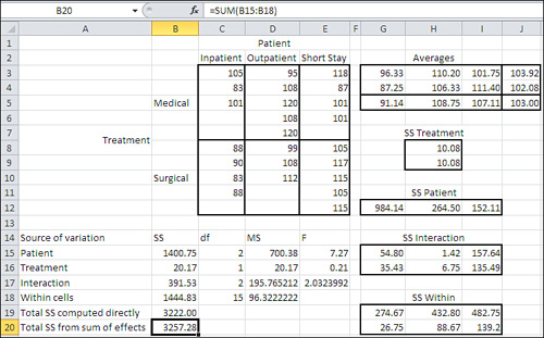
In Figure 11.9, the design has groups whose sizes are not identical to one another: Two groups have three observations, two have four observations, and two have five. The unequal design cell frequencies—often termed unequal n’s—introduce ambiguity in how the total sum of squares is to be allocated. Notice that cell B19, which calculates the total sum of squares using DEVSQ(C3:E12), returns a smaller value (3222.00) than does cell B20, which returns 3257.28 as the total of the sums of squares for the main effects, interaction effects, and within groups.
The DEVSQ() result is inarguable: That is the total sum of squares available for allocation among the sources of variation. But a quantity of 35.28 has been counted twice and some of the surplus has been put in the sum of squares for Patient, some for Treatment, some for the interaction, and some to the remaining within-cell variability.
The underlying reason for this situation will not become clear until Chapter 12, “Multiple Regression Analysis and Effect Coding: The Basics,” but it is due to the unequal n’s. With one important exception, any time you have unequal n’s in the cells of your design—any time that different combinations of one or more factor levels have different numbers of observations—the sums of squares in the ANOVA become ambiguous. When the sums of squares are ambiguous, so are the mean squares and therefore the F ratios, and you can no longer tell what’s going on with the associated probability statements.
Note
An occasionally important exception to the problem I’ve just described is proportional cell frequencies. This situation comes about when each level of one factor has, say, twice as many observations as the same level on the other factor. The multiplier could be a number other than 2, of course, such as 1.5 or 2.5. The condition that must be in place is as follows: The number of observations in each design cell must equal the product of the number of observations in its row, times the number of observations in its column, divided by the total number of observations. If that condition is met, the partitioning of the sums of squares is unambiguous. You can’t use Excel’s Data Analysis two-factor ANOVA tool on such a data set, because it demands equal numbers of observations in each design cell. But the methods discussed in Chapter 12, including the Data Analysis Regression tool, work just fine.
Several approaches are available to you if you have a design with two or more factors, unequal n’s, and disproportional frequencies. None of these approaches is consistent with the ANOVA tools in the Data Analysis add-in. These methods are discussed in Chapter 12, though, and you’ll find that they are so powerful and flexible that you won’t miss the ANOVA tools when you have two or more factors and unequal n’s.
Repeated Measures: The Two Factor Without Replication Tool
There’s a third ANOVA tool in the Data Analysis add-in. Chapters 10 and 11 have discussed the single-factor ANOVA tool and the ANOVA tool for two factors with replication. This section provides a brief discussion of the two-factor without replication tool.
First, a reminder: In ANOVA terminology, replication simply means that each design cell has more than one observation, or replicate. So, the name of this tool implies one observation per design cell. There is a type of ANOVA that uses one observation per design cell, traditionally termed repeated measures analysis. It’s a special case of a design called a randomized block, in which subjects are assigned to blocks that receive a series of treatments. The “randomized” comes from the usual condition that treatments be randomly assigned to subjects within blocks; but this condition does not apply to a repeated measures design.
The subjects are chosen for each block based on their similarity, in order to minimize the variation among subjects within blocks: This will make the tests of differences between treatments more powerful. You often find siblings assigned to a block, or pairs of subjects who are matched on some variable that correlates with the outcome measure.
Alternatively, the design can involve only one subject per block, acting as his own control, and in that case the randomized block design is termed a repeated measures design. This is the design that ANOVA: Two Factor without Replication is intended to handle.
But here’s what Excel’s documentation as well as other books on using Excel for statistical analysis don’t tell you: A randomized block design in general and a repeated measures design in particular make an additional assumption, beyond the usual ANOVA assumptions about issues such as equal cell variances. This design assumes that the covariances between different treatment levels are homogeneous: not necessarily equal, but not significantly different (the assumptions of homogeneous variances and covariances are together called compound symmetry). In other words, the data you obtain must not actually contradict the hypothesis that the covariances in the population are equal. If your data doesn’t conform to the assumption, then your probability statements are suspect.
You can use a couple of tests to determine whether your data set meets this assumption, and Excel is capable of carrying them out. (Box’s test is one, and the Geisser-Greenhouse conservative F test is another.)
However, these tests are laborious to construct, even in the context of an Excel worksheet. My recommendation is to use a software package that’s specifically designed to include this sort of analysis. In particular, the multivariate F statistic in a multivariate ANOVA test does not make the assumption of homogeneity of covariance, and therefore if you arrange for that test, in addition to the univariate F, you don’t have to worry about Messrs. Box, Geisser, and Greenhouse.
Excel’s Functions and Tools: Limitations and Solutions
This chapter has focused on two-factor designs: in particular, the study of main effects and interaction effects in balanced designs—those that have an equal number of observations in each design cell. In doing so, the chapter has made use of Excel’s Data Analysis add-in and has shown how to use its ANOVA: Two Factor with Replication tool so as to carry out an analysis of variance. One limitation in particular is clear: You must have equal design cell sizes to use that tool.
In addition, the tool imposes a couple other limitations on you:
• It does not allow for three or more factors. That’s a standard sort of design, and you need a way to account for more than just two factors.
• It does not allow for nested factors. Figure 11.1 shows the difference between crossed and nested factors, but does not make clear the implications for Excel’s two-factor ANOVA tool (see Figure 11.10).
Figure 11.10. If you show the nested factor as crossed, the nature of the design becomes clearer.
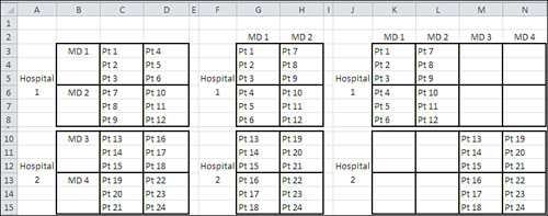
As the design is laid out in Figure 11.10, in A3:D15, it’s clear that MD is nested within Hospital: That is, it’s not the case that each level of MD appears at each level of Hospital. However, although it’s customary to depict the design in that way, it doesn’t conform to the expectations of the ANOVA two-factor add-in. That tool wants one factor’s levels to occupy different rows and the other factor’s levels to occupy different columns.
If you lay the design out as the ANOVA tool wants—as shown in F2:H15 in Figure 11.10—then you’re acting as though you have a fully crossed design. That design has only two levels of the MD factor, whereas in fact there are four. Certainly MDs do not limit their practices to patients in one hospital only, but the intent of the experiment is to account for MDs within hospitals, not MDs across hospitals.
The design as laid out in J2:N15 shows the nesting clearly and conforms to the ANOVA tool’s requirement that one factor occupy columns and that the other occupy rows. However, that inevitably leads to empty cells, and the ANOVA tools won’t accept empty cells, whether of the worksheet cell variety or the design cell variety. The ANOVA tools regard such cells as nonnumeric data and won’t process them.
Here’s another limitation of the Data Analysis add-in: The ANOVA tools do not provide for a very useful adjunct, one or more covariates. A covariate is another variable that’s normally measured at the same level of measurement as the outcome or dependent variable. The use of a covariate in an analysis of variance changes it to an analysis of covariance (ANCOVA) and is intended to reduce bias in the outcome variable and to increase the statistical power of the analysis.
These difficulties—unequal group sizes in factorial designs, three or more factors, and the use of covariates—are dealt with in Chapter 12. As you’ll see, the analysis of variance can be seen as a special case of something called the General Linear Model, which this book hinted at in the discussion surrounding Figure 10.2. Regression analysis is a more explicit way of expressing the General Linear Model, and Excel’s support for regression is superb.
I have reluctantly omitted two topics in the analysis of variance from this discussion because Excel is not geared up to handle them: the statistical power of the F test and mixed models.
Power of the F Test
Chapter 9, “Testing Differences Between Means: Further Issues,” goes into some detail regarding the power of t-tests: both the concept and how you can quantify it. F tests in the analysis of variance can also be discussed in terms of statistical power: how it is affected by the hypothetical differences in population means, sample sizes, the selected alpha level, and the underlying variability of numeric observations.
However, in Excel it’s fairly easy to depict an alternative distribution, one that might exist if the null hypothesis is wrong, in the case of the t-test. That alternative distribution has the same shape, often normal or close to normal, as the distribution when the null hypothesis is true. That’s not the case with the F distribution.
When the null hypothesis of equal group means is false, the F distribution does not just shift right or left as the t-distribution does. The F distribution stretches out to assume a different shape, and becomes what’s called a noncentral F. To quantify the power of a given F test, you need to be able to characterize the noncentral F and compare it to the central F distribution, which applies when the null hypothesis is true. Only by comparing the two distributions can you tell how much of each lies above and below the critical F value, and that’s the key to determining the statistical power of the F test.
You can determine the shape of the noncentral F distribution only through integral calculus, which is either very laborious in an Excel worksheet or requires external assistance from VBA or some other coding language. Therefore, I have chosen to omit a discussion of calculating the power of the F test from this book.
However, that doesn’t mean you can’t do it. The fundamental figures are all available, even from the Data Analysis add-in’s ANOVA tools: sample sizes, factor level effects, and within-group variance. By combining those figures you can come up with what’s called a noncentrality parameter for use in a power table that’s often included as an appendix to statistics textbooks.
Mixed Models
It is possible to regard one factor in a factorial experiment as a fixed factor and another factor as a random factor. When you regard a factor as fixed, you adopt the position that you do not intend to generalize your experimental findings to other possible levels of that factor. For example, in an experiment that compares two different medical treatments, you would probably regard treatment as a fixed factor and not try to generalize to other treatments not represented in the experiment.
But in that same experiment, you might well also have a random factor such as hospital. You want to account for variability in outcomes that is due to the hospital factor, so you include it. However, you don’t want to restrict your conclusions about treatments to their use at only the hospitals in your experiment, so you regard the hospitals as a random selection from among those that exist, and treat Hospital as a random factor.
If you have a random factor and a fixed factor in the same experiment, you are working with a mixed model.
In terms of the actual calculations, Excel’s two-factor ANOVA tool with replication will work fine on a mixed model, although you do have to change the denominator of the F test for the fixed factor from the within-group mean square to the interaction mean square. But the real difficulty lies in the assumption of compound symmetry, which is also a problem for the repeated measures design. Therefore, I have chosen not to discuss mixed models beyond these few paragraphs. As I did in the section on repeated measures, I recommend that you consider different software than Excel to analyze the data in a mixed model.