
12. Multiple Regression Analysis and Effect Coding: The Basics
Chapter 10, “Testing Differences Between Means: The Analysis of Variance,” and Chapter 11, “Analysis of Variance: Further Issues,” focus on the analysis of variance, or ANOVA, partly because it’s a familiar approach to analyzing the reliability of the differences between three or more means, but also because Excel offers a variety of worksheet functions and Data Analysis tools that support ANOVA directly. Furthermore, if you examine the definitional formulas for components such as sum of squares between groups, it can become fairly clear how ANOVA accomplishes what it does.
And that’s a good foundation. As a basis for understanding more advanced methods, it’s good to know that ANOVA allocates variability according to its causes: differences between group means and differences between observations within groups. If only as a point of departure, it’s helpful to be aware that the allocation of the sums of squares is neat and tidy only when you’re working with equal group sizes (or proportional group sizes; see Chapter 11 for a discussion of that exception).
But as it’s traditionally managed, ANOVA is very restrictive. Observations are grouped into design cells that help clarify the nature of the experimental design that’s in use (review Figures 11.1 and 11.10 for examples), but that aren’t especially useful for carrying out the analysis.
There’s a better way. It gets you to the same place, by using stronger and more flexible methods. It’s multiple regression, and it tests differences between group means using the same statistical techniques that are used in ANOVA: sums of squared deviations of factor-level means compared to sums of squared deviations of individual observations. You still use mean squares and degrees of freedom. You still use F tests.
But your method of getting to that point is very different. Multiple regression relies on correlations and their near neighbors, percentages of shared variance. It enables you to lay your data out in list format, which is a structure that Excel (along with most database management systems) handles quite smoothly. That layout enables you to deal with most of the drawbacks to using the ANOVA approach, such as unbalanced designs (that is, unequal sample sizes) and the use of covariates.
At bottom, both the ANOVA and the multiple regression approaches are based on the General Linear Model, and this chapter will have a bit more to say about that. First, let’s compare an ANOVA with an analysis of the same data set using multiple regression techniques.
Multiple Regression and ANOVA
Chapter 4, “How Variables Move Jointly: Correlation,” provides some examples of the use of multiple regression to predict values on a dependent variable given values on predictor variables. Those examples involved only variables measured on interval scales: for example, predicting weight from height and age. To use multiple regression with nominal variables such as Treatment, Diagnosis, and Ethnicity, you need a coding system that distinguishes the levels of a factor from one another, using numbers such as 1 and 0.
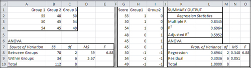
Figure 12.1 shows how the same data would be laid out for analysis using ANOVA and using multiple regression.
Figure 12.1. ANOVA expects tabular input, and multiple regression expects its input in a list format.
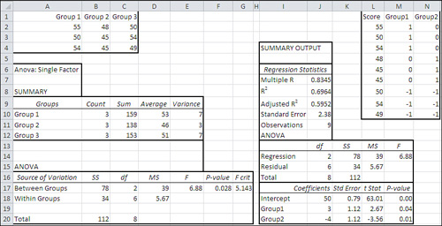
The data set used in Figure 12.1 is the same as the one used in Figure 10.7. Figure 12.1 shows two separate analyses. One is a standard ANOVA from the Data Analysis add-in’s ANOVA: Single Factor tool, in the A6:G20 range; it is also repeated from Figure 10.7. The ANOVA tool was run on the data in A1:C4.
The other analysis is output from the Data Analysis add-in’s Regression tool, in the I4:M20 range. (I should mention that to keep down the clutter in Figure 12.1, I have deleted some results that aren’t pertinent to this comparison.) The Regression tool was run on the data in L1:N10.
You’re about to see how and why the two analyses are really one and the same, as they always are in the equal n’s case. First, though, I want to draw your attention to some numbers:
• The sums of squares, degrees of freedom, mean squares, and F ratio in the ANOVA table, in cells B17:E18, are identical to the same statistics in the regression output, in cells J14:M15. (There’s no significance to the fact that the sums of squares [SS] and degrees of freedom [df] columns appear in different orders in the two tables. That’s merely how the programmers chose to display the results.)
• The group means in D10:D12 are closely related to the regression coefficients in J18:J20. The regression intercept of 50 in J18 is equal to the mean of the group means, which with equal n’s is the same as the grand mean of all observations. The intercept plus the coefficient for Group1, in J19, equals Group 1’s mean (see cell D10). The intercept plus the coefficient for Group2, in J20, equals Group 2’s mean, in cell D11. And this expression, J18 − (J19 + J20), or 50 − (−1), equals 51, the mean of Group 3 in cell D12.
• Comparing cells E17 and M14, you can see that the ANOVA divides the mean square between groups by the mean square within groups to get an F ratio. The regression analysis divides the mean square regression by the mean square residual to get the same F ratio. The only difference is in the terminology.
Note
In both a technical and a literal sense, both multiple regression and ANOVA analyze variance, so both approaches could be termed “analysis of variance.” It’s customary, though, to reserve the terms analysis of variance and ANOVA for the approach discussed in Chapters 10 and 11, which calculates the variance of the group means directly. The term multiple regression is used for the approach discussed in this chapter, which as you’ll see uses a proportions of variance approach.
We have, then, an ANOVA that concerns itself with dividing the total variability into the variability that’s due to differences in group means and the variability that’s due to differences in individual observations. We have a regression analysis that concerns itself with correlations and regression coefficients between the outcome variable, here named Score, and two predictor variables in M2:N10 named Group1 and Group2.
How is it that these two apparently different kinds of analysis report the same inferential statistics? The answer to that lies in how the predictor variables are set up for the regression analysis.
Using Effect Coding
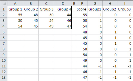
As I mentioned at the outset of this chapter, there are several compelling reasons to use the multiple regression approach in preference to the traditional ANOVA approach. The benefits come at a slight cost, one that you might not regard as a cost at all. You need to arrange your data so that it looks something like the range L1:N10 in Figure 12.1. You don’t need to supply columns headers as is done in L1:N1, but it can be helpful to do so.
Note
I have given the names Group1 and Group2 to the two sets of numbers in columns M and N of Figure 12.1. As you’ll see, the numbers in those columns indicate to which group a subject belongs.
The range L2:L10 contains the scores that are analyzed: the same ones as are found in A2:C4. The values in M2:N10 are the result of a coding scheme called effect coding. They encode information about group membership using numbers—numbers that can be used as data in a regression analysis. The ranges L2:L10, M2:M10, and N2:N10 are called vectors.
As it’s been laid out in Figure 12.1, members of Group 1 get the code 1 in the Group1 vector in M2:M10. Members of Group 2 get the code 0 in the Group1 vector, and members of Group 3 get a −1 in that vector.
Some codes for group membership switch in the Group2 vector, N2:N10. Members of Group 1 get a 0 and members of Group 2 get a 1. Members of Group 3 again get a −1.
Once those vectors are set up (and shortly you’ll see how to use Excel worksheet functions to make the job quick and easy), all you do is run the Data Analysis add-in’s Regression tool, as shown in Chapter 4. You use the Score vector as the Input Y Range and the Group1 and Group2 vectors as the Input X Range. The results you get are as in Figure 12.1, in I4:J11 and I12:M20.
Effect Coding: General Principles
The effect codes used in Figure 12.1 were not just made up to bring about results identical to the ANOVA output. Several general principles regarding effect coding apply to the present example as well as to any other situation. Effect coding can handle two groups, three groups or more, more than one factor (so that there are interaction vectors as well as group vectors), unequal n’s, the use of one or more covariates, and so on. Effect coding in conjunction with multiple regression handles them all.
In contrast, under the traditional ANOVA approach, two Excel tools automate the analysis for you. You use ANOVA: Single Factor if you have one factor, and you use ANOVA: Two Factors with Replication if you have two factors. The ANOVA tools, as I’ve noted before, cannot handle more than two factors and cannot handle unequal n’s in the two factor case.
The following sections detail the general rules to follow for effect coding.
How Many Vectors
There are as many vectors for a factor as there are degrees of freedom for that factor: that is, the number of available levels for a factor, minus 1. In Figure 12.1, there is only one factor and it has three levels. Knowing the effect codes from two vectors completely accounts for group membership using nothing but 1’s, 0’s and −1’s. Each code informs you where any subject is, relative to the three treatment groups. (We cover the presence of additional groups later in this chapter.)
Group Codes
The members of one group (or, if you prefer, the members of one level of a factor) get a code of 1 in a given vector. All but the members of one other group get a 0 on that vector. The members of that other group get a code of −1.
Therefore, in Figure 12.1, the code assignments are as follows:
• The Group1 vector—Members of Group 1 get a 1 in the vector named Group1. Members of Group 2 get a 0 because they’re members of neither Group 1 nor Group 3. Members of Group 3 get a −1: Using effect coding, one group must get a −1 in all vectors.
• The Group2 vector—Members of Group 2 get a 1 in the vector named Group2. Members of Group 1 get a 0 because they’re members of neither Group 2 nor Group 3. Again, members of Group 3 get a −1 throughout.
Figure 12.2 adds another level to the Group factor. Notice what happens to the coding.
Figure 12.2. An additional factor level requires an additional vector.
In Figure 12.2, you can see that an additional level, Group 4, of the factor has been added by putting its observations in cells D2:D4. To accommodate that extra level, another coding vector has been added in column I. Notice that there are still as many coding vectors as there are degrees of freedom for this factor’s effect (this is always true if the coding has been done correctly). In the vector named Group3, members of Group 1 and Group 2 get the code 0, members of Group 3 get the code 1, and members of Group 4 get a −1 just as they do in vectors Group1 and Group2.
In Figure 12.2, you can see that the general principles for effect coding have been followed. In addition to setting up as many coding vectors as there are degrees of freedom:
• In each vector, a different group has been assigned the code 1.
• With the exception of one group, all other groups have been assigned the code 0 in a given vector.
• One group has been assigned the code −1 throughout the coding vectors.
Other Types of Coding
In this context—that is, the use of coding with multiple regression—there are two other general techniques: orthogonal coding and dummy coding. Dummy coding is the same as effect coding, except that there are no codes of −1. One group gets codes of 1 in a given vector; all other groups get 0.
Dummy coding works, and produces the same inferential results (sums of squares, mean squares, and so on) as does effect coding, but offers no special benefit beyond what’s available with effect coding. The regression equation has different coefficients with dummy coding than with effect coding. The regression coefficients with dummy coding give the difference between group means and the mean of the group that receives 0’s throughout. Therefore, dummy coding can sometimes be useful when you plan to compare several group means with the mean of one comparison group; a multiple comparisons technique due to Dunnett is designed for that situation. (Dummy coding is also useful in logistic regression, where it can make the regression coefficients consistent with the odds ratios.)
Orthogonal coding is virtually identical to planned orthogonal contrasts, discussed at the end of Chapter 10. One benefit of orthogonal coding comes if you’re doing your multiple regression with paper and pencil. Orthogonal codes lead to matrices that are easily inverted; when the codes aren’t orthogonal, the matrix inversion is something you wouldn’t want to watch, much less do. But with personal computers and Excel, the need to simplify matrix inversions using orthogonal coding has largely disappeared. (Excel has a worksheet function, MINVERSE(), that does it for you.)
Now that you’ve been alerted to the fact that dummy coding exists, this book will have no more to say about it. We’ll return to the topic of orthogonal coding in Chapter 13, “Multiple Regression Analysis: Further Issues.”
Multiple Regression and Proportions of Variance
Chapter 4 goes into some detail about the nature of correlation. One particularly important point is that the square of a correlation coefficient represents the proportion of shared variance between two variables. For example, if the correlation coefficient between caloric intake and weight is 0.5, then the square of 0.5, or 0.25, tells you how much variance the two variables have in common.
There are various ways to characterize this relationship. If it’s reasonable to believe that one of the variables causes the other, perhaps because you know that one precedes the other in time, you might say that 25% of the variability in the subsequent variable, weight gain or loss, is due to differences in the precedent variable, diet.
If it’s not clear that one variable causes the other, or if the direction of the causation isn’t clear, for example, with variables such as crime and poverty, then you might say that crime and poverty have 25% of their variance in common. Shared variance, explained variance, predicted variance—all are phrases that suggest that when one variable changes in value, so does the other, with or without the presence of causation.
When you set up coded vectors, as shown in Figures 12.1 and 12.2, you create a numeric variable that has a correlation, and therefore common variance, with an outcome variable. At this point you’re in a position to determine how much of the variability—the sum of squares—in the outcome variable you can attribute to the coded vector.
And that’s just what you’re doing when you calculate the between-groups variance in a traditional ANOVA. Back in Chapter 1, “About Variables and Values,” I argued that nominal variables, variables whose values are just names, don’t work well with numeric analyses such as averages, standard deviations, or correlations. But by working with the mean values associated with a nominal variable, you can get, say, the mean cholesterol level for Medication A, for Medication B, and for a placebo. Then, calculating the variance of those means tells you how much of the total sum of squares is due to differences between means.
You can also use effect coding to get to the same result via a different route. Effect coding translates a nominal variable such as Medication to numeric values (1, 0 and −1) that you can correlate with an outcome variable. Figure 12.3 applies this technique to the data presented earlier in Figure 12.1.
Figure 12.3. Two ways to calculate the sum of squares between groups.
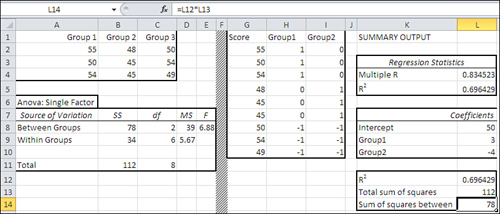
In Figure 12.3, I have removed some ancillary information from the Data Analysis add-in’s ANOVA and Regression tools so as to focus on the sums of squares.
Notice that the ANOVA report in A6:E11 gives 78 as the sum of squares between groups. It uses the approach discussed in Chapters 10 and 11 to arrive at that figure.
The portion of the Regression output shown in K1:L5 shows that the multiple R2 is 0.696 (see also cell L12). As discussed in Chapter 4, the multiple R2 is the proportion of variance shared between (a) the outcome variable, and (b) the combination of the predictor variables that results in the strongest correlation.
Notice that if you multiply the multiple R2 of 0.696 times the total sum of squares, 112 in cell B11, you get 78: the sum of squares between groups.
That best combination of predictor variables is shown in column G of Figure 12.4.
Figure 12.4. Getting the multiple R2 explicitly.
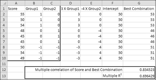
To get the best combination explicitly takes just three steps (and as you’ll see, it’s quicker to get it implicitly using the TREND() function). You need the regression coefficients, which are shown in Figure 12.3 (cells L8:L10):
- Multiply the coefficient for Group1 by each value for Group1. Put the result in column D.
- Multiply the coefficient for Group2 by each value for Group2. Put the result in column E.
- Add the intercept in column F to the values in columns D and E and put the result in column G.
Note
You can get the result that’s shown in column G by array-entering this TREND() function in a nine-row, one-column range: TREND(A2:A10,B2:C10). That approach is used later in the chapter. In the meantime it’s helpful to see the result of applying the regression equation explicitly.
As a check, the following formula is entered in cell G12:
=CORREL(A2:A10,G2:G10)
This one is entered in cell G13:
=G12∧2
They return, respectively, (a) the correlation between the best combination of the predictors and the outcome variable, and (b) the square of that correlation, or R2. Compare the values you see in cells G12 and G13 with those you see in cells L4 and L5 on Figure 12.3, which were produced by the Regression tool in the Data Analysis add-in.
Of course, if you multiply the R2 value in cell G13 on Figure 12.4 by the total sum of squares in cell B11 on Figure 12.3, you still get the same sum of squares between groups, 78. In a single-factor analysis, the ANOVA’s Sum of Squares Between Groups is identical to regression’s Sum of Squares Regression.
Understanding the Segue from ANOVA to Regression
It often helps at this point to step back from the math involved in both ANOVA and regression and to review the concepts involved. The main goal of both types of analysis is to disaggregate the variability—as measured by squared deviations from the mean—in a data set into two components:
• The variability caused by differences in the means of groups that people belong to
• The remaining variability within groups, once the variability among means has been accounted for
Variance Estimates via ANOVA
ANOVA reaches its goal in part by calculating the sum of the squared deviations of the group means from the grand mean, and in part by calculating the sum of the squared deviations of the individual observations from their respective group means. Those two sums of squares are then converted to variances by dividing by their respective degrees of freedom.
Sum of Squares Within Groups
The sum of the squared deviations within each group is calculated and then summed across the groups to get the sum of squares within groups. Group means are involved in these calculations, but only to find the deviation score for each observation. The differences between group means are not involved.
Sum of Squares Between Groups
The between groups variance is based on the variance error of the mean—that is, the variance of the group means multiplied by the number of groups. This is converted to an estimate of the population variance by rearranging the equation for the variance error of the mean, which is
![]()
to this form:
![]()
In words, the variance of all observations is equal to the variance of the group means multiplied by the number of observations in each group. (The concept of the variance error of the mean is introduced in Chapter 8, “Testing Differences Between Means: The Basics,” in the section titled “Testing Means: The Rationale.”)
Similarly, you get the sum of squares between groups by multiplying the sum of the squared deviations of the group means by the number of observations in each group:
![]()
Comparing the Variance Estimates
The relative size of the variance estimates—the F ratio, the estimate from between groups variability divided by the estimate from within groups variability—tells you the likelihood that the group means are really different in the population, or that their difference can be attributed to sampling error.
This is as good a spot as any to note that although a mean square is a variance, “Mean Square Between Groups” does not signify the variance of the group means. It is an estimate of the total variance of all the observations, based on the variability among the group means. In the same way, “Mean Square Within Groups” does not signify the variance of the individual observations within each group—after all, you total the sum of squares in each group. It is an estimate of the total variance of all the observations based on the variability within each group.
Therefore, you have two independent estimates of the total variance: between groups, based on differences between group means, and within groups, based on differences between individual observations and the mean of their group. If the estimate based on group means exceeds the estimate based on within cell variation by an improbable amount, it must be due to one or more differences in group means that are, under the null hypothesis, also improbably large.
Variance Estimates via Regression
Regression analysis takes a different tack. It sets up new variables that represent the subjects’ membership in the different groups—these are the vectors of effect codes in Figures 12.1 through 12.4. Then a multiple regression analysis determines the proportion of the variance in the “outcome” or “predicted” variable that is associated with group membership, as represented by the effect code variables; this is the between groups variance. The remaining, unattributed variance is the within groups variance (or, as regression analysis terms it, residual variance). Once again you divide the between groups variance by the within groups variance to run your F test.
Or, if you work your way through it, you find that to calculate the F test, the actual values of the sums of squares and variances are unnecessary when you use regression analysis. See Figure 12.5.
Figure 12.5. You can run an F test using proportions of variance only.
Note
The adjusted R2 is simply an estimate of what the R2 might be using a different sample, one that’s larger than the sample used to calculate the regression statistics. Larger samples usually do not capitalize on chance as much as smaller samples, and often result in smaller values for R2.
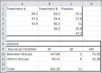
In Figure 12.5, cells A7:E10 present an ANOVA summary of the data in A1:C4 in the traditional manner, reporting sums of squares, degrees of freedom, and the mean squares that result from dividing sums of squares by degrees of freedom. The final figure is an F ratio of 6.88 in cell E8.
But the sums of squares are unnecessary to calculate the F ratio. What matters is the proportion of the total variance in the outcome variable that’s attributable to the coded vectors that here represent group membership. Cell L8 contains the proportion of variance, .6964, that’s due to regression on the vectors, and cell L9 contains the remaining or residual proportion of variance, .3036. Divide each proportion by its accompanying degrees of freedom and you get the mean squares—or what would be the mean squares if you multiplied them by the total sum of squares, 112 (cell B10).
Finally, divide cell N8 by cell N9 to get the same F value in cell O8 that you see in cell E8. Evidently, the sum of squares is simply a constant that for the purpose of calculating an F ratio can be ignored.
You will see more about working solely with proportions of variance in Chapter 13, when the topic of multiple comparisons between means is revisited.
The Meaning of Effect Coding
Earlier chapters have referred occasionally to something called the General Linear Model, and we’re at a point in the discussion of regression analysis that it makes sense to make the discussion more formal. Effect coding is closely related to the General Linear Model.
It’s useful to think of an individual observation as the sum of several components:
• A grand mean
• An effect that reflects the amount by which a group mean differs from the grand mean
• An “error” effect that measures how much an individual observation differs from its group’s mean
Algebraically this concept is represented as follows for population parameters:
Xij = μ + βj + εij
Or, using Roman instead of Greek symbols for sample statistics:
![]()
Each observation is represented by X, specifically the ith observation in the jth group. Each observation is a combination of the following:
• The grand mean, ![]()
• The effect of being in the jth group, bj. Under the General Linear Model, simply being in a particular group tends to pull its observations up if the group mean is higher than the grand mean, or push them down if the group mean is lower than the grand mean.
• The result of being the ith observation in the jth group, eij. This is the distance of the observation from the group mean. It’s represented by the letter e because—for reasons of tradition that aren’t very good—it is regarded as error. And it is from that usage that you get terms such as mean square error and error variance. Quantities such as those are simply the residual variation among observations once you have accounted for other sources of variation, such as group means (bj) and interaction effects.
Various assumptions and restrictions come into play when you apply the General Linear Model, and some of them must be observed if your statistical analysis is to have any real meaning. For example, it’s assumed that the eij error values are independent of one another—that is, if one observation is above the group mean, that fact has no influence on whether some other observation is above, below, or directly on the group mean. Other examples include the restrictions that the bj effects sum to zero, as do the eij error values. This is as you would expect, because each bj effect is a deviation from the grand mean, and each eij error value is a deviation from a group mean. The sum of such deviations is always zero.
Notice that I’ve referred to the bj values as effects. That’s standard terminology and it is behind the term effect coding. When you use effect coding to represent group membership, as is done in the prior section, the coefficients in a regression equation that relates the outcome variable to the coded vectors are the bj values: the deviations of a group’s mean from the grand mean.
Take a look back at Figure 12.1. The grand mean of the values in cells L2:L10 (identical to those in A2:C4) is 50. The average value in Group 1 is 53, so the effect—that is, b1—of being in Group 1 is 3. In the vector that represents membership in Group 1, which is in M2:M10, members of Group 1 are assigned a 1. And the regression coefficient for the Group1 vector in cell J19 is 3: the effect of being in Group 1. Hence, effect coding.
It works the same way for Group 2. The grand mean is 50 and the mean of Group 2 is 46, so the effect of being a member of Group 2 is −4. And the regression coefficient for the Group2 vector, which represents membership in Group 2 via a 1, is −4 (see cell J20).
Notice further that the intercept is equal to the grand mean. So if you apply the General Linear Model to an observation in this data set, you’re applying the regression equation. For the first observation in Group 2, for example, the General Linear Model says that it should equal
![]()
or this, using actual values:
48 = 50 + (−4) + 2
And the regression equation says that a value in any group is found by
Intercept + (Group1 b-weight * Value on Group1) + (Group2 b-weight * Value on Group2)
or the following, using actual values for an observation in, say, Group 2:
50 + (3 * 0) + (−4 * 1)
This equals 46, which is the mean of Group 2. The regression equation does not go further than estimating the grand mean plus the effect of being in a particular group. The remaining variability (for example, having a score of 48 instead of the Group 2 mean 46) is regarded as residual or error variation.
The mean of the group that’s assigned a code of −1 throughout is found by taking the negative of the sum of the b-weights. In this case, that’s −(3 + −4), or 1. And the mean of Group 3 is in fact 51, 1 more than the grand mean.
Note
Formally, using effect coding, the intercept is equal to the mean of the group means: Here, that’s (53 + 46 + 51) / 3, or 50. When there is an equal number of observations per group, the mean of all observations is equal to the mean of the group means. That is not necessarily true when the groups have different numbers of observations, and then the intercept is not necessarily equal to the mean of all observations. But the intercept equals the mean of the group means even in an unequal n’s design.
Assigning Effect Codes in Excel
Excel makes it very easy to set up your effect code vectors. The quickest way is to use Excel’s VLOOKUP() function. You’ll see how to do so shortly. First, have a look at Figure 12.6. The range A1:B10 contains the data from Figure 12.1, laid out as a list. This arrangement is much more useful generally than is the arrangement in A1:C4 of Figure 12.1, where it is laid out especially to cater to the ANOVA tool’s requirements.
Figure 12.6. The effect code vectors in columns C and D are populated using VLOOKUP().
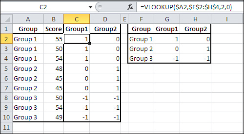
The range F1:H4 in Figure 12.6 contains another list, one that’s used to associate effect codes with group membership. Notice that F2:F4 contains the names of the groups as used in A1:A10. G2:G4 contains the effect codes that will be used in the vector named Group1; that’s the vector in which observations from Group 1 get a 1. Lastly, H2:H4 contains the effect codes that will be used in the vector named Group2.
The effect vectors themselves are found adjacent to the original A1:B10 list, in columns C and D. They are labeled in cells C1 and D1 with vector names that I find convenient and logical, but you could name them anything you wish. (Bear in mind that you can use the labels in the output of the Regression tool.)
To actually create the vectors in columns C and D, take these steps (you can try them out using the Excel file for Chapter 12, available at www.informit.com/title/9780789747204):
- Enter this formula in cell C2:
=VLOOKUP(A2,$F$2:$H$4,2,0)
- Enter this formula in cell D2:
=VLOOKUP(A2,$F$2:$H$4,3,0)
- Make a multiple selection of C2:D2 by dragging through them.
- Move your mouse pointer over the selection handle in the bottom-right corner of cell D2.
- Hold down the mouse button and drag down through Row 10.
Your worksheet should now resemble the one shown in Figure 12.6, and in particular the range B1:D10.
If you’re not already familiar with the VLOOKUP() function, here are some items to keep in mind. To begin, VLOOKUP() takes a value in some worksheet cell, such as A2, and looks up a corresponding value in the first column of a worksheet range, such as F2:H4 in Figure 12.6. VLOOKUP() returns an associated value, such as (in this example) 1, 0, or −1.
So, as used in the formula
=VLOOKUP(A2,$F$2:$H$4,2,0)
the VLOOKUP() function looks up the value it finds in cell A2 (first argument). It looks for that value (Group 1 in this example) in the first column of the range F2:H4 (second argument). VLOOKUP() returns the value found in column 2 (third argument) of the second argument. The lookup range need not be sorted by its first column: that’s the purpose of the fourth argument, 0, which also requires Excel to find an exact match to the lookup value, not just an approximate match.
So in words, the formula
=VLOOKUP(A2,$F$2:$H$4,2,0)
looks for the value that’s in A2. It looks for it in the first column of F2:H4, the lookup range. As it happens, that value, Group 1, is found in the first row of the range. The third argument tells VLOOKUP() which column to look in. It looks in column 2 of F2:H4, and finds the value 1. So, VLOOKUP() returns 1.
Similarly, the formula
=VLOOKUP(A2,$F$2:$H$4,3,0)
looks for Group 1 in the first column of F2:H4—that is, in the range F2:F4. That value is once again found in cell F2, so VLOOKUP() returns a value from that row of the lookup range.
The third argument, 3, says to return the value found in the third column of the lookup range, and that’s column H. Therefore, VLOOKUP() returns the value found in the third column of the first row of the lookup range, which is cell H2, or 0.
Figure 12.7 shows how you could extend this approach if you had not three but four groups.
Figure 12.7. Adding a group adds a vector, and an additional column in the lookup range.
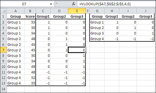
Notice that the formula as it appears in cell E7 uses $A7 as the first argument to VLOOKUP. This reference, which anchors the argument to column A, is used so that the formula can be copied and pasted or autofilled across columns C, D, and E without losing the reference to column A. (The third argument, 4, would have to be adjusted.)
Notice also that the lookup range (F2:H4 in Figure 12.6 and G2:J5 in Figure 12.7) conforms to the general rules for effect coding:
• There’s one fewer vector than there are levels in a factor.
• In each vector, one group has a 1, all other groups but the last one have a 0.
• The last group has a −1 in all vectors.
All you have to do is make sure your lookup range conforms to those rules. Then, the VLOOKUP() function will make sure that the correct code is assigned to the member of the correct group in each vector.
Using Excel’s Regression Tool with Unequal Group Sizes
Chapter 10 discussed the problem of unequal group sizes in a single-factor ANOVA. The discussion was confined to the issue of assumptions that underlie the analysis of variance. Chapter 10 pointed out that the assumption of equal variances in different groups is not a matter of concern when the sample sizes are equal. However, when the larger groups have the smaller variances, the F test is more liberal than you expect: You will reject the null hypothesis somewhat more often than you should. The size of “somewhat” depends on the magnitude of discrepancies in group sample sizes and variances.
Similarly, if the larger groups have the larger variances, the F test is more conservative than its nominal level: If you think you’re working with an alpha of .05, you might actually be working with an alpha of .03. As a practical matter, there’s little you can do about this problem apart from randomly discarding a few observations to achieve equal group sizes, and perhaps maintaining an awareness of what’s happening to the alpha level you adopted.
From the point of view of actually running a traditional analysis of variance, the presence of unequal group sizes makes no difference to the results of a single-factor ANOVA. The sum of squares between is still the group size times the square of each effect, summed across groups. The sum of squares within is still the sum of the squares of each observation from its group’s mean. If you’re using Excel’s Single Factor ANOVA tool, the sums of squares, mean squares, and F ratios are calculated correctly in the unequal n’s situation. Figure 12.8 shows an example.
Figure 12.8. There’s no ambiguity about how the sums of squares are allocated in a single-factor ANOVA with unequal n’s.
Compare the ANOVA summary in Figure 12.8 with that in Figure 12.9, which analyzes the same data set using effect coding and multiple regression.
Figure 12.9. The total percentage of variance explained is equivalent to the sum of squares between in Figure 12.8.
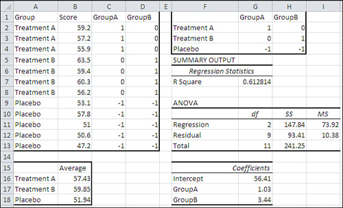
There are a couple of points of interest in Figures 12.8 and 12.9. First, notice that the sum of squares between and the sum of squares within are identical in both the ANOVA and the regression analysis: Compare cells B10:B11 in Figure 12.8 with cells H11:H12 in Figure 12.9. Effect coding with regression analysis is equivalent to standard ANOVA, even with unequal n’s.
Also notice the value of the regression equation intercept in cell G16 of Figure 12.9. It is 56.41. That is not the grand mean, the mean of all observations, as it is with equal n’s, an equal number of observations in each group.
With unequal n’s, the intercept of the regression equation is the average of the group averages—that is, the average of 57.43, 59.85, and 51.94. Actually, this is true of the equal n’s case too. It’s just that the presence of equal group sizes masks what’s going on: Each mean is weighted by a constant sample size.
So, the presence of unequal n’s per group poses no special difficulties for the calculations in either traditional analysis of variance or the combination of multiple regression with effect coding. As I noted at the outset of this section, you need to bear in mind the relationship between group sizes and group variances, and its potential impact on the nominal alpha rate.
It’s when two or more factors are involved and the group sizes are unequal that the nature of the calculations becomes a real issue. The next section introduces the topic of the regression analysis of designs with two or more factors.
Effect Coding, Regression, and Factorial Designs in Excel
Effect coding is not limited to single-factor designs. In fact, effect coding is at its most valuable in factorial designs with unequal cell sizes. The rest of this chapter deals with the regression analysis of factorial designs. Chapter 13 takes up the special problems that arise out of unequal n’s in factorial designs and how the regression approach helps you solve them.
Effect coding, combined with the multiple regression approach, also enables you to cope with factorial designs with more than two factors, which the Data Analysis add-in’s ANOVA tools cannot handle at all. (As you’ll see in Chapter 14, “Analysis of Covariance: The Basics,” effect coding is also of considerable assistance in the analysis of covariance.)
To see why the regression approach is so helpful in the context of factorial designs, it’s best to start with another look at correlations and their squares, the proportions of variance. Figure 12.10 shows a traditional ANOVA with a balanced design (equal group sizes).
Figure 12.10. The design is balanced: There is no ambiguity about how to allocate the sum of squares.
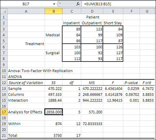
Figure 12.11 shows the same data set as in Figure 12.10, laid out for regression analysis. In particular, the data is in Excel list form, and effect code vectors have been added. Columns D, E, and F contain the effect codes for the main Treatment and Patient effects. Columns G and H contain the interaction effects, and are created by cross-multiplying the main effects columns.
Figure 12.11. Compare the ANOVA for the regression in cells J3:O3 with the total effects analysis in cells A17:D17 in Figure 12.10.
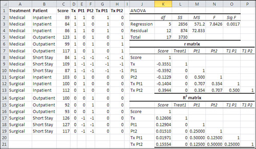
Figure 12.11 shows a correlation matrix in the range J8:P13, labeled “r matrix.” It’s based on the data in C1:H19. (A correlation matrix such as this one is very easy to create using the Correlation tool in the Data Analysis add-in.) Immediately below the correlation matrix is another matrix, labeled “R2 matrix,” that contains the squares of the values in the correlation matrix. The R2 matrix shows the amount of variance shared between any two variables.
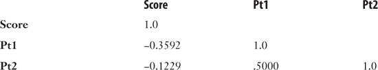
As pointed out in the section “Variance Estimates via Regression,” earlier in this chapter, you can use R2, the proportion of variance shared by two variables, to obtain the sum of squares in an outcome variable that’s attributable to a coded vector. For example, in Figure 12.11, you can see in cells K18:K19 that the two Patient vectors, Pt1 and Pt2, share 12.90% and 1.51% of their variance with the Score variable. Taken together, that’s 14.41% of the Patient vector variance that’s shared with the Score variable. The total sum of squares is 3730, as shown in cell L5 of Figure 12.11 (and in cell B21 of Figure 12.10). 14.41% of the 3730 is 537.67, the amount of the total sum of squares that’s attributable to the Patient factor.
Except it’s not. If you look at Figure 12.10, you’ll find in cell B14 that 497.33 is the sum of squares for the Patient factor (labeled by the ANOVA tool, somewhat unhelpfully, as “Columns”). It’s a balanced design, with an equal number (3) of observations per design cell, so the ambiguity caused by unequal n’s in factorial designs doesn’t arise. Why does the ANOVA table in Figure 12.10 say that the sum of squares for the Patient factor is 497.33, while the sum of the proportions of variance shown in Figure 12.11 leads to a sum of squares of 537.67?
The reason is that the two vectors that represent the Patient factor are correlated. Notice in Figure 12.11 that worksheet cell M11 shows that there’s a correlation of .5 between vector Pt1 and vector Pt2, the two vectors that identify group membership for the three-level Patient factor. And in worksheet cell M19 you can see that the two vectors share 25% of their variance.
Because that’s the case, we can’t simply add the 12.90% (the R2 of Pt1 with Score) and 1.51% (the R2 of Pt2 with Score) and multiply their sum times the total sum of squares. The two Patient vectors share 25% of their variance, and so some of the 12.90% that Pt1 shares with Score is also shared by Pt2. We’re double-counting that variance, and so we get a higher Patient sum of squares (537.67) than we should (497.33).
Exerting Statistical Control with Semipartial Correlations
From time to time you hear or read news reports that mention “holding income constant” or “removing education from the comparison” or some similar statistical hand-waving. That’s what’s involved when two coded vectors are correlated with one another, such as Pt1 and Pt2 in Figure 12.11. Here’s what they’re usually talking about when one variable is “held constant,” and how it’s usually done.
Suppose you wanted to investigate the relationship between education and attitude toward a ballot proposal in an upcoming election. You know that there’s a relationship between education and income, and that there’s probably a relationship between income and attitude toward the ballot proposal. You would like to examine the relationship between education and attitude, uncontaminated by the income variable. That might enable you to target your advertising about the proposal by sponsoring certain television programming whose viewers tend to be found at certain education levels.
You collect data from a random sample of registered voters and pull together this correlation matrix:
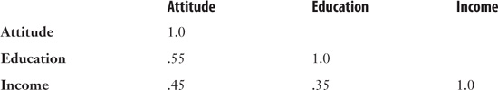
You would like to remove the effect of Income on the Education variable, but leave its effect on the Attitude variable. Here’s the Excel formula to do that:
= (.55 − (.45 * .35)) / SQRT(1 − .35∧2)
The more general version is
![]()
where the symbol r1(2.3) is called a semipartial correlation. It is the correlation of variable 1 with variable 2, with the effect of variable 3 removed from variable 2.
With the data as given in the prior correlation matrix, the semipartial correlation of Attitude with Education, with the effect of Income removed from Education only, is .42. That’s .13 less than the raw, unaltered correlation of Attitude with Education.
It’s entirely possible to remove the effect of the third variable from both the first and the second, using this general formula:
![]()
And with the given data set, the result would be .47. This correlation, in which the effect of the third variable is removed from both the other two, is called a partial correlation; as before, it’s a semipartial correlation when you remove the effect of the third from only one of the other two.
Note
In yet another embarrassing instance of statisticians’ inability to reach consensus on a sensible name for anything, some refer to what I have called a semipartial correlation as a part correlation. Everyone means the same thing, though, when they speak of partial correlations.
To solve the problem discussed in the prior section, you could use the formula given here for semipartial correlation. I’ll start by showing you how you might do that with the data used in Figure 12.11. Then I’ll show you how much easier—not to mention how much more elegant—it is to solve the problem using Excel’s TREND() function.
Using a Squared Semipartial to get the Correct Sum of Squares
As shown in Figure 12.11, the relevant raw correlations are as follows:
Applying the formula for the semipartial correlation, we get the following formula for the semipartial correlation between Score and Pt2, after the effect of Pt1 has been removed from Pt2:
=(−0.1229−(−0.3592*0.5))/SQRT(1−0.5∧2)
This resolves to .0655. Squaring that correlation results in .0043, which is the proportion of variance that Score has in common with Pt2 after the effect of Pt1 has been partialled out of Pt2.
The squared correlation between Score and Pt1 is .129 (see Figure 12.11, cell K18). If we add .129 to .0043, we get .1333 as the combined proportion of variance shared between the two Patient vectors and the Score variable—or if you prefer, 13.3% is the percentage of variance shared by Score and the two Patient vectors—with the redundant variance shared by Pt1 and Pt2 partialled out of Pt2.
Now, multiply .1333 by 3730 (Figure 12.11, cell L5) to get the portion of the total sum of squares that’s attributable to the two Patient vectors or, what’s the same thing, to the Patient factor. The result is 497.33, precisely the sum of squares calculated by the traditional ANOVA in Figure 12.10’s cell B14.
I went through those gyrations—dragging you along with me, I hope—to demonstrate these concepts:
• When two predictor variables are correlated, some of the shared variance with the outcome variable is redundant. You can’t simply add together their R2 values because some of the variance will be allocated twice.
• You can remove the effect of one predictor on another predictor’s correlation with the outcome variable, and thus you remove the variance shared by one predictor from that shared by the other predictor.
• With that adjustment made, the proportions of shared variance are independent of one another and are therefore additive.
In prehistory, as long as 25 years ago, many extant computer programs took precisely the approach described in this section to carry out multiple regression. Suppose that you attempted the same thing using Excel with, say, eight or nine predictor variables (and you get to eight or nine very quickly when you consider the factor interactions). You’d shortly drive yourself crazy trying to establish the correct formulas for the semipartial correlations and their squares, keeping the pairing of the correlations straight in each formula.
Excel provides a wonderful alternative in the form of TREND(), and I’ll show you how to use it in this context next.
Using TREND() to Replace Squared Semipartial Correlations
To review, you can use squared semipartial correlations to arrange that the variance shared between a predictor variable and the outcome variable is unique to those two variables alone: that the shared variance is not redundant with the variance shared by the outcome variable and a different predictor variable.
Using the variables shown in Figure 12.11 as examples, the sequence of events would be as follows:
- Enter the predictor variable Tx into the analysis by calculating its proportion of shared variance, R2, with Score.
- Notice that Tx has no correlation with Pt1, the next predictor variable. Therefore, Tx and Pt1 have no shared variance and there is no need to partial Tx out of Pt1. Calculate the proportion of variance that Pt1 shares with Score.
- Notice that Pt1 and Pt2 are correlated. Calculate the squared semipartial correlation of Pt2 with Score, partialling Pt1 out of Pt2 in order that the squared semipartial correlation consist of unique shared variance only.
Excel offers you another way to remove the effects of one variable from another: the TREND() function. This worksheet function is discussed in Chapter 4, in the section titled “Getting the Predicted Values.” Here’s a quick review.
One of the main uses of regression analysis is to provide a way to predict one variable’s value using the known values of another variable or variables. Usually you provide known values of the predictor variables and of the outcome variable to the LINEST() function or to the Regression tool. You get back, among other results, an equation that you can use to predict a new outcome value, based on new predictor values.
For example, you might try predicting tomorrow’s closing value on the Dow Jones Industrial Average using, as predictors, today’s volume on the New York Stock Exchange and today’s advance-decline (A-D) ratio. You could collect historical data on volume, the A-D ratio, and the Dow. You would pass that historical data to LINEST() and use the resulting regression equation on today’s volume and A-D data to predict tomorrow’s Dow closing.
Note
Don’t bother. This is just an example. It’s already been tried and there’s a lot more to it—and even so it doesn’t work very well.
The problem is that neither LINEST() nor the Regression tool provide you the actual predicted values. You have to apply the regression equation yourself, and that’s tedious if you have many predictors, or many values to predict, or both. That’s where TREND() comes in. You give TREND() the same arguments that you give LINEST() and TREND() returns not the regression equation itself, but the results of applying it.
Figure 12.12 has an example. (Remember that to get an array of results from TREND(), as here, you must array-enter it with Ctrl+Shift+Enter.)
Figure 12.12. TREND() enables you to bypass the regression equation and get its results directly.
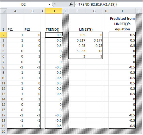
In Figure 12.12, you see the values of the two Patient vectors from Figure 12.11; they are in columns A and B. In column D are the results of using the TREND() function on the Pt1 and Pt2 values. TREND() first calculates the regression equation and then applies it to the variables you give it to work with. In this case, column D contains the values of Pt2 that it would predict by applying the regression equation to the Pt1 values in column A.
Because the correlation between Pt1 and Pt2 is not a perfect 1.0 or −1.0, the predicted values of Pt2 do not match the actual values.
Columns F through I in Figure 12.12 take a slightly different path to the same result. Columns F and G contain the results of the array formula
=LINEST(B2:B19,A2:A19,,TRUE)
where the relationship between the predicted variable in B2:B19 with the predictor variable in A2:A19 is analyzed. The first row of the results contains .5 and 0, which are the regression coefficient and intercept, respectively. The regression equation consists of the intercept plus the result of multiplying the coefficient times the predictor variable it’s associated with. There is only one predictor variable in this instance, so the regression equation—entered in cells I2—is as follows:
=$G$2+$F$2*A2
It is copied and pasted into I2:I19, so that the predictor value multiplied by the coefficient adjusts to A3, A4, and so on.
Note that the values in columns D and I are identical. If what you’re after is not the equation itself but the results of applying it, you want TREND(), as shown in column D.
For simplicity and clarity, I have used only one predictor variable for the example in Figure 12.12. But like LINEST(), TREND() is capable of handling multiple predictor variables; the syntax might be something such as
=TREND(A1:A101,B1:N101)
where your predicted variable is in column A and your predictor variables are in columns B through N.
One final item to keep in mind: If you want to see the results of the TREND() function on the worksheet (which isn’t always the case), you need to begin by selecting the worksheet cells that will display the results and then array-enter the formula using Ctrl+Shift+Enter instead of simply pressing Enter.
Working with the Residuals
Figure 12.13 shows how you can use TREND() in the context of a multiple regression analysis.
Figure 12.13. The TREND() results are explicitly shown here, but it’s not necessary to do so.
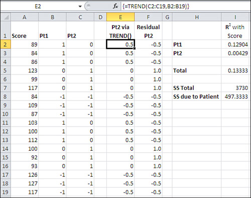
The data in columns A, B, and C in Figure 12.13 are taken from Figure 12.11. Column E contains the result of the TREND() function: the values of Pt2 that the regression equation between Pt1 and Pt2 returns. The array formula in E2:E19 is
=TREND(C2:C19,B2:B19)
Column F contains what are called the residuals of the regression. They are what remains of, in this case, Pt2 after the effect of Pt1 has been removed. The effect of Pt1 is in E2:E19, so the remainder of Pt2, its residual values, are calculated very simply in Column F with this formula in cell F2:
=C2−E2
That formula is copied and pasted into F3:F19. Now the final calculations are made in column I. (Don’t be concerned. I’m doing all this just to show how and why it works, both from the standpoint of theory and from the standpoint of Excel worksheet functions. I’m about to show you how to get it all done with just a couple of formulas.)
Start in cell I2, where the R2 between Pt1 and Score appears. It is obtained with this formula:
=RSQ(B2:B19,A2:A19)
The RSQ() worksheet function (its name is, of course, short for “r-squared”) is occasionally useful, but it’s limited because it can deal with only two variables. We’re working with the raw R2 in cell I2. That’s because, although Tx enters the equation first in Figure 12.11, Tx and Pt1 share no variance (see cell L18 in Figure 12.11). Therefore, there can be no overlap between Tx and Pt1, as there is between Pt1 and Pt2.
Cell I3 contains the formula
=RSQ(A2:A19,F2:F19)
which returns the proportion of variance, R2, in Score that’s shared with the residuals of Pt2. We have predicted Pt2 from Pt1 in column E using TREND(). We have calculated the residuals of Pt2 after removing what it shares with Pt1. Now the R2 of the residuals with Score tells us the shared variance between Score and Pt2, with the effect of Pt1 removed. In other words, in cell I3 we’re looking at the squared semipartial correlation between Score and Pt2, with Pt1 partialled out. And we have arrived at that figure without resorting to formulas of this sort, discussed in a prior section:
![]()
(What we’ve done in Figure 12.13 might not look like much of an improvement, but read just a little further on.)
To complete the demonstration, cell I5 in Figure 12.13 contains the total of the two R2 values in I2 and I3. That is the total proportion of the variance in Score attributable to Pt1 and Pt2 taken together.
Cell I7 contains the total sum of squares; compare it with cell L5 in Figure 12.11. Cell I8 contains the product of cells I5 and I7: the proportion of the total sum of squares attributable to the two Patient vectors, times the total sum of squares. The result, 497.33, is the sum of squares due to the Patient factor. Compare it to cell B14 in Figure 12.10: the two values are identical.
What we have succeeded in doing so far is to disaggregate the total sum of squares due to regression (cell L3 in Figure 12.11) and allocate the correct amount of that total to the Patient factor. The same can be done with the Treatment factor, and with the interaction of Treatment with Patient. It’s important that you be able to do so, because you want to know whether there are significant differences in the results according to a subject’s Treatment status, Patient status, or both. You can’t tell that from the overall sum of squares due to the regression: You have to break it out more finely.
Yes, the ANOVA gives you that breakdown automatically, whereas Regression doesn’t. But the technique of regression is so much more flexible and can handle so many more situations that the best approach is to use regression and bolster it as necessary with the more detailed analysis described here.
Next up: how to get that more detailed analysis with just a couple of formulas.
Using Excel’s Absolute and Relative Addressing to Extend the Semipartials
Here’s how to get those squared semipartial correlations—and thus the sums of squares attributable to each main and interaction effect—nearly automatically. Figure 12.14 shows the process.
Figure 12.14. Effect coding and multiple regression analysis for a balanced factorial design.
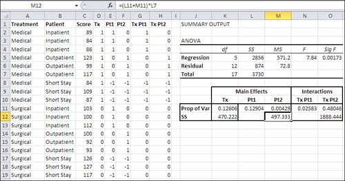
Figure 12.14 repeats the underlying data from Figure 12.11, in the range A1:H19. The summary analysis from the Regression tool appears in the range I3:O7. The raw data in columns A:H is there because we need it to calculate the semipartials.
Cell K11 contains this formula:
=RSQ(C2:C19,D2:D19)
It returns the R2 between the Score variable in column C and the Treatment vector Tx in column D. There is no partialling out to be done for this variable. It is the first variable to enter the regression, and therefore there is no previous variable whose influence on Tx must be removed. All the variance that can be attributed to Tx is attributed. Tx and Score share 12.6% of their variance.
Establishing the Main Formula
Cell L11 contains this formula, which you need enter only once for the full analysis:
=RSQ($C$2:$C$19,E2:E19−TREND(E2:E19,$D2:D19))
Note
You do not need to array-enter the formula, despite its use of the TREND() function. When you enter a formula that requires array entry, one of the reasons to array-enter it is that it returns results to more than one worksheet cell. For example, LINEST() returns regression coefficients in its first row and the standard errors of the coefficients in its second row. You must start by selecting the cells that will be involved, and finish by using Ctrl+Shift+Enter. In this case, though, the results of the TREND() function—although there are 18 such results—do not occupy worksheet cells but are kept corralled within the full formula. Therefore, you need not use array entry. (However, just because a formula will return results to one cell only does not mean that array entry is not necessary. There are many examples of single-cell formulas that must be array-entered if they are to return the proper result. I’ve been using array formulas in Excel for almost 20 years and I still sometimes have to test a new formula structure to determine whether it must be array-entered.)
The use of RSQ() in cell L11 is a little complex, and the best way to tackle a complex Excel formula is from the inside out. You could use the formula evaluator (in the Formula Auditing group on the Ribbon’s Formulas tab), but it wouldn’t help much in this instance. Taking it from the right, consider this fragment:
TREND(E2:E19,$D2:D19)
That fragment simply returns the values shown in cells E2:E19 of Figure 12.13: the values of Pt1 that are calculated from its relationship with Tx. You don’t actually see the calculated values here: They stay in the formula and out of the way.
Backing up a little, the fragment
E2:E19−TREND(E2:E19,$D2:D19)
returns the residuals: the values in E2:E19 that remain after accounting for their relationship with the values in D2:D19. These residuals are shown in Figure 12.13, cells F2:F19.
Finally, here’s the full formula in cell L11:
=RSQ($C$2:$C$19,E2:E19−TREND(E2:E19,$D2:D19))
This formula calculates the R2 between the Score variable in cells C2:C19 and the residuals of the values in E2:E19. It’s the squared semipartial correlation between Score and Pt1, partialling Tx out of Pt1.
As you see, the value returned by the formula in cell L11, 0.129, is identical to the raw squared correlation between Score and Pt1 (compare with cell K18 in Figure 12.11). This is because in a balanced design using effect coding, as here, the vectors for the main effects and the interactions are mutually independent. The Tx vector is independent of, thus uncorrelated with, the Pt1 vector (and the Pt2 vector and all the interaction vectors). When two vectors are uncorrelated, there’s nothing in either one to remove of its correlation with the other.
So in theory, the formula in cell L11 could have been
=RSQ(C2:C19,E2:E19)
because it returns the same value as the semipartial correlation does. But for practical reasons it’s better to enter the formula as given, for reasons you’ll see next.
Extending the Formula Automatically
If you select cell L11 as it’s shown in Figure 12.14, click and hold the selection handle, and drag to the right into cell O11, the mixed and relative addresses adjust and the fixed reference remains fixed.
Note
The selection handle is the black square in the lower-right corner of the active cell.
When you do so, the formula in L11 becomes this formula in M11:
=RSQ($C$2:$C$19,F2:F19−TREND(F2:F19,$D2:E19))
The R2 value returned by this formula is now between Score in C2:C19 and Pt2 in F2:F19—but with the effects of Tx and Pt1 partialled out of Pt2. In copying and pasting the formula from L11 to M11, the references adjusted (or failed to do so) in a few ways, as detailed next.
The Absolute Reference
The reference to $C$2:$C$19, where Score is found, did not adjust. It is an absolute reference, and pasting the reference to another cell, M11, has no effect on it.
The Relative References
The references to E2:E19 in L11 become F2:F19 in M11. The references are relative and adjust according to the location you paste them to. Because M11 is one column to the right of L11, the references change from column E to column F. In so doing, the formula turns its attention from Pt1 in column E to Pt2 in column F.
The Mixed Reference
The reference to $D2:D19 in L11 becomes $D2:E19 in M11. It is a mixed reference: the first column, the D in $D2, is fixed by means of the dollar sign. The second column, the D in D19, is relative because it’s not immediately preceded by a dollar sign. So when the formula is pasted from column L to column M, $D2:D19 becomes $D2:E19. That has the effect of predicting Pt2 (column F) from both Tx (column D) and Pt1 (column E).
This is exactly what we’re after. Each time we paste the formula one column to the right, we shift to a new predictor variable. Furthermore, we extend the range of the predictor variables that we want to partial out of the new predictor. In the downloaded copy of the workbook for Chapter 12, you’ll find that by extending the formula out to column O, the formula in cell O11 is
=RSQ($C$2:$C$19,H2:H19−TREND(H2:H19,$D2:G19))
and is extended all the way out to capture the final interaction vector in column H.
This section of Chapter 12 developed a relatively straightforward way to calculate shared variance with the effect of other variables removed, by means of the TREND() function and residual values. We can now apply that method to designs that have unequal n’s. As you’ll see, unequal n’s sometimes bring about unwanted correlations between factors, and sometimes are the result of existing correlations. In either case, regression analysis of the sort introduced in this chapter can help you manage the correlations and, in turn, make the partition of the variability in the outcome measure unambiguous. The next chapter takes up that topic.