
communication and design
essential skills
~ An understanding of how a photograph is a two-dimensional composition of lines, patterns and shapes.
~ An understanding of how photographic technique can influence the emphasis and communication of the image.
~ Produce research showing an understanding of composition and design in the creation of images.
~ Complete a series of activities exploring the importance of communication and design in photographic imagery.
Fabio Sarraff

Introduction
In the context of communication and design there is no right or wrong, only good and bad relative to the styles and tastes of the day. Unlike most other genres of photography the inspiration for a studio photograph has to be preconceived. Studio photographers cannot observe, compose and interpret by pointing the camera at the world around them. In a darkened studio there is no world around them. The studio photographer has to create or obtain everything appearing in front of the camera. Compared to other forms of photographic illustration this could be seen as a disadvantage. In actual fact it is a major advantage as the photographer has total control over all aspects of the photographic process. Studio photography is not a random process. It should be highly pre-produced and previsualised. Studio photographers, especially in the area of still life, do not capture images. They construct images. This enables the photographer to compose and design a photograph almost without restriction. The studio photographer can change perspective, contrast, point of view and lighting at will. When coupled with astute observation of the subject there are few limitations inhibiting the design and composition of a photograph. Every element can be changed or moved to improve the image. It is the photographer’s skill that can turn a mundane subject into a remarkable image.
Jacqui Melville

Context
In reality the context of a studio photograph is the studio environment. The photographer can, however, create a different environment in which to place the subject. The context of the subject is therefore determined by the photographer and not by the subject. This enables a studio photographer to control, to varying degrees, the amount of information and thereby communication within each image. The image can be made obvious or ambiguous. Advertising illustration often excels at making the message obvious. Abstract images are by their very nature ambiguous. It is the viewer’s interpretation of the photograph the photographer is attempting to influence. A viewer can be guided towards an objective opinion by placing the subject on a plain background (e.g. an egg on a white background). The information is singular and indisputable. However, if the egg is placed in a box of straw and lit and composed in such a way as to imply the egg is no longer in a studio, the viewer will be inclined to form a subjective opinion about the image. Imagination will create an environment ‘existing’ outside the frame of the photograph.
Hock Loong Goh

ACTIVITY 1
Research (other than product and catalogue photography) and compile examples in your Visual Diary where you feel the viewer is being guided to make an objective opinion.
Discuss what could have been changed in the photograph to encourage the viewer to make a subjective opinion.
Format
Format describes the size and proportions of an image. It applies to both ‘image format’ and ‘camera format’. The difference need not be confusing as the outcome is the same.
Image format
A vertical image is described as ‘portrait format’ even though the dominant composition may be horizontal. A horizontal image is described as ‘landscape format’ even though the dominant composition may be vertical. The terminology dates to when artists first started to turn a rectangular canvas one way or the other to suit their subject matter. When working with an art director or designer the image format will be determined by the layout and final medium. In editorial work photographers must often ensure images are composed using both formats. This enables greater flexibility with page design.
Relative size of formats
Relative shape of formats

Camera format
Format also describes the size of camera being used (small, medium or large). Each of these cameras produces a different size image. The decision to use a particular format may lie with the client’s requirements for reproduction (image quality) or the practicalities of one camera over another.
Small format cameras frame images narrower than the proportions of a single page. The 6 × 4.5 and 6 × 9cm medium format cameras frame images in proportion to the size of this page. That is to say, if the size of the image was increased to the size of this page the image would fit exactly. The 6 × 6, 6 × 7, 6 × 8cm medium format and 5 × 4” large format cameras frame images shorter than the proportions of a single page. In these cases some of the visible image in the viewfinder will be lost when reproducing a full page image. This should be taken into account when composing an image required to fit a specific layout format. This problem can be overcome by masking off the viewfinder to the proportions determined by the client’s layout. See ‘Art Direction’.
Content
Viewing the subject in relation to its background is essential to forming an understanding of compositional framing. By definition a background is something secondary to the main subject. It should be at the back of the image and of relatively less or little importance. This does not mean it should be ignored, but should be controlled. It is a common fault to position the camera too far away from the subject. This is compounded by the problem of filling in the empty space (background) created by this point of view. Too much information can lead to confusing photographs. Keep it simple is often the best rule. Move closer, reduce the background to a minimum. Move even closer until the subject fills the whole frame and becomes the dominant part of the composition. A truck full of props is no substitute for a strong visual awareness of the virtues and merits of your subject, a preconceived idea of its context and the purpose of the communication.
Fabio Sarraff

ACTIVITY 2
Research contemporary sources (other than product and catalogue photography) to find examples of photographs where the photographer has reduced the visual importance of the background to enhance composition and focus attention on the main subject.
Compile in your Visual Diary.
Balance
In nature there is a natural balance or harmony of texture, shape, form and colour. Many objects upset this balance and impair the visual relationship between one object and another. It is this control of balance by the photographer, whether to achieve harmony or discord, that determines the level of acceptance of an image by the viewer. As humans we naturally gravitate towards a balanced image (symmetrical). When there is symmetry between the elements within the frame the image is said to have a sense of balance. A balanced image although pleasing to the eye can sometimes appear bland and conservative. Knowing this a photographer can change the balance of an image to achieve a different result. A dominant element of balance is visual weight created by the distribution of light and dark tones within the frame. To frame a large dark tone on one side of the image and place tones of equal visual weight on the other side will create an imbalance. An unbalanced image (asymmetrical) will often create visual tension, interest and a sense of things not being as they should be. The communication of harmony or tension is the deciding factor when composing an image intended to convey a specific message.
Fabio Sarraff

ACTIVITY 3
Research examples where the photographer has used imbalance to create tension and examples where the photographer has used visual balance to create visual harmony.
Composition
Composition is not a question of getting all the relevant information in the frame. Although information is necessary it is more important to attract and keep the viewer’s attention. This calls for composition where the subject matter receives prominence without distraction from other elements within the frame. In this way composition complements communication. The image should encourage the viewer to explore without complicating the communication and decreasing the importance of the subject matter. The subject should be viewed as a two-dimensional object. This will help the photographer become aware of distractions to the composition that could confuse the communication. Avoid placing the main subject matter in the centre of the image. Use the whole frame in which to compose your image. You are paying for every part of the image, so use it.
Rule of thirds
Rules of composition have been formulated over the centuries to help artists create harmonious images. The most common of these rules are the ‘Golden Section’ and the ‘Rule of Thirds’. The Golden Section, dating back to the time of Ancient Greece, is the name given to the traditional system of dividing the frame into unequal parts.
The rule of thirds

The rule of thirds is the simplified modern equivalent. Visualise the viewfinder as having a grid which divides the frame into three equal segments, both vertically and horizontally. Use these lines and their intersecting points as key positions to place significant elements within the image.
ACTIVITY 4
Research examples of photographs that follow the rule of thirds and examples that do not. Discuss whether the same subject matter could be made to work with a different approach to composition and design. Could breaking the rules improve the communication?
Point of view
Working in the studio a photographer has ample time in which to explore the subject in great detail. With the exception of fashion and portraiture the studio photographer is not limited to capturing the precise moment in history that will never occur again. This creates the opportunity to view the subject from all possible angles without the risk of ‘losing the shot’. Start with, but immediately discard, the ‘normal’ viewpoint. Look for something different and unusual but still capable of communicating with the viewer. Try different focal length lenses. Try climbing a ladder or lying on the floor. Forget how you would see the subject from a normal vertical position and try to visualise how the camera, which is not subject to any normal viewpoint, might be used to interpret the subject.
Shannon Pawsey

Line
Western visual culture has determined the way we look at images. From the moment of our first visual encounter with images and the written word our eye has been conditioned to viewing what is in front of us following certain patterns of perception. We instinctively scan images from top left to bottom right. The same way we read. This element of design is a major factor in the success of the communication. Lines, whether horizontal, vertical or diagonal, lead the viewer around an image. If the flow of the image is easy to follow, and therefore unnoticeable, the intended communication is more likely to succeed. If the flow is interrupted by poor use of line the viewer will lack visual guidance, not understand the communication and possibly disregard the image.
Horizontal lines
The horizontal line is often the dominant line in an image. Everyone is aware the horizon is level to their normal viewpoint. Horizontal lines within the image will give the viewer a sense of stability and balance when correctly aligned with the edge of the frame. Incorrect alignment may upset this static perception and the image could appear unbalanced.
Vertical lines
Our perception of the vertical line is as strong as that of the horizontal. Its use in composition and design is similar. The horizontal line divides an image from top to bottom, vertical lines divide an image left to right. The horizontal line guides the viewer left to right, the vertical line guides the viewer top to bottom. When correctly aligned to the edge of the frame vertical lines will give a static composition with a sense of strength, power and dominance. When vertical lines are tilted within the frame this perception is reduced and replaced with a sense of imbalance. However, converging vertical lines create perspective and can lead the viewer to an implied horizon and visual stability.
Diagonal lines
Horizontal and vertical lines when correctly aligned to the frame create a sense of stability relative to a normal viewpoint. Diagonal lines are not relative to the normal perception of stability and are therefore viewed as unstable and precarious. Whether actual or perceived the visual tension created by the use of diagonal line can lead to dynamic composition and a sense of movement within the image.
Curves
Images are viewed from top left to bottom right. A curved line achieves this progression in an unobtrusive and orderly way. Curved lines are soothing to the eye and depending on their degree of curvature unlikely to create visual tension and discord. When placed close to the edge of frame the effect of the curve is greatly enhanced.
Ricky Bond

ACTIVITY 5
In the example above discuss which elements of design have been used to the best effect. Is one design element stronger than another?
Find examples where the photographer has used horizontal line to create stability and examples where the photographer has used vertical line to create visual dominance.
Depth
A photograph is usually a two-dimensional representation of a three-dimensional subject. To imply a sense of depth within an image a studio photographer can artificially create dimension by placing objects in front of (foreground) and behind (background) the main subject matter. The foreground objects will appear larger than the subject and the background objects will appear smaller. This illusion of depth can be increased by careful use of line, tonality, contrast, colour, depth of field and framing. When these elements work successfully the viewer will create the third dimension in their mind.
Natarsha Gleeson

Perspective
Visual perspective is achieved by the creation of depth and distance within a two-dimensional medium. Our perception is parallel lines converge as they recede towards the horizon and objects diminish in size as the distance between them and the viewer increases. Because the human eye has a fixed focal length this perspective cannot change. Most cameras, however, can be used with lenses of differing focal lengths. This means the photographer can alter perspective by changing the focal length of the lens. A normal lens has a perspective similar to the human eye. A long lens will compress perspective and create the illusion that elements within the frame are close together. A wide angle lens will exaggerate perspective, distort the perception of distance and scale and create the illusion elements within the frame are further apart. See ‘The Studio’.
Charanjeet Wadhwa

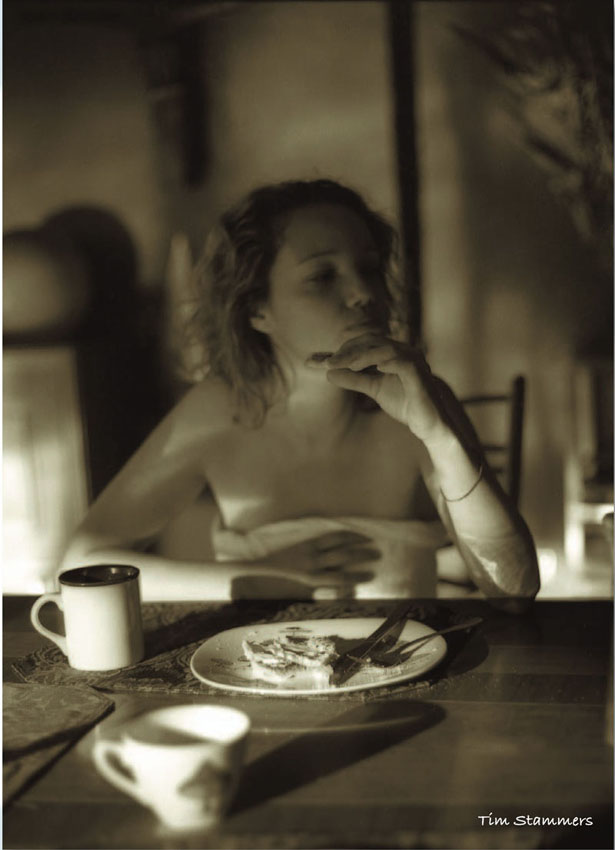
Tim Stammers
Itti Karuson
