The main message of most of your Web sites will be conveyed by the site’s text. When you add text, you need to deal with two different aspects of the text: its structure and its presentation. The structure, implemented with XHTML, includes things like paragraphs, headings, lists, and the like; presentation (applied using CSS) is how the text looks, including things like the font, font size, text color, and so on.
Using CSS styles, your site doesn’t just look good—you get other benefits as well. Because the CSS stylesheet is separate from the XHTML, it’s easy to make changes in your site’s look simply by modifying the CSS rules in the stylesheet.
In this chapter, we’ll focus on creating and applying CSS rules for your site’s text.
To style text with CSS, you need to know that it’s a bit different from styling text in say, a word processor, where you simply select some text and choose a font and font styles from a menu. With CSS, you create rules, and these rules can style anything defined by an XHTML tag, class, or id.
A CSS rule consists of a selector followed by declarations, as we’ve seen in past chapters. Declarations contain properties, which, in turn, have values. So, for example, if we wanted to style all <h2> tags in the document with a serif font, bold, and colored gray, we could write this rule:
h2 {
   font-family: Georgia, "Times New Roman", Times, serif;
   color: gray;
   font-weight: bold;
}
We can see immediately that there’s something unusual going on here, from the standpoint of a designer that comes from the print world. In that world, you set the type using the font family you want, and that’s the end of it. But that approach doesn’t work on the Web, because the installed fonts are different on the myriad of computer and mobile platforms that can browse the Web. Macs don’t come with the same fonts as Windows or Linux machines, and mobile devices like the BlackBerry or iPhone add even more possible fonts to the mix. That’s why with CSS, instead of specifying a font, you use the font-family property to provide a list of fonts the Web browser should look for, in the order that it should try them in, separated by commas. So because you don’t have exact control over the typeface, it follows that you don’t have exact control over how the page will look for all readers, either. Just relax and get used to it.??????
As a general approach, choose fonts using this rule:
font-family: ideal, alternative, common, generic
Here are some recommendations for different sorts of font groups:
Sans-serif: font-family: Arial, Helmet, Freesans, sans-serif;
Serif: font-family: Cambria, “Times New Roman”, “Nimbus Roman No9 L”, Freeserif, Times, serif;
Monospaced: font-family: “Courier New”, Courier, Freemono, “Nimbus Mono L”, monospace;
Notice how when you have a font name that contains a space, you need to put quotes (″) around the name. See the Extra Bits for more information about the generic fonts.
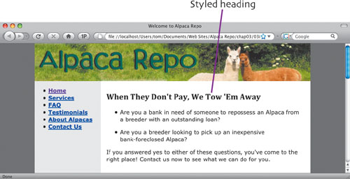
On the Alpaca Repo site, we’re going to style most of the text with a sans-serif font, starting with Verdana. The easiest way to do that is to restyle the <body> tag. By restyling body, we change the look of all of the text in the document, and we don’t have to add any extra classes or ids at this time.
body {
   font-family: Verdana, Geneva, "Bitstream Vera Sans",
                "DejaVu Sans", sans-serif;
   background-color: #666666;
   color: #000000;
   margin: 0;
   padding: 0;
   text-align: center;
}
This rule first sets the font-family to a series of sans-serif fonts. The background-color property is set to a dark gray, which you can see on the left and right sides of the columns in the picture below. The color property sets the text to black. Margin and padding are both set to zero. And finally, we set text-align to center the container div on the page.

While we are styling text, let’s add some properties to the #sidebar id.
#sidebar {
   float: left;
   width: 12em;
   font-weight: bold;
}
You can see in the picture that the links in the sidebar are bold. We are adding the bold property now as a little prep work for when we turn the links into a navigation menu in Chapter 5.
The page is coming along, but we’re not so happy with the look of the headings. Let’s change the look of all heading tags by turning them into a serif font. And because we want all the sizes of headings to appear in this font, let’s change all of them at once.
h1, h2, h3, h4, h5, h6 {
   font-family:  Cambria, "Palatino Linotype", "Book
                 Antiqua", "URW Palladio L", serif;
}
As we mentioned previously, a selector can apply to multiple XHTML tags by simply separating the tags with commas. The result of the rule addition appears at the top of the mainContent div, and makes the page a bit more interesting and easier to read.??????
Style Text p. 41
If you’re used to word processors or page layout programs, you may think that bold and italic are applied in the same property, but that’s not the case with CSS. The former is a value for font-weight, and the latter is a value for font-style.
The text properties can add some interesting options to your text styling. For example, by adding
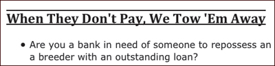
text-decoration:underline overline;
to the heading rule that we defined, you can set off the text even more.
If you’re a designer looking to control the leading of your type, you can do it using the line-height property. Similarly, you can use the letter-spacing and word-spacing properties for more control over the kerning and tracking, respectively, of text. Keep in mind, though, that browser support for these last two properties is uneven, at best.
Instead of using the individual properties for (for example) font-style, font-size, and font-weight, you can use font as a shorthand property by itself to combine them all. For example:
font: italic bold 1.2em “andale mono”;
When you use the font property, it must contain at least a font-size and a font-family, in that order. If you use font-style, or font-weight, put them before the other two properties.
The italic and oblique values for font-style do the same thing. Sorry, typographers!