As a Web designer, you want your site to look its best, no matter which browser your site visitor is using to view it. There are so many possibilities, from traditional desktop and notebook computers, to smartphones like the iPhone and the BlackBerry, to browsers built into consumer electronics devices like the Sony PlayStation and the Amazon Kindle. And for the future, you should anticipate that browsers will be built into any device with a screen; your television is the obvious next candidate for Web surfing.
To meet the challenge of looking good on any device or browser, there are a few different paths that you can take, and we’ll cover them in this chapter. First, we’ll show you how to work around some of the many CSS flaws in Microsoft Internet Explorer. Next, you’ll see how to take advantage of the extensions to CSS found in newer browsers to get great new effects. And finally, you’ll learn how to create special print stylesheets that will help your Web pages look good on that oldest of display devices—the humble sheet of paper.
One of the enduring truths of the Web is that because it may be viewed by many different devices, a designer can’t always be sure what a page will look like to a given user. That simple fact has led to endless frustration, and that frustration is only compounded when you consider that each browser manufacturer is free to interpret the agreed-upon CSS standards as they see fit. A browser maker may choose to render a particular CSS property differently than other browsers, or indeed not support properties supported by most other browsers.
This brings us to Microsoft Internet Explorer (IE), the most widely used browser in the world. As a Web site author, you can expect the majority of your visitors to be using Internet Explorer 6, 7, or 8. In terms of adherence to CSS standards, in our opinion, IE 6 is terrible, IE 7 fixed many CSS bugs, and IE 8 is still in progress as we write this in early 2009, but it aims for full CSS 2.1 compatibility.
Most people are using IE 7 (approximately 50% of all users, as of Q4 2008), with another 20% still using IE 6. So that means that a significant percentage of your site’s vistors will be using browsers that don’t render CSS correctly. If you want your site to work well with IE, there are some workarounds that you must implement.
Adapting your pages for IE involves two parts. The first part is simple: it’s just a bit of conditional XHTML. That’s some XHTML that is wrapped in XHTML comment tags, so that it is only executed by Internet Explorer. The second part is CSS that takes advantage of the conditional XHTML.
The conditional XHTML is straightforward, with an easily understood syntax.
<!--[if IE]>
   Any XHTML here that you want
<![endif]-->
The XHTML comment begins and contains the [if IE] statement. At the end of the XHTML, there’s another comment tag that contains the [endif] statement. This is a Microsoft-only thing, and only IE 5 or later will understand it as an instruction to pay attention to the XHTML inside the comment tags. However, because it appears to be a simple XHTML comment to all other browsers, your page is still valid.
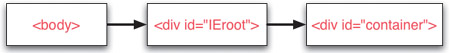
On the Alpaca Repo site, we’ve put this conditional XHTML near the top of each page (between <body> and <div id=“container”>):
<!--[if IE]>
   <div id="IEroot">
<![endif]-->
and this near the end (between </div> and </body>):
<!--[if IE]>
    </div>
<![endif]-->
All this does is check to see if you’re running any version of IE. If you are, you’ll get an extra div called #IEroot around #container. If you aren’t, you won’t.
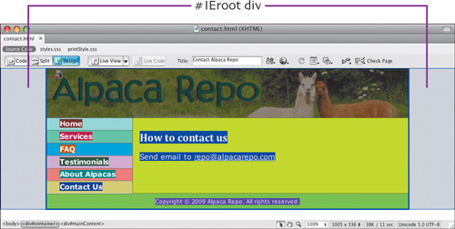
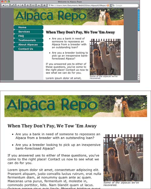
We’re using Adobe Dreamweaver’s handy ability to show the boxes on a page in different colors. The conditional XHTML creates a new div, #IEroot, around #container, but only in IE.
Now that we’ve wrapped a new div around the whole page for IE users, we need to write some CSS that targets that div. To show that, we’ll use a modification of one of the table examples in Chapter 6. We took one of the tables from Chapter 6 and styled it one way for non-IE browsers and another for IE. Remember how we said in that chapter that IE can’t handle last-child and IE through version 7 doesn’t handle border-spacing? Well, this works around that—the non-IE browsers get the better versions, and IE gets the older stuff.
In our CSS, we need a way to target elements on the page if the user is employing one of the more capable browsers, such as Firefox and Safari, and a different way to target those elements if the page is being viewed in IE.
To do that, we’ll use the > operator, which is the child selector. A child selector targets an immediate child of a certain element. In other words, the child selector lets you set rules that are only applied when a particular element is directly inside another element you specify.
Here’s how we’re using it. If we want to write some CSS just for IE, all we have to do now is write:
#IEroot #myTable {
   border-collapse: collapse;
}
The end result of that is that you get a rule that only ever applies to IE. In a nutshell: all you have to do is add #IEroot before your rule, and it becomes an IE-only rule.
The reverse side of that is that you can add non-IE rules as well, just by writing, say:
body > #container #myTable {
   border-spacing: 6px;
}
This works because the #container div is an immediate child of body only for non-IE browsers.
This can be a little puzzling, so a diagram of the structure of the XHTML file can help.
This is the structure seen by Internet Explorer.
This is the structure that non-IE browsers see.
Here’s the CSS, first for the more capable browsers, such as Firefox and Safari:
body > #container #fiberChart {
   border-spacing: 6px;
}

body > #container #fiberChart tr:hover {
   background-color: #BAE8BF;
}

body > #container #fiberChart td:last-child {
   text-align: right;
}
These rules contain selectors that IE doesn’t handle, such as border-spacing and last-child. As a result, the CSS can be relatively short.
For IE, the CSS is more extensive:
#IEroot #fiberChart td+td+td+td {
   text-align: right;
}

#IEroot #fiberChart {
   border-collapse: collapse;
}

#IEroot #fiberChart tr+tr+tr,
#IEroot #fiberChart tr+tr+tr+tr+tr,
#IEroot #fiberChart tr+tr+tr+tr+tr+tr+tr,
#IEroot #fiberChart tr+tr+tr+tr+tr+tr+tr+tr+tr,
#IEroot #fiberChart tr+tr+tr+tr+tr+tr+tr+tr+tr+tr+tr {
   background-color: #EEEEEE;
   border-bottom: 2px #006600 solid;
}

#IEroot #fiberChart tr+tr,
#IEroot #fiberChart tr+tr+tr+tr,
#IEroot #fiberChart tr+tr+tr+tr+tr+tr,
#IEroot #fiberChart tr+tr+tr+tr+tr+tr+tr+tr,
#IEroot #fiberChart tr+tr+tr+tr+tr+tr+tr+tr+tr+tr {
   background-color: #BAE8BF;
   border-bottom-width: 0;
}
In these rules, we’re selecting the #IEroot div, then acting on only the elements within that div. Because the div is created by the conditional XHTML only in IE, the rules only take effect in IE, and are ignored by other browsers. The actual work being done by these rules is very similar to the way we formatted tables in Chapter 6; take a look there if you need an explanation of how these rules work.
The results of this table formatting are different by design; we could have made the CSS produce equivalent results, but we prefer to show you how to achieve two different looks.
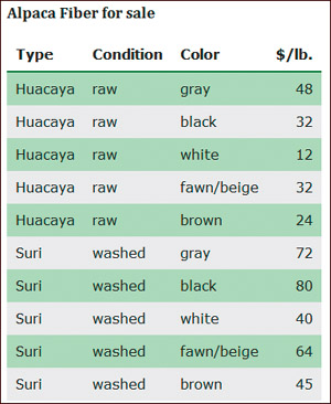
The table as formatted in Internet Explorer.
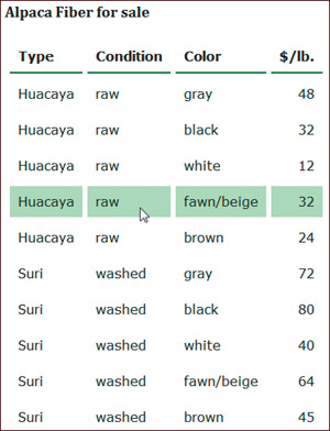
The table as formatted in Firefox.
Ever since the Web became a popular medium in the mid-1990s, Web site designers constantly pushed the boundaries and limitations of XHTML to create pages that reflected their vision. This desire to do more with Web pages eventually led to the creation of CSS and XHTML and their standardization by the W3C, the World Wide Web Consortium. But as the Web became more complex, the pace of standards change by the W3C has slowed to a crawl. The currently accepted, widely supported version of CSS, CSS 2.1, has still not become a final and official standard (as of January 2009), and the next standard, CSS3, has been in the works since 1998, with no final resolution in sight.
On the Alpaca Repo site, we’ve used a CSS3 property, text-shadow (only supported by Safari and Firefox 3.1 or later), and applied it to all the headings.
h1, h2, h3, h4, h5, h6 {
   font-family:  Cambria, "Palatino Linotype", "Book Antiqua",
                 "URW Palladio L", serif;
   text-shadow:  #444444 2px 2px 4px;
}
The text-shadow property has the values color, x-offset, y-offset, blur-radius.
The result, shown in Safari, shows the subtle shadow added to the heading.
We also added text-shadow to the button text in the sidebar, both in the normal state and in the hover state.
#sidebar a {
   text-shadow: #264C4C 2px 2px 4px;
}

#sidebar a:hover {
   text-shadow: #264C4C 1px 1px 2px;
}
The result looks like this:
Although the W3C moves slowly, browser manufacturers are sensitive to the desires of their customers. Consequently, over the years, they have produced a variety of browser extensions, which are CSS properties that are understood by a particular browser, and not by other browsers. We’ve seen extensions for Firefox, Safari, and Internet Explorer. These extensions add any number of abilities to the CSS rendered by these browsers. For example, many extensions provide selectors and properties that are expected to be included in the eventual CSS3 standard. Others, especially some of the Apple extensions, add stylistic tweaks that allow Web sites to more closely mimic Mac OS X user interface elements.
Browser makers have implemented these extensions with care, however. They don’t want designers to start to use extensions, and then later get messed up when the standard actually does ship and the syntax has changed. So they’ve come up with a convention that will protect developers’ work in the future. If a browser maker does add something non-standard, they start its name off with a dash, followed by the vendor name.
One of the nicest bits about browser-specific CSS is that if you’re on the page with anything other than that specific browser, there’s absolutely no effect, positive or negative. So if you’re designing your page to look really cool in Firefox, for instance, you don’t have to worry about these properties screwing up other browsers.
You probably noticed the rounded corners on the buttons in the sidebar; we produced those (supported in Safari and Firefox 3 and later) with the border-radius property, with specific versions for each browser. In these declarations, webkit refers to the Web rendering engine built into Safari, and moz is a reference to the Mozilla Foundation, the sponsors of the open-source Firefox browser.
#sidebar a {
   -webkit-border-radius: 10px;
   -moz-border-radius: 10px;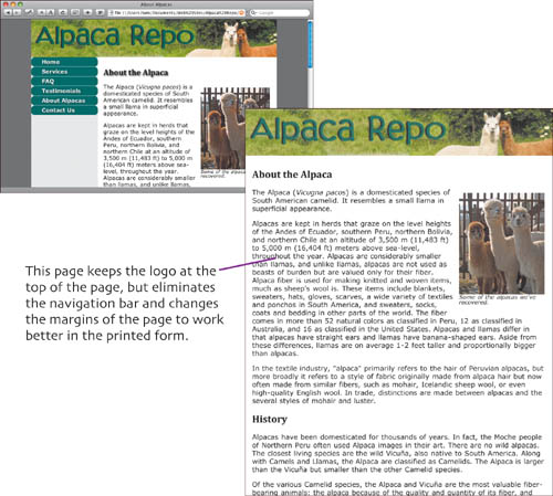
}There’s a tendency to think of the Web as a medium that only appears on screens, whether it be the screen of a computer or a mobile device. But the Web is a flexible and useful medium, and people often want to print hard copies of Web pages for reference or even for archival purposes. However, often when you print a Web page, there is a lot of the page that you just don’t need in the printed document. For example, you probably don’t need the Web page’s navigation bar, and you might not need some of the images on the page either. With CSS, you can create a special stylesheet that only takes effect when the page is printed, and omits the information that you don’t want to print.
To begin creating a print stylesheet, you’ll need to link the new stylesheet, which we’re calling printStyle.css, in the XHTML of your page, as we discussed in Chapter 1.
<link rel="stylesheet" href="printStyle.css" type="text/css" media="print" />

<link rel="stylesheet" href="printStyle.css" type="text/css"
media="print,handheld" />
As an alternative, this second example includes the handheld media type, because handheld devices (the major exception being the iPhone; see the Extra Bits for more information) often have browsers that can’t handle the complexities of modern Web pages well, and so a simplified representation is more appropriate.
Next, in each of the following rules in the CSS file, all we’re doing, really, is backing out something that was done in the main styles.css file.
#container {
   width: 100%;
}
Here we reset the width of #container from 80% to 100%, because we don’t want the big side borders when we print.
#sidebar {
   display: none;
}
When we print, we also don’t need to see the navigation.
#mainContent {
   margin-left: 0;
}
In the online version, we set a large left margin on #mainContent so that it doesn’t overwrite the navigation. We need to turn that off for the print version.
h1, h2, h3, h4, h5, h6 {
   text-shadow:  #444444 0 0 0;
}
Finally, shadows don’t look good when printing, so we want to get rid of them, too.?????????
Add Print Stylesheets p. 93
There are many media types, and though we’re focusing on the one most commonly used, print, it is just one of them. This table includes them all.
all
Suitable for all devices. If no media type is used, this is the default.
braille
Intended for Braille tactile feedback devices.
embossed
Intended for paged Braille printers.
handheld
Intended for handheld devices (small screen, limited bandwidth).
print
Intended for paged material and for documents viewed on screen in print preview mode.
projection
Intended for projected presentations, for example projectors.
screen
Intended primarily for color computer screens.
speech or aural
Intended for speech synthesizers.
tty
Intended for media using a fixed-pitch character grid (such as teletypes). Authors should not use pixel units with this media type.
tv
Intended for television-type devices (low resolution, color, limited-scrollability screens, sound available).
When you’re working with print stylesheets, you can sometimes preview how your page will print. Tell Safari/Mac you want to print, and the Print dialog shows how it will appear when it’s printed—you don’t actually have to waste the paper while making sure your page looks good. Or tell Firefox/Mac to print, then just click Preview in the following dialog. On Safari for Windows, use the File > Print Preview menu choice to see how your printed page will look.
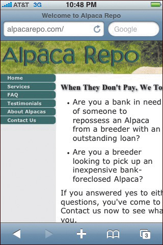
The Safari browser in the iPhone is, for our purposes, identical to the Safari browser in desktop versions of Mac OS X or Windows. It doesn’t identify itself with the handheld media type, and Web pages look pretty much the same as they do in Safari on the desktop.
If there was anything else that we wanted to get rid of or not see when printing, we could add a rule for that with display:none as well. On the other hand, if there was something we wanted to show only when we were printing, we could put it on the main stylesheet with display:none and then use display:block in this stylesheet to make it print.