
The Sustainable Quality Model
I believe there is a new holistic way to look at quality. It starts by building a strong foundation. You need a solid foundation as your base to build and grow your quality strategy. I believe that foundation should be a culture of quality. You need to develop a culture that truly embraces what you are trying to build. On top of that foundation, you need to create vision. You need a roadmap to show where you are going, with clear goals and objectives to get you there. You cannot expect anyone to follow you if they do not know where you are going. Once you have a direction, you need to provide the tools and the training to accomplish the goals and objectives. The new model is shown in Figure 3.1.

Figure 3.1a

Figure 3.1b New quality model
A New Approach
I believe that where most improvement efforts fail is that culture is either not ready to embrace the initial change, not ready to sustain the changes after they are made, or both. Even the best methods and tools will fall short if they are introduced into an environment that is not ready for them. This can happen when top management pushes a methodology from the top and the culture does not embrace it. I have been in companies where I experienced this firsthand. Nothing wrong with the methodology, but the change never had a chance. At one of the large companies I worked at, one of the executives heard from his peers at other technology companies that Six Sigma helped them with some significant improvements. Soon after, there was a mandate that all organizations needed to complete a Six Sigma project. A group of Six Sigma black belts were brought in to assist the organizations. The culture was never prepared for this type of mandate. I remember talking with other managers and the general feeling was this is another program of the month. A few of us managers tried to work with the black belts to do something meaningful. But by and large, most managers just went through the motions to get this checked off their “to do” list.
In these situations, it is not unusual for people to just go through the motions. At best, it will fizzle out as soon as top management loses interest or moves the priority to something else. The worst case is trying to introduce change into a dysfunctional or even toxic environment. It is a waste of everyone’s time. Most people in those types of environments are either looking to survive or looking to leave. In this type of culture, people are not likely to go “above and beyond.” In a toxic culture, it is more likely “I’m doing the bare minimum, until I can find a way out of this situation.” They most certainly are not focused on process improvement. Fix the culture before you can fix the process.
I worked at a small tech startup that had a stressful and demanding environment. We talked about improvements, but they were never a priority until there was an issue. Frustration and burnout turned into people leaving. It was not the average or above average performers that got frustrated and left the company first. It was the top performers that could walk out the door and immediately find a new job.
A long-term, sustained commitment to quality only comes from employees that feel good about what they are doing and feel good about who they work for. This type of dedication is often referred to as a “culture of quality” and only comes from a work environment and leadership that values each employee. This type of culture creates a sense of belonging and pride in the company, as well as its products/services. To develop this type of culture you must drive out fear, break down barriers, and provide employees with the vision, tools and support that “inspires” them to do their best. This culture is fundamental to any sustainable change.
What Is Culture?
When we talk about culture, what exactly do we mean? Culture represents the beliefs, values, rules of behavior, attitudes, and norms that reflect a company’s values and modes of operation. It is the day-to-day environment that everyone works within. Every company has a culture—but not all cultures are conducive to helping a company achieve its goals. It is not unusual for companies to have a “stated culture,” and another that is the “real culture.” The “stated culture” may sound good on paper or on a website but may not be true.
Some of the main components that make up a culture might include:
• Behaviors based on people interactions.
• Norms for how employees work together, individually and in groups.
• Dominant values adopted by the organization.
• Rules of the game for getting ahead.
• The overall climate.
Additionally, there are key factors that influence a culture that should be considered:
Business Environment
• Social values
• Diversity
• Company maturity
• Outside influences
• Competition
Type of Company
• Industry
• Products/technology
• Size
• History
• Market position
• Quality maturity
Employees
• Values
• Attitudes
• Knowledge
• Experience
• Collaboration
• Loyalty/commitment
• Vision
• Management style
• Communication style
• Growth opportunities
• Pay structures
• Benefits
• Recognition
• Teamwork
• Work conditions
Warning Signs
It may not always be easy to spot a problematic culture. Especially, if you are not looking for it. Culture can exist on multiple levels. The working environment at the top levels is not necessarily the same as at the lower levels. Problems occurring at the worker level may not be seen at the executive level, depending on the size of the company. To create real and lasting change, your business must tackle cultural issues on all levels. Changing your culture is a challenging process, but it is not impossible. With the right approach, you can turn around the mindset of your employees. It starts with understanding some of the warning signs. Do you recognize any of these warning signs in your workplace?
• Missed Deadlines. Consistently (or too frequently) missing key deadlines. There can be several causes, but it is important to understand why commitments are not being met. Are the deadlines realistic? Were the people doing the work involved in setting the deadline? Was their input ignored? Have they been properly trained?
• Mistakes/Errors/Defects. Consistently finding mistakes or errors that need to be resolved. This would include finding new errors or repeated errors. Consistently dealing with issues is time-consuming and costly. It is important to know that human errors are consequences, not causes. To understand the root cause of these errors, deeper analysis is needed. Do not accept that the root cause for the mistakes was due to human error. If humans are making mistakes, there is a reason. Do not treat the symptom; get to the actual root cause.
• Inefficiencies. It is possible that work is getting done. But it takes too long, or it requires additional work to make it right. This can also be where certain work items are not always done the same way, leading to greater variation in the results.
• Customer Complaints. Nothing can derail a company faster than unhappy customers. Typically, less than 5 percent of unhappy customers will complain directly to you. On average, a dissatisfied customer will tell 10 or more people about their poor experience. In many cases, it takes 40 positive customer experiences to make up for a single bad experience.
• Turnover/Absenteeism. Losing good talent and experience can be costly for any company, especially when there is little overlap or cross-training in place. The cost to bring a new employee up to speed is expensive (in time and money). Employee turnover has a direct impact on company revenue and profitability. The cost of replacing an employee can be 50–100 percent of their annual salary, depending on position. These costs include advertising, interviewing, screening, and hiring. Then it may take a new employee one to two years to reach the productivity of the previous person, which might directly impact your customers. This also has an impact on remaining employees who see the high turnover and become more disengaged and less productive.
• Team Dysfunction. While some amount of disagreement or difference of opinion is healthy, too much can become a problem. Also watch for lack of team communication or collaboration. The dysfunction could be horizontal (across groups) or vertical (manager to employee).
• Impact on Quality. It is easy to see how these types of issues can have a negative impact on quality. You want to be at your best to produce your best. But if you are hampered by mistakes, turnover, and dysfunction, you are certainly not at your best. You need to understand the root cause for these issues before you can focus on improving. For most, if not all, of these issues, the cause may be directly tied to your culture. Culture can make or break an improvement effort as well as the company. We will be focus more closely on the relationship between culture and quality in the next section.
Tier I: Quality Culture
What Is a Quality Culture?
A long-term, sustained commitment to quality only comes from employees that feel good about what they are doing. This means a sense of purpose and a role that contributes to that purpose. They need to feel good about who they work for. At a micro level, this means their direct boss. Do they trust her or him? At a macro level, this is the company. Do they believe in top leadership and the direction they have the company headed? When these all align and the employee feels safe, confident, and motivated, they become dedicated. This type of dedication is often referred to as a “culture of quality.” It only comes from a productive work environment, where employees feel valued and appreciated. This type of culture creates a sense of belonging and pride in the company and its products/services. To develop this type of culture, you must drive out fear, break down barriers, and provide employees with the vision, tools and support that “inspires” them to do their best. A quality culture is fundamental to any sustained change.
Think of a time in your personal or work life, where you were genuinely inspired and entirely focused on doing your absolute best on some project, task, or job. How did you feel about the environment you were working in? Was it safe? Supportive? Even encouraging? How did you feel about the actual work you were doing? Confident? Challenged? Maybe a stretch for you from previous work? Think about the driving factors that made this important to you? Was there a sense of achievement? A sense of pride? Were you a part of a team that you could not let down? Were you breaking new ground on something that had not been done before within your circle of friends, your family, or with coworkers?
If these questions help you conjure up that image of a special time in your life, when you were at your absolute best, then you know what an ideal quality culture is.
Now think about your current work environment. Is there a sense of pride that spans companywide? Is each person inspired to do their best? Or does the environment (culture) strip that inherent desire away from them? If it is the latter, can you honestly expect a continuous improvement effort to take hold?
Developing pride in your company is hard. But unfortunately, destroying pride in workmanship and the company is easy. Ignore a worker that raises a potential issue (or worse, chastise them for it), force them to work long hours (on a regular basis) or without the tools and training to be successful, demand results based on unclear or unreasonable expectations. All of these contribute to a poor culture. Additionally, you must eliminate any type of harassment from your workplace. This includes bullying and unprofessional behavior from anyone in a position of authority. All too often, top management does not see the middle manager or lead technical person that bullies or belittles other employees in meetings or hallways. Even worse, top management knows about it and looks the other way. This is unacceptable, no matter how much you depend on those technical skills.
Ask yourself if any of the symptoms we discussed earlier reflect your current environment: dysfunctional teams, increased employee turnover or absenteeism, customer complaints, increased mistakes, errors, defects, missed deadlines, lack of results, low productivity, increased product returns, and increasing costs.
Take a few minutes and do this little experiment. Go to a site, such as Glassdoor, that has ratings on the different companies. Randomly pick a few companies that have lower ratings. Now go look at the reviews of those lower rated companies. Do you see any comments similar to the common business warning signs or pain points we mentioned above? What do the comments say about the leadership of that business? How is your company rated and what comments do you see from current or previous employees?
You can either create your culture or you let it happen. As a leader, you must consciously create an environment that allows, encourages, and even inspires people to care and want to do their best. The famous management consultant and writer Peter Drucker1 was credited with the quote, “Culture eats strategy for breakfast.” It is not the strategy is unimportant. It is just that having a strong and healthy culture is required before any strategy has a chance to work. Beyond the focus on quality, a healthy culture is essential for the success of your business.
The well-known author and consultant Stephen Covey shared his thoughts on quality and culture. Covey2 talks about an outside-in approach to quality, as compared to an inside-out approach. The outside-in approach is driven by outside influences, like management and “program of the month” scenarios. But the inside-out approach is internally motivated. As Covey states, you can hire the hands and backs of people, but they volunteer their minds and hearts. You get the most out of people when they work in an empowering environment and feel a sense of accomplishment.
Culture and Motivation
Culture shapes employee motivation. Understanding motivation (and de-motivation) may help you to develop a more desired work environment.
Recall the Maslow Theory of Motivation.
• We each have a hierarchy of needs that range from “low” to “high.”
• Maslow’s theory maintains that a person does not reach for a higher need until the need of current level have been satisfied.
• Maslow’s hierarchy pyramid3 shows five levels.
Applying Maslow’s hierarchy to the workplace:
1. Level 1—Physiological needs: Provide ample breaks and pay salaries that allow workers to buy life essentials.
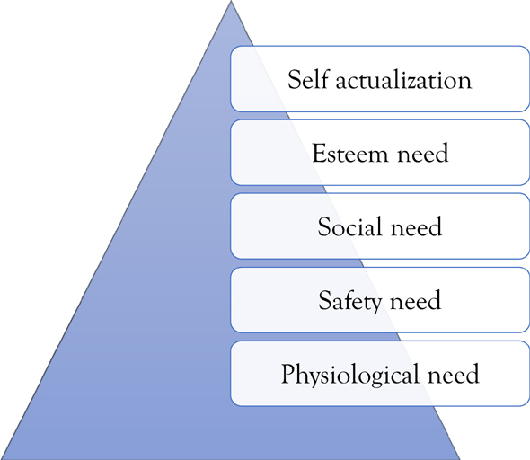
Figure 3.2 Maslow’s hierarchy of needs
2. Level 2—Safety needs: Provide a safe environment for work, relative job security, and freedom from threats and harassment.
3. Level 3—Social needs: Generate a feeling of acceptance, belonging by reinforcing a team dynamic.
4. Level 4—Esteem needs: Recognize achievements, utilize talent appropriately, and provide status to make employees feel valued and appreciated.
5. Level 5—Self-actualization: Offer challenging and meaningful work assignments.
But how do these basic needs tie into quality? Table 3.1 shows how the levels align.
Now if we take this one step further, Table 3.2 looks at how we transition from a traditional company culture to a quality culture:
Maslow’s Hierarchy |
Satisfies Maslow’s Needs |
Impact on Quality |
Self-actualization Needs |
Creative and challenging work Participation in decision making Job flexibility and autonomy |
Cultural alignment, trust in policies, beliefs, methods, and communications within the company. Opportunities are clear and achievable. |
Esteem needs |
Responsibility for important job Promotion to higher status job Praise and recognition from boss |
Organizational trust in company’s products, direction, leaders and doing the right thing. You feel compelled to do things right. |
Social needs |
Friendly coworkers Interaction with customers Likable boss |
Interpersonal trust with other coworkers and team members. Collaboration is the norm. |
Safety needs |
Safe working conditions Job security Base compensation and benefits |
Managerial trust with your direct manager and overall leadership. You feel appreciated and supported. |
Physiologic needs |
Rest breaks Physical comfort on the job Reasonable work hours |
Comfortable work environment and comfortable work conditions. |
Table 3.2
Traditional Culture |
Quality Culture |
Hierarchical style |
Participative style |
Top-down information flow |
Top-down, lateral, and upward information flow |
Inward quality focus |
Customer defined quality focus |
Functional focus |
Process focus |
Short-term planning |
A vision for the future |
Sporadic improvements |
Sustainable continuous improvement |
Top-down initiatives |
All staff involved and engaged |
Manage and delegate |
Lead and coach |
Direct |
Empower |
Counsel |
Ownership and participation |
Functional and narrow scope on jobs |
Integrated functions |
Enforcement |
Promoting mutual trust |
Firefighting—a few individuals/groups |
Team initiatives—focus on continuous improvement |
We talked about how culture can shape motivation. But some management actions can quickly de-motivate employees, adversely affecting culture. Here are some of the more common demotivators:
1. When an employee hates their boss. Most employees quit their boss, not the company. If the employee cannot trust their direct boss, at the very least they will be demotivated. More likely they will eventually leave.
2. Having a toxic culture. A bad culture can suck the productivity out of people and kills any creativity. This is the top reason for high turnover.
3. Overwork your people. It is not unreasonable to occasionally expect some long hours from your employees. But if “occasionally” turns into “ongoing or normal,” that is a problem. Demanding more and more from your employees leads to burnout, more mistakes, and higher absenteeism.
4. A lack of vision. Everyone looks for meaning in their jobs. They want to know they are contributing something that makes the work rewarding. Give them a reason for what they are doing, “a constancy of purpose,” as Deming stated.
5. Unclear expectations and poor communication. It is hard to hit the target when you don’t know what the target is. This can be so frustrating for an employee. You should never have to guess if you are working on the right thing or doing things right.
6. Harassment. Any type of harassment or bullying causes disengagement. These types of issues will continue to escalate until someone quits or gets fired.
7. Micromanaging. Overmanaging or babysitting employees that do not need it kills creativity and confidence. It either drives them to stop thinking or drives them to leave.
8. Lack of on-boarding plan. Nothing worse than bringing a new person on board and have nothing ready for them, such as a workspace, initial tasks, training, and so on. All the enthusiasm they came into the company with will begin to fade away quickly.
9. No consistency. Why establish processes, policies, and procedures if they are not enforced? It is especially bad when management continues to make exceptions or excuses for not following the very processes they wanted in place.
10. Not addressing poor performance or addressing it to the general workforce (instead confronting the poor performer directly). It is never comfortable to confront an employee on a performance issue. However, that is part of manager’s responsibility and it impacts others when they see that poor performance is not addressed. It is no help to the poor performer either, if they do not realize there is a problem. Hold your employees accountable but do so by getting to the root of the problem (e.g., Are the requirements clear? Is there a training issue?) You need to understand the problem before you can address it.
11. Treating everyone equally (when the performance is not equal). This is the opposite of number 10. This is giving everyone credit when the workload is not balanced. You need to understand who is contributing and who is not. Assuming everything is equal when it is not can be very demotivating for the person or persons carrying the load.
12. Management not following through on their promises. If your employees cannot trust you, they will not follow you. Do what you say you will.
Tier II: Quality Strategy
If we look at the next level in the sustainable quality model, the middle tier is a quality strategy.
We can break the strategy into three key parts:
1. Shared vision (future state). This is where you create your lofty shared view of the future.
2. Current realty (current state). It is important to know where you currently are, so you can assess that gap to the future. Be honest with yourself.
3. Action plan (the gap). The gap is about building that bridge. It is your plan of action. The details of your action plan get worked out through goals and metrics.
Figure 3.3 shows how these three parts all fit together.
Your quality strategy should have a positive influence on your culture. It feeds into the social, esteem, and self-actualization needs discussed previously. Having a clearly stated direction is empowering. Team interactions will improve and day-to-day decision-making gets better. This is possible when you have a well communicated strategy and vision. Every decision should be determined based on whether it helps or hinders you from reaching your immediate goals and ultimately your vision.

Figure 3.3 Quality strategy model
Shared Vision
Every business should have a clear and well-articulated vision of their future. Having a clear picture of where you want to be is a critical success factor. You often hear of elite athletes that use visualization as a key part of their training. It is equally, if not more important in business. A clear vision should provide hope, purpose, and inspiration. When we talk about vision for sustainable quality, it is not referring to the company vision statement. However, the quality vision should support the corporate vision. The important point is that building a quality strategy also starts with a vision. With respect to quality, where do you want to be in one year? three years? five years?
I have found that vision can be a polarizing word. You have people, like me, that get excited when I hear the word vision. I get excited because it immediately makes me think about possibilities, opportunities, and getting better. In fact, significantly better. But for others, vision is instantly associated with “change” or “dreaming.” Not everyone embraces change. Some people are unsure about working toward something that is not tangible or demonstrable. This should not stop you from creating your new vision. Just be aware of the challenges and that some people will be much harder to convince than others.
The vision for quality, and for the entire business, should be a well-defined and set a clear image of the future. And not just a vision, but a “shared vision.” Peter Senge,4 in his book The Fifth Discipline says, at its simplest level, a shared vision is the answer to the question, “What do we want to create?” “It’s not an organizational mandate.” “When people truly share a vision they are connected, bound together by a common aspiration.” Your work becomes part of something larger. There is a sense of purpose. If you have the right culture, a shared vision can be a powerful thing, pulling everyone together to accomplish something remarkable.
From a quality perspective, your vision should paint an inspiring picture of your future state. It needs to be defined clearly, in measurable terms. If you cannot clearly define it, how will you know if you get there? That is not to say that things cannot change along the way (and they most likely will), in which you will have to adjust. But the more specific you are, the better you can put a plan in place to get you there.
Think about what is important to your business. This might include:
• Improving customer satisfaction
• Reducing time to market
• Improving margins
• Reducing operational costs
• Reducing rework, repair, retest, scrap
A shared vision is about creating excitement and passion. It should inspire action and propel you into improving your customer’s experience, your employee’s experience, and your overall business success.
When Fusion-io got acquired by SanDisk, we had a small but highly talented quality and reliability team. After the acquisition, we got moved into the SanDisk Corporate Quality group but continued to support the Fusion-io manufacturing and engineering teams, which also got moved into corporate groups. As the postacquisition planning and integration continued, it became evident our group would eventually be split up or laid off. However, there were a few things we learned during that integration period. We were much more advanced in our tracking of field performance, as well as our overall quality reporting including the work we were doing with cost of quality. Additionally, we knew we had strong supporters for these functions in the manufacturing and engineering ranks. So, in an attempt to save jobs, I proposed we reinvent ourselves and create a center of excellence. We had some long team meetings to flush out this new vision. We put together a final proposal that emphasized these focus areas and how we could help other groups. I called on some business leaders to voice their support for our work and I pitched the proposal to the head of corporate quality. He bought in completely. The vision to do something bigger and better completely revitalized my team, as we went from thinking our jobs were at risk to working across the entire company, raising the bar for all product lines.
Current Reality
Before you get to where you want to be, you must know where you are starting from. If you have measurements in place already, you are a step ahead. If not, you will need to create a baseline as your starting point.
1. Establish a baseline. This is an important step to understand the climb toward your future state.
(a) Where are you at today?
(b) What’s working?
(c) What’s not working?
(d) Why is it not working?
(e) What measurements are in place?
(f) What can be measured, that is not?
![]() Defect rates?
Defect rates?
![]() Cost?
Cost?
![]() Cycle time?
Cycle time?
Start collecting and analyzing the data that you have.
Once you know your current state and where you wish to be. The “distance” between these two points is the very gap you need to bridge to succeed. This is where it takes some analysis to figure out the root causes for this gap.
Ask yourself the following questions:
• What actions and decisions caused our current position?
• Why did the gap happen?
• What could be done differently?
• What resources are required to achieve our goals?
• What are the critical issues we are dealing with today?
• What critical issues do we see in the foreseeable future?
• What changes/improvements can we make to incrementally get us to our desired (vision) state?
Goals (Long Term)
After you have assessed how far you are away from your future state, you should have some sense of the time it will take you to get there. You will have to consider all the factors that contribute to that timing (e.g., resources, budget, training, workloads, etc.). Achieving a lofty vision does happen overnight. So, chances are you are going to need some long-range goals (e.g., one year, five years, longer?). When planning long-term goals, you want them to be meaningful, clearly stated, and measurable. For these types of goals, I use a methodology called GQM.
GQM
Goals–questions–methods (GQM)5 is a method or approach that was developed by Victor Basili and David Weiss when trying to find a better way to collect valid and useful data, while working on the NASA Goddard Space Flight Center. This is a top-down method, shown in Figure 3.4, that starts by creating a meaningful set of goals that you have set for your organization. You then develop the questions you want answered to help achieve those goals. Lastly, you define metrics that will help you answer those questions.
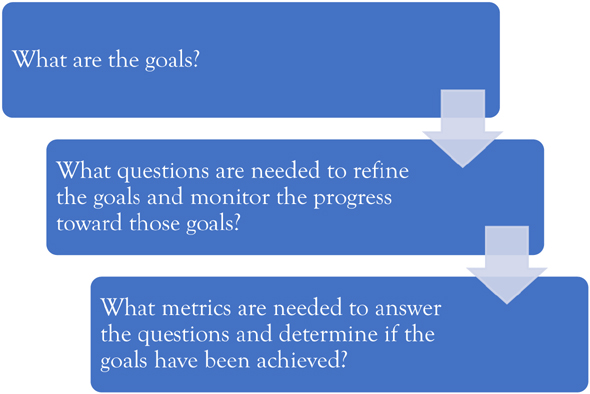
Figure 3.4 GQM flow
As you flush out the information about your goals, questions, and metrics, everything should tie back to your vision in the form of a tree structure.
Goals should tie back to the vision, questions should tie back to a goal, and metrics should tie back (and help answer) the questions.
There are probably more elaborate methods for developing and tracking GQM, depending on the scope and size of your effort. But for projects I have worked on, a simple spreadsheet has worked fine for documenting and tracking progress. Table 3.3 shows an example related to a new product validation effort and product readiness.
Addressing the Gap
Once you have your goals, questions, and metrics defined, you need to compare the current state to the future state. Where are you today compared to the key goals you defined? What are the challenges or barriers preventing you from achieving those goals? What changes or improvements are needed to break through those barriers? Depending on how big the gap is, it may seem overwhelming. If it does, you need to break your action plan into reasonable deliverables. For the more short-term deliverables, which should tie to your longer-term goals, you can create a set of initiatives that can be accomplished using the Six Sigma DMAIC methodology. Select one of the goals and create a Six Sigma project to address it.
Goals |
Possible Questions |
Possible Metrics |
1. Provide a technical assessment of the risk associated with the validation of product requirements |
a. Are the requirements clearly defined? |
Approved requirements plan |
b. Are the requirements clearly understood and agreed to? |
# of requirements validated |
|
c. Are the high-priority requirements identified? |
# of requirements not tested |
|
d. What percentage of the requirements have been validated? |
# of requirements failed |
|
e. What are the known risks (i.e., failures)? |
# of requirement changes |
|
f. What are the unknown risks (i.e., untested requirements)? |
||
2. Communicate the status of customer relevant data, measuring “plan” versus “actual.” |
a. Does the product demonstrate required functionality? |
# of open problems |
b. Does the product meet its expected Reliability, Availability, Serviceability goals? |
# test cases planned/executed |
|
c. Does the product meet its required agency standards? |
# of hard failures |
|
d. Does the product meet its expected performance goals? |
Mean Time Between Failures (MTBF) / Mean Time Between Interruptions (MTBI) |
|
e. Are the potential risks to our customers? |
Fault detection/isolation % |
|
f. What are the impact of those risks? |
Defects/1,000 hours of test |
|
3. Maximize the cost effectiveness of the project by using the resources efficiently to drive defect detection earlier in the development process |
a. What are the test escapes? |
# of escapes |
b. What is the cost of the test effort, in: |
People-hours |
|
* People/time? |
In-house equipment costs |
|
* Equipment under test? |
Infrastructure costs |
|
* Test infrastructure? |
# of changes |
|
c. How many “restarts” due to product/code turns? |
Average time to close problems |
|
d. How long do problems stay open? |
tester time utilization |
|
e. How many problems had the “root cause” identified? |
time to closure |
|
4. Maximize the cost effectiveness of the project by using |
a. What are the test escapes? |
# of escapes |
Six Sigma6
Every Six Sigma project uses a structured approach known as DMAIC. This acronym us made up from the first letters of each stage of the approach: define, measure, analyze, improve, and control. An overview of the methodology is shown in Figure 3.4.
Depending on the scope and size of your effort, your overall plan may look something like Figure 3.11.

Figure 3.5 DMAIC methodology
Table 3.4 shows some of the key activities associated with each stage.
Table 3.4
Stage |
Description |
Key Activities |
Define |
Define the problem, goals, objectives |
Develop a project charter, to include: project purpose, alignment of goals to vision, team members. |
Measure |
Establish a baseline |
Develop detailed process maps, collect data from current process(es). |
Analyze |
Analyze the process and process data to understand the issue(s) |
Analyze data, identify anomalies, and poor performance, develop root cause(s). |
Improve |
Develop solution(s) based on previous analysis |
Identify possible solutions, rank/prioritize solutions, pilot top solutions. |
Control |
Develop a control plan to monitor and optimize the improvement(s) |
Verify improvement, develop a control plan to monitor, close out project charter. |
As we get into the next section, we will discuss in more detail, some of the specific tools that can help with the analyze phase and for closing the gap between the current state and the future state.
Tier III: Tools, Methods, and Training
At this point, you are developing a quality culture and have established a clear direction, with well-defined goals and action plans. You now need to equip your team with the resources they need to be successful. These resources would be the right tools, methods, and training to make them successful.
Cost of Quality
Introduction
As mentioned at the beginning of the book, cost of quality (COQ) is a measurement of what you are investing in good quality and what you are spending on poor quality. The best method for understanding how much poor quality is costing you, or conversely how much good quality can save you, is by using real dollars as the measurement.
Formalization of cost of quality was developed out of the work of Joseph Juran, Armand Feigenbaum, and Harold Freeman. The American Society for Quality’s (ASQ) Quality Cost Committee worked to further formalize the concept and to promote its use. Phil Crosby’s publication of Quality Is Free7 provided probably the biggest boost to popularizing the COQ concept beyond the quality profession.
COQ is generally known as the sum of costs incurred to prevent nonconformances from happening (cost of conformance) and the costs incurred when nonconformance in products do occur (cost of nonconformance or “poor quality”).
In companies that do not measure COQ, it is not uncommon for poor quality costs (nonconformance costs) to reach as high as 30 percent
Total Cost of Quality = Nonconformance Costs + Conformance Costs
of sales or more. As stated in the opening paragraph, that means you could be spending 1½ days each week, re-doing work that was not done right the first time. Stop and think about that, just for a minute. What additional work could be realized if you had that entire 1½ days back to work on new things?
Using COQ as the metric, you can plan improvement actions to prevent these poor quality problems and reduce the total COQ significantly. Because COQ is measured in dollars, the savings will ultimately boost the bottom line of the organization.
Putting a COQ program in place is not trivial. Most companies do not have a structure in place that easily allows tracking costs this way. But before we discuss an approach, it is important to understand the different COQ categories.
Cost of Quality Classifications
There are four types of costs captured into the total COQ, shown in Figure 3.6.

Figure 3.6 Cost of quality model
Prevention Costs
These are the costs associated with prevention of defects. This means identifying issues before the product is built or developed.
Examples:
• Formal design reviews
• Training (on product or process)
• Process design
• Requirement specifications (voice of the customer)
• Product design specifications
• Software complexity analysis
Appraisal Costs
These are costs associated with appraisal: inspection, test, audits. These are the costs of “searching” for defects. These costs happen after the product is built or developed.
• Inspection (first pass only)
• Product testing (first pass only)
• Process measurements
• Product measurements
• Audits
Internal Failure Costs
These are the costs associated with internal defects from inspection, test, or audit. These are the costs of “finding” defects. These costs occur before the product is sent to a customer.
Examples:
• Rework
• Scrap
• Re-inspection (after initial inspection)
• Retest (after initial test)
• Lost time due to debug and defect removal
• Development of bug fixes
• Schedule delays
External Failure Costs
These are the costs associated with customer defects/issues. These are the costs of your customer “finding” defects. These costs occur after the product is sent to a customer.
Examples:
• Lost sales
• Replacement costs
• Shipping & Logistics costs due to a quality issue
• Support costs
• Customer downtime & liability costs
• Lost time (including executive time spent on issue)
• Rework
• Scrap
• Re-inspection (after initial inspection)
• Retest (after initial test)
• Lost time due to debug and defect removal
• Development of bug fixes
Understanding Cost of Quality
Understanding what your poor quality is costing you is essential to your business. Consider the cost of a dissatisfied customer.
• An average business doesn’t hear from 96 percent of unhappy customers.
• Of those who complain, 50–70 percent will do business again if the complaint is resolved. And 95 percent will return if resolved quickly.
• An average customer with a complaint tells 9 to 10 people, 13 percent tell more than 20 people.
• Those who have complained and had a resolution tell five people.
Having tracked the quality costs associated with external failures (customer found issues), we found by far the significant impact from poor quality, was lost sales. As hard as it is to gain a trusted customer, it is quite easy to lose one.
When you are collecting the information for quality costs, it is important that you consider all of the costs. Some costs are not so visible. Examples of hidden costs are shown in the bottom half of the iceberg in Figure 3.7. The better you can account for these hidden costs, the more accurate your total quality costs will be.
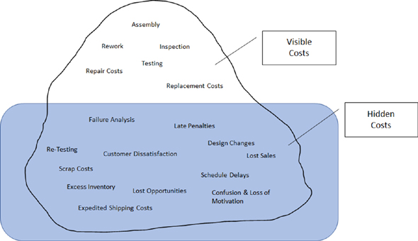
Figure 3.7 Hidden costs
Table 3.5 shows the actual quality costs associated with one product issue that impacted multiple customers. This resulted in a stop ship (i.e., all shipments put on hold until the issue was resolved) for that product.
Table 3.5
Cost Type |
Amount |
Man-hour costs (burdened) |
$336,179 |
RMA/rework/logistics costs |
$198,968 |
Opportunity and lost sales costs |
$10,500,000 |
Total Stop Ship Costs |
$11,035,147 |
If you add up all the costs associated with resolving this one issue, there are hard costs and soft costs. The hard costs included all the man-hours for all the people involved with resolving this issue. That includes the salespeople dealing directly with the customer, and it could involve executives getting on calls with the customer or even on a plane to meet the customer. It includes engineers working on failure analysis: root cause and then a fix. It involves test people testing the fix. It includes logistics people handling returned products. It also includes the hard costs of returned products and shipping out new products, which is often includes expedited fees in these situations. No doubt it is challenging to capture these man-hours and assign a pay rate to them. The logistics costs are a bit easier to track. But most difficult and most important are the soft costs that tell you the real impact. As you can see in the above example, these costs can be multiple orders of magnitude over the other costs. To gather the soft costs for this issue, I got on the phone and talked directly to the salesperson assigned to each of the top customers that experienced this particular issue. Some of those customers withdrew recently placed orders and some cancelled large orders they were about to place. Some customers stated they lost trust with us due to the issues and some stated that the delays impacted their timelines and they moved on to a competitor to fulfill their needs. The number above reflects all these lost orders. Again, this is for one specific issue.
Therefore, it is so important to focus on prevention instead of reacting to issues. Prevention has more leverage, so the priority should be “prevention, not correction.”
Putting a COQ program into place takes effort, training, and discipline. The biggest challenge comes in setting up the data collection needed to track all the costs. This is likely to be a manual effort to start. As with any new effort, the training is necessary to get a shared understanding of how COQ works and why it is important. Then the discipline is required to consistently collect and analyze the data. But once you have your process in place, it can be illuminating.
Trying to put the costs into the correct categories can be challenging at first. The flowchart in Figure 3.8 shows how to determine the correct cost category.
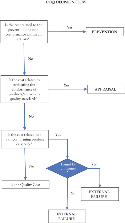
Figure 3.8 Quality cost decisions
Once the specific cost areas are determined for each cost category, a simple spreadsheet like the one in Figure 3.9 can be used to compile the data. In the next chapter, we will discuss some ways to make this easier in the “Quality for Finance” section.

Figure 3.9 Example data collection form for gathering quality costs
Q1 |
Q2 |
Q3 |
Q4 |
|
Prevention Costs |
||||
Appraisal Costs |
||||
Internal Failure Costs |
||||
External Failure Costs |
Figure 3.10 Example summary spreadsheet to compile quarterly quality costs by cost category
Capturing the data is essential, but the real work becomes putting corrective action in place to drive down the failure costs, which should drive down the total cost of quality. You should hopefully start to see trends like the example in Figure 3.11 if your corrective actions are effective.

Figure 3.11 COQ trends
You can eventually utilize this data to isolate and prioritize specific issues. In the example shown in Figure 3.12, we wanted to get a better understanding of the cost and trend of our product returns. But in doing so, we also found we needed to investigate why a growing percentage of the returns were determined to be No Problem Found (NPF) once they went through our failure analysis.
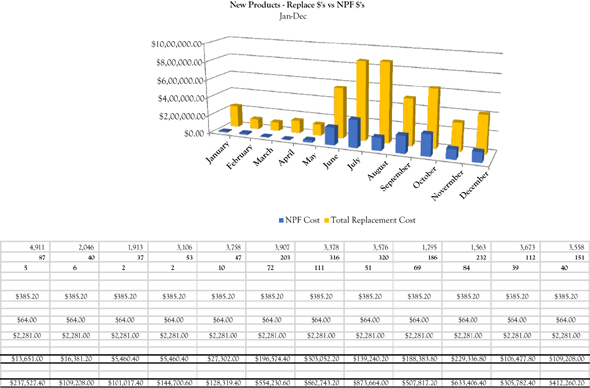
Figure 3.12 Field returns
After digging a bit deeper, we found one of our larger customers to be the major contributor to our NPF issue, shown in Figure 3.13. This turned out to be a handling and training issue that we were able to address with them. Having this data available, made that improvement possible.

Figure 3.13 Customer breakout costs
The chart in Figure 3.14 shows the COQ from a program across its lifecycle. This was before we implemented a COQ program. The chart shows the costs by COQ categories. As you can see, not much time was spent on prevention.

Figure 3.14 Program breakout costs
For companies that do not have a strong metric system in place, COQ is a great place to start. It is an effective method for showing how the lack of quality is impacting your business. This approach provides a valuable structure for prioritizing improvement efforts. By monitoring the trends in this metric over time, you can better understand where to focus your efforts. Since COQ is using real dollars to measure quality issues and quality improvements, you can directly tie your results (both savings and costs) back to your bottom line.
Seven Basic Quality Tools
There is a standard set of tools associated with quality improvement, known as the 7 Quality Tools. These tools are intended to be a good starting point when first getting involved in quality improvement.
1. Check Sheet. A check sheet is a simple list of tasks to ensure no steps get missed. It can be used as reminder to complete each of the steps and the sequence they should be executed in. The check list can be used as a quality record, if there is no electronic record kept. An example shown in Table 3.6.
Table 3.6 Checklist for quality assurance
Number |
Non-conformance |
Corrective action |
Responsible |
Target Date |
Status |
Notes |
|
|
|
|
|
|
|
|
|
|
|
|
|
|
|
|
|
|
|
|
|
|
|
|
|
|
|
|
|
|
|
|
|
|
|
|
|
|
|
|
|
|
|
|
|
|
|
|
|
|
|
|
|
|
|
|
2. Histogram. A histogram is a graphical display of data that visually helps you draw a conclusion. The data is typically based on a specific measurement or attribute and the frequency of occurrence for the different values. In Figure 3.15, the thickness of a printed circuit board was charted across several samples.
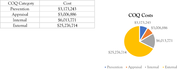
Figure 3.15 Histogram of bare boards
3. Pareto Chart. A pareto chart is another display of data that lines up the frequency bars in ascending or descending order based on frequency of occurrence. In Figure 3.16 the bars are showing the causes of test failures in descending order and the line shows the total accumulated failures.

Figure 3.16 Pareto of test failures
4. Cause and Effect Diagram. A cause and effect diagram (also known as a fishbone diagram) is a team brainstorming tool to help identify possible causes of an issue or problem. You start by defining the problem you are trying to solve and place possible causes into likely groups. You continue to add detail by adding additional branches. In the Figure 3.17, the problem is High Product Returns. The failure groups identified are design maturity, vendor process, and internal process. Each of the failure groups get discussed. As more ideas are generated, more detail is added (shown as branches and subbranches). For example, workmanship (under vendor process) has two sub-branches: poor documentation, poor training. You continue to add detail until the team runs out of ideas and suggestions. Then the diagram is used to develop improvements in the areas identified.

Figure 3.17 Fishbone diagram
5. Control Chart. The foundation for statistical process control was created by Dr. Walter Shewhart working in the Bell Telephone Laboratories in the 1920s conducting research on methods to improve quality and lower costs. He developed the concept of controlling variation and came up with statistical process control (SPC) charts, which provide a simple way to determine if the process is in control or not.
Dr. W. Edwards Deming built upon Shewhart’s work and took the concepts to Japan following World War II. The Japanese industry adopted these concepts. The resulting high quality of Japanese products was directly attributed to the teachings from Dr. Deming.
Regarding SPC, there are generally two types of defects:
“Common Cause” defects. Common cause defects are those defects that occur naturally (i.e., “normal” variation) that is within established control limits. Common defects are what you might see from the day-to-day variation expected from a specific process. While you always want to work on reducing the variation, your process would still be considered “in control.”
“Special Cause” defects. A special cause defect is an indicator that something has changed with your product or process. This would look like Lot #2 in the control chart in Figure 3.18, where you have a point outside the control limits. This is an early indicator that requires investigation. Examples include a supplier that made a process change, a supplier made a material substitution, a software engineer submitted new code without the proper checks, or a new assembly person was added to the line without proper training.
SPC is used to monitor processes and can be applied to both manufacturing and business processes. It uses statistical methods to ensure that the process is stable and monitors the processes for timely identification of special causes. All processes are subject to variation. SPC is used to help understand that variation and process capability. Control charts provide an analytical decision-making tool, which allows you to see when a process is working correctly and when it is not. Control charts also allow you to monitor trends. It is a good to see if your improvements are making a difference. While variation is present in any process, deciding when the variation is natural and when it needs correction is the key to quality control.
Figure 3.18 is an example of a control chart, plotting manufacturing yields.

Figure 3.18 Control chart of manufacturing yields
The example chart is a p-chart that is used for monitoring yields and % defective. The p-chart uses variable control limits based on the sample size. This means as the sample size goes up, the limits (dotted lines) get tighter, which is why the dashes are not a straight line. Upper control limits (UCL) and lower control limits (LCL) are calculated from the data.
For the p-chart above, the data would look like Table 3.7. Notice the number tested (sample size) varies from lot to lot.
Control charts are an essential tool of continuous quality control. Control charts monitor processes to show how the process is performing and how the process and capabilities are affected by changes to the process. This information is then used to make quality improvements. Control charts are also used to determine the capability of the process. They can help identify special or assignable causes for factors that indicate something has changed.
Table 3.7 Data used for p-chart
Lot |
Date |
Tested |
Passed |
Failed |
Yield (%) |
P |
LCL |
p-bar |
UCL |
% Defective |
1 |
15-Aug |
816 |
812 |
4 |
99.51% |
0.00490 |
0.967362954 |
0.98151 |
0.995658289 |
0.49% |
2 |
15-Nov |
285 |
265 |
10 |
92.98% |
0.03509 |
0.95757154 |
0.98151 |
1.005449703 |
3.51% |
3 |
15-Jan |
312 |
300 |
12 |
96.15% |
0.03846 |
0.958630801 |
0.98151 |
1.004390442 |
3.85% |
4 |
15-Feb |
300 |
295 |
5 |
98.33% |
0.01667 |
0.958177691 |
0.98151 |
1.004843552 |
1.67% |
5 |
28-Feb |
290 |
286 |
4 |
98.62% |
0.01379 |
0.957778809 |
0.98151 |
1.005242434 |
1.38% |
6 |
30-Mar |
211 |
210 |
1 |
99.53% |
0.00474 |
0.9536886 |
0.98151 |
1.009332643 |
0.47% |
7 |
7-May |
328 |
327 |
1 |
99.70% |
0.00305 |
0.959195822 |
0.98151 |
1.003825421 |
0.30% |
There are two types of control charts. Control charts for attributes and control charts for variables.
(a) Variable Data
Variable charts are based on variable data that can be measured on a continuous scale. For example, weight, volume, temperature, or length of stay. These can be measured to as many decimal places as necessary. Individual, average, and range charts are used for variable data.
(b) Attribute Data
Attribute charts are based on data that can be grouped and counted as present or not. Attribute charts are also called count charts and attribute data is also known as discrete data. Attribute data is measured only with whole numbers. Examples include: Acceptable vs. non-acceptable, passed vs. failed, forms completed with errors vs. without errors, or number of customer orders with errors vs. without errors.
Table 3.8 lists examples of several types of control charts and when to use them. This is not an exhaustive list, but with a little research you can determine how to set up the right control chart for your processes, what data is needed, and how to interpret the results.
Table 3.8
Chart |
Type |
Use |
u-Chart |
Attribute |
Defects per unit |
np-Chart |
Attribute |
Number of defectives in a sample |
p-Chart |
Attribute |
Percent of defects in a subgroup |
c-Chart |
Attribute |
Number of defectives in a subgroup |
Xbar-R Chart |
Variable |
Mean and range of a group (small) |
Xbar-s Chart |
Variable |
Mean and range of a group (large) |
X-R Chart |
Variable |
Mean and range of individual measures |
The decision tree in Figure 3.19 can help to identify which type of chart to use, based on your process, sample size, and data type.
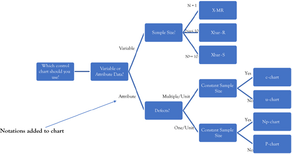
Figure 3.19 Control chart decision tree
6. Scatter Diagram. Another quality tool that can be useful is the scatter diagram. A scatter diagram is a graph, using pairs of numerical data with one variable on each axis. This plot of the points is used to determine if there is any correlation the two variables. The example in Figure 3.20 shows that more cold calls result in higher sales.

Figure 3.20 Scatter diagram for sales
7. Flow Chart. A process flow is a visual diagram that shows a series of steps to get a piece of work done. It typically includes a decision or multiple decisions, which can break the flow into different branches, based on the decision taken. We will discuss processes and flows more in Chapter 7. Figure 3.21 is an example of a high-level process for corrective action. In this example, issues can be identified from multiple sources: at the customer or in manufacturing. There is one decision point. If the cause of the failure is determined to be a bad component, then further failure analysis is required before determining the corrective action.

Figure 3.21 Flow chart for corrective action
Stratification
While I said there were seven basic quality tools, occasionally you will see a stratification chart as one of the seven tools. Just as a point of reference, it is worth mentioning here in case you see it listed as one of the seven tools.
Stratification is a method of dividing data into subcategories and classifying the data based on group, division, class, or levels that help in deriving meaningful information to understand an existing problem. When data from a variety of sources or categories are grouped together, it is difficult to visualize the meaning of that data. The stratification technique separates the data so that patterns of the data can be seen.
8. Lean Tools. The Lean principles are a comprehensive set of tools to drive improvement throughout a process or set of processes. Below are some of the key tools that help with Lean improvements.
5S. 5S comes out of the Lean principles and is a system for organizing spaces so work can be performed efficiently, effectively, and safely. Table 3.9 provides an overview.
Table 3.9
# |
Japanese |
English |
Description |
1 |
Seiri |
Sort |
Eliminate what is not needed |
2 |
Seiton |
Set in order |
Organize by arranging and identifying for ease of use |
3 |
Seiso |
Shine |
Clean the work area |
4 |
Seiketsu |
Standardize |
Schedule regular cleaning and maintenance |
5 |
Shitsuke |
Sustain |
Form a habit of following the first four S’s |
Kaizen. Kaizen is a Japanese term meaning “change for the better” or “continuous improvement.” It is a Japanese business philosophy regarding the processes that continuously improves business operations and involves all employees. Kaizen views improvement in productivity as a gradual and methodical process. It refers to the practice of improving on a regular basis. The practice involves small, incremental changes rather than large changes. With Kaizen, all people within the organization look for possible improvement opportunities, not just managers or executives. The Kaizen philosophy is based off many Japanese management concepts, such as total quality control (TQM), quality control circles, and small group improvement activities with involvement from all employees. It requires a willingness to change and strong communication.
Muda (Waste). One of the best methods to increase productivity, save time, and reduce costs is to eliminate waste. The specific concept, within Lean, that addresses this is called muda. Muda translates roughly as waste and refers to the inefficiencies within processes which you can strive to reduce or eliminate entirely. Muda identifies eight key sources of waste (there were originally seven classic wastes, but an eighth one has emerged over recent years), shown below.
1. Waste of transportation. This is wasted movement of materials.
2. Waste of inventory. Costs associated with items not used in a just-in-time approach.
3. Waste of motion. This is the time and costs associated with the unnecessary travel around the factory or office.
4. Waste of waiting. This is when resources (people or equipment) are not being fully utilized because they are waiting on someone or a prior operation to complete.
5. Waste of overproduction. This is creating, building, and storing more than required for current customer demand.
6. Waste of processing. This is the unneeded steps in key process.
7. Waste of defects. This is the time and costs associated with any additional effort required when the work was not done right the first time.
8. Waste of untapped or underutilized human potential. This is the time and costs associated to an organization when it does not take advantage of the skills or talent available to them.
Poka-Yoke (Error Proofing). Poka-yoke is a Japanese term that means “mistake-proofing” or “inadvertent error prevention.” A poka-yoke is a method or mechanism in any process that helps a worker avoid mistakes. An example would be to add a key and notch on two mating parts, so they can only be put together one way. Another example would be when using online forms, you are not able to hit submit until all required fields have been filled in. The purpose of poka-yoke is to eliminate product or process defects by preventing, correcting, or drawing attention to errors as they occur.
Value Stream Mapping. A value stream map helps to understand the customer’s perspective of value. In this sense, value is any necessary step or action during a process of a product or service that the customer is willing to pay for. Refer back to our discussion of muda (the eight wastes), on where to look for non-value-added steps.
Value stream mapping is a Lean technique that helps companies visualize processes in an effort to define and optimize the steps involved in getting a product, service, or value-adding project from start to finish. When performed effectively, value stream mapping shines a light on ways to either reduce waste within processes or to increase items that directly add value to customers.
A value stream map can be divided into three sections.
1. Production or process flow. In this section, as in a traditional process flowchart, the flow of the process is drawn from left to right.
2. Information or communication flow. In this section all the communication that occurs within the value stream is shown. Note that communication can flow in any direction.
3. Timelines and travel distances. Timelines appear at the bottom of the value stream map. This conveys the time-related data measured in the process improvement.
9. Failure Mode and Effects Analysis.
Developed in the 1940s by the U.S. military, failure modes and effects analysis (FMEA) is a structured approach for identifying possible failures in a design, a manufacturing or assembly process, or in a product or service.
• Failure modes. The ways or modes, in which something might fail. Failures are any errors or defects, especially ones that affect the customer, and can be potential or actual.
• Effects analysis. Refers to studying the consequences of those failures.
Failures are prioritized according to how serious their consequences are, how frequently they occur, and how easily they can be detected. The purpose of the FMEA is to take action toward the elimination or reduction of failures, starting with the highest-priority ones. The information can be collected in a simple spreadsheet that might include:
• Product function
• Function owner
• Potential effect of failure
• Likely severity
• Potential cause of failure
• Probability of occurrence
• Detection capability
• Recommended action
10. Risk Prioritization Number.
The risk prioritization number (RPN) is a structured method for assigning risk to issues. It is particularly useful, when you have a number of issues and need to prioritize which ones should be addressed first. It is based on a multiple of the three values outlined below. It is intended to be a formal mechanism / methodology for prioritizing issues and quantifying the associated risks to the customer, and ultimately the business.
The RPN Formula Is: RPN = “S” × “O” × “D”
As a general rule, the higher the RPN value, the higher the risk to the customer / business and the more critical it becomes to ensure the issue’s resolution.
(i) Value “S”: Issue Severity / Impact
Severity 1 (Priority=Critical). Product, service, process, or function is nonoperational or there is a direct safety threat to the personnel, product, or the environment. The system or product is not operational resulting in a critical impact to the customer’s business, requiring immediate resolution. Weight = 5
Severity 2 (Priority=Major). Product, service, process, or function is severely degraded. The system or product is operational, but with severely restricted functionality or system degradation that impacts the customer’s business (addresses degraded functionality of a product). Weight = 3
Severity 3 (Priority=Minor). Product, service, process, or function is operational with impaired capability. The system or product is operational with functional limitations or restrictions to the overall customer operations (potential impact to customer with limitations to expected functionality). Weight = 1
(ii) Value “O”: Predicted Likelihood of Occurrence
High. High probability to occur during normal conditions (system is being operated within published specifications / limits / configurations). Weight = 5
Moderate. Moderate probability to occur during normal conditions (system is being operated within published specifications / limits / configurations). Weight = 3
Low. Low probability to occur during normal conditions (system is being operated within published specifications / limits / configurations). Weight = 1
(iii) Value “D”: Ability to Detect and Mitigate Without Customer Knowledge / Impact
High. High probability that customer will be aware of the issue or they will be required to take action to remediate it. Weight = 5
Moderate. Moderate probability that customer will be aware of the issue or they will be required to take action to remediate it. Weight = 3
Low. Low probability that customer will be aware of the issue or they will be required to take action to remediate it. Weight = 1
RPN is a good way to manage risks. At one of the startups I worked at, we wanted to prioritize our backlog of issues in preparation for the initial release of our new product. It helped us determine which issues would be addressed in the planned builds leading up to the final release build, based on impact of the issue, along with availability of engineering and test resources. Figure 3.22 shows an example of tracking this in a spreadsheet.

Figure 3.22 Spreadsheet for RPN
Training
Continuous improvement is very dependent on continuous learning. Improvement is based on what we are learning about our products, processes, and people. Within the context of this book, there is a wide range of learning needs, to include:
• Management and leadership training
• Change management training
• Program management training
• Educating teams on the quality strategy, vision, and goals
• Educating teams on the quality methods and tools
• Information and wisdom to come out of the data analysis efforts
• Lessons learned from the improvement efforts
Training is about making an investment in your team. The better the commitment, in terms of planning and resources, the better the return. Your training plan should take into consideration both general and individual training needs. For example, as you roll out the new quality strategy, it should be followed by training to help reinforce the key principles and train them on the methods and tools. This would be general training that everyone should attend (including management). There is also a need for individual training. This type of training is specific to an individual’s role, responsibilities, career aspirations, and development needs. As a manager, it is your responsibility to ensure each employee, as well as the entire team, have the skills they need to be successful.
Training needs can be built into the employee development plan. We will discuss development plans in a later chapter. But for now, here are some considerations:
• Know what skills you need to get the job done right (skills required).
• Know what skills you have on hand (current skill set).
• Develop plans to upgrade or recruit the skills needed to close the gap.
Delivering Training
Take advantage of the many ways that training can be delivered. Delivery methods can range from individual coaching to large classroom settings. Depending on the intended audience and material to be shared, methods could include:
• Classroom training
• Workshops
• Process or training guides
• Small booklets on a specific topic
• Computer-based training (CBT)
• Posting training materials on internal collaboration sites
• Mentoring program
• Individual coaching
1 Hyken (2015).
2 Covey (1994).
3 Research History (2012).
4 Senge (1990).
5 Basili (1992).
6 Alansohn, et al. (2012).
7 Crosby (1979).