Unless you’ve been living in an unelectrified cave for the last decade, you are accustomed to clicking buttons. After providing more information about the first of Tk’s three geometry managers, pack, this chapter looks at Tk’s button widgets. In addition to learning how to use buttons, I’ll show you how to use color in a Tk application and how to bind buttons to commands and events.
This chapter’s game, Memory Test, flashes buttons arranged in a grid in a given sequence (see Figures 10.1-10.4) and then asks you to repeat that sequence from memory, much like the game Simon (except there are no musical tones to accompany the flashing buttons).


As I remarked in Chapter 9, geometry managers arrange widgets on the screen, register them with the underlying windowing system, and manage their display on the screen. Of the three geometry managers Tk uses, pack, grid, and place, pack and grid are general-purpose. I start with pack because it is the one I use most often and because it was the first geometry manager Tk used. I’ll discuss the grid geometry manager in Chapter 11, “Windows, Frames, and Messages.”
The first thing to understand is that pack is constraint-based, meaning that rather than specifying precise placement information for widgets, you tell pack in general terms how you want widgets placed, that is, you define limits or constraints on widget placement, and then allow pack to work out the placement details itself. The upside to this method is that pack is easier to use precisely because you don’t have to fuss with placement details; the downside to this placement model is that if you don’t understand how pack’s algorithm works, the results you get will surprise you or might not be what you wanted or expected.
Note: Masters, Slaves, Parents, and Children
Recall that widgets are arranged hierarchically. As I use them in this book, the terms master and parent are equivalent and refer to widgets that contain other widgets. Likewise, slave and child are equivalent and refer to widgets that are contained within master or parent widgets.
The packer works from an ordered list of slaves referred to as the packing list. When you use -in, -before, and -after, you are inserting new slaves into specific positions in the packing list. Otherwise, as widgets are packed, they are added to the end or bottom of the packing list. After creating a cavity into which to place widgets, the packer processes the packing list in order, doing the following:
Assigns a rectangular area, or parcel, of the cavity to the widget on the side of the cavity specified by
-side(the bottom if-sideis not specified).Dimensions the slave, which is its requested width plus twice the sum of
-ipadxand-padxand its requested height plus twice the sum of-ipadyand-pady.If
-fillisxorboth, the width is expanded to fill the parcel width minus twice the value-padx, if specified. Likewise, if-fillisyorboth, the height is expanded to fill the parcel height minus twice the value of-pady, if specified. If-fillisall, both the width and height are expanded to fill the parcel.If the widget is smaller than the parcel, the value of
-anchor, if specified, controls where the widget will be placed, offset by the value(s) of-padxand/or-pady, if specified.The size of the parcel is subtracted from the cavity, leaving the remaining cavity space for the next slave.
If the size of the parcel isn’t large enough to contain the slave, the slave gets the remaining space.
If the cavity space shrinks to zero, remaining slaves will be unmapped (removed from the screen) until the master window is large enough to hold them.
After all slaves have been placed, remaining cavity space, if any, is evenly allocated to all slaves for which the
-expandoption was set. Horizontal space is evenly allocated to expandable slaves whose-sideoption, if any, specifiedleftorright; and vertical space is evenly allocated to expandable slaves whose-sideoption, if any, specifiedtoporbottom.
Figure 10.5 illustrates the layout of a widget on the screen.
To get you over the initial hump, here are some tips for using pack:
The parent must be created before you can pack widgets into it.
Pack vertically or horizontally, but not both.
Use
-in,-before, and-afterto specify a slave’s master widget.
Table 10.1 shows the arguments that pack supports.
Table 10.1. pack Arguments
Option | Description |
|---|---|
| Inserts the slave window in the packing order after the window specified by |
| Places each slave window at |
| Inserts the slave window in the packing order before the window specified by |
| Expands the slave to consume extra space in the master if true; defaults to 0 or false. |
| Defines the fill behavior of a slave that is smaller than its parcel; must be one of none, |
| Inserts the slave window into the packing order of the master specified by |
| Specifies |
| Specifies |
| Specifies |
| Specifies |
| Packs the slave against |
| Sets the configuration options for slave widgets. |
| Removes specified slaves from the packing list, removing them from the screen. |
| Returns the configuration of the specified slave. |
| Disables/enables propagation of a master’s geometry settings to its slaves. |
| Returns a list of slaves in a specified master’s packing order. |
Tk’s buttons come in the three flavors listed below:
button—. Createsbuttonwidgets.checkbutton—. Createscheckbuttonwidgets.radiobutton—. Createsradiobuttonwidgets.
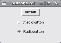
Actually, there’s a fourth button widget, the menubutton, but I cover it in the section, “A Smörgåsbord of Menus,” because it makes more sense to discuss menubuttons in the context of the menu widget. Figure 10.6 shows what each of these buttons looks like in its default, unconfigured state.
Sure, they’re not much to look at just now, but as you’ll see in the rest of this section, Tk’s button widgets are highly configurable and support most, if not all, of the options and capabilities sophisticated GUI users have come to expect.
I’ll start with the simplest of Tk’s buttons, the eponymously named button widget. Its syntax is:
button name ?args?This command creates a button whose name is name with the attributes and command options specified by opts. Table 10.2 lists the arguments the button command supports.
Table 10.2. button Arguments
Option | Description |
|---|---|
| Specifies the command to execute when the button is pressed. |
| Defines the state used for the default appearance, which must be one of |
| Sets the button’s height. |
| Specifies a non-default relief when the cursor hovers over the button. |
| Specifies the button’s current state, which must be one of |
| Sets the button’s width. |
| Returns the value of the specified option. |
| Returns or sets the button’s configuration options. |
| Flashes the button by alternating between its active and normal colors. |
| Executes the Tcl command associated with the button, if one is defined. |
Tk’s widget commands support two kinds of arguments: options and commands. Options are prefixed with a hyphen, and each option is usually followed by an argument. The -command option, for example, specifies a Tcl command to execute when the widget is executed, while the -height option specifies the widget’s height. Commands perform operations on the widget, such as the configure command, which modifies or queries the widget’s current configuration, and the flash command, which causes the widget to flash. Some commands accept no arguments, others accept a single argument, and still others accept multiple arguments.
In the case of the button command, you’ll usually want to modify the width or height, the command it executes, or click it programmatically by using the invoke command.
The following script, button.tcl in this chapter’s code directory, gets you started with buttons:
proc FlashButton {b} {
    # Save the original color
    set ocolor [$b cget -activebackground]    $b configure -activebackground red
$b flash    # Restore the original color
    $b configure -activebackground $ocolor
}

set lFlash [label .flash -width 20 -text "Flash Activate button"]
set lActivate [label .activate -width 20 -text "Activate Exit button"]

set bExit [button .e -width 8 -text "Exit" -state disabled
    -command exit]
set bActivate [button .a -width 8 -text "Activate"
    -command {$bExit configure -state normal}]
set bFlash [button .f -width 8 -text "Flash"
    -command {FlashButton $bActivate}]

pack $lFlash
pack $bFlash -pady {0 20}
pack $lActivate
pack $bActivate -pady {0 20}
pack $bExit
When you execute this script, the initial screen should resemble Figure 10.7.

The FlashButton procedure accepts a single argument, the name of a button to flash (using the button widget’s flash command). Because the flash is so quick, I use the configure command to change the active background color to red (-activebackground red) before flashing the button. That way, when the button flashes, it is easier to see. After flashing the button, FlashButton restores the original background color, which is stored in the ocolor variable using the cget command at the beginning of the procedure.
Next, I create two labels to provide some descriptive text for their associated buttons. As a convention, I use an initial lowercase l (ell) to indicate that the variables (lFlash and lActivate) refer to label widgets. As with most coding conventions, it matters less what the convention is than it does that you choose and use one. This is mostly for your own sanity, but it helps other people who read your code to understand it, too. Similarly, for readability, I assigned easily recognized pathnames to the label widgets, .flash for the Flash button’s label and .activate for the Activate button’s label.
The next step is to create the buttons (I use an initial b for variables that refer to button widgets). The Exit button, a reference to what is stored in the bExit variable, is initially disabled (-state disabled), as you can see in Figure 10.7. When enabled and clicked, it executes the Tcl exit command to terminate the script.
The Activate button (accessed through the bActivate variable) comes next. When clicked, it changes the state of the Exit button to normal, meaning that the Exit button is enabled. I defined the Activate button after the Exit button because I needed to refer to $bExit when specifying $bActivate’s -command option. Similarly, the Flash button ($bFlash) had to be defined after $bActivate because $bFlash’s -command invokes the FlashButton procedure with an argument of $bActivate.
Click the Flash button to flash the Activate button. When you’re done amusing yourself with that, enable the Exit by clicking the Activate button. Finally, click the newly enabled Exit button, shown in Figure 10.8, to terminate the script.

Okay, so it isn’t a mind-numbingly awesome program, but it does demonstrate some of the key features of Tk’s button widget.
Tk’s checkbutton widget is equivalent to what are known as option buttons in other windowing toolkits. Its syntax is identical to the button widget’s syntax:
checkbutton name ?args?In addition to all the functionality of plain vanilla Tk buttons, checkbuttons also have a variable associated with them. When you select a checkbutton, the indicator is set (or “on”), and its linked variable’s value is set to 1 (the default) or the value specified by the -onvalue attribute. Deselecting or clearing a checkbutton clears or unsets the indicator and sets the variable’s value to 0 by default or the value specified by the -offvalue attribute. You can also use a checkbutton widget’s -command option to execute a Tcl command when the widget is clicked with the left mouse button.
Check buttons are often used in windows or tabs that set multiple options for program behavior. Unlike radio buttons, discussed in the next section, multiple checkbutton widgets can be set at once (radio buttons are linked together and only one can be set at a time). When used in this way, script code interrogates the value of the associated variable and sets the program’s behavior based on that value.
Tk’s checkbutton widget supports a wider array of options than does the plain button widget, as you can see in Table 10.3.
Table 10.3. checkbutton Arguments
Description | |
|---|---|
| Specifies the command to execute when the |
| Sets the |
| Determines if the indicator is on (true) or off (false). |
| Specifies the relief if the indicator is not drawn and the |
| Sets the value of the associated variable when the |
| Sets the value of the associated variable when the |
| Specifies a non-default relief when the cursor hovers over the |
| Specifies the |
| Specifies the image to display when the |
| Specifies the |
| Sets the name of the variable associated with the |
| Sets the |
| Returns the value of the specified option. |
| Returns or sets the |
| Unselects the |
| Flashes the |
| Executes the Tcl command associated with the |
| Selects the |
| Toggles the |
The following listing, ckbutton.tcl in this chapter’s code directory, shows how you can use checkbuttons and regular buttons together:
proc DoButton {action ckbuttons} {
    foreach ckbutton $ckbuttons {
        switch $action
            toggle { $ckbutton toggle }
            clear { $ckbutton deselect }
            set { $ckbutton select }    }
}

proc ShowStatus {ckbuttons} {
    foreach ckbutton $ckbuttons {
        set var [$ckbutton cget -variable]      global $var      set val
[set $var]        puts "$var = $val"    }
}

set ckTop [checkbutton .cktop -text "Top checkbutton"
    -command {ShowStatus .cktop}]
set ckMid [checkbutton .ckmid -text "Middle checkbutton"
    -command {ShowStatus .ckmid}]
set ckBot [checkbutton .ckbot -text "Bottom checkbutton"
    -offvalue "OFF" -onvalue "ON" -command {ShowStatus .ckbot}]

set ckbuttons [list $ckTop $ckMid $ckBot]

set bExit [button .eb -width 8 -text "Exit"
    -command exit]
set bToggle [button .toggle -width 8 -text "Toggle All"
    -command {DoButton toggle $ckbuttons}]
set bClear [button .clear -width 8 -text "Clear All"
    -command {DoButton clear $ckbuttons}]
set bSet [button .set -width 8 -text "Set All"
    -command {DoButton set $ckbuttons}]
set bShow [button .show -width 8 -text "Show All"
    -command {ShowStatus $ckbuttons}]

pack $ckTop $ckMid $ckBot -anchor w
pack $bToggle -pady 5 -padx 5 -side
left pack $bClear $bSet $bShow $bExt -pady 5 -padx {0 5} -side left
The first procedure, DoButton, takes two arguments: an action to perform and a list of checkbuttons on which to perform the requested action. action corresponds to one of three command buttons: toggle (for the Toggle All button), clear (for the Clear All button), and set (for the Set All button). Toggling the checkbuttons means reversing their selected status; clearing them means calling each checkbutton’s deselect command; setting them means invoking their select command. I use a foreach loop to iterate through each button and perform the requested operation.
The second procedure, ShowStatus, displays the value of each checkbutton’s associated variable. It accepts a single argument, a list of checkbuttons over which to iterate. Again, using a foreach loop, I iterate over each checkbutton, performing the following steps:
Retrieve the name of the widget’s associated variable.
Declare that variable name as a global variable so I can access its value.
Retrieve the value of the widget’s associated variable.
Display both the variable’s name and its value.
Step 3, fetching the value of the widget’s linked variable, is a bit of a trick. Recall that the set command called with just a variable name (for example, set $var) returns the value of that variable. So the code set val [set $var] evaluates the nested command [set $var] and assigns the result of that command, the value of $var, to the variable $val. Although this might seem a bit obscure, you will appreciate being able to build a variable name and extract its value this way as you progress in your Tcl-writing avocation.
Notice that ShowStatus uses the puts command, which displays its output to stdout. I just want to be clear that even in a GUI program, you still have access to stdout and that the puts command does not scribble on the GUI, but on a plain old terminal session. If you start ckbutton.tcl from an icon without an underlying terminal session, the output generated by puts would be lost (unless you puts it to a file, of course).
The next section of code creates three checkbutton widgets. Nothing really extraordinary in this code block, but do notice that I give each widget a -command option, {ShowStatus name}. When you click the corresponding checkbutton, it will display its value after the click. For example, if you click the top checkbutton (see Figure 10.9), that click first selects the widget, setting its linked variable to its -onvalue (which defaults to 1), and then executes ShowStatus .cktop, which displays the new value. As a final twist, I define alternative values for the bottom checkbutton ($ckBot) selected and unselected states, OFF and ON, respectively, to demonstrate that you aren’t limited to using simple numeric values.

Note: Don’t Forget about Grouping!
The -command option expects a single string argument, so you have to use braces to group arguments that include embedded spaces.
The last bit of setup code involves defining the command buttons that provide most of the application’s functionality. There are five buttons: an Exit button ($bExit); a Toggle All button ($bToggle) that invokes each checkbutton’s toggle command; a Clear All ($bClear) button that deselects each checkbutton; a Set All button ($bSet) that selects each checkbutton; and a Show All button ($bShow) that displays each checkbutton’s current selection status.
Finally, I’m ready to arrange and display the widgets. The first pack command arranges the three checkbuttons in the upper-lefthand corner of the window. I use the anchor w option to fix the checkbuttons against the “west” or left edge of the window. All of the buttons are laid out relative to the left side of the window using the -side left attribute. First, I place $bToggle with five pixels of padding on all sides. Next, I place $bClear, $bSet, $bShow, and $bExit with five pixels of padding on the top and bottom, zero padding on the left side, and five pixels of padding on the right. I don’t pad the left side of these four buttons because the padding on the right side of the previous button provides the spacing I need.
Figure 10.9 shows this script in action. Play around with the buttons while looking at the associated code so you can see how all the parts connect and interact.
Figure 10.9 shows the ckbutton.tcl script and the output created by clicking the Show All button. I ran this ckbutton.tcl from a terminal so you could see the output when you click the Show All button or one of the checkbuttons.
Unlike checkbuttons, radio buttons are usually used to select one item from a set of mutually exclusive set of items. Suppose that you want to allow users to select a color scheme, often called themes or skins, for your application. You can only apply a single color scheme at a time, so it makes sense to use radio buttons for the scheme selection interface. When a user selects one color scheme, the other color scheme radio buttons will be automatically unselected. The nice thing about Tk’s radiobutton widget is that it monitors the value of its associated variable and when the value of that variable changes, the widget automatically updates its selection status to reflect the current value of the linked variable. If, for example, the radiobutton for the Raspberry Red color scheme is selected and the user, in a fickle moment, selects the Passionate Purple radiobutton, the radiobutton for the Raspberry Red scheme automatically unselects itself. You’ll see this in action in just a moment.
Table 10.4 shows the arguments that Tk’s radiobutton widget supports.
Table 10.4. radiobutton Arguments
Option | Description |
|---|---|
| Specifies the command to execute when the |
| Sets the |
| Determines if the indicator is on (true) or off (false). |
| Specifies the |
| Specifies the relief if the indicator is not drawn and the |
| Specifies a non-default relief when the cursor hovers over the |
| Specifies the image to display when the |
| Specifies the |
| Defines the value to store in the |
| Sets the name of the variable associated with the |
| Sets the |
| Returns the value of the specified option. |
| Returns or sets the |
| Unselects the radiobutton and sets its associated variable to the value specified by the |
| Flashes the |
| Executes the Tcl command associated with the button, if one is defined. |
| Selects the |
The following script, radio.tcl in this chapter’s code directory, uses Tk’s radio buttons to implement a simple color section interface (you’ll learn more about Tk’s color handling later in this chapter):
proc SetColor {newColor} {
. configure -background $newColor
global lColor $lColor configure -background $newColor
global radButtons foreach w $radButtons {
$w configure -background $newColor
-activebackground $newColor
-highlightbackground $newColor }
}
set rRed [radiobutton .rred -text "Red" -value red]
set rBlue [radiobutton .rblue -text "Blue" -value blue]
set rGreen [radiobutton .rgreen -text "Green" -value green]
set rYellow [radiobutton .ryellow -text "Yellow" -value yellow]
set rPurple [radiobutton .rpurple -text "Purple" -value purple]
set radButtons [list $rRed $rBlue $rGreen $rYellow $rPurple]
set lColor [label .lcolor -text "Select color scheme"]
set bSet [button .bset -width 8 -text "Set Color"
-command {SetColor $selectedButton}]
set bExit [button .bexit -width 8 -text "Exit" -command exit]
$rPurple select
$bSet invoke
pack $lColor -anchor w
pack $rRed $rBlue $rGreen $rYellow $rPurple -pady 0 -padx {2 0} -anchor w
pack $bSet -pady {10 2} -padx 5
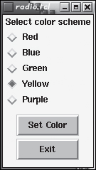
pack $bExit -pady {2 10} -padx 5radio.tcl uses five Tk radiobutton widgets from which you can select a color. When you click the Set button, the background color of the main window, the label, and the buttons change to the color you selected. Figure 10.10 (in black and white, so the color change is difficult to see) illustrates how it looks.
The SetColor procedure takes a single argument: the new color for the main window, the label, and the buttons. The first command sets the background color of the main window. After declaring the lColor global variable, I set its background color. I use a foreach loop to set the background color for each of the radiobutton widgets. Rather than passing in a list of widgets like I did in ckbutton.tcl, I declare the $radButtons variable as a global. I set three background attributes for each radiobutton to ensure that the color is correct, regardless of its state. The -background attribute covers the normal state, enabled but not active. It will come as no surprise that -activebackground covers the state when the radiobutton is active, that is, when the mouse is hovering over the button and clicking (selecting, in this case) the button. The -highlightbackground attribute colors the rectangle that appears around a widget when it is active.
After I define the SetColor helper procedure, I start laying out the widgets. First, I define five radiobutton widgets, one each for red, blue, green, yellow, and purple and a list of radiobutton widgets ($radButtons). For each button, I use the -value color attribute. This attribute sets the value that is assigned to the linked variable when the radiobutton is selected. You’ll no doubt notice that I don’t specify the name of the linked variable. If no variable name is specified (using -variable varname), the name defaults to selectedButton. While one could argue that it would be better to use a special variable name for uniqueness and easy identification, this script is short enough that using the default name is acceptable.
I then create a label, $lColor, to give users a hint what the radio buttons do, followed by two buttons, $bset and $bExit, to set the selected color or exit the script, respectively. The Exit button needs no comment. The Set Color button simply invokes the SetColor procedures, passing the $selectedButton variable to the procedure. Be careful here! Although the variable’s name is $selectedButton, the value it holds is the name of the color that will be set. It is precisely this potential confusion that makes defining my own variable instead of using the default variable a good idea. I kept the default name for a pedagogical reason (not to mention plain laziness), namely, I wanted you to know that radiobutton widgets have a default variable and what it is named.
Before displaying the widgets, I set a bit of initial state. The $rPurple select command sets the state of the purple radiobutton to be selected, which means that $buttonSelected has the value purple. $bSet invoke programmatically clicks the Set Color button to set the color to the one I just selected, which is purple. Bear in mind that the results of these commands won’t be visible until I explicitly draw the window with pack.
To display my GUI masterpiece, I first draw the label, anchoring it to the left side of the window. Next, I stack the five radiobutton widgets one on top of the other, again, anchoring them to the left side of the parent window. When I pack the Set Color button, I use a large amount of vertical padding to visually separate it from the radio buttons above it. For a similar but inverse reason, I pack the Exit button with very little vertical padding between it and the Set Color button. The purpose of this visual grouping is to relate the two command buttons to each other and to distinguish them from the radio buttons.
A GUI without menus is like a day without sunshine. Or not. Regardless, menus are an important part of any graphical application, and Tk has excellent support for the full range of menu operations. To create a menu, you use the menu widget to create a menu entry and then use additional commands to add entries to the menu widget. Tk supports a variety of menu features, including:
Cascading menus, which allow you to display sub-menus.
Check entries, which resemble
checkbuttonwidgets.Command entries, which resemble
buttonwidgets.Option menus, which display a set of choices using
radiobuttonwidgets.Pop-up menus, normally displayed in response to a right-click.
Radio entries, which resemble
radiobuttonwidgets.Separators, providing visual separation between menu entries.
System menus, which add entries to the existing Windows system menu, the Macintosh Apple menu, and the Help menu on any supported platform.
Tear-off entries, which allow users to detach, or tear off, a menu from its parent.
To do full justice to Tk’s menu support would require a full chapter and more space than I have, so I’ll focus in this section on creating a menu bar that contains commands and separators. This should meet your immediate menu-creation needs, provide a template for creating complete, full-featured menus, and give you a sense of Tk’s capabilities with respect to menus.
The following script, basic_menu.tcl in this chapter’s code directory, shows the steps you need to follow to add a menu to your application:
set mainMenu [menu .mainmenu]
. configure -menu $mainMenu
set mFile [menu $mainMenu.mFile -tearoff 0]
$mainMenu add cascade -label "File" -menu $mFile
$mFile add command -label "Open" -command {DoCmd Open}
$mFile add command -label "Close" -command {DoCmd Close}
$mFile add command -label "Save as" -command {DoCmd "Save as"}
$mFile add command -label "Save" -command {DoCmd Save}
$mFile add separator
$mFile add command -label "Exit" -command exit
proc DoCmd {cmd} {
tk_messageBox -icon info -type ok -message $cmd
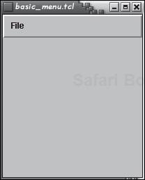
}The resulting window should resemble Figure 10.11.
If you click the File item on the menu, the figure you see should look like Figure 10.12.

The first command, set mainMenu [menu .mainmenu], creates a menu entry. It doesn’t have any content, but I’ll take care of that in a moment. The next command, . configure -menu $mainMenu, associates the menu I just created with the root window, meaning that the menu entry referenced by $mainMenu is the menu bar for the root window. The next two lines of code add an item to the menu bar. In this case, I’m creating a “File” menu. First, I create a second menu entry named $mainMenu.mFile, which establishes the widget mFile as a child of the main menu—this relationship is necessary so that the mFile menu will display properly when users click the File item on the menu bar. The attribute -tearoff 0, tells Tk that this menu cannot be detached from the menu bar (the default value is -tearoff 1, which permits detaching, or tearing off the menu, to create a new top-level window). The second command, $mainMenu add cascade -label "File" -menu $mFile, adds an item named File to the menu bar (add cascade -label "File"), which, when clicked, opens the menu specified by $mFile (-menu $mFile).
The next block of code adds items to the newly created File menu. Specifically, I add an Open command, a Close command, a Save as command, a Save command, a separator, and an Exit command. The separator is merely a visual aid. Each of the command entries consists of a label and an associated command to carry out the requested operation. In this case, the command is DoCmd label, where label is the text. DoCmd itself is a simple procedure that uses the tk_messageBox procedure to pop up a window that displays the text passed to DoCmd. The exception is the Exit item, which invokes Tcl’s exit command to terminate the script.
To add another menu item, say, Edit, to the menu bar, you would create a second menu item and populate it with commands, for example:
set mEdit [menu $mainMenu.mEdit -tearoff 0]
$mainMenu add cascade -label "Edit" -menu $mEdit

$mEdit add command -label "Copy" -command {DoCmd "Copy"}
$mEdit add command -label "Paste" -command {DoCmd "Paste"}
$mEdit add command -label "Cut" -command {DoCmd "Cut"}
$mEdit add command -label "Search" -command {DoCmd "Search"}
$mEdit add command -label "Replace" -command {DoCmd "Replace"}
Figure 10.13 shows what the resulting menu would look like.

As you can see, creating a Tk menu isn’t difficult at all.
In simplest terms, binding a command to an event means to arrange for a command or procedure or script to execute when an event occurs. The -command attribute of most Tk widgets does precisely that, it binds or ties the specified command to a particular event, such as selecting a radio button or pressing a command button. Not surprisingly, most events in a Tk application are not tied to pressing keys or mouse clicks. Rather, events occur, quite literally, all the time. Clicking on a window to give it the focus is an event; moving the mouse cursor across a window generates mouse movement events and events when the mouse enters and leaves the window; creating and deleting windows are events; resizing a window is an event; even changing a window’s visibility is an event.
Tk, like most GUI frameworks, provides a method for hooking into these (and other) events to bind a command, procedure, or script to them. The command that accomplishes this is the aptly named bind command. Its syntax is:
bind tag ?event? ?+??cmd?
This command binds the command specified by cmd to the event specified by event that happens to the widget or GUI element specified by tag. To put it more directly, when tag’s event occurs, cmd executes. Table 10.5 lists the events that you can bind.
Table 10.5. Bindable Events
Event | Description |
|---|---|
| Occurs when a window is activated, usually by receiving focus. |
| Generated when a mouse button is pressed; ButtonPress and Button are |
| synonyms. |
| Occurs when a mouse button is released. |
| Occurs whenever a window is moved, resized, or its border width changes. |
| Occurs when a window is deactivated, usually by losing focus. |
| Generated when a window is destroyed, usually by closing or deleting it. |
| Delivered to the window that the mouse pointer enters. |
| Generated when a window must be redrawn after being uncovered or drawn for the first time. |
| Sent to a window receiving keyboard input focus. |
| Sent to a window losing keyboard input focus. |
| Generated whenever a key is pressed; |
| Generated whenever a key is released. |
| Delivered to the window that the mouse pointer is exiting. |
| Generated when a window is made viewable by being mapped onto the screen (not minimized or iconified). |
| Occurs whenever the mouse pointer is moved. |
| Delivered to a window with input focus when a wheel on a mouse is scrolled up or down or clicked. |
| Generated when a window is iconified, minimized, or removed from the active screen. |
| Occurs when a window’s visibility changes, such as when another window is moved over it and obscures it or when an obscuring window is moved out of the way. |
My discussion of event binding and the bind command covers the simplest case, binding a single command or procedure to a single widget. The topic is considerably more sophisticated than I suggest in this section. The goal of this section was to show you that the capability exists, rather than to show you how to use it. I consider it an advanced topic beyond this book’s limited scope because it is one of the most complicated parts of Tk programming. I don’t want to overwhelm you with minutiae that you might not use for a long time. If you need more information, the bind command’s man page (man 3tk bind) has all of the gory details.
The Tk widget attributes that set and modify colors, such as -activebackground and foreground, accept colors in one of two formats: a color name, such as red, blue, or green, or their RGB value specified in hexadecimal (hex) format, such as #f00, #0f0, or #0ff (which are red, green, and blue, respectively, specified in 8-bit hex values). The color names that Tk supports are documented in the colors man page (man 3tk colors). On UNIX, Linux, and BSD systems, you should be able to view the complete list of colors using the showrgb command (part of the X Window System, not Tcl or Tk), shown in the following excerpt, which displays a variety of colors according to their decimal RGB value and their name:
$ sshowrgb
255 250 250              snow
248 248 255              ghost white
248 248 255              GhostWhite

...
139   0   0              DarkRed
144 238 144              light green
144 238 144              LightGreen
The complete color list has 752 entries (admittedly, some are duplicates, like ghost white and GhostWhite), so you’ll pardon me for not showing the entire list. These color names are derived from Tk’s origins on the X Window System and are supported on all platforms to which Tk has been ported.
If you choose to use the hex format, you can specify each component in 4-, 8-, 12-, or 16-bit format. 4-bit hex values use a single digit for each component; 8-bit hex values use two hex digits; 12-bit hex values use three; and 16-bit hex values use four. Thus, you can specify the color red as #f00, #ff0000, #fff000000, or #ffff00000000.
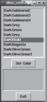
As a bonus, I’ve included a simple Tk application, show_colors.tcl in this chapter’s code directory, which shows the colors available in the stock Tk distribution. It shows a listbox that contains all of the predefined colors (well, the color names) that Tk supports. You select a color from the listbox and click the Set Color button to update a color swatch (actually, a label widget) with the currently selected color. Figure 10.14 shows what this script looks like.
I won’t describe show_colors.tcl’s code because it uses the listbox widget, which you don’t learn to use until Chapter 13.
memtest.tcl is the longest script I’ve created (so far) in this book. Most of it consists of procedure definitions and setup code; the actual execution is pretty simple.
#!/usr/bin/wish
# memtest.tcl
# Play a Simon-like memory game

# Block 1
# Randomly select a button from a list of buttons
proc SelectButton {buttons} {
    set index [expr {int(rand() * [llength $buttons])}]
    return [lindex $buttons $index]
}

# Flash randomly selected buttons count times
proc FlashButtons {buttons count} {
    # Create a list of buttons to flash
    for {set i 1} {$i <= $count} {incr i} {
        set btn [SelectButton $buttons]
        lappend flashList $btn
    }

    # Flash the buttons in the list
    foreach btn $flashList {
        $btn flash
        $btn flash
        after 1000
    }

    return $flashList
}

# Compare the flashed buttons to players buttons and display
# the results
proc Score {flashedButtons pressedButtons} {
    global bScore
    global lInfo

    # Disable the score button
    $bScore configure -state disabled

    # Compare the buttons
    if {[llength $flashedButtons] != [llength $pressedButtons]} {
        $lInfo configure -text "Sorry, wrong sequence!"
        return
    }

    if {[lindex $flashedButtons] ne [lindex $pressedButtons]} {
        $lInfo configure -text "Sorry, wrong sequence!"
        return
    }
    # Only get here if the sequences match
    $lInfo configure -text "You did it!"
    return 0
}

# Block 2
# Play the game
proc PlayGame {buttons} {
    global lInfo
    global bPlay
    global bScore

    # Disable the Play button
    $bPlay configure -state disabled

    # Flash the buttons
    set flashedButtons [FlashButtons $buttons 4]

    # Enable the Score button
    $bScore configure -state normal

    # Tell the player what's next
    $lInfo configure -text "Try to repeat the
sequence. Then press
Score to see how
    you
did."
    return $flashedButtons
}

# Block 3
# Game buttons
set bRed [button .bred -background red4 -activebackground red
    -command {lappend pressedButtons $bRed}]
set bBlue [button .bblue -background blue4 -activebackground blue
    -command {lappend pressedButtons $bBlue}]
set bGreen [button .bgreen -background green4 -activebackground green
    -command {lappend pressedButtons $bGreen}]
set bYellow [button .byellow -background yellow4 -activebackground yellow
    -command {lappend pressedButtons $bYellow}]
set bCyan [button .bcyan -background cyan4 -activebackground cyan
    -command {lappend pressedButtons $bCyan}]

# List of game buttons
set buttons [list $bRed $bBlue $bGreen $bYellow $bCyan]

# Command buttons
set bPlay [button .bplay -text Play
    -command {set flashedButtons [PlayGame $buttons]}]
set bScore [button .bscore -text Score -state disabled
    -command {Score $flashedButtons $pressedButtons}]
set bExit [button .bexit -text Exit -command exit]

# Instruction label
set lInfo [label .linfo -width 20 -height 4 -justify left
    -text "Press Play to start"]

# Display
pack $bRed -pady {5 0} -expand true -fill x
pack $bBlue $bGreen $bYellow $bCyan $lInfo -expand true -fill x
pack propagate $lInfo false
pack $bPlay $bScore $bExit -pady {20 0} -side left -expand true -fill xAs usual, most of the code appears in the procedure definitions that make up Block 1 at the top of the file. The first procedure, SelectButton, selects a button at random from a list of buttons passed to it in the argument buttons and returns the name of that button to the calling procedure.
FlashButtons flashes each button in the list of buttons passed to it as an argument in buttons. The count argument indicates how many buttons to flash. The for loop creates the list of buttons to flash by calling SelectButtons $count times and appending the button name to the $flashList variable. The foreach loop iterates through $flashList, flashing each button twice and then pausing 1000 milliseconds (after 1000), or one second, to create a delay before flashing the next button. After flashing all of the buttons, FlashButton terminates, returning the list of flashed buttons to the calling procedure.
The next procedure, Score, compares the list of buttons the computer generated, passed in flashedButtons, to the list of buttons the player pressed, passed in pressedButtons. First, I disable the Score button to prevent the user from pressing it multiple times and to give the player a visual cue that the game is almost over. I perform two comparisons. If the length of the two lists is different, I know the lists don’t match and can terminate the procedure without needing to compare each button. If the lengths match, the second if statement compares the lists of buttons in their entirety. If the strings returned by the two lindex statements don’t match, the procedure terminates. Otherwise, the two lists match, and the player has won. In all cases, I update a label in the game window showing the player whether she won or lost.
Block 2 consists of the PlayGame procedure, which handles the bulk of the gameplay. It starts by disabling the Play button, then calls the FlashButtons procedure, passing it the list of buttons that was passed to PlayGame and the number of buttons to flash. I save the list of buttons returned by FlashButtons in the $flashedButtons variable so I can return that list to the main game loop. After all of the buttons are flashed, I enable the Score button and then instruct the player to try to replicate the sequence of button presses.
In Block 3, I start creating the game board. First, I create five colored buttons. Their -command attributes create entries in the list of buttons pressed by the user (stored in pressedButtons). Each button’s background color is a darker shade of its active background color. When pressed, this arrangement of colors makes the button noticeably easier to distinguish in its flashing state. I create a list of these game buttons to pass to the various procedures.
The command buttons, naturally, do the work in the program. The Play button, $bPlay, invokes the PlayGame procedure when pressed. The Score button, $bScore, starts out in the disabled state. As described earlier, it will be enabled after the buttons are flashed. This is largely a visual cue to the player to facilitate gameplay, but also serves to prevent unpleasant events if the player presses the Score button while the game buttons are being flashed. $bScore calls the Score procedure, passing the two lists of buttons to Score for evaluation. The Exit button is nothing new and enables the player to exit the game at any time. The instruction label, $lInfo, just provides an area where I can display text telling the player how to proceed.
The final lines of code lay out the widgets on the screen. I pack the red button first, to set a more aesthetically pleasing distance between the top of the button and the top edge of the window. Next, I pack the rest of the buttons and the information label in below the red button. The attributes -expand true -fill x cause the widgets to expand horizontally to fill their parcels in the window. I pack the Play, Score, and Exit buttons across the window with sizable padding between the instruction label and the tops of the command buttons. While this is partly an aesthetic preference on my part—I don’t like windows with widgets jammed together—it is also yet another visual hint to the player that separates the elements of the game to suggest that they have different functions.
With just a few widgets, you can write a reasonably complete Tk application. buttons, radiobuttons, and checkbuttons are common UI elements that enable users to invoke actions and make choices. Knowing how to set and modify colors in a user interface is important because humans use colors as visual cues. Nonetheless, no matter how visually rich and widget-packed you make your user interface, the core of any Tk application is still the Tcl code that ties UI elements to commands and procedures and that provides the logic that makes the application work.