If you’ve finished Chapter 10, you’ve probably decided that the pack geometry manager leaves a lot to be desired. It handles a lot of layout details for you, but it is precisely this lack of control that makes pack hard to use. In this chapter, you learn how to use the grid geometry manager; I think you’ll like it better than pack. I’ll also introduce you to three more Tk widgets, frames, toplevels (that is, top-level windows), and messages. But first, you get to play my thrilling version of Tic-Tac-Toe.
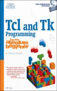
To play my version of Tic-Tac-Toe, execute the script tic-tac-toe.tcl in this chapter’s code directory on the CD. To start the game, click the Play button (see Figure 11.1). Clicking a button changes its text from “?” to “X” or “O,” depending on whose turn it is. Notice that you play for both X and O (see Figure 11.2). If you click a button that has already been played, the script gently chides you, as shown in Figure 11.3. When someone has a winner, the winning “line” turns green, and a dialog box pops up to announce the winner (see Figure 11.4). If no one wins, well, nothing happens, so click the Quit button to exit the game.


The grid geometry manager lays out widgets in a grid of rows and columns. Each row and column can have a different size (height for rows, widths for columns). You decide the row(s) and column(s) into which each widget is placed and grid adjusts the layout grid to fit the widgets. Much like using HTML tables for Web page layout, grid gives you finer control over the layout of a window. I prefer grid over pack because I find grid to have more predictable results. Or perhaps I’m just a control freak, so I simply prefer the command that gives me more control.
grid offers two placement models, relative and absolute. With relative placement, grid determines the row and column sizes based on the contents of each cell. With absolute placement, you specify the row and column positions using grid’s -row and -column arguments.
When you use grid’s relative positioning model, each distinct grid command creates a new row, and the number of columns is determined by the number of widgets given as arguments to the grid commands. The order in which widgets are passed to grid establishes the order in which the widgets appear in the column. grid sets the column width to the width of the widest widget, so, by default, grid centers the rest of the widgets in their respective cells. Row height, similarly, is fixed based on the height of the tallest widget in a cell. The following script uses relative positioning to lay out a 3×3 grid of labels (see rel_grid.tcl in this chapter’s code directory):
. configure -bg black
wm title . $argv0

for {set i 1} {$i <= 9} {incr i} {
    frame .f$i -bg white -width .30i -height .30i
    label .l$i -bg blue -fg bisque -text $i
    grid propagate .f$i false
    grid .l$i -in .f$i
    if {![expr $i % 3]} {
        grid .f[expr $i - 2] .f[expr $i -1] .f$i -padx 5 -pady 5
    }
}

grid propagate .f5 true
.l5 configure -width 10 -height 10
Figure 11.5 shows the window that rel_grid.tcl creates.

I meanly sneaked in a few additional commands to confuse you. I set the background color of the root window to black to make it easier to see the grid-wise arrangement of the label widgets. The second command, wm title . $argv0, tells the window manager to set the window title to the name of the script (see the sidebar, “Understanding Window Managers,” for more information about the wm command).
The for loop creates nine frame widgets named .f1 through .f9 and nine similarly-named label widgets (.l1 through .l9). Each label is numbered for easy identification. I use frames to serve as containers for the label widgets, which means that each frame is both a child widget (referred to as a slave in the Tk documentation) of the top-level or root window and a parent (referred to as a master) widget of the label widget it contains.
The for loop does most of the work. I created a frame widget that is three-tenths of an inch wide (-width .30i) and tall (-height .30i), locking the frame’s size using the grid propagate command. I needed to use grid propagate commands on the frames to prevent them from shrinking or growing to fit the size of their children. The syntax of the grid propagate command is:
grid propagate master ?boolean?
The master parameter specifies the master widget to which the command applies. If boolean is true or any value or expression equivalent to true (such as 1), master will shrink or grow to fit the size of its largest child widget. If boolean is false or any value or expression equivalent to false (such as 0), master will not resize.
Next, I draw the frame and its label using grid’s -in option to specify the master/slave relationship between the widgets. The argument following -in indicates the widget’s master. Thus, for example, grid .l4 -in .f4 says that the label widget named .l4 is a slave widget of the frame widget named .f4.
At the end of each row, (when the $i loop counter is evenly divisible by 3), I execute the grid command for the three frame and label combinations on that row. Each grid command arranges three labels in a three-column wide row. As you can see in Figure 11.5, the resulting figure is a 3×3 grid of label widgets numbered consecutively from one to nine, as you move left to right and top to bottom.
The final two commands unlock the middle frame and resize its child label. The purpose of this otherwise gratuitous modification is to demonstrate that the width or height of the largest widget in a cell sets the width or height of the corresponding row or column, respectively.
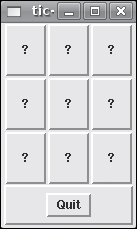
Absolute positioning using grid’s -row and -column arguments enables you to explicitly place widgets. -row and -column both accept a single integer value specifying the (zero-based) row or column, respectively, in which to place the widget. The following script, abs_grid.tcl in this chapter’s code directory, creates the same 3×3 grid as rel_grid.tcl using absolute positioning:
. configure -bg black
wm title . "abs_grid.tcl"

set row 1
for {set i 1} {$i <= 9} {incr i} {
    frame .f$i -bg white -width .30i -height .30i
    label .l$i -bg blue -fg bisque -text $i
    grid propagate .f$i false
    grid .l$i -in .f$i
    if {![expr $i % 3]} {
        grid .f[expr $i - 2] -row $row -column 0 -padx 5 -pady 5
        grid .f$i -row $row -column 2 -padx 5 -pady 5
        grid .f[expr $i - 1] -row $row -column 1 -padx 5 -pady 5
        incr row
    }
}

grid propagate .f5 true
.l5 configure -width 10 -height 10
Figure 11.6 shows the resulting screen so you can compare it to Figure 11.5.
In abs_grid.tcl, I used three grid commands rather than one to lay out the frames. At the end of each row, I call grid, but only for a single frame widget. In addition, I used the -row and -column arguments of each widget. When used in this way, grid uses the values specified and does not follow the layout algorithm I described in the previous section. To demonstrate this point, I called grid on the columns out of order (column one, column three, then column two). As you can see from the code for abs_grid.tcl, absolute positioning requires more code (a whopping four lines) than relative positioning, but if you need the additional control, the additional code is the price you have to pay.
To gain more control over where in a cell a widget is placed, you can use grid’s -sticky argument to control to which edges of the cell the widget is anchored (yes, this is similar to pack’s -anchor option). You may use any combination of the compass points n, s, e, and w (north, south, east, and west, or top, bottom, right, and left, respectively) to indicate where to anchor the widget in its cell. The chief difference between -sticky and -anchor is that -sticky also causes the widget to expand to fill its cell. So, it wouldn’t be a stretch, as it were, to suggest that grid’s -sticky option combines the functions of pack’s -anchor and -fill options. The following script, sticky.tcl in this chapter’s code directory on the Web site, shows -sticky’s effects:
wm title . "sticky.tcl"

set idx 0
foreach i {NW NE SW SE} {
    set col [expr {$idx % 2}]
    set row [expr {$idx / 2}]
    frame .f$i -width 1i -height 1i -bg black -relief groove -borderwidth 2
    grid .f$i -row $row -column $col -sticky nsew
    label .l$i -width 3 -bg blue -fg bisque -text $i
    grid .l$i -row $row -column $col -padx 3 -pady 3 -sticky $i
    incr idx
}
Similarly, you can use external (-padx and -pady) and internal (-ipadx and -ipady) padding on the widgets themselves to fine-tune spacing. Padding a widget changes the size of the grid. External padding adds space between the edge of a widget and its containing cell, that is, outside the widget’s border. Internal padding, on the other hand, is added to the space inside the widget’s border. The following script, ipad.tcl in this chapter’s code directory, illustrates the difference between external and internal padding:
set pad [lindex $argv 0]
if {[string length $pad] == 0 || ($pad <=0)} {
    set pad 20
}

wm title . "ipad.tcl"

frame .container -bg black

label .lInt -text "Internal Padding" -relief groove
label .lExt -text "External Padding" -relief groove

grid .container -sticky nsew
grid .lInt -ipadx $pad -ipady $pad -in .container
grid .lExt -padx $pad -pady $pad -in .container
To execute this script, type the script name followed by a number that specifies the desired padding value to use (the units used are pixels). So, to execute ipad.tcl and request 100 pixels of padding, you would execute the command, ipad.tcl 100. In fact, Figure 11.8 shows one window created by ipad.tcl with precisely that padding. The other window in Figure 11.8 was created with 20 pixels of padding (ipad.tcl 20).

The first line of code in ipad.tcl retrieves the argument passed to the script. Tcl stores command-line arguments passed to the script in a predefined list variable named argv. As a result, you can use standard list options, such as lindex, lsearch, lsort, and so forth, to access command-line arguments. In this case, I use lindex argv 0 to retrieve the single argument and store that value in that integer variable pad. After setting the window title, I created three widgets, a container frame widget (.container), and two label widgets (.lInt and .lExt). As their names suggest, .lInt demonstrates internal padding and .lExt demonstrates external padding.
After drawing the frame with the first grid command, I drew .lInt with the requested amount of internal padding. You can see in Figure 11.8 that internal padding is added inside the border of the .lInt label, enlarging it significantly. Likewise, you can see how the external padding added to the .lExt label is placed outside of the widget’s border and inside the border of its containing cell.
Just as a cell can contain multiple widgets, a widget can occupy, or span, multiple cells. Spanning behavior is controlled by the aptly named -rowspan and -columnspan attributes. Each attribute accepts a single integer value specifying the number of rows or columns the widget will occupy. The short script that follows, span.tcl in this chapter’s code directory, shows a simple example of widgets that span rows and columns:
foreach c {red blue violet magenta cyan green} {
    label .l$c -bg $c -width 10 -height 2 -relief groove
        -text [string totitle $c]
}

grid .lred -row 0 -column 0 -columnspan 2 -sticky nsew
grid .lblue -row 0 -column 2 -rowspan 2 -sticky nsew
grid .lviolet -row 1 -column 0 -columnspan 2 -sticky nsew
grid .lmagenta .lcyan .lgreen -sticky nsew
The code is uncomplicated. The foreach loop creates six colored label widgets with a width of ten characters, a height of two lines, and a grooved border. The four grid commands lay out the widgets in various configurations on the master window. The result is the window shown in Figure 11.9.

The grid options and attributes I’ve discussed so far have operated at the cell level. There are also options and attributes that apply to entire rows or columns, which can make layout less complicated by applying characteristics, particularly sizing or padding, to a row or a column as a whole rather than applying them to individual cells. This section looks at these more general capabilities.
The all-purpose row- and column-configuration commands are rowconfigure and columnconfigure:
grid rowconfigure master row ?attribute ...?
grid columnconfigure master col ?attribute ...?
Each attribute is specified as a -name value pair. If you omit attribute entirely, rowconfigure and columnconfigure return the current attributes as a list. If you specify only the attribute -name, the return value is its corresponding value. Otherwise, rowconfigure and columnconfigure set the specified attributes, which can be one or more of -minsize, -weight, -uniform, or -pad. Table 11.1 describes these attributes.
Table 11.1. Row and Column Attributes
Attribute | Description |
|---|---|
| Sets/queries the minimum size of a row or column in screen units (pixels by default). |
| Sets/queries the amount of padding, in screen units (pixels by default), added to the display area of the largest widget in a row or column. |
| Assigns widgets to a group named for the attribute value; used with |
| Sets/queries the rate at which additional space is apportioned to widgets. |
I’ll start with the simplest example, querying row settings. The code is in attr_query.tcl in this chapter’s code directory:
wm title . "attr_query.tcl"

set colors [list red blue violet magenta cyan green]
foreach c $colors {
    label .l$c -bg $c -width 10 -height 2 -relief groove
        -text [string totitle $c]
}

grid .lred -row 0 -column 0 -columnspan 2 -sticky nsew
grid .lblue -row 0 -column 2 -rowspan 2 -sticky nsew
grid .lviolet -row 1 -column 0 -columnspan 2 -sticky nsew
grid .lcyan .lgreen .lmagenta -sticky nsew

puts [format "%10s%10s%10s" Row Name Value]
puts [string repeat "-" 30]
set row 0
while {$row < 3} {
    set attrs [grid rowconfigure . $row]
    foreach {name value} $attrs {
        puts [format "%10s%10s%10s" $row $name $value]
    }
    incr row
}
Readers who have been paying attention will no doubt notice that attr_query.tcl is just span.tcl with code at the end for querying the attributes. After creating a header, I set a loop counter (set row 0) and then loop through each row of widgets, displaying the row number, the attribute name, and the attribute value. I leave querying column attributes as an exercise for the reader.
The output is rather boring, as you can see below, because the row attributes are all at their default settings:
$ ./attr_query.tcl
       Row     Name      Value
------------------------------
         0 -minsize          0
         0     -pad          0
         0 -uniform
         0  -weight          0
         1 -minsize          0
         1     -pad          0
         1 -uniform
         1  -weight          0
         2 -minsize          0
         2     -pad          0
         2 -uniform
         2  -weight          0
Note: Don’t Use Console Output in GUI Programs
It is generally considered bad form to use stdout in a GUI program. However, when you are developing an application, common practice is to display debugging information to the console because it is a simple way to obtain information about what is happening inside the script. Users are usually paying attention to the GUI, so console output might not be noticed. More to the point, because GUI scripts are usually started from an icon, they might not even have a console attached, so console output will be lost.
To assign a minimum size to a row or column, use the -minsize attribute. The default unit is pixels. In the following script, minsize.tcl, I created two rows of two labels. The first row’s height is implied by the size of the largest label widget. I set the minimum size of the second row using -minsize, which ensured that the row would be at least, in this case, 50 pixels tall and 50 pixels wide. Here’s the code:
wm title . "minsize.tcl"
. configure -bg black

label .lNw -bg #eee -fg black -text NW -relief groove
label .lNe -bg #ddd -fg black -text NE -relief groove
label .lSw -bg #ccc -fg black -text SW -relief groove
label .lSe -bg #bbb -fg black -text SE -relief groove

grid .lNw .lNe -sticky nsew
grid .lSw .lSe -sticky nsew

grid rowconfigure . 1 -minsize 50
grid columnconfigure . 1 -minsize 50
I defined four labels in various shades of gray, giving each one a grooved border so you could see its edges clearly. The first two grid commands created two rows of labels each containing two labels; that is, I created a 2×2 grid of labels. I used the -sticky nsew widget option to make the labels expand to fill their containing cells. The third grid command used the rowconfigure option to set the minimum size of the second row to 50 pixels. The fourth grid command used columnconfigure to set the minimum size of the second column to 50 pixels. Figure 11.10 shows the resulting window.

As you can see in Figure 11.10, the second row is 50 pixels tall, and the second column is 50 pixels wide. Had I not set the -minsize attribute, all of the labels would have been the same as the NW label.
Another way to manipulate the height of a row or the width of a column is to use the -pad attribute. Where padding a widget using the -padx and -pady options creates space between the widget and the edges of its cell, the -pad option grows the overall height of a row or width of a column, allowing more space for displaying a widget. It’s easier to show you the difference than describe it, though, so consider the following script, rowpad.tcl, and its resulting windows, shown in Figure 11.11.

if {$argc < 1} {
    puts "Please specify a padding option"
    exit 1
} else {
    set opt [lindex $argv 0]
}

. configure -bg black
wm title . "rowpad.tcl"

label .l -width 12 -bg #eee -relief groove

switch $opt
    "none" {
        .l configure -text "No Padding"
        grid .l -sticky nsew
    }
    "cell" {
        .l configure -text "Cell Padding"
        grid .l -padx 10 -pady 10 -sticky nsew
    }
    "row" {
       .l configure -text "Row Padding"
       grid .l -padx 10 -pady 10 -sticky nsew
       grid rowconfigure . 0 -pad 20
    }
    default {
        puts "Invalid padding option: $opt"
        exit 1
    };
}
I padded the label widget with -padx and -pady for row padding so that you can see that the padding is cumulative, that is, that the amount of padding added to the row with the -pad attribute increases the row’s overall height while maintaining the distance between the edge of the cell and the widget itself. Figure 11.11 shows three rowpad.tcl windows to enable you to compare the appearance of each possible padding option. To perform your own comparison, execute the following three commands in a terminal window:
$ ./rowpad.tcl none &
$ ./rowpad.tcl cell &
$ ./rowpad.tcl row &You might have noticed by now that the widgets in my Tk scripts don’t resize themselves if you resize their parent windows. By default, widgets don’t grow or shrink when their master grows or shrinks. You can enable resizing by assigning rows and columns a -weight attribute whose value is greater than zero. If the value is zero (the default), resizing is disabled. Otherwise, resizing is enabled. To illustrate, I modified rowpad.tcl to enable resizing both vertically and horizontally. The resulting code follows (see weight.tcl in this chapter’s code directory). To make the changes easier to see, I’ve shown them in bold:
set opt [lindex $argv 0]

. configure -bg black
wm title . $argv0

label .l -width 12 -bg #eee -relief groove

switch $opt
    "none" {
        .l configure -text "No Padding"
        grid .l -sticky nsew
        grid rowconfigure  . 0 -weight 1
        grid columnconfigure  . 0 -weight 1
    }
    "cell" {
        .l configure -text "Cell Padding"
        grid .l -padx 10 -pady 10 -sticky nsew
        grid rowconfigure  . 0 -weight 1
        grid columnconfigure  . 0 -weight 1
    }
    "row" {
       .l configure -text "Row Padding"
       grid .l -padx 10 -pady 10 -sticky nsew
        grid rowconfigure . 0 -pad 20 -weight 1
        grid columnconfigure . 0 -weight 1
    }
    default {
        puts "Invalid padding option: $opt"
        exit 1
    };
When you execute the script (I used weight.tcl row), the initial window looks the same as rowpad.tcl’s. However, if you resize the window, you’ll see the difference in the behavior of the two scripts (see Figure 11.12).

With resizing enabled, the widgets in weight.tcl grow (or shrink) as the master window grows (or shrinks). Not so rowpad.tcl. When its master window grows, the slave windows remain centered in the middle of the master, If you make the master smaller than the label, the label will be clipped in the lower right-hand corner. Pretty ugly and probably not what you want your applications to do.
This section and the next deal specifically with widgets that I’ve already used a good bit: frames and labels. It was necessary to use them without giving you much detail about them because I needed to keep the discussion focused on the particulars of the grid command without getting bogged down in side discussions of the specifics of, say, frames. Hopefully, filling in the gaps now will help you understand more fully some of the preceding sections. This section covers frame widgets and their enhanced counterparts, labelframe widgets. The next section discusses label widgets.
A frame widget’s purpose in life is to be a container for other widgets or to be a spacer between other widgets. It supports a few attributes for setting its width, height, background color, and a 3D border to make the frame appear raised or sunken. I’ve used the frame widget extensively in this chapter, so I won’t repeat that discussion. However, I will describe and demonstrate the -relief attribute, which defines the possible 3D effects that can be applied to most widgets, not just the frame widget. The -relief specifies how the interior of a widget should appear relative to its exterior. It can take one of the values raised, sunken, flat, ridge, solid, or groove. The following script, frame.tcl, shows each possible 3D effect:
set row 0
foreach effect {raised sunken flat ridge solid groove} {
    frame .f$effect -width 1i -height .25i -relief $effect -borderwidth 2
    label .l$effect -text $effect

    grid .f$effect
    grid .l$effect -in .f$effect -sticky nsew

    grid propagate .f$effect false
    grid rowconfigure . $row -pad 5

    incr row
}
grid columnconfigure . 0 -pad 5
In each iteration of the foreach loop, I define a one-inch-wide and quarter-inch-tall frame with a two-pixel border. Inside each frame, I place a label with one of the possible effects, making it sticky on all sides to fill the frame. Next, I disable propagation to prevent the frames from resizing to fit the size of the labels embedded in them. Finally, before exiting the loop, I place a five-pixel pad around each row. The result is Figure 11.13.

As its name suggests, Tk’s labelframe widget combines the appearance and some of the functionality of both labels and frames. A labelframe functions as a frame, serving as a spacer or a container for other widgets. The label portion of the name comes from the labelframe’s ability to place a label along the border of the widget. Figure 11.14 shows a typical use of a labelframe.

The code that created Figure 11.14 appears in the following script, which is labelframe.tcl in this chapter’s code directory:
labelframe .f -text "3D Effects" -width 1i
grid .f -padx 5 -pady 5

foreach effect {raised sunken flat solid ridge groove} {
    label .f.l$effect -text $effect -relief $effect -width 10
    grid .f.l$effect -padx 5 -pady 5
}
To establish the master-slave relationship between the labels and the container, I’ve used the “.” notation described in Chapter 9.
The labelframe widget has a couple of attributes that behave differently than they do for other widgets or that you have not seen before. In particular, the -text attribute is used to create the label that appears along the border. In addition, labelframes default to having a -relief groove attribute and a -borderwidth 2 attribute (standard frame widgets have no relief and no border by default). The labelframe’s different defaults reflect its intended usage, as a container for other widgets and as a design element to create a visual segregation of UI elements.
Two other attributes bear mentioning as well: -labelanchor and -labelwidget. The first, -labelanchor, controls where the default label (the one specified by the -text attribute, if any) will appear. The value can be any of the usual compass points (n, e, sw, ne, and so on) and defaults to nw, meaning that it is placed on the north or top side of the border and on the west or left end of the border. A specification of, for example, -labelanchor es, would place the label on the east or right border at the south or bottom end of the border (see Figure 11.15). The order in which you specify the compass points matters. A specification of es places the label on the east border at the south end; a specification of se places the label on the south border at the east end.

The other unique labelframe attribute is -labelwidget. You use this attribute to define your own label for the labelframe and then associate it with the labelframe. If you use -labelwidget, it overrides the value set using the -text attribute. A typical usage of -labelwidget is to use a bitmap or specially styled label instead of the default. For example, the following two commands create a label that has an image rather than text and then associates that label with a labelframe using -labelwidget:
label .l -image disc
labelframe .lf -labelwidget .l
The corresponding window appears in Figure 11.16.

You haven’t learned how to work with images, yet, so I won’t go into the code involved here (see Chapter 15, “The Canvas Widget”). If you’re curious, though, see pixframe.tcl in this chapter’s code directory.
By now, you and the label widget should be on friendly terms, but there are a few characteristics that you haven’t seen or used. These attributes include -textvariable, -underline, and -wraplength.
-textvariable—. Associates a variable with the label and displays the variable’s value, updating it automatically as the value changes.-underline—. Specifies the index of a character in the text that should be underlined.-wraplength—. Defines the length in screen units at which the text should be wrapped.
The -wraplength attribute is defined in an unfortunate manner, screen units (pixels, by default), rather than the number of characters, which is the unit in which the label widgets themselves are defined. The -underline attribute is equally odd in that it defines the index of the character in the text string that will be underlined and so used as a selection key. This is odd because label widgets are read-only and aren’t often used interactively. It is useful, though, because if you use a label on a text box, you can cause input focus to shift to the text box when the underlined letter is typed. You’ll see how to do this when I discuss text widgets in Chapter 14, “Scrollbar, Scale, and Text Widgets.”
The last new label attribute, -textvariable, enables you to update a label widget’s text string dynamically to meet the needs of your UI. You might recall that the memtest.tcl script in Chapter 10 updated the instruction label dynamically using the configure command; a more elegant way to do it would have been to assign a variable to the label and update the variable. It’s a longish script so I won’t repeat it here, but you can see the changes in memtest2.tcl in this chapter’s code directory.
All of the scripts you have seen up to this point show their output in a single window. Often, though, you will want or need to create a separate, stand-alone window in addition to your “main” application window (say, for a modal dialog box). In Tk parlance, such a window is called a toplevel and is created with the like-named toplevel command. Its syntax is:
toplevel name ?options ...?
The toplevel command returns the pathname of the new window. It is so named because the resulting window is a top-level window; that is, its master is not another widget, but the root window of the screen. A toplevel has only two visible features: its background color and an optional 3D border that enables the window to look raised or sunken. Like frame and labelframe widgets, a toplevel’s raison d’être is to hold other widgets. This role explains why toplevels themselves have few configuration knobs; most of the configuration will be applied to the widgets they contain and most of the decoration of the toplevel itself will be handled by the window manager.
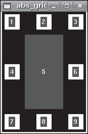
The following script, toplevel.tcl in this chapter’s code directory, illustrates a simple use of a toplevel, creating a window in which to display the source code to the script:
proc ShowSource {f} {
    set h 1
    set w 0

    set fileId [open $f r]
    while {[gets $fileId line] != -1} {
        incr h
        append s $line "
"
        set len [string length $line]
        set w [expr $len > $w ? $len : $w]
    }
    close $fileId

    toplevel .w
    wm title .w "Source Code"
    label .w.l -justify left -height $h -width $w -text $s
    button .w.b -text "Close" -command {wm withdraw .w}
    grid .w.l -sticky w
    grid .w.b -sticky s -pady {30 10}
}

set b [button .b -text "Show Source" -command {ShowSource $argv0}]
set e [button .e -text "Exit" -command exit]
grid $b $e -padx 10 -pady 10
The procedure ShowSource accepts a single argument, the name of a file to read and display. The first two set commands set the initial height (h) and width (w) of the label in the toplevel. The next block of code opens and reads the specified file. Each iteration of the while loop reads a line of text, increments the variable h (which is the height, or number of lines read from the file), and appends the line of text read to the variable s, which will be the value assigned to the label’s -text attribute. To ensure that the label will be wide enough to display the longest line of text in the file, I use the conditional expression set w [expr $len > $w ? $len : $w]. It compares the current width of the label (stored in $w) to the length of the line just read (stored in $len). If $len is greater than $w, I update $w with $len’s value. Otherwise, $w’s value remains unchanged. The command button .w.b -text "Close" -command {wm withdraw .w} associates the wm withdraw command with the Close button so that when you click the Close button, the toplevel closes, leaving the “main” or parent window open. The wm withdraw command just withdraws or removes the window on which it is called from the screen without otherwise affecting the rest of the application.
After closing the input file, I lay out the toplevel window, using the variables set in the while loop to configure the label widget that will display the input file. A single grid command displays the file. The “main” part of the script simply defines and displays two buttons, one to create the window (by calling the ShowSource procedure) and one to exit the script. Figure 11.17 shows the main window and the toplevel window created by this script.
You’ll notice that if you close the main window using the Exit button, both windows close. However, if you close the toplevel using the Close button, the main window remains open. The Exit button, rather the exit command, exits the Tcl/tk process, shooting down all the windows it has created.
It is certainly useful to be able to create new windows using the toplevel command, but for many uses, creating a new top-level window is excessive and more work than you might want or need to do. If you need to show a text string, don’t want to have to manually break (wrap) the text, want automatic left-justification, and would like to avoid writing code to handle control characters, then the message widget is for you.
The message widget’s syntax is just like other widgets’ syntax:
message name ?options ...?In addition to the standard attributes with which you should be familiar by now, the message widget has some special attributes that tailor it for displaying text strings using the features I just mentioned. Table 11.2 lists these attributes.
Table 11.2. Message Widget Attributes
Attribute | Description |
|---|---|
| Sets the aspect ratio of the message widget. The ratio is defined as the width of the text to its height, multiplied by 100 (100 * width / height). The aspect ratio defaults to 150. |
| Defines the justification of the text, defaulting to left-justification. |
| Specifies the length of text lines in the widget. |
The default value of -aspect is 150, meaning that the text will be one and a half times as wide as it is tall. A value of 200 means that the text would be twice as wide as it is tall. A value of 50, conversely, means that the width of the text would be half of its height. Although the text defaults to left-justification, you can request center- or right-justification with the values center or right, respectively. The value of the -width attribute (in screen units, which are pixels by default) defaults to zero, meaning that the -aspect attribute determines the width of the message widget. Accordingly, a non-zero for -width disables the -aspect attribute.
The following script, message.tcl in this chapter’s code directory, shows how the message widget looks with its default settings. It displays the README file from the Tk 8.5a6 source distribution:
set fileId [open README r]
set msg [read $fileId]
close $fileId

message .m -text $msg
wm title . "README"
grid .m
As you can see, it takes a lot less code to display a text file using a message widget than using a toplevel widget. All I had to do was read the input file, store the text in a variable, $msg, and then assign that variable to the message widget’s -text attribute. Figure 11.18 shows the resulting window.

I think the most difficult part of this game was getting the game-play logic correct, particularly the procedure that identifies whether a particular sequence of buttons represents a winning combination.
#!/usr/bin/wish
# tic-tac-toe.tcl
# Play a game of Tic-Tac-Toe

# Block 1
# Start the game
proc Start {btns} {
    # Convert the "Play" button to a "Quit" button
    .bExit configure -text "Quit" -command exit

    # Enable the grid buttons
    foreach btn $btns {
        $btn configure -state normal
    }
}

# Disable the grid buttons
proc DisableBtns {} {
    global btns

    foreach btn $btns {
        $btn configure -state disabled
    }
}

# Block 2
# Set "X" or "O" on a button, then check for
# a winning combination
proc SetMark {b} {
    global player X O
    set mark [$b cget -text]
    # Can only update a button not already pressed
    if {$mark eq "?"} {
        $b configure -text $player
        # Switch players
        if {$player eq "X"} {
            lappend X $b
            CheckWinner $X
            set player "O"
        } else {
            lappend O $b
            CheckWinner $O
            set player "X"
        }
    } else {
        toplevel .w
        message .w.msg -text "Sorry, that square has already been used!"
        grid .w.msg
    }
}

# Block 3
# Winning button combinations
set winCombos [list {.b1 .b2 .b3} {.b1 .b4 .b7} {.b4 .b5 .b6}
    {.b1 .b5 .b9} {.b3 .b5 .b7} {.b2 .b5 .b8} {.b3 .b6 .b9}
    {.b7 .b8 .b9}]

# See if list of buttons passed in "btns" contains a winning
# button combination
proc CheckWinner {btns} {
    global winCombos player

    # Compare known winning button combinations the list of
    # buttons pressed so far
    foreach winCombo $winCombos {
        for {set i 0} {$i < 3} {incr i} {
            set combo [lsort [lrange $btns $i [expr $i + 2]]]
            set ret [string compare $combo $winCombo]
         if {!$ret} {
             # We have a winner!
             foreach btn $combo {
                 $btn configure -bg green -highlightbackground green
                 $btn flash
             }
             # Announce the winner
             toplevel .w
             message .w.m -aspect 200 -text "Player $player wins!"
             grid .w.m
             # Don't allow further gameplay
             DisableBtns
             return
         }
      }
   }
}

# Block 4
# X always plays first
set player "X"

# Set up the game grid
set row 0
for {set i 1} {$i <= 9} {incr i} {
    button .b$i -text "?" -width 3 -height 3
        -state disabled -command "SetMark .b$i"
    if {![expr $i % 3]} {
        grid .b[expr $i - 2] -row $row -column 0
        grid .b[expr $i - 1] -row $row -column 1
        grid .b$i -row $row -column 2
        incr row
    }
    lappend btns .b$i
}

# Start/Quit button
frame .fExit -relief raised -borderwidth 2
button .bExit -text "Play" -command {Start $btns}
grid .fExit -row 3 -columnspan 3 -sticky nsew
grid .bExit -row 3 -columnspan 3 -in .fExit
grid rowconfigure . 3 -pad 10Block 1 defines two utility procedures: Start and DisableBtns. When the script starts, all of the buttons are disabled. The Start procedure, invoked when you click the Play button, enables each button. Start also reconfigures the Play button to be an Exit button, changing both the text on the button and its associated command. The DisableBtns procedure simply loops through each button in the game grid and sets its -state attribute to disabled, effectively preventing further gameplay.
The only procedure in Block 2 is SetMark. It accepts a single argument, the button to mark with an “X” or an “O,” depending on who the current player is, which is read from the value of the global variable $player. First, I get the value of the -text attribute for the button passed in. If it is not ?, then the button has already been used or marked, so I create a toplevel window that contains a message widget with text indicating that this square has already been used. Otherwise, I mark the button with an “X” or “O,” append the name of the button widget to a list associated with the current player, check to see if the current player has won the game (with the CheckWinner procedure described shortly), and switch players. The variable $X contains a list of all the buttons selected by Player X; $O, likewise, stores a list of the buttons selected by Player O.
The code in Block 3 handles checking to see if a given sequence of buttons contains a winning combination. First, I define a list variable name $winCombos that consists of all the possible combinations of button names that constitute a “win.” Each list element, is itself a list of three button combinations. {.b1 .b2 .b3}, for example, are the three buttons across the top of the grid, while {.b3 .b5 .b7} is the diagonal sequence of buttons running from the southwest to the northeast corner of the grid.
CheckWinner does the heavy lifting. It accepts a single argument, a list of marked buttons to check for the known winning combinations stored in $winCombos. The outer loop, the foreach loop, iterates through each possible winning combination until a winner is found or all combinations have been checked.
The inner for loop processes the marked buttons. To do so, I use the lrange command to select three consecutive buttons from the list of marked buttons. I also use the lsort command to sort the list lrange returns in ascending order before I store it in $combo. It is necessary to sort the retrieved values for two reasons. First, the order of buttons in the X and O lists is the order in which they were pressed, which will most likely not be alphabetical. Second, the known winning combinations are sorted in ascending order.
Each iteration of the for loop moves the starting value used with lrange one element into the list of marked buttons. For example, if the marked button list is {.b2 .b3 .b5 .b6}, the three iterations of the for loop will return the following lists. The number to the left of the stylized arrow is the value of the for loop’s counter variable, $i:
0 → {.b2 .b3 .b5}
1 → {.b3 .b5 .b6}
2 → {.b5 .b6 {}}
Yes, the third list has a null or empty element. The inner for loop runs for index values 0, 1, and 2. This is sufficient to cover all possible combinations of button presses because the most buttons either player can press is five; if I haven’t found a match by the time I get to the third element in list, I’m not going to find one at all.
Next, I use string compare to compare the marked buttons to the winning combination. Recall that string compare returns zero if the two compared strings are identical, which explains why the if condition is !$ret. If the compared strings are not identical, I proceed to the next combination of marked buttons. Otherwise, when the two button combinations are identical, someone has won the game.
To show the winning combination, I change the background of the buttons in the winning combination to green and flash each button. I also use a toplevel window to announce who won, call DisableBtns to prevent further gameplay, and exit the CheckWinner procedure because there is no reason for further comparisons.
Block 4 sets up the game board. I set the default value of the $player variable to “X” because someone has to go first. I use a for loop to create the 3×3 grid of buttons. Each button is initially disabled. After creating and laying out each button, I append the button list stored in $btns for use in the Start and DisableBtns procedures in Block 1. Finally, I create the combination Play/Quit button, placing the button in a frame widget to make the layout simpler to manage.
Here are some exercises you can try to practice what you learned in this chapter:
11.1 Modify tic-tac-toe.tcl to use both a Play and an Exit button instead of using one button and modifying it dynamically.
11.2 Modify Block 4 of tic-tac-toe.tcl to choose the starting player, either X or O, randomly.
11.3 Modify tic-tac-toe.tcl to show who the current player is.