
CHAPTER 4
Primary Color Correction: Color Manipulation Tools
In the previous chapter, we discussed two of the most important color manipulation tools: the hue offset wheels and the individual red, green, and blue gain, gamma, and shadow controls. In this chapter, we’ll continue to explore those tools and will also look at other tools that are available in Color and other applications.
Color Wheels
The color wheels are analogous to the triple trackballs that most DaVinci and other serious colorists use as their main color manipulation tools. Whatever your software calls them, they are the GUI analogy of the triple trackballs on all color correction panels.
We did a correction tutorial already with trackballs or color wheels using a chip chart in the last chapter, so let’s dive right in to a real-world correction using trackballs or color wheels. I’ll be working in DaVinci Resolve, but you can use any application that has this same functionality.
The color wheels functionality in DaVinci Resolve is in the 3-Way Color tab. It’s also known as the 3-Way Color Corrector in Final Cut Pro. Apple Color just calls them color wheels in the Primary Room, and in Avid and Color Finesse, they are the hue offset wheels in the HSL Tab.
With the “Ghost_diner” clip (Figures 4.1 and 4.2) loaded up in your color correction app, make sure that no previous color correction work is still applied to it. If you have a global “reset” button, use that before continuing so that all parameters are at the factory defaults.
I’m going to do this correction with the Tangent Devices WAVE control panel attached (Figures 4.3 and 4.4), but the corrections will work just the same by using your mouse with the GUI on the screen.
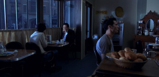
Fig. 4.1 Starting point for the “Ghost_diner” clip. Fairly dark and cool.
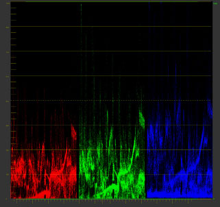
Fig. 4.2 Matching RGB Parade waveform for “Ghost_diner” clip. Note that the blue channel is the highest of the three color channels.
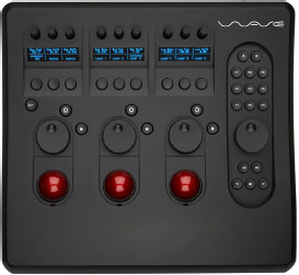
Fig. 4.3 The Tangent Devices WAVE controller is compatible with many color correction applications, including DaVinci Resolve.
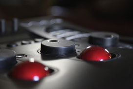
Fig. 4.4 The three large dials above the trackballs control the levels of the three tonal ranges. On many other controllers, like Avid MC Color, these dials surround each trackball.
In the Resolve software, the 3-way color wheels themselves (Figure 4.5) don’t have any way to correct for the tone of the picture. On the WAVE panel, I’ll use the large dials that are directly above the trackballs to control the levels of the shadows, midtones, and highlights (Figure 4.3). In Resolve’s Color screen, in the 3-Way Color Corrector tab, you can use the thumb wheels under the color wheels to control these same functions.
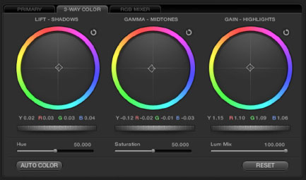
Fig. 4.5 In Resolve’s UI, in the 3-Way Color Corrector in the Color screen, the three thumbwheels under the color wheels control the lift, gamma, and gain.
I started by bring up the master lift control, using the large dial above the left trackball. The black levels are sitting nice and low, but I wanted to see if the blacks were being crushed, so I lifted them a bit to check. Doing that, I can see that the red and green channels are a little crushed and the blue channel is just slightly elevated, indicating that there is some blue in the shadows. To fix that, I will roll the lift trackball up just a bit toward the 10 o’clock position. This evens out the bottoms of the red, green, and blue channels. Then I’ll pull the black levels back down by rotating the lift dial counter-clockwise until they reached 0% on the RGB Parade waveform. (That’s “anti-clock-wise” for our friends speaking the Queen’s English.)
Using the highlight trackball, I rolled the highlights up toward 10 o’clock just like I did for lift. On the far left side of each color channel is a thin highlight that is easiest to see in the green channel and hardest to see in the red channel. I manipulated the highlight trackball until all three of the color channels had the highlight at 100 percent on the RGB Parade waveform. This is one of those instances when the better resolution of an external waveform monitor really helps.
With those two changes made, the image looks much better balanced. The last fix is to the gamma or midtones. Let’s worry about balance first. To balance this, I look at the angled diamond shape about halfway up each color channel on the far right of the RGB Parade. This shape probably represents the wall above the mirrored hutch to the right side of the frame, near the top of the picture. I would guess that that wall should either be neutral or maybe even slightly warm if it was painted in a eggshell or cream color. If that’s the case, then the diamond shapes should either match across all three channels or maybe be slightly higher in the red and or yellow channel. To start with, let’s manipulate the midtone or gamma trackball to make the three diamond shapes in the RGB Parade waveform monitor match (Figure 4.7). Then maybe we can look at the image and push it slightly warmer to see if it works. Finally, I’ll dial in the level of the midtones watching our hero—facing us in the booth—so that we have detail in his clothing, but keeping skin tones natural. Also, keep an eye on the other elements of the image so that things like the guy at the counter or the bread in the foreground don’t get too much visual attention by lifting the gamma too much. My main concern in determining that level is watching the hero’s skin tones and shadow detail (Figure 4.6).
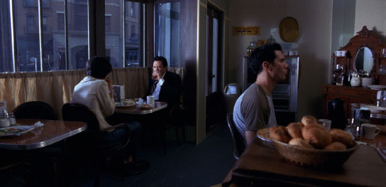
Fig. 4.6 The “Ghost_Diner” final correction. The print image may look a little saturated. This image is definitely more balanced, though the original intent of the director of photography may have been to maintain the cooler look.
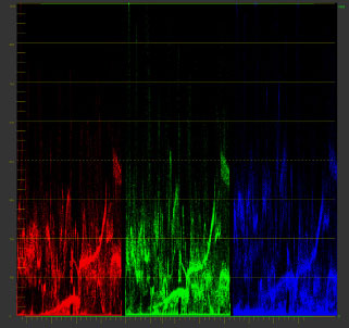
Fig. 4.7 The RGB Parade, showing the balanced image. Note the three diamond-shaped sections of trace about midway up on the right side of each color channel. In this image, those diamond shapes have matching vertical position. In the original (Figure 4.2), the red channel was the weakest and the blue channel was the strongest. Refer back to Figure 4.2 on page 112 to compare.
Terry Curren from Alpha Dogs in Burbank, California, has a rule of thumb for balancing images on the RGB Parade waveform: “Even though the whites and the blacks end up even, the mids have this little angle to them with slightly higher reds, mid greens, and lower blues.” Terry demonstrated this by holding a pen up to his RGB Parade scope, showing about a 15-degree angle from the midtone blue cell to the midtone red cell, with the green midtone perfectly in between. The angle of the pen was similar to the red line showing the same angle in the gammas on this RGB Waveform display (Figure 4.8). Obviously, there are times when the midtones have one of the other channels that is more dominant than in this example, but as we went through correction after correction, this angle on the midtones with reds above greens above blues seemed to be the most common by far.
This angle makes sense when you think about how much skin tone there is in the midrange of most of our images. Skin tones are reddish-yellow. Yellow is higher red and green than blue. And a warmer, redder yellow tone would be slightly more red than that.
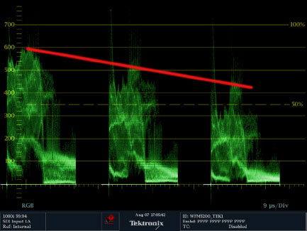
Fig. 4.8
Color Wheels and Trackballs with RGB Parade
One of the tricky things with the color wheels—or trackballs—is to figure out which way you need to move when watching the RGB Parade waveform. Using hue offsets while monitoring a vectorscope is very easy. It’s almost like you’re directly manipulating the image on the vectorscope with the wheels. It’s the same kind of direct manipulation and response you get with RGB controls or curves while watching the RGB waveform.
Using the trackballs or hue offsets is one of the most universal, hands-on ways to do color correction, and the RGB Parade waveform is arguably the most important piece of test equipment for color correction—not counting the video monitor itself. So you really should have a good understanding of how these two pieces of equipment work together.
Load the “grayscale_neutral” clip into your preferred color correction software that has hue offset wheels (or some form of “color wheel” correction). The goal here is to make the movement of the trackballs or color wheels correspond in your brain to the resulting desired movement for each cell in the RGB Parade waveform. This is not something that’s going to happen quickly for many people. If you are a musician, think of it like practicing a musical instrument. You need to get the feel of this “under your fingers.” It’s a question of muscle memory that will develop over some time. The directions should make sense, because they adhere to the color theory that we’ve already discussed elsewhere. It may appear to be backward, but if you understand what the color wheels are actually doing, it will make more sense.
Consider pulling the shadow trackball straight toward green (moving toward the 8 o’clock position on the wheel). What do you think should happen to the RGB Parade waveform? If you consider that pulling the wheel toward green is adding green and that you are doing this in the shadow wheel, then you should guess correctly that the green cell will rise at the bottom and the red and blue cells will come down, because the opposite of green is magenta, which is composed equally of red and blue.
From that position, swing the point on the color wheel from 8 o’clock toward 9 o’clock. Green stays the same basically and red (which is in that basic direction) moves up and blue (which is in the opposite direction) moves down. Swinging from 8 o’clock toward 6 o’clock raises the blue channel while keeping green fairly even and lowering red.
Using the trackballs or hue offsets is one of the most universal, hands-on ways to do color correction.
After you’ve tried those moves, reset the shadow wheel to the default. Practice trying to move specific combinations of cells with specific moves of the wheels or trackballs:
• Moving toward green raises green while lowering red and blue (Figure 4.13).
• Moving toward yellow raises red and green while lowering blue (Figure 4.11).
• Moving toward red raises red while lowering blue and green (Figure 4.21).
• Moving toward magenta raises red and blue while lowering green (Figure 4.19).
• Moving toward blue raises blue while lowering red and yellow (Figure 4.17).
• Moving toward cyan raises blue and green while lowering red (Figure 4.15).
Another important trick to learn is this: if you want to maintain the position of one cell while moving the other two, imagine a line drawn from the color that you want to remain stationary across to the color opposite it. For our example, we’ll try to keep the green channel stationary while having the red and blue channels move up and down on either side of it. So draw the imaginary line from green to magenta. To move red and blue while maintaining the green cell’s position, move the trackball or wheel perpendicular to the imaginary line. For us, this perpendicular line is from about 10 o’clock (raising red and lowering blue) to 4 o’clock (raising blue and lowering red). This corresponds almost perfectly to the “I” line on the vectorscope.
Thinking about what you are doing from a color theory perspective, this makes sense. You are not moving toward or away from yellow at all. You are maintaining the cursor’s distance from green while moving it toward yellow-red or blue-cyan.
Trying to maintain the position of the red channel while moving green and blue in different directions means a move that corresponds to the Q line of the vectorscope. This is approximately from 2 o’clock (lowering green) to 8 o’clock (lowering blue). Let’s make a shorthand for these clock positions by dropping the quote marks and the “o’clock.” For the next couple of paragraphs, numerical entries will refer to clock positions around the color wheel or vectorscope. (Technically it would be best to use degrees, but clock positions are easier, I think.)
Trying to maintain the position of the blue channel while moving green and red in different directions means a move from 1 (lowering green) to 7 (lowering red).
If you are not following along with the tutorial in an application right now, you may need some visual support. Here are some examples. I will drag the midtone hue offset wheel to extreme values around the circumference of the color wheel and show the corresponding RGB Parade waveform. Remember that the starting point for all of the midtones is about 50IRE and not quite perfectly balanced, but close. Note the direction of the hue offset change (exact degrees are indicated by a number under the hue offset wheel) compared to the movement of the midtones in the RGB Parade.
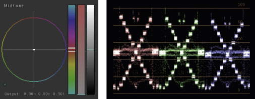
Fig. 4.9 This is the starting point for all of the corrections.
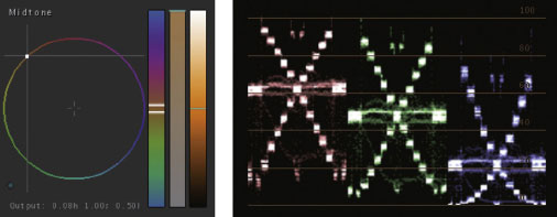
Fig. 4.10 This correction raised red, lowered blue, and green stayed the same.
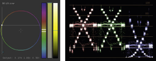
Fig. 4.11 This correction raised green and red equally and lowered blue.
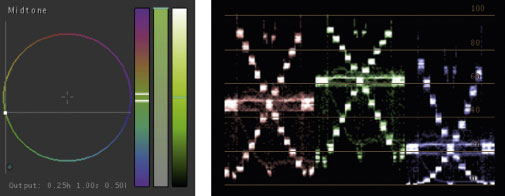
Fig. 4.12 This correction raised green, lowered blue, and red stayed the same.
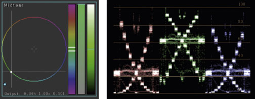
Fig. 4.13 This correction raised green, and lowered red and blue equally.
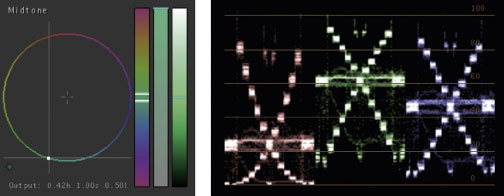
Fig. 4.14 This correction raised green, lowered red, and blue stayed the same.
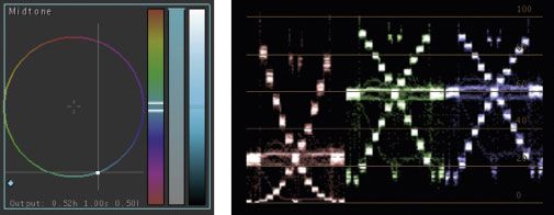
Fig. 4.15 This correction lowered red, and raised green and blue equally.
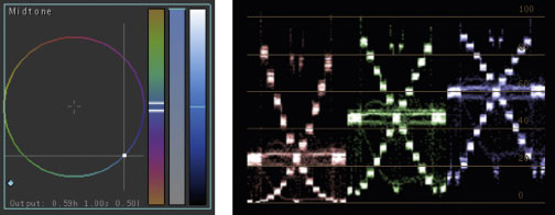
Fig. 4.16 This correction lowered red, raised blue, and green stayed the same.
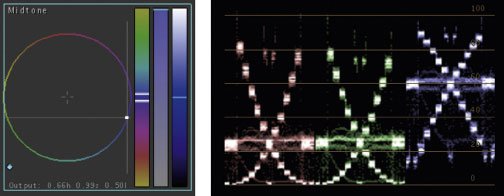
Fig. 4.17 This correction raised blue and lowered green and red equally.
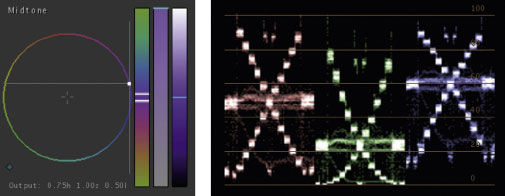
Fig. 4.18 This correction lowered green, raised blue, and red stayed the same.
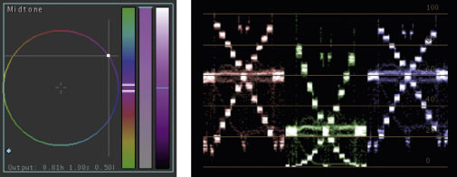
Fig. 4.19 This correction lowered green, and raised red and blue equally.
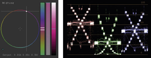
Fig. 4.20 This correction raised red, lowered green, and blue stayed the same.
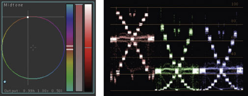
Fig. 4.21 This correction raised red and lowered green and blue equally.
Saturation Controls
Before we discuss some of the other tools for making color corrections that are available in some of the color correction applications and plugins, we have to discuss saturation controls. Any good color correction application should have the ability to control saturation in the highlights, in the shadows, and across the entire image as well.
It’s kind of fitting that I’ve left the discussion of saturation so late in the section about color, because as I watched the expert colorists, most of them didn’t do changes to saturation until fairly late in the process. As with so many things in color correction, this is not a hard and fast rule, but it does make a lot of sense because of the way that many of the other primary color corrections can alter saturation. Changes in black level, brightness, contrast, and color balancing can all affect saturation. So until these things are all set, the real saturation of the image remains fluid.
Changes in black level, brightness, contrast, and color balancing can all affect saturation.
Once the tonal range and color balance are set, there are several reasons for adjusting the saturation controls. Obviously, we need to have “legal” colors, and if raising the gain has also raised the saturation of certain colors, then we need to use saturation to bring those levels in to the correct range. Also, corrections such as raising the blacks or stretching gamma can increase saturation and cause color noise in various portions of the picture. Using the high or low saturation controls can help diminish the appearance of noise in these areas.
One of the other important reasons for adjusting saturation is in matching shots. If you are trying to match shots that were white balanced differently, adjusting saturation in certain tonal ranges after balancing the colors will often help tweak the match in a way that simply balancing the colors cannot do.
The other important reason for adjusting saturation is in creating a look. So many of the great looks that the colorists developed for the later chapters of this book relied on the creative use of saturation. Usually this meant lowering the saturation, but sometimes it meant taking saturation to the extreme upper limits.
Saturation adjustments are also important when you’re trying to take an image in a very different color direction than it was intended to have. The reason for this is that if you are trying to introduce a totally new color scheme to an image, the old colors must be nulled out so that they don’t “pollute” the colors you’re trying to add. For example, if you are trying to create an icy-blue skin tone on a person with a normal skin tone, the reds and yellows of that skin tone will blend in with the correction you’re trying to make. If you first lower the saturation in the areas of that skin tone, or across the entire image, you will find that your icy-blue look will be much easier to achieve and much more satisfactory in the end.
Obviously, one of the important reasons to adjust saturation is simply “to make it look good.” Saturation levels are very subjective—like gamma levels. When you’re doing primary color correction, you sometimes “break” something that needs to be fixed elsewhere. That is often the case with saturation. If you had to add warmth to the midtones of an image in order to get a nice healthy skin tone, it’s possible that other areas of your midtones will need to have saturation reduced. Or possibly the addition of warmth in the midtones meant that some cool element in the midtones became desaturated, so you may be able to bring the saturation up in that case, though the only real way to fight this would probably be a secondary color correction, which we will discuss in the next chapter.
Histograms
Most histograms used in color correction applications are just tools for analysis (Figures 4.22 and 4.23), but there are some that allow you to actually manipulate the image with the histogram interface. Color Finesse actually gives you both. As part of their analytical tools, along with RGB Parade waveforms and vectorscopes, Color Finesse offers up a histogram for analysis (Figure 4.24), but in its correction tools, it provides “Levels,” which allow you to manipulate the image in a histogram display (Figure 4.25).
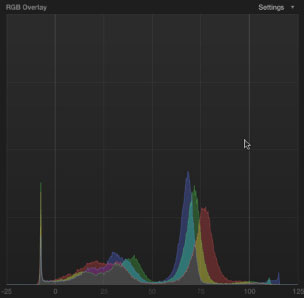
Fig. 4.22 Final Cut Pro X histogram display.
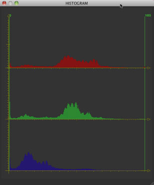
Fig. 4.23 DaVinci Resolve histogram display.
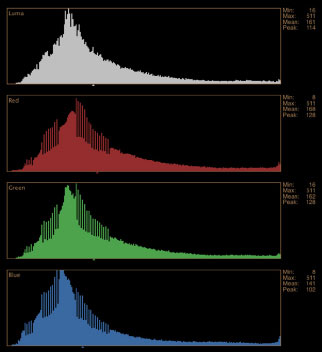
Fig. 4.24 Color Finesse histogram display for analysis.
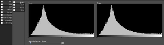
Fig. 4.25 Color Finesse histogram display—called “Levels”—for direct manipulation.
Avid Symphony’s tool to manipulate color using a histogram display is also called Levels.
Trying to do color balancing with histograms would definitely not be my choice, but it’s certainly possible if your application has the tools. I should also point out that using histograms as a tool to do color correction (as opposed to just analyze a color correction) is a favorite of print retouchers, who are the “colorists” of the print world.
The basic concept for using histograms to fix color casts is similar to using curves. You are remapping the incoming levels to different outgoing levels. With curves, the relationship is on a grid where the horizontal and vertical axes define the relationship between incoming and outgoing signals. In a histogram, you basically have two horizontal axes and you attempt to match the position that the histogram levels sit with their ideal location.
In the tonal range correction that we did with the histogram, the goal was to spread out the tonal range across the histogram as much as possible. With color cast corrections you attempt to do the same thing in three different color channel histograms—this work gets very difficult with severely un-white balanced images.
Call up the “ChromaDuMonde_cool” clip into an application that allows histograms to be manipulated and look at each color channel. The green channel appears pretty good, but the red and blue channels don’t have much that’s recognizable to match to the green channel (Figure 4.26).
The way I approached this correction was to try to match the blacks, whites, and grays using an eyedropper tool, constantly adjusting the levels and resampling. The things to adjust are the small triangles under the histogram. The default positions for the outgoing black and white histogram triangles correspond to the correct legal levels of black and white. That’s why I did most of my corrections on the input (left) side.
The basic concept is to match the points on the histogram on the left side so that the histogram on the right looks like you want it to look. Figures 4.27 through 4.29 show the results of my correction.
The whites, dark grays, and blacks are correct, but there is a blue cast to the upper grays. This is probably because the blue channel is clipped in the high end (due to the cool white balance), so all of the colors between the clipped blues and the midtones are more blue than they should be. The only way to fix this problem would be to try to lose the blue cast in the upper midtones by making the whites too warm, then using a secondary color correction to either pull all of the saturation out of the clipped area, or try to balance just the highest whites.
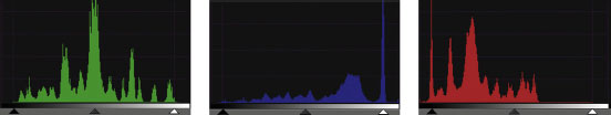
Fig. 4.26
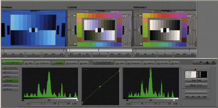
Fig. 4.27
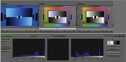
Fig. 4.28
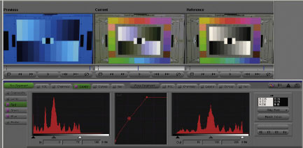
Fig. 4.29
One of the ways we can check to see what the clipping in the blue channel looks like is to look at another color correction tool in Avid Symphony called Channels, which is similar to After Effects’ ability to display the individual color channels using the controls at the bottom of the Composition window (Figure 4.30).
After Effects can show you what the individual color channels look like using the Show Channel and Color Management Settings under the Main Comp window.
Looking at the individual color channels as black and white images gives you a good idea of what kind of damage has been done to specific channels. It is also a good way to see which channel has the worst noise problems. Often, noise needs to be corrected only in specific channels.
Figures 4.31, 4.32, and 4.33 are the red, green, and blue channels, respectively, of the “chromadumonde_cool” image. You can see that the green channel is very nicely exposed across all tonal ranges. The red channel is also fairly evenly exposed—though darker and less contrasty. And the blue channel is overexposed throughout, with the highlights completely clipped. On a properly exposed chart, all of these color channels should look identical because the amount of red, green, and blue in each of the black, gray, or white chips should be identical. Obviously, the color chips around the edge of the chart will have different exposures due to the different amounts of each channel in each chip.
Fig. 4.30 After Effects Show Channel Control.
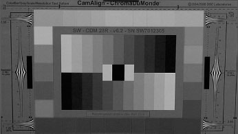
Fig. 4.31 Red channel.
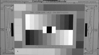
Fig. 4.32 Green channel.
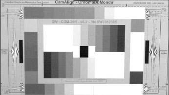
Fig. 4.33 Blue channel.
Curves seem to be the Rodney Dangerfield of color correction. They just don’t get any respect. I’m not entirely sure why this is. I’ve spoken to many colorists. Though curves have been around for quite some time on DaVinci and other color correction systems, experienced colorists have largely shunned them. Possibly this has happened because they are most comfortable with the hands-on speed of manipulating images with their color correction panels alone (Figures 4.34 and 4.35), which don’t have an easy way to control the curves interface.
The most common Curves tool is probably the one available in Adobe Photoshop. This tool is also available in Resolve, Color, After Effects, Color Finesse, and all Avid products (Figures 4.36–4.41).
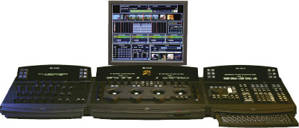
Fig. 4.34 DaVinci 2K panels. Image courtesy of DaVinci Systems.
Fig. 4.35 DaVinci Resolve. Image courtesy of DaVinci Systems.
Definition
DaVinci: The manufacturer of the most commonly used color correction gear for the last several decades, starting in 1984. Most colorists working through the 1980s and 1990s worked on DaVinci systems of one flavor or another, including the DaVinci 2K+.
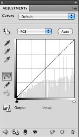
Fig. 4.36 Adobe Photoshop Curves.
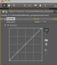
Fig. 4.37 Adobe After Effects Curves.
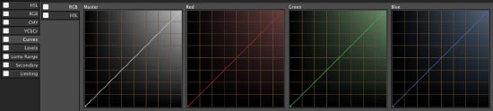
Fig. 4.38 Color Finesse Curves.

Fig. 4.39 Apple Color Curves.
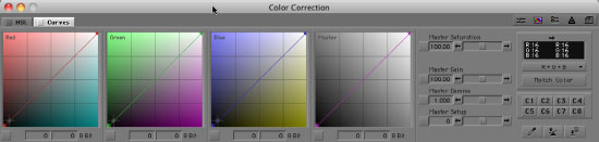
Fig. 4.40 Avid Media Composer Curves.
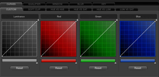
Fig. 4.41 DaVinci Resolve Curves.
We’ve discussed curves in the Tonal Tools chapter, but that was in the context of making adjustments to the tonal range of the picture. Curves can also be used to adjust color in a very quick and intuitive way.
To show you the power of curves, let’s run through a quick tutorial. Call up the “flowerbench” file in an application like Resolve, Color, After Effects, Color Finesse, or Avid Media Composer that has curves. As shown in Chapter 2 page 53, curves can make tonal corrections easily in the master curve. I’ll be doing this tutorial in Avid Media Composer because I like the nice color coding of the curves in that application.
When dealing with curves, the RGB or YRGB Parade waveform is the most intuitive way to monitor your image while you are making corrections.
Take a look at the RGB Parade waveform with the “flowerbench” image up (Figure 4.42).
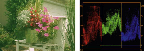
Fig. 4.42 Flowerbench image and Avid Media Composer internal RGB Parade.
All of the black levels are elevated, but the red is the closest to being down at 0IRE where it probably should be, followed closely by blue, and the greens are highest of all. The red highlights appear to be clipped, and they are as high as they can go. The greens highlights are low and so are the blue highlights. Let’s take care of those things first, then see what else the image needs when we get those things taken care of.
Drag the bottom of the red curve to the right to pull down the shadows in the red channel (Figure 4.43). Watch the red cell of the RGB Parade waveform until the lowest part of the shape gets to the bottom. Your image will not look any better, but the tonal range of the red channel is much improved. My correction pulled the 0 black level in red over to 24. That means that everything that was between 24 and 0 on the original image has now been pulled down to 0 on output.
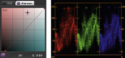
Fig. 4.43
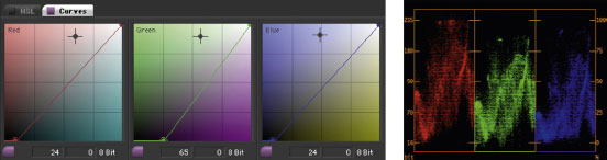
Fig. 4.44
Now, drag the same points to the right on the green and blue Curves. I took the black point of the green curve to 65 and the blue curve to 24. The image starts to look better and the three cells of the RGB Parade waveform are much more even (Figure 4.44).
Grab the upper right corner of the red curve and pull it down just a little to see if you can get rid of some of the clipping in the highlights. You don’t want to bring it down too low. There are lots of bright whites in this image, and you need some part of all three RGB channels at the very top. I ended up bringing the top of the red curve down to 252. Greens are pretty low. To bring a highlight level up in curves, you need to drag it to the left along the top, because you can’t drag it any higher. Drag it to the left while watching the highest spot in the middle of the green RGB Parade cell. Line the high spot on the green channel with the high spot on the red channel. This point corresponds to the bright white leg of the bench at the middle bottom of the image. My correction put the top of the green curve to 230. Do the same thing with the blue channel. My correction put the top of the blue curve to 240 (Figure 4.45).
The image is looking even better at this point, but still seems a little yellow. If you look at the RGB Parade waveform, this yellow tint is evident by the fact that the red and green channels appear stronger. (And red and green make yellow. With the addition of a weak blue channel, this means that the color opposite from blue—yellow—is stronger.)
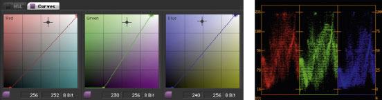
Fig. 4.45
Note
DaVinci’s curves only go up and down at the extremes. Shadows can’t be dragged right and highlights can’t be dragged left.
Looking at some of the shapes in the waveform monitor, we can try to see if the corresponding parts of the image are white or black and figure out what we need to do to get them to be balanced white or black. Notice that the far left side of the red and green channels on the RGB Parade are higher than the blue channel. On the red and green channel, that portion of the trace comes up to about 40IRE. On the blue channel, it’s at about 25. To pull this part of the waveform up, click on the blue curve about 25 percent of the way up the diagonal line and drag it straight up (Figure 4.46). We’ll watch the blue channel of the RGB Parade, but we’ll also watch the video image. That part of the waveform is on the left side, so we need to be looking at the left side of the video image as well. We’re also pulling up part of the image that is fairly dark, so we want to keep our eyes on the shadows on the left side of the video image.
I was able to get the blue channel to match the red and green channels, but when I did, I noticed that the shadows in the pine tree in the background to the left became very blue. So I undid that correction.
What I know about the real-world scene is that the extreme left side of the image is actually the siding of my house. That siding is painted a warm tan color (reddish yellow). The bluish tinge to the shadows gave us the clue that we didn’t want that part of the waveform to match.
Let’s try something else. Looking at the RGB Parade waveform, we can see that even though we have the brightest part of the blue channel up as high as it can go, the rest of the blue highlights aren’t as strong as the highlights in the red and green channels. Knowing that the bench has a lot of white in it and the garage door in the background is also probably white tells us that we need to bring up the highlights of the blue channel.
Grab a point on the blue curve about 75 percent of the way up the diagonal line and drag it upward. We’re trying to get the area on all three channels to look about the same at 75IRE. Before doing this correction, there’s a kind of a “peak” in both the red and green channels at about 75IRE. Bring that same area of the trace in the blue channel up to match them. My adjustment was to bring the point at 185 on the blue curve up to 207. When I did that, I also brought the highest highlights on the blue channel up too far, so I made an adjustment at the top point of the blue curve back down to 246.
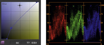
Fig. 4.46
You could look at the RGB Parade and decide that the highlights in the red channel are too strong, but I think that the extra “weight” at the top of the red channel trace on the waveform is probably due to the red and pink flowers that are in a corresponding position to the strongest parts of the red channel of the waveform monitor. If you want to, you could play with the red channel to get it back into line with the blue and green channels, but you’ll see that the white highlights in the picture quickly turn cyan, which is the opposite of red.
The image looks significantly better at this point. But there’s a lot of green in the tin flower can on the bench and I don’t think the green foliage pops very well. Let’s see if we can pull out some of the green in the midtone areas.
Start with a point in the green curve that’s about halfway up and pull it down a little. Using the information in the tip box on this page (in the margin to the right), you know that you’re moving the midtones of green down, so you need to be looking at the midtones of your video image to prevent the image from going too magenta, which is the opposite of green. As soon as you see the midtones turn magenta, you have to back off the correction. For me, the magenta cast started almost immediately when I pulled the gammas down, so I returned it to its original place. (Undo—Command-Z or Control-Z—should work on most applications, or you can select the point and delete it.)
I still feel that there’s a bit of a green cast to the middle shadows, so this time, let’s place a point that’s much lower on the green curve and pull it down subtly. I brought the point from around 106 down to 57, which may not seem like a very subtle move, but remember that the black level of green was already pulled down quite a bit, which pulls down all of the other points on the curve as well.
Looking at our original image (Figure 4.47) compared to our correction shows a significant improvement (Figure 4.48). These are changes that would not be quite as easy to make using the traditional hue offset wheels because the changes to the midtones of the blue and green channels wouldn’t work as well as the specific changes we made to the high midtones of the blue channel and the low midtones of the green channel (Figure 4.49).
The important thing to remember when choosing a point is to determine a specific portion of the picture you’re trying to change—like the tin watering can in the previous example—and to try to guess where that tonal range lies on the curve. Don’t be afraid to make mistakes. Pick a point and move it a bit. If it’s not affecting the tonal range you want, then delete it and pick another point. Use the information you gathered from the first point to determine where the second point should go. Did the first point affect a tonal range that was slightly above or below the range you really wanted? That will guide you in picking the correct spot.
TIP
Whenever you are making a correction, be aware of what tonal range you are adjusting and which color you’re adjusting. When you’re looking at your video monitor, you want to be especially tuned to the subtle changes in that specific tonal range and with that specific color. Sometimes if your eyes are looking at the entire image, you’ll miss subtle changes that you would notice if you were looking in the right place. You also don’t want to be blind to what the correction does to the larger image. Sometimes this means tweaking the image back and forth looking at just the shadows the first time you tweak it and then at the overall image the next time you tweak it.
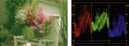
Fig. 4.47 Flower bench, original.
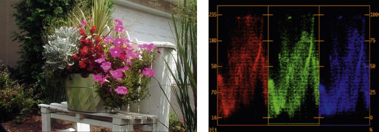
Fig. 4.48 Flower bench, corrected final.
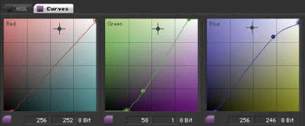
Fig. 4.49 Final corrected curves.
TIP
Some applications, such as Avid Media Composer, allow you to eyedropper a point on the image and see exactly where on the curve that point lies. This feature is a great instructional tool to develop your ability to know where these points would fall without letting the software do it for you. A good photographer knows how to use a light meter, but most also pride themselves on being able to set exposure by eye if they have to. Developing a good sense of the luminance levels of various parts of an image will make you much faster as a colorist, because your corrections will be more intuitive.
You also want to remember the tip from Chapter 2 about curves: use extra points on the curve to protect portions of the curve that you don’t want to affect. For example, if a correction to the midtones of the red curve is working great for the midtones, but it is adding too much red to the highlights, then place a point on the red curve between the top of the Curve and the area that you are moving in order to protect the red highlights from being affected by the red midtone point. When you do this, be careful not to place the points too close to each other or it will cause banding or posterization. You can use the previous tip about eyedroppering the image to determine where the “protection point” should go.
RGB Lift, Gamma, and Gain Sliders
A tool that works similarly to curves are the red, green, and blue numerical or slider controls for lift, gamma, and gain. Virtually all color correction software includes sliders like these. In DaVinci Resolve, they are in the Color Screen in the Primary tab. They are available in the Advance tab of Color’s Primary Room. They are available in Color Finesse and many Avid and Final Cut Pro color correction plug-ins, such as 3Prong’s ColorFiX AVX plug-in or Magic Bullet’s Colorista plug-in for Final Cut Pro.
Note that I’m not talking about simply adjusting lift, gamma, and gain, but adjusting the individual color channels of red, green, and blue in each of those tonal ranges.
Figures 4.50 through 4.56 show a range of options from various products and plug-ins that allow you to color balance your images using RGB sliders or numerical values in each tonal range. Although we’re going to do this correction in Color, any of these applications—or others with a similar RGB-level UI—will work similarly.
For this tutorial, we’ll use the “ChromaDuMonde_properexwarm” clip from the DVD.
Looking at the ChromaDuMonde chart is a little more complicated on the vectorscope and RGB Parade, but it is still very similar to the grayscale chart. To familiarize yourself with how the chart should look on the scopes, import the “ChromaDuMonde_properexwhite” clip from the DVD. Notice the way that the color from the color chips surrounds the center of the vectorscope evenly and how they aim toward the six color vector targets. Also, the various skin tone chips should form a line that follows the I line of the vectorscope. The I line runs the diagonally across the vectorscope from about the 5 o’clock position to about 10 o’clock. Many people refer to this as the “skin tone” line on the vectorscope. Technically though, this line, along with the Q line, which is at a 90-degree angle to the I line, are actually the in-phase and quadrature phase lines for the color difference signals in NTSC. What does that mean? Nothing to a colorist, so we might as well call the top half of the I line the skin tone line—for us, that’s what it’s good for.
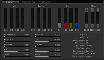
Fig. 4.50 RGB sliders in DaVinci Resolve.
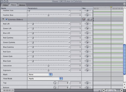
Fig. 4.51 RGB sliders for the Final Cut Pro Colorista plug-in.
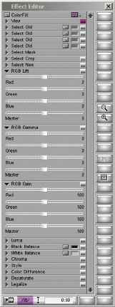
Fig. 4.52 RGB sliders for 3Prong’s ColorFiX plug-in for Avid.
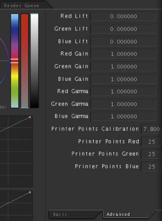
Fig. 4.53 Color’s RGB sliders are in the Advanced tab of the Primary In room.
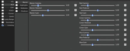
Fig. 4.54 Color Finesse’s RGB sliders.
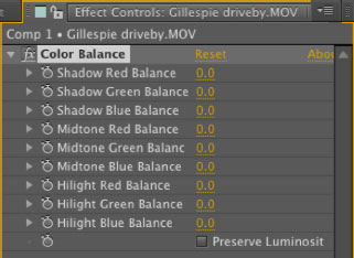
Fig. 4.55 After Effect’s built-in RGB color balance UI.
Fig. 4.56 IRIDAS’s SpeedGrade DI primary color correction controls. IRIDAS has been purchased by Adobe but had not been integrated into its product line when this book was written.
Back to our tutorial. Ignoring the color chips, the goal here will be similar to the tutorial we did with curves. We want to use the red, green, and blue channel sliders or numerical entry boxes in each of the tonal ranges to color balance the gray chips. We’ll use the red, green, and blue “lift” data boxes to control the bottom of the trace as it appears in the RGB Parade display.
Compare the waveform of the properly exposed chart (Figure 4.57a) with the improperly exposed chart (Figure 4.57b). Notice in the top left RGB Parade display (Figure 4.57b) the difference in levels between the channels, with the red channel (the first cell) having higher levels in all three tonal ranges and the blue channel (the third cell) having the lowest levels of the three. The green channel is relatively close to being correct. If you look at the RGB Parade display at the lower left, you are looking at a 5x vertical gain. You can see that the black levels of all the red and green channels are elevated somewhat. Looking at the composite waveform display in the upper right corner, you can tell that there is some kind of color cast, because of the excursion in the trace for each chip chart. Compare it to the tight, well-defined steps of the X in the upper right scope of Figure 4.57a. The vectorscope shows the red color cast because the color chips are all pushed up toward the red vector instead of being evenly distributed around the center of the scope.
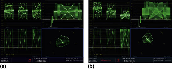
Fig. 4.57 Tektronix WVR7100 displays of both the balanced ChromaDuMonde chart (a) and the chart with a warm white balance (b).
For this tutorial, our main focus will be the standard RGB Parade waveform display because it will match up very nicely with the specific red, green, and blue sliders or numerical entry controls.
The controls in the Advanced Tab of Color’s Primary In room are actually laid out in the order you should use them: with lift first, gain next, and gamma last. Watching the RGB Parade waveform, bring the red, green, and blue lift down until the center black chip rests on the 0IRE line. Remember the focusing analogy and bring the level only low enough to get a good clean black without clipping the signal or creating an illegal black level. The center black chip in the blue channel reads much higher than the darkest chip to the left. In the red and green channels, the lowest chip is the center chip. We may have to determine which chip we try to put at 0 for the blue channel. For now, we’ll put the center chip for the blue channel at 0. Remember, once the relative positions of various parts of the lower part of the trace start to change, you need to stop, because that is showing clipping. See Figure 4.58.
Next are the gain controls. Bring them up so that the brightest part of the white chip is at 100IRE. Note that the chart is not quite evenly lit, so the left side of the chart is slightly brighter than the right side of the chart. Seeing this slight difference in luminance between the right and left sides of the chart is very difficult to do visually, but is quite obvious with your scopes. Also, you may notice that as you start to bring up the green channel gain, you can’t really get to the top (100IRE) before the green channel starts to compress and a strange interaction starts happening with the red channel gain, which almost seems to start unclipping. Once this happens, stop raising your green gain and bring your red gain down quite a bit (I brought mine down to about 80IRE) until you can get the green channel to 100IRE without compressing. Then bring your blue channel up to match green. See Figure 4.59.
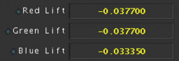
Fig. 4.58 My numbers for the lift correction from Color.
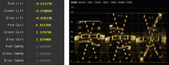
Fig. 4.59 My numbers for the gain correction and the resulting waveform from my gain corrections.
As you make changes to the gain—and especially to the gamma—you may notice that your lift (black) has changed. This is because the gain corrections were so drastic that they affected the lift. This effect is common. If you were grading these sequences with a manual user interface that allowed you to tweak the red gain and red lift at the same time, you could do this much faster. By using a single mouse, you’ll need to go back and forth between the gain and lift controls until you’ve got both of them in equilibrium. See Figure 4.60.
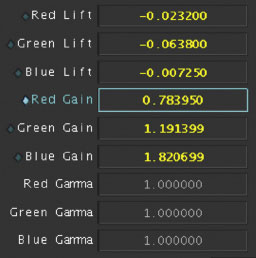
Fig. 4.60 The numbers for gain and lift. Check the minor difference between these and the numbers in the previous illustration. Now it’s time to make sure that the midtones are also balanced. With the highlights and shadows balanced already, the midtones should be pretty close.
Notice, though, that the similar shapes that sit just under the 60IRE line in the RGB parade are not quite at the same level in all three channels, even though the white chips and black chips are even. I’m going to match the red and blue midtone shapes to the green midtone. The midtone corrections will have a fairly strong effect on both the highlights and shadows, so I’ll have to do some back and forth corrections between the three tonal ranges until I have the shadows, midtones, and highlights all even across the three color channels. Figure 4.61 shows my final result with the numbers and RGB waveform.
With the amount of clipping in the red channel, this correction is problematic, but you can see from the vectorscope and the 3D Color Space that most of what is supposed to be neutral is actually fairly neutral. There is a slight red cast in some of the chips still, due to the clipping of the red channel. In a real-world image, you could determine whether this slight warming was appropriate and what you were willing to sacrifice in other colors or tonal ranges to try to get these into “spec.”
Let’s apply this to grading a real-world image with these same tools. Call up “piano_cool” from the DVD into your chosen color correction application or plug-in. I’ll do this one in Color Finesse.
Figure 4.62b is the starting RGB Parade waveform display for the piano cool image. It shows that the black levels are slightly elevated across all three channels. Looking at the right side of the shadows, the blue channel starts at about the same level as the other channels at its lowest point, but the portion of the trace from about 0IRE to about 20IRE shows that the deep shadows above black are elevated above the other two tracks. Also, looking at the highlights, the red channel is the lowest, and the blue channel is the highest. Midtones are a bit hard to judge at the moment. Let’s set our black, lift, or pedestal level first across all three channels. We have the nice black piano keys on the right to use as a very clean black, so that should be relatively easy.
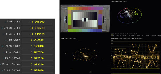
Fig. 4.61
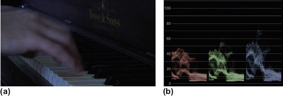
Fig. 4.62
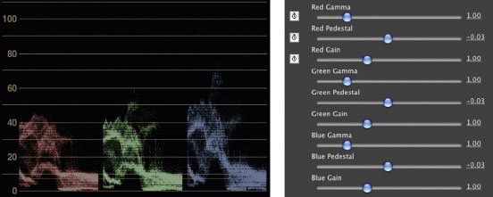
Fig. 4.63
Figure 4.63 shows what the numbers and RGB Parade look like at the end of the pedestal correction. Now we’ll move to the highlight or gain correction. Once again, we have nice white keys to use as we set our highlights.
The blue channel is closest to being correct and the red channel needs the most help. Let’s set all of these so that the highlights on the white keys in the middle of the frame are at 100IRE. That might be too bright, but we’ll start with that goal to spread out the tonal range as much as possible, then we can look at the video monitor and determine whether 100IRE is too bright for this image.
Here’s where I left the gain controls (Figure 4.64). There is some green above 100IRE, but the main shapes across the 100IRE line match across all three channels. Notice that the blacks in the red channel are slightly elevated now, because the gain change was so radical. We’ll need to fix that, then decide what we want to do with the gammas.
Now that I’m satisfied that the gains and pedestals match across the three color channels, we need to decide what to do with the gammas. First, let’s look at the RGB parade display (Figure 4.65) and figure out what we’re looking at. We have only a couple of elements to figure out. There are the hands, the brown piano wood, and the black and white keys. What is what in the waveform?
Well, the area between 0IRE and 20IRE to the right of each cell is the black keys and probably some of the dark wood to the right of the image. The area in the middle of each cell between 90IRE and 100IRE is the highlight on the white keys in the middle of the screen. The area to the left and extending past the middle of each channel between about 80IRE and 30IRE is the hands. In the red channel, this shape goes up to about 90IRE, probably due to the highlight on the “pinky” side of the hand.
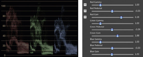
Fig. 4.64
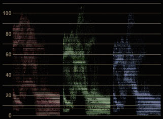
Fig. 4.65
You may think that we need to even out the discrepancy in the levels in that 80IRE to 30IRE zone—which is definitely defined as “gamma”—but consider the color of flesh. It’s pretty red and fairly yellow, without much blue. Considering that, the RGB Parade may be sitting just about right.
But we wouldn’t be doing our job—and I would be contradicting my own advice—if we didn’t try to focus our correction and see what we can do with the skin tones and any other colors in the gammas. But trying to focus color in gammas is not something you can generally do with scopes. This is where you have to turn your eyes to the actual image and find where the image is most pleasing or correct visually.
I started by making an adjustment to the blue gammas, and the skin tone, and the tops of the piano keys quickly started getting too yellow as I dropped the blue gammas. Raising the blue gammas added too much coolness to the flesh tones in the hands.
Changing the green gammas downward pulled some green noise out of the wood and skin tones, though going just slightly too far started making the image go very magenta very quickly. Lowering the green gamma also added a nice richness to the dark wood of the piano. Raising the greens instantly started looking sickly.
Bringing the red tones down certainly doesn’t help the skin tones. Raising them creates a nice warm glow to the dark piano wood, but moving it too much adds an unnatural oversaturated look to the hands first and then to the wood.
Here’s where we started and where we ended up (Figure 4.66).
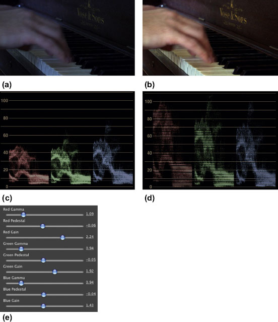
Fig. 4.66 (a) Source image. (b) Final corrected image. (c) Source RGB Parade waveform before correction. (d) RGB Parade after correction. (e) Color Finesse RGB sliders in their corrected positions.
Avid Symphony and After Effects allow you to see the individual channels as black and white images, and Symphony allows you to blend the channels together in combinations that include not only red, green, and blue, but also Luma, Cr, Cb, and an offset percentage.
DaVinci Resolve also provides a similar toolset (Figure 4.67), though it is called the RBG Mixer and is available in the Color Screen in the RGB Mixer tab.
The black and white views are handy visual tools, but don’t give you too much more information than the RGB waveform. Here are the individual channels for red, green, and blue (Figure 4.68).
Green looks pretty much like you would expect for a black and white representation of the ChromaDuMonde chip chart (Figure 4.68b), except that the dark grays are a little stretched out and the upper grays are a little compressed. The red channel looks like nothing is really clipped or badly crushed (Figure 4.68a), but all of it is pretty dark compared to the green channel. The blue channel really shows the clipping in the upper whites (Figure 4.68c), just as I suspected it would, but notice that the chips from the blacks up to the midtones match pretty well between the green channel and the blue channel. But nearly all of the upper gray chips are almost the same luminance value in the blue channel. This explains why our previous correction looks like it does.
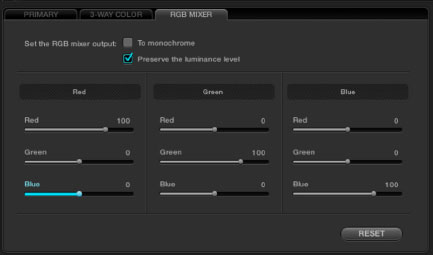
Fig. 4.67 DaVinci Resolve RGB Mixer tab in the Color Screen.
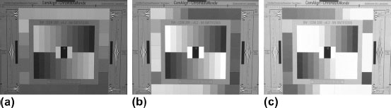
Fig. 4.68
Compare what the three channels are showing you visually against the Tektronix RGB Parade waveform image.
In the RGB Parade waveform, in the upper left of Figure 4.69, you can see how compressed the chips above the midtone are in the blue channel. This effect is giving you more information, actually—it’s just not so visually simple to digest. The waveform is showing you that even though the green channel image looked pretty good, it actually has quite a bit of clipping going on in the upper grays.
Fixing these issues with Channels is a different matter than seeing them, though. With Channels, the way to fix the problems is to combine channels with each other. This is basically way too unintuitive for most color corrections, but it can save you—if you have access to a Channelslike interface (Figure 4.70)—for some really nasty corrections. There are two main situations where I find myself turning to Channels. The first is when a color channel is completely missing or is almost completely missing. Sometimes this happens on multi-camera shoots, where a single color channel gets shorted out going to the iso deck. The camera seems fine going into the switcher, but not the iso deck. I can try to fake the missing color channel using Channels.
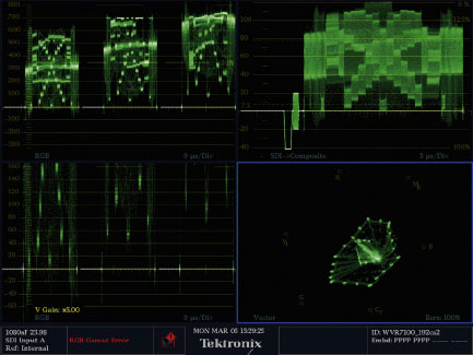
Fig. 4.69 Tektronix display of the “Chromadumonde_properex_cool” chart.
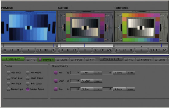
Fig. 4.70 Avid Symphony Channels interface.
I also use Channels with very noisy video. Nine times out of ten, the noise primarily resides in a single channel. By reducing the strength of the noisy channel and mixing it with the cleaner channels, I can take out the noise.
You should know that Channels is only going to get you so far in saving things. In almost every color correction that I start in Channels, I have to use other tools to fix what I broke in the image.
I’m not going to get into a detailed explanation of this tool because very few applications have it. What I did above was to look at what was wrong with a given channel and try to correct it by reducing the percentage of the problem channel and mixing it with a percentage of a channel that had attributes that would address the missing elements of the bad channel. Sometimes this causes some whacked-out color shifts. The goal here is to try to make the picture look more normal than what you started with. Channels is really only a last-ditch attempt to fix bad technical problems for me. If you have access to Channels or an RGB Mixer, as in Resolve, and want more information on how to use it properly, I would suggest checking out one of the many Photoshop color correction books, such as Photoshop Color Correction by Michael Kieran. There is an entire chapter on blending channels in that book. Photoshop offers a much greater capability to blend many different channels using options beyond those available in Avid Symphony, Color Finesse, and Resolve.
After Effects also has a similar color correction tool called Channel Mixer that can be found at Effects > Adjust > Channel Mixer. The Channel Mixer defaults to having the red channel be 100 percent red, the green channel be 100 percent green, and the blue channel be 100 percent blue. You can also combine each color channel with one of the other two color channels by percentage or you can choose the Constant (“Const”) option with specifies the amount of the input channel to be added to the output. Color can’t do this type of correction, but there is a channel mixer plugin for Final Cut Pro that does this.
Printer Lights
There is another option on several color correction systems, including DaVinci Resolve, Apple Color, and IRIDAS’s SpeedGrade. You can choose to alter the color the way the film industry has done it for decades: with Printer Lights. This is not going to give you a lot of control.
Basically, this approach turns your highly specialized, finely tuned digital color correction workhorse into an analog processor that harkens back to the dawn of color film: changing the color correction of scenes with a paper tape reader (Figure 4.71) controlling the relative light levels of the red, green, and blue printer lights that create the film print from the negative. This additive color timing of a film print uses printer points or printer lights from 1 up to 50 for each channel. Typically the printer is set up to the “default” exposure of 25 red, 25 green, and 25 blue, which is right where Color’s default levels are set. To raise any given channel, you lower its numerical value. If you want to raise the overall brightness of a scene, you lower all three color channels evenly. There is no ability to change relative levels for each tonal range. Of course, in SpeedGrade and Color you can combine the use of printer lights with any other tools in the system.
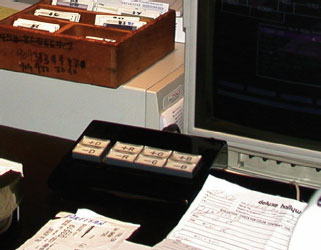
Fig. 4.71 The actual control device for color correcting major motion pictures using printer lights. I took this at Deluxe Labs in Hollywood while timing a trailer print.
Filters
In addition to the various tools that give you primary color correction control, there are numerous effects plug-ins for color correction, editing, and compositing software that allow you to place filters on your image to make global corrections such as duotone, bleach bypass, sepia tone, film look, and gradated filter looks (“grads”). There are really too many of these to mention, and the filter choices are constantly expanding and evolving, but the ability to use them creatively to affect color in your images certainly exists and I felt I should at least mention the possibility of its use.
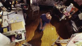
Fig. 4.72 Original image.

Fig. 4.73 Duotone filter.
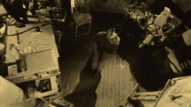
Fig. 4.74 Sepia filter.
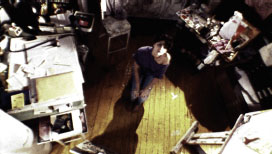
Fig. 4.75 Bleach bypassfilter.
Definition
duotone: A process that reduces the color palette of an image to two tones. Sepia tone is a duotone image with yellow or gold and black (Figure 4.73).
sepia tone: A duotone image using yellow or gold and black. The purpose of sepia tone is usually to give something an aged or antique look. Sepia itself is a brownish pigment or color. The specific HTML color list RGB coordinates for sepia are 112, 66, 20 (Figure 4.74).
bleach bypass: AKA skip bleach. A film developing process that bypasses the bleach bath creating an image that is more contrasty and less saturated because the silver is retained along with the color dyes of the film, creating an image similar to laying black and white on top of color (Figure 4.75)
gradated filters: Filters that are usually placed in the matte box of a film or video camera, a piece of glass that is gradated either from dark to light or from one color to another or from a color to transparent. It is generally referred to as a “grad” and its purpose is often to take some of the brightness out of a harsh sky or to add color interest to a scene. (sometimes called graduated or graded filters) (Figure 4.76b).
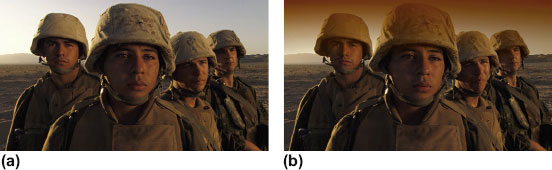
Fig. 4.76
Additional Tools
Many color correction applications have specific, patented tools that make it stand out from the other applications that are available. DaVinci Resolve has the ability to combine nodes and to composite different looks using the same compositing tools that are available, for example, in Adobe Photoshop: add, subtract, difference, multiply, screen, overlay, darken, and lighten effects. This really increases the ability to create very complex grades.
Apple Color also has the very cool and powerful Color FX Room, with its nodal effects tree that allowed multiple effects to be combined in intricate ways.
Because these tools are not widely available across multiple applications, I am not going to cover them. There are application-specific training books and DVDs by myself and others that teach these tools, but this book was created to be product- and platform-agnostic, so the aim with this book is to cover features, workflows, tools, and tips that can be accessed by most colorists, regardless of the software or hardware that they have access to.