Primary Color Correction: Tonal Range Primer
Color correction is generally broken down into two distinct processes: primary and secondary color correction. These two processes will probably always be referred to as two distinct processes, but the technology itself is starting to change the perception of how and why these two processes are used and when the colorist moves from one process to another.
Primary color correction is the process of setting the overall tone, contrast, and color balance of the image. Secondary color correction is an additional step that refines the image in specific geographical regions of the image or in specific color vectors of the image. Don’t let that word “vector” scare you. There are a number of definitions of the word “vector” that are used when discussing color space. It basically means the specific location or coordinates of a color. A vector can also mean the direction that something is heading, from one point in space towards another. So, essentially, in the color correction world, “vector” is just the technical word that defines a specific “color.” Think of a vectorscope, which is a tool that allows you to kind of see the “color wheel” (Figure 1.1). The vectorscope shows you where parts of the picture are on the color wheel. So the vectorscope shows you the vector—or location on the color wheel—for the elements of your video image.
The first step in any color correction is to assess the tonal range of the picture. What are the problems with the tonal range and how can you address them? From a purely technical standpoint, it seems like an easy question to answer. As a matter of fact, many color correction plug-ins or color correction systems built into nonlinear editors have “automatic” buttons that will attempt to spread out the tonal range for you based on purely technical information. These automatic systems assume that the brightest parts of the picture should be as bright as possible while remaining “legal.” The darkest part of the picture is also set automatically to be as low as possible while remaining “legal.”
Definition
legal: For video-based images, “legal” means that the brightness and color saturation of an image does not exceed minimum or maximum levels that have been determined for a specific delivery channel for a video. This usually implies broadcast, but can also pertain to duplication. Each duplicator or broadcaster sets their own specific requirements for video levels, but in general these levels adhere to national and international standards and describe that the darkest portions of the luminance of the picture can not fall below 0IRE for NTSC digital video (and most other international video of any type) or 7.5IRE for composite NTSC in the United States. The brightest pixels are not to pass 100IRE when monitoring luminance only or, when combined with chroma, cannot pass 110IRE. (There are other ways to measure the signal other than IRE, such as in millivolts.) Also, as our delivery systems become more and more digitally based, “gamut” is also included in “legal” levels. Not all waveform monitors or vectorscopes can monitor gamut levels. These gamut levels are the legal amounts—or values—of certain colors. It is possible for the luminance of an image to be well under legal levels, but because of a combination of saturation and luminance, the legal gamut levels can be exceeded. We’ll get into this more later in the book. In addition to “legal” levels, there is a second, similar term called “valid” levels.
vector: A position or coordinate in space or a direction between two coordinates. On a vectorscope, the vector is the specific position of a color in the two-dimensional circle defined by the vectorscope. The “targeted” vectors on the vectorscope are the three primary colors—red, green, and blue—and the secondary colors fall between them—magenta, cyan, and yellow.
valid levels: Levels that remain legal when transferred, translated, or transcoded between formats.
gamma: Technically gamma is a curve, but in some software programs, gamma is the label for the midtone adjustment slider. For all intents and purposes, gamma and midtone are synonymous in color correction.
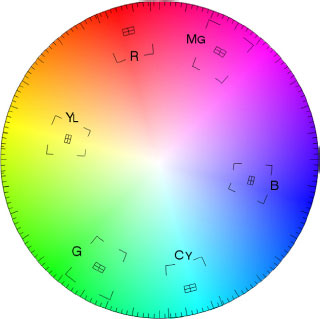
Fig. 1.1 The graticule of a vectorscope superimposed onto a color wheel. Notice that the “targets” on the vectorscope—the small boxes next to the black letters—correspond to the colors of the color wheel.
There are two big problems with this behavior. Simply setting the brightest pixel to 100 and the darkest pixel to 0 with all of the intermediate pixels spread evenly between them does not necessarily provide the best spread of the tonal range across the most visually important parts of the image. The other problem is that the image may not need to have either its brightest pixel at 100 or its darkest pixel at 0.
The first problem is solved with some experience. Great colorists know tricks that can enhance the perception of an image’s tonal range. They know that they can sacrifice the detail in a certain tonal range where it may not be noticed so that they can use that tonal range to enhance a more visually important part of the picture. These are tricks that you will learn in this chapter and throughout the rest of the book, Automatic software doesn’t know what is visually important, so it treats all areas of the image equally.
Even if the image should be spread from 0 to 100, that still leaves out one critical component: gamma. Spreading out the tonal range really serves to increase contrast, but the real impression of how bright or dark the image is relies largely on your gamma or midtone controls. Gamma really refers to a curve. The reason that midtones are sometimes referred to as “gamma” is because by lifting or lowering the midtones, you are creating a curve between the white point and the black point instead of a simple straight line (Figure 1.2).
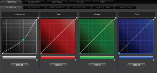
Fig. 1.2 Note that the luminance curve is curved because a point at the midtone was pulled down. The red, green, and blue curves are all straight lines from a black point at the bottom left to a white point at the top right.
Great colorists know tricks that can enhance the perception of an image’s tonal range.
The second problem is that the image may not require an expanded tonal range (Figure 1.5). Most shots should have a pretty wide tonal latitude (range) with rich blacks and sparkling whites, but there are those images that should not take advantage of the full tonal range. Some examples: an igloo in a snow storm; a dark, moonlit close-up of a Navy SEAL creeping through the underbrush; a foggy, early morning rowboat ride; a long lens shot of a smoggy city at dusk. Each of these may only have a partial tonal range, lacking either a deep black or bright highlights. However, these examples are usually the exceptions to the rules. But they do require the colorist to consider the clues in the image itself to determine whether anything in the image deserves to be completely black or bright white.
The colorist must consider the clues in the image itself to determine whether anything in the image deserves to be completely black or bright white.
tonal range (singular): The tonal range is the difference between the brightest and darkest areas of the image, sometimes also called the dynamic range, luminance range, or contrast range, though these terms can have slightly different technical definitions. The tonal range of the image—and how those tones are spread throughout the tonal range—defines its contrast. For some applications of this phrase, tonal range indicates the actual number of levels of tones that a recording medium can record (256 per channel in the case of RGB 8-bit, or 1025 per channel in the case of RGB 10-bit). For our purposes, we will refer to tonal range (singular) as the range of tones between brightest and darkest. Ansel Adams and other proponents of the Zone System break the tonal range of an image into 11 distinct tonal ranges.
tonal ranges (plural): The three commonly used tonal ranges that are used to break down the description (and control) of an image are shadows, midtones, and highlights. Sometimes shadows are referred to as blacks, pedestal, set-up, lift, or even lowlights. Midtones are often referred to as gamma, but also as grays or mids. Highlights are sometimes also referred to as whites, gain, luma, or even video. These are not necessarily technically correct terms, but they are terms that were used by the colorists as they were verbally conveying the use of these individual tonal ranges. The terminology in the book will not remain the same, because in real life, these terms are often interchanged—sometimes even by the same speakers.
Gamut: The complete range of colors that can be captured, displayed, or broadcast by a device or a system of devices. Most cameras or color correction devices have a much wider gamut (range of colors) than those that can be used further on in the production stream. For example, the gamut of colors later in the production stream that could require a limited gamut can be those: recorded to tape, burned to a DVD, encoded for the Web, broadcast from a TV transmitter, or viewed on a TV set. So there are multiple gamuts that have to be considered (see the previous definition for “legal” and “valid”).
Automatic Corrections Are Bad
Let’s run an experiment to show that you are already a better colorist than the automatic color correction tools available in most software packages. Even if you aren’t tempted to use these automatic features, this little experiment is an important lesson in using your eyes instead of the numbers or doing things technically perfectly.
Open the “Artbeats Popcorn” image (from Artbeats’ beautiful Food1 collection; Figure 1.3) in any application that allows you to automatically color correct. Most of these tools automatically spread the tonal values and “white balance.” But because these tools don’t know what the image actually looks like, they do everything by the numbers. Sometimes using them can get you in the ballpark very quickly, and sometimes it makes an image look worse.
For my example, I brought the popcorn QuickTime into Avid Xpress Pro and color corrected it using the automatic color correction tools. To be fair to Avid and other applications with these tools, these automatic corrections can sometimes do a pretty good job. If you’re in a rush, give each image a shot with them, but be prepared to take matters into your own hands. Doing things manually is actually a good thing. If all someone needed to do was push a button, then there’d be nothing special about the skills you’re trying to develop.
Anyway, after running the popcorn image through the auto color correction, it doesn’t look nearly as appetizing as the beautifully color corrected original image.
Most of these tools figure that you want something that’s pretty “white” or neutral-looking and with a tonal range that’s completely spread out. In the case of the popcorn image, the image needs to have a nice, warm golden tone. Also, the original image doesn’t really go much beyond 80IRE in brightness, yet the autocorrection spreads the tonal values over the entire range, which causes the steam rising from the popcorn to take on a harsher feel and the brighter parts of the popcorn come close to clipping out, destroying detail by overexposing (Figure 1.4). (See definition of clipping on page 22.)
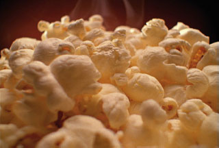
Fig. 1.3 Original image courtesy of Artbeats’ Food1 collection.
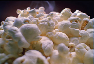
Fig. 1.4 Color corrected using automatic correction tools.
This point is a good thing to keep in mind as you’re color correcting things by hand. Not all images need to be at 100IRE and not all color casts are a bad thing. Some images need to be very contrasty and others need to have less contrast. You need to look for the clues in each image to help you find where the image wants to go. The long shadows of dawn or dusk should indicate warmer tones and lower contrast. The sharp shadows of the noonday sun should indicate higher contrast and maybe a hint of blue—or possibly yellow for heat.
The contrast for “golden hour” and “high noon” can be the reverse of what I just said. It depends on where the sun is. If the sun and camera are both pointing in the same direction at golden hour, things will be very evenly lit, like by a giant softlight. But if the camera is pointing toward the sun or perpendicular to it, instead of low contrast, it would have higher contrast because the difference between what was lit by the sun and the shadows would be great. The same goes for high noon. It can have great contrast, throwing deep shadows under the eyes, for example, or it can have lower contrast because the entire sky is acting as a big bounce light.
Keeping these exceptions in mind, let’s consider the approach to most of the images that—as you will see—will benefit from spreading the tonal range as much as we can.
Monitoring
My first book on color correction, cowritten with Jaime Fowler—Color Correction for Digital Video—goes into detail about monitoring. I don’t want to address those same issues as thoroughly in this book, but I will touch on them briefly.
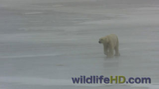
Fig. 1.5 A classic example of when not to spread the tonal range: a polar bear in a snowstorm. No part of this image should be completely black. Image courtesy of Dan Zatz at WildlifeHD.com.
Video Monitor
Proper monitoring is crucial: you must have a well set up video monitor. There are instructions for doing this in my first book and on numerous websites and online instructions. Although LCD monitoring has been largely shunned by serious colorists, the production of CRT displays for video was halted several years ago, leaving many with no choice but to switch to LCDs or some other technology. The main issue with these LCD monitors is how colors and tones shift with the viewer’s angle to the screen and how deep a black is able to be displayed. This problem is called off-angle viewing.
At a recent NAB (National Association of Broadcasters) convention, Sony revealed some beautiful OLED video monitors that largely resolved the off-angle viewing issue and improved performance in the blacks, which is a weakness of LCD video monitors. These monitors remain very expensive, but they’re getting serious attention from the colorists and facilities that deliver high-end broadcast and film images.
Many LCD video monitors can be set-up with look-up tables (LUTs) or by using calibration hardware and software. The cost and accuracy of these calibration units varies widely from several thousand dollars to under a hundred dollars. For my computer, I use a midlevel unit by X-Rite called the i1Display Pro (about $240). It uses a hardware device and software to create a custom monitor profile that even takes ambient lighting into account. This device would not fulfill the expectations of a serious, full-time colorist, but it creates a profile that seems very accurate to me.
Many high-end video monitors also have hardware-based calibration options that can help properly calibrate them. As I mentioned earlier, for video monitors that aren’t capable of being set up with a profile or LUT, my first color correction book offers an in-depth description of how to set up a monitor to color bars. There are also several resources for doing this available on the Web and from the monitor manufacturers. Ensemble Designs has an SDI to HDMI converter box that allows calibration of a consumer monitor. Instructions for calibration are included with the device.
At the higher end, the manufacturer Cine-tal has created a small box, called the Davio. A software application runs the Davio hardware and allows any monitor, even a consumer monitor, to be calibrated and matched to another monitor or to a specification. All of the calibration is done automatically and only takes a few minutes.
This type of device (or some kind of LUT box) is really necessary to get the most accurate color reproduction from your monitor. Simply adjusting the brightness, contrast, hue, and saturation on your monitor will not deliver dependable results. Instructions on using these devices for monitor calibration vary and are provided by the manufacturers. Entire seminar series are devoted to the topic of color management, so it’s outside the scope of this book to provide it.
For serious color correction, consulting firms can be hired to set up your suite, making sure that the image is accurate at each stage of the postproduction process, creating a workflow that guarantees the integrity of the image throughout the process.
Viewing Environment
The viewing environment is also of critical importance. The lighting in a color-critical environment is daylight balanced, not tungsten. There is some debate over the exact temperature of “daylight,” but it’s about 6000–6500K. The daylight-balanced light is often used only as reflected light as opposed to direct light. For example, it is bounced off of a back wall behind the monitor. It is also fairly dim. The eCinema displays we used for most of the color correction sessions come with a separate, external, daylight-balanced backlight that actually matches the light used inside the monitor itself. It is designed to be placed behind the monitor, bouncing light onto the wall behind it. The light bouncing off the wall behind the monitor should be one-tenth the intensity the monitor when displaying 100 percent white.
Any additional lighting in the room can’t increase this brightness level. The light sources should be 6500K bulbs or be filtered to reach that temperature. This color value is often referred to as D65. The “D” refers to daylight; “65” refers to 6,500 Kelvin. Actually D65’s exact Kelvin rating is 6503.6. The actual color of daylight varies. D65 represents the color temperature at high noon in the northern sky.
No bulbs or light sources should be visible to the colorist’s eyes while grading. Some color correction suites have a bulb near the colorist’s desk that sends a beam of pure 6500K light to a small white card or tile near the colorist to act as a reference for pure white. This light can be turned on or off independently from the other lights in the room.
Walls should be a completely neutral gray: no tint at all. Paint mixers have a very hard time with this. Bring an 18 percent grey photo card to your local paint store and see if they can match it. Many color suites aren’t painted at all but are instead covered in gray cloth, which cuts down on reflected light and glare.
High-level colorists are very sensitive to their viewing environment.
Here’s a simple test to prove how important the viewing environment is to good color correction. Look at the following squares and determine whether the blocks to the right are darker than the blocks to the left (Figure 1.6). If you’re familiar with optical illusions, you can probably guess the right answer despite what your eyes are really telling you.
The color chips inside the black surround (to the right) appear to be brighter than the ones on the white surround (to the left). The black surround also makes the contrast ratio of the chips appear slightly lower. This is due to a thing called lateral-brightness adaptation, which means that a particular retinal receptor in the eye is affected by the brightness of the receptors coming in to its neighboring receptors, which helps us detect edges better. (For more on the color theory involved, check out Digital Color Management: Encoding Solutions by Edward Giorgianni and Thomas Madden [Wiley]. Publication Date: January 27, 2009 ǀ ISBN-10: 047051244X ǀ ISBN-13: 978-0470512449)
High-level colorists are very sensitive to their viewing environment. This sensitivity extends to very small stimuli, such as glowing on/off switches on equipment and the color of the trace of the waveform or vectorscope. Most colorists try to grade using waveform or vectorscopes that have a neutral trace and graticule color instead of the traditional green.
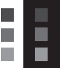
Fig. 1.6 The environment around your monitor affects how you see what’s in it.
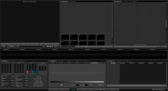
Fig. 1.7 The GUI for DaVinci Resolve is dark and essentially colorless.
This obsession with surrounding environment used to include the option to turn off the bright white Mac menu bar at the top of the monitor when using Color (then FinalTouch). Color and some other color correction software applications, such as Avid Symphony, go so far as to allow the user to customize the application’s graphical user interface (GUI) colors to be darker and less saturated. A look at the GUI for DaVinci Resolve makes this clear (Figure 1.7).
Definition
GUI: Graphical user interface. Basically, the screen that you see when working in an application that allows you to interact with the program and execute commands (Figure 1.7).
Surround Environment
Interview with Randy Starnes
To relate how important the surround is, when I first started, we worked in a room that was designed to resemble the living room, and the thought was, “You’re going to watch television in an environment similar to this, so let’s color grade in this environment. The monitor was set in a bookcase. It was a warmly lit room with a desk lamp, overhead tungsten lights. A beautiful room, very comfortable—it was like a den, a gentlemen’s smoking room. And I think in those days, we even smoked in the rooms. The longer you would color correct something, the more red you would put into the pictures because your eyes became desensitized. At the start of the day, skin tones would look normal, but after six or eight hours, you were correcting skin tones oversaturated, like basketballs, because your perception has changed. The reason you have the neutral background is that you keep the same perception all along. You refer to something that is neutral. Otherwise, if you bathe the area in blue, you’re going to compensate for that. You’re going to lose your sensitivity to blue, or red, or warm. And then you become desensitized to that. If you sit in a yellow room, your pictures are going to end up yellow. Or you’re going to be constantly fighting what you perceive. So the easiest way to avoid that is to surround the monitor with something that is neutral and daylight. You can also take your monitor to black and white to refresh your perspective. Sometimes I’ll use the switcher to put a gray border or a white border around my image to judge what pure white should look like or pure gray. Sometimes that helps the colorist and sometimes that helps the client, whose perception is just as important to the process. If you have an environment that is not neutral, the hardest thing to get right are going to be the white scenes.
Randy Starnes has been the colorist on Desperate Housewives, Extreme Makeover: Home Edition, Dr. Quinn: Medicine Woman, Touched by an Angel, and others.
Definition
waveform monitor: A waveform monitor displays the amplitude level—brightness and darkness—along the vertical axis with the dark parts of the image near the bottom and the brighter parts of the signal near the top. Technically, the horizontal axis of the waveform displays “time,” but practically speaking, the horizontal axis of the waveform corresponds to the horizontal placement of picture elements across the image with no regard to the vertical placement of elements in the image.
Waveform and Vectorscope Displays
Most of the waveform and vectorscope displays that are built in to the software of desktop applications are barely sufficient for color correction purposes. These scopes have two things going for them: they’re free and they’re convenient. Other than that, there’s not much to recommend them. There are a number of reasons that they do not stand up to a professional’s needs.
Depending on the specific application, many of the built-in scopes are not showing you full resolution. Some are designed to only show every other line or every fourth line of your video image! They also don’t have the full complement of features that are available on an outboard scope, such as ability to zoom or position the trace to better evaluate the image. There can also be a problem with lag time between a correction and that correction being sensed by the scope, because the amount of computational horsepower that is required to display the scope is pretty intensive. The main problem with these built-in scopes for broadcast work is that they have no real relation to the signal that comes out of the computer, because they’re not downstream of the video output. In the initial release of Color, the scopes inside Color didn’t match the scopes for the exact same footage inside Final Cut Pro, though this was more of a Quicktime issue. Another serious issue for efficient color correction is the ease with which you can jump from display to display or presets of displays. Largely, though, the issue with internal scopes is that they just don’t have the resolution needed for color correction.
For a lot of reasons, I recommend having an external waveform and vectorscope. When choosing a scope, find features and tools that you think will be most useful to you. Some brands, like Tektronix, have patented displays such as the Lightning Display, Spearhead Display, Luma Qualified Vectorscopes, and the Arrowhead display that provide you with valuable information that you can’t get from other manufacturers. So shop around for the tools in a scope that make the most sense to you as you color correct.
Also, make sure that the scope is monitoring the type of signal that you are recording to tape. It doesn’t make much sense to be monitoring the composite or component video signal if you’re laying HD-SDI or something else to tape.
I could see that their eyes were really watching the outboard scopes for critical decision making.
I used several Tektronix model waveform monitors during the writing of this book, including the WFM7000 and the WVR7100 (Figures 1.8 and 1.9) and the WFM5200 that I own.
Though the colorists who participated in this book could use the internal scopes, I could see that their eyes were really watching the outboard scopes for critical decision making. Many of the colorists used specialized views or amplifications of views that simply were impossible to deliver with the internal scopes. Having a scope that was capable of displaying multiple views at the same time was also important.
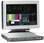
Fig. 1.8 Tektronix WFM7000 rasterizer. Images courtesy Tektronix, Inc.
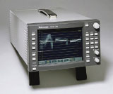
Fig. 1.9 Tektronix WVR7100.
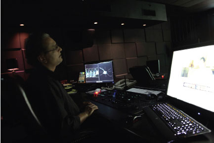
Fig. 1.10 Senior colorist Pankaj Bajpai at Encore Hollywood grading images from the book using a Lustre. He has an OmniTek scope prominently displayed, set to show an RGB Parade and vectorscope. Pankaj has been the colorist for Justified, Lie to Me, Sex and the City, Hung, Rome, and How to Make It in America. Before his career as a colorist, he was a director of photography. Later in the book, Pankaj will walk you through some corrections, step by step starting on page 258 and 276.
All of the colorists, except Pankaj Bagpai and Bob Festa, who worked in their own personal suites with their own equipment, used a Tektronix scope for these sessions that enabled them to view four different panes of information on the monitor. They all configured the four-pane view to display an RGB Parade waveform display and a vectorscope. Some colorists set up an RGB Parade waveform showing the entire height of the waveform and then a second RGB Parade that was zoomed in and focused on the 0IRE line to better see how to balance their blacks. Most also set a fourth monitor pane to see the standard full waveform luminance display. This setup is similar to what I saw in the suites that the colorists worked in every day. Almost all of them had four dedicated outboard scopes—or a single display with four scopes—set to different views or displays (Figures 1.11–1.12), which allows them to see information in multiple presentations at a single glance without having to switch between views by pressing buttons on a single scope.
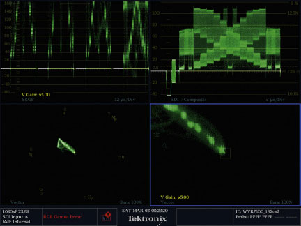
Fig. 1.11 Upper left quadrant: a YRGB Parade waveform monitor that has been zoomed in to focus on the shadows only. Upper right quadrant: the full-scale composite standard waveform. Lower left quadrant: a standard zoom on a vectorscope. Lower right quadrant: a 5x zoom to the center of the vectorscope.
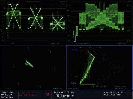
Fig. 1.12 Another set of views using the same video image input (a DSC Labs grayscale chart with a warm white balance) fed to the scope. Upper left quadrant: an RGB Parade waveform monitor showing the full scale (not zoomed). Upper right quadrant: the full scale-composite standard waveform (single field only). Lower left quadrant: a standard zoom on a vectorscope. Lower right quadrant: an Arrowhead gamut display.
RGB Parade mode (waveform): The RGB Parade is simply a display option of a standard waveform monitor. Colorists rely heavily on the RGB Parade viewing option on a waveform because it displays the individual levels of the red, green, and blue channels of the image. Each of these channels is displayed in its own “cell” horizontally with red, green, and blue in a “parade” from left to right across the screen. Each of these cells is essentially identical to the regular display of information on a waveform monitor, except that the values only pertain to the amount of that one color in the image. A variation on this display is the YRGB Parade display (Figure 1.13) that you will see throughout this book, which has four cells instead of three; the first being luminance (Y) followed by red, green, and blue.
vectorscope: Displays chrominance and hue. The saturation—or gain—of the chroma—or color—is measured by how far it extends from the center of the scope. Neutral images (black, white, and all levels of gray) register as a dot in the middle of the vectorscope. Hue is indicated by the position of the trace around the perimeter of the circle. Vectorscopes have graticules that show each of six different colors (red, green, blue, magenta, cyan, and yellow) in a different, fixed vector (position) around the vectorscope (Figure 1.14). Apple Color includes a cool 3D vectorscope that allows you to rotate the vectorscope in 3D space to see luminance displayed as well; 2D vectorscopes cannot display luminance information.
graticule: The overlay on the scope that indicates levels and positioning information. The graticule does not change unless the user changes it. It is usually customizable to display various scales and to provide information on how the trace signal is being displayed. It is analogous to the legends and lines on a chart or graph. The latitude and longitude lines on a map are the map’s graticule.
trace: Part of the waveform or vectorscope display that reacts to the incoming video information. The trace is a representation of your video image on the waveform or vectorscope. Nontechnically, it’s the squiggly stuff.
cell: This term is used to describe one of the three (or four) separate images on the RGB Parade waveform corresponding to the individual red, green, blue and—in the case of a YRGB display—luminance signals.
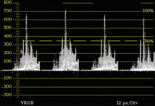
Fig. 1.13 Tektronix WVR7100 YRGB display, showing a separate cell for overall luminance plus each of the three color channels: red, green, and blue. Also note that this display is presenting the information on a scale of millivolts instead of percentage or IRE. This setting is a matter of personal preference. Most people find the IRE or percentage scale easier to understand and communicate. The Tektronix display is capable of displaying the graticule for either scale.
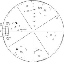
Fig. 1.14
Alternative Displays and Tools for Analysis
There are additional methods for analyzing the image. Most of these are specialized and are available only to specific applications. We’ll address these methods throughout the rest of the book where they’re applicable.
Some of the analytical tools for video images that are alternatives to the basic waveform and vectorscope include eyedroppering (available in most color correction applications), histograms (available in some color correction applications), and Luma Range view (available in a few color correction applications). Also, some applications such as Final Cut Pro can superimpose zebra patterns or warning symbols on video that has levels that are near or in excess of legal limits. Avid products have a similar warning system for illegal and out-of-gamut video levels. Tektronix scopes can also do this, with a setting called “Bright-up” displays.
Eyedropper tools (Figure 1.18) are a great way to look at a very specific part of the picture. You simply select the tool and click or drag to an area of your picture that you want to analyze, and then you use the same basic skills for balancing color on an RGB Parade waveform monitor. The goal is to get the levels—numerical, in this case—to match across all three color channels for any part of the image where you want a neutral balance. Be careful, because if you’re analyzing only a single pixel, you may be looking at noise instead of the actual color. Move the eyedropper around a little to get a sense of the surrounding pixels. Also, eyedroppering can show you clipping. If the eyedropper numbers don’t vary by much in a given area, that means there is probably clipping.
Histograms have some fans. I’m not one of them. The best thing a histogram can show you is whether there is clipping at either end in one of the color channels. If you have histogram analysis tools in your preferred color grading application, keep an eye on the histograms while you’re doing a correction using one of the other methods, like with an RGB Parade. You’ll start to see how you can balance the colors and to dial in a nice spread on your tonal range using the histograms. Histograms are actually quite good at setting the limits on your tonal ranges, but for balancing, I’ve found them to sometimes be quite deceptive. The basic concept for balancing with histograms is the same as with an RGB Parade. You are looking to match the starting and ending positions of the limits of each color channel. To compare the histogram to the RGB Parade, look at the image of the man with the sunglasses (Figure 1.15) and the corresponding image of the RGB Parade (Figure 1.16) and histogram from DaVinci Resolve’s internal scope displays (Figure 1.17).
Fig. 1.15 The image represented in the RGB Parade and histogram.
Fig. 1.16 Note that the black levels are balanced across the bottom of all three cells of the RGB Parade (red line). This is DaVinci Resolve’s internal RGB Parade waveform monitor. Also that the levels across the bottom of the three cells is elevated quite a bit above 0, indicating a fairly “lifted” black level.
Fig. 1.17 Note that the histograms also show that each color channel starts at a similar horizontal position, indicating that they are balanced (red line). The left side of the screen indicates black and the right indicates white. The position of the first bump on the histogram isn’t as far left as it could be, indicating the same elevated black levels as the RGB Parade. The difference in the balance of the bumps on the right side of the histogram indicates the warm skin tones and orange paint on the container in the highlight areas.
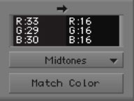
Fig. 1.18 The numbers from Avid’s eyedropper, sampling the black in the shirt. These numbers are in 8-bit color space. The numbers in the red, green, and blue channels (33, 29, 30) are fairly close to each other, indicating that the blacks are balanced but are quite elevated compared to the true black indicated by the 16, 16, 16 numbers to the right of them. All of these tools are giving us the same information in different ways.
First Things First: Black Level
Nearly every colorist attacks an image by first determining where the blacks should be. “Blacks” refers to the deepest, darkest shadows and black portions of the image. As mentioned earlier, blacks are also sometimes referred to as setup, lift, shadows, pedestal, or lowlights. There is usually some portion of an image that you can pick out that should be corrected to the lowest legal level. If you don’t correct at least some portion of the image to a black level that is low enough that it is almost devoid of detail, the shadows of the image will appear milky and the image will lack snap or pop. The trick is to lower the blacks to the proper point without losing detail that you want to keep.
Some colorists, when working with a monitor that they trust and with which they have a lot of experience, will judge this black level by eye. But although a good colorist knows how to judge these things from a trusted, proven monitor, black levels are generally set by looking at a waveform monitor, preferably one set to display in RGB Parade mode.
Mike Most on black balance and scopes: “The first place I go is black balance. I think it’s pretty much the first place pretty much everybody goes. I like to use scopes to do that. Scopes don’t lie. I can do it largely by eye, but it depends on what time of day it is, what I’ve been looking at for the last 20 minutes, and my mood. So for times when you’re looking for a pure balance, a scope is kind of your best friend. I know a lot of people who tend to stay away from scopes entirely and I personally think it’s kind of a mistake. I think you get a certain sloppiness that you don’t need to have by doing that. I don’t think you need to be a slave to scopes because a lot of it is just feel. But there are a lot of absolutes, and black balance is an absolute. Either the blacks are balanced or they’re not and scopes don’t lie. I trust the parade display. The vectorscope is a good guide, but for black balance, the parade display has to be the bible.”
Looking at the waveform monitor in RGB Parade mode allows you to view the brightness of each of the three color channels: red, green, and blue. Separating the display into these channels allows you to see whether one channel has more detail in the darkest areas of the picture and whether any one color channel has the black levels elevated above the others. This is an important thing to be able to see, so that when you are using your color correction tools to lower the black levels, you do not crush the detail out of one channel that may be lower than the other two.
Definition
crush: To lower the black levels to the point where detail is lost in the deep shadow areas. “Crushing” clips the signal on the low end. Sometimes “crushing the blacks” is a desired result: creating a contrasty look. It is also sometimes a warning that the black levels are too low. For example: “As I lowered the blacks, the picture was looking nice and rich, but I pulled back a little on my correction because I saw that I was crushing the blacks and couldn’t see any detail in the shadows.”
Definition
Low Pass: A mode or setting on the waveform monitor that filters out all of the chroma information in the image as it displays the waveform, allowing you to analyze only the luminance values. The opposite of this setting is Flat, which does not filter out the chroma information. On some scopes, especially those internal to many desktop applications, the Flat mode is called Y/C, which stands for luma/chroma. This Y/C mode is often displayed with the luma and chroma information in different colors. On a standard waveform monitor in Flat mode, the luminance and chrominance values are indistinguishable by color on the display.
Reading the Waveform Monitor
Let’s take a look at an image and determine the proper black level looking at both a standard waveform image in Low Pass—or luminance-only—mode and a waveform image in RGB Parade mode. First, we’ll identify the picture elements in the video image and find the corresponding areas on the waveform monitor. This step will help us judge the effect of our corrections as our eyes move from the waveform monitor to the video image.
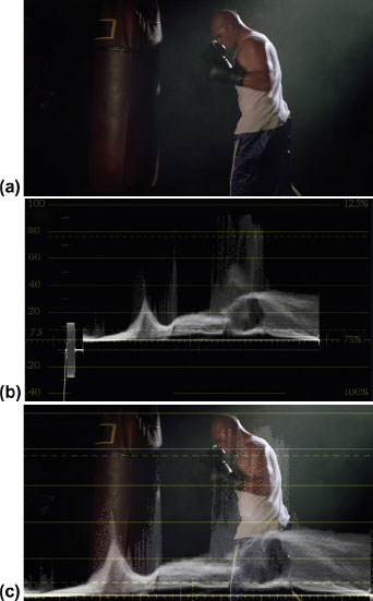
Fig. 1.19 (a) High-definition still from Artbeats’ Sports 1 HD collection—SP120. (b) Waveform image grabbed from a Tektronix WVR7100. (c) Artbeats’ image from Sports 1 HD collection overlaid with waveform display.
The images will give you a good idea of the correlation of the waveform monitor and the video image. The image of the boxer is a high-definition (HD) still grabbed from Artbeats’ Sports1 HD collection, clip SP120H1 (Figure 1.19a). The image of the waveform was grabbed from a Tektronix WVR7100, the waveform image is simply an enlarged portion of that same scope (Figure 1.19b), and the third image is an overlay of the boxer and the waveform done in Photoshop (Figure 1.19c).
Take a look at the waveform from left to right and find the matching portions of the picture itself. The large rectangular shape on the waveform is not part of the image itself. This is the black burst. You can ignore that as you grade. The first small rises on the left correspond to the very shadowed boxing gloves hanging in the background. Then there is a small ramp leading up to a steeper spike. The small ramp is probably a little atmospheric smoke that is only barely perceptible in the HD image behind and about half way up the punching bag. The angled spike indicates the left highlight on the punching bag. The ramping of the waveform is because the highlight gradually gets brighter as the light reflects in growing intensity on the curve of the bag then falls away on the right side of the curve. The speckled area above the steep spike appears to be the portion of the yellow rectangle at the top of the bag. I can basically confirm this suspicion by looking at the YRGB parade.
Definition
grade: The act of color correcting an image. It can be used as both a noun and a verb. For example: “I like the grade you did on this image.” “I’ll pull some of the blue out as I grade this.” “Grade” will be a common term used in this book because it’s easier to type than “color correct.” Also, this is a preferred term used by many colorists because it does not have the implication that something needed to be simply “corrected.” I think it also tends to imply that it is more art than science. “Color correction” seems like a very engineering-based term. The term “grade” seems to have more favor in Europe, but it is widely used throughout the world, including the United States.
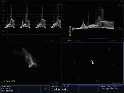
Fig. 1.20 Full display from a Tektronix WVR7100 showing (clockwise from upper left) a YRGB Parade, a composite (flat) display of the waveform, a vectorscope set to 5x gain (zoomed in), and a vectorscope set to normal gain.
If you look at the same horizontal area on the YRGB display (Figure 1.20 upper left corner)—the first of the three spikes—you will notice that the spike is taller in the red and green cells and shorter in the blue cell. I’ll explain this in more detail in an upcoming sidebar, but the equal combination of red and green in RGB colorspace makes yellow. Now the yellowish nature of the spike is certainly partly due to the fact that the highlight on the bag is slightly yellowish, but the difference between the amount of red and green compared to blue at that point doesn’t correspond to just a small yellowish tint to the highlight. It indicates something that is quite yellow, like the rectangles at the top of the punching bag.
Continuing on across the waveform from left to right, there are a four grayish spikes leading up to a thick spire that sits about one-third of the way across the image. These smallish spikes are the highlights in the wrinkles at the top of the punching bag: one along the seam in the middle of the bag and three short, but bright highlights just to the left of the other yellow rectangle. The tall spear in the waveform is the bright highlight at the top of the right side of the bag. Notice that in the tall spear, the discrepancy between the height of the red, green, and blue cells is minimized, because the yellow of the rectangle is obscured both by the bright highlight and in shadow. Your brain tells you that this has to be the same color yellow as the rectangle on the other side of the bag, but if you just look at the right-side rectangle, it’s very difficult to make out any real yellow tint.
After the spike from the right-side bag highlight, there is a slightly elevated band in the waveform that goes between about 2 or 3IRE up to about 20IRE. (On the YRGB Parade, it goes from about 15 millivolts to about 150 millivolts if you use the measurement scale to the left, which goes from –300 to 800.) This band corresponds to the light caught by the atmospheric smoke between the boxer and the bag.
The complex shape to the right of that is the boxer. The highest portions of this shape indicate the reflected highlights from the top of his rear boxing glove, head, neck, shoulders, and left tricep. There are also bright portions indicating his white shirt, reflections on his pants, and the brighter flesh of his chest and forearm. The heavy band at the very bottom of the waveform is the shadow of his pants. On the right side of this shape, it falls off precipitously, with only a small ramp around 40–50IRE (Figure 1.19c). I think that ramp is the highlight from the top of his back leg.
The rest of the waveform display to the right is the bright haze of smoke. The top of the band is the bright smoke at the top of the picture gradually tapering down to the dark shadow at the bottom of the picture, behind the boxer. Notice that at about 20IRE on the waveform monitor about two-thirds of the way across there is a circular gap in this smoke band? That’s where the boxer is blocking the haze.
Definition
IRE: One of the units of measurement that can describe a composite analog video signal’s amplitude (brightness), where 0IRE generally represents black and white extends to +100IRE. 1IRE is equal to 1/140 of a volt or 7.14 millivolts in NTSC, though in all other systems, it corresponds to 7 millivolts. IRE stands for the Institute of Radio Engineers, which defined the unit.
Notice that the placement of picture elements in the vertical axis has no bearing on the waveform. In other words, there is no indication on the waveform whether a bright spot is at the top of the picture or at the bottom of the picture.
Looking at the black levels of this picture, you can see that they are already set about as low as they can go without crushing the detail out of the darker portions of the picture. This is no surprise, really, as this is stock footage from Artbeats that was shot on film and already benefited from a colorist’s touch as it was transferred from film to tape.
Setting the Black Level
Let’s look at an image that needs to have the black level adjusted. The most obvious candidate would be a picture that looks a little washed out. We’re going to analyze the image in a number of ways and then look at several tools in various applications to correct the problem.
Please import the file “Brian interview overexposed” (Figure 1.21) from the DVD. It is a CCIR601 file size (NTSC, standard-definition video) and color space with interlaced fields, lower field first. You can use the color correction software that is most comfortable to you. I apologize to those of you in PAL or SECAM land. You will have to transcode the tutorial footage from these NTSC QuickTime files to something usable by your equipment.
The very first way that most colorists analyze an image is to view it on a broadcast monitor, which used to mean a CRT (cathode ray tube) display, but increasingly, even serious colorists are turning to LCD (liquid crystal display) monitors and projectors as CRTs have been phased out. Future monitor technologies, like SED (surface conduction electron emitter display), hold great promise, but are not available as of the writing of this book. OLED (organic light emitting diode) technology seems to be the current gold standard for reproducing the rich blacks that CRTs were able to achieve.
Fig. 1.21 An interview shot with available light on BetaSP back in 1996. I was the shooter and my brother Brian is the subject. This footage is available on the DVD as the file labeled “Brian interview overexposed.”
For now, you may use the image on the pages of the book itself, but you may also find this image on the DVD as a QuickTime file. The duration of each of the tutorial clips is quite short, in order to get as much data onto the disk as possible.
Import the file into whatever application you choose to use to do the tutorials. This might be Apple’s Color, DaVinci’s Resolve, IRIDAS’s Speed-Grade (now owned by Adobe), Discreet’s Lustre, Synthetic Aperture’s Color Finesse, any of the Avid products, Apple’s Final Cut Pro or Shake, or Adobe’s Premiere or After Effects. There are obviously more desktop color correctors, compositors, and nonlinear editing systems with color correction capabilities as well. If you want to, you could even attempt these corrections with Adobe Photoshop.
Looking at this footage, you can see that the image has very little contrast and is quite washed out, with very little bottom (see the sidebar “The Language of Music and Color” on this page). There are no darker tones to anchor the midrange and highlights. The subject is poorly separated from the background elements. Looking at the waveform monitor indicates that there is probably some clipping of the highlights in the sky area, but there should be plenty of detail available in the rest of the image. The blacks are certainly not crushed because very little of the waveform trace is below 20IRE.
WARNING
Please understand that your purchase of this book does not include the rights to use the tutorial images on the disk for any purpose other than to complete the tutorials in this book.
Definition
clipping: An electronic limit on the maximum brightness of an image (usually imposed in the camera) to avoid overly bright or hot signals, or simply due to the fact that the imaging or recording medium can’t perceive or record any greater brightness. Images recorded with portions where that level were exceeded will have lost picture information—detail—where the image exceeded the level. Clipping can usually be perceived on a waveform as a flattening out of the top of the trace into a sharp white horizontal line. Clipping is also possible on the low end of the signal, but that is generally referred to as “crushing.” It is also possible for clipping to occur in individual color channels. An artifact of clipping is the flattening out of tonal or color detail.
trace: The part of the waveform monitor that indicates the actual image being fed into the waveform. The other elements of the waveform monitor (IRE numbers and lines) are relatively fixed and are referred to as the graticule. (“Graticule” is also the word used for the longitude and latitude lines on a map.) On some waveform monitors, the graticule and the trace have separate brightness adjustments.
The Language of Music and Color
As someone who has hung out and performed with musicians most of his life, and who has had the chance to hear the unique language of colorists as well, I have noticed that the language of these two groups of artists is remarkably similar.
The example of the word “bottom” is used in both worlds. In music, it refers to having bass tones or low frequencies. To a colorist, it means blacks and deep shadows. Musicians and colorists also refer to images and music as being “warm” or “cool.”
“Tone,” “color,” “midrange,” “high end,” “low end,” and “shading” are often discussed by musicians. These words are obviously important to colorists as well. Adding “sparkle” or “depth” are things desired by both groups. “Spreading the tonal range” and “creating definition” are common goals. Having something that sounds or looks “thin” is bad for either group, while having an image or a sound that is “fat” is usually desirable. (And I don’t mean “phat.”) Other common words include “tension,” “contrast,” “texture,” and “brightness.”
To both groups, these are words that cross the artistic divide between the aural arts and the visual arts. What connects them is emotion.
Both color and music have a profound effect on our emotions. That is why they are both so important to storytellers and others who use media to influence and affect an audience.
Also, because collaboration and creative communication are important to both groups, it is important to learn to speak and understand a common language with your colleagues. The language used for creative communications is constantly evolving and is also varied by geography and by specific types of film and video professionals, so the exploration of these terms will need to be a personal one.
When you encounter a new word that is tossed at you by another creative professional, you can either ask what it means, if your ego will allow it, or “mirror” the phrase back with the meaning you think that the speaker intended. So if someone says “The bottom seems a little thin.” You can say, “So you want me to pull down the shadows to beef it up a little?” If you get an affirmative response, then you know you’ve translated it correctly.
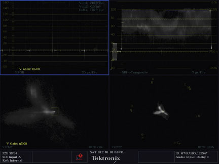
Fig. 1.22 Tektronix display showing (clockwise from upper left corner) a YRGB parade zoomed in 5x to the bottom of the waveform, a standard composite waveform with no zoom, a vectorscope with a 5x zoom, and a standard vectorscope display.
The standard composite waveform monitor (top right quadrant) shows that there is a small area in the middle of the image that appears to be almost on the 0IRE line where black should be, but most of the rest of the image doesn’t reach all the way down to black (0IRE); see Figure 1.22.
An experienced colorist would actually tackle this color cast in the blacks at the same time, but we’re going to break this task down into its components.
Looking at the YRGB Parade waveform (top left quadrant) shows that really nothing is hitting black except a small portion in the middle of the blue cell. This indicates that there really isn’t a nice rich black anywhere in the picture and that the black balance has a heavy blue cast to it. We’ll deal with the blue cast in the next chapter. For now our goal is to spread the tonal range, focusing on bringing the black level down to the proper level first.
An experienced colorist would actually tackle this color cast in the blacks at the same time, but we’re going to break this task down into its components. Generally speaking, though, we wouldn’t want to pull the overall blacks down on this image very much because we’ll end up crushing the blacks in the blue channel while trying to bring down the overall level. That will mean we’ll lose some detail there and cause some color problems.
So far we’ve used three methods to look at the black level in this image: we viewed the actual image on a broadcast monitor, we viewed a composite waveform display, and we viewed a YRGB waveform display. You’ll learn more ways to analyze the image later in the book. Some of these methods have the widespread support of professional colorists; others are still gaining acceptance as the tools evolve.
Now that we have analyzed the image, it is time to actually do something to it. To affect the black levels, we are going to look at a few tools common to many of these applications. I will not show all of the tools from all of the applications, but I’ll show you a broad array of tools that are available across the spectrum of applications. Your application may not have all of these tools. But you should be able to find one or two of them that look familiar, even if the specific tool is from a different application. That’s all you’ll need.
Often, when I’m teaching color correction, I tell the story of my martial arts training. I never got very far in the art that I studied—Hapkido—but I learned a lot of great lessons. One of the things that we did in Hapkido training was to learn many, many different ways to defend against the same attack. Sometimes there would be a dozen approaches to the same problem. We practiced all of these approaches over and over again, but the more we practiced, the more each of us felt comfortable with just two or three of the methods. That is the way the training was supposed to work. Depending on your physical build, strength, speed, weight, flexibility, and agility, certain methods would almost always work better. All of the methods were taught so that each of us could find what worked best for us. Sometimes the speed, strength, and skill of an opponent would dictate which defense was the best. The same goes for color correction. You’ll see lots of tools and techniques. Some you won’t be able to use because you don’t have those tools at your disposal. Other tools or techniques just won’t feel comfortable compared to others. And sometimes you’ll use the same technique 99 percent of the time, but every once in a while, you’ll need to try something different on a specific image because of the unique problems it presents. This Hapkido example is an important one to remember as you are exposed to the various ways to both analyze the image and to correct it.
All of the methods were taught so that each of us could find what worked best for us.
Now, back to setting the blacks on this particular image. We’re going to watch the waveform monitor—and the broadcast monitor—and find a tool in your application that controls the setup, shadow, or black level. I’ll tackle this correction in Apple’s Color.
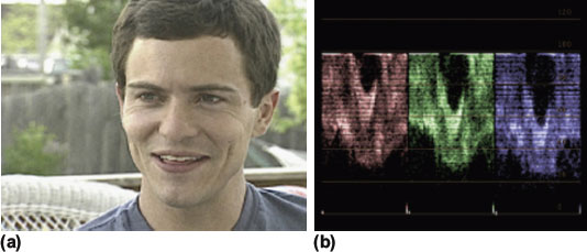
Fig. 1.23 (a) Here’s the original source image again. Please remember that the translation between the RGB video color space and the CMYK print color space is not perfect. (b) Here’s the internal RGB Parade waveform display that corresponds to the uncorrected image.
With the clip “Brian overexposed” called up into your application (Figure 1.23a), keep your eye on the RGB or YRGB waveform display (Figure 1.23b). Bring down the master setup level until the trace of the blue channel of the waveform display starts to flatten out at the bottom, then bring it back just a hair. If you don’t have an RGB or YRGB display, then bring down the setup (or black or shadow) level until the overall waveform level starts to flatten out at the bottom, then bring it up just a touch.
In Color, there are two ways in the Primary Room that you can make this adjustment. One would be to drag inside of the black to white gradated bar in the Shadows group (Figure 1.24a). I pulled the shadows down to around –0.301 from 0 (Figure 1.24b).
Or, on the right side of the screen, you could pull the Master Lift down to about the same level. (This is done by dragging in the number window, holding down the center button or mouse scroll wheel.)
One of my favorite color correction analogies is that making adjustments—especially to blacks and highlights—is like focusing a camera. Point a camera at a subject and look in the viewfinder. The image may, by chance, appear to be in focus. But you don’t really know if it’s in focus or not unless you adjust the focus ring a little bit in each direction, then settle in on the proper focus. Doing color correction is similar. You need to see how far you can push an image and when you haven’t pushed it far enough.
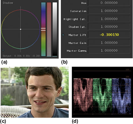
Fig. 1.24 (a) Shadow color wheel adjustment. (b) Master lift adjustment. (c) What the image should look like after the correction to shadows or lift. (d) The internal RGB Parade waveform display that corresponds to the first correction to shadows or lift.
The black levels can actually come down a little lower in the red and green channels, but we’ll get to those kinds of adjustments in another tutorial. I chose to stop when the blue channel reached the bottom because I didn’t want to clip or crush the blue shadows. Also, I was watching the detail area in the dark portions of the eyes, and that’s as far as I could go before I started to lose details in the eyes.
Setting Highlights
With the black levels set, turn your attention to the highlights or gain controls. You can see from the waveform that the sky, especially on the right side, is clipped (Figure 1.25). This clipping is evident from the sharp white line at the top of the right side of the waveform display. It’s never a good thing to see this kind of clipping, but it is very common in this kind of scenario of an interview shot outside with the sky in the shot. Trying to “unclip” this is not worth our time at the moment, so all we really want to do is set our gain control to get that clipped part of the sky to be the maximum legal level. We also want to use our “focusing” analogy to see if we can pull the highlights down to possibly eliminate the clipping. The clipping may be something that is fixable. You don’t know until you try to get rid of it. If the shape of the top of the waveform stays flat, then the clipping occurred before it was brought in to the color corrector, probably during shooting.
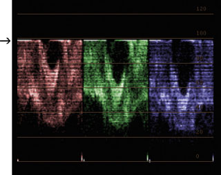
Fig. 1.25 The thin, hard white line at the top of the waveform display—indicated by the black arrow on the left side of the figure—shows where clipping of the highlights has occurred.
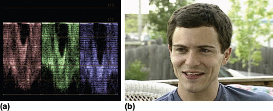
Fig. 1.26 (a) The resulting RGB Parade with a good spread between highlights and shadows. (b) The resulting image with the highlights and shadows spread out.
When the maximum gain is reached, it may have affected your black levels, so adjust them a little bit to get them as close to 0IRE as possible (assuming that your video signal is not set for 7.5IRE) without “crushing” any detail. Remember, we don’t want to see the highlights or the shadows flatten out on the waveform monitor for now. The goal is to spread the tonal range from 0 to 100IRE.
Also, the shapes in the trace representing the brighter portions of your picture that are not already clipped will start to compress. Unless you are going for a specific “look,” this clipping, flattening, or compressing is a bad thing. It means you are losing detail in those bright portions of the picture. This result is similar to the issues we discussed while setting black levels.
When you start to see this “flattening” in the waveform monitor, try to find the corresponding part of the image in the broadcast monitor and lift, then lower the gain while you watch the actual image (Figure 1.26). Do you notice the point at which the highlights begin to lose detail? Remember that camera focusing analogy here, too.
Making color correction adjustments is like focusing a camera.
If you don’t have a limiter on your software, then the highlights can be adjusted far above “legal” without the waveform showing clipping (this may depend on your software or your settings in your software, to some extent). However, at some point in the broadcast or duplication or distribution chain, these super-bright highlights will get clipped. It’s much better for the colorist to determine how and where the clipping occurs than to rely on some “dumb” device downstream to do this, because you’ll have no control of the way the signal looks at that point. Plus, if you are doing these corrections with a client supervising the session, they may love the look of what you’re doing in the suite, but may be less than pleased when they see what the limiter does to their beautiful corrections.
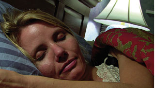
Fig. 1.27 The table lamp behind the sleeping woman is referred to as a “practical.”
Definition
practical lights: Sometimes called “practicals”; lights that are part of the scene, such as a table lamp in a scene next to an actor (Figure 1.27). Usually the brightness of practicals is closely controlled by the director of photography by changing the wattage of the bulb or putting it on a dimmer.
blow out: A nontechnical term for clipping or letting a bright highlight get so hot that it loses all or most of its detail. “The only way I can bring the level up enough to see the actor’s face is to blow out the window.”
For an image with highlights that are very high above the rest of the levels in the shot, you may want to set the main “brightness” using the midtones or gamma so that you have a pleasing level, then use the gain controls to bring just the highlights back down to a legal level. This example also can be an instance in which you break the rules in regards to clipping. If you have a scene that is perhaps mostly dark except for a couple of very bright practical lights that are seen in the shot or a scene with a very bright window behind a darker subject, you can make the decision to clip or “blow out” that window or practical in order to gain enough tonal range in the area that matters: your subject.
Make one last check to confirm that your setup change didn’t affect your highlights, and then we’ll find the correct gamma adjustment to make this look as rich and well lit as possible.
Setting Gamma or Midtones
After setting blacks and highlights, the final tonal correction is to set your midtones. This is how a lot of the mood of the shot is created. With the other two levels basically done by looking for their “extreme” legal limits, the overall tone of the piece is set using the gamma or midtone.
When I do color correction, I do not have to deal with too many outside opinions. My decision about the look is pretty much the final say. I realize that this is not the case for many colorists.
My personal preference when setting midtones in an image is to create a rich feel with a slightly lowered gamma. If your image seems a little dark, even with the highlights raised to the peak legal level, then raising your gamma can give you a brighter—though usually flatter—feel, sometimes somewhat akin to the look of a sitcom. The reason for this is that often the detail of the image is in the gamma and highlight areas, so the closer those two ranges are to each other, the less contrast there is in this critical portion of the image. Some images with more detail in darker portions of the image would actually look less flat by raising the gamma, but in my experience, this is the exception, not the rule.
The final tonal correction is to set your midtones. This is how a lot of the mood of the shot is created.
When setting the gamma, there’s really not much to go by except for personal taste. If you’re trying to see into the shadows or trying to hide things a little in the shadows, then raising or lowering gamma—respectively—can accomplish much of what you want to do.
Often I consider the gamma controls to be my “post lighting controls.” If I feel like the on-set lighting was a little too contrasty or too flat, I can often use gamma to get it to look closer to what I want. Lowering the gamma usually increases the contrast in the shadow details of the flesh tones. Raising the gamma tends to flatten out those shadow details. A lot of that depends on the exact levels of the shadows on the flesh tones. On most “normal” footage, though, the shadows on flesh are in still in the midtone range, so lowering them tends to increase the contrast between the rest of the lit flesh tones, which are also in the midtones but are affected by the highlights as well.
To complete the correction on the Brian interview footage, let’s set the gamma so that the flesh tones look rich and healthy but make sure that the footage isn’t too dark. This is a pretty standard interview clip, so we want something that looks natural and not overly dramatic.
I brought the Master Gamma down about 0.05 in Color from 1.000 to 0.95. I used the “focusing” technique, looking at the eyes of the subject on the video monitor instead of at my waveform monitor. Actually, this was an instance in which the gamma looked good right where it was. When I brought it up higher than 1.0, the picture started to look washed out. When I brought it down around 0.90, it started to look too dark and I lost the detail and “sparkle” in his eyes. I ended up at around 0.955 (Figure 1.28). I want to point out that I wasn’t being guided by the specific number of the gamma control. I was being guided by looking at the richness of the skin tone, the amount of texture and detail in the hair and eyes, and the overall brightness of the image. I am relating the numbers merely as a matter of reference after the fact.
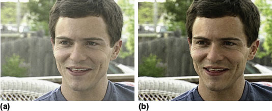
Fig. 1.28 (a) The video image before correction. (b) The video image after correction. This is not a “final” correction; it is only the tonal correction in the primary room. The colors, saturation, and secondary color correction have not been affected yet.
Remember that if you are working with color correction software using only a mouse or single trackball to control tonal ranges one at a time, making adjustments to gamma will affect the levels for shadow and highlight that you’ve already set, so once you are done with your gamma adjustment, you will need to revisit the corrections you did to highlights and shadows. Then readjust gamma. Then recheck highlight and shadow levels after that.
Something else that occurs with tonal range corrections—especially gamma corrections—is that the saturation of the image changes. If you are doing a tonal range correction and you start to dislike what you’re seeing, try to determine whether it’s the actual tonal range or if it’s the increase in saturation. If it’s saturation-based, try to ignore the saturation of the image and just look at the tonal range apart from that. You can always go back in and readjust the saturation independently when you are done with the tonal range correction.
Defining Contrast
Another important concept to understand in developing the tonality of an image is that contrast is not just a “global” parameter in an image. Contrast is generally defined as the range of an image from brightest to darkest. The wider the range, the more the contrast. But it is possible to increase the contrast in a specific area of an image by playing either the highlights against the gammas or the shadows against the gammas. This method can develop an increased amount of contrast in your shadows, your midtones, or your highlights. You can use it to draw attention to parts of the image that you want the viewer to focus on.
It is possible to increase the contrast in a specific area of an image by playing either the highlights against the gammas or the shadows against the gammas.
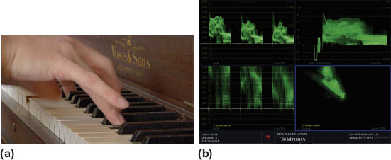
Fig. 1.29 (a) Warm piano image. b) Waveform images for warm piano images.
How does this method work? Think of the waveform image of a picture with low contrast. The entire trace on the waveform is squished into a small area. To increase the contrast across the entire image, you spread out the trace by making the shadows lower and the highlights higher. Now you can use this same concept to increase the contrast in a specific portion of the image. The goal in that area is to spread out the distance between the bottom of that portion and the top. So, if you want to increase contrast in your dark shadows, you lower the shadows and raise the midtones.
Now you have a choice of adding contrast to the area between midtones and shadow or midtones and highlights.
Notice that the difference in contrast between the tops of the black keys and the sides of the blacks keys is not that different (Figure 1.29a). If you wanted to increase that contrast so that the sides of the keys were more black and the tops seemed to have more light, then you would lower the shadow level (or Master Lift as it is called in Color) while raising the Master Gamma. In addition to seeing a difference in the image, notice that the spread of the trace in the lower portion of the waveform also becomes greater, indicating increased contrast.
I took this approach to an extreme in this case to make the difference clearly visible. In this instance, I introduced a lot of unwanted noise and a gamut error, but the contrast between the highlights of the black keys and the deeper shadows of the black keys is definitely sharper (compare the front highlight of the black keys in the middle, under the hands), while the hands have become more washed out.
Now change the contrasty portion of the picture to the highlights instead of the shadows.
Notice that one image emphasizes the keys and the other emphasizes the hands. The name of the piano is also clearer because the contrast has been increased between mid and high. Also, notice that the lower portions of the waveform monitor are stretched out when the contrast is in the shadows, as opposed to the stretched upper portion when the contrast is in the highlights.
Understanding how to gain contrast in the correct portion of the picture is essential as you develop your skills as a colorist. It isn’t enough to simply increase the overall contrast. You need to be able to control contrast within the image because that helps in creating distinct “looks” in your images and also helps direct the viewer’s eye where you want to focus it. Practicing this particular contrast “focusing” trick will also help you when a client asks you to “pop” something off of a background. To do that, you will need to understand the tonal range of the background and the tonal range of what is supposed to pop off of it and then figure out how to stretch that range. This trick is further supported by eliminating contrast in other areas of the picture so that the viewer’s eye is drawn to the areas of the image that have more information. If you crush the shadows, then there is nothing to look at in that area and the viewer looks elsewhere.
I boosted the contrast even more in an attempt to get the piano name to pop even more off the background. One thing to be very aware of in doing these extreme contrast moves is that increasing contrast also increases the chroma levels. The hands got very heavily colored and unnatural as I pushed the contrast, so I had to also lower the saturation levels across the board. You can control the saturation of shadows, midtones, and highlights separately, so use this ability to create natural-looking color levels and reduce noise in unwanted areas. Some of the most objectionable noise is color noise, so reducing the saturation levels where you see noise can really clean up an image.
This concept of playing gammas against the highlights and shadows to increase contrast in specific regions of the picture is very important to your ability to quickly and easily manipulate the “look” of an image. It will help you execute a look that a client has in mind, and it will help you match the look of two or more shots in a sequence. Because of the importance of this concept, you should really practice this on your own.
The three images you will need to develop this skill are a ramp like the one on the DVD called “BWRamp” or “ramp from 0-254.psd.” Most nonlinear editing systems (NLEs) have a similar test image built in to them, or you can even make your own. The ramp should start at 0 percent luminance on one side (usually the left) and then go all the way to 100 percent luminance on the other side (usually the right). The other image that you will need is the image of the chip chart from the DVD called “grayscale_neutral.” And finally, use some of the real video from the DVD or—better yet—from your own projects to see how these gamma versus highlights or shadows corrections affect a natural image.
Think of it as a rubber band. At first the image is “loose” and low contrast. Then you stretch the tonal range so that it goes from 0 to 100 or whatever is natural. Now the rubber band is tightened and contrast is increased. But you can also grab the middle of the rubber band and pull it up or down as well, stretching values (adding contrast) in one direction and compressing them (lowered contrast) in another.
This practice will be greatly enhanced by using a manual control device with the ability to adjust the highlights, gammas, and shadows all at the same time, like the Tangent Devices CP-200 or CP-100 that the colorists in this book used. The reason for this is that adjusting the gammas will obviously have an effect on the highlights and shadows, so if you can move only one at a time, it will require numerous adjustments back and forth as the various tonal range corrections interact.
Practice with the ramp image and try to get the dark part of the ramp compressed in a tight dark band on one end while the bright area is spread out more. Then reverse that. If you can copy and paste your color corrections in your application, try applying these corrections to real-life images or to the grayscale chart.
Do the same thing with the grayscale chart. Try to get the chips at the bottom to all be very close together while spreading the distance between each chip in the highs and mid-highs. Then do the opposite.
Try to practice on real-life images from the DVD or your own collection. What if you want to add lots of contrast to the skin tones? What if you wanted to see lots of detail in the shadows? How could you get more detail out of the clouds in the sky? Playing gamma against the other two tonal ranges will deliver these effects. Taking the highlights or shadows past the point of clipping and then playing with gammas will take these corrections even further by stretching the contrast over an even greater area.