Chapter 16
Charts and Indicators
In This Chapter
• Short-term traders often favor a particular type of chart
• Some charts are easier to read than others, but carry more information
• Technical indicators inform traders of major changes in price or direction
• Charts and indicators both need interpretation
Technical analysis as expressed in charts and certain indicators is one of the most common tools used by short-term traders. Charts provide a quick, graphic representation of what is happening with a stock and suggest a course of action (buy or sell). Indicators, which may show up on charts, provide the same type of information for quick decisions. Short-term traders who use technical analysis swear by it, while some buy-and-hold investors who use only fundamental analysis would put the same faith in astrology. Charts and indicators are subject to some interpretation and may not be read the same way by two different traders.
Worth a Thousand Words
Charts, which are used in many applications other than investing, can deliver a lot of information quickly and in a format that is easy to comprehend. Science, politics, business, or other areas have found that charts convey complicated and detailed information in a manner that is much easier to understand than the raw data. There is a place for analyzing the raw data, but if your point is to show sales growth over the past 12 months, a well-done chart will accomplish that quickly and in a manner that everyone can comprehend.
The same concept applies to technical analysis of stocks. Short-term traders need to grasp large blocks of data in a way that shows a comparison to other blocks of data. Long columns of numbers aren’t the answer, but a chart can tell traders exactly what they need to know in a matter of seconds.

Trading Tip
Technical analysis is a skill traders must practice to improve. Since there is a certain amount of interpretation, practicing with paper trades makes good sense.
It is important to understand that technical analysis and the charts it generates is not an exact science. Charts do not predict with scientific accuracy what a stock’s price will do next. The information represented on the chart is historically correct, but interpreting the patterns to form a trading strategy is a very subjective exercise. Technical analysis is predicated on prices moving in trends and these trends repeating themselves. If these conditions are correct, chart patterns may (or may not) predict which way a stock’s price will move next.
Investors who come from a fundamental analysis background may have trouble adjusting to the different information needs of the short-term trader. Analyzing financial statements is irrelevant to short-term trading. It will hurt the trader because it slows down the process and introduces information that has nothing to do with the price of the stock in the next five minutes.

Margin Call
If you want to make money as a short-term trader, you must train yourself to focus on the information that is relevant to the stock’s price right now, not at some point in the future. Any other information or analysis will cost you money.
Charts Explained
Most charts used in technical analysis have the same basic format. The bottom axis is the timeline, which can be months, weeks, days, or minutes. The axis on the right is usually the dollar value of the security. Price points are plotted along the chart and often connected in some manner, such as by a line. The result is a chart that follows the price of the stock over a set period. In most cases, a simple chart will plot the closing prices of a stock. We’ll explore the more complicated (and useful) following charts.
One math consideration when viewing charts is whether you are looking at a simple mathematical chart or one that is logarithmic. You should be aware of the difference. Most charts plot the price on the right axis in equal units (for example, $5, $10, $15, $20, and so on). This means that as you plot the graph, it shows no difference between a stock that moves from $5 per share to $10 per share and a stock that moves from $20 per share to $25 per share. Mathematically, they are the same; both moved up $5 per share. However, when the stock went from $5 per share to $10 per share that represented a 100 percent increase. When the stock went from $20 per share to $25 per share that only represented a 25 percent increase. The logarithmic chart reflects percent changes and would show a larger space between $5 and $10 than it would between $20 and $25. Percentage change is more meaningful since it represents the magnitude of the increase or decrease.
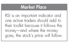
Market Place
Math can be tricky, but it is worth it to slow down and pay attention to how numbers are used or represented. For example, the Dow is roughly 10 times larger than the S&P 500 index, so comparing point changes in the indexes doesn’t make sense. However, looking at the percent change is a valid comparison.
def·i·ni·tion
Logarithmic charts, or price scales as they are also known, reflect the percentage change in prices rather than the actual dollar amount of change. A stock price that moves from $15 to $30 per share would be represented by the same amount of space on the chart as a move from $3 to $6 per share. Both represent an increase of 100 percent. This is the preferred measurement by most traders because actual dollar changes do not show the magnitude of change.
The Importance of Volume
Most charts also include a section across the bottom that details trading volume for the period represented on the chart. This chart within a chart has its own scale of size. It helps traders see the strength or weakness of price movement based on trading volume. Strong volume confirms trends, while weak volume may indicate a false start or the end of a trend.
It is not uncommon to hear that everything is in the price, but without sustaining volume, prices changes can be false signals. Don’t ignore volume and the volume indicators we’ll discuss later.
What Charts Tell Traders
Charts signal two conditions for stock prices: the continuation of a trend or the reversal of a trend. If you think about it, those are the only two things that can happen to a stock’s price—it will either continue in the same direction (up, down, or flat) or it will reverse direction. For short-term traders and some swing traders, this is all the information they need to trade. A continuation signal may mean buy or sell more shares (depending on the direction), while a reversal signal tells traders to buy or sell depending on their position.
The Three Basic Types of Charts
Which are the best charts to use? That’s a matter of personal preference, but beginners should get to know the three basic types of charts and decide for themselves. The charts differ in the amount of information they deliver. Some traders want to strip information down to the essentials, while others believe that a little more detail means the difference between good trades and guesses.

Trading Tip
Don’t make your mind up on any type of chart until you have worked with it using live data or in a simulation of live data. Paper trading with a chart until you see its potential is the best way to discover those tools that work for you.
The Line Chart
The most basic type of chart is the line chart. This chart takes a period and plots the closing price of the security on the chart. The points are connected by a line so you can instantly see where the stock has been and whether its most recent activity has been up, down, or flat.
The line chart’s advantage is its simplicity. There is little to interpret, and you get a quick picture of the stock’s history over the period covered. When you combine other indicators, such as moving averages, the chart becomes more valuable and provides buy or sell indicators.
In this example, a line chart is combined with an accumulation/distribution line. We’ll discuss this indicator more later in the chapter, but be aware that it measures buying and selling pressure on the stock.

This is a one-year line chart for Yahoo! from Interactive Brokers’s Trader Workstation. The line chart is the simplest chart to use and provides the least amount of information. The accumulation and distribution chart across the bottom tracks selling pressure on the stock. On this chart, the trend roughly follows the price. If the A/D line were to turn another direction from the price line, it would signal a change in the trend.
(Photo courtesy of Interactive Brokers.)
The Bar Chart
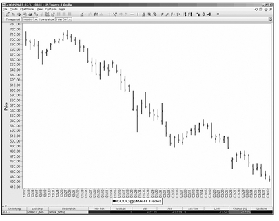
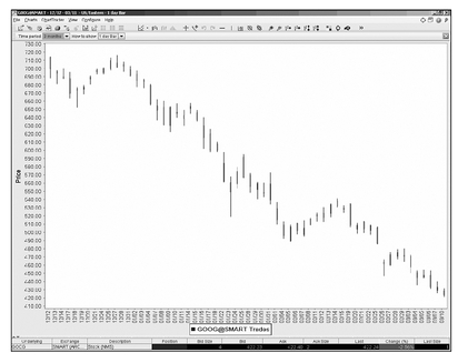
The bar chart expands the amount of information included, but sacrifices some of the readability of the line chart as it does. The bars in this case are vertical lines that represent the stock’s high and low for the trading period. A horizontal line to the left indicates the opening price and a horizontal line to the right is the closing price. If the stock closed up for the trading period, the bar is shaded black or blue. A losing day will shade the bar red.
On up days the line to the left should be lower than the line to the right. If the opening price is also the low price, you may not see a left horizontal bar.
If the chart covers a number of periods, you can spot trends, but the vertical bars may make it harder to see what is happening. Some charting software will draw lines on bar charts connecting the price points you request (closing numbers, for example).
This is a three-month bar chart for Google from Interactive Brokers’s Trader Workstation. The bar chart adds a significant amount of information; however, some find it difficult to read if there are many bars. The vertical bar marks the high and low price for the day. The left horizontal mark is the opening price and the right horizontal mark is the closing price.
(Photo courtesy of Interactive Brokers.)
Candlestick Charts
Candlestick charts deliver the most information and may be the easiest to read. Candlestick charts have been in use by various traders since their perfection by a Japanese rice broker in the seventeenth century. The name comes from the obvious shape of the markers on the charts, which resemble a candle with the wick exposed at both ends. Each part of the marker delivers information about the stock’s price in the period covered by the chart.
It takes some practice, but reading candlestick charts is much easier than bar charts with their tiny horizontal lines. The upper and lower wicks are called shadows and mark the stock’s high and low. The shadow’s length is determined by the relative difference between the stock’s high and low and the stock’s open price. For example, if a stock opens at 30 and the high for the period is 35 and the low is 28, the upper shadow will be proportionately longer than the lower shadow.
Another key piece of information relates to the body of the candle itself. If the body is white or clear, it means the stock closed above its opening price. If the body is black, it means the closing price was lower than the opening price. A note of caution: not all chart providers use these coloring conventions, so check with the vendor regarding its color designations.
These are the absolute basics of candlestick charts. Interpreting patterns on the charts is where the real power for traders lies according to charting proponents. The candlestick forms may change as different price conditions emerge. For example, if a stock opens at its low for the trading period and never drops below that point before close, the candlestick will not have a lower shadow. That form is called a shaved bottom. If the reverse is true (stock opens at high and never moves above that mark), the form will have no upper shadow and is known as a shaved head. If a stock’s opening and closing price are the same, the pattern is known as a doji.
This is a three-month candlestick chart for Google from Interactive Brokers’s Trader Workstation. The candlestick chart is one of the oldest forms of communicating market prices. It takes some practice to become comfortable reading, but the candlestick is very popular with technical traders. Vendors use different colors to indicate up closes from previous days and other important information.
(Photo courtesy of Interactive Brokers.)
Trend Lines
In Chapter 15, we talked about support and resistance. Support is the lower price that acts as a floor holding up the stock, while resistance is the upper price that is difficult for a stock to push through. When a stock trades between these two values, you can see the range defined by the support and resistance trend lines. Most charting software will draw lines connecting all the low prices and all the high prices. This gives you a visual trading range where the stock trades until it pushes through either support or

Trading Tip
Trend lines are not always easy to read and interpret. Like other technical analysis tools, they should be used in conjunction with other indicators to confirm trends.
resistance. Trading in this range can be profitable for short-term traders who buy at support and sell at resistance.
If a stock is trending up, your chart with lines connecting support values and another line connecting resistance values will angle up from left to right. This chart will reflect the upward movement of support and resistance values. If the stock is trending down, the parallel lines will slope down left to right.
Chart Patterns
Chart patterns tell active traders whether a price trend will continue or reverse, according to technical analysis proponents. (It’s more complicated than that, but you’ll need a book devoted to technical analysis for more detailed explanations.) Because active traders, and especially short-term traders, are more interested in price direction than value, any tool that can help them spot trends and changes in trends will help make them money. There are dozens of chart patterns and signs that purists follow. We only have room to look at a few samples here, but check out Appendix A for more resources on charts and technical analysis.
Head-and-Shoulders Pattern
The head-and-shoulders pattern on a chart signals a reversal in a price trend. Many technical analysis followers consider it one of the most reliable patterns. Unlike some of the more esoteric patterns, the head-and-shoulders pattern name tells you exactly how to recognize it. With a distinctive left and right shoulder and a head in the middle, the pattern stands out on a chart without too much nuance.
There are two major variations of the head-and-shoulders pattern. In an up trend, the head and shoulders are in an upright position on the chart. While in a downtrend, the pattern is inverted. Again, not much is left to the imagination for the basic patterns.
The basic head-and-shoulders pattern actually has four parts—the three mentioned above (left and right shoulders, plus the head) and a fourth component known as the neckline. The neckline is important because it is prices breaking through this level that signal completion of the pattern.
Head-and-shoulders patterns are considered trend reversal signals as stated above and tend to appear at the top of an uptrend in prices or at the bottom of a downtrend. Technical analysis proponents believe the reversal will commence when the head and shoulders pattern is completed.
That completion is the fourth step in the process that creates the pattern, which begins with the left shoulder as it hits a new high, then backs off to a new low. This forms the left shoulder. The price then hits a higher high, which is the head, before falling back to another new low. The third step is another high, but not as high as the head, which creates the right shoulder. The fourth and final step completes the pattern and begins the trend reversal. This is when prices fall off the high that created the right shoulder and keep falling through the neckline. Technical analysts believe this signals the completion of the trend reversal.
For stocks that have been in a downward trend the head-and-shoulders pattern is inverted, but the same process occurs to complete the reversal of the trend. When this happens, technical analysts believe the stock is headed up.

Margin Call
One of the dangers of charts is that not all patterns take shape in the classic manner that makes them easy to identify. What may look like a certain pattern may just be close to the shape, but sending you the wrong signal.
Cup-and-Handle Pattern
The cup-and-handle pattern signals the continuation of an upward trend. Active traders can profit from this pattern, which is characterized by a pause and dip in price before a resumption of the upward trend. The cup-and-handle pattern may be more appropriate for swing and position traders as it can signal a longer term price pattern.
As you might guess, the cup-and-handle pattern looks like a cup and handle with a rounded cup and a moderate downward move marking the handle. The cup is made by prices falling off a high and gently sliding down into the bottom of the cup before rising to form the right side of the cup.
The handle is formed by prices retreating from the high of the right peak forming the cup. Usually chart watchers expect no more than one-third retrace from the right-peak high. This brief dip gives form to the handle and sets up completion of the pattern. When the pattern is complete, prices will continue their upward trend.
The cup-and-handle pattern is on par with the head-and-shoulders pattern as a reliable indicator. There are some indicators about the cup-and-handle pattern to watch. If prices have had a large run-up before the pattern, there may not be a large surge following completion of the cup and handle. The pattern may signal some remaining enthusiasm by buyers, but with limits.
Other Signals
We have barely scratched the surface of charts and technical analysis. Active traders, especially those who plan to trade short term, should pursue an education in reading and understanding charts. Not every short-term trader uses charts to the exclusion of every other trading tool, but you should know more about them before you make that decision for yourself. Using them is your personal decision; however, many short-term traders couldn’t imagine trading without charts.
Technical Indicators
Not all proponents of technical analysis rely on chart patterns. Many technical traders, as they are sometimes called, use technical indicators to help spot trading opportunities. Indicators are mathematical calculations usually related to price changes over time. They may also include volume and other factors. Indicators may be plotted on a chart to see how they change or move over time, especially in relationship with other indicators or over different periods.
Indicators can be used to confirm chart patterns or by themselves as buy or sell signals. Most technical analysts like to have more than one confirmation of a signal. Although chart patterns have a visual appeal, they can become complicated because price movements don’t always follow patterns precisely. That is why having an indicator confirm a pattern’s signal is a wise step.
Leading and Lagging Indicators
Indicators are either leading or lagging. Leading indicators are more predictive and work best when prices are not following an obvious trend—they may be moving in a choppy or sideways fashion. Leading indicators are known as oscillators, meaning they move in a set range that goes from overbought to oversold. As the oscillator moves between these two ranges, it will generate buy and sell signals.
Lagging indicators work best when prices are trending. They are less predictive and produce fewer buy and sell signals, which helps traders stay with the trend longer. These indicators focus more on historical price movements to confirm trends.

Trading Tip
Technical indicators are rooted in mathematical relationships of past price and volume patterns. Many technical indicators can be used without charting as they produce a numerical score that can be a buy or sell signal.
Using Technical Indicators
Technical indicators are used to create buy and sell signals. Indicators generate signals through either crossovers or divergence, both of which are the result of plotting the values on a chart. This may sound like a return to chart reading, but the difference is indicators don’t require you to recognize special patterns or combinations of patterns. Because the indicator is a computed value, its interaction with a price level or moving average, for example, is significant without the need for detailed interpretations. Some indicators, as we’ll see below, can be interpreted without a chart simply by their value—above a certain level is considered bullish and below that level is bearish.
def·i·ni·tion
Crossovers occur when an indicator crosses a major marker such as a moving average or a price trend and can signal a buy or sell situation.
Divergence occurs when an indicator moves away from or in the opposite direction of a price trend. This usually signals a reversal of the trend.
Using technical indicators that diverge from major levels or moving averages quickly shows that the direction of the price trend is losing support. The divergence can be either positive or negative. If the price of the stock is going down, but the indicator is trending up, it suggests that interest is building in the stock and the price may soon reverse its direction and begin moving up. Negative divergence is the opposite—the price is trending up, but the indicator is headed down. This suggests that support of the stock’s price is weakening and sellers are gaining strength. The stock’s price is likely to begin falling.
Examples of Major Technical Indicators
In this overview of technical analysis, there is only room for a brief introduction to indicators. We’ll look at some of the most popular indicators and how they are used. For a more comprehensive overview and other resources on technical indicators, visit Appendix A.
On-Balance Volume Indicator
The on-balance volume indicator (OBV) measures the effect of volume on price and the strength of price trends. The indicator measures a running total of volume that is adjusted by price movement—rising price on volume is added in while decreasing price volume is subtracted. The calculation can be found in the reference material in Appendix A. This indicator tells traders whether there is support for price changes (as reflected in volume).
If a stock’s OBV is rising, it is predictive of a price increase, while a declining OBV signals a drop in the stock’s price. Volume is the driver in this indicator and precedes any price change. An OBV moving in the same direction as the price trend confirms the direction, while the opposite indicates the trend is weakening.

Trading Tip
Volume is an important indicator for traders to watch. If there is low volume associated with what appears to be a change in price trend, be careful of a false signal. Trend change signals with strong volume are much more valid.
Accumulation/Distribution Line Indicator
The accumulation/distribution line captures the money or demand for a security. Supply and demand (as represented by money or buyers for the stock) are the basic determinants of a stock’s price in the short term. When there is money coming into a security (buyers), the pressure is on the stock’s price to rise. When the sellers take over, money is flowing out and the price must soon decline.
The accumulation/distribution line can confirm a trend if it tracks the same direction or it can signal the end of a price trend by reflecting the money flowing in a different direction. For example, if a stock has been trending up, but the accumulation/ distribution line begins to trend down, it is telling traders that support for the stock at that price is eroding and the trend will soon end.
The calculation for the accumulation/distribution line is found in resources listed in Appendix A. However, traders will find this important tool calculated for them in most direct access broker packages and in dedicated charting software.
MACD Indicator
The moving average convergence divergence (MACD) fits in the category of must-know technical indicators. It is composed of two moving averages—one for 12 periods and the other for 26 periods. The two are referenced against a nine-period signal line. The indicator notes a stock’s momentum by comparing the short-period moving average to the longer period’s moving average.
The MACD generates signals several ways, including crossing the signal line, diverging from the price trend, and when the short-period line crosses the long period line. There is not room to discuss all of the signals MACD can reveal, but you’ll find more information in Appendix A. All technical traders and those who want some confirmation of price trends or changes should master this indicator.
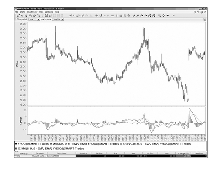
This is a one-year moving average convergence divergence (MACD) chart for Yahoo! from Interactive Brokers’s Trader Workstation. The MACD chart is one of the most important confirmation tools traders use to verify breakouts.
(Photo courtesy of Interactive Brokers.)
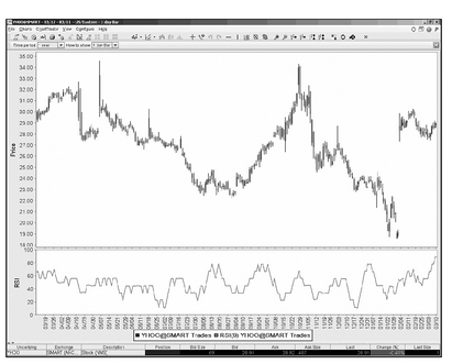
Relative Strength Index
The relative strength index (RSI) is an important technical indicator that is used with charts, but can also be helpful as a standalone calculation. The RSI calculation generates a number between 0-100. Traders consider an RSI of 70 or more overbought and any value under 70 as oversold. As values move away from 70, the degree of intensity changes.
This number is helpful by itself as a trading tool because it gives traders a sense of what direction the stock may be headed and where the money is. For example, a stock with an RSI in the 90s could be headed for a price reversal as that number indicates the stock has heavy buying pressure, pushing the price up. RSI can also be used to confirm trends or signal reversals. Check out the resources in Appendix A for more information on using this important indicator.
This is a one-year relative strength index chart for Yahoo! from Interactive Brokers’s Trader Workstation. The RSI chart is an important technical indicator that can generate buy and sell signals.
(Photo courtesy of Interactive Brokers.)
The Stochastic Oscillator
The Stochastic Oscillator is another popular momentum indicator favored by technical traders. It tracks closing prices on the theory that they should follow the prevailing price trend. For example, a stock in a rising trend should close near the high end of the trading range. In a declining trend, the stock should close near the low end of the trading range. When a stock begins a pattern of closing in variance with these norms, it signals a change in the trend.
The Stochastic Oscillator is too complicated to explain in this limited space; however, you should know it registers a numeric score between 0-100. A score above 80 is considered overbought, while under 80 is oversold. With this number alone, traders have useful information. The value of this indicator extends when it is plotted on a chart. There you can see if it confirms a price trend or signals a coming change in direction. Like other indicators, this information generates buy and sell signals. Appendix A has more detailed information on the Stochastic Oscillator and how active traders use it.
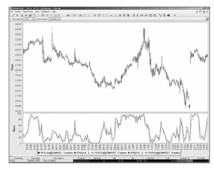
This is a one-year Stochastic chart for Yahoo! from Interactive Brokers’s Trader Workstation. The Stochastic chart is an important technical momentum indicator that traders use to spot a change in the prevailing price trends.
(Photo courtesy of Interactive Brokers.)
Market Indicators
Most active traders, especially short-term traders, are more concerned about immediate price trends and don’t pay too much attention to overall market activity. However, even very short-term traders keep an eye on certain market indicators that may influence prices.
One of the most important market characteristics traders watch is volatility. Is the market overbought or oversold? Too much volatility may lead to a market correction that can affect virtually all stocks. Three main indicators track major stock indexes: the VIX tracks the S&P 500; the VXN tracks the Nasdaq 100; and the VXD tracks the Dow.
One of the main uses of these indicators is to measure risk in the market. This means the higher the risk the lower the indicator will be, while the lower the risk the higher the indicator. Traders can gauge the perceived risk (is the market bearish or bullish?) by following the appropriate indicator. If the indicators are very high, while the market index is low, traders take that as a positive sign that the market has over-corrected and will reverse.
Many active traders start their day with a check of these market indicators.
The Least You Need to Know
• Charts offer traders a quick way to grasp information.
• Charts help traders confirm or deny price trends.
• Charts are subject to interpretation.
• Market indicators measure volatility and risk.
..................Content has been hidden....................
You can't read the all page of ebook, please click here login for view all page.